
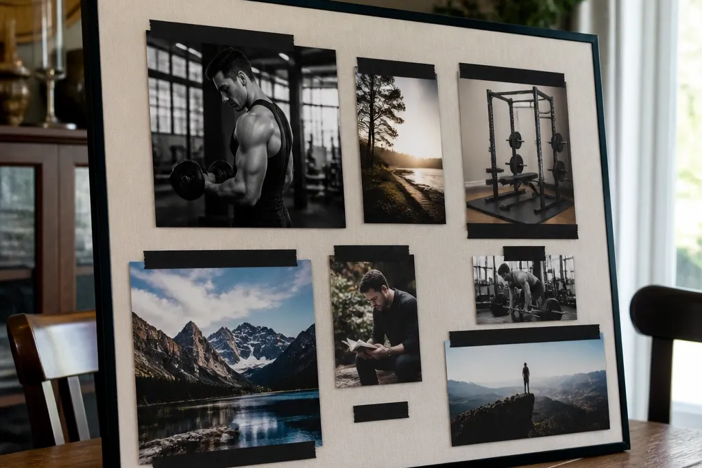
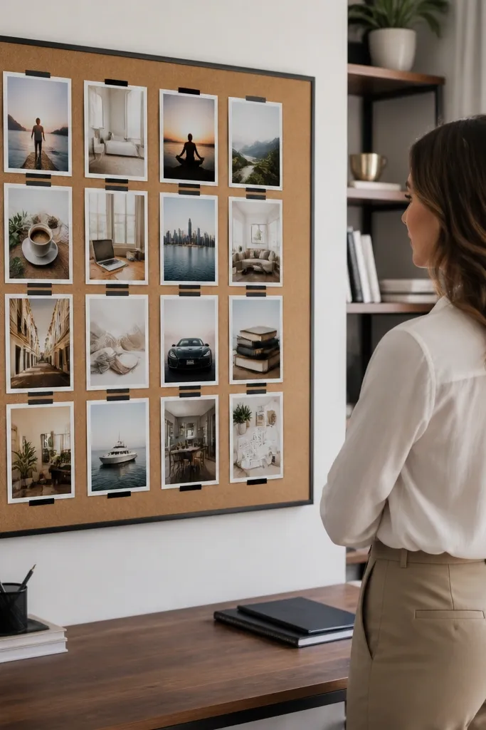
1. Black-and-cream gym ladder board
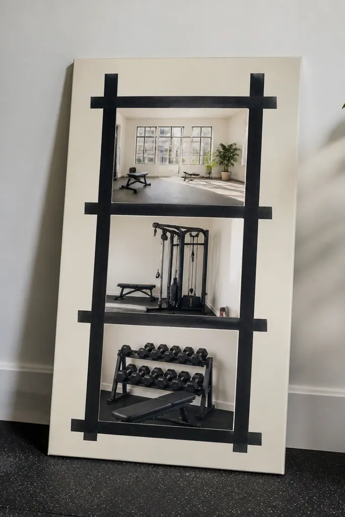
This layout looks expensive because the palette is strict and the spacing is calm. Use a cream backing (thick cardstock or linen paper) and black frames or black tape borders so every photo has a clean edge. Build it as a ladder: top photo shows the outcome vibe (clean, bright training space), then two photos below show training actions, and the bottom strip shows recovery cues like stretching or a towel setup. The board stays actionable because each tier tells you what to do next, not just what you want.
Start with a 16x20 inch backing and mark a 2-column grid with 1/2 inch margins. Place one large anchor photo at the top spanning both columns, then add three smaller photos beneath it: workout shoes by the door, a workout scene, and a recovery item like foam rolling. Finish by adding black borders around every photo using 1/2 inch matte tape or slim black picture frame strips. Keep all captions in one style: small, uppercase, cream-on-black or black-on-cream, sized so they don’t cover faces.
Print the workout photos slightly darker than you think so they don’t look washed-out against cream paper.
Don’t mix bright neon accents with black-and-cream — it ruins the premium look.
2. Sage and stone meal prep grid
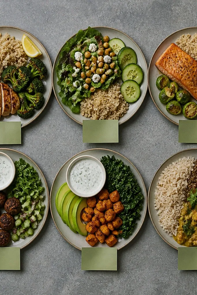
This is one of the best high-end vision board ideas pictures for fitness because it makes food planning look calm, not restrictive. The look comes from muted colors: stone gray background, sage sticky notes or paper tabs, and photos that show consistent plate styling. Pick 4-6 meal photos where the lighting is soft and the portions are clear, like a bowl, a sheet-pan tray, or a simple breakfast plate. It works because you’re training your eye to recognize “your meals,” which makes grocery shopping and decision-making faster.
Choose a stone gray backing board and cut 2 inch wide sage paper tabs for the sides of each photo. Arrange six photos in a tidy 3x2 grid with 3/4 inch spacing between frames. Use matting: print on matte photo paper and add a thin white mat (around 1/8 inch) behind each image if you’re mounting. Label each photo with one short word only, like “Protein,” “Fiber,” “Hydration,” placed on the sage tab.
Keep the meal photos consistent in angle (top-down or 3/4 view) so the board feels designed, not random.
Skip food pictures with messy backgrounds or mixed lighting — they look cheap next to sage.
3. Morning shoes by the door photo strip
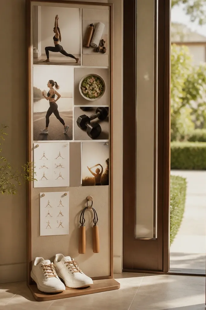
If you want your board to change behavior, this picture theme is hard to beat. It’s visually simple and reads instantly: shoes are the cue that your workout starts now. Make it premium by using a clean doorway scene, neutral flooring, and a single color accent like a matching shoelace or gym bag strap. The board works because it turns “I’ll work out later” into “I already have the gear ready,” which reduces friction.
Take or print three photos of the same setup: shoes by the door, gym bag on the hook, and a water bottle on a small tray. Place them horizontally as a strip across the middle of your board, leaving 1 inch of space above and below. Add a small weekly card next to the strip with 3 checkboxes for the week’s workouts, using a simple black pen style font. Mount using double-sided photo tape so the strip looks flush and clean.
Editor's noteUse the same shoe angle in all three photos — consistency makes it look styled instead of accidental.
Skip thisDon’t add five different shoe colors or chaotic clutter in the background.
4. Navy and warm tan strength icons
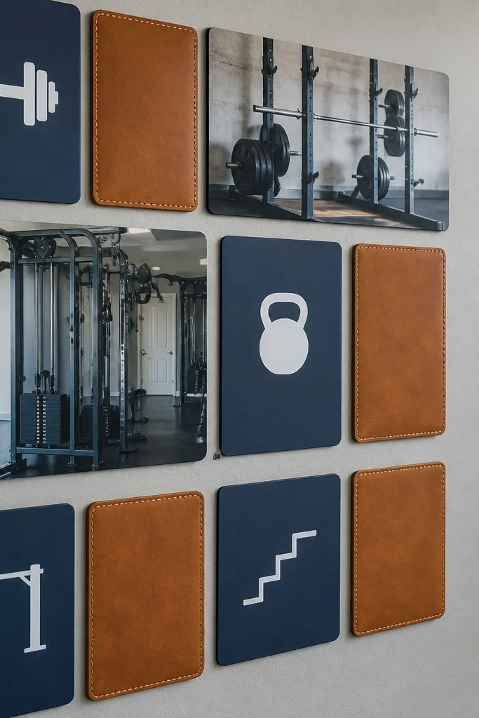
This one is for people who like structure and want their board to feel like a brand. Navy makes everything look sharper, and warm tan adds that “leather notebook” vibe. Use a mix of small icon prints (dumbbell, kettlebell, pull-up bar, steps) and two larger photos showing form — a barbell rack, a cable machine, or a pull-up grip. It works because icons turn your goals into a checklist you can scan in seconds.
Start with a navy backing and print 8 small icon cards in warm tan on matte paper. Place two larger photos at the top corners, then arrange the icon cards in a neat grid underneath with consistent 1/2 inch spacing. Add a tan header card across the top with one line of text: your weekly focus, like “Strength + Steps.” Seal the whole board with a clear matte laminate sheet if you’re using paper that smudges easily.
If you’re printing icons, keep line weight consistent so the whole board looks like one set.
Don’t use multiple font styles — the navy board will look messy fast.
5. Wood frame recovery corner
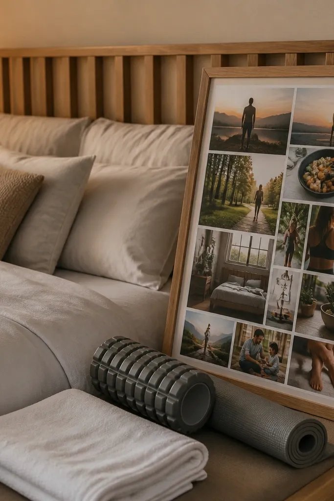
Recovery images are what most boards ignore, and that’s why they don’t feel balanced. This layout uses a light wood frame look and focuses on recovery cues: towel folded on a bench, foam roller, stretching mat, and a calm bedroom corner. The high-end feel comes from warm wood tones and soft, low-contrast photos. It works because it tells you recovery is part of training, so you plan it instead of trying to squeeze it in.
Use a backing with a warm wood finish or a faux wood paper sheet. Place one recovery anchor photo in the center, then add four smaller photos around it like a loose square. Use thin wood clips or small binder clips in matching color to hold prints at the corners. Add one small “wind-down time” card with a specific time you pick, like 9:30 PM, and place it at the bottom.
Editor's noteChoose recovery photos with soft shadows; harsh flash makes this theme look cheap.
Skip thisSkip bright gym-floor clutter in recovery photos.
6. Chrome water bottle and hydration tiles
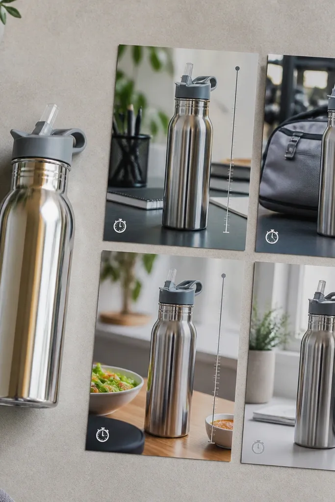
Hydration is boring until you give it a visual system. These tiles look premium because they use one hero object — a metallic water bottle — and repeat it in different contexts: on a desk, in a gym bag, next to a meal. Each tile should show a clear cue like a straw, a time note, or a measurement line. It works because you’re making hydration a routine you can check, not a vague goal.
Print 6 tiles sized 3x4 inches. Use the same bottle in each photo so the look stays cohesive. Arrange them in two columns and add a small strip of numbers under each tile like “2:00 PM,” “5:30 PM,” “Before bed.” Mount with matte adhesive corners so the edges stay crisp and flat.
Editor's noteMake the time labels in one color only, like charcoal gray, so the tiles look designed.
Skip thisDon’t mix hydration photos with different bottle styles or colors.
7. Pastel cardio route map collage
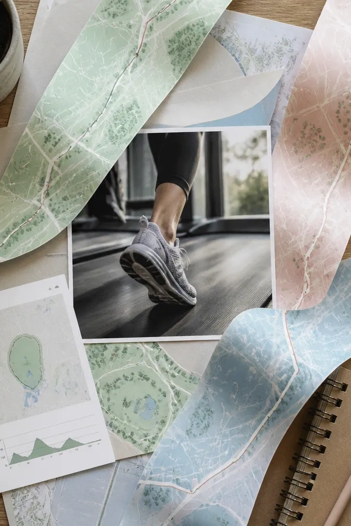
Cardio boards look better when they show the route, not just running people. This collage uses pastel map strips, a simple running shoe photo, and one small screenshot-like graphic of your planned route style (park loop, treadmill incline, stair session). The high-end look comes from soft paper textures and consistent pastel ink tones. It works because it removes the “where do I go?” friction and makes the plan feel real.
Print or draw a simple loop map on pastel paper and cut it into 3 strips. Place the shoe photo in the center, then layer the map strips around it like a frame, with 1 inch overlap. Add small cards for “tempo,” “distance,” or “time” using a single handwriting style font. Mount with removable glue dots so you can swap route strips next week.
Editor's noteUse light ink colors and keep roads thin; thick lines make map collages look like worksheets.
Skip thisSkip busy street maps with tiny labels.
8. High-contrast mirror selfie with rules
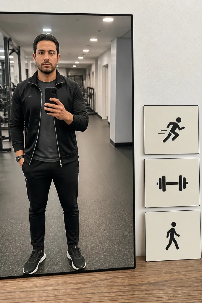
This is a bold option and it looks great when you keep it clean. Use one high-contrast mirror photo with a neutral outfit and a simple background, then pair it with three tiny “rules” cards that define the workout — like “10-minute warm-up,” “Form over weight,” “Finish with 5 minutes steps.” The premium look comes from limiting the number of elements and keeping the text small and consistent. It works because the photo gives you identity and the rules give you execution.
Choose one mirror photo where the background is uncluttered. Print it larger than everything else (around 8x10 inches) and center it. Create three cards sized 2x3 inches with one rule each and place them in a vertical stack to the right side. Use a single ink color and a thin border line around each card for cohesion.
Editor's notePick a photo where your outfit color matches one element elsewhere in the board (like tan shoes or navy shirt).
Skip thisDon’t add ten rules — three reads like a system.
9. Olive and cream strength board with barbell rack
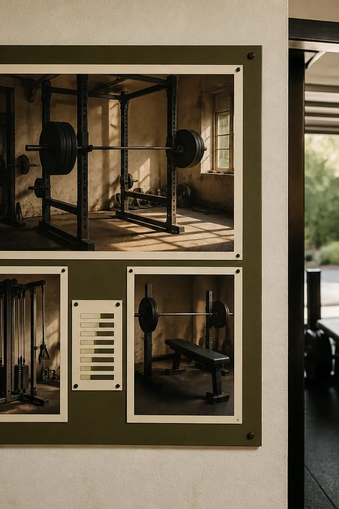
Olive looks grounded and makes strength photos feel intentional. Use it with cream paper and matte prints so the board looks like a serious training mood board, not a scrapbook. Pick one barbell rack photo as the hero, then add two smaller photos for your specific lifts or machines. Add a small “rep range” card as a visual reminder. This works because you’re connecting your identity to your actual training setup and numbers.
Use an olive backing board and print your hero barbell rack photo at 8x10 inches. Add two supporting photos at 4x6 inches below it, aligned to the center. Create one small card with your rep targets like “Squat 3-5 reps” and place it under the hero photo. Mount everything with matte photo adhesive and add thin cream tape borders around each print.
Keep the rep card in the same font style as your other labels and keep it short enough to read from across the room.
Don’t mix glossy strength photos with matte labels — the contrast looks off.
10. Fitness calendar wall with checkable weeks
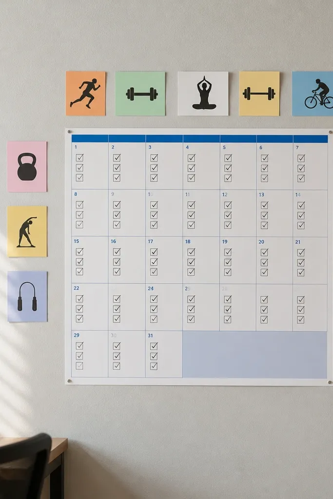
A calendar is the most honest fitness vision board picture because it forces time into the plan. This design looks high-end when the typography is clean and the grid is consistent. Put a monthly calendar photo or printed calendar page on the board and surround it with tiny workout icons and one outcome image. It works because you’re deciding what happens this week, not just what you want eventually.
Print a monthly calendar page and mount it centered. Add five small icon cards around the calendar (steps, strength, mobility, rest, hydration) and place each icon next to a week row. Use a single pen style for checkboxes — draw 7 boxes under each workout day. Add one anchor photo at the top that matches the palette of the calendar (same color range).
Use thick black checkbox lines so they look crisp even after you write on them.
Don’t leave the calendar empty — blank grids kill motivation.
11. Linen texture board with workout bag flat lay
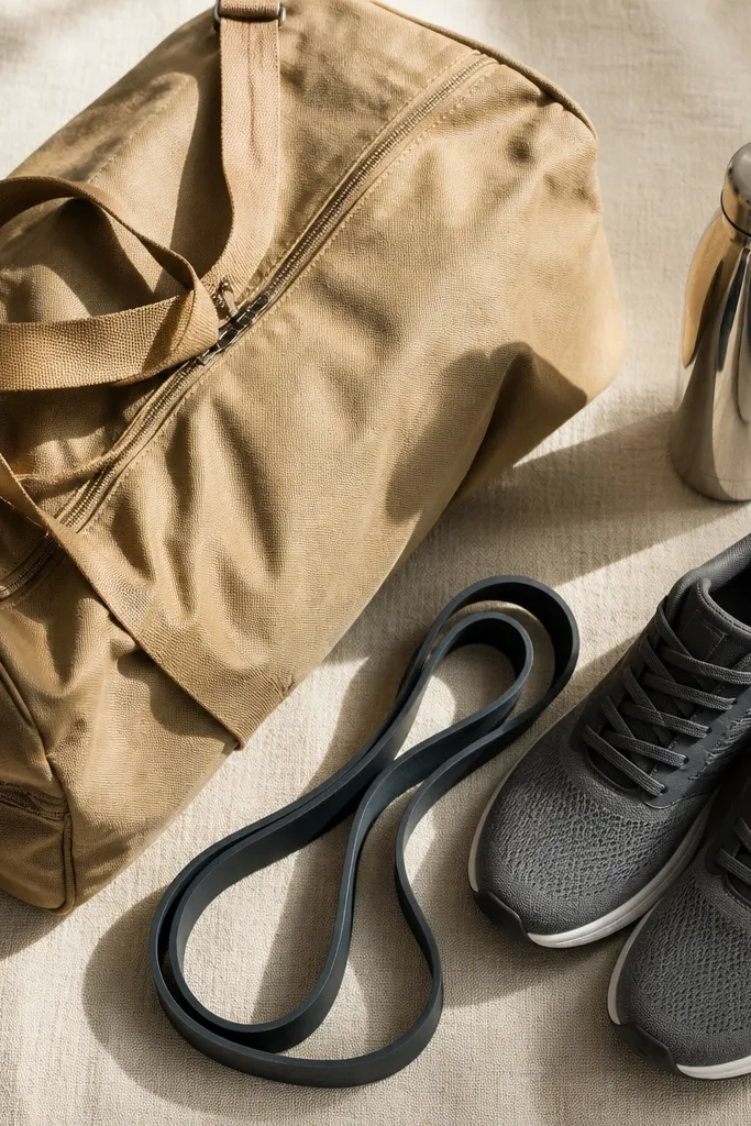
If you want “high-end” to show up in photos, linen texture is cheating in the best way. This board uses a neutral linen-like backing and a clean flat lay of your workout bag, shoes, resistance band, and water bottle. The board is photogenic because the arrangement looks styled even if your items are normal. It works because it makes packing feel satisfying and reduces the chance you skip because you forgot something.
Pick a linen-texture backing or print linen paper and mount it on a board. Arrange a flat lay photo of your bag in the center (8x10 inches). Add two smaller photos above and below it: shoes and a band or mat. Use small corner mounts or clear acrylic clips so the board looks like a modern gallery wall. Add one small label card that says “Pack night before” and place it under the flat lay.
Editor's noteKeep the flat lay photo in the same color family as your backing — neutrals look intentional.
Skip thisAvoid busy items in the flat lay like loose wrappers or random receipts.
12. Sculpted plate photos with color-coded labels
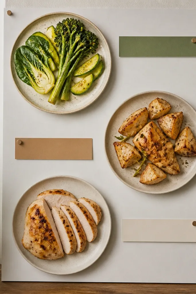
This is a high-end vision board picture set because the food looks like design, not clutter. Use plate photos with consistent lighting and a clean background, then add color-coded label strips that tell you what each plate includes. Choose three colors that match your palette — like sage for fiber, tan for carbs, and charcoal for protein. The board works because it turns meals into categories you can shop for and assemble quickly.
Print three meal plate photos at 5x7 inches and place them in a row with 1 inch gaps. Cut label strips 1 inch wide and 3 inches long in your chosen colors. Put one label strip under each plate, like “Protein,” “Carbs,” “Fiber,” using a simple black font. Keep the rest of the board empty enough that the plates are the focus.
Use matte prints for plates; glossy prints make food look plasticky on a board.
Don’t add extra text under the labels — one word reads cleaner.
13. Home workout zone rules and timers
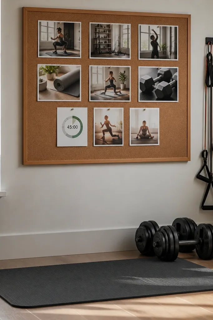
Home workouts fail when you rely on memory. This board fixes that by showing your setup and your timer plan in pictures. Use one photo of your workout space (mat, dumbbells, or band area), then add a timer card with your default session length. Pair it with two rule cards: warm-up first, end with mobility. It looks premium because it’s minimal and uses one typographic style for the cards.
Place a 7x9 inch photo of your home workout zone centered. Add a timer card sized 3x5 inches to the right with bold time text like “35 min” and smaller text like “AMRAP or circuit.” Add two rule cards sized 2x3 inches on the left. Mount with photo corners to keep edges crisp and add a thin border line around the entire card cluster.
Use the same timer length for a full month before you change it so your board isn’t constantly rewriting itself.
Don’t clutter the zone photo with random cords; crop tighter for the clean look.
14. Steps + stairs visual stack
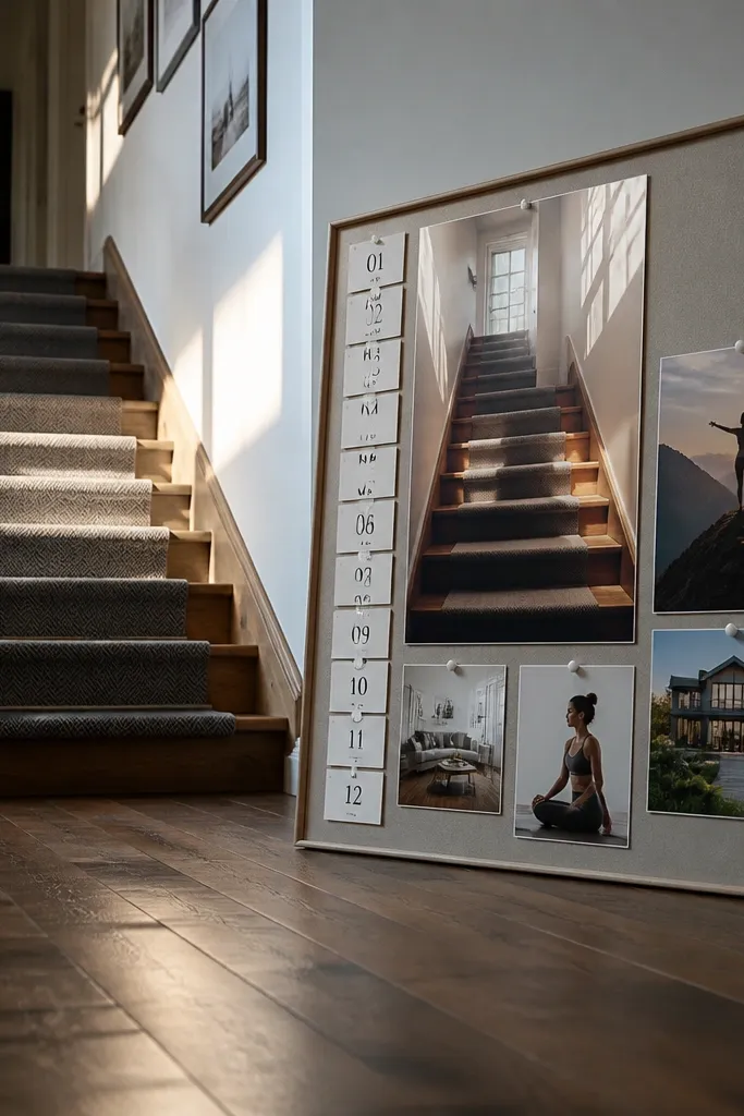
If you want a board that pushes daily movement, build it around one simple visual: a stair or pathway photo plus step numbers. This design is high-end because the numbers are clean and the cards are consistent in size. Put a hero photo of stairs or a hallway, then stack two smaller cards with step targets and “after lunch” timing. It works because it ties your goal to a daily schedule you can remember.
Print one stair or pathway photo at 8x10 inches and center it. Create two cards sized 4x6 inches and write your targets in large numerals like “6,500 steps” and “10 minutes after lunch.” Add a small third card at the bottom for “weather plan” with “walk inside” or “short route.” Use a single font style and mount with matte adhesive to avoid glare.
Put the after-lunch card closer to the bottom so your eye catches it when you’re most likely to slack.
Skip tiny step targets written in small text — they disappear when you need them.
15. Neutral gym mirror outfit study
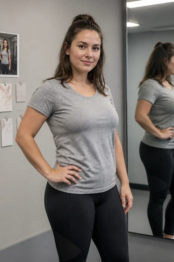
This is a fashion-forward approach to fitness vision boards, and it looks good in pictures because the outfit and background stay neutral. Choose a mirror photo where the outfit is one color family (like gray + black) and the gym background is blurred or uncluttered. Then add three small motivation cards with actions: “Track sleep,” “Hydrate,” “Move daily.” It works because it turns “I look good” into “I follow my system,” without turning the board into a generic quote wall.
Pick one neutral mirror photo and print it at 8x10 inches. Mount it centered and leave 1.5 inches of margin around it. Create three cards sized 2x3 inches with action words and place them in a vertical line on one side. Use a gray backing and black ink for the cards so the whole board looks cohesive.
Crop the mirror photo so it shows your upper body and the workout setup, not random gym clutter.
Don’t add pastel rainbow cards to a neutral mirror theme.
16. Walnut frame and photo corners workout set
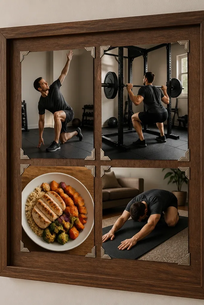
This one gives you that gallery wall feel without needing fancy framing. Walnut-toned backing plus clear photo corners makes everything look intentional and clean, which is the fastest way to get “high-end vision board ideas pictures” results. Use four photos: warm-up, main lift, meal plate, and recovery stretch. Keep each photo the same size so the board looks designed. It works because it gives you a repeatable sequence you can follow each session day.
Use a board with a walnut finish or cover a backing with walnut-toned wrapping paper. Print four photos at 5x7 inches each. Place them in a 2x2 grid with 1 inch spacing. Mount with clear photo corners at each corner so the photos look flat and crisp. Add one tiny legend card under the grid with a short sequence like “Warm-up > Lift > Eat > Recover.”
If you’re using photo corners, press them firmly with a ruler edge so they stay aligned.
Don’t mount photos with thick glue blobs; they look messy and catch light.
17. Color-blocked habit icons with one hero photo
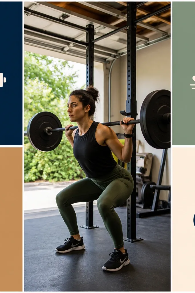
This style looks modern and expensive because it mixes one hero photo with graphic color blocks. The hero photo sets the mood, and the icons turn the plan into quick decisions. Use four habit categories: strength, steps, hydration, sleep. Each category gets a colored block card with a simple icon. It works because your board becomes a dashboard you can scan in under 10 seconds.
Choose a neutral backing like off-white and print one hero workout photo at 8x10 inches. Create four color-block cards sized 4x6 inches using one color per category, with a simple icon centered on each. Place the four cards in a 2x2 grid below the hero photo. Add a thin border line around each card using matching charcoal pen so the edges are crisp.
Keep icon style consistent (same line thickness) or the cards will look like they came from different sets.
Don’t add extra stickers or patterned paper; color blocks need clean edges.
18. Sunrise training window with time cards
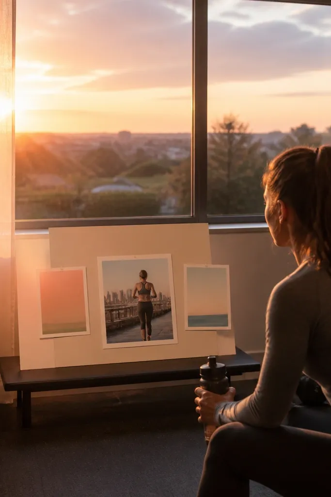
Morning light photos make fitness boards feel calm and focused. This design uses a sunrise or early light window photo as the background theme, then overlays two time cards and one training photo. The high-end look comes from soft gradients and limited text. It works because it anchors your habit to a time, which helps your brain stop negotiating with you.
Print a sunrise or window light photo at 8x10 inches and mount it as the background layer. Add a workout action photo at 5x7 inches on top, aligned slightly to one side. Create two time cards sized 2x4 inches with your workout start time and a short reminder like “Start warm-up.” Use matte tape to secure the cards so the edges don’t lift.
Editor's noteChoose time card colors that match the sunrise tones — warm peach and charcoal look clean together.
Skip thisAvoid heavy black text over bright highlights; it looks muddy.
19. Monochrome stretch routine strips
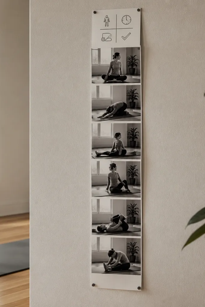
Mobility boards look high-end when they’re monochrome and consistent. This layout uses black-and-white stretch photos in a vertical strip, with one small “routine” card at the top. The look is clean because the photos share the same lighting and contrast level. It works because it turns recovery into a sequence you can follow, and it’s easier to do a 10-minute routine when you can see each step.
Print three black-and-white stretch photos at 4x6 inches each. Arrange them vertically with 3/4 inch spacing and center alignment. Add a small routine card at the top with a title like “10-Min Mobility” and a single line of text. Mount using matte photo paper and secure with corner mounts so the strip stays flat.
Editor's noteUse the same crop size for each stretch photo so the strip looks uniform.
Skip thisDon’t mix different photo styles like gym color shots with black-and-white stretching.
20. Weekend grocery list and cart photo
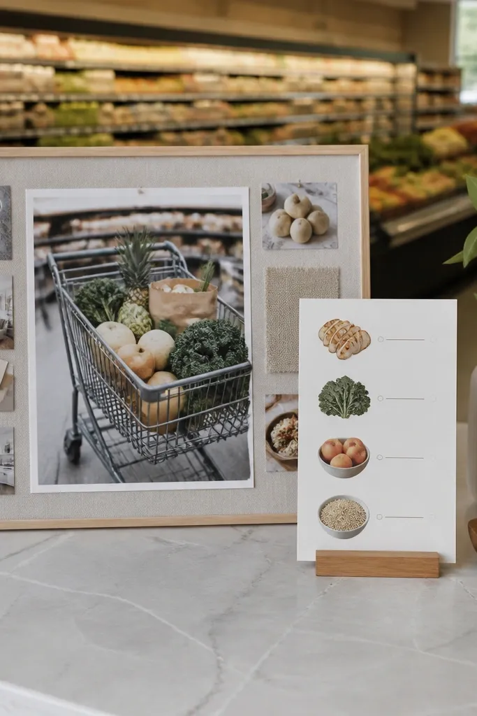
This is the most practical “fitness vision board picture” for people who fall off with food. It looks premium because it’s mostly neutral — cart photo, clean paper, and a handwritten-style list card. Put the grocery cart photo next to a list of repeatable items: protein, vegetables, fruit, and a couple of prepared staples. It works because it turns nutrition into a shopping plan you can run every week.
Print one grocery cart photo at 5x7 inches and mount it on the left side. Create a list card sized 6x8 inches with a simple layout: four lines only, each with 3 items max. Place the list card to the right side with 1 inch spacing. Use matte adhesive and keep the list ink dark so it stays readable from across the room.
Write your list in the same order each week — protein first, then vegetables, then carbs, then fruit.
Don’t include long paragraphs of nutrition info; keep it to items you buy.



