
1. Antique Brass Band with Tiny Starburst Halo
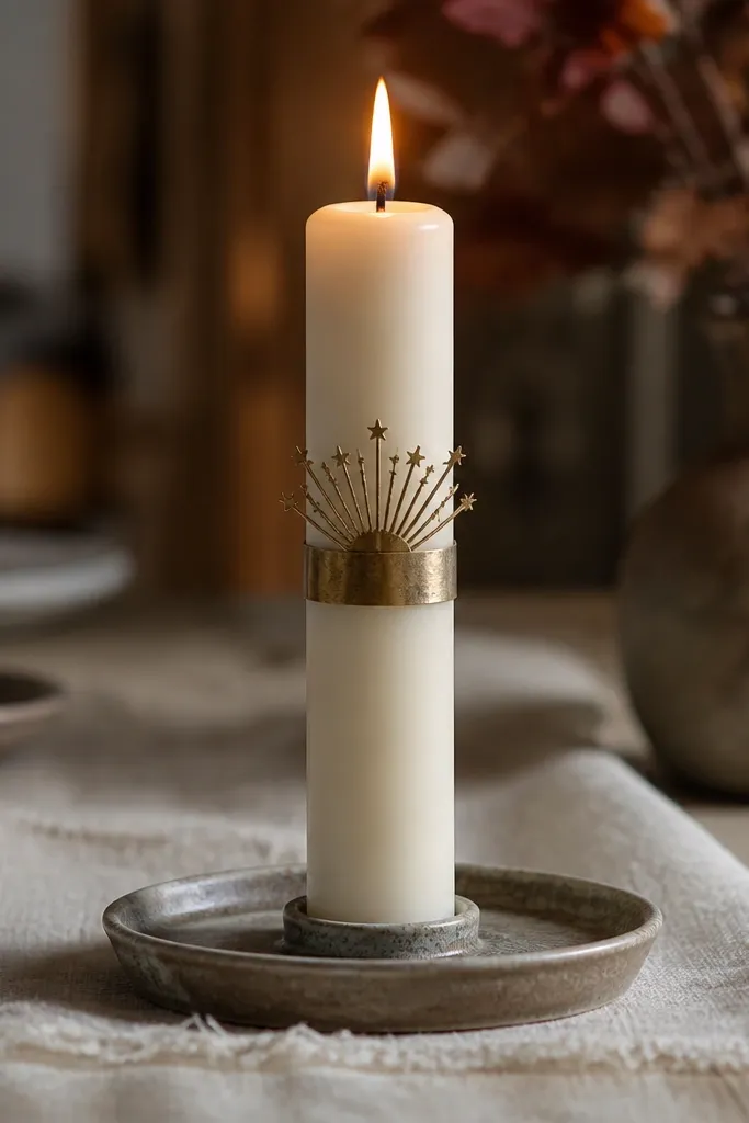
This look reads expensive because it gives the flame a built-in frame. Start with a creamy matte base so the brass stays warm instead of harsh. The thin band keeps the design graphic, and the tiny starbursts add sparkle without turning into blobs. When lit, the star points catch light and look like they’re floating above the band. It’s also forgiving: even if your stars aren’t perfectly even, the halo effect still looks intentional.
First, paint a matte cream background or use an off-white taper. Tape a straight band 2 to 2.5 inches from the top, then brush on antique brass metallic acrylic in one thin coat. While it’s still slightly tacky, use a liner brush to add 10 to 14 tiny starbursts radiating outward from the band center. Seal with a matte craft sealer once fully dry, keeping the seal off the wick area.
Dry-brush the brass over the tape edge for a sharper line, then remove tape while paint is still a little wet.
Don’t flood the starbursts with paint — thick dots look opaque and smear when the candle warms.
2. Inky Blue Ombré with Warm Gold Bottom Glow
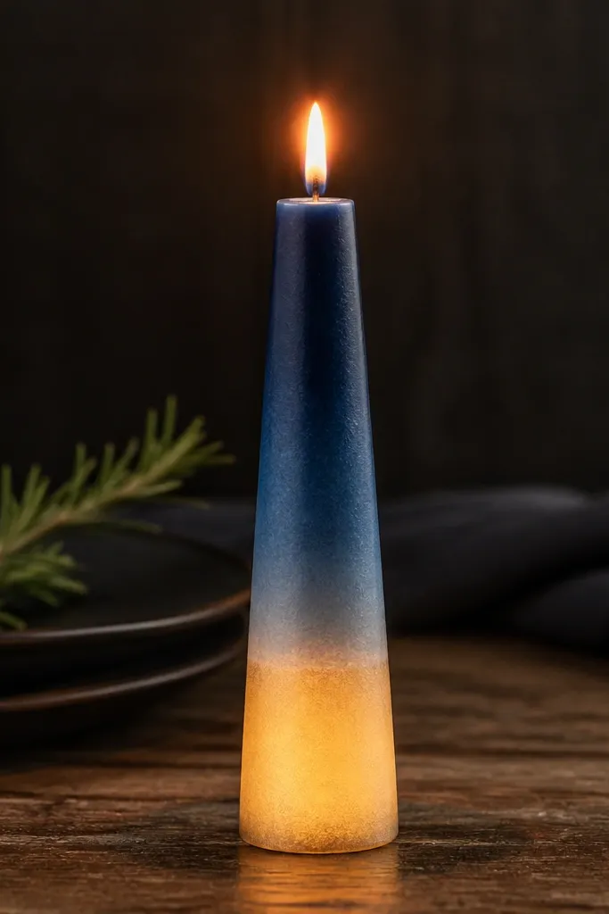
Ombré looks high-end when it transitions smoothly and keeps the light direction in mind. The inky blue gives drama in daylight, while the lighter mid tones make the lit glow feel softer. The warm gold bottom band acts like a candle “shadow,” so the design looks dimensional instead of flat. It also photographs well because the gradient creates depth even when you’re not close to the candle. This is a strong choice for dining tables and winter styling.
First, paint the candle from top to bottom with inky blue acrylic, then blend downward using a damp sponge so the fade looks gradual. Work in small sections and wipe your sponge between passes. Once the ombré is dry, tape a bottom band about 1 inch tall and paint it with warm gold metallic acrylic. Use a second pass very lightly so the gold stays thin, then remove tape and let it dry completely before sealing.
Use a makeup sponge for the blend — it creates a softer ombré edge than a brush.
Avoid straight brush strokes across the fade — they show as streaks when the candle is lit.
3. Terracotta Speckle with White Linework Constellations
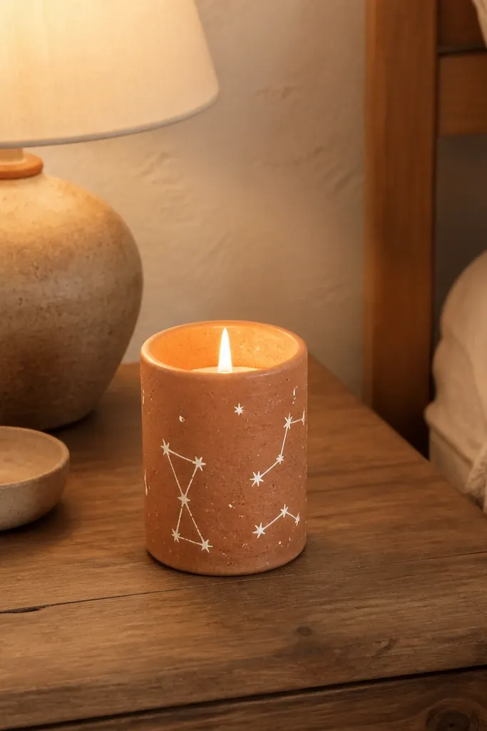
Speckle textures read luxe because they look like intentional design, not a mistake. Terracotta gives warmth, and the white linework makes the pattern clean and readable. The trick is that the constellation lines should be thin and slightly uneven by hand, so they feel organic. Lit, the white lines brighten and the speckle turns into a gentle scatter effect. This design looks great on a shelf with mixed neutrals or on a dinner table with earthy linens.
Start with a terracotta base coat in matte acrylic. Flick a loaded toothbrush to add speckles across the middle third, aiming for lighter density near the top. With a liner brush, sketch 3 small constellations using straight segments and tiny dots for star points. Keep lines under 1/16 inch thick so they don’t look chunky lit. Seal with matte sealer after everything dries.
Editor's notePractice your constellation spacing on paper first — candle curvature makes long lines drift.
Skip thisDon’t overdo the speckles — if the whole candle is dense, it turns muddy when lit.
4. Sage Green Ribbon with Micro Dots and a Single Gold Accent
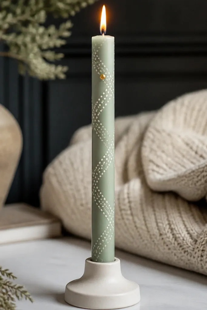
This look is clean and designer because it uses repetition with restraint. The sage ribbon gives a fashion-forward color block, and the micro dots make it feel delicate. A single gold accent keeps it from looking like a craft project; it catches light and pulls the eye upward toward the flame. In photos, the dots create a subtle texture that stays visible even at a distance. It’s perfect for minimalist spaces and modern tables.
Paint the candle matte cream or use an off-white taper. Tape two parallel lines to form a ribbon about 3/4 inch tall, then paint the ribbon in sage green acrylic. Remove tape carefully to keep crisp edges. Add micro dots using a dotting tool or the tip of a toothpick, placing them in two rows along the ribbon. Finish with one small gold accent near the top band (about 1 inch from the flame) and seal matte.
Editor's noteFor micro dots, load very little paint on the tool and tap lightly — you want pinpoints, not circles.
Skip thisDon’t use glossy paint for the ribbon — shine makes the ribbon look wet and cheap lit.
5. Black Lace-Style Bands with Negative Space Hearts
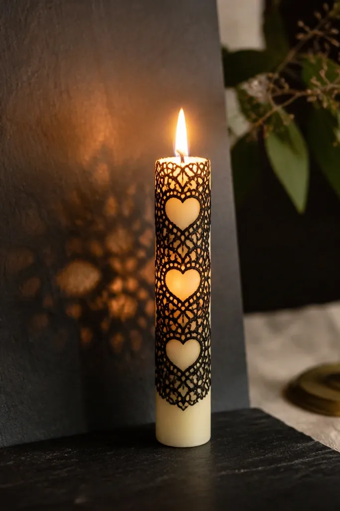
Negative space is what makes this look high-end. Lace-style bands can look busy, but leaving heart shapes unpainted keeps it elegant and readable. The off-white base makes the black lines pop in daylight, and lit, the lace pattern turns into a delicate “shadow” effect around the flame. This design photographs like a boutique candle without needing ultra-fine detail. It works especially well for date-night tables and gift sets.
First, mark two band areas with painter’s tape, each about 1 inch tall, spaced 2 inches apart. Paint the bands with black acrylic using a stencil or freehand lace motifs, but stop short of the heart zones you want to leave blank. To create hearts, mask them with small tape pieces or use a thin brush to outline and paint around them. Once dry, reinforce lace lines with a liner brush for crispness. Seal with matte sealer to keep the lace from looking shiny.
Editor's noteUse tape to mask the hearts — it’s faster than trying to paint around tiny shapes freehand.
Skip thisDon’t thicken lace lines — wide strokes look like a logo instead of lace when lit.
6. Charcoal Marble Veins with Smoky Gray Edge Highlight
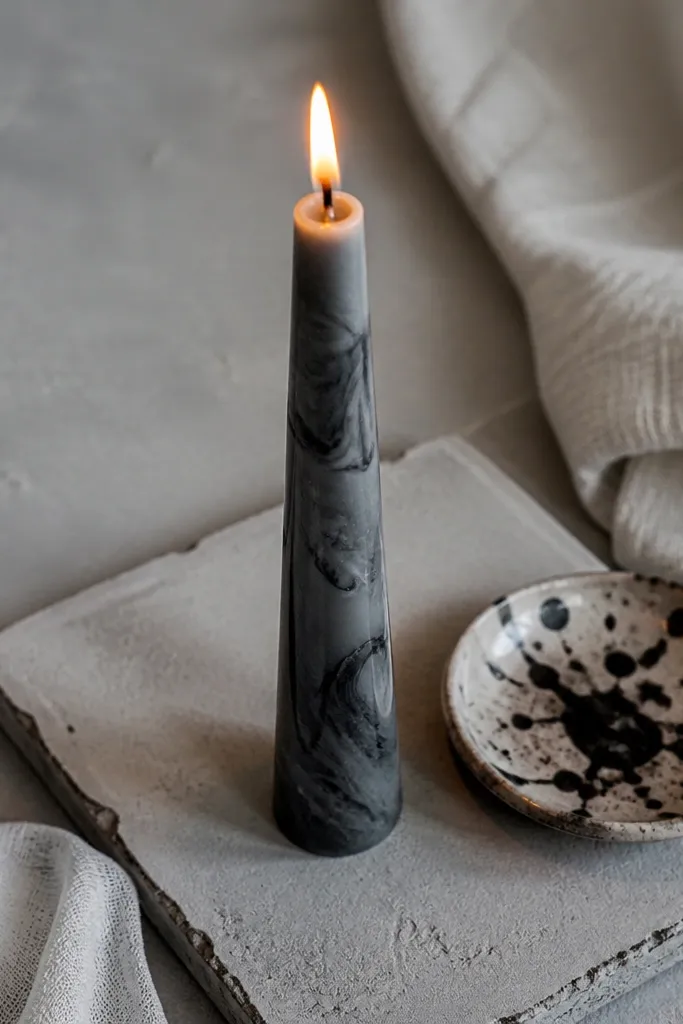
Marble painting looks expensive because it mimics high-end stone — but it only works when the veins are controlled. Charcoal veins on a gray base create depth, and a smoky edge highlight makes the taper look sculpted. Lit, the gray glow softens the stone effect and makes the candle look like it has depth rather than flat paint. This is a great pick for modern decor and black-and-gray rooms.
Start with a smooth gray base coat using matte acrylic. After it dries, drag a thin brush lightly to pull charcoal streaks, then soften some edges with a barely damp sponge so veins look natural. Add a few thicker “anchor” veins so it doesn’t look like random scribbles. For the edge highlight, lightly dry-brush smoky gray along one side of the candle only. Seal matte once fully dry.
Do the veins in 2 rounds — first for the big shapes, second for a few thin lines that connect them.
Avoid high-contrast black everywhere — too many dark veins makes it look like soot.
7. Dusty Rose Bloom with Gold Thread Stems
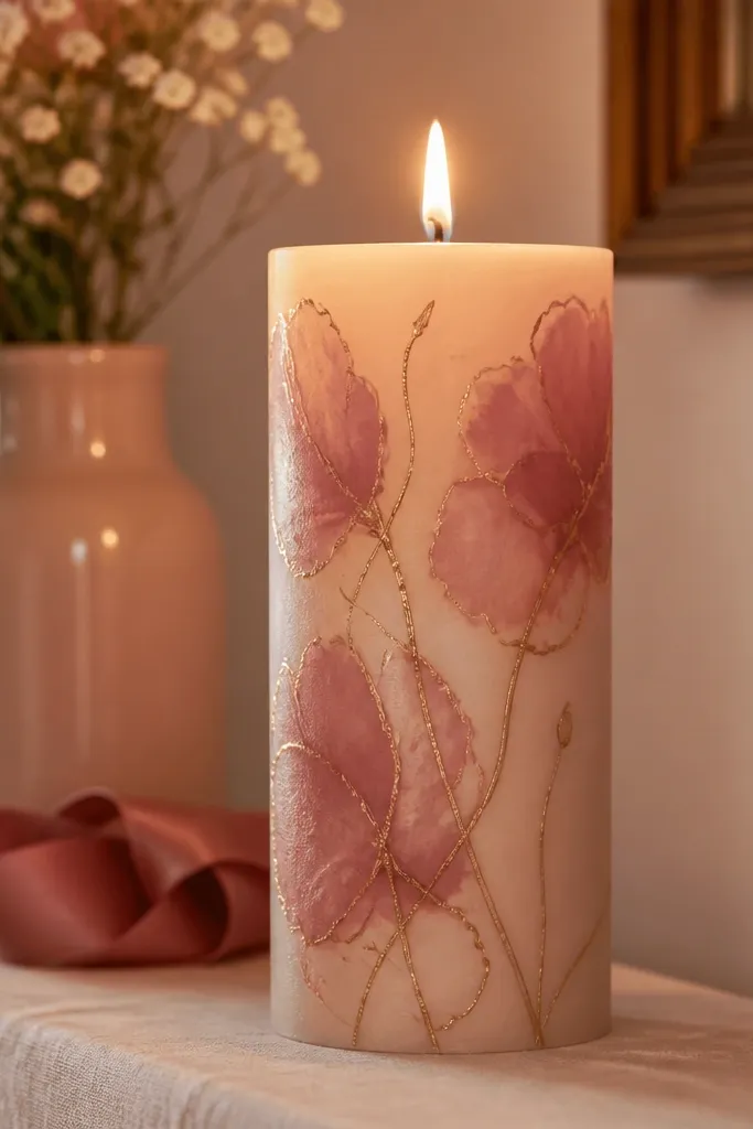
This design has a “wedding invitation” feel without being overly sweet. Dusty rose stays flattering under candlelight, and the gold thread stems add that fine-line, couture look. Keep the blooms slightly abstract — soft petals with a few darker edges look better lit than perfect roses. The gold threads also catch the flame glow, so the candle looks like it’s gently lit from within. It works for bridal tables, but it also looks good year-round with neutral plates.
Paint a matte base in dusty rose or cover with a dusty rose wash. Sketch 3 simple bloom clusters using a pencil lightly, then paint petals with a small round brush using 2 rose tones (light and darker). Add gold thread stems with a liner brush, pulling 1 to 2 thin lines upward from each bloom. Finish by placing a tiny gold dot at the center of each bloom. Seal matte, keeping the gold lines thin.
Editor's noteGold looks cleaner when you mix metallic acrylic with a drop of matte medium so it dries less shiny.
Skip thisDon’t outline every petal in gold — it turns into a border instead of a delicate stem.
8. Forest Green Vertical Stripes with Pearl Highlights
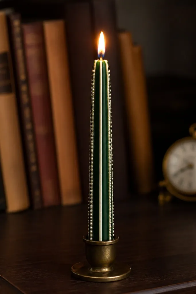
Vertical stripes look luxe because they elongate the candle and keep the design readable from far away. Forest green feels rich without being heavy, and pearl highlights give a soft glow that looks intentional when lit. The key is spacing: leave narrow cream gaps so the candle base contributes to the contrast. When the flame flickers, the pearl highlights brighten and make the stripes look dimensional. This is a strong option for holiday tables and moody interiors.
Tape off 5 to 7 vertical stripe positions around the candle, leaving consistent cream gaps. Paint stripes in forest green matte acrylic in thin coats and remove tape after the paint sets slightly. For pearl highlights, use a light pearl white metallic or pearlescent acrylic and dry-brush it into only one side of each stripe gap. Keep highlights narrow so they don’t look like frosting. Seal matte and let it cure fully before lighting.
Editor's noteRotate the candle as you paint stripes so your lines stay straight relative to the viewer, not the table.
Skip thisAvoid wide stripes — the design looks blocky and loses its high-end, tailored feel lit.
9. Cream Base with Espresso Script Looping Around the Middle
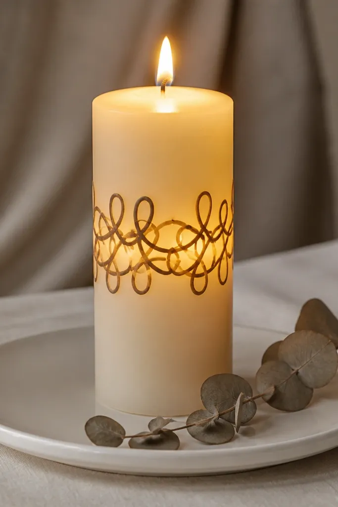
Hand-lettered script can look high-end when it stays simple and flows with the candle curve. Espresso brown gives a warm, vintage tone that reads well under flame glow. The best versions use 1 line of script with loops that wrap the midsection, leaving the top and bottom clean. Lit, the script becomes a warm silhouette instead of messy handwriting. This is a great choice for personalized gift sets and neutral decor.
Start with a clean cream taper. Use a pencil or washable marker to map one horizontal line of script across the middle, keeping letters spaced so they don’t touch. Paint over the guide with espresso acrylic using a thin liner brush, then add thicker downstrokes by pressing slightly harder on the brush. Let it dry, then add a second thin pass only on the most important strokes. Seal matte carefully.
Editor's noteIf your letters wobble, outline the key strokes only and leave minor strokes thinner.
Skip thisDon’t write too close to the top — the flame will blur the first few letters.
10. Monochrome Botanical Branches with Tiny Dew Drops
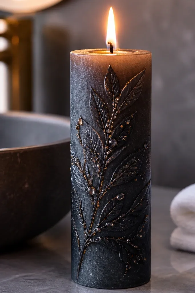
Botanical branches look expensive because they’re delicate and structured. A monochrome palette keeps it modern, and dew drops add a “fresh” sparkle that lights up beautifully. Use black or very dark charcoal for branches so they stay crisp. The dew drops should be tiny and placed along the veins, not scattered everywhere. Lit, the drops read like highlights on glass, which makes the candle feel polished.
Paint the candle off-white matte. Sketch two branches that curve upward from the midsection, leaving a clear top zone for flame framing. Paint branches with black acrylic and a liner brush, then add small leaf shapes with a slightly wider tip. Add dew drops as small circles with white acrylic, then tap each drop lightly with a damp brush to create a tiny highlight edge. Seal matte.
Editor's noteKeep leaf shapes under 1/4 inch — anything bigger looks cartoonish lit.
Skip thisAvoid heavy outlines around leaves — they make the branches look like stickers.
11. Rose Quartz Wash with Silver Vein Lines
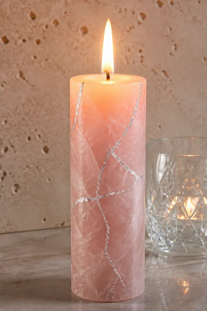
Rose quartz looks high-end because it mixes soft color with sharp lines. The wash gives a cloudy, stone-like surface, and silver veins create the contrast that makes the pattern pop when lit. Keep the silver lines thin and a little imperfect so they look like mineral streaks. Under a flame, the pink wash glows and the veins catch light without looking like foil. This one is gorgeous on blush and white tables.
Apply a pink rose wash using diluted matte acrylic so it looks translucent. Layer 2 to 3 thin coats instead of one thick coat, letting each coat dry. Then paint silver vein lines with a liner brush, pulling a few main veins and several shorter offshoots. Add a couple micro specks of silver where veins branch. Seal matte so the wash stays soft and not glossy.
Editor's noteDilute your pink with matte medium, not water, so it dries smooth.
Skip thisDon’t use thick metallic paint for veins — it looks raised and catches wax drips.
12. Midnight Navy with Copper Chevron Panels
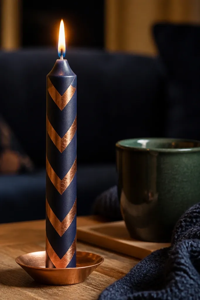
Chevron panels make a candle look designed because they create strong geometry. The midnight navy keeps it dramatic, while copper reads warm and premium under candlelight. The trick is to keep chevrons crisp and separated by navy negative space so the pattern doesn’t merge. Lit, the copper lines look like they’re glowing from inside the wax. This style works well for modern homes and holiday decor.
Paint the full taper midnight navy matte acrylic and let it dry. Tape off 2 to 3 chevron panels across the middle, each about 2 inches wide. Paint copper chevrons using a ruler and liner brush, following the tape edges for sharp angles. Remove tape and touch up corners with a fine brush. Seal matte once everything is dry.
Editor's noteUse painter’s tape with a firm burnish — soft tape edges lead to wobbly angles.
Skip thisDon’t try to paint chevrons in one thick pass; do two thin passes.
13. Ivory Base with Black Moroccan Tile Frames
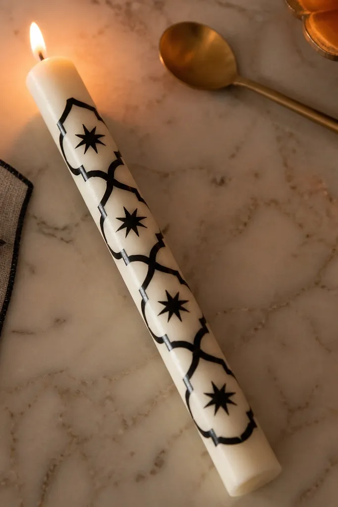
Moroccan tile patterns look high-end because they feel architectural. An ivory base keeps it bright and clean, while black frames create graphic contrast that reads well even when the candle is lit from a distance. Add small geometric stars inside the frames to keep it interesting without turning into clutter. Lit, the tile outlines become crisp shadows that look like lace for your tabletop. This is a great pick when you want “decor” without heavy color.
Use an ivory taper or paint ivory matte acrylic. Tape 3 to 4 tile frames around the middle, keeping each frame about 1.5 inches tall. Paint black frame lines with a liner brush, then add tiny star points inside each frame using a dot-and-line technique. Remove tape carefully and add one extra inner line to each tile for depth. Seal matte.
Editor's noteDraw a simple tile layout on paper first so the spacing stays consistent between frames.
Skip thisAvoid filling every tile with too many shapes — the candle will look busy lit.
14. Gold Leaf Look with Matte Black Background Dots
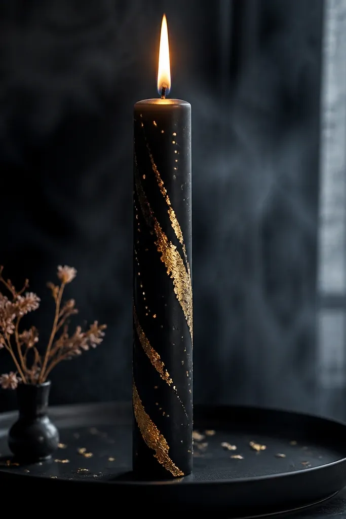
This is the “luxury noir” candle look. Matte black makes the gold feel expensive, and sparse dots keep it from looking like a random glitter mess. When lit, the gold dots turn into tiny warm sparks, and the matte black reduces glare so photos look clean. The gold streaks add movement and keep the design from feeling static. This one is great for parties, bars, and dramatic styling.
Paint the candle matte black and let it dry fully. Use a sponge or small brush to apply tiny clusters of gold metallic acrylic in dot form, keeping clusters spaced 1 to 2 inches apart. Add a few short gold streaks between dot clusters by dragging the brush lightly downward. Keep the gold application thin so it doesn’t look raised. Seal with matte sealer for a smooth, photo-friendly finish.
Editor's noteGold looks more leaf-like when you apply it with a stipple motion instead of brushing.
Skip thisDon’t coat the entire candle in gold — it kills the high-end “sparks” effect.
15. Soft Gray Clouds with White Lightning Crackles
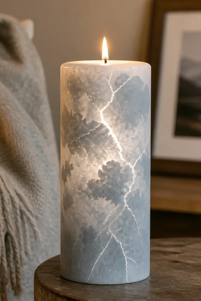
Cloud textures look modern when you keep them subtle and pair them with sharp accents. Soft gray gives the background depth, while thin white crackles add a playful energy that still reads polished. Lit, the crackle lines brighten and the cloud edges glow softly, like weather seen through glass. This style looks good with silver decor and cool-toned rooms. It’s also easy to photograph because the contrast is clear.
Paint the candle soft gray matte acrylic in a sponge pattern so it looks cloudy. Use a slightly darker gray on one side to create depth, then blend edges with a damp sponge. Next, use a liner brush to paint 2 to 4 lightning crackle shapes across the middle and lower third, keeping lines thin. Let it dry, then add a second white pass only on the brightest segments. Seal matte.
Editor's noteKeep crackle lines short and angled — long lines wrap awkwardly on a taper.
Skip thisAvoid thick lightning lines; they look like paint drips when lit.
16. Cream with Chocolate Drip Frame and Gold Speckle Interior
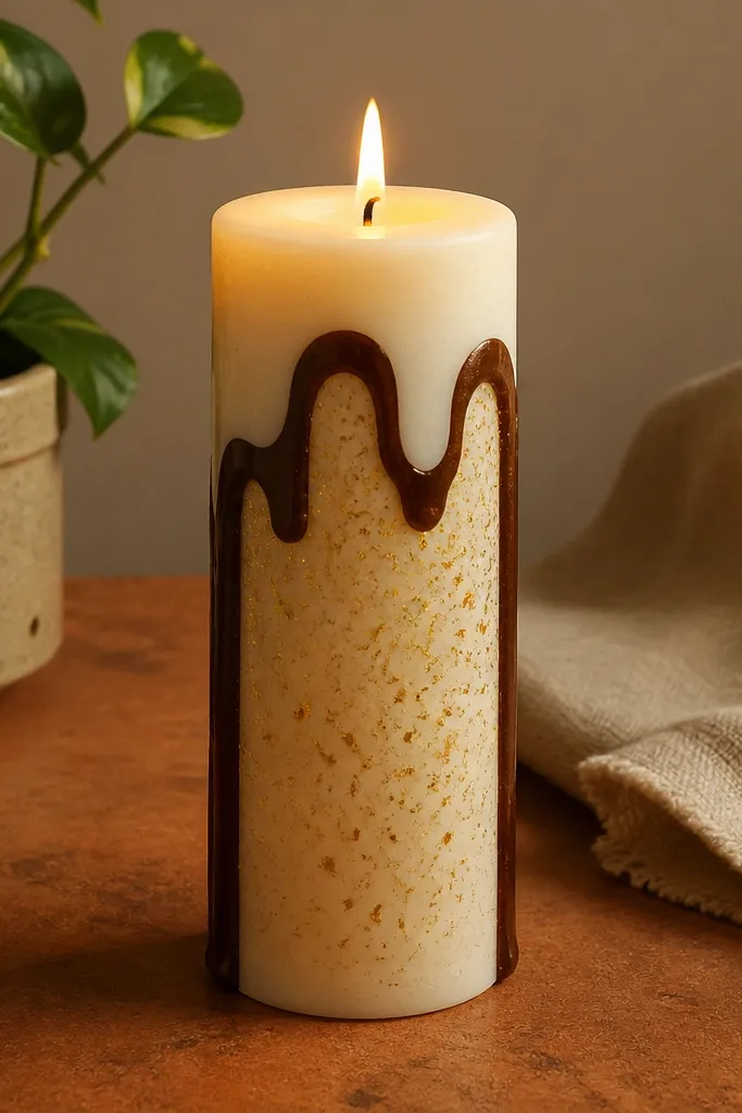
Frames make candles look styled because they create boundaries. A chocolate drip frame feels modern and a little artsy, while gold speckle inside the frame gives that high-end sparkle. The drip border also creates movement, which reads well in candlelight. Keep the interior speckle controlled so it looks like texture, not glitter. This design works for gifts and for shelves where you want something that looks expensive even when unlit.
Start with a cream matte base. Tape a rectangular frame area around the middle, then paint chocolate brown along the tape edges. Remove the tape and add drip tails downward using a thin brush, letting drips vary slightly in length. Inside the frame, stipple gold speckles using a toothbrush with very little paint. Seal matte, and keep the gold thin so it doesn’t look grainy.
Editor's noteIf drips get too wide, touch them with a barely damp brush tip to sharpen the edges.
Skip thisDon’t put the frame too high — the flame will distort the top border.
17. Satin-Look Stripes with Dusty Gold and Black Intervals
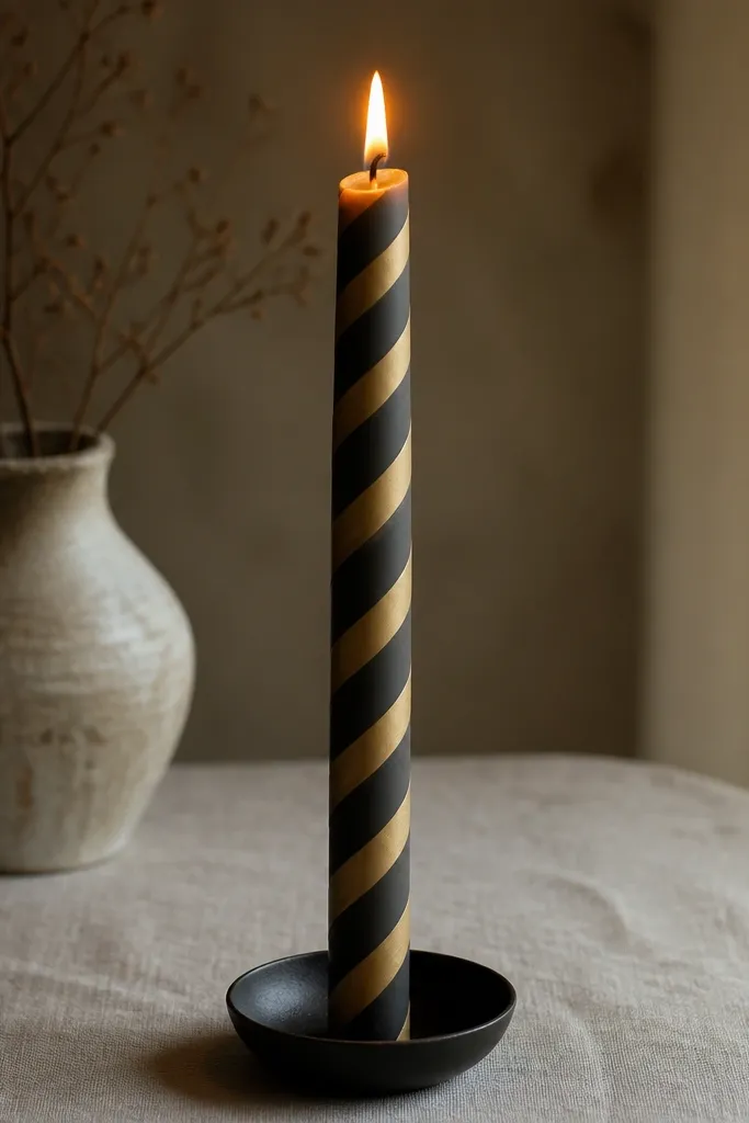
This look feels high-end because it imitates satin ribbon. Dusty gold reads warm and premium, and the black intervals keep the stripes crisp and graphic. When lit, the “satin” effect comes from thin paint layers and controlled brush direction, not from glossy paint. The result is clean, tailored, and photo-friendly. Use it for holiday tables or anywhere you want a polished, classic vibe.
Paint the candle cream matte. Tape off thin stripe bands around the candle, spacing them with 1/8 to 1/4 inch cream gaps. Brush dusty gold acrylic in very thin layers, then lightly blend the gold with a soft, dry brush to smooth streaks. Add black intervals by painting narrow bands in the gaps where you want separation. Remove tape once paint is set and seal with matte sealer.
Editor's noteBrush in the same direction each time; it reduces streaks and makes the satin effect read better lit.
Skip thisDon’t use heavy gloss medium; shine turns the stripes into a plastic look.
18. White On White Raised Texture Dots with One Navy Dot Row
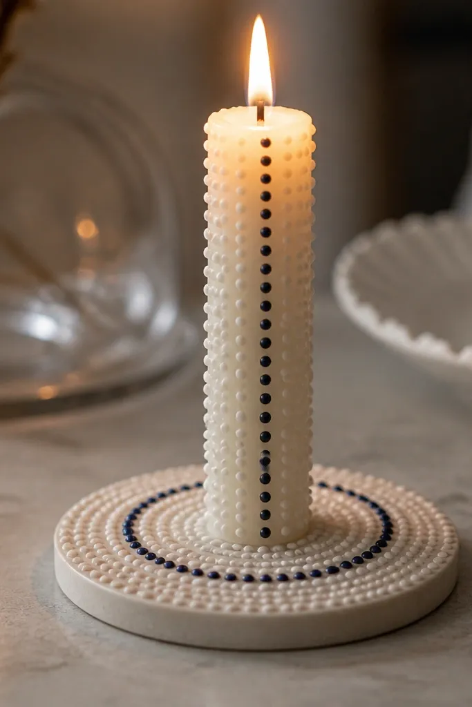
White-on-white can look luxurious when the texture is real. This design uses raised dots for shadow depth, so even when the candle is unlit it has dimension. Then you add one navy dot row as a clean accent that makes the whole piece look intentional. Lit, the raised dots cast tiny shadows and the navy row becomes a crisp focal line. This is perfect if you like minimal decor but still want a “designed” look.
Use an off-white taper. Mix acrylic paint with a small amount of texture medium or thick acrylic gel to create raised dot paste. Dot the midsection with a toothpick or stylus, pressing lightly to create consistent bumps. Let the texture dry fully (it takes longer than flat paint). Once dry, paint one straight navy dot row through the texture using a liner brush for alignment. Seal carefully with a matte finish so dots stay defined.
Editor's noteLight pressure gives cleaner raised dots; too much pressure smears the edges.
Skip thisDon’t seal before the texture fully cures — it can flatten the dots.
19. Pearl Pink Wash with Tiny Black Leaf Veins
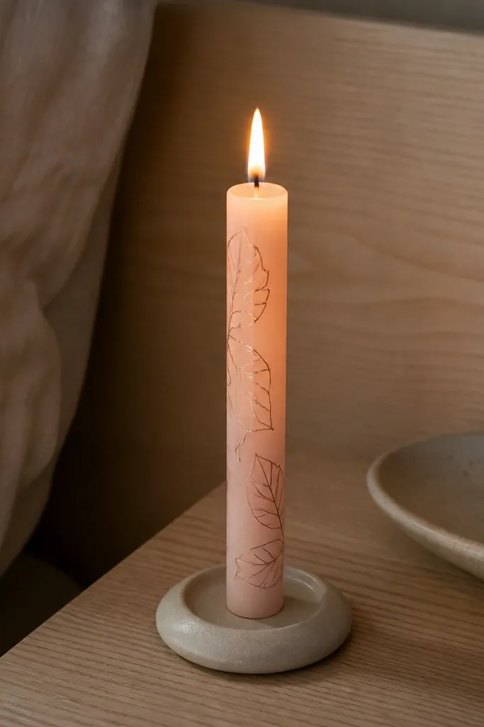
This look is soft but sharp. Pearl pink creates a gentle glow under flame, while tiny black leaf veins add contrast without overwhelming the design. The veins should be drawn like fine pencil lines — thin and slightly varied. Lit, the pink reads creamy and the leaf details look like they’re etched into the wax. It’s a great choice for spring tables and feminine decor.
Paint the taper with pearl pink acrylic thinned slightly with matte medium so it dries smooth. After it dries, place 8 to 12 small leaf sketches along the sides of the candle, not the front center only. Paint leaf veins with black acrylic using a liner brush, starting from a center vein and pulling smaller lines outward. Add 1 or 2 tiny dots at leaf tips for a finished look. Seal matte so the pearl stays soft, not glossy.
Draw leaf veins from the center outward to keep them consistent across different leaf sizes.
Avoid big leaf shapes — they look heavy and blocky when lit.
20. Candlelight Halo Ring with Tiny Gold "Smoke" Lines
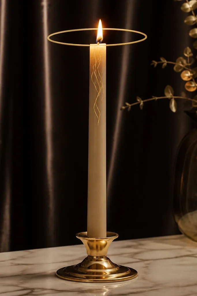
A halo ring is the fastest way to make a candle look high-end lit. Place the ring high enough that the flame sits just above it, so the ring frames the light. Add tiny gold “smoke” lines beneath the ring to create motion and softness. This look feels airy, not heavy, and it photographs beautifully because the top area is the focal point. It’s great when you want a clean candle that still looks special up close.
Start with a matte beige base. Tape a thin circle band 1.5 to 2 inches from the top and paint it with gold metallic acrylic, keeping the band narrow. Remove tape and immediately add 6 to 10 thin gold smoke lines below the ring using a liner brush dragged lightly downward. Keep lines irregular and light so they don’t look like scribbles. Seal with matte craft sealer once fully dry.
Gold smoke lines look better when you reload your brush less — fewer passes keep them delicate.
Don’t place the ring too low — it competes with the flame and blurs in photos.
21. Black and Cream Checker Panels with One Copper Corner Star

Checker panels look sharp and “designed” because they’re graphic. The trick to making it look high-end is scale: use small squares and keep the grid tight. The copper corner star gives a premium focal point that catches candlelight and adds a little surprise. Lit, the checker pattern stays readable because the contrast is strong and the squares are consistent. This style works for modern decor and for bold gift styling.
Paint the candle cream matte. Tape a checker panel area across the middle and lightly mark a grid of small squares (about 1/4 inch each). Paint squares in black acrylic, working one row at a time. Let it dry, then remove tape and correct edges with a liner brush. Add one copper star near the top of the panel (about 3 inches from the flame) and seal matte.
Use a ruler and mark squares lightly with pencil — it keeps the grid from drifting on the curve.
Avoid giant squares; they look childish and smear when the candle is lit.
22. Deep Emerald with Thin Silver Arcs and Micro Dot Stars
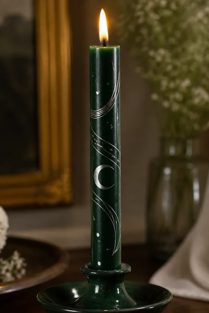
Deep emerald makes everything look richer, and silver arcs feel like fine jewelry. This design stays photogenic because it uses thin lines and tiny dots that catch flicker without turning the candle into glitter. The arcs should curve across the midsection, leaving negative space so the pattern breathes. Under light, the silver arcs brighten at the edges and the micro dots look like a night sky. Great for winter evenings and moody interiors.
Paint the candle deep emerald matte acrylic and let it dry completely. Use painter’s tape to define a horizontal guideline across the middle. Paint 6 to 8 thin silver arcs above and below that guideline, each arc about 1/2 inch wide at its widest. Add micro dot stars between arcs using a toothpick and silver paint thinned slightly. Seal matte once dry.
Editor's noteThin silver lines look cleaner when you wipe excess paint off the brush before you start.
Skip thisDon’t cover the whole candle in dots — too many turns it into a speckled blob.
23. Sandstone Texture Base with Burnt Umber Contour Lines
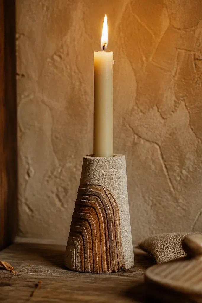
Texture plus linework is what makes this feel high-end. The sandstone base looks like stone when unlit, and lit it glows warm and soft. Burnt umber contour lines add a design element that looks intentional and architectural. This is not a “paint pattern” — it’s a mini surface transformation. It works great for rustic modern spaces and for shelves where you want tactile-looking decor.
Paint the candle warm beige matte acrylic, then stipple with a sponge to create a sandstone texture. Let it dry, then paint 4 to 6 contour lines using burnt umber acrylic with a liner brush. Each contour line should curve to follow the candle’s shape, not go straight around it. Add small breaks in a few lines so it feels like natural topography. Seal matte, and avoid heavy gloss over the texture.
Use slightly diluted paint for contour lines so they dry crisp instead of raised and uneven.
Avoid thick texture paste — it can crack and look messy when the candle warms.
24. Champagne Gold Stripes with Neutral Wash Between Bands
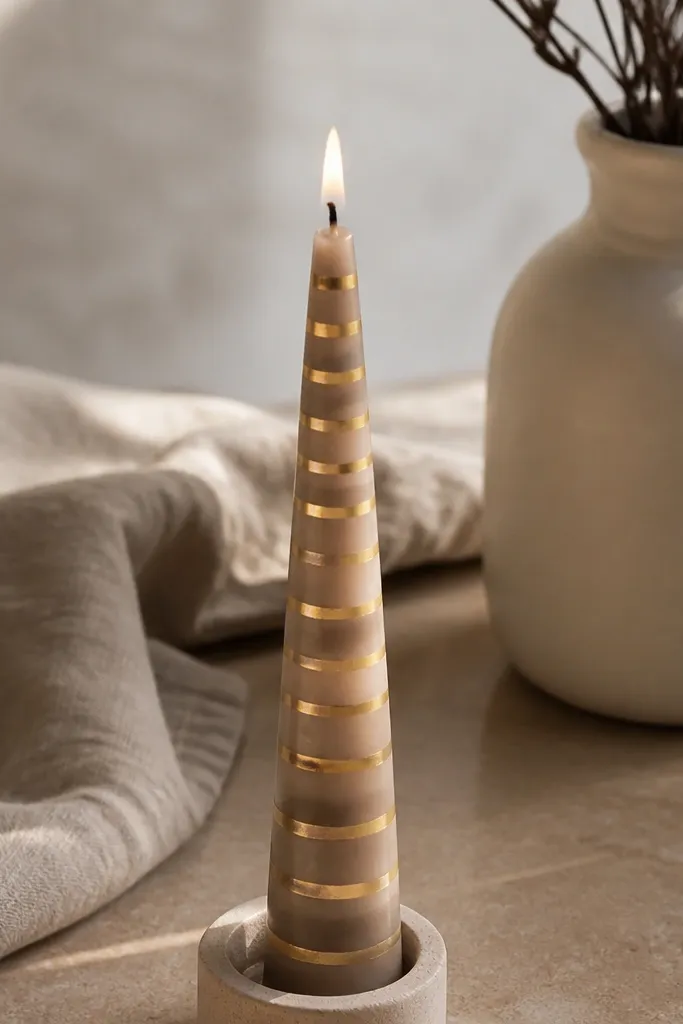
This look is subtle luxury. Champagne gold stripes are thin and elegant, and the taupe wash between bands gives a smudged, silk-like transition that reads premium under flame. It’s also forgiving because the between-band wash hides small brush imperfections. Lit, the gold catches light at the edges and the neutral wash makes the candle glow smooth. This is a safe pick if you want high-end Candle Painting looks without loud color.
Start with an ivory matte base. Tape off narrow gold stripe bands (about 1/4 inch wide) and paint champagne gold metallic acrylic in thin coats. Remove tape and then paint a soft taupe wash in the spaces between stripes using a damp brush and diluted paint. Blend the wash lightly so it looks feathered, not streaky. Seal with matte sealer once fully dry.
Editor's noteChampagne gold looks better when you mix it with a tiny amount of matte medium so it dries satin, not shiny.
Skip thisDon’t make the stripes too thick — thick metallic stripes look like stickers when lit.
25. Chocolate Brown Frame with Tiny White Dots Like Porcelain
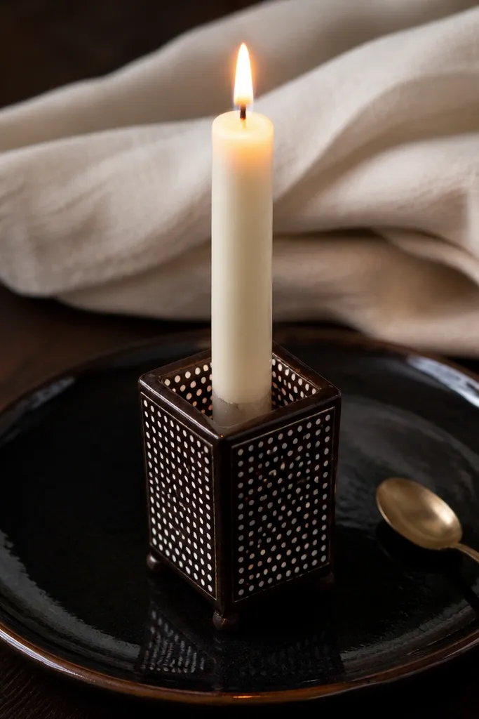
Porcelain dot styling looks expensive because it mimics fine ceramics. The chocolate frame feels grounded and the tiny white dots create a delicate, controlled texture. Lit, the dots brighten and the frame anchors the candle so it looks styled instead of scattered. This design is also easy to replicate across a set, which is why it photographs well in groups. It works for classic tables and cozy interiors.
Use a cream matte taper. Tape a rectangle frame across the middle and paint it chocolate brown, then remove tape. Add a second inner line about 1/8 inch inside the frame for depth. Fill the center area with tiny white dots using a toothpick, placing dots in loose rows. Let it dry, then seal matte carefully so dots stay crisp.
Editor's noteFor consistent dot size, dip the toothpick once and tap lightly without reloading every dot.
Skip thisSkip the heavy dot clusters — too many dots make the center look gray instead of porcelain.



