
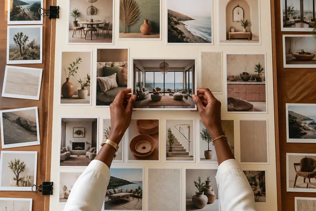

1. Black-and-cream grid with bold dividers
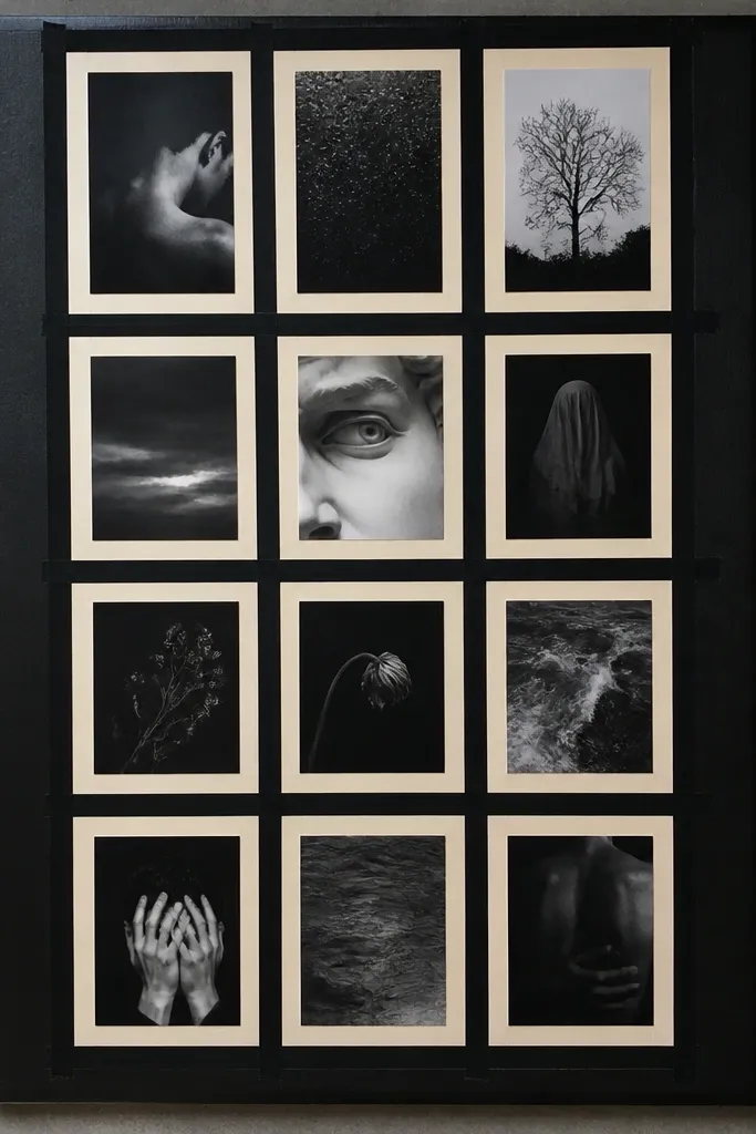
This look is for you if your vision board keeps turning into a scrapbook pile. A strict grid makes the board feel organized even when your goals are messy, and the thick dividers keep everything legible in photos. Use cream paper or cardstock as the base, then place black-and-white or dark-toned prints so the contrast stays sharp. Add tiny labels in the same font style every time so the board reads like a plan, not a collage. It’s clean enough for a bedroom wall and structured enough for a desk view.
Editor's noteUse a corner rounder punch on label cards so edges look finished in every photo.
Start with a cream poster board and mark a grid using a ruler: 4 columns by 5 rows works well on an 18x24 inch board. Cut photos to fit each cell with a 1/4 inch border, then place them dry first to check spacing. Add bold dividers by drawing thick white strips between columns using a paint pen or white acrylic marker. Finish by adding small goal labels under each row in black marker, keeping the text size consistent.
Skip thisDon’t mix glossy photo prints with matte paper — the glare makes the board look uneven.
2. Magazine spread board with one oversized hero per category
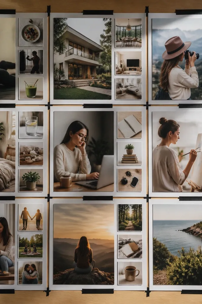
This is the most photogenic format if you want your good-looking vision board ideas pictures to look like a real editorial page. One oversized hero per category gives you instant “focus,” while smaller supporting images fill in the story. The result feels intentional because your eye always knows what to land on first. Use print photos that share a similar color temperature (warm or cool) so the page doesn’t look stitched together. This format works great for travel, home decor, and style goals because those categories naturally have one main image.
Editor's noteTrim hero images with straight edges and leave a 1/8 inch white margin so they look crisp like print layouts.
Pick 3 categories and choose one hero image for each. On an 18x24 inch board, dedicate a 2-column wide hero area for each category by leaving negative space around it. Fill the remaining space with smaller cutouts — 1/4 to 1/3 the hero size — and align them to a single baseline grid using a ruler. Add thin type labels in black at the bottom of each category block, then seal the page with a light coat of matte Mod Podge over paper edges only.
Skip thisAvoid using more than 3 hero images — the page loses that magazine clarity.
3. Monochrome calm board with one color tint
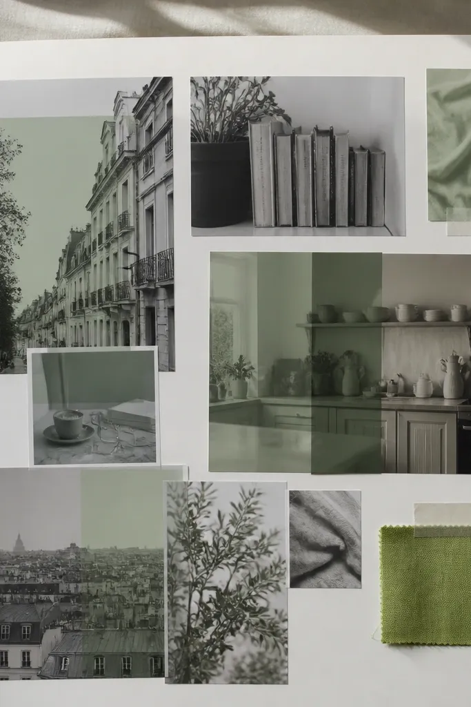
If you want your board to feel like a deep breath, this monochrome approach is the cleanest way to get that look. You use mostly grayscale or near-grayscale images, then tint everything with one subtle color — sage, dusty blue, or warm taupe. That keeps the board cohesive even when the subject matter changes. It’s especially good for mental health routines, cozy home setups, and learning goals where you want calm rather than chaos. This format also photographs well because there’s less visual noise.
Editor's noteUse colored paper behind photos instead of colored overlays on top — it looks smoother and avoids streaks.
Choose one tint color and a matching base background (cream for warm tints, light gray for cool tints). Print or collect grayscale photos, then lightly color-copy or overlay with a semi-transparent colored paper strip behind each photo. Arrange in a loose grid but keep spacing consistent at about 1/4 inch. Add 3-4 repeated elements like the same leaf shape, fabric swatch, or patterned paper corner to make the tint feel intentional.
Skip thisDon’t add a second tint color — two tints usually make it look accidental.
4. Fabric swatch mood board with photo windows
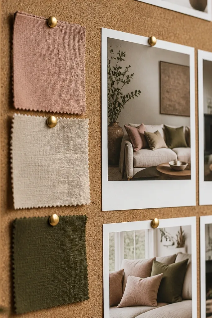
This one is for texture lovers. Fabric swatches make your vision board look expensive and real, and photo windows keep it from becoming a craft-only board. The mix of soft materials and crisp images creates a high-end “room mood” feel. It’s perfect for home decor goals, wedding planning, and wardrobe color direction. When someone sees it, they can instantly tell the theme because the fabric gives tactile cues that photos alone can’t.
Editor's noteUse iron-on interfacing on thin fabrics so swatches stay flat and don’t curl.
Start with a corkboard or heavy cardstock base. Cut fabric swatches to 2x3 inch rectangles and glue them down with fabric glue or double-sided tape. Place small printed photos on top or beside each swatch, leaving a clean 1/4 inch frame around the photo. Label each cluster with one short phrase in pencil, then finish by sealing paper edges with matte sealant so glue doesn’t warp the board.
Skip thisDon’t use slippery satin without backing — it will slide and ruin the neat layout.
5. Pastel border board with repeated corner frames
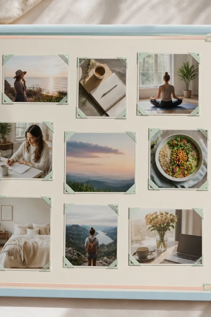
This is a sweet, clean look that still reads as “vision board” instead of scrapbook. A pastel border frames the content and makes every photo feel like it belongs together. Repeated corner frames add that designed rhythm that makes good-looking vision board ideas pictures feel cohesive in a single snapshot. It’s great for kids' goals, studying plans, and gentle personal goals where you want light energy. Keep the border color consistent so the whole thing stays calm.
Pick one pastel border color and one neutral base (white or cream). Draw or tape a border about 1 inch from the edges, then create corner frames by cutting 1 inch square corners from light cardstock. Place photos inside the framed area, keeping a consistent gap of 1/4 inch. Add small icon stickers or tiny printed symbols in the corners of each photo block, then seal with matte spray if the surface is glossy.
Use pastel washi tape for the border — it sticks cleanly and looks intentional on camera.
Don’t vary border thickness — uneven borders make the board look handmade in a messy way.
6. All-white board with black typography blocks
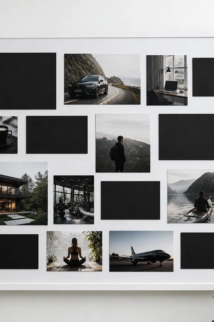
This look is graphic and modern, and it helps if your photos don’t all match in color. Instead of forcing a color palette, you force a layout palette: black blocks and white space. That makes the board feel crisp and readable, which is exactly what you want from good-looking vision board ideas pictures. It works well for career goals, fitness plans, and skill-building because the typography blocks can carry the “what” and “how” in plain language. The photos become accents instead of the whole personality.
Editor's notePrint photos with a light gray background so black blocks don’t feel too harsh.
Use a smooth white poster board so ink and tape edges look clean. Print photos in black-and-white, then cut them into rectangles that fit between typography blocks. Create black type blocks using black cardstock strips, then write one short phrase per block with a white gel pen. Arrange blocks first, then slide photos into the spaces so spacing stays consistent. Finish by pressing down tape firmly along all edges.
Skip thisSkip tiny fonts — if it’s hard to read in a photo, it’s also hard to read in real life.
7. Sunset gradient board with color-matched cutouts
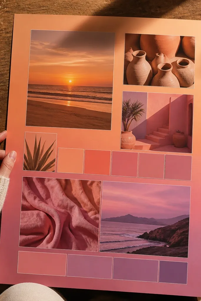
A gradient board looks stunning because the viewer’s eye naturally follows the color flow. For vision boards, that means your goals feel connected, not scattered. Use sunset tones — peach, coral, pink, and soft purple — and pick images that contain those colors so the board looks like one story. It’s especially good for travel dreams, lifestyle changes, and creative projects where you want energy. This layout also photographs beautifully because the color progression creates depth.
Choose a base color progression and mark 5 horizontal bands across your board. Print or cut images that match each band’s color — start with peach/orange at the top and end with purple at the bottom. Leave 1/4 inch spacing between images so the gradient is visible. Add paper strips or thin washi tape between bands to strengthen the color transition. Write one mini goal line centered in each band.
Use colored paper backing behind each photo to “lock” the gradient even when the photo colors are slightly off.
Don’t add neutrals like gray or black in big areas — they break the gradient rhythm.
8. Travel ticket stub board with map scraps
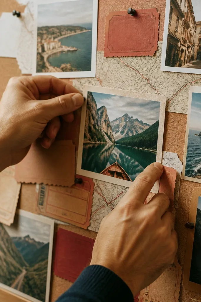
This is a clever way to make travel vision board ideas look real instead of generic. Ticket-stub labels and map scraps give instant theme, while small destination photos keep it grounded. The look is photogenic because it has strong shapes — rectangles, not random cutouts — and the map texture adds depth. It’s great for anyone planning trips, language study, or “go new places” routines. You’ll also find it easier to update later because each stub can be swapped out.
Editor's noteUse a craft punch for the ticket notch so every label looks consistent.
Print or cut map scraps (atlas pages or simple map printables) and tear them into rectangles. Create ticket-stub labels by cutting cardstock into rounded-end strips and writing a destination name plus one detail. Arrange the map scraps as a background layer, then place ticket stubs over them in rows. Add destination photos in small squares (about 2x2 inches) between stubs, then cover paper edges with matte tape to prevent fraying.
Skip thisDon’t overcrowd — leave empty map space so the board doesn’t look like a pile.
9. Kitchen shelf aesthetic board with product-style photos
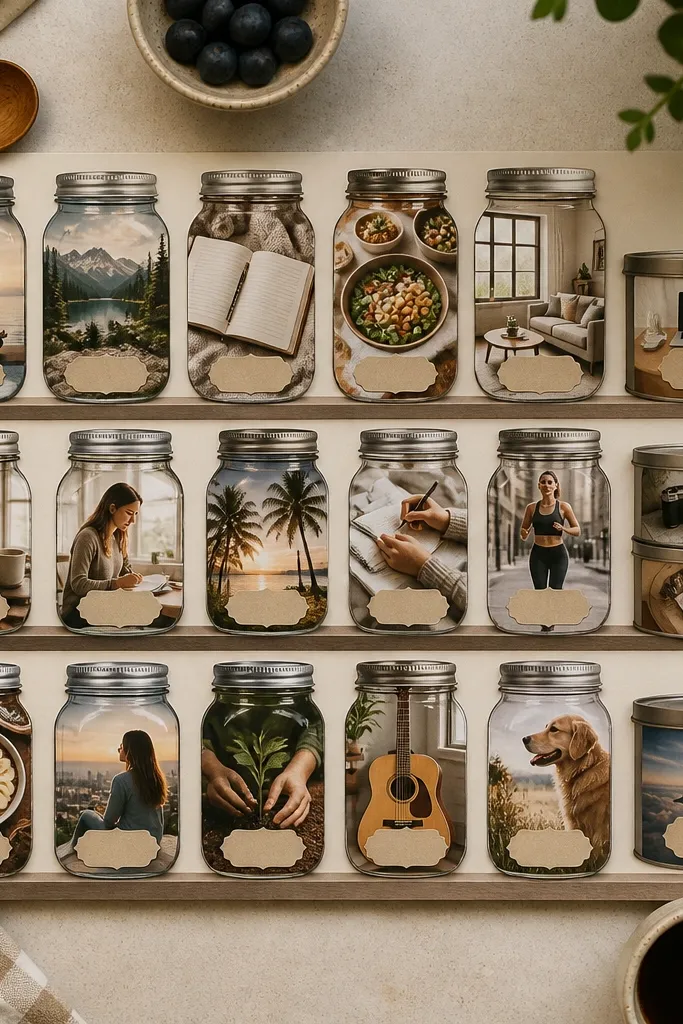
This look turns “home goals” into something you can picture daily. Product-style photos of jars, spices, dishware, and tidy countertop setups make the board feel practical, not dreamy-only. The key is to build it like a shelf: repeat vertical jar shapes and keep labels consistent. It’s perfect for meal planning, slow living habits, and cleaning routines you want to stick with. The result looks great in photos because the items have similar shapes and spacing.
Pick 6 to 10 product photos with similar framing (front-facing jars, flat-lay dishes). Cut them into vertical strips and arrange them in a “shelf” row across the middle of the board. Add fake label tags by printing tiny label text on white cardstock and taping them under each jar photo. Fill gaps with small photos of ingredients and a few empty jar silhouettes for balance. Seal the board with matte spray if you used glossy prints.
Use the same label font style for every tag so the board reads like one system.
Avoid mixed lighting (sunny vs indoor flash) — it makes the shelf look mismatched.
10. Wardrobe layout board with outfit capsules
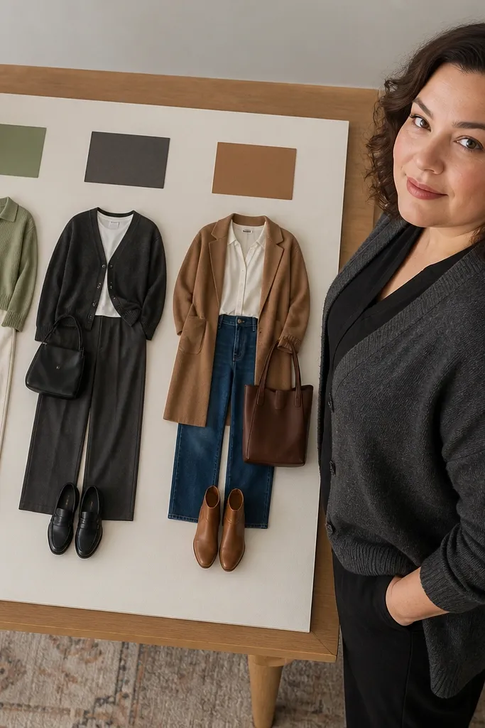
Wardrobe vision boards look best when they show capsules, not random outfits. Use a capsule layout: 3 to 4 outfit “sets” labeled by season or occasion, each with matching color swatches. This makes your good-looking vision board ideas pictures feel like a usable wardrobe plan. It’s especially helpful if you want a cohesive closet, because you can spot gaps instantly. The aesthetic comes from repeating colors and keeping the layout grid-like.
Choose 3 outfit sets and find 3-5 images per set that share a color story. Print or cut each set into a vertical block, then place a color swatch strip (1 inch wide) beside the block. Add small text labels like “Work capsule” or “Weekend uniform” under each set. Keep consistent photo sizes per set so it looks like product photography. Finish by taping swatches flat so edges don’t lift.
Use fabric swatches from your own closet for the color strips — even a small hem scrap works.
Don’t mix too many shoe styles across sets — it breaks the capsule look.
11. Fitness routine board with time-strip scheduling
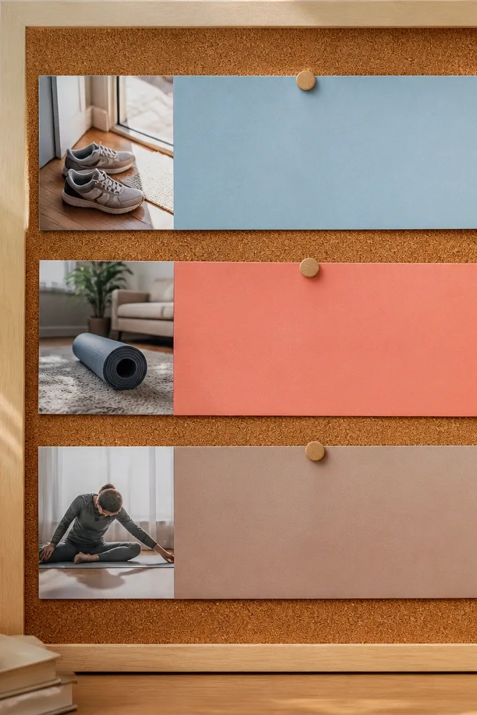
This board turns fitness inspiration into a schedule you can see. Time-strip scheduling looks clean because the strips create structure, and the photos act like motivation anchors. Instead of a wall of workout pics, you get a plan: morning movement, midday reset, evening stretch. It’s a great fit for busy weeks because the layout tells you when each goal happens. It also photographs well because the timeline strips create a strong visual line.
Draw or tape 3 horizontal time strips across the board labeled Morning, Midday, Evening. Place one workout photo per strip, then add two smaller photos underneath each strip for the specific actions (walking, strength, mobility). Add checkmark icons or simple checkbox squares next to each strip label. Use a consistent icon style so it doesn’t look like a random sticker pile. Seal everything if you used paper tape and ink.
Keep strip height at about 1.5 inches so the board doesn’t get cramped.
Avoid putting every workout photo everywhere — choose one hero per time strip.
12. Desk setup board with device silhouettes and cables
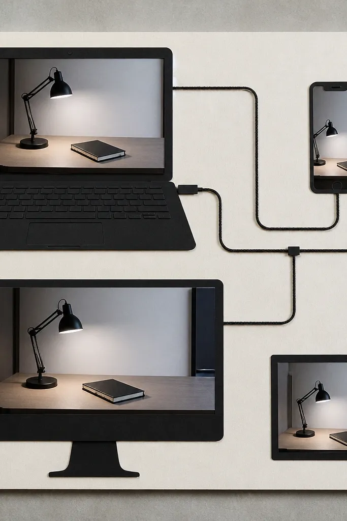
If your goal is a calmer work space, this layout gives you that tidy, techy look. Device silhouettes and cable-line doodles create a “system” vibe without needing tons of different colors. It’s great for creatives, students, and anyone who wants focus and fewer distractions. The photos look good because you’re repeating a narrow style: clean surfaces, neutral tones, and simple angles. This board also helps you decide what to buy first because the layout maps out zones.
Start with a neutral base (white or light gray). Print desk photos with similar lighting and cut them into rectangles for a grid. Add device silhouettes by tracing from printed outlines or cutting simple shapes from black cardstock. Draw cable lines with a fine-tip black marker from each device silhouette to a small “power” label. Place one short label per zone: “Notes,” “Charging,” “Inbox.”
Use a single paper thickness for all cutouts so edges sit flat and don’t curl.
Don’t add bright neon accents — the desk vibe turns chaotic fast.
13. Coffee ritual board with mug circles and repeated typography
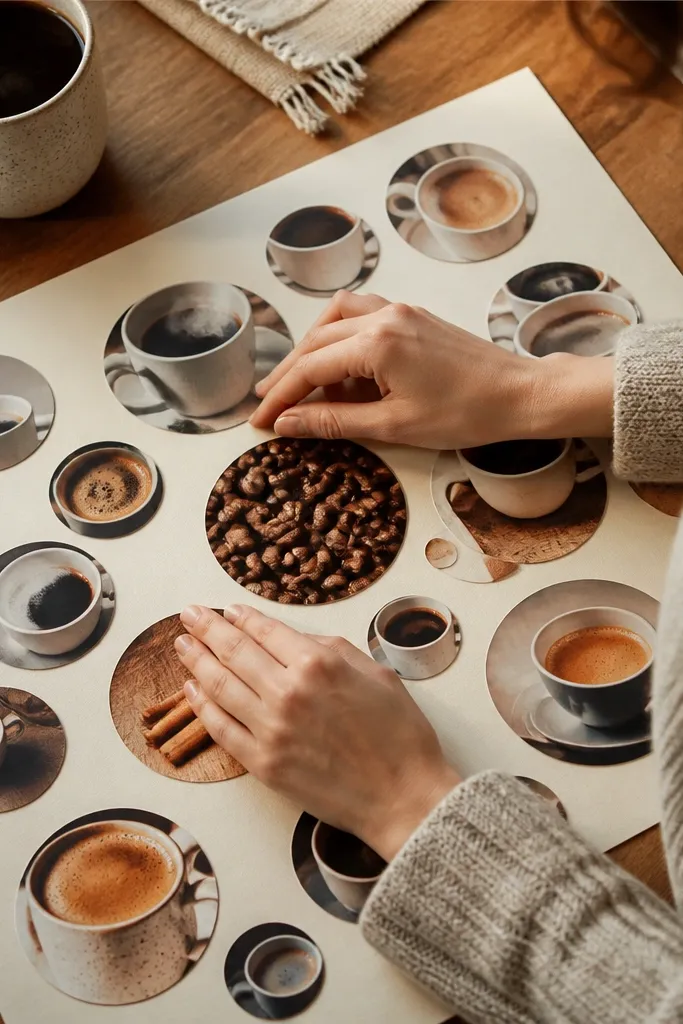
This board looks cozy and clean because it repeats one shape: circles. Mug circles, coffee beans details, and warm lighting make the board instantly inviting. Repeated typography phrases like “quiet first sip” or “journal after brew” give the board a rhythm that feels intentional. It’s perfect for morning routine goals, habit tracking, and self-care that needs structure. When photographed, the circles create a pattern that reads well even if your photos are different.
Cut or print photos into circles using a template (3 inch diameter is a good start). Arrange them in rows with equal spacing — about 1/4 inch between circles. Add a warm background paper and place a small phrase label under each row in the same font or handwriting style. Add one small texture element per row, like a strip of brown paper or a tiny coffee-bean collage. Use matte tape on circle edges to keep them flat.
Use a white gel pen for labels on dark photos so text stays readable in pictures.
Don’t use too many different circle sizes — it breaks the pattern.
14. Color-blocked learning board with subject tiles
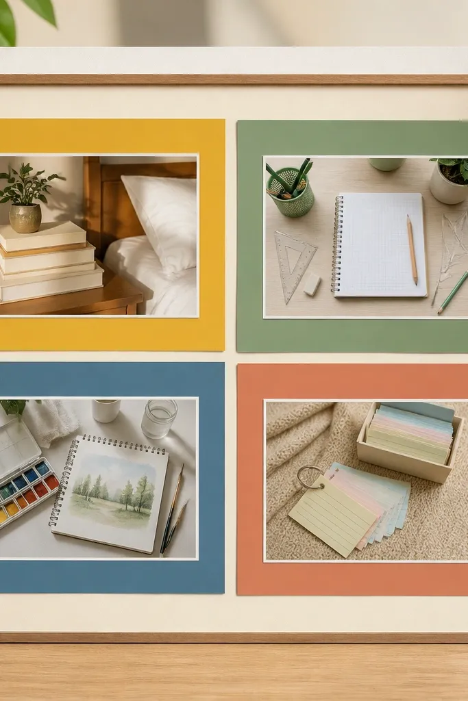
Learning boards look best when they act like a map of your study plan. Color-blocked subject tiles give you instant structure and make your good-looking vision board ideas pictures feel organized instead of random. Pick 4 subjects max, then assign each subject one color block and keep it consistent across the board. This format is great for language study, exams, creative skills, and habit-building goals that need categories. The aesthetic comes from clean edges, consistent spacing, and repeatable tile shapes.
Editor's noteUse a paper cutter for straight edges — tile borders look 10x cleaner than scissors.
Choose a base and draw four big rectangles across the board, each about 8x10 inches on an 18x24 inch sheet. Assign each rectangle a color and create a header bar with the subject name. Place 3 small photos or print cutouts inside each tile, aligned to the same grid. Add one “next step” line under each tile header, written in the same handwriting size. Tape down corners so tile edges stay crisp.
Skip thisSkip more than four subjects — the colors get muddy and the board loses clarity.
15. Art gallery wall board with framed prints look
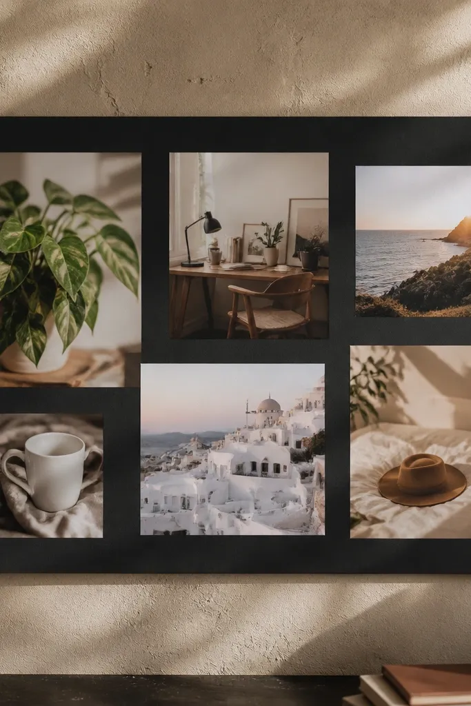
This one makes your vision board look like actual wall art. Faux frames and matting turn random inspiration into a gallery layout, which is exactly what looks good in good-looking vision board ideas pictures. It’s perfect for creative goals, home decor themes, and anyone who wants their board to double as decor. The trick is consistent frame proportions and clean spacing so it reads like a real gallery. It also makes updating easy because each framed piece can be swapped.
Cut 8-12 frame mats from white cardstock, each with a center window sized to your photos. Use a ruler to keep the mat borders at 1/2 inch for a unified look. Arrange mats on the board like a gallery wall, then glue photos behind the windows. Add a thin black strip at the bottom of each frame mat for a title tag. Finish by sealing with matte medium over the cardstock only.
Make every frame the same width even if the photo sizes differ — it keeps the gallery vibe.
Don’t mix frame colors like gold and black — choose one finish so it looks intentional.
16. Botanical leaves board with pressed-paper accents
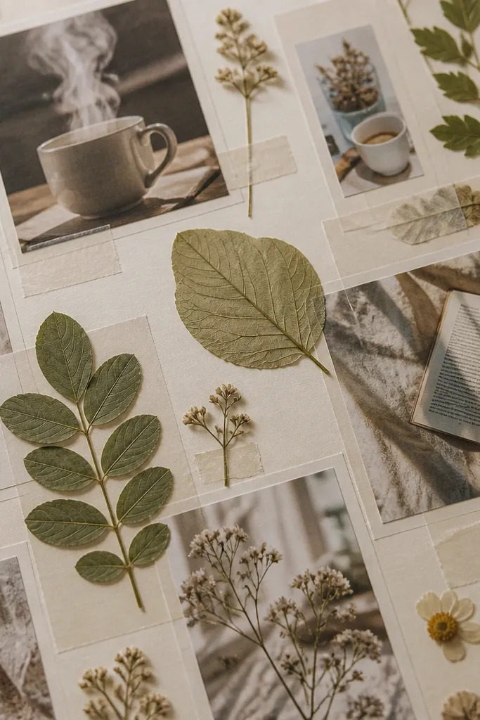
Botanical accents make vision boards feel grounded and calm, especially for wellness, growth goals, and creative projects. The look works because leaf shapes add natural texture while photos keep the direction specific. Use consistent leaf colors (sage, olive, deep green) and pair them with muted photo tones. Add small handwritten notes to connect each photo panel to a specific intention. This format is also photogenic because leaves create shadows that add depth.
Editor's notePress or flatten paper leaves under a heavy book for a day — it makes shadows look more realistic.
Pick 6-10 leaf cutouts from craft paper or print leaf silhouettes. Arrange leaf clusters as a border around photo panels, keeping leaf density even around the board. Place one main photo in the center and surround it with smaller photos that match the leaves' green tones. Add handwritten notes in pencil near each leaf cluster. Seal the board with a matte clear coat to protect paper edges and prevent curl.
Skip thisDon’t use bright neon greens — botanical boards look best with muted plant tones.
17. Earthy terracotta board with clay-toned paper layers
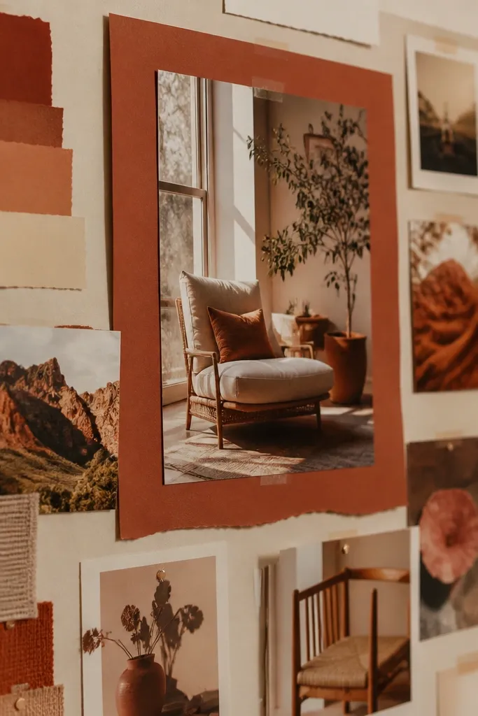
Terracotta layers give your board that warm, lived-in look without needing a ton of different colors. It’s a strong choice for home projects, self-care, and “make it cozy” goals because the palette feels grounded. The layering makes photos pop and adds dimension that looks great in pictures. Pair terracotta with cream and a little dark brown for contrast. Keep text minimal so the board stays clean and decorative.
Editor's noteUse double-sided tape for photo edges — it prevents glue bumps that show in photos.
Pick a terracotta cardstock or craft paper and cut it into 1/2 inch thick frames behind your photos. Glue the terracotta frames behind each photo, then mount the photo onto a cream base. Arrange in a staggered grid so frames show evenly around the edges. Add a few small label tags in dark brown marker, one per category. Finish with matte Mod Podge on the paper layers only.
Skip thisAvoid too many different textures at once — terracotta already adds warmth.
18. Navy-and-gold board with star map accents
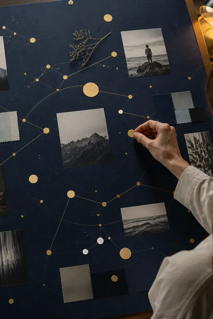
This is the “night sky” look that still feels organized. Navy gives you deep contrast, and gold star-map dots add a subtle magical detail without turning into glitter chaos. Use small goal photos in muted tones so they don’t fight the dark background. Add star labels like “read,” “train,” or “learn” to make the board feel like a plan. It’s excellent for creative goals, nighttime routines, and long-term projects because the dark base makes the details pop.
Editor's noteTest your gold pen on scrap paper first — some inks look dull until they dry.
Use navy cardstock as the base. Arrange 10-14 photo cutouts in a neat grid with consistent spacing. Add gold star dots by stamping with a small gold ink stamp or using a gold paint pen to dot around the photos. Create mini label tags with gold cardstock and write short goal words in navy marker. Seal the board with matte spray so gold dots don’t smear.
Skip thisDon’t use large glitter shapes — they reflect too much light in photos.
19. Whiteboard style board with sticky-note blocks

If your brain likes checklists, this board makes inspiration feel actionable. The whiteboard style works because you repeat sticky-note blocks and keep writing consistent. Photo cutouts act like examples next to each goal, so your board reads like a plan you could follow. This is great for “systems” goals: meal prep routines, saving money, cleaning schedules, study habits. It looks good in photos because sticky notes create bright pops against a clean background.
Editor's noteUse a ruler for handwriting baselines so text looks aligned across the whole board.
Start with a white or light gray board. Cut sticky-note style rectangles from pastel paper or use actual sticky notes as a template to trace. Add handwritten goal text on each sticky-note block with a fine black marker. Place one small photo next to each block, then tape everything down with removable tape for clean edges. Add one thin black line grid in the background so it looks like a real whiteboard.
Skip thisAvoid messy handwriting sizes — one big font and the rest tiny makes it look unplanned.
20. Monochrome line-art board with photo clusters
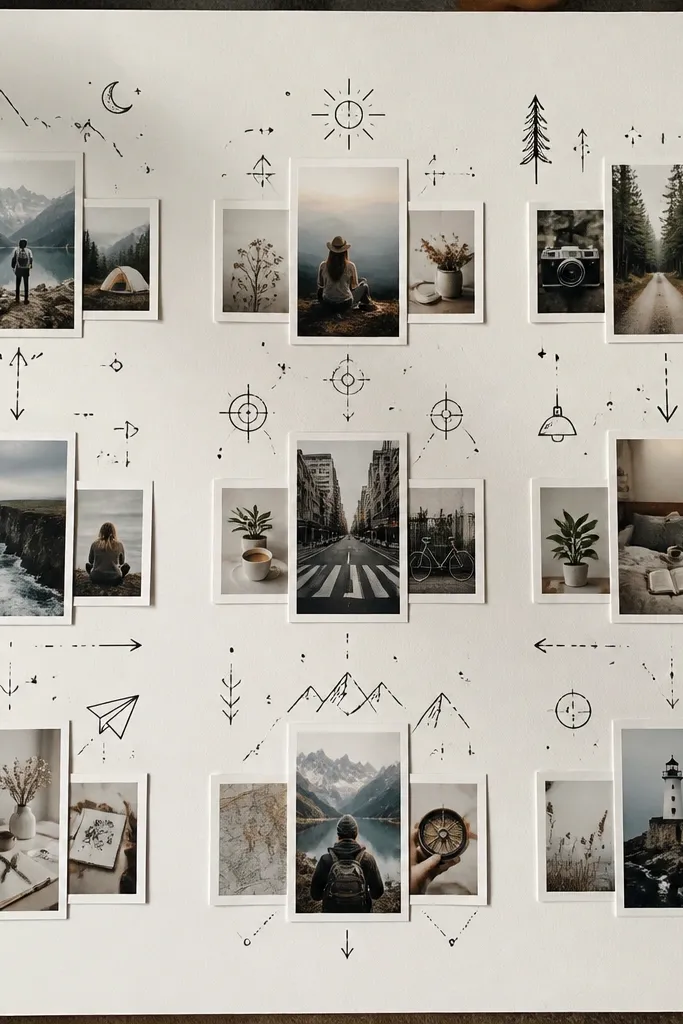
This look is for people who want calm but still want personality. Black line-art doodles — simple icons, arrows, and tiny sketches — guide the eye across the board without adding color chaos. Photo clusters keep the board grounded in real visual direction. It’s perfect for journaling goals, creative projects, and self-improvement plans that need a narrative. The board photographs well because line art creates structure and contrast against a light background.
Editor's noteUse one arrow style everywhere (same thickness) so the board looks designed, not doodled randomly.
Use a cream or white base and collect photos in black-and-white or muted tones. Arrange photos in 3-5 clusters, each cluster about the size of your hand. Draw arrows and small icons around clusters using a black fine liner. Add short handwritten phrases next to doodles, keeping them under 6 words. Seal the board with matte spray to protect ink from smudging.
Skip thisDon’t add too many doodles — use them to connect photos, not decorate everything.
21. Color wheel board with goals in matching spokes
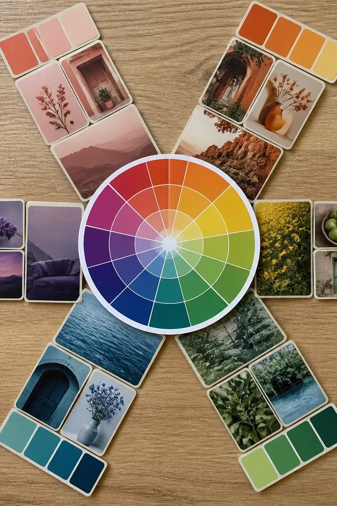
A color wheel board looks impressive because it has a clear structure and a satisfying visual logic. You place goals in spokes that match a color palette, which makes your good-looking vision board ideas pictures feel cohesive even with different topics. Use a center hero photo, then build outward with 8 spokes: one color per spoke. It’s great for personal goals, creativity, and lifestyle changes because you can connect each goal to a “mood color.” This format also makes it easy to add new goals later without wrecking the layout.
Editor's noteUse colored paper wedges instead of marker fills — paper stays flat and looks cleaner in photos.
Draw a circle in the center of your board and divide it into 8 equal wedges using pencil lines. Choose one color per wedge and fill each wedge with colored paper or marker. Place a photo in the center, then add one goal photo per wedge that matches that wedge color. Write a short goal word in each wedge using a marker that contrasts with the wedge color. Add a thin black outline around wedges for crisp separation.
Skip thisAvoid too many small photos in each wedge — one hero per wedge looks best.
22. Soft rainbow border with photo strips
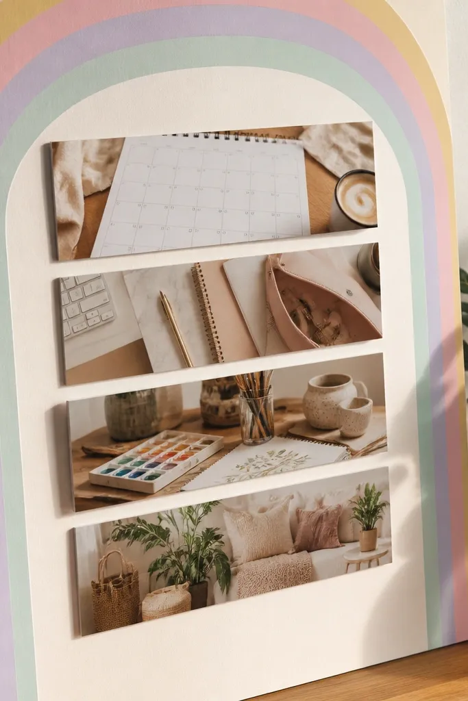
This is a friendly, bright board that still looks organized because the photos are in strips. The rainbow border gives you a cohesive frame, and the horizontal strips make it easy to read. It’s perfect for kid goals, creative calendars, and “life looks better when it’s organized” projects. The aesthetic is cheerful without being overwhelming because the color lives on the border, not everywhere. When photographed, the border creates a strong edge, so the board looks complete.
Editor's noteCut strips with a paper cutter so the top and bottom edges line up in every photo.
Create a rainbow border using paper strips taped along the edges. Use 5 colors maximum so it stays soft — think peach, yellow, mint, sky blue, blush. Inside the border, cut photos into horizontal strips about 2 inches tall and arrange them in 6 to 10 rows. Leave 1/4 inch spacing between strips. Add one small label per row in the same handwriting style.
Skip thisDon’t use full rainbow everywhere — keep the color border-only for a clean look.
23. Black tape collage with exposed edges
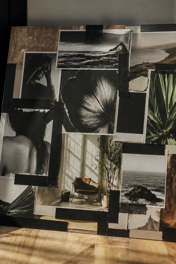
This one looks edgy and artsy, but it still stays good-looking because the tape is consistent. Using black tape as the “binder” gives your board a graphic identity and makes mismatched photos look intentional. Exposed edges add texture and dimension, and the board reads like a magazine collage. It’s a strong choice for creative goals, music or art nights, and mood direction when you want personality. The look photographs well because the tape creates strong lines and contrast.
Editor's noteWarm the tape slightly with your fingers before pressing so it adheres flat.
Start with a light base and place photos in a layered arrangement, leaving some edges exposed. Use black washi tape or black masking tape to “strap” photos down — keep tape strips the same width. Add small strips of tape across photo corners to create a consistent pattern. Write one short goal word near the center using black marker. Press down tape firmly so edges don’t lift and catch light.
Skip thisAvoid mixing multiple tape colors — the look collapses without one dominant tape style.
24. Soft leather and paper board with faux notebook texture
This board looks grown-up and calm because it mixes paper texture with faux leather accents. Use it for planning goals, budgeting, study routines, and anything that needs a “structured but soft” vibe. Photo squares keep the content clear, while leather-like strips add visual weight. The key to making it look good is staying in a tight palette: beige, cream, dark brown. The contrast is subtle, so your photos look intentional rather than glued-on.
Editor's noteIf your faux leather sheds dust, wipe it with a dry cloth before gluing.
Use a beige cardstock base. Cut small strips from brown faux leather or textured craft paper and glue them as borders behind clusters of photo squares. Print or cut photos into 2x2 inch squares, then place them on top of the leather strips. Add a thin “notebook line” pattern using a pencil or gray pen across the empty spaces. Seal the surface with matte medium so textures don’t smear.
Skip thisDon’t use shiny leather-like material without a matte seal — it reflects hard in photos.
25. Minimal black frame board with one color photo accent
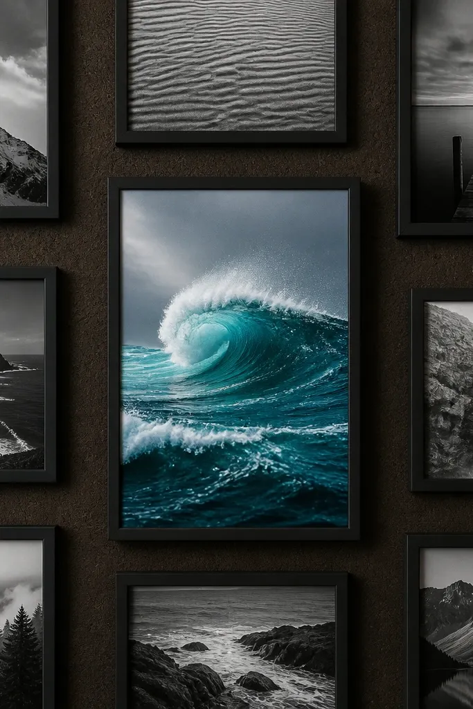
This is the “gallery minimalism” approach that makes one direction feel loud. You keep most images black-and-white inside black frames, then choose one bright color accent photo in the center. That contrast makes the board look designed, not cluttered. It’s great for big goals that have one clear “main character” image — a dream home, a graduation moment, a creative project outcome. This format also makes your board easier to photograph because there’s less competing color.
Editor's notePick one accent color from the center photo and use a tiny matching pen dot in 2-3 other captions.
Use a white base and cut 10-12 photo frames from black cardstock, leaving a 1/2 inch border around each photo window. Place black-and-white photos into most frames. Choose one color photo and put it in the center frame only. Add small caption tags under each frame in black marker, keeping captions consistent length. Glue frames down and press flat so corners don’t lift.
Skip thisAvoid multiple color photos — the “one accent” rule is what makes it look sharp.
26. Layered paper cutout board with shadow edges
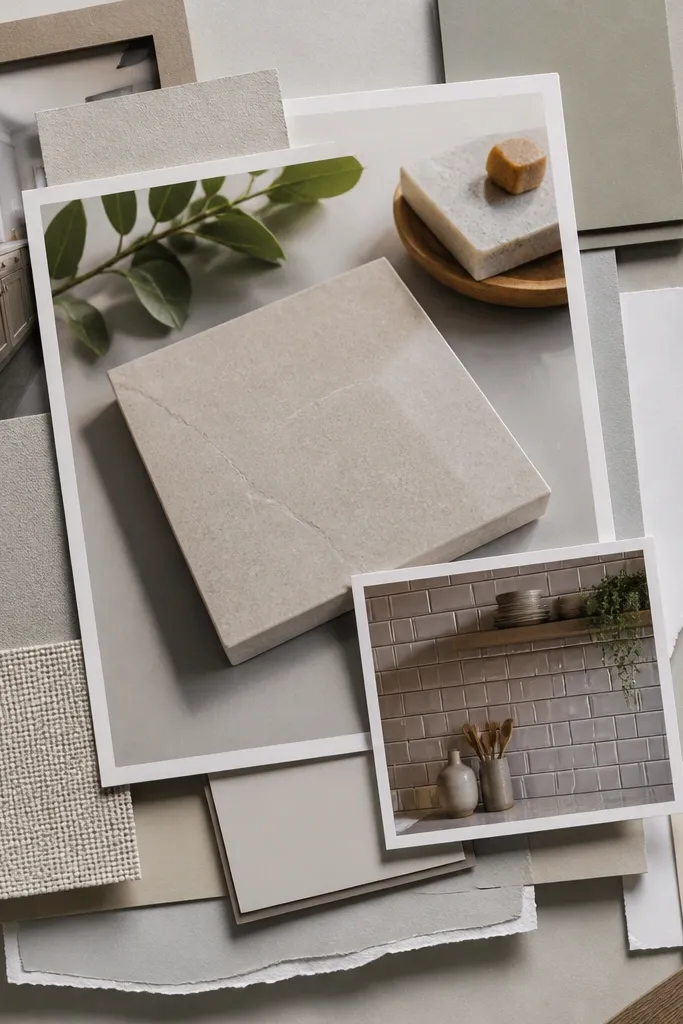
Layered paper cutouts create depth without needing fancy tools, and depth is what makes good-looking vision board ideas pictures feel dimensional. You stack paper behind photos so you get a shadow edge, which looks like a graphic design layout. This is perfect for goals with themes like home upgrades, craft projects, and creative outputs where you want your board to feel like a design object. The look is best with 2-3 paper shades max so the layers don’t get muddy.
Cut 3 paper layers behind each photo: base layer, mid layer, and a thin top layer. Use the same layering offset each time, about 1/8 inch so the shadow edge is consistent. Glue layers first, then mount the photo on top. Arrange photos in a loose grid but keep the layer style identical across the board. Finish by sealing the whole board with matte spray to lock everything down.
Use foam tape for only the top photo layer if you want extra lift without warping the base.
Don’t stack too many paper colors — two shadows max looks clean.
27. Checklist board with photo examples per task
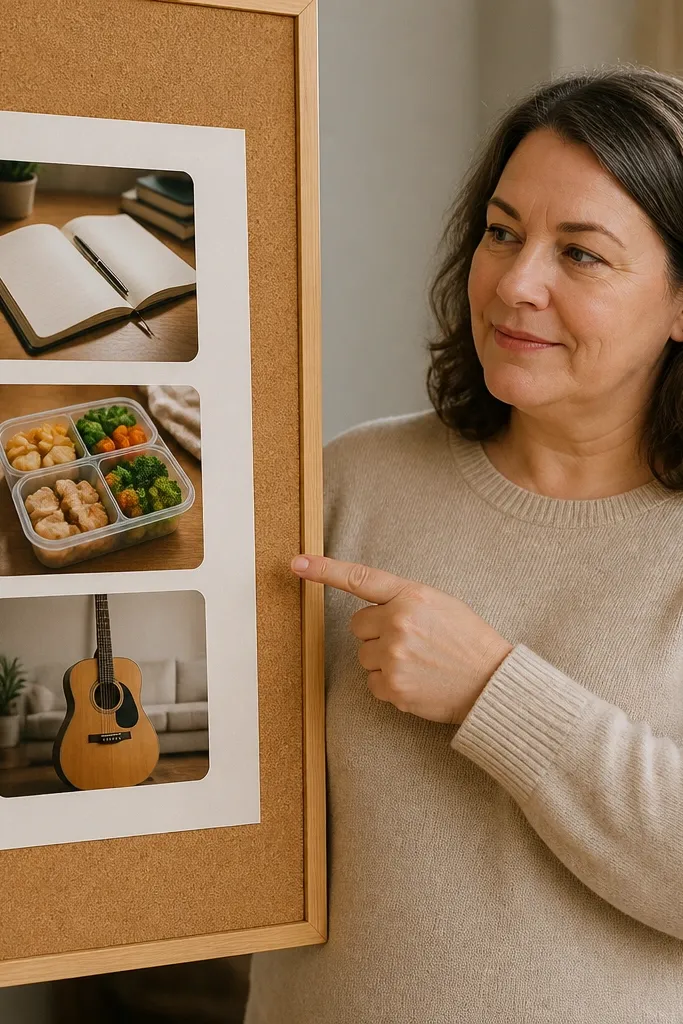
This format makes your vision board feel actionable, and that’s why it stays attractive over time. You get a clean checklist with photo examples next to each task, so the board doubles as a reminder. It’s perfect for routines like “learn guitar,” “save for a trip,” or “meal plan every week.” The photos act like proof of the outcome, and the checklist keeps you from forgetting the steps. It looks good in photos because it has strong lines and a clear structure.
Draw 8 to 12 checklist lines across the board with a ruler, leaving 1 inch margins. Under each line, add a small photo that matches the task outcome. Keep photo sizes consistent (about 2x3 inches) and align them to the same side of the checklist. Write tasks in neat handwriting with checkboxes in front. Seal with matte medium so ink doesn’t smear.
Use a fine-tip pen for lines, then write tasks after the lines dry so everything stays crisp.
Avoid long paragraphs — keep each task under 5 words so the board stays readable.
28. Color-coordinated magazine cutout collage
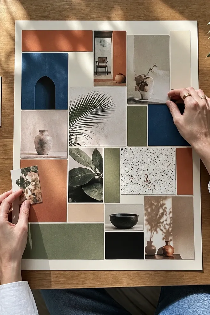
This is the quickest way to get good-looking vision board ideas pictures without printing anything. The secret is color coordination, not random cutting. Pick a palette of 5 colors max, then sort cutouts before you glue so every piece belongs. Use a consistent cut style — either all rectangles or all torn edges — for a clean look. This format works for lifestyle goals, aesthetic direction, and brand-like personal style because magazine cutouts naturally bring variety while staying cohesive.
Editor's noteCut a few identical “texture strips” (like fabric ads or patterned pages) and place them at intervals to unify the collage.
Choose your 5-color palette and pull only magazine pages that match those colors. Cut shapes into consistent sizes — rectangles about 2x3 inches — and sort them into piles by color. Arrange them in a grid with consistent spacing, then glue down from the center outward. Add one bold headline phrase in the same color as the darkest palette shade. Finish by pressing the board under a heavy book for a few hours.
Skip thisDon’t glue before you dry-fit — you need to see color balance first.
29. Resume-style career board with skill chips
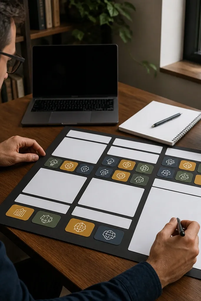
If your career goals feel vague, this layout forces clarity. A resume-style board has sections and “skill chips” that make your next steps visible. You add small professional photos as direction cues, then list skills and action outcomes as chips. This is great for job hunting, learning a new tool, or building a portfolio. It looks clean and modern because it mimics a professional document layout, which photographs well.
Pick 3 sections like Role Focus, Skills, and Proof of Work. Create section headers using a bold marker or printed cardstock strips. Cut small chip cards from colored cardstock (about 2x1.5 inches) and write one skill or action per chip. Place one small professional photo near each section, then arrange chips under the headers in a tidy grid. Glue everything down and add a thin border around the board.
Use the same chip color for Skills and a different color for Proof of Work so the sections read instantly.
Avoid handwriting too small — chips should be readable in a photo.
30. Seasonal switch board with two halves
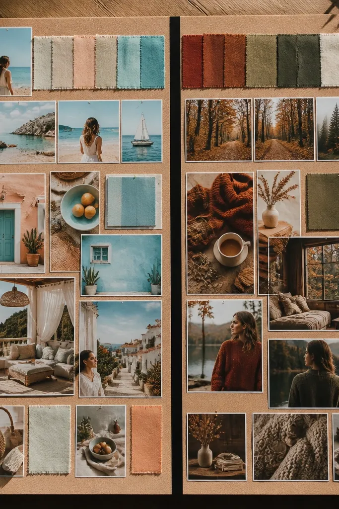
Two-halves boards are great when you want your vision board to track change. You split the board into two sections — like Spring/Summer and Fall/Winter — and assign each half a different color palette. That makes your good-looking vision board ideas pictures feel intentional because you can see progression. It’s perfect for fitness progression, wardrobe planning, and creative seasons. The aesthetic stays clean because the halves keep the content separated.
Use a board that’s at least 18 inches wide, then draw a vertical split line down the center. Pick one palette for the left half and a different palette for the right half. Place 6-8 photos on each side, keeping spacing consistent and photo sizes identical. Add one label at the top of each half and write 3 short goals per side. Finish by adding a thin divider strip in a neutral color so the split looks sharp.
Choose palettes that share one common color (like cream) so the whole board still feels like one piece.
Don’t mix random colors within each half — keep each side tight to its palette.



