
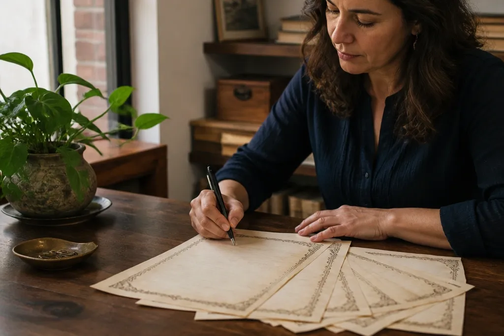
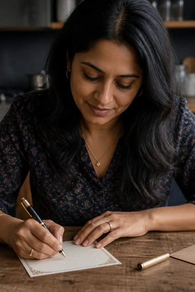
1. Cream Ledger Lines with Small Corner Date Boxes
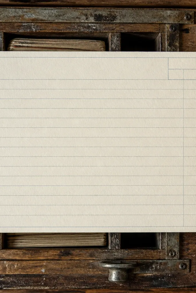
This design gives you the vintage look of an old ledger without turning your page into a muddy photograph. The cream background reads warm on camera, and the blue-gray rules stay easy to write over. The small date boxes in the corners make it feel like a real document, not decorative filler. It’s a strong choice for letter writing, recipe cards, and “dated note” pages where you want structure. Skill level is easy because you’re printing, not building anything complex — just set up your printer once and you’re done.
Step 1: Download the letter-size or A4 version, then set your printer to Actual size and disable any fit-to-page option. Step 2: Print on 24 lb cream or white cardstock for the best contrast, and let it sit flat for 10 minutes. Step 3: Use a fine-tip black gel pen so the ink lands cleanly on the slightly textured look of the paper.
If your printer tends to lighten backgrounds, print one test sheet first and bump “media type” to heavier paper.
Don’t choose a dark pen color if your version’s background is already warm and close to beige.
2. Sepia Stationery with Ornate Top Border and Clean Writing Zone
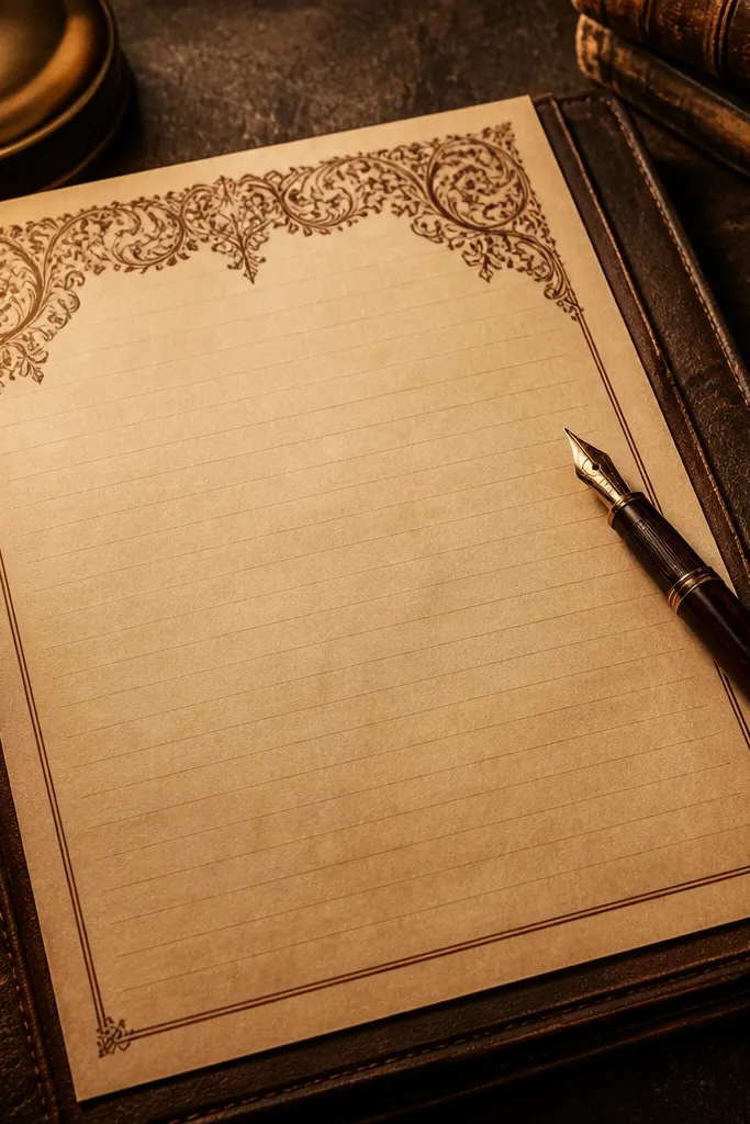
This one is all about the contrast between a decorative top and a practical writing area. The ornate border draws the eye immediately, so it looks good even when you only write a few lines. Below it, the rules are spaced so you don’t fight the page while writing. The sepia tone photographs well under warm light and feels “old book” without being distressed to death. It’s best for letters, formal notes, and any page where the header matters more than filling the whole sheet.
Step 1: Print on smooth 24 lb paper so the border stays crisp, then check for cropping at the top edge. Step 2: If you want more vintage depth, print twice — first as a light pass, then again at slightly higher density only on the border area using your printer’s grayscale settings. Step 3: After drying, write with a medium-fine nib or gel pen to keep the top decoration from smearing.
Use a ruler to line up your page before clipping it into a binder so the border stays straight.
Skip designs that cram the border into the writing area — your handwriting will look cramped fast.
3. Faded Rose Background with Thin Gray Rules
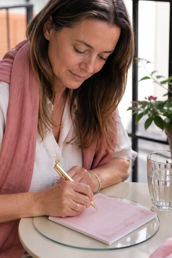
A rose-tinted background makes vintage writing paper feel romantic without switching to full sepia. The trick here is thin gray rules — they look delicate on camera and don’t overpower pencil or gel ink. This printable is ideal for journaling, love letters, and “small thoughts” pages where you want the paper to look pretty even if the writing is sparse. The color also helps your page look cohesive with warm-toned decor like terracotta and brass. Time investment is basically zero since your work is printing and choosing the right pen.
Editor's noteFor extra clean lines, store the printed pages under weight for 30 minutes after printing.
Step 1: Print on 24 lb paper and set color to “normal” (not high saturation) so the rose stays soft. Step 2: Use a gel pen in dark brown or charcoal; those shades look natural against pinkish paper. Step 3: If you’re using pencil, test one sheet first — lighter pencil can disappear on rose tones.
Skip thisDon’t use bright neon pens — they look like a mistake on rose vintage paper.
4. Vintage Blueprint Margin Notes with Writing Lines
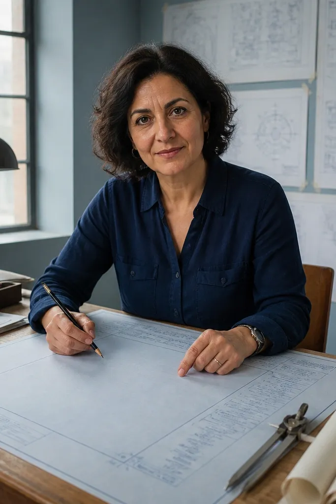
Blueprint-style vintage paper looks modern and retro at the same time, and it’s unusually photogenic because of the margin notes. The page has a clear writing zone plus side annotations that mimic technical documents from the past. This format is great for study notes, project planning, and “plan then write” pages where you want structure. Because the background is usually pale, your handwriting stays readable. It also pairs well with white ink highlights if you’re using a gel pen or paint pen for accents.
Editor's noteIf your printer makes blues too light, switch to “photo paper” mode at low saturation rather than cranking contrast.
Step 1: Choose the version with visible margin widths so you actually have space for notes on the side. Step 2: Print at actual size, then trim only if the border is too close to the edge for your binder. Step 3: Write with a dark blue-black pen so the lines and text match the blueprint tone.
Skip thisDon’t pick a blueprint printable that has tiny margin text — it turns into gray mush.
5. Weathered Ivory with Vertical Side Rule and Date Column
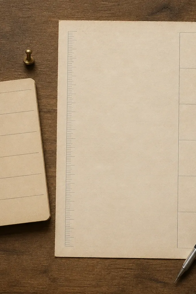
This is the best option if you want “vintage document” energy but still need easy writing. The vertical side rule and date column make the page feel organized, and the texture keeps it from looking like plain office paper. It’s great for tracking tasks over time, writing daily journal entries, and making quick letters where you want dates visible. Because the writing zone is big, your handwriting looks calm instead of squeezed. It’s a straightforward print-and-go printable that looks expensive on a desk.
Editor's noteUse a slightly thicker pen tip (0.7mm) to avoid skipping lines on textured paper.
Step 1: Print on 24 lb ivory or off-white paper and double-check that the vertical rule isn’t shifted by printer scaling. Step 2: Use a ruler to align the date column with your usual spacing habits, then write dates first before filling the entry. Step 3: Let ink dry flat so the textured background doesn’t grab wet ink.
Skip thisDon’t choose a pen that’s too wet — the texture can cause feathering.
6. Old Map Style Frame with Centered Writing Lines
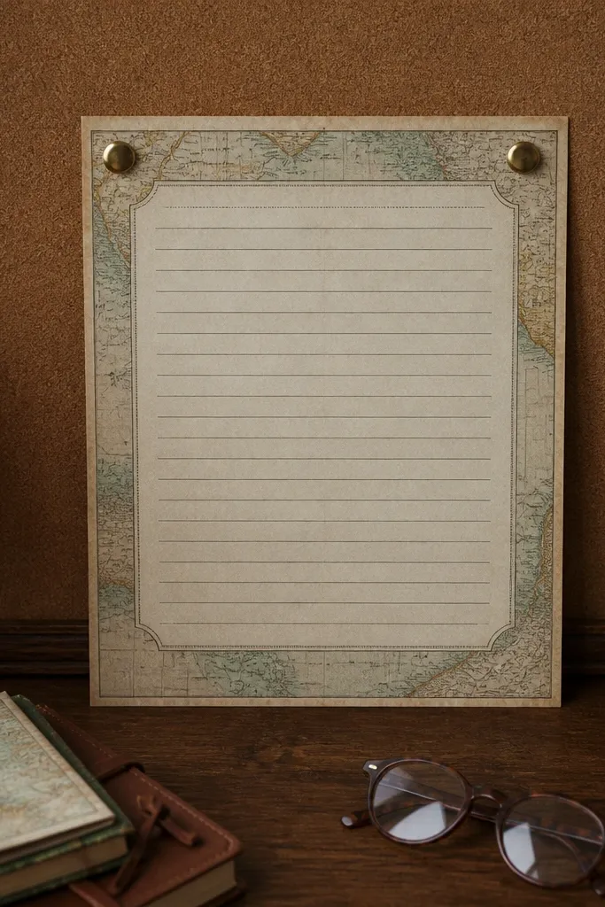
Map frames bring instant story to stationery. The outer border gives you that travel-poster vibe, while the centered writing lines keep the page usable. This is perfect for letter writing when you want the stationery to feel like an artifact, not a generic template. The map style also photographs well because the border creates depth and a clear edge. Use it for personal notes, postcards you print to tape into envelopes, and journaling spreads where the page is the star.
Editor's notePair with a stamp-style label or wax seal sticker in matching tones to make the page feel “complete.”
Step 1: Print on heavier paper (24-32 lb) so the border doesn’t look washed out. Step 2: If the map frame has small labels, keep your pen darker (black, espresso brown) so it stays readable. Step 3: Trim only the outer white margin if needed for clean framing in a binder.
Skip thisAvoid very light pens like gray — the map frame already has low contrast.
7. Typewriter Textured Paper with Monoline Rules
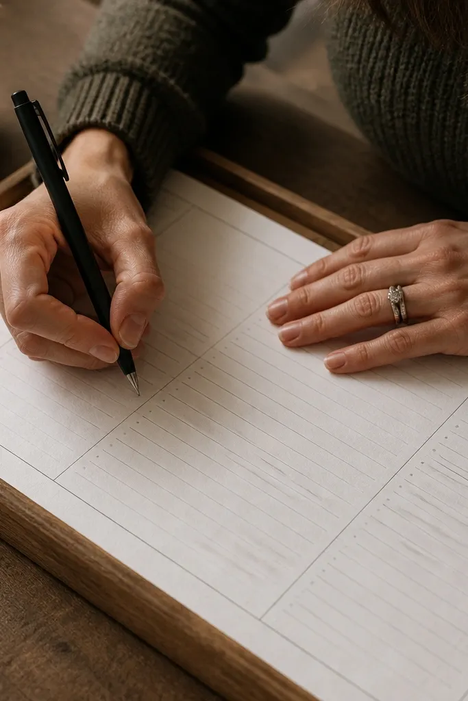
Typewriter-textured paper gives you a subtle, tactile vintage look that still keeps writing front and center. The monoline rules are clean and don’t fight handwriting, which makes this a good daily-use printable. It looks great for correspondence, practice writing, and quick lists that still feel special. The texture also reduces the “flat print” look, so your pages look more like real stationery. This one is ideal if you want vintage without heavy ornament.
Editor's noteIf your printer leaves streaks on textured backgrounds, clean the print head and run one test page before you commit.
Step 1: Print on 24 lb paper and choose a darker ink setting if your printer offers it. Step 2: Write with a consistent line weight pen — a 0.5-0.7mm gel pen works well for the texture. Step 3: Store the sheet flat so the texture doesn’t pick up curl from thin paper.
Skip thisDon’t use ultra-fine 0.3mm pens if the texture is pronounced; skipping can show.
8. Antique Script Header with Ruled Body
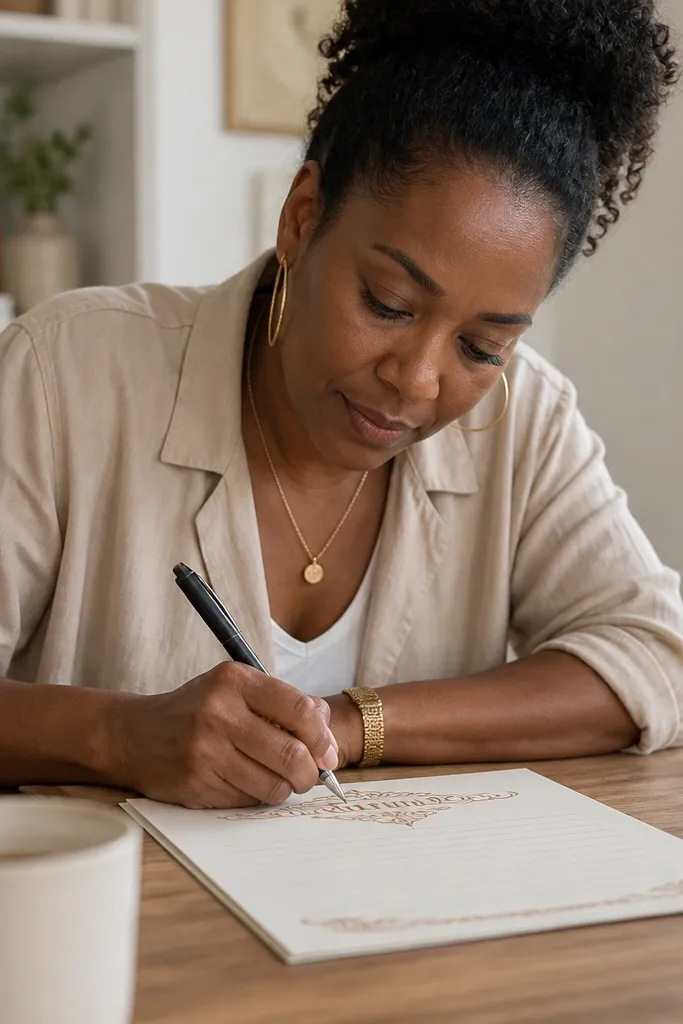
This printable gives you the best of both worlds: a decorative script header that looks hand-set, plus a ruled body that’s easy to write on. It’s photogenic because the header reads clearly even when only one or two lines are written beneath it. The rules keep your text aligned, so the whole page looks tidy. This works for letters, invitations, and “note cards” you print and fold. It’s also a good choice for people who don’t want a full page border cluttering the writing area.
Step 1: Print with “normal” scaling and confirm the script header sits centered. Step 2: Write your date and a short title first, then fill the ruled area; the header helps you keep spacing consistent. Step 3: Use a pen color that matches the script tone (dark brown or black) so the header and body look like one set.
If your header is too faint, print one test and switch from draft to standard quality rather than increasing contrast.
Don’t place the paper at an angle when photographing — script headers exaggerate skew.
9. Engraved Frame Border with Numbered Lines
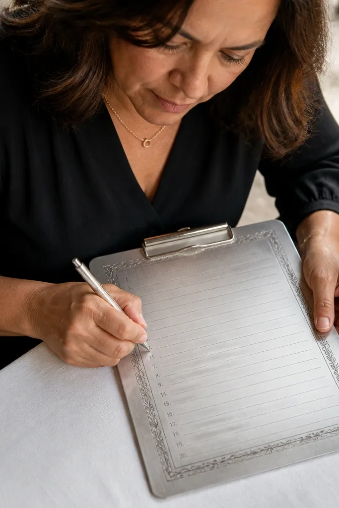
Numbered lines make this feel like a real document, and the engraved frame gives it that old printing press look. The numbers are subtle enough that you can write normally, but they add structure for correspondence, drafts, and edits. This is a strong pick for writers who like to reference lines while rewriting. The frame photographs well because it creates a clear boundary around your handwriting. It’s also great for classroom worksheets that need to look vintage.
Editor's noteUse a ruler once to set your writing starting point, then repeat across pages for a consistent look.
Step 1: Print on 24 lb paper and check that the numbers are sharp enough to read; if they blur, lower the printer’s speed or use higher quality mode. Step 2: Use a consistent pen and keep your lines aligned with the numbered guides. Step 3: If you’re binding pages, punch holes outside the engraved frame area.
Skip thisAvoid designs where numbers sit too close to the line — your pen will hit them.
10. Deep Sepia with Faint Watermark Icons
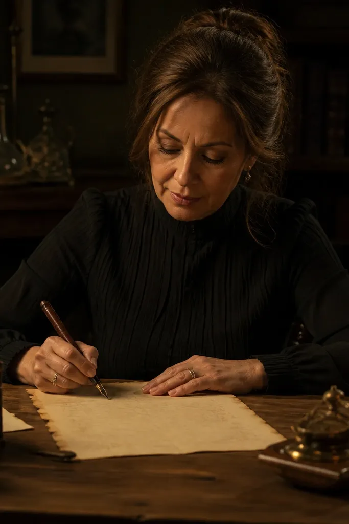
If you want a serious, moody vintage stationer look, go deep sepia with faint watermark icons. The icons stay subtle so your writing is still readable, but the page looks layered and old. This is great for letters you want to feel dramatic, like holiday notes or “long-form” pages. It also works well for calligraphy practice because the watermark texture adds visual interest without heavy ornament. Your main job is choosing a pen color that stands out against the sepia base.
Step 1: Print on thicker paper (24-32 lb) so the sepia background doesn’t look patchy. Step 2: Use a dark ink gel pen or a fine fountain pen with black ink; let it dry fully to prevent smudges. Step 3: Store flat — deep sepia backgrounds show edge curl more than lighter papers.
If your printer makes sepia look blotchy, run a nozzle check and avoid high-speed printing.
Don’t use gray ink on deep sepia; it disappears into the background.
11. Pastel Lavender Wash with Dotted Header Area
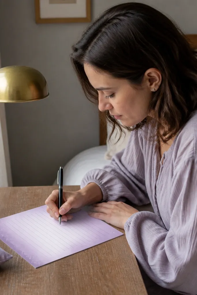
Lavender wash printables look soft and pretty, and the dotted header area makes them feel like a planner page from a calmer era. The dots guide where you write a title or topic, while the ruled body keeps your handwriting neat. This is a great option for journaling, gratitude notes, and “weekly reflection” pages. It also looks good with stickers and washi tape because the wash isn’t too heavy. If your goal is aesthetically pleasing stationery that still works, this one hits that balance.
Editor's noteUse a dark purple or black pen so the dots and lines read as one system.
Step 1: Print on 24 lb paper and choose color settings that keep the lavender soft rather than neon. Step 2: Fill in the dotted header first, then write in the ruled area — it keeps spacing consistent. Step 3: Dry flat for 10 minutes and avoid high-bleed markers; gel pens are your friend here.
Skip thisSkip alcohol markers unless you test one sheet — lavender washes show bleed.
12. Botanical Frame with Wildflower Corners
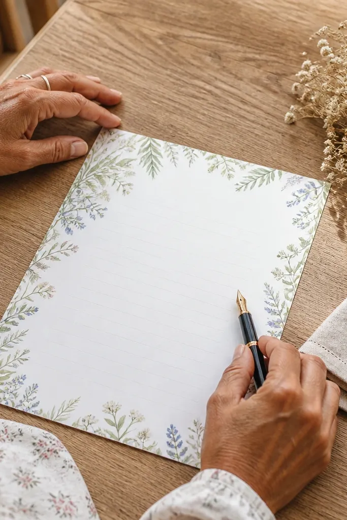
Botanical frames make writing paper look like it belongs on a cottage desk. Wildflower corner accents add charm without covering your writing space, and the light frame keeps the sheet airy. This printable is perfect for thank-you notes, invitation inserts, and journaling when you want a gentle aesthetic. The frame also helps your page look complete even with short writing. It’s easy to use because you’re not trying to copy complicated layouts — just write normally in the ruled center.
Editor's noteChoose a pen with minimal sheen; glossy ink can look too modern on botanical paper.
Step 1: Print on smooth 24 lb paper so the flower edges stay crisp. Step 2: Use a fine black or deep green pen to match the botanical tone. Step 3: If you plan to trim, leave a thin border so the flowers don’t look cut off.
Skip thisDon’t pick a design with flowers that overlap the lines — it makes handwriting look messy.
13. Gilded Edge Border with Light Rules
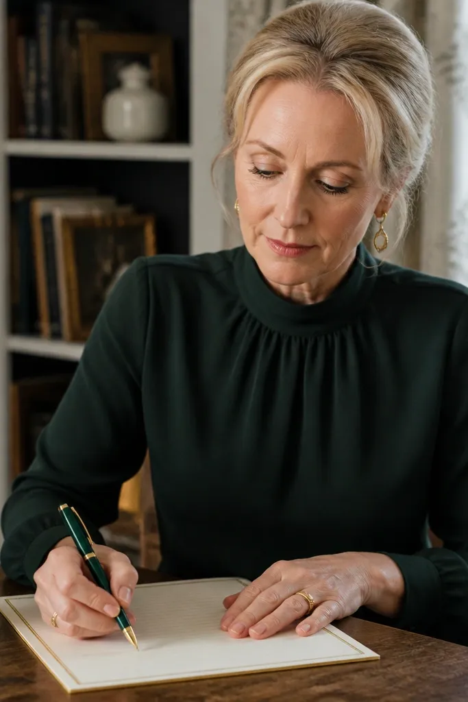
A gilded edge border makes any printable feel elevated, and it stays photogenic because it creates a crisp perimeter. The key is keeping the rules light so the gold edge doesn’t compete with your handwriting. This is a strong pick for formal notes, holiday cards, and letterhead-style pages. It also works well for printing multiple sheets and stacking them as a desk set. Your writing will look framed, even if you only fill a few lines.
Editor's noteIf your gold edge prints too dark, reduce “ink density” in your printer settings instead of switching paper.
Step 1: Print on 24-32 lb paper and set your printer to normal quality; overly high quality can darken the gold effect. Step 2: Use a dark pen to keep contrast sharp against the ivory base. Step 3: Let it dry flat, then handle by the edges to avoid smudges near the border.
Skip thisAvoid gel pens that smear on glossy inks — borders tend to show smudges first.
14. Weathered Paper with Tear Strip Side Accent
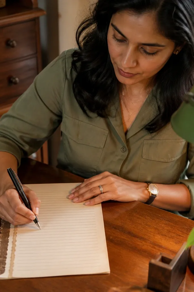
This is the “artifact” look that still lets you write comfortably. The tear strip side accent creates visual drama, while the main writing area stays clean and ruled. It’s great for letters you want to feel recovered from an archive, and it also works well for scrapbook inserts. Because the accent is on one side, your handwriting stays uncluttered. This printable is a good choice when you want vintage style without a full border that crowds the page.
Editor's noteUse a darker brown pen; it matches the weathered tones and looks less harsh than pure black.
Step 1: Print on heavier paper so the tear strip edge doesn’t look too thin. Step 2: Write within the ruled zone and keep your first line aligned with the top rule — the torn accent draws attention upward. Step 3: If you’re mounting it, use a mat or backing so the torn edge looks intentional, not cut.
Skip thisDon’t trim too close to the torn strip — it ruins the effect.
15. French Café Menu Style with Ruled Lists
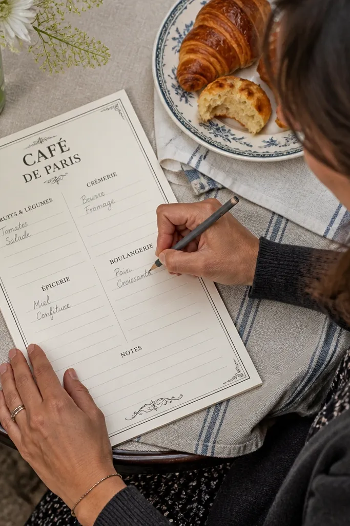
Menu-style stationery looks great for writing because it gives you built-in sections. You get vintage typography vibes plus ruled list blocks where your text stays organized. This one is perfect for recipe swaps, grocery notes, and “offerings” lists like subscription ideas. The visual hierarchy also makes pages look full even with short entries. It’s photogenic because the layout has strong structure and clear zones. Skill level is low because it’s print-and-write.
Editor's noteFor a more authentic menu look, write item names first, then dates last in the smallest header area.
Step 1: Print at actual size and verify the section headers aren’t getting cropped. Step 2: Fill one block at a time so your writing stays aligned with the list lines. Step 3: Use a pen with steady flow; menus look messy when ink skips.
Skip thisAvoid designs with too many tiny header words — they blur and reduce the vintage feel.
16. Antique Letterhead with Centered Emblem and Lines
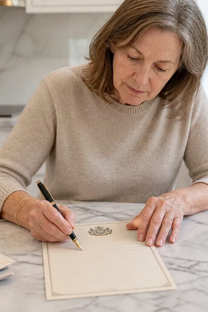
An antique letterhead layout makes the whole page feel official. The centered emblem gives you a focal point, and the lines below keep your handwriting tidy. This printable works well for letters, formal invitations, and “company-style” notes you want to look serious. It also photographs well because the emblem sits above the writing like a classic stationary suite. If you like clean layouts but still want vintage flavor, this hits the sweet spot.
Editor's noteIf your emblem looks too light, print one sheet in higher quality mode rather than changing fonts or editing the file.
Step 1: Print on 24 lb paper and leave the top margin alone so the emblem isn’t cut off. Step 2: Write your greeting or subject line right under the emblem, then continue down the ruled area. Step 3: Use black or deep brown ink and let it dry flat before stacking.
Skip thisDon’t overfill the page — letterhead layouts look best when the writing has breathing room.
17. Vintage Music Manuscript with Staff Lines
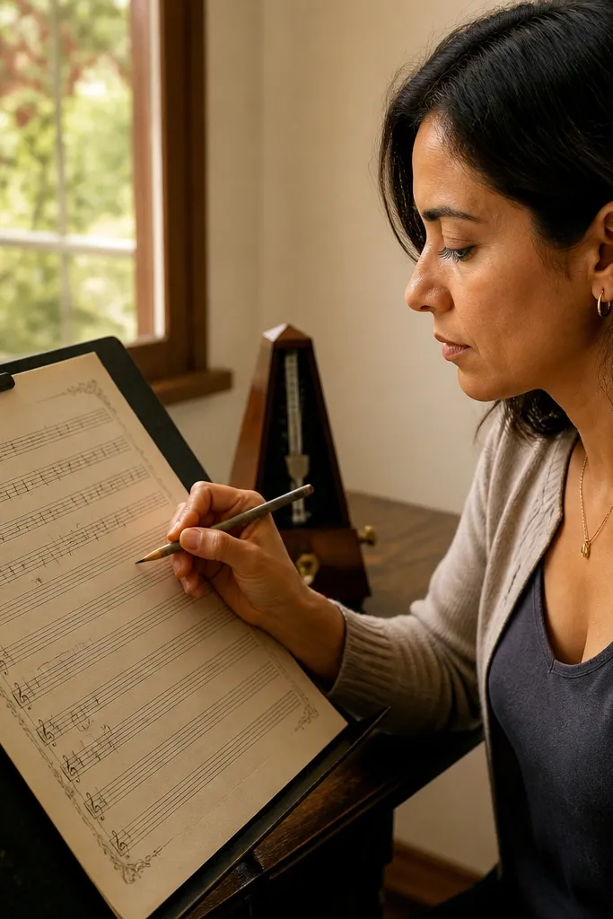
Music manuscript paper is a clever stationery option because staff lines look inherently vintage and structured. Even if you’re writing lyrics or notes, the staff gives a built-in rhythm to the page. The vintage border adds frame without interfering with the central writing area. This printable is great for song drafts, poem drafts, and creative journaling where you want the page to feel like a document. It’s also very photogenic because the staff lines create texture even when the page is mostly blank.
Step 1: Print on 24-32 lb paper for stable line visibility, especially if your printer prints thin lines. Step 2: Use a black gel pen so your lyrics or notes stay readable against sepia. Step 3: If you plan to bind, punch holes outside the border and keep the staff aligned.
Use a ruler to keep your lyrics straight — staff lines make slanted writing look extra obvious.
Avoid light gray pens; staff lines already create visual noise.
18. Old Postcard Style with Dotted Address Box
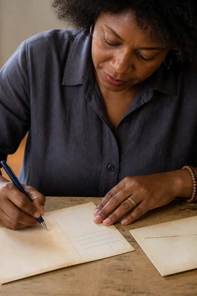
Postcard style printables are a cheat code for looking good instantly. The dotted address box gives you a clear “send” area, while the writing lines stay practical for messages. This is perfect for travel journals, note cards, and letter inserts you slide into envelopes. The postcard layout also makes the page feel balanced even with short messages. It’s visually striking because the address box creates a graphic block that reads well in photos.
Step 1: Print on 24 lb paper and check that the dotted box is fully visible and not cropped. Step 2: Fill the address box first with your date and location, then write your message in the ruled area. Step 3: Use a darker pen and let it dry before folding or packaging.
If your printer smears dotted boxes, lower ink density and print one test sheet.
Don’t choose a postcard printable with a full-bleed background — your message area can get washed out.
19. Victorian Corner Flourish with Minimal Ruled Center
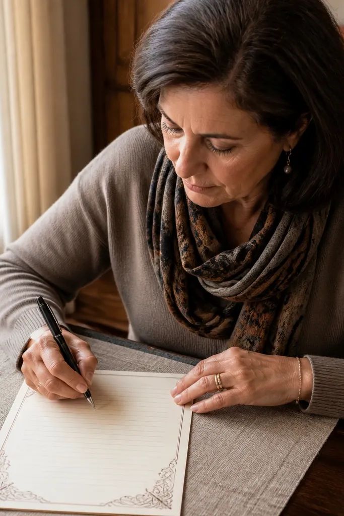
Corner flourishes are the best Victorian-style move because they frame the page without stealing space from writing. The center stays minimal and readable, so you don’t end up with a page that looks pretty but is painful to write on. This printable is ideal for formal notes, letters, and wedding-related stationery like small thank-you inserts. It also photographs beautifully because the corners give you decorative points of interest while the writing stays the main content. Skill level is easy: print, write, and trim only if you want a tighter look.
Step 1: Print on smooth 24 lb paper so the flourishes don’t look fuzzy. Step 2: Use a fine-tip pen and start your first line right under the top rule for symmetry. Step 3: If you’re trimming, keep a small margin so the flourishes don’t get cut down.
Use a dark brown ink if your flourishes are warm-toned; it matches and looks more period-correct.
Avoid heavy gel pens that leave raised ink; flourishes can smear under thicker ink.
20. Distressed Paper with Ink Splatter Header Accent
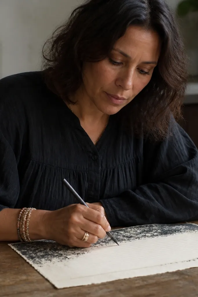
This design is vintage in a different way — it looks like ink was used, not just printed. The distressed background adds age, while the ink splatter header creates a strong visual hook above your writing. It’s great for creative journaling, letter drafts, and pages where you want the stationery to look like part of the story. The rules below keep it functional, so you’re not stuck with an art-only sheet. This is also a good pick if you like your vintage to feel gritty instead of delicate.
Editor's noteUse a black or deep charcoal pen; lighter inks blend into distressed backgrounds.
Step 1: Print on 24-32 lb paper and avoid ultra-gloss finishes that can make splatter look smeared. Step 2: Use a pen with consistent flow, then write after the sheet dries fully. Step 3: If you want a cleaner look, lightly press the page under books before you photograph it.
Skip thisDon’t use markers with high bleed — splatter headers make ink spread look worse.
21. Art Deco Vertical Rules with Geometric Side Panel
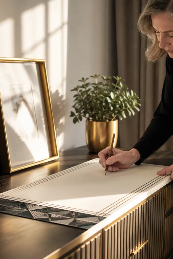
Art deco stationery looks vintage and stylish without going full sepia. The geometric side panel creates a bold graphic edge, and the vertical rules keep handwriting aligned. This is a strong choice for structured writing like outlines, meeting notes, and goal lists. It’s photogenic because the shapes catch light differently than flat borders. The page also reads “designed,” even if you only write a few lines. If you want good-looking vintage paper that still feels modern, this fits.
Step 1: Print on 24 lb paper and choose the highest quality mode so geometric lines stay sharp. Step 2: Write with a pen that matches the rule color; dark blue-black works well for deco tones. Step 3: If the side panel is close to your margin, trim only after printing and check the panel stays intact.
Use a 0.7mm pen to keep line weight steady across vertical rules.
Avoid designs with thin geometric lines if your printer struggles with fine detail.
22. Old Paper with Faint Threaded Border Lines
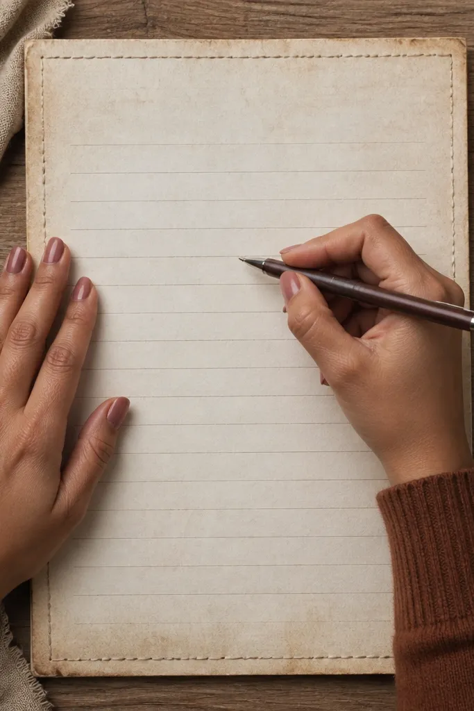
Faint threaded border lines look like stitched parchment, and they add a soft vintage frame without heavy ornament. This printable is all about subtlety: the background is aged, the borders are present, and the writing area stays clean. It’s great for everyday correspondence and journaling when you want the page to look vintage but not busy. The faint lines also make the page easy to photograph because the composition stays simple. If your taste runs toward quiet vintage, this is the one.
Step 1: Print on 24 lb paper and use actual size to keep the double border aligned. Step 2: Use a dark pen and keep your handwriting centered between the borders. Step 3: Let the page dry flat, then stack it under a book so the edges don’t curl while you use it.
If the border looks too faint, run one sheet in higher quality rather than editing the file.
Don’t use light gray ink; faint borders plus gray ink makes everything blend.
23. Vintage Index Card Layout with Rounded Corners
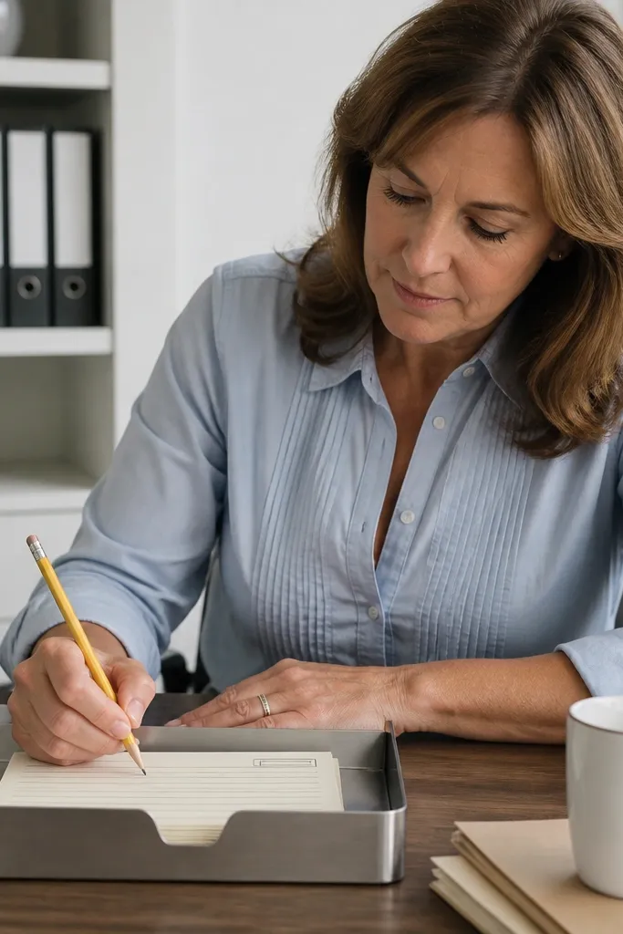
Index card style printables make writing feel organized and collectible. Rounded corners and a classic label area give you that vintage office vibe, and the ruled writing zone keeps the page easy to fill. This is perfect for note cards, file labels you handwrite, and quick letters you want to keep short. It also photographs well because the rounded corners and label block create a neat silhouette. It’s low effort and high reward for anyone who likes tidy stationery sets.
Editor's noteUse a paper trimmer with a sharp blade for clean rounded-corner edges.
Step 1: Print on 24 lb paper sized to your card format (or letter with cut lines if provided). Step 2: Fill the label area first with the topic and date, then write in the ruled zone. Step 3: Trim along the provided guides so the rounded corners look intentional.
Skip thisDon’t freehand cut; jagged edges kill the vintage index vibe.
24. Royal Blue Letter Paper with Ornate Corner Spots
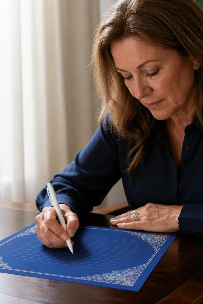
Royal blue stationery looks dramatic and clean, which is why it photographs so well. The ornate corner spots act like decorative anchors, and the writing lines are lighter so your handwriting pops. This is a great choice for invitations, formal notes, and any message where you want a bold vintage tone without heavy sepia. Blue also plays nicely with gold-toned pens and markers. The page feels “designed” even with minimal writing.
Editor's noteTest one sheet: dark backgrounds make ink performance obvious fast.
Step 1: Print on thicker paper and make sure your printer is set to handle colored backgrounds without skipping. Step 2: Use a lighter ink color like white gel pen or a very light gold tone if your printable supports it visually. Step 3: Dry flat and avoid smearing by using quick-dry ink pens.
Skip thisAvoid dark pens on royal blue unless the printable’s lines are designed to contrast with them.
25. Monochrome Vintage Frame with Centered Date Lines
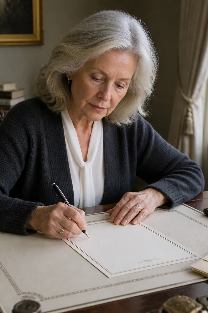
Monochrome frames look classy and “archival” without needing ornate color. Centered date lines give you a clean place to write the day, while the ruled text area stays readable. This printable is ideal for formal letters, records, and structured journaling where consistency matters more than ornament. The black and cream palette also makes your handwriting stand out, which is what you want from a writing paper printable. It’s a strong pick if you plan to use the set long-term.
Step 1: Print on 24 lb paper and confirm the frame is centered — scaling errors show up fast with monochrome designs. Step 2: Write the date first, then keep your lines aligned to the rule spacing. Step 3: If your printer smudges black ink, switch to a different pen or let the page cure longer before stacking.
Use a pen with a matte finish; shiny ink can look too modern on monochrome vintage paper.
Don’t stack wet prints — monochrome ink can transfer.



