
1. Cream Desk Calm Grid With 4 Term Cards
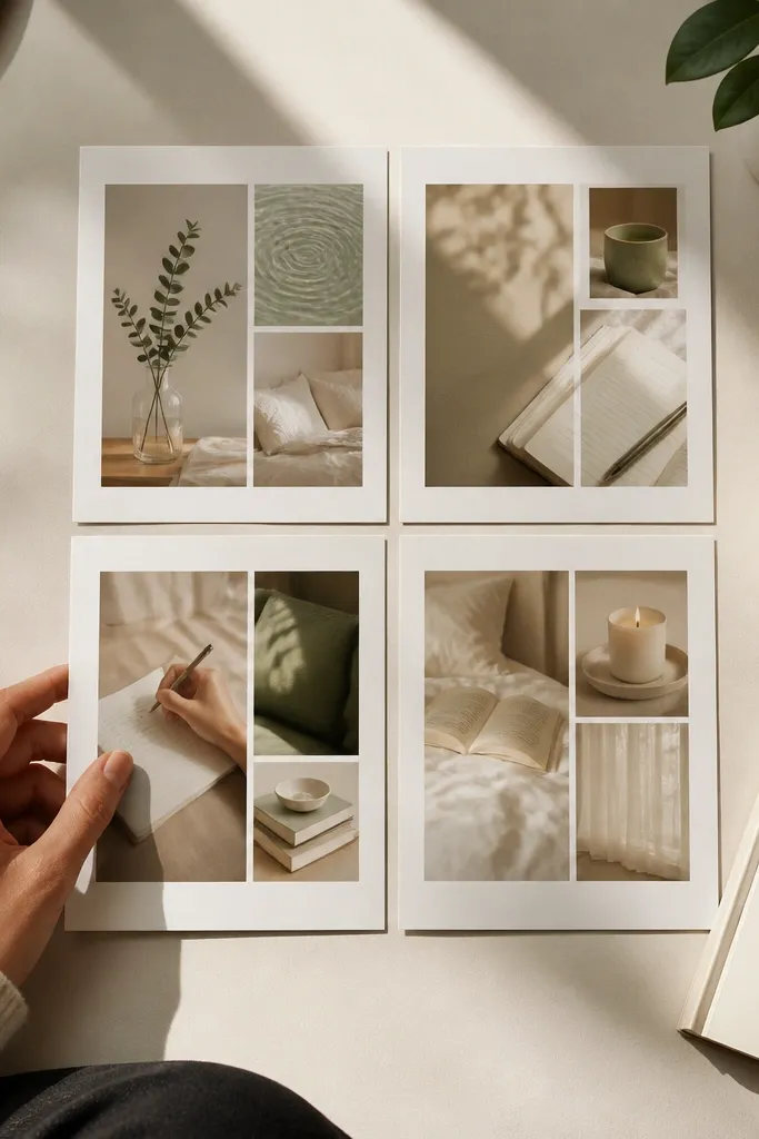
This layout is for days when you feel scattered and need a quick visual reset. The cream base keeps the board warm, and the grid forces clarity: four cards, four focused terms, no clutter. Use photos that read cozy in low contrast — think warm light, paper textures, and simple desk scenes. It’s a strong option for study self care because it frames your next action as something calm, not intense. This one looks clean in photos, too, because the spacing stays consistent.
Editor's noteUse matte glue stick, not hot glue, so the paper edges don’t warp and the photo stays crisp.
Start with a 12x16 inch cardstock backing in cream or oatmeal. Add a pencil grid at 1.5 inch margins so you get four equal rectangles for term cards; keep lines light so they don’t show through. Print four 4x6 term cards and layer each with a thin mat strip of sage paper, then glue them down with a 1/8 inch border. Finish by adding a single curved corner tape detail in sage at the top right of the board.
Skip thisAvoid mixing bright colors across cards — it makes the board feel noisy when you’re tired.
2. Brown Paper Discipline Strip Board
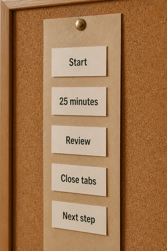
If your problem is procrastination disguised as “I’ll start later,” this is the board that hits back with structure. The brown paper base feels grounded, and the vertical strip creates a single lane for your focus. Each label is a short term like “Start,” “25 minutes,” “Review,” “Close tabs,” and “Next step.” The look is intentionally simple and tactile, so it reads cozy instead of harsh. It’s great for a desk wall or a phone photo because the vertical line guides the eye instantly.
Editor's notePre-trim labels with a paper trimmer so the strip stays perfectly straight in photos.
Cut a 12x18 inch sheet of kraft or brown wrapping paper as your base and trim edges straight. Create a 2 inch wide vertical column in the center using kraft strips glued down first, then cover with a lighter tan strip to make text pop. Print five small labels (about 2.5x4 inches), align them with consistent spacing (around 0.5 inch between). Seal the surface with a light coat of matte spray over the labels only, keeping spray distance wide to avoid warping.
Skip thisDon’t use glossy stickers on brown paper — the glare ruins readability.
3. Sage Linen Self Care Corner Board
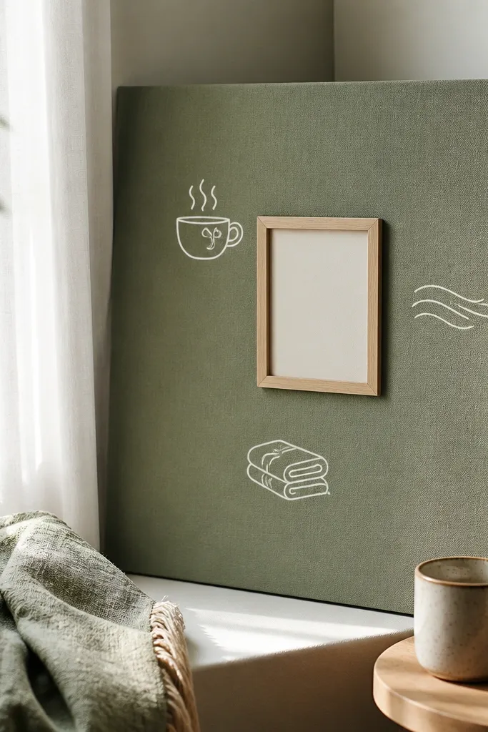
This is a self care-first board for people who need permission to slow down without giving up. The sage linen look makes the corner feel grounded and soothing, while the framed term card keeps the focus behavior clear. Add small white doodle icons around the frame — like a teacup, breath lines, or a folded blanket — so the board communicates “care first” at a glance. It’s a great fit for evenings, especially when your brain wants comfort more than pressure. It also photographs beautifully because fabric texture adds depth without visual chaos.
Cut a 9x12 inch board backing from thick white cardstock. Glue a 5x5 inch square of sage linen fabric into one corner, then trim any frayed edges with small scissors. Print one 4x6 term card and mount it on a 1 inch white mat strip so it looks like a mini frame. Add 6-8 doodle icons using a white gel pen, spaced evenly but kept small so the term card stays the main focus.
Use fabric glue and press with a flat book for 10 minutes so the linen doesn’t lift at the edges.
Don’t overload the corner with icons — it turns self care into clutter.
4. Warm White Flashcard Review Wall
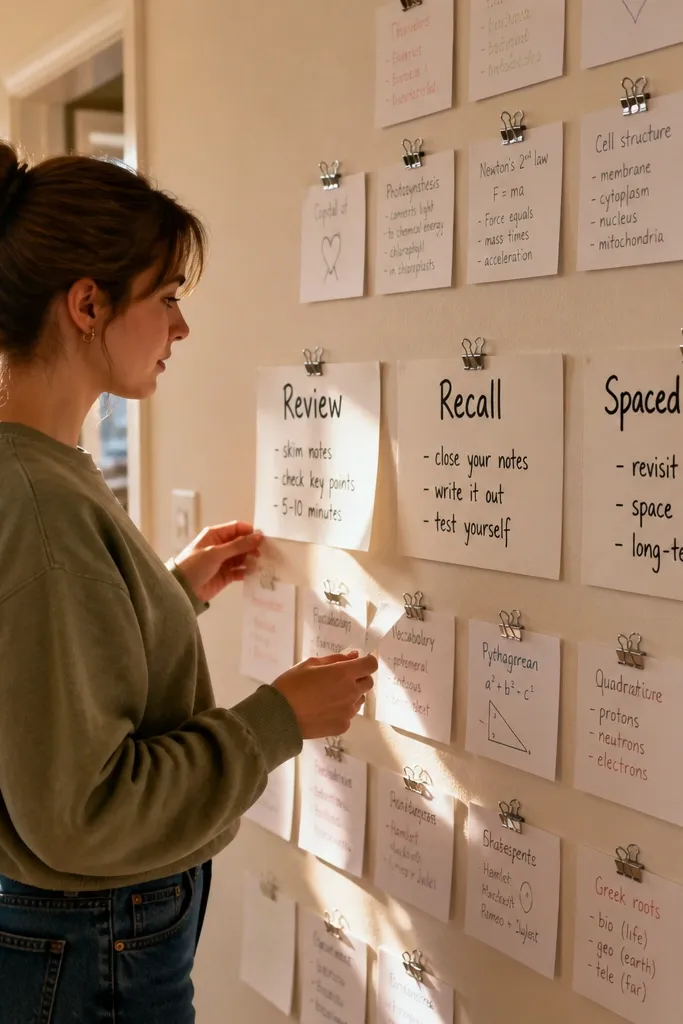
This board is for focused terms that repeat, like “Review,” “Recall,” and “Spaced repetition.” It mimics a study wall without looking like a classroom poster. The flashcard format keeps the visuals actionable: you can point to a card and do the corresponding action immediately. Add tiny binder clips or paper clips as accents to make it look lived-in and cozy. This layout is ideal for students who need a repeating routine that doesn’t rely on motivation.
Editor's noteKeep term cards the same font and size; the consistency reads as calm focus in photos.
Use a warm white poster board (11x14 or 12x16). Print three rows of term cards sized 2x3 inches and punch a small hole at the top of each card. Attach the cards with mini binder clips to a thin string or ribbon stretched across the board (about 1 inch below the top). Finish by adding one larger “Review cycle” card at the bottom using double-sided tape so it sits flat.
Skip thisSkip long paragraphs — flashcard boards need short terms to stay usable.
5. Oatmeal Time Block Watch Face Board
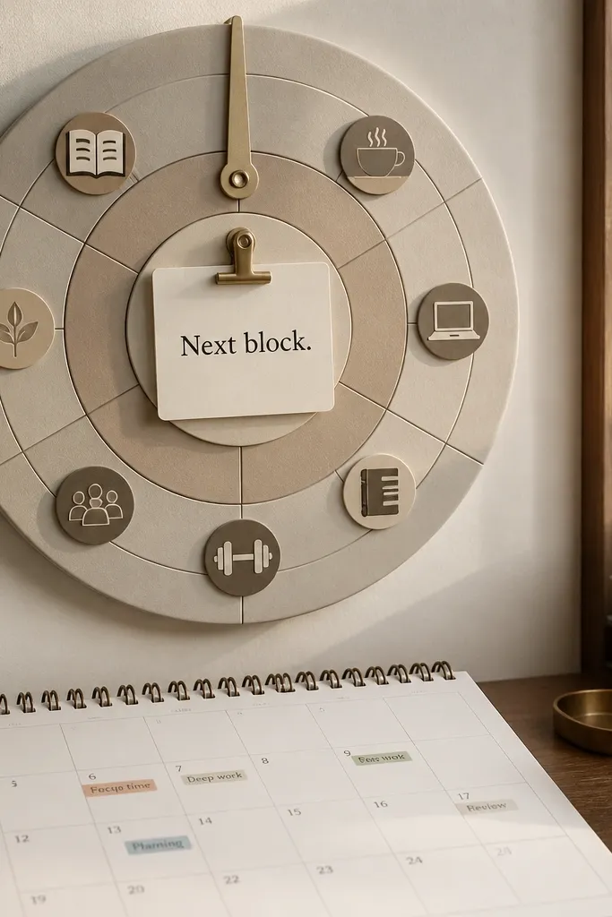
This one turns your schedule into a visual cue, which is the fastest way to study when you’re busy. A circular watch-face design makes “time” feel concrete, and it keeps attention on the next block rather than the whole day. Use cozy icons and muted tones so it doesn’t feel like a productivity planner. The focused terms should match your actual blocks, like “Deep work 25,” “Break,” “Notes,” and “Review.” It’s photogenic because circles always look intentional, and the symmetry makes it feel calm.
Start with a 12 inch circle cut from oatmeal cardstock mounted on a 16x20 inch backing board. Create four or five wedge sections using light pencil lines; each wedge gets one term card. Print wedge labels at about 2.5x3.5 inches, then glue them centered inside each wedge. Add a simple clock hand drawing with a black fineliner pointing to your current focus wedge, and seal with matte clear tape over the labels.
Use a compass or a paper bowl to trace the circle so everything looks clean in pictures.
Don’t pick too many wedges — five is the max before the board starts looking busy.
6. Charcoal Notes Rewriting Checklist Board
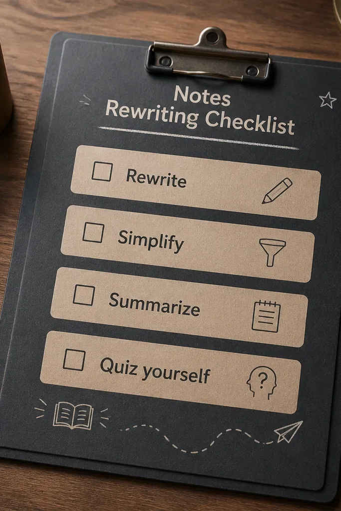
If your focus breaks when you hit messy notes, this board is built for rewriting and clarity. Charcoal looks dramatic but still cozy when you pair it with warm beige boxes and minimal icons. The checklist format turns “self care” into a study habit: rewrite, simplify, summarize, then quiz yourself. This layout is great for people who need structure without clutter. In photos, charcoal makes the beige boxes pop, which keeps the term cards readable.
Cut a 12x16 inch sheet of charcoal paper or matte cardstock for the base. Print four term boxes sized 4x5 inches on warm beige paper and cut them with straight edges. Arrange them in a 2x2 grid with 0.75 inch spacing, then add small checkbox icons in the corner of each box using a fine black marker. Finish by adding one thin beige strip at the bottom that says your “next action” term in smaller text.
Use a white gel pen for checkboxes so they stay crisp on dark paper.
Don’t use bright neon ink on charcoal — it kills the cozy vibe.
7. Terracotta Breathing + Study Reset Board
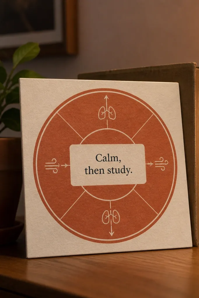
This is a self care board for focus resets when your mind starts racing. The breathing circle gives you a visual cue for calming your body, and the center term card keeps the study goal attached to that calm. Terracotta adds warmth without feeling childish, and the simple diagram keeps it visually adult. Put one focused term in the center, like “Start with one page” or “Breathe, then begin.” It’s photogenic because the center stays clean and the circle diagram adds a gentle focal point.
Use a 12x12 inch terracotta cardstock square. Draw a simple circle diagram: three concentric circles and an arrow line, leaving the center clear for a term card. Print one 4x6 term card and mount it with two layers of paper mat — cream on top of the terracotta base. Add small breath words around the outer circle (about 8-10 tiny labels), then outline the circles with a black fineliner.
Lightly sketch pencil first, then ink — it keeps your circle diagram from wobbling.
Skip complicated diagrams; one breathing cue reads better than a whole infographic.
8. Soft Beige Sticky Note Lab Board
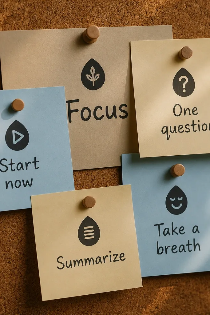
This layout leans into the “I can start right now” feeling. Sticky-note style cards make the board look like real study tools, not art you’re afraid to touch. Layering gives it dimension, and using one accent color (like muted blue) keeps it from turning into a random pinboard. Each sticky note should be one focused term action: “Open doc,” “Underline,” “Summarize,” “Quiz.” It’s perfect for small spaces because it looks neat and still reads clearly in close-up photos.
Cut a 11x14 inch board from soft beige cardstock. Print four sticky-note cards sized 3x3.5 inches with rounded corners; cut them out and lightly roughen the edges with sandpaper for texture. Layer them with 1/4 inch offset using double-sided tape so they look stacked. Add one mini binder clip or paper clip on top of the top note in muted blue, then write one tiny “today’s term” directly on the top note with a dark marker.
Roughen edges lightly; it makes the paper catch light and look more cozy on camera.
Don’t use too many colors on the sticky notes — layering works only if the palette stays tight.
9. Pastel Washi Tape Focus Path Board
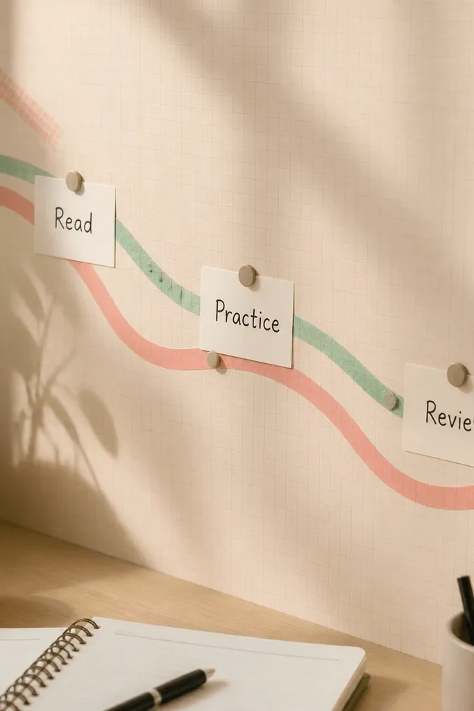
This board is for people who need a step-by-step path, not a list. The washi tape path creates a visual “walk” across the board, and the terms sit along the route like checkpoints. Pastel tape looks cozy and handmade, but it stays clean if you limit to two tape colors. Choose focused terms that match your process: “Read,” “Highlight,” “Rewrite,” “Practice,” “Review.” The result looks playful and aesthetic without losing study clarity.
Editor's notePress tape with a ruler so the edges stay flat for a clean photo.
Start with a 12x16 inch matte white board. Choose two pastel washi tapes (for example, sage and dusty pink) and map a winding path from top left to bottom right using strips about 1 inch wide. Place five term cards along the path, each around 2.5x3.5 inches, and glue them to the tape so the tape frames the cards. Finish by adding small arrow marks on the tape in a dark pencil or fineliner.
Skip thisAvoid thick tape piles; they look messy and cast shadows that hide text.
10. Walnut Frame Photo Strip Self Care Board
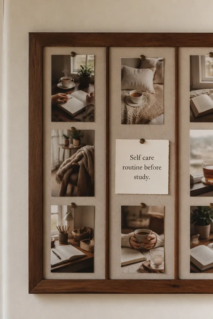
This is the board for when you want cozy visuals but still need focused terms to stay readable. A walnut frame look gives warmth and structure, while a three-strip photo layout keeps the board from feeling chaotic. Put one term card in the center that ties the three strips together, like “Self care routine before study.” Choose photo subjects that match the board’s goal: mug + notebook, tidy desk corner, and a close-up of reading. The frame design makes it look like a real wall piece.
Use a 12x18 inch board backing and draw a rectangle frame with brown paper strips, leaving a 2 inch inner window. Print three photo strips sized 3x6 inches and mount them with 1/4 inch spacing. Place them in a row across the top half of the inner window. Add one central term card sized 5x7 inches in the bottom half and glue it down flat, then seal the photos with matte tape over edges.
Use matte photo paper; gloss creates glare that ruins the cozy look.
Don’t pick wide, busy photos — crop them so only the study-relevant details show.
11. Lavender Corner Quote + Term Card Board
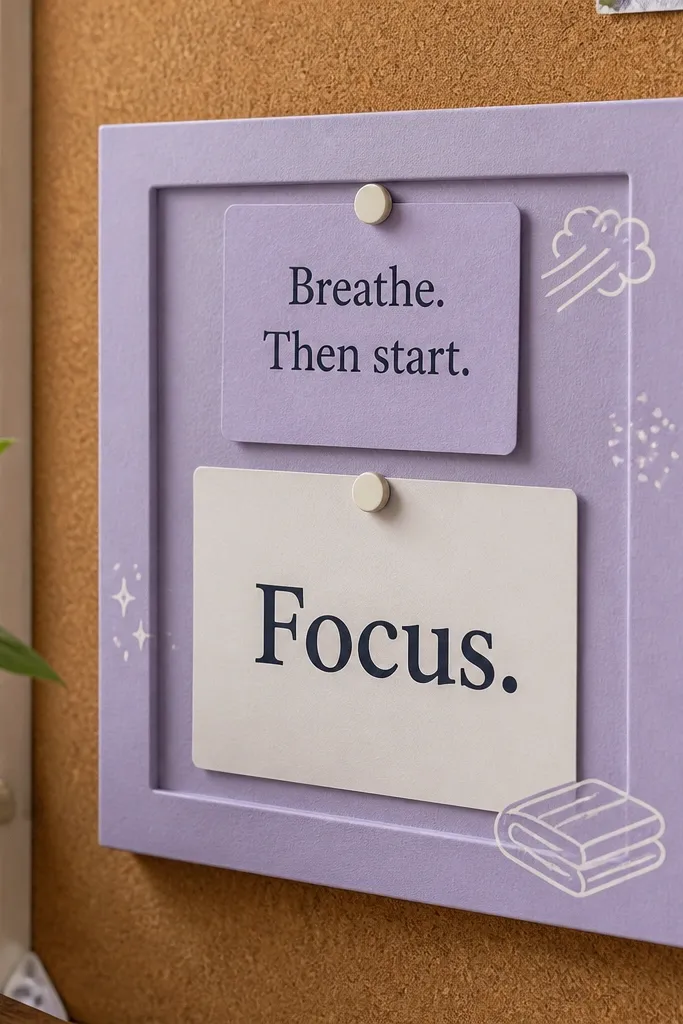
This is a softer board for self care without turning study into a motivational poster. A lavender corner adds calm, and the main term card keeps you anchored in the focused behavior. Use a short quote block as a comfort cue — like “Breathe. Then start.” Keep it small so the term card stays the hero. The aesthetic comes from the contrast: lavender corner with clean typography and plenty of negative space. It’s great for a bedroom desk where you want it to feel cozy, not classroom.
Editor's noteUse a consistent font style across the term card and quote block for a cleaner look.
Cut a 12x16 inch white cardstock base. Glue a lavender paper triangle into the top left corner (about 4 inches on each side). Print one main term card sized 6x8 inches and place it slightly right of center. Add a small quote block card sized 3x4 inches tucked under the lavender corner, then outline the quote card with a thin lavender marker border.
Skip thisDon’t add multiple quotes — one comfort line is enough.
12. Soft Grid Notebook Pages With One Focus Term
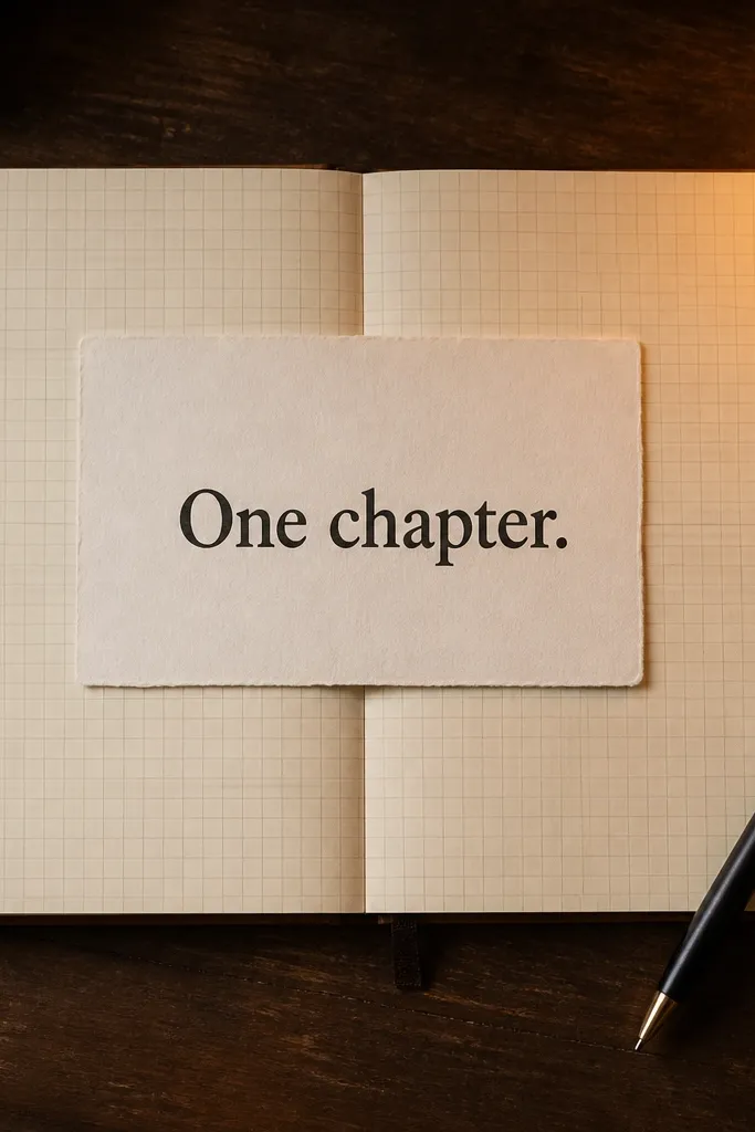
This board is for when you want your focus to feel like “work mode” without stress. Notebook paper backgrounds look cozy and study-specific, and a faint grid makes the whole board feel like it’s already organized. The design centers one bold term card so you don’t split attention. Choose a term like “One chapter” or “Finish the practice set.” This layout is extremely photogenic because it looks like a planner page, not a collage.
Use a 12x16 inch sheet of printed notebook-paper pattern or draw your own light blue lines lightly. Center a bold term card sized 7x5 inches; keep generous margins so it feels calm. Add a thin underline in the accent color under the term (sage, caramel, or dusty blue). Finish by adding three small bullet icons on the card edges, each representing a tiny action like “read,” “rewrite,” “check.”
Lightly blur the background pattern by printing at lower contrast; it makes the term card pop.
Don’t use dark background blocks — the notebook look only stays cozy when the page stays light.
13. Warm Candle Glow Study Reset Board
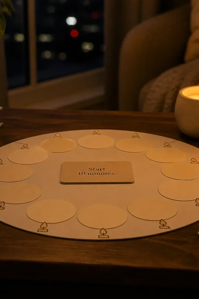
This layout uses warm “glow” cues to connect self care to starting. Candle icons and soft circles signal comfort, while a single term card tells you exactly what to do after you calm down. It works well for people who avoid studying because they associate it with dread. Keep the rest of the board minimal so the glow feels intentional. The aesthetic is cozy because the color temperature stays warm and the shapes stay rounded.
Start with a 12x12 inch beige cardstock base. Draw a large circle in the center using a warm caramel marker, then place a candle icon or simple flame doodle at the top of the circle. Print one term card sized 4x6 inches and mount it on a cream mat strip. Add two small supporting term cards sized 2.5x3 inches on either side of the center circle, then connect them with thin curved lines like a path.
Use rounded corners on every card for a softer, cozier look in photos.
Skip sharp geometric shapes — they make the board feel cold.
14. Muted Blue Review Cycle Timeline Board
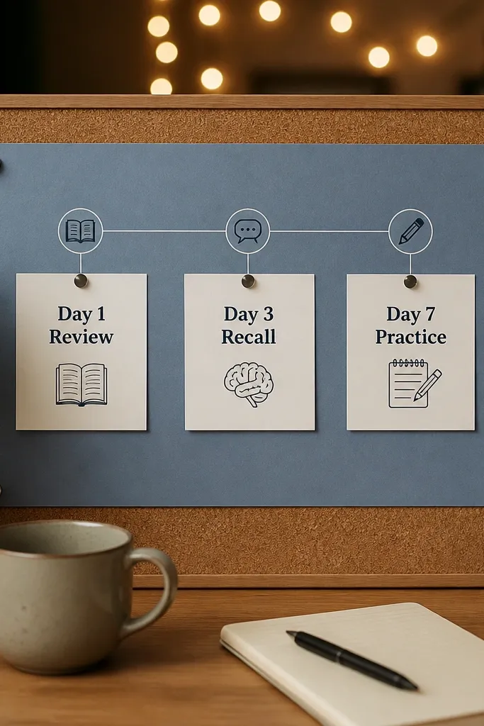
This is for focused terms tied to repetition, like review timing and recall practice. A timeline line gives your brain a sequence, which makes “review” feel like a plan instead of a vague idea. Muted blue keeps the board calm, while warm white keeps it cozy. Place three cards in order so you can glance and know what step comes next. It’s ideal for exam weeks because the visuals match the reality of spaced review.
Use a warm white base (12x16 inch). Draw a horizontal line across the middle using muted blue pencil or marker, leaving equal spacing for three checkpoints. Print three term cards sized 3.5x5 inches and label them with your review steps like “Day 1,” “Day 3,” “Day 7” or your chosen schedule. Add small circle markers on the blue line under each card, then outline the cards with a thin blue border.
Measure spacing with a ruler; timeline boards look sloppy when the gaps vary.
Don’t add more than three review steps — too many makes the timeline hard to read.
15. Terracotta + Cream Desk Checklist Strip
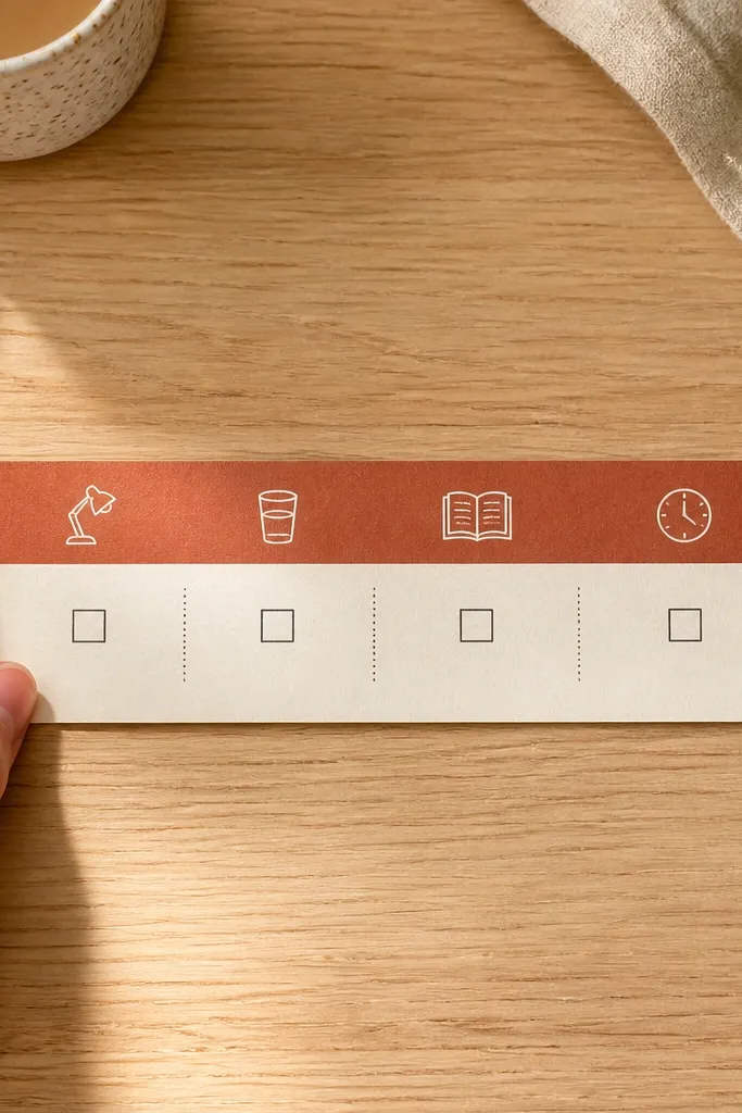
This board is for focused terms that happen before you even open your books. The terracotta strip at the top feels warm and sets the mood, while the cream checklist area keeps the action clear. Each box is a pre-study step like “clear desk,” “water,” “open notes,” and “start timer.” This is cozy self care because it removes friction — you do the setup first, then study feels easier. It’s also easy to photograph because the top strip creates a strong visual anchor.
Cut a 12x18 inch base from cream cardstock. Add a 2.5 inch terracotta strip across the top and glue it down with even pressure. Print four term boxes sized 4x3 inches and arrange them in a single row under the strip, leaving 0.5 inch gaps. Add small checkboxes on each box corner and finish by writing one “start time” note in the bottom right with a fine marker.
Use a paper score tool to keep the terracotta strip edge sharp and flat.
Don’t cram the checklist too low — leave breathing room so it still looks cozy.
16. Rose Pink Warm Focus Mandala With Term Center
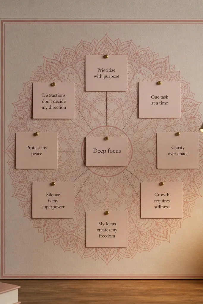
If you want cozy vision board ideas pictures that look artsy but still study-focused, this one hits the balance. A warm rose mandala creates a gentle focus halo around a single term card. The center stays clean for readability, while the surrounding rings keep it visually interesting without adding chaos. Use it for self care terms like “reset,” “breathe,” or “start gentle.” It’s photogenic because symmetry reads well and the center card stays the sharp focal point.
Editor's noteKeep the marker lines light; heavy ink makes the mandala look harsh and less cozy.
Use a 12x12 inch warm white cardstock base. Draw a simple mandala: three concentric rings with small petal shapes between them, in rose pink marker. Place one term card sized 4x5.5 inches in the exact center and glue it flat. Add tiny dot accents on the rings and outline the card with a thin rose border to tie everything together.
Skip thisAvoid adding extra text around the mandala — the term card needs space to lead.
17. Green Sage Window Light Board
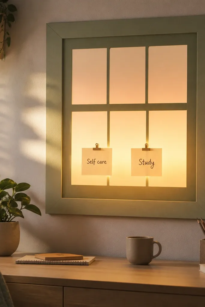
This layout is for people who study best with a “light cue.” The window-frame shape makes the board feel like morning focus, even if you’re working at night. Sage green feels calm, and the warm light gradient background adds that cozy glow. Put two focused term cards inside the window frame: one for self care and one for the next study step. It’s visually strong because the frame creates structure and the gradient adds softness without clutter.
Editor's noteUse tissue paper layers — they photograph softer than printed gradients.
Start with a 12x16 inch backing board in warm white. Create a window frame by cutting two vertical strips in sage paper and two horizontal strips, then glue them to form a rectangle with about 1.5 inch margins. Add a warm light gradient background inside the frame using two layers of tissue paper in cream and pale gold, then secure with spray adhesive lightly. Print two term cards sized 4x6 inches, place them side by side inside the window, and tape the corners so they don’t lift.
Skip thisSkip glossy gold foil; it reflects light and can wash out text.
18. Map-Style Study Route Board With Coordinates
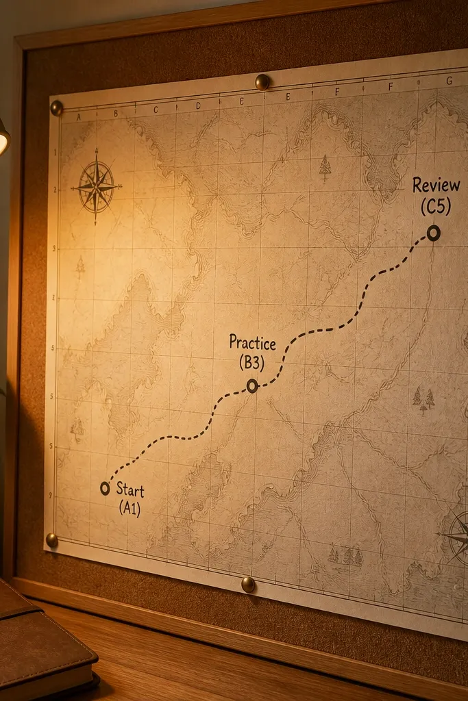
This is a focus board for people who respond to progress. A map-style route turns studying into a journey you can track, but the term tags keep it grounded in actions. Use three coordinate-style labels like “Start,” “Practice,” and “Review.” The look is cozy because the palette stays warm and the route line can be drawn with soft brown marker. It’s great for self care because it removes the “all or nothing” feeling — you always know what the next checkpoint is. It also photographs cleanly because the route line is a strong visual guide.
Editor's noteUse a ruler for the route line; a wobbly line makes the map vibe look messy.
Cut a 12x16 inch cream board and draw a curved route line across it using a thin brown fineliner. Create three coordinate tags by printing small labels sized 3x2 inches with a faux coordinate format like “A1,” “B2,” “C3” next to your terms. Glue the tags near the route at evenly spaced points and add tiny star icons at each tag. Finish by adding a simple compass rose in one corner using two lines and four dots.
Skip thisDon’t add real map imagery — it competes with the term labels.
19. Warm Gray Photo Corners With One Action Term
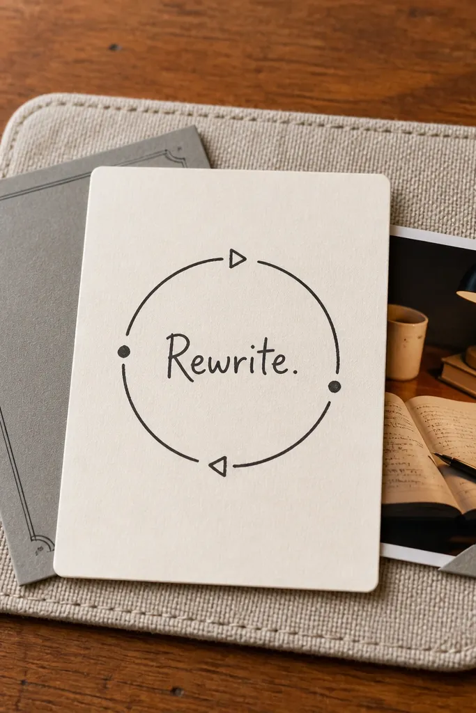
This is the cleanest cozy vision board setup when you want it to look intentional, not crowded. Warm gray corners frame simple study photos without turning the board into a collage. The center action term card stays the focus, so you still get the focused-term benefit every time you look. Choose one main term like “Rewrite notes” or “Do practice questions,” then support it with three tiny photo corners that match the action. It’s perfect for desk setups where you want a calm aesthetic that doesn’t distract.
Editor's noteCut photo corners with a craft knife for crisp edges instead of tearing.
Use a 12x16 inch warm gray cardstock base. Print three small photos sized 2x3 inches and cut them so only the corners remain, leaving white space in the center of each photo. Glue each corner to the board in a triangular layout, leaving the center open. Print one main term card sized 6x8 inches, mount it with a cream mat strip, and place it in the open center area. Seal around photos with matte tape so corners stay flat.
Skip thisDon’t use more than three photo corners — the center term needs room to breathe.
20. Oatmeal + Caramel Study Checklist With Tabs
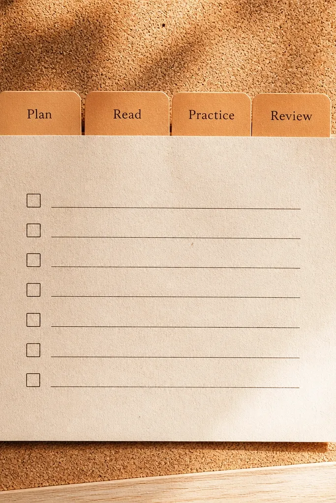
This one is for focused terms that you want to flip through quickly. Tabs make the board feel like a reference binder, which is cozy because it looks practical. Use four tabs for actions like “Plan,” “Read,” “Practice,” and “Review.” The oatmeal base keeps it warm, and caramel tabs add depth without being loud. This layout is ideal for students who want a physical routine they can glance at while studying, not a board you only admire.
Editor's noteCut slits a tiny bit narrow so cards hold friction — they won’t slide around in photos.
Start with a 12x16 inch oatmeal cardstock base. Cut four caramel tabs sized about 2x6 inches and glue them along the top edge, spaced evenly with 1 inch gaps. Print four term cards sized 2x5 inches and slide them under each tab using a slit you cut with a craft knife. Add one small piece of washi tape at the bottom of each tab to lock cards in place, then press everything under a book for 15 minutes.
Skip thisAvoid thin paper tabs — they bend and look cheap fast.



