
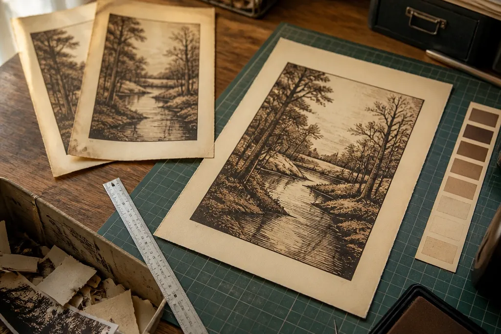
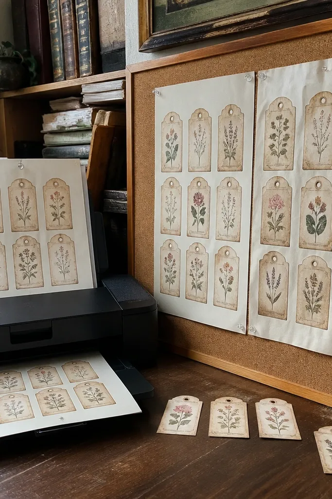
1. Aged Ledger Background Page for Decoupage Trays
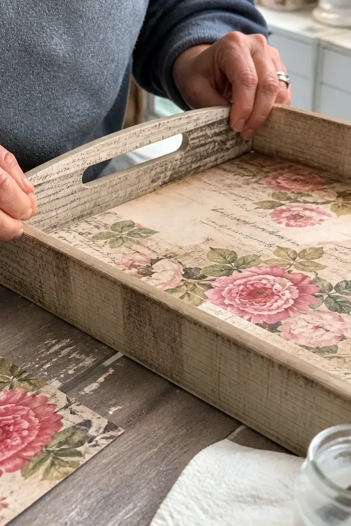
Start by measuring the surface area you’re covering and cut the printable 1/4 inch bigger than the footprint on each side. Print on heavier paper — 60-110 lb cardstock — so the texture doesn’t look too thin under varnish. Brush a thin layer of decoupage medium (matte or satin) on the surface, lay the paper down, then smooth from the center outward with a plastic brayer or credit card edge. Let it dry fully, then trim flush with a sharp craft knife and ruler. Seal with two coats of decoupage medium, drying between coats, so the edges don’t lift.
This is the printable I recommend when you want vintage paper that actually survives handling, like a decoupage tray or a paper-covered box lid. A good aged ledger background has enough texture in the whole sheet so small wrinkles and glue ridges don’t show up as obvious “blank” areas. It also gives you built-in visual noise, which hides uneven brush strokes when you seal it. Skill level is beginner-friendly: you’re mostly cutting to size and sealing. It’s a great fit for entryway organizers, catch-all trays, and any piece where the paper is a base layer, not the main hero.
Skip thisDon’t print on copy paper and then expect decoupage medium to hide the wrinkling.
Editor's noteUse a dull pencil to mark trim lines before you cut — it keeps you from cutting into important text.
2. Ticket Stub Collage Sheet for a Gallery Wall
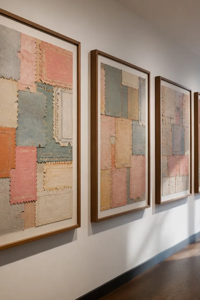
A ticket stub collage sheet works when you want a gallery wall that looks collected instead of perfectly matched. The best printables have repeated elements with slightly different distress so the wall feels layered even though it’s one file. You’ll also get more forgiving trimming because the design naturally includes borders and perforation cues. This project is medium effort because you’ll cut multiple pieces and align them, but it’s not hard. It suits dorm rooms, hallways, and any spot where you want movement without bright colors.
Print the sheet at the final size you plan to frame — don’t “fit it later” by scaling up. Choose heavy matte photo paper or cardstock so the text stays readable after sealing or framing. Cut along the outer edge of each stub with a metal ruler and craft knife, then test the spacing on a dry layout on the floor. Arrange pieces into a grid or staggered collage, then glue only the back edges so you don’t warp the front. Finally, frame behind glass if you’re using paper cuts that might curl.
If you want a more authentic look, vary your spacing by 1/8 to 1/4 inch instead of keeping everything perfectly even.
Avoid scaling the collage sheet to “make it fit” — ticket text gets blurry when you enlarge.
3. Botanical Print Strip for Drawer Liners
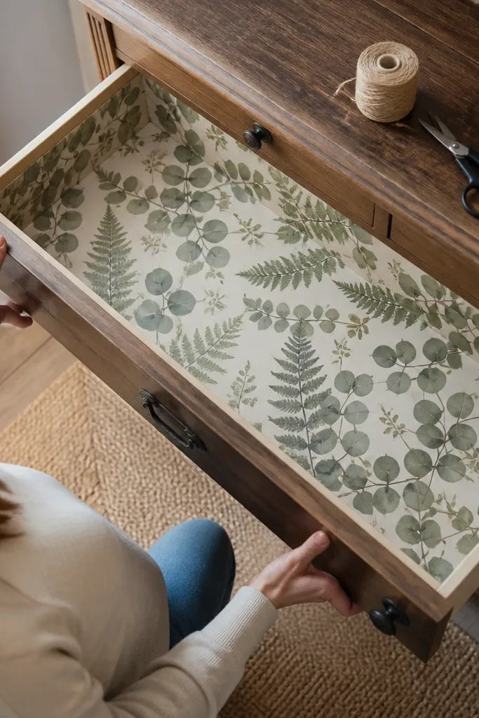
Measure your drawer liner surface and add 1/2 inch to your length for overlap and trimming. Print on 65-80 lb cardstock or thicker paper so it doesn’t buckle when it meets moisture. If your printable has white margins, trim them off carefully so the liner doesn’t show a bright border. Lay the liner down dry first, then apply a light coat of spray adhesive or a thin layer of decoupage medium to the drawer surface. Press with a brayer, let it set, and trim edges with a sharp blade.
Botanical strip printables are the right move for drawer liners because the pattern repeats visually and forgivingly. The mistake people make is choosing a single centered botanical image and then trying to stretch it across a drawer. A strip format keeps the design consistent, so seams don’t look like accidents. This also works well for lining small shelves, cabinet doors, and even jewelry boxes where you want a soft vintage feel. You’re dealing with measurement work more than craft work, so it’s straightforward if you plan your cuts.
Skip thisDon’t use glossy photo paper; the shine makes botanical aging look fake.
Editor's noteDo a quick test print at 25% scale to confirm the pattern repeat matches your drawer length before you waste a full sheet.
4. Vintage Recipe Card Set for Framing or Clipboards
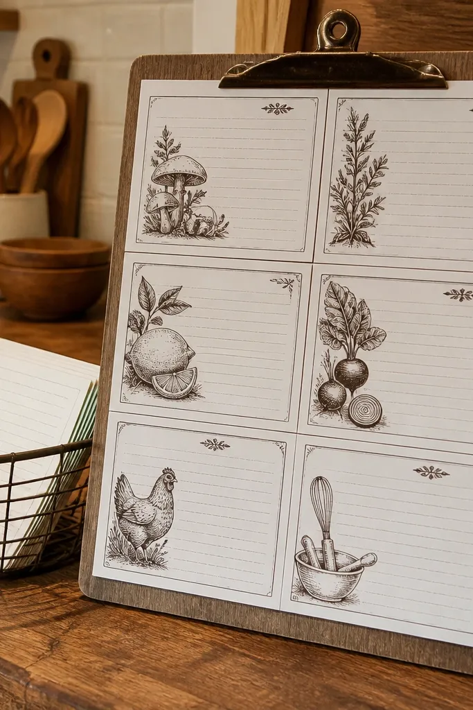
Pick one card size and keep it consistent across the set so frames don’t look mismatched. Print on 80-110 lb cardstock for sturdiness, then trim with a paper trimmer for straight edges. If the cards include bleed, print at 100% scale and use a printer setting like “no scaling” or “actual size.” Mount with archival photo corners or a thin mat so the card doesn’t sit right on the glass. Seal with a matte spray only if you’re not using glass — otherwise, framing already protects the paper.
Recipe card printables are a clean way to get vintage paper that reads as “real” even from across the room. The best sets have consistent card sizes and matching typography so you can mix and match without odd alignment. They also look great when you frame them because the grid structure hides small print imperfections. This project is beginner-friendly if you stick to one card size. It fits kitchens, coffee bars, and spaces where you want a story without clutter.
Skip thisDon’t crop the card to remove margins — recipe text usually sits too close to the edge in many files.
Editor's noteUse a mat with a 1 to 1.5 inch opening so the distressed edges have room to breathe.
5. Old Map Compass Rose for Labels and Jar Covers

Print label-sized portions at 100% scale and test one jar first — measure the jar diameter and add a 1/8 inch overlap for closure. Use matte sticker paper if you want easy application, or print on cardstock and glue to the jar with Mod Podge. Cut label shapes with a craft knife or circle cutter for clean edges. Seal with a thin matte topcoat so the ink doesn’t smear if you wipe the jar. If you’re making wrap-around jar covers, overlap by 1/4 inch and press the seam flat.
A compass rose map print is ideal for small labels and jar covers because it gives you a focal point that stays readable when you shrink it. The common failure is picking a huge map image and then printing it tiny — the text turns into gray noise. Choose a printable that’s designed as label-sized artwork or has clear focal elements. This project is perfect for pantry jars, bathroom apothecary containers, and desk organizers. It’s quick too — once you have the file, you’re cutting circles or rectangles and sealing.
Skip thisDon’t print a full map and rely on “shrink to fit” — it kills the readability of the compass details.
Editor's noteFor crisp compass lines, use a matte paper and avoid high-speed draft printing settings.
6. Damaged Book Page With Typographic Blocks
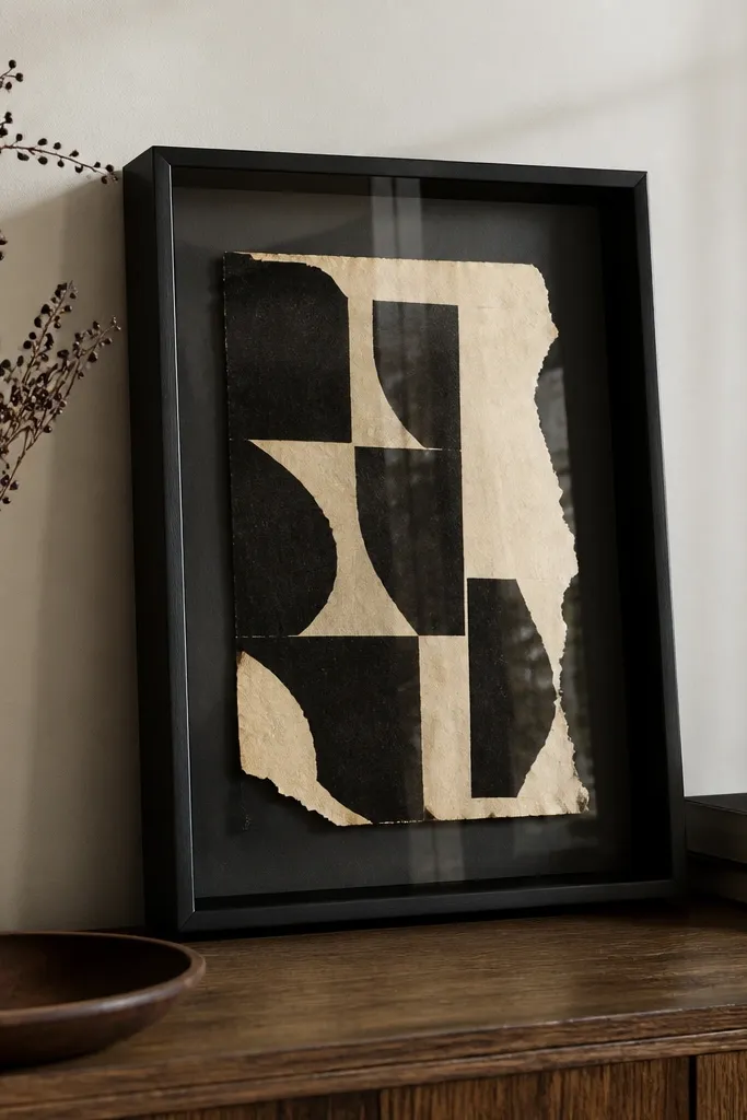
Print on 65-80 lb paper so the torn edges don’t look too stiff. Trim using a craft knife and a ruler for straight sections, then use scissors only on the curved or torn areas. Dry-fit the page in your shadow box so you see how the glass or backing changes contrast. Apply adhesive to the backing only, not the whole front, to reduce warping. Seal with matte spray if it’s a shadow box without glass, or keep it unsealed if it’s under glass for best color stability.
Typographic book pages look the most believable when the design includes negative space and torn-edge cues. If your printable is only distressed background without strong typographic blocks, it can look like a blurry photocopy under framing glass. This one is great for mixed media decor, like covering a small shadow box or making a collage backdrop for a shelf. It also layers well with plain cardstock cutouts. Skill level is medium because you’ll be trimming irregular edges and aligning blocks. Great for craft rooms, reading nooks, and anywhere you want “found paper” energy.
Skip thisAvoid gluing the front flat against a rigid board if the paper curls — it will show waves through the glass.
Editor's noteIf distress looks too dark, reduce print darkness settings one notch before you print the final sheet.
7. French Ephemera Ornate Frame Set for Prints
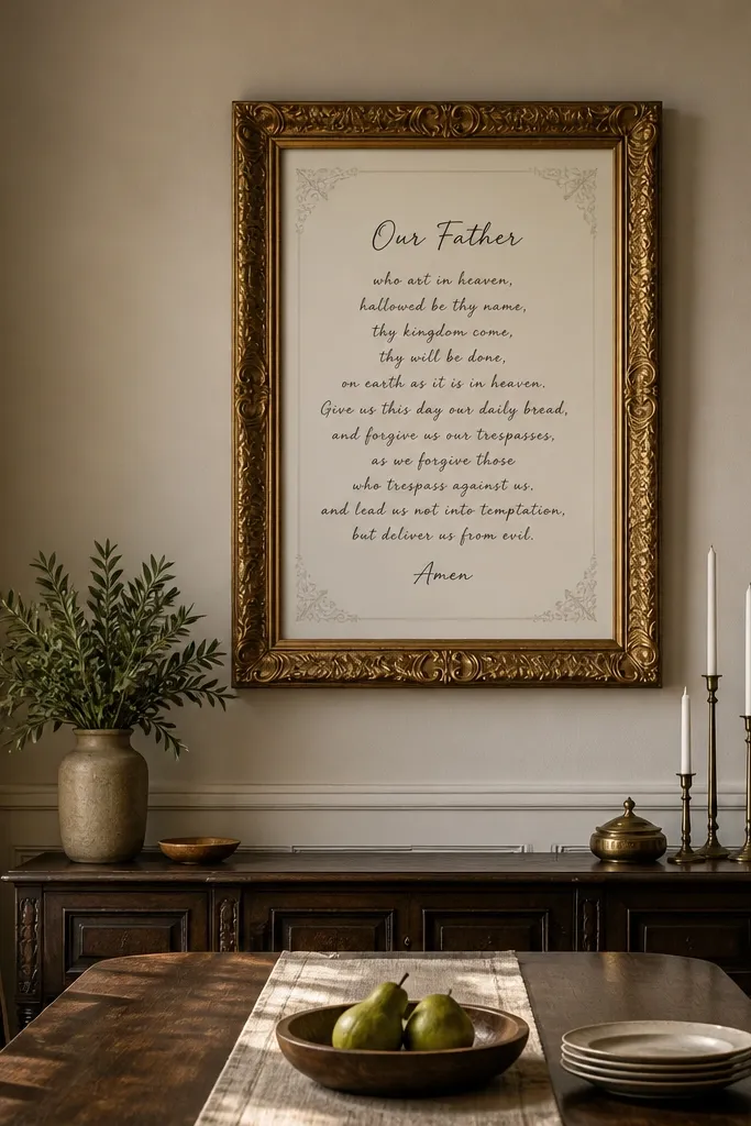
Choose a frame size that matches the printable’s intended print size so you’re not stretching the artwork. Print on 110 lb cardstock with “actual size” enabled. Trim just outside the frame inner border, leaving a hairline margin so the frame design doesn’t get cut off. Mount to a backing board with photo corners so the paper stays flat. If the frame has an outer decorative edge, use a mat to prevent the paper from touching the glass.
Ornate frame print sets are a trap when the inner text is too small, but they’re fantastic when the file is built for framing. The trick is to choose a printable where the frame lines have enough thickness to survive resizing and where the inner script still reads. This works best for single-piece frames, not tiny gallery cards. It suits entryways and mantel displays where you want a polished vintage look without going full baroque. Skill level is easy: print, trim, and mount.
Skip thisDon’t trim to the exact outer edge if the file bleeds — you’ll cut into frame lines.
Editor's noteUse a matte backing board behind the print — it reduces contrast glare on ornate lines.
8. Vintage Postcard Series for Leaning Shelf Displays
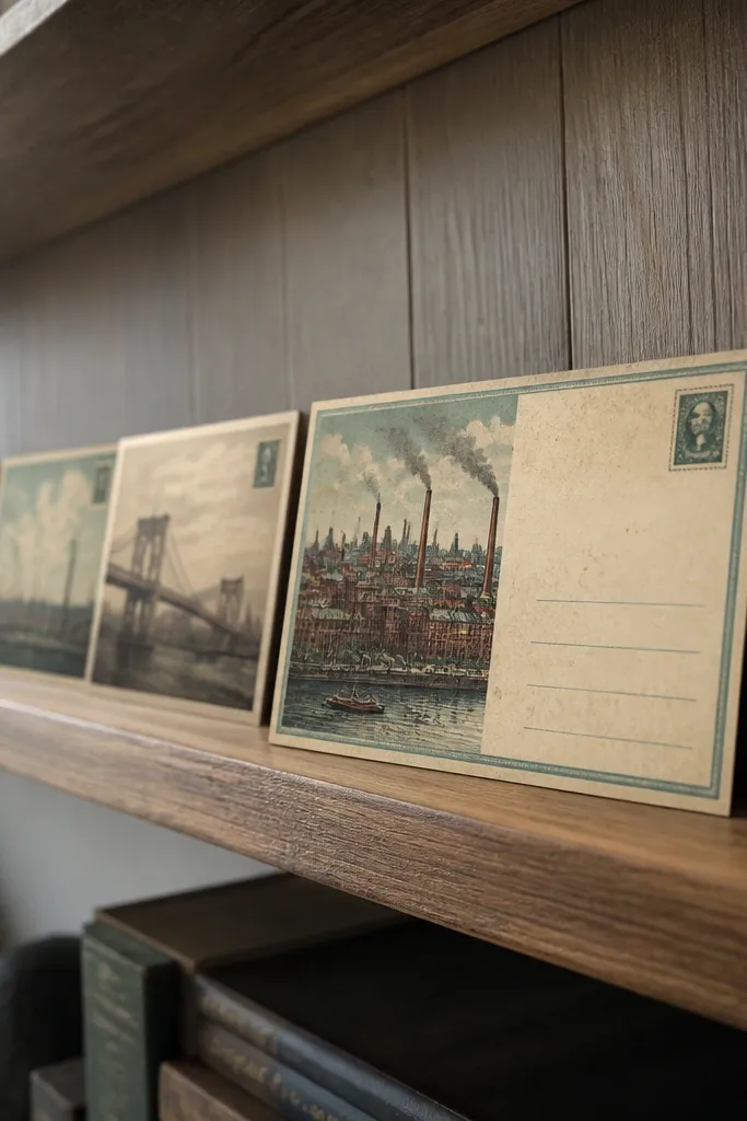
Print postcards on 80-110 lb cardstock for stiffness so they don’t curl when leaned. Trim with a trimmer to keep the top and bottom edges straight — crooked cards look sloppy fast. If the file includes a stamp and address box, keep those elements intact by trimming only the outer border area. Add a clear corner tab or tape on the back only so the front stays flat. For extra protection, spray with a matte fixative if you plan to handle them often.
Postcard printables are perfect for leaning displays because you get a natural border and built-in “message” area. The best series has matching postcard sizes and consistent stamp placement, so they look like a set even when you mix designs. This is one of the easiest ways to get vintage paper decor without decoupage mess. It’s beginner-friendly — mostly printing and trimming. It fits shelves, coffee tables, and desk styling where you want small bursts of character.
Skip thisAvoid cheap thin paper; postcards need body or they curl at the edges.
Editor's noteLean postcards against a book spine or a binder clip — it keeps them from sliding and wrinkling over time.
9. Vintage Sheet Music Page for Table Number Cards
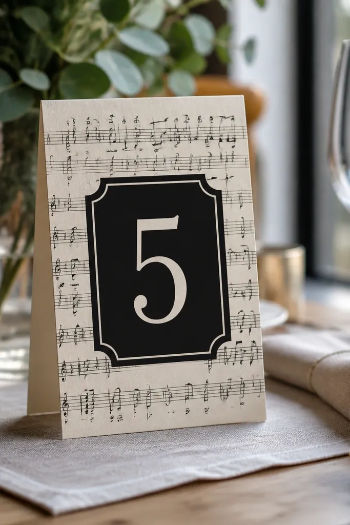
Print on 80 lb cardstock so the staff lines don’t blur. Trim to your final card size with a consistent border so the music pattern frames the center. Add your table number with a separate label layer or handwritten-style marker — keep it dark brown or black so it pops against the sepia. If you’re writing directly, use pigment ink so it doesn’t smear when you seal. Seal lightly with matte spray after the ink dries completely.
Sheet music printables look classy on small cards because staff lines give a built-in structure that reads as vintage instantly. The mistake is using a full-page music sheet as a background without checking contrast — the notes can get too faint once you add your own number or name. This printable is ideal for table numbers, labels, and small place cards where you want pattern without clutter. It’s medium effort because you’ll be layering text on top or adding a number overlay. Works in dining rooms, events, and craft projects.
Skip thisDon’t print sheet music on glossy photo paper — the glare kills the vintage effect.
Editor's noteUse a dark brown marker instead of pure black; it matches aged paper better and looks less harsh.
10. Victorian Ornate Border Strip for Bookmarks
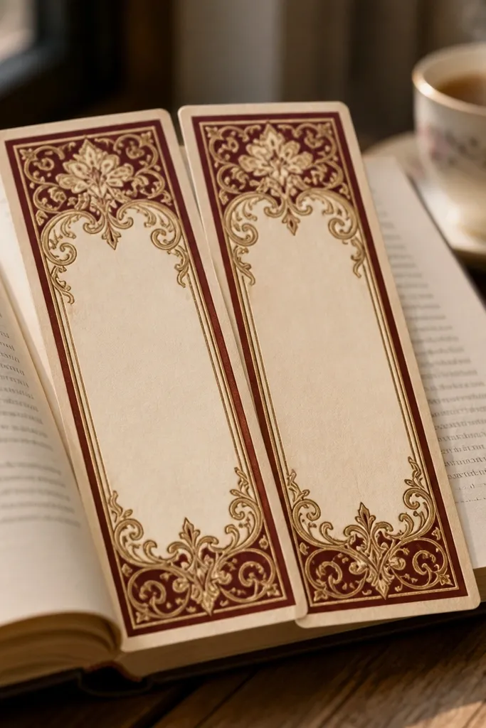
Print on 110 lb cardstock so bookmarks don’t bend after a few weeks of use. Trim to a narrow rectangle, then round the corners lightly with a corner rounder. Cut a small notch or banner shape at the top only if the design already includes that cue. Seal with a thin matte laminate sheet or matte spray to protect the flourishes. If you’re using a hole, punch it after sealing so the ink doesn’t flake at the edges.
Border strips are the right choice for bookmarks because you don’t need full-page detail to look good — you need clean edges and a strong top and bottom design. The best printables have borders that don’t rely on super-thin lines, because thin lines disappear when you trim. This project is fast and feels satisfying because each bookmark is a small win. It’s beginner-friendly if you have a trimmer and a steady hand. Great for book clubs, gifts, and stocking stuffers.
Skip thisAvoid trimming through the border’s thin inner lines — leave a 1/16 inch safety margin.
Editor's noteLaminate is cleaner than spray for bookmarks because it resists smudging from fingers.
11. Vintage Receipt Tear-Off Style for Mini Notepads
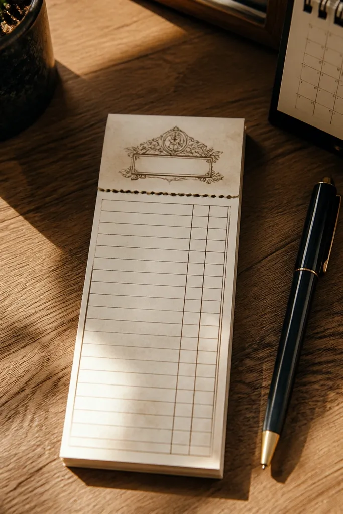
Print your receipt sheet on 110 lb cardstock or thicker paper. Cut it into notepad-size rectangles and keep the tear line orientation consistent across all pieces. If you’re binding as a small stack, glue the spine edge with a thin layer of PVA glue and clamp until dry. Cover the front with a matching cardstock strip if your printable is only printed on one side. For a cleaner look, punch two holes and use a waxed thread binding.
Receipt tear-off printables work because they look functional, even when you’re turning them into decor. The key is choosing a file with a realistic tear line and perforation cues — otherwise it looks like a generic “receipt graphic.” Mini notepads also hide small print flaws because you’re using the top section and leaving the rest for writing. This is medium effort because you’re assembling a pad, but the printable part is simple. It fits desks, kitchens, and any place you want “useful vintage” instead of plain wall art.
Skip thisDon’t skip clamping; un-clamped stacks bow and the pages stop tearing cleanly.
Editor's noteUse a metal ruler when cutting the tear line — uneven cuts make the perforation look fake.
12. Grunge Paper Background Set for Coasters
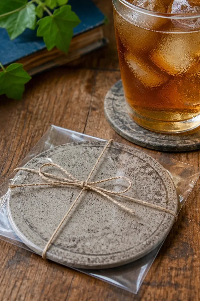
Print on 80-110 lb paper and cut circles using a compass cutter or a template. Seal the paper cut with one thin coat of matte decoupage medium before you attach it — this prevents bubbling from later glue. Glue onto cork or a coaster base with even coverage, then smooth edges with a brayer. After it dries, add two more top coats so the coaster surface stays wipeable. Let the final coat cure for at least 24 hours before heavy use.
Grunge paper backgrounds are made for coasters because the design already reads as texture, not illustration. A mistake people make is printing grunge on paper that’s too smooth — the distress pattern looks like colored noise instead of physical wear. Coasters also let you control the finish: you can seal hard and keep the surface from soaking up spills. Skill level is beginner-friendly if you’re using pre-cut circles or a circle template. Great for coffee tables, kitchens, and gift sets.
Skip thisAvoid water-based glue directly on dry paper without sealing first — it can warp the circle.
Editor's noteIf your grunge looks blotchy, reduce printer contrast by one step rather than changing the file size.
13. Old Frame Label Sheet for Closet Organization
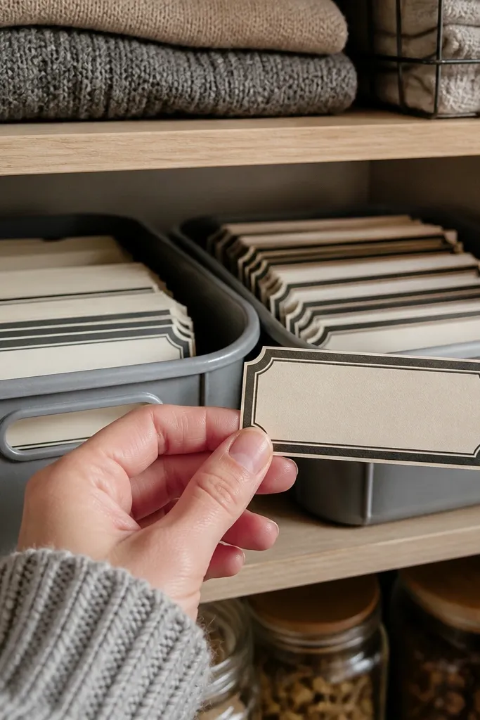
Measure the label area on your bin or container and print at 100% scale so the frame fits the space. Print on matte label paper if you want peel-and-stick, or on cardstock if you’re gluing. Cut each label with a sharp blade — don’t use scissors for small text frames. If gluing, apply adhesive to the back only and press firmly for 30 seconds. Seal with a thin matte clear coat if you’re placing labels in a high-touch area like a closet handle zone.
Vintage label sheets are the most practical use of printable paper decor because they solve a real problem: messy storage that looks chaotic. The best printables have consistent label spacing and built-in frame borders so your cuts don’t look jagged. This works for closet bins, pantry shelves, and drawer categories where you want order without modern fonts. It’s easy, but only if you get the label size right the first time. Great for anyone who wants vintage styling that still functions.
Skip thisAvoid centering labels on the bin if the frame has an asymmetrical edge design — it looks off.
Editor's notePrint one label on scrap paper first and hold it up next to the bin — scale errors show immediately.
14. Vintage Letterhead Page for Desk Backdrops
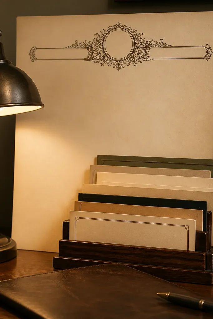
Trim the letterhead to a working rectangle that matches your tray or photo size — keep the logo/header area in the top third. Print on 80-110 lb paper so the lines stay crisp. Mount it to a backing board with a thin layer of adhesive, then seal the top with one coat of matte medium. If you want a softer look, lightly sand the sealed surface after it dries with very fine sandpaper. Finish with a second coat so dust doesn’t catch on the paper texture.
Letterhead printables are a smart pick for desk backdrops because they look like something you’d actually file, not decoration pasted on. The mistake is treating letterhead like a single poster — you end up with giant empty space and a header that feels too high. Letterhead designs work when you crop and place them intentionally, usually with the header near the top third. This is medium effort because you need to cut and mount neatly. It fits planners, photo backdrops, and desk trays where you want a calm vintage tone.
Editor's noteIf your letterhead looks too dark, lower printer settings for “darkness” instead of using a different paper.
15. Crumpled Paper Collage Sheet for Side Tables

Crumpled collage sheets are for when you want texture-led decor, like covering a side table top with a layered paper look. The reason this works is that the design already has depth cues, so minor misalignment and small bubbles don’t look like mistakes. People choose these sheets and then print them too small, losing the scale of the crumple shadows. If you get the size right, the final piece reads as dimensional even though it’s flat paper. This project is medium to advanced because it involves sealing and smoothing over a larger area. It suits side tables, trays, and cabinet panels where you want texture without painting.
Print on 65-80 lb paper for flexibility and trim the collage shapes with a 1/8 inch margin around key edges. Apply a thin layer of decoupage medium to the surface, then place pieces starting with the largest shapes. Smooth each section with a brayer, working from the center outward to push out air. Let it dry, then add a heavier top coat to lock the texture in place. Sand very lightly between coats only if you see sharp ridges, then seal again.
Use a heat tool on low for 10-20 seconds per area to relax tiny bubbles before the medium sets.
Avoid thick cardstock for large collage — it bridges and creates visible seams when sealed.



