
1. Soft Library Edges (Tea + Dry Brushing)
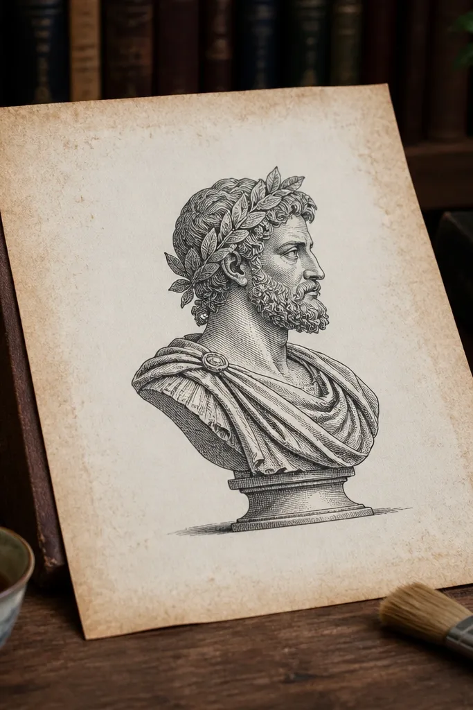
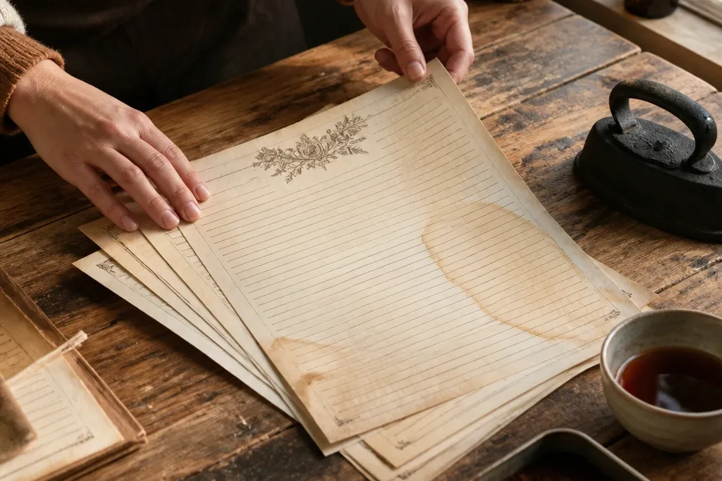
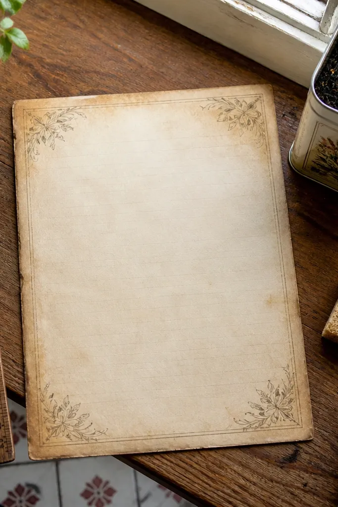
This look reads instantly vintage because the aging sits where it naturally happens: around the edges. Tea gives a warm, slightly brown tone that fades toward the middle, so your printed lines stay readable. The dry-brush part matters; it adds a whisper of texture without turning the page into a wrinkled mess. Skill level is beginner-friendly, and the result is perfect for journal pages where you still want crisp handwriting space.
Mix black tea with hot water until it looks like weak iced tea, then let it cool. Lightly dip a foam brush or makeup sponge, wipe off excess on a paper towel, and paint only the outer 1/2 inch around the sheet. After it dries 10-15 minutes, use a dry, stiff paintbrush with a tiny bit of leftover tea to flick color lightly into the corner edges. Finish by pressing the sheet under a thick book for 20 minutes to flatten it.
If your ink smears, reduce tea intensity and use a damp sponge instead of soaking.
Don’t flood the paper; soaking turns the center gray and smears printed details.
2. Coffee Bloom Corners (Spot Stain + Heat Set)
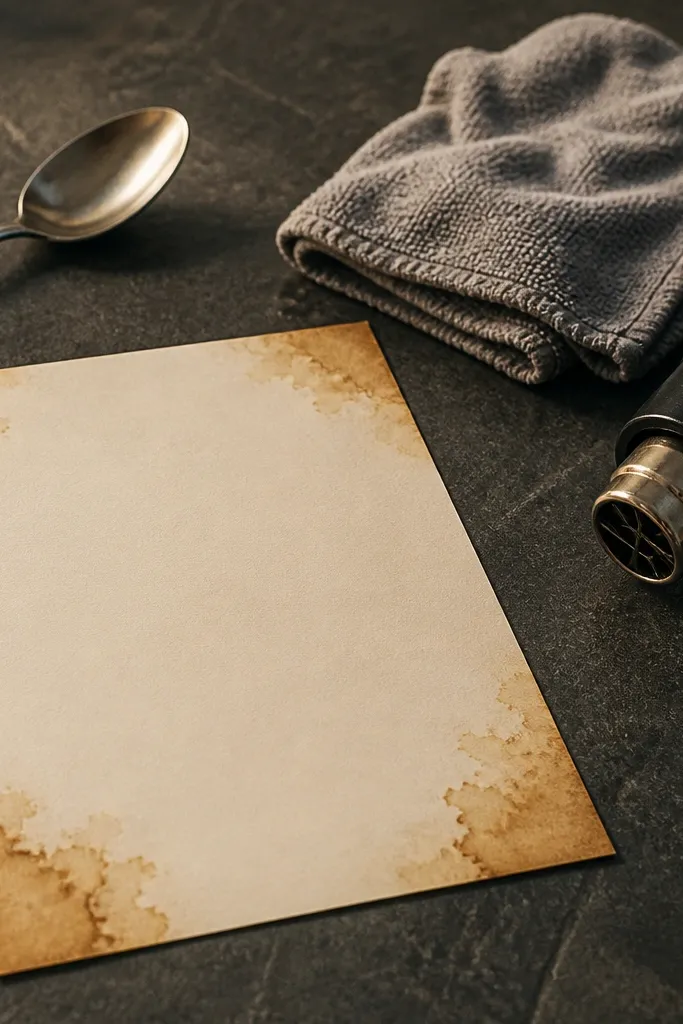
Brew strong coffee (more grounds than usual), cool it, and pour a small amount into a shallow dish. Dip a cotton swab and touch it to each corner edge, then lift — don’t swipe across the page. Let the halos grow for 2-3 minutes, then dry the sheet fully with a fan for 10 minutes. Use a hair dryer on low heat from 12-15 inches away for 30-60 seconds to set the color, then press under a book.
Coffee blooms create that “handled for years” effect because the stain spreads outward in irregular halos. You get high visual payoff without covering the whole page, which keeps text areas usable. Warm sepia tones also play nicely with most vintage journal print designs. This is a great option when you want the paper to look aged but not destroyed.
Skip thisDon’t use boiling coffee; it can curl the paper and make harsh rings.
Editor's noteUse cotton swabs for control; foam applicators spread too much on corners.
3. Salt Speckle Patina (Crackle Without Full Wrinkles)
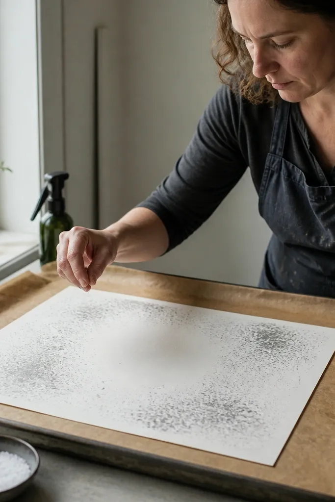
Lightly mist the sheet with plain water using a spray bottle until it looks damp but not shiny. Sprinkle coarse salt in small pinches across the surface, focusing on the center and corners, then wait 5-8 minutes. When the paper is dry to the touch, brush off salt gently with a dry makeup brush. Apply a thin wash of diluted tea or coffee over the speckled areas using a sponge, then dry fully and press.
Salt makes those tiny speckled spots that look like old paper fibers and light oxidation. It adds texture you can’t get from edge staining alone, so the sheet looks more dimensional in photos. The trick is using salt on only slightly damp areas so you get speckles instead of big tide marks. This works beautifully for map-style backgrounds and collage layers.
Skip thisDon’t soak the paper before salting; it turns speckles into blotches.
Editor's noteCoarse salt gives bigger, more visible speckles than table salt.
4. Ink-Shadow Aging (Faux Pen Wear)
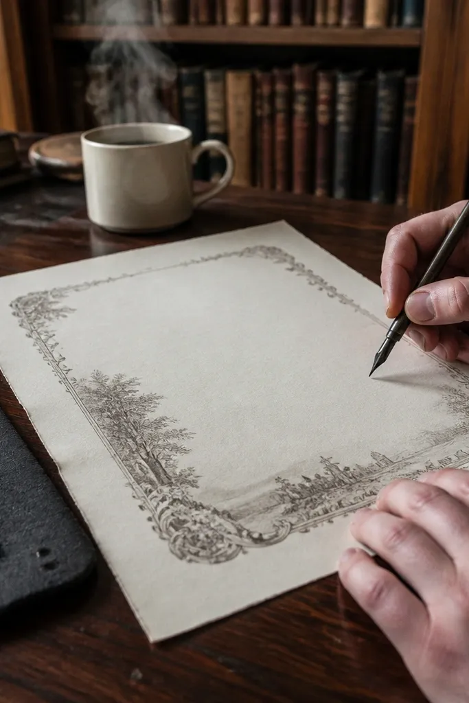
Dilute a sepia or gray ink (or watered-down black ink) so it’s translucent. Using a small makeup sponge or fingertip, dab ink lightly along the outer edges and a few spots where you expect wear, like near headings. Use a damp cotton swab to blur edges immediately so it stays soft, then let it dry completely. If you want more depth, repeat once with lighter pressure instead of adding more ink at the start.
This look sells the idea of a journal that lived in someone’s hands. You’re not staining the whole page; you’re adding subtle ink shadows near the lines so the print feels like it’s been used, not just printed. Gray-brown tones look aged without muddying the design. It’s also one of the cleanest options for people who hate messy coffee stains.
Skip thisDon’t draw bold lines; hard ink marks look new and graphic.
Editor's noteMake a scrap test and match the ink strength so you don’t darken printed text.
5. Sun-Faded Look (Ink-Like Stain + No Heat)
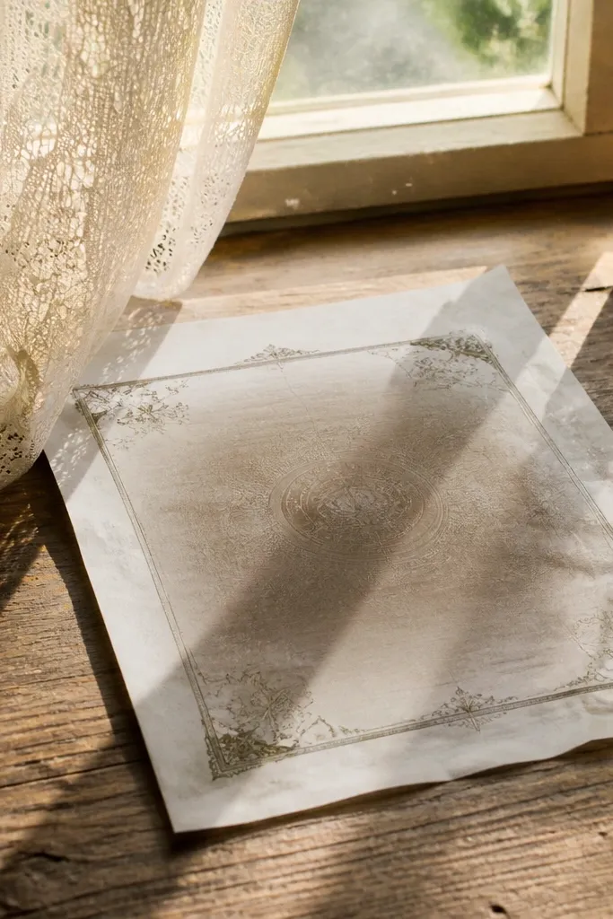
Mix diluted tea with a splash of water so it looks very light. Brush only in broad strokes from the edges toward the center, leaving intentional lighter bands. Let the sheet air dry without heat — heat can create hard edges that don’t look sun-worn. After full dry, lightly mist again in one direction only, then press flat to reduce any curl.
Sun-faded paper is believable because it has uneven lightness, not heavy stains. This method keeps the sheet mostly smooth and gives a gentle gradient that photographs well. Instead of browning everything, you fade it — which keeps decorative borders from looking too dark. It’s ideal for journal pages that need to stay pretty and readable.
Skip thisDon’t use a strong tea mix; it turns into a uniform brown wash.
Editor's noteLeave one “clean strip” uncolored so the fade reads natural.
6. Trunk Found Sepia (Strong Coffee + Full Drying)
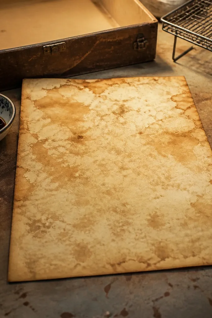
Brew strong coffee and cool it to room temperature. Sponge the coffee across the whole sheet in thin layers, keeping the outer 3/4 inch darker than the center. Let it dry fully on a rack or clean surface, then check color. If it’s too light, repeat one more thin layer; if it’s too dark, you can tone down by lightly dabbing with a barely damp cloth.
If you want that “found in a box” vibe, go stronger and cover more of the sheet. This look creates mottling that makes the paper feel older than it is, especially with vintage print frames and borders. It’s more forgiving than you think because the mottling hides small print misalignments. Use this for ephemera backgrounds and journaling pages where you don’t need super crisp contrast.
Skip thisDon’t heat-dry repeatedly while it’s still wet; you’ll get scorch spots.
Editor's noteDry on a rack so the sheet doesn’t stick and create uneven puddle marks.
7. Edge Burnish + Tea (Faux Wear Spots)
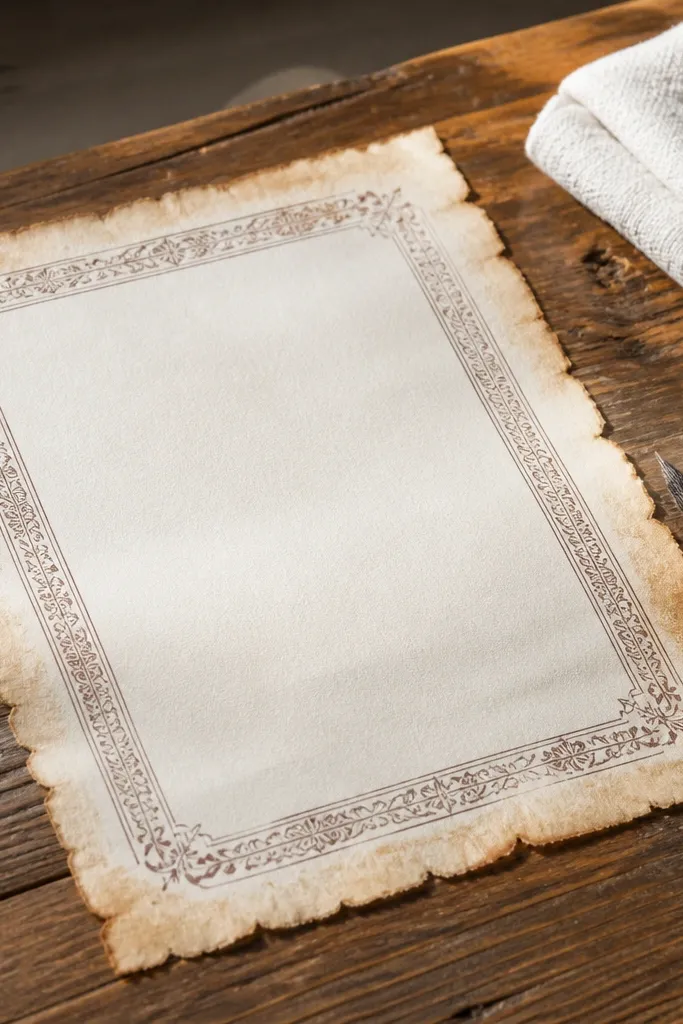
Brew a medium tea batch and cool it. Lightly sponge tea on the outer 1/4 to 1/2 inch of the sheet, then let it dry until tacky. Buff the edges with a dry soft cloth using gentle pressure to burnish the fibers. Add two or three tiny wear spots by tapping a cotton swab with tea onto corners, then press under a book to flatten.
This look mimics worn paper edges from storage and handling. Burnishing creates a subtle sheen where fibers compress, while tea adds the color. It’s great when your printable has fine borders and you want the aging to frame them, not drown them. The result is photogenic because the edge texture catches light.
Skip thisDon’t rub hard on wet paper; it smears ink and tears fibers.
Editor's noteUse a white eraser to gently rub edges after drying for a cleaner burnish.
8. Washi Tape Resist Aging (Crisp Shapes)
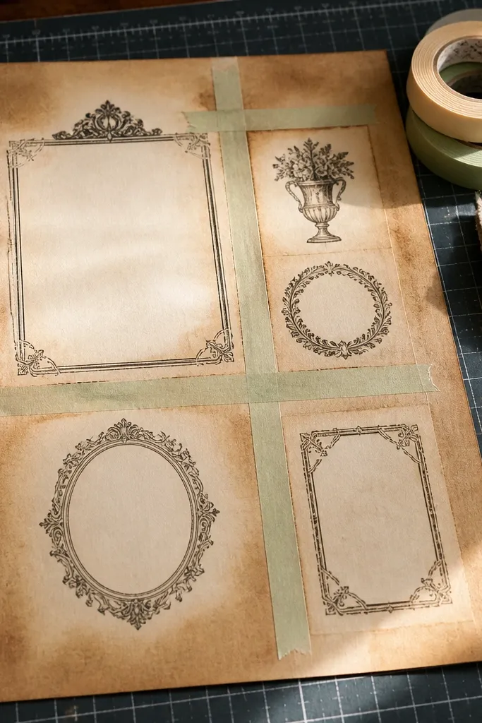
Resist aging is how you get graphic vintage — clean lines inside worn paper. Washi tape keeps areas lighter, so your printable designs look intentional instead of accidentally stained. It’s perfect for planners and journal pages where you want labels, frames, or “window” shapes. The look is also super photogenic because the contrast is clear.
Cut strips of washi tape and place them on the areas you want to stay lighter, like between border sections or around a central label block. Apply diluted coffee or tea with a sponge over the entire sheet, making sure you cover tape edges without soaking. Let it dry, then remove tape slowly while the paper is fully dry. If you want extra age, add a light edge wash after tape removal and press flat.
Use low-tack tape so it doesn’t lift printed ink when removed.
Don’t remove tape while the paper is wet; it pulls ink and fibers.
9. Gesso Tint + Tea Vignette (Matte Museum Look)
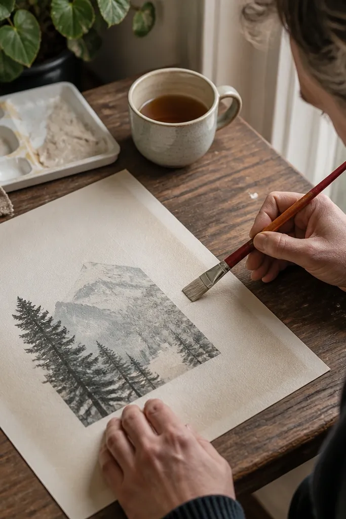
Mix a small amount of gesso with water until it’s the consistency of heavy cream. Brush a very thin layer over the sheet, focusing on the background, and let it dry completely. Then sponge diluted tea only around the edges to form a vignette. After the tea dries, press the sheet under books to keep it flat and smooth.
This method gives the paper a matte, museum-like finish that hides print harshness. A thin gesso tint knocks down bright white, while tea creates a gentle vignette. It’s ideal if your printable comes out too stark on the page and you want it to look like it has always been there. The chalky finish also reduces glare in photos.
Skip thisDon’t skip drying time; layering tea over wet gesso creates streaks.
Editor's noteUse a light touch with gesso — too much makes text look fuzzy.
10. Distressed Edge Scuffing + Ink Wash
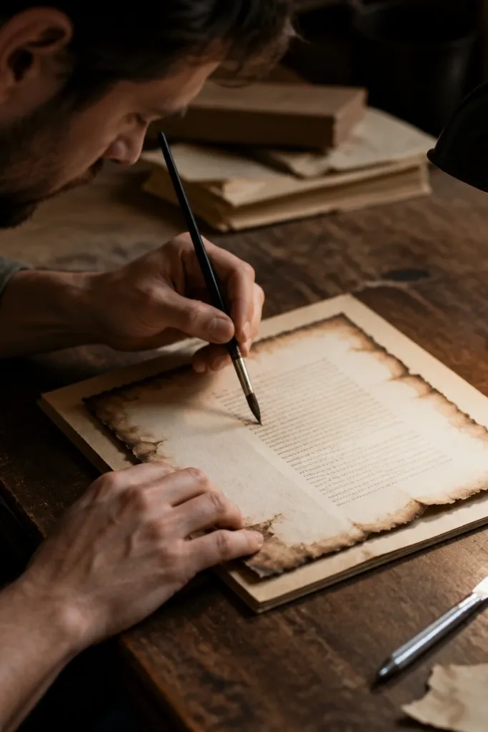
Use fine-grit sandpaper or a nail file to gently scuff the outer edge in small passes, especially at corners. Wipe off dust with a dry cloth. Apply a diluted sepia or gray ink wash around the edge with a sponge, then feather inward slightly. Let it dry, then repeat one more light edge wash if you want more contrast.
Scuffing edges makes the paper look physically old, not just color-aged. Combine that with a thin ink wash and you get both texture and tone. This is the best approach for journal papers that will be torn, layered, or taped down because the edges look believable. It’s also controllable — you can keep the center clean.
Skip thisDon’t scuff the center; wear should frame the design, not destroy it.
Editor's noteAngle the paper while scuffing so you don’t create a uniform “machine” look.
11. Crayon Wax Resist (Smudged Highlight Aging)
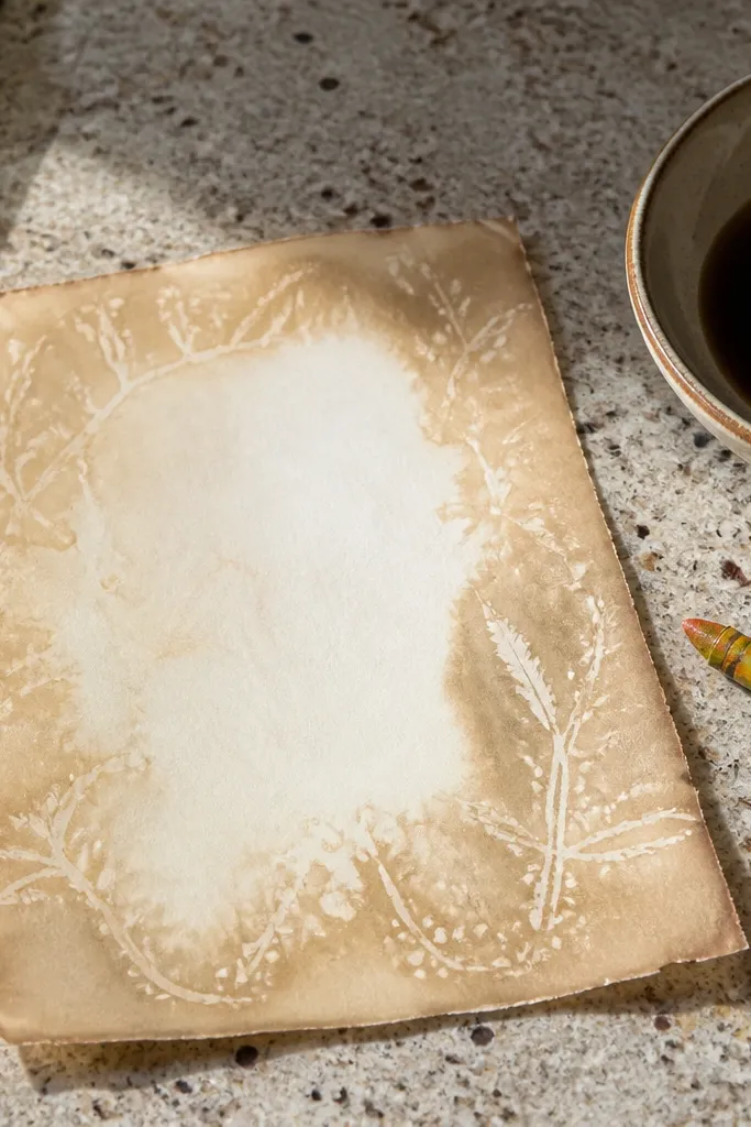
Use a beige or light brown crayon and lightly rub it over small areas you want to stay lighter, like tiny swirls in the corners or along border edges. Apply diluted coffee or tea over the whole sheet with a sponge, letting it pool slightly at edges. Let it dry fully, then gently buff the waxy areas with a dry cloth to soften the contrast. If you want more depth, add a second light tea wash only around the perimeter.
Wax resist gives you that soft, uneven highlight where older paper shows through. The crayon marks repel stains, so you get interesting light shapes without painting. This is especially good for ornate borders because the contrast makes them pop while still feeling old. It takes a little patience, but the look is really photogenic.
Skip thisDon’t press hard with the crayon; deep grooves show as harsh lines after staining.
Editor's noteRub in short strokes so the wax pattern looks organic, not scribbly.
12. Matte Acrylic Wash + Ink Drips (Controlled Drip Wear)
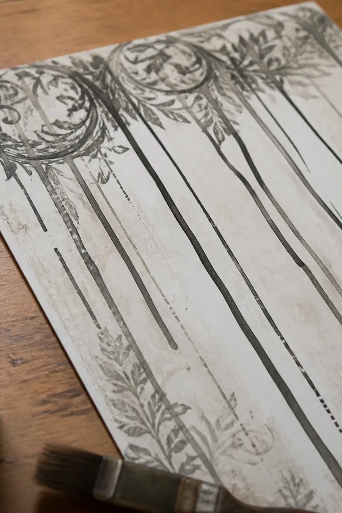
Paint a very thin matte acrylic wash (diluted with water) across the page, keeping it lighter in the center. While it’s drying but still slightly tacky, load a brush with diluted sepia ink and touch it near the top edge so gravity pulls a couple of lines down. Tilt the sheet slightly to guide drip direction, then set it flat. Once dry, sponge a darker wash around the edges and press to flatten.
Drips add drama, but they need control to look vintage instead of accidental. A matte acrylic wash tones the paper evenly, then ink drips create vertical streaks like old overflow. This is a great pick for printable pages meant to look like aged letters. The matte finish also helps your print look more like paper than digital output.
Skip thisDon’t drip on fully wet paper; the ink will spread into blobs.
Editor's noteUse a small brush and wipe it often; too much ink makes thick, modern-looking trails.
13. Gum Arabic Fading (Glossy to Aged Transition)
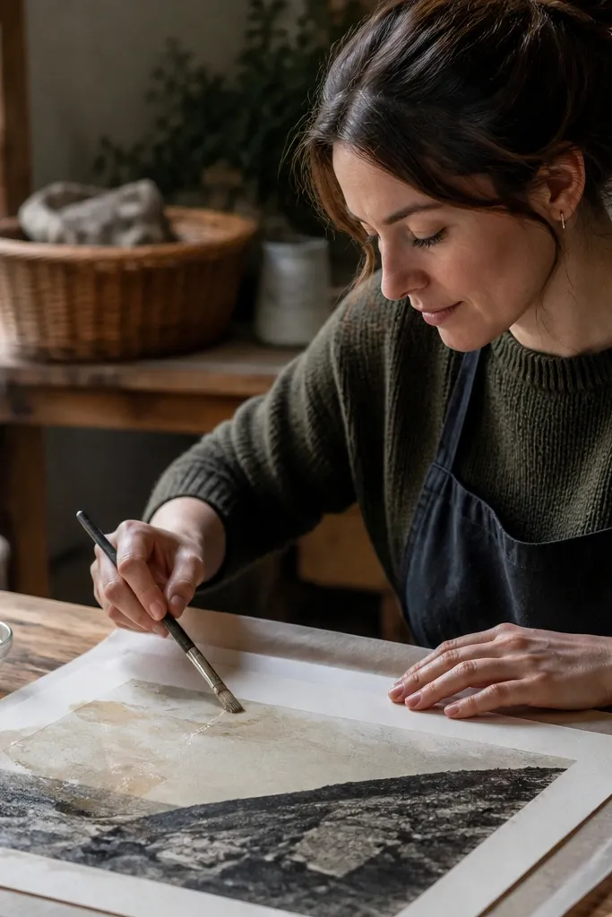
Gum arabic changes how the paper takes on color. You get a subtle shift from slightly glossy wet patches to a more aged, blended surface when it dries. This is a good option for people who want color to look integrated instead of sitting on top like a stain. It also helps prints look less stark because it slightly softens contrast.
Mix gum arabic with water to a thin brushing consistency. Brush a thin layer in a loose pattern across the sheet, mostly around the borders and corners. Let it dry until it’s no longer tacky. Then sponge diluted tea lightly over the whole page; the gum areas take color differently, creating blended vintage fading.
Apply gum arabic thin — heavy coats can make the paper too stiff.
Don’t layer too many gum coats; it turns patchy and feels plasticky.
14. Ink Spritz + Edge Tea (Speckled Atmosphere)
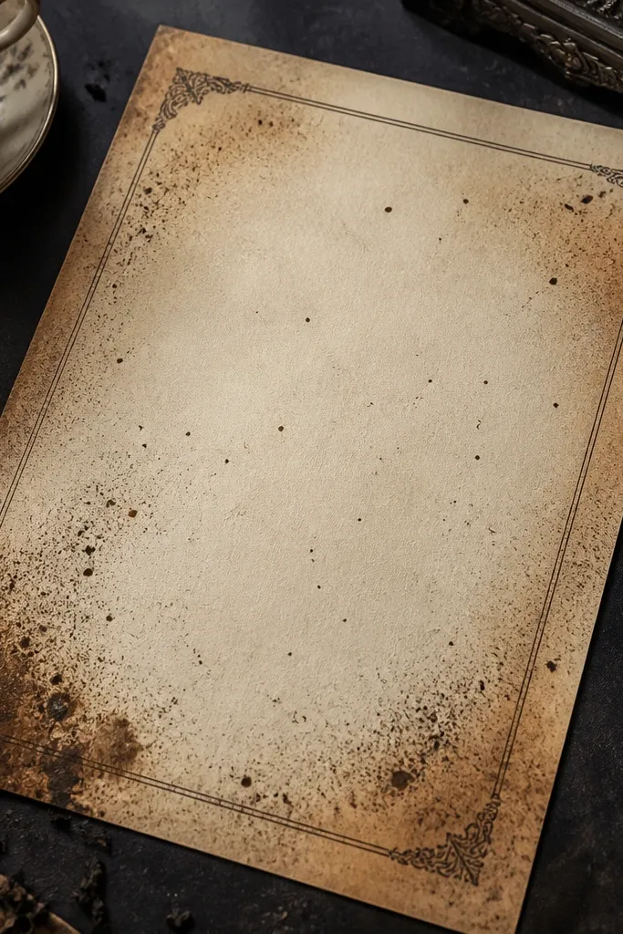
Dilute a sepia ink or black ink until it’s light gray-brown. Load it into a small spray bottle and spritz from 10-14 inches away across the sheet in a few passes. Let it dry completely. Then sponge diluted tea only around the perimeter and feather inward slightly, and press flat after drying.
Fine speckles add atmosphere without wrecking readability. This method gives you that airy, dusty look you see on old documents, especially behind headings and decorative frames. The tea edge keeps it grounded so the speckles don’t look like random mess. It’s a strong choice for journal pages that need to feel aged but still crisp enough to write on.
Skip thisDon’t spray too close; droplets pool and create dark spots.
Editor's noteSpritz in short bursts; one long spray makes heavy blotches.
15. Paper Tea Stain + Wax Seal Circle (Antique Label Look)
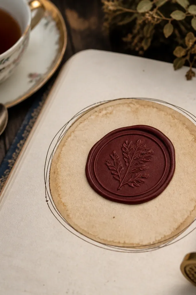
Cut a circle of thin freezer paper or use a wax seal stamp as a resist guide (you can also use a round sticker as a temporary resist). Place it on the print where you want the label circle to stay lighter. Sponge diluted tea around the entire sheet, darker at the edges. Let it dry fully, then remove the resist carefully and press the sheet.
This is the cleanest way to make a page look like it has a “document label” moment. A lighter circle reads like a sealed or protected area, then the surrounding tea stain makes the label feel older. Your printable borders and headings look more intentional because the aging has a focal point. It’s great for journaling inserts, recipe cards, and letter-style pages.
Skip thisDon’t remove resist while the tea is wet; it tears the paper fibers.
Editor's noteUse freezer paper resist for crisp circles; stickers can leave adhesive ghosts.
16. Border-Only Distress (Masking for Clean Centers)
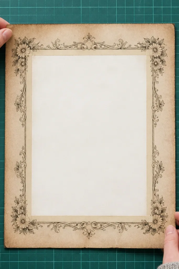
If your printable has a lot of text or a boxed writing area, border-only distress is the smartest aesthetic move. You get the vintage framing effect while keeping the center bright and usable. Masking also stops the common problem of smearing ink across important lines. This look is perfect for journal pages you plan to actually write in.
Apply painter’s tape or thin masking tape along the inside edge of your border, leaving only the border area exposed. Sponge diluted coffee or tea on the exposed border edges and corners, then dab lightly with a dry cloth to soften. Let it dry fully, then remove the tape slowly. Finish by pressing under a book to keep the page flat.
Use a hair dryer on low for 10-15 seconds after border staining to speed up tape removal.
Don’t skip masking; border aging bleeds into the writing zone and ruins legibility.
17. Burnt Paper Edge Look (Candle-Softened Color, No Holes)
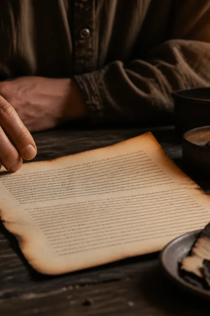
Hold the dry sheet at a safe distance from a candle flame, and lightly pass the edge near the heat to warm the fibers. Stop before any visible charring — you should see a gradual darkening, not black spots. Rotate the sheet and repeat on corners only. Then add a thin tea wash around the edges to blend the color and keep it from looking too harsh.
The burnt-edge look is the fastest way to make paper feel dramatic, but you have to do it carefully. You’re aiming for color darkening and slight edge curl, not actual holes. The result photographs like charred storage paper, especially with cream prints and dark ink outlines. This method takes more caution than tea, but the look is worth it for ephemera and layered backgrounds.
Skip thisDon’t hold the paper in one spot; that creates char holes and uneven black blobs.
Editor's noteWear heat-resistant gloves and keep a metal tray under your work surface.
18. Embossed Border Shadow (Dry Brushing + Raised Texture)
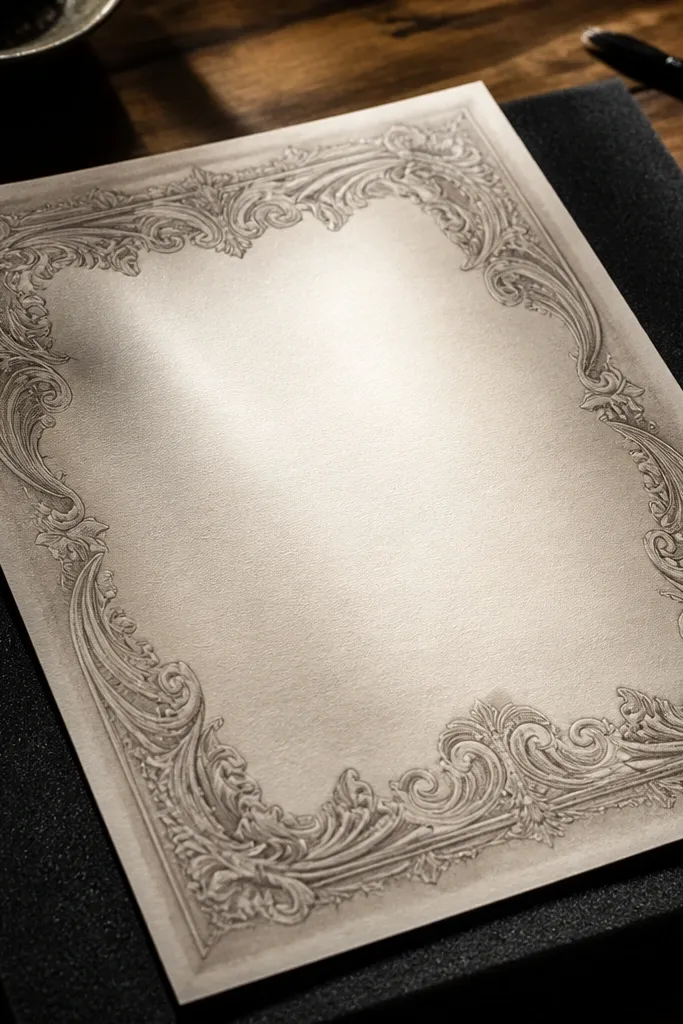
Use a dry stiff brush and a very light tea or sepia tint on the bristles. Brush across the border area so color lands mostly in the recesses, not on top of lines. After 2-3 passes, stop and let it dry. If the border still looks flat, add a second lighter pass only around the edges, then press flat.
If your Vintage Paper Printable has raised or embossed-looking borders, you can make them pop with shadow aging. Dry brushing color into the “high/low” areas makes the border feel physically older and more dimensional. It’s also a way to add age without soaking the paper, which protects ink and keeps print crisp. This is a strong pick for scrapbook pages, journal covers, and tuck spots.
Skip thisDon’t wet the brush; wet brushing flattens texture and smears ink.
Editor's noteTest on a scrap first; dry brushing strength changes fast from “perfect” to “muddy.”
19. Mica Dust + Tea Vignette (Glinting Vintage Paper)
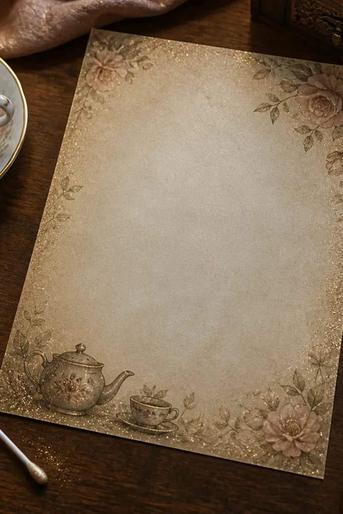
Brew diluted tea and sponge a thin edge vignette around the sheet. Let the tea dry fully. Tap a small amount of mica powder onto a dry makeup brush and lightly brush it only on raised border areas and corners. Seal with a very light matte fixative spray from a distance, then press the paper under a book.
This look is for people who want vintage paper that photographs with extra life. Mica dust adds a gentle glint, while tea provides the age tone so it still looks old, not craft-glam. The shimmer is subtle — concentrated near corners and border edges — so it looks like worn, light-catching fibers. It’s great for journal covers, bookmark inserts, and decorative backgrounds.
Skip thisDon’t dust mica on wet or tacky areas; it clumps into dark specks.
Editor's noteUse matte fixative, not gloss; gloss turns paper plastic-looking.
20. Accordion Fold Patina (Crease Aging Without Tears)
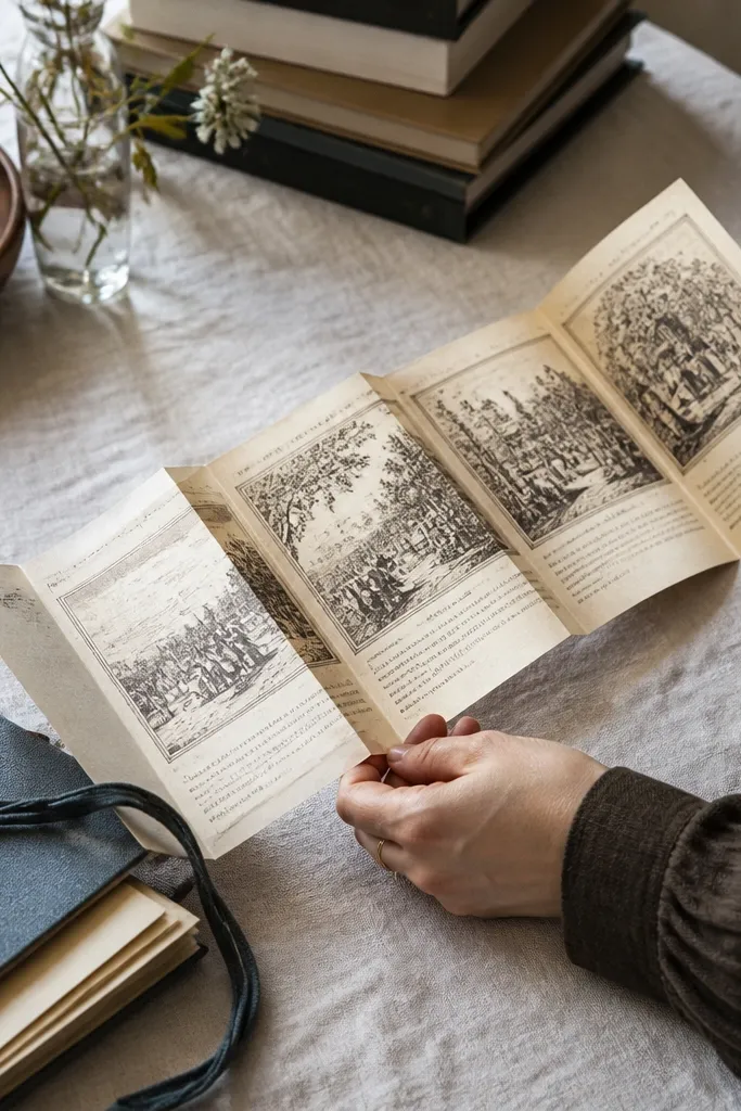
Lightly mist the paper with water just along where you want folds, then let it sit for 1-2 minutes so it’s pliable. Fold into accordion sections using a ruler to keep creases straight, then press firmly along each fold for 30 seconds. Unfold partially to check color, then sponge diluted tea lightly over the folds and edges. Dry fully, then press flat under a book for 30 minutes if you want it less curled.
Crease aging gives you a totally different vintage story than stains. It makes the paper look like it was folded, stored, and reopened, which gives natural highlights in the fold lines. This is ideal for paper that will be used as a pocket, tuck-in, or envelope insert. You get texture and visual interest even if your printable design is simple.
Skip thisDon’t force stiff paper into tight folds; it will crack along printed ink areas.
Editor's noteUse a bone folder or plastic card to sharpen creases without tearing.



