
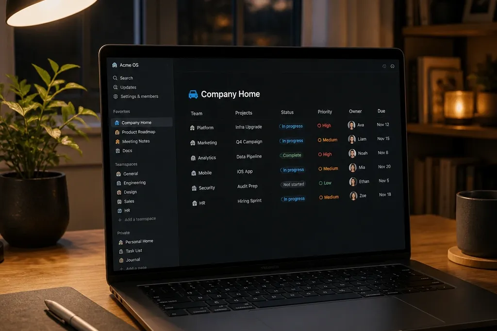
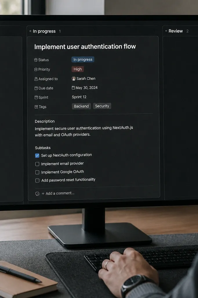
1. Monochrome Habit Grid with Status Chips
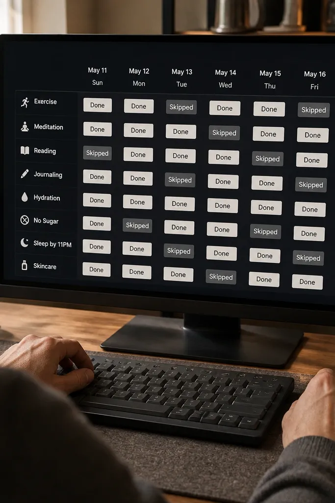
This one looks sharp because the grid is doing the heavy lifting. You build a habit database with a clean status select (Done, Skipped, Pending) and display it as a compact table or gallery so each habit reads like a tile. In dark mode, the status chips are what the eye catches — keep them muted gray/white and only tint the active state. Use uniform covers (solid dark with a thin accent line) so the template feels designed, not dumped. It’s great for routines, fitness trackers, and daily practice pages because you can scan it in seconds.
Start by creating a database called Habits with properties: Habit (title), Status (select: Done, Skipped, Pending), Frequency (select: Daily, 5x/week), and Notes (text). Add a Due date only if you’re tracking cycles; otherwise leave it out to keep the grid clean. Then create a view set to Gallery or Compact Table, turn on property display for Status and Frequency, and hide everything else. Finally, add covers to each habit entry using the same cover style and only vary the accent color for the Status you want to highlight.
Set Status chip colors to gray tones first, then use one accent color for Done. It keeps the whole page from looking “loud.”
Avoid using too many status options; 3 statuses look crisp, 7 statuses look messy in dark mode.
2. Project Dashboard with Two-Tone Progress Bars
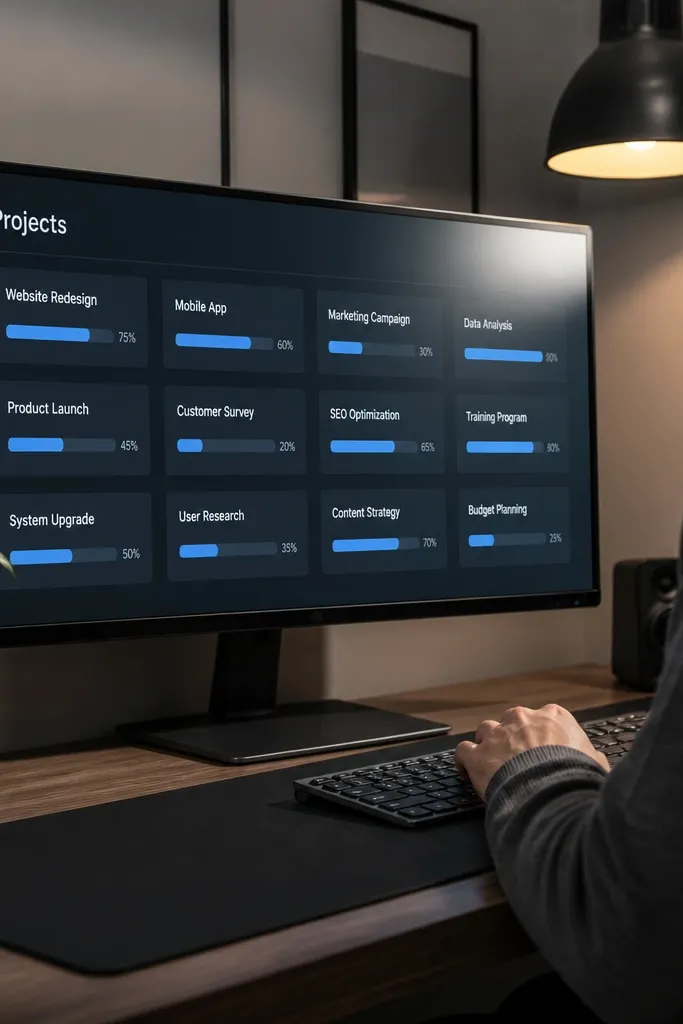
This template looks good because progress is visual, not buried in text. You create a Projects database and show it in a board view with a custom property for progress, then format each card so the progress bar stands out. In dark mode, the trick is using two-tone bars: a muted track and a brighter fill. Keep your card content minimal: project name, status, and progress — that’s it. It works for freelance pipelines, study plans, and any workflow where you want the page to look like a dashboard photo.
Editor's noteUse Progress as a number, not a text like “40%.” Bars behave better when they’re numeric.
Create a Projects database with properties: Project (title), Stage (select: Idea, Doing, Review, Done), Progress (number 0-100), Due (date), and Client/Area (select). Switch to a Board view grouped by Stage, then add Progress as the prominent property on the card. For the two-tone bar look, set Progress to display as a bar and keep the Stage colors muted so the bar is the star. Add a top page summary with three linked views: “Doing” board, “Due soon” table filtered by Due within 7 days, and “Done” list sorted by completed date.
Skip thisAvoid mixing a board with a giant table on the same page without filters. It kills the clean dashboard look.
3. Recipe Cards with Ingredient Checklists
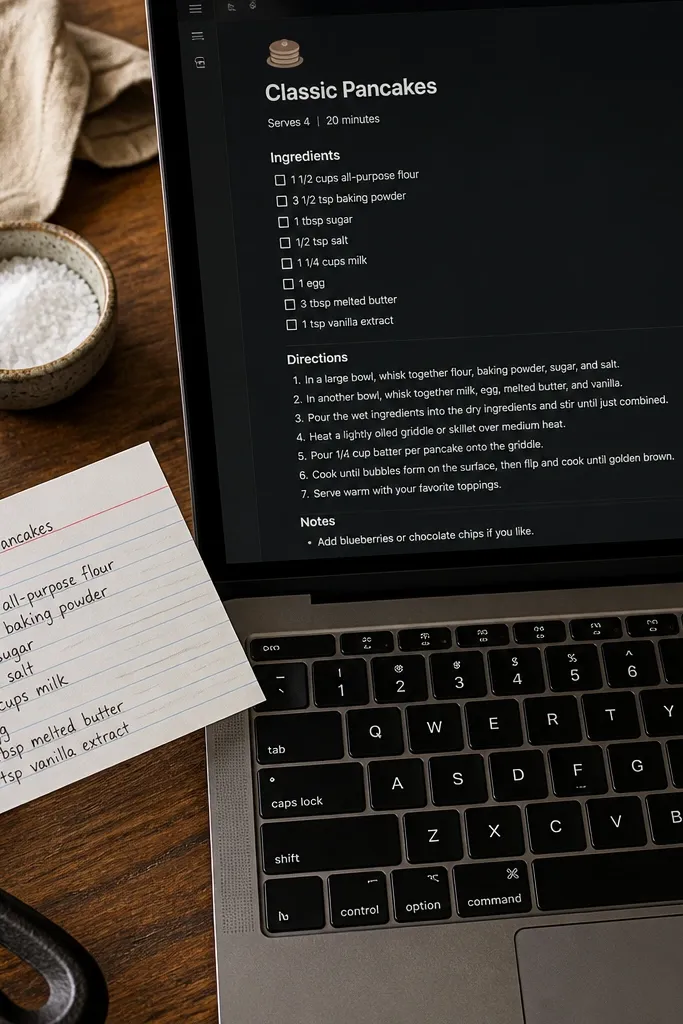
Recipe templates look sharp when the card reads like a real index card. You build a Recipes database where each recipe has properties for Cook time and Difficulty, and the page content uses checklists for ingredients. Dark mode helps here because checklist items with consistent indentation look crisp and structured. Keep your recipe pages photogenic by using a simple layout: short intro, ingredient checklist, then steps with numbered headings. This is perfect for meal planning, pantry organization, and anyone who wants their recipes to look good on a tablet screen.
Editor's noteUse a single measurement style across all recipes (like “g” or “tbsp”) so the checklist aligns visually.
Create a Recipes database with properties: Recipe (title), Time (number or select like 15, 30, 45), Difficulty (select: Easy, Medium, Hard), Tags (multi-select), and Source (text). In each recipe page, add a checklist block for ingredients and a numbered list for steps. Then create a Gallery view that shows cover + difficulty + time, and apply a filter by Tags for quick meal browsing. Finally, set up one “Meal Plan Week” page with a linked database view filtered to the chosen recipes so it looks tidy and cohesive.
Skip thisAvoid long paragraphs in the ingredient section. Checklist lines make dark mode look clean.
4. Study Planner with Color-Coded Weeks
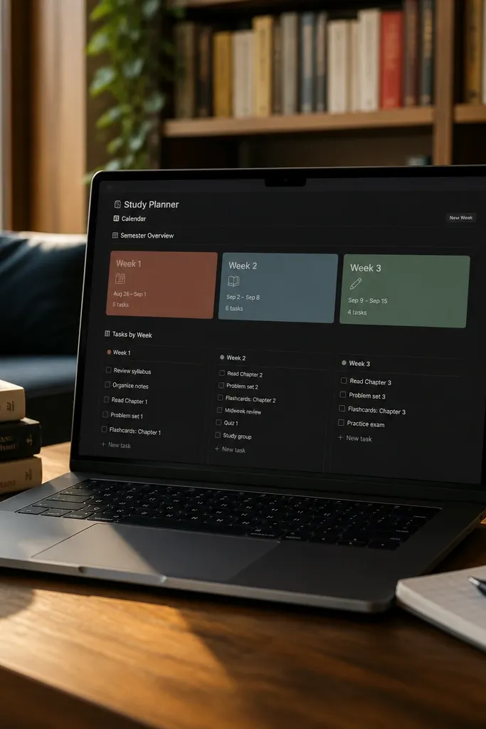
This is one of the easiest ways to get a sharp, aesthetic look because the weekly structure becomes the design. You use a Weeks database with a Week label and show it as a calendar or gallery, then link it to a Tasks database. In dark mode, color-coded week labels work better than lots of icons because they stay readable. The cards should show only three things: week name, total tasks, and the top subject. Keep everything else inside the linked page so the overview stays clean.
Create a Weeks database with properties: Week (title), Start date, Week theme (select with a fixed set of colors), and Total tasks (rollup from Tasks). Create a Tasks database with properties: Task (title), Subject (select), Due (date), Status (select), and Week (relation to Weeks). Set up views: a calendar view for Tasks and a gallery view for Weeks filtered to the current month. Then create a Week page layout that shows a filtered linked view of Tasks where Due falls within that week range.
Pick 4-6 week colors and reuse them every semester. Consistency is what makes it look designed.
Avoid free-form “Week notes” titles like “Week 3 — stuff.” Use a fixed “Week 03” format.
5. Dark Mode Book Tracker with Minimal Covers
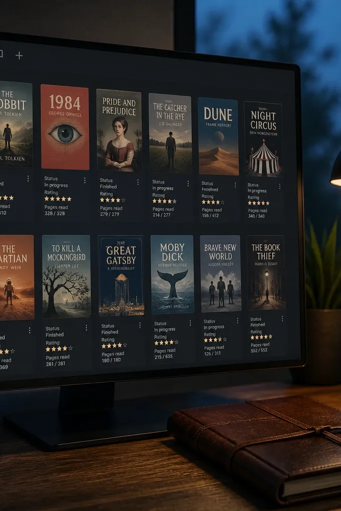
Book trackers look sharp when the covers don’t scream and the fields stay aligned. You build a Books database with properties for Author, Status (Plan, Reading, Finished), Rating (1-5), and Pages read (number). Then you show it in gallery view with small, consistent covers and a compact property set. In dark mode, minimal covers with one accent color look better than full-color images that clash with the interface. This template suits reading logs, library lists, and anyone tracking progress without turning it into a messy scrapbook.
Create a Books database with properties: Title (title), Author (text), Status (select with 3-4 values), Rating (select or number 1-5), PagesRead (number), and TotalPages (number). Add a rollup property called Progress (%) by calculating PagesRead/TotalPages if you track both. Make a gallery view showing cover, Status, and Progress (%). Add a second view as a table sorted by Status then Rating so you can browse finished books cleanly.
Use the same cover style for every entry: dark background with a thin line accent and the first letter of the genre in the cover caption area.
Avoid attaching full-size cover images to every card. Dark mode turns them into visual noise.
6. Home Inventory with Room Filters
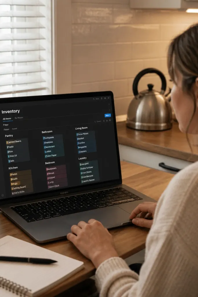
Home inventory looks good when the interface acts like a search tool, not a spreadsheet. You create an Inventory database with a Room property and build views that filter by Room so each page becomes a clean “zone list.” In dark mode, room chips and consistent list formatting make it feel organized and calm. Add a small photo cover per item and keep the item page layout consistent: where it is, purchase info, and warranty. This is ideal for moving prep, maintenance tracking, and quick insurance documentation.
Editor's noteUse a Room select with fixed values like Kitchen, Bedroom, Living Room — no custom entries. Filters stay clean.
Create an Inventory database with properties: Item (title), Room (select), Category (select), Serial (text), Purchase date (date), Warranty ends (date), and Notes (text). Add a relation to a separate Maintenance Log database if you want service history. Then create a set of views: one table view filtered by Room, plus a “Warranty Expiring” view filtered to Warranty ends within 60 days. For each item page, use a simple structure: Location line, Specs/Serial line, Warranty line, then a short notes section.
Skip thisAvoid mixing rooms and categories as free text. Filters break and your template stops looking sharp.
7. Event Planning Timeline with Week Blocks
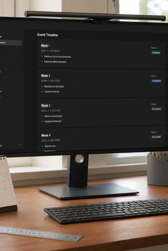
Events look sharp when you show time as blocks, not scattered checklists. Build a timeline-like structure using a Weeks database that links to Tasks, with each week showing its tasks in a compact list. In dark mode, the week block acts like a visual anchor; the page feels like a schedule. Keep tasks short and add a Status select with only 3-4 values so the cards don’t turn into rainbow text. Great for weddings, parties, conferences, and travel planning where you need a “what happens when” view.
Editor's noteUse Week label format like “Week of Aug 12” so the timeline reads instantly in dark mode.
Create a Weeks database with properties: Week label (title), Start date, and Week status (select). Create a Tasks database with properties: Task (title), Owner (select optional), Status (select: Not started, Doing, Waiting, Done), Due date (date), and Week (relation to Weeks). Then create a linked view inside each Week page that shows Tasks filtered to that week and sorted by Due date. Make a second top-level calendar view to sanity-check dates across the whole event.
Skip thisAvoid putting everything in one big table. The timeline look comes from week blocks and linked views.
8. Finance Snapshot with Category Tiles
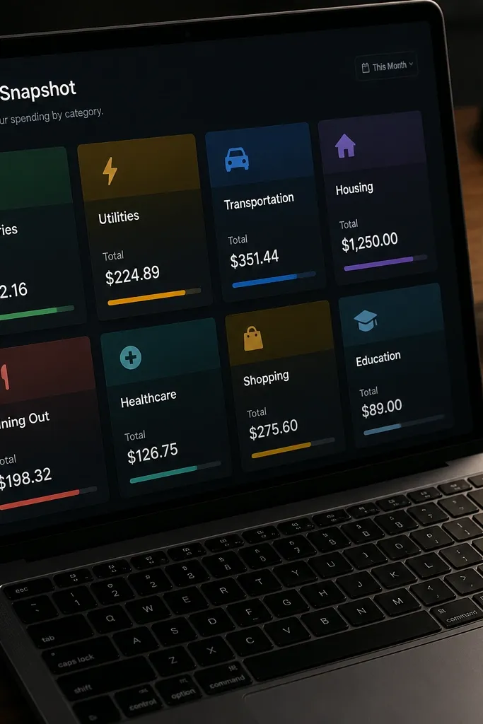
Finance templates can look ugly fast because people paste numbers without structure. This one stays sharp by using category tiles with consistent formatting and a small set of totals. Create an Expenses database with Amount and Category, then show it as a gallery where each card is a category tile (using a cover color per category). In dark mode, the visual separation of tiles makes totals feel clear instead of scary. It’s good for budgeting, expense tracking, and simple monthly reviews where you want a page that looks like a dashboard photo.
Editor's noteKeep categories to 8-12 items. Too many categories makes the tile grid look cluttered.
Create an Expenses database with properties: Expense (title), Amount (number), Category (select), Date (date), and Payment method (select). Create a Categories database if you want a tile per category; otherwise use category cards by styling a view. Build a Monthly Summary page with a linked database view filtered to the selected month and grouped by Category. Then create a total-per-category rollup by using a Categories database relation and rollups to display category sums.
Skip thisAvoid a single “Notes” field holding both description and category. Separate fields make the layout readable.
9. Toolbox Knowledge Base with Tag-First Navigation
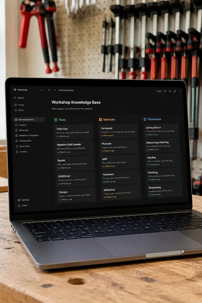
This one looks sharp because navigation is visible. You build a Knowledge database where every article has a clear tag set (tools, materials, techniques) and a short “When to use” line at the top. In dark mode, tag chips are the fastest way to browse, so the template stays clean. Keep each page’s body structured: materials used, steps, troubleshooting, and a photo cover. It’s great for DIY guides, home repair notes, and craft workflows where you want quick lookups.
Editor's noteUse tag names that are consistent and short, like “Sanding,” “Drilling,” “Paint,” so chips don’t wrap.
Create a Knowledge database with properties: Article (title), Tags (multi-select), Project type (select), Difficulty (select), and Last updated (date). In each article page, start with a short paragraph labeled “When to use” using a single bold phrase, then add sections with headings for Steps and Troubleshooting. Create a main page view as a table or gallery filtered by Tag and sorted by Last updated. Add a second view that filters by Project type so you can browse by workflow instead of keywords.
Skip thisAvoid long tag names like “Painting — interior walls — eggshell.” They wrap and ruin the dark mode look.
10. Wardrobe Capsule Tracker with Outfit Preview Cards

Wardrobe trackers look sharp when the outfit preview is the star, not the closet spreadsheet. Build a Wardrobe Items database and an Outfits database, then connect them with relations. Each Outfit page shows a compact linked view of the items used, with a cover that matches the outfit color theme. In dark mode, consistent chip styles for season, occasion, and weather make the cards look cohesive. This suits capsule wardrobes, travel packing lists, and anyone trying to reduce decision fatigue.
Editor's notePick 6 color families max. Color chips that wrap ruin the clean look.
Create a Wardrobe Items database with properties: Item (title), Type (select: Top, Bottom, Shoe, Outerwear), Color family (select with fixed values), Season (select), and Fit note (text). Create an Outfits database with properties: Outfit (title), Occasion (select), Weather (select), and Items (relation to Wardrobe Items). Then create an Outfit Gallery view showing Outfit cover, Occasion, and Weather. Inside each Outfit page, display a linked view of Items filtered to that relation, sorted by Type for a neat preview.
Skip thisAvoid free-form color entries like “navy-ish.” Use fixed color family values so the cards stay tidy.
11. DIY Shopping List with Priority Sections
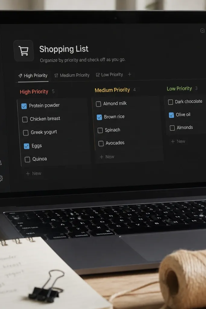
Shopping lists look sharp when they’re broken into priorities and the checked state is obvious. Build a Shopping List database with a Priority select and a Checkbox-like status field, then show it with separate views for High, Medium, and Low. In dark mode, you want the unread items to stand out, not vanish. Use simple covers: one accent color for each priority level, and keep the item name short. This template works for tool runs, craft hauls, and restocking supplies where you need speed and clarity.
Editor's noteUse a single Status select with 3 values. It keeps the card look clean in dark mode.
Create a Shopping List database with properties: Item (title), Priority (select: High, Medium, Low), Needed by (date), Status (select: Not started, Buying, Bought), and Store (text). Create three views filtered by Priority and sorted by Needed by. On the main Shopping page, place the three views under one heading so the page reads like sections. Add a cover or icon per item that matches its Priority, then keep the item page body to a short notes section for size, color, or SKU.
Skip thisAvoid mixing “bought” items in the same view as “need to buy.” Filters keep the page sharp.
12. Gallery-First Moodboard for DIY Materials
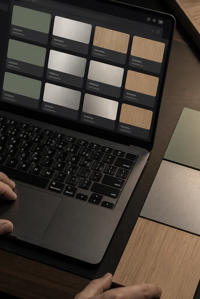
Moodboards look sharp when they’re consistent, not when they’re huge. This template uses a Materials database with a small set of properties: Material type, Color, Finish, and Use case. You display it in gallery view with consistent cover blocks, so every card looks like a swatch. Dark mode makes the swatches feel modern, but only if the covers use the same layout style and you don’t throw in random images. It’s perfect for selecting paint colors, wood finishes, fabric choices, and hardware styles.
Editor's noteUse a fixed set of Color values like “Charcoal,” “Warm beige,” “Olive.” Swatch cards stay cohesive.
Create a Materials database with properties: Material (title), Type (select: Wood, Fabric, Paint, Metal, Stone), Color (select), Finish (select: Matte, Satin, Gloss), and Use case (select). Add a cover image or color block per entry, but keep it consistent in sizing and placement. Make a main gallery view grouped by Type and filtered by Finish if you want to compare matte vs satin. Add a second view filtered by Use case so you can jump straight from idea to materials.
Skip thisAvoid adding ten different finish labels like “low sheen,” “semi sheen.” Pick one finish list and stick to it.
13. Cleaning Checklist with Room-Specific Views
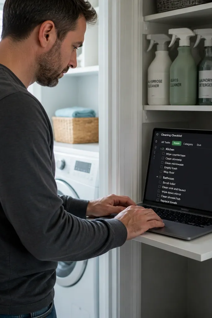
Cleaning templates look good because they’re repetitive in the best way. You set up a Cleaning Tasks database with Room, Frequency, and a checklist-style template on the task page. Then you create separate linked views per room so the user sees only what matters right now. In dark mode, checklist formatting stays readable when tasks are short and the status is consistent. This works for apartment routines, seasonal deep-clean plans, and shared household chore systems.
Create a Cleaning Tasks database with properties: Task (title), Room (select), Frequency (select: Daily, Weekly, Monthly), and Status (select: Not started, In progress, Done). For each task page, add a checklist for steps like “Clear surface,” “Wipe,” “Disinfect,” and “Reset supplies.” Create views filtered by Room and Frequency, then add one master page with three sections: Daily, Weekly, Monthly. Sort each view by Task name so the order doesn’t jump around.
Keep task titles action-based like “Wipe kitchen counters.” It makes the checklist feel clean and intentional.
Avoid making one mega list with every room mixed together. Separate views are what keep it sharp.
14. Event Travel Pack with Document Cards
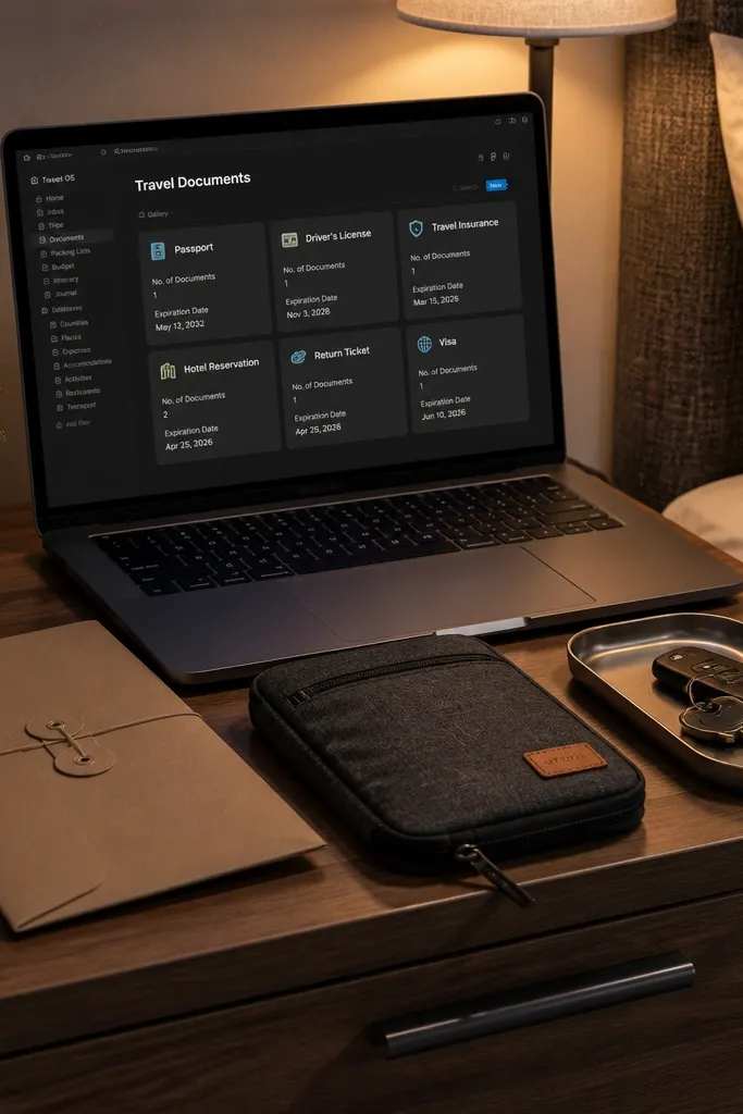
Travel and event prep looks sharp when you treat documents like cards, not a pile of notes. Build a Travel Docs database with properties for Document type, Status, Expiration, and Who needs it. Display it in a gallery view that shows the document type and expiration date, and keep the document pages short: where it is saved, what to bring, and a checklist for prep steps. In dark mode, compact cards with consistent properties look organized and photo-friendly. This fits conferences, destination weddings, and any trip that has deadlines and paperwork.
Editor's noteUse a Location field with fixed values like “Email,” “Offline folder,” “Phone.” Free text makes cards inconsistent.
Create a Travel Docs database with properties: Document (title), Type (select: ID, Ticket, Booking, Insurance), Status (select: Not ready, Ready, Submitted), Expiration (date), and Location (text like “Phone / Email / Folder”). Add a checklist section on each document page for “Verify details,” “Print or save offline,” and “Pack in folder.” Create a gallery view grouped by Type and filtered to show only documents with Expiration in the next 60 days. Add a second table view sorted by Status so you can see what’s lagging.
Skip thisAvoid storing expiration as text. Dates let you build filters that stay clean.
15. Appointment Scheduler with Time-Block Cards
Appointment templates look sharp when the schedule is readable by time blocks, not by long lists. Create an Appointments database with Start time and End time, then build a timeline-style view using a calendar or table grouped by day. In dark mode, time labels and status chips are the visual anchors — keep them in the same position on every card. Add a clean client notes section that’s hidden behind the page, so the schedule view stays uncluttered. This is great for booking systems, coaching calendars, and DIY service scheduling where you need quick scanning.
Editor's noteSet Start and End as actual date-time properties. It makes your schedule layout behave more predictably.
Create an Appointments database with properties: Appointment (title), Start (date), End (date), Status (select: Requested, Confirmed, Completed, Canceled), and Service (select). Add a view set to Calendar for day-level scanning and a table view sorted by Start time for detailed review. In the calendar view, ensure the Appointment card displays Status and Service so you don’t have to open every entry. Inside each appointment page, add a short checklist for prep like “Confirm time,” “Gather materials,” and “Send reminder.”
Skip thisAvoid using one “When” text field. Time-block views need real date-time properties.



