
1. Center-Column Hero Stack With Side Labels
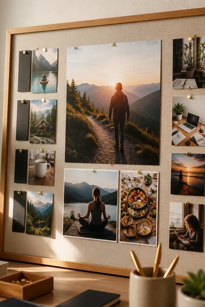
Start by drawing a light pencil grid: one center column and two narrow side zones, leaving a 1 inch outer margin. Place the hero image in the center column first, then add the second and third images under it, keeping a 1/2 inch gap between photos. Add one short label per supporting image using a consistent alignment — left side for the left column, right side for the right column. Finish by adding thin border tape (masking tape or washi) along the photo edges if you want that magazine-cutout look.
This layout looks polished because the center column gives your board one clear focal area. Put your biggest, most emotional image in the middle, then stack two smaller supporting photos beneath it with equal spacing. The side labels keep the board readable without covering the visuals. It works especially well for boards focused on one theme like career direction, health routines, or a single home aesthetic. If you want your vision board to look good in a frame, this is the safest structure.
Skip thisAvoid mixing random sizes in the center column; it turns into a pile instead of a stack.
Editor's notePrint your hero image 20-30% larger than the supporting images so the hierarchy reads instantly.
2. Two-Column Split Board With a Diagonal Mood Bridge
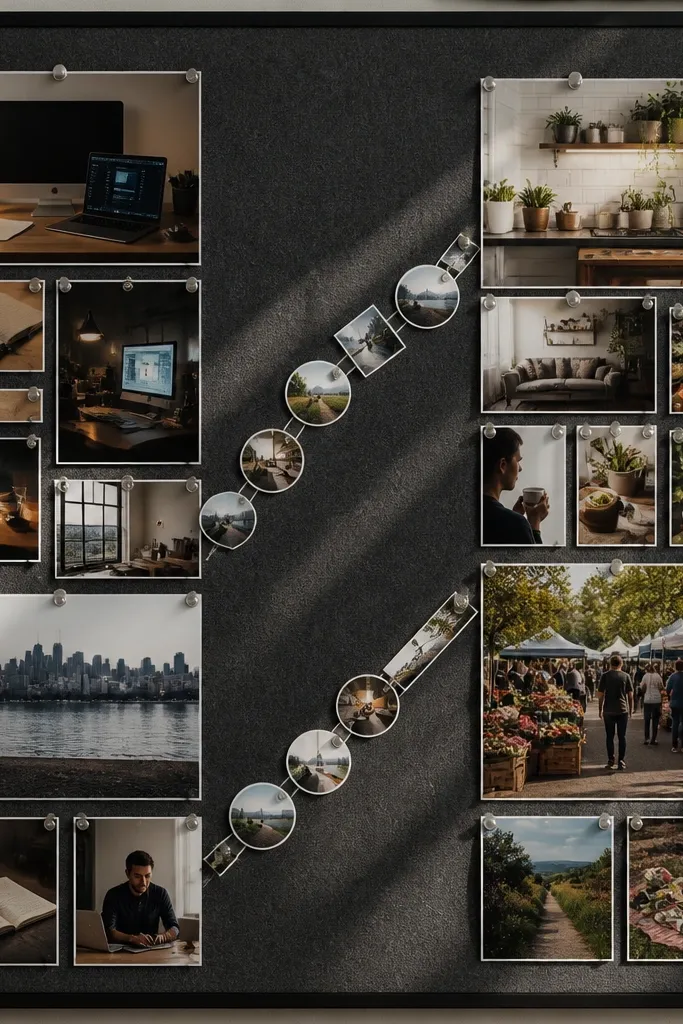
This is a great way to combine goals without making the board feel chaotic. The two columns separate themes clearly, like “work” on the left and “life” on the right, while the diagonal bridge adds motion and makes it look designed. Use small icon cutouts or tiny photo strips along the diagonal so the two halves feel connected. It looks clean in overhead photos because the eye follows the diagonal line. You can keep the photos varied, but the diagonal structure makes it feel intentional.
Mark two equal columns across your board and leave a 3/4 inch outer margin. Place your left-theme photos in the left column and right-theme photos in the right column, keeping each photo’s width consistent within its column. Then draw a faint diagonal from the top of the left column to the bottom of the right column and place 4-6 small icon or mini-photo cutouts along it. Add a single short caption near the center of the diagonal, then tape everything down with photo-safe adhesive.
Use one diagonal color cue, like a strip of muted gold washi tape, so the bridge looks cohesive.
Avoid putting big text blocks across the diagonal; it breaks the flow.
3. Polaroid Row Gallery With Equal Photo Heights
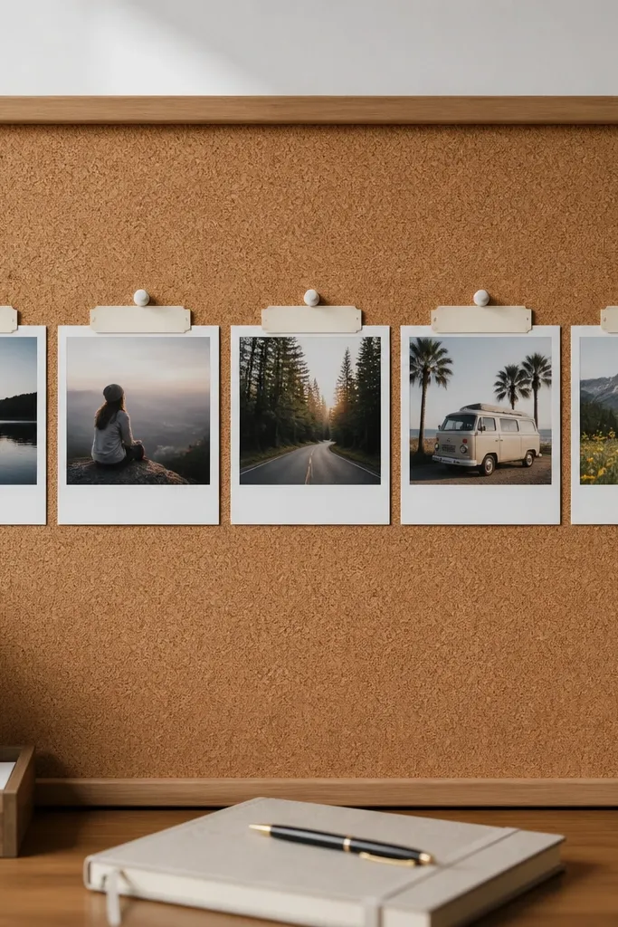
A Polaroid row looks cute and intentional because it’s uniform. Equal photo heights create a rhythm that photographs well, especially if you use a matte background or cork board. This layout is perfect when you have a set of “steps” or “chapters,” like learning, saving, traveling, or building a routine. Keep captions small and placed consistently under each mini-mat so the row stays airy. It’s also one of the easiest layouts to assemble without overthinking.
Choose 5 photos and print them with the same dimensions, then cut small white mats around each one to mimic Polaroid borders. Lay them in a straight line, leaving 1/2 inch gaps between mats and a 1 inch outer margin. Place each caption tag directly under its photo mat, aligned to the center of the mat. Tape the corners first, then press the full surface down once you’ve confirmed spacing.
Trim your mats with the same ruler guide every time; tiny mat-size differences show up in photos.
Avoid mixing portrait and landscape photos in the same row; the rhythm collapses.
4. Magazine Grid With Micro-Headings
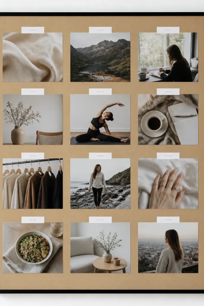
Create a grid with 3 columns and 4 rows on paper or poster board, leaving 1 inch margins. Crop each image to fill its grid cell, then add a micro-heading (3-5 words) at the top of each cell. Keep headings the same font style and color, then use thin tape or a small label sticker to mount each image. Finish by checking straight lines from corner to corner — the grid has to be level.
This layout turns random inspiration into a designed page. A strict grid prevents the “clutter wall” effect and helps your board read like a magazine spread. Micro-headings keep the picture meaning clear without turning the board into a notebook. It’s strong for boards that need clarity: goals, habits, and aesthetic rules all belong in a grid. If you’re printing from Pinterest or screenshots, cropping tightly makes this layout look expensive.
Skip thisAvoid full-size screenshots with margins; the grid needs tight crops.
Editor's noteUse black or dark gray headings only; colored headings compete with the photos.
5. Frame-Within-Frame Look Using Shadow Boxes
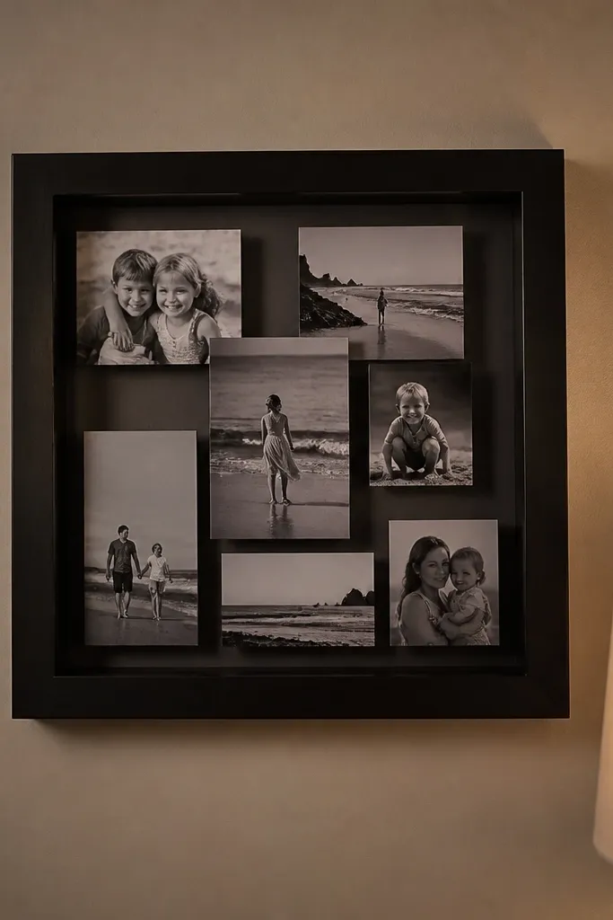
Buy or build a small shadow box insert that fits your board, then place it centered with a 1 inch border around it. Inside the shadow box, arrange 4 photos in a 2x2 layout with 1/4 inch gaps. Add one thin border line around the shadow box opening using painter’s tape so it looks crisp. Mount the shadow box to the board with strong adhesive tabs, then add your captions directly on the photos or on tiny tags inside the box.
A frame-within-frame layout looks intentional because it adds depth. Instead of scattering photos, you group them into one “window,” which makes the board feel curated without being crowded. This is perfect if you have a theme set like kitchen goals, bathroom updates, or a capsule wardrobe vibe. The photos stay contained, so your board photographs cleanly even if the rest of the wall is busy. It also lets you swap pictures later without rebuilding the whole board.
Skip thisAvoid placing glossy photos inside a windowed shadow box; glare ruins the look.
Editor's noteUse matte photo paper inside the box so reflections don’t wash out your pictures.
6. Stair-Step Ascent Layout for Growth Goals
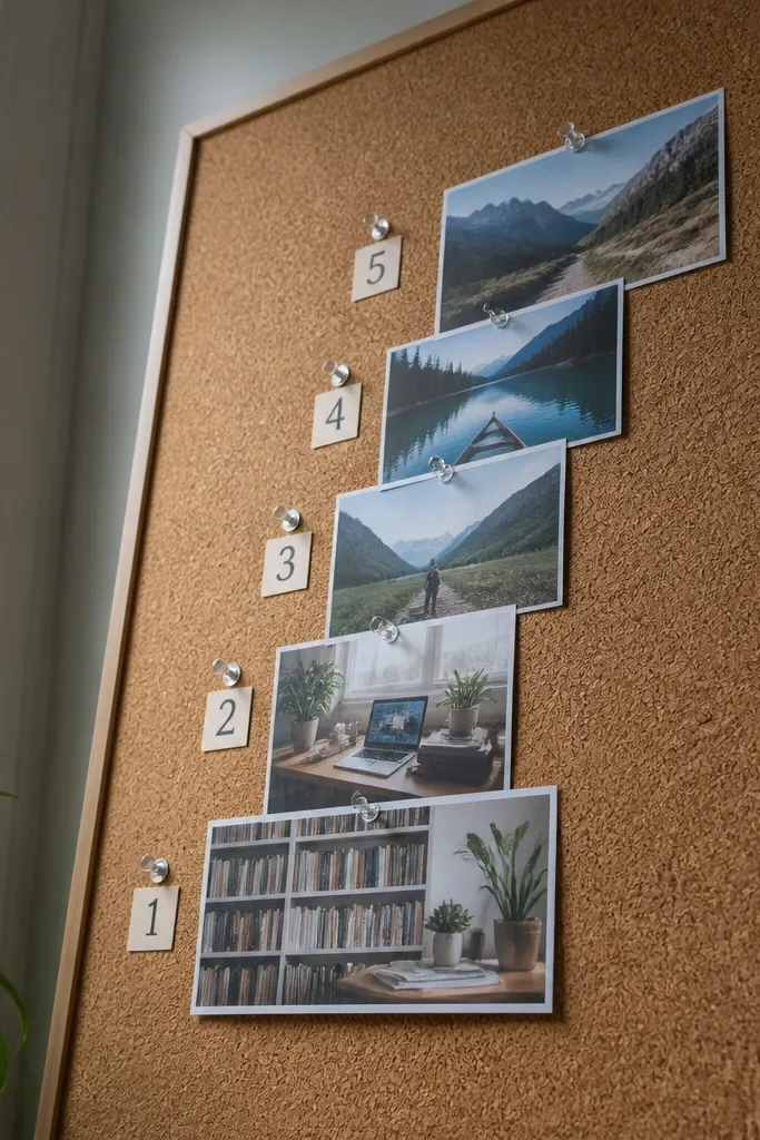
Stair-step layouts make progress feel visual because the images literally climb. Put your most recent, stable goal at the bottom and your stretch goal at the top. Add small numbered markers next to each step so the board reads as a sequence, not random inspiration. This layout is great for learning goals, fitness routines, or “build your life” plans. It also looks great from a distance because the shape guides the eye.
Sketch a staircase path that rises 4-5 steps across your board, keeping 1 inch outer margins. Place each photo on a step so the bottom edge aligns with the step line, leaving 1/2 inch spacing between steps. Add a tiny number (1-5) near each photo corner, then keep all numbers the same size and color. Mount photos with double-sided tape and press firmly so edges don’t lift.
Choose photos with a similar color palette for the staircase so the upward progression feels smooth.
Avoid using wildly different photo sizes; the staircase needs consistent photo footprints.
7. Corner Cluster With Negative Space Breathing Room
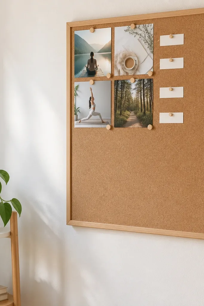
This is the layout for people who hate clutter. A corner cluster makes your board look clean because negative space does half the work. Use it when you have a few high-impact images and don’t want the board to feel busy. It’s also the easiest way to make vision board ideas pictures look “intentional” in photos because blank space frames the cluster. Add only one small caption per photo so the corner doesn’t turn into a text dump.
Pick one corner — top-left is the most common and looks balanced — then leave at least 2 inches of blank space on all sides of the cluster. Place 3-5 photos in that corner with a tight 1/4-1/2 inch gap between them, overlapping slightly if you like a scrapbook feel. Add one mini label tag under the biggest photo and skip labels on the smaller ones. Tape everything down and leave the rest of the board empty on purpose.
Use lighter paper or a neutral board color so the blank space doesn’t look dingy.
Avoid filling the empty space later; it defeats the negative-space look.
8. Circle Orbit Layout Around a Central Word
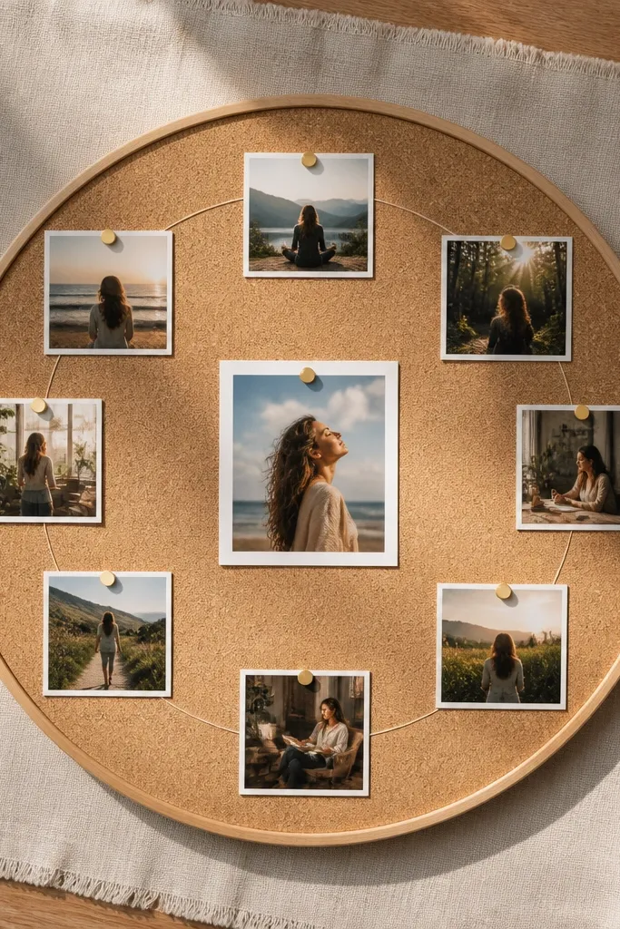
Mark a center point on your board and draw a faint circle radius that fits the photos you’ll use. Place one central word label (short phrase, 3-4 words max) and tape it down. Then arrange 6-8 photos around the circle with equal spacing, keeping each photo oriented the same way (all upright or all slightly angled). Add tiny connector dots or a thin ring border to make the orbit feel complete.
Orbit layouts look striking because they’re symmetrical and easy to read. Put one central word or short phrase in the middle, then place 6-8 photos around it like planets. The symmetry makes the board feel designed even if your photos vary. This works well for themes like “home,” “health,” “career,” or “creative life.” It also photographs well because the eye lands on the center first, then circles outward.
Skip thisAvoid placing photos too close to the center; leave a clear gap so the word remains the focal point.
Editor's noteUse one color for the central label (dark gray or black) so it stays readable over busy photos.
9. Color-Block Background With Photo Windows
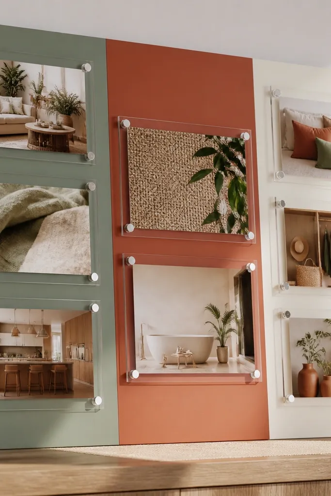
Pick two or three background colors that match your theme, then tape off clean rectangles on your board. Paint or use colored paper squares behind the rectangles, keeping edges straight with painter’s tape. After the background dries, cut photo windows with straight edges and mount them centered on each color block. Finish by adding a thin white border (optional) around each photo using cardstock strips to unify everything.
This layout makes your pictures look brighter and more cohesive because the background controls the mood. Use 2-3 solid color blocks, then mount photos on top as “windows” so each photo feels like part of a poster. It’s ideal for vision boards focused on an aesthetic palette — kitchen colors, bedroom vibe, or outfit colors. The clean blocks also reduce visual noise from random backgrounds in your photos. It’s one of the easiest ways to make your vision board pictures look like a set.
Skip thisAvoid too many background colors; three blocks max keeps the look graphic.
Editor's noteUse matte paper for the color blocks; glossy backgrounds make photos look mismatched.
10. Two-Layer Overlap Collage With Consistent Angle
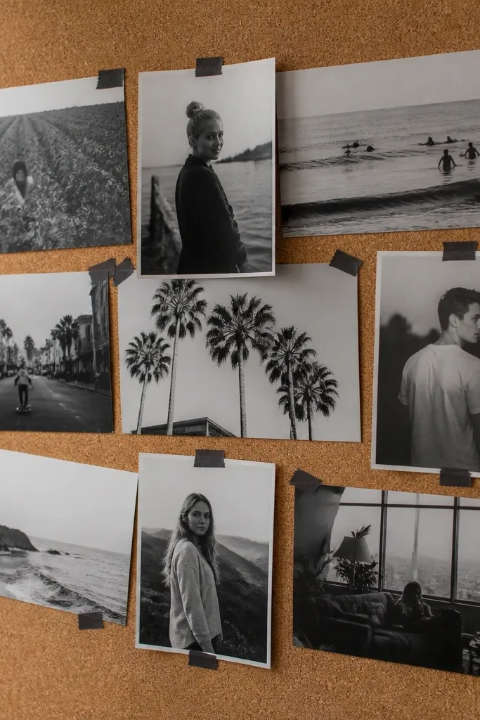
Choose 6-8 photos and decide a single tilt angle, like 3-5 degrees clockwise for every overlapping photo. Place the base layer first — no overlap yet — then add the second layer only on top corners, keeping overlaps under 1 inch. Use washi tape at the corners to mount the top photos so the edges look intentional. Add one small quote strip or label and keep it short so the collage doesn’t turn into clutter.
Overlapping looks artsy, but it only stays aesthetic when the angles are consistent. This layout uses two layers: one base layer of photos and a second layer that lightly stacks on top in controlled spots. The consistent tilt makes it look curated instead of messy. This is a good pick for boards that pull from magazines, printed quotes, and mixed textures. It also works well if you want a “creative wall” vibe without losing readability.
Skip thisAvoid random angles on every photo; that’s what makes overlap turn into mess.
Editor's noteUse a paper cutter and keep photo corners square; crooked overlaps look sloppy fast.
11. Vertical Timeline for Habits and Checkpoints
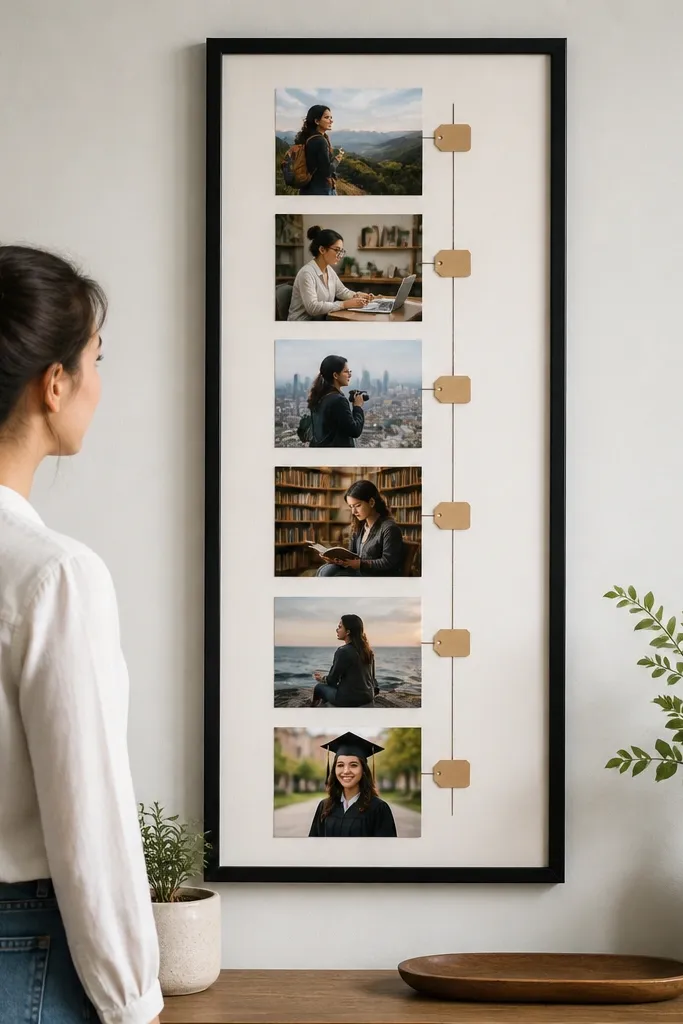
A timeline layout makes a vision board feel like a plan instead of a scrapbook. Put your “start” image at the top and your “finished” image at the bottom, then place 3-5 checkpoint photos along a vertical line. Tiny date tags or checkpoint labels keep each step clear. This format is great for DIY home projects, learning goals, or any routine you can track. It also photographs cleanly because the eye follows one strong line.
Draw a straight vertical line down your board using a ruler, keeping it centered or slightly off-center. Place your top and bottom hero photos first, then add 3-5 smaller photos at equal intervals along the line. Add mini labels next to each checkpoint photo with the same font size and color. Mount everything with tape strips that don’t cover important parts of the photos.
Use one consistent label style, like white sticker labels with black text, for a cohesive look.
Avoid uneven spacing between checkpoints; it breaks the timeline feel.
12. Grid of Borders Only Using One Photo Type
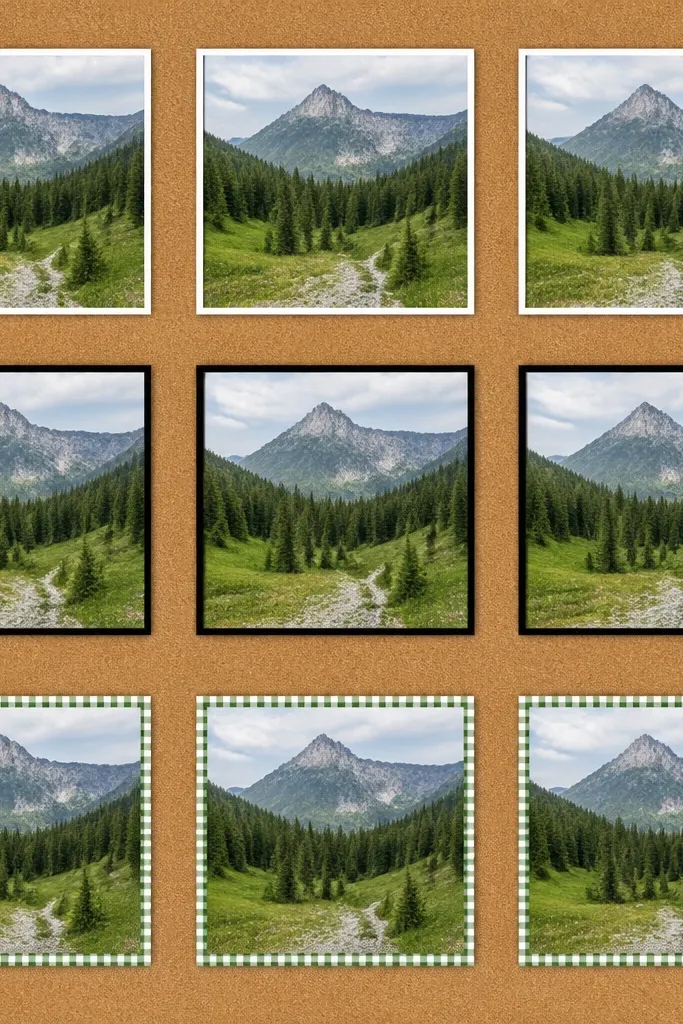
Pick one photo size and print 9-12 images at the same dimensions. Create a grid on your board with equal cells, leaving 3/4 inch outer margins. Mount each photo inside its cell, then add a colored border using thin cardstock strips or washi tape around each image. Keep border thickness consistent across the board so the grid stays crisp.
If your pictures have similar lighting but different subject matter, a border grid makes them look like a designed set. The trick is to keep the photos consistent in size and style, then vary only the border color or pattern. This layout is great for boards built from outfit photos, paint swatches, or product shots. It looks clean, modern, and graphic in pictures. You’re controlling the design with borders, not forcing random cropping.
Skip thisAvoid mixing photo sizes; the border grid only works when everything aligns.
Editor's noteUse 3 border colors max and repeat them across the grid for a calmer look.
13. Gallery Row With Overhead-Friendly Caption Tabs
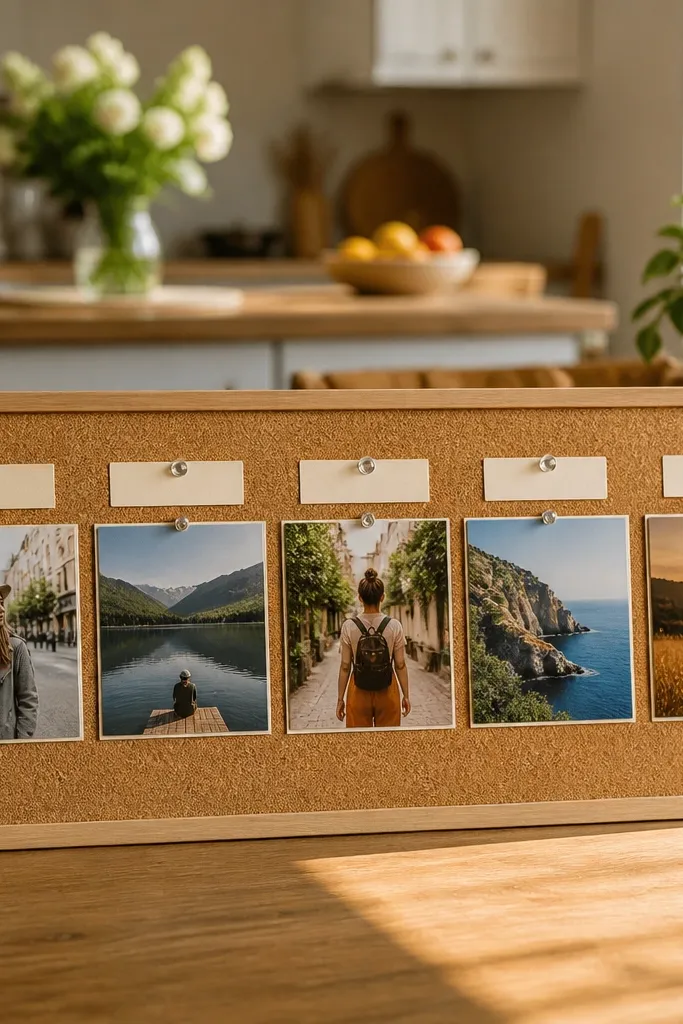
Caption tabs are underrated because they keep text visible without covering faces or key details. This layout uses a straight horizontal row with small tabs placed above each photo, like labels on a museum display. It’s perfect if you want your vision board pictures to look good in overhead shots or phone photos. The tabs also help you keep captions short and consistent. This layout works well for boards that include goals plus a single action phrase per photo.
Choose 4-6 photos and print them in one consistent size, then trim to exact rectangles. Arrange them in a single row with 1/2 inch gaps and a 1 inch outer margin. Cut small rectangles of cardstock for caption tabs and place each tab above its photo, centered. Tape the tabs first, then mount the photos so the edges don’t cover the tab text.
Use a slightly thicker cardstock for tabs so they don’t curl and cast uneven shadows.
Avoid placing captions on top of the photo; tabs keep the text readable and clean.
14. Staggered Masonry Layout With Uneven Heights
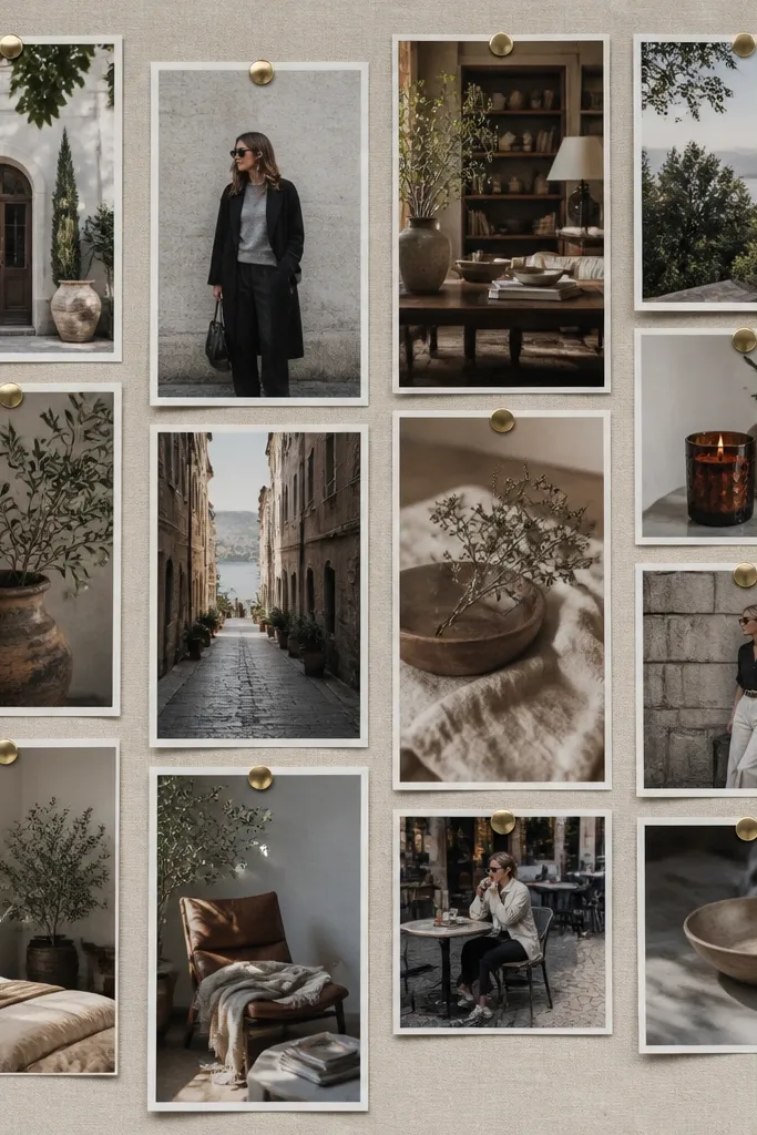
Masonry layouts look modern because they mimic how Pinterest pins feel — but you control it so it still looks designed. Keep widths consistent, then vary heights slightly to create rhythm. This is a strong choice when you have photos with different aspect ratios and you don’t want to crop them into awkward shapes. The stagger also reduces the “grid boredom” look. It’s great for boards that mix home decor, travel plans, and wardrobe pieces.
Pick two columns with a consistent photo width, then choose 8-10 photos. Mount the first column photos at full height, then start the second column so its top aligns with a gap between the first column photos. Keep horizontal gaps at 3/4 inch and vertical gaps at 1/2 inch. Add one thin paper strip divider between columns if you want a clearer separation for photos with busy backgrounds.
Use a matte black label strip for captions; it makes text stand out across bright photos.
Avoid random width changes; masonry fails when columns aren’t uniform.
15. Dip-Dye Accent Strip Through the Middle
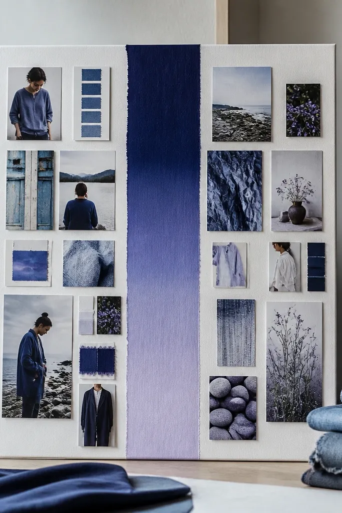
Choose a gradient strip color palette and create it with colored paper or paint on cardstock, then let it dry flat. Tape the strip across the center of the board, keeping it straight with painter’s tape guides. Place 3-4 photos above the strip and 3-4 below, aligning their centers to the strip so the spacing feels balanced. Finish by adding one short caption in a small label near the strip’s center.
An accent strip is a visual anchor that makes a mixed collection look cohesive. This layout uses a single gradient or color strip through the middle, then places photos above and below so your board feels like one poster. It’s especially good for vision boards that pull from different sources but share a color theme, like warm neutrals or cool blues. When you photograph it, the center strip gives the image a clean focal path. It also makes your board look more “decor” than “craft project.”
Skip thisAvoid placing too many photos right next to the strip; leave 1/2 inch breathing room.
Editor's noteUse a strip height of about 1.5-2 inches; thinner strips disappear, thicker strips crowd the photos.
16. Corner-to-Edge Photo Border Frames
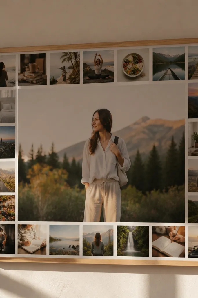
This border-frame layout makes your board look like wall art. You build a photo border around the edges, then keep the center mostly blank or reserved for one hero image. It’s a great way to use smaller photos without turning them into clutter. The border also creates a natural frame in photos, which helps your board look good even when the background changes. Choose a consistent crop style for the border photos so the edge looks intentional.
Pick 8-12 small photos and decide on one crop style, like all square or all portrait. Place them along the edges of your board first, leaving a 1 inch outer margin and a 1/2 inch gap between border photos. Leave the center open for one hero image or one short phrase. Mount the border photos with thin tape strips and then add the hero photo centered.
If your photos have different brightness, run a quick brightness adjustment in editing so the border doesn’t look patchy.
Avoid a full border with no blank center; it removes the contrast that makes the look work.
17. Fabric Texture Swatch Backing With Photo Overlays
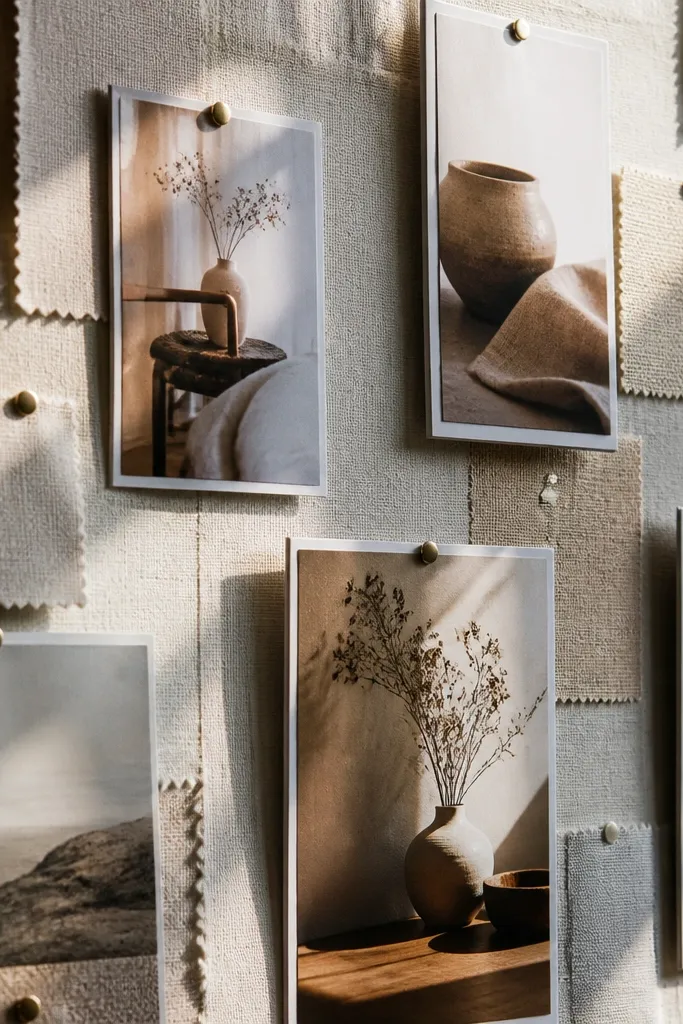
Cut fabric swatches into squares, like 3x3 inches, and arrange them in a grid pattern with 1/4 inch gaps. Secure swatches with spray adhesive or double-sided fabric tape so edges don’t lift. Place 4-6 photos on top of the swatches, centered, with a small border of white cardstock behind each photo to separate layers. Finish by adding one matching color caption tag per photo.
Texture backing is a cheat code for making vision boards feel tactile and expensive. Put fabric swatches like linen, cotton, or textured paper behind your photos, then mount photos on top like cutout cards. This layout looks great for home decor, wedding planning, or any aesthetic-driven board because the texture unifies mismatched images. It also gives you color consistency without heavy editing. The best part is that it photographs with depth, even if your photos vary.
Skip thisAvoid stretchy fabric that puckers; flat swatches look way cleaner.
Editor's noteUse a matte fabric or matte backing paper; shiny fabric catches light and makes photos look washed out.
18. Three-Section Storyboard With Titles Above Each Block
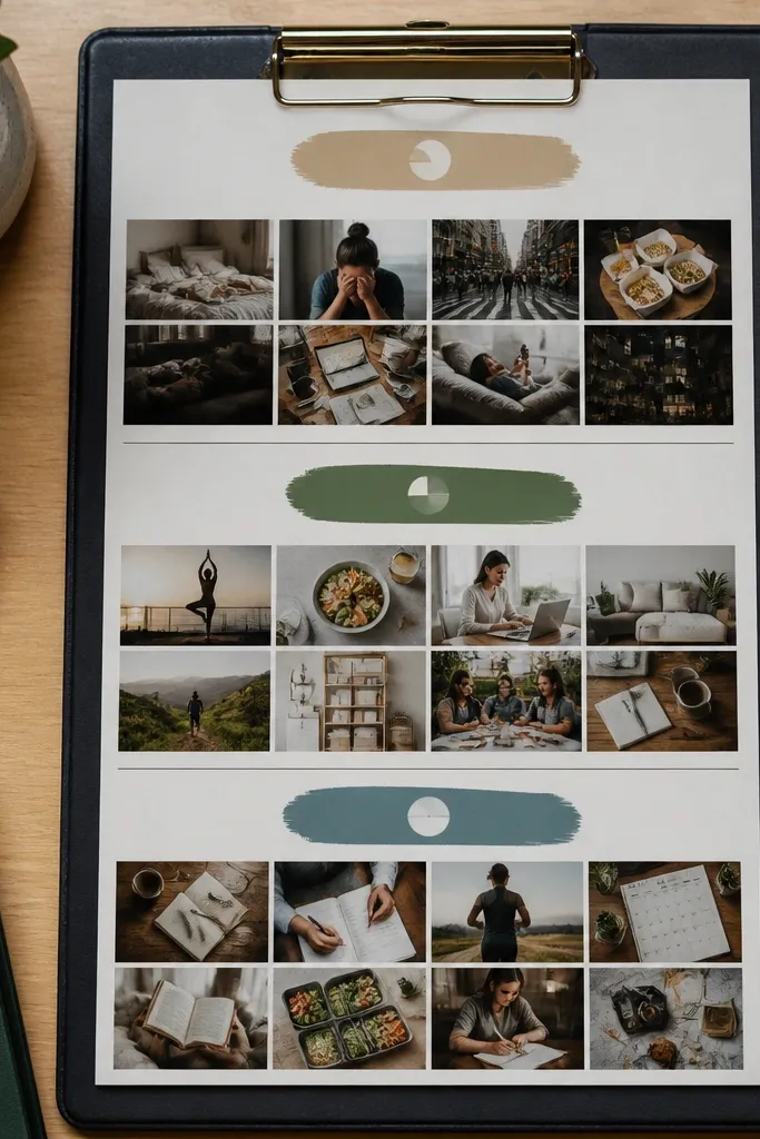
Divide your board into three equal horizontal sections, keeping 1 inch outer margins. Add a title label at the top of each section using consistent typography and spacing. Fill each section with 3-5 photos arranged in a mini grid, keeping photos the same width within that section. Mount with tape and then align all section edges to the same height using a ruler.
Storyboard layout is readable and stylish because it treats your vision board like a page with chapters. Use three stacked sections with a title above each: where you are, what you want, and how you’ll get there. Each section gets a small grid of photos, so the board stays organized while still looking full. This format works well for people who need direction, not just pretty images. It also makes your board look good when you add a frame because the sections align like print design.
Skip thisAvoid long paragraphs under titles; it ruins readability.
Editor's noteKeep titles to 2-3 words so the board stays visually light.
19. Asymmetrical Balance Layout With One Big and Three Small
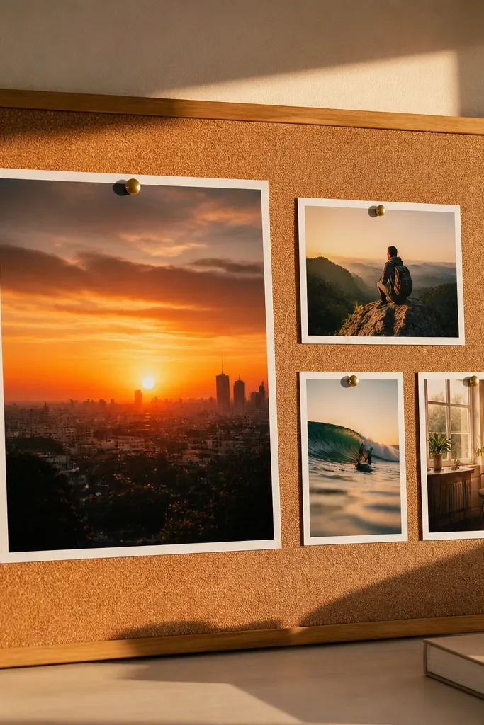
Asymmetrical balance is the layout that looks grown-up and artsy without being messy. The rule is simple: one big anchor image plus three smaller supporting images, placed so the visual weight feels even. You get variety in your pictures while keeping the board clean. This works great when you have one standout goal image and a few supporting ones like routines, colors, or places. It photographs well because there’s a clear main subject.
Pick one big hero photo and place it on the left side, leaving a 1 inch outer margin. On the right, place three smaller photos stacked in a loose column, keeping 1/2 inch gaps between them. Add tiny caption tags only under the two top-right photos to keep it airy. Use the same alignment for all right-side photos so the stack looks intentional.
If the hero photo is busy, choose quieter supporting photos so the board doesn’t feel crowded.
Avoid putting the three small photos too close together; you need spacing to show balance.
20. Monochrome Filter Theme With One Accent Color Sticker
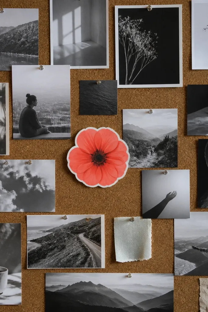
Edit your photos so 80-90% of them look monochrome or very low-saturation, then print them in consistent sizes. Place them in a grid or staggered pattern, keeping 1/2 inch gaps and a 3/4-1 inch outer margin. Add one bright accent label or sticker at the center or near the hero image, and use that same accent color in one tiny element only, like a thin tape line. Mount everything and check contrast from arm’s length.
This layout makes your vision board pictures look cohesive even if your original images vary. Convert most pictures to monochrome look so they share the same tone, then choose one accent color for a single sticker label or small shape cutout. The contrast makes the accent pop and gives your board a designed feel. It’s a strong choice for modern homes, minimal rooms, and anyone who gets annoyed by color chaos. You can still show personality through the accent color and photo choices.
Skip thisAvoid multiple accent colors; it kills the clean contrast effect.
Editor's notePick one accent color and stick to it: terracotta, sage, or cobalt only.



