
1. Gold Leaf Border With Charcoal Center
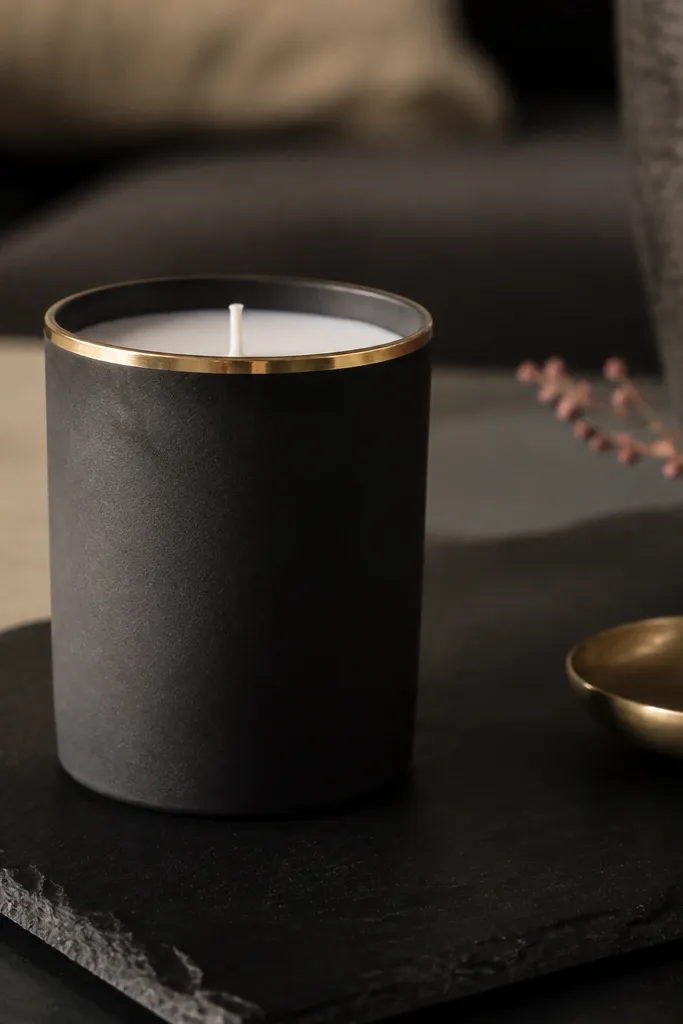
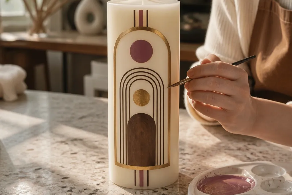
This one looks expensive because it uses contrast and restraint. A charcoal center hides brush texture, while a narrow gold border gives the candle a jewelry-like frame. Keep the border thin and even so it reads clean in photos instead of looking hand-wobbly. Use a metallic gold that dries with a smooth sheen, not a chunky glitter that catches dust.
Start by painting the candle center charcoal, leaving a clear band where the border will go. After it dries, tape a straight line around the candle for the border and paint a thin gold strip using a small liner brush. Let it dry fully, peel the tape, then seal with a clear acrylic topcoat so the gold stays sharp when you handle it.
Warm your gold paint by keeping it in a pocket for 2 minutes; it flows thinner and avoids lumpy lines.
Avoid painting the gold over wet charcoal — it bleeds and turns muddy.
2. Marbled Clay Wash in Dusty Rose and Espresso
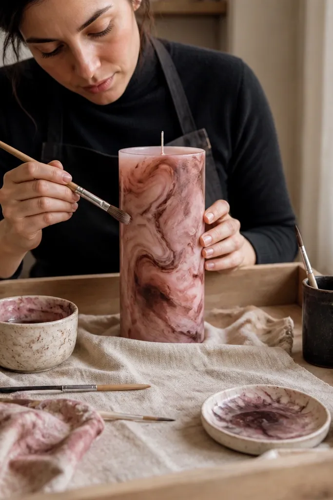
Marbling looks hard, but it’s mostly about layering translucent color. Dusty rose gives the candle a soft glow, while espresso adds depth in the swirls so it doesn’t look flat. The trick is using a wash consistency so the wax still shows through and the pattern stays airy. This style photographs well because the marbling creates movement without needing crisp lines.
Mix dusty rose and espresso paint with a little water or medium until it looks like tinted milk. Brush a light rose wash first, then dab espresso in small spots and drag a toothpick lightly through it to form veins. Stop before the swirls get too dark, let it dry, then do one more super-thin rose pass to unify the pattern.
Editor's noteUse a damp paper towel to lift heavy dark blobs while the paint is still wet.
Skip thisAvoid thick paint — it kills the translucent marbled look and leaves streaks.
3. Single-Line Botanical on Off-White
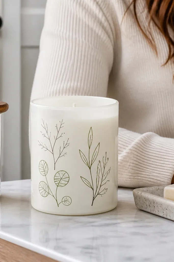
This design is all about clean linework and negative space. An off-white base makes the candle feel calm and modern, while a single-line botanical drawing looks crisp even at a glance. Use a fine brush or paint pen so the lines stay consistent in thickness. It’s also forgiving: if a leaf shape is slightly uneven, the minimal style still reads intentional.
Paint the whole candle off-white, then let it dry completely. Sketch the botanical lightly with a pencil, then trace over it using black paint with a liner brush or paint pen. Add one or two tiny accent dots in muted green, then seal with a matte or satin clear coat to keep the lines from turning glossy.
Practice the leaf curve on scrap wax paper first — steady pressure keeps the line weight even.
Avoid filling every gap — heavy coloring makes line art look like a coloring book.
4. Ombre Fade From Cocoa to Cream
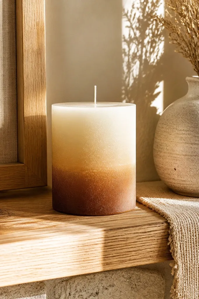
Ombre reads premium when it’s smooth and vertical. Cream at the top stays bright and airy, while cocoa at the bottom adds grounding weight. This look hides minor brush marks better than solid color blocks, but only if you blend while the paint is still workable. The result is photogenic because the gradient catches light differently across the candle’s curve.
Paint a cream base first and let it dry. Then paint cocoa starting at the bottom third and feather upward with a damp brush, blending until you get a gradual transition. Repeat with lighter passes if you need more smoothness, then seal with a satin topcoat to keep the gradient soft.
Use a slightly damp blending brush, not wet — wet brush reactivates paint and causes tide lines.
Avoid hard boundaries between colors — tape lines make ombre look like stripes.
5. Terrazzo Speckle in Sage, Sand, and Black
Terrazzo-style speckling creates instant texture without needing artistic drawing skills. Sage and sand keep it fresh and neutral, while black specks add contrast so the candle looks lively in photos. This style is also great for covering small imperfections from earlier candle attempts. The key is controlling dot size: big blobs look messy, tiny dots read clean.
Base-coat the candle with sand. Load a toothbrush or stiff brush with sage paint, then flick small dots across the surface; clean the brush often to avoid clumps. Add smaller black dots for contrast, then let everything dry and seal with a clear coat so the specks don’t scratch off.
Hold the brush farther away for smaller dots — close flicking makes big splats.
Avoid one heavy pass — do two light flicks instead of drowning the candle in paint.
6. Sunburst Rays With Negative Space Center
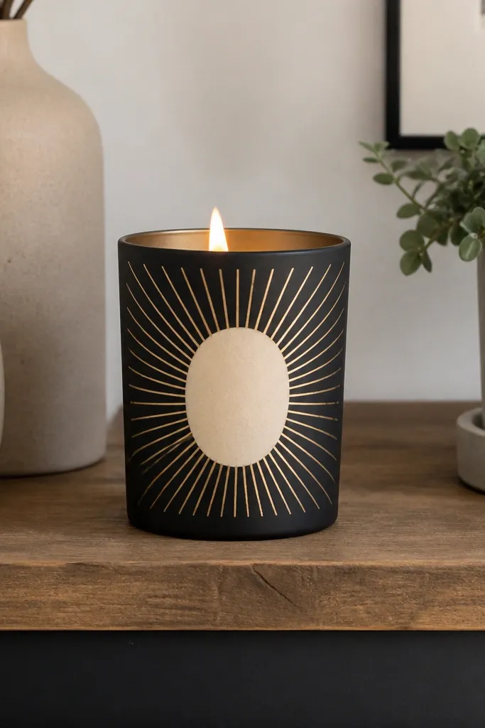
Sunburst designs look graphic and celebratory, but they only work if you keep the center clean. Leave a small circular or oval negative space where the candle’s original color shows, then paint rays radiating outward. Gold rays bring warmth without needing a rainbow. This style is perfect for shelves and front-facing photos because it reads like a poster.
Mark a center point and lightly sketch ray lines with pencil. Paint the candle in a light base color only if needed, then brush gold rays between the pencil marks. After the gold dries, erase pencil marks and add a thin gold ring around the negative center for structure. Seal with satin clear coat so the rays don’t dull.
Editor's noteUse a ruler to space rays, then only draw half — mirror the spacing to keep symmetry.
Skip thisAvoid thick rays — they turn into blotches and lose the sunburst look.
7. Stencil Check Grid in Two-Color Contrast
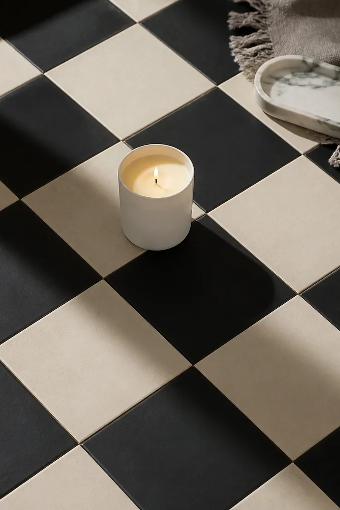
A check grid looks modern and tidy when the squares are consistent. Two-color contrast makes it pop: think cream and black, or blush and deep navy. Stencil work is where candle painting looks most “designed,” because edges stay sharp. This one is a lifesaver when your freehand lines usually wobble.
Choose a stencil with square openings sized to your candle diameter. Paint the base color first and let it dry fully. Tape the stencil in place and paint the second color using a sponge or stencil brush, pressing lightly so paint goes into openings without bleeding. Remove carefully, let dry, then seal with clear coat.
Warm the stencil with your hands for 10 seconds so it grips the wax better and won’t shift.
Avoid dragging the stencil — it smears the second color and ruins the grid.
8. French Stripe Band With Matte Topcoat
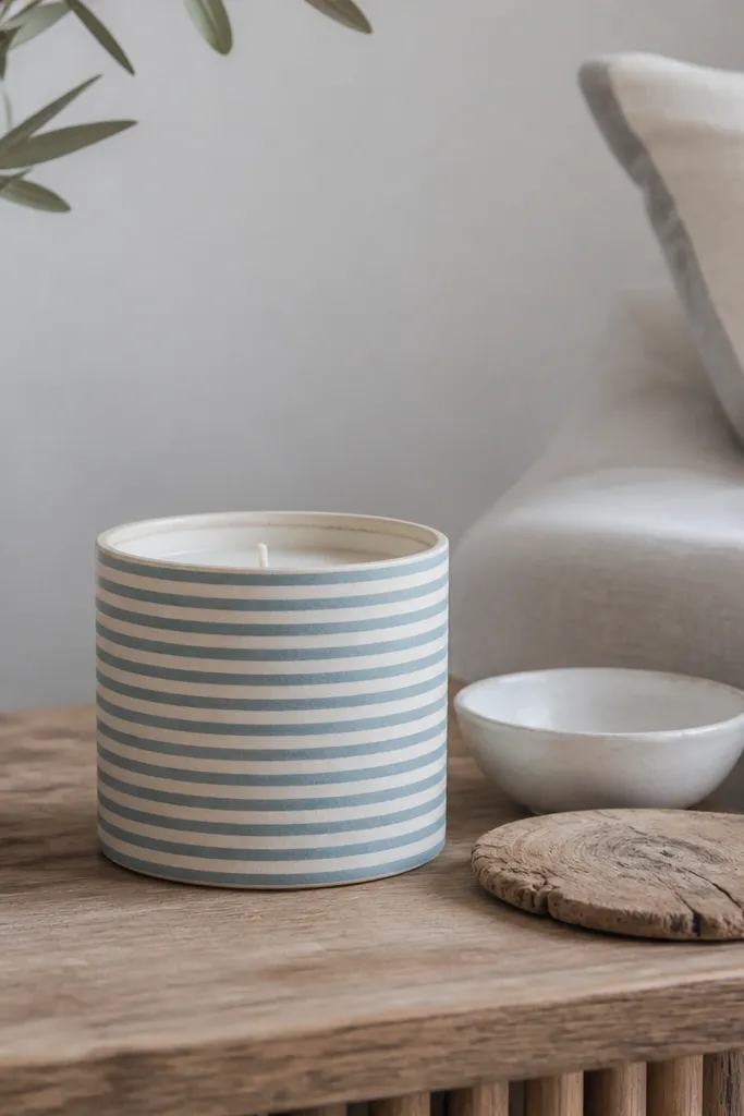
Thin stripes make candles look styled like decor objects, not craft projects. Matte finish is the secret for aesthetic photos because gloss highlights every brush stroke. Choose muted blue and cream for a clean, coastal vibe, or black and ivory for a more dramatic look. Keep stripes narrow and evenly spaced so the candle reads as design, not decoration.
Base-coat the candle with cream and let dry. Use painter’s tape to mark thin stripe bands around the candle, leaving small gaps for the blue stripe areas. Paint muted blue, remove tape while paint is slightly tacky, then after full dry apply a matte topcoat to lock it in.
Editor's notePull tape at a sharp angle — it keeps stripe edges cleaner than pulling straight off.
Skip thisAvoid wide stripes — they amplify uneven paint and make the candle look homemade.
9. Galaxy Fade With Star Dot Constellations
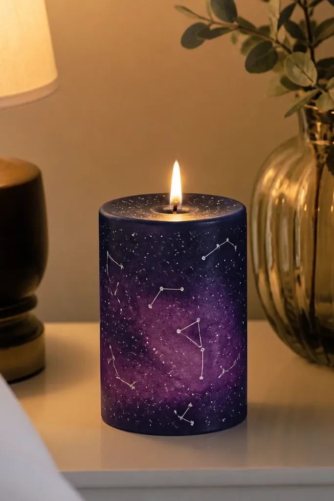
Galaxy candles look great because they combine smooth gradients with tiny details. A dark navy base gives depth, then purple fade adds a soft glow. Tiny white dots for stars make the candle feel dimensional in a photo, especially under warm light. Keep the constellation lines thin so it doesn’t turn into a messy doodle.
Paint the candle navy and blend a purple wash from mid-height upward. While the purple is still slightly wet, splatter tiny white dots using a toothbrush. Add 2-3 short constellation lines with a fine liner brush, then seal with satin clear coat to preserve the gradient without turning everything cloudy.
Editor's noteUse a piece of cardboard behind the candle when splattering so dots stay controlled.
Skip thisAvoid big star blobs — they look like accidental paint drops.
10. Botanical Wreath Around the Middle
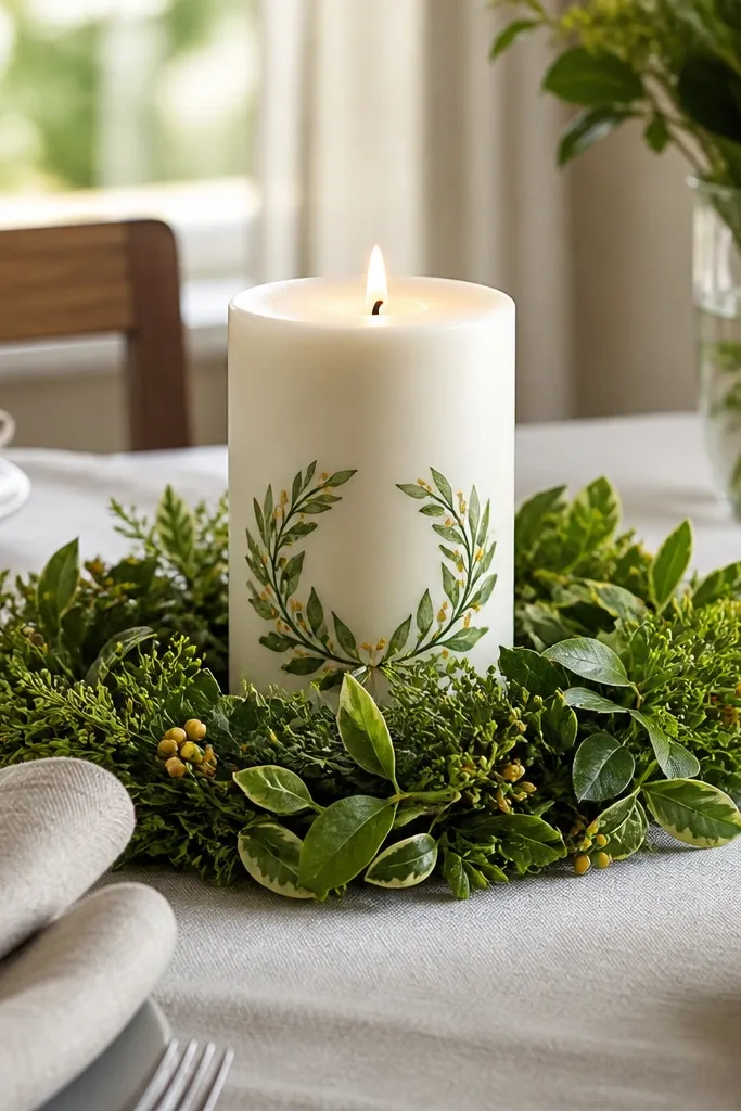
Wreath placement is what makes this look premium. Put the wreath around the candle’s middle so it frames the candle when it sits on a tray. Use small leaf shapes and a few tiny berries or dots so it looks balanced, not busy. This style also hides minor imperfections because the wreath draws the eye.
Paint the candle off-white and let it dry. Lightly draw a circle guide around the middle, then paint small leaves outward and inward along the guide using a fine brush. Add tiny berry dots in muted red or terracotta, then outline 3-4 leaves with a slightly darker green for depth. Seal with clear satin coat.
Make leaves all the same size range; variety in size looks natural, but chaos looks accidental.
Avoid covering the whole candle with leaves — a wreath needs breathing room.
11. Terracotta Faces With One-Line Features
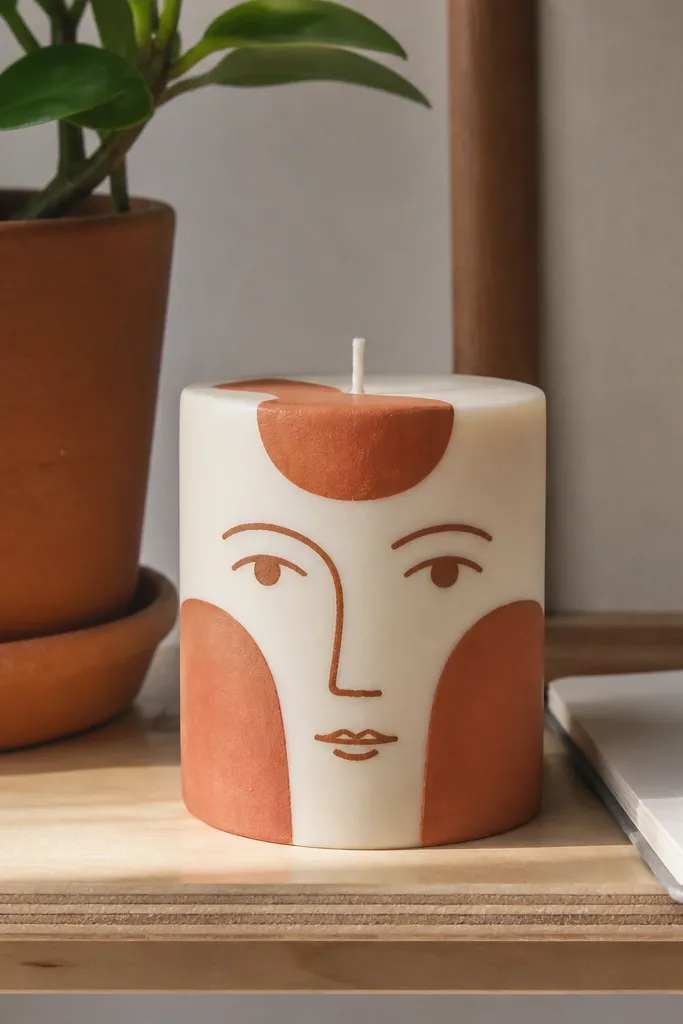
Faces are instantly photogenic because they read like art, even when simple. Use terracotta shapes for cheeks and forehead patches, then one-line eyes and a small mouth for personality. This design works because the bold color blocks create structure, while the line details keep it clean. Pick a calm expression so it looks decor-friendly, not cartoonish.
Base-coat the candle cream. Paint two terracotta cheek patches and a forehead patch, keeping edges soft with a damp brush. Add one-line eyes and a small nose using black liner paint, then add a thin terracotta mouth. Let everything dry and seal with matte topcoat to reduce glare in photos.
Keep facial features centered — off-center faces look like mistakes even if they are intentional.
Avoid heavy shading around the eyes — it turns into smudges on wax.
12. Marigold Floral With Dotted Petal Centers
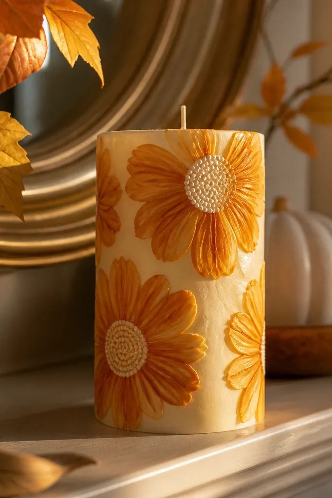
Marigolds look cheerful and high-end when the petals are painted in controlled arcs. Use white or pale cream base so the marigold color pops. Dotted petal centers add texture that catches light, making the candle feel handmade without looking messy. This is a strong choice if you want a warm look for fall and photos that still feel clean.
Paint the candle pale cream and let it dry. Sketch flower positions lightly, then paint petals in marigold orange with small curved strokes. For the center, use a sponge or tiny dotting tool to dab yellow dots, then add a few darker orange dots around the edge for depth. Seal after full dry with satin coat.
Dot the center last — it stays crisp and doesn’t smear into petal edges.
Avoid painting petals in one thick layer — thin layers keep petal edges defined.
13. Geometric Triangles With Tape-Perfect Edges
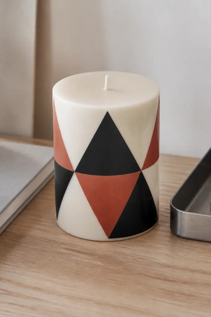
Geometric triangles look sharp because tape creates straight edges that the eye trusts. A cream base keeps the design clean, while black and terracotta add modern contrast. This is one of the fastest ways to get an aesthetic result because you’re building shapes, not drawing. It also hides small brush mistakes since the design is structured.
Base-coat the candle cream and let it dry. Apply painter’s tape to form triangle sections, then paint one section black and another terracotta. Remove tape carefully while paint is slightly tacky for crisp edges. Fill any tiny gaps with a liner brush, then seal with clear satin topcoat.
Editor's notePress tape down with a fingernail, not your palm — you get cleaner lines and less bleed.
Skip thisAvoid overworking edges after paint dries — you’ll create fuzzy borders.
14. Monochrome Ombre Rose With Vein Details
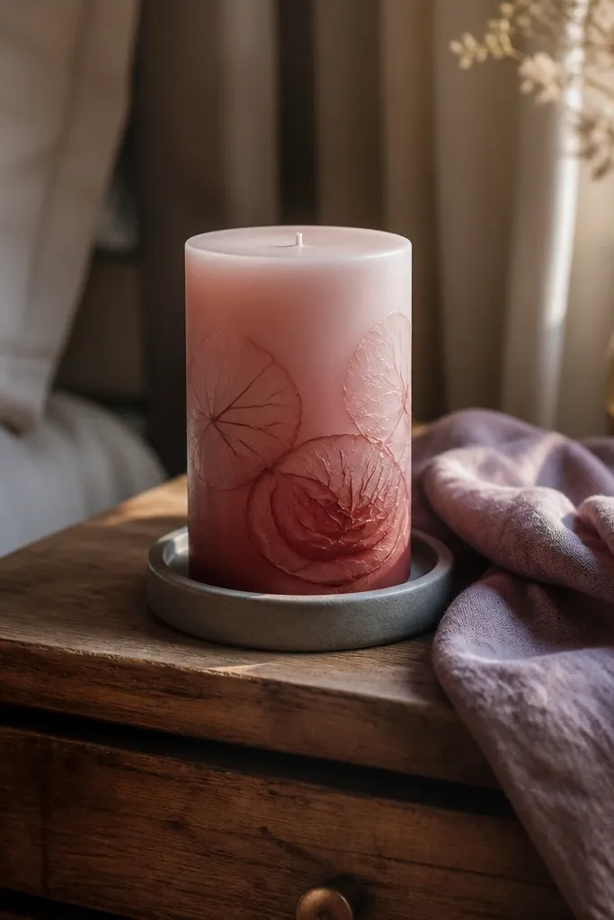
This look is delicate and photo-friendly because it stays monochrome. A rose ombre base provides soft color, then a faint rose outline adds structure without adding clutter. Vein lines make the flower feel real, and monochrome keeps everything cohesive. It suits tabletop decor where you want something pretty but not loud.
Paint the candle a light base pink, then add deeper rose starting at the bottom and blend upward with a damp brush. Sketch a large rose outline near the front and keep it faint with light pencil. Paint the rose outline in a slightly darker pink, then add 5-7 simple vein lines from the center to petal edges. Seal with satin clear coat once fully dry.
Editor's noteUse pencil lightly — dark pencil lines can show through under translucent paint.
Skip thisAvoid adding too many flower details — veins are enough; extra petals make it look busy.
15. Navy and White Nautical Rope Wrap Illusion
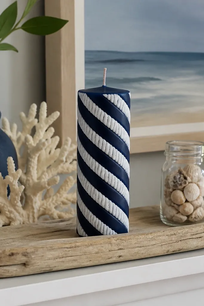
Rope wrap designs look three-dimensional even when they’re flat paint. Use navy as the base and paint a white spiral that suggests twisted rope. The illusion works because the spiral has consistent spacing and slight thickness variation, like real rope strands. This one pops in coastal rooms and looks great on a shelf because it reads from a distance.
Base-coat the candle navy and let it dry. Starting near the top, paint a thin white spiral line around the candle using a liner brush, keeping the spacing consistent. Add a second parallel spiral line and connect them with short dashes to suggest rope twist. Let dry, then add a very thin highlight line on one strand for depth and seal with satin topcoat.
Rotate the candle slowly while painting the spiral to keep the curve even.
Avoid thick spiral lines — rope should look slender or it turns into random swirls.
16. Coffee-Bean Brushstroke Pattern on Cream
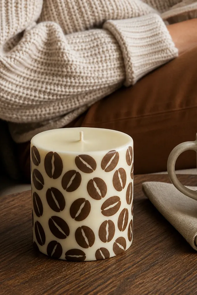
This is a pattern design that looks handcrafted without being fussy. The coffee-brown bean shapes repeat cleanly and create texture that reads well in close-up photos. Cream base keeps it warm and modern, and the brushstroke edges look natural when you don’t try to make each bean perfectly identical. It’s a strong choice for kitchen decor.
Paint the candle cream and let it dry. Mix coffee-brown paint with a touch of water so it flows like a soft stain. Stamp or brush small bean shapes in a grid pattern, leaving gaps so the candle shows through. After the pattern dries, add a tiny lighter brown highlight on each bean edge, then seal with satin coat.
Use a stiff brush for bean edges; soft brushes smear and flatten the texture.
Avoid filling every gap with paint — negative space makes the pattern look intentional.
17. Pastel Gradient Brushstroke Stripes
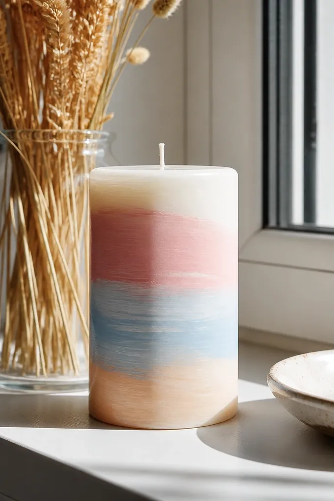
Layered brushstroke stripes look airy and modern when the colors blend lightly instead of forming hard blocks. Choose three pastels and keep the stripe edges slightly feathered so the candle feels soft. This style is photogenic because it shows visible brush texture in a controlled way, not in chaotic streaks. It’s a good option if you like painterly looks.
Base-coat the candle white or very pale cream. Paint one pastel stripe, then while it’s still tacky, blend the edge into the next stripe color with a damp brush. Repeat for all stripes, then do a thin clear matte topcoat to unify the texture. Keep stripe widths consistent so it reads as design, not random color.
Blend only the edge — leave the center of each stripe more solid for contrast.
Avoid using too much water — it creates translucent patches and breaks the stripe shape.
18. Black Lace Dotwork With Soft Gray Base
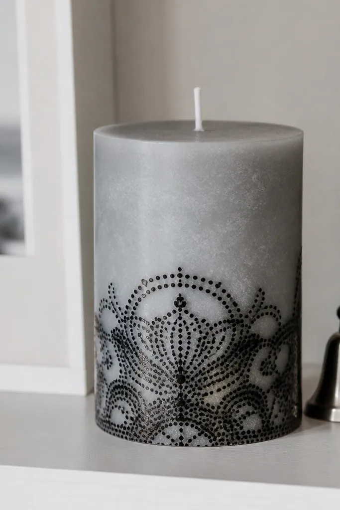
Dotwork lace looks delicate and dramatic because it builds texture with tiny marks. A soft gray base keeps the candle modern, while black dot lace gives contrast that shows in photos. Place the lace near the bottom third or around the middle to frame the candle and make it feel intentional. This style works well for people who struggle with drawing — dots are easier to control than curves.
Paint the candle soft gray and let it dry. Use a dotting tool or the back of a small paintbrush to create a lace border around the chosen area, starting with a simple scallop edge. Fill the inside with small arches and connecting dots, keeping gaps so it doesn’t turn into a solid blob. Let it dry, then seal with matte topcoat to keep the lace texture from looking shiny.
Editor's noteKeep dot spacing consistent by counting about 3-5 dots per small section before you move on.
Skip thisAvoid thick paint for dots — it spreads and turns into rings.
19. Rainbow Micro-Blocks in a Vertical Stack
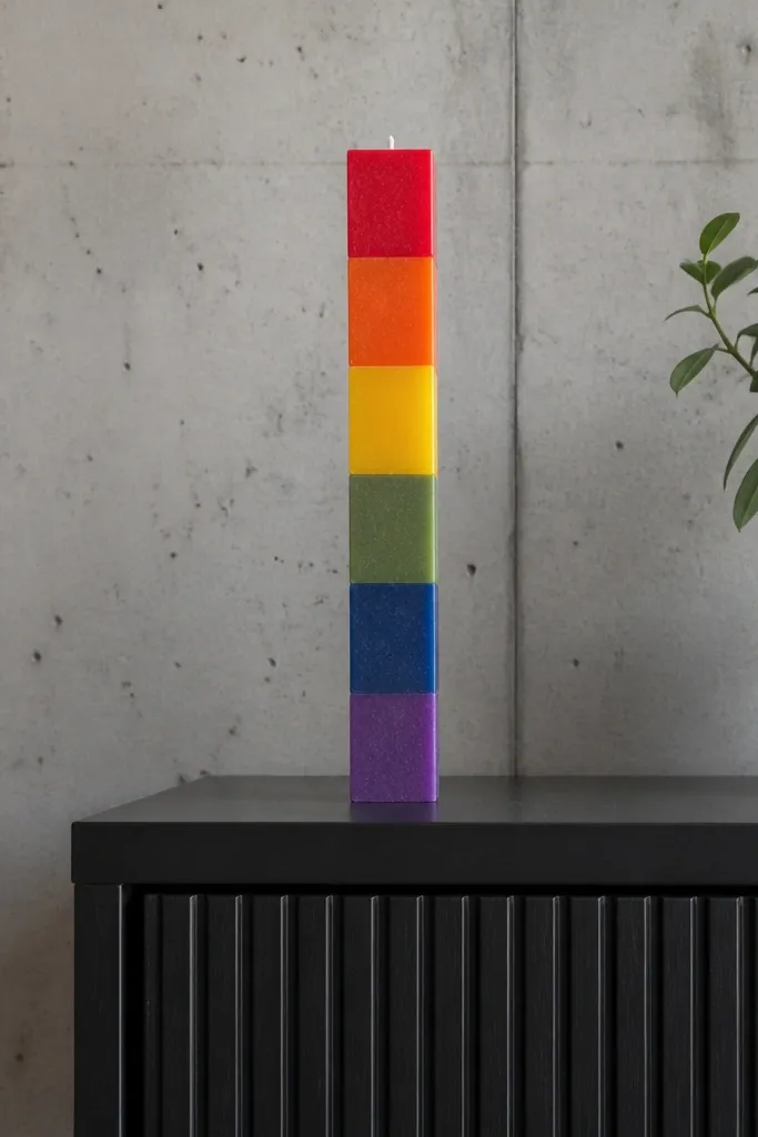
Micro-block stacks look playful and very photo-friendly because each color reads separately. Use bright but clean hues, and keep the blocks narrow so the candle looks like a modern art object. The vertical stack direction also flatters tall candles. This is one of the best ways to use multiple colors without ending up with muddy blends.
Paint a white base and let it dry. Tape off narrow vertical strips, then paint each strip a different color using a small brush. Remove tape carefully after each color dries slightly, then touch up edges with a liner brush. Seal with satin topcoat so colors stay crisp and don’t dull into gray.
Do two passes per color: first thin coverage, second solid color after it sets for 5-10 minutes.
Avoid painting all colors at once — accidental overlap turns blocks into smudges.
20. Pressed-Dried Flower Silhouette With Ink Bloom
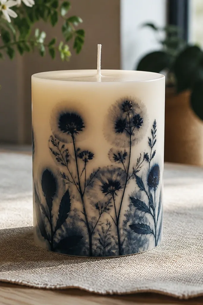
This one looks fancy fast because the silhouette reads crisp from a distance, while the ink bloom gives that handmade, slightly imperfect edge that photographs well. You are building a high-contrast design with real texture from pressed flowers, then softening the boundary with diluted paint so it looks intentional, not like a smudge. It fixes the two most common candle-painting problems at once: designs that look flat and designs that bleed into each other at the edges. You only need basic supplies, and the time sink is the flower press, not the painting. It fits small spaces like shelves, bedside tables, and gift sets because it looks like custom stationery turned into candle art.
1) Press real flowers flat for at least 3-5 days (thin petals work best). Choose one flower per candle side, then sketch the outline lightly with a pencil so you keep the silhouette centered. 2) Paint the candle base with 2 thin coats of matte base color (charcoal gray or deep navy). While the base is dry, trace the flower shape and fill it in with acrylic ink or craft paint thinned to a smooth flow, then immediately dab around the edges with a brush loaded with water-diluted ink to create the bloom. 3) Seal after everything is dry with a candle-safe clear coat in thin layers, keeping the sprayer or brush strokes light so you do not create a thick glossy ridge over the silhouette.
Use 2-3 thin coats instead of one heavy layer. Heavy paint makes the edges look chalky and increases cracking when the candle warms.
Do not use wet flowers or skip a long press time — moisture turns the silhouette edges fuzzy and makes the paint lift.



