

1. Candy-Stripe Glass Candle Band
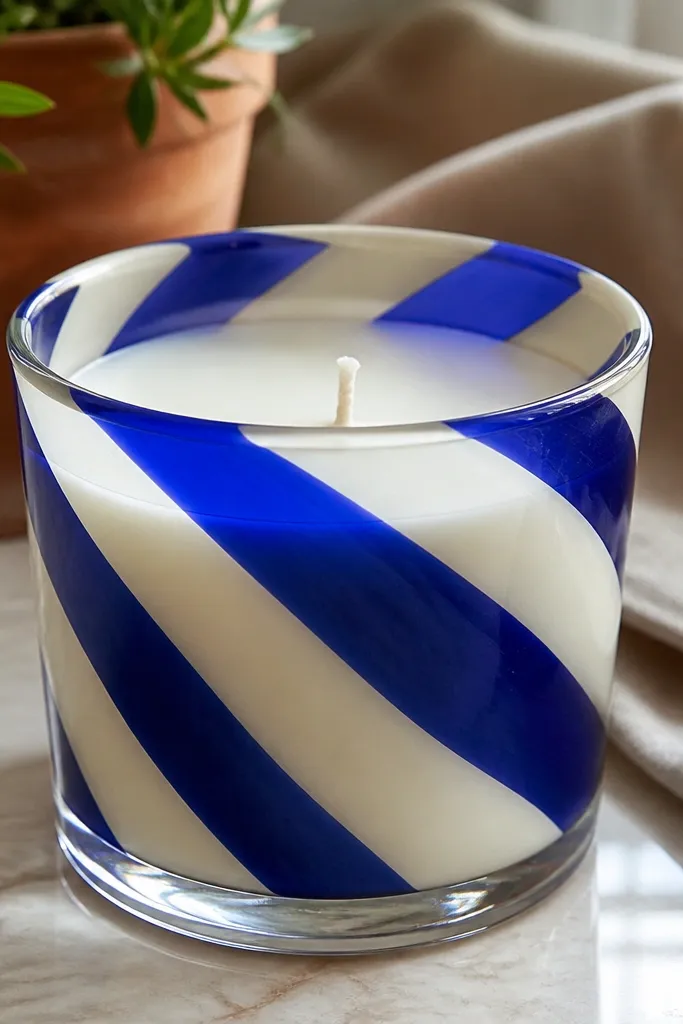
Start by wiping the glass with rubbing alcohol and letting it dry. Tape two or three diagonal guide lines with painter’s tape, then paint between them with acrylic — red first, white second if you want a crisp alternating look. Let it dry, remove tape while the paint is still slightly tacky for cleaner edges, then add a thin second coat where gaps show. Finish with a clear acrylic sealer after full cure.
This one looks instantly polished because stripes create a clean graphic line around the candle. Use diagonal bands so the curve of the glass turns the stripes into something dynamic instead of flat. It’s also forgiving: if your lines wobble slightly, the overall pattern still reads. Pair it with a glossy clear coat so the paint looks like it’s printed, not painted by hand. This is best for glass pillar or jar candles and works in under an hour.
Skip thisDon’t flood the stripe area; thick paint runs down the glass.
Editor's noteUse painter’s tape, not masking tape — it leaves fewer edge ridges on glass.
2. Sunset Gradient Wax Pillar
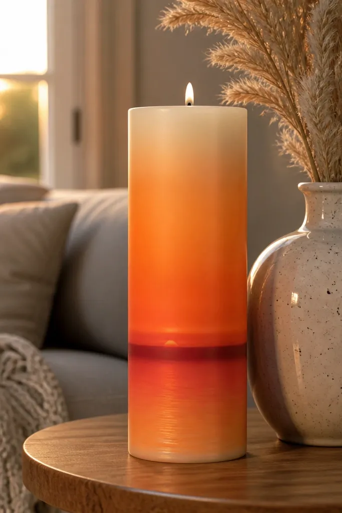
Lightly sketch a faint horizon line with a pencil. Paint three to five wide horizontal bands: deep purple at the top, then plum, then pink, then orange near the middle, and a thin cream or yellow near the bottom. Blend the edges with a slightly damp sponge or a dry brush, using light taps instead of scrubbing. Add a tiny darker “hill” silhouette at the bottom if you want extra contrast.
A sunset band makes a candle look like decor, not a DIY experiment. The gradient hides small brush marks because the color changes smoothly across the surface. Keep the horizon line simple and let the colors do the work. This looks especially good on tall wax pillars because the scene stretches upward. Beginners love this because you’re not drawing complex shapes — just layering color bands and blending them.
Skip thisDon’t use too-dark yellow — it turns the sunset into a dirty brown.
Editor's noteBlend with a sponge using 1-2 taps per edge; scrubbing makes muddy color.
3. Black Cat Silhouette on Cream Taper
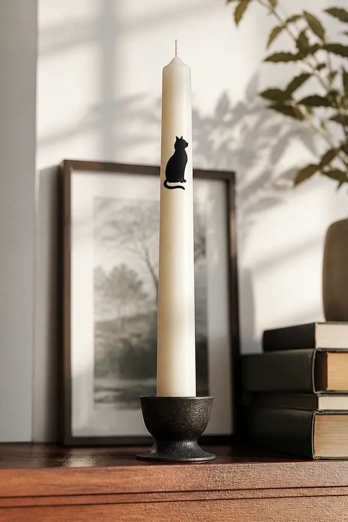
Sketch the cat outline lightly or trace from a printed silhouette. Paint the cat body with black acrylic in one or two coats, keeping the edges smooth. Add one small highlight line on the cheek and a short tail curve using a white paint pen. Let it dry fully before handling, then finish with a clear sealer made for acrylic if you want extra protection.
High-contrast silhouettes read cleanly on a taper and photograph well. A cat shape is simple enough for beginners but still feels cute and intentional. You get instant personality without tiny details. Place the silhouette near the top third so it looks like decor on a shelf, not a “sticker” stuck at the bottom. This is a great idea for Halloween or cozy fall styling.
Skip thisSkip the whisker dots if they look shaky; thicker whiskers read better.
Editor's noteUse a paint pen for the tail — it gives you a cleaner curve than a brush.
4. Botanical Line Art on Clear Glass
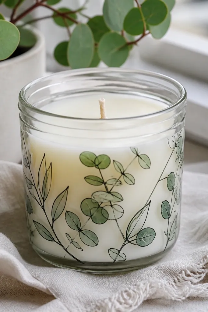
Plan a simple composition: one main stem running vertically, with leaves branching to each side. Use a fine liner brush or paint pen to draw in green and add darker green for leaf veins. Let lines dry, then add a light wash of pale green at the base to make the plant look rooted. Seal with a clear acrylic sealer for glass.
Line art is one of the easiest ways to make candle painting look expensive. Thin leaves and stems stay crisp even if you’re new to freehand because you’re drawing with controlled strokes. The clear glass makes the lines pop and creates depth as the candle curves. Choose one plant theme — like eucalyptus or monstera — so it looks cohesive. This works best on glass jars or hurricane-style holders.
Skip thisDon’t use thick paint for the lines; it smears when you touch the surface.
Editor's noteDo one leaf at a time and rotate the candle so your hand stays steady.
5. Gold Foil Look Dots on Matte White Candle
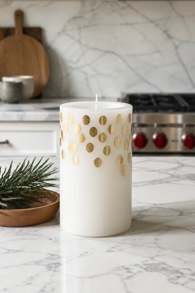
Lightly mark a vertical center line. Add a line of dots from top to bottom using gold acrylic, spacing them evenly. For extra depth, add a second staggered dot row on one side at about half the dot size. Let dry, then paint a few tiny white highlights inside select dots for a faux-foil sparkle effect.
Dot patterns look clean and modern because they’re rhythmic. The gold-foil look gives you that “holiday decor” vibe without needing real foil sheets. Matte white is the best base because it keeps the contrast crisp. This design is quick, beginner-friendly, and very photogenic from straight-on angles. It also hides minor placement issues because dots forgive small shifts.
Skip thisSkip swirling the paint on the candle; it creates lopsided blobs.
Editor's noteUse a toothpick for uniform dots if you don’t have a dotting tool.
6. Marbled Wax Candle with Two-Color Veins
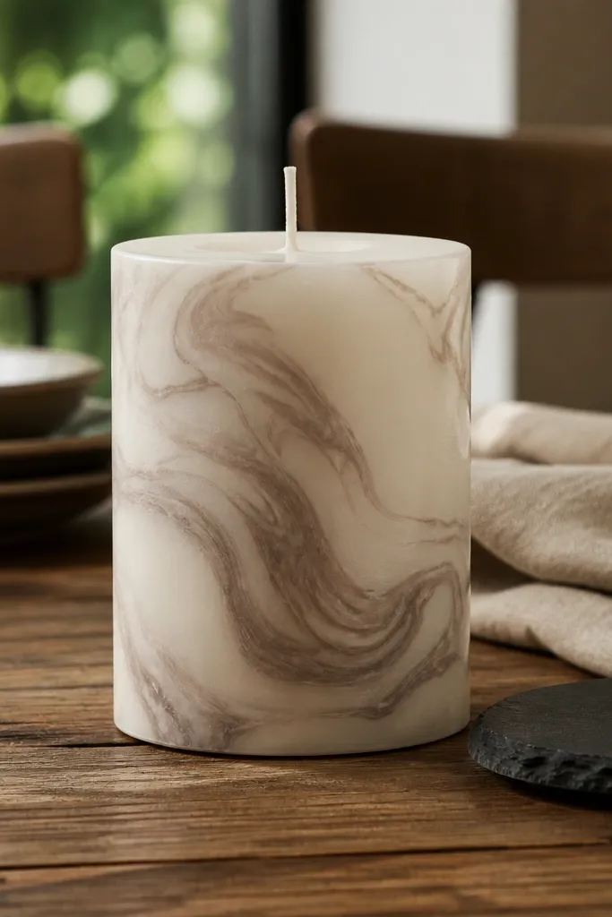
Marbling looks complex, but it’s mostly about controlled chaos. You get a premium, stone-like effect that makes a cheap candle look high-end. Two colors are enough: one base and one vein color. The wax shape helps because the swirls naturally flow around the curve. This is a great pick when you want wow-factor without needing to draw anything perfectly.
Paint the entire candle with a smooth base coat in your lighter color. Mix your vein color with a tiny amount of water so it flows, not pools. Drag the vein color through the base with a clean brush or a palette knife held at a slight angle, then add a few extra lines with a paint pen. Let it cure fully before you stack or gift it.
Keep a damp paper towel nearby and wipe your brush between passes.
Don’t overwork the marbling; too many layers dull the effect.
7. Geometric Triangle Frame on Glass
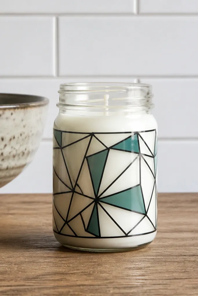
Geometric frames look bold and clean in photos because the shapes read instantly. A triangle border is simple to plan, and you can keep it beginner-level by using only two or three colors. Black outlines make everything pop, while small colored fills add interest without turning into a busy mess. This is perfect for a modern shelf or a desk candle. Glass makes the frame look sharp and dimensional.
Draw a rectangle outline area on the glass using painter’s tape as guides. Inside, paint a triangle frame: top triangle pointing down, bottom triangle pointing up, and side triangles if you want a fuller look. Use black acrylic for the outline, then fill each triangle with one bright accent color like teal or mustard. Remove tape carefully after the paint sets, then seal for durability.
Use tape to create straight edges, then touch up with a fine brush after it dries.
Don’t freehand the whole frame; straight guides make it look intentional.
8. Galaxy Dots and Tiny Stars
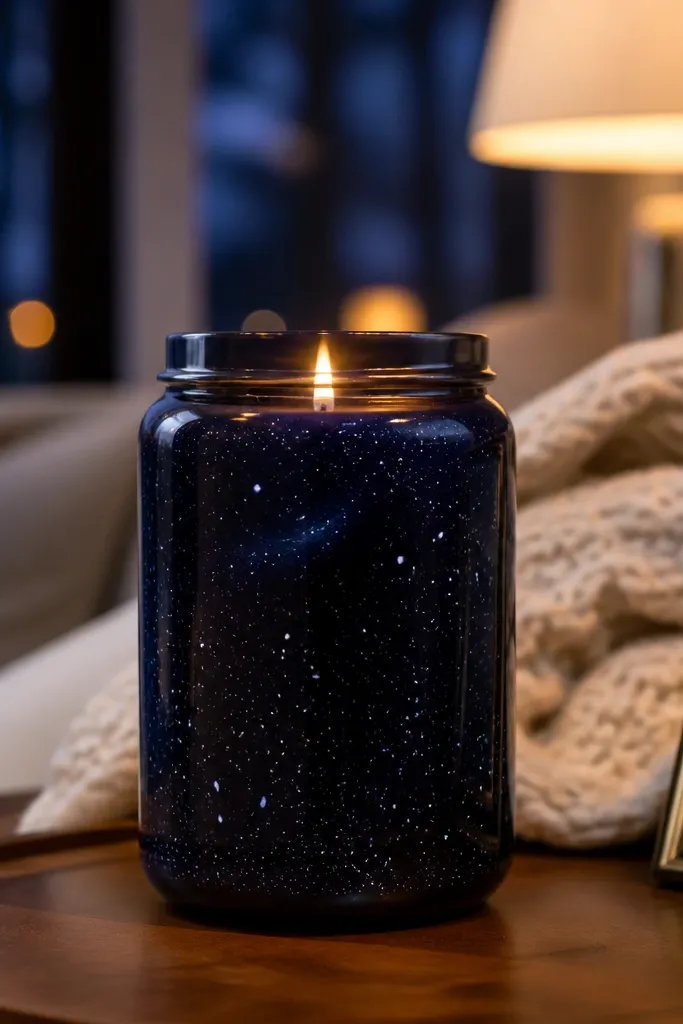
This is the “I didn’t know candle painting could look like this” design. The galaxy effect uses layered dark colors plus tiny star dots, so it hides uneven coverage. It’s easy because you’re repeating a pattern: stars get smaller and sparser toward the edges. Add one faint swirl for motion and you’re done. It looks amazing in low light and photographs well with a dark background.
Paint the candle with a dark navy or black base coat. Dip a toothbrush (or a stiff brush) into white acrylic and flick tiny stars across the surface. Add a few larger dots as focal points, then lightly blend a lighter blue streak with a damp sponge for a nebula cloud. Let dry, then optionally add a couple of silver dots for extra sparkle.
Practice flicking on scrap paper first so the star size matches your candle scale.
Don’t use thick white paint for stars; it looks like paint blobs.
9. Wreath Leaves Half-Moon on Taper
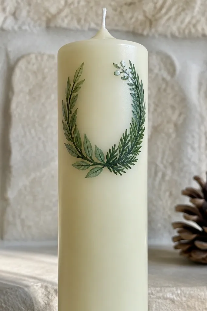
Decide where the wreath arc lands — usually on the upper third. Paint a thin green arc line, then add leaf shapes along it using a small angled brush. Use a darker green for leaf edges and a lighter green for the center strokes. Finish with 3-5 berry dots in red or burgundy and a tiny cream bow line if you want it extra cute.
A half-moon wreath gives you a decorative frame without needing to draw a full circle. It hugs the taper shape in a way that looks balanced and intentional. Leaves painted in two greens give dimension, and you can add a tiny bow or berry dots near the top. This is a strong beginner project because the composition is simple: one arc, then leaf clusters. It looks great for spring, winter, or year-round styling.
Skip thisDon’t fill the whole taper with leaves; the negative space makes it look clean.
Editor's notePaint the leaves in clusters of 2-3; single leaves look sparse on a taper.
10. Monochrome Checkered Band
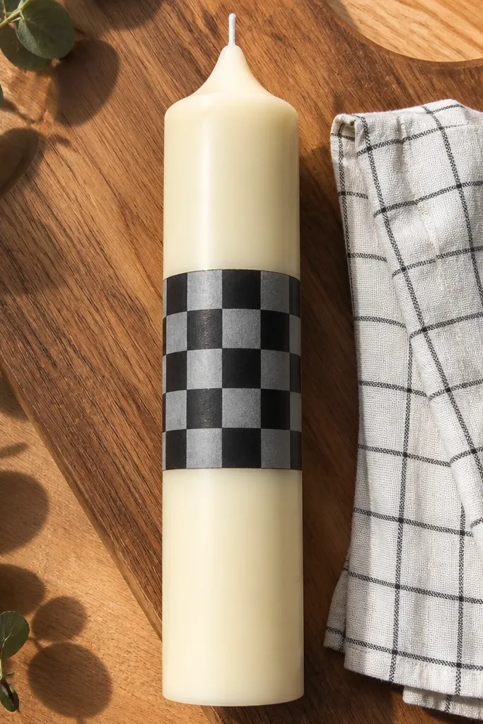
Tape off a horizontal band across the candle using painter’s tape. Paint the band in white first and let it dry. Then use a ruler to mark small squares and paint alternating black squares with a small flat brush. Remove tape after the black dries and add a thin second coat if any squares look streaky.
Checkers look sharp and graphic, and they’re easier than they seem. A band design keeps the effort contained, so you don’t have to cover the whole candle. Monochrome checkers also photograph well because contrast is high. If your lines aren’t perfect, the grid still reads. This is great for beginners who want a structured pattern.
Skip thisDon’t rush tape removal; pull too early and you’ll lift wet paint.
Editor's noteUse a square brush or a small flat brush so your square edges stay crisp.
11. Terracotta Pot and Stem on Glass Jar
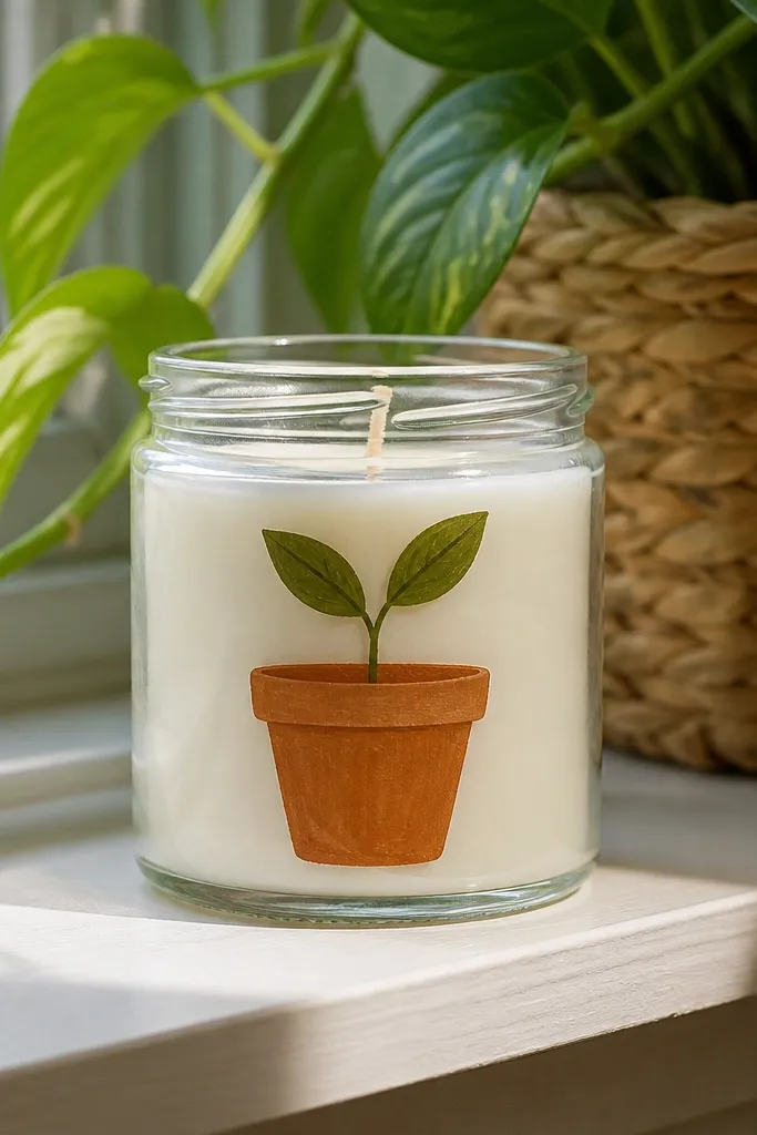
This design looks like mini plant decor, which people love because it feels “real” and layered. You paint a simple pot shape, then add a stem and a few leaves. The glass jar makes the pot look like it sits inside the jar space. It’s also easy to keep tidy because the pot is a clear outline and the leaves can be simplified. Great for small spaces and shelves.
Paint a simple semicircle pot shape in terracotta near the lower third of the jar. Add a darker terracotta rim line and a light cream highlight stroke at one side. Paint a single vertical stem in deep green, then add 3 leaf shapes branching out. Seal with clear acrylic sealer for glass so the paint doesn’t scuff.
Use watered-down paint for the highlight so it blends into the pot without harsh edges.
Avoid painting tiny leaf veins; too much detail makes beginners' lines look messy.
12. Soft Ombre Hearts Around a Taper
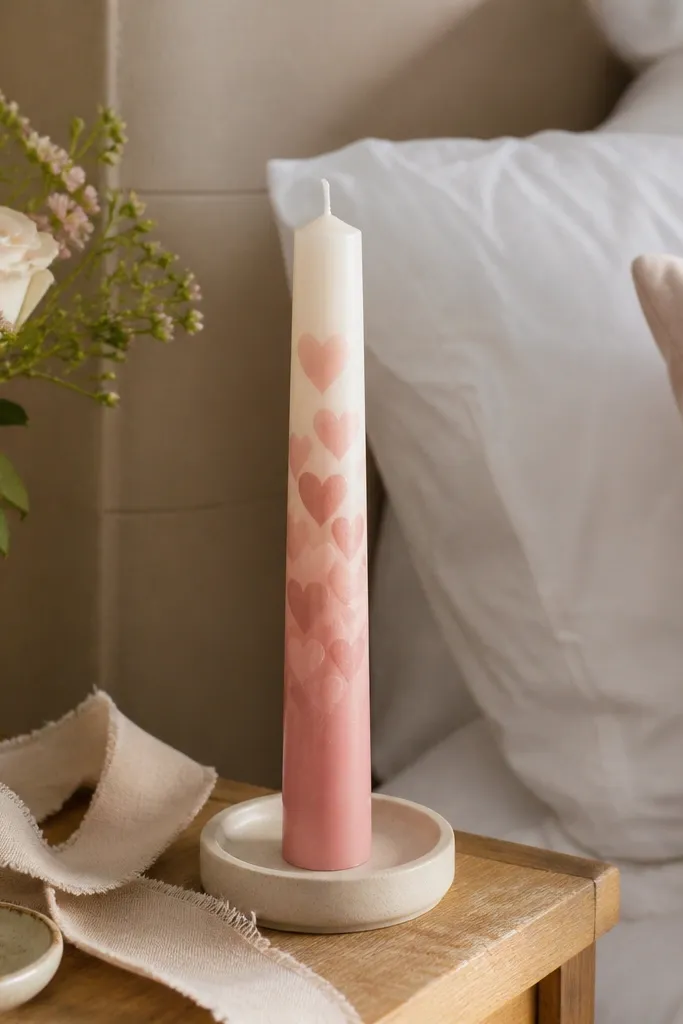
Paint a vertical ombre base on the taper using three pink shades, blending at the edges with a sponge. Use a heart stencil or a printed heart template to place hearts in a slightly darker pink. Paint hearts in two passes: one for the fill, one for a thin outline if you want extra definition. Let fully dry, then add a couple of tiny white dots inside hearts for highlight.
Hearts are cute, but the ombre makes them look grown-up. The gradient background softens any brush unevenness and makes the hearts look like they’re floating. This is a great idea for Valentine’s, bridal showers, or just cozy vibes. It’s beginner-friendly because you can use a stencil for hearts and focus on placement. Photograph it against a neutral surface so pink reads cleanly.
Skip thisDon’t make hearts all the same size; a little variation looks more natural.
Editor's noteIf you don’t have a stencil, trace heart shapes on scrap paper and reuse it as a guide.
13. Art Deco Arches in Black and Brass
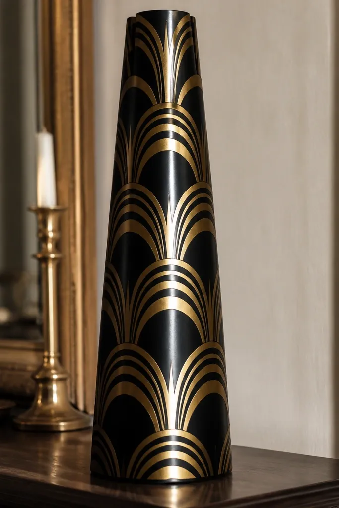
Mark three vertical columns and a few horizontal guide lines lightly. Draw repeating arch shapes in black — each arch opens upward or downward depending on your layout. Fill the arch interiors with a thin gold acrylic line or dots to mimic brass accents. Let dry, then add a final gold outline to sharpen the edges.
Art deco arches make a candle look like it belongs in a stylish room. The repeating arch pattern looks intentional and high-contrast, even with simple shapes. Black and gold are a classic combo that reads as “decor” instantly. This design works best on tall tapers or pillars because the arches can stack vertically. It’s clean, bold, and very photogenic from the front.
Skip thisDon’t use glitter paint for the whole design — it can look gritty and uneven.
Editor's noteUse a ruler for the guide lines; it stops the pattern from drifting.
14. Watercolor Wash Florals with One Bold Stem
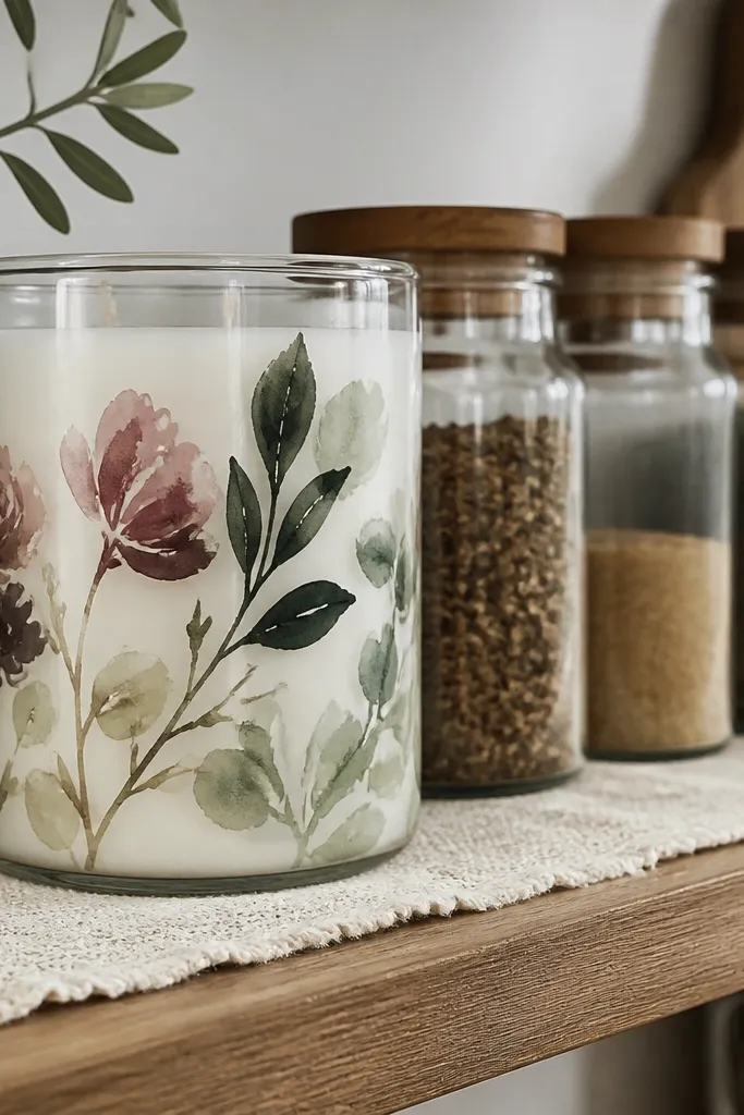
You get the watercolor look without needing fancy techniques. The trick is choosing one bold stem and letting the flowers be loose and simple. That keeps it from turning into a “paint splatter” mess. Use a limited palette like sage green, dusty rose, and cream so it looks curated and calm. This works beautifully on glass and smooth wax because the wash spreads evenly.
Paint a light base wash across the candle using watered-down acrylic in cream. Add one strong vertical stem in deep green with a small brush. Paint 4-6 small flower blobs around the stem using rose and sage, then blend edges with a damp brush for a watercolor effect. Let it dry, then add tiny dot centers in a darker shade.
Water down acrylic with a drop of water, not a splash, so it stays controlled.
Don’t cover the whole candle with full-strength paint; watercolor needs air between shapes.
15. French Stripe Lavender Candle
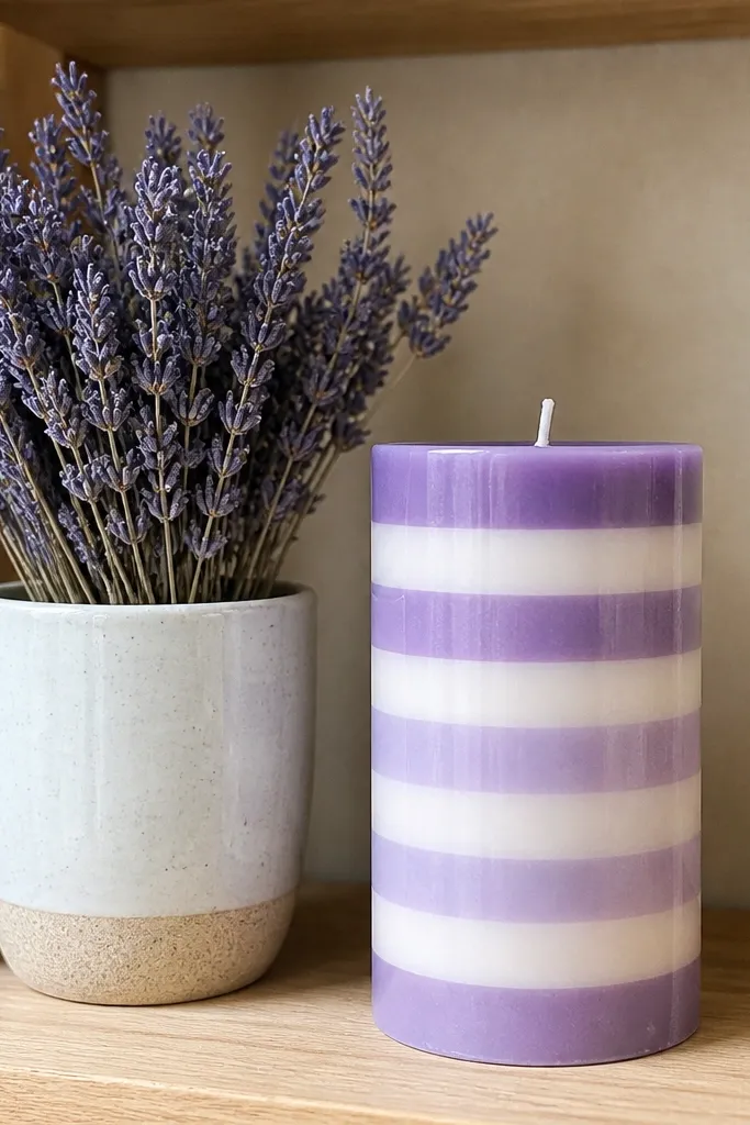
Tape off 5-7 narrow horizontal stripes across the candle. Paint alternating stripes in lavender and cream, using a small flat brush to avoid bleeding under tape. Let each color dry before removing tape so edges stay crisp. Add a thin gold line above or below the band if you want a slightly fancy finish.
French stripes look cheerful and clean, and lavender makes it feel fresh. This is another band design, so it’s beginner-friendly and fast. The key is keeping stripe widths consistent so the candle looks intentional. It also pairs well with real dried lavender stems on shelves. This one is photogenic because the stripes are easy to read even from a few feet away.
Skip thisDon’t paint over wet stripes; they blend and ruin the crisp look.
Editor's noteUse a ruler to mark stripe widths on the tape — it’s the difference between “cute” and “clean.”
16. Pressed Flower Vein Look with Green Dry-Brush
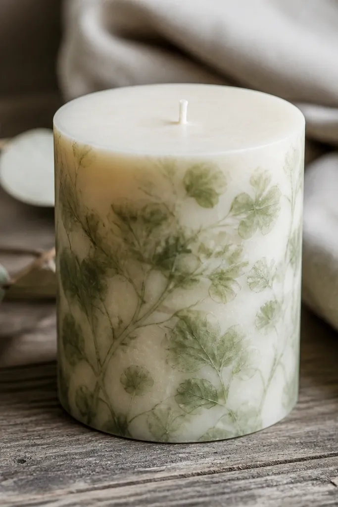
This design gives you that pressed-flower vibe using paint only. You’re not trying to recreate a perfect leaf. Instead, you paint faint vein lines and then dry-brush a soft green veil over them. That makes the candle look like it has layers, which reads well in photos. It’s a great option when you want something organic without drawing detailed petals.
Lightly sketch 3-4 leaf outlines with pencil, then draw vein lines inside using a fine liner brush. Use a light green paint mixed with lots of water for the veil, then dry-brush over the leaf areas so veins show through. Let it dry fully, then deepen a few main vein lines with slightly darker green. Seal if you’re using glass; for wax, keep coats thin so the finish stays smooth.
Dry-brush on a paper towel first so the brush is almost dry before touching the candle.
Don’t fully paint over the veins; the point is that they peek through.
17. Single Rosebud in Dusty Pink
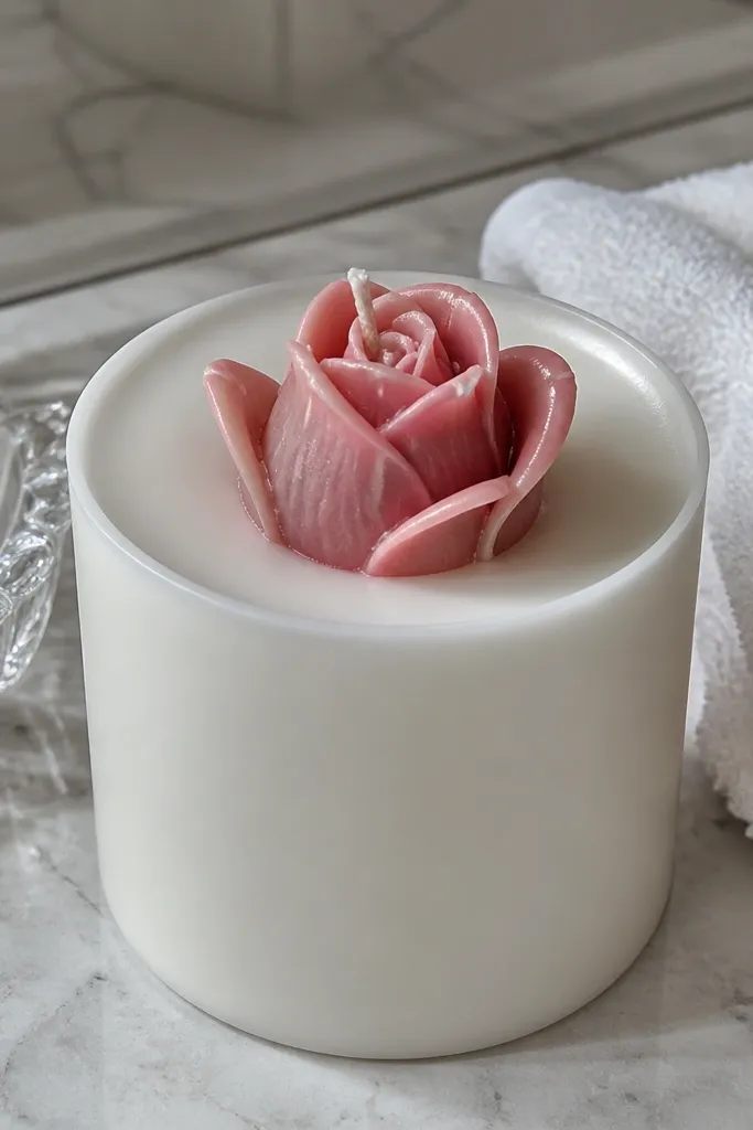
Paint a small oval or teardrop for the rosebud base using dusty pink. Add 4-5 overlapping petal curves using a slightly lighter pink, keeping the petals clustered. Use a tiny dab of darker rose near the center for depth and a thin green stem leaf beneath the bud. Finish with a tiny cream highlight line on the most raised petal.
One rosebud is a clean, timeless look that still feels special. It’s photogenic because it creates a clear focal point, and you’re not fighting to cover every inch. Dusty pink looks soft and modern, especially on white or cream candles. Beginners can nail this by using simple petal shapes and a few highlight strokes. Keep the background minimal so the flower stands out.
Skip thisDon’t add too many petals — a small rosebud reads better than a full rose.
Editor's noteUse the side of the brush for petal strokes; it gives a natural taper.
18. Cornfield Popcorn Sunflower Dots
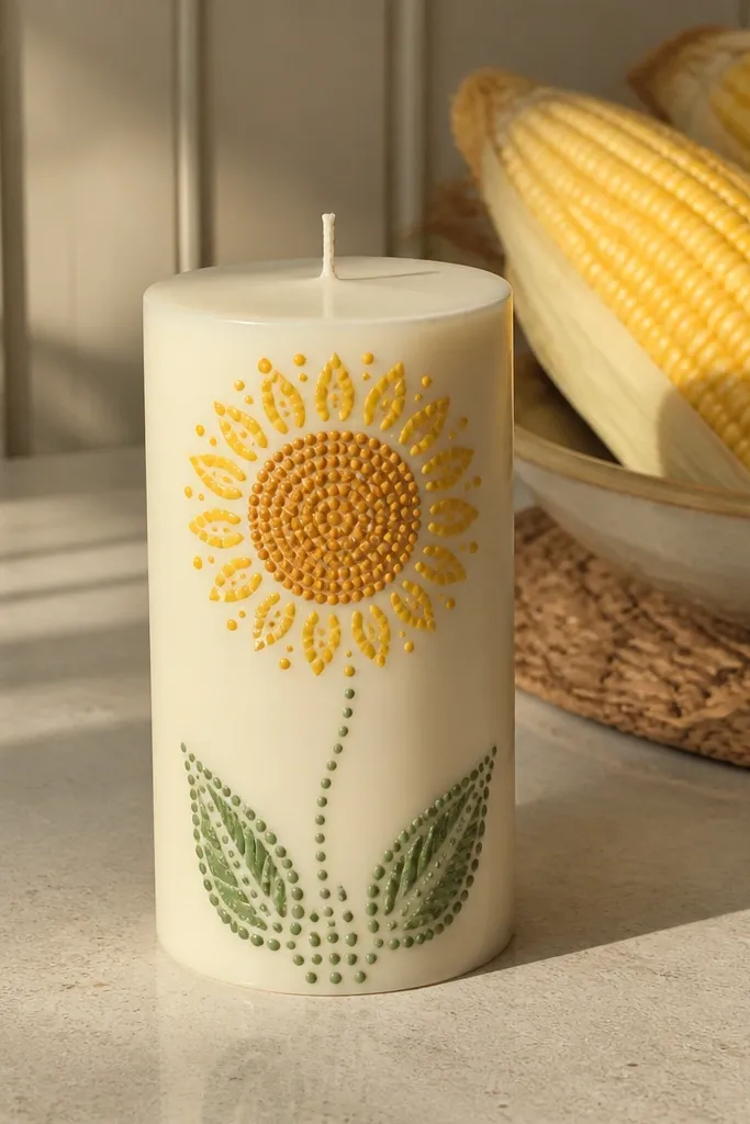
Draw a circle for the sunflower head and fill it with a medium brown or dark tan. Paint 12-16 simple teardrop petals around the circle in bright yellow. For the center, add dots in a slightly darker brown and a few tiny lighter dots for shine. Add a short green stem and one leaf below the head.
Sunflowers are popular for a reason: they create instant cheer and strong contrast. The dot center is where beginners can win. Instead of trying to paint detailed seeds, you stamp or dot the center with a small brush tip or dotting tool. Petals can be simple teardrops. This design looks bright and sunny in photos, especially with a dark background cloth.
Skip thisAvoid painting the center fully smooth; dots create the sunflower texture.
Editor's noteUse a dotting tool or the end of a cotton swab cut short for consistent seed dots.
19. Ocean Wave Line Stack on Glass
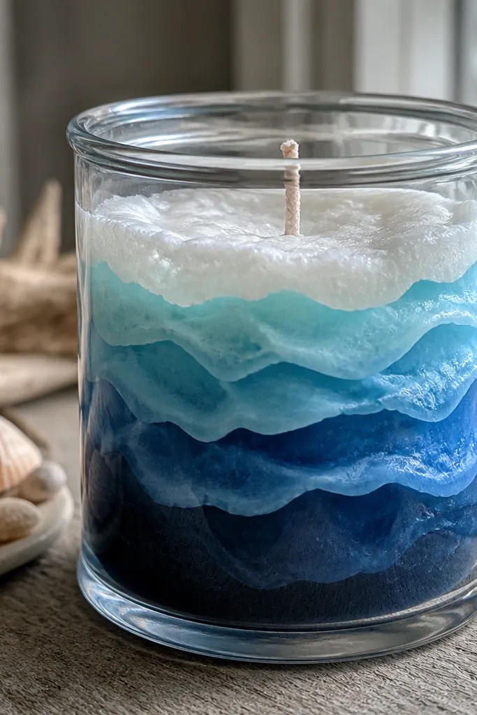
Paint a thin horizontal base band in light blue near the middle of the glass. Draw 6-10 curved wave lines above it using a medium blue, each line slightly shorter. Add a white foam line on every other wave using a thin paint pen or liner brush. Finish with a light clear sealer for glass so the lines don’t scuff.
Wave line stacks look modern and calm, and they’re much easier than full ocean scenes. The repeated lines create a rhythm that photographs cleanly. You can keep it beginner-level by using only three shades of blue and a white foam line. Glass jars make the wave lines look like they’re floating inside. This is a great project if you want something relaxing for a bathroom shelf or coastal decor.
Skip thisDon’t make the waves too thick — thin lines look more realistic.
Editor's noteKeep wave spacing even; it’s what makes the design feel “designed,” not random.
20. Lemon Slice and Leaf on Cream Candle
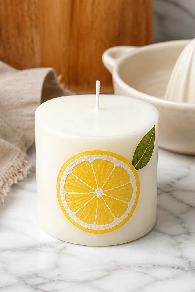
Lemons read as bright and playful, and the slice detail is easy to simplify. You paint a few lemon segments, add a yellow ring, then draw a small green leaf. The result is a clean summer graphic that looks great on kitchen shelves and countertops. This idea works well on smooth wax and glass because the bright shapes stay crisp. It’s a strong beginner pick when you want color without complexity.
Paint a lemon slice shape using yellow acrylic, then add a slightly darker yellow arc line inside each slice. Add three to five slices stacked diagonally for movement. Paint one leaf in deep green with a few vein lines using a liner brush. Add a tiny cream highlight line on each lemon segment for a glossy look.
Use a pencil to map slice positions first; it prevents lopsided stacking.
Skip orange-brown shadows; they make lemons look dirty instead of fresh.
21. Midnight Stripes with Neon Edge
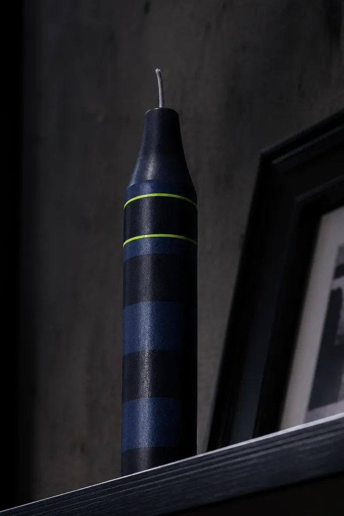
Dark stripes plus one neon edge looks bold and modern, like street art for your shelf. The neon line gives you a clean pop without needing complex art. It’s beginner-friendly because you’re mostly painting bands and one outline, not drawing characters. This looks best on dark-colored candles or after you paint a navy base. It also photographs well against light backgrounds.
Paint the entire candle navy and let it dry. Tape off 3-5 vertical or diagonal stripes and paint them in a slightly lighter navy or charcoal for subtle contrast. Use neon green (or neon pink) to outline the outer edges of one stripe group with a thin brush or paint pen. Remove tape after the neon line sets and let everything cure before sealing.
Outline last; it’s the step that makes it look intentional.
Don’t mix neon with too much water; it fades and turns patchy.
22. Polka Dot Ombre Fade
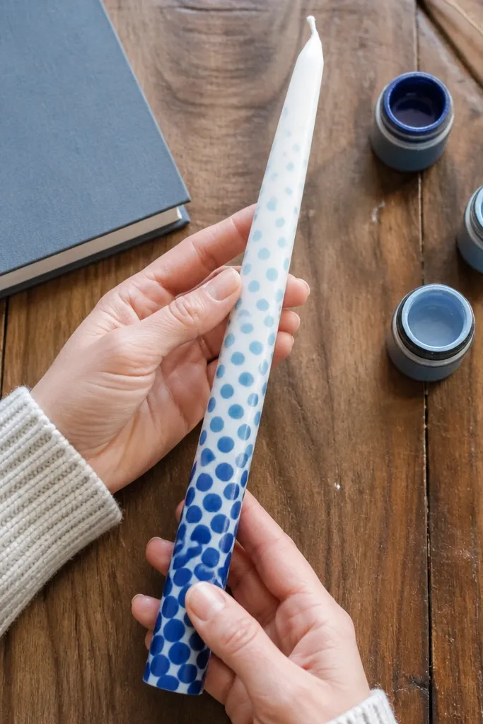
Polka dots feel fun, but the ombre fade makes it look styled instead of random. You control the pattern with spacing and color intensity, so beginners still get a smooth, photo-friendly gradient. Place the darkest dots at the bottom and fade upward for a clean visual flow. This works on tapers and pillars because the dot field wraps nicely around the curve. It’s also a great way to use up extra paint colors.
Paint a faint base tint if you want, then choose 3-4 dot colors that step lighter. Starting at the bottom third, dot evenly with the darkest color. Move upward with lighter colors and reduce dot density slightly so it feels like the fade is happening. Let dry, then add a tiny white dot highlight in the darkest row for sparkle.
Use the same dot size across the candle; vary color intensity instead of size.
Don’t leave big gaps; a sparse dot field looks unfinished on a taper.
23. Terracotta Sun with Radiating Lines
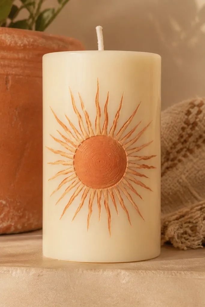
A sun graphic is one of the fastest ways to make a candle look like seasonal decor. Terracotta looks warm and grown-up, unlike bright primary oranges that can look childish. Radiating lines create texture, even if your lines are slightly uneven. Put the sun near the top third so it feels like it’s “peeking” above the candle. This design looks great on white or cream tapers.
Paint a circle in terracotta near the top third. Add 12-16 radiating lines around it using a liner brush, keeping line lengths consistent. Fill the circle with a lighter terracotta center and add a small cream highlight crescent on one side. Optional: paint a few tiny cloud blobs in cream behind the sun.
Map line angles lightly with pencil first so they radiate evenly.
Don’t overfill the space around the sun; negative space makes it readable.
24. Cherry Blossom Branch on Clear Jar
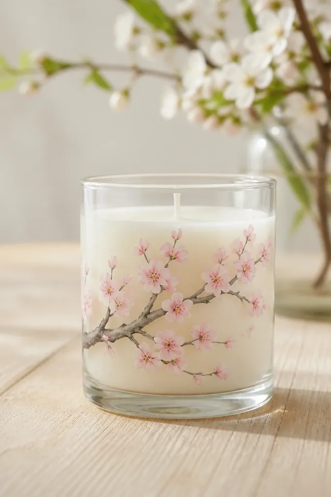
Paint a thin branch line in deep brown or dark gray on the glass jar. Add small clusters of 5 teardrop petals in pale pink around the branch, leaving space between clusters. Add tiny yellow dot centers with a paint pen or liner brush. Let fully dry, then seal with clear acrylic sealer for glass to protect the petals.
Cherry blossoms look delicate, but you can paint them with simple shapes. The branch line is your main drawing, and the flowers are just tiny petal blobs. This gives you a soft, airy look that photographs beautifully on light backgrounds. Clear glass makes the colors feel lighter and more layered. It’s a calm spring project that still looks bold enough for decor photos.
Skip thisDon’t outline every petal; filled shapes read better for beginners.
Editor's noteVary petal sizes within each cluster; it keeps the blossoms from looking stamped.
25. Blackboard Labels with White Lettering
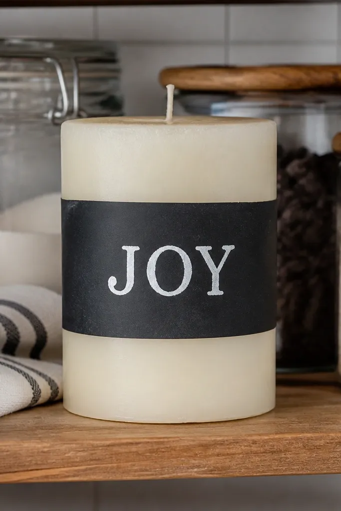
This is a practical-looking design that still looks cute. A chalkboard-style label gives you a clean, typographic look, and you can write a short word like “JOY” or “LOVE” in big letters. The contrast is strong, so it’s easy to read in photos. It also lets you personalize without painting detailed pictures. Use it on plain candles that need a focal point.
Paint a rectangular or oval label area in matte black acrylic. Let it dry fully, then outline the label edges with a lighter gray for definition. Use a white paint pen to write your word in block letters — keep it bold and centered. Add a small underline stroke and two tiny dots at the ends to finish the label.
If your letters wobble, go back and redraw over the lines once — acrylic covers well.
Don’t use glossy black; it reflects light and makes the lettering harder to see.
26. Holiday Candy Cane Mini Scene on Glass

A mini scene looks like themed decor without needing a full mural. Paint a simple candy cane curve, then add a few snow dots and a tiny star at the top. The look is playful and very photogenic because it has one clear subject. This works best on glass jar candles where you can place the scene on the front. It’s beginner-friendly because each element is simple and separate.
Paint the candy cane curve in red and white stripes using tape to keep the stripe edges clean. Add a thin green top bow if you want extra color. Use a white paint pen to add snow dots around the cane and a tiny star near the top. Seal with clear acrylic sealer for glass once everything is dry.
Use a small angled brush for the cane curve so the stripes stay neat.
Don’t paint tiny snowflakes; dots look cleaner and easier.
27. Modern Frame Border with One Accent Color
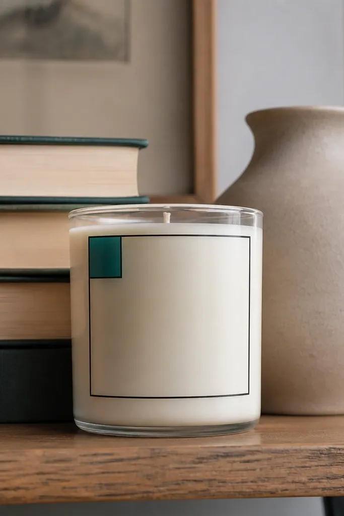
A simple border frame makes any candle look designed, even if you only add one accent. Thin lines read crisp, and one accent color keeps it from getting busy. This design is great when you want a “gallery” look for your shelf. It’s also easy to scale across different candle heights because you’re placing the same border area each time. Photographs well because the border gives a clear shape to the candle.
Paint a thin border rectangle or rounded rectangle near the center of the candle. Use black acrylic for the border and let it dry. Add 3-7 small accent marks inside the frame — dots, short lines, or tiny filled circles in teal, gold, or burgundy. Seal for glass or let wax cure fully before handling.
Keep border thickness consistent by reloading your brush the same way each time.
Avoid adding too many accent marks; one cluster looks intentional.
28. Soft Lavender Cloud Background with Starry Top
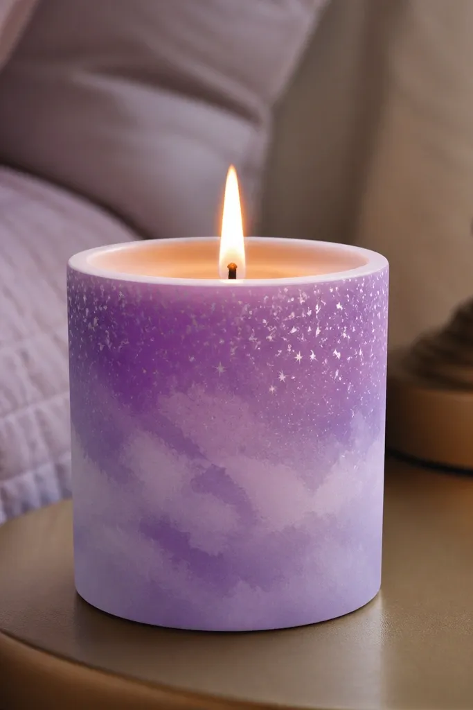
Paint a lavender base wash across the upper half of the candle using watered-down acrylic. Blend cloud shapes with a dry brush or sponge by tapping and lifting, leaving lighter areas. Add white star dots across the top third with a paint pen or flicking brush. Finish with a slightly darker lavender line at the bottom edge to ground the scene.
This mixes two easy techniques: a soft cloud wash and scattered stars. The cloud background hides brush streaks, and the stars add the “night sky” payoff. Lavender looks soothing and looks great with light-colored decor. Place the brightest lavender near the top, then fade it downward so the stars feel like they sit in a sky. It’s photogenic and beginner-friendly.
Skip thisDon’t make the entire candle a solid purple block; the fade is what makes it look airy.
Editor's noteBlend by lifting paint off the brush, not pressing harder.
29. Monogram Letter in Negative Space
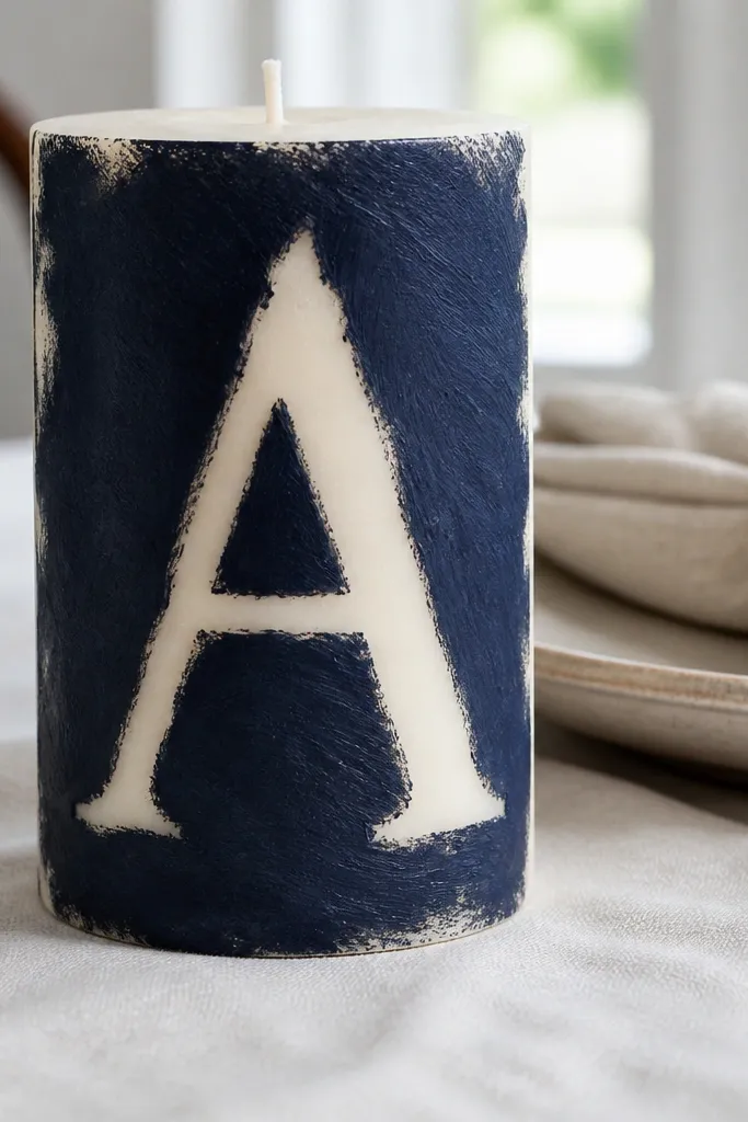
Negative-space monograms look clean and modern because the letter shape is defined by contrast. Instead of drawing every line, you paint a background and leave the letter area blank. It’s a beginner trick that makes your work look more precise than it really is. Pick one letter and place it centered on the candle. This design photographs well because the monogram is readable from straight on.
Tape a monogram shape onto the candle using painter’s tape or cut a stencil from cardstock. Paint the background area around it in your chosen color — black, navy, or terracotta. Let it dry, then carefully remove the tape so the letter shape stays the candle’s original color. If you want more definition, outline the letter edge with a thin paint pen.
Press tape firmly along curved edges so paint doesn’t creep under it.
Don’t use cheap tape that lifts paint when you remove it.
30. Butterfly Wing Wash with Outline
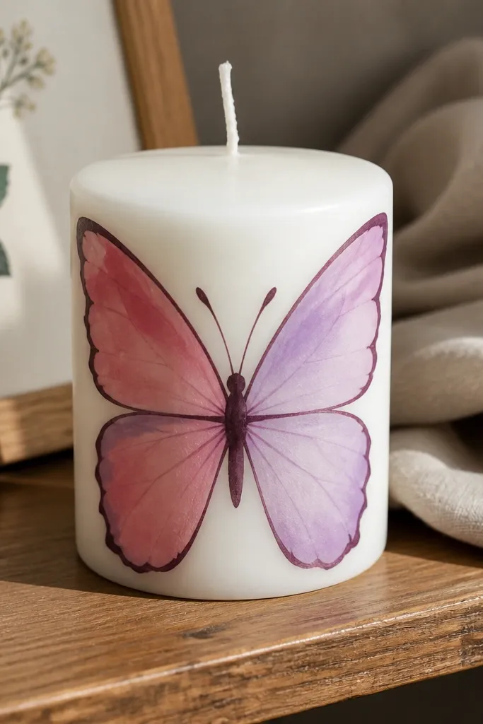
Paint two wing shapes on the candle using a light wash color, one on each side of a center line. Blend edges with a damp brush so the wings look airy. Outline the wing edges with a darker acrylic color, then add a few simple line patterns inside each wing using a lighter shade. Add a small body line and antenna dots at the center top.
Butterflies look detailed, but you can paint them in beginner-friendly layers. Start with a soft wing wash in two colors, then outline the wings with a darker line. The outline is what makes it look like a real butterfly instead of abstract paint. This design works best on smooth candles where the wings can sit symmetrically. It’s a great “wow” idea without needing fine drawing skills.
Skip thisDon’t over-detail the wing veins; 3-5 lines per wing is enough.
Editor's noteKeep the butterfly centered; symmetry makes it look intentional in photos.



