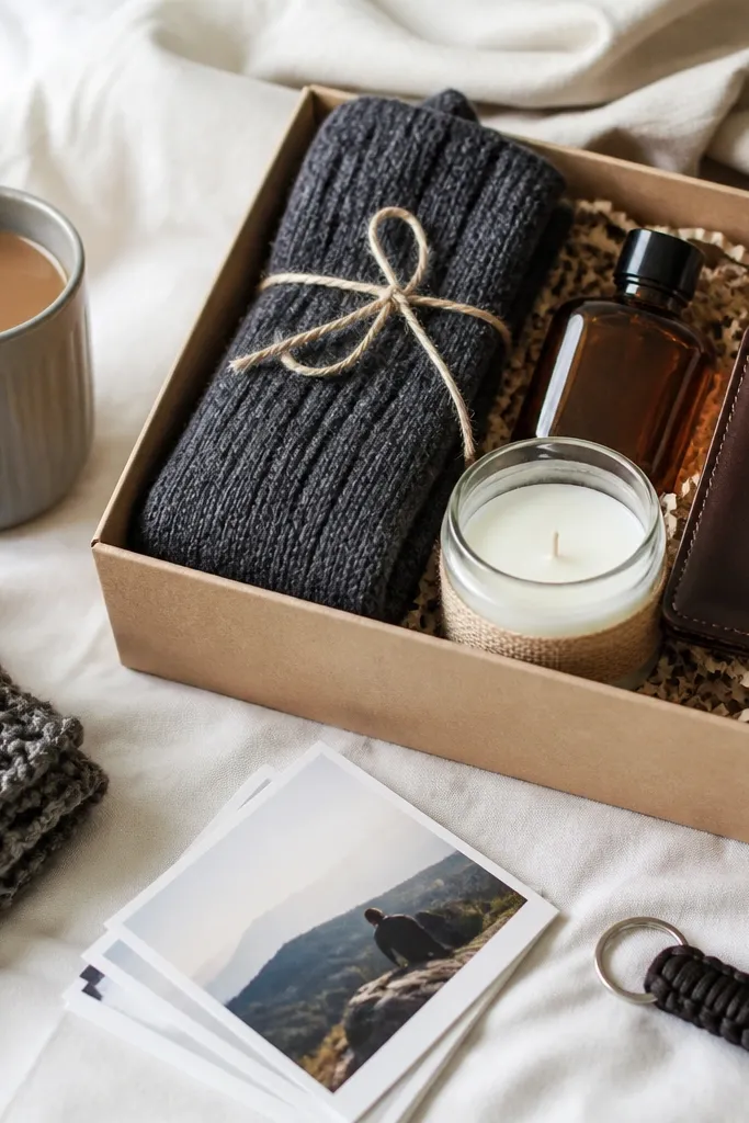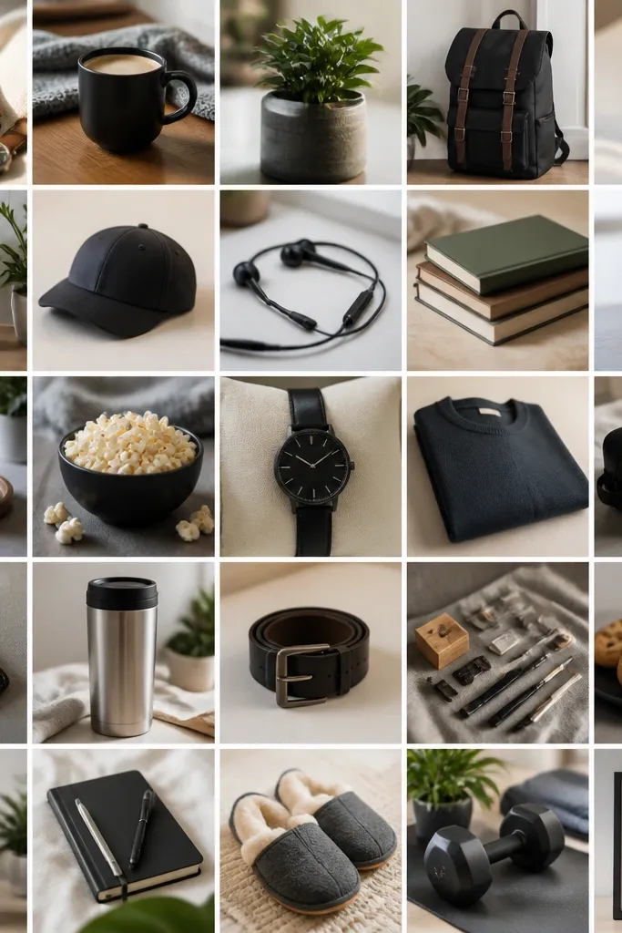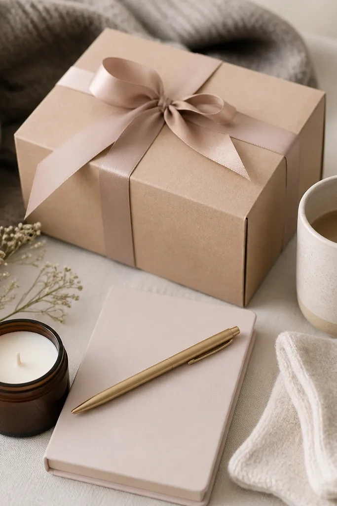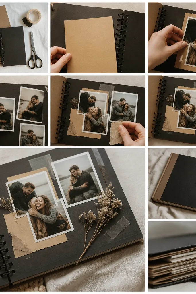

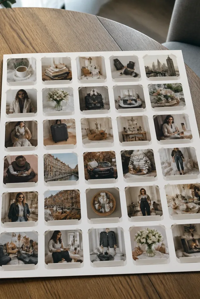
1. Kraft Paper Grid With Black-and-White Photos
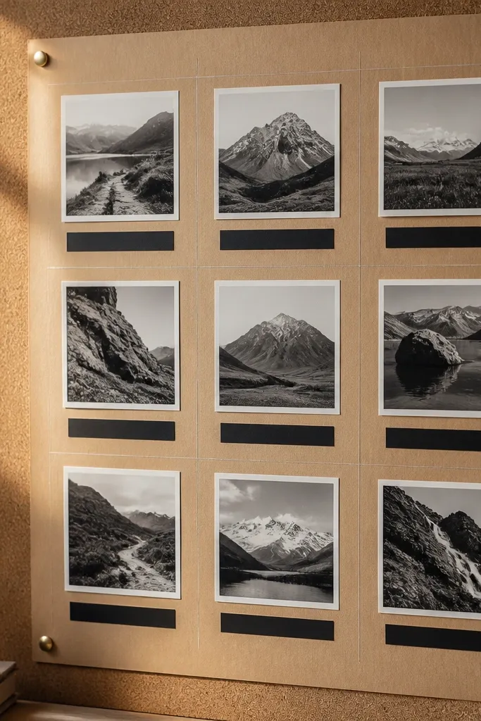
Start with 2 sheets of kraft paper or kraft cardstock cut to 8.5x11. Use a ruler to mark a simple 3x3 or 2x4 grid, then cut photo squares to match each cell with a 1/8-inch white border. Tape photos down with painter’s tape (small strips) so you can reposition before it sets. Finish by writing a single-line label in black marker under each photo, then seal the whole sheet with a matte adhesive spray if your paper is stable.
This one looks expensive because the background does the heavy lifting. Kraft paper gives you warm texture, while black-and-white photos add contrast without needing bright colors. The grid layout keeps everything aligned, so cheap printouts still look curated. Add tiny black labels under each photo and keep them short — think 2-4 words — to make the board read clean. This works best for goals that need clarity: routines, skills, fitness, or study themes.
2. Cream Cardstock Collage With One Accent Color
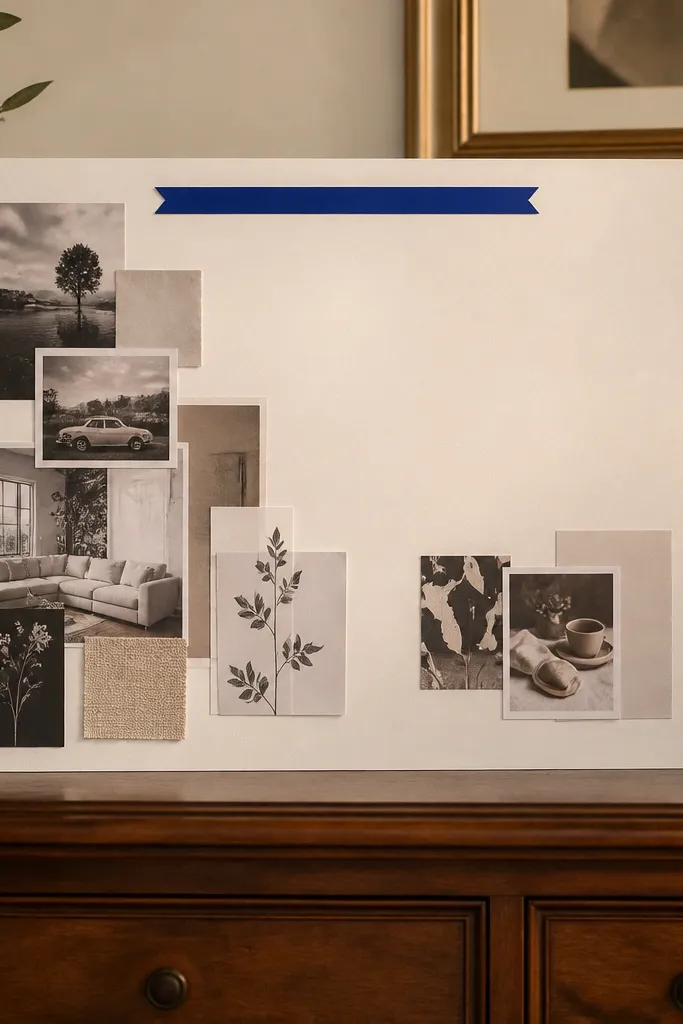
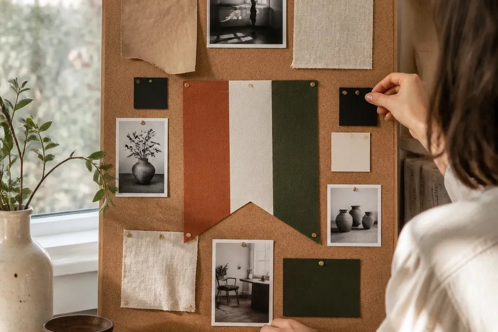
This layout is a cheat code for budget vision board ideas pictures that look polished. Cream cardstock makes everything softer and more expensive-looking than bright white paper. Then you pick one accent color — like terracotta, forest green, or cobalt — and only let that color appear in one or two places: a banner, a label underline, or a single photo. The rest of the collage stays neutral so the accent pops. It’s perfect for home decor goals, aesthetic outfits, and calm lifestyle themes.
Cut a piece of cream cardstock to letter size and lightly plan a loose collage area using tape marks. Choose 6-10 photos that are mostly neutral (beige, gray, black, off-white) and set aside only the accent-color items. Place the accent items first, then fill around them with neutral photos layered slightly (no more than 1/4 inch overlap). Add a thin strip of accent paper or printed fabric across the top for your header, then write your theme in black or dark brown marker.
3. Matte White Background With Pastel Photo Blocks
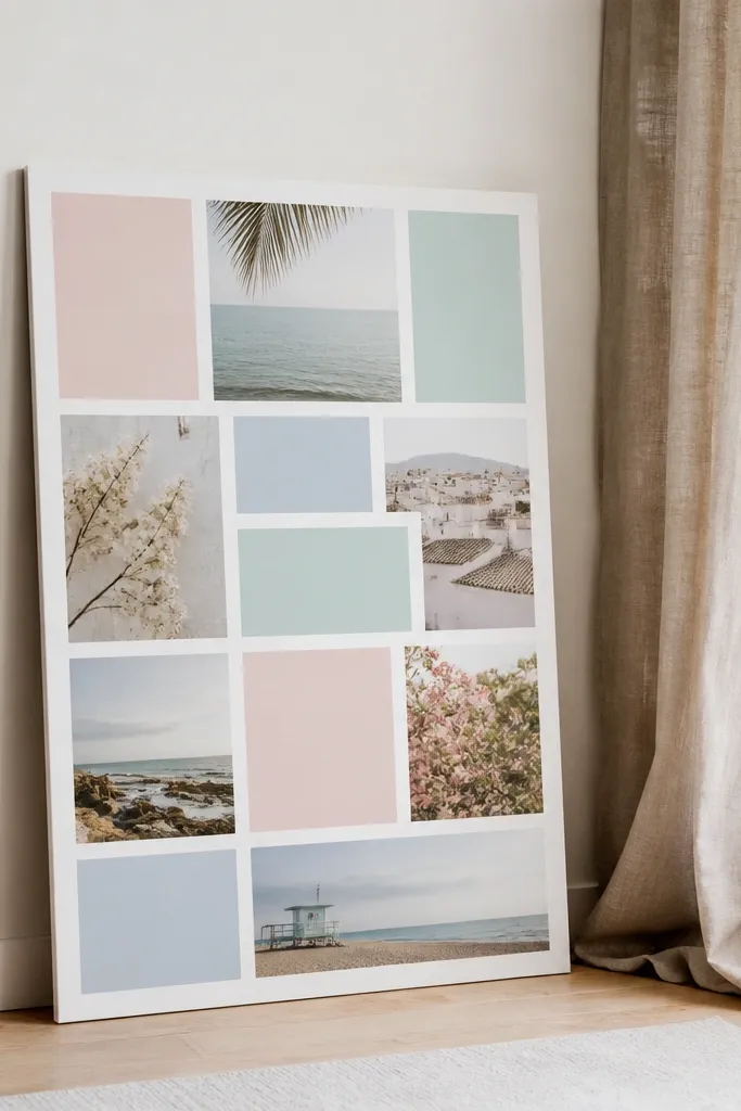
If you want “airy” and clean, matte white is the best base. Pastel photo blocks look cohesive when you keep the spacing consistent and avoid too many different photo styles. Use rectangles instead of squares for a more editorial feel. The look stays budget-friendly because you’re printing standard sizes and cropping cleanly. This style fits wellness, self-care, and travel mood boards where you want a calm visual rhythm.
Use matte white cardstock or matte craft paper, then cut it to 8.5x11. Crop your photos to a 4:3 rectangle ratio (for example, 4x3 inches) so they align visually. Arrange them in 3 rows with even gaps (about 1/2 inch), then tape down one row at a time. Add thin gray lines with a ruler between rows using a light pencil, then write small captions in a muted gray pen.
4. Vintage Magazine Strip Timeline
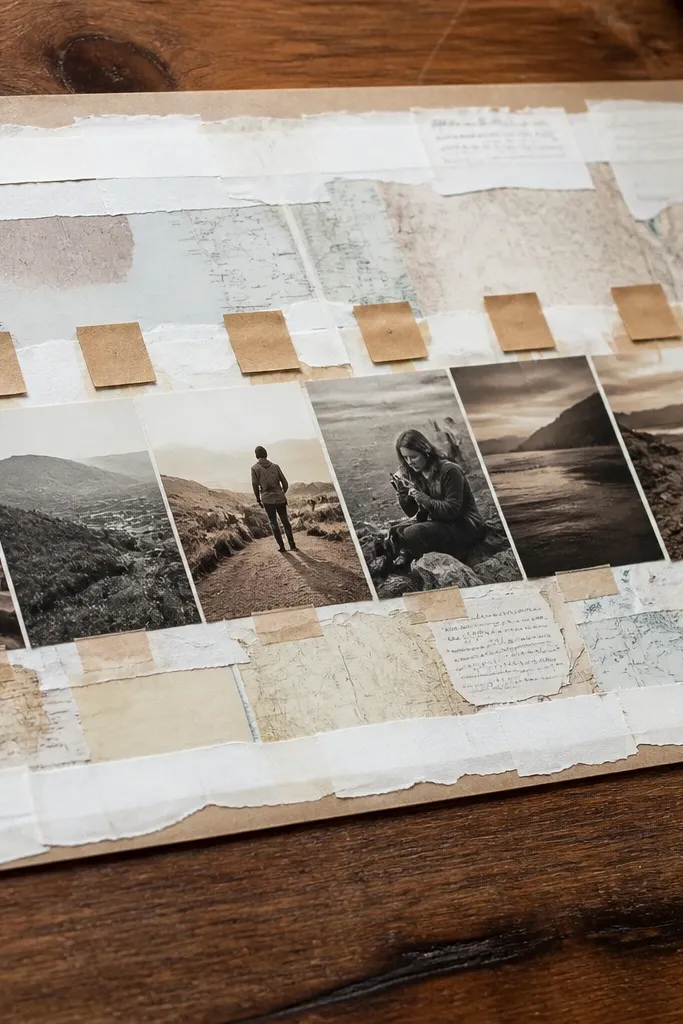
Cut a long strip of cardstock across the middle of your page (about 2.5 inches tall on letter size). Gather magazine cutouts and arrange them in order from left to right, keeping each cutout’s top edge aligned. Add small label tags under each section using paper tabs or cut rectangles (2x1 inches). Glue the strip down with a glue stick, then finish by outlining the timeline path with a thin black marker.
A timeline layout makes your vision board feel organized, not random. The vintage magazine strip look works because old paper textures and worn fonts create visual interest even with simple photos. You’ll get that “saved” aesthetic when you keep the strip straight and repeat the same label placement. Use it for seasonal goals, skill-building steps, or long-term plans you want to see clearly. It’s one of the easiest ways to look intentional without buying expensive printables.
5. Black Tape Frame Collage on Color Paper
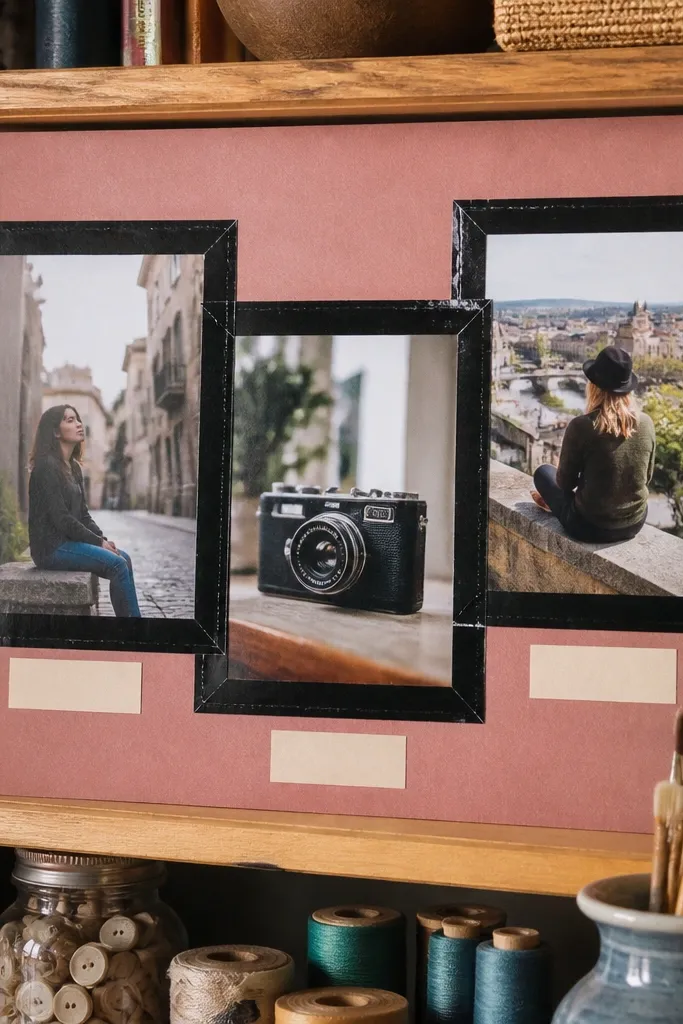
This is the look people stop for because the frames feel graphic, not messy. Black tape frames create crisp borders even when your photos are printed at home. Pick a color paper background like deep sage, muted mustard, or dusty rose. Layer two or three photos inside each frame at slightly different heights for dimension. The tape makes it look like a designed poster, not a craft project. It works great for fashion goals and bedroom or office decor themes.
Choose one solid color sheet and trim it to letter size. Lay down your photos first, then trace their approximate edges with painter’s tape. Apply black masking tape or washi tape to form rectangular frames around each cluster, pressing edges firmly. Add one label sticker or hand-written caption in the bottom corner of each frame, then seal with a light matte fixative if your tape tends to lift.
6. Polaroid-Style Stack With Cropped Edges
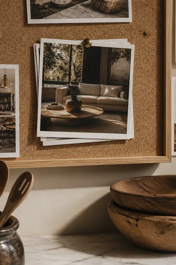
Print photos with white borders or add a 1/2-inch white cardstock frame before gluing. Cut 5-8 Polaroid-like rectangles, then arrange them in a loose stack using tape at the top corners. Keep all captions handwritten in one place (bottom right) and in the same marker color. Finish by adding one small washi tape strip diagonally across the stack to tie it together.
Polaroid-style stacks are visually satisfying and forgiving. You don’t need perfect alignment because the “stack” look hides small cutting errors. The key is consistent white borders and a limited color palette. Use photos that share one vibe — like neutral interiors, warm skin tones, or dark outfits — so the stack reads cohesive. This style is great for “daydream” boards: outfit ideas, coffee-table decor, weekend plans.
7. Fabric Swatch Backdrop With Photo Overlays
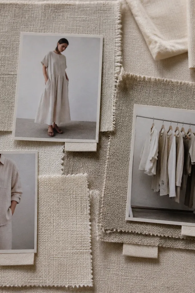
Cut fabric to cover letter-size cardstock, leaving a 1/2-inch border around the edges for trimming. Glue fabric down with a thin layer of tacky glue or fabric glue, then trim edges neatly. Place 4-7 matte photos on top and secure them with double-sided tape dots so the fabric isn’t wrinkled. Add a small label under each photo using cream paper strips and black marker.
Texture is what makes budget vision board ideas pictures look premium. A fabric swatch backdrop — linen, cotton muslin, or even a thick paper-texture fabric substitute — gives you depth that flat paper can’t. Add photos with matte finishes on top so they don’t look shiny or cheap. Include small fabric labels like “oat” or “charcoal” to make it feel like a mood board from a real design studio. This is best for home decor goals and color palette planning.
8. Rounded Corner Photo Circles on Pastel Paper
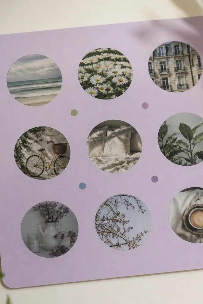
Circle motifs instantly look aesthetic because they break the square-and-rectangle monotony. The trick is to keep the circles consistent in size and spacing so it doesn’t turn into a craft mess. Pastel paper keeps the tone soft, and matte photos keep the circles looking clean. Add tiny dot labels in a matching ink color — like dark teal or charcoal — to keep the board readable. This works for goals related to personal style, skincare routines, or gentle wellness themes.
Use pastel cardstock and mark a grid of circle positions, keeping about 1/2 inch between edges. Cut circles using a craft circle cutter or trace a template like a 2-inch or 2.5-inch lid. Crop photos to fit each circle and glue them with a thin layer of glue stick. Finish with small dot labels drawn using a fine-tip marker and a ruler for spacing.
9. Monochrome Outfit Board With Shoe-First Layout
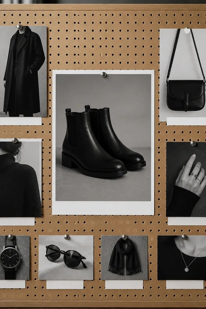
Pick your monochrome palette and print 6-9 photos, cropping them so each item fills the frame. Place the shoe image in the top center, then arrange the rest in two columns beneath it. Keep labels small and aligned using a strip of cardstock as a caption bar. Use matte glue dots to prevent photo warping, then lightly press the corners to flatten.
For fashion vision boards, start with shoes. When the shoe image is centered and everything else supports it, the whole board looks like a real outfit recipe. Use monochrome photos — black, gray, and cream — so you don’t need color coordination. Add one tight label under each item: “boots,” “coat,” “bag.” This layout looks great on a budget because you can print from your own saved photos and crop tightly. It’s ideal for capsule wardrobe planning and daily outfit goals.
10. Neon Accent Labels on Neutral Photo Grid
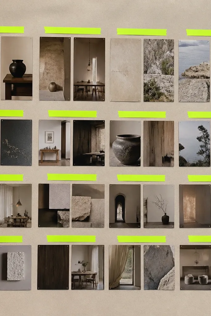
Neon labels are the visual punch that makes budget vision board ideas pictures look modern. Keep the photos neutral and muted, then add neon label strips for headings like “Focus,” “Health,” or “Home.” Even cheap printouts look sharper when the label color is bold and consistent. This style is great for productivity boards and “choose your focus” boards where readability matters. The neon also helps your eye scan the board quickly.
Create a neutral photo grid on off-white cardstock using 3 rows of 3 or 2 rows of 4. Cut neon label strips from craft paper or neon sticky notes, about 1 inch tall. Write one short heading on each strip and tape them in the same position under each photo. Add small simple icons in black marker (a heart, a dumbbell, a house) so the board looks cohesive.
11. Travel Ticket Stub Collage With Maps
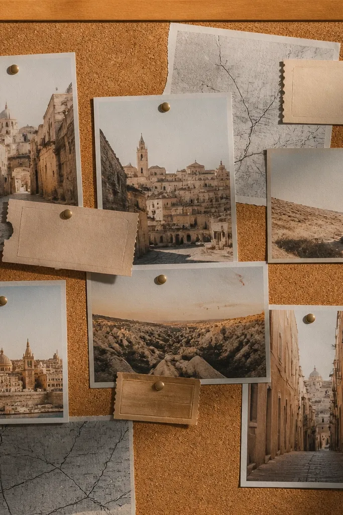
This is a tactile travel look that reads authentic without needing expensive printables. Ticket stubs, boarding passes, and map fragments add graphic texture and make the board feel like a story. Use muted travel photos — sand, sky, stone — and keep the color palette to warm beige plus one cool gray. The aesthetic comes from the mix of shapes: rectangles, ticket angles, and small map blocks. Great for travel wish lists, move-in plans, or event goals.
Cut 6-10 map segments (small rectangles) and 3-5 ticket-stub shapes from paper or printed cutouts. Place the map pieces first around the edges, then anchor the center with one larger photo. Add ticket stubs at slight angles using tape so they look layered. Finish by drawing a small route line with a thin black pen from one map segment to the main photo.
12. Botanical Press Look With Transparent Tape Borders
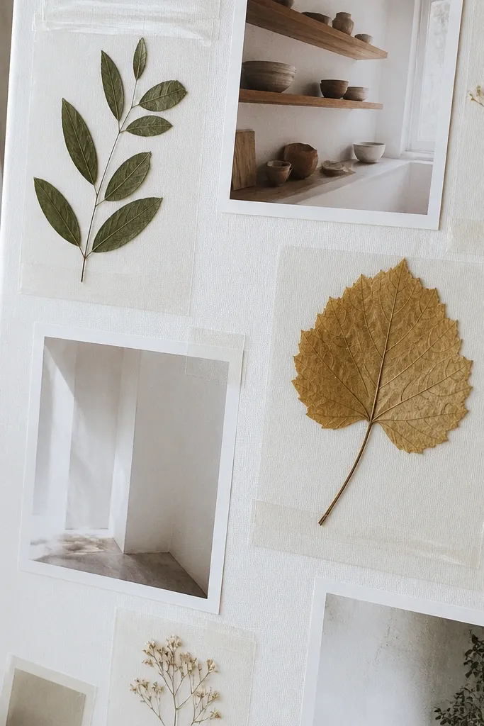
Press leaves between book pages for at least 1-2 weeks, then cut your cardstock base to letter size. Place photos and botanicals on top lightly, then outline each section with clear packing tape strips. Press tape edges down firmly so it won’t lift, and add one small label under each cluster. Seal the whole page with a matte spray only if your botanicals stay flat and dry.
Pressed botanicals give you a natural, high-end texture even on a tight budget. The aesthetic comes from the delicate shapes and the clear tape borders that mimic museum mounting. Use small pressed leaf pieces and pair them with minimalist photos — white walls, wooden shelves, soft daylight. Keep the board mostly light and airy so the botanicals stand out. This style fits plant goals, calm home decor, and “slow living” mood boards.
13. Gallery Wall Layout With Tiny Captions
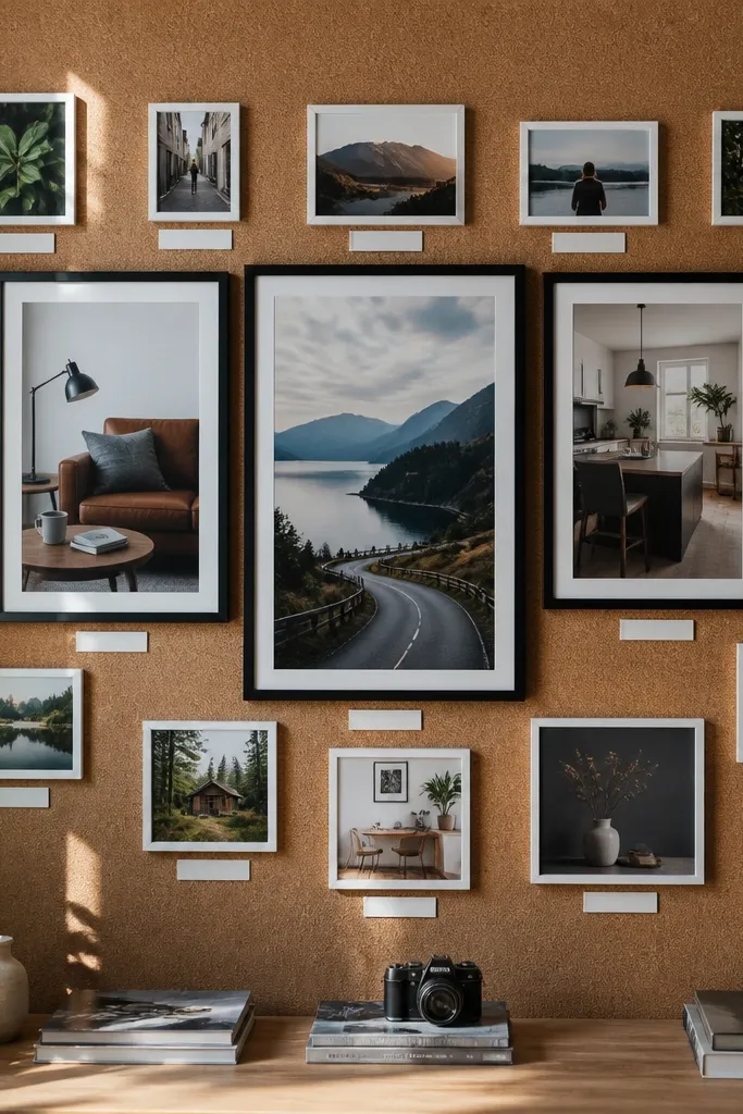
A gallery wall layout looks like you’re curating a real space, which is why it reads aesthetic. Use multiple “frames” on one page: three big photos and several smaller ones around them. Keep the caption style uniform — tiny, all-lowercase, and in one ink color. This works because the composition has a clear hierarchy: big images grab attention, small ones fill in context. Great for home office themes, bedroom mood boards, and “make this corner” projects.
Cut a base of thick cardstock and lightly sketch frame outlines with a pencil. Make three larger frame areas (about 6x4 inches each) and 5-6 smaller ones (about 2x2.5 inches). Add thin strips of paper to mimic frame borders, then glue photos inside. Write captions under each photo in consistent font style (handwritten works best) and keep them under 3 words.
14. Color Block Headings With Photo Corners
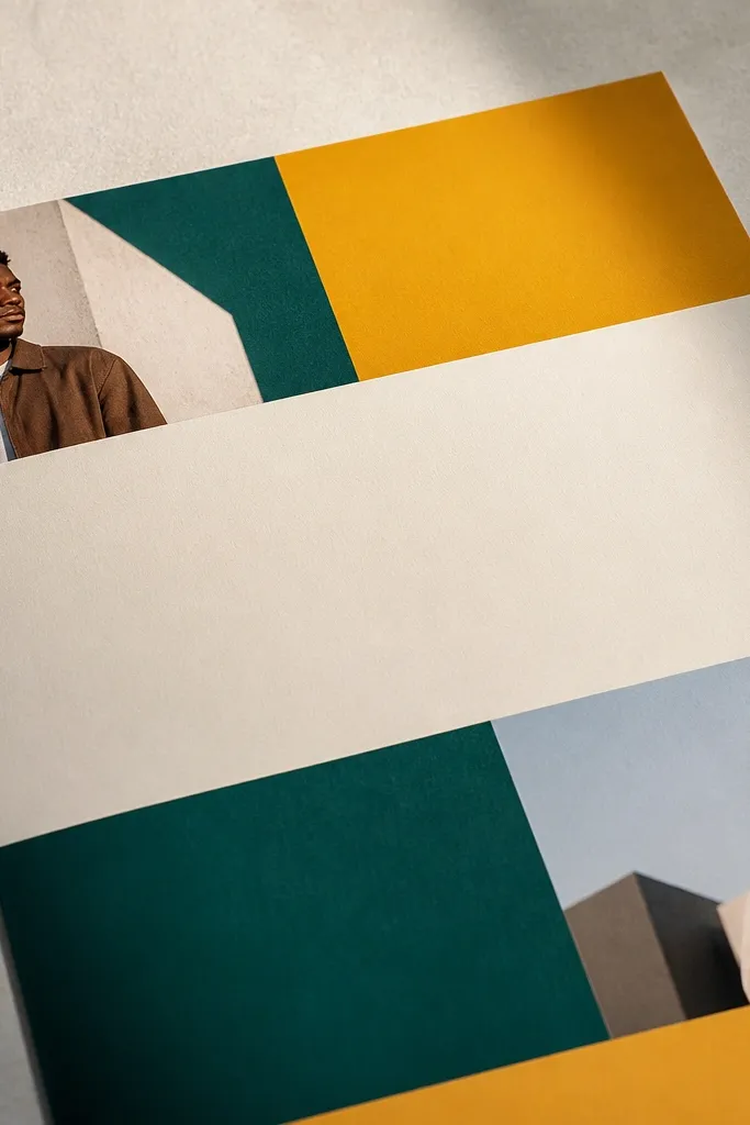
This is a layout trick that makes a board look designed even when the photos are simple. Instead of covering the whole page, you place photos in corners or along the edges, then use thick color blocks for headings. The negative space keeps it clean and modern. Pick two strong colors plus one neutral and repeat the heading bar across the board. This is perfect for vision boards that need structure: goals by category, like health, work, and home.
Start with a neutral cardstock base and choose two color papers for headings. Cut heading bars (about 1.5 inches tall) and place them at the top of each section. Add photos only at corners or along section edges, leaving at least 1 inch of clean space between clusters. Glue everything down with a glue stick, then add small handwritten category labels inside or just under the color bars.
15. Scrapbook Page With Tear-Edge Layers
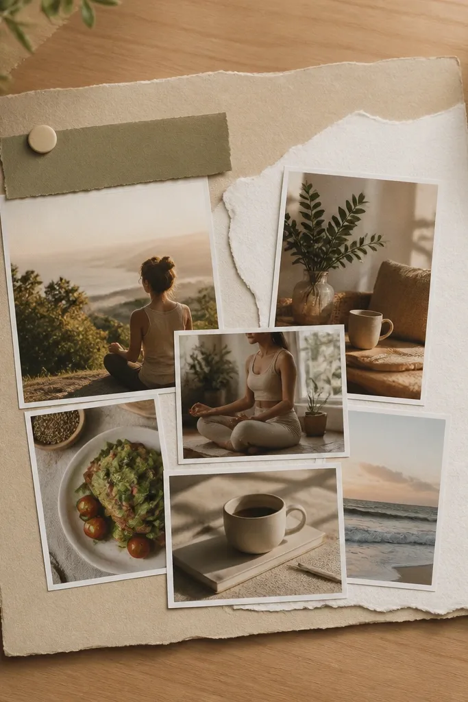
Cut a background sheet and add a larger torn-paper layer using handmade tears (avoid straight scissors cuts). Layer 2-3 torn pieces behind the photos, then place photos on top with small overlaps. Add a title strip at the top and write with a black marker. Use a glue stick for paper layers and double-sided tape for photos so the page stays flat.
Torn edges make cheap paper look intentional. The tear-edge scrapbook style adds movement and softens the hard lines of printed photos. Use one main background color and only 2-3 paper layers so it stays cohesive. Put your title near the top left and keep it short. This style is great for personal goals because it feels journal-like, but the photos keep it aesthetic rather than diary-like.
16. Monochrome Quote Strip With One Photo Anchor
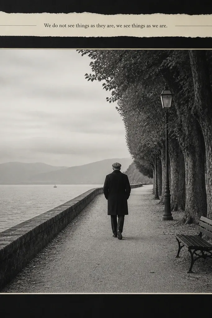
This is for people who want their vision board to read like a poster, not a collage. One large photo in the center keeps the focus, and a quote strip across the top adds structure. Keep everything monochrome — black, gray, and cream — so it looks clean. The quote should be short and specific, like “10k steps” or “quiet mornings,” written in neat handwriting. This format works especially well for habit goals and daily intention boards.
Pick cream cardstock as your base. Crop one hero photo so the subject fills the center, then create a top strip of gray paper about 1.5 inches tall. Write your short phrase in black marker with consistent spacing, then glue the strip down first. Add the photo last, centered, with a 1/4-inch border if you want a framed look.
17. Fabric Ribbon Bookmark Style Columns
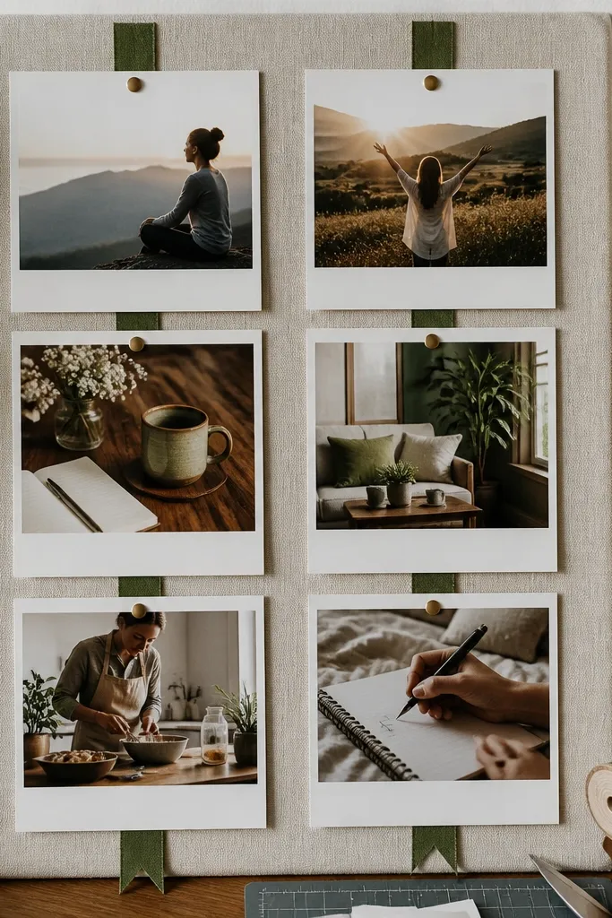
Cut your base cardstock and draw a light center guideline. Place two narrow ribbon strips (about 1/2 inch wide) along the left and right margins, then tape them down. Arrange photos in the middle column space, leaving at least 3/4 inch between images. Add small caption tags on tiny paper slips and secure them with tape so they look pinned rather than glued solid.
Column layouts feel organized and look good in photos because the eye tracks downward. Fabric ribbon accents add that handmade touch that reads aesthetic without costing much. Use two vertical columns and place photos between them like pinned notes. Keep ribbon color consistent across the board — choose black, olive, or rust. This style works for self-improvement boards where you want categories like “before” and “after” or “work” and “rest.”
18. Matte Black Background With White Photo Cutouts
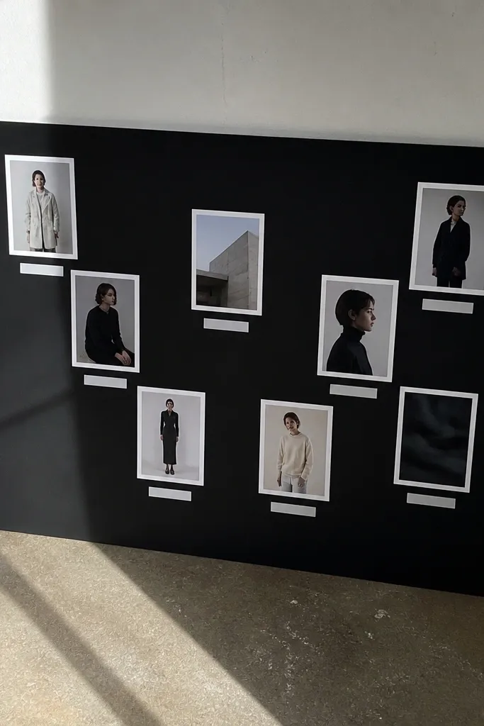
Use matte black cardstock or craft paper as your base. Print photos in grayscale or keep them high-contrast, then add a 1/2-inch white border around each photo before gluing. Arrange photos in a simple grid or two-column layout, leaving 1/2 inch gaps. Write labels in white gel pen and let the ink dry flat before you move the page.
High-contrast boards look expensive because your eye reads them instantly. A matte black background makes every white-bordered photo pop and gives the board a graphic poster feel. Use white or light gray labels so text stays crisp. Keep the number of photos smaller — 6-8 — so it doesn’t feel busy. This style is perfect for bold personal style goals, night-city travel vibes, or any board you want to look sleek.
19. Soft Denim Blue Background With Warm Photo Tone
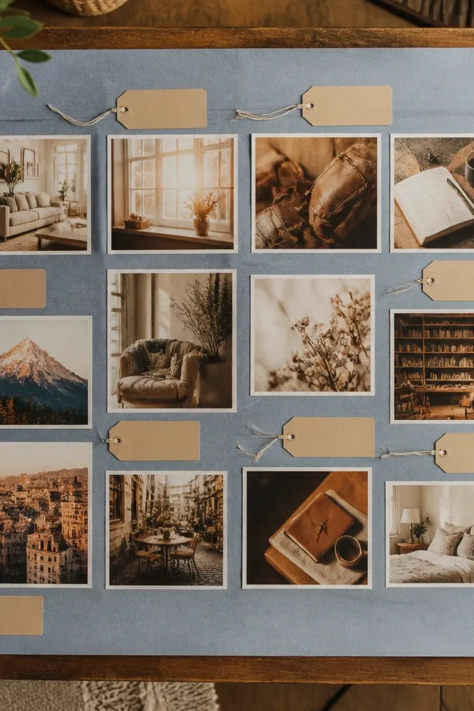
A soft denim blue background is one of the prettiest cheap bases because it adds color depth without screaming. Pair it with warm-toned photos — beige interiors, golden light, brown leather — and you’ll get an aesthetic board that looks cohesive. Use tan or cream label tags so the text feels connected to the warmth in your photos. This style works for home decor goals, outfit goals, and “cozy corner” projects.
Cut denim-blue cardstock to letter size. Crop 8-10 photos so they share warm tones, then arrange them in a loose grid with consistent spacing. Make tan label tags from craft paper strips (about 2 inches long) and glue them under each photo. Finish by adding one thin line border around the page using a ruler and a lighter marker.
20. White Border Only Layout With Full-Size Photos
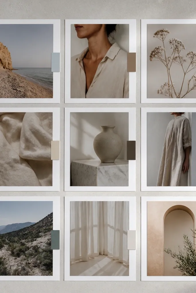
Print photos and crop them to a consistent aspect ratio, like 4x5 or 3x4. Add a 1/2-inch white border around each photo using cardstock, then glue photos on a neutral base with 1/2-inch gaps. Keep labels to one line each and place them in the same spot under every photo. Use matte glue to prevent shine and let everything dry under a flat book for 30 minutes.
This layout looks modern because it refuses to over-style the page. You use full-size photos but keep the design discipline: one white border width, consistent gaps, and minimal labels. The photos become the decor. It works with any theme because the visual system is the same. If you want your board to look like a printed set instead of a craft collage, this is the move.
21. Leafy Green Washi Tape Path Across the Page
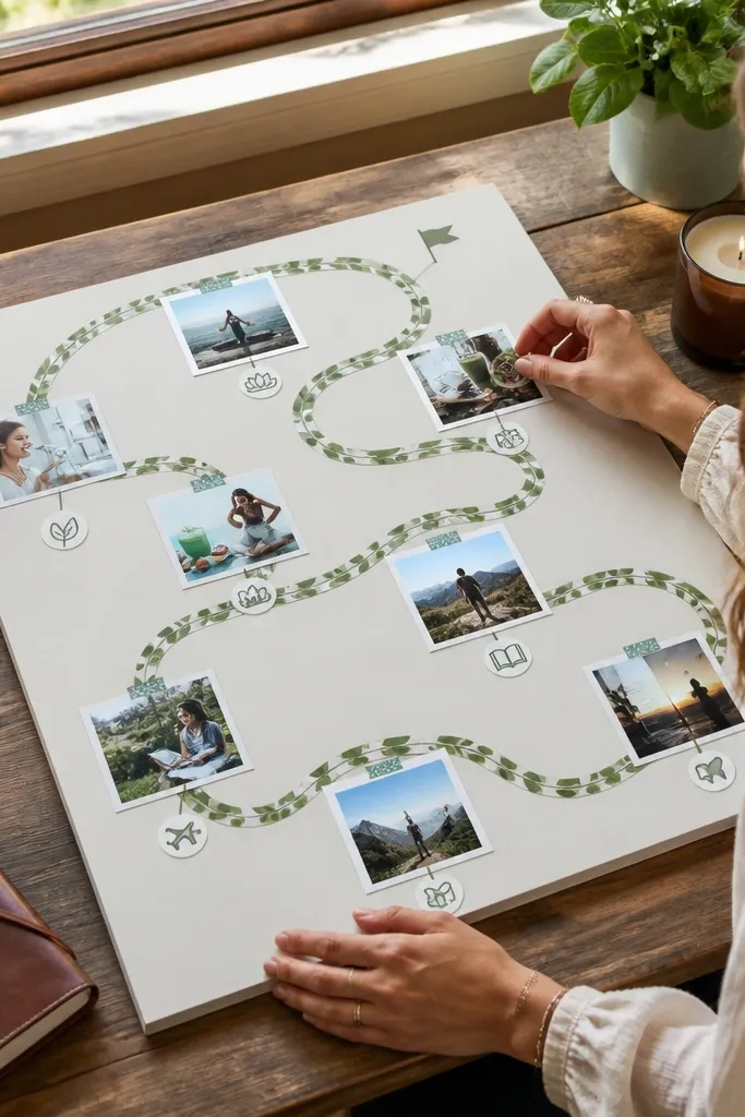
A tape “path” gives your board a sense of direction, which makes it look intentional. Washi tape in leafy green is easy to find and adds a soft, organic line. Place photos along the path like stepping stones, then add small icons to mark categories. This style is great for goal journeys: fitness progress, skill learning, or habit tracking. It also photographs well because the tape line creates a strong visual anchor.
Choose a light background cardstock and decide where the path starts and ends. Tear or cut washi tape strips into a continuous line and place them first, pressing edges down. Glue photos along the tape at intervals and keep each caption tag the same size. Add 3-4 simple category icons in black marker near the tape to keep the board readable.
22. Pale Yellow Notes With Photo Cutouts
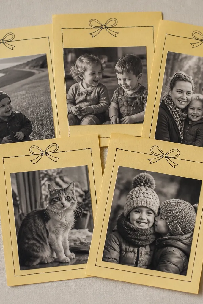
Cut note rectangles from pale yellow cardstock or print yellow note templates. Glue photos onto each note rectangle with a 1/4-inch margin so the note border is visible. Arrange notes in a neat grid or staggered pattern, then write headings on each note with a fine-tip black marker. Secure the whole page with painter’s tape at the corners if you expect to update it.
Yellow note paper looks friendly and gives your board a “living document” feel. The aesthetic comes from the consistent note shape and the handwritten headings. Keep photos slightly smaller than the note rectangles so the notes frame them. Use black ink for the headings and keep them short. This style is good for boards that change — like weekly focus — because you can swap photos without rebuilding the whole page.
23. Gold Foil Accent With Minimal Photo Trio
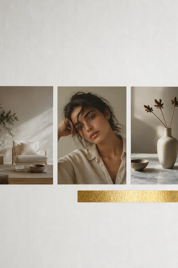
Use a neutral base like light gray or cream. Place three photos in a horizontal row or a triangle arrangement with equal spacing (about 1 inch between edges). Cut gold foil strips as label bars and glue them under each photo. Write one short phrase per label, then add a thin gold line border around the page using a gold marker.
Minimal boards look expensive when the accents are controlled. A gold foil label strip — even from inexpensive craft foil paper — adds that celebratory feel without clutter. Use only three hero photos and leave lots of negative space. Keep labels in a single font style, written neatly or printed. This works for milestone goals: wedding planning, graduation, move-in plans, or a single major focus category.
24. Polished Marble Contact Paper Backdrop
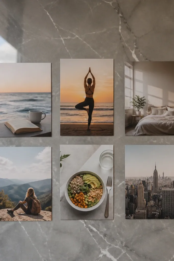
Cut marble contact paper slightly larger than your base, then smooth it onto a rigid backing like foam board or thick cardstock. Trim edges clean with a craft knife and metal ruler. Print and crop photos, then add a thin white border before mounting. Glue or tape photos down with double-sided mounting tape so they adhere without bubbles; wipe the surface gently to remove dust first.
Marble-pattern contact paper instantly upgrades your board without any special tools. The look is clean, glossy, and photogenic, which is why marble backgrounds work so well for budget vision board ideas pictures. Use matte photos on top so they don’t fight the shine. Keep the collage simple: 6 photos max, arranged in a clean grid, with thin white caption strips. This style is great for modern home decor boards and aesthetic office planning.
25. Shadow Box Style Layering on Foam Board
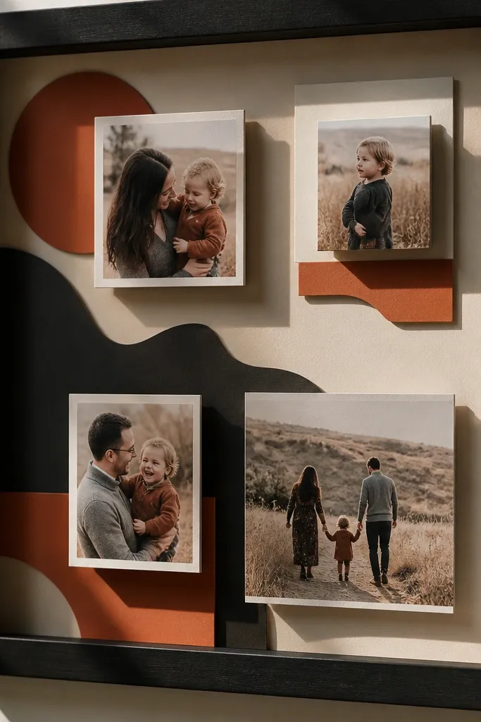
Start with a foam board base cut to letter size. Cut backing shapes from scrapbook paper and glue them down first, then add photos on top using foam mounting dots for height. Keep photo sizes consistent and leave a 1/2-inch space between elements. Finish by adding a thin caption strip on the bottom edge and seal the paper edges with a light matte medium if needed.
A shadow-box style board looks like real decor because the layers have depth. Even on a budget, foam board + layered paper gives you that dimensional look in photos. Use a few thicker elements like cut paper shapes behind photos, then mount the photos with thicker foam dots or layered cardstock. Keep the palette tight so depth doesn’t become clutter. This suits goals tied to home organization, aesthetic shelf displays, or any theme where you want a “display piece” vibe.
26. Black Marker Doodles Over White Photo Squares
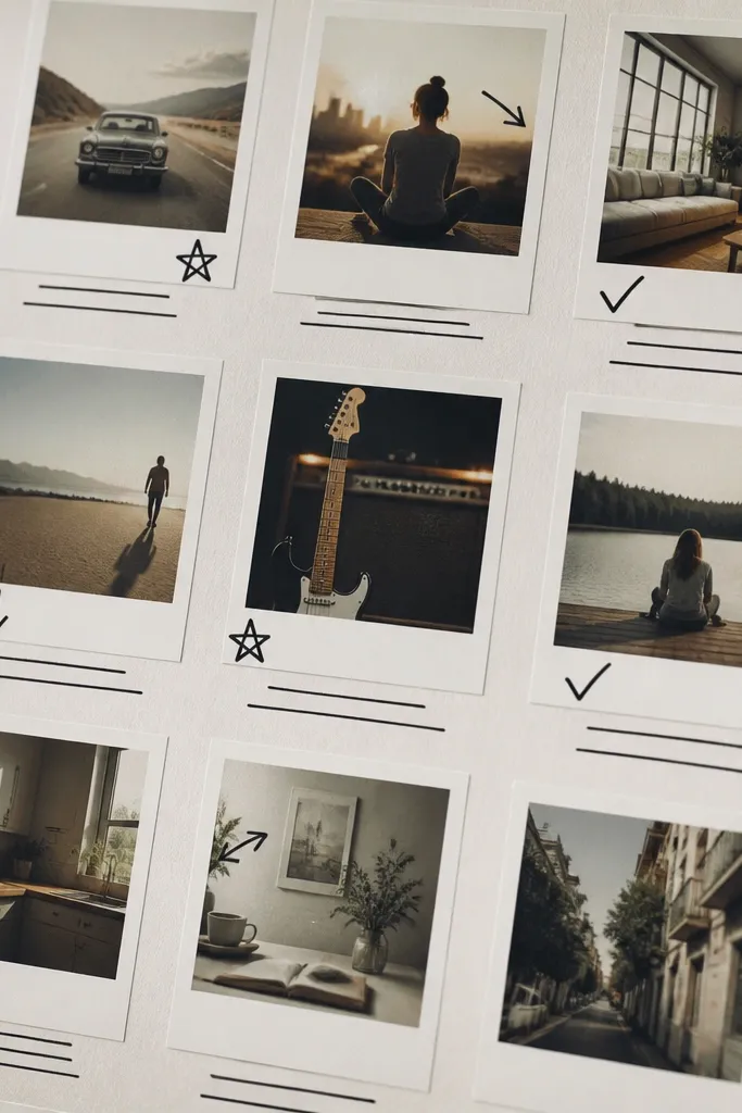
Doodles make your board feel custom, and the black-on-white look stays aesthetic even when supplies are cheap. Use simple icon doodles — stars, arrows, hearts, tiny checkmarks — and place them consistently near captions. The key is to keep photo squares uniform and use only black marker for the doodles. This style is great for action-oriented goals like workouts, study plans, or skill practice. It also photographs well because the contrast is strong.
Print and crop photos into uniform squares, then mount them onto a light background with a 1/2-inch white mat border. Draw a consistent caption area under each square, then add doodles next to each caption. Use a fine-tip black marker and keep doodles small, not full-page. Seal with a matte spray only if your marker ink is dry and won’t smear.
27. Rust and Cream Desert Palette Board
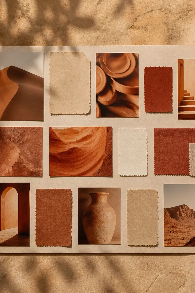
Desert palettes look gorgeous because rust, cream, and warm grays naturally blend. You’ll get budget vision board ideas pictures that look cohesive if you stick to that palette and keep the layout clean. Use photos with sand or terracotta tones and add labels in sand-colored paper. The aesthetic comes from consistent warm lighting and controlled typography. This style fits travel wishes, home decor, and “warm cozy” lifestyle goals.
Pick a base of cream cardstock. Print 8-9 photos with rust or sand tones, then crop them into rectangles for a grid. Cut sand-colored label strips and glue them under each photo with consistent spacing. Add a thin rust border line around the page and write your theme in black marker in the top left.
28. Soft Rose Paper With Clear Sticker Titles
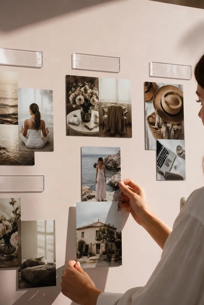
Clear sticker titles look clean and modern, and they’re cheap compared to printed signage. A soft rose paper background adds warmth, and photo clusters keep the board personal. The aesthetic comes from layering: one sticker title per section, then photos grouped underneath. Use matte photos and keep the number of photos per section to 2-3 so the sticker remains readable. This style works for self-care goals, beauty routines, and cozy home themes.
Cut soft rose cardstock to letter size. Choose 3 section areas and place clear sticker titles at the top of each section. Glue 2-3 photos under each title, with small white borders so they look crisp. Finish by adding one tiny handwritten label in the bottom right of each section and press everything flat under a book.
29. Ocean Blue Tape Corners With White Captions
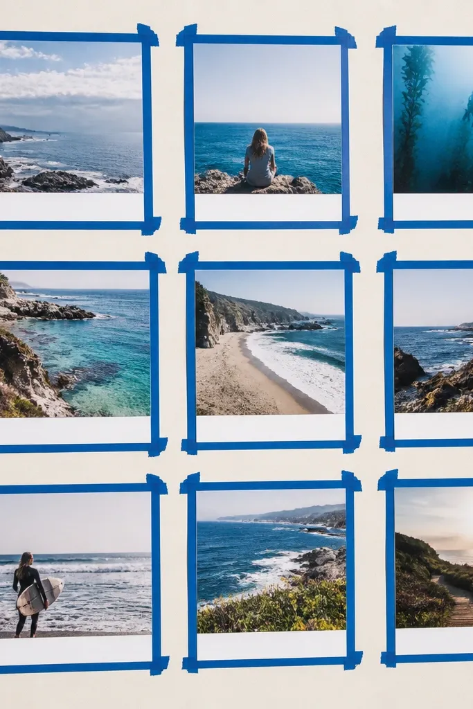
Use a light background cardstock like off-white. Arrange 6-8 photos in a grid, then place ocean blue washi tape only at each photo corner (two corners per photo is enough). Add white caption strips under each photo, about 1 inch tall, and write headings in blue or black ink. Press the whole page flat so the tape edges stay crisp.
Tape corners create a neat, frame-like effect without cutting borders. Ocean blue tape against light paper looks fresh, and white caption strips keep text readable. You only need a handful of photos, placed in a grid with consistent corner tape placement. This style is great for water-themed goals, travel boards, and any theme where you want a clean, airy feel. It also hides slight photo misalignment because the corners visually anchor each image.
30. Corner Folded Paper Frames With Center Photo
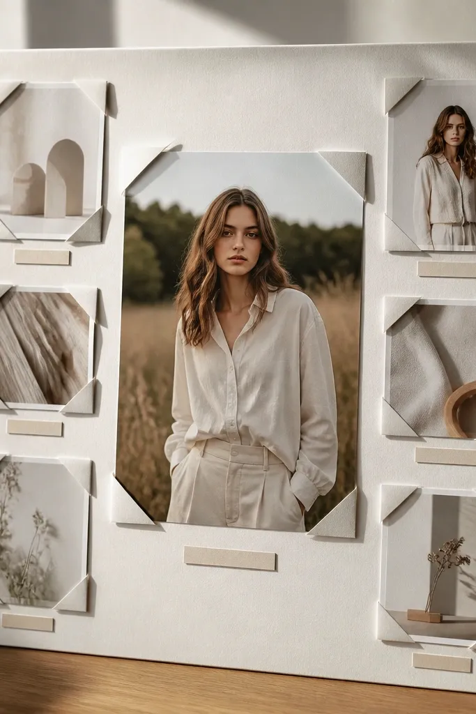
Cut a base sheet and choose one large center photo. Create corner “frames” by cutting small squares from cardstock, then folding each square’s edges inward to form a corner pocket. Glue corners to the base around the center photo placement area, leaving the center open. Mount the center photo inside the corner pockets with double-sided tape, then add one small caption under it.
Folded corner frames look like you made a mini display. The center photo remains the hero, while folded corners create structure and make the board feel tactile. This is a great option if you want aesthetic vision board pictures that still feel handmade. Use a neutral palette and keep text minimal. It’s perfect for one big goal — like a move, a new job plan, or a single major personal project.