
1. Typewriter Headline Journaling Cards (Sepia Strips)
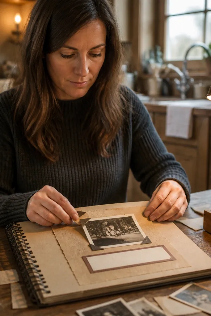
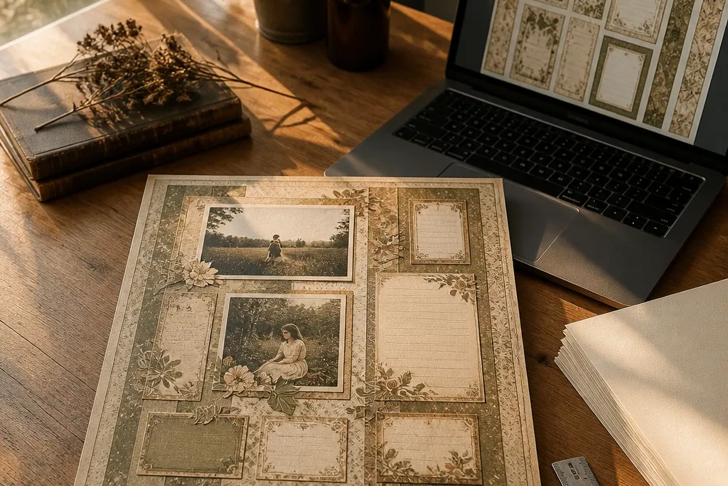
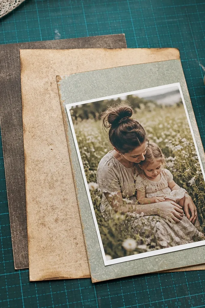
These cards make journaling look like it was written and saved, not typed on a computer and pasted in. The typewriter headline style gives you a clear visual hierarchy so your handwriting area feels intentional. Use the sepia tone to soften modern photos and keep the layout from looking too digital. They work especially well for 12x12 pages where you want one clean text block without covering the main image. They also handle busy photos well because the card border and headline separate the content.
Start by printing on 80-110 lb cardstock at 300 dpi, then trim each card to a consistent size like 4x6 inches or 4x4 inches depending on your page plan. Next, ink the edges with a brown archival ink pad or a foam brush using diluted acrylic paint (thin it so it looks like wear, not paint). Finally, layer one card slightly off-center on your page and place your journaling line or handwritten note inside the lighter text area.
If your print has crisp borders, lightly sand the torn edges with fine sandpaper to make them look irregular.
Don’t print on thin copy paper — the edges stay too clean and the vintage effect collapses.
2. Ledger Paper Background Sheet with Faint Accounting Lines
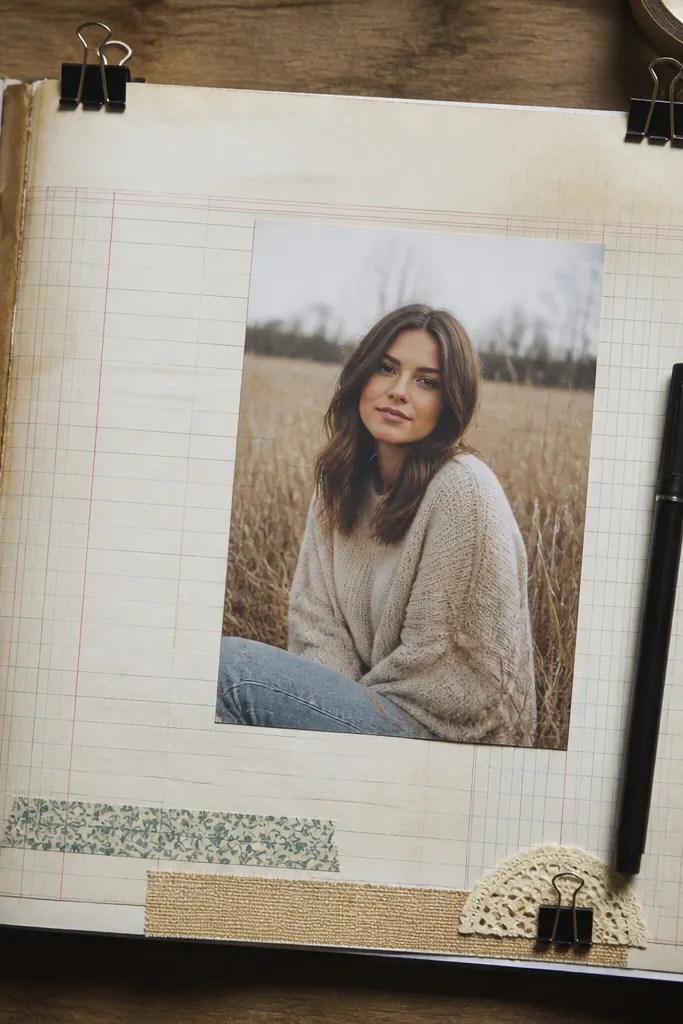
A ledger-style background instantly signals age because the lines feel like something that got reused. You get a subtle structure behind photos, which means you don’t need a complicated layout to make it look finished. The faint marks keep the page from feeling blank while still letting your photo be the hero. This is a strong choice when your pictures are bright or modern, because the gray linework mutes the overall tone. It also gives you a natural place to tuck ephemera labels and tickets.
Editor's noteUse a straight edge to trim — ledger lines look best when your cut edges are clean even if the paper texture is distressed.
Print the ledger sheet as a full-page background, then trim it to 11.75x11.75 inches for a standard 12x12 layout. Next, place it on your page base and add a photo mat or journaling card only after you decide where the linework looks strongest. Finally, if the lines are too light, run a very light pass with a graphite pencil over a few areas to deepen contrast without turning it muddy.
Skip thisSkip heavy darkening across the whole page; ledger backgrounds lose their vintage read when they become uniformly dark.
3. Vintage Postcard Frame with Rounded Corners
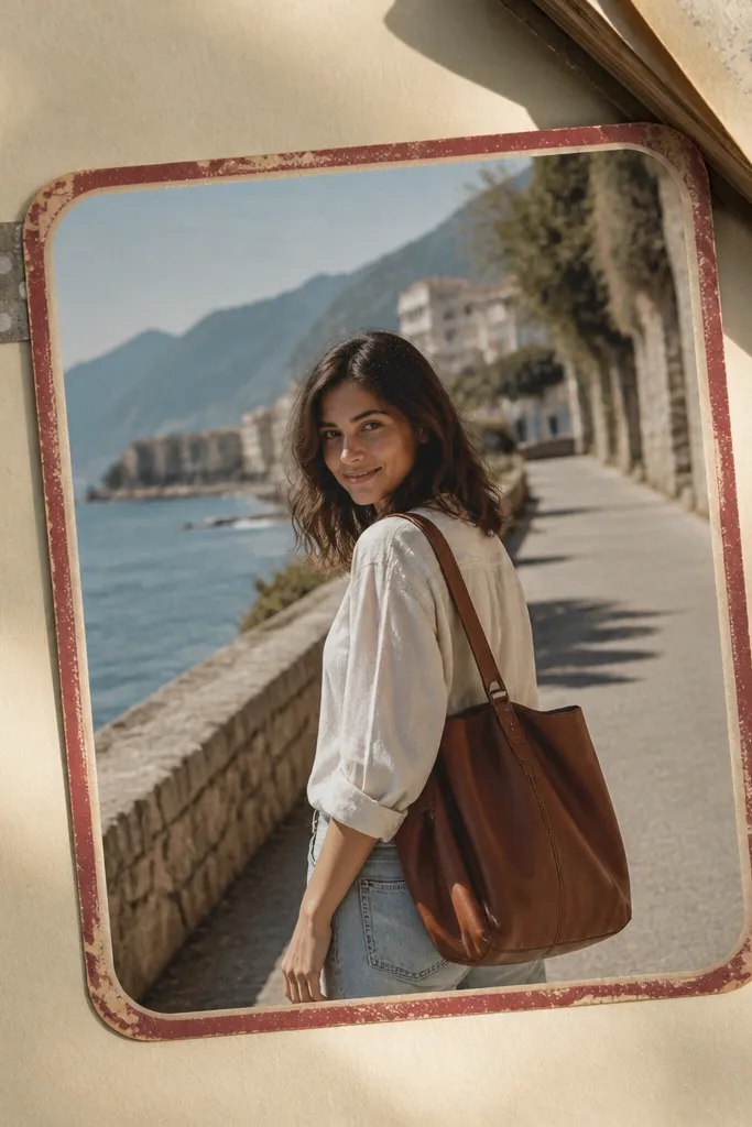
A postcard frame gives you instant photo context without adding clutter. The rounded corners feel softer and more “kept in a drawer,” and the postcard border makes it obvious that your photo is meant to be remembered. This is great for travel photos, grandparents' portraits, or any picture that benefits from a nostalgic caption area. It also works well with modern photo crops because the frame provides the vintage boundary. If you want your layout to look styled in under an hour, this is the easiest win.
Editor's noteMatch the photo’s color temperature to the postcard by slightly warming the photo before printing if it looks too cool.
Print the postcard frame on cardstock, then cut along the outer border and keep the inner photo opening intact if the design includes a mat. Next, place the frame over a printed photo that matches the opening size (measure once, then print at that scale). Finally, add a small title strip or a tiny stamp element in the postcard caption area and glue the frame with a thin foam tape so the photo sits slightly recessed.
Skip thisDon’t place a postcard frame over a photo that’s too busy — the border will fight for attention.
4. Ticket Stub Border Strips (Cut-and-Layer)
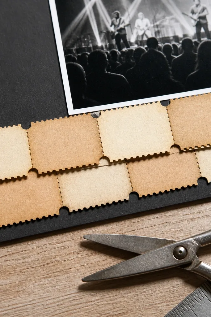
Ticket stubs are the fastest way to create movement and a “saved memory” vibe. The perforated edge look makes it feel like a real scrap, and the repeating ticket shapes give you a built-in rhythm across the page. Use them to frame a photo corner, run along the bottom edge, or create a diagonal accent. They also help balance layouts when your photo is large and you need a visual anchor without covering faces. This style reads vintage even at small sizes.
Editor's noteIf your printer makes perforations too smooth, lightly score along the line with a craft knife before cutting to create a more authentic edge.
Print the ticket strip set on cardstock and cut single stubs or halves depending on your layout. Next, tear or snip the ends so they don’t look perfectly machine-straight; then ink the cut edges with brown or black-brown. Finally, place one strip under the photo edge and one strip parallel to it, using a staggered height so you get layered depth.
Skip thisAvoid using all strips at full opacity — one needs to look faded so the layout doesn’t turn into a monochrome block.
5. Vintage Stamp Set (Single-Use Corner Marks)
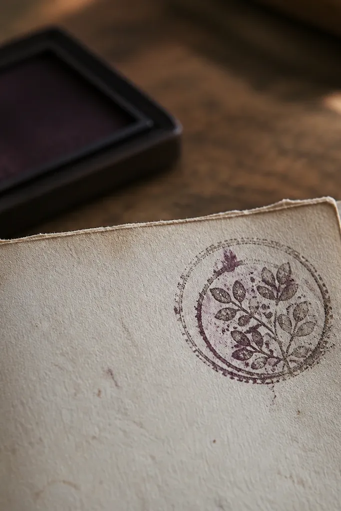
Stamp marks are tiny but powerful because they create realism. When you place a faded stamp in a corner, your layout suddenly looks processed and handled, not assembled in one sitting. Choose one stamp for a page and keep it small; too many makes it look like a sticker sheet. This is perfect for scrapbookers who want a vintage look without covering large parts of photos. It also ties together multiple elements like tickets, labels, and journaling cards.
Print stamps on cardstock, then cut each stamp close to the design. Next, ink the edges lightly with a matching brown ink pad so the stamp looks like it belongs to the page. Finally, glue one stamp to a corner with a little foam adhesive and add a short journaling date under it using a typewriter-style font or handwriting.
Use archival ink for stamping effects so the ink doesn’t smear when you add glue.
Don’t center stamps; corner placement is what makes them read like real postmarks.
6. Aged Newspaper Strip with Headline Blocks
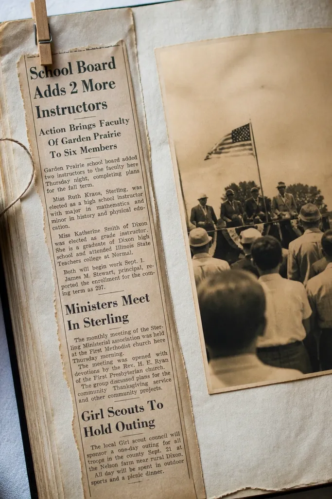
Newspaper strips add instant texture and a story vibe. The trick is to use them like an accent, not a full background, unless the whole spread is meant to be heavy and journal-like. Headline blocks are readable even when small, and the column texture looks authentic behind a photo. This works especially well for event pages, milestones, or any moment you want to feel reported. Pair it with a clean label so the typography doesn’t all compete.
Editor's noteIf the text is too dark, soften it with a light swipe of white chalk or gesso on the printed surface before gluing.
Print the newspaper strip on cardstock and cut a strip width like 2 to 2.5 inches. Next, distress the edges with a sanding block or tearing tool, then ink the edges so the strip looks separated from the page base. Finally, layer the strip under a photo corner or along the bottom, and add a small journaling label on top using foam tape for separation.
Skip thisAvoid using a full-page newspaper background with high-contrast photos; it can overpower faces and dates.
7. Faded Polaroid Photo Mat Set (Cream Border)
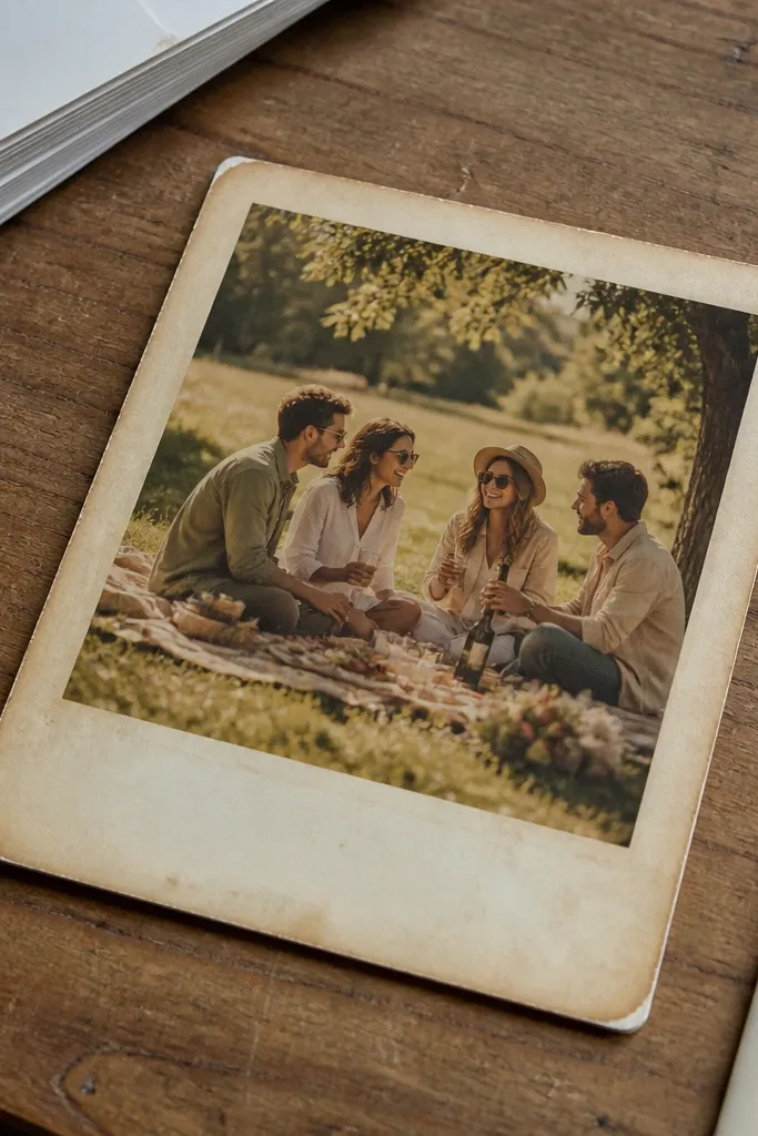
Polaroid-style mats are a clean way to make modern photos look like they belong in a vintage scrapbook. The cream border and slight fade help photos blend into aged paper without looking pasted on. Use this when you want a softer, more casual vintage vibe than ledger or stamps. They also help with layout flow because the mat shape guides the eye toward the photo center. Great for portraits, family gatherings, and anything where you want warmth.
Editor's noteShake up the look by choosing one mat slightly more faded than the others — it makes the page feel collected, not uniform.
Print the polaroid mats on cardstock, then cut out the outer border and the photo opening if needed. Next, print your photo slightly smaller than the opening so you don’t see white gaps; matte it with a thin strip of cream paper if the photo edges look too harsh. Finally, glue the photo to the back of the mat using a light adhesive and attach the mat to the scrapbook page with foam tape for a raised vintage feel.
Skip thisDon’t use glossy photos; the glare fights the matte vintage look.
8. Ornate Corner Filigree Frames (Black-Brown Ink)
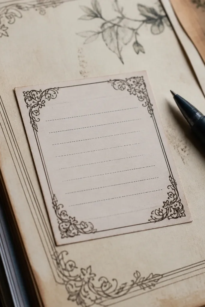
Corner filigree frames make a layout feel finished without adding heavy borders across the whole page. The key is choosing black-brown ink tones so it looks like old stationery rather than modern lace. Use them around journaling cards or photo corners to create a “frame within a frame” effect. This style also helps when your photos are bright — the darker corners anchor the page and keep it from floating. It’s a good pick for pages that need structure but not clutter.
Editor's noteUse a ruler to align corner pieces — crooked filigree reads “off” fast.
Print the filigree corners on cardstock, then cut each corner piece with a craft knife or scissors close to the ornament. Next, rub the edges with a brown ink pad so the cut lines disappear. Finally, place one or two corners on opposite sides of a photo or card and glue them flat, then top with your main element to hide the adhesive under the layer.
Skip thisDon’t place filigree on top of busy backgrounds; use it near a calmer photo area or on textured paper.
9. Vintage Label Tags with Blank Lines
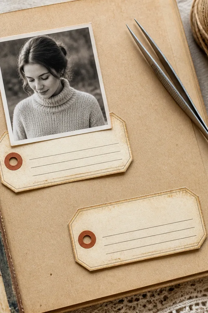
Blank-line labels are the easiest way to add journaling that looks period-correct. The label shape gives you a defined place to write, and the aging effect makes it look like it came from old packaging or library cards. Use them for names, dates, or short captions so your page doesn’t rely on one huge paragraph. This is also the best option for scrapbookers who want to write neatly but hate covering photos with long text blocks. Pair with one stamp mark for a stronger vintage read.
Print labels on cardstock, then cut out each tag and crease along any fold lines if the design includes them. Next, ink the edges and lightly sand the paper around the corners for a worn look. Finally, glue one label under a photo edge or across a corner, then write with a fine-tip archival pen on the blank lines.
Use a gel pen only if the printable ink is matte; otherwise the pen can smear into the printed texture.
Skip labels that are too small; tiny text areas look cramped and cheap once you cut them out.
10. Faux Book Page Background Sheet (Cream + Gray Type)
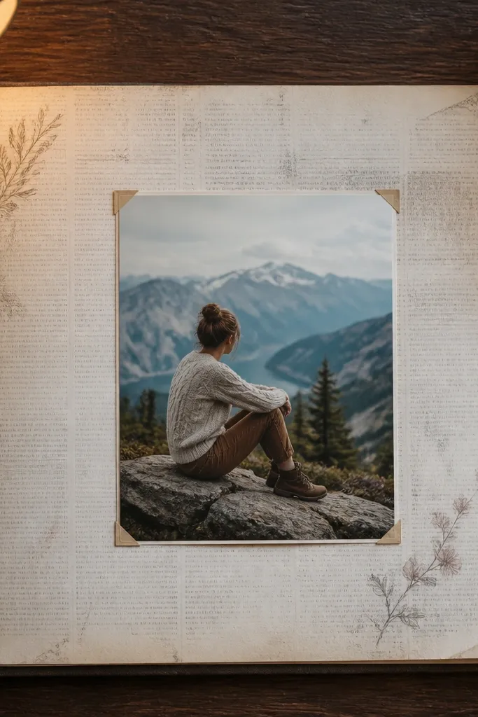
A book-page background makes your layout feel like a page from an old journal. The gray type texture is subtle enough to keep photos readable, so you don’t have to design around it. This works when you want a vintage backdrop but don’t want visible stains or heavy distress. It’s especially good for scrapbooks where you use lots of photos and need background texture that won’t distract. You can also cut shapes out of it later for layered accents.
Editor's noteKeep text density consistent by using one book-page background per layout, not multiple competing backgrounds.
Print the book-page sheet on cardstock and trim to 11.75x11.75 inches. Next, decide whether you want the text visible behind the photo or whether you’ll cover part of it with a mat; place your photo first so you know what area matters. Finally, if you want extra age, rub a light amount of brown chalk along the bottom edge and blend with your finger or a makeup sponge.
Skip thisDon’t choose a background with bright black typography; it reads like a modern newsletter.
11. Vintage Botanical Border Strip (Muted Green Wash)
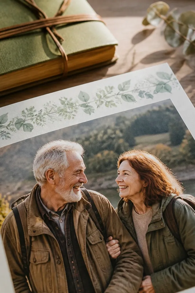
Botanical borders give you vintage charm without the heavy sepia-only look. Muted green wash feels like old printed stationery and pairs well with warm photos, especially outdoors and family gardens. Use border strips along the side edge or as a thin top accent so it frames the page instead of competing with photos. The leaf clusters look photogenic even when they’re small, and the faded ink makes it feel like a real piece of paper. Great for spring sessions, weddings, or any nature-themed layout.
Print the botanical border on cardstock and cut a strip width that matches your page design, like 1.25 inches for a side border. Next, ink the cut edges with a neutral brown so the border doesn’t look like it was printed and glued instantly. Finally, glue it along the page edge and add one label tag or stamp near the border to tie the theme together.
Use thin adhesive for borders — thick glue can warp cardstock and make the strip curl.
Avoid bright neon greens; vintage borders should look like faded dye, not fresh ink.
12. Faded Film Negative Strip (Dark Frames + Grain)
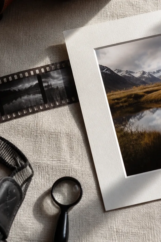
Film negative strips make your scrapbook feel like it’s documenting real photography history. The dark frames add contrast and help modern photos pop. This works best as a horizontal accent behind a title or alongside a row of smaller photos. If you’re doing a page about memories, anniversaries, or a photo series, film strips create instant cohesion. The grainy look also hides small print imperfections, so your layout stays photogenic even if you’re not a perfectionist with trimming.
Editor's noteIf the film strip looks too clean, add a tiny amount of diluted sepia ink with a sponge to mimic age spots.
Print the film strip on cardstock, then cut it to a length like 10 inches so it fits neatly with margins on 12x12. Next, ink the edges with black-brown and lightly rub graphite along the darkest areas to deepen contrast. Finally, place the strip under a photo strip or title block and secure with a few dots of adhesive so it lies flat.
Skip thisDon’t stretch the strip too tight across the page; keep a small margin so the film frames feel intentional.
13. Vintage Envelope Flap Pocket (Small Photo Insert)
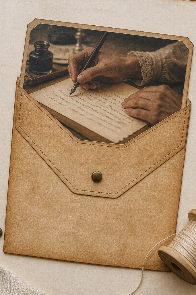
An envelope flap pocket is a practical and photogenic way to tuck in journaling, a tiny photo, or a ticket you want to keep visible. The stitched line details make it look handmade, even though it’s printed. This is ideal for pages where you want one interactive element without building a complicated folder. The pocket also creates depth because you can layer a small insert behind the flap. Choose this when your layout needs a hidden surprise but still needs to look vintage from the front.
Editor's noteUse a craft knife for the side seams so the pocket edges stay straight and the flap shuts cleanly.
Print the envelope pocket template on cardstock and cut along the outer edges plus any flap line. Next, score along the fold line with a bone folder so the flap creases sharply. Finally, glue the pocket sides and bottom, then insert a small journaling card or photo and close the flap with a tiny strip of removable adhesive or a brad hole if the template includes it.
Skip thisDon’t overfill the pocket; if it bulges, the flap stops looking like vintage paper and starts looking like a craft lump.
14. Aged Map Corner with Compass Rose (Use as Anchor)
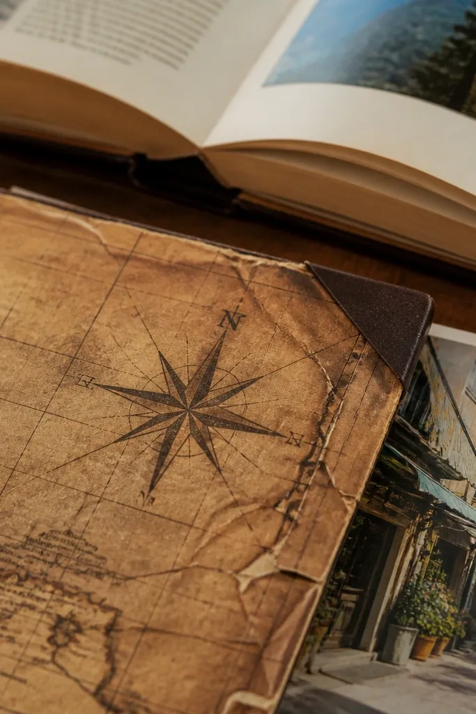
Map corners work like an anchor for travel pages. The compass rose gives you a clear focal point, and the grid lines add texture without covering too much. Use one corner near a photo of a place, street, or landmark to make the page feel like you’re documenting a route. The aged look also tones down the brightness of modern travel photos. It’s a strong choice when you want the vintage theme to feel specific, not generic.
Editor's noteUse the map corner only once per layout so it stays the “place” moment instead of becoming background clutter.
Print the map corner on cardstock and cut it into a corner shape that lands around your photo edge. Next, ink the outer edge with brown and lightly distress the paper with a sanding block. Finally, glue the corner flat, then add a small label tag with a location name and date next to it.
Skip thisDon’t place the compass rose over a face; keep it near landscape or empty space.
15. Vintage Blueprint Sheet with Diagram Lines
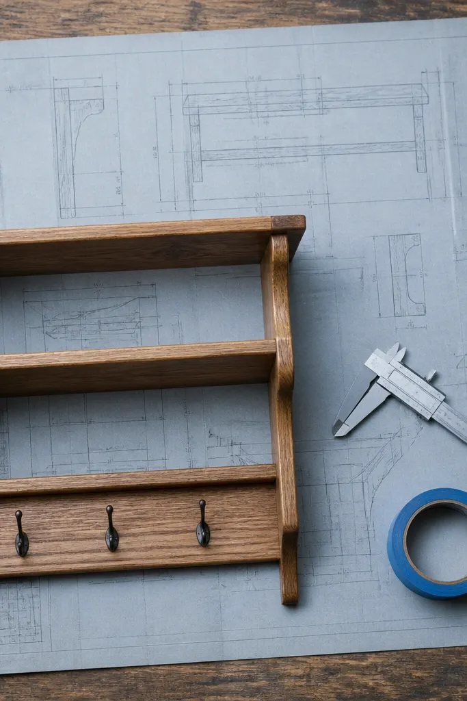
Blueprint printables give you a vintage look that isn’t sepia. The gray-blue diagram lines feel like old engineering plans, and they add structure that pairs well with modern photos because the lines are thin. Use this background when your theme is DIY, building, crafts, or any page where you want a technical mood. It also looks great with simple black-and-white photos. Keep the layout clean so the diagram lines don’t compete with too many other textures.
Editor's noteIf the blueprint prints too blue, tone it down with a very light brown chalk dusting across the page edges.
Print the blueprint sheet at 300 dpi on cardstock and trim to 11.75x11.75 inches. Next, place a photo mat centered over the lighter diagram area so your photo stays readable. Finally, add one journaling strip or small label in a contrasting warm brown to balance the cool blueprint tone.
Skip thisAvoid using blueprint backgrounds with heavy dark photos; the page can feel visually cramped.
16. Vintage Lace-Style Border with Scalloped Edge
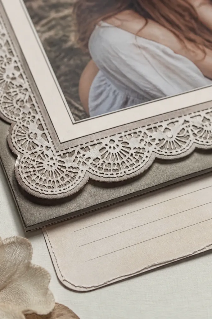
Scalloped lace-style borders add softness while still reading vintage because the ink tone is muted. These borders look best when they frame a photo mat or a journaling panel, creating a delicate edge that photographs well. Use them in small amounts — a top strip, a side strip, or a corner border — because lace patterns can overwhelm. This is a strong choice for family portraits, heritage photos, and any page where you want a gentle, romantic vintage feel without glitter or modern lace fabric.
Print the border on cardstock, then cut along the scallops using a craft knife for clean curves. Next, ink the scalloped edge lightly so the cut line disappears into the vintage print. Finally, glue the border along the page edge and place your main element slightly over it so the border reads like it’s part of the paper, not a sticker.
Use a matte glue or thin double-sided tape; shiny tape can show through the ink pattern.
Skip lace borders when your photo already has ornate details everywhere; it crowds the page.
17. Faded Calendar Page with Date Boxes
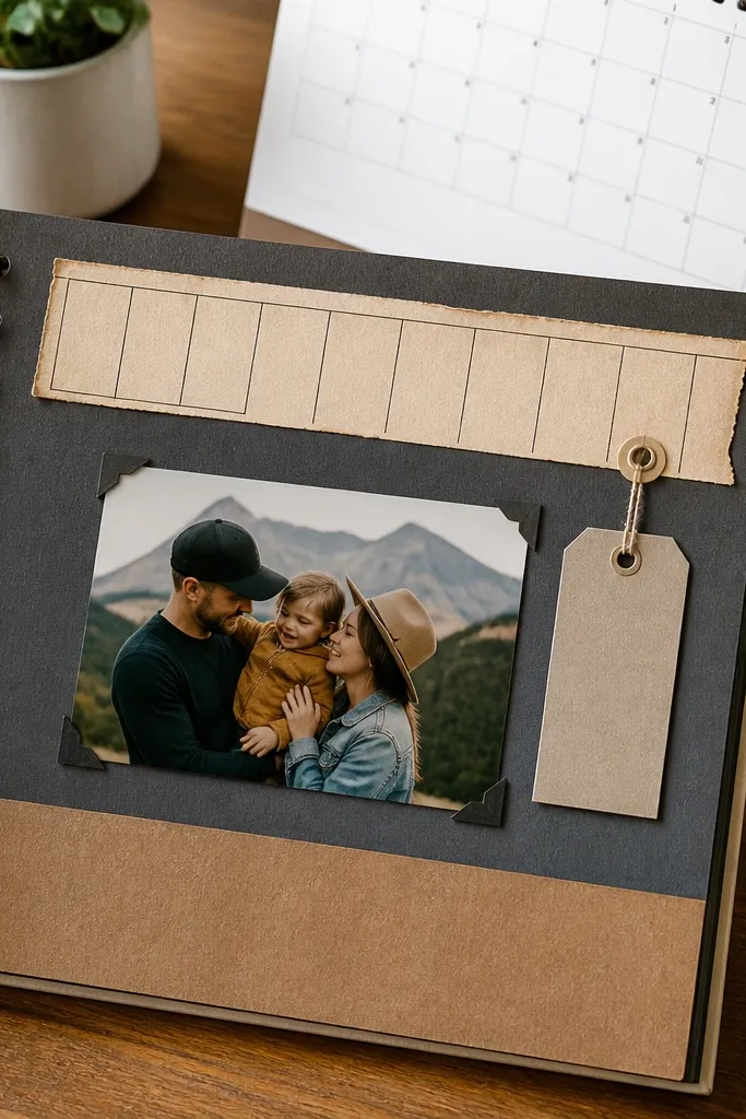
Calendar printables make dates feel grounded and real. The date boxes give you a structured place to record birthdays, anniversaries, or event days without writing a paragraph. Use one calendar strip for a timeline-like look, or a full background if your page theme is time-based. The faded ink reads vintage because it looks like it was used, not printed once and stored. It’s also great for scrapbooking kids' activities where you want dates to be visually clear.
Editor's noteChoose the date box area that matches your journaling length; don’t try to cram long text into a small grid.
Print calendar pages on cardstock and trim to the size you need, like a 2-inch strip for a header or a full 11.75x11.75 background if the design supports it. Next, ink the edges with brown to mimic aging paper and reduce the clean-cut look. Finally, fill in the date with a fine pen and glue a small label or stamp near it for a finishing touch.
Skip thisDon’t use bright red date accents if your photos are warm; it can look modern and loud.
18. Vintage Recipe Card with Stain Marks
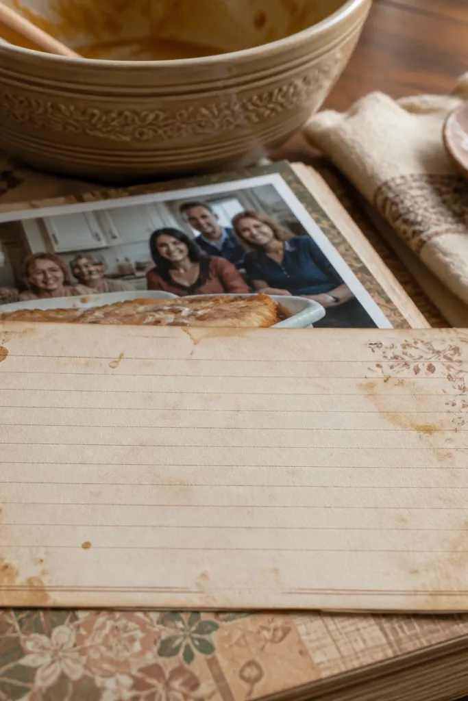
Recipe cards are a scrapbook cheat code because they bring both typography and nostalgia. The stained speckles make it look handled, and the lined layout gives you a clear place to write what the memory is about. Use this for family cooking stories, holiday pages, or any memory linked to food. It also looks great on pages with portraits because the card sits beside faces without needing to cover them. Keep it as a focal journaling element and let your photo be the second focal point.
Editor's noteUse a gel pen or pencil for writing depending on your printer’s ink — test one scrap first to avoid smearing.
Print recipe cards on cardstock and cut the card out cleanly. Next, add distress by tapping diluted sepia ink with a sponge around the stain areas so the printed stains look blended. Finally, write your short recipe note or memory title on the lined section and glue it with foam tape so it lifts off the background paper.
Skip thisAvoid recipe cards with too much decorative script if you want legible journaling.
19. Vintage Music Sheet Strips (Staff Lines)
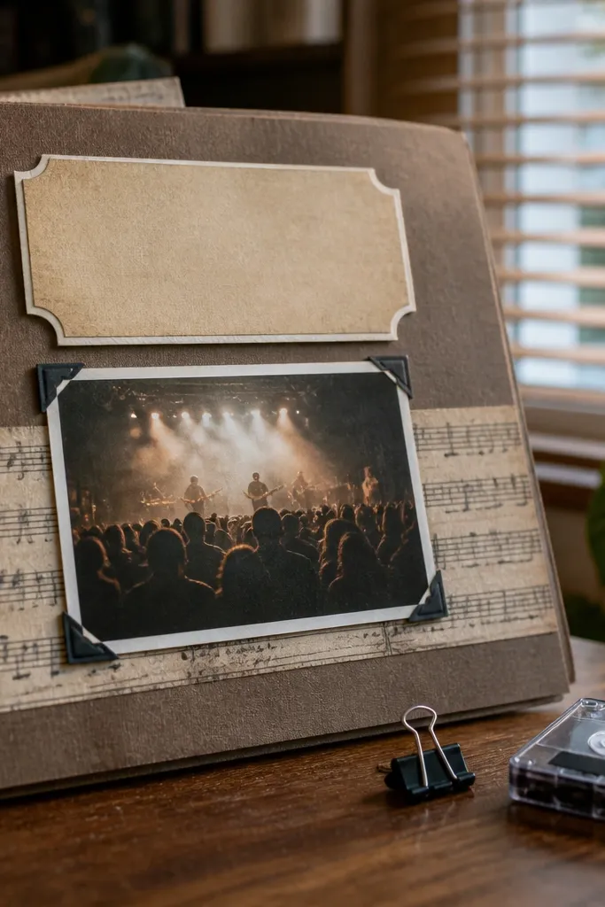
Music sheet strips bring a specific vintage flavor that looks amazing next to photos from concerts, family parties, or weddings. The staff lines add rhythm, and the faded notes keep it from looking too graphic. Use it as a narrow strip under a title or along the side of a photo mat. This style also works when you want a themed scrapbook page without adding lots of icons. The monochrome feel keeps your layout cohesive and readable.
Editor's noteIf staff lines are too faint, increase visibility by adding a thin layer of chalk at the edges only, not across the whole strip.
Print the music sheet strip on cardstock and cut it to a width like 1.5 to 2 inches. Next, ink the edges with brown and gently rub a gray pencil over a few lines to deepen contrast. Finally, place the strip under a photo or journaling card and secure it flat so it doesn’t warp.
Skip thisDon’t use music strips as full backgrounds unless the page is intentionally music-themed.
20. Vintage Ticket Receipt Overlay (Semi-Transparent Look)
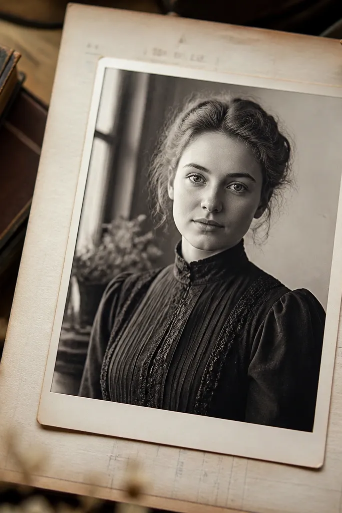
Receipts and overlays give you that “layered ephemera” look without complicated assembly. The faded text blocks create texture even when you keep the overlay small, and worn corners make it feel like it has been through a bag. Use this on top of a photo mat or behind a title to add depth. It’s also useful when you want to hide an awkward photo crop — the overlay adds visual interest right where you need it. Keep the overlay at 40-70% of the page width so it frames, not covers.
Editor's noteUse a light adhesive only on the corners if you want the center to look more “floating.”
Print the receipt overlay on cardstock and cut it to fit your photo mat size. Next, distress the corners with a craft knife and ink the edges so the overlay blends into the page. Finally, glue it flat or with thin foam tape over a photo mat and add your journaling title in a clean label area so the text stays readable.
Skip thisDon’t stack multiple overlays with heavy text; the page becomes unreadable fast.
21. Old Photo Frame Mat with Faux Wear Around the Edges
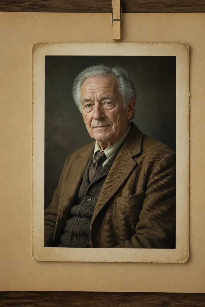
This mat style makes your photo look like it’s been framed for decades. Faux wear around the edges adds realism and makes the photo feel set into paper rather than pasted on top. Use it for portraits and single hero photos where you want a clear, classic finish. It works well with both color and black-and-white photos because the frame tone is neutral. If your goal is “vintage at a glance,” this is one of the most reliable printable types to start with.
Editor's noteIf the frame edge looks too uniform, rub a tiny bit of dark brown chalk on just the outer rim.
Print the frame mat on cardstock and cut out the inner window. Next, print or resize your photo to match the window size, then test-fit before gluing. Finally, glue the photo to the back of the mat, then attach the whole mat to your page using foam tape for a raised, framed look.
Skip thisAvoid frames with super-thin borders; they crumble or peel when you distress edges.
22. Vintage Monogram Corner Labels (Initials + Date)
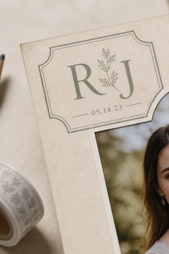
Monogram corner labels add a personal vintage touch without needing lots of writing. The initial-focused design keeps it classy and photo-friendly, and the faint date text helps it read like a real keepsake. Use these for family albums where each page highlights one person or one event. The corner placement makes it look intentional and balanced even on busy pages. This style also works great with clean backgrounds like ledger paper or book pages.
Editor's noteStick to one monogram per layout; multiple initials look like decoration instead of a keepsake.
Print monogram labels on cardstock and cut them close to the design. Next, ink the edges and lightly distress the corners so they match the rest of your aged paper. Finally, glue one label in a top corner or opposite corner of your main photo and add a short date note in the same ink color.
Skip thisDon’t choose a monogram size that’s too big — oversized initials dominate the page.
23. Vintage Botanica Cut-Apart Shapes (Leaves + Sprigs)
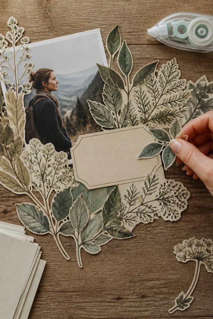
Cut-apart botanica shapes let you build your own border without committing to a single full strip. You can tuck sprigs around a photo, cluster leaves near a label, or make a diagonal accent that guides the eye. Because these are individual pieces, they look handmade even when printed. This is a smart pick if you want variety across pages but still want everything to look like the same “paper line.” Keep the colors muted so it reads like printed dye, not modern craft paint.
Editor's noteUse a small dot of glue near the center vein and let the outer leaf edges lift slightly for better dimension.
Print the botanica sheet on cardstock and cut out each sprig shape. Next, distress the edges with a brown ink pad and add a tiny bit of gray pencil to the veins so they look layered. Finally, arrange two or three pieces around your photo or journaling card and glue only the contact points so the pieces don’t look pasted flat.
Skip thisDon’t use too many sprigs in one spot; leave negative space so the leaves read clearly.
24. Vintage Ticket Border with Tear-Away Tabs
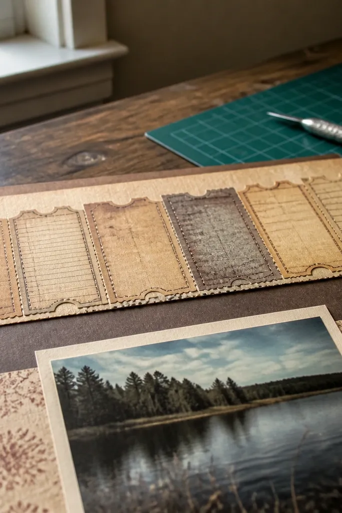
This ticket border has tear-away tab shapes that make your page look like it came from a real event. Tabs add a playful, layered look, and the faded text keeps everything vintage instead of comic. Use it along the top or bottom edge for a strong horizontal anchor. It also works well when you want your title to sit above a “ticket strip” without covering the photo. The tabs create tiny shadows when layered, which makes layouts look more expensive in photos.
Editor's noteIf your tabs curl, press them under a heavy book between two scrap papers for 10-15 minutes.
Print on cardstock and cut the border strip as one piece if you want the tabs to align, or separate the tabs if your layout needs flexibility. Next, tear or cut the tab ends so they match the worn style, then ink edges with brown-black. Finally, glue the strip down and place your title or photo mat so it overlaps the tab area slightly for a seamless look.
Skip thisAvoid perfectly straight placement across every page; slight offset looks more like collected ephemera.
25. Faux Woodcut Frame Panel (Aged Print Texture)
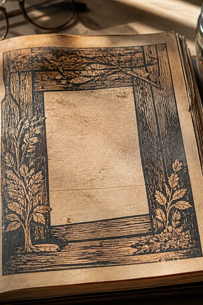
Woodcut-style frames look vintage because the texture mimics carved or printed imperfections. The scratchy ink surface adds depth even when you keep the frame size small. Use this as a centerpiece panel for a photo or a journaling block when you want a dramatic vintage look without heavy ornament. It’s also great for black-and-white photos because the texture echoes old prints and album covers. Keep the rest of the page simple so the frame becomes the main visual feature.
Print the frame panel on cardstock and cut out the inner window if included. Next, distress the frame edges with a sanding block to soften the border and ink with a dark brown pad. Finally, mount your photo or journaling card behind the window and attach the frame to your page using foam tape around the perimeter.
Use a matte photo finish so the woodcut texture doesn’t get overwhelmed by shine.
Skip glossy photos and high-contrast backgrounds behind this frame; it will look busy.



