
1. 12x12 200gsm Matte Cardstock in Warm Cream
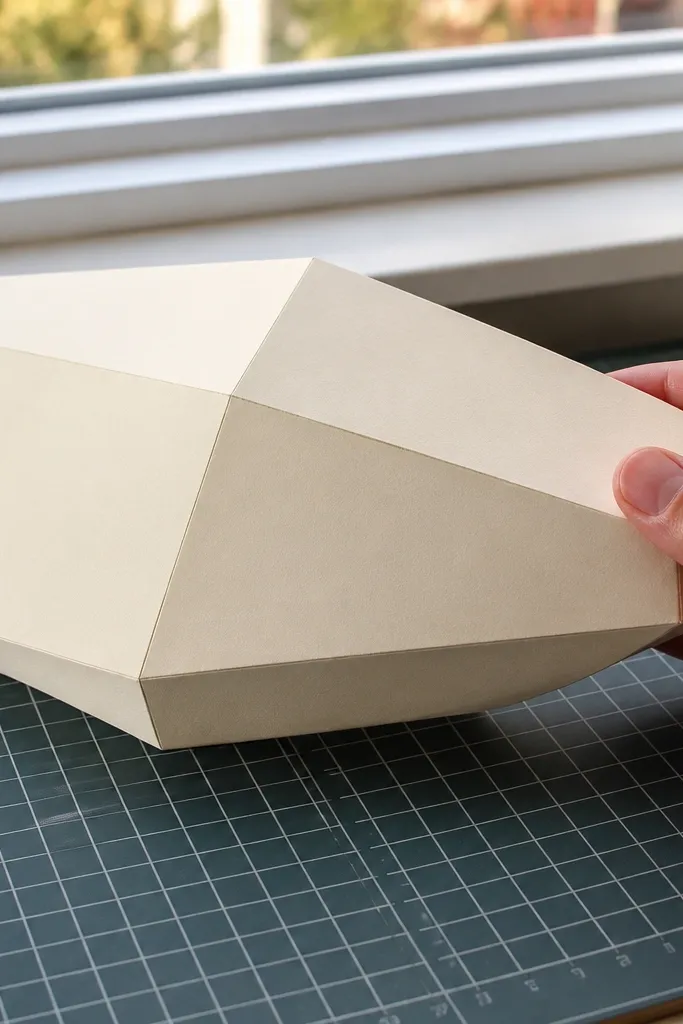
This is the foundation for a clean, high-end paper duck because 200gsm holds a crease without turning wavy. Warm cream also makes browns and soft greys look richer, even with basic printing. Matte surface hides fingerprints and glare, which matters when you take photos near a window. If your ducks keep curling at the edges, this cardstock weight is the simplest fix. It’s also easy to cut into consistent shapes for repeatable parts.
Editor's noteLabel the paper brand and weight on the back. You’ll thank yourself the next time you remake the duck.
Step 1: Choose 200gsm matte cardstock and cut a small test duck panel using your usual template or pattern. Step 2: Score fold lines lightly with a craft knife back or a scoring tool, then fold only after you’ve tested the pressure. Step 3: Assemble one small duck section and check if edges stay crisp after 10 minutes under normal room conditions.
Skip thisSkip thin printer paper — it looks fine until you fold it and it warps.
2. Heavyweight Origami Paper for Smooth Curves
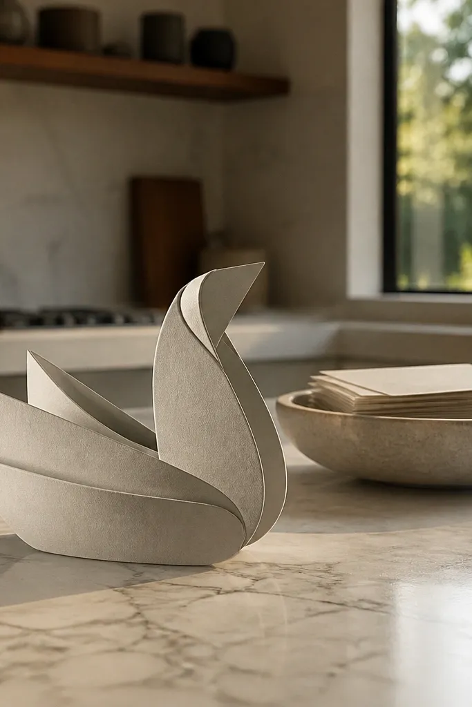
Heavyweight origami paper gives you the best curve control for duck bodies that should look rounded, not faceted. The lighter paper that still behaves like cardstock lets you form gentle bends without cracking. Choose a set with neutrals or single-color sheets so you don’t get weird patchy dye when you fold. This supply makes the duck look polished because the surface stays even, and edges don’t fuzz. It’s ideal for wings, neck curves, and any part that needs a clean arc.
Step 1: Pick origami paper labeled heavyweight and test one fold line on a scrap to see if it creases cleanly. Step 2: Use a bone folder or the back of a spoon to compress folds, then unfold to check for sharpness. Step 3: Trim only after the main creases are set so you don’t introduce frayed edges.
Press folds with a bone folder for 10-15 seconds per crease for a sharper look.
Don’t cut all pieces first. Curves look worse when you trim before creasing.
3. Black Pigment Ink Pad for Crisp Line Work
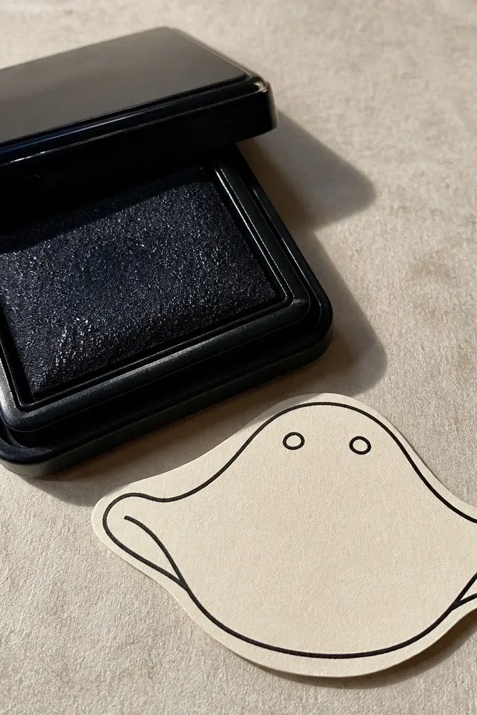
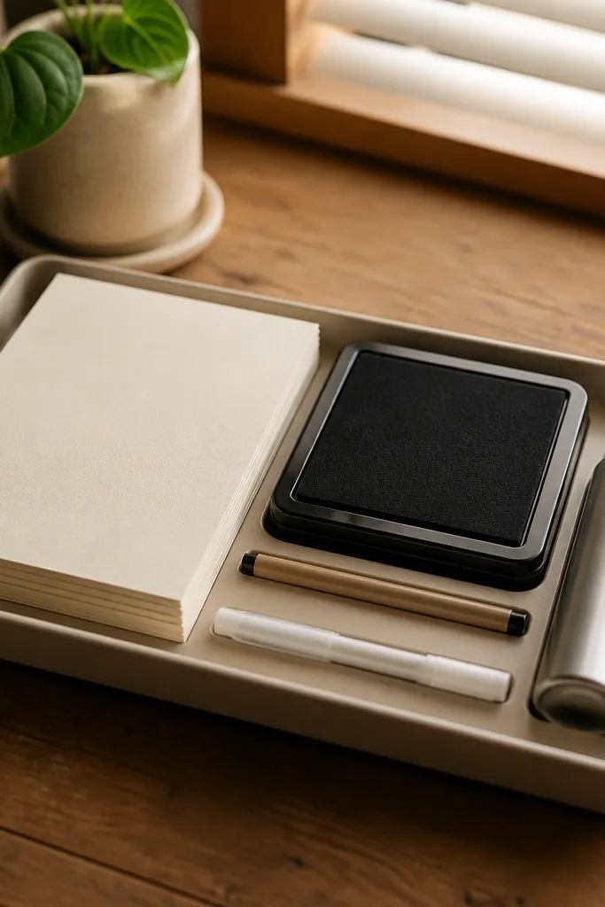
A pigment ink pad makes your paper duck details look intentional instead of smudged. Pigment ink sits on top of paper fibers more cleanly than dye ink, so fine lines stay crisp. Use it for beak outlines, feather marks, and any repeated texture stamps. Pigment ink also helps when you want dark accents that don’t feather into the paper. It’s a small supply that changes the whole “high-end” read because your lines stay sharp in photos.
Editor's noteKeep a scrap sheet under your work. Pigment ink can transfer if you bump the table.
Step 1: Test the ink on the exact cardstock you’re using, because absorbency changes results. Step 2: Use a small foam or stamp dauber for controlled coverage, then wipe any excess so you don’t blob details. Step 3: Let it dry fully before layering paper pieces on top, so you don’t smear the ink.
Skip thisDon’t use dye ink for fine details — it bleeds and makes edges look cheap.
4. 0.3mm Fineliner Micron-Style Pen for Feather Edges
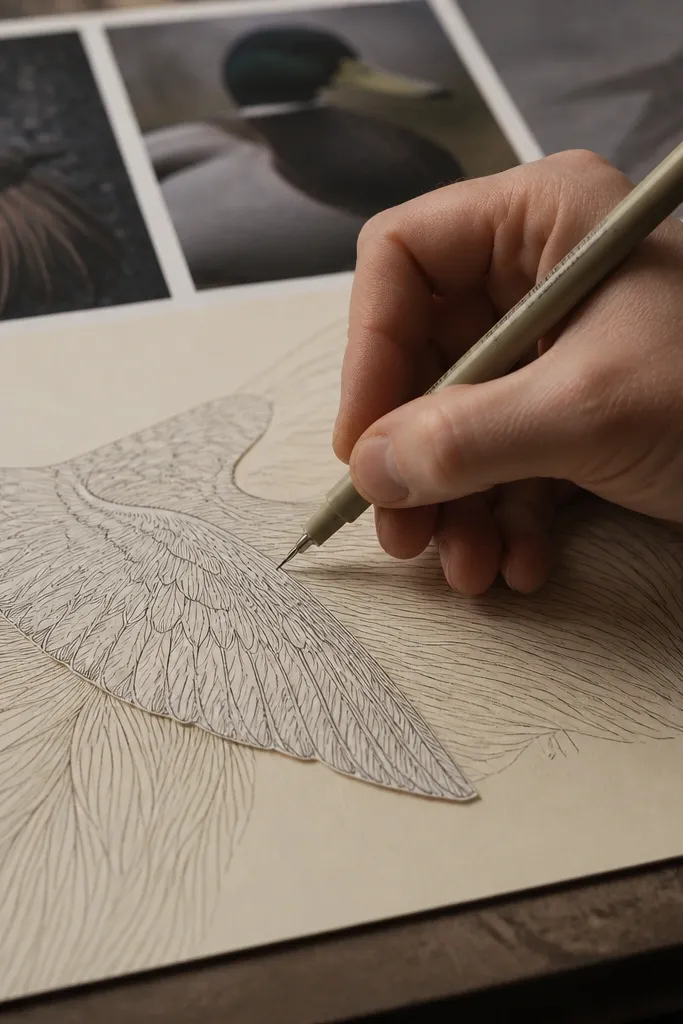
Ultra-fine fineliners are how you get that “illustrated” duck look without messy line weight. A 0.3mm tip is small enough for feather seams, eyelash-like accents, and thin border lines around cutouts. Choose a waterproof, archival pen so your ink doesn’t smear if you use a light mist of water or clear coat later. This supply upgrades the duck’s face and edges, which are what people notice first. It’s also great for labeling parts on the back without leaving thick marks.
Editor's noteIf the tip skips, scribble on scrap for 10 seconds. Don’t press harder — it creates thick spots.
Step 1: Practice on scrap using the same pressure you’ll use on the duck. Step 2: Draw feather lines in short strokes so the ink doesn’t pool at the end of each line. Step 3: Seal only after the ink is fully dry, especially if you plan to add any clear finish.
Skip thisSkip gel pens for outlines — they smear and look glossy under daylight.
5. White Gel Pen for Beak Highlights and Eye Pop
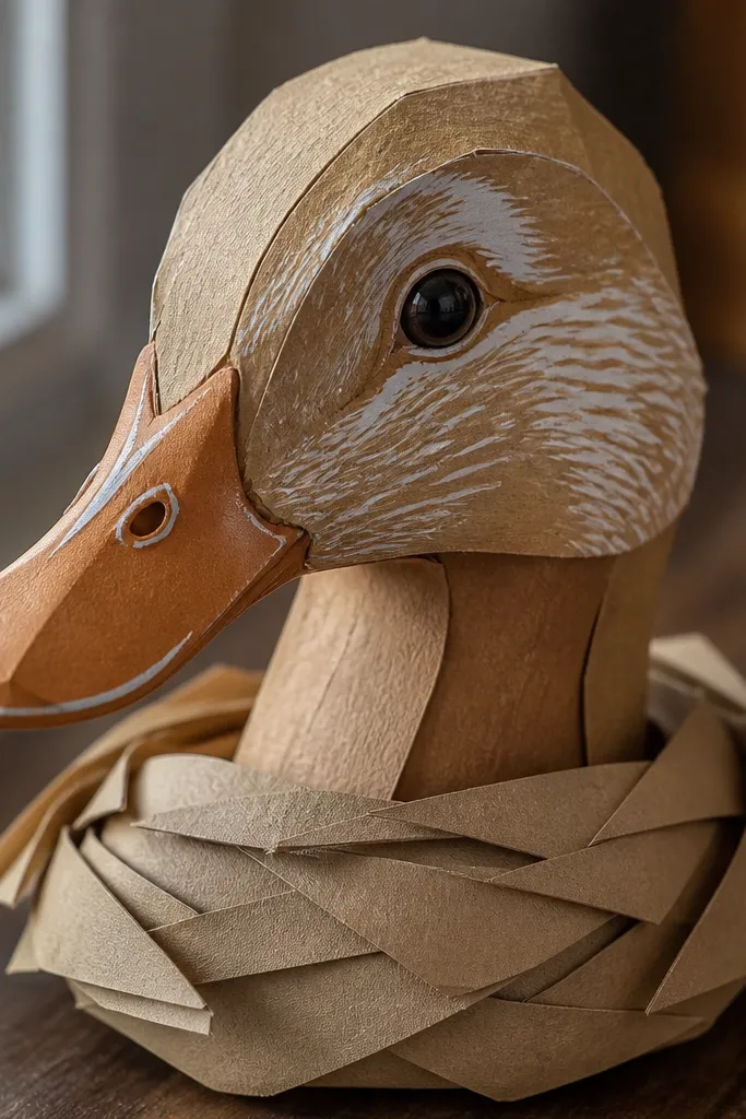
White gel pen marks make your duck look like it has light catching on it. Use it sparingly on the beak edge, eye highlight dots, and the top ridge of wings so the duck reads dimensional. On matte cardstock, white gel pen stands out cleanly without turning reflective like metallic paint. This is one of the fastest ways to make a budget paper duck look intentional. It also helps cover tiny cutting mistakes — a small highlight can disguise a slightly uneven edge.
Step 1: Add a tiny dot or short line on the highlight spots only after your main ink lines are dry. Step 2: Let it sit for 1-2 minutes, then add a second layer if the first looks too faint. Step 3: Avoid running your hand over it while it’s fresh.
Dot the highlights with the pen tip, then drag one millimeter maximum for a clean taper.
Don’t flood large white areas. It turns chalky and looks pasted on.
6. Matte Clear Spray Sealer for Photo-Ready Surfaces
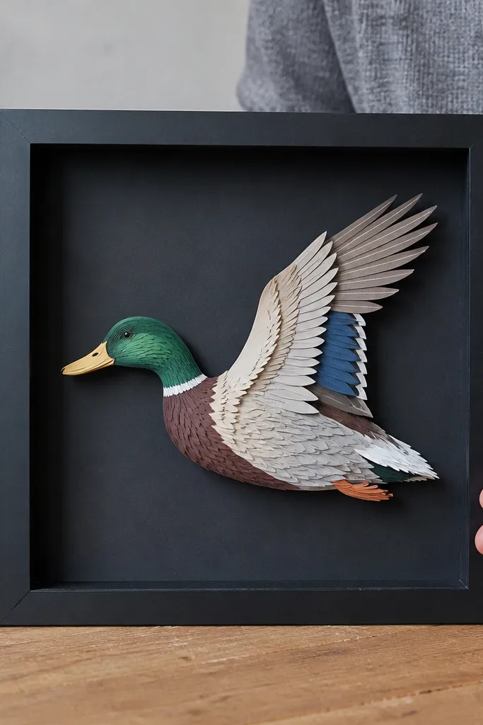
A matte clear sealer makes paper ducks look finished instead of handmade-in-a-hurry. It reduces glare, protects ink from smudging, and makes colors look more even under indoor lighting. Matte is the key — glossy sprays create shine spots that blow out details in photos. This supply also helps if your duck will live on display and get touched by curious hands. It’s especially useful when you used pigment ink and fineliners and want them to stay crisp over time.
Step 1: Work in a ventilated area and test spray distance on a scrap piece. Step 2: Apply light coats from 8-12 inches away, letting each coat dry before the next. Step 3: Avoid heavy spraying on folds so the paper doesn’t stiffen or crack.
Spray two light coats rather than one heavy coat. Heavy coats cause pooling and texture changes.
Don’t use glossy sealer for a paper duck — it looks shiny and cheap under window light.
7. Double-Sided Adhesive Tape Runner for Flat Assembly
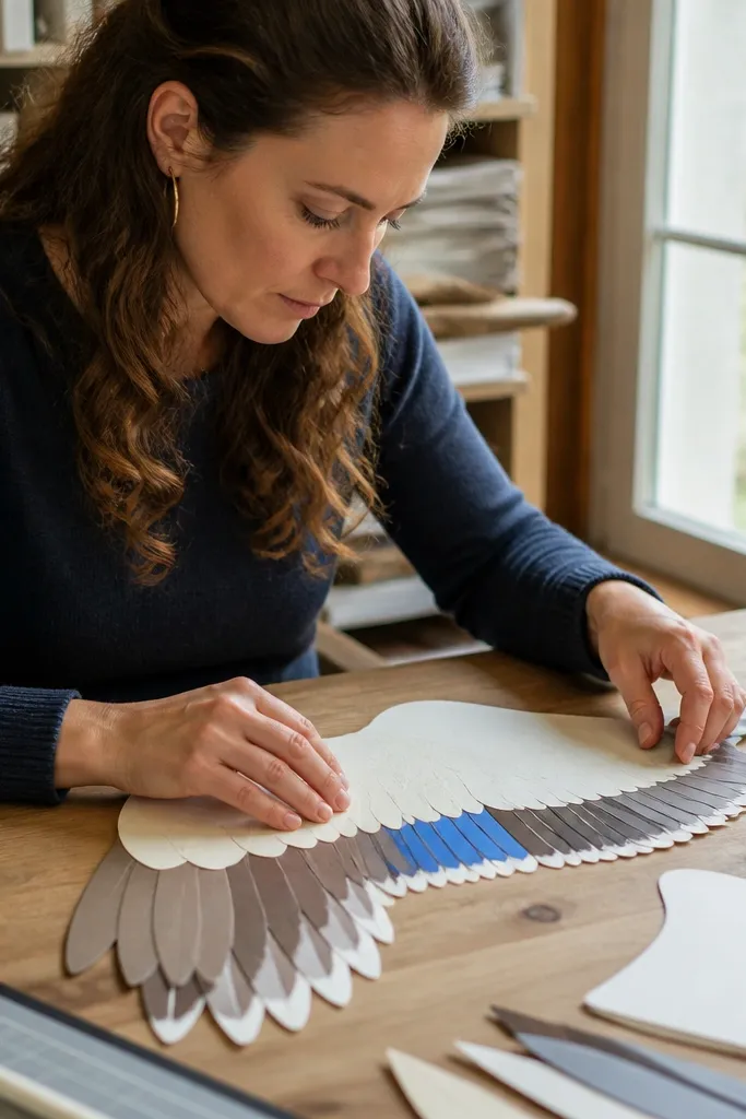
A tape runner keeps your duck seams flat and aligned, which is what makes the finished piece look “designed.” Compared to glue, tape dries instantly and doesn’t create ripples in thin cardstock. Use it for wings, layered feathers, and attaching paper textures where you want crisp edges with no squeeze-out. It also speeds up assembly when you’re making multiple ducks. If your projects always look slightly crooked, this is the easiest fix. The finish is clean, and the paper stays smooth.
Editor's noteMark alignment dots lightly in pencil on the back. Tape runners reward accurate placement.
Step 1: Apply tape to one surface only, then place the second piece with light pressure and check alignment before pressing fully. Step 2: Use a brayer or clean scrap card to burnish the tape so edges bond evenly. Step 3: Trim any tape overhang with a sharp craft knife for a flush look.
Skip thisDon’t use tape on thick, heavy folds. It can lift after stress.
8. Archival Matte Glue Stick for No-Warp Bonds
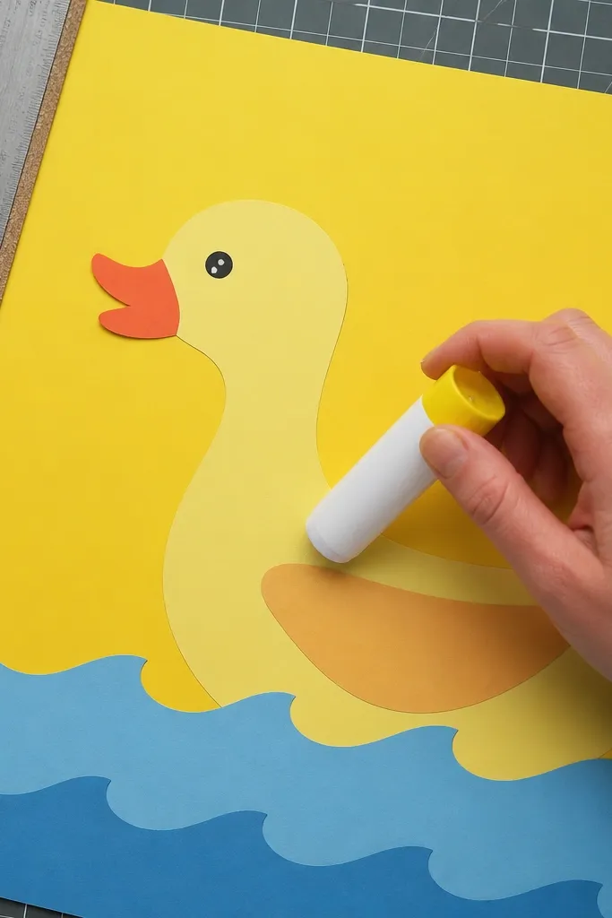
A glue stick is the “quiet” supply that keeps paper ducks looking crisp. Choose an archival, matte glue stick so it dries clear and doesn’t create glossy patches that catch light. Use it for attaching larger paper panels, background pieces, and feather backing layers. Glue stick bonds are strong, but they also let you reposition for a short moment. This reduces the stress of cutting and re-cutting parts. It’s a clean option when you want a polished look without glue ridges.
Step 1: Apply a thin, even layer — think coverage that disappears into the paper, not wet-looking streaks. Step 2: Press and hold for 20-30 seconds, then let it sit flat for 10 minutes before you fold or stack. Step 3: If you need extra hold on edges, add a small touch of gel glue at the corner only.
Use a scrap piece of cardboard under your work so the glue stick doesn’t stick to your table.
Don’t blob glue on delicate cutouts. It soaks in and makes edges swell.
9. 3D Foam Squares for Feather Lift
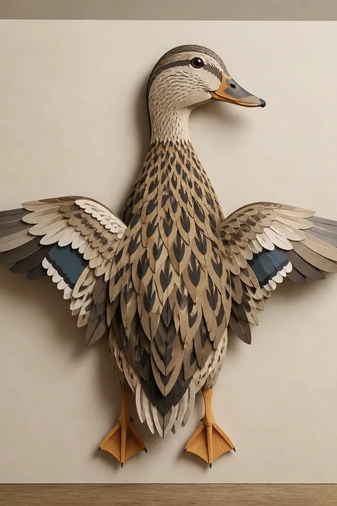
Foam squares create instant depth, which makes a paper duck look like it’s standing in a tiny scene. Use them on the wing edges, tail feathers, and around the head so shadows fall naturally. That shadow is a big part of the high-end look because it adds dimension without heavy sculpting. Choose thin foam squares (around 1-2mm) for most duck builds; thicker foam can make the duck wobble and look chunky. This supply is also great for making parts feel intentional instead of pasted flat.
Step 1: Cut foam squares smaller than the surface you’re lifting so edges don’t show. Step 2: Place foam near the center of a piece, then press down firmly to set the bond. Step 3: Build your highest-lift parts last so you can adjust layering without crushing earlier pieces.
If you see foam edges, cover them with a matching paper strip or a tiny white highlight line.
Don’t use foam squares on thin paper that will flex. It creates separation lines.
10. Cutting Mat with 1/8-inch Grid
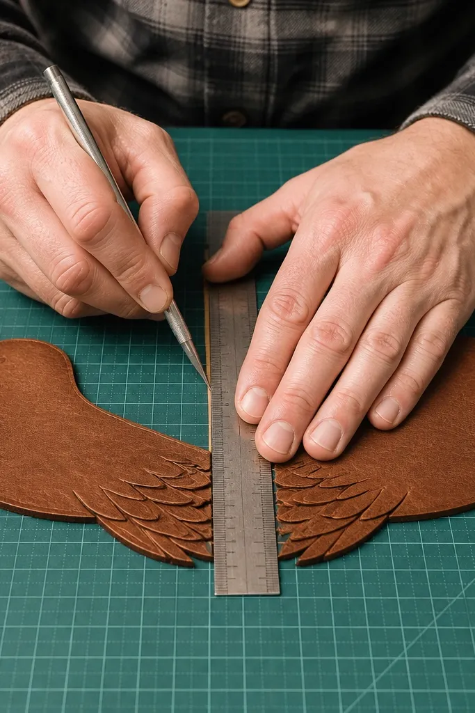
A gridded cutting mat is boring until you see the difference in clean shapes. The grid helps you keep wing tips symmetrical and makes it easier to align repeated feather cuts. A self-healing mat also protects your blade so you get smoother cuts, which looks better on camera. If you keep getting ragged edges, the mat and blade combo is usually the fix. This supply also helps you measure consistent margins for backgrounds and frames. It’s the unglamorous item that makes everything else look more professional.
Step 1: Place your mat under bright light and align your paper with the grid marks. Step 2: Use a fresh blade and cut with steady pressure, letting the blade do the work. Step 3: Clean off paper dust so it doesn’t dull the next cut.
Rotate your paper, not your wrist. Straight cuts look straight when the paper stays aligned to the grid.
Skip a dull blade. Ragged edges ruin the “high-end” illusion fast.
11. Snap-Off Craft Knife with Fresh Blades
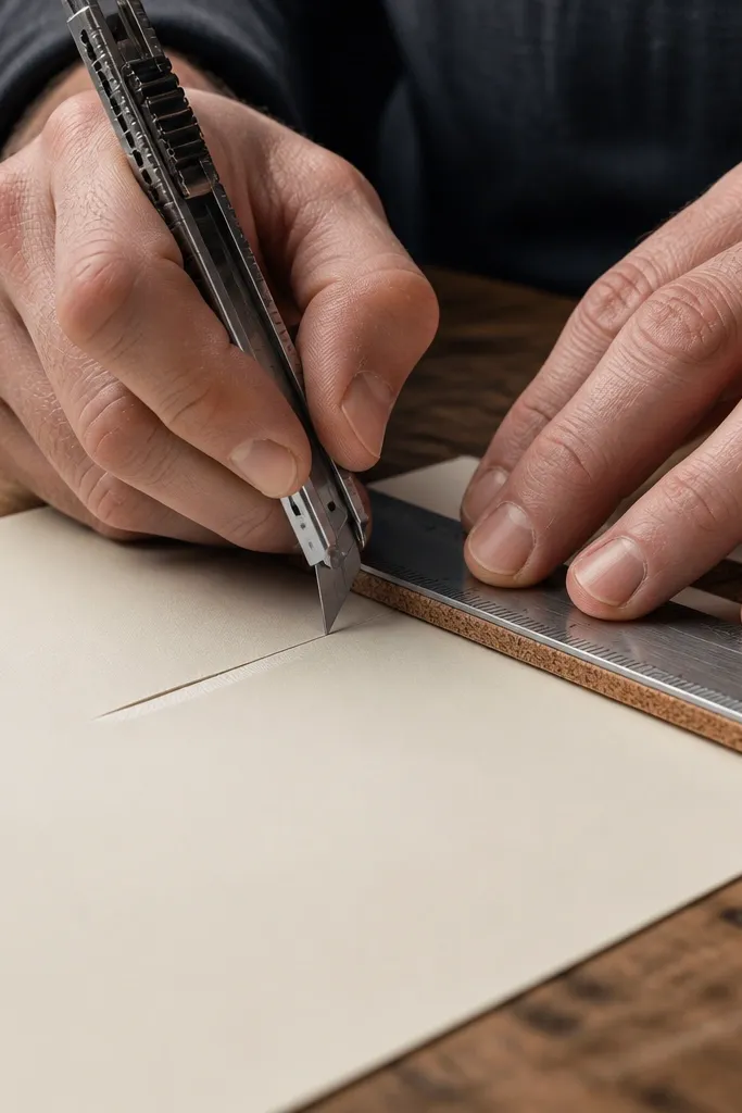
A snap-off craft knife makes clean, controlled cuts for duck bodies, beaks, and tiny feather slits. Fresh blades cut paper fibers cleanly, so your edges don’t look fuzzy. That matters because paper ducks are basically edge work — the silhouettes are the style. I’d rather have a good blade than fancy paper, because the cut quality is what reads as “intentional.” If you’ve ever had paper corners look soft or torn, blade freshness is the first place to fix it.
Editor's noteChange blades after you feel resistance. Dull blades push fibers and ruin edges.
Step 1: Snap to a fresh blade segment before you start detailed cuts. Step 2: Score first for thick cardstock, then do a second pass for full cut-through. Step 3: Pull your cut line slowly and keep the knife angle consistent.
Skip thisDon’t force the knife through thick layers. That causes jagged breaks.
12. Metal Ruler with Cork Backing
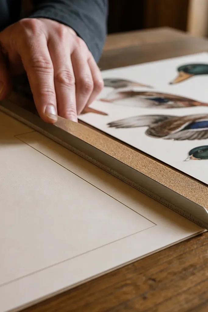
A metal ruler with a non-slip cork backing keeps your cuts straight and your borders even. For paper duck supplies, the difference shows up in wing lines, tail separators, and background frames. When your edges are consistent, your duck looks designed even if the project is simple. This is especially helpful when you’re trimming cardstock for a shadow-box display. The ruler also helps you draw clean guide lines for assembly and keeps your hand from wobbling.
Step 1: Place the ruler on the mat and press the cork side down so it doesn’t slide. Step 2: Use the ruler edge as your cutting guide and cut in one smooth motion. Step 3: Wipe off dust so the ruler stays grippy and doesn’t scratch your paper.
Mark tiny pencil ticks on the ruler edge, not on the paper, for cleaner visuals.
Don’t use a cheap plastic ruler. It flexes and creates uneven cuts.
13. Soft-Touch Brown Acrylic Paint for Duck Feet
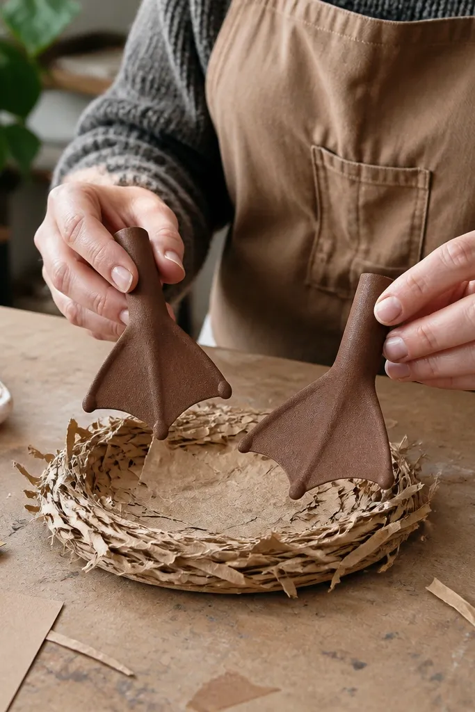
If your paper duck feet look flat, acrylic paint fixes it with the right texture and color depth. Use a soft-touch or matte acrylic so it doesn’t look like wet plastic. Paint the underside and toe tips, then let it dry before you glue. This makes feet look like they belong on a real sculpture instead of paper cutouts. It also helps hide minor edge imperfections where your cut meets glue. Keep the color warm brown so it matches cream and beige paper tones.
Step 1: Paint only the areas that need depth — underside and toe edges — using a small flat brush. Step 2: Let it dry completely, then add a second thin layer if the brown looks patchy. Step 3: Seal with matte clear spray if you want durability.
Mix a tiny drop of white into your brown for toe highlights so the feet look dimensional.
Skip watery paint. It soaks and warps thin cardstock.
14. Gold 1mm Washi Tape for Tiny Accent Stripes
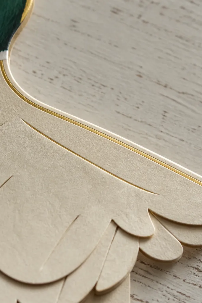
Gold washi tape at 1-2mm width adds that “high-end detail” without turning the duck into a craft project. Use it for micro accents like border lines on a base, beak edge trims, or tiny stripes on the wing backing. Matte gold tape looks cleaner than shiny foil tape and photographs better under mixed lighting. You get controlled shine without the mess of paint. This supply is small but it changes the visual hierarchy in your duck scene.
Step 1: Plan where the tape will land by marking the line lightly with pencil. Step 2: Apply tape using a burnishing tool like a clean fingernail or plastic scraper so edges stay crisp. Step 3: Trim with a sharp knife right along the paper edge for a flush finish.
Use tape on flat surfaces only. On thick folds, it can lift at the edges.
Don’t wrap big areas with foil-like tape. It reads costume-y.
15. Matte Photo Paper for Background Panels
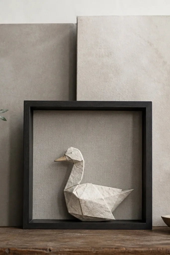
Background panels decide whether your paper duck looks like art or a craft on a table. Matte photo paper holds color smoothly and has a slightly textured feel that hides print banding. Choose a paper with a neutral tone — warm grey, soft beige, or pale stone — so the duck stands out without competing. This supply is also forgiving when you print patterns for feathers or subtle gradients. With matte finish, your duck edges look sharper because glare doesn’t wash them out.
Editor's notePrint your background at a slightly higher contrast than you think you need. Matte paper dulls contrast in photos.
Step 1: Print a background test on matte photo paper and check it under the same light you’ll photograph in. Step 2: Cut the panel slightly larger than your display base so you can trim the final edges cleanly. Step 3: Attach with tape runner for flatness, then add your duck pieces after the background is secure.
Skip thisSkip glossy photo paper. It creates glare hotspots behind the duck.
16. Shadow Box Frame with Deep Lip
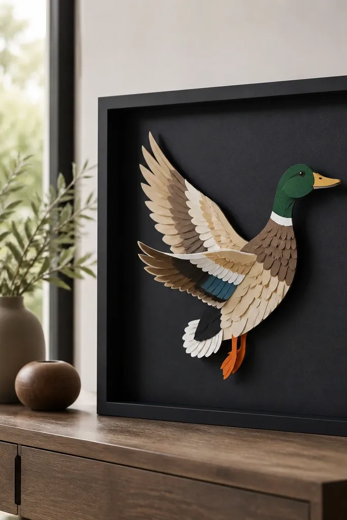
A shadow box turns separate paper duck parts into a cohesive display. The deep lip creates a natural gap so your duck casts a small shadow inside the frame — that depth reads premium. Choose a frame with a matte black or dark walnut finish because it makes warm paper tones look richer. This supply also gives you a clean border for photos and keeps dust off your duck. If your ducks keep looking “unfinished,” framing is the simplest upgrade with the biggest visual payoff.
Step 1: Buy a shadow box with enough depth for foam squares or folded wings (look for 1.5-2 inches internal depth). Step 2: Cut a backing panel from cardstock and tape it to the back so it stays flat. Step 3: Arrange your duck on the backing first, then glue or tape pieces in place and close the frame.
Use a dark backing even for light ducks. It increases contrast and makes edges pop.
Skip frames with thin, shiny plastic fronts. They glare and hide details.
17. Museum Glass or Acrylic Sheet for Durability
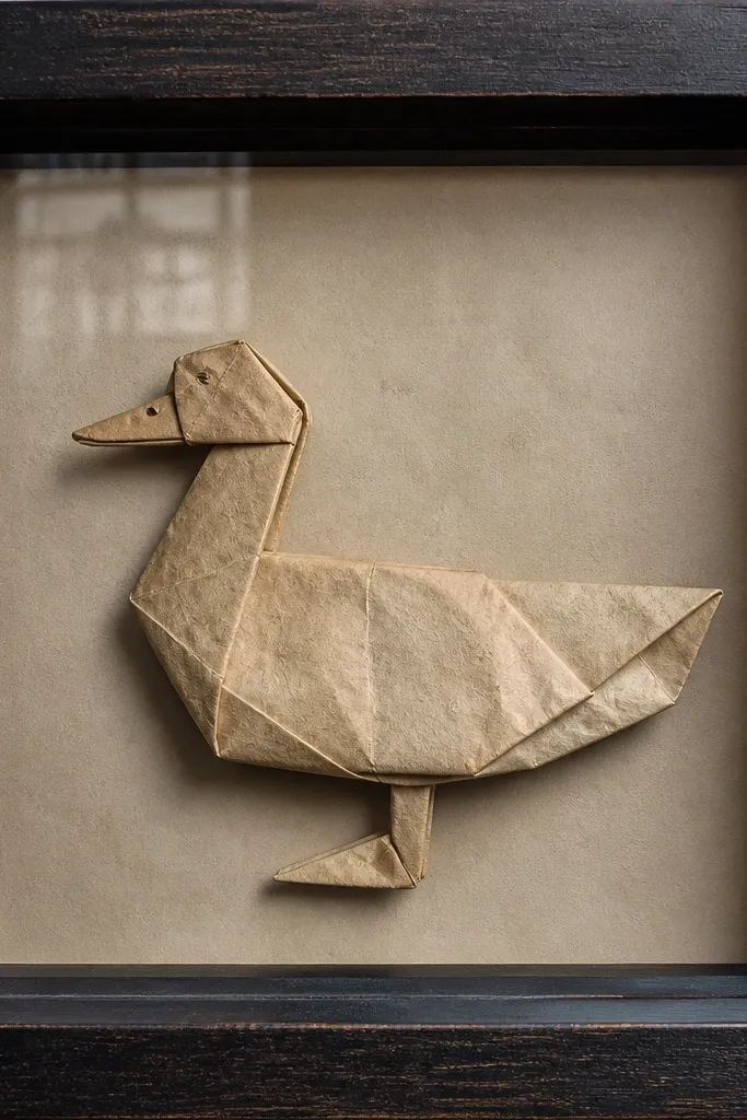
Clear protective sheets make your paper duck display feel like it belongs in a gallery shelf instead of a craft bin. Museum-style glass or acrylic reduces dust and fingerprints, and it keeps the matte seal from looking uneven from handling. Acrylic is lighter and safer for DIY, but it scratches easier, so handle carefully. This supply is worth it if you plan to display the duck or sell projects. The look improves because the surface stays consistent and clean for photos.
Step 1: Measure the inside frame opening and cut the acrylic to size using a scoring method or have it cut at a supply store. Step 2: Clean both sides with microfiber cloth before installing. Step 3: Add spacers if needed so the acrylic doesn’t press into raised foam pieces.
If you use acrylic, keep it in a protective film until the last second.
Don’t press down on foam-backed parts with the acrylic — it flattens the depth.
18. Self-Adhesive Felt Pads for Clean Standoffs
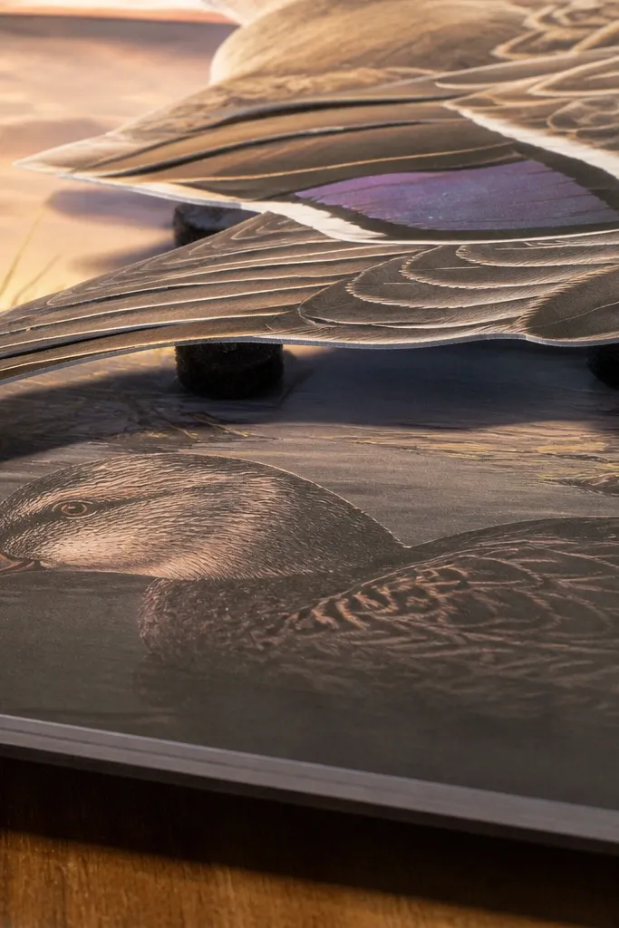
Felt pads are a simple trick to keep your duck from looking like it’s glued directly to the base. Use them as standoffs under layered wings, beaks, or tiny props so the shadows look natural and the paper doesn’t sag. Felt also reduces friction if you move the display around. Choose dark felt so it blends into shadow areas and doesn’t show as a bright block. This supply makes your duck scene look “set up,” not slapped down. It’s a small change with a noticeable difference in depth and cleanliness.
Step 1: Cut felt pads into smaller squares or strips so they sit under the hidden underside of pieces. Step 2: Apply adhesive backing to the underside, press for 10 seconds, then test stability. Step 3: Arrange on your base and adjust placement before the final glue or tape goes in.
Use felt under the center of heavy pieces so they don’t tilt.
Don’t use felt on areas that need flat contact for glue lines.
19. Pearlized Off-White Cardstock for Feather Shine
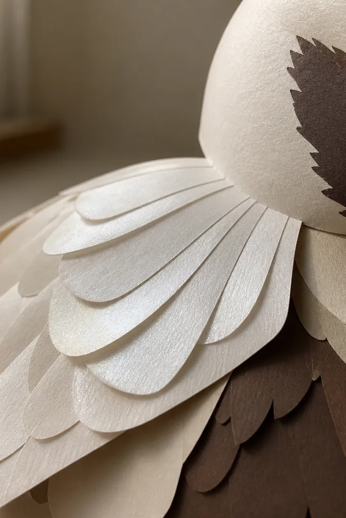
Pearlized cardstock gives you a soft sheen that reads like feather texture, without looking like cheap metallic foil. Pair it with matte cream and brown so the duck has contrast: matte body surfaces and slightly luminous accents. Use it for feather tips, inner wing layers, and the highlight areas around the eye patch. Under daylight, pearlized paper looks smooth and expensive. It also helps hide small print imperfections because the light catches the surface evenly.
Step 1: Cut small accent pieces first and test how the sheen looks in your room lighting. Step 2: Glue pearlized pieces with tape runner or glue stick to avoid soaking the surface. Step 3: Seal only if needed — heavy clear coats can reduce the pearl effect.
Keep pearl accents small. Too much sheen makes the duck look costume-y.
Don’t mix pearlized paper with glossy tape. The shine fights itself.
20. Brown Kraft Paper Roll for Duck Nest Base
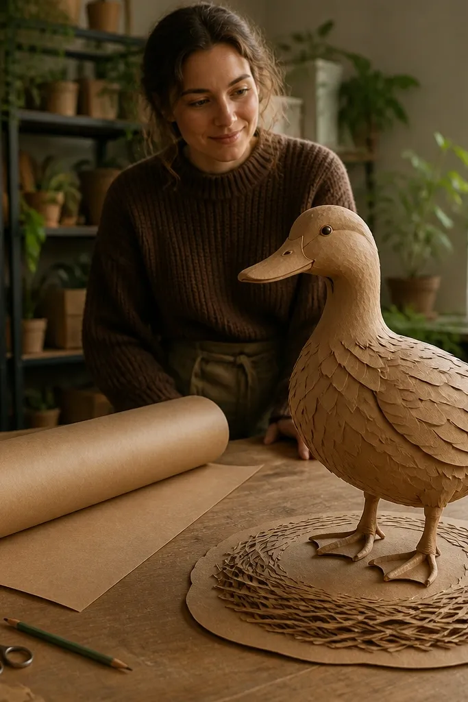
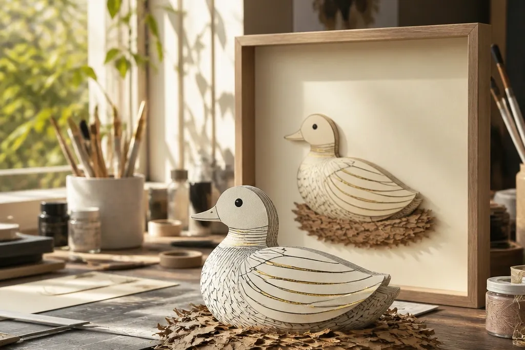
Kraft paper turns your duck from a standalone cutout into a scene with context. It’s cheap, easy to shape, and it photographs well because the fibers create a natural texture. Use it for a nest base, a folded background wrap, or a simple ground layer under the duck feet. Kraft also hides glue marks and minor uneven cuts, which makes the whole project look more intentional. If you want that high-end diorama vibe without spending on props, kraft paper is the move.
Editor's noteDistress the edges lightly with sandpaper for a softer, more realistic nest texture.
Step 1: Cut strips and curl them slightly by rolling around a pencil, then arrange into a nest shape on your base. Step 2: Secure with tape runner or small dots of gel glue at the underside contact points. Step 3: Add your duck feet on top once the nest holds its shape and dries flat.
Skip thisDon’t use kraft as the only base if you need crisp lines. It’s textured and forgiving, but messy trims show.



