
1. Denim-and-White Grid With One Navy Center Frame
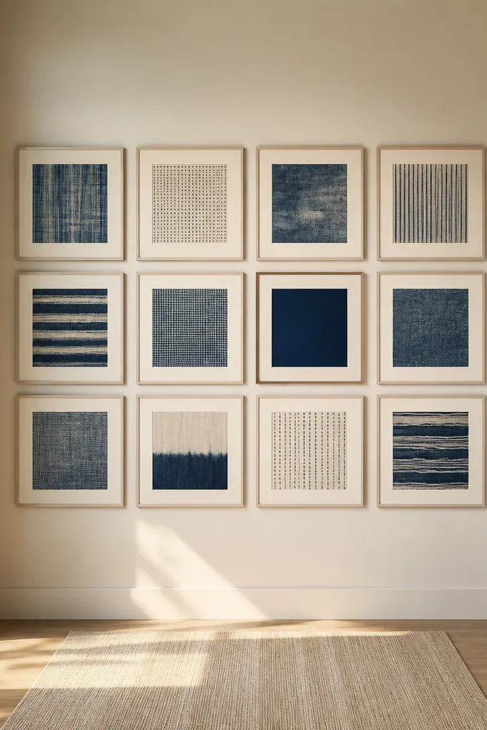
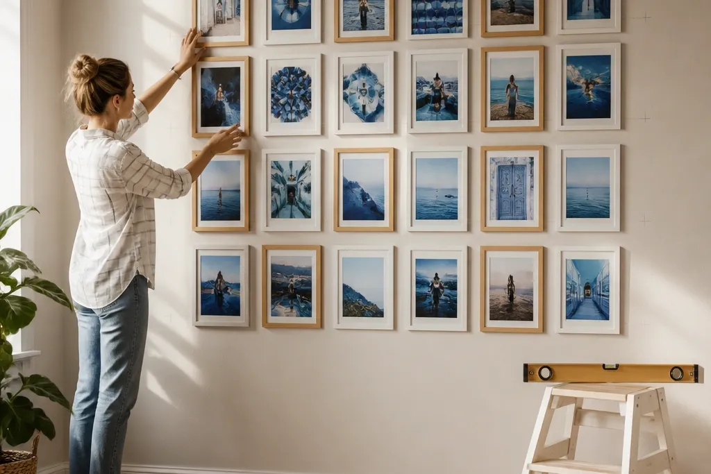
This layout makes blue photos look styled instead of random. The white frames keep the wall bright and make blues pop, while the single navy center frame gives your eye a landing spot. Use either square or near-square frames so the grid feels intentional. To keep it level visually, aim for consistent mat widths and uniform frame sizes across the grid. It works in hallways and living rooms because it reads clean from a distance and doesn’t fight busy furniture.
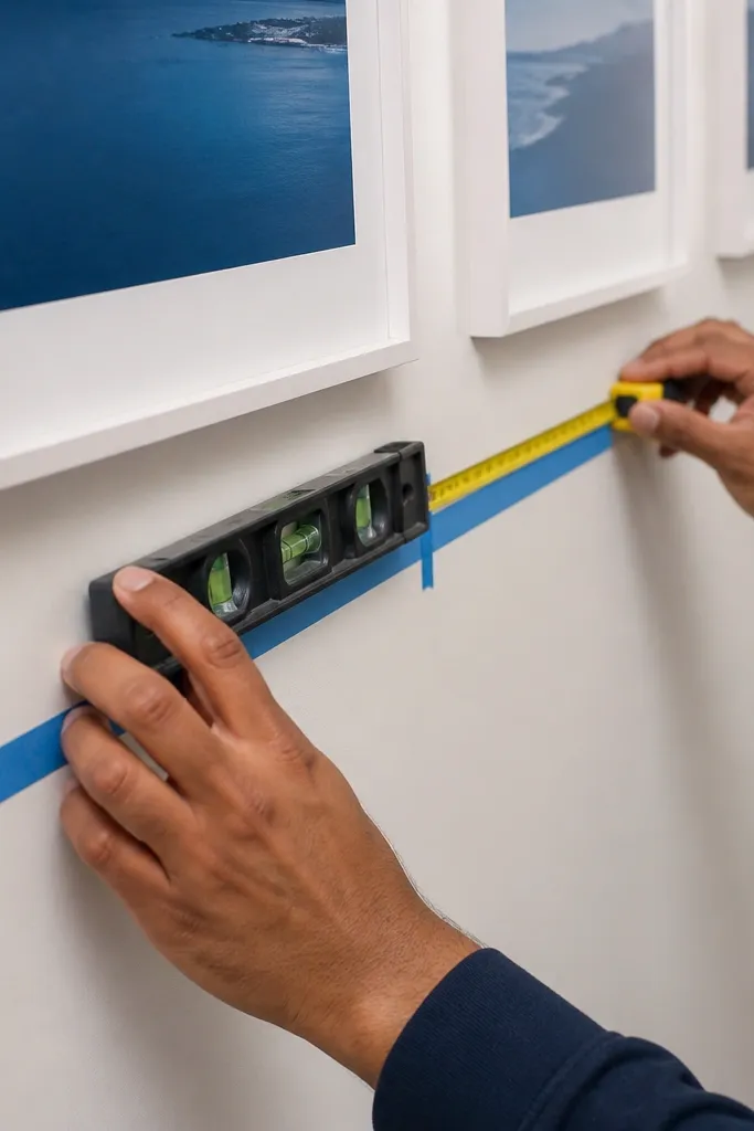
Start by choosing a grid size that fits your wall width. Mark a center point, then decide how many frames across you want (for example, 3 across) and keep frame outer edges aligned to a grid plan. Tape paper templates for each frame on the wall, using painter’s tape to mark the exact outer border. Run a level line across the wall at the top of the center frame, then place the rest using the same spacing gap (1 inch or 2 inches). Drill and hang only after you confirm the whole grid looks straight from eye level.
Use the frame’s outer edge as your measurement reference, not the glass edge.
Don’t vary the spacing between frames — it’s the first thing your eye notices.
2. Steel-Blue Gallery Row With Floating Mat Panels
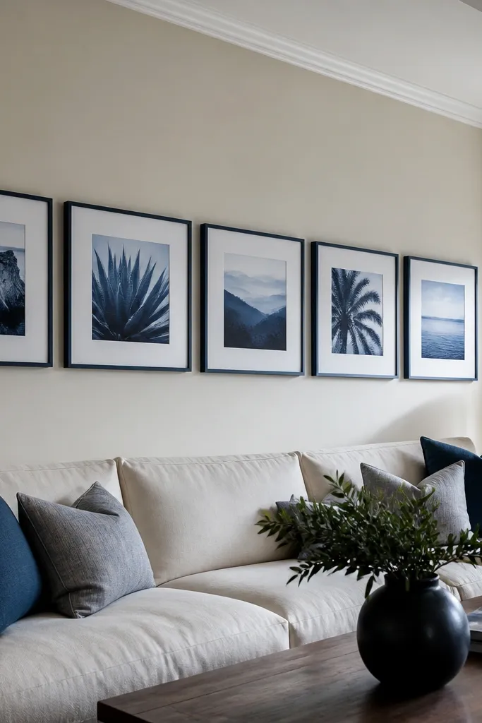
Pick 5 to 7 frames and keep them the same size, with a mat that’s visible around the photo. Use a tape measure to set your total row width, then mark the center of the wall and calculate left and right edges. Tape templates for each frame and draw a level line across the top edges of the row. Hang the center frame first, then use a spacer strip cut to your chosen gap (like a 1-inch strip) to place the next frames off the center. Once everything matches, drill and anchor each frame.
If you want a calm, modern look, this is the one. The steel-blue photos pair with light mats to create breathing room between images, so the collage doesn’t feel crowded. Matching frame color and mat color makes the wall look like one designed piece, even if the photos vary. This works best when your blue photos have similar color temperature (cool blues, not mixed with warm orange tones). It’s great for dining rooms and entryways where you want order without a strict grid.
Skip thisAvoid frames with thick bevels if your mat is thin; the shadows can look uneven.
Editor's noteCut a single spacer strip from cardboard and reuse it for every gap.
3. Coastal Blue Stair-Step Collage
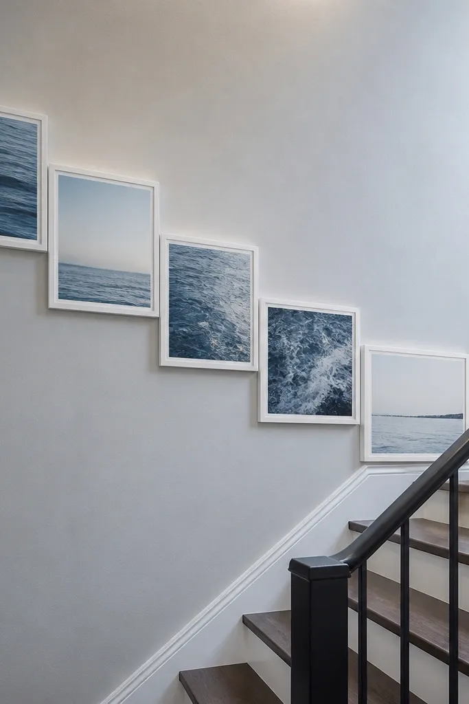
This layout looks dynamic, but it still hangs level if you follow a spacing-first system. The stair-step pattern uses consistent gaps while shifting the vertical placement of certain frames, which makes the wall feel like it has motion. Choose blue photos with different subject distances (close water texture, horizon, sky) so each step tells a mini story. Keep frame finishes consistent, or your eye will treat it like a pile. This works really well above a console table where you want movement without chaos.
Decide on a base line for the top of the lowest row, then choose how many “steps” you want (usually 3). Tape templates for all frames, but shift the top edge of each step by a fixed amount like 2 inches. Keep your left-right spacing identical by measuring from the same vertical reference point (use a level-checked vertical line). After taping, check alignment from both standing eye level and slightly off to the side. Once the step pattern looks right, drill anchors one frame at a time starting with the lowest step.
Take one phone photo from across the room before drilling — it reveals crooked spacing fast.
Don’t change the gap between steps; keep it uniform so the pattern reads intentional.
4. Navy Frame Cluster Around a Whitewashed Photo
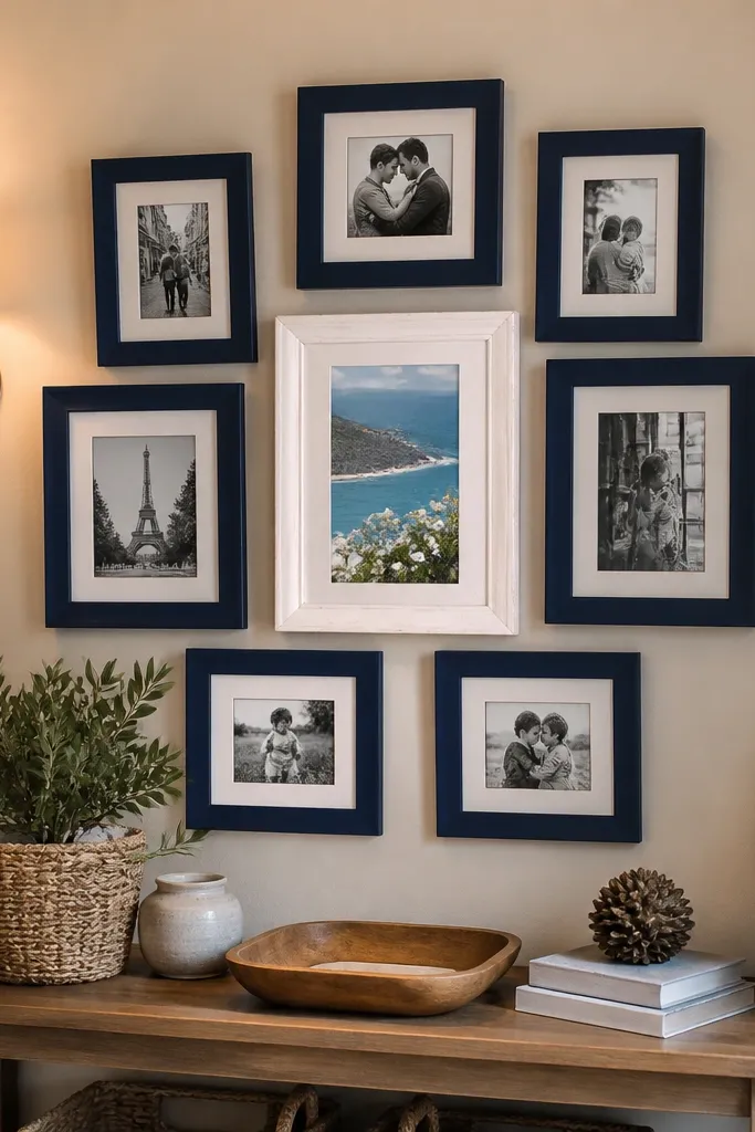
Clusters look cozy and designed when the cluster has one bright anchor. Use navy frames for the surrounding images so the collage feels cohesive, then choose one whitewashed blue photo in the center to brighten the cluster. This layout is forgiving because slight variations in angles blend into the cluster, but you still need consistent spacing so it doesn’t look messy. It’s a strong option for small walls or for creating a focal point above a couch. Keep the cluster tight enough that it reads as one unit.
Choose a center frame size and then pick 4 to 6 surrounding frames that are smaller or equal. Make a paper template for each frame and tape them into a cluster while keeping a consistent gap, like 1 inch. Use a level line for the top edge of the center frame, then align the rest relative to that same line. Drill anchors for the center frame first, then hang the surrounding frames using the spacer strip again so the gaps match. Finish by stepping back and checking the cluster edges are even.
If your cluster sits above furniture, align the center frame with the furniture’s center, not the wall center.
Skip random frame sizes without a spacing plan; it turns into clutter.
5. Blue Ombre Frames From Light to Deep
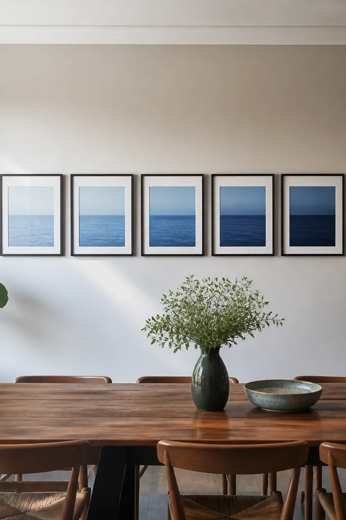
This one looks like color grading on your wall. Arrange frames so the blue tone in the photo gets darker as you go down or across, then match frame colors to the progression if you can. Light-to-deep creates a visual rhythm that feels intentional and calm. Use the same frame size for every piece, or the ombre effect gets interrupted by layout chaos. It works especially well in bedrooms and reading corners where you want a soothing gradient vibe.
Pick 6 to 10 frames and decide whether your ombre runs vertically or horizontally. Keep frame sizes identical and use the same mat style so all the blue progression comes from photos, not from different framing. Tape templates in the final order first, then align the top row to a level line. Use a spacer strip for the gap between frames and mark the hanging points on each template. After you confirm the gradient reads clearly, install anchors starting with the top-most frame.
Use a consistent photo crop size so the gradient doesn’t jump because of subject composition.
Don’t mix warm and cool blues in the progression; the gradient will look muddy.
6. Monochrome White Frames With Blue Photo Cutouts
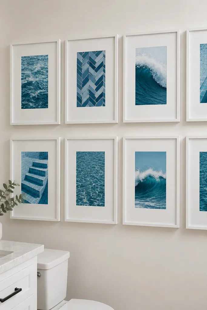
Choose frames with the same outer dimensions, and decide which photos get the extra white border (mat or print border). Tape templates in a grid pattern with a 1-inch gap. Mark a level line at the top of the highest frame, then place the rest using the same vertical spacing. Drill the top center anchor points first, hang those frames, then move outward. Keep a small bubble level on the frame edges while you tighten hangers.
This layout is clean and graphic. White frames plus extra white border around some photos makes the blue look like it’s cut out of the wall. It’s great when your blue photos have strong shapes — window reflections, ocean waves, geometric tiles. Keep the frames uniform so the collage reads like a design grid. This style also makes leveling easier because you’re repeating the same frame geometry.
Skip thisAvoid mixing frame depths; different shadows make the wall look uneven.
Editor's noteIf your prints don’t have matching aspect ratios, trim or re-crop so the border width stays consistent.
7. Black Frame Contrast With Light Blue Prints
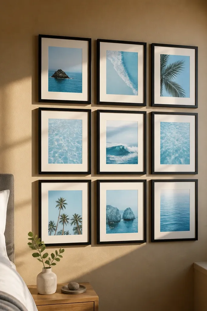
Black frames pull light blues forward. This collage looks crisp and a little dramatic, which is why it works so well with sky-blue and pale aqua photos. Keep the mat either white or off-white, not gray, so the contrast stays clean. Use a grid or near-grid layout so the black lines feel structured. In a room with warm wood furniture, this combo looks especially sharp.
Pick 6 to 9 frames and keep them the same size for the cleanest structure. Tape templates and decide on 2-inch gaps if you want a modern airy look, or 1 inch for tighter. Use a level line across the wall at the top edge of the highest frame. Hang the center frame first, then measure left and right using the spacer strip so the layout stays symmetrical. Anchor into studs when possible; if you’re on drywall only, use proper toggle anchors for the frame weight.
Paint or swap any mismatched hardware so all frames use the same hanging direction and height.
Don’t hang black frames with uneven top alignment — the contrast makes crookedness obvious.
8. Blue Tile Photo Wall With Faux Grout Lines
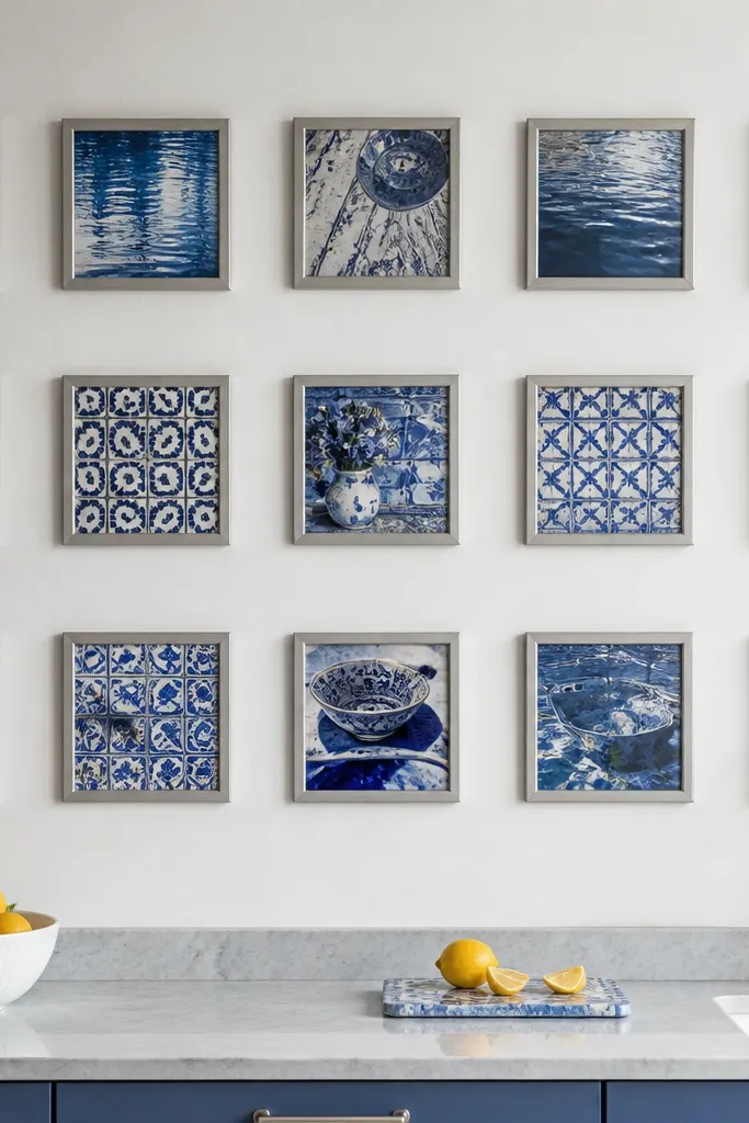
Choose small frames with identical outer dimensions so the grid feels like real tile. Plan your layout like a tiled rectangle: mark the wall’s center, then count frames across and down. Tape templates and set a 2-inch gap using a spacer cut to exactly 2 inches. Draw a level line for the top row first, then align each row to that line using the same vertical spacing. Use wall-safe anchors and keep frame weight in mind — small frames still add up fast.
This is the most “designed” look in the list because it mimics tile grout. Use smaller frames and set a wider gap between them, like 2 inches, so it reads like grout lines rather than random spacing. Choose blue photos that match the tile vibe: close-ups of ceramic, patterns, water textures, or architectural repeats. The wider gaps make leveling easier because you can sight across the grout-like spaces. It works great in bathrooms and mudrooms where you want a durable, graphic focal wall.
Skip thisSkip glossy prints — grout-line spacing plus glare makes the collage look messy.
Editor's noteUse matte finishes on frames to reduce glare from bathroom lighting.
9. Oval Float Frame Collage With Blue Water Themes
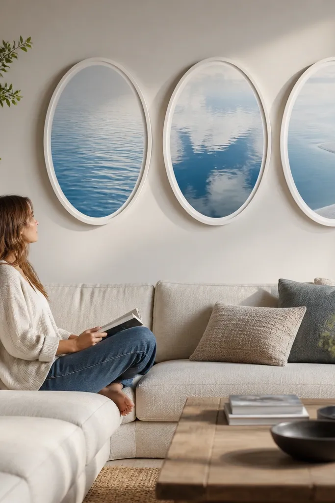
Ovals make blue photos feel softer and more boutique. This layout looks great when your blue images have curves: waves, clouds, arches, or reflected light. The oval shape also hides tiny alignment errors better than rectangles, but you still need consistent spacing so the wall looks intentional. Use a balanced arrangement: one larger oval as the anchor, smaller ovals around it. Works well in living rooms and bedrooms where you want a calm, less boxy look.
Pick one large oval frame and 4 to 6 smaller ovals, and keep frame sizes consistent within each tier. Tape paper templates first — ovals are tricky to measure by hand because corners don’t exist. Mark a level line at the top of the large frame, then place smaller ovals using a consistent gap around the outer edges, like 1.5 inches. Once the spacing looks even, drill anchors for the large frame first, then hang the smaller frames. Use a bubble level on the top edge of each oval frame to fine-tune.
Print a simple oval template from paper and trace around it on the wall tape to get spacing right.
Don’t crowd ovals too tightly; the wall needs breathing room to read as a curated cluster.
10. Blue Photo Strips With Two Horizontal Levels
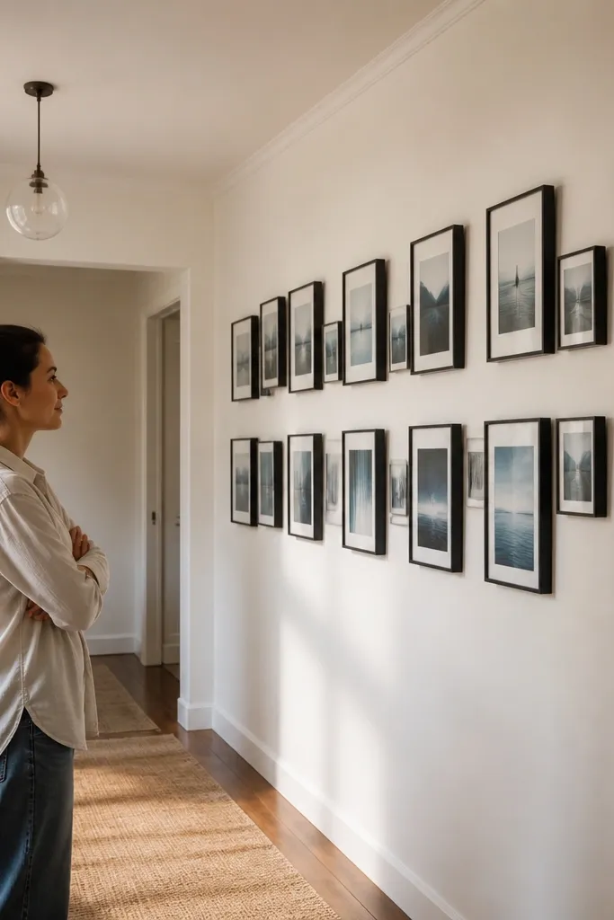
Horizontal strips make a wall feel longer and cleaner, especially with blue photos that have horizons. Use two rows of frames and stagger them slightly, but keep every frame’s top edge on one of two level lines. This is one of the easiest ways to stay level because you’re controlling only two heights. The look is great above a dresser, console, or bed. It also makes it easier to swap photos later without changing the whole layout.
Choose 6 to 10 frames and keep them consistent in size for both rows. Decide your top-row count, then place the second row with a fixed vertical offset, like 3 inches lower. Tape templates for both rows and draw two level lines on the wall corresponding to the top edges of each row. Use a spacer strip for the horizontal gaps between frames. Hang the top row first, then hang the bottom row aligned to the second level line.
If you’re using different frame heights, measure from the top edge of the outer frame, not the mat opening.
Avoid random vertical offsets between frames; it kills the clean strip look.
11. Shelf-Backed Photo Collage Behind Frames
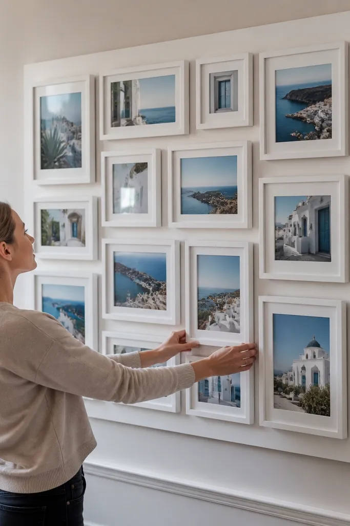
This style makes blue photos look like they have depth. You mount frames over a flat backing board (plywood or foam board) so the wall behind the collage looks consistent, then you can add a tiny shadow gap. Choose a backing color that supports blue — warm white or light gray looks better than pure bright white. It’s especially good if your wall has texture or patchy paint, because the backing hides it. It also helps with leveling because the backing board can be set level first.
Cut a backing board to fit your planned collage rectangle. Use a level to mark the top edge of the board, then mount the board with screws into studs if possible. Tape a layout grid on the backing board so you can position frames without fighting the wall. Pre-drill small pilot holes for each frame hanger or use frame hooks mounted to the backing. Hang frames one by one, keeping the gap between frames consistent with thin spacers like 1/4-inch strips.
Paint the backing board the same color as your wall or a soft off-white so it disappears behind the frames.
Don’t skip a level check on the backing board; the frames will look crooked even if each one is correct.
12. Farther-Forward Blue Prints With Raised Frame Heights
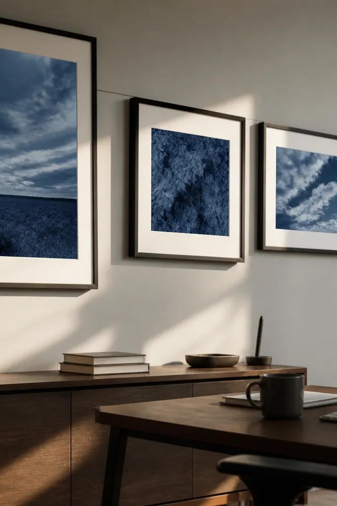
This look uses different frame heights to create a rhythm, but it stays level by aligning the spacing and using a reference line. Choose blue photos that look good in different crop sizes: one tall horizon shot, one square texture, one wide sky. The raised heights add design punch without turning into a random collage. Keep the frame finish consistent and use the same mat color so the wall reads as one composition. It suits living rooms where you want the collage to feel layered.
Pick 7 to 10 frames with two or three height categories, like tall, square, and wide. Tape templates in your final arrangement while keeping the gaps consistent, like 1 inch. Draw a level line across the wall for the top edge of the tallest frame, then align each next frame’s top edge relative to that line based on your chosen step increments, like 2 inches. Install the anchor points for the tallest frame first, then work outward. Keep checking the top edges with a level as you hang each frame.
Use the same mat width across all frame sizes so the wall looks intentional even with different dimensions.
Don’t change mat color between frames; it breaks the cohesion that makes this style look high-end.
13. Blue Ombre Vertical Triptych Plus Side Singles
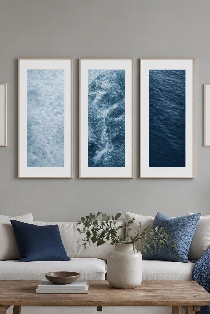
Pick three tall frames for the center and two smaller frames for the sides. Tape templates and set a level line at the top of the top triptych frame. Keep the gap between the center triptych frames consistent, like 1 inch, and keep the side gaps the same as well. Hang the top triptych frame first, then the middle and bottom, checking the top edges stay level. Finish by hanging the side singles aligned to the same vertical centerline and gap spacing.
A triptych anchors the wall, and side singles add personality without losing structure. Choose photos that progress from light blue to deep navy across the three tall frames, then add one or two smaller frames on each side with complementary blue textures. The side frames should match the mat and frame color so they feel like part of the same design. This works great for large blank walls because the triptych creates a clear focal block. It also keeps leveling manageable because the center group sets the reference.
Skip thisDon’t place side singles at random heights; align their top edges to a consistent height reference.
Editor's noteMark a vertical centerline on the wall with a level so side singles don’t drift outward.
14. Nautical Navy Frames With Rope-Style Texture Border
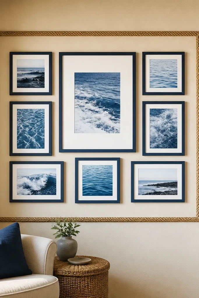
This is a decor-forward collage that reads coastal even if your photos are modern. Use navy frames and add a thin textured border around the collage area using natural fiber trim or a rope-style cord strip. The border gives you an extra alignment cue, so your frames look more intentional even if your wall isn’t perfectly smooth. Choose blue photos with water, boats, or architectural lines that feel nautical. Best in entryways or living rooms where you want a theme without going full beach mural.
Plan a rectangular collage area and tape your frame templates inside it. Add a rope-style trim border by measuring the rectangle edges and cutting the trim to length; attach with a hot glue gun or small finishing nails, depending on the surface. Keep the border outside the frame edges so it doesn’t interfere with hanging. Level the collage using the top edge of the center frame as your reference line, then hang frames with consistent gaps (1 inch is a good starting point). Finish by trimming the border ends cleanly and checking the whole rectangle looks straight.
Use matte rope trim, not shiny — glare fights with blue photos.
Skip thick trim — it makes the collage look uneven and can hide real alignment errors.
15. Blue Photo Collage on a Pegboard Backer
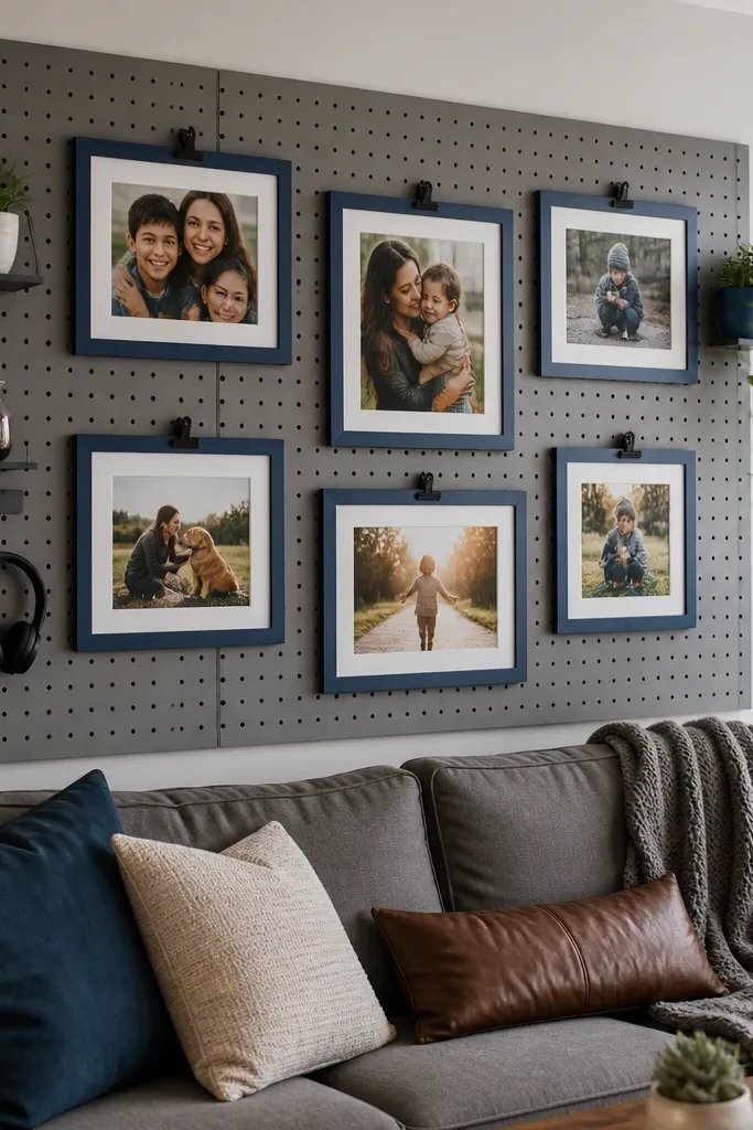
Mount a pegboard to the wall with screws into studs, then verify it’s level. Lay out frame positions on the pegboard using paper templates or by lightly marking with pencil. Use picture-hanging hooks or small pegboard mounts rated for the frame weight. Keep a consistent gap between frames by measuring from the same pegboard reference holes. Once everything is positioned on the board, press back and check alignment from eye level before tightening mounts.
Pegboard makes your blue collage adjustable and crisp. The grid of holes lets you place frames at exact positions, so leveling stays consistent without repeated measuring every time you rearrange. Choose a pegboard color that flatters blue — medium gray or white looks clean. This style is great for apartments and renters because you can avoid heavy wall anchors. It also looks good in craft rooms where the wall can handle a more industrial vibe.
Skip thisDon’t hang heavy frames directly on thin plastic pegboard hooks without checking weight ratings.
Editor's noteLabel your pegboard hole coordinates with small painter’s tape so you can repeat a layout later.
16. Picture Ledge Look With Blue Frames in Two Rows
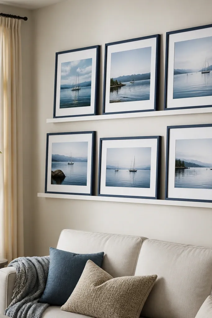
Install a picture ledge using a level and screws into studs. Mark two rows of frame positions on the ledge surface, keeping a consistent gap like 1 inch between frames. Place frames with their backing supported by the ledge lip, then adjust so top edges line up. If your frames have different depths, add thin spacers under the lighter ones so they sit at the same height. Once the row looks straight, secure any frames using the ledge’s built-in stops or small adhesive pads designed for picture ledges.
A picture ledge gives you that museum feel while keeping the collage easy to level. You can line up frames on the ledge, then adjust individual heights without re-drilling. Use blue photos with consistent lighting so the wall looks cohesive. This layout is best for living rooms, bedrooms, and hallways where you want a clean, changeable display. It also keeps glass glare under control because you’re not forcing everything to sit perfectly on the wall.
Skip thisDon’t mix frame widths without a gap plan; the ledge makes it look like a jumble fast.
Editor's noteWipe glass before hanging; ledge setups show smudges more than wall-mounted frames.
17. Blue Photo Wall With Uneven Frame Sizes but Consistent Outer Rectangle
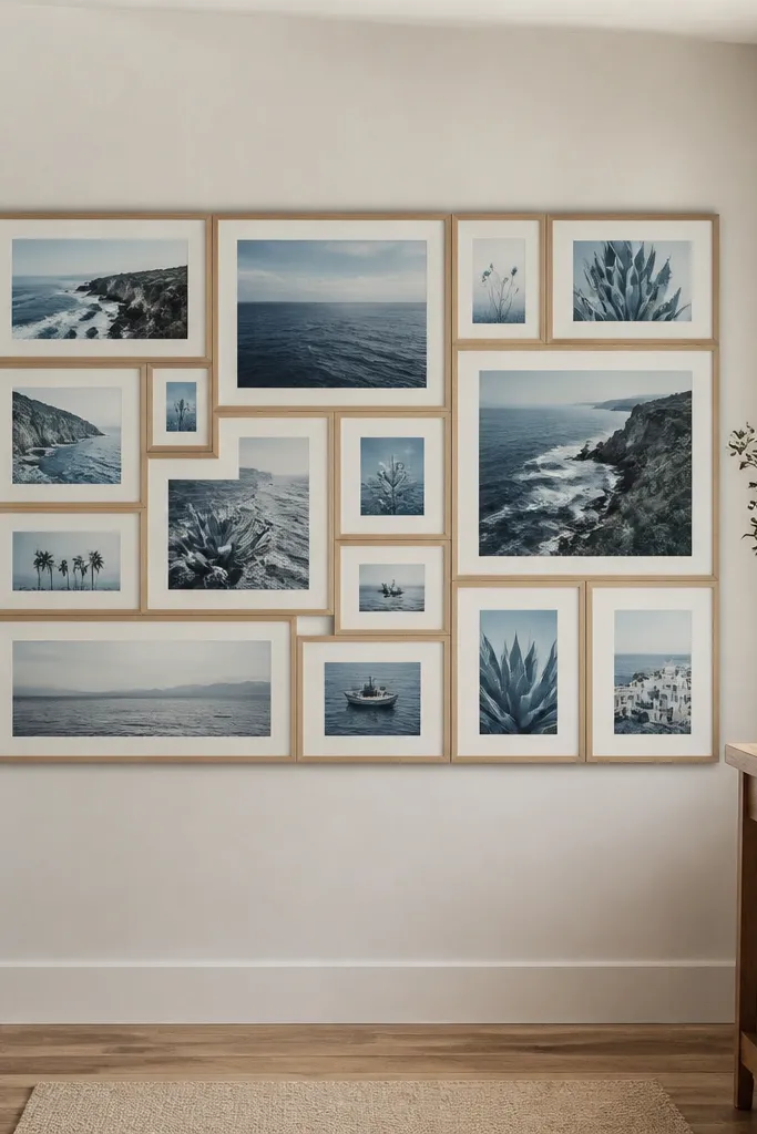
Start by drawing a rectangle on the wall where the collage will live, then tape paper templates for frames inside that rectangle. Keep a consistent internal gap like 1.25 inches, measured from frame outer edges. Use a level line to align the top edge of the outer rectangle and use that as your anchor for placement. Install the heaviest frame first, usually the largest, then work outward. When all frames are hung, confirm the outer rectangle looks straight even if inner frames vary.
This is the most forgiving “designer” look: you can mix frame sizes for variety, but the collage still reads straight because the outer boundary stays rectangular and level. The trick is to treat the collage like one large piece, then place frames inside it with consistent internal spacing. Use blue photos with different subject focus so the variation feels curated. Pick one mat color and keep it consistent across frames so the wall looks cohesive. This works on wide walls and behind sofas where you want something more interesting than a grid.
Skip thisAvoid different mat sizes — they create tiny misalignment signals that make the whole collage look off.
Editor's noteUse a single mat color and same frame finish across all sizes so the rectangle reads as one unit.
18. Half-Blue Wall Split: Top Collage, Bottom Solid Color
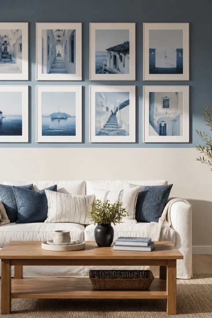
Mask and paint the bottom half or apply a removable wall covering so you have a crisp horizontal line. Tape your collage layout templates above the split line, using a level to align the top edge of the collage. Decide on a consistent frame gap and repeat it across the collage. Hang the center frame first, then place the rest using the spacer strip. Finally, step back and check the collage’s bottom edges land in a satisfying band without dips.
This layout makes the blue collage feel intentional because it has a visual boundary. Paint or use removable wall color on the lower half in a neutral that supports blue — warm white, soft sand, or pale gray all work. Then build a collage only on the top half, using blue photos that relate to the color you painted. The result looks cleaner because your collage has breathing room and a clear horizon line. It’s ideal for rooms with strong wall colors where a full-wall collage would feel too busy.
Skip thisDon’t choose a bottom color that competes with your blue photos; keep it muted.
Editor's noteIf you’re painting, use painter’s tape and a small foam roller so the line stays sharp for the collage boundary.
19. Blue Photo Wall With Mirrored Frame Pair Symmetry
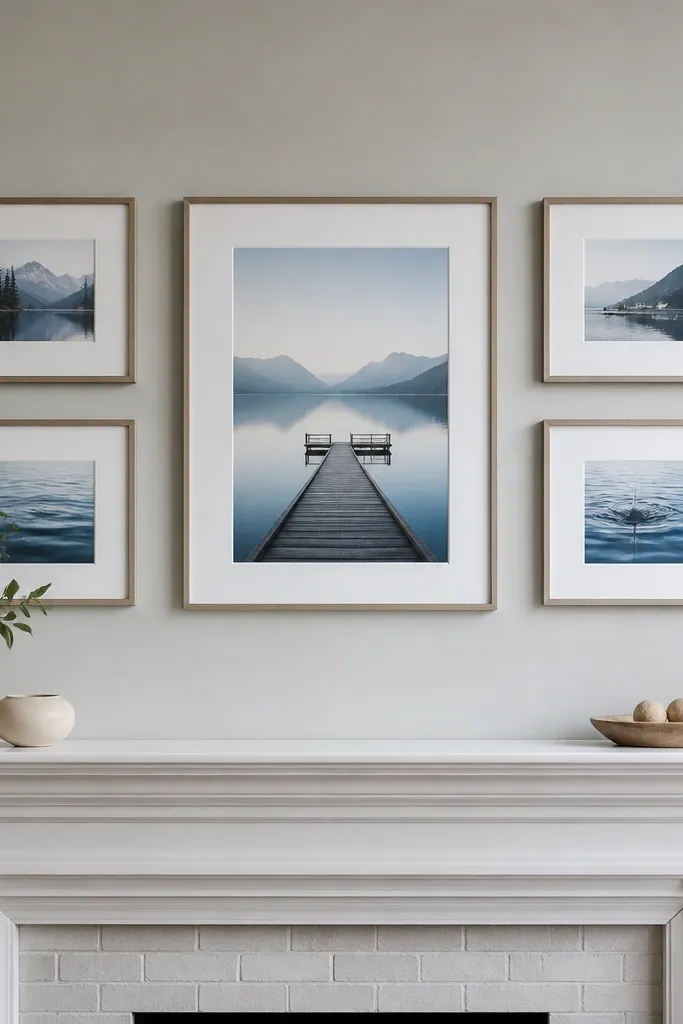
Mark the wall centerline with a level. Plan your frame pairs so each left frame has a matching right frame in size and spacing. Tape templates and draw a level line for the top edge of the center frame, then place matching pairs using the same gap measured from the centerline. Hang the center frame first, then hang one side pair at a time, checking that the mirrored edges line up. After both sides are installed, confirm the whole collage looks level from straight-on and from a slight angle.
Symmetry makes your blue photo collage look expensive even when the photos are simple. Use a center frame or center gap, then mirror pairs left and right with matching frame sizes and similar matting. The blue tones look more cohesive because your eye reads it as one balanced composition. This works best on mantels, stair landings, or walls with a clear center. It also makes leveling simpler because you can verify both sides match.
Skip thisAvoid mixing different frame colors on opposite sides; symmetry breaks fast.
Editor's noteUse the same photo orientation on mirrored pairs so the layout doesn’t feel lopsided.
20. Powder-Blue Tape-Line Grid With Mixed Blue Photos in a Leveling Jig
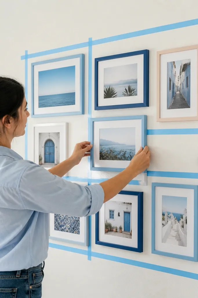
This one fixes the annoying problem that blue photo collage ideas look messy fast when frames are slightly off. You build a temporary tape grid on the wall first, then place frames inside it so every row and column lines up perfectly. The look is clean and graphic because the tape lines act like grout, but the photos still feel personal since you mix sizes and tones. Use it when you want a modern blue photo wall collage that reads level from across the room, even if your frames aren’t identical. It’s a DIY weekend project that takes more time to prep than to hang, and it works best in hallways, dining rooms, and any long wall where straight lines matter.
1) Measure the wall width and choose a grid you can repeat without awkward half-frames. Mark a level baseline with painter’s tape, then use a 2 ft level or laser level to snap horizontal lines and add vertical lines every 10 in (or 12 in if your frames are larger). Press masking tape down hard, then lightly pencil in where each frame center will sit. 2) Assemble a simple leveling jig: cut two scrap wood strips to the same height as your frame’s hanging point offset (for most frames, 1/2 in to 3/4 in below the top edge). Screw small L-brackets or just use wood blocks to keep the jig from sliding, then set each frame into the tape area and mark the screw holes through the jig. 3) Hang frames one row at a time. Start with the top row, confirm level across both ends, then attach wire or D-ring hardware and mount the frame. Remove tape only after all frames in the grid are mounted, then touch up any pencil marks with a damp eraser and let the wall dry.
If your frames have wire hangers, measure the wire-to-frame top distance and set that distance against your jig so every frame sits at the same height. Use painter’s tape as the guide, but remove it only after the last frame is screwed in so nothing shifts mid-install.
Avoid trusting your eye for the first row — if the baseline is off, every blue photo wall collage idea after it will look crooked even when frames are individually level.



