
1. Sky-Blue Course Dashboard with Status Board
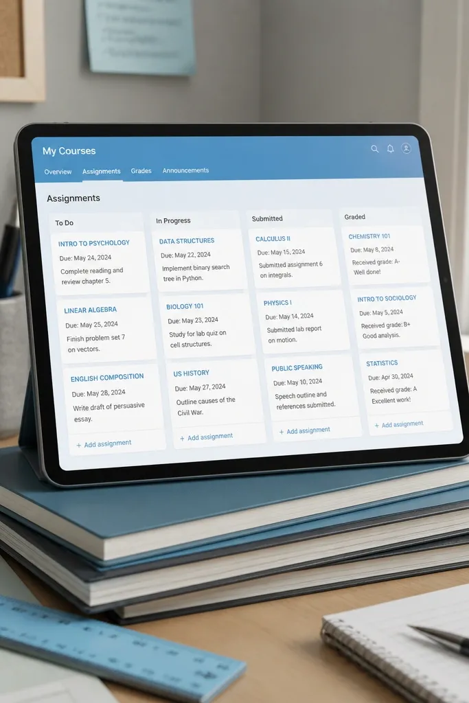
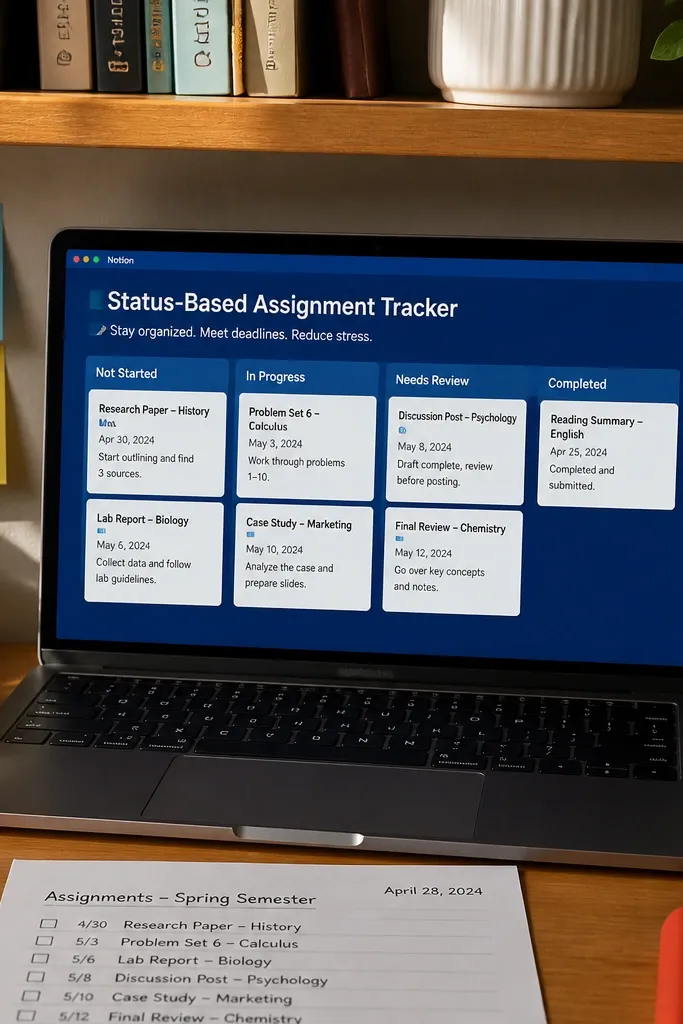
Start by making a database called Assignments with properties for Course (select), Status (select: To do, Doing, Done), Due date (date), and Priority (select). Then create a dashboard page with a blue section header and add three embedded views: a board filtered to the current week, a board filtered to “Doing,” and a small list view sorted by due date. Finally, add a “Next up” callout at the top that shows the earliest due item using a filtered view, so the page always looks intentional.
This one is for students who keep forgetting what’s due next. You create a single dashboard page with a blue title bar, then embed a board view that tracks assignments by course and status. The look stays clean because each card is short: title, due date, and a one-line note. Pair it with a second small table for “quick wins” so your page has visual rhythm instead of a long scroll of tasks. The blue theme makes the board feel organized instead of harsh, and the status columns give you an instant read before you start studying.
Skip thisDon’t add 8 statuses. Three keeps the board readable and pretty.
Editor's noteKeep your board card template to 2 lines max — long text makes the whole blue layout feel messy fast.
2. Blue Cornell Notes Template with Margin Prompts
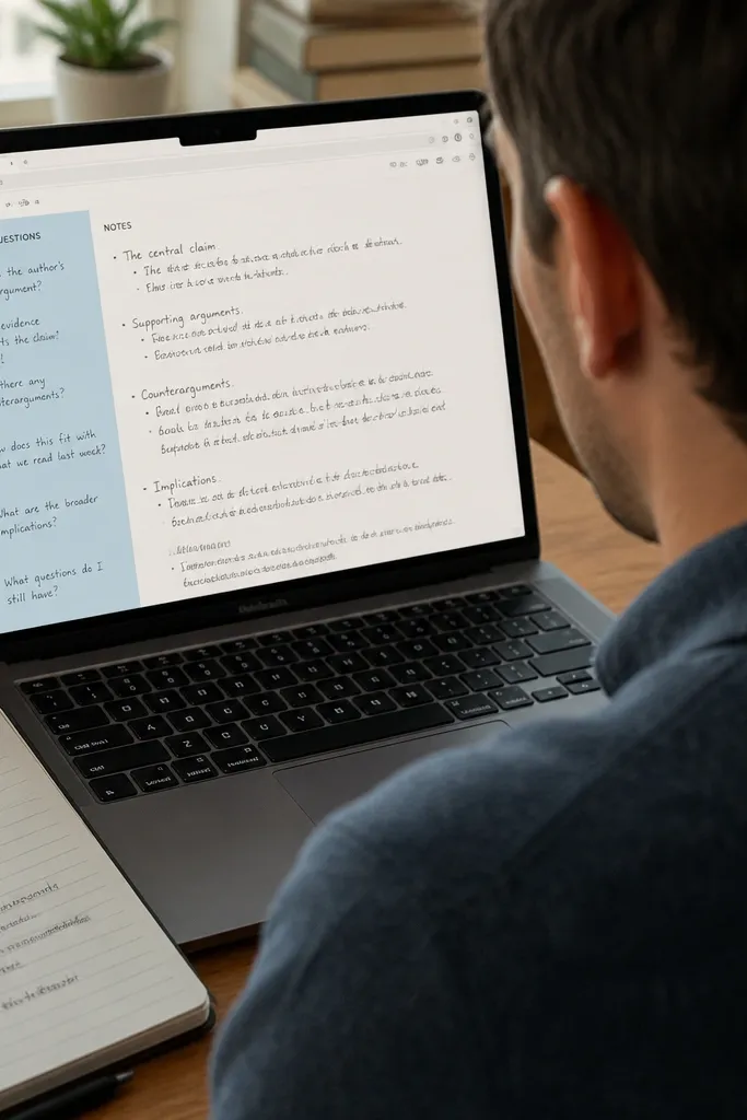
Cornell notes look great in Notion because the layout is naturally structured. This template uses a blue left-column for cues and questions, while the main area stays white or off-white for the actual notes. The blue margin gives you that “designed” look even when your notes are messy, and it makes reviewing faster because your cues are always in the same spot. It’s also easy to reuse across classes: you just swap the cue prompts and keep the same format. If you want a clean study page you can screenshot for your own reference, this is the one.
Create a page template called Cornell Notes with a two-column layout: left column width about 30%, right column 70%. In the left column, place a blue header named Cues and prompts, then add bullet blocks labeled Definition, Example, Question. In the right column, add a blue divider and a Notes section with a checklist for key points. Finish by adding a bottom full-width section called Summary in plain text, then link it to your subject page.
Use one consistent cue set for each class (ex: “Definition / Why it matters / Likely exam question”) so the blue margin stays uniform.
Don’t let the left column get long paragraphs. Keep cues short so the blue margin still looks tidy.
3. Deep Blue Reading Log with Color-Coded Status
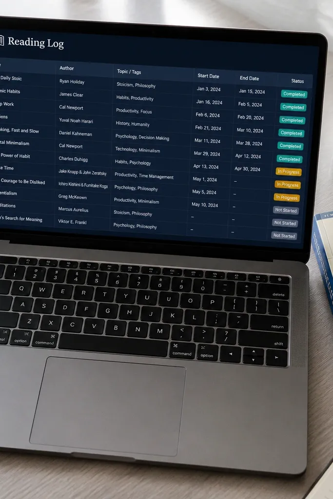
A reading log is one of the most photogenic student pages because it turns a vague task into a clean timeline. This template uses a deep blue table header and status chips that stay consistent across books and articles. Your entries look good because each row has a compact structure: title, author, topic tags, start date, due date, and current status. The blue status makes it obvious where you are without opening every page. It also helps you plan revision because you can see what’s finished vs. Still in progress.
Build a database called Reading Log with properties: Title (title), Topic (multi-select), Status (select: Not started, Started, Reading, Finished), Start date (date), and Due date (date). Create a view called Reading Progress and style it so Status appears as colored pills. Add a page template for “Reading Entry” that includes a short reflection box with prompts for Key idea, Quote to remember, Confusing part. Finally, create a filtered view for “Due soon” sorted by Due date and embed it on the student dashboard page.
Add a “Topic” multi-select with only 5-8 fixed tags. Too many tags makes the blue table feel chaotic.
Don’t store full summaries in the table cells. Put summaries in the entry page so the grid stays clean.
4. Blue Assignment Tracker with Weekly Calendar Strip
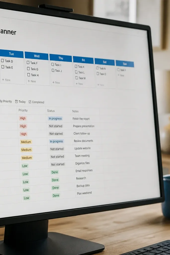
Create a database called Assignments (if you already have one, reuse it) with a Due date property and Status property. Create a page called Weekly Tracker and add an embedded calendar view filtered to the next 7 days. Under it, add a list view filtered to Status not equal to Done, sorted by Due date ascending. Add two small toggles: “Today’s focus” and “Tomorrow’s prep,” each using filtered views based on the due date.
Calendars look good in Notion when they’re small and focused. This template gives you a weekly calendar strip in a blue section, plus a list view underneath that repeats the same items in priority order. The design keeps your eyes moving: glance at the calendar for deadlines, then scan the list for what to do today. It’s perfect for students who plan weekly but lose track midweek. The blue header makes the layout feel like a real planning dashboard, not a notes dump.
Skip thisDon’t put the whole month calendar on one page. Weekly keeps it readable and prettier.
Editor's noteSet the calendar to show only Due date events. If you add created date or start date, it turns into a cluttered blue map.
5. Blue Exam Prep Hub with Study Sessions Checklist
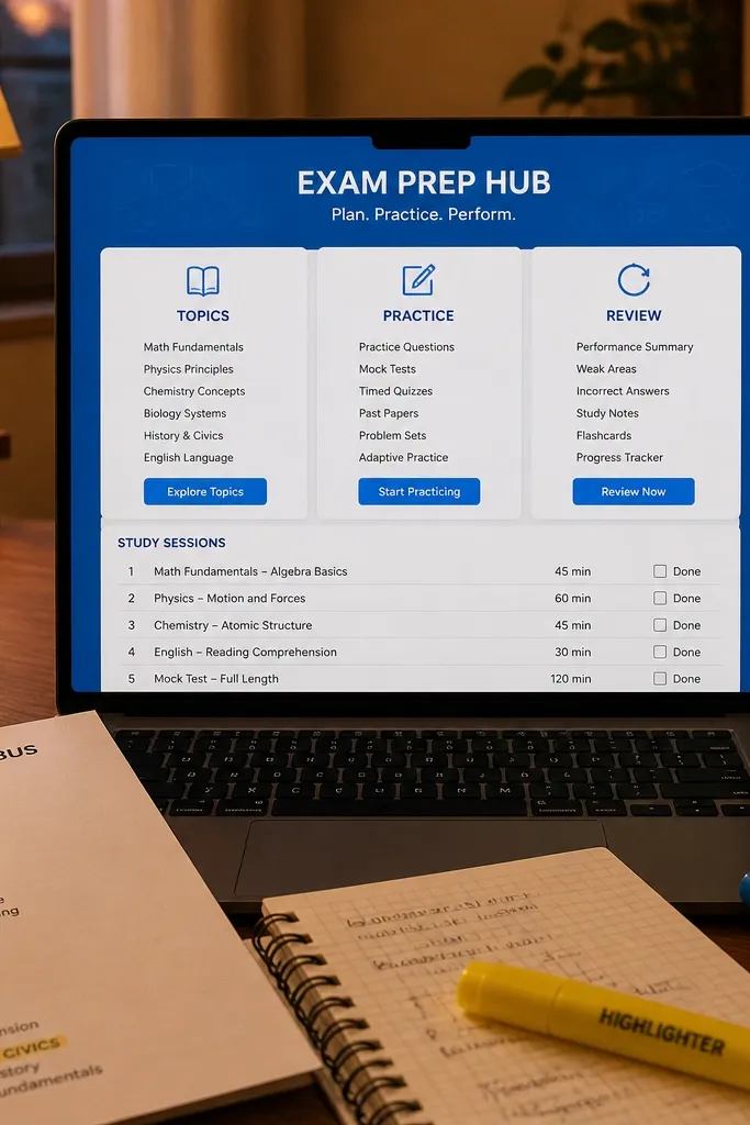
Make a database called Exams with properties: Course (select), Exam date (date), Status (select), and Topics (multi-select). Create a template page for each Exam that has three blue section headers: Topics to learn, Practice problems, and Review notes. Under Topics, insert a checklist block per topic, using the Topics multi-select to decide what you prefill. Add a second checklist section for “Practice” with items like “Past questions,” “Timed set,” and “Error review,” then add a final section that links back to your subject notes pages.
Exam prep needs structure, and structure looks good. This template is a single hub page per course with a blue header and sections for Topics, Practice, and Review. You build it so each exam has a checklist of study sessions tied to topics, then you track completion with a simple Done box. The look stays aesthetic because every section uses the same spacing and the same blue divider lines. It also makes your last-week panic smaller because you can see exactly what’s left in one place.
Skip thisDon’t mix flashcards and essays in the same list. Separate them into their own sections so the page stays visually clean.
Editor's noteUse a checkbox list for sessions, not long text. Checkboxes keep the blue layout crisp and scannable.
6. Blue Flashcard Study Page with Example-First Layout
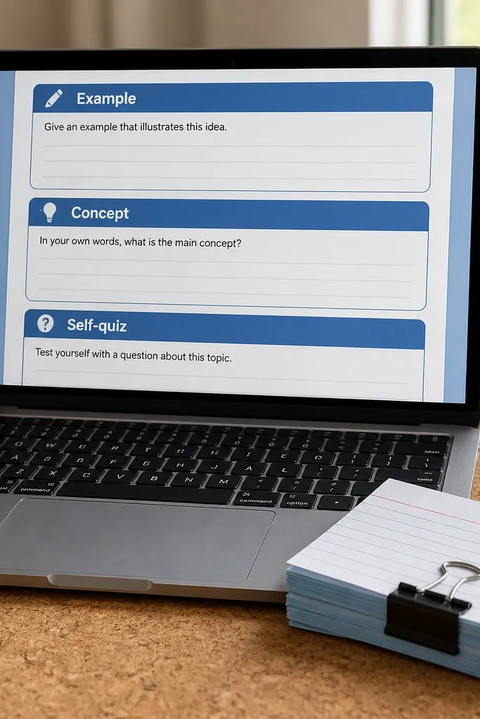
Create a template page called Flashcard Study with a blue title line and three sections. Add a “Example” section with a short paragraph block, then a “Concept” section with a one-sentence definition plus a bullet list for related terms. Add a “Self-quiz” section with a question block and a checklist for your answer steps. Finally, link the page to your subject database entry so you always know which topic it belongs to.
Flashcards are only pretty when the study page is structured. This template uses a blue header and three fixed blocks: Example, Concept, and Self-quiz. The reason it works is that you read the example first, then the definition, then you ask yourself the question. That order makes your page feel intentional, and it reduces blank-mind moments when you sit down to study. The blue sections also help you keep momentum because you can scan what you’ve already done.
Skip thisDon’t start with the definition. Start with the example so the blue page helps you remember, not just read.
Editor's noteWrite the example in one sentence. A tight example keeps the blue page from getting visually heavy.
7. Blue Lab Notebook Template with Results Table

Science students need pages that look organized even when data spills everywhere. This template uses blue headers for each stage: Objective, Materials, Procedure, Data, Results. The Data and Results parts are laid out as tables so measurements stay aligned and easy to read. The blue accent lines make the page look designed, while the tables keep it functional. You also get a clean workflow for writing up: you can paste raw numbers into the table and then summarize the results into a short section.
Create a page template called Lab Notebook with five blue section headers. Add a “Procedure” section with a numbered list format and a space for assumptions. For “Data,” insert a table with columns: Measurement, Unit, Value, Notes. For “Results,” add a second table with columns: Variable, Observed effect, Conclusion. End with a short “Error sources” paragraph block and link the page to the course folder.
Use consistent units in the table. Mixing units makes the blue tables look messy even when you did the work correctly.
Don’t put results in paragraph form. Tables keep the look clean and make review faster.
8. Blue Weekly Study Plan with Time Blocks and Color Rules

Create a page called Weekly Study Plan and add a table with rows for days (Mon-Sun) and columns for blocks like Morning, Afternoon, Evening. In each cell, use a short line format: Course + Task + Status. Add a second small section called “Study mode key” with three blue labels: Learn, Practice, Review. Then connect your assignments database by copying only the top 3 tasks per day into the plan cells so the page stays clean.
A weekly study plan is only useful if it looks like a plan, not a list. This template uses a blue time-block grid that separates learning from practice and review. The aesthetic comes from consistent block sizing and a strict order of sections: Deep work first, then practice, then review. It’s perfect for students who want control over their week and hate scrolling through dozens of tasks. Blue helps you visually separate “study modes” so you can tell what you’re doing without reading every line.
Skip thisDon’t let the plan become a dumping ground for every task. The grid gets ugly when it’s full.
Editor's noteKeep each cell to 6-10 words. If you need more, put details on the assignment page and leave the plan cell short.
9. Blue Subject Notes Hub with Icon Tabs
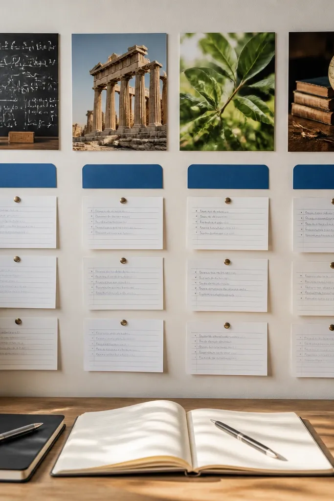
Create a parent page called Subject Notes Hub and add a row of three to five linked pages as tabs or linked page blocks. Style each subject header with the same blue color and consistent spacing. Inside each subject page, create three sections with blue dividers: Lecture notes, Reading notes, and Assignment links. Add a small database or linked database view for “This week’s items” filtered by course so the subject page stays updated without manual rewriting.
This is the “open Notion and instantly know where to go” template. Instead of one massive notes page, you create a subject hub with blue icon tabs and short preview lists. Each subject has its own page with lecture notes, readings, and links to assignments. The look is photogenic because the sidebar is tidy and the main page stays structured. Students who switch between classes during the day get a calmer experience because the blue tabs keep navigation predictable.
Skip thisDon’t mix multiple layouts across subjects. When one subject has tables and another has paragraphs, the whole page looks inconsistent.
Editor's noteUse the same three section titles on every subject page. Consistency is what makes the blue layout feel clean in screenshots.
10. Blue Assignment Page Template with Rubric Blocks

Create a template page for Assignments with a blue title header and a “Prompt” section. Add a “Requirements” bullet list with fields you paste from the syllabus. Then create a rubric section with a checklist for criteria like Thesis, Evidence, Organization, Formatting. Add a “Draft notes” section with a few bullet lines and a final “Next edit” checklist. Link the assignment page back to the Assignments database record so due dates show in your dashboard.
Turning assignments into pages you can actually finish is where Notion gets real. This template makes each assignment a mini workspace with a blue header, a short prompt summary, and rubric blocks you can check off as you write. Students waste time when they can’t see what the grader cares about. This layout fixes that because the rubric criteria are always visible, and the blue sectioning stops you from losing your place. It also looks good because each block is short and aligned, not one giant paragraph.
Skip thisDon’t hide the rubric in a collapsed toggle. If it’s hidden, you forget it exists.
Editor's noteKeep rubric criteria to 4-6 items. More items make the blue page feel crowded.
11. Blue Project Timeline with Milestone Cards

Create a database called Project Milestones with properties: Project (select), Milestone (title), Due date (date), Status (select), and Deliverable (text). Build a timeline view sorted by Due date and filter to the active project. On the project home page, embed the timeline in a blue section header, then add a board view filtered to Status not equal to Done. Finally, create a milestone page template with a checklist for tasks and a notes section for links and references.
Projects look messy in Notion when milestones are buried in text. This template uses a timeline-style view with blue milestone cards so you can see the order at a glance. Each milestone card has a short deliverable line and a status. The aesthetic comes from the card structure: you get consistent spacing, consistent titles, and the same blue accent across the timeline. It’s great for group projects and long assignments because it reduces the “what do we do first” confusion. Students also use it for personal deadlines like portfolios and research papers.
Skip thisDon’t put tasks inside the milestone card text. Keep tasks in the milestone page so cards stay short.
Editor's noteWrite deliverables as nouns: Outline, Draft, Slides, Final figures. It makes the blue cards look clean and scannable.
12. Blue Meeting Notes Template with Action Items Panel
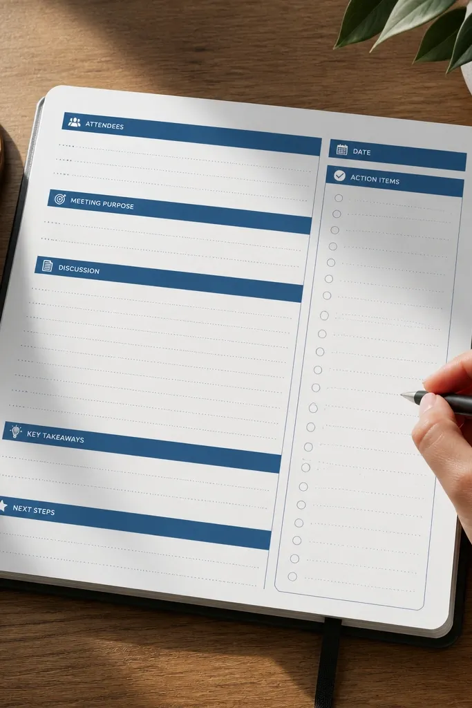
Create a template page called Meeting Notes with two columns: left 70% for Notes, right 30% for Action items. Add blue headers for each column and keep action items as a checklist. In the Notes column, add blocks for Agenda, Questions, Decisions, and Next steps (optional). In the Action items column, add checklist items with due dates in parentheses. After writing, link the page to the relevant course or project database record.
Office hours and study group notes need a layout that separates “what happened” from “what to do.” This template does that with a blue header and a two-panel format: notes on one side, action items on the other. The action items panel is what makes it look good because it stays compact and stays visible while you write. Students use it for advisor meetings, lab check-ins, and group study sessions. You end up with a clean record and a clear follow-up plan without rereading everything later.
Skip thisDon’t mix decisions with tasks in the action panel. Decisions belong in Notes so the panel stays neat.
Editor's noteWrite each action item as a verb phrase with a due date. It keeps the blue panel readable.
13. Blue Reading-to-Notes Converter Page
Create a template page called Reading-to-Notes with four blue section headers: Key idea, Quote, Your summary, Connects to. Under Key idea, add a single sentence block. Under Quote, paste the quote and add a 1-2 bullet explanation. Under Your summary, keep it to 3 bullets: What it says, Why it matters, Terms to remember. Under Connects to, add two linked page fields or dropdowns tied to your course topics.
Students lose points when they read and then forget to turn reading into usable notes. This template forces that conversion with a blue block structure that makes each reading entry actionable. The look is consistent: every entry has the same blue headings, which makes your study folder feel organized. You also get a “connect” section that prompts you to link the reading to lecture topics or assignments. It’s a strong option for courses with heavy theory because it turns long articles into short, visual study chunks you can review quickly.
Skip thisDon’t paste the whole article. This template works when you reduce the content into study-sized blocks.
Editor's noteKeep “Your summary” to exactly 3 bullets so the blue page stays uniform across entries.
14. Blue Habit Tracker for Study Consistency
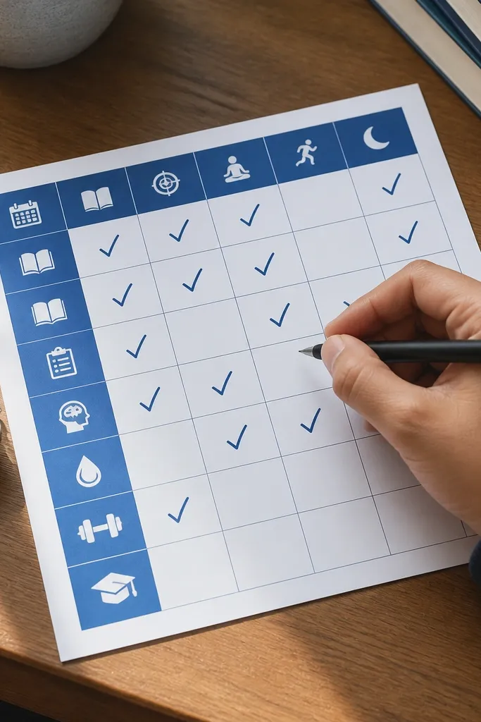
Create a database called Study Habits with properties: Habit (title), Frequency (select: Daily, Weekdays), and Color label (select). Then create a separate page called Habit Calendar with a table view that has rows for habits and columns for days. Add checkboxes in each cell, and use a consistent blue header for the table. Finally, create a monthly view that filters to the current month and add a small “Streak notes” text block for reflections.
This template is for students who want steady progress without constant planning. It uses a blue header and a simple daily checklist layout, so your page looks tidy even after months. Instead of tracking 20 habits, it tracks a few study behaviors that actually build consistency: lecture review, problem practice, flashcard review, and reading time. The blue coloring keeps it from looking bland, and the checkbox grid makes progress obvious at a glance. It’s also useful for exam season because you can see whether you’re practicing enough, not just reading notes.
Skip thisDon’t add habits that require long sessions. If it’s too big, you’ll skip it and the blue page loses credibility.
Editor's noteStart with 4 habits max. The blue grid looks better and you stick with it longer.
15. Indigo Research Inbox with Taggable Source Cards
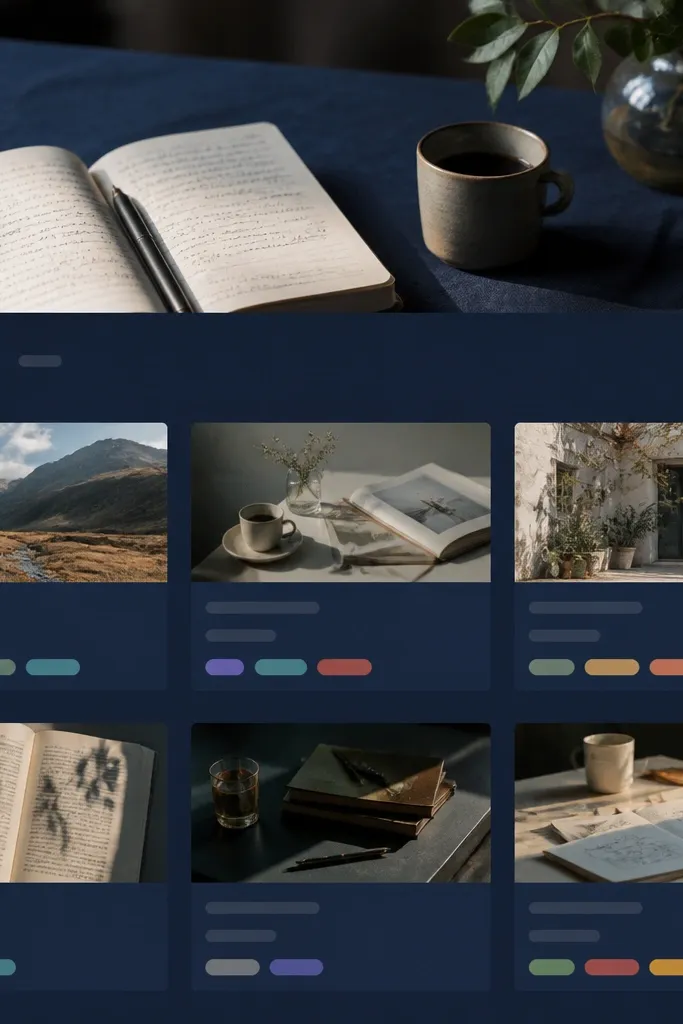
Start a Notion database called Source Cards with properties: Title (text), Author (text), Year (number), Type (select: Article, Book, Video, Paper), Tag (multi-select), Status (select: Reading, Cited, Quoted), and Citation (rich text). Make the page background a deep indigo and set card styling by using a “Type” select and showing it as a small badge. Create a view called Research Inbox and set it to a “Board” view grouped by Status with card preview showing Title, Type badge, and the first line of Citation. Add a second view called Tag Grid using the Tag property as the grouping key, so you can quickly see what you’ve tagged for a specific assignment. For the citation block, format it as a single compact paragraph with author-last-name first, then year, then title — it looks neat and is easier to copy into your reference list.
This is the blue Notion template idea for students that fixes the messiest part of research — sources getting lost between notes, bookmarks, and half-written outlines. The page is a single indigo inbox where every source lands as a card with a photo-friendly header, a clean citation block, and tag chips you can filter later. It stays photogenic because the cards have consistent spacing, a strong indigo background, and bright blue tag colors that read fast. You end up with a system you can use all year, not a one-time template. Build it once, then keep adding cards; the layout is designed to stay calm even when your list grows.
Skip thisDon’t make the cards too “freeform” — if every card has different fields, your future self will stop updating it.
Editor's noteKeep Tag values short and consistent (2-3 words max). Long tags look fine at first, then turn into clutter when you have 40+ sources.



