
1. Matte photo paper + spray adhesive on foam board
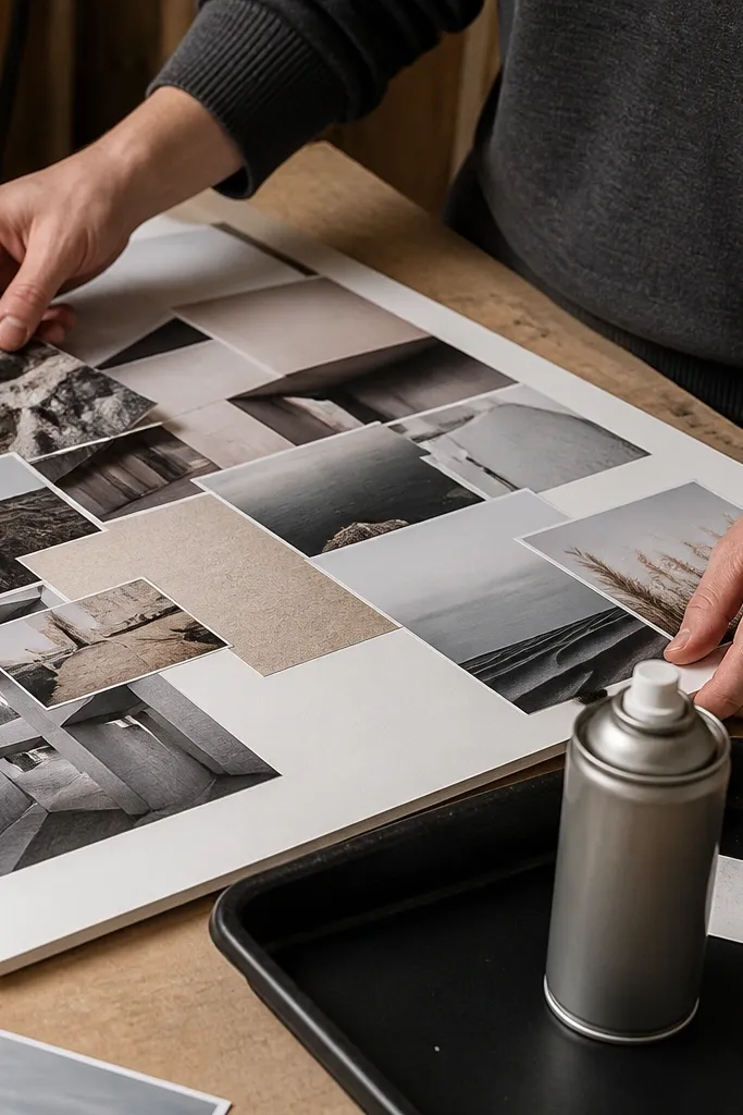
This is the “clean edges, no glare” setup. Matte photo paper keeps your collage from looking like a glossy flyer, and it reads well under indoor lighting. Spray adhesive also speeds things up because you’re not brushing glue under each piece, so you get fewer bubbles. Your board stays flatter than plain copy paper once it’s mounted, especially if you press for a full minute with a brayer or a clean roller. This works best for foam board, poster board, or any stiff backing where you want a crisp, finished look.
Start by trimming your prints slightly larger than your final layout, then dry-fit them on the foam board so you can confirm spacing. Use a light, even spray adhesive on the foam board, wait 30-60 seconds for it to tack up, then place each print and press from the center outward. Finally, use a craft knife and metal ruler to trim edges flush if you overhang, and seal with a thin coat of matte Mod Podge only if you need extra scuff resistance.
Press each piece with a brayer in 2 passes: one horizontal, one vertical.
Don’t use heavy wet glue straight onto foam board — it warps and creates ripples.
2. Inkjet glossy photo paper for punchy colors on a taped board
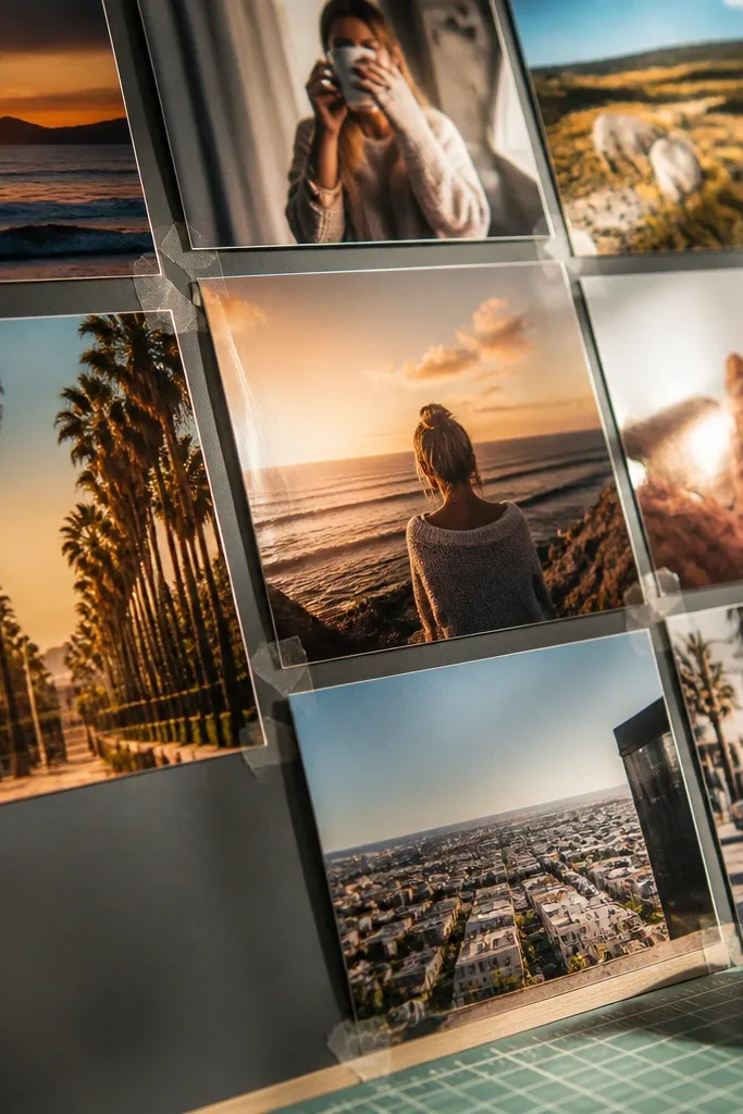
If your vision board has lots of color — sunsets, product shots, lifestyle photos — glossy photo paper makes those colors pop. It also hides minor print banding better than matte, which matters if you’re printing at home. Tape attachment is straightforward because glossy paper grips tape less aggressively than cardstock, so you can reposition before it fully sticks. The trade-off is glare: glossy surfaces reflect lights, and text can become harder to read in bright rooms. Use this for cork boards, framed boards behind glass, or spaces with softer lighting.
Design your layout with exact sizes in mind, then print photos on glossy photo paper using the highest quality setting your printer supports. Cut to size with a straight edge and keep edges clean. Mount using small strips of tape at the corners so you can adjust alignment, then add a thin clear sheet or frame backing if glare bothers you.
Use painter’s tape for repositioning, then switch to clear tape once the layout is final.
Don’t tape over thick glossy edges — they can peel up and look like a corner curl.
3. Laser printer + matte cardstock for typography-heavy boards
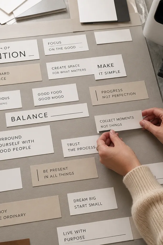
This option is for boards where words matter more than photo depth. Laser prints on matte cardstock stay crisp, and text edges look sharp even when you cut them into strips or labels. Because laser toner sits on top of the paper, it handles light handling better than inkjet prints that can smear if glue gets too wet. It also dries fast, so you spend less time waiting and more time assembling. This setup is great for vision boards in binders, folders, or a flat board where you’ll be cutting and rearranging pieces.
Print your text blocks on matte cardstock at the size you want them to appear, then let the sheets cool for 5 minutes so toner sets. Cut with a craft knife on a cutting mat and keep your blade angle consistent for clean edges. Glue with a thin layer of PVA glue or use double-sided photo tape on the back, then press flat under a book for 20-30 minutes.
Set your printer to “matte” or “plain paper” media to reduce toner sheen.
Don’t brush Mod Podge directly over laser toner — it can create a cloudy look.
4. Copy paper + Mod Podge transfer method for budget collage boards
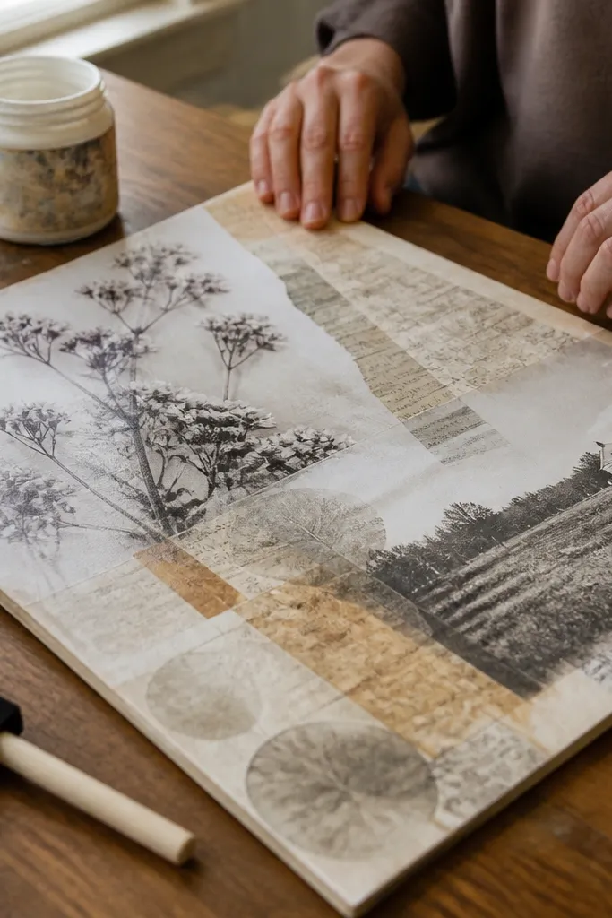
Print on regular copy paper, cut your images with a small border, then apply a thin layer of Mod Podge to the board. Place the cutout, smooth from center outward with a plastic card, and let it dry fully — usually overnight for thicker areas. Add a second thin coat over the top once dry, then trim any raised edges after it cures.
If you’re working on a tight budget and you like a layered, artsy feel, this is the cheapest way to make prints look integrated. Plain copy paper under Mod Podge becomes more uniform visually, and the surface gets a soft satin finish. The downside is that paper can warp, and tiny text can blur if you overwork it with wet medium. You’ll also need to seal edges carefully so corners don’t lift over time. Use this for poster boards, not for glossy framed glass displays where you want perfectly flat edges.
Skip thisDon’t soak the paper — wet edges curl and you’ll see it later.
Editor's noteUse multiple thin coats instead of one heavy coat to reduce wrinkling.
5. Copy shop color prints on cardstock for fast, predictable results
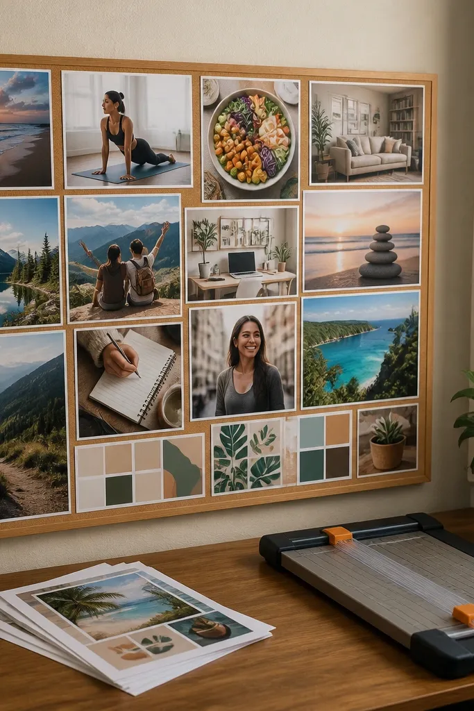
This is a beginner-friendly sweet spot when you want clean output without learning printer settings. Copy shops can print on heavier paper than most home setups, so your pieces stay flatter and cut edges look cleaner. Color depth is decent for most vision board images, especially when you’re not chasing gallery-level detail. It also reduces the risk of ink smearing because the prints are dry and handled professionally. Choose this when you want a reliable board for a room display and you don’t want to buy photo paper.
Format your images to the exact sizes you want on the board, then send them as separate files or a print-ready PDF. Ask for cardstock weight compatible with your layout; for most boards, 80-100 lb cover stock is a good target. Pick matte if your room has overhead lighting, then cut and mount with double-sided tape or a thin PVA glue layer.
Bring a ruler and measure your board grid before you print so you don’t get stuck trimming uneven borders.
Don’t rely on “fit to page” at the shop — it can shift your crop and ruin alignment.
6. Local print shop poster prints for wall-ready vision boards
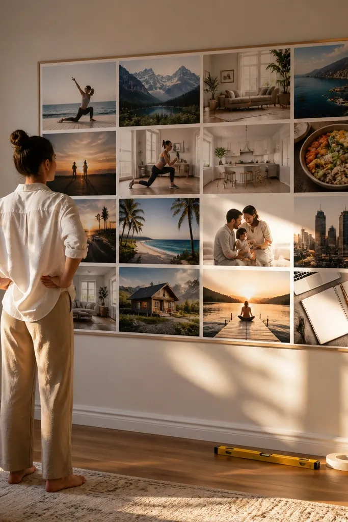
Create a layout at the final poster size in a design tool, set margins so your important elements stay inside the safe area, and export a high-resolution PDF. Choose matte for glare control, then print at a size that matches your frame opening. Mount the finished poster on foam board or inside a frame with spacer backing so it doesn’t bow.
If you want one big statement board that looks sharp across a room, poster prints are the cleanest path. The print shop can handle larger formats without you buying specialty paper or messing with printer drivers. This option works well when your design is already aligned and you want minimal assembly — basically mount and frame. You also get better consistency for gradients, skin tones, and fine details than most home inkjet prints. Use this for a single-piece board on the wall, above a desk, or on a door.
Skip thisDon’t pick a glossy finish if the board will sit under a bright ceiling light.
Editor's noteAdd a 0.25 inch border around image edges so trims look intentional.
7. Print-on-demand posters for zero-guesswork sizing

Build your vision board as one PDF page at the final size you want, including bleed or safe margins if the service requests them. Export at the recommended resolution for print and check the preview for crop issues. Order the poster, then mount on a rigid backing or frame it with a mat if you want that gallery spacing.
Print-on-demand takes the guesswork out of paper choice and color settings. You upload a ready-to-print PDF, and the service handles scaling and production, which is exactly what beginners need when they’re worried about blurry results. The output is consistent across batches, so if you want a second board later, it looks the same. The trade-off is shipping time and cost per size, so it’s best for one or two boards rather than constant experiments. Choose this when you want your board to look polished with minimal DIY assembly.
Skip thisDon’t upload a low-resolution image and hope the service “fixes it” — you’ll see pixelation.
Editor's noteUse matte if you plan to hang it where lights reflect off glossy surfaces.
8. Print-and-cut sticker vision board panels with Cricut
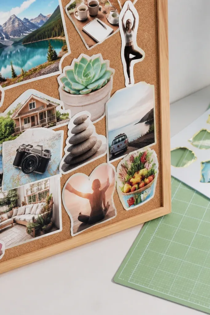
This is for people who like a tidy look and hate messy glue. Print-and-cut sticker workflow produces a consistent border around each image, so your board looks intentional even when pieces overlap. It also makes repositioning easier because stickers are more controlled than random tape strips. You do need a cutting machine and you’ll spend time on calibration, but once you dial it in, the process is repeatable. This is best for smaller vision boards, mini goals panels, or a binder page where you want clean edges.
Design each image panel with extra margin for the sticker border, then upload to your cutting software and set the print-then-cut calibration. Print on sticker paper that matches your machine settings, let it dry, then run the cut job. Peel carefully, place on your backing, and press down firmly along the edges.
Do a test cut with one small square first to confirm alignment.
Don’t rush the calibration step — misalignment creates crooked borders.
9. Printable vinyl labels for vision board dividers and icons
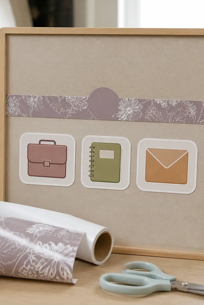
Print your labels and small icons on printable vinyl using the correct paper type setting in your printer. Cut with a craft knife or a machine, then weed out the negative space so only the label remains. Apply to a clean backing surface with light pressure, then burnish edges with a scraper for a tight seal.
Printable vinyl is the workhorse for the parts of a vision board that need to survive handling: dividers, category labels, and small icons. Vinyl resists smudging and scuffs, so it stays readable when you’re moving pieces around. It also looks crisp and uniform, which is hard to get with paper cutouts. The downside is it’s not the best choice for full-page photo collage because vinyl is thicker and you’ll see texture differences. Use it for accents, not for every image.
Skip thisDon’t apply vinyl to dusty foam board — edges lift fast.
Editor's noteWipe your backing with a dry microfiber cloth before applying vinyl to improve adhesion.
10. Iron-on transfers for canvas boards and fabric vision panels
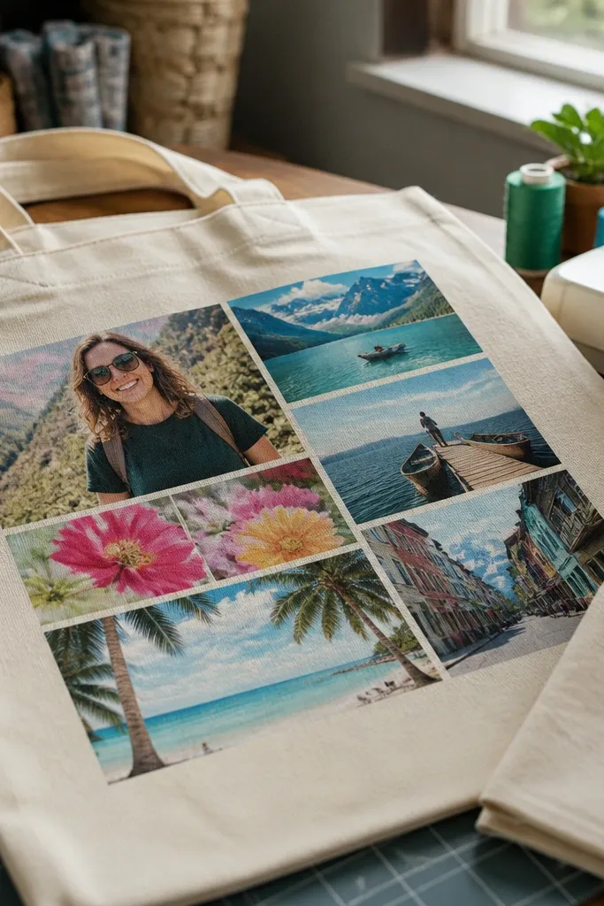
Print on transfer paper that matches your fabric type and color requirements, then cut with a border for trimming. Preheat the fabric, place the transfer face-down or face-up according to the paper instructions, and cover with a pressing cloth. Press firmly for the recommended time, let it cool completely, then peel slowly to check adhesion.
If your vision board is on fabric — canvas, tote, or a cloth organizer panel — iron-on transfers make it look like the design is part of the material. The print feels integrated, and you avoid paper edges altogether. This option is beginner-friendly only if you’re careful with heat settings and you use a protective sheet. Fine details can look great, but if you overheat or press too long, the transfer can crack or fade. Choose this for fabric boards where you want softness and a stitched-in feel.
Skip thisDon’t peel while warm — you’ll pull up the ink layer.
Editor's noteDo a one-inch test transfer first so you don’t ruin a whole panel.
11. Canvas photo prints from a print shop for textured, forgiving boards
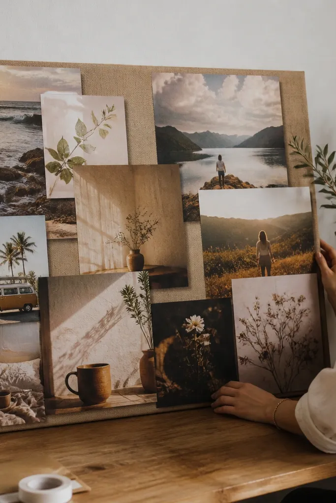
Choose canvas prints at a size that matches your wall space, then build a simple layout with fewer, larger images. Order matte or standard canvas depending on glare, and check the preview for cropping so your faces and key objects stay centered. Mount using picture-hanging hardware or place framed canvas panels on a dedicated board area.
Canvas prints look great when you want the board to feel artsy and textured rather than paper-flat. The texture hides slight imperfections in images, and the finished piece looks finished even if you don’t surround it with lots of extra decoration. You also get stronger resistance to minor handling than thin copy paper. The trade-off is the cost and the fact that canvas prints are less ideal for tiny text. Use this for photo-forward vision boards where the “mood” matters more than micro typography.
Skip thisDon’t design with thin fonts if you want legibility from normal room distance.
Editor's notePick larger images instead of many tiny ones — canvas texture makes small text harder to read.
12. Single-page digital montage printed once for the cleanest layout
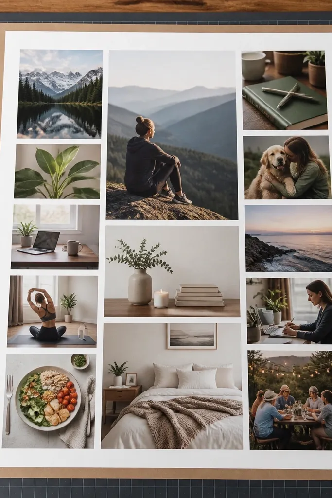
This is the most beginner-friendly workflow because it removes assembly math. When your entire vision board is one printed page, you don’t spend time aligning dozens of pieces, and you avoid edge-banding that happens when separate prints don’t match. A digital montage also lets you keep consistent spacing, font sizes, and margins. The look is clean and cohesive, which matters if you’re using a frame or a clear cover. It’s best when you want a polished board you can mount quickly and stop fussing with.
Design your board in a grid with fixed margins and consistent spacing, then export at the final size as a high-resolution PDF. Print on matte photo paper at home or order a poster print if you want larger dimensions. Mount to a rigid backing and add a clear protective cover if the board sits in a high-touch spot.
Lock your layout size before you start inserting images so nothing rescales at export.
Don’t mix print sources (home + shop) on one montage — the color and sharpness won’t match.
13. Photo book style pages for a binder-based vision board
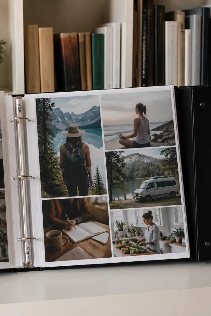
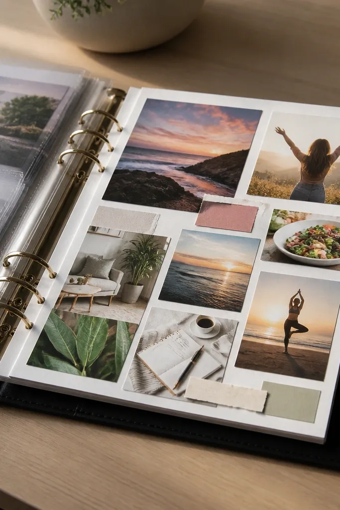
Create a set of pages with one theme per page, keeping text sizes readable and images large enough to avoid blur. Export each page as part of the photo book layout system and upload according to their templates. Print the book or page set, then insert into a binder if the service provides loose pages.
A binder vision board solves the “what if I change my mind?” problem. Photo book printing gives you consistent page quality, and the pages are easy to flip and rearrange without destroying paper edges. This style is great for beginners because you can print in batches, then upgrade sections over time. The look is neat, with clean corners and no messy glue lines. It also works well in small spaces where wall mounting feels too permanent.
Skip thisDon’t cram too many tiny images per page — binder boards look messy fast.
Editor's noteUse page spreads for categories like Health, Work, and Home so each section has breathing room.



