
1. Warm Beige Base Sheets for Marker Work
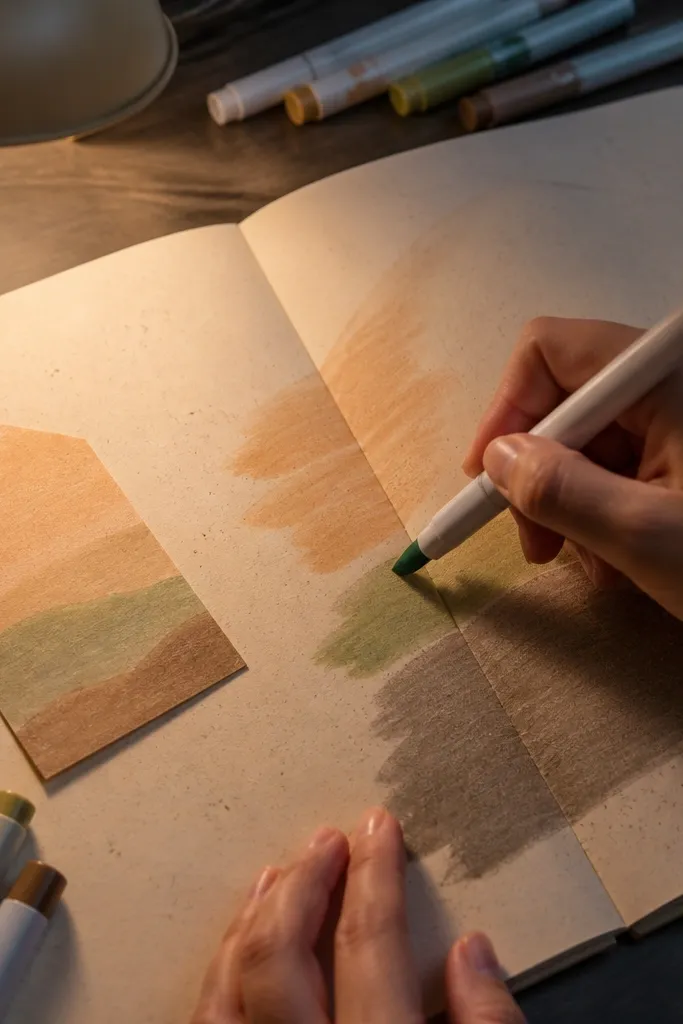
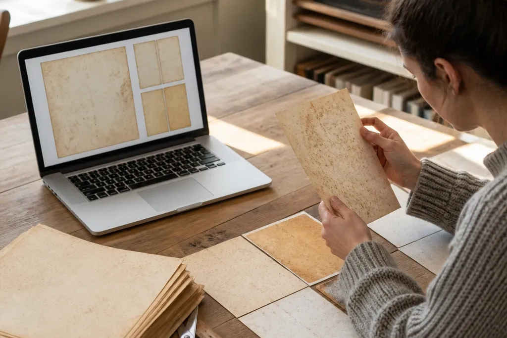
This is the safest “vintage” look for beginners because it doesn’t fight your pens. Warm beige backgrounds print with a steady tone, so your marker colors don’t look muddy or overpowered. The speckling pattern gives age without turning into an unreadable mess when you cut shapes for journaling or tags. It also layers well under photos and printed ephemera since the background stays calm.
Start by printing one sheet on the paper you plan to use, at 100% scale, with printer settings on plain paper or photo off (no “vivid” mode). Let it dry for 10 minutes, then run a marker test in a corner and see if ink pools. If the background looks too dark, reduce printer contrast or choose a lighter paper option next run. Finally, trim using a straight blade or paper trimmer so the border stays crisp.
Use a Uni-ball Signo gel pen or a fine felt-tip for clean lines on top of the beige background.
Don’t print on glossy photo paper — it can make the “age” look blotchy and slick.
2. Sepia Wash Papers for Watercolor Blending

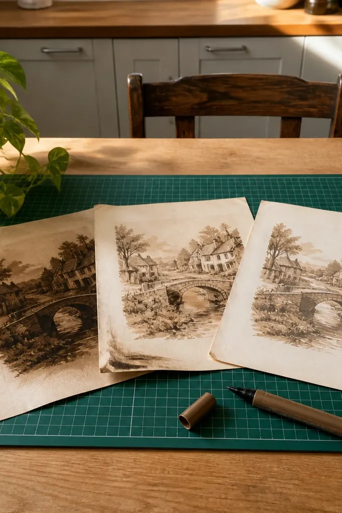
If you want that watercolor-on-old-paper look, sepia wash sheets are the easiest starting point. The wash starts light, so your paint can deepen it without creating harsh halos. This style also hides minor printing imperfections because the background is already blended. It’s great for art journaling pages, card backgrounds, and collage layers where you plan to add your own color.
Print on heavier paper if you have it, like 90 lb cardstock, because it grips paint better and stays flatter. Watercolor test: add a light wash with a round brush and watch the edges — if you see strong bleeding, switch to less water and paper with a smoother surface. Then let the sheet fully dry before layering adhesive, so you don’t warp it. Cut after drying, not before, since wet paper stretches.
Mist a tiny amount of water on the surface first, then paint. It reduces streaking and makes the sepia background blend smoothly.
Skip heavy, watery paint right over very dark printed areas — it can lift ink and create gray blooms.
3. Ledger Lines for Faux Records and Labels
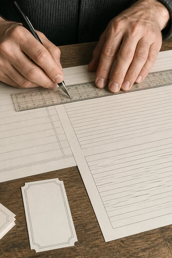
Ledger line prints give you instant structure. The lines make it easy to place headings, date stamps, or small blocks of text, which is why they’re ideal for labels, recipe cards, and mini journaling templates. The key is that the design should print crisp enough that lines still read after you trim. When it does, it looks like you printed directly onto old stationery instead of “adding vintage later.”
Print at the highest quality mode your printer offers, especially if your printer is inkjet. Use a ruler to check line spacing on the first test sheet — if lines blur together, reduce printer speed or switch paper thickness. Once you get clean lines, cut strips for tabs and label backgrounds. Seal with a light matte spray if you plan to handle the paper often, but test spray first on a scrap.
If your printer is low-res, scale the sheet slightly larger (like 102-105%) so the linework stays readable after cutting.
Don’t choose this style if your printer struggles with fine lines; blurry ledger looks messy fast.
4. Book Page Fade for Decoupage Layers
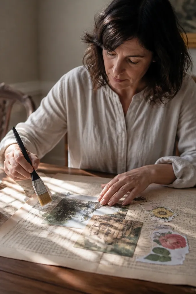
Book page fade prints are built for layering and texture, not for crisp readability. The faded text pattern gives you that paper history feel while still letting your main elements — photos, cutouts, stickers — stand out. This style is forgiving when you overlap pieces because the background doesn’t punch through with high contrast. It’s a strong pick for decoupage on trays, boxes, and journal covers.
Print on 65-80 lb paper for flexible decoupage, or 90 lb cardstock if you want less wrinkling. Tear or rough-cut edges instead of using a perfect straight cut, so the fade blends into whatever you’re covering. Apply a thin coat of decoupage medium to the surface, lay the paper down, then smooth from center outward to push bubbles away. Let it cure fully before sanding or adding more layers.
Use a foam brush for the decoupage medium — it spreads thin and reduces streak lines.
Don’t saturate the paper while applying; too much medium can dissolve the printed texture and create a smeared look.
5. Torn Edge Border Sheets for Card Fronts
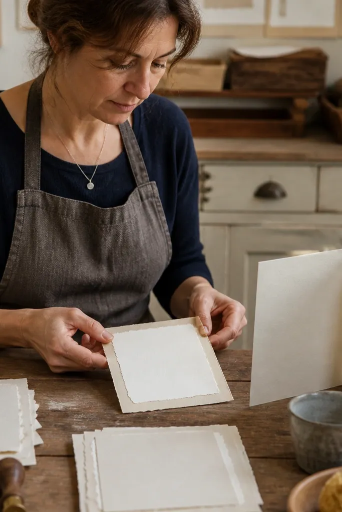
Torn edge borders make the vintage look feel intentional, even if you barely add anything. The torn effect frames your design, so you don’t need extra embellishments to make it look finished. This is also one of the easiest styles to trim neatly because the border guides your cut line. It works well for card fronts, scrapbook mats, and small prints like recipe cards or tag backings.
Editor's noteUse a craft knife with a new blade for the torn-edge line. A dull blade crushes fibers and makes the tear look flat.
Print one sheet and check the border darkness. If the torn shadow looks too heavy, lower contrast or switch to a less saturated print setting. Trim the page so the border sits centered, then add your focal element with a thin adhesive or double-sided tape. If you want extra realism, lightly distress the torn edge with a sanding block or emery board after trimming.
Skip thisAvoid thick glue blobs near the torn edge — they create shiny lumps that catch light.
6. Postmark and Stamp Mix for Tags and Envelope Flaps
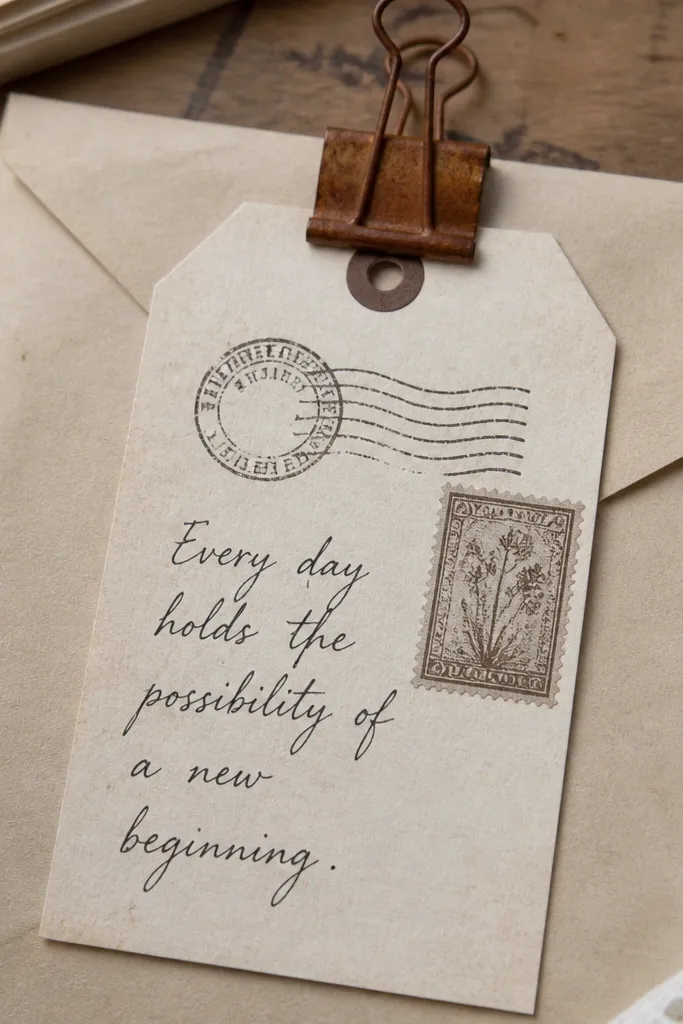
Postmarks and stamps turn blank paper into instant ephemera. The appeal is practical: stamp shapes give you built-in focal points for tags, envelope labels, and mini cards. This style shines when you add a real handwritten note on top, because the printed marks keep the page from looking empty. Choose it when your printer can handle small details without turning them into blobs.
Editor's noteUse a 0.5 mm gel pen over stamp areas. It stays readable on top of the printed ink without streaking.
Print on 90 lb cardstock or heavyweight copy paper so the stamp edges don’t feather. After printing, check the smallest text — if it’s unreadable, your printer settings are too low, and you should switch to higher quality mode. Cut tags with a consistent size and add a hole with a punch before you decorate, so you don’t tear fibers. For extra vintage realism, rub a little brown chalk or ink around the stamp edges after it dries.
Skip thisDon’t use this on very cheap paper; stamp edges bleed and ruin the crisp postmark look.
7. Map Grid Paper for Stencils and Travel Decor
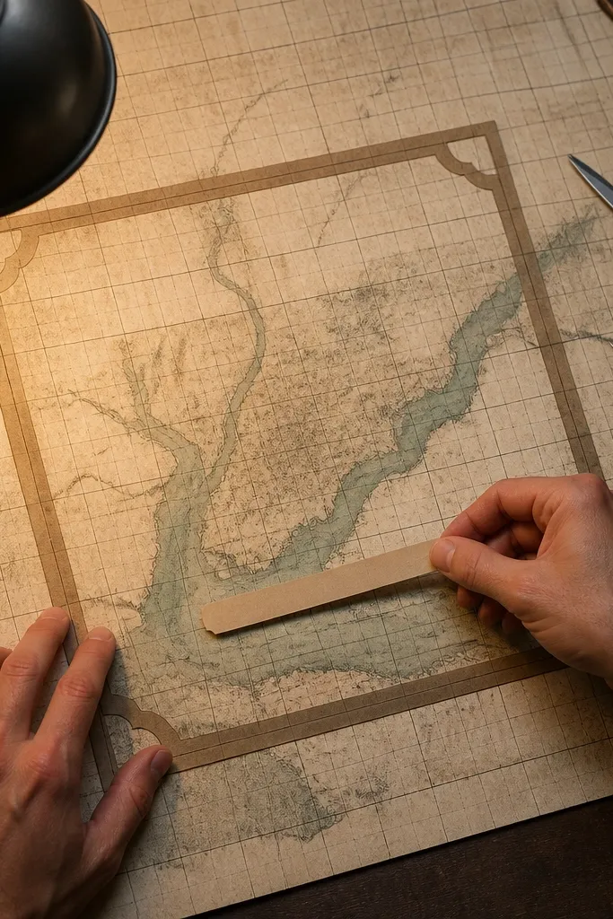
Map grid paper is the best choice when you want vintage background that also gives you alignment. The grid helps with straight borders, layered stickers, and stencil placement. It also makes labels feel “official” without needing extra design elements. When it prints cleanly, the map lines add character but still let your main message be the star.
Editor's noteIf your grid lines are too light, add a faint gray outline with a pencil before you cut — it helps your eyes keep edges straight.
Print at high quality and keep scaling at 100% so the grid spacing stays consistent across multiple sheets. If you plan to use it as a stencil layer, print one sheet and hold it up to light to confirm the thinnest lines are visible. Then cut out windows for stencils or trim into rectangles for label backgrounds. Seal with a matte finish if you’re using it in mixed media so the grid doesn’t pick up smudges.
Skip thisDon’t crank printer saturation; heavy map lines look like a modern blueprint instead of aged paper.
8. Aged Letter Background for Mixed Media Layers
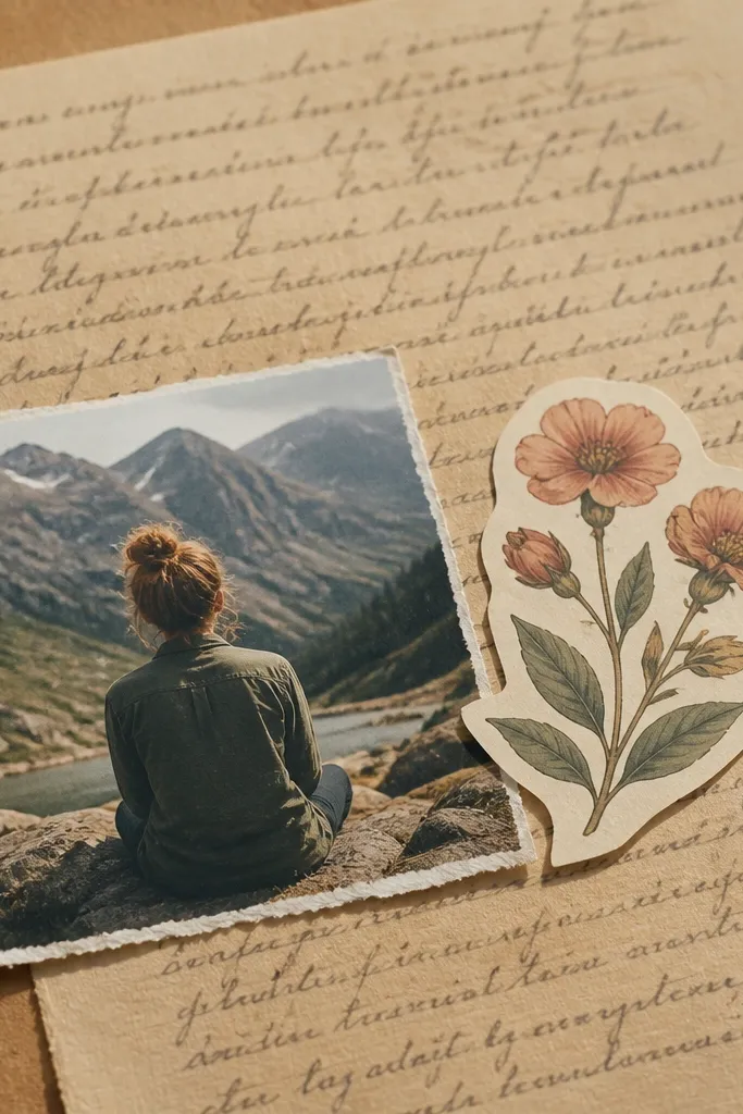
Aged letter backgrounds give you texture and depth without forcing you to read anything. The printed blocks look like handwriting or paragraphs, so your collage feels grounded even when the top layer is simple. This style is great for mixed media because it hides small mistakes: misaligned stickers, uneven glue, and slight color variation. It also works well behind photos because the background texture doesn’t steal attention.
Editor's noteUse a soft pencil to lightly mark where you want your main element — it keeps placement consistent across sets.
Print on medium-weight paper like 80-90 lb so it holds up to tape and light adhesive. Tear along one edge to create a natural boundary, then layer your main piece slightly off-center. If you’re adding ink, use a sponge dauber and dab at low pressure so the letter texture shows through. Let everything dry fully before you add a second layer, especially if you used water-based mediums.
Skip thisSkip thick paint directly on top of the printed blocks; it can erase the letter texture and flatten the whole look.
9. Heavy Ink Distress for Monochrome Accents
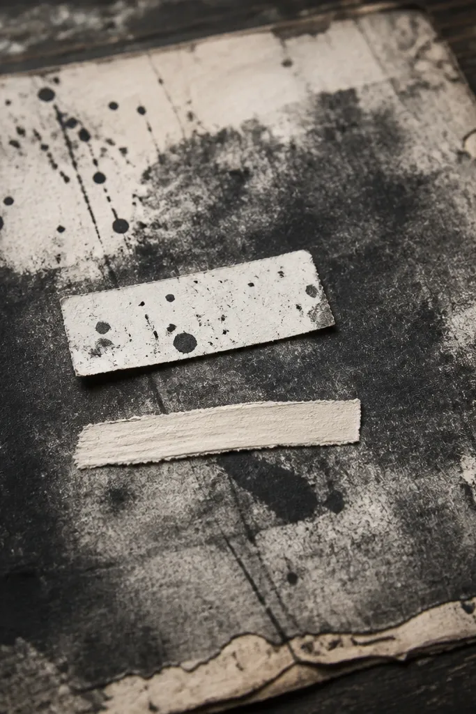
Heavy ink distress is dramatic, but it’s not the easiest starting point for beginners. It’s best when you want a monochrome, grungy vibe and you’re using the print as a background you can tone down. The benefit is visual impact: dark marks create instant depth, and lighter inks and chalks pop on top. Choose this only if your printer prints dark areas cleanly without smearing.
Print a test on the paper you’ll use and immediately check for smudging with a fingertip rub near the darkest zones. If it smears, switch to a heavier paper and a higher drying time between steps. Plan to tone it down with a light brown chalk or diluted sepia ink over the surface, then blend with a soft cloth. Cut and use as a background panel so the worst distortion isn’t visible on a focal edge.
Pair this with matte finishes and avoid glossy adhesives; shine makes smudge marks look worse.
Don’t use this for delicate text labels; the heavy distress hides fine writing fast.
10. Faint Border Corners for Minimal Vintage Frames
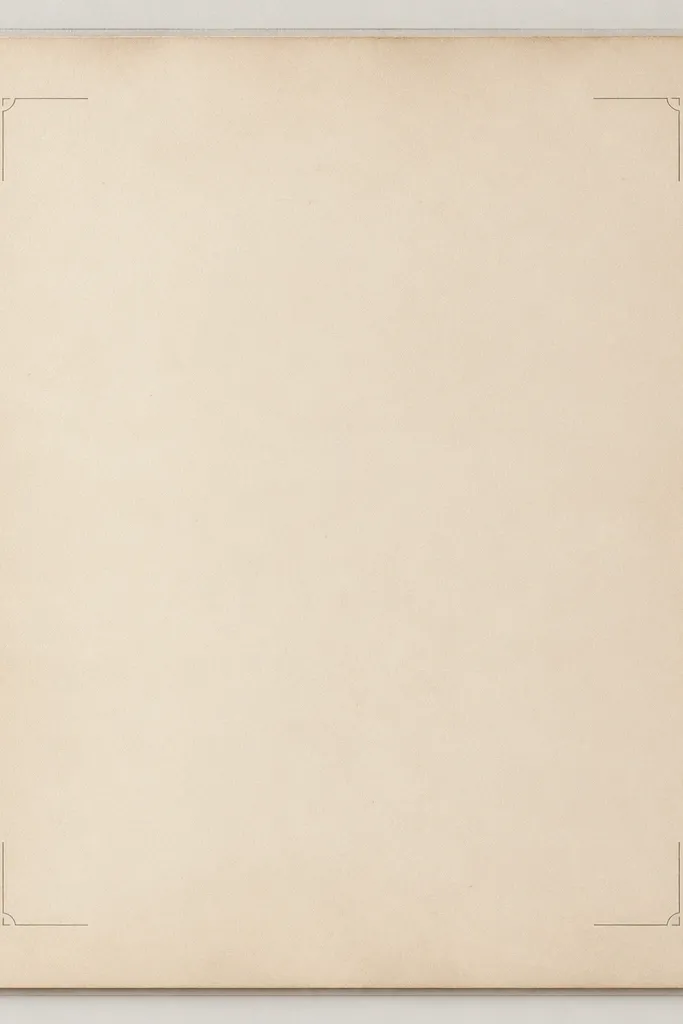
If you want vintage without clutter, faint border corners are a clean option. They frame your design while keeping the background quiet, which is exactly what you need when you’re printing quotes, journaling prompts, or small art prints. The light borders make it easy to layer over photos and other papers without fighting the print. This style is also beginner-friendly because small printing issues are less obvious in low-contrast designs.
Editor's noteUse a 2H to HB pencil to test placement lines lightly — it won’t show through as much as a darker pencil.
Print at normal quality first, then only reprint at higher quality if the corner details disappear. Use a paper trimmer for straight edges and keep the border margin even across multiple sheets. Add your main text or image on top, then reinforce the placement with a thin layer of matte medium if you’re building a collage. If you want more age, tap a tiny amount of brown ink around the corners after printing.
Skip thisDon’t over-distress faint borders; too much ink makes them look like stains instead of framing.
11. Soft Speckle Paper for Scrapbook Matting
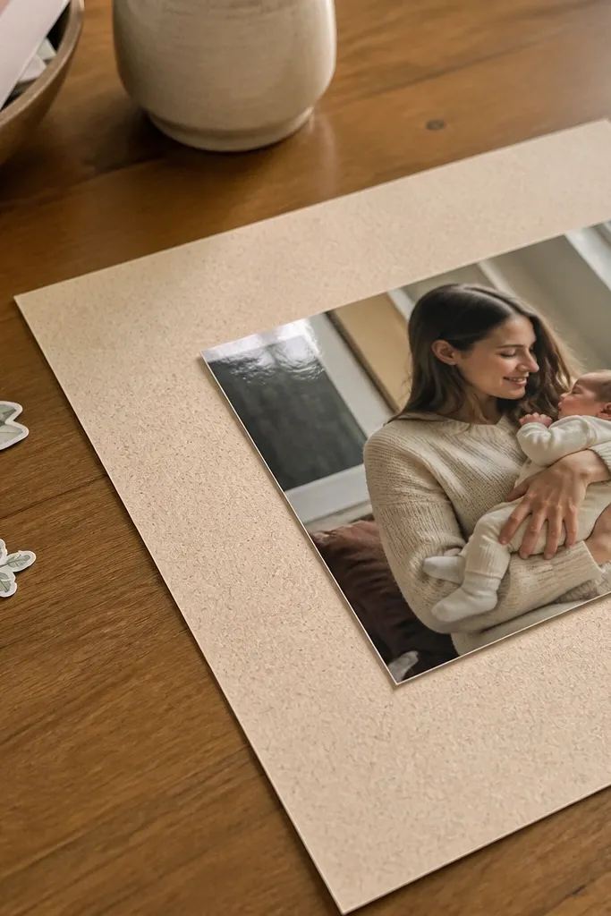
Soft speckle paper is the “works with everything” option for vintage sheets. The speckles add texture so plain backgrounds don’t look flat, but they don’t compete with your photos or printed embellishments. This style is also great for beginners because it tolerates different printer settings better than high-contrast distressed papers. Use it as a mat behind journaling blocks, stickers, and cut-apart cards.
Editor's noteFor crisp mats, chill the printed sheet under a heavy book for 15-20 minutes before cutting.
Print one sheet and check if the speckles are evenly distributed. If the speckling looks patchy, clean your printer nozzles and rerun the test. Once it prints evenly, cut mats with a consistent border width, like 1/4 inch around your focal element. If you’re layering with adhesive, keep glue near the center and edges so the speckles don’t smear from excess moisture.
Skip thisDon’t use wet mediums directly on this paper; speckles can lift and turn gray.
12. Vintage Recipe Card Style for Easy DIY Stationery
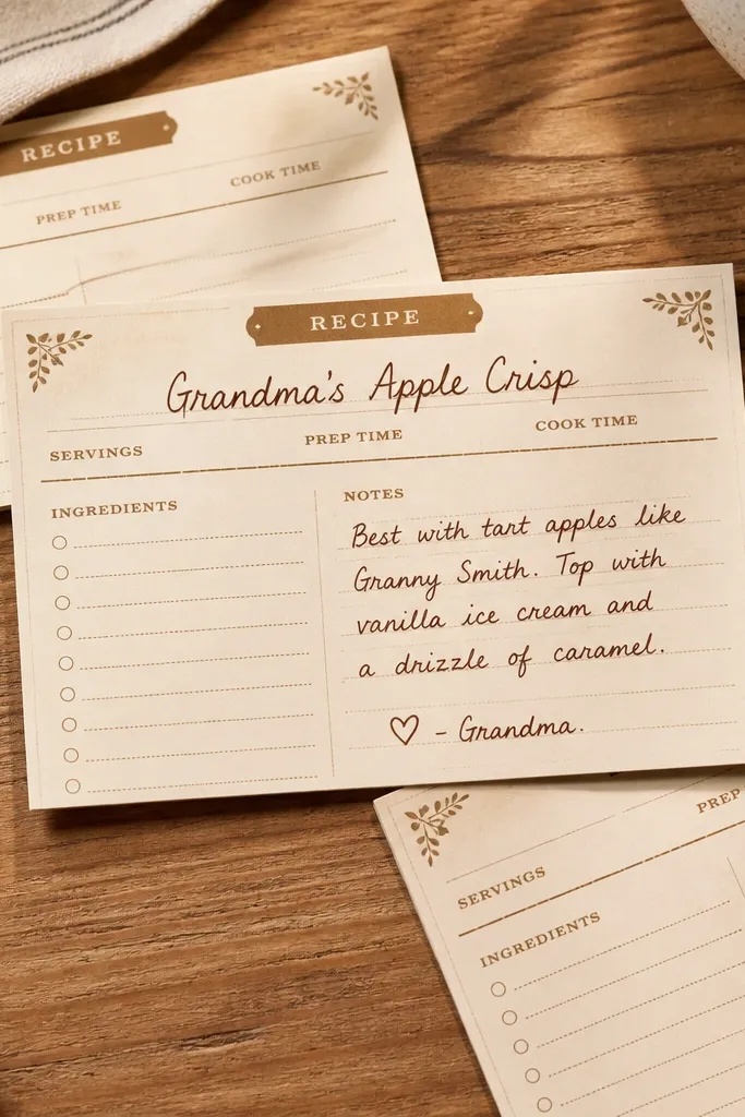
Recipe card style printables are a practical shortcut: they give you a ready-made layout. The top area for a title and the body for notes make it easy to create a set of matching cards without measuring every time. It’s also beginner-friendly because you can use pens and markers with minimal fuss. This is a strong pick for fridge magnets, gift tags, and small journaling cards.
Print on 80-90 lb cardstock and cut to a standard size like 4 x 6 inches if you want easy storage. Use a ruler to keep lines straight, then write with a fine-tip pen for the title and a slightly thicker tip for body notes. If you want extra vintage tone, swipe a very light brown ink wash only on the bottom third. Seal the card with matte spray after the ink dries.
Write titles with a darker pen first, then add smaller notes — it keeps spacing from shifting.
Avoid gel pens on very textured paper; they can skip over speckles and look patchy.



