
1. 8x10 French Market Price List Sheet
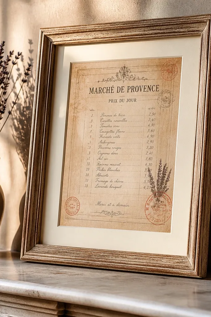
Start by downloading the 8x10 version and print on cream 90 lb cardstock. Trim with a straight paper trimmer so the edges sit clean in the frame. Add a thin off-white matte if your frame has room, then place the paper under glass or a clear sleeve to prevent smudging. Finally, hang it with the header at eye level, not centered too low, so the text reads when you walk by.
This is the kind of vintage paper printable that makes a wall look curated fast. The layout usually has a top header, column-like numbers, and stamp-like accents, so it reads clearly from a few feet away. Print it at 8x10 and you get an instant “market found this” vibe without needing to hunt for antiques. Use warm cream paper so the ink looks like it soaked in, not like it sits on top. It works best in kitchens, hallways, and above a small console where you want busy detail.
Skip thisDon’t print on plain copy paper — it curls and kills the crisp vintage look.
Editor's noteIf your printer runs cool, switch to “photo paper” or “matte” mode to warm up the blacks.
2. 5x7 Apothecary Herb Labels Set
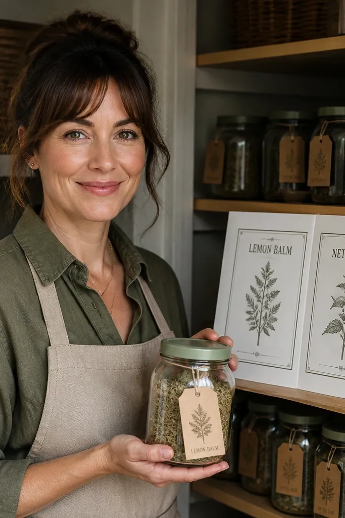
Print the label sheet and let the ink dry for 10 minutes before cutting. Cut along the outer border using a craft knife and metal ruler for straight edges. Apply to clean glass or kraft containers using matte glue stick, then finish with a thin layer of Mod Podge (matte) if you want water resistance. If framing, mount four to six labels on a single 8x10 board with equal spacing.
Herb labels are vintage paper gold because they look good even when they’re small. Each label has its own border and typography, so you get variety without needing a whole gallery wall. Print on 80-110 lb cardstock, then use them on jars, drawers, or a framed collage. The look is especially strong in pantries and bathrooms because the colors stay warm and grounded. This is beginner-friendly because the design already tells you where everything goes.
Skip thisDon’t use glossy paper — it makes ink look shiny and less vintage.
Editor's noteUse a white gel pen to add tiny dots or “batch” marks on a few labels for extra age.
3. Vintage Botanical Specimen Card
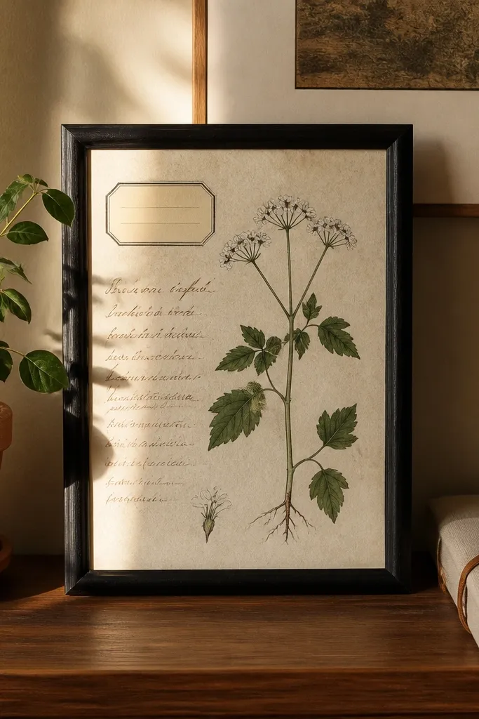
Print the card at its intended size (commonly 8x10 or A4). Trim with a straight edge, then mount on a neutral matte board so the botanical artwork has breathing room. If you want extra realism, add a second strip of kraft paper behind the card’s bottom edge like a label tab. Finish by sealing the paper with a clear matte spray made for paper or placing it under glass.
A specimen card feels scientific but still decorative, which is why it works in modern homes. The print usually has a main plant image, a boxed title, and handwritten-style notes, so it looks authentic on paper. Frame it in a simple black or natural wood frame and it instantly makes a shelf or desk look styled. Print it on slightly textured paper if you have it, because the texture makes the “archival” look more convincing. This is great for bedrooms, offices, and reading nooks.
Skip thisAvoid designs with ultra-fine lines if your printer is low quality — they blur.
Editor's noteTry a 1-inch matte border on 8x10 cards — it makes the plant drawing look deeper.
4. Weathered Ledger Page with Numbers
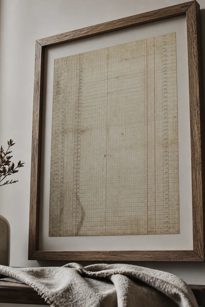
Choose a ledger design sized for 8x10 or 11x14 equivalents. Print on warm gray cardstock and set your printer to the highest quality setting for smoother lines. Trim and mount with a white matte or light kraft backing. Place it in a frame with a mat to hide any minor ink irregularities and prevent edge rubbing.
Ledger paper is one of the easiest “vintage” looks to pull off because it already has structure. The faded lines and number blocks create texture even if you keep the frame simple. This printable is perfect for beginners who want the aged effect without worrying about ornate details. Print on warm gray or cream cardstock so the background stays believable. It looks best in living rooms and entryways where you want a neutral vintage layer that isn’t too busy.
Skip thisDon’t over-sharpen the image in your printer settings — it makes the page look fake.
Editor's noteIf the background looks too dark, reduce ink density by switching to “draft” only for a test print, then dial back.
5. Victorian Mourning Photo Frame Mat (Blank Center)
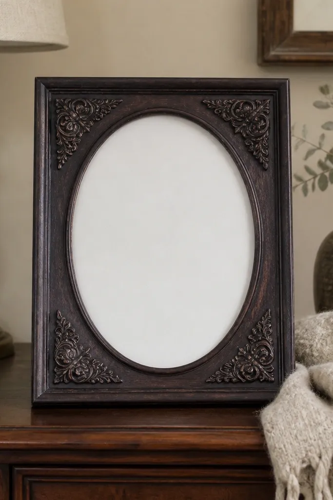
Print the mat at the size that matches your frame opening (commonly 8x10). Trim only the outer border — keep the inner window intact. If the printable has a cut line, score lightly with a craft knife so the window edges look clean. Insert your chosen center piece behind the window and secure with tape or glue dots at the back.
This one is a smart beginner move because it gives you a layout and a decorative border while leaving the center flexible. The mourning frame look often uses ornate corners and a subtle oval or arch window, so it reads vintage even when you add your own photo or a simple paper insert. Print the blank center version, then insert a printed quote, a tiny family photo, or a plain cream circle. Frame it in a shadowbox or regular frame with glass for crisp edges. It fits bedrooms, mantel decor, and sentimental gift displays.
Skip thisSkip glossy photo paper for the center — it can look too modern under glass.
Editor's noteUse matte glue dots, not liquid glue, so you don’t warp the paper around the window.
6. Old Postcard Collage Strip (Cut-and-Frame)
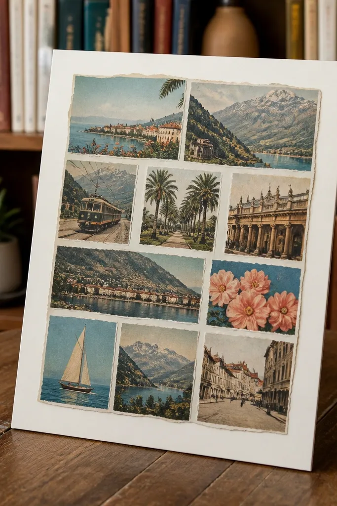
Print the collage strip on 90 lb cardstock. Use scissors for torn edges or a craft knife for straight sections, depending on the design style. Mount pieces onto a backing board with a small overlap so the collage feels layered. Add a thin black or warm wood frame for contrast and hang it in a light area so the paper texture shows.
Postcard strips make your decor look like a real travel find because they mix different scenes and typography. The torn-edge look is the key: it breaks the “clean print” feel and makes the paper look collected. Print it as a strip, then cut into sections and mount on a single board for a mini collage. This is beginner-friendly because you don’t need to perfectly align multiple prints — the vintage style forgives slight mismatches. Great for hallways, coffee bars, and above a dresser.
Skip thisDon’t glue the entire sheet flat — overlapping pieces looks more authentic.
Editor's noteIf the torn edges look too uniform, lightly rough them with sandpaper before mounting.
7. French Script Sheet with Decorative Corner Labels
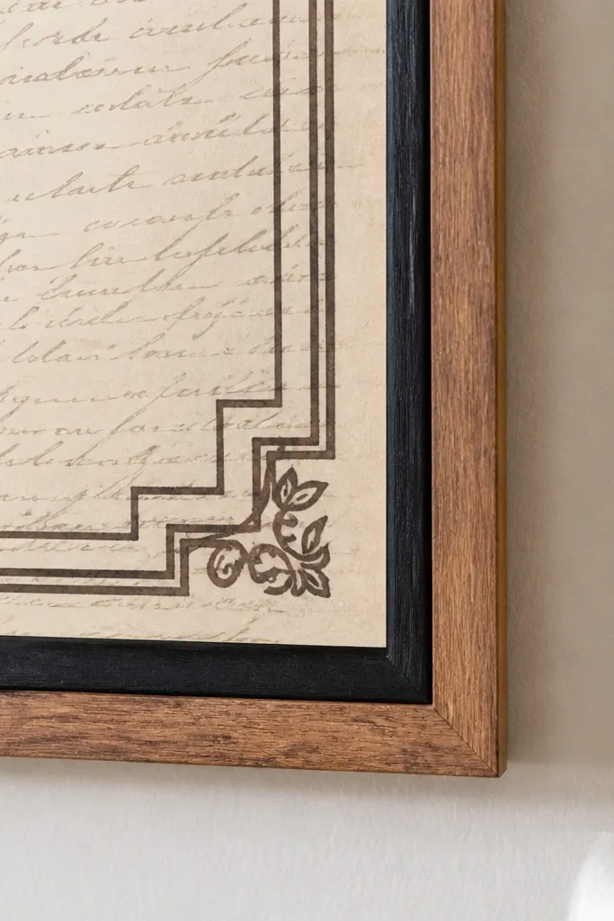
Print on cream cardstock and set your printer to “matte” paper type. Trim to size with a paper trimmer. For framing, center the script so the corner labels sit near the upper corners without touching the frame edge. If you want tags, cut out the corner label boxes and glue them to cardstock scraps with a thin layer of mod podge.
Corner labels make a printable feel like it belongs on vintage stationery. The script background plus boxed corners creates a high-end look even when the design is simple. Print it for a clean, aesthetic frame that works in almost any room. The trick is to choose a script style that has readable letterforms; otherwise it turns into a gray smudge. This is also great for DIY gift wrap accents because you can cut corner sections into small tags.
Skip thisDon’t choose a script design with ultra-thin lines if you’re printing at home.
Editor's noteUse a 0.5-inch border matte so the script has space to breathe.
8. Vintage Map Fragment with Compass Rose
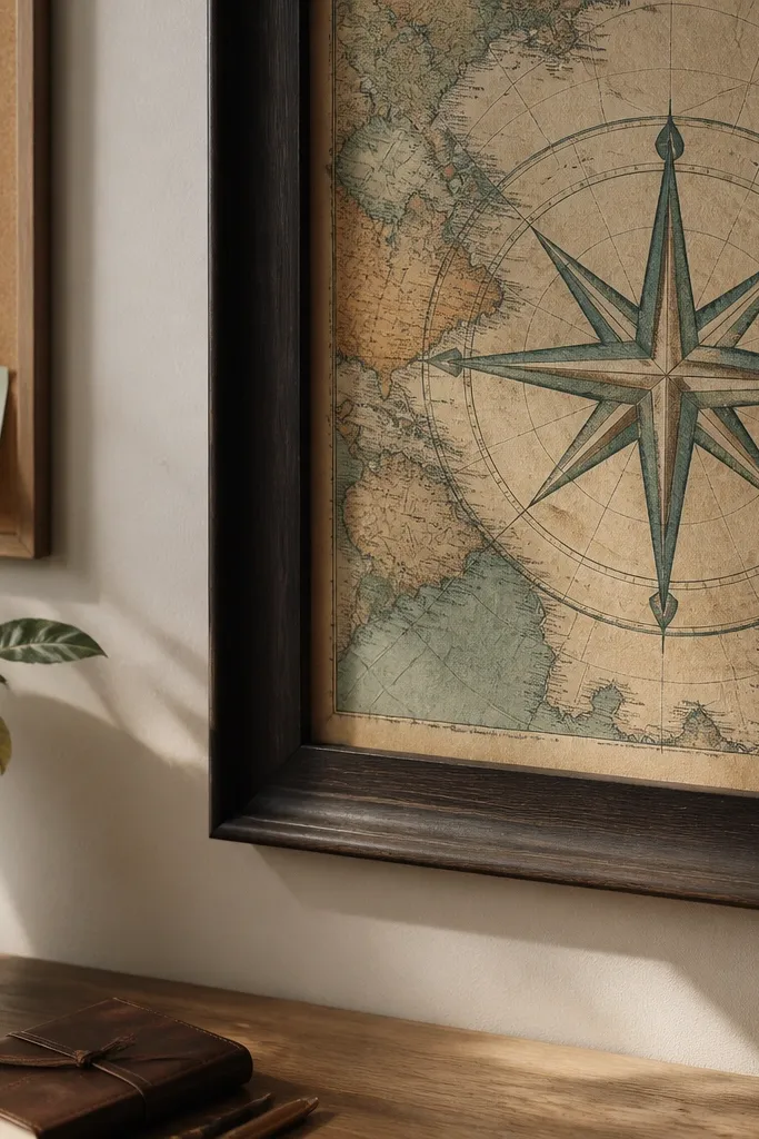
Print the map fragment at its suggested size, commonly 8x10 or A4. Trim along the map border and keep the “torn” edge if the design includes it. Mount on a kraft backing so the compass rose pops. Place in a frame with a matte or use a frame that has enough depth for paper thickness.
A map fragment gives you both vintage texture and a clear focal point. The compass rose is the part that makes it photogenic, and it stays interesting even in a simple frame. Print it on thicker paper so the map edges don’t curl. If you want the look to feel intentional, frame it slightly off-center so the compass rose lands where your eye naturally goes. It looks great in offices, bedrooms, and entryways where you want a story on the wall.
Skip thisDon’t laminate — glare kills the aged paper vibe.
Editor's noteIf your ink looks too crisp, lower contrast in your printer settings and print a test strip first.
9. Antique Recipe Card with Ingredient Columns

Print the recipe card on 90 lb cardstock in the exact size listed. Trim with a straight edge and lightly round corners using corner rounder scissors if you want a softer vintage feel. Mount on a matte board and add a small strip of kraft paper behind the bottom margin. Frame under glass so the ink stays clean and doesn’t smudge from handling.
Recipe cards look vintage because they have built-in organization: titles, ingredient lists, and step blocks. That structure makes them easy to style and easy to read, which matters when you want a print that looks good up close. Print one large card as wall art or make a set of smaller ones for a gallery. It’s beginner-friendly because you can treat it like a label — one design per frame or board. Best for kitchens, breakfast nooks, and small shelving displays.
Skip thisAvoid designs packed with tiny instructions if you want it to stay readable.
Editor's noteUse a matte finish spray for extra scuff resistance if you handle it often.
10. Vintage Post Office Stamp Sheet (Label Style)
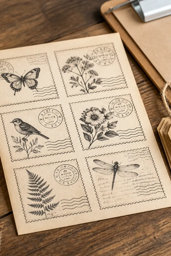
Print on 80-110 lb cardstock and set to highest quality so the edges stay defined. Cut each stamp with a craft knife and metal ruler for clean borders. If you’re making labels, punch a small hole and thread twine through, then attach to jars or packages. For framing, mount a grid of stamps onto an 8x10 board with even spacing and a narrow matte.
Stamps make vintage decor because they’re already small, layered, and graphic. This printable works as wall art, but it’s also great for crafts: make mini labels, add them to gift boxes, or use them to decorate a clipboard. The look depends on strong cancellation marks and bold stamp borders, which tend to print cleanly. Print on cardstock and keep the edges crisp so the stamp outlines look sharp. It’s a fun beginner project that turns one file into multiple decor uses.
Skip thisDon’t use thick glue blobs — they show through and ruin the flat stamp look.
Editor's noteFor extra realism, lightly distress the cut edges with sandpaper.
11. Sepia Botanica Gallery Wall Set (Three Panels)
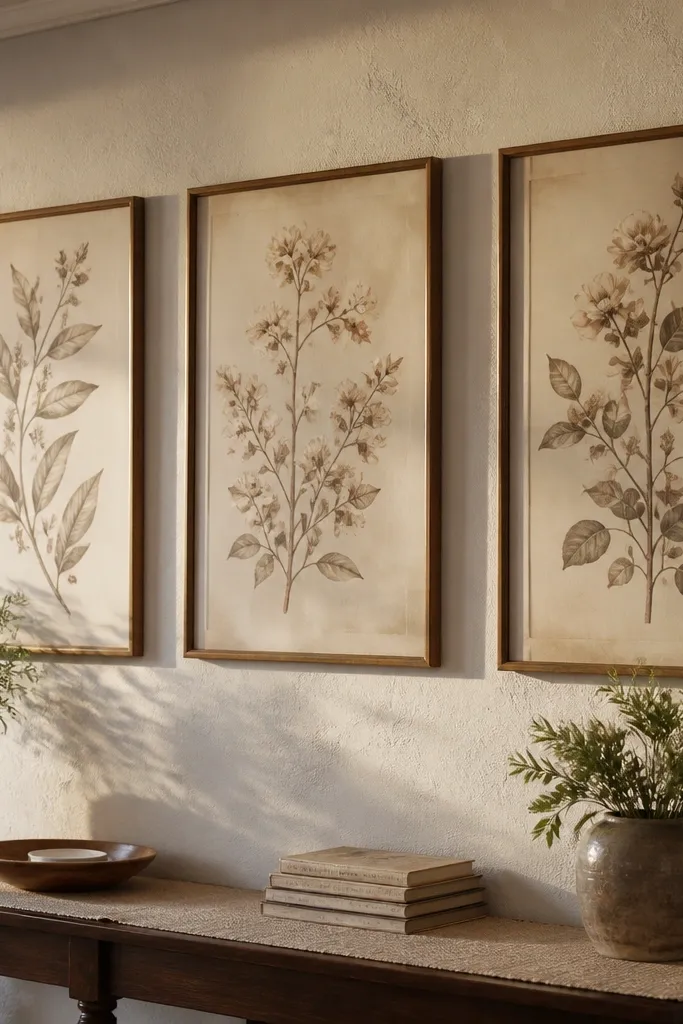
Three-panel sets look intentional on walls because you get rhythm and spacing without overthinking. This botanical style usually has consistent color and a matching border, so your gallery doesn’t look random. Print each panel, then hang them as a trio with equal gaps. It’s beginner-friendly because you’re not mixing unrelated designs; the set is already coordinated. Great for bedrooms, hallways, and above a bed where you want a calm vintage tone.
Print all three panels on cardstock and let them dry fully. Trim to match the border lines exactly so the set lines up visually. Use picture hanging strips so spacing stays consistent; measure the gap between frames with a ruler. Add a light matte behind each panel or use frames with mats to keep paper edges clean.
If your wall is light, choose frames in black or dark walnut for stronger contrast.
Don’t hang the panels too close — the set needs visible gaps to read as a trio.
12. Vintage Ticket Stub Sheet with Perforated Edges
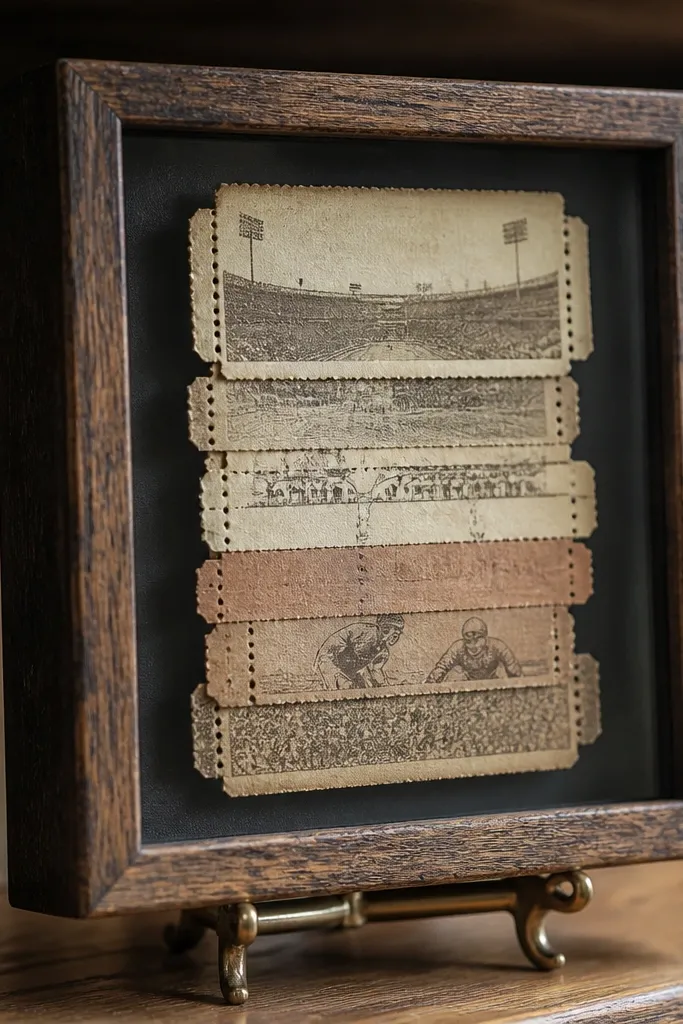
Print the ticket sheet on 90 lb cardstock. Score along the perforation lines with a craft knife and ruler, then tear for cleaner edges. Mount a small stack on a backing board using thin adhesive, leaving the edges visible. Place in a frame or shadowbox; if it’s under glass, it looks crisp and stays protected.
Ticket stubs are instantly nostalgic because they look like something you saved. A perforated-edge design gives you that satisfying “real paper” feel even when it’s printed. Print on cardstock, then cut and stack them on a shadowbox or mount them as a flat collector-style display. This is also a great beginner option for gift packaging because you can add a single stub as a tag. Works well in living rooms, craft rooms, and gift corners.
Skip thisDon’t use heavy liquid glue on perforated edges — it smears into the paper.
Editor's noteUse a paper tear method: tear slowly along the score line for a smoother perforation effect.
13. Antique Typographic Alphabet Poster Sheet
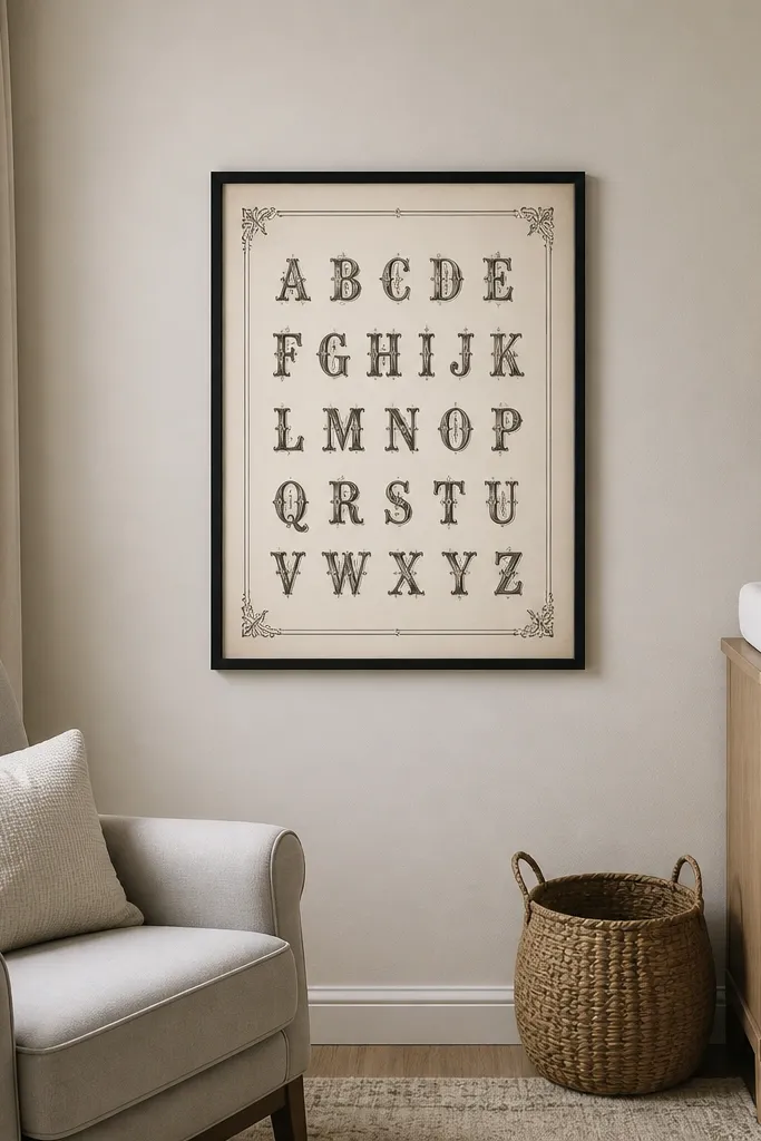
Print on 11x14 paper if you have it, or scale to A4 for a smaller framed look. Use cardstock so the letter edges stay crisp. Trim carefully and mount on a matte board with a consistent border. If you want a more vintage feel, lightly age the paper edges with a tea-brown marker or diluted ink wash before framing, then let it dry fully.
Typography printables look vintage even when you keep the rest of the decor modern. An alphabet sheet gives you a clear focal point and lots of white space, so it doesn’t feel cluttered. Print it large and frame it as a statement piece on a plain wall. The look is especially good in nurseries or kids rooms because it feels old-school without being childish. This is beginner-friendly because you’re not relying on tiny imagery — the letters carry the design.
Skip thisAvoid printing at too low a resolution; thin letter strokes disappear.
Editor's noteKeep the frame simple — white, black, or natural wood — so the type stays the hero.
14. Vintage French Labels on a Kraft Backing
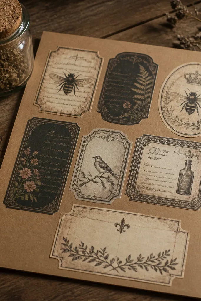
Print the label sheet on white cardstock first. Trim the labels and mount them onto kraft paper using a glue stick for even coverage. Arrange in a tidy grid with 1/8-1/4 inch gaps so it looks intentional. Seal the final board under glass if you’re using it in humid spaces.
This printable is “decor-ready” because it’s designed to look good on kraft paper, not only white backgrounds. The labels usually include borders, small icons, and aged text blocks that pop against brown. Print and mount them onto a kraft backing board to instantly make it look like a real collection. Beginners like it because the layout guides you — it’s hard to place pieces wrong. Great for pantry shelves, laundry rooms, and bathroom storage.
Skip thisDon’t over-wet kraft backing with liquid glue; it warps.
Editor's noteUse a craft knife with a fresh blade — label edges should look sharp, not ragged.
15. Vintage Encyclopedia Diagram Card
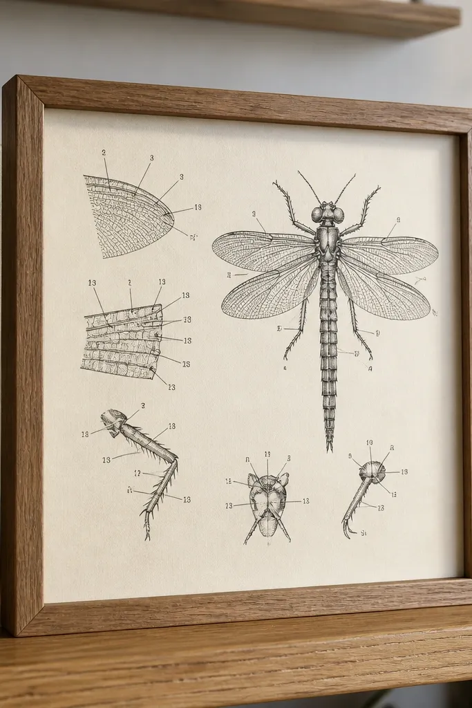
Diagram prints give you a modern-clean vintage look because the lines and numbers feel crisp. They’re also great for small decor because you can frame them without needing a lot of space. The best ones have clear callout arrows and legible numbering, so they don’t turn into clutter at a glance. Print on matte paper so the ink doesn’t reflect light. This works in offices, craft rooms, and beside desks where you want visual interest without romance-only styling.
Print the diagram at the recommended size on matte cardstock. Trim the outer border and mount on a neutral matte board. If there’s a title strip, keep it aligned at the top so the diagram reads correctly. Place under glass or in a sleeve to protect the ink from handling.
If arrows look too light, increase print darkness slightly and test on a scrap first.
Skip designs with tiny micro-text if your printer blurs fine print.
16. Old Library Card Catalog Strip
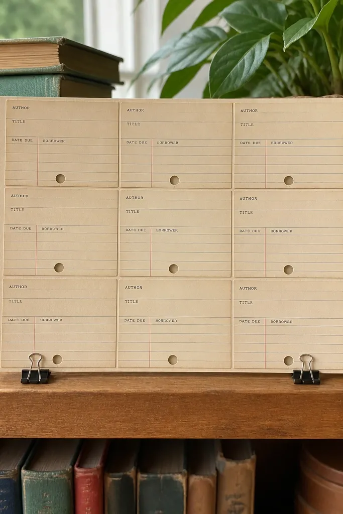
Print the card strip on 90 lb cardstock and let it dry. Cut individual cards with a ruler so the edges line up cleanly. Mount them onto a backing board in a neat row, leaving a consistent margin around the edges. Frame with a simple mat so the cards look like they’re sitting inside a file drawer.
Library card printables look vintage because they’re built from a familiar grid and typing style. A strip format is especially photogenic because you get multiple cards in one frame or display. Use it on a small shelf with clips, or mount it into a single 8x10 board for wall art. It’s beginner-friendly because the card layout tells you how to crop and where to place it. Best for home offices, reading rooms, and craft corners.
Skip thisDon’t leave cards loose — they curl and look sloppy on display.
Editor's noteUse spring clips on a string or cord if you want it to change seasonally.
17. Vintage French Ornate Border Sheet (Frame-Ready)
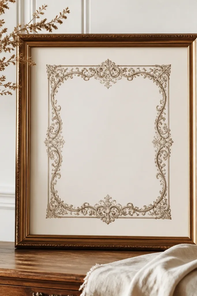
An ornate border printable is a shortcut to a high-end look because it gives you the frame aesthetic without needing extra design skills. The blank center means you can add your own quote, date, or a simple photo. Print it, mount it, and you get a finished piece that looks like vintage stationery. The border should have thick lines and strong corners so it prints cleanly. Great for gifts, mantel decor, and wedding-style keepsakes.
Print the border sheet on 90 lb cardstock. Trim to the outer edge and score the center window if the file includes cut lines. Add your own insert behind the window using a smaller cardstock rectangle. Seal under glass and keep the insert matte so it doesn’t glare.
Choose a font for your insert that matches the border tone — a simple serif looks best.
Don’t use glossy inserts; the shine fights the vintage border.
18. Aged Paper Envelope Liner (Printable Insert)
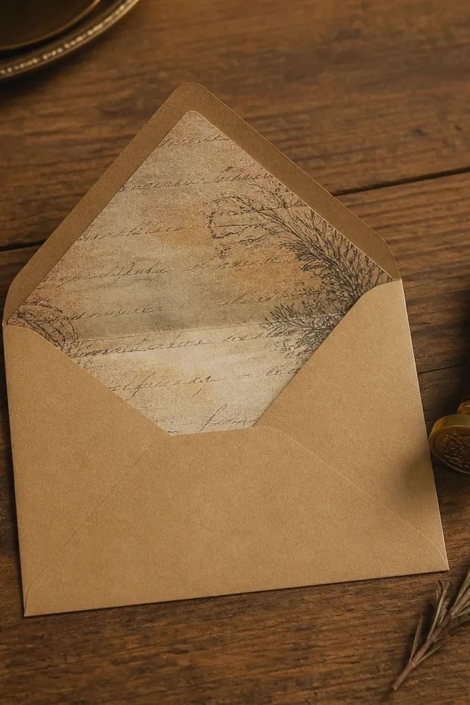
Envelope liners are the kind of vintage paper printable people notice because the details show when you open something. The liner look is also useful for DIY gift packaging, wedding invitations, and keepsake cards. Print it as a single insert and it instantly upgrades a plain envelope. It’s beginner-friendly because you’re not arranging multiple elements; you’re sliding one piece into place. Works for gift cards, small thank-you notes, and party favors.
Measure your envelope opening width and height first. Print the liner at the closest size, then trim until it fits without bunching. Fold the liner along any printed guide lines so it sits flat inside the envelope. If you want it sturdier, print on thicker cardstock and seal with a clear matte finish after trimming.
Test-fit one corner before you cut the whole thing — liners are easy to misalign.
Avoid printing on thin copy paper; it wrinkles inside envelopes.
19. Vintage Ticket + Stamp Collage Tag Sheet
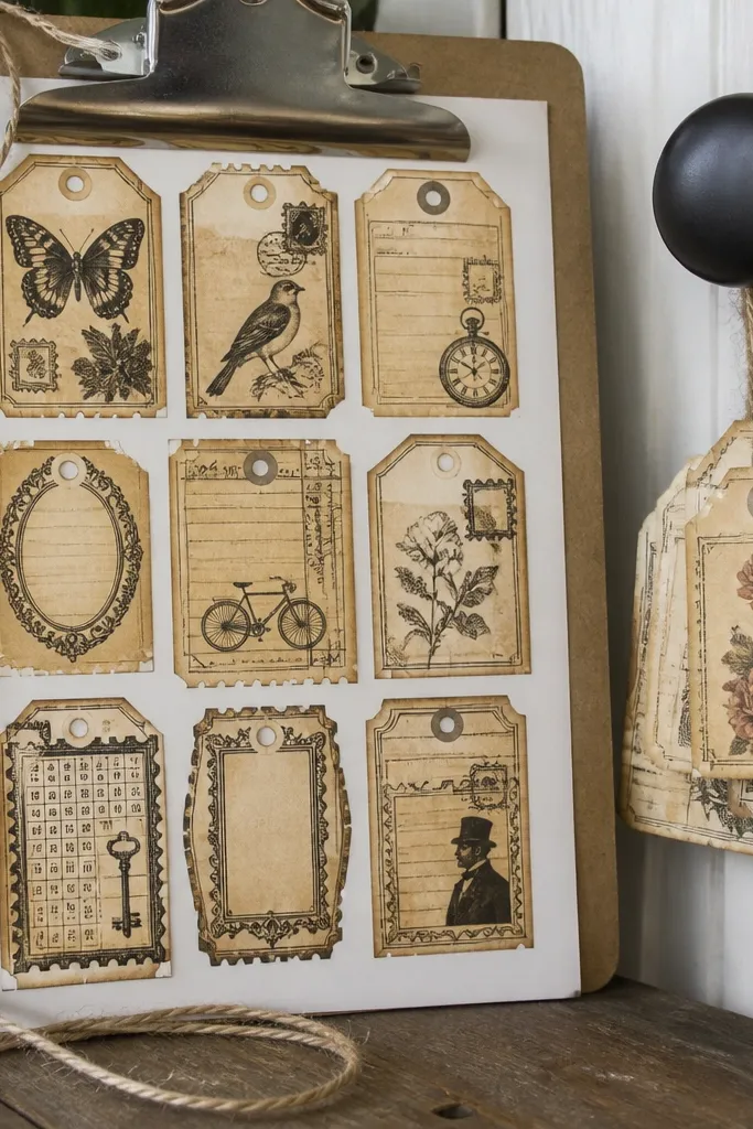
This is a beginner-friendly printable pack because it gives you small decor pieces you can use immediately. Tags are photogenic when they’re layered with twine, stacked on a clipboard, or attached to gift boxes. The collage style makes it look collected, not repetitive. Print on cardstock, cut, punch holes, and you have ready-to-use accents. Great for gift wrapping, craft storage labeling, and seasonal decor.
Print the tag sheet on 80-110 lb cardstock. Cut each tag cleanly and punch a hole near the top using a single-hole punch. Thread twine or ribbon through and tie with a short loop so the tag hangs flat. If you want a display, pin tags onto a corkboard or mount them under glass in a shadowbox.
Use matte tape on the back so the twine doesn’t tug the fibers.
Don’t punch too close to the edge — it tears the vintage border.
20. Vintage Typographic Quotes on A4 Cards
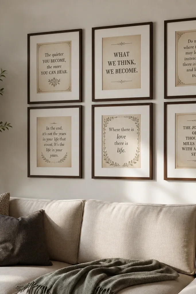
Print each quote card on matte cardstock and set quality to high. Trim exactly to the card border so the typography stays centered. Mount on a neutral matte board or add a thin craft-paper backing strip behind one side for depth. Frame with glass if you plan to keep it in a high-touch area.
Quote cards are one of the simplest ways to make vintage paper look intentional on a wall. The design usually has strong typography, generous margins, and small decorative flourishes that print clearly. Print a set, then choose a theme for your display: French phrases, library-style quotes, or simple single-line sayings. This works in living rooms and bedrooms where you want decor that feels personal without needing photos. Beginners like it because it’s basically plug-and-frame.
Skip thisDon’t print quotes too close to the page edge; home printers clip margins.
Editor's notePick one frame style and repeat it — matching frames make quote sets look designed.
21. Vintage Botanical Label Strip for Jars
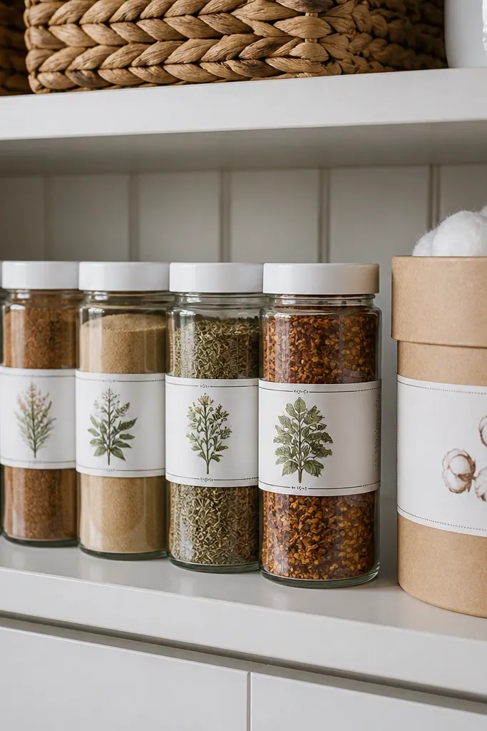
Print the label strip on 90 lb cardstock and cut into individual labels. If the labels are designed to wrap, score a light fold line where the design suggests it. Apply with matte glue stick for clean edges, then press for 30 seconds. For a more durable finish, seal the label surface with a matte clear coat made for paper.
A label strip is practical and pretty, which is why it works for real homes. You get multiple jar labels from one printable, and the botanical illustrations add color without looking childish. The strip format is also great for beginners because the spacing is already planned. Place labels on spice jars, cotton canisters, or bathroom storage. It’s photogenic because jars stack nicely and the labels create a repeating rhythm.
Skip thisSkip glossy label paper; it looks shiny and less vintage.
Editor's noteUse a damp cloth to clean jars first; dust makes labels peel at the corners.
22. Vintage Sewing Pattern Sheet with Notches
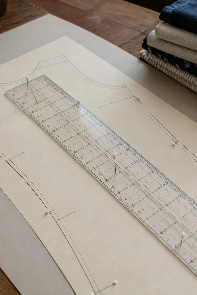
Sewing pattern sheets look vintage because they’re technical and graphic at the same time. The best printables include cut piece outlines and labeled sections, so it feels like a real pattern archive. Print it on matte cardstock and frame it like a poster, or cut the pieces out and use them as tags and gift accents. It’s beginner-friendly if you pick a version with thick lines and large labels; tiny pattern numbers disappear on home printers. Great for craft rooms and studios.
Print the pattern sheet at the given size on matte cardstock. Trim to the border and frame it under glass. If you want to use pieces, cut along the outer outlines only — don’t try to cut every notch on day one. Seal any cut pieces with a matte spray so the ink stays protected during handling.
Use a metal ruler and fresh blade for clean pattern edges.
Don’t laminate pattern prints; it creates glare and makes lines look plasticky.
23. Vintage Nursery Bookplate with Decorative Frame
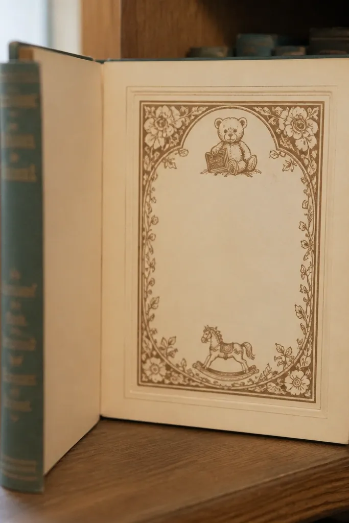
Print the bookplate on 80-110 lb cardstock. Trim along the outer border and round the corners if the design allows it. Apply to the inside cover with a glue stick for even adhesion. If you want it to last, seal over the bookplate with a matte medium and let it dry fully.
Bookplates are small, but they read as vintage because they’re designed to sit on a book spine or inside cover. This printable gives you a ready-to-use label frame that looks like it came from an old library. Print it on cardstock, then apply to a book or scrapbook page. It’s beginner-friendly because it’s one clean placement, not a layout puzzle. Works for kids' books, journaling, and keepsake albums.
Skip thisDon’t use liquid white glue; it can soak in and wrinkle the paper.
Editor's noteUse a bone folder to press the edges down smoothly.
24. Old World Map Compass Rose Coaster Print
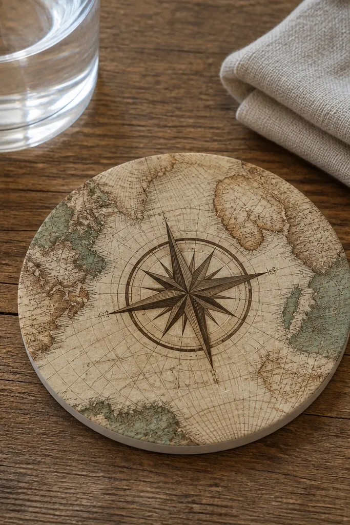
Coaster-sized printables are a sneaky way to make vintage paper look polished. The compass rose is bold and graphic, so it stays readable when printed small. You get a clean vintage look that also protects surfaces if you seal it correctly. This is beginner-friendly because the circle format tells you exactly what to cut. Great for coffee tables, bedside tables, and craft-room counters where you want small decor that still photographs well.
Print the circular design on cardstock and cut circles with a circle cutter or template. Seal the top with a clear matte or satin sealer for water resistance. Glue the sealed circle onto a cork or felt base using strong craft adhesive. Let it cure flat so the coaster doesn’t warp.
Do a test coaster first to match your printer’s color — small prints show color shifts fast.
Don’t skip sealing; moisture will ruin the ink quickly.
25. Vintage French Sheet Music Notes Panel
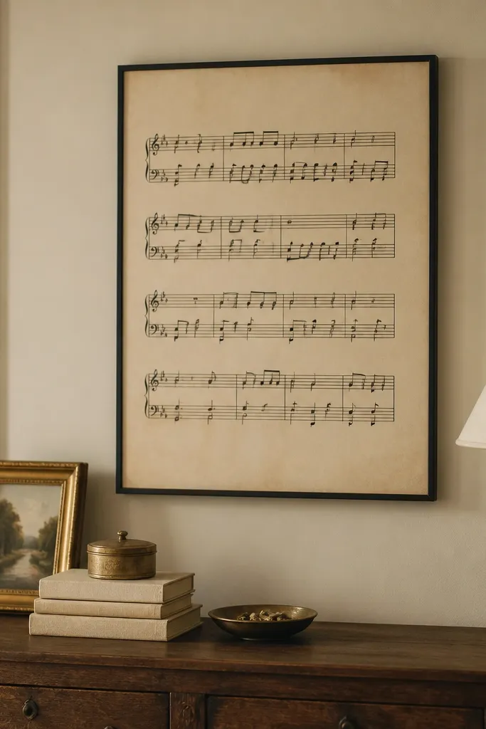
Print the sheet music at 8x10 or 11x14 if you have a matching frame. Use matte cardstock to reduce glare. Trim and mount on a matte board so the paper sits flat. For extra authenticity, lightly distress the outer edges with a sanding sponge, then keep it under glass.
Sheet music printables give you instant texture because the lines and spacing create a visual pattern even from a distance. A panel layout makes it look like a framed antique rather than a random music page. Print on warm cream paper so the lines look like ink, not gray toner. Frame it with a simple black frame and it goes with modern furniture too. Great for living rooms, dining rooms, and music corners.
Skip thisAvoid super light sheet music; it disappears on home printers.
Editor's noteIf the notes look too dark, lower contrast in your print settings and reprint a single sheet first.
26. Vintage Hotel Key Tag Label Sheet
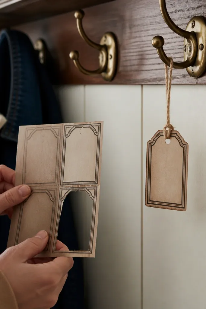
Print the tag sheet on cardstock. Cut each tag and punch a hole at the top. Thread twine or ribbon through and tie a knot that sits flat against the tag. If you’re using them on keys, attach to a small key ring and avoid adding bulky hardware that covers the design.
Key tags look vintage because they’re designed for hanging, and hanging decor always photographs better. This printable gives you a label you can punch and thread onto a ring, ribbon, or twine. Use them as actual key tags, on closet hooks, or as gift tags for housewarming presents. It’s beginner-friendly because the build is simple: print, cut, punch, attach. The look is bold and graphic, so it reads clearly even at small sizes.
Skip thisDon’t use flimsy paper; it bends and the typography looks wrinkled.
Editor's noteUse a slightly thicker ribbon so the tag hangs straight and doesn’t curl.
27. Vintage Botanical Frame Corner Set (DIY Border)
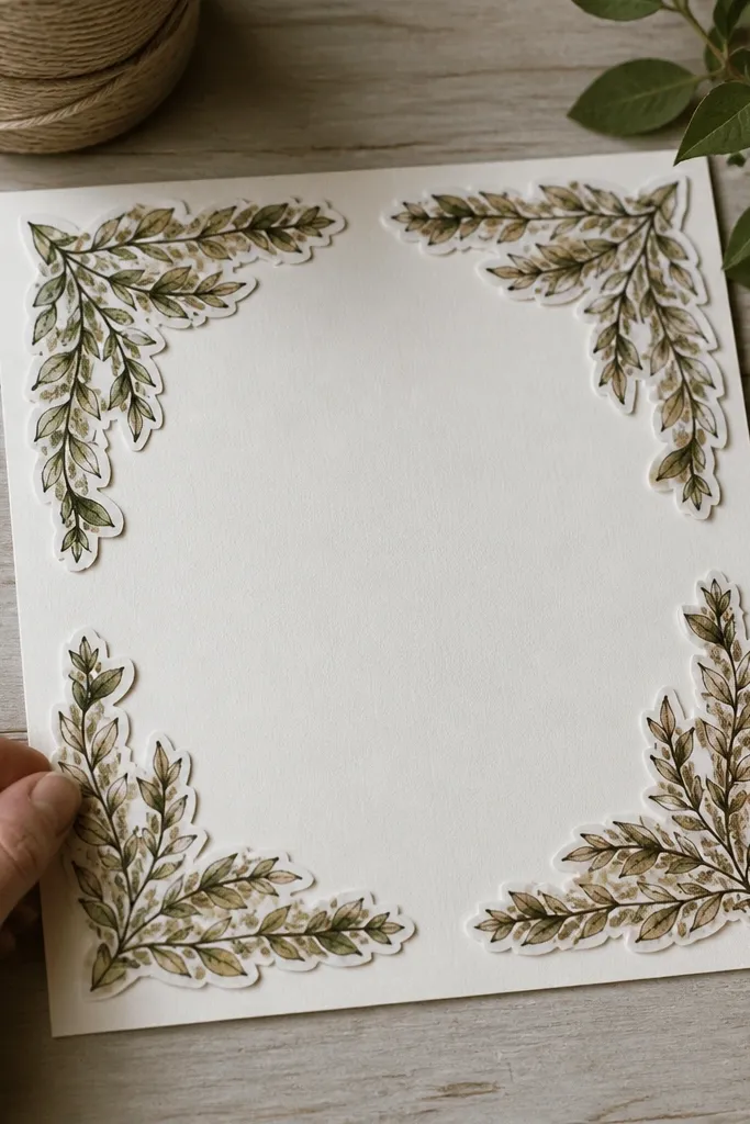
Print the corner set on cardstock and cut each corner precisely along the border line. Dry-fit the corners to your matte so the placement matches the center window. Glue with a thin layer of glue stick, pressing for 20-30 seconds so edges don’t lift. Add your center print behind the matte and place it in a frame with a mat or spacer so nothing warps.
Corner sets are a great beginner-friendly Vintage Paper Printable because they let you build your own frame look around any center image. The corners usually have leaves, vines, or botanical flourishes that make the whole piece feel coordinated. Print the corners on cardstock, then apply them to a blank matte or a plain paper center you already like. This approach gives you control and keeps costs low. It’s perfect for turning a plain quote into something that looks like antique stationery.
Skip thisDon’t overfill corners with glue; it squeezes out and makes the botanical edges look messy.
Editor's noteUse a ruler to keep the corner margins even — symmetry reads as “designed.”
28. Aged Paper Background Sheet with Dark Edges (Matting Base)
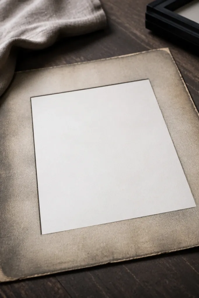
Print the background on 90 lb cardstock at the recommended size. Trim it so it sits behind your main print with a clean border, usually 1/4 to 1/2 inch. Use glue stick to attach the background to a backing board, then place the main print on top. Frame the layered piece under glass to keep the paper edges protected.
This printable isn’t a “picture” — it’s a background that makes other vintage printables look better. Darkened edges and subtle texture create instant depth, so your framed print looks more like layered paper. Beginners like it because you can use it with almost any center design: quotes, labels, or a photo insert. Print it on cardstock and trim as a mat behind your main print. It’s especially good when your main design looks too flat.
Skip thisDon’t glue the background directly to glossy photo paper — the layers can lift.
Editor's noteIf the edges look too dark, reprint once with a lighter printer setting and compare side-by-side.
29. French Pharmacy Vial Labels Sheet (2 Sizes + Tiny Warnings)
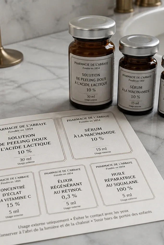
This is the kind of beginner-friendly Vintage Paper Printable that makes your shelf look styled in minutes. You get two label sizes for small glass apothecary vials plus a set of tiny “warning” lines that sit under the main text like real old packaging. The design is built for close-up viewing — narrow type, tight alignment, and slightly distressed ink tones that look good even when you print at home. Print, cut, and apply to jars, bottles, or craft-store glass containers for a French pharmacy vibe that reads vintage without needing any fancy tools. It takes about 20-30 minutes total, and it fits kitchens, bathroom counters, and a craft room where you want things to look intentional.
Print the sheet on matte photo paper or thick cardstock (150-200 gsm). Cut the labels with a craft knife and metal ruler for straight edges, or use scissors for the smaller ones. If you want a more “printed label on glass” look, run each label through a warm laminating pouch (no heat press needed) and trim close to the border. Prep your vial with a quick wipe using isopropyl alcohol on a lint-free cloth, then apply the label so it sits centered and straight. Seal the edges with a thin coat of clear drying glue or Mod Podge matte, then let it dry flat for 1-2 hours before handling.
For clean placement, measure the vial circumference and lightly mark the centerline on the glass with a removable painter’s tape strip before sticking the label.
Skip glossy paper — it reflects light and makes the ink look too new.
30. Antique Windowpane Recipe Card Set with Faux Cracks
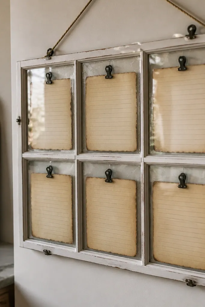
Choose a paper that takes ink cleanly: 110-160 gsm cotton-style paper or matte cardstock works best for the crack texture. Print at 100% scale, then cut each card to a consistent size using a paper trimmer (a 5x7 or 4x6 card size works well with this layout). If you want the “glass” illusion, layer the card behind a clear acrylic sheet or place it under a small frame with real glass — the grid lines pop when there’s a reflective surface. Add a thin border by trimming a second backing sheet slightly larger, then glue the print to the backing with matte glue. Let everything dry flat to avoid warping before you hang or tuck it into a frame.
This set turns plain recipe cards into something you can hang like vintage art. The “windowpane” layout gives you a grid for ingredient lines and steps, but the faux cracks and aged paper edges make it feel like old printed ephemera under glass. It’s beginner-friendly because you’re only printing and cutting; no distressing techniques required beyond choosing the right paper. The finish looks great as a framed set, taped to a clipboard, or arranged in a kitchen drawer insert for a styled, collectible feel. Plan for about 30-45 minutes from print to ready-to-display, and it fits kitchens, home offices, and recipe stations where you want function plus atmosphere.
Skip thisDon’t use heavy glitter inks or metallic pens — the crack texture gets lost under shine.
Editor's noteUse a matte clear sheet protector for the crack effect if you don’t want glass frames — it keeps the paper from scuffing and softens glare.



