
1. The 3-Row Grid With One Big Anchor
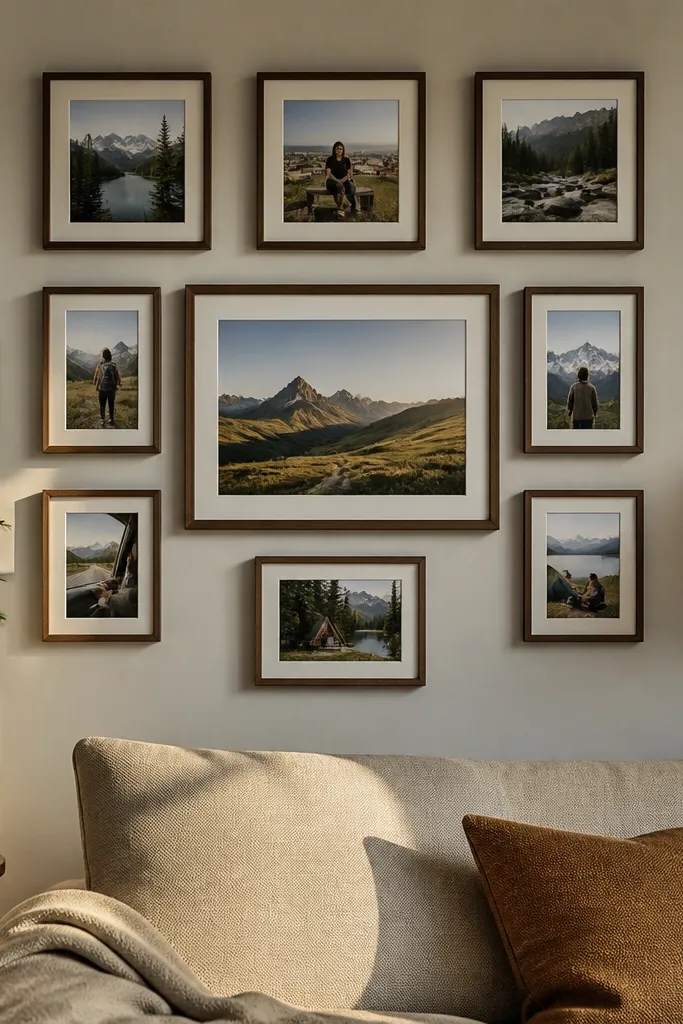
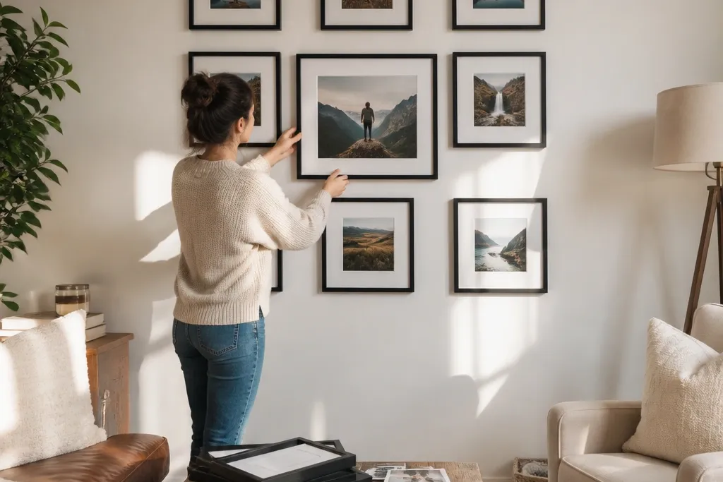
This layout makes a blank wall feel “designed” because the grid tells the eye where to land. You place one larger centerpiece photo in the middle row, then surround it with equally spaced smaller frames. It’s beginner-friendly because the math is simple and the spacing stays consistent. Use it when you have a mix of photo sizes and want everything to look tidy instead of chaotic. The result reads clean from across the room, with enough visual variety from the bigger anchor photo.
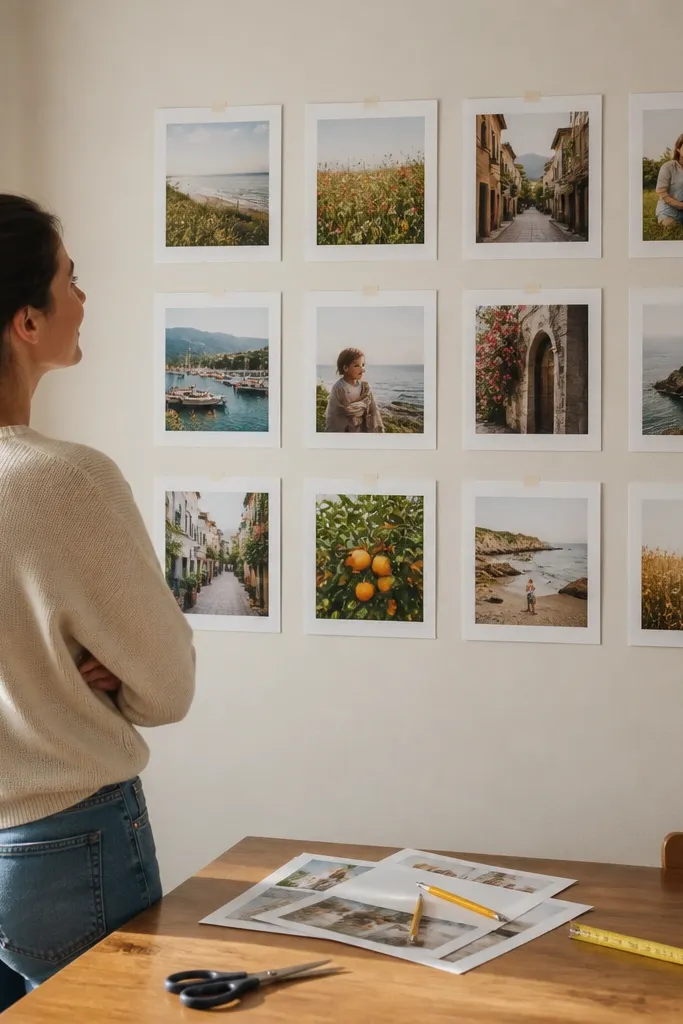
Measure your wall width and mark a center point. Lay out three rows of frames with equal vertical spacing; make the center frame larger (about 2x the area of the side frames). Print paper templates for each frame size, tape them to the wall, and confirm the spacing from standing height. Level and mark only after the templates look right, then mount using picture-hanging hooks or a French cleat if your frames are heavy. Finish by tightening gaps so the border edges look aligned across the grid.
Choose one border color (white mat or natural wood) for every frame so the grid looks intentional.
Don’t mix drastically different frame depths — it creates shadows that make spacing look messy.
2. Black Frame Checkerboard (4x4 Look Without the Full Grid)
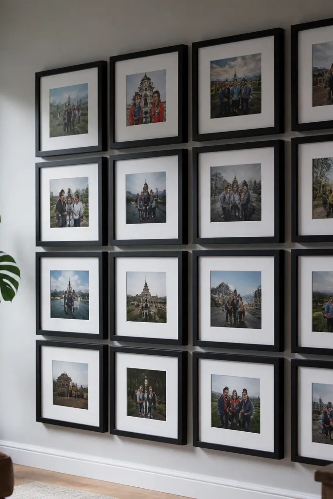
A checkerboard pattern gives you that graphic, magazine-wall feeling without requiring perfect symmetry everywhere. You alternate frame sizes or leave small gaps so the wall breathes. This works great for a beginner-friendly photo wall collage because it hides uneven photo cropping; the pattern makes it look styled. Use black frames for maximum contrast against light walls, or go dark wood if your wall is already warm-toned. The spacing also makes it easy to add a new frame later without redoing the whole wall.
Pick two frame sizes: a square-ish size (like 8x8 or 8x10 with a mat) and a smaller companion (like 5x7). Decide on a layout that feels like four-by-four from a distance but uses fewer frames (for example, 10-12 frames total). Tape templates in the checker order, alternating sizes, and keep the gap between frames consistent. Mount the larger frames first so your pattern anchors correctly, then fill in smaller ones. Use a level and a measuring tape for horizontal alignment so the checker lines don’t drift.
Editor's noteKeep all frames the same brand or at least the same glass finish so reflections don’t vary frame-to-frame.
Skip thisDon’t use mixed metal colors (black + brass) — it breaks the clean checkerboard look.
3. Staggered Gallery Wall With Consistent Borders
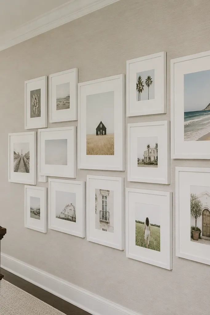
This is the “real-life gallery” look that still works for beginners because the borders unify everything. You stagger frame positions like a salon wall, but you keep the mat border thickness identical across frames. That single choice makes the collage look cohesive even when your photos vary. It’s ideal when you have mostly standard photo prints and want a polished result without custom layouts. The stagger adds movement, while the consistent border keeps it from looking messy.
Choose one mat style and border width (for example, a 1.25-inch white mat) and stick to it across frames. Start with a center frame, then place two frames to the left and right at slightly different heights (about 1-2 inches higher/lower). Continue outward, keeping horizontal gaps in the same range (about 2-3 inches). Tape everything first, then take photos of the layout from two angles so you can adjust before drilling. Hang the heaviest frame at the center and work outward, using spacers or painter’s tape to keep gaps even.
Editor's noteIf you’re using different frame sizes, keep the mat opening the same size whenever possible to reduce visual noise.
Skip thisDon’t eyeball the spacing — staggered walls look sloppy when gaps vary wildly.
4. Polaroid-Style Collage With Real Paper Margins

Polaroid-style layouts look playful and intentional because the white margins create a consistent frame around every photo. You get an instant scrapbook vibe without needing fancy framing hardware. This is excellent for a beginner-friendly photo wall collage because you can scale the look by changing the print size while keeping the margin rules the same. It also works when some photos are vertical and others are horizontal. The thick paper border makes the collage readable even if your prints aren’t perfectly color-matched.
Print or trim your photos to a consistent photo size (like 4x6 or 5x7) and decide a margin width (about 1.5 inches). Cut thick cardstock or photo paper for each “polaroid” base, leaving a top margin slightly larger than the sides. Tape or glue the photo to the cardstock base, then arrange on the wall with even overlaps or even gaps. Use removable tape under the corners if you want flexibility. Once the spacing looks right, mount a few key pieces firmly and leave others on lighter adhesive strips.
Editor's noteUse matte cardstock so glare doesn’t flatten the photos.
Skip thisSkip shiny photo paper for this look — it fights the paper-margins aesthetic.
5. Vertical Timeline Strip (Down the Wall)
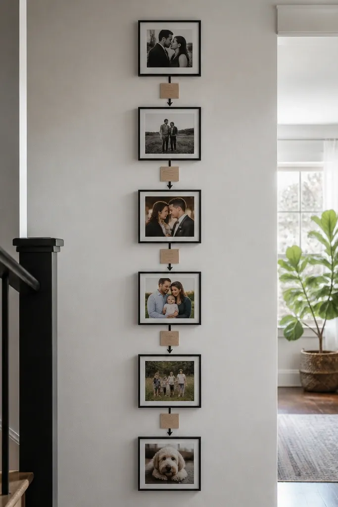
A vertical timeline turns your collage into a clear story path, so it never looks random. You stack photos in a single main column, then add small label cards or arrow markers to show order. This works especially well in entryways or stair landings where vertical movement feels natural. It’s beginner-friendly because you only have one “spine” to align, then you repeat spacing. Use it for travel, family milestones, or seasonal changes. The labels also make the wall feel curated without needing matching frames for every image.
Choose a column width and a frame or mat style for all photos in the strip (for example, 8x10 frames with 1-inch mat). Decide the number of photos that fit your wall height, then keep consistent spacing between frames (about 2-3 inches). Add small label cards under some photos using the same paper color each time. Tape the full timeline template to the wall first so you can verify height. Mount the spine frames first, then place labels and arrows last so your chronology looks clean.
Editor's noteUse one font style for labels (simple sans-serif) and keep label text short — 3-6 words each.
Skip thisDon’t mix label styles (fonts and colors) — it turns into clutter fast.
6. Mirror-Matte Photo Band (Moody, Modern)
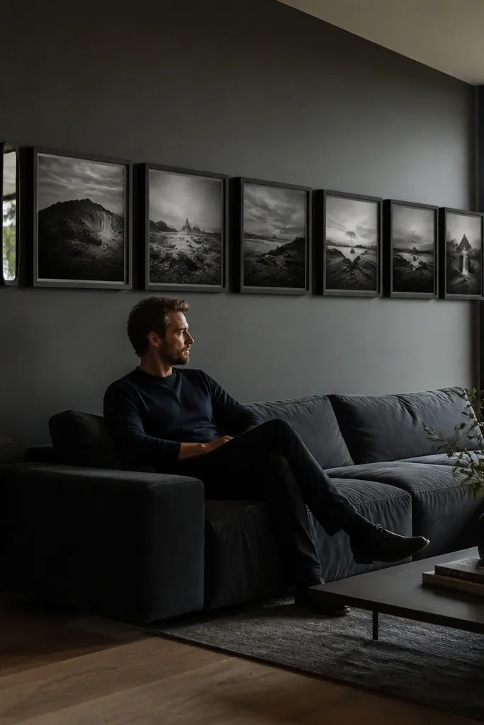
A horizontal band looks sleek because it reads like one design element instead of scattered frames. You use dark matte frames and keep the photo borders minimal, letting the photos do the work. This is a strong beginner-friendly photo wall collage option for living rooms because it sits at eye level and doesn’t overwhelm a wide wall. The look is especially good with black-and-white photos or high-contrast images. It also helps if you don’t have many photos — a band can be 6-8 frames and still feel intentional.
Pick frames in one finish (matte black or dark walnut) and choose a consistent size across the set. Decide the band height by measuring the total frame height plus equal gaps; aim for a band that sits centered at about 57-60 inches from the floor to the middle of the collage. Tape templates to confirm the band placement. Hang using a level line across the wall, then install the frames one by one. Add a thin shelf or a row of small ledge mounts only if you want a layered look without changing alignment.
If your photos have mixed tones, convert them to black-and-white so the band looks cohesive.
Don’t use thick white mats here — they fight the modern, dark band vibe.
7. Wood Ledge + Floating Photos (No Frames)
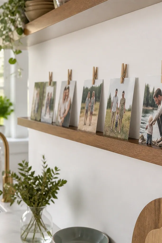
Floating photos give you a fresh, airy collage look, and you can rearrange later without remaking anything. This works well when you want a beginner-friendly photo wall collage that doesn’t require perfect frame alignment. You mount a slim wood ledge and use photo clips or small clothespins to hold prints. The photos show texture and color directly, so it looks warm and lived-in. It’s great for kids' artwork, travel prints, or rotating seasonal photos. The downside is it needs a clean mounting line, but the ledge makes that easy to control.
Choose a ledge depth around 1-2 inches so photos don’t sag. Mount a level ledge at your desired height (centered around eye level). Print photos to a consistent size, then clip them to the ledge using spring clips or mini clothespins. Space clips evenly using a ruler or pre-marked tape marks. If you want a second row, add a second ledge above, but keep the photo sizes consistent so the wall doesn’t look lopsided.
Use a matte clear spray on the photos if your prints are on thinner paper and you want better durability.
Skip glossy photo paper with strong lighting — reflections make clips look messy.
8. Color-Blocked Frames (One Color Per Row)
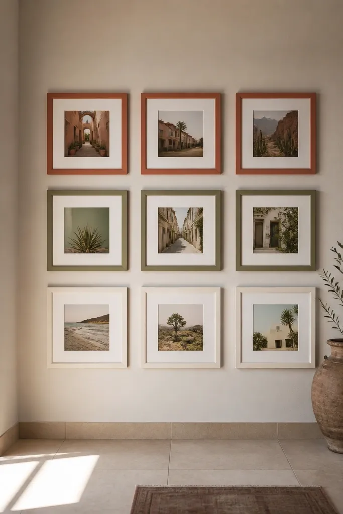
Color-blocking is the quickest way to make a beginner-friendly photo wall collage look intentional, even if your photos aren’t from the same set. You assign one color story per row: warm tones on the top, cool tones in the middle, neutrals on the bottom. The frames can all be the same style, but the photos do the “design work.” This layout looks especially good in rooms with strong existing decor colors. It also helps you edit your photo selection because you can reject images that break the row’s color story.
Pick a frame style you’ll repeat (same frame size and mat color). Choose 3-4 color themes and sort your photos into those buckets. Arrange the wall in rows where each row has a consistent theme and consistent spacing. Tape templates first so you can adjust which photos go where without committing to mounting. After you hang, step back and check if each row feels cohesive from across the room; swap only one photo if a row feels off.
Editor's noteIf you’re unsure, start with grayscale for one row — it stabilizes everything.
Skip thisDon’t use random color photos in the same row — it kills the block effect.
9. Round Frames Cluster (Big Impact, Small Effort)
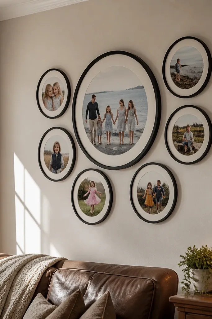
Round frames soften a wall and instantly make the collage feel curated. You can build the whole look around one large round frame, then surround it with smaller circles in a loose cluster. This is beginner-friendly because circles are forgiving — you’re not lining up corners, and the cluster hides small spacing errors. It’s a great option for modern interiors with curved furniture or warm lighting. If you keep the frame color consistent, it looks designed even with mixed photo orientations.
Choose one large round frame size (like 12-inch diameter) and one smaller size (like 8-inch). Arrange them in a cluster with a clear center point, then add rectangular frames only if you want contrast (keep it minimal). Tape templates on the wall and adjust until the cluster feels balanced. Mount the largest circle first, then build outward. Use a spacer or measuring tape to keep the gaps between circles consistent around the cluster.
Editor's noteMatch the photo content to the curve: use portraits or close-ups in the round frames and landscapes in rectangles.
Skip thisDon’t let circles overlap your main subject — keep clear gaps for a clean look.
10. Photo + Fabric Swatch Wall (Textile Backdrop)
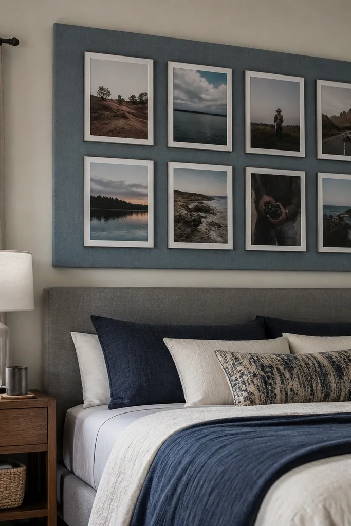
This collage looks richer because fabric adds texture behind the photos. You mount a fabric panel or stretched canvas on the wall, then place photos on top in a neat grid or stagger. It’s a beginner-friendly photo wall collage option when your wall is plain and you want depth without painting. Choose a fabric color that matches your room palette, then pick photos that either match the fabric tones or contrast them. The photos look more “styled” because the fabric acts like a giant background mat.
Pick a fabric large enough to cover an area about 2-3 feet wide and stretch it tight over a backing board or use a frame system. Mount the fabric backdrop to the wall flat and wrinkle-free. Print photos to consistent sizes and mount them using photo corners or adhesive strips. Arrange in a grid so spacing stays clean. Finish by adding a thin trim strip or border around the fabric panel if you want a finished edge.
Editor's noteUse iron-on fabric stabilizer on the back if your fabric stretches while you mount it.
Skip thisSkip stretchy knits — they wrinkle and fight your photo alignment.
11. Oversized Mat Frames (Gallery Calm)
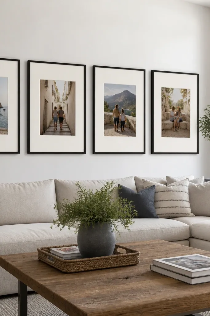
Oversized mats make your collage look expensive because they create breathing room around each photo. You repeat one oversized mat size across frames, so the whole wall feels uniform. This is beginner-friendly because it hides small differences in photo sizes and reduces visual clutter. It’s ideal for bright walls and minimal interiors where you want the photos to look like art prints. The downside is you need wall space — but that’s exactly why the look works.
Choose frames that fit your photo prints, then upgrade the mat to a larger border (for example, a 2-3 inch mat). Plan a layout with fewer frames, like 5-7, so the mats don’t crowd. Tape templates first to confirm the overall rectangle of the collage. Mount the frames in a straight line or a simple two-row arrangement with consistent gaps. Hang at eye level, then check sightlines from the couch or doorway to make sure the mats read cleanly.
Editor's noteKeep mat color consistent (white or warm ivory) — it makes the whole wall look intentional.
Skip thisDon’t mix mat colors — it breaks the calm, gallery effect.
12. Vintage Postcard Wall With One Ripped Corner
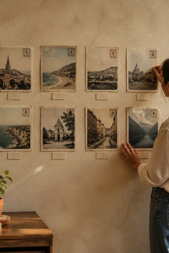
A postcard-style layout feels collected and personal, and it’s easier than it sounds. You print photos with postcard dimensions and add faux stamps or handwritten-style dates on small labels. The look works for travel photos, family history, or any mix of casual images. It’s beginner-friendly because postcard sizes are consistent, so your spacing stays simple. The “one ripped corner” detail gives it a lived-in, artsy edge without needing true distressed materials.
Print your photos onto cardstock at postcard proportions (commonly 4x6). Add a thin border if needed so it looks like a postcard, then create small label cards for dates or locations. Arrange them in a grid with slight overlaps or consistent gaps, depending on how curated you want it. For the ripped-corner effect, cut one corner of one photo base slightly irregular and tape it down lightly so it looks like paper. Mount using adhesive strips or small nails through the postcard backing if it’s thick cardstock.
Editor's noteUse a warm off-white background label color so the dates look intentional, not random.
Skip thisDon’t put every photo at a different rotation angle — keep it mostly level.
13. Monochrome Picture Strip With Numbered Captions
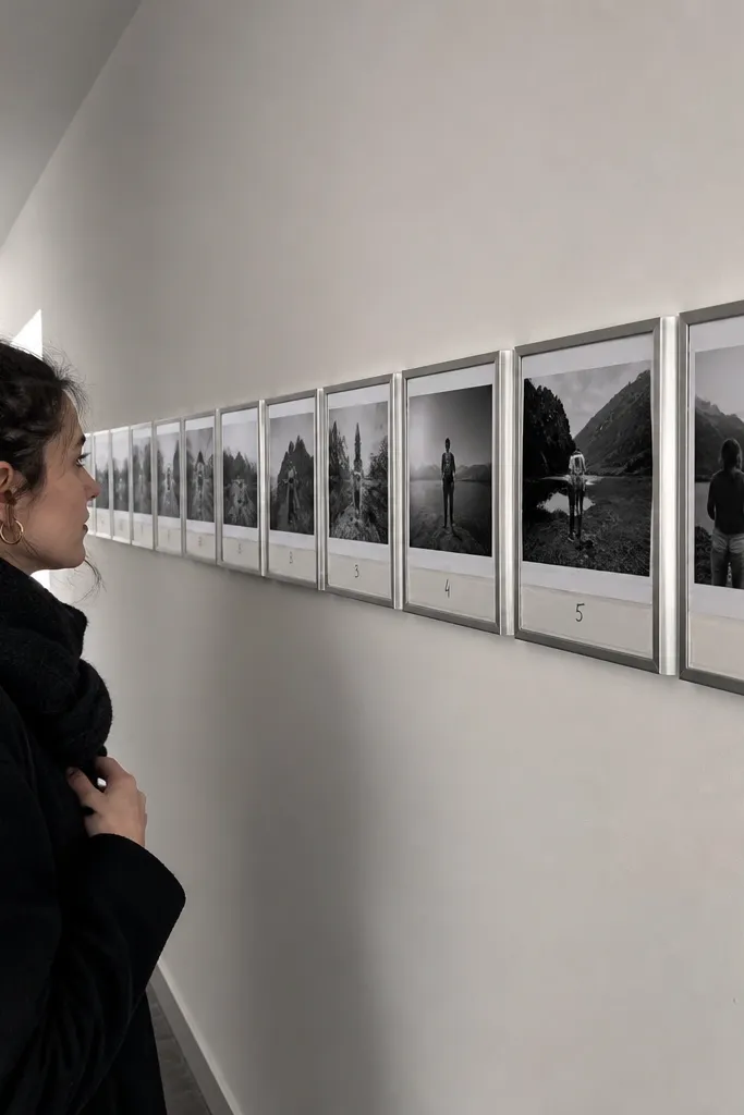
A monochrome strip gives you a clean, editorial feel and makes the collage look like a single design piece. You print all photos in black-and-white, then add small numbered captions under each one. This is beginner-friendly because the captions help you keep order and stop the wall from feeling like a jumble. It also works well in narrow walls where a vertical timeline might be too tall. Keep the strip tight and consistent, and it looks sharp even with varied photo subjects.
Convert your photos to black-and-white and print them in consistent sizes (like 4x6). Choose a mat or border style that matches your room, then print small captions with numbers 1-8 or 1-10. Arrange photos in a single horizontal strip, keeping equal spacing between frames or mats. Tape templates on the wall to align the strip height across the wall. Mount the strip frames, then attach captions centered under each photo.
Editor's noteUse a simple numbered font and keep caption text short to avoid clutter.
Skip thisSkip color accents — one neon caption color is enough to break the monochrome look.
14. Frame Within a Frame (Shadow Box Collage)
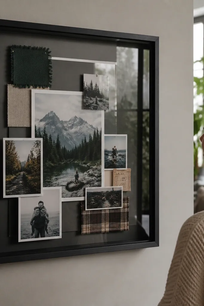
Layered shadow box collages look deep and intentional because you’re not just mounting photos flat. You use a larger shadow box frame and place photos on different depths, maybe with small ticket stubs or fabric swatches behind glass. It’s beginner-friendly because the outer frame contains the chaos — everything stays inside one boundary. This works when you want one statement piece instead of a full wall grid. The glass also protects photos from dust, so it’s practical for entryways.
Buy or build a shadow box with a depth of at least 1 inch. Print photos to sizes that fit the inner back panel, then plan a layout with one focal photo at the top. Place smaller photos at the corners and layer them with thin foam adhesive so they sit at different depths. Secure items with acid-free photo corners or archival tape. Close the shadow box, wipe the glass, and mount it like a single artwork piece using a proper hanging system.
Use foam adhesive squares under photos instead of thick tape so the layering looks smooth.
Don’t use regular office tape directly on photos — it can stain and stick over time.
15. Gallery Line + Small Polaroid Scatter
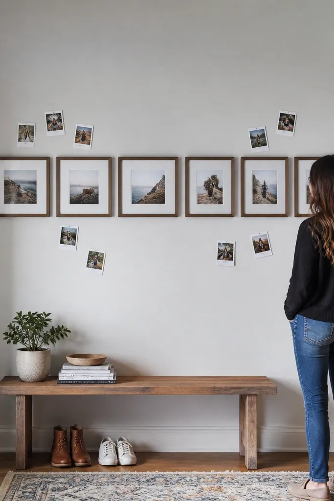
This mix gives you structure plus personality. You hang a straight row of frames as the backbone, then add a few polaroid-style prints around them for a casual, collected feel. It’s beginner-friendly because the backbone row keeps your spacing consistent, even if the scattered pieces vary slightly. This look is great for kids, holidays, or any wall where you want new photos to slot in later. The scattered prints also draw attention to the center of the wall.
Pick a consistent frame size for the backbone row and install it first using templates. Print a few photos as polaroid-style bases with the same margin width and paper color. Tape the polaroids around the row, keeping them within a defined rectangle so it still reads as one collage area. Once spacing looks right, mount the polaroids with removable adhesive strips if you plan to rotate them. Keep rotations tiny — one or two degrees — so the scatter looks deliberate.
Use one paper color for the polaroid bases so the scatter doesn’t look random.
Don’t scatter too many polaroids — five to eight pieces is the sweet spot for this look.
16. Two-Column Vertical Stack With Overlap
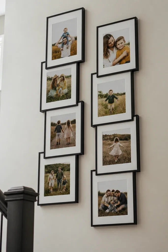
Two columns look modern and keep your wall from feeling busy. You stack photos in two vertical lines, then overlap some frames just enough to create depth. This is beginner-friendly because you’re only aligning two “tracks,” not a whole grid. Overlap adds visual interest without requiring complicated measuring. It works well for portrait-heavy sets, like family photos or event coverage. Keep one column slightly denser for a more natural look.
Choose two frame sizes that match your photo prints, and keep mat style consistent. Mark a center line and split it into two columns with equal spacing. Build the first column from top to bottom, then mirror the spacing in the second column but stagger heights by 1-2 inches. Tape templates to test overlap angles and distances, aiming for consistent overlap width (about 0.5-1 inch). Mount the frames, starting with the ones that overlap the most so placement stays stable.
Editor's noteKeep overlap only between frames of the same color finish to avoid weird shadows.
Skip thisDon’t overlap everything — a few overlaps are enough to create depth without chaos.
17. Puzzle Piece Layout (Jigsaw-Like Edges)
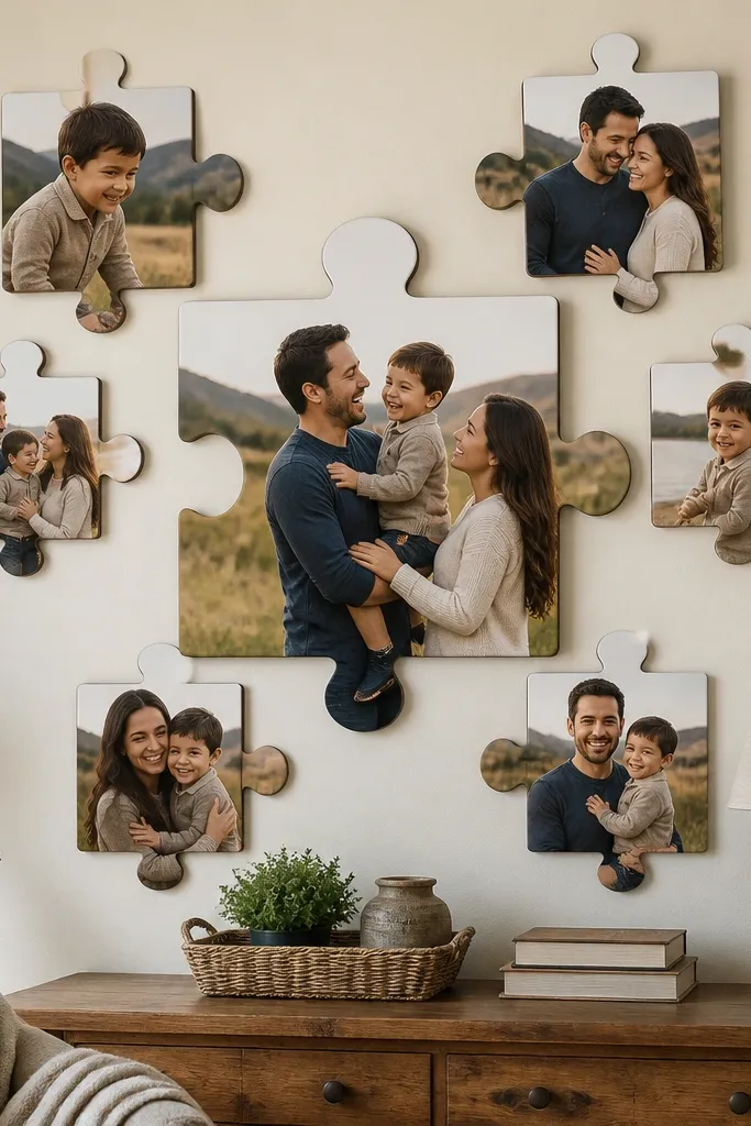
Puzzle-piece layouts feel playful and design-forward because the shapes break the rectangle monotony. You print photos onto puzzle-shaped boards or use pre-cut craft puzzle pieces as frames, then arrange them so the edges interlock visually. It’s beginner-friendly if you commit to one size puzzle set and keep the spacing consistent — you’re basically doing a pattern. This is a great option for kids' rooms, playrooms, or any space where you want charm. The look is photogenic because the irregular edges create movement and shadow.
Buy a puzzle-piece set template or trace puzzle shapes onto thick cardstock or wood panels. Print or mount photos onto the puzzle pieces, then seal the surface if needed. Arrange the pieces on the wall in a rectangle boundary so the puzzle doesn’t sprawl. Tape the whole arrangement first, then mount each piece using picture-hanging hooks or small screws through the backing. Keep the gap between pieces consistent so the “fit” looks intentional.
Editor's noteUse matte Mod Podge or a matte sealer so puzzle edges don’t glare under light.
Skip thisDon’t mix puzzle sizes — it makes the pattern look accidental.
18. Washi Tape Border Wall (No Frames, Big Style)
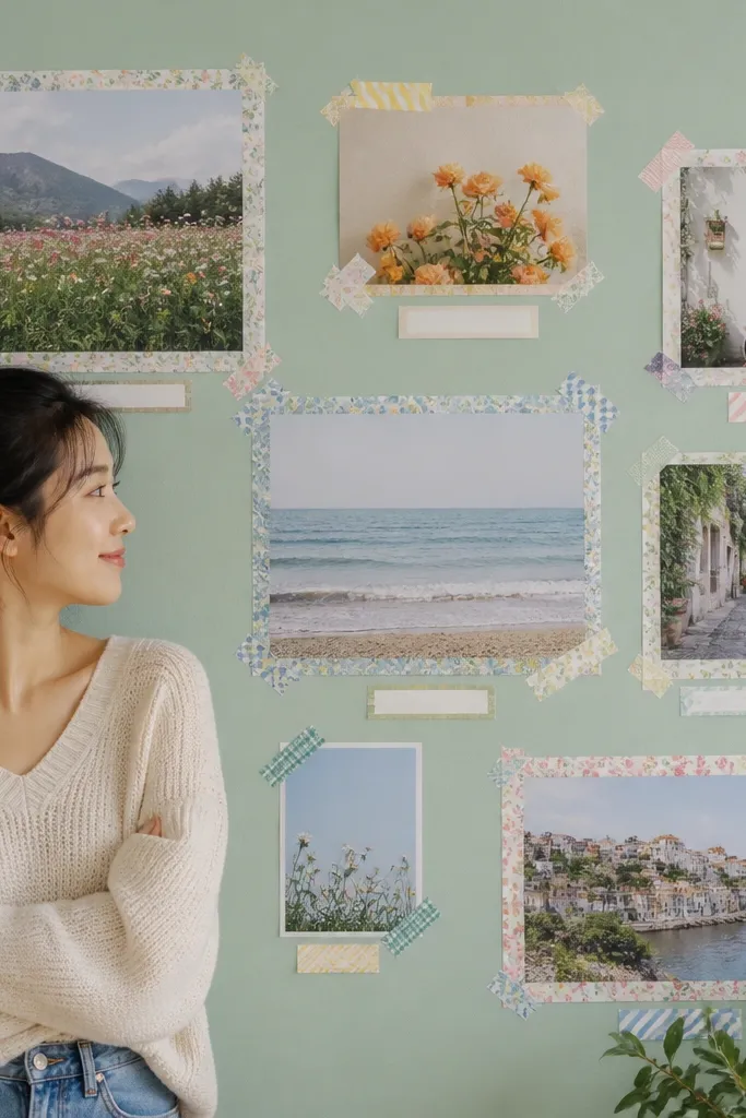
Washi tape borders create a crisp collage look without buying frames, and the wall stays flexible. You tape clean rectangles around photos, then add small label strips for dates or captions. This is beginner-friendly because you can adjust spacing instantly and remove pieces without damaging paint. It also looks great in rentals where permanent mounting is a no-go. Use it for a tight grid or a staggered gallery with consistent tape width. The taped borders give a uniform edge that makes mixed photo sizes work.
Print photos to a consistent size and cut them cleanly. Use painter’s tape to lightly mark the final collage area, then lay washi tape rectangles around each photo with equal border width (like 1/2 inch). Arrange the photos in a grid or gentle stagger, keeping the tape seams aligned. Press tape edges firmly so they don’t lift, especially near corners. Once the layout is locked, add small label strips using the same tape color or a second coordinated pattern.
Editor's noteChoose one washi pattern and one solid tape so the collage looks intentional instead of busy.
Skip thisSkip cheap tape with fuzzy edges — it looks sloppy in close-up photos.
19. Fabric Ribbon Hanger With Photo Clips (Rotating Display)
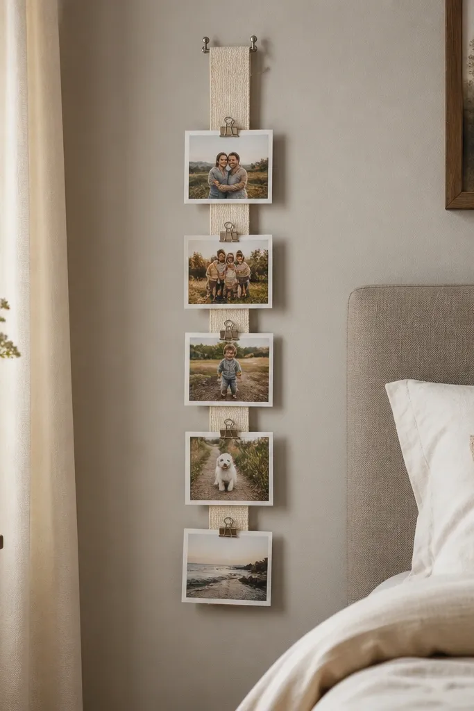
A ribbon hanger makes your photo wall collage feel alive because you can rotate photos seasonally. It looks airy and light, and it’s beginner-friendly because you only mount one or two anchor points for the ribbon. The photo clips create consistent spacing and a uniform silhouette. This is a smart choice for areas where you want to update photos without drilling new holes. It also photographs well because the clips and ribbon create a pattern line.
Mount two anchor points on the wall, then run ribbon across them taut. Choose ribbon width around 1-2 inches so clips have something solid to grip. Print photos to uniform sizes and clip them along the ribbon using mini clips or clothespins designed for paper. Mark clip spacing first with tape so the row stays even. If you want a second row, add it above with matching spacing and keep the same photo size across both rows.
Editor's noteUse a ribbon color that matches a wall accent, not a random shade — the ribbon is visible in every photo.
Skip thisDon’t use thin string — it sags and makes the photos look crooked.
20. Corner-to-Center L-Shaped Collage
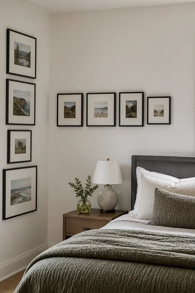
An L-shaped collage uses wall corners instead of fighting them. It makes a blank corner look intentional and gives your collage a built-in flow. This is beginner-friendly because you can measure one arm, then build the other arm from a right-angle corner reference. It’s also a great way to avoid covering too much wall in one go. Use this when you have a wall with a focal feature like a door, window, or console table. The L shape keeps the collage from feeling like it’s floating.
Pick a frame size and mat style you’ll repeat. Measure the corner area and decide how far each arm should extend (for example, 24 inches along one wall and 30 inches along the other). Tape templates along both arms, aligning the inside corner so the right angle looks crisp. Mount frames along one arm first, then the second arm. Keep the spacing between frames consistent across both arms so the design reads as one unit.
Editor's noteIf your corner isn’t perfectly square, use the inside edge of frames as your alignment reference, not the wall edges.
Skip thisDon’t force frames to cover the corner too tightly — leave a small gap so the collage breathes.
21. Mat + Caption Strip Under Every Photo
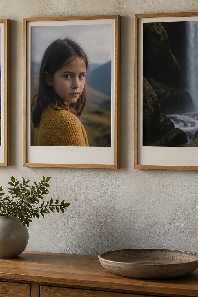
Captions make the collage feel purposeful instead of decorative-only. You attach a small caption strip under each photo, using the same font and paper color for every frame. This layout is beginner-friendly because the caption strip gives you an easy rule for spacing and alignment. It also helps you choose which photos to include because each one gets a short label. The look is clean, readable, and very photogenic because the caption strips create a consistent rhythm across the wall.
Pick frames that allow a mat or insert area under the photo. Print photos at a size that fits the opening, then design caption text cards sized to the mat strip (keep them consistent, like 2-inch tall). Assemble frames with photos and caption cards first on a flat surface. Tape the dry layout on the wall and adjust heights so caption strips align in a straight line. Mount the frames, then double-check that caption strips are level and not drifting across the set.
Editor's noteUse short captions — date + place — so the strip stays clean and doesn’t turn into a wall of tiny text.
Skip thisDon’t mix caption sizes; one big caption breaks the rhythm instantly.
22. Three-Shape Mix (Rectangles + One Circle + One Triangle)
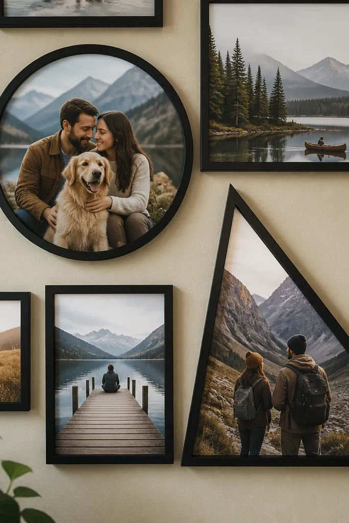
Shape mixing gives your beginner-friendly photo wall collage a design hit. You keep most photos in rectangles for structure, then add one circle element and one triangle or angled photo panel for contrast. The result looks styled because the wall has a focal variety, not just different photos. This works when you want a modern look and you have photos that feel like they belong together by color or theme. It also photographs well because the shapes create shadow and depth.
Choose one rectangle frame size and mat style for the majority of photos. Add a circle mat insert or frame for one photo, and create a triangle panel using a pre-cut triangle frame insert or a custom mat board. Tape templates for all shapes on the wall so you can check balance before mounting. Mount rectangles first, then place the circle and triangle last so you can adjust their position around the center. Keep all shapes aligned to a common grid line so the mix looks intentional, not random.
Editor's noteMatch the frame color for every shape so the wall reads as one system.
Skip thisDon’t add too many odd shapes — two accent shapes are enough.
23. Horizontal 5-Photo Row With Unequal Widths
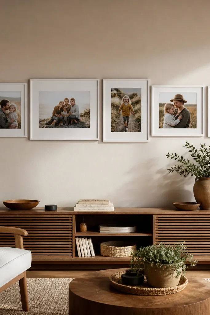
Unequal widths in a single row create a “designed collage bar” effect. You keep all photos the same height so the row stays clean, then vary widths by using different mat sizes or crop ratios. This is beginner-friendly because you only align one baseline. It works in living rooms and hallways where you want a strong horizontal statement without a full wall grid. Use it with photos that have similar color grading so the varying widths still feel cohesive.
Pick one overall row height and decide on five photos to display. Choose frame/mat combinations that match the widths you want while keeping the height consistent. Tape templates along a straight level line, adjusting widths so the total row width fits your wall. Mount the center frame first, then mount the frames left and right, using measuring tape for equal gaps. Add a thin border or consistent mat color so the different widths don’t look like separate projects.
Editor's noteIf you’re mixing photo orientations, crop them so the subject sits near the center — it reduces awkward visual shifts.
Skip thisDon’t let the row height vary across frames — that’s what makes the uneven widths look messy.
24. Shadowed Photo Corner Gallery (One Wall Feature)
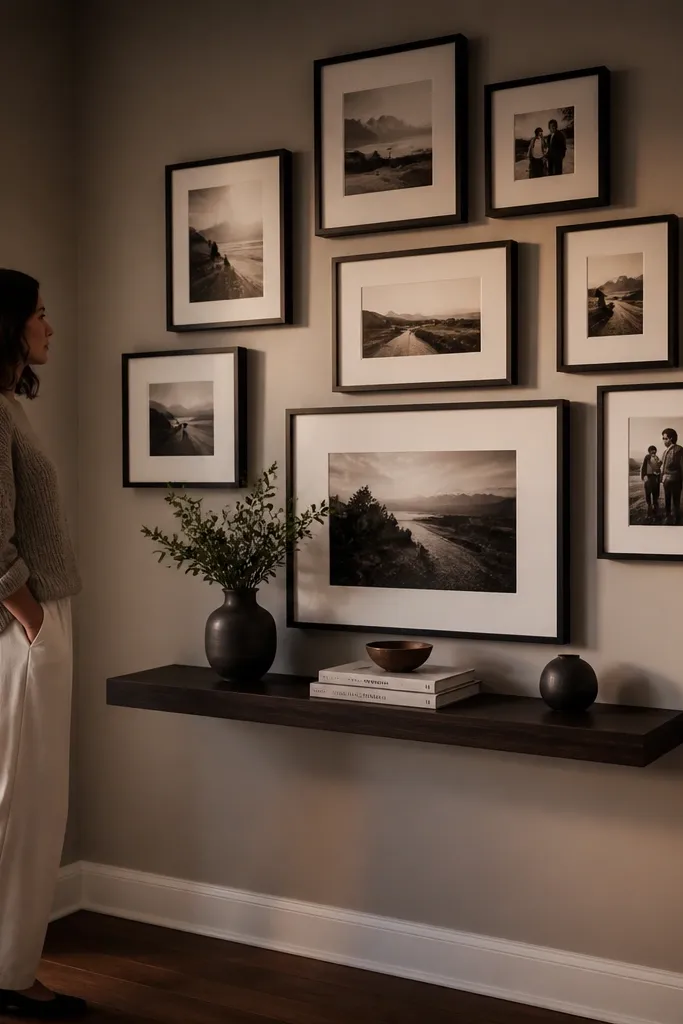
This collage is built around a wall feature like a shelf, console, or light switch area. Instead of scattering frames everywhere, you cluster them around the feature so the whole wall looks planned. It’s beginner-friendly because you can use the feature as your anchor reference and keep everything aligned to it. This style also photographs well because the cluster creates a focal point that’s easy to frame in pictures. Use consistent frame color so the cluster doesn’t look like leftover frames.
Measure the feature width and decide how many frames will fit around it without crowding (often 7-11). Tape templates around the feature area, keeping a consistent gap between frames and the shelf or wall edges. Mount the frames that sit closest to the feature first, since those define the overall geometry. Then fill in the remaining frames outward, keeping a consistent vertical rhythm. Level everything with a straightedge, not just the frames — the wall can be slightly uneven.
Use one frame size for the top row and one for the bottom row so the cluster feels structured.
Don’t cover the feature completely — leave negative space so the cluster doesn’t block function.
25. Photo Collage on a Pegboard Backing (Industrial Clean)
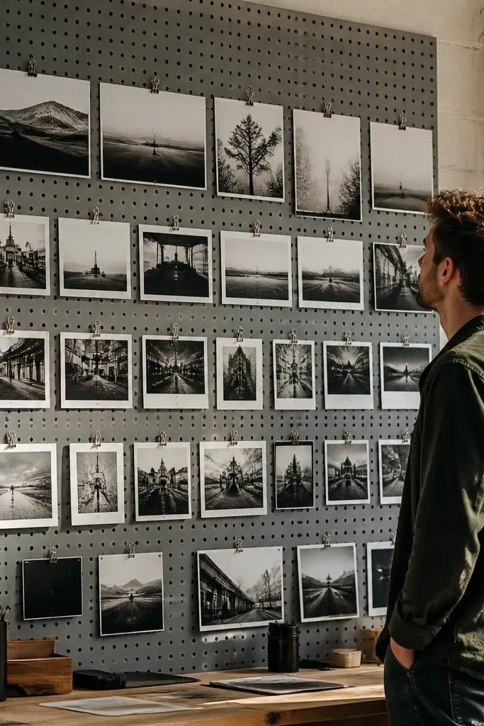
Pegboard makes a photo wall collage feel organized because everything attaches to a grid of holes. You can arrange photos in straight lines, then tweak spacing later without starting over. This is beginner-friendly if you like hardware-based projects and want a wall that can change as your photo collection grows. The look is industrial-clean, and it photographs well because the pegboard creates a patterned background. Use it in a home office, craft room, or entry where you want functional decor.
Mount a pegboard section to the wall using appropriate anchors for your wall type. Paint the pegboard if you want a cleaner look, then let it cure fully. Print photos to consistent sizes and attach them using pegboard hooks with small clips or rigid photo holders. Arrange photos in a grid pattern, measuring spacing by peg-hole columns. Once the arrangement is correct, press all clips securely so photos don’t tilt.
Editor's noteUse rigid photo holders for heavier prints so the corners don’t droop.
Skip thisSkip flimsy clips with thick cardstock — they’ll sag over time.
26. Fabric-Covered Foam Board Panels With Photo Squares
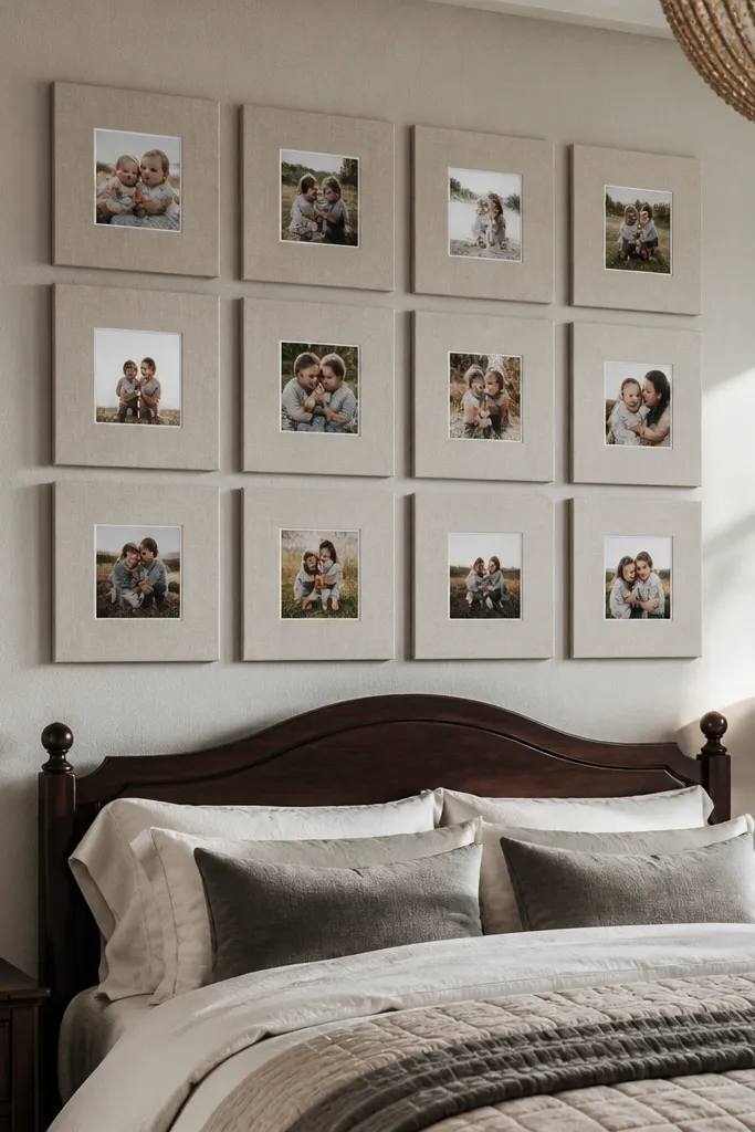
This collage looks soft and high-end because fabric-covered panels add texture behind each photo square. You mount multiple foam board squares to the wall, each with a photo placed in the center. It’s beginner-friendly because you can build each panel separately, then hang them as a set. Great for bedrooms and nurseries where you want warmth instead of hard frame edges. The photos still pop because the fabric fields act like large mats.
Cut foam board panels to a consistent size, like 10x10 or 12x12. Wrap each panel with fabric, pulling tight on the back and securing with hot glue or staples. Print photos to fit the center area and mount them using photo corners or adhesive squares. Arrange panels on the wall in a grid or staggered formation, then tape templates first so seams line up. Mount using picture hangers rated for the panel weight, and check level after the first row.
Editor's noteChoose fabric with a tight weave so it doesn’t look wrinkled when photographed.
Skip thisDon’t use slippery fabric like satin — the wrap can loosen and look sloppy.
27. Two-Layer Collage With a Top Frame Row
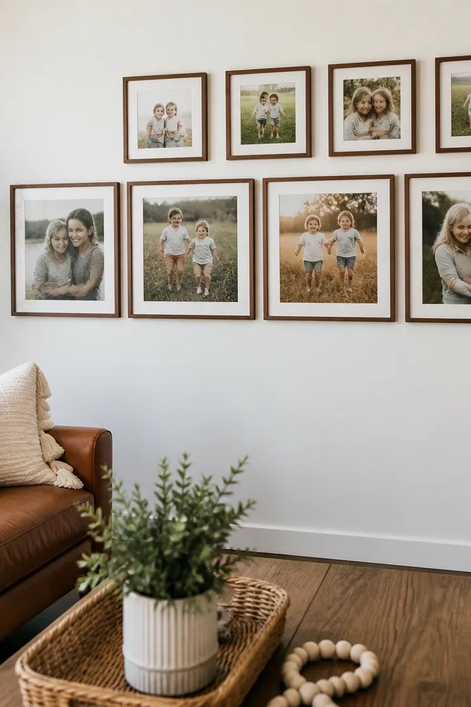
Two-layer collages look dynamic because you create depth with one row placed slightly higher and offset. You keep the bottom row consistent, then add a smaller top row with different frame sizes. This is beginner-friendly because the bottom row sets the rules and the top row acts like accents. It’s great for blank walls that feel too wide for a single row of frames. The offset creates movement and makes the collage feel like it’s “growing” upward.
Choose a bottom grid of frames in one size, then pick a smaller top row of frames in a different size. Tape templates for both layers on the wall and decide the vertical gap between rows (about 3-5 inches). Mount the bottom grid first so you’re working from a stable base. Then mount the top row, keeping the spacing consistent across the row and aligned to a center reference point. Finish by stepping back and checking that the top row doesn’t crowd the bottom row’s visual space.
Editor's noteUse the same mat color for both layers so the depth feels intentional, not accidental.
Skip thisDon’t vary frame sizes randomly across layers — pick a clear rule for each layer.
28. Monogram + Photo Tiles (Lettering Takes the Guesswork Out)
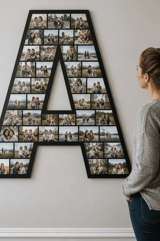
When you want a beginner-friendly photo wall collage that looks designed even with mixed photos, use a monogram as the structure. You create a big letter shape from photo tiles or framed tiles, then fill the letter with consistent photo squares. The letter gives the eye a clear form, so the collage looks cohesive. This works for entryways, nurseries, and bedrooms. It also makes the wall feel personal without needing complicated storytelling.
Choose a letter size based on your wall space, then create a grid of photo tiles sized to fit the letter shape. Print photos as consistent squares, then mount each photo onto a backing tile (foam board or cardstock) or into small frames. Arrange tiles on the wall following a letter template, then tape everything first to confirm the outline. Mount tiles one by one using picture hangers for each tile or adhesive if they’re light. Add a solid background color behind the letter if your wall is too busy visually.
Editor's noteUse one background tone behind the letter so the photos don’t blend into the wall.
Skip thisDon’t use wildly different photo crops in each tile — keep faces or main subjects centered.
29. Long Photo Strip Above a Bed or Sofa
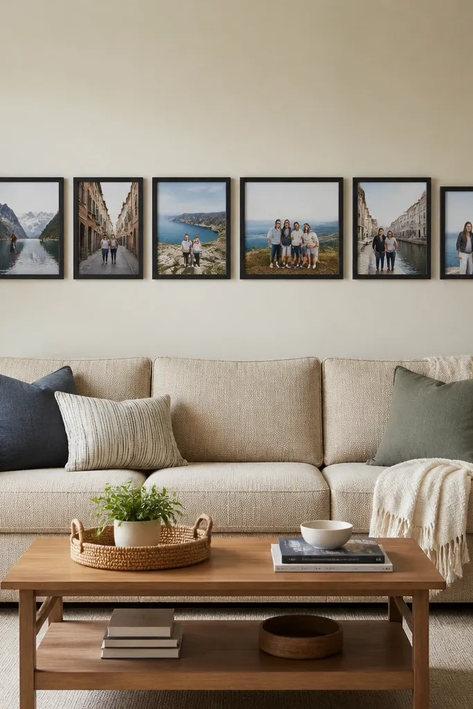
A long strip is the easiest way to fill a blank wall with a photo collage that still looks neat. You hang a single horizontal row of frames, but you keep them slightly varied in width or spacing so it feels modern. This is beginner-friendly because you’re not juggling a whole grid — you’re aligning one line. It works in bedrooms, living rooms, and offices where you have furniture below and want the wall to match. The strip also photographs well because it creates a clean focal band for your space.
Measure the furniture width and decide your collage strip length to match it. Choose a frame size that keeps the height consistent, then vary widths by using different mat openings or cropping ratios. Tape templates along a level line centered above the furniture. Mount frames starting from the center and work outward so the strip stays balanced. If the wall is wide, add a subtle spacer gap in the middle to keep the strip from looking like one long line.
Keep the strip height consistent and avoid stacking frames taller than the rest — it makes the band look uneven.
Don’t let the strip sit too high — if it’s above eye level by a lot, it reads like decor clutter.
30. Photo Collage With a Centered Quote Card (Short and Clean)
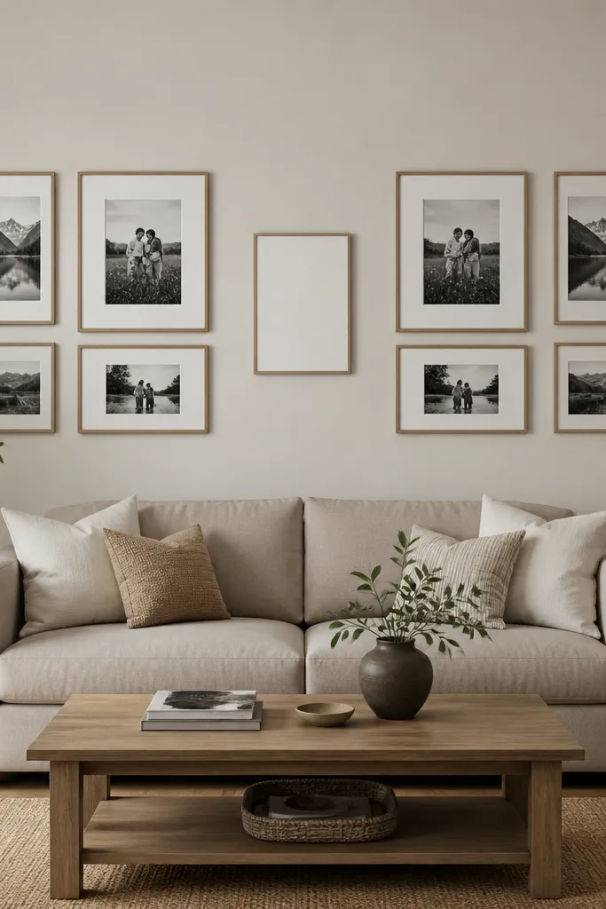
A centered quote card gives your collage a focal point that’s easy to design around. You arrange photos in a symmetrical pattern around the card, with equal spacing on both sides. This is beginner-friendly because symmetry reduces decision fatigue and makes the wall look intentional. Keep the quote card small and simple — it should look like a label, not a poster. This works best when your photos share a theme, like family moments or travel memories. The quote adds cohesion even when photos differ in color.
Pick a quote card size that’s smaller than your frames, like 8x10 with a mat. Arrange frames in two equal groups on left and right so the quote card sits centered between them. Tape templates first to verify symmetry, then mount the quote card and two center frames first. Build outward on both sides, keeping vertical alignment consistent. Use a level and measuring tape so the spacing stays even across the whole piece.
Editor's noteUse a plain font and black text on off-white cardstock so it looks like it belongs with frames.
Skip thisSkip long quotes — tiny crowded text looks messy in a collage.



