
1. 4x6 Accent Grid (with bigger anchors)
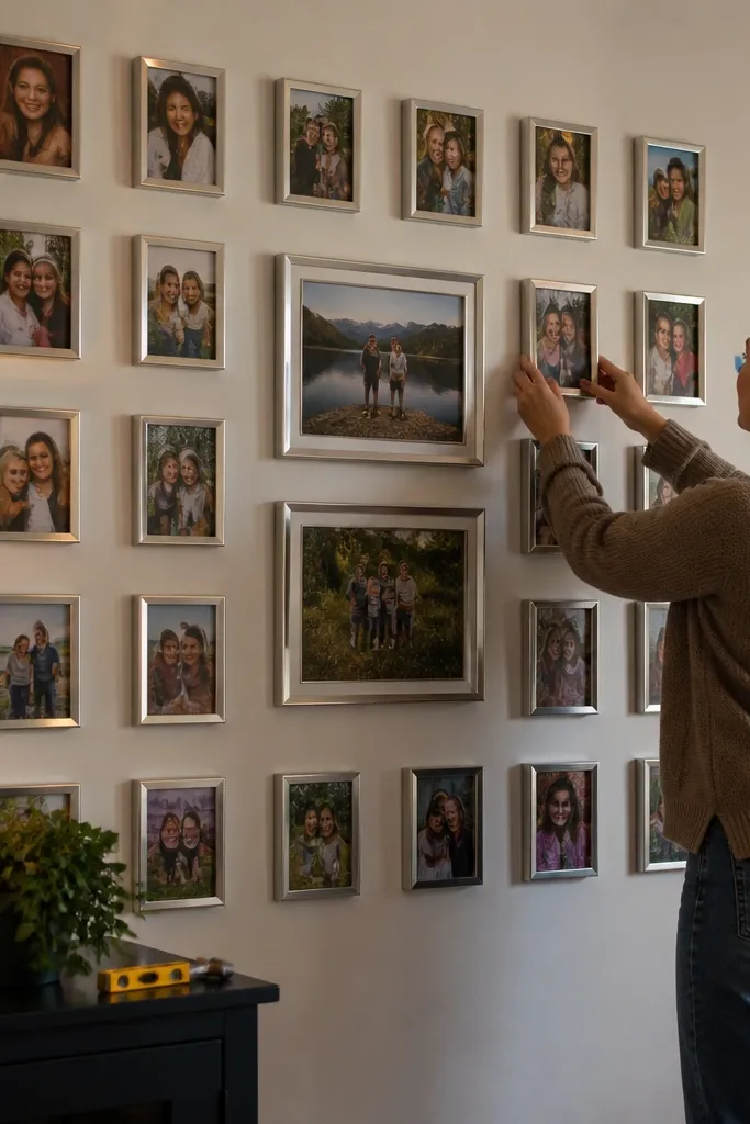
Use 4x6 prints as the accent layer, not the whole wall. They’re small enough to repeat across a collage without turning the wall into a single-photo dominance, but big enough to show faces when you hang them at normal eye-level. The trade-off is that 4x6 can look a little “snapshot-y” unless you mix it with one or two larger sizes like 5x7 or 8x10. This setup works best in family-photo walls where you want lots of moments, not one hero picture.
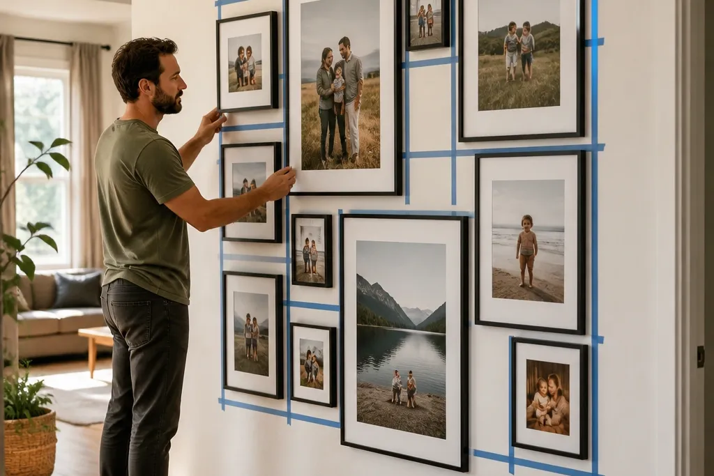
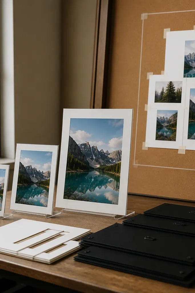
Measure your wall and pick a target row width like 30 to 36 inches. Build a simple grid on paper: for example, two larger frames in the center row and 4x6 tiles around them, then add your frame gap (1/2 inch is a good default). Order prints to match the frame openings you plan to buy, not just the photo size — if you’re using mats, confirm the mat opening equals the print size. Lay the frames on the floor first and tape the arrangement to the wall before you commit to hanging.
Editor's noteIf you’re unsure about cropping, choose borderless prints only when the original photo ratio matches the print ratio.
Skip thisDon’t fill an entire wall with only 4x6 prints — the spacing looks random and faces get harder to read.
2. 5x7 Main Tiles for a 2x2 or 3x3 Collage
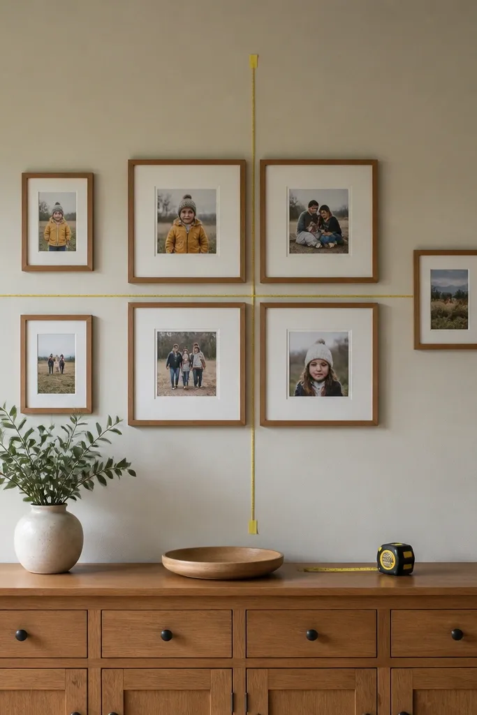
5x7 is the beginner-friendly sweet spot because it’s readable, easy to frame, and forgiving if your wall spacing isn’t perfect. In a collage, 5x7 photos create a consistent visual rhythm, especially when the frames have the same color and thickness. It also plays nicely with 4x6 and 8x10, so you can add accents without changing your whole plan. This size suits living rooms, entryways, and bedroom walls where you want the photos to feel personal but not overpowering.
Pick your layout first: a 2x2 collage is easiest, then you can scale to 3x3. Choose one frame gap number and stick to it — 3/4 inch between frames looks clean. Calculate your row width using frame outer dimensions (not just the print size), then adjust with one or two 4x6 accents if you’re short on space. Use a level and painter’s tape to mark the grid centerline, then hang the top-left frame before you place the rest.
Use the same frame matte color across all sizes so the collage looks like one designed wall instead of scattered frames.
Don’t mix different frame thicknesses on the same row — the misalignment shows up fast.
3. 8x10 Anchor Photos with 5x7 Surrounds
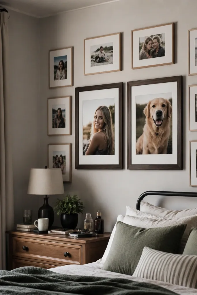
This is a strong “default collage” plan: 8x10 anchors bring clarity and presence, while 5x7 surrounds keep the wall from looking too heavy. 8x10 is big enough for faces to stay crisp at typical indoor viewing distance, and it frames easily with common frame sizes. The trade-off is that you need fewer photos — too many 8x10s will crowd your wall. It’s perfect for couples, family portrait walls, and any collage where you want certain moments to feel like focal points.
Start by choosing how many anchors you want: two anchors for a 3x3 layout is a clean look. Place anchors in the center row corners or center column depending on your wall shape, then fill remaining slots with 5x7. Confirm frame sizes and outer dimensions so the spacing stays even; if you’re using mats, aim for a consistent mat border width across all frames. Once the floor layout matches your grid, transfer frame positions to the wall with small pieces of tape.
If you want a calmer look, keep your anchor photos in the same orientation style (either portrait-heavy or landscape-heavy).
Don’t put 8x10 anchors next to each other with tiny gaps — it creates a visual block instead of a collage.
4. 11x14 Statement Photo in a Mixed Wall

11x14 is the best “one big moment” size for collage walls because it reads like intentional artwork, not just a larger photo. It gives you a focal point that still fits naturally in mixed layouts with 8x10 and 5x7. The downside is that it takes up more wall width, so you need to reduce the total number of frames or increase your gaps. This works great for a hallway gallery where you want one photo to catch attention as you walk by.
Pick the statement placement: center of a row or dead center of the wall looks most balanced. Build the surrounding grid using 8x10 and 5x7, then check row width against your 11x14 frame outer size so everything lines up. If your wall is narrow, keep the 11x14 in a vertical column and let the other frames be smaller. Hang the statement frame first, then align the rest using the top edges so the collage has a straight visual line.
Use a matte border or consistent frame color so the 11x14 doesn’t look like an afterthought among smaller frames.
Don’t choose a busy, high-contrast photo as the statement if your other photos are also busy — the wall turns into visual noise.
5. Square Collage with 3x3, 4x4, and 6x6
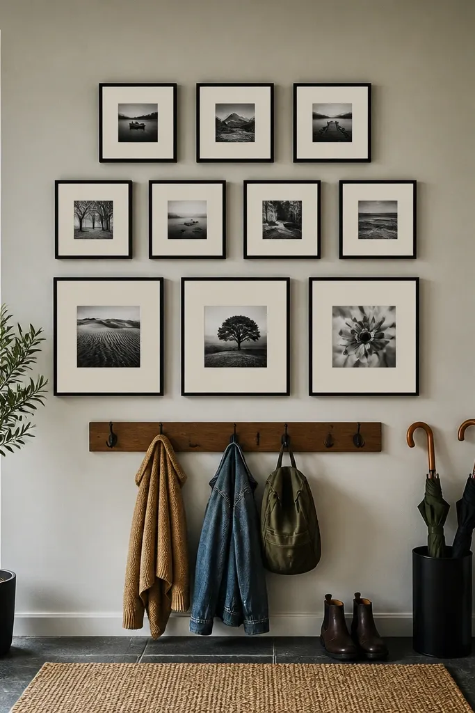
Squares make spacing easier because every frame has the same aspect ratio, so alignment errors are less obvious. A mix of 3x3, 4x4, and 6x6 lets you build depth without the “why does this look stretched?” problem that happens with mixed ratios. This style suits modern interiors and photo sets that are naturally square, like portraits cropped for social media. The trade-off is you need to be picky about which photos you crop, because squares force cropping for most 4:3 and 3:2 images.
Choose one square set for your grid unit, like 4x4 as the spacing baseline. Use 6x6 as the bigger tiles and 3x3 or 4x4 for the accents, but keep the number of sizes to two or three so it stays coherent. If you’re printing from photos with different ratios, decide now whether you’ll crop to square or add borders. When you hang, align all frames by their top edges first, then check that the grout-like gaps between squares stay even.
Editor's noteIf you want square consistency without heavy cropping, use mats and print sizes that match the mat opening rather than forcing borderless prints.
Skip thisDon’t mix landscape and portrait photos in a square grid without planning — the crops look inconsistent fast.
6. 6x6 Photo Tiles for a Calmer, Less Busy Wall
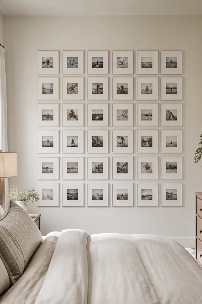
6x6 is a nice middle ground for square collages: bigger than 4x4 so faces stay readable, smaller than 8x10 so you can still fit a satisfying number of frames. It’s also forgiving if you use a consistent mat because it hides minor differences in print border or trimming. This style looks clean in bedrooms and dining rooms where you want a gallery feel without the wall becoming crowded. Pair 6x6 with one or two 8x10 rectangles if you want a single non-square focal moment.
Choose your grid size by counting slots across your wall — four across is usually too wide for 6x6 unless your wall is large. Lay out a 2x2 or 3x2 arrangement on the floor, then measure the total width including frame outer edges. Order prints in 6x6 and confirm your frame opening matches that exact size. Hang from the center outward: mark the wall centerline, hang the top-left frame, then mirror it with the top-right frame before filling the rest.
Use the same mat color on every frame to make the gaps look intentional instead of random.
Avoid mixing mat widths on the same wall — differences show up as uneven “breathing” between photos.
7. Vertical Story Wall with 6x8 and 8x12
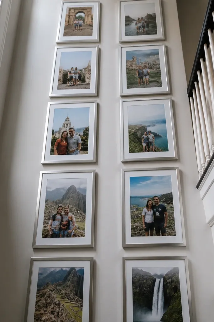
If your wall is tall or narrow, vertical prints make everything look planned. 6x8 and 8x12 create a strong rhythm and they work well for portraits, architecture details, and any photo where height matters. The reason this works for beginners is that vertical columns are easier to line up than complex mixed grids — you can focus on one column width and spacing. This approach shines in hallways, stair landings, and small entry spaces where horizontal sprawl looks cluttered.
Decide on one column width using your frame outer dimensions, then plan two to four vertical tiles per column depending on your wall height. Use 6x8 for the smaller steps and 8x12 as the visual “beats” in between. Keep your gap consistent — 1/2 to 3/4 inch looks good with vertical columns. Hang the bottom tile first so you can control the overall height, then mark the centerline of each tile above it using a level and tape.
Make sure your vertical photo crops keep the subject away from the top edge so the frame doesn’t feel like it’s cutting heads off.
Don’t stack vertical frames with uneven spacing — the wall starts to look crooked even when it isn’t.
8. 8x10 + 10x10 Grid for a Square-Plus Balance
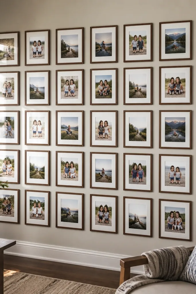
This is a good option when you want square energy but still need a rectangular anchor. 10x10 keeps the collage structured and modern, while 8x10 adds variety without going too large. It’s beginner-friendly because the sizes are both common enough to frame, and you can build a grid where rows alternate between square and rectangle. The trade-off is that you have to be strict about spacing and top-edge alignment because the rectangle height differs from square height.
Pick a layout that repeats — for example, alternating 10x10 and 8x10 in each row. Measure your frame outer heights so the top edges line up cleanly; if they don’t, use a mat system that equalizes the visible border. Print or order 10x10 and 8x10 photos and make sure your frame openings match exactly. Hang by row: level the first row, then use a straightedge across the top edges to position every frame in that row.
If your frames have different border thickness, use mats to keep the visible photo area consistent across sizes.
Avoid random placements of 8x10 among 10x10 — alternating rows looks intentional, scattered placement looks accidental.
9. 4x4 Accent Squares with 5x7 and 8x10
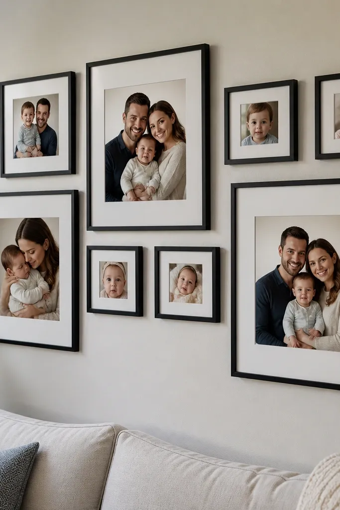
4x4 squares are a smart accent size because they fill space without stealing attention from your main photos. In a mixed collage, they add a “pattern” effect and they help the wall look connected even when your photos vary in subject. This works best when your main photos are 5x7 or 8x10, since those sizes frame easily and keep faces readable. The trade-off is that 4x4 requires cropping for many non-square photos, so choose photos you don’t mind cropping.
Start with your main grid using 5x7 and 8x10, then fill leftover corners with 4x4 squares. Keep the square count low enough to feel like accents, not a complete second grid. Order 4x4 prints and match them to square frames or mat openings so the photo area stays consistent. Before hanging, tape every frame outline on the wall and step back to check that the accents create a balanced pattern around the main frames.
Editor's notePick one photo type for 4x4 squares — details, solo portraits, or close-up moments — so the cropping feels purposeful.
Skip thisDon’t use 4x4 for your most important group photo if you need everyone visible.
10. 3x4 Narrow Frames for a Clean Vertical Column
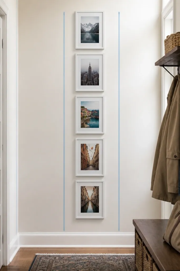
3x4 is a niche size, but it’s great for vertical columns where you want a tight, clean look. It’s beginner-friendly when you keep the layout simple: one column, one spacing rule, and a consistent frame style. These narrow frames are especially good for travel photos with strong vertical composition, or for portrait shots where you want the face centered. The trade-off is that frame availability is less common than 4x6 or 5x7, so you may end up using mats more than you expect.
Choose a frame style you can buy easily with mats, then confirm the mat opening can be 3x4. Plan one column layout: three to five frames depending on your wall height and desired gap. Print 3x4 with the correct aspect ratio or add borders if your photo ratio doesn’t match. Hang from the top: mark the top anchor point, place the first frame, then measure down for the next frame using your chosen gap.
Editor's noteUse a template made from cardstock the size of your frame outer edges — it speeds up alignment a lot.
Skip thisDon’t mix 3x4 with random landscape sizes in the same row — the row height mismatch looks messy.
11. 2x3 Mini Prints for a Dense Birthday-Style Collage
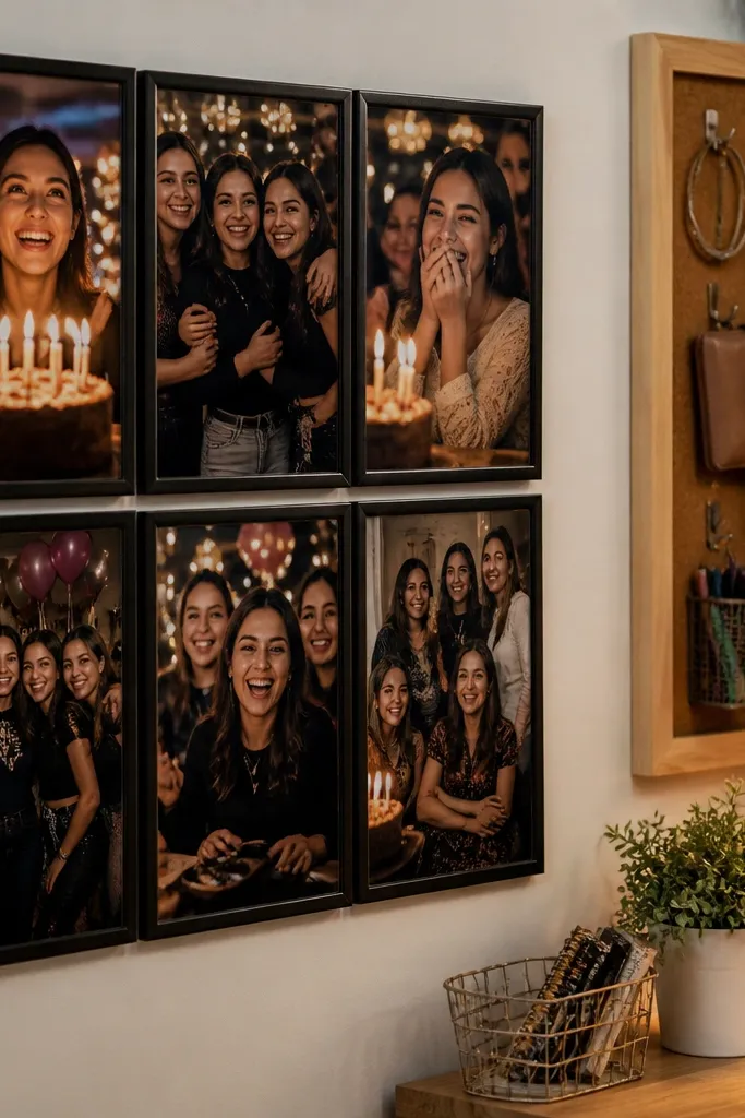
2x3 mini prints work when you want a dense, energetic collage look like a memory wall. They’re not ideal for reading faces from across the room, so this size is best for close-to-the-wall viewing — like a gallery in a bedroom corner or near a desk. The advantage is that mini prints let you include many moments without needing large wall space. The trade-off is that you need consistent spacing and uniform frames or mats, or the wall turns into a patchwork.
Pick a frame system that supports 2x3 prints, then choose a consistent frame color and mat border if you want a clean look. Create a grid on paper with a fixed gap, like 1/4 inch between frame edges if you’re using matless frames. Order all prints at once so the trims match your expectations. Hang the center row first to prevent drift, then build outward row by row using a tape measure and level.
If you can’t find frames, mat the 2x3 prints into a larger opening with the same visible border width across the set.
Avoid borderless printing for mini sizes if your printer crops — tiny shifts get obvious.
12. 6x8 Mat-Framed Photos for Ratio-Safe Cropping
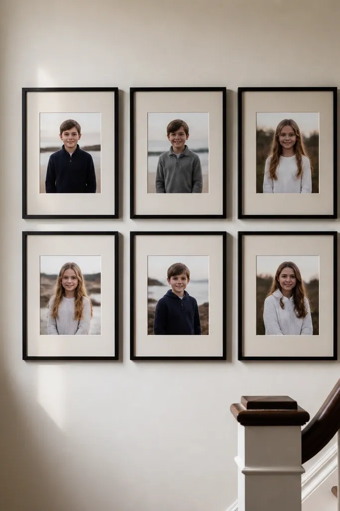
6x8 is a great “ratio compromise” size for vertical photos because it’s big enough to look substantial but not as large as 8x12. I like it for beginners when they don’t want their portraits chopped into awkward compositions. Mat framing helps here because you can control what’s visible and keep the collage cohesive even if your photos vary slightly. This style is perfect for stairwell galleries and living room walls where you want a vertical feel without going full hallway strip.
Choose mats that open to 6x8 exactly, then build your layout around 6x8 tiles paired with 5x7 or 8x10. Measure your wall width and decide how many tiles fit across; two to three per row looks clean. Print 6x8 with the same aspect ratio settings across all photos so the crop style stays consistent. Hang using a centerline: place the middle frame first, then align the rest based on the same top-edge reference.
Use the same mat thickness across every frame so the photo edges align visually even when frame sizes differ.
Don’t mix 6x8 frames with different mat border sizes — the wall looks uneven even if everything is level.
13. 8x12 Long Frames for Hallway Layouts
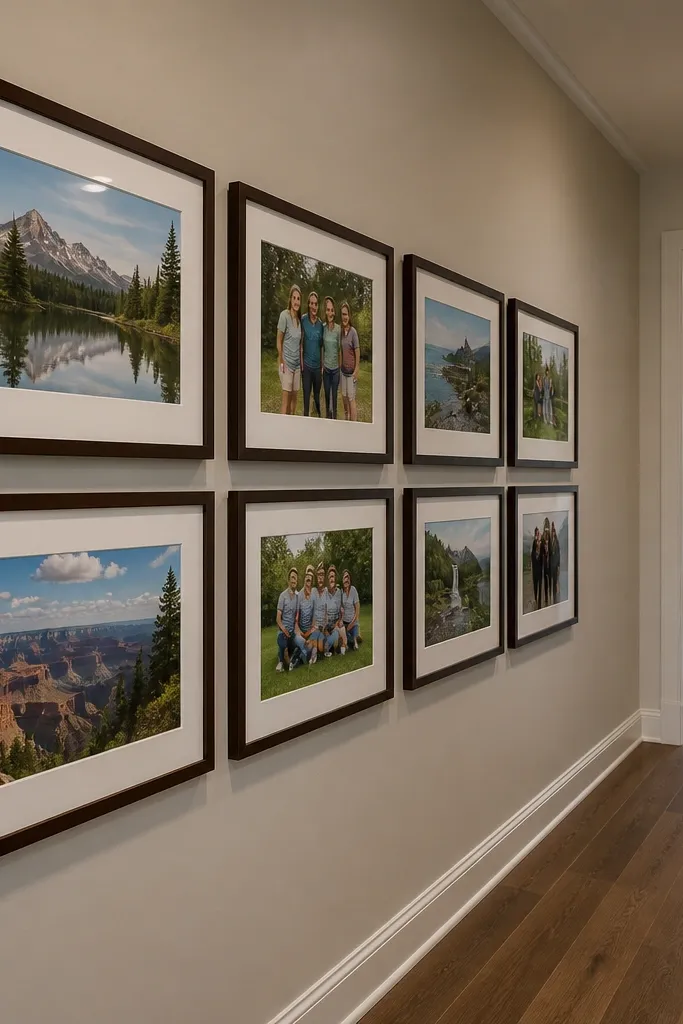
8x12 is a strong hallway size because it reads as one piece of wall art while still letting you create a collage. It gives you more horizontal space than 8x10, which helps group photos and landscapes look less squeezed. For beginners, this is easier than trying to force a bunch of 4x6s into a hallway — the wall stays organized. The trade-off is frame cost and spacing: you need enough wall width so the long frames don’t feel cramped.
Measure your hallway wall segment and decide on a row count — one row of three is a common beginner target. Use consistent frame outer widths to calculate spacing; keep gaps around 1/2 inch. Order 8x12 prints and choose frames that you can mount securely at the correct height so the row feels level. Hang the middle frame first, then mirror the left and right frames based on your tape marks.
Editor's noteIf your hallway is narrow, reduce to two frames per row and add one smaller 5x7 tile above for balance.
Skip thisDon’t place 8x12 frames too close to a door trim or vent — the composition looks cut off.
14. 9x12 and 10x10 as the "Fewer, Bigger" Strategy
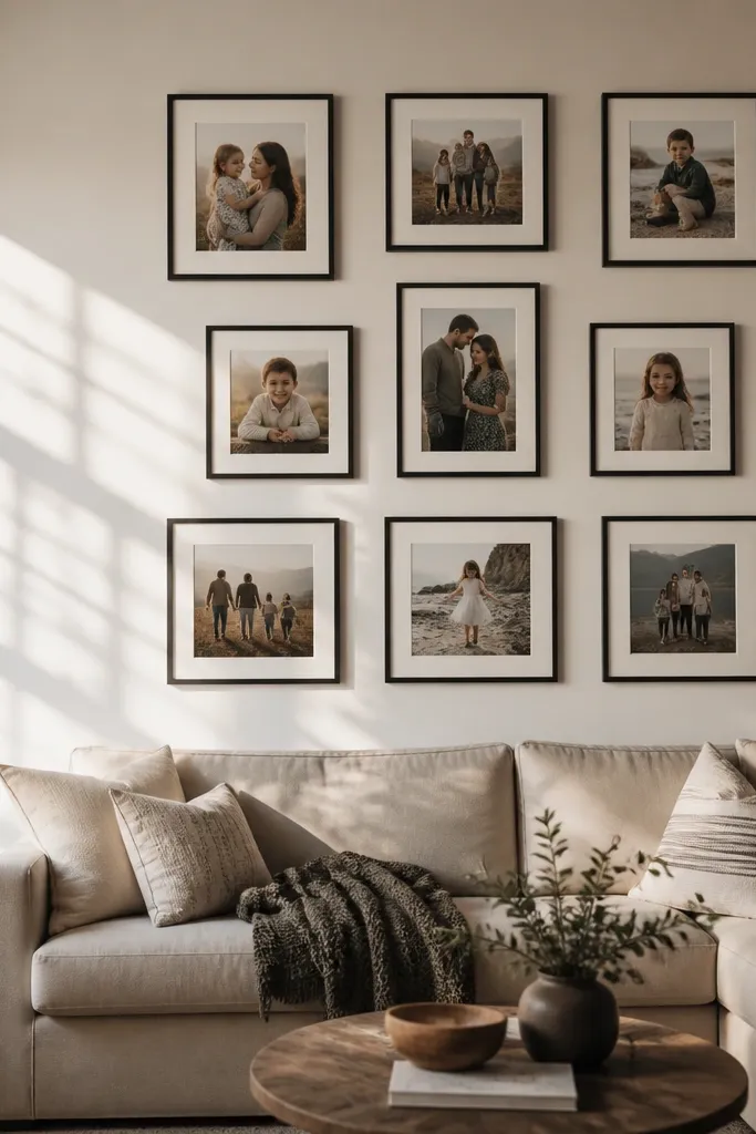
9x12 and 10x10 are for people who want a collage wall that doesn’t feel busy. These sizes let you include fewer photos while keeping each one readable and framed like artwork. 10x10 is especially good for square rhythm, while 9x12 adds a slight rectangle feel that breaks monotony. The trade-off is that you need planning and wall space — random placement gets expensive fast because you’re using larger frames.
Choose a layout that keeps spacing consistent, like a 2x2 with one 9x12 replacing a 10x10 slot. Measure the wall area and decide your maximum number of frames before you buy prints; for most walls, three to five frames looks better at these sizes than eight or nine. If your photos aren’t square, use mats so the visible photo area stays intentional. Hang by row, keeping frame top edges aligned and checking the gap between frames with a ruler as you go.
Editor's noteUse a single frame finish across all large sizes; it makes the wall feel designed even with mixed dimensions.
Skip thisAvoid mixing large sizes with lots of tiny accents — it creates hierarchy confusion.
15. 12x18 Vertical Poster-Style Collage Strip
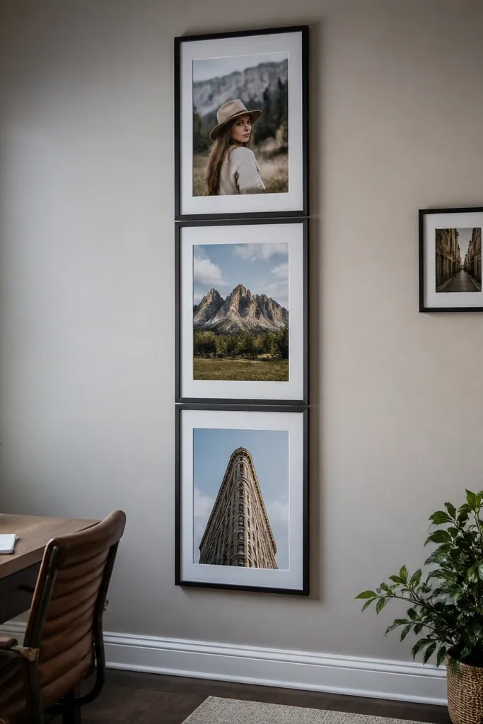
12x18 is the “poster-sized” option for collage walls, and it’s easiest when you build a strip instead of a complex grid. It reads like curated wall art, which is exactly why it can work for beginners: you’re not fighting a complicated layout. Use it for strong vertical photos — portraits, travel landmarks, or high-contrast moments. The trade-off is cost and space; this size works best on large walls or long hallway sections where it can breathe.
Pick a vertical strip layout: two frames stacked or three frames in a line depending on your wall height. Keep the gap consistent, around 1/2 to 1 inch between frame outer edges. Use frames with sturdy mounting hardware and confirm you can mount each frame level — the long size makes crookedness more obvious. Print 12x18 with the correct aspect ratio or use mats to avoid awkward cropping.
Place the strip so the center of the middle frame lands around eye level, then build from there.
Don’t try to cram 12x18 into a small wall corner — the scale makes everything else look tiny.



