
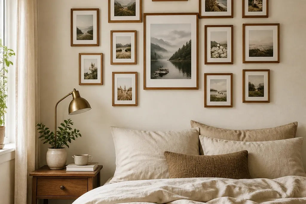
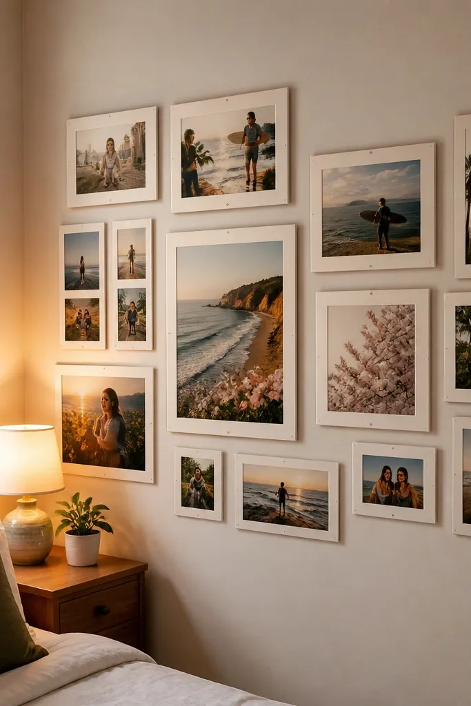
1. Walnut frames with a centered oversized 8x10 anchor
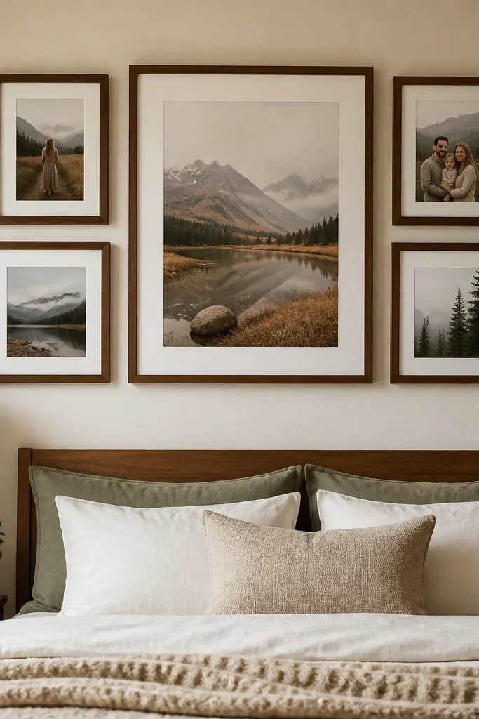
This layout works because it gives your wall one obvious focal point, then uses smaller frames to support it. Walnut frames add warmth, and matching finishes keep the collage from looking like a random collection. The oversized 8x10 anchor prevents the wall from feeling flat, even if your other photos are smaller. It’s a smart fit for a bedroom where you want cozy, not loud. Build it with prints that have clear subjects or consistent color tones so the focal photo can do the heavy lifting.
Start by choosing one main photo for the center and print it at 8x10. Surround it with four smaller frames at 5x7 and 4x6, keeping the same walnut finish and a 1/2-3/4 inch gap between frames. Lay everything out on the floor first to check spacing, then mark the centerline on the wall and hang the anchor at about 58 inches high. Finally, level the outer frames using a tape measure from the centerline so the collage stays symmetrical.
Editor's noteUse a simple frame spacer template cut from cardboard so your gaps stay consistent.
Skip thisDon’t mix frame finishes across the whole wall — it makes the collage look like storage, not decor.
2. Black frames in a staggered 2x4 grid for clean drama
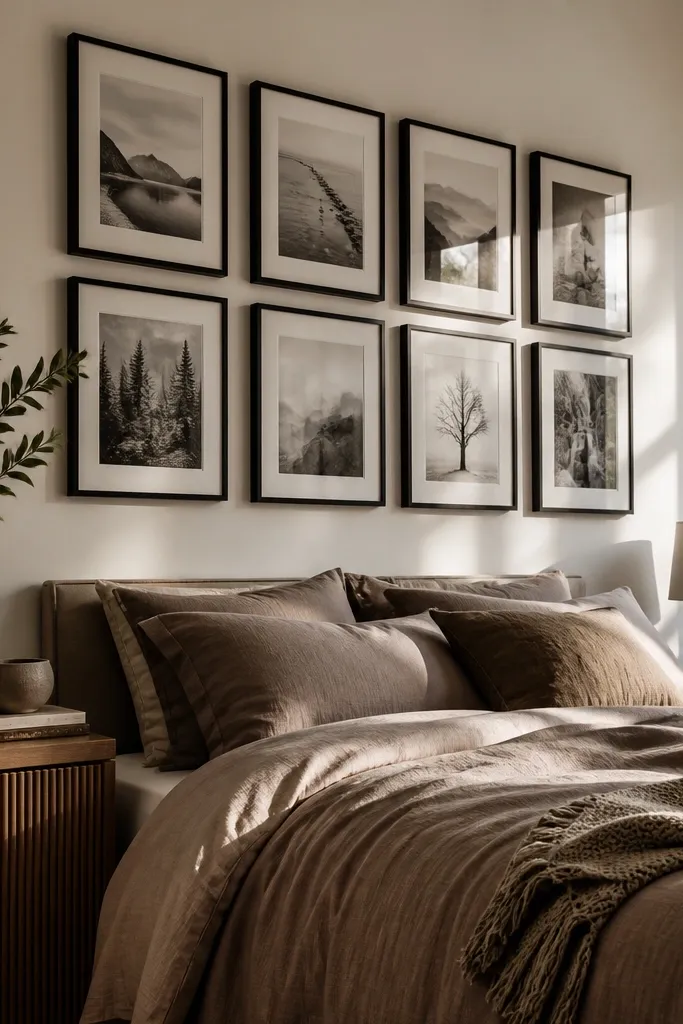
A staggered grid gives you that gallery look without needing perfect symmetry. Black frames read crisp against most bedroom wall colors, especially warm whites, greiges, and soft taupes. The staggering adds motion, so it looks styled even when you’re not staring at it. This layout is great above a bed because it creates structure while still feeling modern. Use mostly portraits or scenes with high contrast so the black frames don’t swallow the photos.
Print photos in three sizes: 4x6, 5x7, and 8x10. Plan a 2x4 grid, then stagger the second column up by about 1 inch so the top edges don’t line up. Keep frame gaps at roughly 1/2 inch and use a consistent mat width if you want a uniform look. Hang by installing two picture hooks or a single mounting rail at the correct heights, starting with the tallest 8x10 pieces, then filling in the smaller frames.
If your photos have different brightness, add a thin white mat to the darker ones so the collage stays even.
Avoid hanging all frames at the same height — it turns into a bland spreadsheet instead of an aesthetic collage.
3. White frames with thick linen-mat spacing
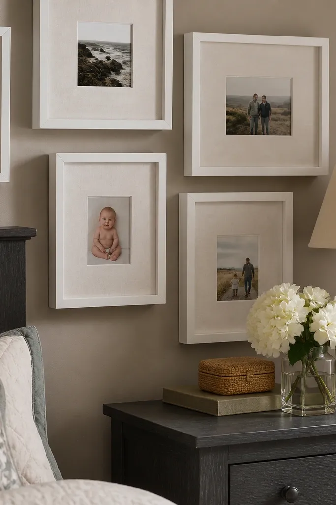
Thick mats make small photos look curated and expensive, and linen-mat texture adds softness that feels right in a bedroom. White frames keep the collage airy, which helps if your room has low light or dark furniture. This approach also forgives uneven photo proportions because the mat creates a visual buffer. It’s ideal for travel prints, artful portraits, or anything with muted colors. If you want calm and cozy, this is the direction.
Choose a mat color close to eggshell or warm off-white, and set mat width around 1.5-2 inches. Use matching white frames and keep photo sizes consistent across the wall (for example: all 5x7 and 4x6). Arrange in a loose cluster around a center 8x10 or 11x14, leaving 3/4 inch gaps between frame edges. Mark the centerline, hang the middle piece first, then attach the rest by measuring from the centerline and adjusting with a level.
Editor's noteBuy frames that accept interchangeable mats so you can swap mat colors if your wall paint shifts.
Skip thisDon’t use thin mats with small photos — the collage will look cramped and cheap.
4. Cream and gold frames with a "sunburst" photo burst
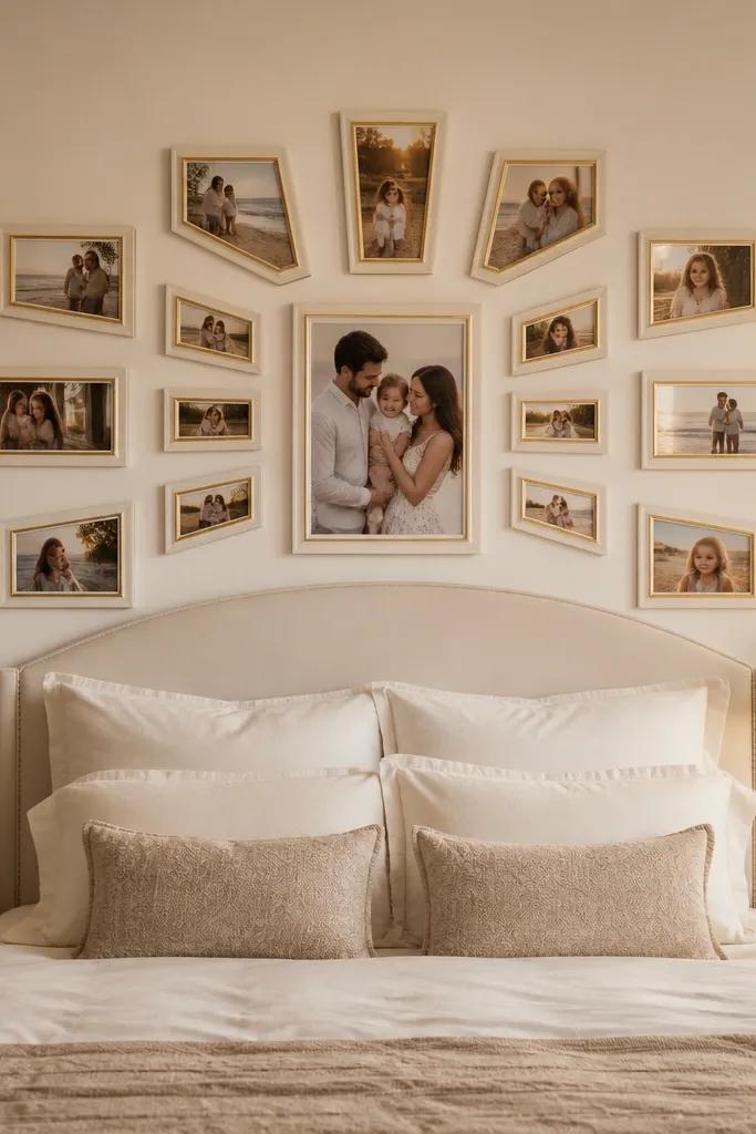
A sunburst layout gives you an aesthetic photo wall collage bedroom that looks like art, not decoration. The center photo anchors the burst, and the radiating frames guide your eyes across the wall. Cream and gold tones add warmth without going overly glam. This one works best with a mix of landscapes and portraits where colors repeat, like sand, blush, and muted greens. Keep the number of pieces limited so it doesn’t become a clutter burst.
Pick a center photo and print it at 8x10. Plan 8-10 frames around it, alternating 4x6 and 5x7, and tilt each frame slightly outward by 5-7 degrees. Use consistent frame color (cream or gold) and keep gaps around 1 inch so the burst stays readable. Mount the center at 58 inches from the floor, then build outward, using a paper protractor or a simple cardboard wedge template to keep the angles even.
If you’re tilting frames, do it in one direction only for a cleaner look across the wall.
Don’t use too many tiny photos — the burst loses its shape.
5. Gallery shelf look with small frames above a ledge
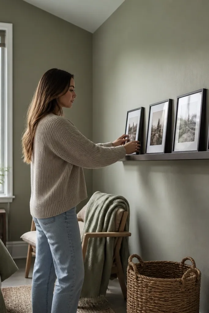
This idea works because you get the collage look without the “floating frames” chaos. A narrow ledge (or floating shelf) lets you align frames at the same height and keeps the wall from feeling busy. It’s perfect for bedrooms where you want a gentle, lived-in style. Use small frames like 4x6 so the wall stays light and doesn’t overpower the headboard. The ledge also makes it easy to swap photos seasonally.
Install a narrow shelf with the top of the shelf at about 60 inches from the floor. Choose 8-12 small frames (4x6) in one finish, and decide on a layout that spans the bed width. Use spacers of 1/2 inch between frames so the gaps look intentional. Place the frames on the shelf first, mark where the hanging points land, then hang any that need wall anchors so nothing slips.
Editor's noteUse shelf brackets with a matte finish so they don’t steal attention from the photos.
Skip thisDon’t overload the shelf with too many frames — keep it to 8-12 for a clean gallery rhythm.
6. Oversized black-and-white collage with one color pop frame
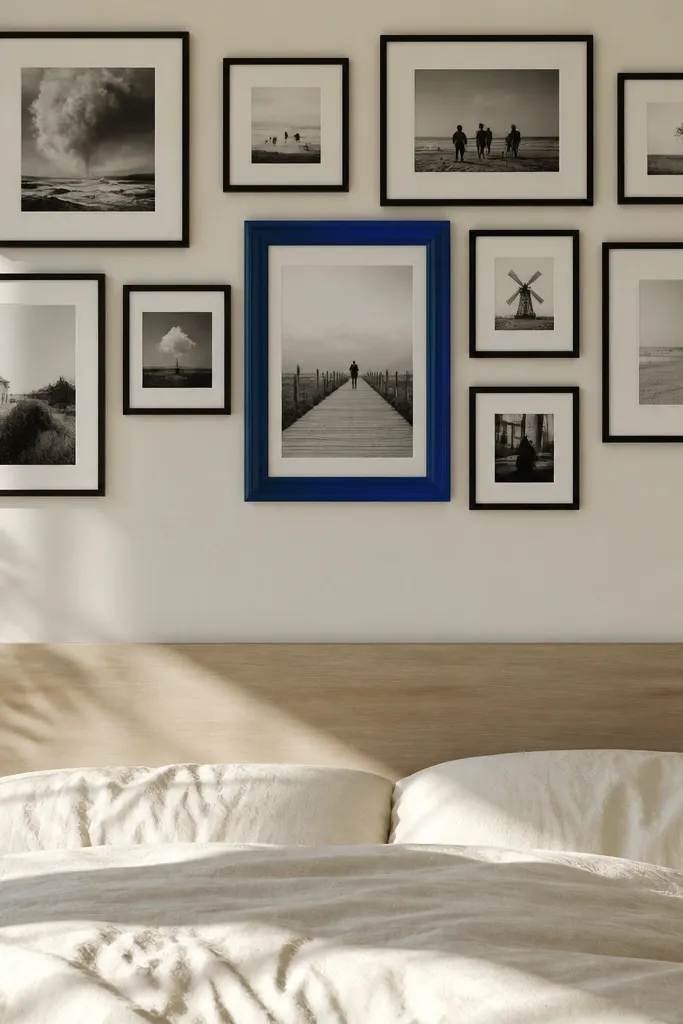
Black-and-white keeps the collage cohesive, and one color pop frame makes the whole wall feel intentional. This is a great option if your photos don’t match in color, because monochrome removes the mismatch. The single colored frame acts like punctuation. It also photographs well because contrast is high and the eye has clear destinations. This layout suits bedrooms with neutral bedding, since the pop frame will stand out.
Print most photos as black-and-white at 8x10, 5x7, and 4x6, all in matching frame finishes. Add one color photo printed at 8x10 in a contrasting frame finish, like brass or a deep forest green. Arrange in a broad horizontal collage above the bed, leaving 2-3 inches from the headboard. Hang the center color pop first, then fill with grayscale frames while keeping consistent gaps and alignment.
Pick a color pop that matches an existing element in the room, like a pillow accent or lamp shade.
Don’t add two or three color-pop frames — it breaks the focal point.
7. Patchwork frames with visible mat borders like a quilt
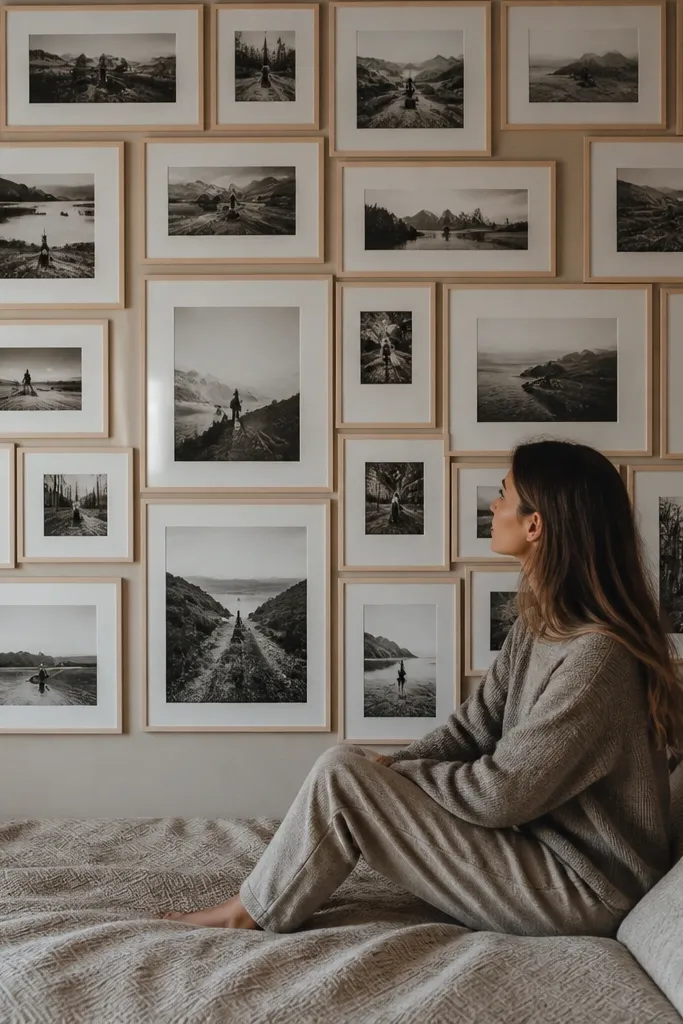
Patchwork layouts look handmade in a good way, but they still need structure. Visible mat borders create the “seams” and make different frame sizes look planned instead of random. It’s a strong choice for bedrooms with patterned bedding because the collage becomes a texture layer. Use a limited palette for frames, like white + natural wood, so the quilt effect stays aesthetic. This one is especially good if you like the look of vintage photo walls.
Choose two frame finishes (example: natural wood and white) and keep mat color the same for both. Cut or print photos in a patchwork mix: 4x6, 5x7, and 8x10. Arrange into a rectangle cluster, then measure the overall width so it spans the bed width minus 6-10 inches. Hang by starting with the largest frames at the corners, then fill the center with smaller ones, adjusting gaps to about 3/4 inch.
Use the same mat width across every frame so the patchwork seams line up visually.
Avoid mixing three or more frame finishes — the patchwork becomes noisy.
8. Polaroid-style collage with faux tape accents
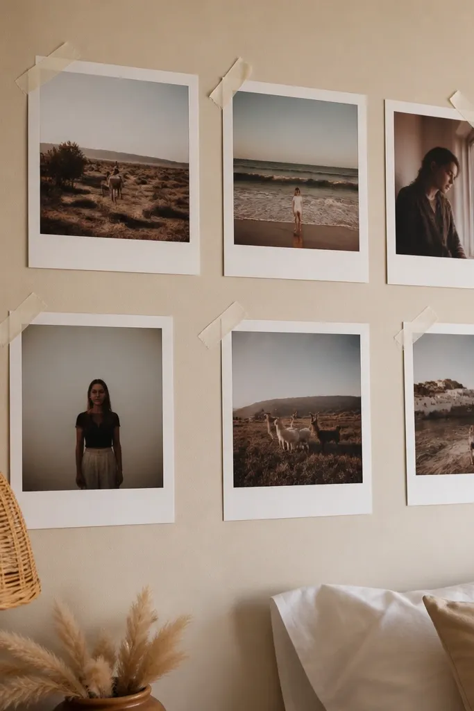
Polaroid-style prints feel casual, but you can keep them aesthetic by using consistent spacing and one tape color. Faux tape corners add charm without the mess of real adhesive. This layout is great for bedrooms that already feel cozy and informal, like a lived-in reading nook vibe. Keep the photos cohesive by using a single filter style or matching color temperature. It also looks great in photos because the white borders create a clean visual frame.
Print your photos with a white border sized like 2.5x3.5-inch Polaroids, then place them into a grid across the wall. Use 12-16 pieces so it looks like a collage, not a few snapshots. Add faux tape corners using painter’s tape or removable washi tape on the top corners only. Mark a centerline, place the middle photo first, then build outward with 1 inch vertical spacing and 1/2 inch horizontal spacing.
Stick the “tape” only at corners so the photo edges stay flat and crisp.
Don’t vary the border thickness — mismatched Polaroid borders look sloppy.
9. Vertical growth collage for narrow bedroom walls
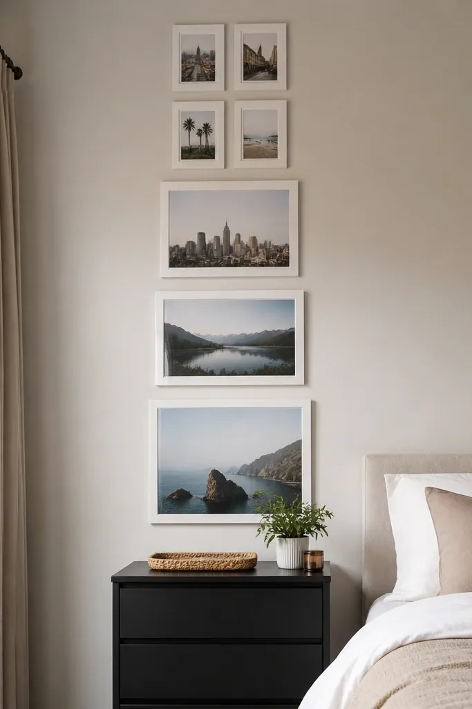
If your bedroom wall is narrow, a vertical collage is the cleanest way to make it feel intentional. The “growth” effect — smaller up top, larger down low — gives your eye a path and makes the space feel taller. This layout also works above a narrow dresser or between a door and a window where a wide collage would feel cramped. Choose frames in one finish and keep the mat color consistent for a polished look.
Pick 7-10 photos, print them in increasing sizes: 4x6 at the top, then 5x7, then 8x10 at the bottom. Arrange them in a straight vertical line with a 3/4 inch gap between frames. Mark the top of the collage so the center lands around 58 inches from the floor. Hang the smallest frame first, then measure down for each next frame so the spacing stays even.
Editor's noteUse a level and a long ruler — vertical lines show every mistake.
Skip thisAvoid mixing landscape-only photos with portrait-only photos — it disrupts the growth rhythm.
10. Mirrored symmetry collage centered over the bed
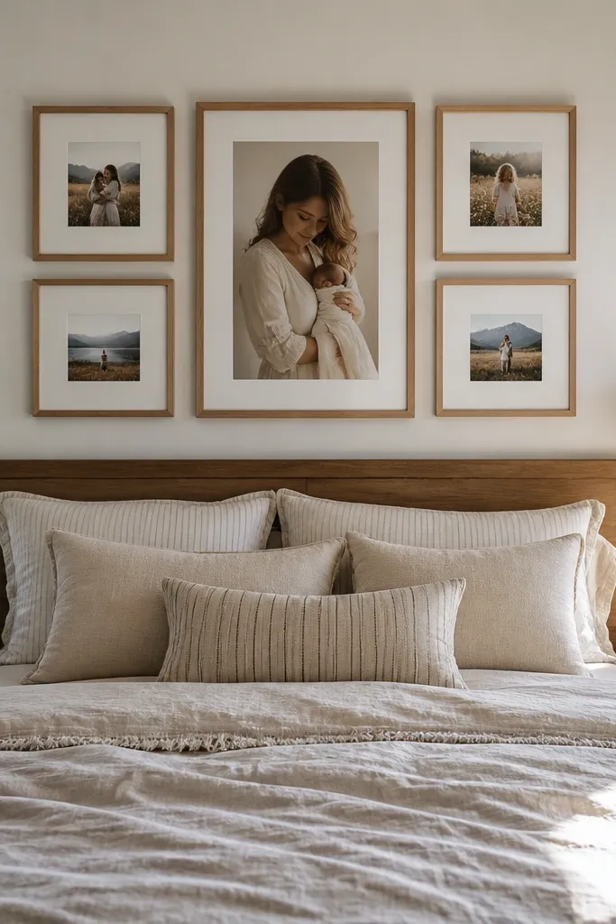
Symmetry is a cheat code for bedrooms because it looks calm and “designed” even if you’re using personal photos. Mirrored layouts feel balanced above a bed, and the room instantly looks put together. This works best when your frames are the same size or at least the same mat width. Choose a center piece that’s either a larger frame or a pair of frames side-by-side. Keep the color palette consistent across the photos so both sides match visually.
Choose a center anchor: either one 8x10 or two 5x7 side-by-side. Build two matching sides using the same frame sizes and the same photo orientation (portrait vs landscape). Keep gaps at 1/2-3/4 inch and aim for the total collage width to match the bed width. Hang the center anchor first, then place left and right frames using measurement from the centerline to each frame edge.
Editor's noteUse identical frame mats on both sides so differences in photo brightness don’t steal attention.
Skip thisDon’t let one side drift vertically — symmetry breaks fast.
11. Floating frame grid with hidden spacers for a modern look
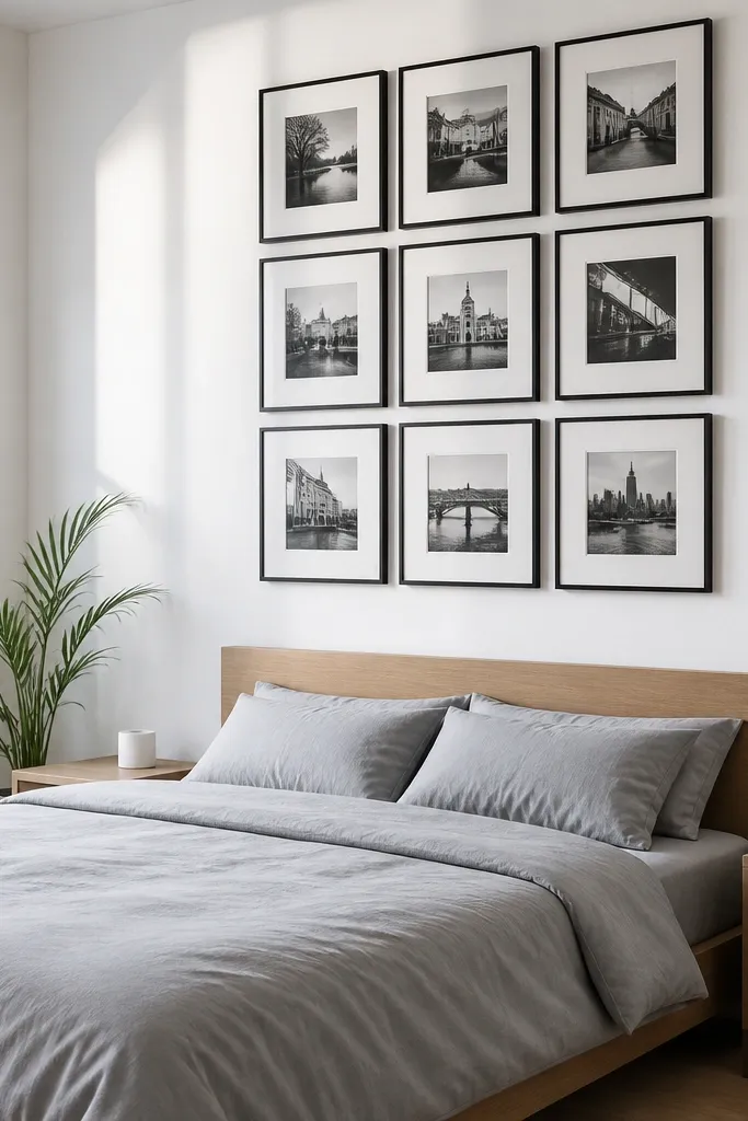
This is the modern, slightly architectural take on a photo wall collage. The “floating” look comes from consistent gaps and straight alignment, not from fancy tricks. It looks best in bedrooms with clean lines — white walls, simple bed frames, and solid bedding. Use frames with built-in stand-offs or add your own spacer system so the distance between frames stays uniform. This is a good project if you like precise results and don’t mind measuring.
Pick 10-14 frames in two sizes, like 5x7 and 8x10, and stick to one finish. Use a spacer method: cut acrylic strips or use frame spacers so the gap between frame edges stays around 1 inch. Layout on the floor, then transfer measurements to the wall with painter’s tape guide lines. Install a level mounting rail or mark individual anchor points, then hang the frames in rows, checking alignment every 2 frames.
Editor's notePaint the wall behind the frames a shade close to your frame finish for extra depth when light hits.
Skip thisAvoid mixed frame thickness — it makes the floating gap look uneven.
12. Shadowbox collage with layered depth for travel souvenirs
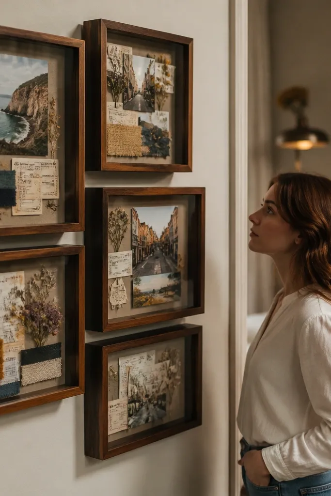
Shadowboxes add depth, which makes the collage feel dimensional instead of flat. This is ideal if your bedroom photos include souvenirs like ticket stubs, small fabric swatches, or pressed flowers. The depth also catches light and makes the wall look more expensive. Use shadowboxes for the top half of the collage and flatter frames for the bottom half so it feels intentional, not crowded. Skill level is moderate because you need careful placement inside each box.
Choose shadowbox frames with a depth of at least 1 inch. Plan each box: one main photo plus one keepsake element, centered on a backing board. Print photos sized to fit the shadowbox opening with 1/2 inch margin around the edges. Arrange shadowboxes in a cluster above the bed, then fill remaining spaces with flat frames to keep the wall balanced. Secure keepsakes with acid-free tape and avoid bulky items that press against the glass.
Editor's noteUse acid-free foam squares for items that need height so they don’t sag.
Skip thisAvoid using glossy tape or adhesives that can yellow — it shows through over time.
13. Fabric-backed photo collage with pinned corners
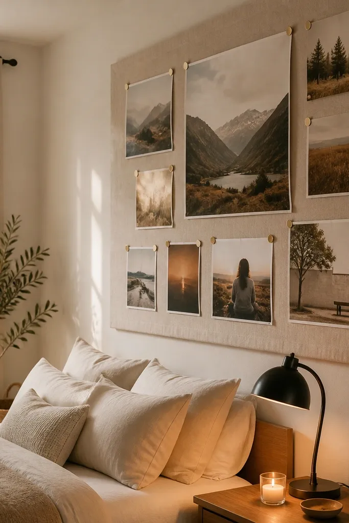
This look turns your photo collage into wall art. A fabric backing softens everything — the photos feel warmer, and the collage blends with textiles in the bedroom. It’s also a practical way to reuse prints without drilling into a wall for every frame. Best for renters or anyone who wants easy updates. Use neutral fabric like linen, cotton canvas, or textured muslin so the photo edges stand out.
Stretch fabric over a foam board or a wooden frame, pulling tight so there are no wrinkles. Cut photo prints to fit and mount them using adhesive photo corners or pinning with small brass tacks. Arrange a collage grid, then pin the photos in place before you remove any protective backing. Hang the finished fabric board using two sturdy wall anchors or a hanging strip rated for the board weight.
Editor's noteChoose fabric in a warm neutral so it doesn’t overpower your photos' colors.
Skip thisDon’t stretch fabric loosely — wrinkles show and ruin the clean aesthetic.
14. Monochrome typography + photos mix for a designer wall
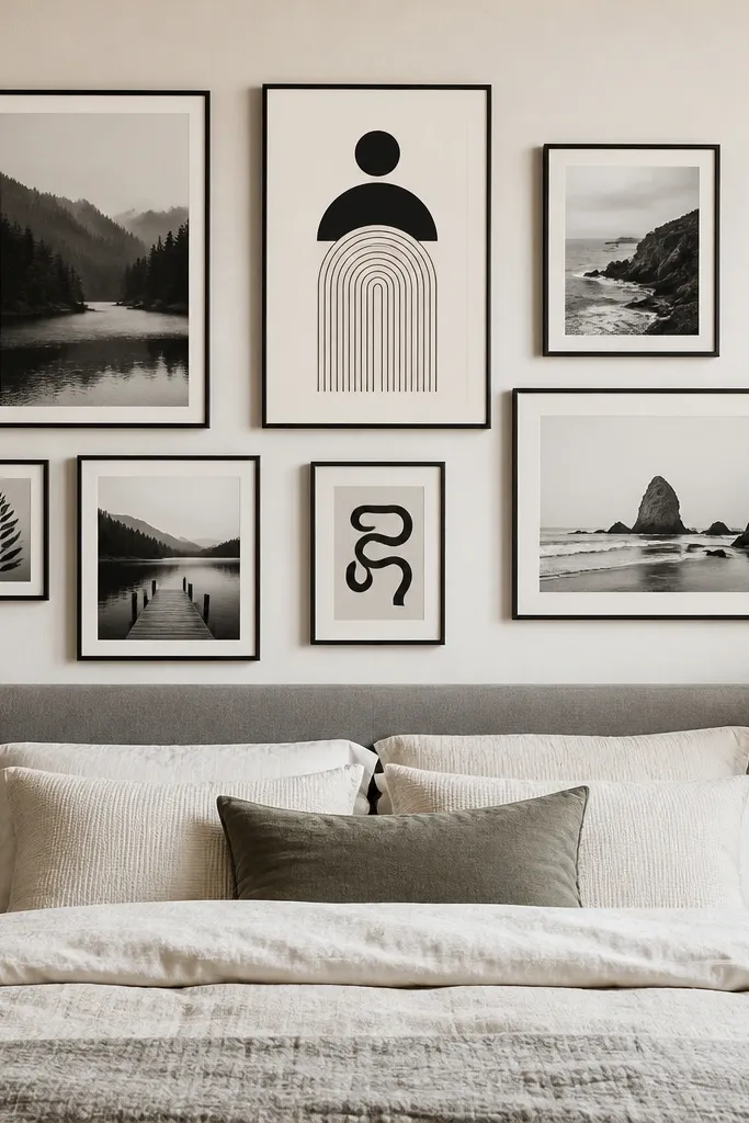
Mixing typography cards with photos makes your collage feel curated instead of purely sentimental. Keep the typography monochrome and simple, like a single quote line or a date, so it doesn’t compete with the photos. This layout works well in bedrooms because it adds structure and visual breathing room. Use the same frame finish for everything and keep the typography cards the same size across the wall. It’s also great if you have fewer photos than you want to fill a wall — the text cards fill the space.
Design 2-4 typography cards in a clean font, sized to match your frame mat window (example: 4x6 cards). Print photos as black-and-white or muted color to keep the palette consistent. Frame everything in identical black or white frames with the same mat color. Arrange in a rectangle cluster above the bed, then hang by starting with the center frame and building outward with even gaps of 3/4 inch.
Editor's noteUse one text style only — one font size and one line length looks intentional.
Skip thisAvoid multi-color typography — it breaks the monochrome cohesion.
15. Rattan or wood clip line for instant collage changes
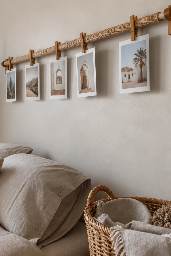
A clip line keeps the collage flexible. You can swap prints without removing frames, and the rattan or wood material adds texture that fits bedrooms. The look is airy and relaxed, but you still get an aesthetic grid by spacing clips evenly. This is ideal if you love seasonal photos or you’re building a wall over time. Keep the clip line above the bed or along a hallway wall where the texture reads clearly.
Install two small wall hooks or a single mounting rail at your chosen height, leaving about 2-3 inches of clearance from nearby elements. String a rattan or twine line tight between hooks so it stays straight. Print photos with white borders and use small wooden clips spaced about 4-5 inches apart. Arrange in two rows or one vertical column for a clean look, then adjust the clip positions so photo edges align evenly.
Lightly iron your string or use a new twine roll so it doesn’t look kinked.
Don’t hang it too low — clipped photos can crowd your headboard visually.
16. Frame-within-a-frame collage using one large outer frame
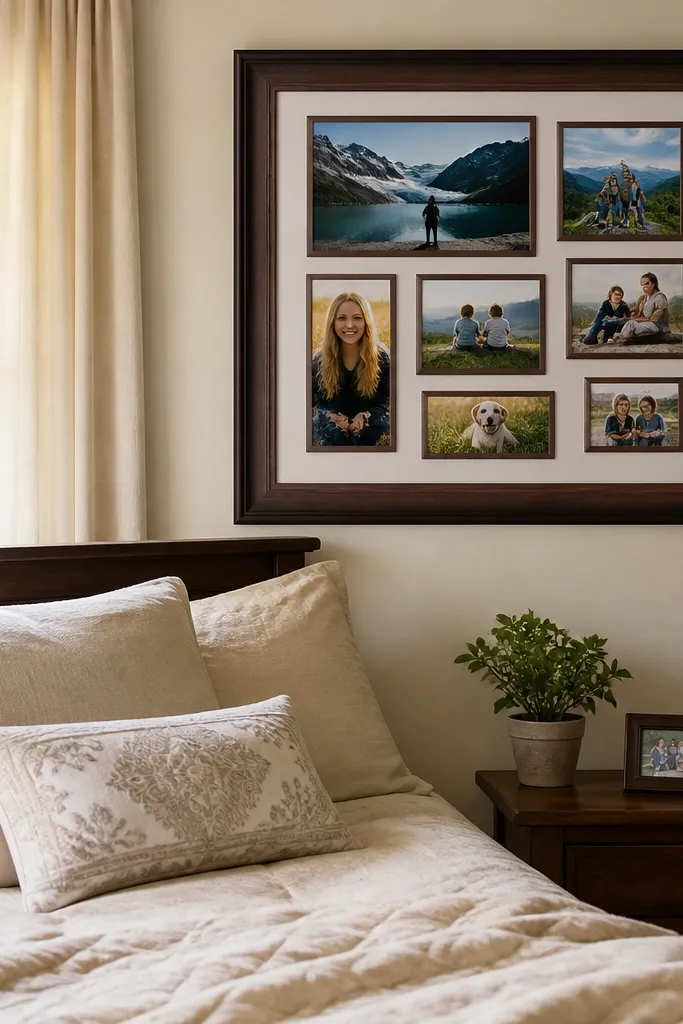
This is a shortcut to a high-end look: one big outer frame makes the collage feel like a single piece of art. It also hides small spacing mistakes because everything sits inside the border. Bedrooms look better with one clear statement piece, and this gives you that without needing a painting. Use a large outer frame in black, walnut, or white, then fill with smaller frames or photo mats inside. Keep your photo palette consistent to make the inner collage read as one.
Choose an outer frame size that covers your collage area, like 24x36 or 30x40. Mount a backing board inside the outer frame and attach smaller frames directly to the board or to photo corners mounted on the backing. Arrange your inner frames in a balanced cluster and keep gaps around 1/2 inch. Hang the outer frame using two secure wall anchors, then check alignment with a level before tightening the hanging hardware.
Use a matte black outer frame to hide fingerprints and keep the piece looking clean.
Avoid overfilling the outer frame — leave some negative space so it doesn’t look like a photo dump.
17. Color-block collage with solid color mat panels
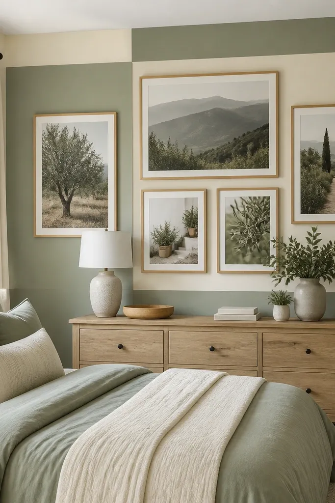
Color-blocking makes your collage look designed even if your photos are different. Instead of relying on frame color alone, you use solid mat panels in two or three tones that match your bedding. This approach creates clear sections on the wall, so it never feels messy. It’s also great if you want an aesthetic photo wall collage bedroom that coordinates with a duvet, curtain, or rug. Keep the palette tight: one neutral and one accent color are enough.
Pick two mat panel colors and one neutral, then cut mat boards to standard sizes that match your frame openings. Print photos sized to fit the mat window and mount them flat with photo corners. Arrange frames in blocks: for example, left half uses one accent mat color, right half uses the other, with a few mixed pieces in the center. Hang using a centerline, then measure each block’s width so the color transitions stay straight.
Editor's noteIf your wall is warm-toned, use cool accent mats like slate or sage to keep contrast clean.
Skip thisDon’t add more than two accent colors — the collage becomes decorative chaos.
18. Polished minimal collage with only three frames
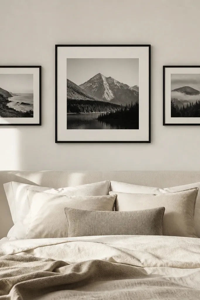
Minimal doesn’t mean boring. A three-frame collage can look intentional and high-end because it uses negative space as part of the design. This works when you have a few photos that are strong and you don’t want to fight with spacing rules across many pieces. Choose frames with clean lines and consistent matting. Place the collage above the bed or on a blank wall next to a nightstand. The wall gets calmer, and the photos get more impact.
Choose three photos and print them in sizes like 8x10, 11x14, and 8x10. Use identical frames and mats so the whole set looks like one unit. Arrange them in a horizontal row with the center piece taller, or in a triangle-like stagger with the bottom corners slightly lower by 1-2 inches. Mark the centerline, hang the center frame first at about 58 inches high, then position the side frames using equal distances from the centerline.
Use a matte finish on frames if your room has bright lamp glare — it keeps the wall looking clean.
Avoid mixing thin and thick mats — it makes minimal layouts look unfinished.
19. Bedside vertical collage for one-wall styling
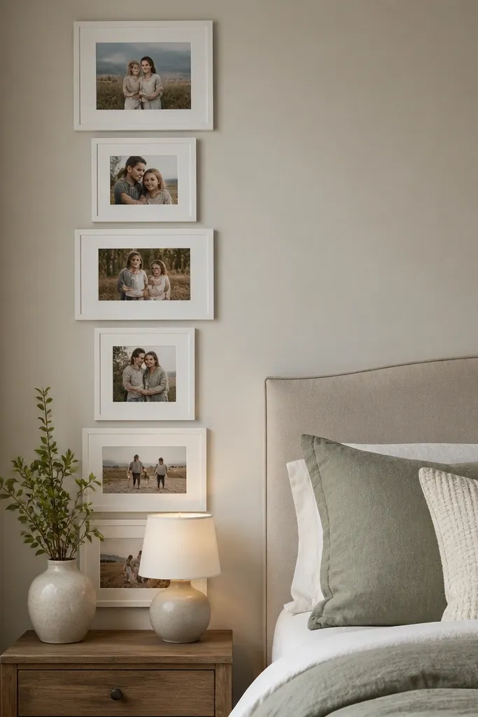
You don’t need a big wall to make an aesthetic photo wall collage bedroom. A vertical collage beside the bed draws attention to the nightstand area and makes the whole corner feel styled. Use fewer frames here — 5-7 pieces — so the view from the bed stays clean. This layout works well with narrow bedrooms where the main wall is taken by a headboard and lighting. Choose frames that match your nightstand finish or your lamp bases for cohesion.
Print 5-7 photos in two sizes, like 4x6 and 5x7, plus one larger 8x10 if you want a focal piece. Arrange them in a vertical stack with small gaps around 3/4 inch. Keep the top of the collage around 72 inches from the floor so it doesn’t feel too low. Hang the biggest frame first, then use a tape measure to place the smaller frames directly above and below it.
Editor's noteIf you have a reading lamp, place the collage so it doesn’t compete with the light cone — keep frames to one side of the lamp.
Skip thisDon’t put the collage too close to a doorway trim — it looks cramped.
20. Frame cluster with one oversized photo and two diagonal rows
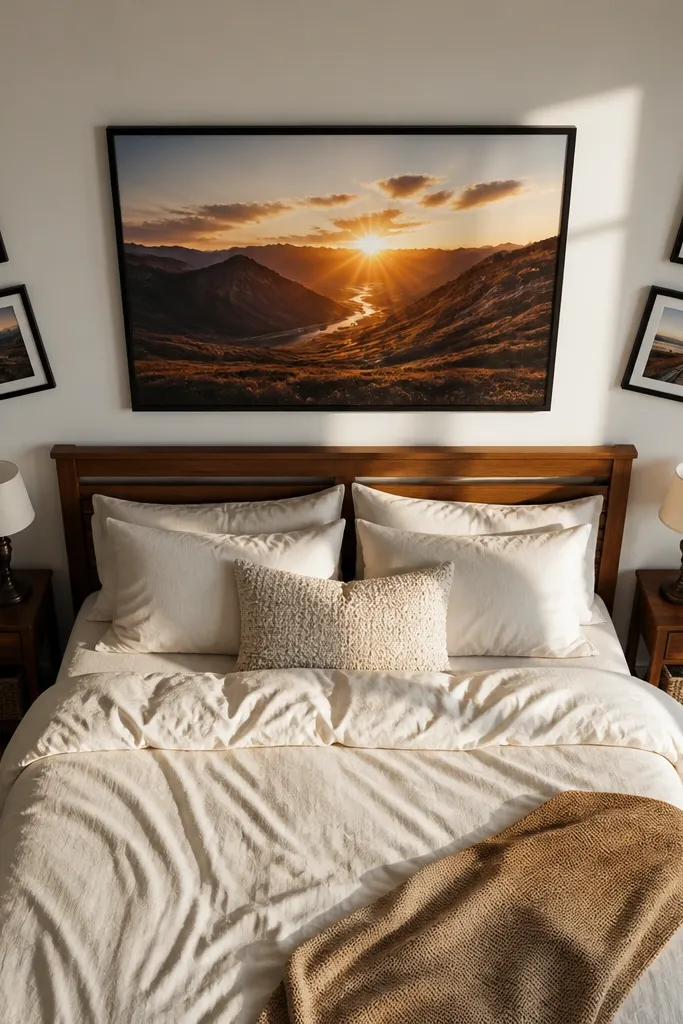
This cluster layout adds energy without turning into a random collage. The oversized photo gives you a clear focal point, while diagonal rows create movement that feels modern. It looks great above a bed when you want something more styled than a straight grid. Choose one theme photo — a scenic shot or a portrait with strong composition — and surround it with supportive smaller photos. Frame finish should stay consistent for the calm factor.
Pick one main photo at 11x14 or 8x10 and print it as the anchor. Surround it with 8-10 smaller frames, using 4x6 and 5x7, arranged into two diagonal lines crossing slightly behind the anchor. Keep consistent gaps of about 3/4 inch and make sure the outer edges form a neat rectangle. Mark the centerline, hang the anchor first, then place the diagonal rows by measuring from the anchor corners.
Use the same mat width on all frames so the diagonal lines look intentional instead of uneven.
Avoid diagonals that slope too steep — keep it subtle at about 10-15 degrees.
21. Pastel frames with a soft ombre photo set
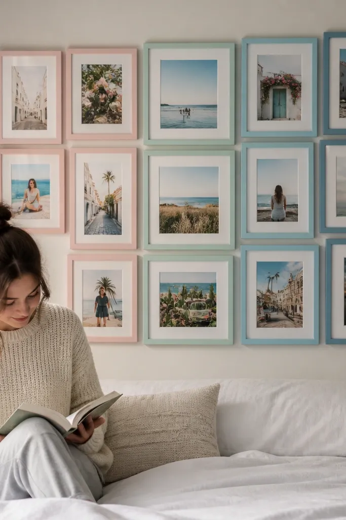
Pastel frames paired with an ombre photo set looks sweet and designed, especially for bedrooms with light bedding and soft wall paint. The progression — light tones to deeper tones — makes the collage feel cohesive even when images differ. Keep frame finishes in pastel colors that match your room palette, like blush, powder blue, and sage. This is a good pick if your photos are mostly in similar lighting and you want the wall to feel airy. It also photographs nicely because the color transitions are clear.
Choose 9-12 photos and edit them so their color temperature shifts gradually from light to deeper tones. Print them in 4x6 and 5x7 sizes and assign each photo a pastel frame color in order. Arrange in a staggered grid that flows left-to-right or top-to-bottom, with the lightest frames at one corner. Hang by marking a reference corner on the wall, then measure each frame position from that corner using painter’s tape guides.
Editor's noteUse one mat color (warm white) across all pastel frames to keep the softness from turning into clutter.
Skip thisDon’t add bright neon accents — pastels need restraint to stay aesthetic.
22. Deep green frame cluster with warm neutral photos
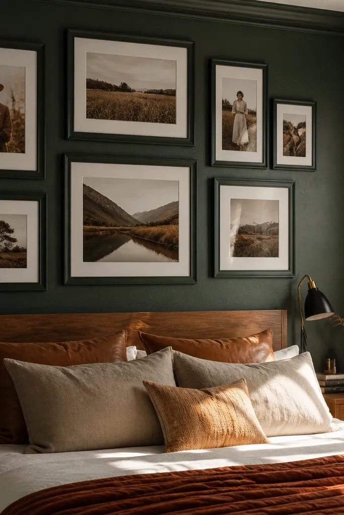
Deep green frames give the collage a moody, grown-up feel that still looks cozy in a bedroom. Warm neutral photos — like beige, cream, tan, and muted brown — keep the collage from feeling dark and heavy. This layout works best when you have a bed with warm wood, caramel leather, or cream bedding. The cluster approach adds intimacy, like curated wall art. Keep the frame finish consistent and avoid mixing with too many other bold colors on the wall.
Print 10-12 photos in 4x6 and 5x7, plus one 8x10 centerpiece. Use deep green frames with a light mat color, like off-white, so photos stay readable. Arrange into a compact rectangle cluster above the bed, leaving 2-3 inches between the collage and the headboard. Hang the centerpiece first at about 58 inches high, then fill around it with smaller frames using equal spacing.
Editor's noteIf your photos are low-contrast, add a white mat so faces and details don’t get washed out.
Skip thisAvoid mixing deep green with black frames in the same cluster — it can look harsh.
23. Round frames with a honeycomb layout
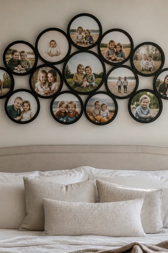
Round frames soften the geometry and make the collage feel playful but still curated. A honeycomb pattern keeps it structured, so it doesn’t look like random circles. This is a great aesthetic photo wall collage bedroom option if you want something different from the usual rectangle grid. Keep photo sizes consistent inside the round frames to maintain the honeycomb rhythm. This layout suits bedrooms with curved decor elements like rounded mirrors or arched headboards.
Choose round frames with a consistent diameter, like 6-7 inches outer size, and standardize photo sizes inside them. Plan a honeycomb layout by using a template: draw hexagon centers on cardboard and place frames at those points. Arrange 10-14 frames to form a rectangle cluster so it spans the bed width. Hang by marking the center point first, then measure out to each frame position, using a level to keep rows consistent.
Editor's noteUse painter’s tape to mask the wall and map the honeycomb before you hang anything.
Skip thisDon’t mix different circle sizes — the honeycomb loses its clean pattern.
24. Photo strips like film frames with a top rail
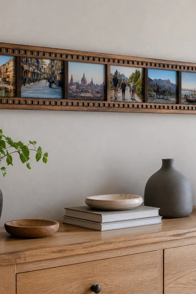
Film-strip style gives you instant personality without clutter. The clean horizontal rhythm looks good above a dresser or along a long wall. It’s also easier to plan than a full grid because you’re repeating one format. Use photos that work as a sequence — travel days, a month of portraits, or a timeline of a hobby. Keep everything in one frame finish so the strip looks like a single designed piece.
Print photos as long strips sized to fit a frame window, like 3x7 or 4x8, and choose frames that have a slim profile. Arrange 6-10 frames in a single horizontal line or two staggered lines. Install a top rail or use a single mounting point per frame, depending on frame weight. Mark the wall centerline, hang the middle frame first, then work outward so the strip stays straight.
Editor's noteUse consistent spacing between frames, around 1 inch, so the film-strip rhythm stays crisp.
Skip thisDon’t use different frame depths — the strip will look uneven in photos.
25. Vintage postcard collage with aged paper mats
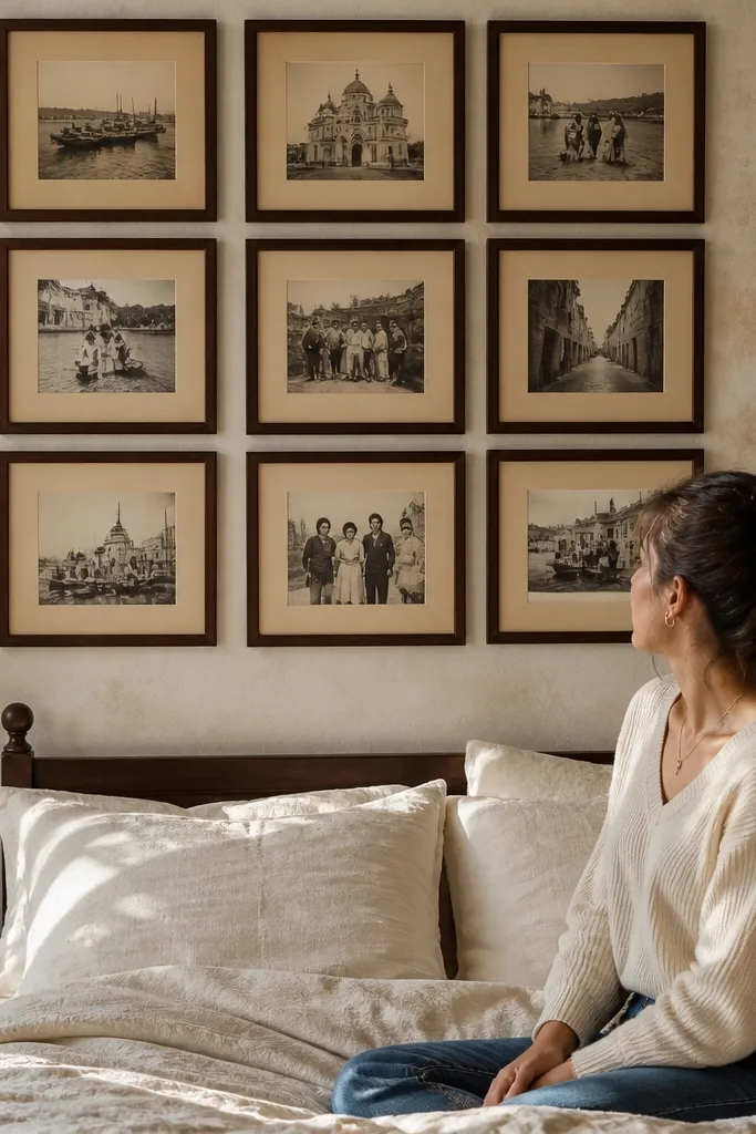
Postcard-style prints plus aged mats create a vintage bedroom vibe that still looks neat. The trick is uniform mat color and consistent frame finish so it doesn’t turn into a craft project. This layout is great for travel memories, old family photos, or anything with sepia tones. Keep the photos mostly 4x6 so the collage feels cohesive. It’s also a good solution if you have postcards or printables you want to use without turning them into loose clutter.
Print or trim photos to postcard proportions, like 4x6 with a white border. Use frames in one vintage finish, like brushed wood or antique bronze, and add aged cream mats with a 1.5-2 inch border. Arrange into a rectangle cluster above the bed, leaving 1/2-3/4 inch gaps. Hang the center piece first at 58 inches high, then place the surrounding frames by keeping the outer edges aligned.
Use a mat color that’s slightly darker than your print border so the edge definition stays sharp.
Avoid mixing modern glossy frames with aged mats — it looks mismatched.
26. Rainbow border collage using one frame color and colored mats
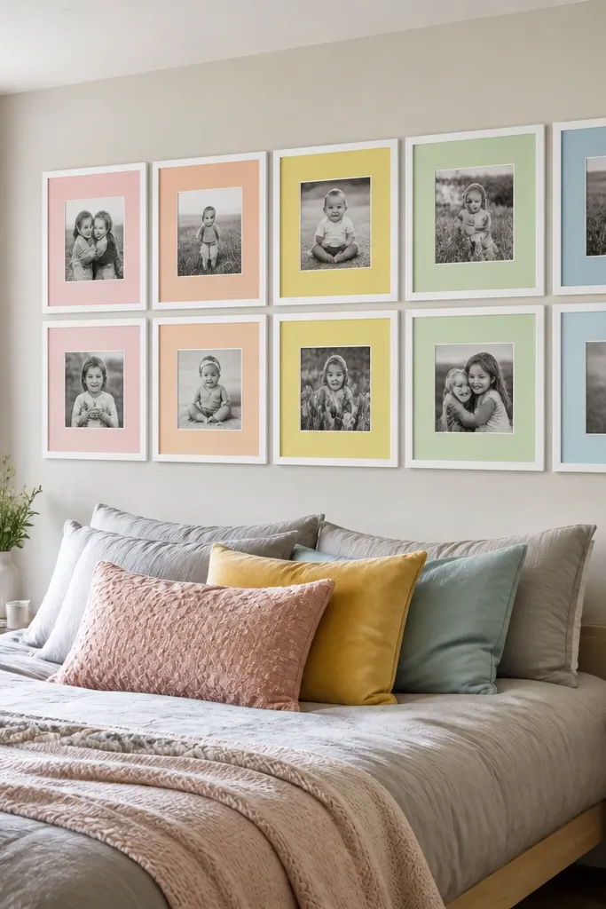
A rainbow border collage looks fun and aesthetic because the color lives in the mats, not in random frames. That makes it easier to keep the overall wall cohesive. Use one frame finish for everything, then vary mat colors in a soft gradient or a few selected hues that match your bedding. The collage stays readable from far away because frames are consistent. This style is great for kids' rooms too, but it still works in adult bedrooms if you keep the palette muted.
Choose one frame finish, like white, and keep the frame style identical. Cut mats in 6-10 colors, but keep them within a muted range (blush, dusty rose, sage, sky gray, tan). Print photos in consistent sizes like 4x6 and 5x7 and mount them flat. Arrange the mats in an order that creates a gradient across the collage, then hang by marking a grid on the wall with painter’s tape.
Editor's notePick mat colors that repeat in your room textiles so the wall feels connected, not random.
Skip thisDon’t add neon mats — it overwhelms the photos.
27. Single-line minimal collage with long horizontal frames
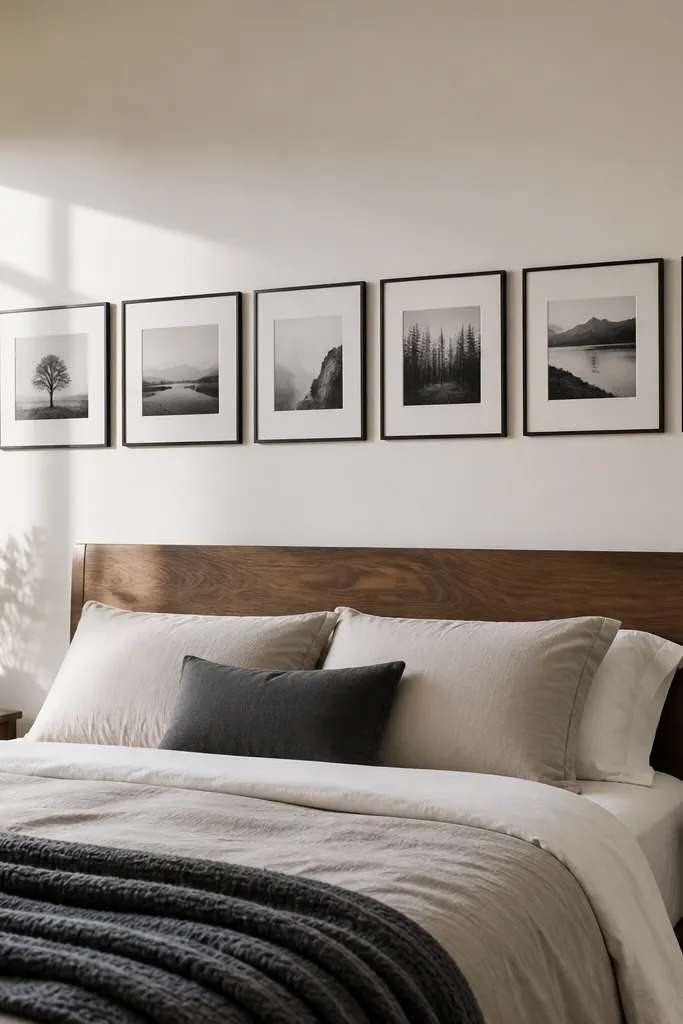
A single-line collage is the cleanest way to get an aesthetic photo wall collage bedroom when you want minimal visual noise. Long horizontal frames stretch the wall and make the room feel wider, which helps in smaller bedrooms. This style is especially good for landscape photos, sheet music scans, or monochrome art prints. Keep the frames identical so the row reads like intentional design. If you like calm, this is the layout.
Pick 5-7 long horizontal frames, like 5x15 or similar proportions, and mount landscape photos inside. Space frames 1 inch apart and keep the row centered above the bed or dresser. Mark the centerline, hang the middle frame at about 58 inches high, then place adjacent frames by measuring equal distances from the center. Use a level for the entire row so it doesn’t drift.
Use matte glass or anti-glare frames if you have bright overhead lights — reflections ruin the clean look.
Avoid mixing vertical and horizontal frames — it breaks the single-line effect.
28. Overlapping frames with a controlled "messy" look
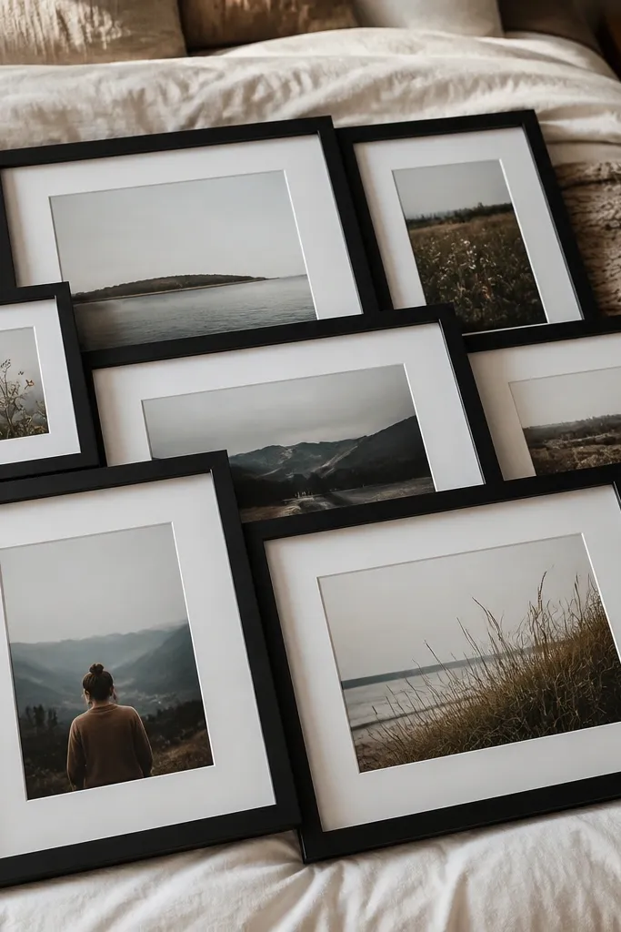
Controlled overlap makes a collage feel casual and artsy without going chaotic. The trick is overlap only slightly, like 1 inch, and keep frame colors consistent. This style looks great when your photos have different compositions because the overlap creates a layered collage feel. It’s a good option for bedrooms that already have a more relaxed style, like soft linens and layered bedding. Use fewer frames than you think — 8-10 pieces looks intentional.
Choose 8-10 frames in one finish and print photos in two sizes, like 4x6 and 5x7. Arrange on the floor first, overlapping frames by about 1 inch so the collage forms a stable rectangle. Mark the wall, then start hanging the back-most frames first, using wall anchors rated for frame weight. After the back frames are secure, hang the front frames last so the overlap looks layered rather than accidental.
Editor's noteTape your overlap positions with painter’s tape on the wall before drilling — it prevents wobble.
Skip thisDon’t overlap too much — the collage becomes hard to read and looks messy in photos.
29. Two-tone frame collage with a neutral base and one accent wall color
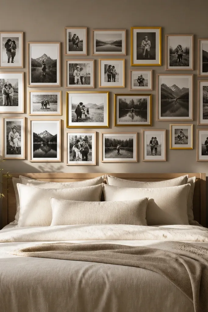
Two-tone frames let you add personality without losing cohesion. Pick a neutral frame finish for most pieces, like white or natural wood, then choose one accent finish that matches something in your room, like warm brass or muted black. Use accent frames sparingly — around 20% of the collage — so they feel like designed pops. This layout is great when you want your aesthetic photo wall collage bedroom to match a specific decor element, like a lamp or mirror frame. Keep mat color consistent across both frame types.
Choose 12-14 frames total, with 9-11 in the neutral finish and 2-3 in the accent finish. Print photos in 4x6 and 5x7 sizes and keep the same mat width across all frames. Arrange in a rectangle cluster above the bed, placing accent frames near corners and the center for visual balance. Hang by installing the centerline guide, then placing frames in pairs to keep the cluster even.
Editor's noteIf your accent finish is brass, keep photo tones warm so the brass doesn’t clash with cool images.
Skip thisAvoid using accent frames in the middle of every row — it stops being a pop.
30. Mirror-like photo collage using silver frames and light mats
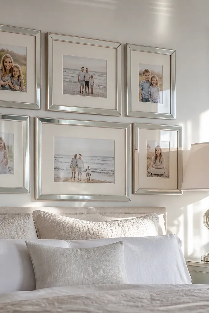
Silver frames create a clean reflective feel that makes bedrooms look brighter, especially when you have light-colored walls. Pair them with light mats so photos stay readable. This layout works well for bedrooms with metallic details like silver lamps or chrome hardware. The aesthetic comes from uniform frame shine and consistent spacing, not from over-styling. Use mostly photos with cool tones or crisp contrast so the collage looks sharp.
Pick silver frames and keep them identical in size wherever possible. Use 10-12 frames in a rectangular cluster, mixing 4x6 and 5x7 sizes, with one 8x10 centerpiece. Keep mat color bright white with a 1-1.5 inch border. Hang the centerpiece first at 58 inches, then fill around with measured spacing of 3/4 inch between frames.
Wipe frames with a microfiber cloth before hanging to remove fingerprints — silver shows everything.
Avoid matte and glossy silver together — it looks patchy.



