
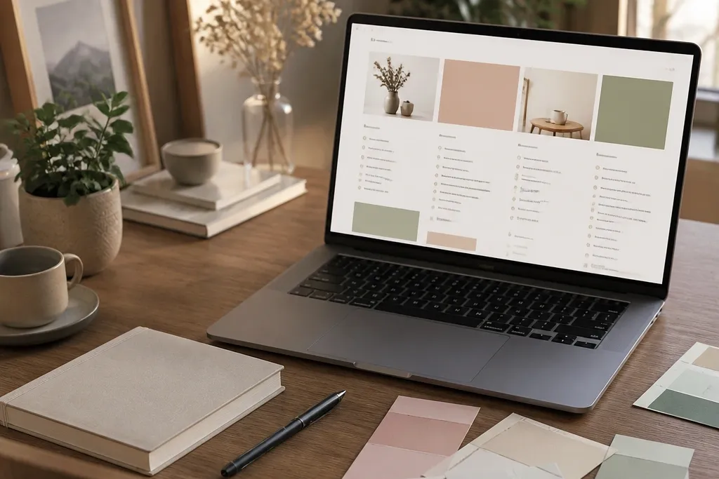
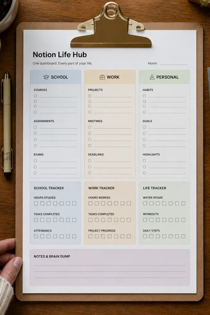
1. Soft-Minimal Room Planner with Color Blocks
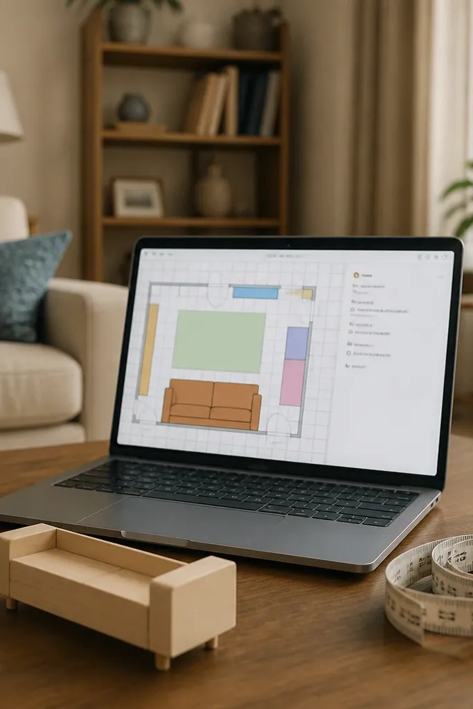
This template is built for people who want decor planning that looks calm and screenshot-friendly. You get a simple room map area and a set of pastel blocks that represent zones like seating, storage, and wall space. The beauty comes from how the template forces spacing: the planning area is wide, and the details sit in a narrow column so nothing crowds the image. It’s also practical because you can attach photos to each zone and keep notes, measurements, and links in one place.
Start by duplicating the template and changing the cover to a light photo with low contrast (think white walls or neutral linen). Then edit the database properties so each zone has a color label and a short “what goes here” field. Finally, add a relation from your “shopping” or “project” database to the zone database so items show up where you planned them. Keep the room map area to one page width so your layout stays clean on mobile.
Editor's noteUse consistent color names in your property values so your blocks match across pages.
Skip thisDon’t add three different cover styles across pages — it breaks the calm look fast.
2. Gallery-Wall Project Board with Photo Per Tile
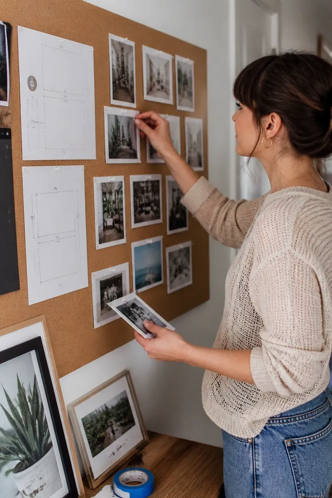
If you’re into gallery walls, this is the most visually satisfying setup because every item gets its own photo tile. The template organizes frames, prints, and spacing notes without turning into a spreadsheet. Your photos stay front-and-center, while the metadata lives in a compact side panel. It works great for people who plan by eye — you can compare sizes and gaps quickly when you’re choosing what to hang next.
Duplicate the template and set up a “Frames” database with properties for frame size, print size, and mounting type. Then create a gallery view where the tile shows the cover photo plus one line of text for size. Next, add a “Placement” field (like top row, left column) so you can sort visually by section. Finish by adding a “print notes” text property and keeping it short so the tile layout doesn’t stretch.
Editor's noteName your images with exact dimensions (ex: 11x14) so the tiles stay scannable.
Skip thisAvoid long captions in the gallery tile — they ruin the grid look.
3. Dark Denim Studio Tracker with Status Colors
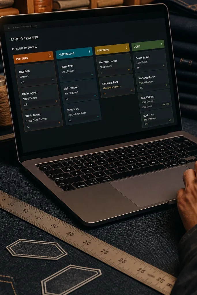
This template is for an aesthetic that feels grounded and maker-first. It uses a dark, high-contrast visual style so progress is obvious at a glance. Each project has a status property with strong colors like “Cutting,” “Assembling,” “Finishing,” and “Done.” The key is that you can see your whole pipeline without opening every page. It’s also useful for DIY because it forces you to break work into phases, which reduces the “where is this project?” problem.
Duplicate the template and set your status property to a fixed set of options with color coding. Then create a linked “Materials” database and add a relation so each project page shows what it needs. Next, set a board view by status and keep only 4-5 columns so it doesn’t become a cluttered rainbow. Finish by adding a “Finish type” property (paint, stain, varnish, fabric) to keep your finishing notes consistent.
Editor's noteUse one finish vocabulary across the workspace so your filters stay useful (for example, always say “matte varnish” not “varnish” sometimes and “clear coat” other times).
Skip thisDon’t add 10 status values — the board stops reading clean.
4. Recipe-to-Decor Moodboard with Sticky Notes
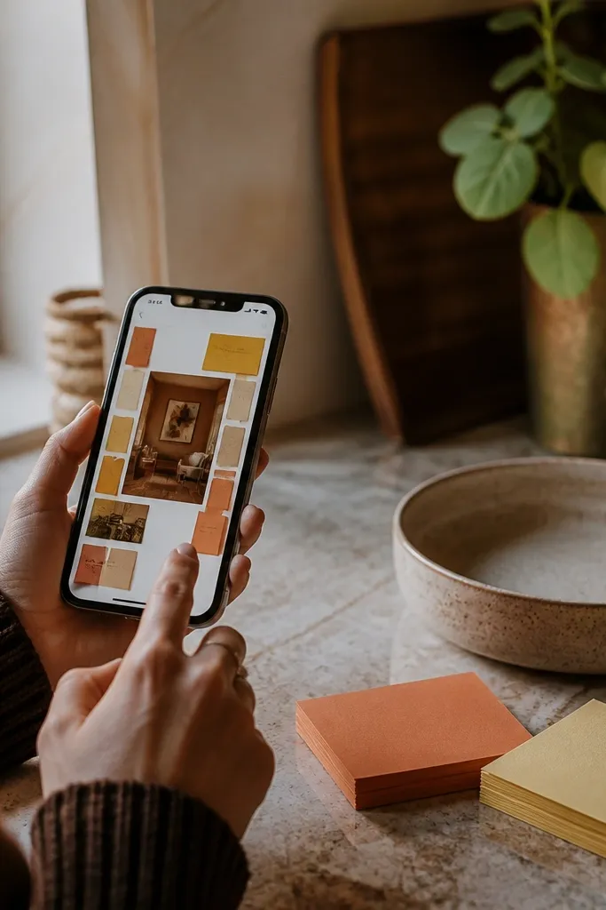
This template turns your food inspiration into room inspiration, which sounds quirky but looks great. Each entry is a sticky-note style card with a background color, a photo, and one line of “what to copy.” It’s photogenic because the layout uses repeated card shapes and a limited palette, so your board looks like a curated wall. You can use it for hosting themes, seasonal tablescapes, or just capturing ideas you’d forget.
Duplicate the template and set up a database with properties for theme color, photo, and a short “copy this” line. Then create a board or gallery view that shows the card color as the visual cue. Next, add a relation to a “Shopping” database so you can attach tableware or DIY craft supplies to the moodboard entry. Finally, standardize the card size by keeping the “copy this” text short.
Editor's notePick 6 background colors and reuse them. Your board will look designed instead of random.
Skip thisDon’t mix fonts or card sizes — the sticky-note look needs repetition.
5. Small-Space Storage Layout with Before/After Slots

This one is pure utility with a clean aesthetic: it keeps your storage plans readable by showing before and after in the same place. You get a before photo area, an after photo area, and a small list of what changed. The look is strong because the template uses a consistent two-column structure, like a mini case study. It’s perfect for DIYers tackling closets, entryways, and under-bed storage where progress is visual and measurable.
Duplicate the template and create a “Storage Projects” database with properties for location (closet, entry, pantry), before photo, after photo, and change notes. Then set a table view for data entry and a gallery view for before/after comparison. Next, add a “Storage item” relation so each project can link to bins, labels, shelves, or baskets. Finish by keeping change notes under 120 characters so the cards don’t balloon.
Editor's noteWrite your before/after captions with one measurable phrase (ex: “replaced 3 bins with 2 pull-out trays”).
Skip thisDon’t cram extra photos into the slots — the before/after comparison needs breathing room.
6. Paint Color Library with Swatch Rows
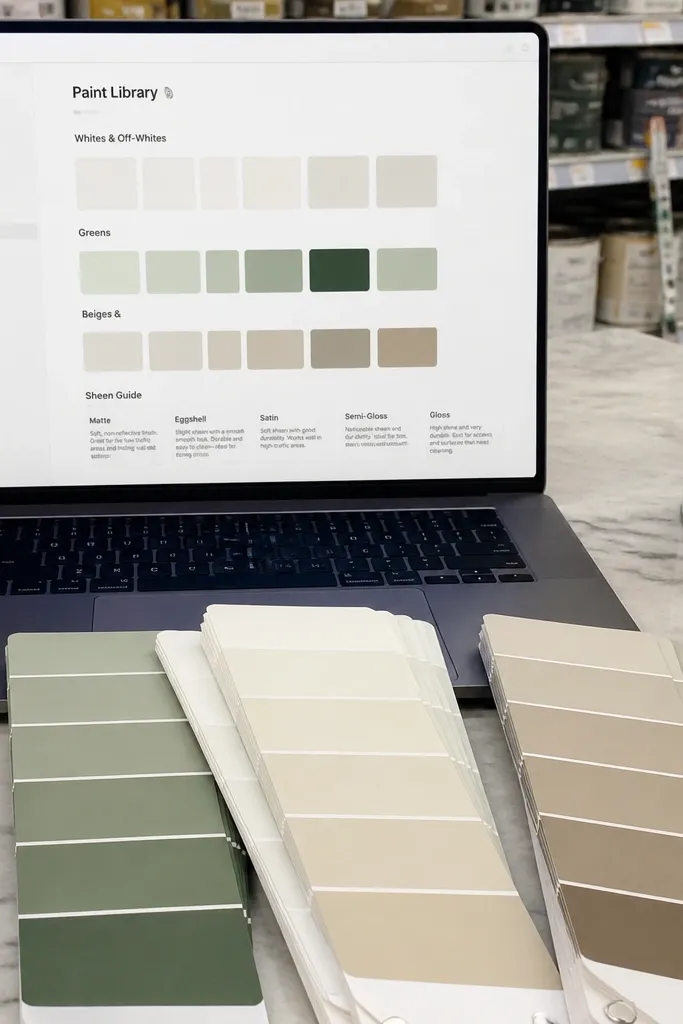
Aesthetic Notion setups fall apart when you keep re-picking colors. This template fixes that by turning your paint picks into a library with swatches and finish notes. Each entry can show a swatch image, the paint name, sheen level, and where it was used. The visual payoff is immediate: when you screenshot your workspace, you see a tidy grid of color options instead of a messy list. It’s ideal for anyone who paints furniture, makes accent walls, or does small decor refreshes.
Duplicate the template and set up a “Paint Colors” database with properties for color name, finish (matte/satin/gloss), undertone notes, and usage area. Then create a gallery view where the swatch image is the cover and the color name is the title line. Next, add a relation to your “Projects” database so each color can link to where it went. Finally, standardize your finish property values so your filters stay clean.
Editor's noteAdd a simple property for “sample size” like 8oz or 1qt so you remember what you actually bought.
Skip thisAvoid importing random swatch images with different lighting — use one consistent lighting source when you upload samples.
7. Weekend DIY Checklist with Photo Headers
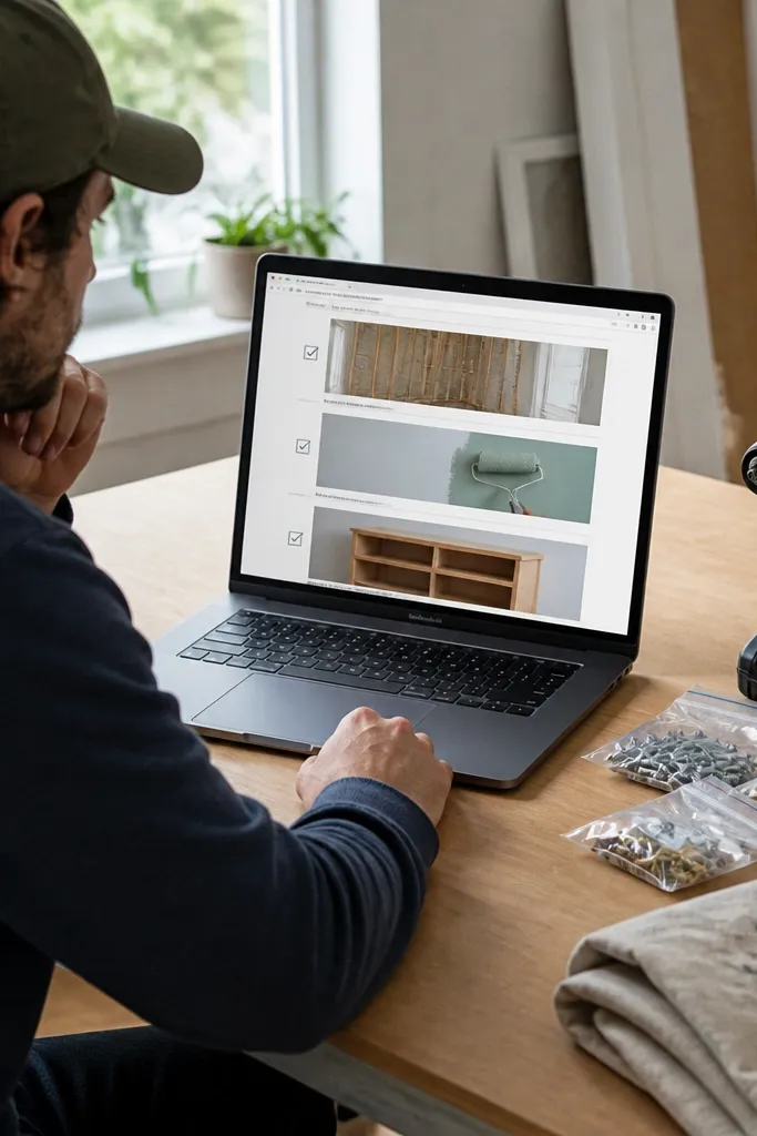
This template makes DIY feel organized without killing the vibe. Each project page starts with a big photo header, then a checklist that’s split into phases like prep, build, finish, and cleanup. The aesthetic comes from the consistent header size and the clean checkbox rhythm. It also helps you finish because the tasks are broken down to the point where you can stop after one session and still know exactly what’s next.
Duplicate the template and create a “Weekend Projects” database with properties for photo header, phase, and due date. Then set a list view with a linked checklist block per project page. Next, add a “Timebox” property (like 60 min, 90 min) and keep each phase tied to that timebox. Finish by using a single checkbox style and keeping checklist item text short.
Editor's noteWrite checklist items as actions with a tool named (ex: “sand with 220 grit,” not “sand”).
Skip thisSkip tasks like “figure out finishing” — they belong as a decision note, not a checklist step.
8. Plant Propagation Log with Growth Stages

Plant people need a system that looks alive, and this template does that with staged entries. Each plant propagation item has a photo area and a stage property like “cutting,” “rooting,” “first leaves,” and “ready to pot.” The look is strong because each card uses the stage label as the visual cue, so your log reads fast. It also prevents the common failure mode of forgetting when you actually started a cutting.
Duplicate the template and set up a “Propagations” database with properties for plant type, start date, stage, and method (water, soil, sphagnum). Then create a board view by stage so you can see progress. Next, add a relation to a “Supplies” database with entries like rooting gel, pots, and soil mix. Finish by adding a date property for “last check” and keep it updated when you take photos.
Use stage dates to filter your board by “started in the last 30 days” for quick tracking.
Don’t keep generic plant names — use a consistent naming format so photos are searchable.
9. Fabric Swatch Organizer with Folded-Edge Look
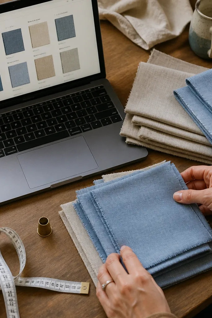
This template makes sewing and upholstery planning look clean because it treats fabric like a catalog. Each swatch entry includes a photo that shows the fabric texture and a few hard details: width, color name, and recommended use. The aesthetic is in the repeated swatch layout and the short note length. It’s a good fit for DIYers making curtains, small bags, or throw pillows who need to match fabrics across multiple projects.
Duplicate the template and create a “Fabric Swatches” database with properties for fabric name, color, width (in inches), and recommended project. Then set a gallery view where each entry shows the swatch photo as the cover and the width and color as the subtitle. Next, add a relation to “Projects” so you can attach swatches to each build. Finish by creating a filter view for “curtain fabrics” and one for “pillow fabrics” so your workspace stays tidy.
Editor's noteWhen you photograph swatches, keep the same background and same daylight direction each time.
Skip thisDon’t add long care paragraphs to the swatch cards — keep care notes on the detail page.
10. Candle Making Lab Notes with Burn-Test Fields
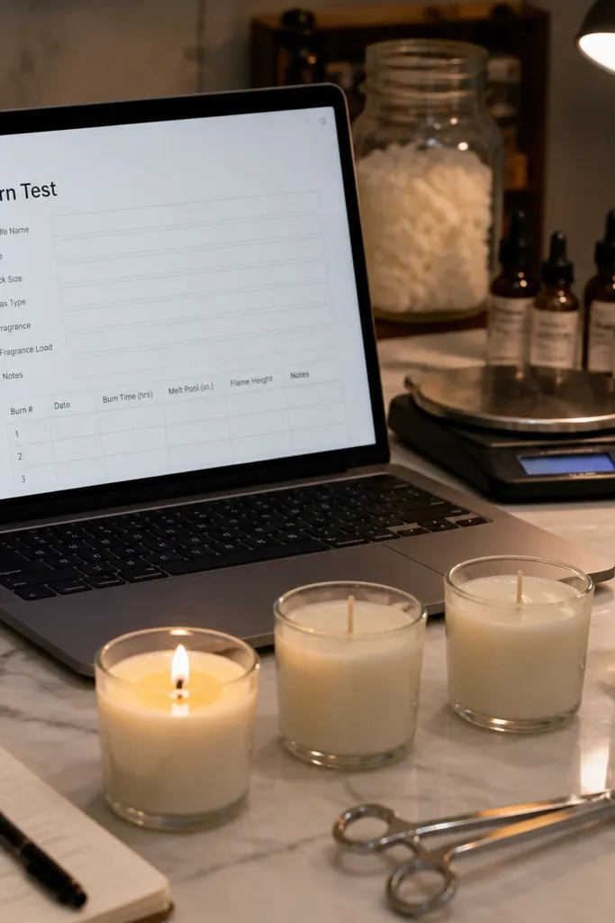
If you make candles, you need data you can find later. This template gives you an aesthetic lab log with fields that map directly to what changes results: wick size, wax type, fragrance load, and burn-test notes. The photos sit above the text so you can visually compare candle color and melt pool. It’s built for duplication because you’ll create a new page per candle batch and want the same structure every time.
Duplicate the template and set up a “Candle Batches” database with properties for wax type, wick size, pour date, fragrance percentage, and container type. Then create a board view by wax type, and a list view for batch entry. Next, add a “Burn Test” section using a template page button so every batch gets the same test fields. Finish by setting a “notes length” rule: use short bullet-style entries so cards stay compact.
Record melt pool width in millimeters for consistency across batches.
Avoid mixing units (grams sometimes, ounces other times) inside the same property.
11. Macrame Wall Hanging Planner with Knot Diagrams
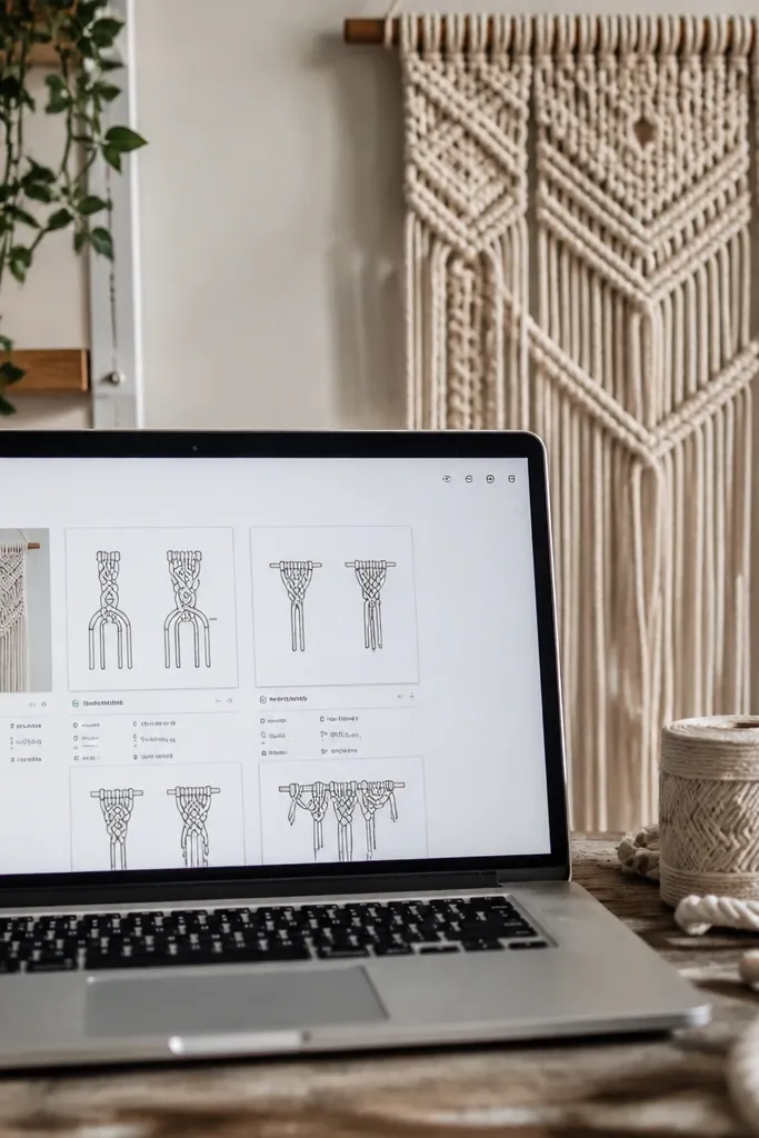
This template is photogenic because it turns your pattern into a diagram library. Each section of the hanging has its own card with a knot diagram image, length measurement, and row order. The look is clean and structured, like a pattern book. It’s also practical: you can track what you already cut, what you still need, and which knots you used so you don’t redo the wrong section.
Duplicate the template and create a “Macrame Sections” database with properties for pattern name, knot type, length (in inches), and row order. Then create a gallery view sorted by row order so you can build from top to bottom. Next, add a “Materials” relation to track cord length and thickness for each project. Finish by creating a “Cut List” table view that pulls only the sections you haven’t marked as cut.
Use one consistent naming format for knot types like “square knot” and “half hitch” so you can filter fast.
Don’t put the full pattern description in the card — keep it in the detail page and use the card for measurements.
12. Desk Setup Aesthetic with Cable Management Map
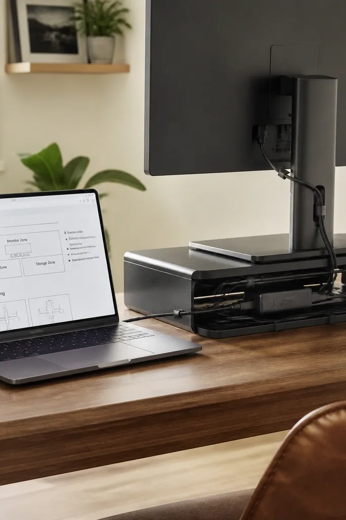
This is for the clean desk look: it documents where everything goes so your workspace stays photo-ready. You get a desk layout area with labeled zones like monitor, charging, and storage, plus cable routing notes. The aesthetic comes from the consistent labeling and the clean separation between zones. It helps you avoid the “why is this cable here” problem after you change one thing.
Duplicate the template and set up a “Desk Components” database with properties for zone, device type, cable type, and outlet location. Then create a board view by zone so the layout reads like a plan. Next, add a “Cable Runs” section where each run has a route note and a photo. Finish by keeping the number of zones limited to 5-7 so the layout stays visually calm.
Editor's noteTake one wide photo from your seating position and keep it as the cover for the desk page.
Skip thisDon’t add dozens of tiny devices — group them into one “charging station” zone.
13. Terrazzo-Style Label System for Organizing
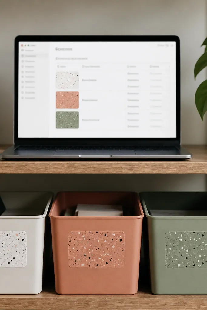
This template is about making your organizing system look designed, not generic. It uses a label layout where each label has a colored background and a short label name, so your shelves and bins look cohesive. You can plan what labels you need, then keep a record of sizes and where each label goes. The aesthetic is in the repeated label shapes and the consistent spacing grid. It’s perfect for pantry, craft storage, and entryway organizers.
Duplicate the template and create a “Label List” database with properties for category, size, font style, and placement. Then set a gallery view where each item uses a label background color as the cover image. Next, add a relation to your “Bins” database so each label links to a physical container. Finish by keeping label text short and using a category property to control the color scheme.
Choose 3 label sizes and stick to them for a cleaner look on shelves.
Avoid adding long names like “spices for baking and cooking” — use “baking spices” or “spice mix.”
14. Seasonal Tablescape Planner with Table Zones

This template helps you plan a tablescape in a way that looks good in photos, not just in your head. It splits the table into zones like centerpiece, plate area, glass area, and place cards, then stores photos and shopping links per zone. The look is strong because each zone has its own card area, so your layout reads like a styled flat-lay. It’s practical too: when you repeat a season theme, you can duplicate the tablescape page and swap only the items that changed.
Duplicate the template and create a “Tablescape” database with properties for season, theme color, and date. Then set up a related “Table Zones” database with zone type and photo. Next, add a “Shopping Links” property (URL) so you can pull items quickly while you shop. Finish by using one hero photo cover for the whole tablescape page and keep zone photos small and consistent.
Editor's noteUse one theme color property and one neutral base so your tablescapes look cohesive across seasons.
Skip thisDon’t mix too many competing accent colors — zone cards start to look chaotic.
15. Budget-Friendly Furniture Flip Tracker with Finish Notes
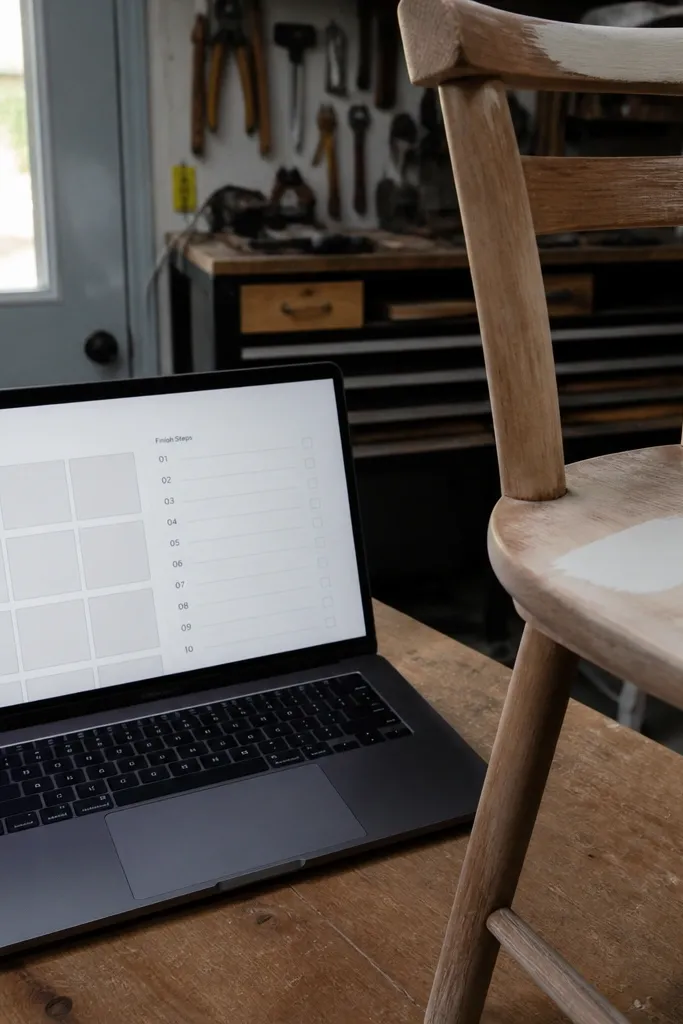
This template is for flips that look intentional: it forces you to record the finish steps and the exact product choices. Each furniture piece has before and after photo slots plus a step-by-step “prep to finish” section. The aesthetic comes from the consistent photo placement and the clean, numbered steps. It also prevents repeat mistakes, like using the wrong sheen or skipping a sanding stage. Perfect for thrift flips, small side tables, and dresser refreshes.
Duplicate the template and create a “Furniture Flips” database with properties for piece type, dimensions, wood type, and finish system. Then add a “Finish Steps” section template page with numbered items for cleaning, sanding, primer, paint/stain, and topcoat. Next, add relations to a “Supplies” database so you can list specific products used for that piece. Finish by keeping your step notes short and using a single property for sheen (matte/satin/gloss).
Photograph the finish in the same lighting each time so you can compare sheen across projects.
Avoid writing essays in the step notes — keep it to product name, grit, and dry time.
16. Printable Wall Art Checklist with Frame Size Matching
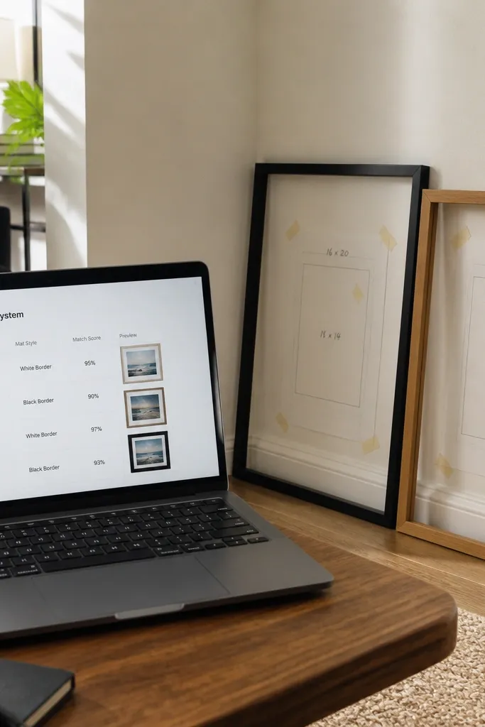
This template is built for people who buy prints and then get stuck matching sizes. It keeps the print size, frame size, and mat style together so you can decide quickly. The layout is aesthetic because it uses preview thumbnails as covers and keeps the checklist clean and minimal. It’s also useful: you can track what you ordered, what’s printed, and what’s ready to hang. Great for DIY wall art, seasonal print swaps, and budget-friendly upgrades.
Duplicate the template and set up a “Print Orders” database with properties for print size, frame size, mat type, and status. Then create a gallery view where each card shows the preview thumbnail as the cover and the size match as the subtitle. Next, add a simple checklist block per page for “downloaded,” “printed,” “trimmed,” and “framed.” Finish by adding a filter for “ready to hang” so your next project is obvious.
Editor's noteStore a small photo of the frame label or invoice in the detail page so you can reorder quickly if needed.
Skip thisDon’t mix mat styles without recording it — that’s where size mismatch happens.
17. Keychain + Bag Charm Maker Catalog with Colorways
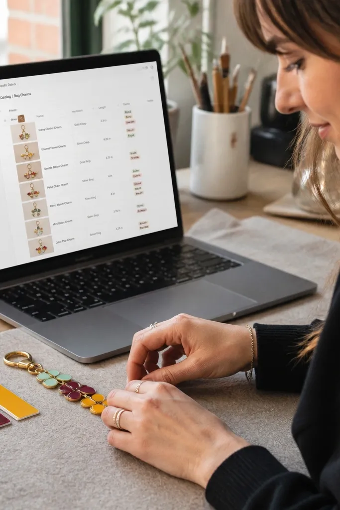
This is a maker-friendly catalog template that still looks good. Each charm design page has a photo tile and properties for colorways, hardware type, and a short spec like length and clasp style. The aesthetic comes from the clean grid view and consistent tag colors. It also makes production easier because you can see which colorways are out of stock and which ones you can restock first.
Duplicate the template and create a “Charm Designs” database with properties for design name, main material, hardware type, and length. Then add a second database “Colorways” and relate it to designs so each design can have multiple color variants. Next, create a board view by availability status and keep only three columns: ready, low, out. Finish by adding a “photo cover rule” — every design needs one strong photo with the same background brightness.
Editor's noteUse one hardware vocabulary across all entries like “lobster clasp” and “key ring” so filters stay clean.
Skip thisAvoid tagging every tiny variation — keep tags for real customer-facing differences.
18. Scrapbook-Style Memory Pages with Date Bands
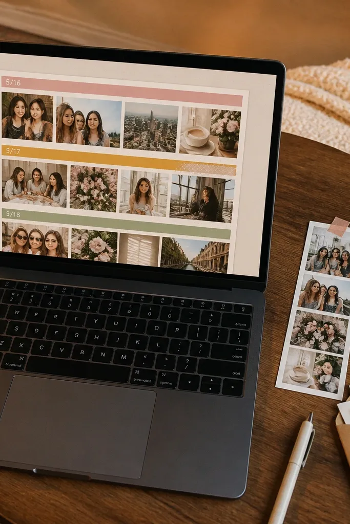
This template is aesthetic because it treats dates like design elements. You get date bands at the top, then photo strips and short captions that feel like a scrapbook page. The layout stays photogenic because the photos are grouped in consistent strips rather than scattered across a list. It’s also useful for DIYers because you can attach craft event notes, receipts, and project photos to a date without losing the story.
Duplicate the template and create a “Memory Pages” database with properties for date, event type, and photo strip. Then set a board or timeline view that uses the date property. Next, create a page template that includes a fixed photo strip section and a short caption field. Finish by standardizing caption length to 1-2 lines so the page looks neat in screenshots.
Use one caption format like “What we made: ___” for instant scanability.
Don’t use giant blocks of text — the scrapbook look needs short captions.
19. Embroidery Pattern Tracker with Stitch Counts
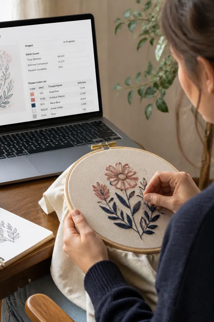
This template looks good because it’s structured like a pattern card. Each embroidery project page has a stitch count area and thread color list in a clean layout. The aesthetic payoff is the organized color labeling and the consistent card sections, which makes the workspace feel like a craft notebook. It’s practical because you can track what you already finished and what still needs stitches, plus the thread colors you used.
Duplicate the template and set up a “Embroidery Projects” database with properties for pattern name, fabric type, hoop size, and completion percentage. Then create a related “Thread Colors” database with thread brand, color number, and quantity. Next, add a checklist for steps like transfer, outline, fill, and finishing. Finish by using a gallery view for projects where each card shows the pattern preview image.
Record thread color numbers exactly as shown on the spool label so you can reorder without guessing.
Avoid vague fabric names like “cotton” — add the weave or count when you know it.
20. Minimal Shopping List with Photo Proof
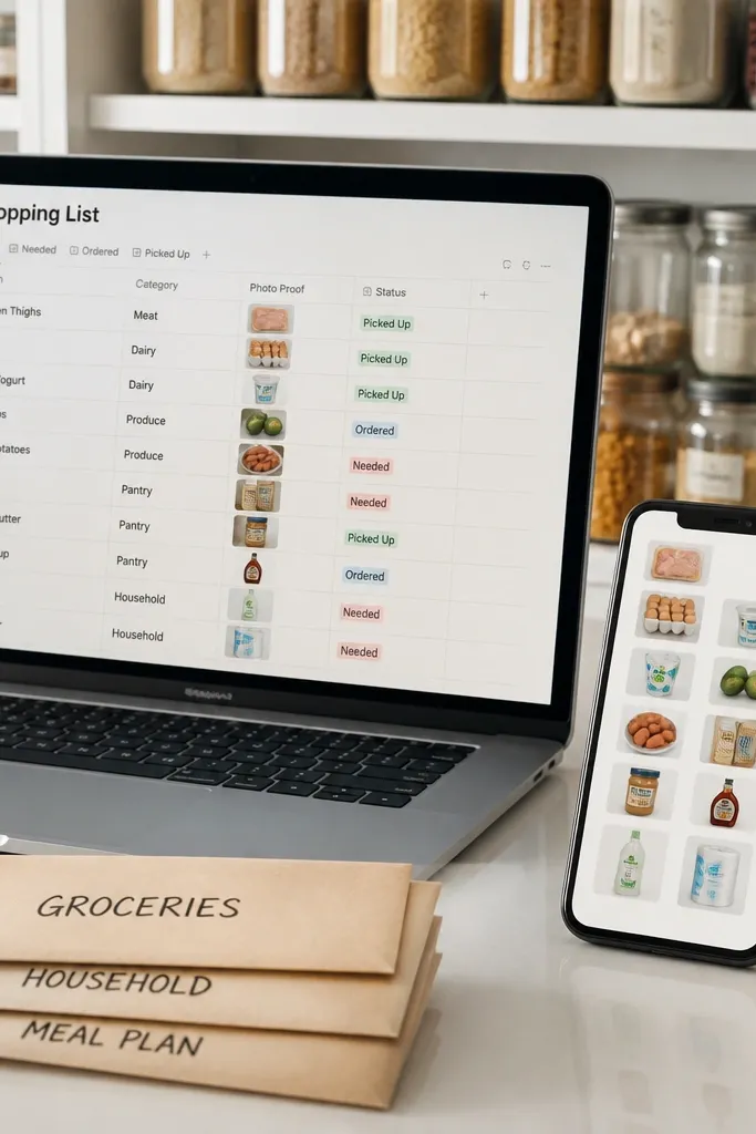
This template makes shopping feel organized and visually clean. Each shopping item has a photo, a category label, and a status like “needed,” “ordered,” or “picked up.” The look is aesthetic because the cards stay minimal and consistent, and your photos create a cohesive vibe. It also prevents duplicate buys because you can mark items as ordered and attach a proof photo. Great for DIY supply runs where you want your cart to match your project plan.
Duplicate the template and create a “Shopping” database with properties for item name, category, status, and link. Then set a gallery view where each card cover is the item photo and the title is the item name. Next, add a relation to your “Projects” database so each item knows where it belongs. Finish by keeping one category system across the workspace to make filtering clean.
Editor's noteUse one status set everywhere so your filters work across projects and seasons.
Skip thisDon’t make a separate shopping list per project — it creates duplicates and breaks the clean system.
21. Holiday Gift Planner with Wrapping Steps
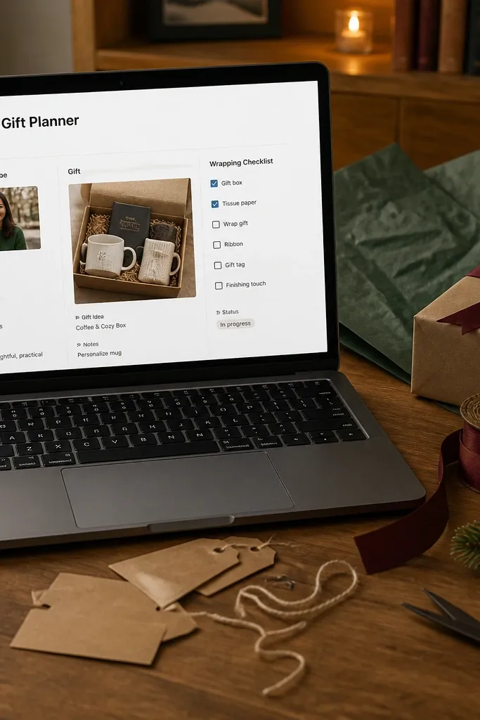
This template is built for gifts that look intentional, not last-minute. Each gift entry includes the recipient vibe, the gift photo, and a wrapping checklist like box, tissue, ribbon, and tag. The aesthetic part is the card layout: consistent cover photos and a compact checklist that keeps the page from turning into a wall of text. It also helps you manage time because you can sort by date and see what’s ready to wrap.
Duplicate the template and create a “Gifts” database with properties for recipient, budget range, gift status, and due date. Then add a template section for a wrapping checklist with checkboxes. Next, connect a “Wrapping Supplies” database so your gift pages show which ribbon or tags you have. Finish by keeping the wrapping checklist in the same order on every gift page so your system feels neat.
Editor's noteAssign each gift a wrapping theme color property so the whole holiday batch looks cohesive in photos.
Skip thisAvoid adding 20 wrapping steps — keep it to the steps you actually do.
22. Cricut Vinyl Project Planner with Material Settings
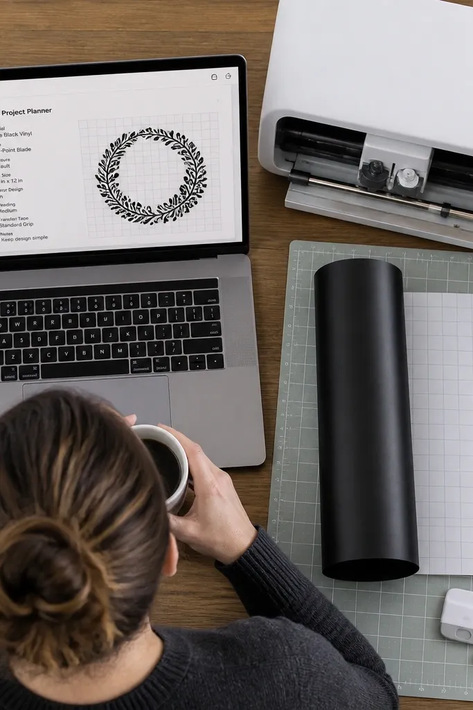
This template helps you plan cutting projects with a designer’s eye. Each project page stores the material type, blade setting, and cut size, plus a preview image of the design. The aesthetic comes from the clean grid of design tiles and the consistent property layout so your workspace looks like a product catalog. It’s practical because it reduces rework: you can replicate settings and avoid cutting the wrong size or wrong vinyl type.
Duplicate the template and create a “Cut Projects” database with properties for vinyl type, setting preset name, design size, and status. Then set a gallery view where the cover is the design preview and the subtitle is the vinyl type + size. Next, add a relation to a “Materials” database to track what rolls you already have. Finish by creating a status flow like “Proofed,” “Cut,” “Applied,” “Removed/Fixed,” and “Done.”
Editor's noteUse preset names like “HTV — cotton” or “Sticker vinyl — indoor” so you can filter by material quickly.
Skip thisDon’t store settings as free text — make them properties so you can repeat and search.
23. Sunset Timeline Moodboard for DIY Milestones
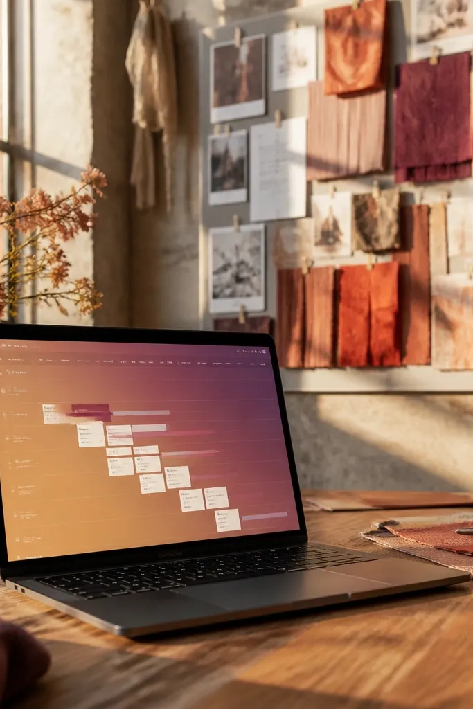
This template turns your DIY plan into something you actually want to open. The page is built like a sunset gradient timeline, with milestone cards snapping into the right time block so you can see progress at a glance. It fixes the “I have a checklist but it looks boring” problem by making your schedule photogenic and color-coded from the start. You get a clean structure for project phases (prep, build, finish, install) without turning it into a spreadsheet. It suits apartment refreshes, room makeovers, and any project where you need momentum more than complexity.
Step 1: Create a Notion page with three database views: “Milestones” (cards), “Timeline” (timeline view), and “Materials” (table view). Set the Milestones database to include properties for Phase (Prep/Build/Finish/Install), Date, Status, and a Color label that you map to a sunset palette (coral, peach, amber, plum, navy). Step 2: Build the timeline area using five narrow sections across the top, each one with a background color matching your gradient; then set the Milestones timeline to use the Date property so cards land in the correct band. Step 3: Add a “Photo” column in Milestones that stores 1-3 images per milestone and keep captions short so the page stays visually tight. Finish by adding a small “Next up” callout linked to the first Status value that is not Done.
Use 5 phases max and keep each milestone card to one photo plus one sentence. More text makes the page look busy fast.
Don’t mix random colors for statuses — keep one color set for the whole template.
24. Marble Countertop Ingredient Panel for DIY Bath Bombs
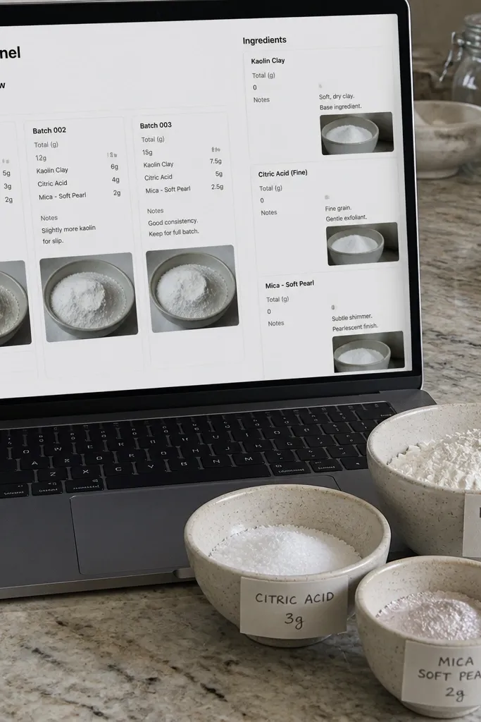
This is a DIY lab template designed for repeat batches, not vague inspiration. The layout looks like a marble countertop ingredient panel — lots of small tiles with grams, notes, and batch photos — so every batch reads clean at a glance. It fixes the “I changed one thing and now I don’t know why it turned out different” problem by forcing you to log amounts and texture notes consistently. The result is a photogenic grid you can screenshot for sharing, and a system you can reuse for salts, scrubs, and bath bombs. It fits beginners through intermediate makers who want reliable results without turning the process into a spreadsheet.
Step 1: Create a database called “Batches” with properties for Batch Name, Date, Mold Size (e.g., 50g/60g), Total Weight (grams), and a Status (Draft/Ready/Testing/Done). Add a second database called “Ingredients” with properties for Ingredient, Amount (grams), Scent Oil, Colorant, and Texture Note (powdery, sandy, clumping). Step 2: Use a linked database view on the Batches page so each batch shows ingredient tiles in a grid, then format Amount as plain numbers and keep units consistent (always grams). Step 3: Add a “Photo” property on Batches for the finished bomb and a second photo slot for the inside cross-section after drying. Finish with a “Fizz Notes” field where you write three short measurements: start fizz time, peak fizz look, and after feel.
Editor's noteSet your ingredient tiles to show Amount and Texture Note only. You want the grid to look like a label wall, not a long recipe page.
Skip thisDon’t log scent strength as vague words like “strong” — use a fixed number like grams or drops.
25. Neon Circuit Habit Board for Studio Practice Hours
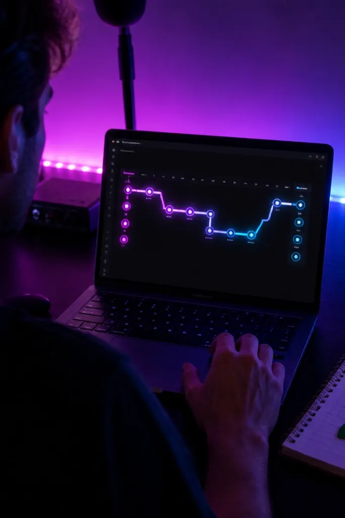
This template makes practice feel like a game without turning it into a cluttered tracker. The “neon circuit” design uses a weekly route — dots connected by a line — so you can see streaks and gaps instantly. It fixes the problem where habit trackers look flat and you stop checking them because they feel like chores. You get a clean visual rhythm for studio work like drawing, sewing practice, Cricut tests, or furniture refinishing prep days. It suits anyone who works in short sessions and needs a system that rewards showing up.
Step 1: Build a database named “Practice Sessions” with properties for Date, Task (2-4 options only), Duration (minutes), Energy (low/med/high), and Status (Done/Skipped). Step 2: Add a separate page section called “Weekly Circuit” with seven small blocks laid out left to right; each block links to the sessions filtered by that day. Put a neon color on Task values (mint, electric blue, hot pink, sunny yellow) and use the Status to control whether the dot looks filled or empty. Step 3: Create a weekly summary section with a progress bar made from a simple formula that counts Done sessions divided by target sessions. Finish by adding one “Photo” field per week for a result shot or a before/after snippet so the board stays visually satisfying.
Editor's noteKeep Task options tight. If you add 10 tasks, the neon circuit turns into a rainbow mess and you lose the point.
Skip thisDon’t track dozens of tiny habits at once — one board for practice hours beats five separate trackers.



