
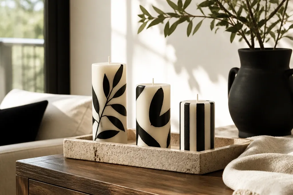
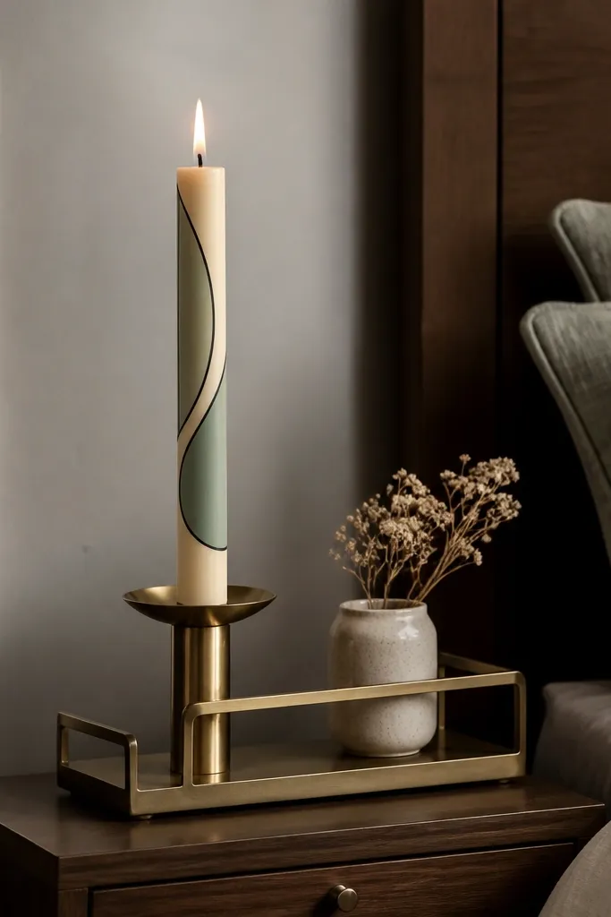
1. Black-and-Cream Geometric Tape Lines
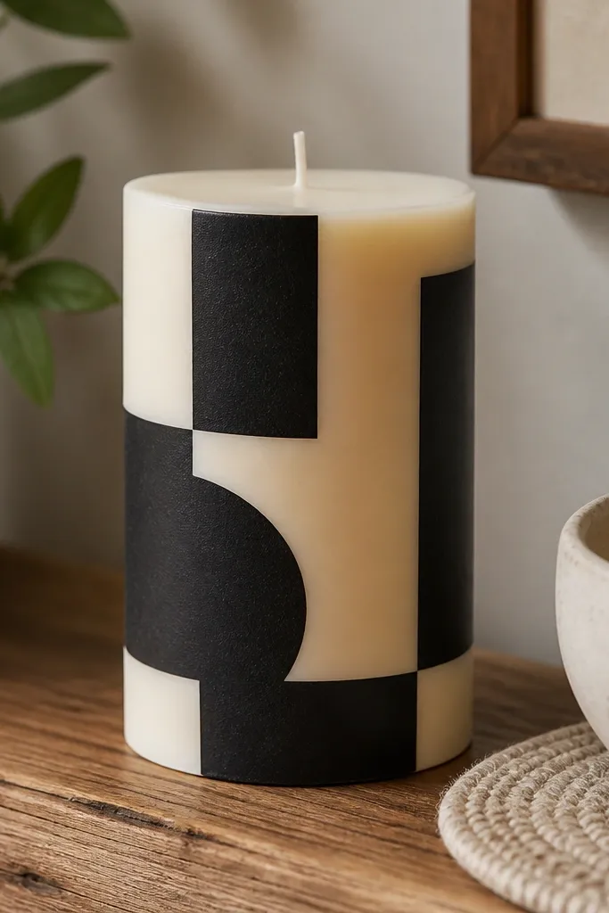
This one is the fastest way to get that clean, designed look people save. The contrast between cream wax and black paint makes the lines read instantly from across a room. Tape-resisted edges also stop the paint from creeping, so your geometry stays sharp instead of fuzzy. It works great on pillar candles and chunky tapers because the straight lines have room to breathe. Skill level is beginner-friendly, and the time is about an evening if you let coats dry properly.
Start by wiping the candle with a dry cloth so dust doesn’t block adhesion. Press painter’s tape onto the candle in your pattern, then brush on a thin coat of black acrylic paint where the tape exposes the wax. Let it dry, add a second thin coat for coverage, and remove tape while the paint is still slightly tacky. Finish with two light coats of clear sealer, letting each coat dry fully before the next.
Use a small foam brush for the black coat — it deposits paint evenly without leaving brush streaks.
Don’t flood the paint under the tape edges or you’ll get a raised, messy border.
2. Marbled Sage Wax Veins
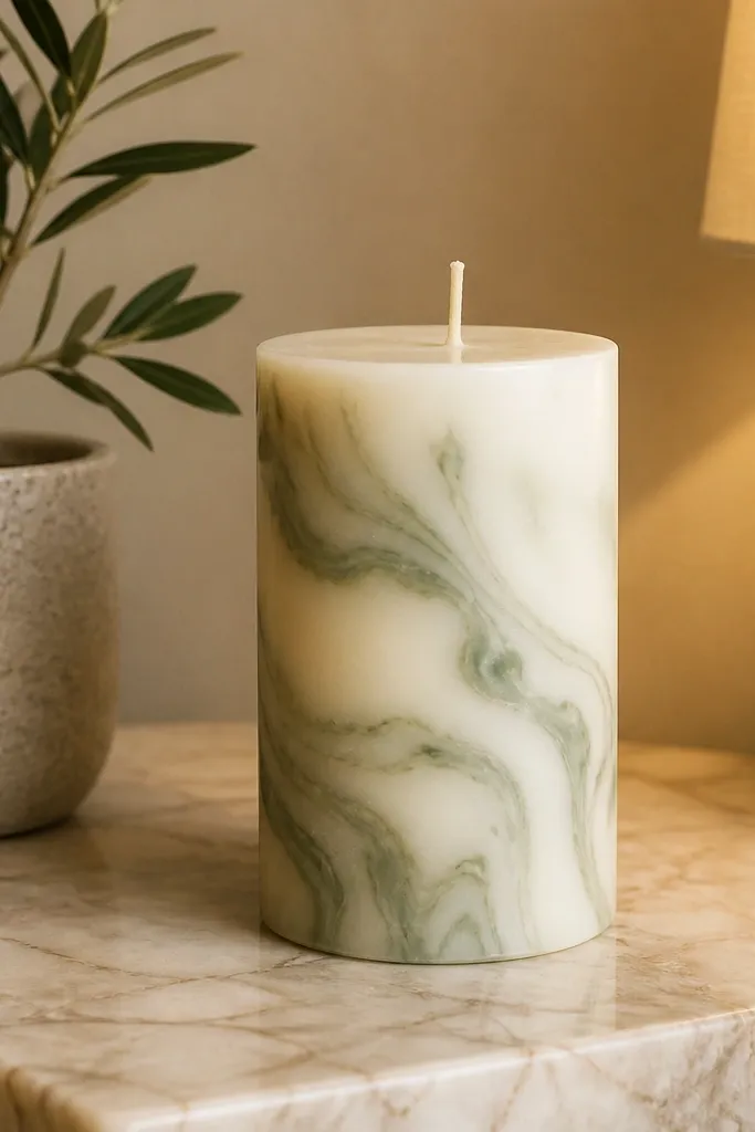
Marbling is one of the few candle painting styles that looks expensive even when you’re not. The swirls hide tiny brush marks because the pattern has motion built in. Sage green on a white or ivory base feels calm and modern, and it photographs well under warm light. This design looks best on smooth pillars because the curves catch light and make the veins pop. It takes medium effort, mostly for drying time, not for skill.
Begin with a fully white base coat and let it dry hard. Mix sage paint with a bit of water to keep it fluid, then dab small blobs around the surface. Use a toothpick or the tip of a damp brush to drag veins through the blobs in short lines, not long strokes. Let everything dry, then seal with a clear matte or satin finish to keep the marbling soft.
Keep a paper towel nearby and wipe your toothpick between swirls so the veins stay airy.
Don’t try to force symmetry — the prettiest marbling looks natural, not copied.
3. Terracotta Sunburst Ombre
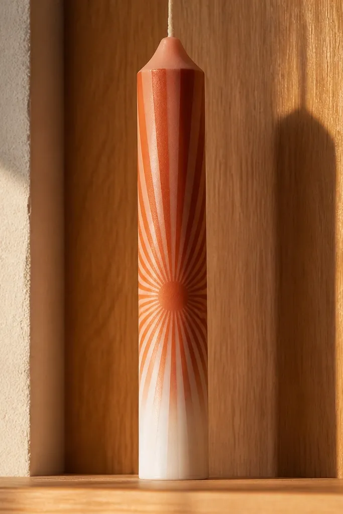
A sunburst pattern gives you that “decor photo” energy because it frames the candle like a mini artwork. Terracotta rays look warm and grounded, and the ombre fade makes it feel layered instead of flat. This design is especially good for shelf styling because the rays create visual height. It suits smooth tapers and cylinders; tapers look extra good because the rays taper with the candle. Expect beginner to intermediate difficulty — the pattern is simple, but you need steady spacing.
Paint the whole candle ivory first and let it dry. Mark light guide points around the candle using a pencil or chalk — just enough to keep rays evenly spaced. Load a flat brush with terracotta and paint rays from the center outward, then soften the outer edges with a slightly lighter mix for the fade. After the paint dries, seal with satin clear so the ombre doesn’t turn patchy.
Use a ruler to check spacing on the first ring of rays. Once the first row is even, the rest is faster.
Don’t skip guide points if you want that pin-perfect symmetry.
4. Tiny Gold Dots on Black Night
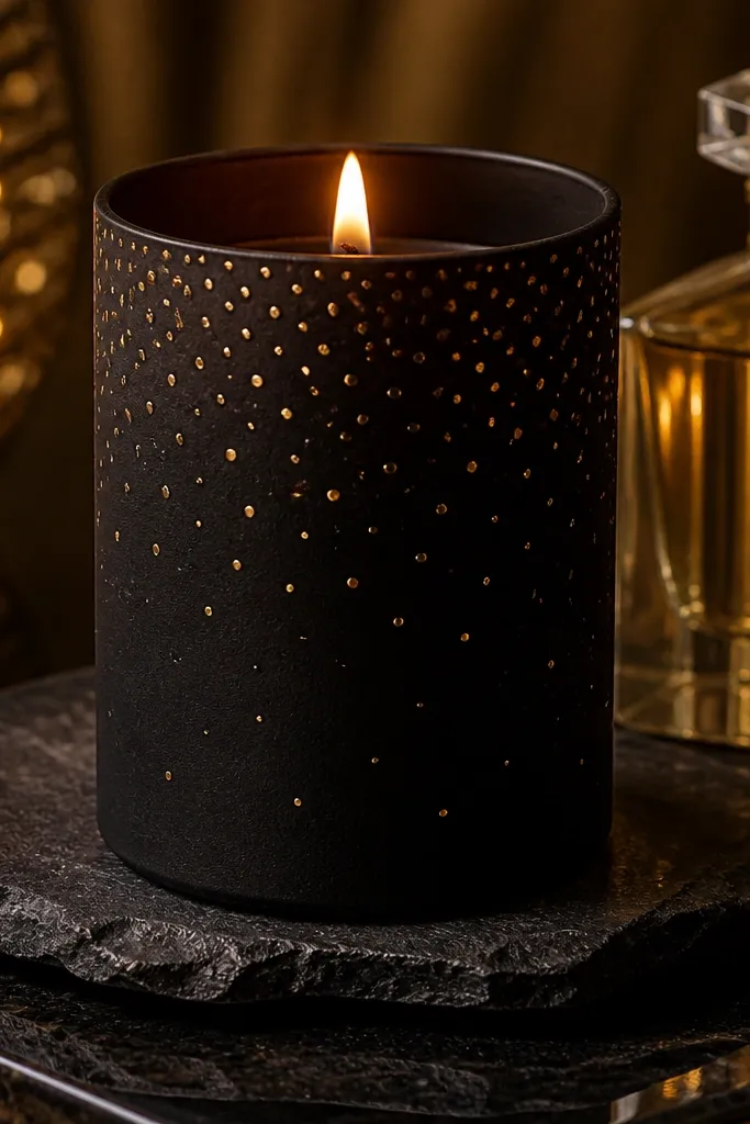
Coat the candle in black acrylic paint and let it cure until dry to the touch. Use gold acrylic paint and a dotting tool or the end of a bamboo skewer to place dots — start sparse, then add clusters. Vary dot sizes by lightly pressing for larger dots and barely touching for small ones. Seal with a clear protective coat; choose satin if you want a gentle glow rather than mirror shine.
This is the candle painting look that reads as “intentional glam” without trying too hard. Black paint gives you a clean, night-sky base, and gold dots create the sparkle effect in photos. The trick is scale: tiny dots spaced like a constellation look better than big scattered spots. This style fits modern homes, holiday tables, and even minimalist styling because it’s graphic. Intermediate effort because you need patience and a steady hand.
Skip thisDon’t use gold paint that’s too thick. Thick gold looks like blobs instead of points.
Editor's noteIf your dots smear, wait longer between dot placements. Fresh wet paint drags easily on wax.
5. Cream Candle Lace-Edge Stencil
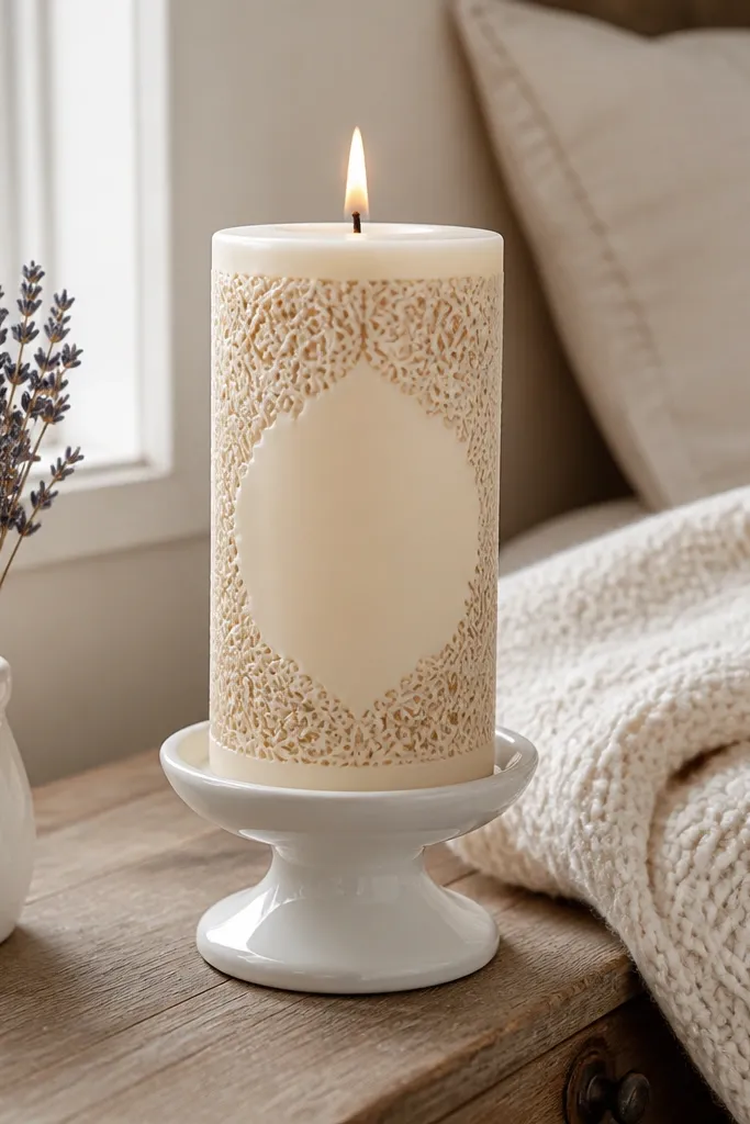
Stenciled lace edges look soft, pretty, and very “saved for later” because the band gives a finished frame. It’s also an easy win if your freehand ability isn’t strong — the pattern does the work for you. Cream base with a slightly warmer beige stencil reads elegant without looking fussy. This works best on candles with a flat, smooth surface so the stencil edges don’t lift. Beginner-friendly and quick once your stencil is positioned.
Choose a lace stencil and place a band near the bottom of the candle, about 1.5 to 2 inches tall. Secure it with painter’s tape so it doesn’t shift. Dab warm beige paint through the stencil using a stencil brush, building color in two thin passes. Remove the stencil carefully while the paint is still slightly tacky, then seal with a clear satin coat.
Use a light tapping motion instead of brushing back and forth. It keeps stencil lines crisp.
Don’t paint heavy in one pass. Overloading the stencil makes edges bleed.
6. Pastel Rainbow Drip Edge
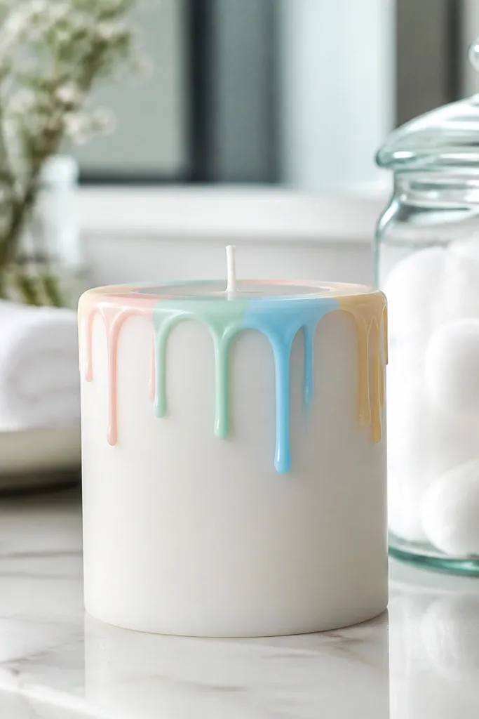
Drips look playful, but the aesthetic comes from control. A pastel rainbow drip edge gives you that cute, candy-color vibe that photographs bright even in indoor lighting. Keep the drips short so it still looks clean on a mantel. This style suits smooth tapers and cylinders; tapers make the drips feel more dynamic. Beginner-friendly if you use a small angled brush and paint in thin layers.
Start with a white base coat and let it fully dry. Mix each pastel color with a little water so it flows slightly but doesn’t run. Paint a thin horizontal line near the top, then pull short drips downward using the tip of an angled brush. Let each color dry before adding the next, then seal with a clear matte finish to reduce shine.
Practice the drip motion on a scrap candle or paper first so you get consistent length.
Don’t over-thin the paint. Watered paint can run and pool at the bottom.
7. Monochrome Brushstroke Waves
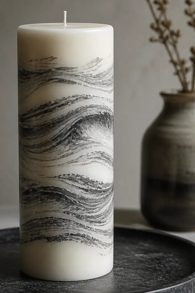
Base paint the candle in off-white or light gray and let it dry completely. Load a flat or broad brush with dark gray acrylic and paint wide wave bands, leaving tiny gaps for the base to show through. Add a second pass only where you need deeper coverage, then soften edges by lightly dragging the brush tip along wet paint. Seal with satin clear so the brush texture still shows.
Brushstroke waves give you movement without needing tiny details. The monochrome palette looks modern and expensive, and it hides uneven coverage because the texture is part of the design. Off-white with dark gray reads clean, while black with white gives stronger contrast. This one looks best on taller pillars so the waves have enough space to flow. Skill level is beginner to intermediate; you’re painting “gestures,” not perfect lines.
Skip thisDon’t chase perfection with repeated strokes. Too much reworking makes the waves muddy.
Editor's noteWork from top to bottom in one direction. That keeps your wave rhythm consistent.
8. Hand-Lettered Minimal Quote Block
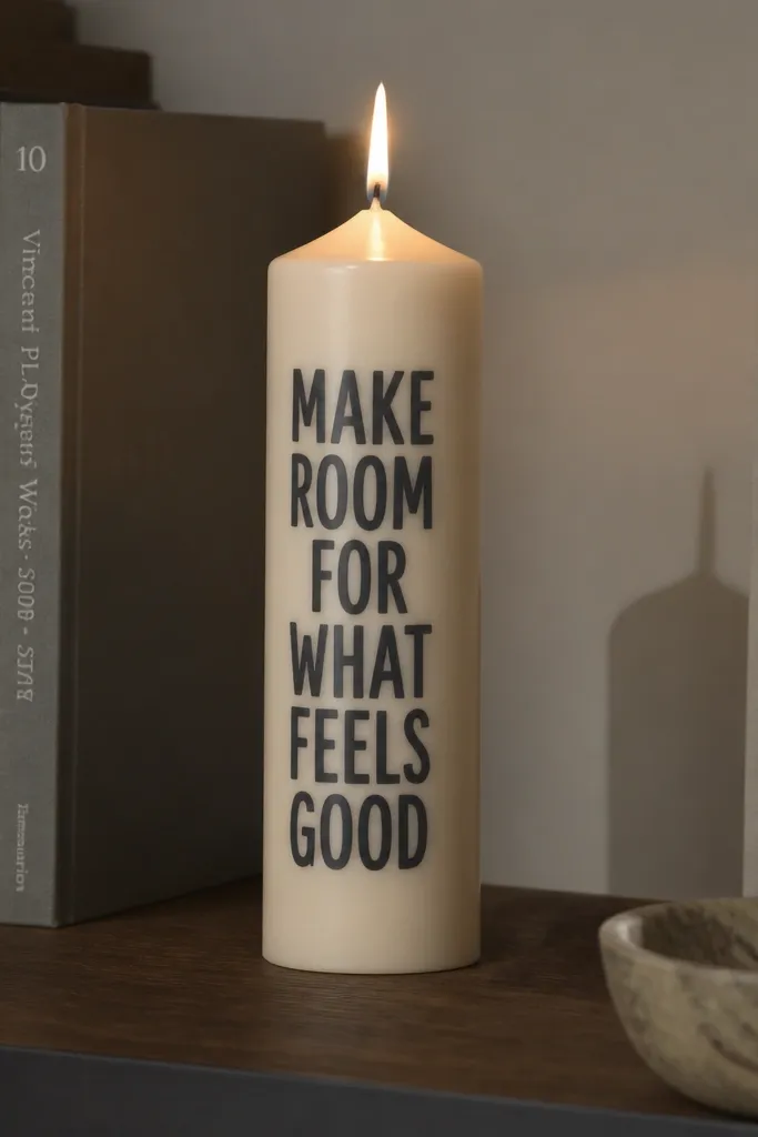
Hand-lettering looks like real decor when you keep it minimal and centered. A single short phrase in blocky lettering gives you a graphic look that’s easy to style with other objects. The key to making it look intentional is spacing — keep letter widths consistent and avoid thin, wobbly strokes. This works well on smooth cylinders and tapers because the lettering stays readable. Beginner to intermediate, depending on your comfort with lettering.
Paint the candle ivory and let it dry hard. Lightly sketch a rectangle guide on the candle using a pencil or chalk, then map the letters within it. Use a fine liner brush for crisp strokes and fill only after the outline is dry enough not to smear. Seal with a clear satin coat, and keep the lettering area away from thick paint buildup.
If your letters lean, rotate the candle slightly as you paint. Your wrist angle matters more than you think.
Don’t use a marker. Wax texture makes markers bleed and look fuzzy.
9. Botanical Line Art with Olive Accents
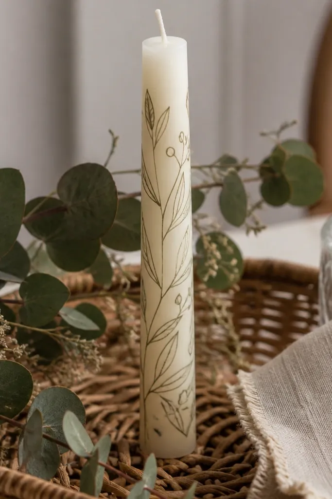
Start with a cream base coat and let it dry fully. Plan one branch per side and keep the leaves small enough to fit without crowding. Paint the stems and veins with a fine brush using dark brown, then add a few olive leaf fills as tiny solid shapes. Let dry and seal with a satin finish to keep the lines crisp.
Thin botanical line art reads fresh and calm, and it’s one of the best styles for making candles look like they belong in a styled room. Use olive accents sparingly so the lines stay the main event. This design works because line art doesn’t require perfect coverage; a light base plus clean lines always looks neat. It’s great for gifting and for everyday shelf decor. Intermediate effort if you want multiple leaves, but the technique is straightforward.
Skip thisDon’t fill every leaf. Sparse color looks more expensive than full coloring.
Editor's noteUse a damp paper towel to clean your brush tip between leaves. It prevents paint globs.
10. Vellum-Style Wash Ombre Edges
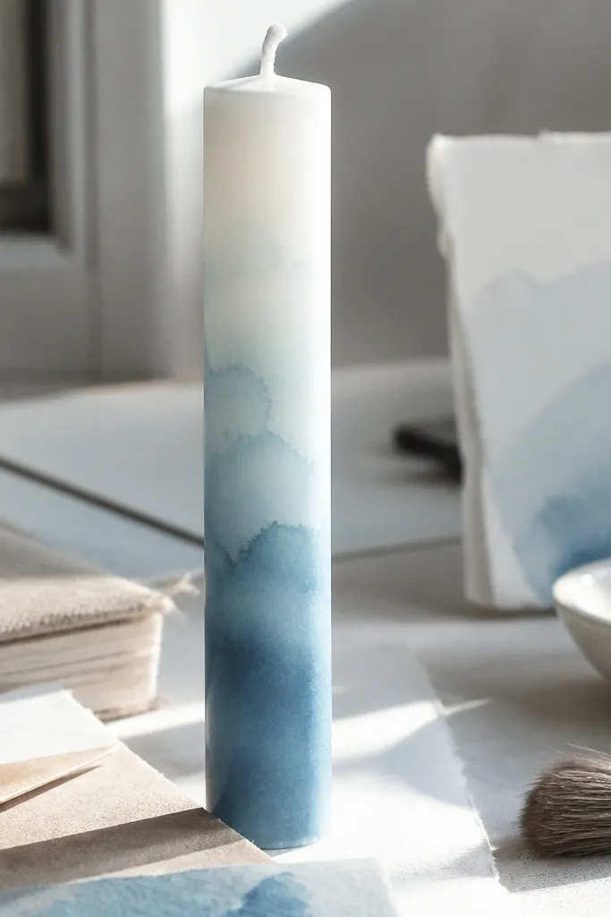
Watercolor-style washes look dreamy in photos, but they fail when paint is too opaque. This vellum-style ombre uses diluted acrylic to create a translucent fade that looks like paper. Pick one color family — dusty blue, blush pink, or muted lavender — so it stays cohesive. It’s best on smooth tapers where the gradient catches light along the curve. Beginner-friendly if you control your water ratio.
Paint the candle white and let it dry. Mix your chosen color with water until it looks like loose tea, then load a wide brush. Paint a soft wash near the bottom or side edge, then pull upward to create a fade — stop before it reaches the center. Repeat for a deeper fade only after the first layer dries, then seal with matte clear to keep it airy.
Dilute in small batches. The color consistency changes fast once acrylic dries on the palette.
Don’t seal while paint is still tacky. You’ll trap moisture and dull the wash.
11. Terracotta + White Half-Moon Cutouts
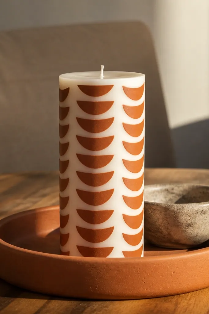
Half-moon cutouts give you a retro-modern look that reads clean from a distance. Terracotta is warm and forgiving, and white shapes create a crisp graphic contrast. The pattern also hides minor unevenness in brushwork because the shapes are bold. This style works best on smooth cylinders so the repeating moons look tidy. Beginner-friendly with a small amount of template work.
Base paint the candle terracotta and let it dry fully. Cut small half-moon shapes out of thin cardstock or use pre-made craft circles, then press them lightly against the wax where you want the white shapes. Brush white acrylic over the edges, removing the template immediately after the first coat sets. Add a second thin coat if needed, then seal with satin clear.
Make one template and rotate it. It’s faster than freehanding each moon.
Don’t use heavy pressure with the template or you’ll leave dents in the wax.
12. Crackle Finish with Color-Blocked Center
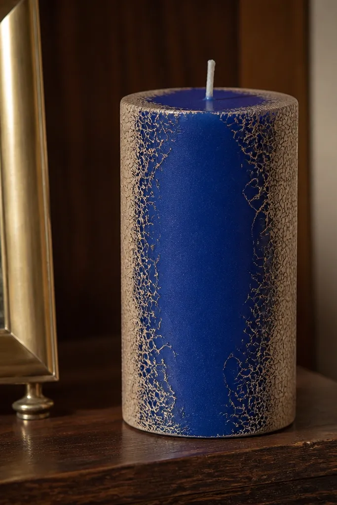
Crackle paint makes candles look like they have texture and age, which is why it photographs so well. Pairing crackle around the edges with a clean solid center keeps the design modern instead of antique-chaos. Choose one center color — cobalt, forest green, or black — then let the crackle do the rest. This looks best on pillars because the crackle spreads across a wider surface. Intermediate effort because crackle finishes have timing rules.
Paint the full candle the base color for crackle and let it dry. Apply crackle medium following the product instructions, then paint the top color layer over it. The crackle forms as it dries, so don’t rush or add extra coats mid-way. Mask the center area with tape before applying the crackle top coat so you get a crisp color block, then seal after everything cures.
Do a test on a spare candle so you know how fast your crackle medium dries.
Don’t touch the surface during crackle formation or you’ll smear the webbing.
13. Celestial Stars with Silver Leaf Specks
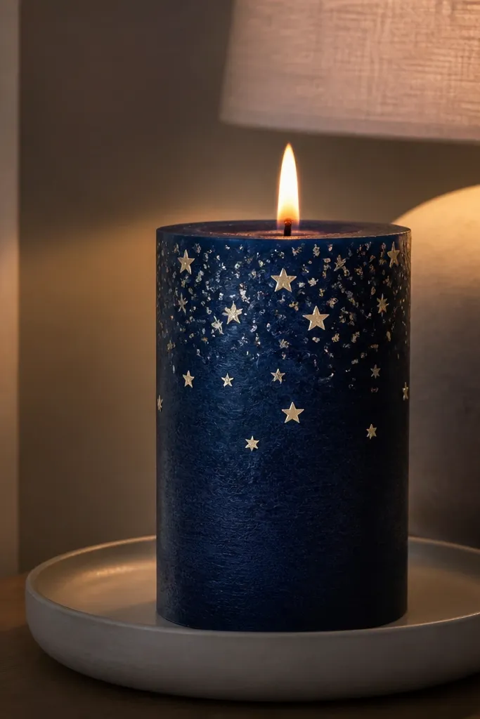
If you want “night sky decor” that still feels classy, this is the look. Midnight blue gives depth, star shapes add instant charm, and silver leaf specks make it look like real shine instead of flat glitter. The design is photogenic because it catches light unevenly, especially near the top. It fits bedroom decor, holiday tables, and cozy corners. Intermediate difficulty because leaf specks are a little fiddly.
Start with a smooth midnight blue base coat and let it dry fully. Paint small star points in a lighter blue or white using a fine brush — keep them varied in size. Tear tiny pieces of silver leaf and press them lightly onto wet or tacky areas so they sit as specks, not sheets. Seal with a clear matte or satin coat to protect without killing the sparkle.
Tap excess silver leaf off over a scrap sheet so you don’t leave big smears.
Don’t use chunky glitter. It looks cheap fast and clumps on wax.
14. Soft Ombre Gradient with Color-Edge Outline
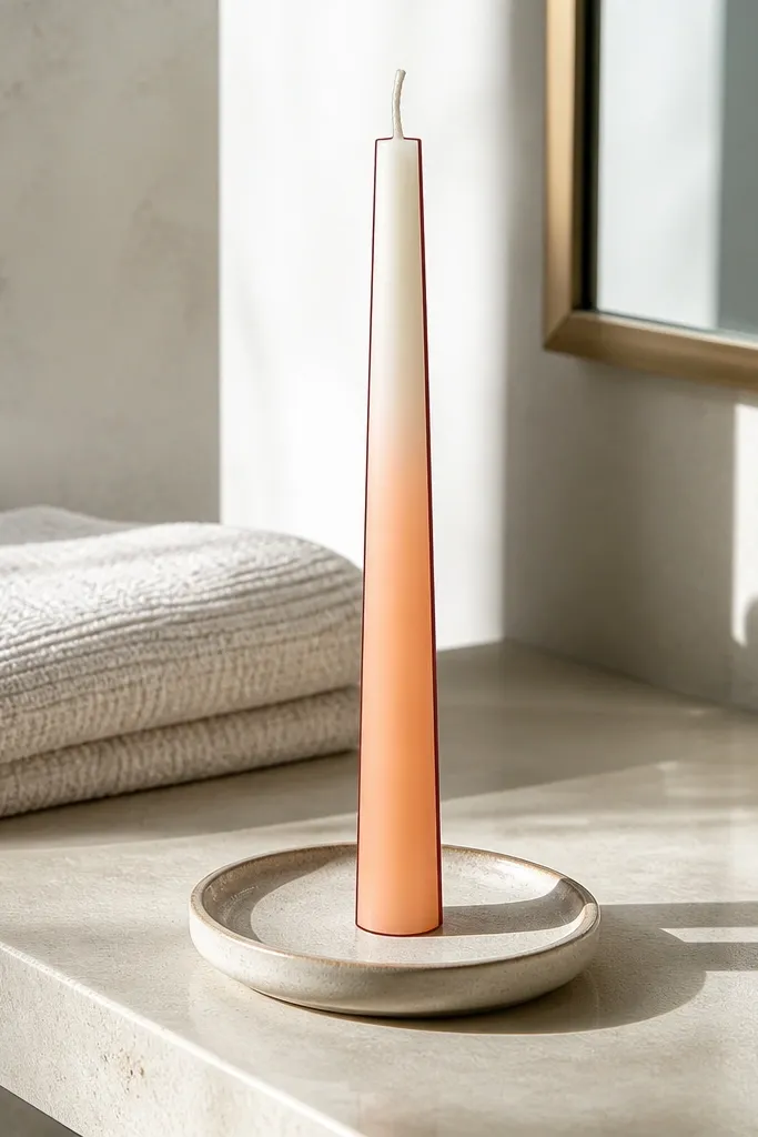
Base paint the candle ivory and let it dry. Apply peach paint with a makeup sponge in a band area, then lightly blend upward with a clean damp sponge to fade it. Once dry, draw a thin outline around the gradient band using a fine liner brush and a darker matching color. Seal with satin clear so the outline stays crisp.
This design makes ombre look intentional instead of accidental. The gradient gives the softness, and the thin outline makes it read like a finished graphic panel. Peach into cream feels warm, but you can swap for sage, powder blue, or muted plum. It’s great for gifting because it looks polished even if you’re a beginner. Beginner-friendly if you use a sponge for blending.
Skip thisDon’t outline while the sponge layer is still wet or the line will blur.
Editor's noteBlend with a damp sponge, not wet paint. Wet blending can smear the edges.
15. Monogram Medallion in Bronze Wash

Paint the candle cream and let it dry fully. Mask a circle or oval medallion area with painter’s tape and paint it bronze using a sponge for even coverage. After it dries, remove tape and paint your monogram in a darker brown or black for contrast. Seal with satin clear, then add a tiny bronze highlight on the medallion edges with a dry brush if you want extra depth.
A medallion monogram looks like a wedding favor or boutique candle, and it’s surprisingly doable. The bronze wash adds depth and makes the letter feel framed. This style is clean enough for modern decor but still looks special because the center is deliberate. Choose a single initial or a short symbol — keep it bold. Intermediate skill because you need straight medallion edges and clean letter strokes.
Skip thisDon’t choose a bronze that’s too light. You need contrast or the monogram disappears.
Editor's noteUse a stencil for the monogram if your lettering isn’t consistent yet.
16. Line + Dots Border Frame

This is the “small detail, big impact” design. A thin border frame makes the candle look like a piece of decor art, and dot corners add a cute finish. It’s also forgiving if your brush control isn’t perfect because the frame structure guides your eye. Works on any smooth candle, but it looks best on tall tapers where the border feels intentional. Beginner-friendly with minimal materials.
Paint the candle base color and let it dry. Draw a thin rectangle or rounded border around the center using a pencil guide first. Use a fine liner brush for the lines, then add dot corners with a dotting tool or skewer tip. Let dry and seal with matte or satin clear depending on how shiny you want the finish.
If the lines wobble, repaint over them after the first coat dries. Dry paint lets you correct cleanly.
Don’t make the border too thick. Thick borders look heavy and less “aesthetic.”
17. Two-Tone Vertical Blocks with Soft Edges
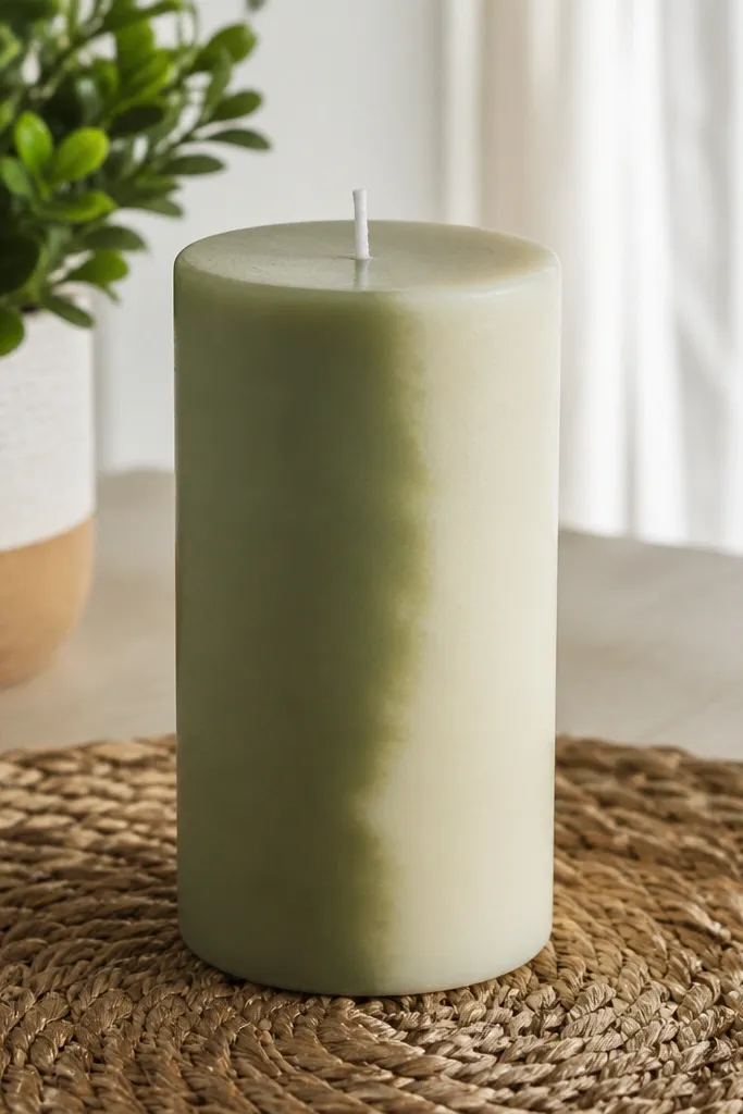
Vertical color blocks look modern, but the secret is in the edge treatment. Feathered edges keep it from looking like paint-by-number, and the two-tone split gives a clean, graphic look. Choose colors that match your room palette: black and cream, navy and white, or sage and ivory. This style looks great on pillars and smooth tapers because vertical lines lengthen the visual. Beginner-friendly if you use tape and a sponge for the feathering.
Base paint the candle one color and let it dry. Tape off two vertical sections, leaving a narrow gap for the transition edge. Paint the second color into the taped area, then soften the edge by lightly dabbing along the tape line with a damp sponge. Remove tape once the second color is set, then seal with satin clear.
Use painter’s tape edges as your guide, not your final border. The feathering should blend past the tape edge slightly.
Don’t pull tape off too late or it may tear dried paint.
18. Rose Quartz Pink Crackle Stripes
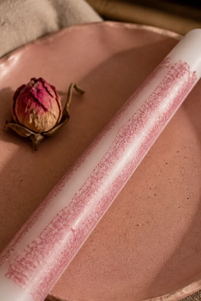
Paint the candle white and let it dry completely. Mask vertical stripe areas with tape, leaving the stripe gaps exposed. Apply crackle medium just on the taped stripe zones, then paint pink over it. Remove tape after the pink coat is dry enough to hold shape, then seal once the crackle is fully cured.
Crackle stripes give you texture without covering the entire candle in webbing. The look feels like rose quartz when the white base stays visible between crackle lines. Pink crackle reads romantic but still modern because the stripes are structured. This is great for adding a “wow” detail to a simple candle set. Intermediate difficulty because you need masking and timing discipline.
Skip thisDon’t apply crackle medium too thick. Thin layers crack more evenly.
Editor's notePress tape edges down firmly with a fingernail so crackle paint doesn’t creep under.
19. Matte Black with White Dry-Brush Halo
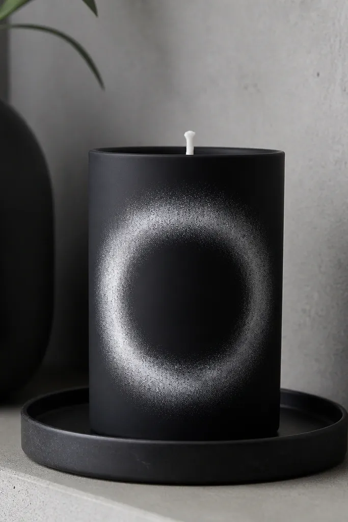
This one looks like modern gallery decor because it uses negative space. Matte black is dramatic, and a dry-brushed white halo ring feels soft and atmospheric. It’s also a good option if you hate painting tiny details — the halo is forgiving. Place it near the middle or slightly low for a more styled look. Beginner-friendly with a dry brush technique.
Paint the candle matte black and let it dry fully. Dip a dry brush into white paint, then wipe almost all paint off on a paper towel. Lightly sweep the brush in a circular motion to build a halo ring, keeping the center mostly black. Let it dry and seal with matte clear so the halo stays velvety, not shiny.
Keep the brush almost dry. The halo should look like a soft dusting, not a stripe.
Don’t overload paint or you’ll lose the airy halo effect.
20. Chocolate Drip with Cream "Foam" Dabs
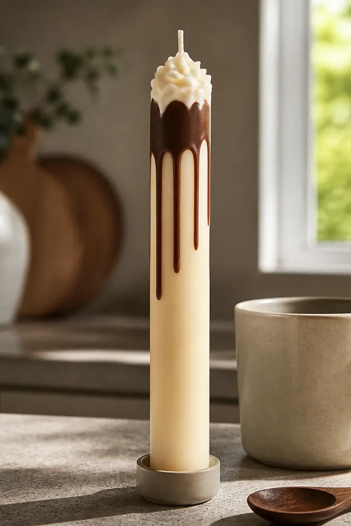
This design reads like dessert decor, but it looks neat because the drip edge is controlled. Chocolate brown on cream is high contrast, and the cream “foam” dabs make it feel playful instead of sloppy. It photographs well because the drips create vertical movement. This works on smooth tapers and cylinders where the drip line can travel evenly. Beginner to intermediate, since you need a steady drip hand.
Start with a cream base coat and let it dry. Paint a thin line near the top with chocolate brown, then pull short drips downward with the tip of an angled brush. For the “foam,” dab small cream circles or peaks on top of the chocolate using a sponge tip or cotton swab. Let dry and seal with satin clear so the surface doesn’t look chalky.
If the drips look too thick, load less paint and do a second thin pass later.
Don’t drag the brush across wet paint. It will widen the drip line.
21. Olive Branch Silhouette with Negative Space
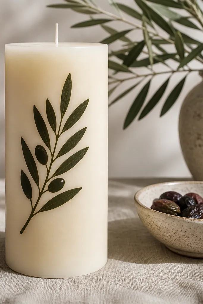
Paint the candle ivory and let it dry. Lightly sketch a branch outline on the candle with pencil or chalk, or use a leaf-branch stencil. Fill the silhouette with dark olive acrylic using a small flat brush, keeping edges sharp. Let dry, then seal with matte or satin clear based on your candle finish preference.
Silhouette painting looks clean because you’re filling one shape, not rendering details. An olive branch in dark olive on ivory reads modern and calm, and the negative space makes it look crisp. This is a good choice if you want a “stylish set” look without worrying about tiny leaf veins. It suits both matte and satin candles because the silhouette is simple. Beginner-friendly if you use a stencil or draw a rough branch guide first.
Skip thisDon’t overwork the edges. Multiple passes make the silhouette look fuzzy.
Editor's noteUse a stencil for the first branch, then freehand the second side to match the curve.
22. Rainbow Stripe Candle with Glossy Clear Topcoat
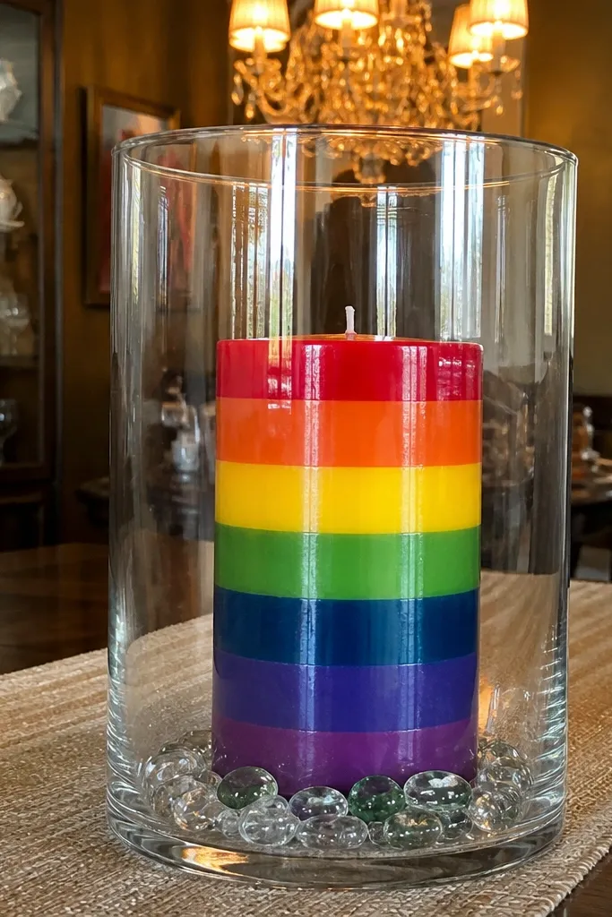
If you want maximum “pin impact,” crisp rainbow stripes win. The look is cheerful, but it still looks aesthetic when the stripes are straight and evenly spaced. A glossy topcoat makes the colors pop under warm light, which is what makes photos look extra satisfying. This design is best on smooth cylinders so stripes stay consistent across the curve. Beginner-friendly if you measure spacing and use tape.
Paint the candle base white and let it dry. Use painter’s tape to mask equal-width stripe bands — keep them around 0.5 to 0.75 inches each. Paint each stripe color in thin coats, letting each dry before removing tape. After the last stripe dries, apply a glossy clear topcoat in two thin layers so the surface looks smooth and photo-ready.
Pull tape off at a slight angle while the paint is just set, not fully cured.
Don’t use too many colors if your stripes are narrow. Crowding makes them look messy.
23. Citrus Slice Pattern in Yellow and White
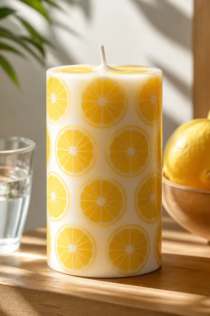
Paint the candle white and let it dry fully. Create a circle template by tracing a small jar lid size you like, then lightly mark slice outlines on the candle. Paint the slice interiors in lemon yellow, then use a thin brush to add a darker yellow rind line and small segment lines. Seal with satin clear so the pattern stays crisp without glare.
Citrus slices are playful but still look clean when you keep the lines simple. White base with yellow slices reads bright and fresh, and it’s an easy theme for spring and summer styling. The pattern photographs well because the circles create a repeating rhythm. This style works on smooth pillars and cylinders where you can fit multiple slices around the surface. Beginner-friendly if you use a circle template.
Skip thisDon’t freehand perfect circles. Template marking makes the design look intentional.
Editor's noteKeep all rind lines the same thickness for a consistent, store-bought look.
24. Monochrome Marble with Charcoal Swirls
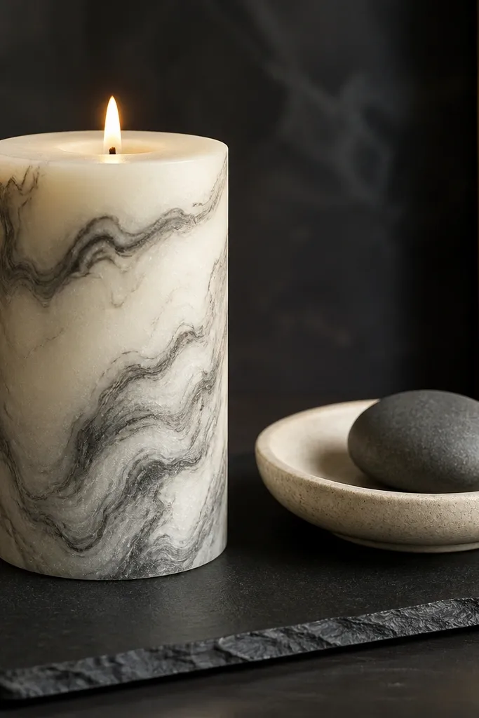
Marble doesn’t have to be colorful to look luxe. Charcoal swirls on ivory create that modern stone vibe, and it hides small uneven paint spots because the pattern covers the surface. This is a great choice if you want aesthetic candle painting looks that match neutral rooms. It also pairs well with other decor textures like wood and linen. Intermediate effort because you need controlled swirling, but it’s still manageable.
Start with an ivory base coat and let it dry completely. Thin charcoal acrylic so it drapes rather than clumps, then dab small puddles and streaks around the candle. Drag through the dabs with a toothpick in varied directions to form veins. Let it dry, then seal with satin clear to keep the marble looking smooth and not chalky.
Use two different charcoal tones — one slightly lighter — to make the veins look dimensional.
Don’t over-blend. Too much dragging makes marble look like smudges.
25. Pearl-Effect Dots with Opal White Base
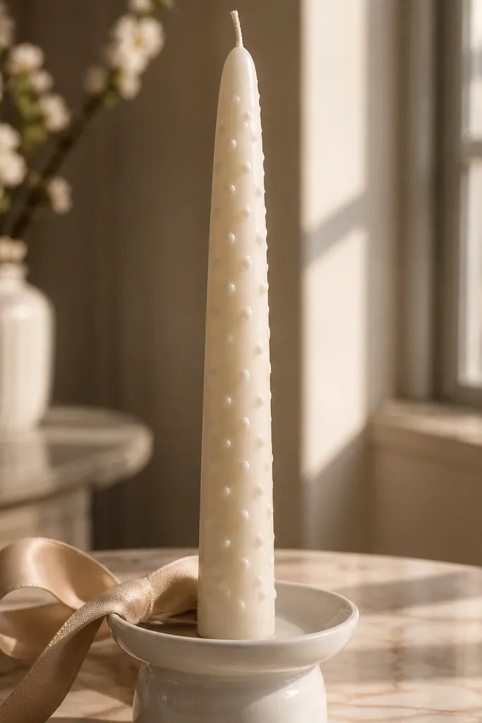
Pearl-effect dots look soft and high-end, especially when the base is an opal white. The dots catch light gently instead of screaming glitter, which is why this style looks good in calm home decor. It’s also forgiving because you’re not painting fine lines; dot placement is the entire design. This works on smooth tapers and pillars and looks especially nice on a tray. Beginner-friendly and quick once your dot tool is ready.
Paint the candle with an opal white or off-white base and let it dry fully. Use pearl white acrylic paint or iridescent pearl pigment mixed into acrylic, then dot across the surface in a loose grid. Vary dot size slightly by changing how long you press the applicator. Seal with a clear satin finish to protect and keep the dots from dulling.
Practice on paper first. The dot size you get on paper transfers to the candle pretty accurately.
Don’t cover every inch uniformly. A little spacing makes it look intentional.



