1. Ticket Stack Timeline Page
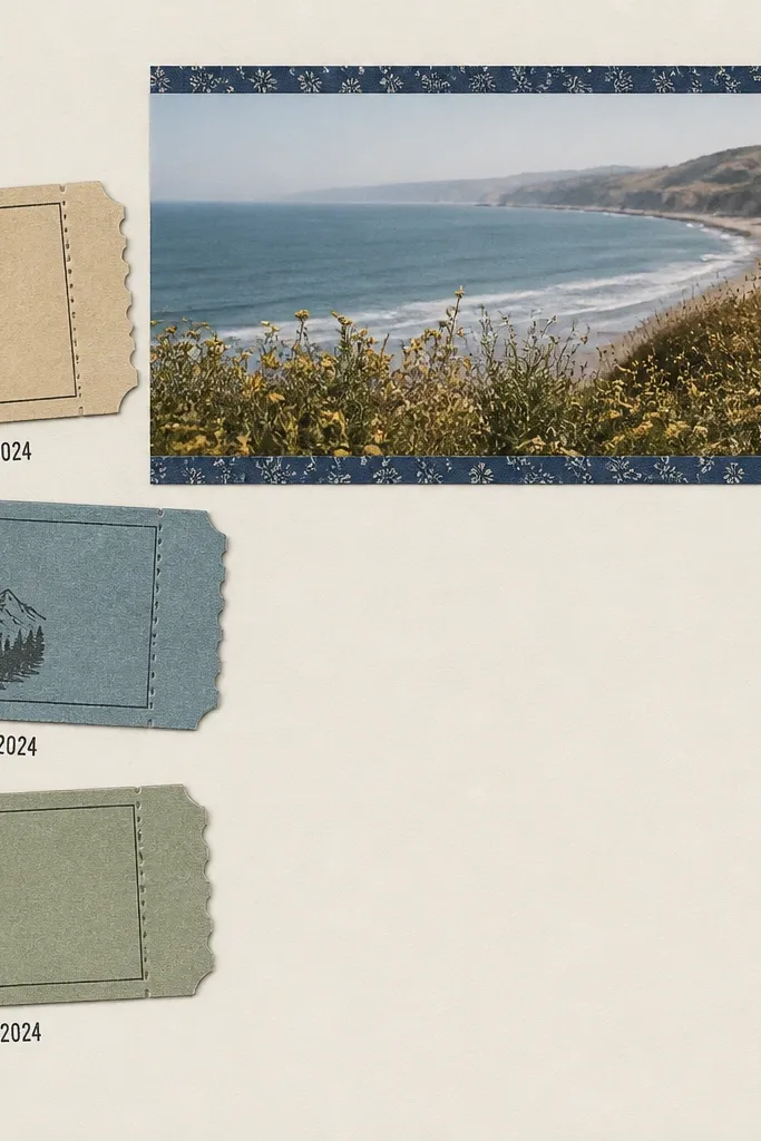
Start by cutting your base to 12x12 and placing your three tickets on the left. Offset them by about 3-4 mm each, then trace the edges lightly so you can glue without crooked placement. Add a thin dark-blue washi tape strip across the photo area as an anchor line, about 1 cm from the top. Glue the photo strip next, leaving a 2-3 mm margin on all sides, then stamp or handwrite dates directly under each ticket. Finish with a small journaling block in the bottom right on a solid card strip, about 2.5 inches wide.
This layout works because tickets already have built-in structure: they’re small, rectangular, and easy to align. I used cream cardstock so the printed tickets don’t look muddy, then I framed a single wide photo strip on the top right. Keep the photo in landscape orientation, and let it run edge-to-edge with a small border so it feels intentional. Use black ink for the dates to match ticket text and keep it readable. This page flatters any boyfriend because it focuses on moments, not facial detail, so it still looks good with blur or motion shots.
Skip thisAvoid covering the ticket text with big stickers; if the ticket can’t be read, it stops feeling like a real moment.
Editor's notePrint your dates in the same font style (simple sans-serif) even if you handwrite them — consistency makes the page look store-bought.
2. Polaroid Grid With Hand-Cut Borders
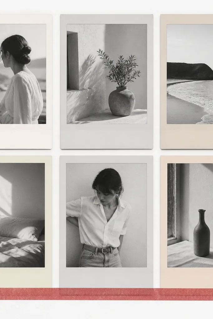
A Polaroid grid looks clean because the white “photo frame” gives your eye a rhythm. I went with six photos instead of four so the grid fills the page and hides uneven photo sizes. Use black-and-white or muted color photos for this style because bright color can feel too busy in a grid. Hand-cut borders matter: make each Polaroid mat about 1.25 inches wide so the white space looks intentional. This layout works for boyfriends with any skin tone because the mat creates a soft buffer and keeps contrast even.
Cut six mats from 110 lb cardstock at 3.75x4.75 inches for each photo window. If your photos are 4x6, trim them to 2.75x3.75 and test the fit against the mat before gluing. Arrange the mats in a 2x3 grid with 0.25 inch gaps between frames. Add a small strip of red washi tape under the entire bottom row — glue it to the mats, not the photos. Write one short caption per photo on the bottom mat area, about 1 inch long, using a fine black marker.
Use a paper trimmer for the mat edges; crooked borders are what make Polaroid grids look cheap.
Don’t use glossy “photo paper” prints under cardstock mats — the glare makes the whole grid look flat.
3. Concert Night Page With Foil Tape Stars
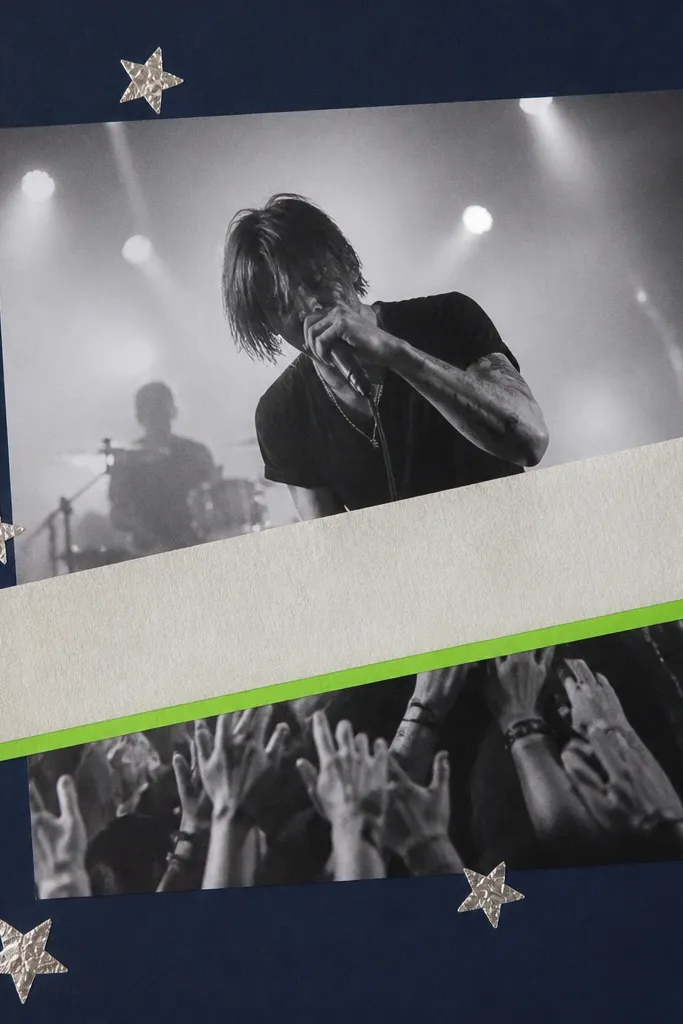
Night photos need contrast, and a dark navy base makes everything pop without you adding heavy layers. I used silver foil tape for star specks because it catches light like stage lights do. The diagonal banner breaks the symmetry so the page doesn’t feel too formal. Keep the title on a neon green strip so it looks like a set list highlight. This style flatters darker photos and also makes lighter skin tones look less washed out because the surrounding navy adds depth.
Cut your base from 12x12 cardstock in navy. Place your main concert photo slightly off-center to the right, then tape a diagonal strip of light gray patterned paper behind it for glow. Add a ticket banner across the top-left to bottom-right using 1-inch wide strips, then glue it down. Punch or hand-cut small star shapes from silver foil tape and place them around the photo edges, not on faces. Finish with a neon green title strip across the bottom third, and write the set date in black ink.
Press foil tape down with a bone folder so it doesn’t lift later when the book opens.
Avoid layering too many stickers — with dark bases, extra shine turns into clutter fast.
4. Recipe Card Love Page
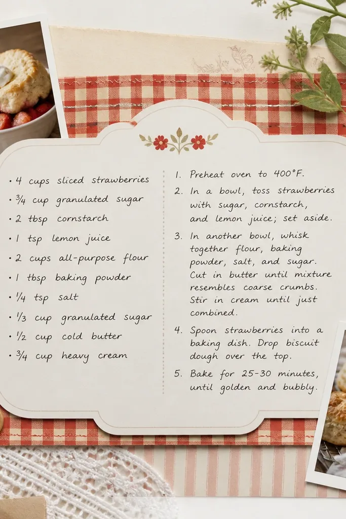
This is the page I made for “boyfriend who cooks” and it turned out way better than I expected because the format tells a story. Recipe cards have natural sections, so you don’t have to invent structure from scratch. I used a cream base and a gingham border to keep it warm. The main photo is optional; the card design carries the theme even if your pictures are just hands, bowls, or plated food. It flatters everyone because skin tones are secondary to the card layout and the texture.
Start with a cream 12x12 base. Cut a recipe card panel from off-white cardstock at about 7x9 inches and ink the edges lightly with a brown distress ink pad. Layer a gingham strip border around the card — about 1 inch wide on the left and right. Add two small photos at the top corners, 2x2.5 inches each, and glue them under the gingham so they look tucked. Write the recipe name as the title, then add ingredients lines and a two-step method in small handwriting.
Use a fine tip black pen for the recipe body so it stays readable after you glue the card down.
Don’t use thick markers for tiny text; it bleeds and makes the recipe look messy.
5. Map Coordinates Page With Thread Lines
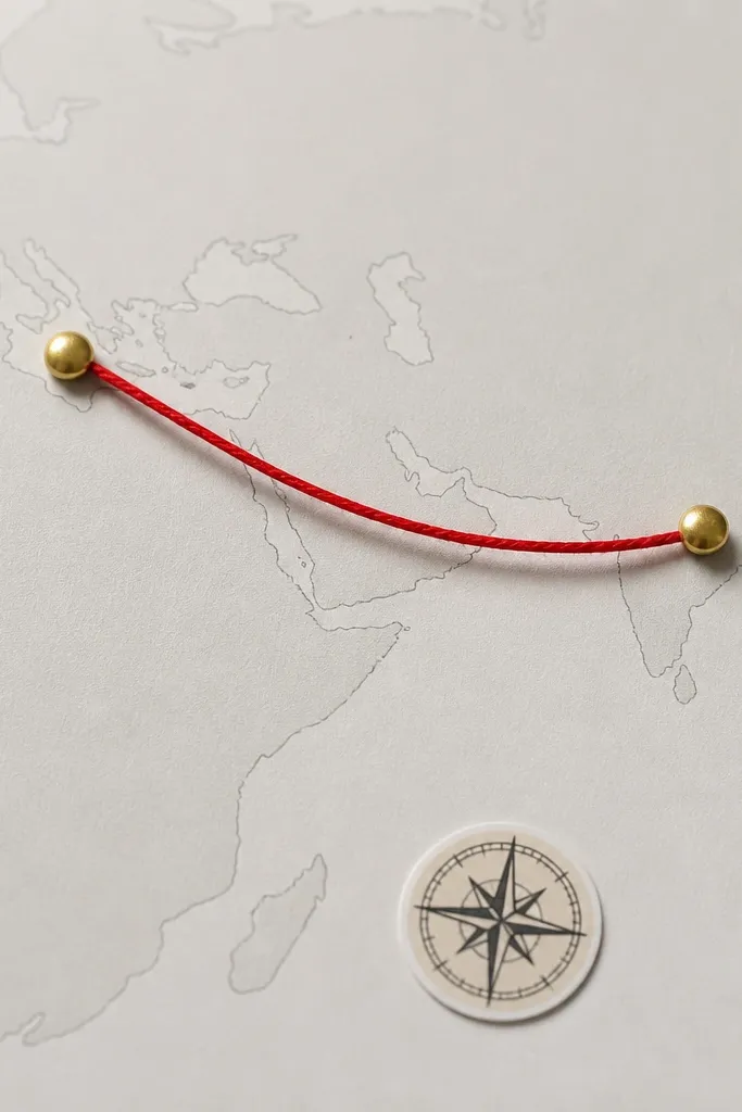
Print a simple map background or use scrapbook map paper as your base. Cut a 9x12 map panel and glue it onto a 12x12 page, centered. Mark two points with gold brads about 2 inches apart. Pull red embroidery thread through the brads and wrap it once around each brad stem so it stays tight. Tie the thread off on the back and trim. Add a small journaling strip under the map with the coordinates in a clean handwritten style.
This layout looks thoughtful because it turns a trip or even a local hangout into a visual line. Thread makes the connection feel physical — you can almost trace the route with your finger. I used a light gray map print because it keeps the thread and pins crisp. The red thread gives strong contrast and looks like a highlight line on a diagram. This works for any boyfriend because it doesn’t require perfect photos; it’s about the place and the story you attach.
Skip thisAvoid pulling the thread too tight; it makes the map buckle and the page looks warped.
Editor's noteUse embroidery thread, not yarn. Thread stays smooth and doesn’t shed fibers into your glue.
6. Polished Black-and-White Portrait With Corner Tape Frame
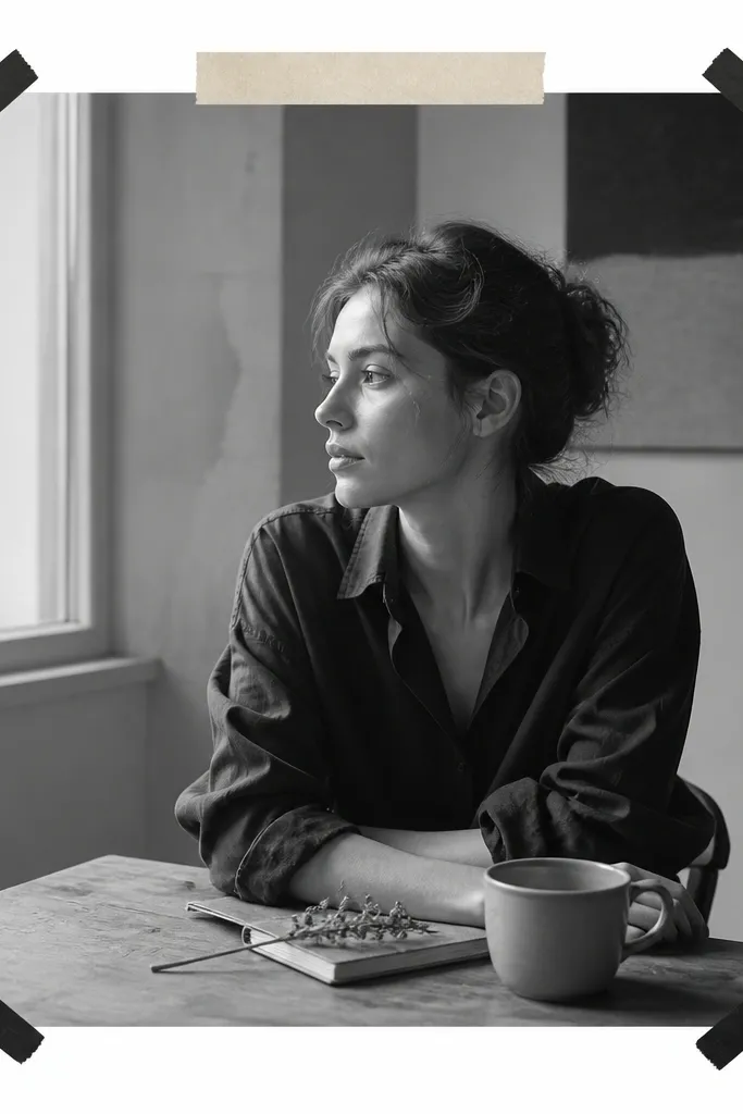
Pick a portrait photo that has clear lighting on the face. Mat it with a 1/8-inch border using black cardstock — trim the mat to be about 0.5 inch larger than the photo on each side. Glue the mat centered on a white 12x12 page. Place small 1-inch pieces of black washi tape in each corner so they touch the mat edges, not the photo. Add a title strip at the top — about 10 inches wide — and glue it under the tape so it looks layered.
One-photo pages can look expensive when you give the photo a controlled frame. I used black-and-white portraits because the page stays graphic and the corner tape adds that clean, modern edge. Corner-only framing keeps the page breathable and stops it from looking like a collage. The typed title strip makes it feel like a layout in a printed book, not a handmade page. This flatters any boyfriend because it doesn’t compete with color — it makes expressions and lighting do the work.
Skip thisDon’t add three different embellishment styles around a single photo; corner tape is enough.
Editor's noteChoose one font style for titles across the entire scrapbook; even handwritten titles look better when they match.
7. Laundry List Date Challenge Page
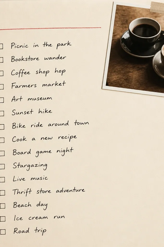
Checklists look great in scrapbooks because they give your boyfriend something to read and react to. I used a heading like “Next Dates” and wrote 10 prompts in a tight column so the page feels organized. The best part is you can fill it out now or later, so the page grows with your relationship. I kept the palette cream and red so it stays masculine and clean. This works for boyfriends who like practical plans because the page has structure, not just decoration.
Start with a cream cardstock base. Cut a 10x3-inch strip of solid paper for the heading and underline it with a red marker. Write 10 date prompts with checkboxes, using a ruler so the lines stay straight. Glue a small corner photo (about 2x2.5 inches) at the top-right and tuck it under a narrow strip of washi tape. Add a tiny “when we did this” note line under the list for future updates.
Use a ruler for the checkbox column; crooked checkboxes are the fastest way to make a page look sloppy.
Avoid using too many colors in the handwriting; two colors max keeps it sharp.
8. Shadow Box Feel Using Layered Photo Strips
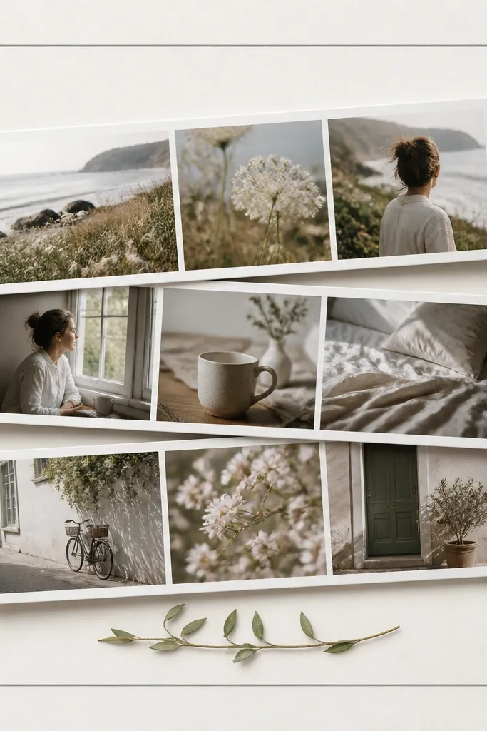
If you want depth without 3D bulky stuff, layered photo strips do it. I stacked three photo strips at different heights so the top strip casts a visual “shadow” even on a flat page. Use foam tape if you want real lift — I used 1/8-inch foam squares under the bottom corners only so it doesn’t warp the page. Keep the color palette consistent by choosing photos with the same lighting tone. This looks good for boyfriends because it feels like a mini gallery, not a scrapbook collage.
Trim three photos into strips about 2.5 inches tall and 5.5 inches wide each. Cut a gray mat frame at 11x11 inches to sit around the layers. Glue the bottom strip first, perfectly centered. Add foam tape under the middle strip corners and glue it on top, slightly offset up by about 1/4 inch. Glue the top strip flat or with tiny foam pads and add a stamped caption at the bottom center.
Use foam tape only on corners. Full coverage can make pages too thick to open flat.
Don’t stack strips with random spacing; keep the offset consistent so it reads as intentional.
9. Sticker World Map With Cities + Date Stamp
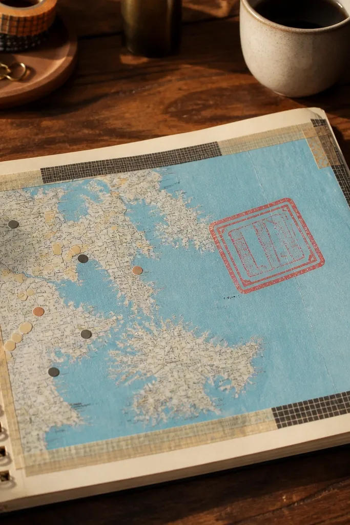
Choose a pale blue map background and glue it to a white or light gray base page. Add a thin route line using a marker or a strip of washi tape, about 1/4 inch wide. Place city stickers at each end and between, then stamp the “date we started planning” in the center area. Add one small photo (2x3 inches) in a corner under a strip of solid cardstock mat. Finish with short journaling on a narrow strip: where you went, where you want to go.
This is the page I used for a “we’ll go here next” vibe, and it still looks good even if you only have one trip photo. Map paper gives you instant structure, and the city stickers act like little waypoints. I used a red date stamp because it stands out against light blue and looks like a marker on a travel document. The small corner photo keeps the page from feeling like a poster. It flatters any boyfriend because the focus is place-based, not face-based.
Skip thisDon’t cover the map with too many stickers; leave open map space so it stays readable.
Editor's noteWrite city names in all caps for a clean look that matches printed maps.
10. Neon Tape Road Trip Page
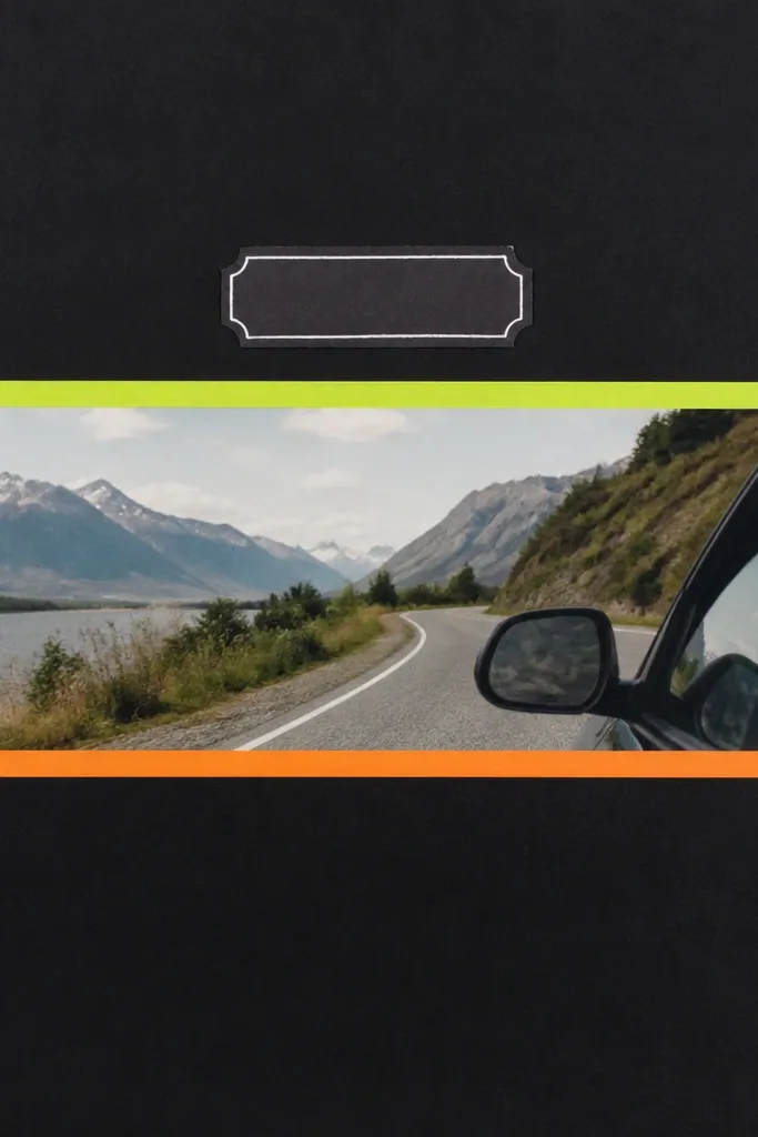
Cut a black cardstock base. Mat your main road trip photo strip so it has a 1/8-inch white border — use white cardstock behind the photo. Glue the strip centered. Add two neon-green washi tape strips as “lanes” running parallel to the photo edges, and one orange strip as a divider across the top third. Put a white label strip with the trip name under the photo, then write the date in small white marker.
Road trips look best when you lean into motion. A black base and neon tape mimic highway signage and make your photos feel like they belong together. I used lane lines — two thin strips — because they guide your eye across the page. Keep the title simple and bright so it matches the neon vibe. This works for boyfriends because it’s graphic and doesn’t demand perfect portrait shots; even scenery photos look like a story.
Skip thisAvoid using more than two neon colors; three starts to look like a craft store bargain bin.
Editor's noteUse matte neon tape if you have it; glossy tape can reflect light and hide the details.
11. Father-Son-Style Handwriting Page for Any Guy
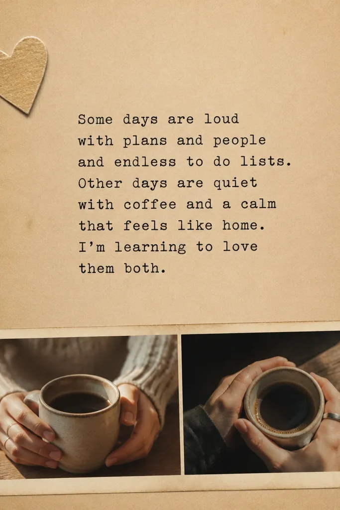
Start with tan cardstock and add a white journaling panel about 8x10 inches. Use a typewriter-style font if you print, or write with consistent spacing if you handwrite. Glue the panel centered. Add a small photo strip at the bottom — two photos side by side, each about 2.25x3 inches. Place a small heart or arrow sticker near the top-left corner and finish with a date stamp in the bottom margin.
This one is sentimental without being cheesy because the design looks like a letter. I used tan cardstock and typed-style handwriting to keep it grounded. The center journaling block is the star, not a pile of embellishments. A tiny icon sticker in one spot gives it a human touch. This flatters any boyfriend because the page doesn’t rely on face photos; it leans on your words and the texture of the paper.
Skip thisDon’t cover the journaling panel with stickers; text needs breathing room.
Editor's notePrint your journaling and then lightly ink the edges so it matches the paper tone.
12. Sports Scorecard Page With Stat Tabs
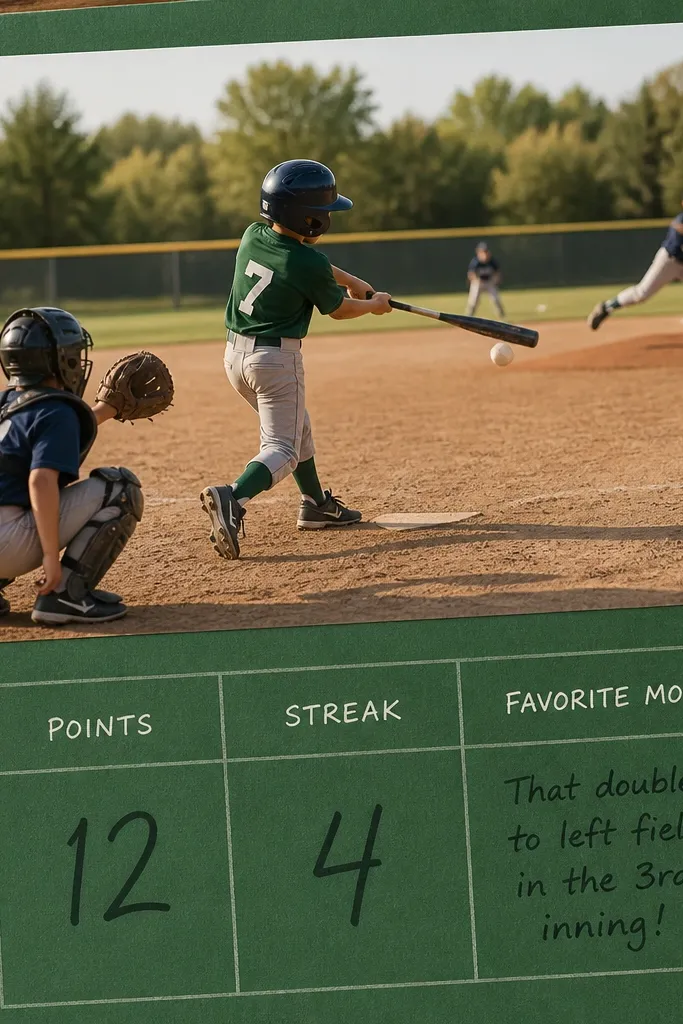
Choose a green cardstock base. Glue a baseball or game photo at the top, mat it with off-white cardstock for contrast. Draw a grid below it using a ruler so the boxes are even — about 1.5 inches wide each. Write three stats: “Favorite play,” “Best moment,” and “Next game idea.” Add three yellow cardstock tabs on the left edge and glue them so they stick out by about 1/4 inch. Finish by writing the date on a small strip at the bottom.
Sports pages look instantly masculine because scorecards already come with grids and stats. I used a green base and a simple grid layout so the page feels like an actual game recap. The tabs on the left make it interactive — you can add future notes for rematches. Use one main action photo, then keep the rest text-only. This works for boyfriends who like numbers because it turns your memories into stats they understand.
Skip thisAvoid cursive for the stats; it makes the page look less like a scorecard and more like a kid’s drawing.
Editor's noteUse a black gel pen for stats; it stays crisp on colored cardstock.
13. Museum Ticket + Caption Strip Page
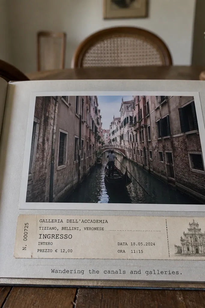
This layout makes a single photo feel “curated” because it anchors with a caption strip. Tickets give you instant authenticity, and the typed caption adds an editorial feel without making it look like you tried too hard. I used a light gray border because it frames the page without stealing attention from the photo. Keep the caption short — one sentence — so it looks like a label from a museum. This flatters any boyfriend because it’s neutral, clean, and doesn’t depend on skin tone matching.
Cut a light gray border frame on a 12x12 base by matting the page with a 1/2-inch solid gray strip around the edges. Place your horizontal ticket across the top third, then glue your vertical photo on the right side, leaving a 1/4-inch margin. Add a caption strip at the bottom — about 10 inches long and 1.25 inches tall — and type or handwrite the text in black. Add a small journaling note under the ticket on a narrow strip. Finish with two small washi tape corners to keep the ticket from shifting.
Make the caption strip the same width as your ticket so everything aligns visually.
Avoid adding multiple long paragraphs; museum-style labels stay short.
14. Coffee Date Page With Brew Receipt Tabs
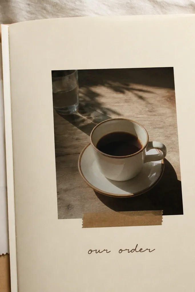
Cut a cream base and glue a small brown washi tape strip underneath where your center photo will sit. Mat your coffee photo so it has a 1/8-inch border, then center it. Cut two receipt pieces into tabs by trimming the top edge into a slight V shape or just rounding corners with scissors. Glue the tabs on the left side so the receipts peek out like bookmarks, about 1 inch visible. Write “our order” above the tabs and add date journaling in a small block at the bottom.
Receipts are underrated scrapbook material because they’re already formatted and they add real texture. I used coffee receipts because they’re slim and slide nicely into a tab layout. The center photo stays clean, and the receipt tabs add movement on the left side. Brown and cream keep it warm and masculine enough without going childish. This works for boyfriends of any style because the page is about the ritual, not the outfit.
Skip thisAvoid gluing the entire receipt flat; it will ripple if the paper is thin.
Editor's noteUse a tiny dot of glue at the corners of receipts so they don’t curl.
15. DIY Sticker Lettering Banner Page
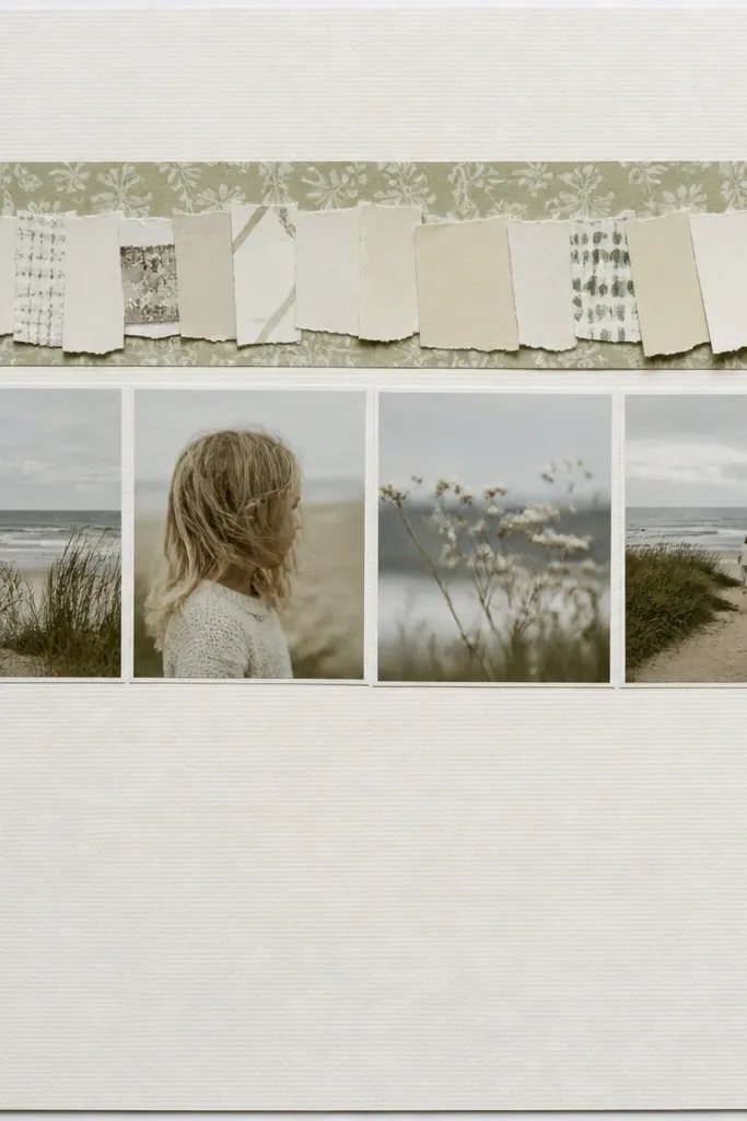
Letter banners look good because they create a clear top line for the eye, and you can control the vibe by choosing matte letter shapes. I used matte white paper letters with black ink so the banner doesn’t look shiny or plastic. The photo strip below stays simple — one row, not scattered. This layout is great when your boyfriend has a lot of photos but you only want to feature a few. It flatters any boyfriend because the banner carries the theme even if the photos are casual.
Cut a patterned paper strip about 12 inches long and 2 inches tall for the banner background, and glue it to the top. Create letters from matte cardstock or sticker letters, keeping each letter about 1.25 inches tall. Arrange the letters with even spacing and glue them onto the banner strip. Add one photo strip below the banner, about 10 inches long, with a 1/8-inch border mat. Finish with a small journaling line under the photos using a fine black marker.
If your letters don’t line up, trim the banner strip shorter so you can re-center it without redoing everything.
Avoid using glossy letter stickers; they reflect light and make the banner look cheap.
16. Maker Hobby Page With Tool Texture Background
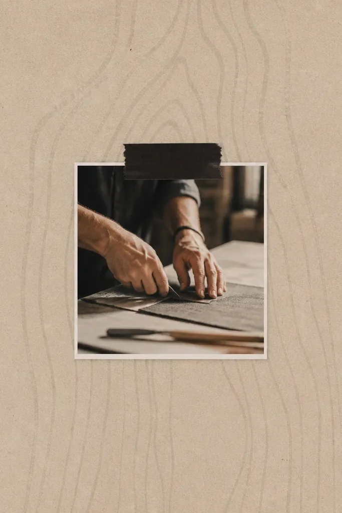
Use a kraft cardstock base or a wood-grain patterned paper base. Place your main hobby photo centered and mat it with off-white cardstock for contrast. Add a black tape strip across the top third and glue a typed title onto it, keeping the text short (2-4 words). Scatter 3-5 metal brads near the right edge — not on the photo — and attach a small journaling tag between them. Write a one-sentence note about what he was building and when.
If your boyfriend has a hobby with texture — woodworking, model building, fixing bikes — use materials that match that feel. Kraft paper and wood-grain patterned paper give you the same warm tone as tools and workbenches. I used typed titles on black tape because it looks like a label on a tool case. Metal brads add tiny hardware detail without turning the page into a junk drawer. This flatters him because the page focuses on craft process and hands, not just face shots.
Skip thisAvoid heavy glitter glue on top of kraft; it looks messy against the paper texture.
Editor's notePress kraft edges with a bone folder before gluing so they lie flat in your album.
17. Beach Day Page With Sand-Color Layering
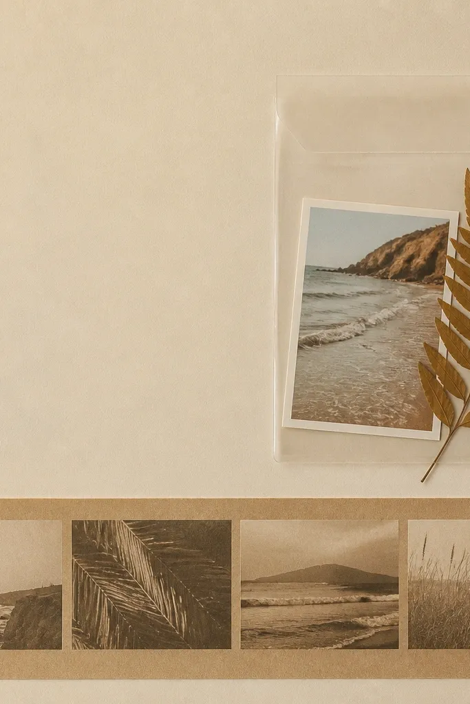
Beach photos can look washed out, so layering sand tones is the fix. I used sandy beige cardstock and added one slightly darker tan layer behind the main photo so the image has depth. An acetate pocket on the right keeps small items like a pressed leaf or a tiny shell photo without gluing them down. The clear pocket also protects the items from bending when the album opens. This works for any boyfriend because the design stays calm and the pocket holds the “real world” souvenirs.
Cut a sandy beige base. Layer a darker tan photo strip at the bottom with a 1/8-inch white border mat. Create an acetate pocket by folding a piece of clear acetate into a sleeve and taping it to the page edges, leaving the top open. Put a small photo and a pressed leaf into the pocket. Add a title strip in white or cream at the top-left and write the location and date. Finish by stamping one tiny wave icon near the title.
Seal acetate corners with double-sided tape strips — they hold better than liquid glue on clear plastic.
Avoid using watery blue paper for beach pages; it makes photos look even more faded.
18. Black Notebook Page With Sticky Note Promises
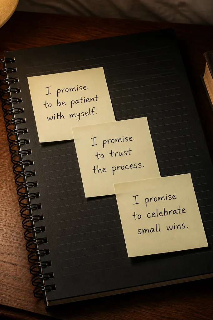
Start with black cardstock and draw horizontal notebook lines across the page using a ruler and light gray pen, spacing about 0.25 inch apart. Add three small “sticky notes” using cut rectangles from cream paper, and write one promise on each. Glue the sticky notes slightly overlapping each other in the center. Place a small photo in the bottom-right with a white mat border. Add one short title line at the top-left in white marker and date it in the top-right.
This is my “boyfriend loves notes” page. The black notebook base makes the sticky notes pop, and the page feels like a personal message rather than a scrapbook collage. I drew subtle notebook lines with a light gray pen so it looks like a real notebook page, not a blank black sheet. Use cream sticky note colors, not neon, so it stays classy. This works for any boyfriend because the message takes focus and the photo stays secondary.
Skip thisAvoid glitter pens on black notebook pages; it looks like a costume instead of a note.
Editor's noteIf your handwriting looks messy on black, write on white paper first and glue it as a label.
19. Map-Card Pocket With Photo Tag Pull
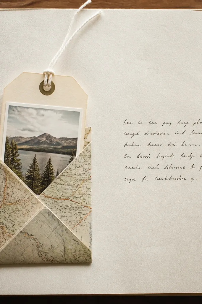
Cut a map pocket piece about 6x7 inches and fold it so the top opens. Glue the pocket to the left side of a 12x12 page, leaving the opening at least 2 inches. Make a photo tag from sturdy cardstock at about 3x5 inches, mat it with a thin border, and glue the photo in the center. Punch a hole at the top of the tag and thread a short piece of twine through, then tie a knot so it sits inside the pocket. Add a caption block on the right side and glue it down with a 1/8-inch margin.
Interactive pockets make a scrapbook feel alive when you flip pages. This one uses a map-card pocket because it matches travel stories and it also gives you a visual “backing” for the tag. The photo tag is held by a small string pull so it’s easy to remove without damaging the page. I used a map print on the pocket and plain cardstock for the tag so the photo stays readable. This flatters any boyfriend because the tag lets you show one extra image without crowding the main layout.
Skip thisAvoid liquid glue on the pocket edges; it warps the paper and the pocket won’t stay flat.
Editor's noteUse sturdy cardstock for the tag. Thin paper tears the hole after a few openings.
20. Summer Polaroid + Leaf Press Corner
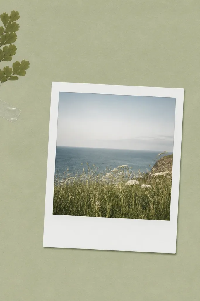
Pressed leaves look expensive when you keep them tiny and place them in one corner. I used pale green cardstock so the leaf and photo feel like they belong together. The Polaroid photo stays the main focus, and the leaf acts like a subtle detail. Clear tape sealing matters because it keeps the leaf from turning brown and lifting later. This works for boyfriends with any aesthetic since the page is calm and natural, not theme-y or cartoonish.
Choose a pale green base and cut a Polaroid mat about 4.25x5.5 inches for one photo window. Glue the mat slightly off-center so it sits lower-right. Press a small leaf and trim it so it fits in the top-left corner — about 1.25 inches across. Seal the leaf under a small rectangle of clear tape, smoothing it with a bone folder. Add a single typed date strip at the bottom and write a short caption on the left margin.
Press leaves for at least 7-10 days and weigh them with a book. Rushed leaves curl and won’t lie flat.
Avoid big pressed leaves; large leaf pieces look messy next to a clean Polaroid.