1. Blush-and-Dusty Rose 3-Size Cluster Wall
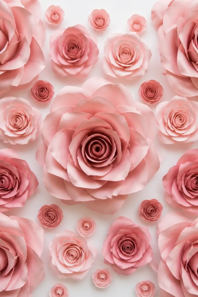
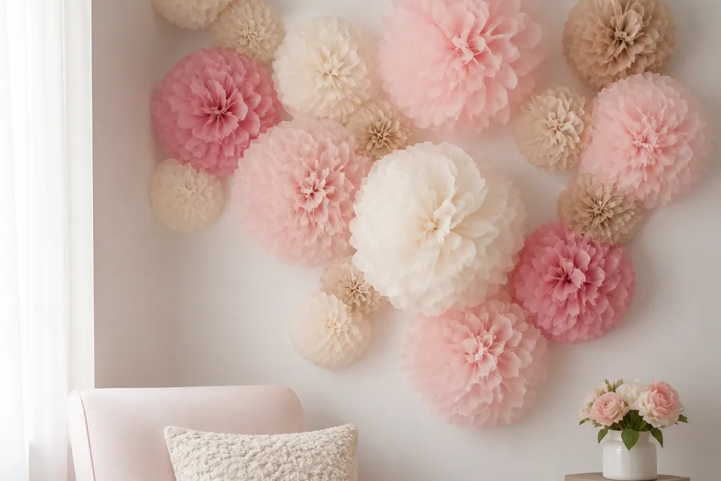
This is the rose-wall layout I reach for when I want it to look expensive in photos without extra fuss. Use blush tissue as your main petal color and dusty rose for the inner folds so you get shadow lines where the petals overlap. The three-size mix flatters most spaces because the big blooms create the focal point and the smaller ones hide the gaps where your wall backing changes texture. For skin-tone photos, blush reads soft and forgiving, especially with warm lighting and light outfits. I build these clusters so the roses look full from the front and also from a slight angle, like when someone steps to the side for pictures.
Start by making three rose sizes: large for about 12-14 inches across, medium around 9-10 inches, and small around 6-7 inches. Assemble each rose with layered petals, then add a thicker paper base circle so the bloom holds its shape when mounted. Lay out a rectangle area on the floor that matches your wall, and mark a loose grid with painter’s tape — I aim for one large rose per corner and one in the center of the top row. Mount a white foam board or poster board backing using Command-style strips, then attach each rose to the backing with foam mounting blocks or binder clips. Finish by fluffing the outer petals outward by hand so the rose edges curve toward the camera.
Editor's noteSprinkle small buds only where two large roses don’t meet — it makes the wall look intentional instead of patchy.
Skip thisDon’t use only one rose size. One-size walls look like a repeating pattern instead of a designed photo backdrop.
2. Cream Roses on Soft Gray Backing for a Clean Look
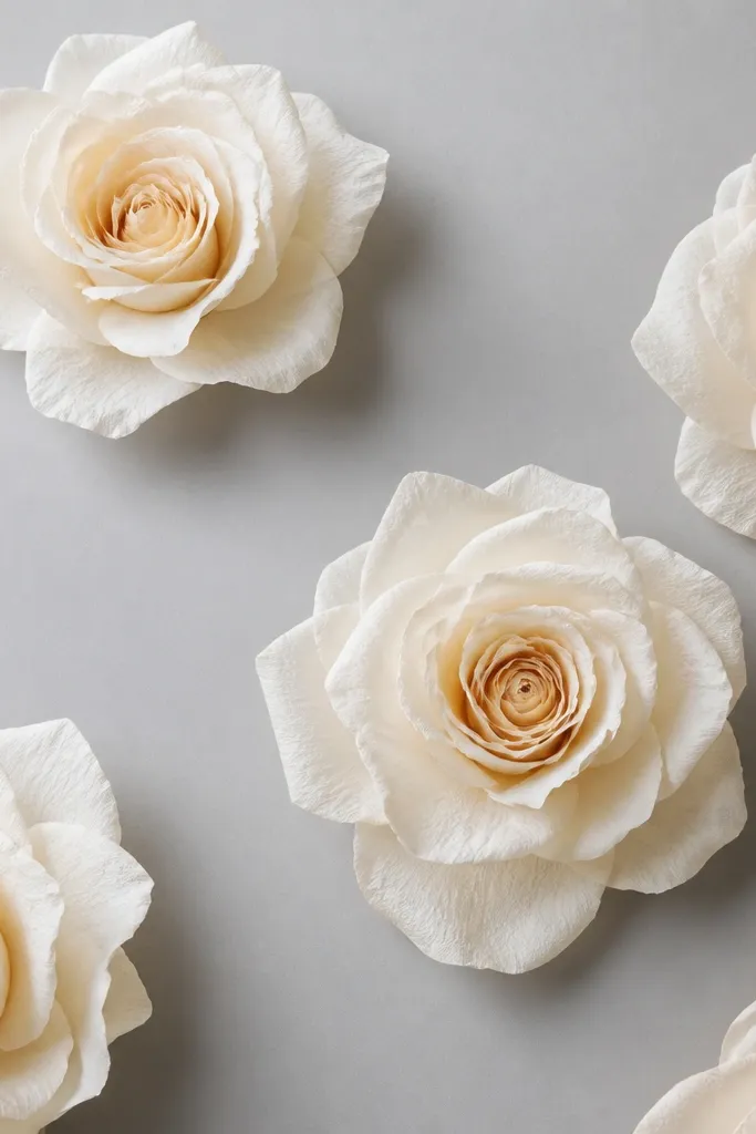
Cream roses on gray are my go-to when the room has cooler lighting or when you want the wall to stay neutral with styling. The gray backing makes the cream tissue look brighter and more “milky,” and it hides minor wrinkles in the backing. This design looks great for office events, baby showers, and minimalist birthday parties where you don’t want loud colors. It flatters a wide range of outfits because cream works with denim, black dresses, and pastel sweaters. The airy spacing also makes it easier to keep the roses from looking crowded or messy.
Cut your backing into a manageable size panel, like 2x4 ft, and mount it to the wall with Command-style strips at the corners and the center. Make cream roses with two tones: a bright cream outer layer and a slightly deeper cream for the inner folds. Roll and pinch each petal the same way, then stack the petals so the darker inner layer peeks through at the top third. Arrange the roses in a staggered pattern with extra space between clusters — I leave roughly 8-12 inches between large blooms. Attach each rose to the backing with foam mounting squares so the petals don’t flatten against the panel.
Editor's noteUse a matte backing, not glossy — glossy gray reflects light and makes tissue look uneven.
Skip thisAvoid tight spacing on gray. Too many blooms make the tissue look grayish instead of creamy.
3. Red Rose Wall with Black Center Contrast
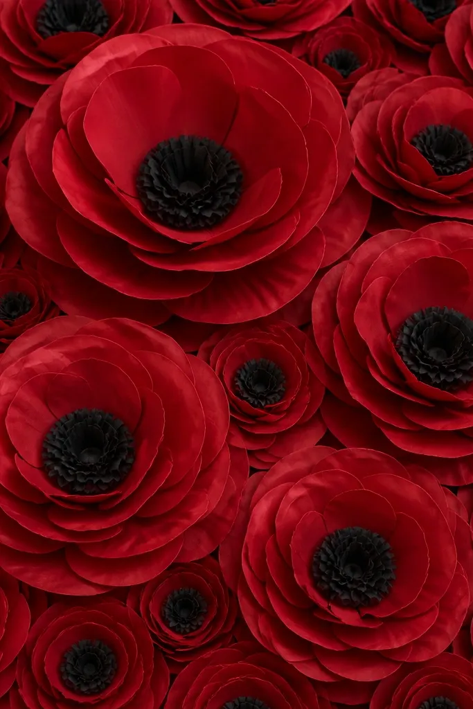
If you want a rose wall that photographs like real florals, red with a black or near-black center gives you that “shadowed rose” look. The black center makes the red petals look richer and adds depth without extra colors. This works especially well for evening events, Valentine-style setups, and themed parties where you want a dramatic backdrop behind candles or a dessert table. It also photographs well with warm amber string lights because the black anchors the color. I like this design because it’s bold but still clean — the contrast is doing the heavy lifting.
Choose red tissue for outer petals and black tissue for the tight inner roll petals. Build each rose with a larger outer layer — about 14-16 inch finished width for the main blooms — and smaller side roses around 10-12 inches. For the center, use narrower strips and roll them tightly around a pencil before pinching, then stack them into a compact rosette. Mount a sturdy backing like foam board, then attach roses using foam blocks or a strong double-sided mounting tape strip under the base. Place large roses in a loose diagonal across the wall and fill the gaps with smaller roses so it looks full but not uniform.
Use a hair dryer on low heat to gently re-curl petals that flatten during transport — keep it at arm’s length.
Don’t use matte craft tissue for both red and black. Black can look dusty — pick a darker, smoother black so the center reads crisp.
4. Pastel Rainbow Rose Grid with One White Rose Column
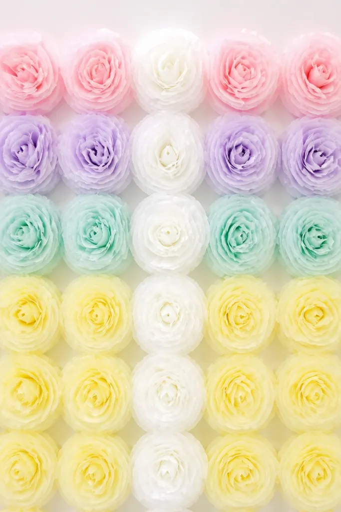
This is a fun setup when you want color without chaos, and it looks great for graduation parties and spring birthdays. The pastel rainbow reads soft in photos, and the single white column adds balance so the wall doesn’t feel like a kid’s craft show. I’ve used this layout behind a dessert table and it keeps the colors from fighting the cake decorations. Pastels also flatter most skin tones because they reflect light gently rather than pulling attention with high saturation. The grid pattern works best when your wall is fairly even — you’re going to see the spacing.
Start by cutting a backing area in panels or using a large foam board section, then mark a grid with painter’s tape at about 12 inches horizontally for medium roses and 16 inches for large ones. Make roses in four to five pastel shades, keeping petal shaping consistent so each rose looks equally “alive.” Build a white rose column in the center with slightly larger blooms so it becomes the visual anchor. Attach each rose to the backing with foam mounting squares — keep the base centered so the rose sits upright. Finally, fill tiny gaps with mini buds made from shorter petal strips so the grid lines don’t show through.
Editor's notePick one pastel shade to be the “leader” (I choose lavender) and make those roses 1 inch bigger for a subtle hierarchy.
Skip thisDon’t mix random sizes in a grid. If the spacing is straight, keep the size pattern consistent or it looks accidental.
5. Monochrome White Rose Wall with Gold-Tinted Centers
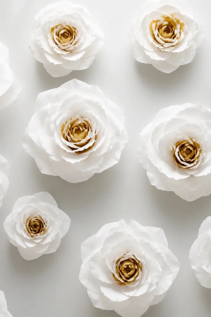
Monochrome white is the cleanest look for weddings, bridal showers, and photo shoots where you don’t want color mixing with dresses. The trick is that white-on-white can look flat unless you add a warm center — gold-tinted inner petals fix that. I tint centers by using gold tissue or by layering a thin gold sheet behind the inner rolls, so the warmth only shows in the core. This design flatters everyone because it doesn’t pull color away from skin tones or outfits. It also makes your bouquet, cake, and candles stand out because the wall stays quiet.
Make outer petals with bright white tissue and inner petals with white plus a gold-tinted layer. For the gold effect, cut small strips of gold tissue and place them behind the inner petal rolls before you stack them. Build large roses around 12 inches wide and medium roses around 9 inches so the wall has rhythm. Mount your backing with Command-style strips, then attach roses using foam blocks so the petals keep their curl. Arrange blooms in a staggered pattern with enough spacing to see the curl detail; I aim for about 6-10 inches between medium roses.
If your white tissue has a sheen, wipe it with a dry microfiber cloth before assembling. Finger oils show up on glossy tissue.
Avoid using only one flat white tissue. The center needs warmth or the rose looks like paper circles.
6. Rose + Leaf Mix Wall with Green Paper Veins
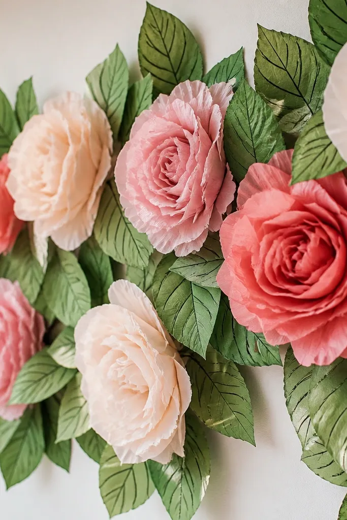
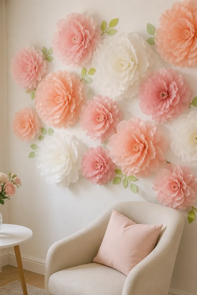
Adding leaves changes everything. Roses alone look like big paper circles; roses with green leaves look like a planted arrangement. I build the leaves from cardstock or thick craft paper, then add light veining lines so they don’t look like flat cutouts. This style works for garden parties, spring birthdays, and anyone who wants the backdrop to feel more “natural” than purely decorative. It also photographs well because the green gives you a second texture that catches light and balances the pink or red petals. For people with warm undertones, green makes skin look healthier in photos.
Make your roses first, then cut leaf shapes from green cardstock — I use teardrop or pointed leaf silhouettes about 5-7 inches long. Draw or scratch light veins with a fine-tip marker, then fold each leaf slightly down the center so it has a natural bend. Mount the backing panel with Command-style strips, then attach roses with foam blocks. Place leaves around the bottom edges of the roses, tucking them under or behind the rose base so the roses look rooted. Finish by trimming any leaf edges that look too straight and fluffing the rose petals outward.
Use two green shades, one darker for the back leaves and one lighter for the front. The layering makes it look like real foliage.
Don’t glue leaves flat on top of the rose base. Flat leaves make the whole wall look pasted on.
7. Large Corner Statement Roses with a Thin Petal Border
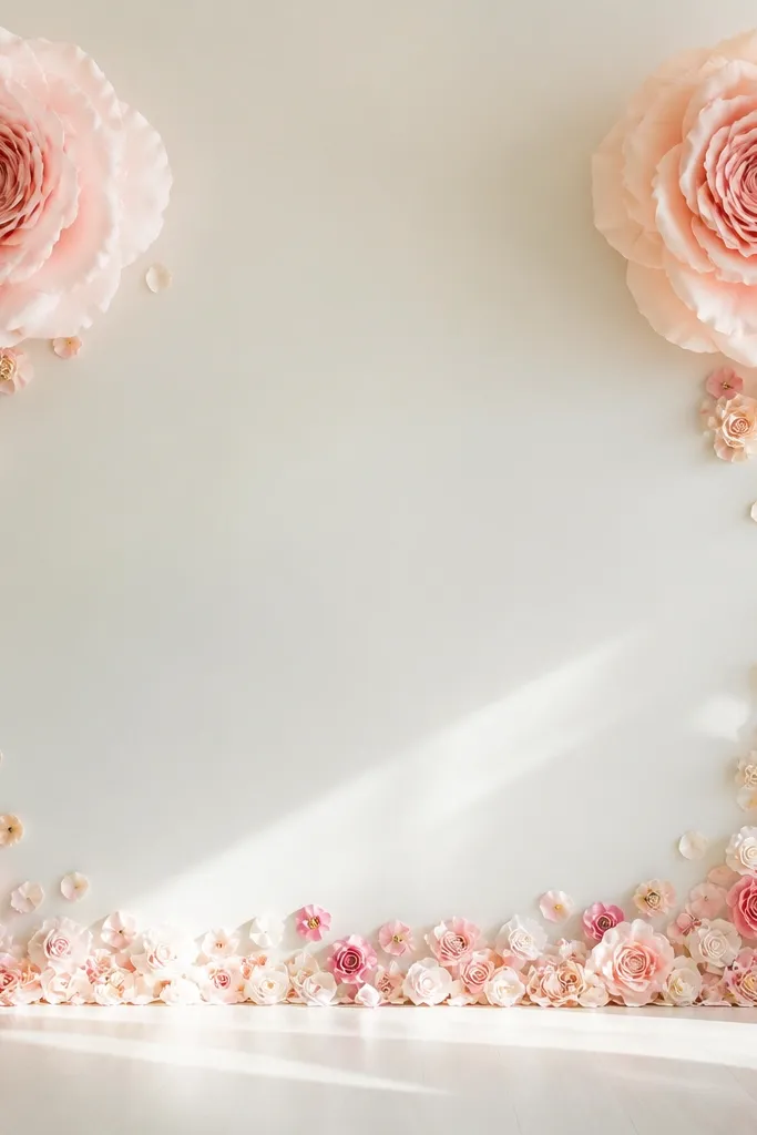
This is the “frame” approach. Big corner roses draw your eye to the subject, and the thin border gives a finished look without covering the whole wall. It’s perfect when you have furniture, a backdrop stand, or a table in front of the wall and you don’t want the entire area to be covered. The open center is also forgiving if your wall isn’t perfectly straight — minor bumps show less. I use this for engagement photos because it keeps faces unobstructed while still giving you that floral wall vibe.
Make two extra-large roses at about 16-18 inches wide for the top corners. Build a border by making mini roses around 4-5 inches and also a few loose petal clusters using shorter tissue strips. Mount a backing panel or directly mount a border strip using removable hooks, then attach the corner roses with foam blocks. Add the border along the bottom and sides with small roses spaced every 10-12 inches, and fill larger gaps with petal clusters. Keep the center area clear so you don’t crowd the camera view.
If your photos show the floor, frame the bottom border higher by 2-3 inches so it doesn’t blend into shoes.
Don’t put the border too dense. Dense borders look like paper confetti rather than a designed frame.
8. Ombre Rose Wall from Peach to Pink to Blush
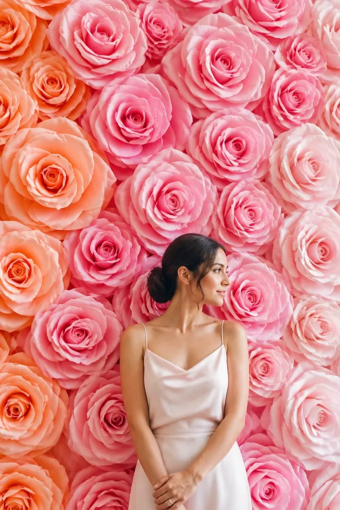
An ombre rose wall feels airy and modern, and it reads as intentional even if you’re using a simple grid. I love this when you want soft color movement but you don’t want obvious rainbow stripes. The ombre transition flatters a lot of outfits because it doesn’t clash with cool or warm tones. For photos, ombre also reduces the “flat paper” look because the petals change shade as they overlap. It’s one of the only rose-wall styles that still looks good when people are standing at different depths in the room.
Pick three tissue shades that step gradually: peach, pink, and blush. For each rose, use a slightly darker shade for the inner petals and a lighter shade for the outer petals, so the rose itself has a gradient. Make large roses with more layers so the ombre is visible — 14 inches wide minimum. Arrange roses so the overall wall transitions left to right (or top to bottom), not random. Mount your backing with removable strips, then attach roses with foam blocks, keeping the gradient direction consistent across every bloom.
Editor's noteCut your petals from the same tissue sheet orientation each time, so the lighter edge always ends up at the petal tip.
Skip thisAvoid mixing too many shades inside one rose. If you jump from peach to blush with no in-between pink, it looks muddy.
9. Mini Rose Confetti Wall for Small Apartments

If your space is small, a confetti wall is smarter than big roses. Mini blooms cover visual area without needing huge backing panels or heavy mounting points. I’ve used this in narrow hallways and it still looks like a full feature wall in photos. It also works when your ceiling is low because the roses don’t extend as tall as large statement blooms. This style flatters people standing close because the wall stays textured behind them without blocking the frame.
Make mini roses around 4-5 inches wide using shorter petal strips. Assemble each rose with a compact center so it doesn’t collapse — I use fewer outer layers than big roses. Mount a lightweight backing like thin foam board or even a large poster board sheet, then attach it with removable strips at the edges. Place mini roses in a staggered pattern with about 2-4 inches between blooms so the gaps don’t show. Attach each mini rose with small foam dots or a couple binder clips so every bloom sits upright.
Editor's notePre-assemble 20-30 mini roses on a table first. It saves your time and keeps spacing consistent.
Skip thisDon’t make the mini roses too tall. Tall minis look like lopsided pom-poms.
10. Rose Lettering Backdrop with No-Drill Mounting Panels
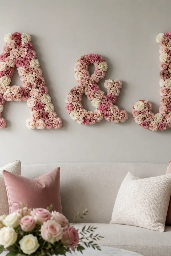
This is how you get a personalized rose wall without turning it into a craft project that takes a week. Lettering adds meaning, and it also controls the layout so you don’t have to cover every square inch of the wall. I’ve done this for birthdays where the main focus is the name, and the rest of the wall stays clean so photos don’t look cluttered. Rose lettering works well for couples photos too because the subject stands in front of the center word. The roses look “intentional” because they fill a shape, not just hang randomly.
Start by cutting letter shapes from foam board or thick poster board, about 12-18 inches tall depending on your space. Cover the letter faces with tissue rose clusters: large roses for the center strokes and smaller roses for inside curves. Attach the rose clusters to the letter base before mounting the letters to the wall. Use Command-style strips to hang each letter panel, placing strips at the corners and one in the middle so it stays level. Once mounted, press the roses gently outward along the edges so the letter reads like a floral cutout.
Editor's noteFor clean edges, leave a 1-inch border of board showing around the letter outline, then tuck the last petals right up to it.
Skip thisAvoid attaching roses after mounting. You’ll fight gravity and the petals will smear into each other.
11. Two-Tone Rose Wall with Dark Outer Petals
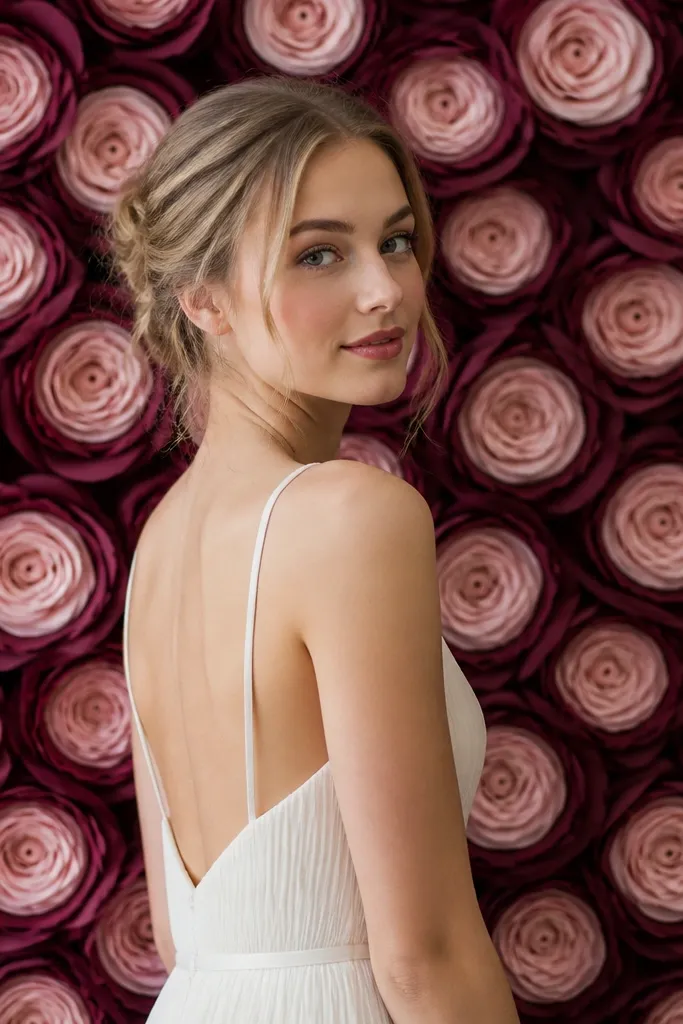
Two-tone roses look more realistic because they mimic how flowers darken at the edges. I use a darker color for the outer petals (like mauve, plum, or deep rose) and a lighter color for the inner petals (like blush or cream). The halo effect makes the rose pop even in dim rooms. This style is flattering for photos because the darker outer ring frames your face and draws attention upward. It also hides minor unevenness in tissue cutting, which is a lifesaver when you’re working quickly.
Choose two tissue shades that are clearly separated: one dark and one light. Build each rose with dark tissue for the first two outer layers, then switch to light tissue for the inner layers and center rolls. Make the petals with rolled curls so the dark outer ring shows at the tips. Arrange roses in a repeating pattern but vary the light-dark ratio slightly — one or two roses can have a thicker dark outer layer to keep it from looking too uniform. Mount roses to a removable backing panel using foam blocks, and press the center layers slightly upward so the rose feels open.
Editor's noteIf your dark tissue sheds color onto your hands, wear cotton gloves while assembling to keep it clean.
Skip thisDon’t use two-tone shades that are too close. If the difference is subtle, the rose reads flat instead of dimensional.
12. Sunburst Backing with Rose Centers Only
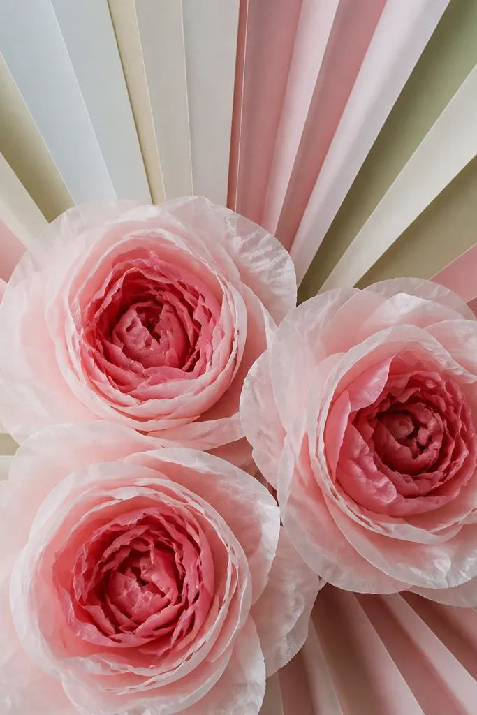
This look is dramatic without requiring huge roses everywhere. The sunburst rays give your camera a strong shape behind the subject, and the roses can be slightly smaller because the background is doing visual work. I used this for a graduation party and it looked like a professional set even though the roses were simple to assemble. It’s great for people who want a bold backdrop but don’t want a wall of heavy blooms. The burst also makes faces look brighter because the rays reflect light in multiple directions.
Make a removable sunburst backing from thick paper or poster board strips, radiating outward from the center behind where the roses will sit. Mount the backing to the wall with removable strips, keeping it flat and centered. Build larger roses for the center points and attach them with foam blocks so they sit a little above the sunburst. For a lighter effect, use fewer outer petals on some roses and rely more on the rays. Space roses along the burst so each one sits at a ray intersection, which makes the pattern feel intentional.
Use metallic gold or warm cream rays if your room lighting is cool. It warms the whole photo.
Avoid thin, flimsy sunburst rays. They bend and make the burst look wrinkled.
13. Pastel Ombre Rose Border Around a Plain Color Wall
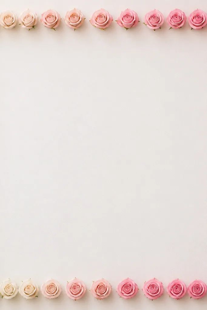
Borders are my favorite when you want the roses to frame a space without taking over the whole room. This ombre border keeps the look soft, and the blank center gives photographers a clean background for faces and outfits. It works well for dining rooms where you need the wall to stay usable and not cluttered. Pastel ombre also pairs with neutral decor like wood shelves and cream curtains. The border trick makes the wall look styled even when you’re not doing a full backdrop session.
Choose three pastel tissues in a gradient family, like pale yellow, peach, and light pink. Make mini roses about 5-6 inches wide and keep the petal curls consistent so the border looks uniform. Mount a thin foam strip or poster board strip along the wall edges using removable strips, then attach the mini roses to that strip with foam mounting squares. Arrange the ombre direction so it flows along the border — for example, lighter at the top, deeper at the sides. Place a small gap between roses so the curls are visible and the border doesn’t look like a packed strip.
Editor's noteMark the border line with painter’s tape before mounting anything so your roses don’t drift upward over time.
Skip thisDon’t glue roses too close to the edge of the backing strip. The petals will catch and fold when people pass by.
14. Monochrome Rose Wall with Texture Mix Using Tissue + Crepe
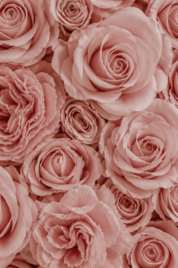
Texture is what keeps a monochrome wall from looking flat. I mix smooth tissue roses with a few crepe-style roses in the same color family so the wall has depth without adding more shades. This is the best approach when your event theme is color-limited, like “all white” or “all blush.” The ruffled crepe texture catches light differently, which makes the roses look fuller from a side angle. It also looks good behind glass frames and mirrors because the texture creates highlights. I’ve used this for quiet, classy events where the decor should feel soft, not loud.
Pick one main color and gather tissue sheets plus crepe paper in the same hue. Build most roses with tissue petals for clean curls, then make a smaller set of crepe roses with looser, crinkled petal strips. Keep the rose sizes consistent in the wall — large around 12 inches and medium around 9 inches — so the texture variation reads as design, not mistake. Mount a backing panel with removable strips, then attach tissue roses with foam blocks and crepe roses with a slightly stronger mount so the ruffled edges don’t sag. Arrange texture roses at the top and corners where light hits first.
Editor's noteIf the crepe looks too messy, pinch the base of each crepe petal tighter. It turns chaos into shape.
Skip thisAvoid mixing textures with wildly different sizes. Big crepe roses can overwhelm the tissue roses.
15. Tear-Drop Petal Rose Wall for a Less-Round, More Flower-Like Look
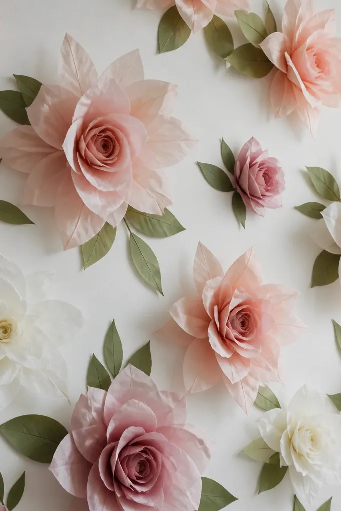
Round petals are pretty, but tear-drop petals look more like real blooms when viewed up close. This design has a looser, open shape, so it gives movement in photos — especially when the petals are curled outward at the tips. I like it for spring and garden themes because it looks less “paper rosette” and more like an actual flower. It also flatters people in busy outfits because the petal points create a softer visual pattern than perfect circles. If you’re worried your roses look too uniform, this is the shape that fixes it.
Cut tear-drop petal strips from tissue so each strip tapers at the top. Roll each strip around a pencil lightly, then pinch the base and flare the tip so it curves outward. Build each rose with fewer, larger tear-drop petals instead of many tiny rounded ones — aim for about 18-24 petals for a medium rose. Mount roses to a backing panel with foam blocks, and arrange them with slight angle differences so the open petals face different directions. Keep a mix of sizes — large at the center, medium around it, and small tear-drop buds to fill the edges.
Editor's noteUse a pencil with a smaller diameter for tighter curls on the tips. It makes the petals look sharp and fresh.
Skip thisDon’t over-roll tear-drop petals. If they curl into loops, the rose looks like a paper fan.