1. Map-Stamp Pocket Page With City Pairing
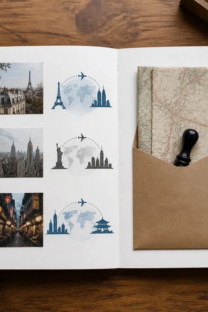
Start by cutting a 3.5 x 4 inch rectangle of patterned map paper and layering it slightly left of center on a kraft base page. Make a pocket by folding a 4 x 6 inch kraft cardstock rectangle in half and gluing only the sides and bottom, leaving the top open. Add two small circle dots for the cities — one dot per city — and connect them with a dashed line using a 0.3 fineliner. Finally, write a one to two sentence note on a folded strip and slide it into the pocket, then seal the pocket opening with a strip of clear tape on the inside edge.
This page looks good because the map print gives texture without needing a lot of decorations. I use a kraft pocket so the page warms up against cooler map tones, then I keep the ink colors to two — dusty blue and black. It flatters most color palettes and skin tones because the elements are neutral and don’t compete with photos. When you pair two city marks, the layout reads like a timeline even if you only add one short note. For him, it also feels “you planned this” because the cities are specific.
Skip thisDon’t cover the map with thick embellishments; it turns the page into clutter and reads cheap fast.
Editor's noteUse a stamp ink that matches your photo undertone — if your photos are warm, choose sepia ink instead of pure black.
2. Ticket Stub Tuck With Faux Boarding Pass Caption
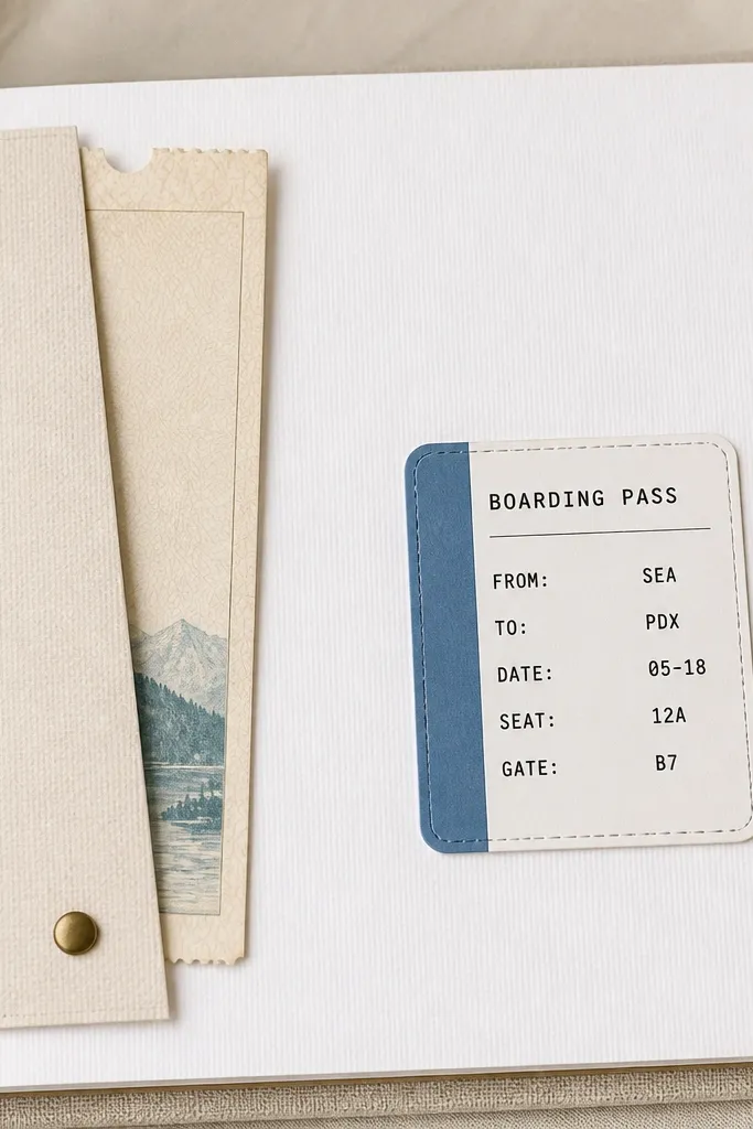
Start with an 8.5 x 11 page protector-friendly layout: place a 2.5 x 6 inch ticket stub on the left and measure a flap of cardstock that will tuck behind it. Cut a flap from navy cardstock so it covers the ticket’s top edge by about 0.5 inch, then tape the flap to the page only on the bottom and one side. On the right, print a simple boarding pass label on sticker paper sized about 4 x 2 inches, with a blue header stripe and black text lines. Stick the label down, then use a black gel pen to add a date and short “Gate” style line like “Gate: home” or “Departure: next visit.”
This is low maintenance because it uses real ephemera and one printed label. The boarding pass style gives him a “trip energy” even when you’re stuck apart. I keep the palette to white, navy, and one accent color like teal so it stays crisp. It works well for men’s albums because it doesn’t look overly girly, and the typography vibe reads modern. If your boyfriend likes travel, trains, or flights, this page always lands well.
Skip thisAvoid using glitter pens or heavy foam stickers on this page; the texture makes it hard to mail.
Editor's noteTrim the ticket edges with a straight ruler for a cleaner look before you tuck it in.
3. Black-and-White Photo Strip + Date Stamp Grid
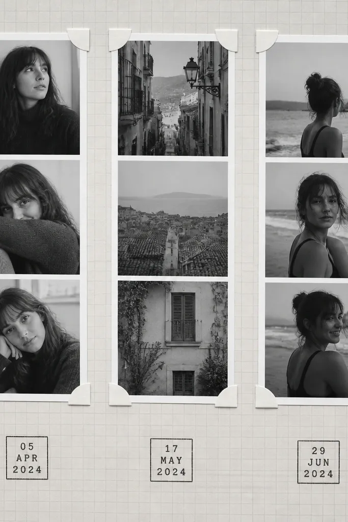
Start by printing three photos in black-and-white at about 2.5 x 3.5 inches each, then cut them into strips with straight edges. Place them across the top with 0.25 inch spacing and secure using photo corners so the photos can be swapped later. Create the grid by drawing faint lines with a light grey marker or by using a pre-printed graph paper sheet trimmed to fit. Stamp dates into small 1 x 1 inch squares below each photo — I use a mini date stamp or a DIY stamp made from foam letters. Write one short caption under each date, no more than 6 words.
This layout looks sharp because it relies on contrast and repetition. I use black-and-white photos because they match any decor and make the page feel like a real mini magazine spread. The grey grid background is quiet but structured, so even a simple caption reads intentional. It flatters almost any photo set, especially if your pictures have mixed lighting. For a long-distance album, it also keeps the “we’re still building our story” feeling without needing a big paragraph every time.
Skip thisDon’t cram captions under each photo; if you need more text, make one story block page instead.
Editor's noteUse a light grey grid, not dark — dark grids make the photos look smaller and cramped.
4. Envelope Mailer Page With Handwritten "Next Letter"
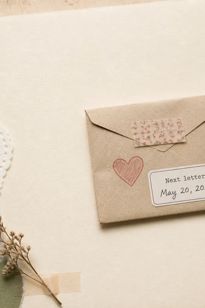
This one is my go-to for low maintenance because it makes future content feel planned. The envelope shape is instantly readable and gives him a tangible “something is coming” moment. I keep the envelope in cream or light brown so it looks like real mail, and I add one stamp only — a small heart or a tiny airplane. It works for any relationship tone: sweet, funny, or practical. If you want the album to feel personal without decorating every square, this is the page.
Start by cutting a 5 x 7 inch envelope from cardstock using an envelope punch board or by folding a template. Place it on the page right side and trace the bottom edge lightly so you can line it up. Glue only the bottom and left side so the envelope flap can open, then add a washi tape strip across the flap edge to keep it closed for mailing. Print or handwrite a label on a 2 x 1 inch strip that says “Next letter” and add the date. Slide in a folded note card that’s sized about 3.5 x 5 inches so it fits without bulging.
Use a note card that’s slightly smaller than the envelope so it slides out easily after shipping.
Avoid bulky embellishments on the envelope flap; they stop the tape from sealing flat.
5. Polaroid-Style Corners With One-Line Caption
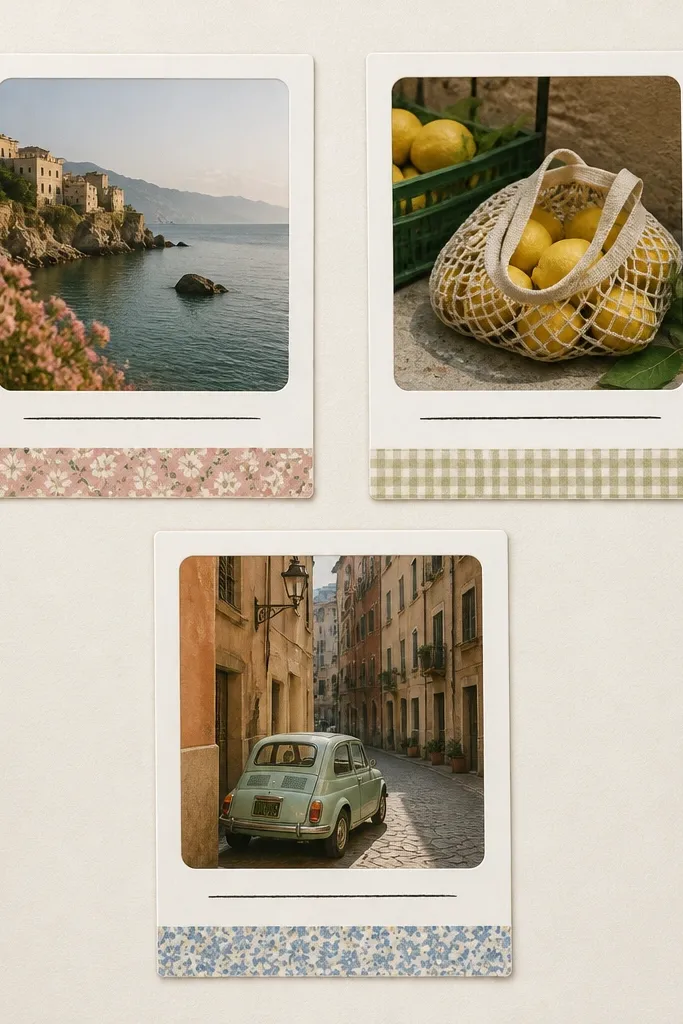
Polaroid corners look friendly and nostalgic, and they hide photo imperfections. I use off-white cardstock for the frame and keep the photo borders thick enough to make the images feel intentional. The one-line caption keeps the page from getting heavy, and it reads clean even if you’re mailing the album. This works especially well for boyfriends because it’s minimal and photo-forward. If you have a mix of selfies, group pics, and random moments, this page style makes them feel like they belong together.
Start by cutting photo frames from off-white cardstock. For each frame, cut a window sized to your photo, then leave a border about 0.75 inch wide. Add rounded corners using a corner rounder, then attach the photo with photo corners or thin double-sided tape. Cut a 1 x 3 inch strip of patterned paper (choose one pattern for the whole page) and glue it along the bottom of each frame. Finally, write one line under the pattern strip using a black gel pen, like “Coffee runs, still us.”
Choose one pattern strip per page so the frames look coordinated instead of random.
Don’t use bright neon marker for captions; it clashes with the soft Polaroid look.
6. Fabric-Backed Quote Block With Ticket-Photo Overlay
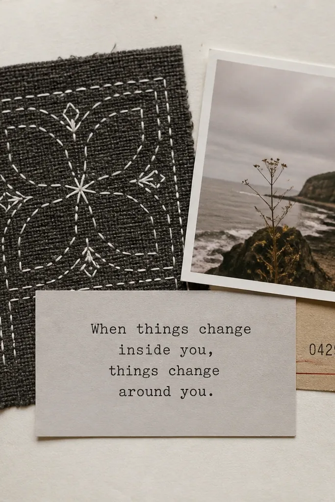
Start by cutting a 3.5 x 4 inch fabric square and gluing it to the left side of an 8x8 page using fabric glue or a thin layer of tacky glue. Draw three to five “stitch” lines with a white gel pen across the fabric area. On the right, place a ticket stub at a slight angle, then layer one small photo on top so the ticket shows around the edges. Print a quote label on plain white sticker paper sized about 2.5 x 1 inch and stick it over the top area where the photo meets the ticket. Write the quote text in black pen so the ink matches the rest of the page.
Fabric makes a scrapbook page feel expensive without adding much work. I use a small charcoal or navy fabric square, then I stitch lines with a white gel pen to mimic real stitching. This gives the page texture that reads well in photos and in person. It’s also flattering for most men’s style — dark neutrals look clean and modern. Pairing it with a real ticket stub and one photo keeps it grounded instead of artsy for artsy’s sake.
Skip thisSkip fuzzy fabrics like thick fleece; they catch on page protectors and look messy.
Editor's notePress the fabric flat under a heavy book for 10 minutes so it glues cleanly without bubbles.
7. Washi Tape Frame Around a Single Hero Photo
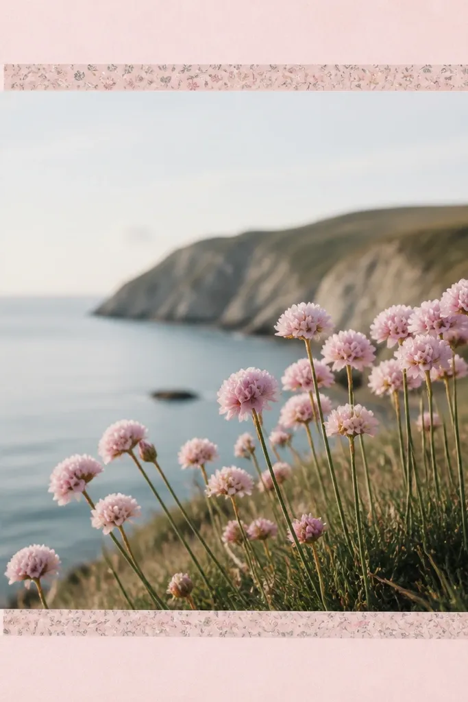
Start with a pastel cardstock page base, like light sage or dusty peach. Place your hero photo centered, leaving about 1 inch border space on all sides. Cut washi tape strips to form a rectangle frame around the photo — top, bottom, left, right — then overlap the corners by 0.25 inch. Add two thin “tape tabs” at the bottom corners of the photo as if you’re masking it in place. Finally, write a small date on a 1 x 2 inch strip and place it under the photo using the same color ink as the washi’s accent.
This is the fastest way I’ve found to make a page look styled. Was is tape frames are forgiving — if you cut a strip slightly crooked, it still looks intentional because the pattern is part of the design. I keep the hero photo large, then use two washi tape styles max: one solid or thin stripe and one tiny pattern. The pastel background keeps everything soft, which helps the album feel romantic without adding lots of decorations. It also works great for guys because the layout is photo-first and clean.
Skip thisDon’t stack five different washi tapes; too many patterns make the page look like a craft store haul.
Editor's noteUse a craft knife and metal ruler for straight tape edges; it looks way cleaner than scissors.
8. Sticker Label Timeline With Weekly Check-Ins
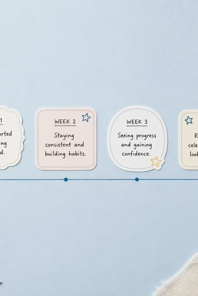
Start by drawing a line across the middle of the page using a ruler and a black fineliner. Add four anchor points spaced evenly, then place small sticker labels above each point sized about 2 x 1 inch. On each label, write the week number and one phrase — keep it short like “Laundry day win” or “Miss your laugh.” Add tiny doodle marks under the labels using a single accent color marker, like teal. If you want photos, leave the top half for later and add one small photo in the bottom right corner.
If you want long distance scrapbook ideas for him low maintenance that still feel alive, this timeline page is it. It turns weekly check-ins into a visual habit, and the look stays clean because labels repeat in the same place. I like using sticker labels because they’re consistent in size, which makes the page feel “designed” even when you’re busy. The timeline line also guides the reader’s eyes left to right, so it reads fast. For him, it feels like you’re keeping up every week, not catching up once a month.
Skip thisAvoid long paragraphs in sticker labels; the tiny type makes it unreadable when mailed.
Editor's noteType the week numbers on a label printer so every label looks the same height and weight.
9. Scratch-Off Promise Card Pocket
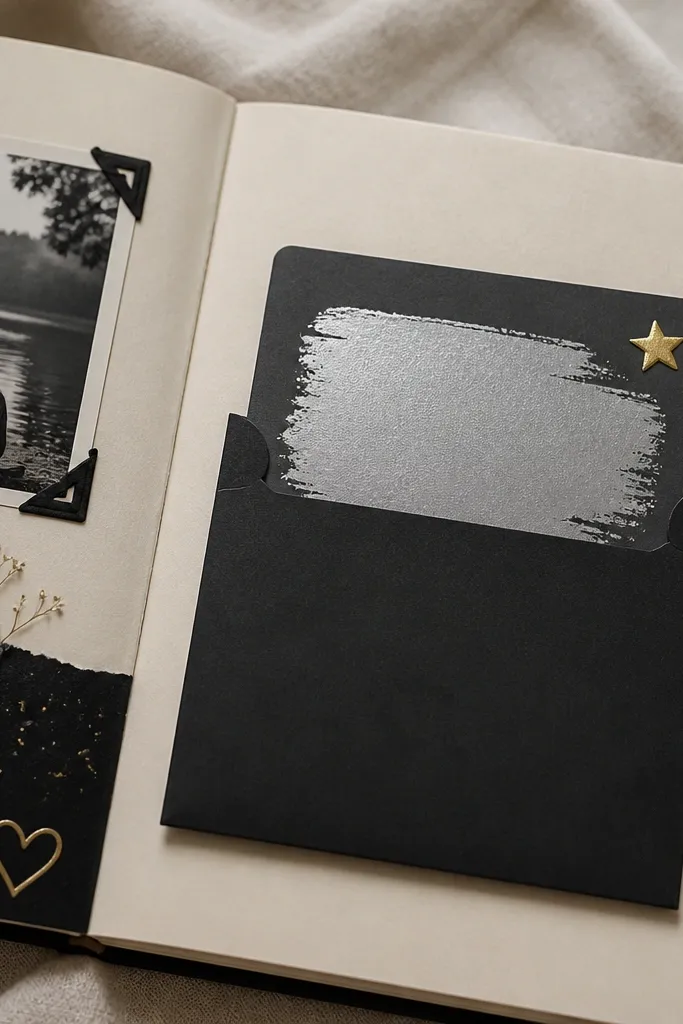
This is low maintenance because you only make one interactive card, then you reuse the format. Scratch-off promise cards feel playful and personal, and they’re great for men who like games. I keep the card simple: one promise per card, one theme per album section. The black pocket makes the silver scratch area pop, so the page looks bold even with minimal decoration. It also works well for couples who don’t want too many “cute” visuals.
Start by making a pocket from black cardstock about 3.5 x 4.5 inches, gluing only two sides and the bottom. Add a small white label at the top that says “Scratch when you miss me” using a label maker or printed sticker. Place a scratch-off card inside the pocket — you can buy scratch cards and cover with a printed promise layer, or use pre-made scratch-off sheets sized to your card. Write the promise text on a small paper strip and glue it behind the scratch area so it’s revealed when scratched. Slide the card in and close the pocket with a strip of clear tape on the inside edge.
Use promises that are specific and time-based, like “Plan the next dinner date” instead of “I love you.”
Don’t use thick glitter scratch areas; they shed and look messy in the mail.
10. Washed Watercolor Border + Photo Corner Captions
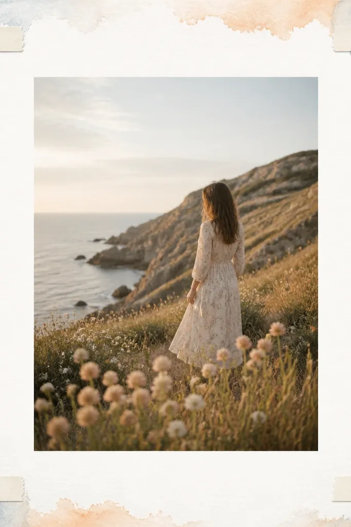
Start by taping off a margin about 0.5 inch from the page edge using painter’s tape. Wet the paper lightly with clean water and add watercolor in two washes — pale blue on the top and peach on the bottom, then blend where they meet. Let it dry completely so it doesn’t smear when you handle it. Add one hero photo in the center with photo corners. Cut four tiny caption strips (about 1 x 2 inches) and place them in the corners with mini photo corners or small tape squares.
Watercolor borders make a page look softer without adding bulk. I do a thin, washed border around the edge so it frames the photo instead of taking over the page. Pale blue and peach are my default for long-distance albums because they look good with both warm and cool photos. The corner captions give you a place to add quick facts like “3,200 miles” or “New job start” without covering the main image. This page style reads clean and calm, which feels right for long-distance stories.
Skip thisDon’t use heavy watercolor pigment; it dries blotchy and makes the border look uneven.
Editor's noteUse a hairdryer on low for drying — watercolor smears are the only thing that ruins this look.
11. Polka Dot Background With Photo Cutout Windows
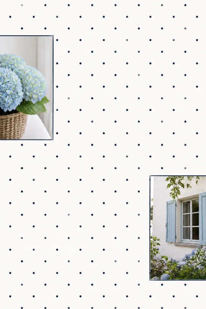
Start with a polka dot cardstock base in navy or black dots on white. Mark two window areas about 3 x 3.5 inches each on the page — keep them spaced evenly. Cut out the windows carefully with a craft knife, then outline the edges using a thin navy marker line so the cut looks deliberate. Tape or glue photo prints behind the windows — use double-sided tape on the back edges only. Finally, add a small title strip at the top using a 1.5 x 4 inch patterned strip, with a date or location.
This page looks playful but still structured because the dots repeat and the windows are precise. I use a navy polka dot paper or stencil dots myself with a stencil and marker so everything matches. The cutout windows make the photos feel like they’re “peeking through,” which looks fun without needing extra embellishments. It’s also low maintenance because you only cut two or three windows and then add photos behind. This works well if your photos are small or if you have a few moments you want to highlight quickly.
Skip thisDon’t skip outlining the windows; unoutlined cut edges look like a school project.
Editor's noteCut on a cutting mat and press the blade straight down for clean edges.
12. Bottle-Cap Magnet Photo Corner Page
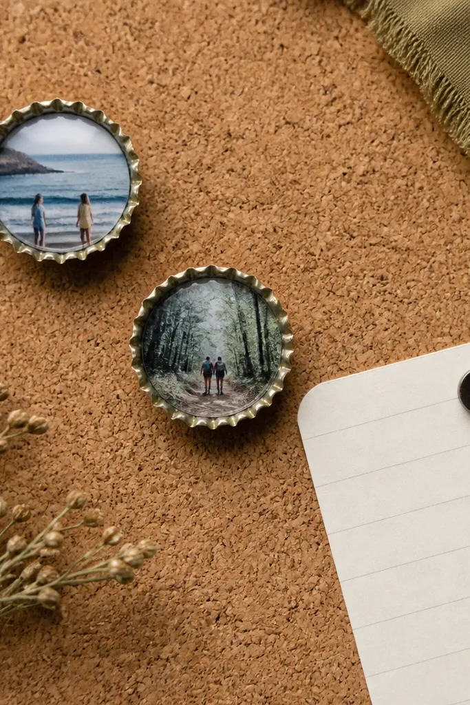
Start by covering the page base with cork sheet or cork-texture paper trimmed to fit. Glue two small bottle caps onto the cork with strong craft adhesive, then place tiny printed photo circles inside the caps (you can print circles using a template). For the note, cut a small 3 x 2.5 inch card and attach a tiny magnet to the back using hot glue. Position the note card so it tucks under or beside the bottle cap. Add a simple caption label near the bottom, like “Keep this one handy,” using black gel pen.
This one feels interactive without being complicated. The bottle cap photo holders look like little keepsakes, and they’re surprisingly easy to mail if you keep the page protected in a sleeve. I use cork texture paper or cork sheet as the background so the bottle caps look like they belong. The magnets let you swap notes, so you’re not locked into one message forever. It’s a great choice if he likes practical, “man-cave” style decor because it looks like a real object, not just paper craft.
Skip thisAvoid big bulky bottle caps; the thicker ones don’t sit flat and can bend in the mail.
Editor's noteSeal the printed photo circle with a clear matte medium so it doesn’t scuff.
13. Handshake Swatch Page With Fabric-and-Thread Binding
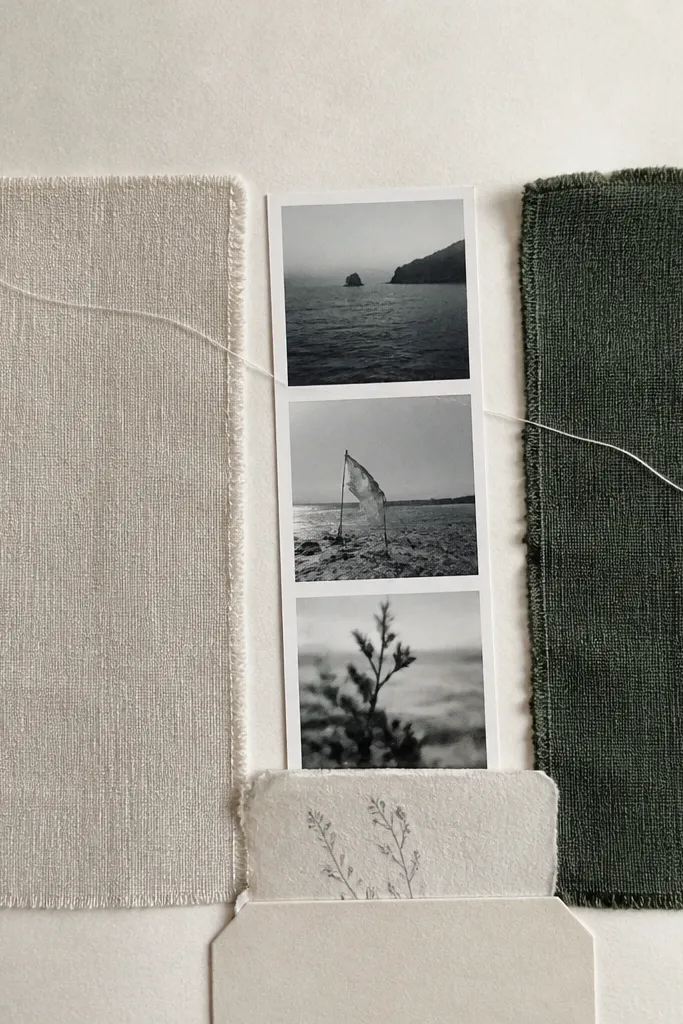
Start by cutting two swatches about 2.5 x 4 inches each. Glue one swatch on the left and the other on the right, leaving a 1 inch gap in the middle. Place a small photo strip in that gap, about 1 x 3 inches, and secure it with photo corners. Draw a simple stitched path across the top using a pencil, then thread a thin embroidery thread through small holes made with an awl or needle, tying off at the ends. Add a paper tab at the bottom using a 1.5 x 3 inch cardstock strip and tuck a short note behind it.
This page is personal because it turns your relationship into materials you can touch. I use two fabric swatches that match his hoodie color and your favorite neutral — think charcoal knit and cream cotton. The thread line gives you that “handmade” feeling without needing real sewing skills. It flatters the album because fabric texture looks good next to photos and paper. When you add one small photo strip between the swatches, the whole page reads like a handshake — equal parts both of you.
Skip thisDon’t use fuzzy thread colors that fight the fabric; match thread to one fabric swatch so it feels intentional.
Editor's noteChoose fabrics that are thin enough to lie flat — avoid thick denim unless you’re not mailing it.
14. Receipt Stack Pocket With "Our Bills, Our Wins" Caption
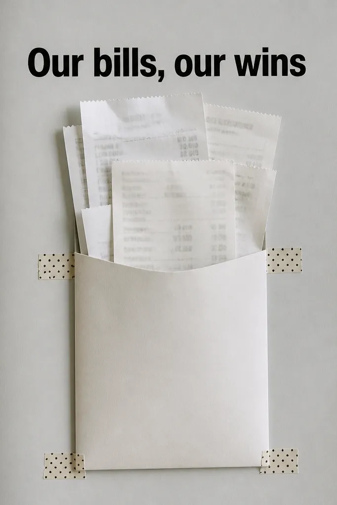
Receipts sound boring until you wrap them in a joke and a clean layout. This page works because the receipts add real texture and the caption gives it meaning. I use a light grey base so the receipts' printed text doesn’t look chaotic. It’s also low maintenance because you’re not crafting new materials — you’re organizing what you already saved. For him, it feels funny and grounded, like you’re building a life together even from far away.
Start by trimming a set of receipts so they’re all within 2.5 inches wide, then stack them neatly. Make a vertical pocket from cardstock about 3 x 6 inches, gluing two sides and the bottom. Use washi tape strips at the top corners to reinforce the pocket opening so it holds up in transit. Place the pocket slightly to the left of center and add a label on top using a sticker label or printed cardstock strip sized about 3 x 1 inch. Slide the stacked receipts into the pocket and add one extra folded note behind them with a date and a short win.
Press receipts under a book for a day; curled paper looks messy fast.
Avoid mixing receipts with different sizes and orientations; it makes the pocket look lopsided.
15. Sticker Map Route With Arrow Prompts and One Photo
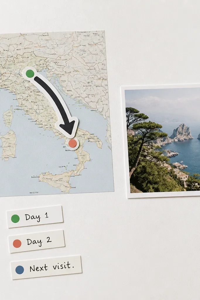
Start with a white or cream page base. Trim a printed map strip to about 3.5 x 7 inches and place it horizontally across the middle. Add a thick arrow sticker — or cut an arrow shape from vinyl-look sticker paper — pointing from your city to his. Place one photo near the arrow tip so the direction feels connected to him. Add three tiny sticker labels or cut paper labels reading “Day 1,” “Day 2,” and “Next visit,” spacing them along the arrow path. Write one short sentence under the photo with black gel pen.
Sticker route pages look clean because the icons are consistent and graphic. I use a small printed map (not a full poster map) so the page stays focused, then I add thick arrow stickers for direction. The one photo near the arrow keeps the page personal and stops it from looking like a travel brochure. This works well for men because it’s visual and simple. If you want long distance scrapbook ideas for him low maintenance that still look modern, this is one of my favorites.
Skip thisDon’t use too many route stickers; two arrows and three labels is enough or it starts looking busy.
Editor's noteIf you don’t have sticker arrows, cut arrows from cardstock and coat them with clear tape for a slick look.