1. Front cover with a photo window and a stitched-looking title strip
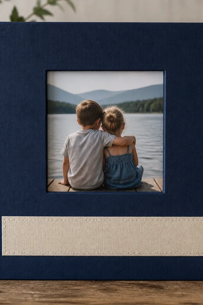
I make the cover feel like a “real book” by using one photo window and one title strip. Start with navy or charcoal cardstock because it hides fingerprints and makes skin tones in the photo look warmer. For the title strip, I use cream cardstock with a subtle texture so it doesn’t look like plain computer paper. The photo sits behind a window cut so it looks crisp and centered, even if your photo isn’t perfectly cropped. This style works for any boyfriend because it doesn’t rely on a theme — it just frames him.
Cut your cover base from 65 lb cardstock to your chosen size (I use 8x10 for a bigger, easier-to-handle feel). Measure and cut a window in the center using a craft knife and ruler, then back it with a thin piece of clear acetate or a plastic sheet. Add double-sided tape around the window edges and press your photo in place. Create a title strip about 1.5 inches tall, glue it under the window, and draw faux stitching with a white gel pen along both sides of the strip.
Use a ruler to keep the window perfectly centered — crooked windows are the fastest way to make it look homemade.
Don’t glue the photo directly to the cover if you want it to feel clean — the window makes the finish look deliberate.
2. Timeline page with a 3-photo grid and date tags
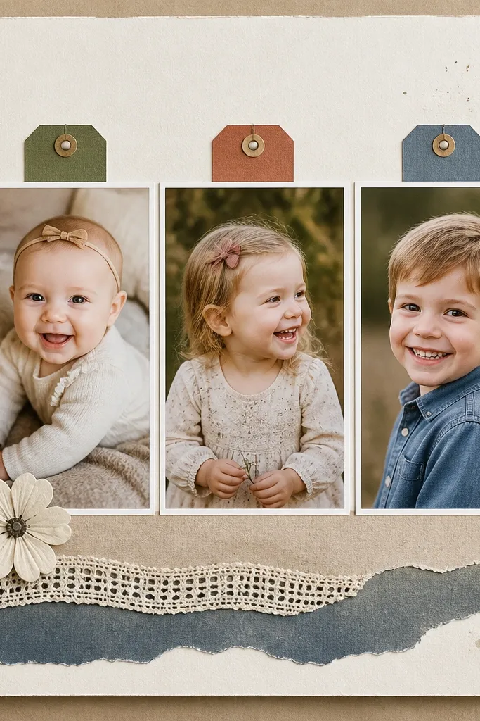
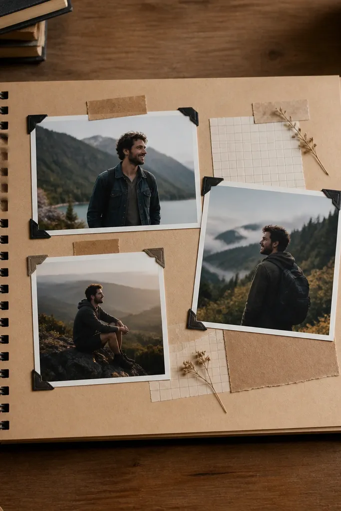
A timeline page is the easiest way to get “organized” without overthinking. I use three photos because it gives variety but stays readable. The date tags are small blocks that catch the eye and help him scan the story quickly. Choose two tag colors that match the photos — for example, forest green and sand for outdoors shots, or slate blue and cream for indoor dates. This layout looks best in portrait photos (3x4 or cropped 4x6 vertical) because the grid feels balanced.
Start with a page base of matte cardstock and place three photos in a 2-1 spacing grid (two on top, one centered below) or a straight 1x3 row if you prefer. Leave a 1/8 inch gap between photos so the page breathes. Cut date tags from coordinating cardstock and write dates with a fine-tip black pen. Glue the photos first using tape runner, then glue the date tags on top so they look layered.
Write dates in a consistent format like “Mar 14” every time so it reads like a real timeline.
Avoid crowding — if your dates are too long, shorten to month + day and move details to a journaling strip.
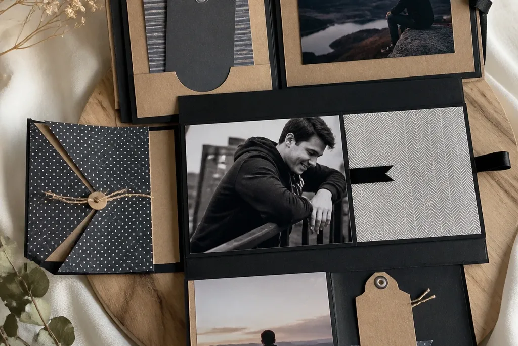
3. Pocket page for tickets, receipts, and a folded note
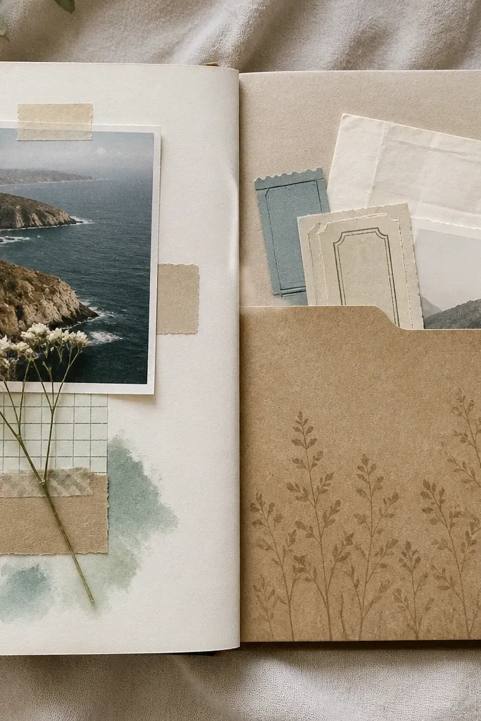
Cut pocket panels from patterned cardstock, then add a side seam: fold the pocket sides so the opening stays clean. Glue the pocket to one side of the page base, leaving about 1/4 inch clearance at the top so it opens easily. Add a small pull-tab by gluing a narrow cardstock tab to the inside edge. Place tickets and receipts inside, then tuck a folded note behind the bundle so it slides out smoothly.
Interactive pockets make the scrapbook feel like it’s storing memories, not just showing them. I build pockets that are wide enough for real ticket stubs, not decorative scraps. Use patterned paper for the pocket lining so it looks intentional from the inside. For the page background, pick a solid color so the pocket stands out. This page works great for sports games, concerts, and road trips because it turns random paper into a keepsake.
Skip thisDon’t make the pocket opening flush with the page edge — you’ll fight it every time you open the scrapbook.
Editor's noteBefore gluing, test the pocket with the thickest item you own so it doesn’t get stuck.
4. Corner tuck page for a mini photo and a journaling strip
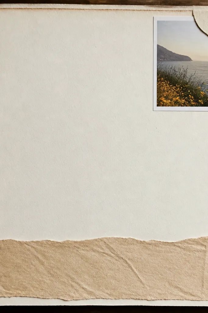
Cut a small photo (2.5x2.5 or 2.5x3) and a coordinating flap from cardstock. Make the flap by cutting a square from patterned paper and rounding or trimming one edge for a neat look. Glue only two sides of the flap so the third side lifts slightly and forms the tuck pocket. Attach a journaling strip across the bottom of the page, about 3/4 inch tall, and write a short sentence with a black pen.
Corner tucks are my go-to when you want the page to look clean but still interactive. The photo sits under a flap, so it looks like it’s hidden on purpose. I like the tuck style because it flatters smaller photos — the corner placement makes them feel intentional instead of lost. Use a journaling strip at the bottom to keep text from swallowing the design. This page is great for dates where you have one standout photo and a few words he needs to read.
Skip thisSkip bulky ribbon on the corner tuck — it makes the page uneven when the book closes.
Editor's noteUse a bone folder to crease the tuck flap so it opens flat instead of popping up.
5. Flip-up photo mat with a hidden message under the flap
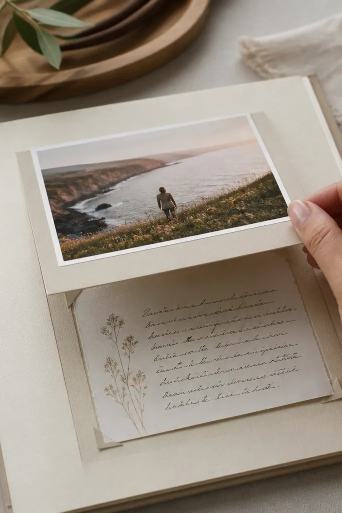
A flip-up mat is dramatic without being hard. The photo looks like it’s mounted normally, then he lifts it and finds the message. I use this when I want the scrapbook to hit emotionally — like a note about how he helped through something, or a “remember this” reminder. The hidden card should be small enough to stay neat under the flap. Use a consistent color for the message cards (like cream) so the reveal looks cohesive across pages.
Cut a photo mat from cardstock and attach your photo to the center with tape runner. For the hinge, create a flap that folds upward — glue only the back of the mat to the page base on two edges, leaving the hinge line free. Write your message on a small card (about 3x4), then slide it under the flap so it stays put. Test the lift angle by closing the book gently — you want the flap to lay back flat.
Write the message first, then cut the card to size so the handwriting fits without squeezing.
Don’t use thick foam tape under the flap — it makes the cover bulge and the hinge tears faster.
6. Shaker window with sports confetti or tiny charms
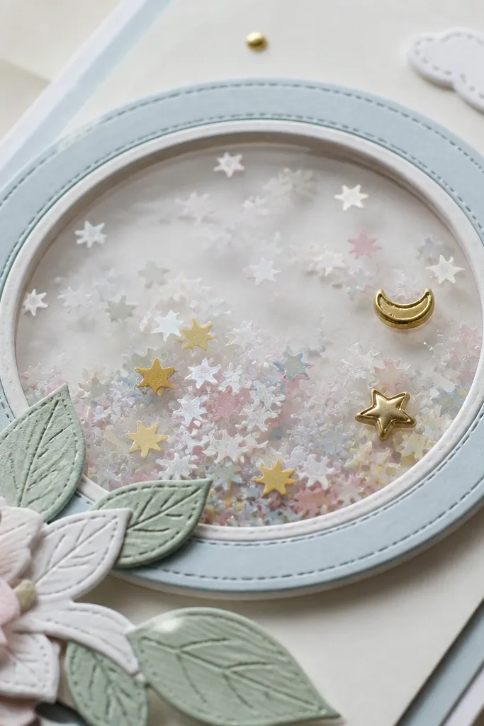
Cut a shaker opening and back it with acetate. Apply a thin strip of foam tape around the opening, then pour in a measured amount of confetti and charms. Seal with another acetate layer on top and press evenly so there are no leaks. Mount the shaker onto a page base with a photo or journaling strip below it, keeping the text at least 1 inch away from the shaker edge.
Shaker windows look fun and boy-friendly when you match the contents to his interests. I’ve used tiny star confetti for general sports vibes and small metallic shapes for travel pages. The key is keeping the shaker size small — about the size of a 4x6 photo area — so it doesn’t overpower the page. Use clear acetate and foam tape so the pieces move freely. This looks best on a solid background like gray or dark green because the confetti pops.
Skip thisAvoid glitter that sheds — it ends up on your photos and makes cleanup miserable.
Editor's noteMeasure confetti with a teaspoon — too much fills the window and makes the pieces stick.
7. Matte black journaling frame with one bold photo
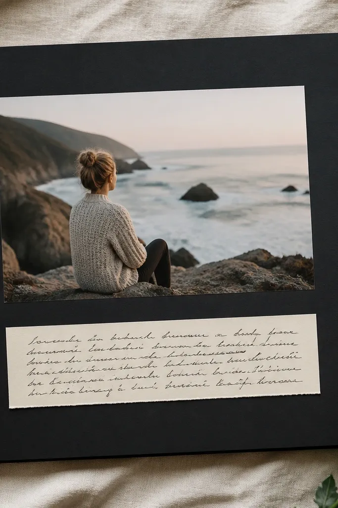
If you want the pages to look modern, use one bold photo with a matte black frame. It makes the photo feel like it belongs on a wall, not in a craft book. I keep the journaling in a cream strip so the black doesn’t swallow the text. This style looks especially good with candid photos where faces are centered — the frame pulls focus. For skin tones, black frames make warm lighting photos look richer and cool lighting photos look clean.
Cut a black cardstock mat slightly larger than your photo (leave about 1/4 inch border). Glue the photo to the mat with tape runner, then glue the whole mat to a lighter page background. Create a journaling strip on top or bottom of the mat about 1 inch tall and write one short message. If you want extra texture, add a thin strip of textured paper behind the journaling strip, about 1/8 inch visible.
Use a ruler and keep the black border even on all sides — that’s what makes it look intentional.
Don’t use thin, glossy black paper — it reflects light and makes the journaling hard to read.
8. Photo strip pull-out with three tiny captions
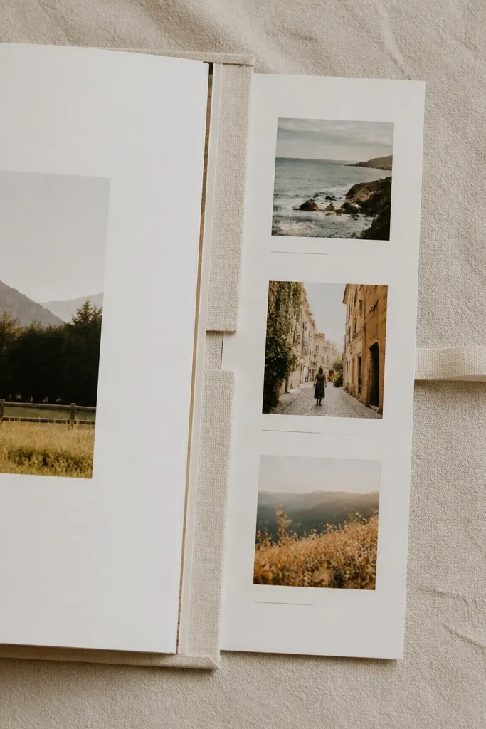
Pull-out photo strips are the easiest way to add “extra content” without adding bulk. You can fit three small photos in one strip and keep captions short. I use this for day trips because it lets you show the sequence without making a full timeline spread. The strip looks clean when the photos are aligned and the captions are consistent in font and size. This is also beginner-friendly because the structure is simple.
Cut a strip base from cardstock sized to slide into two side pockets on your page. Build two small side pockets by gluing thin cardstock walls on the left and right edges, leaving the center open. Glue three small photos onto the strip and add tiny caption labels (like “coffee stop,” “walk,” “sunset”) with a fine pen. Slide the strip into the pockets and test pull smoothness — it should slide without catching on corners.
Round the strip corners slightly with a corner rounder so it glides in and out.
Don’t overfill the strip — if the photos are too close together, the pull-out looks messy.
9. Sports jersey-inspired page using diagonal stripes and numbers
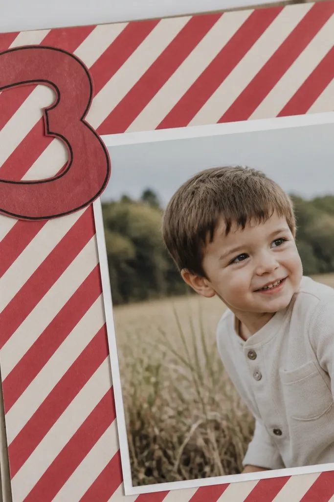
This page is for the boyfriend who loves teams, jerseys, or anything with numbers. Diagonal stripes feel like fabric movement, and the big number gives that sports vibe without needing actual jersey fabric. I keep the palette to two main colors plus black so it doesn’t turn into a craft-store mess. Put the number in a corner and anchor it with one photo so the design feels balanced. This works best with action shots — motion blur makes the stripes look like speed.
Make a background by cutting diagonal stripe paper strips and gluing them across a solid page base, leaving a 1/8 inch gap between stripes. Add a photo centered on top of the stripes, sized about 4x6. Cut a large number from cardstock and outline it with black pen, then glue it to one corner. Add a small journaling line near the bottom that names the game or date.
Use matte black for the number outline — it stays readable even on busy photos.
Avoid too many stripe colors — two stripes plus black looks sharp; three or four turns chaotic.
10. Map page with a route line and a stamped coordinate card
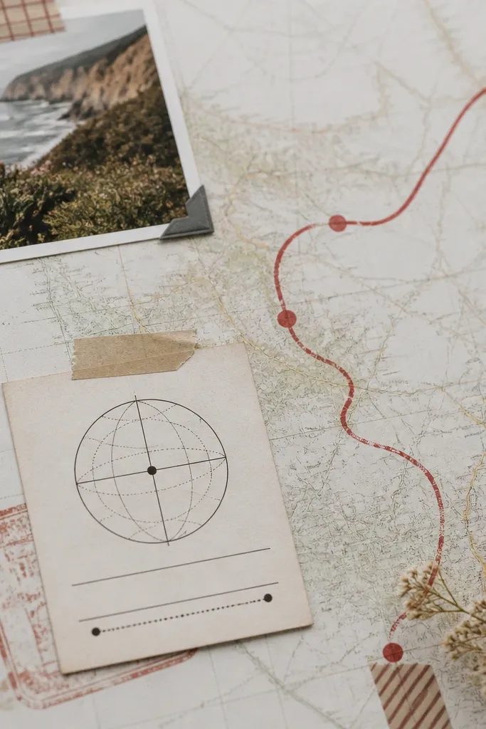
Start with a map-patterned paper sheet or a printed map background sized to your page. Draw a curved route line using a fine red marker, then add two small dots at the start and end. Create a coordinate card from cream cardstock, stamp it with a date (or write it), and glue it near the start dot. Place one photo near the route line — I put it where the route “passes” through — and add a short journaling sentence under the photo.
A map page is a nice way to mark a trip without drowning the page in photos. I use a route line to show the “story path,” then I add one coordinate card so he has a concrete memory point. Keep the map background light and let the route line do the work. Red or orange route lines look best because they pop against beige maps. This page fits trips, road drives, and even places you visit every year.
Skip thisDon’t use neon highlighters — they bleed and make the map look cheap.
Editor's noteTrace the route with pencil first, then go over with marker so you can fix mistakes.
11. Hobby page for his thing with a tool photo and label stickers
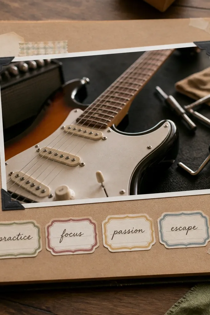
When you build around his hobby, you don’t need a ton of photos. A single close-up — guitar headstock, wrench set, skateboard wheels, gaming controller — makes the page feel personal fast. Label stickers add structure and make the journaling easy to read. I keep the labels to 3-4 short phrases so it doesn’t turn into a paragraph. This works for any hobby because the page design is basically a frame + labels + one strong photo.
Choose a close-up photo and crop it so the main object fills about 70% of the frame. Mount it on a clean matte background with a thin border of cardstock (about 1/4 inch). Write three or four label words on small strips of cardstock, like “favorite,” “first build,” “practice day,” and glue them in a neat row. Add one small journaling line at the bottom, either by hand or typed and printed in a simple font, then cut it into a strip.
Use label words that feel like how he talks, not how you write — it reads more like him.
Skip long quotes on hobby pages — short labels look cleaner and keep the page from getting busy.
12. Boyfriend portrait page with a soft gradient mat and one sentence

A portrait page is where you go simple. I use a soft gradient mat so his face is the focus, and I keep the journaling to one strong sentence. This page looks best with well-lit photos where his eyes are sharp — the gradient adds mood without stealing attention. Use colors that match the photo wardrobe: light blues for cool tones, warm creams and peaches for golden light. If he has a beard, the gradient hides shadows and keeps the photo looking smooth.
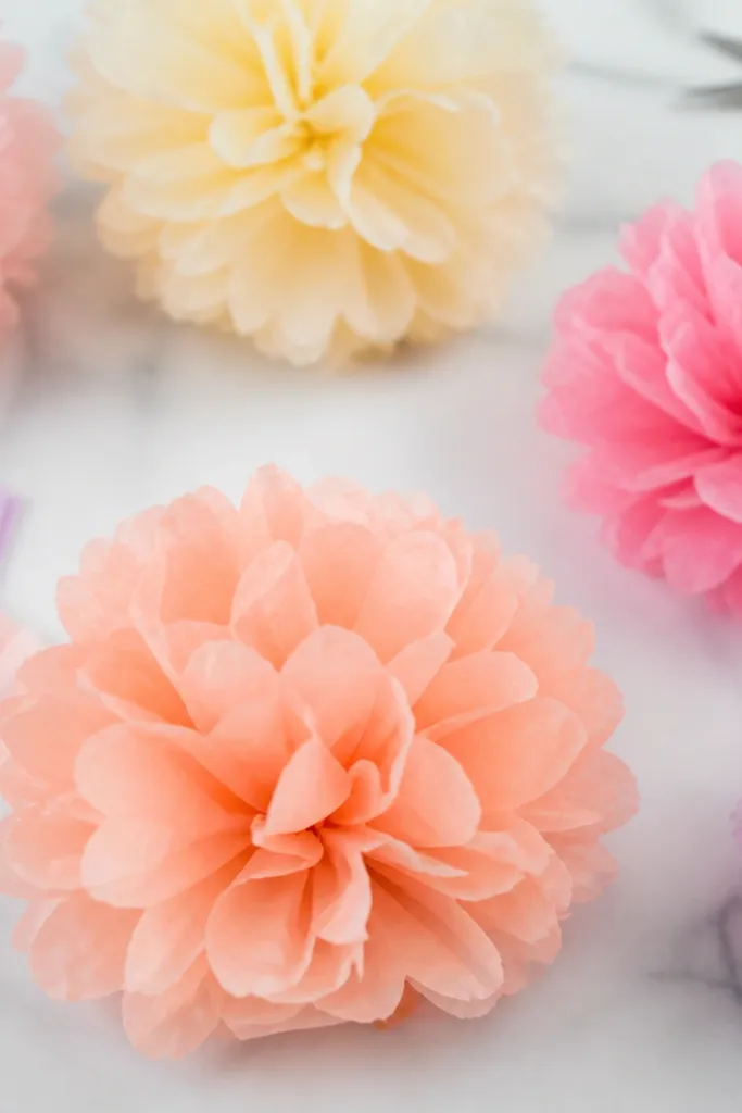
Create the gradient mat with a light watercolor wash or layered tissue paper, then let it dry fully before gluing. Cut the mat with clean edges and mount the portrait photo centered on top with tape runner. Add a single journaling sentence on a small cream strip below the photo, about 3 inches long. Finish with tiny date text in the bottom corner using a fine pen.
Use light pressure when writing on the strip — the paper should show your handwriting clearly without indenting.
Don’t overdecorate this page — if you add stickers and patterns, the portrait loses its impact.
13. Receipt-and-stamp collage page with a monochrome palette
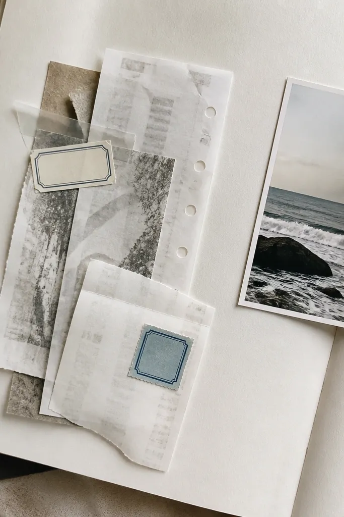
Collage pages look best when the palette stays tight. I do monochrome — black, white, gray — because receipts already have busy text, and too many colors make it look like a pile. Layering receipts under a few stamped labels gives depth without needing fancy tools. Add one photo to anchor the collage so it doesn’t become purely paper texture. This works for restaurant dates and shopping days because receipts are already shaped like keepsakes.
Print or copy receipts in black and white if you can, or use lighter-toned paper receipts you already have. Tear edges for a natural look, then arrange them in a loose rectangle area. Glue the largest receipt pieces first, then tuck smaller ones on top. Place a small photo at one edge with a thin white border strip, and add 2-3 stamped label rectangles with short words like “date,” “bill,” “dessert.”
Use a glue stick to tack down torn receipt edges before switching to tape runner so nothing lifts later.
Avoid heavy glitter accents on receipts — they scratch and catch on pages.
14. 3D paper bow-tie corner detail for a formal night page
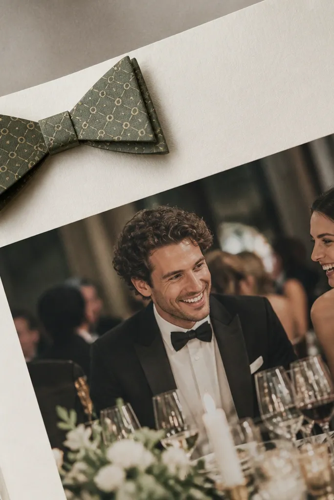
Mount your main photo on a solid page base with a 1/4 inch border. Cut bow-tie pieces from two coordinating cardstock colors and layer them with small foam dots or thin tape so it stands slightly off the page. Glue the center knot piece last so it locks the shape. Add a journaling strip under the photo with a short line like “The night we dressed up for us.”
For formal nights, a small 3D bow-tie detail makes the page feel dressed up without using bulky fabric. I keep it near a corner so it doesn’t block the rest of the design. Use patterned cardstock that matches his outfit — navy with tiny white dots for a classic vibe, or black with subtle gray lines for a modern look. Layering the bow-tie gives a shadow effect that looks surprisingly real. This page is best with one nice photo where he’s in a button-down or suit.
Skip thisDon’t use thick craft foam under the bow-tie — it makes the scrapbook close unevenly.
Editor's notePress the bow-tie layers together for 20 seconds so the bond holds cleanly.
15. Last page with a "future notes" pocket and a date wheel card
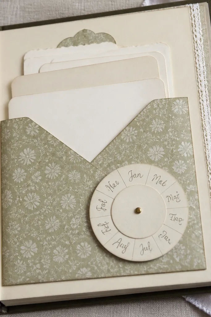
Create a pocket on the right side using 65 lb cardstock for structure and patterned paper for lining. Cut 6-10 blank note cards that fit inside and write nothing on them yet. Make a date wheel from two circles of cardstock: one top with months written around the edge, one bottom with a small metal brad in the center. Attach the wheel card to the pocket front with a brad so it spins, then add a short message strip on the bottom.
The last page is where you turn the scrapbook into something he can keep using. I add a pocket for future notes so it doesn’t become a one-time read. The date wheel card is a fun touch that gives him a reason to open it again — he spins it to pick a month and writes a note back. Keep the wheel simple: 12 months around a circle and a single blank line in the center. This page works for any relationship length because it doesn’t rely on specific events.
Skip thisDon’t pack the pocket so tight that cards buckle — leave a little wiggle room.
Editor's noteUse a brad that sits flat — a tall brad makes the wheel scrape the pocket.