
1. Ticket Stub Timeline Strip
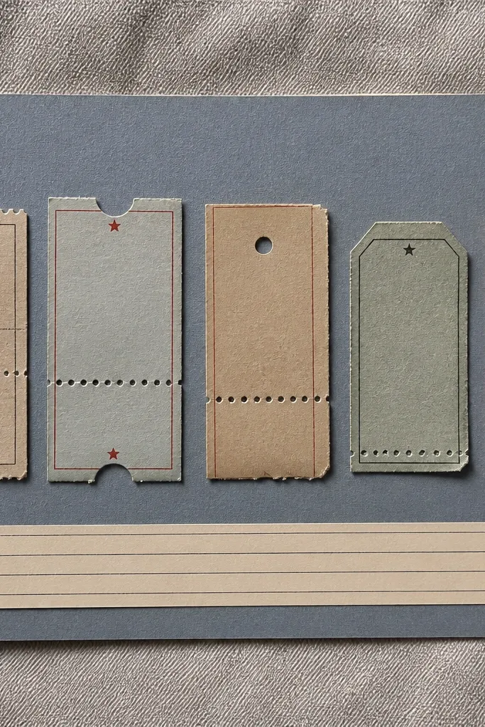
This page works because ticket stubs already have built-in shape and texture, so you don’t need fancy supplies. I use a muted blue or light gray matte cardstock as the background, then place the tickets in a neat row so the page reads left-to-right. Add a narrow journaling strip at the bottom using black ink on off-white paper — it keeps everything readable and adult. This layout looks best for boyfriends who like events, concerts, sports games, or movie nights because the stubs feel like proof. It also flatters smaller photos since the tickets become the visual anchor.
Start by trimming your base page to 6x8 inches and cutting a background panel about 5.5x7.5 inches. Glue three ticket stubs across the center in a straight line, leaving a 1/8 inch gap between each one. Then cut a journaling strip 1 inch tall and run a thin border of washi tape along the top edge only. Finish by writing the date under each ticket in tiny handwriting and adding one line of “what we did” under the whole strip.
Editor's noteInk the edges of the tickets with a black or dark brown marker so they blend into the background instead of floating.
Skip thisDon’t stack tickets with random heights — uneven stacking makes the whole page look messy, even if the materials are cute.
2. Polaroid-Style Photo Frame with Fake Date
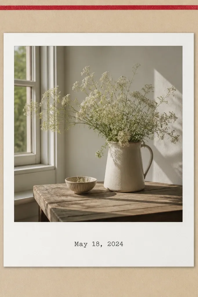
This idea makes any photo look like a real keepsake without buying Polaroid film. I use a thick white paper mat (or cardstock) behind the photo so it has that instant “photo booth memory” vibe. The fake date gives structure, and it looks especially good on face photos because the date text balances the composition. I’ve used this for boyfriends with lots of selfies — it turns “random pics” into a cohesive page. Keep the color palette to beige plus one accent (red, navy, or forest green) and it’ll look clean instead of childish.
Print or select one portrait photo and crop it to fit a 3x4 inch frame area. Cut a white mat that is 4x6 inches, then window the center for the photo so you leave a 1/2 inch border around it. Glue the photo onto the window area, then add a thin washi tape strip along the top of the page, not under the photo. Type the date in a simple font, print it on small paper, and glue it to the bottom mat like a real Polaroid caption.
Editor's noteRound the corners of the photo mat with a corner punch for a consistent, store-bought look.
Skip thisDon’t use glossy photo paper under matte cardstock — glare makes the page look uneven and less “finished.”
3. Map Coordinates Page with Threaded Pin
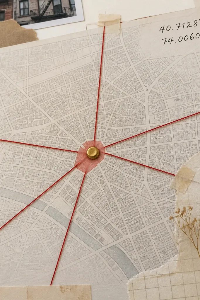
This page looks thoughtful because it ties a memory to a real place without needing expensive embellishments. I print a map in grayscale, then add one highlight point using a red circle or marker dot. The threaded “routes” make it feel interactive — like you traced the journey together. This layout works great for travel days, first dates, or even the place he always buys coffee. It flatters busy backgrounds because the coordinates text sits in the corner and gives the eye a clean landing spot.
Cut a map panel to fit your page, leaving a 1/4 inch border around it. Mark the exact location with a small red circle and place a paper brad at that dot. Thread red embroidery floss from the brad to one small “stop” label (like a cafe name) and back to the brad, keeping the thread lines taut. Write the coordinates in the top right and add a tiny journaling caption under the map point.
Editor's noteUse embroidery floss, not yarn — it stays thin and crisp so the thread lines look intentional.
Skip thisDon’t cover the map with too many stickers — one location point is enough for the page to read clearly.
4. Fabric Swatch + Button Accent Love Page
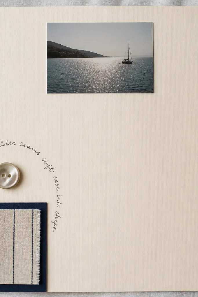
Fabric swatches make a scrapbook feel expensive because texture reads even when the supplies are cheap. I use a small piece of denim, flannel, or a soft knit that matches something about him — a jacket, a hoodie, or even fabric from an old shirt. The button ties the texture to something tactile and man-friendly. This page works best for boyfriend scrapbooks because it feels personal without needing lots of glitter or cute icons. Keep the layout simple: one photo, one swatch, and one handwritten note so the texture does the work.
Choose a fabric swatch about 2x3 inches and trim the edges neatly. Glue it to the page with a thin layer of tacky glue, then add a navy paper border around it if you want extra structure. Sew or glue a single button above the swatch, centered, then write a short note under the button in black pen. Add one small photo at the top center, glued with a tape runner so it doesn’t lift.
If the fabric frays, run the edges over a quick zigzag stitch on a machine or use fray check.
Don’t use slippery satin fabric — it shows glue bumps and looks sloppy once it dries.
5. Baseball Card Style Mini Stats Page
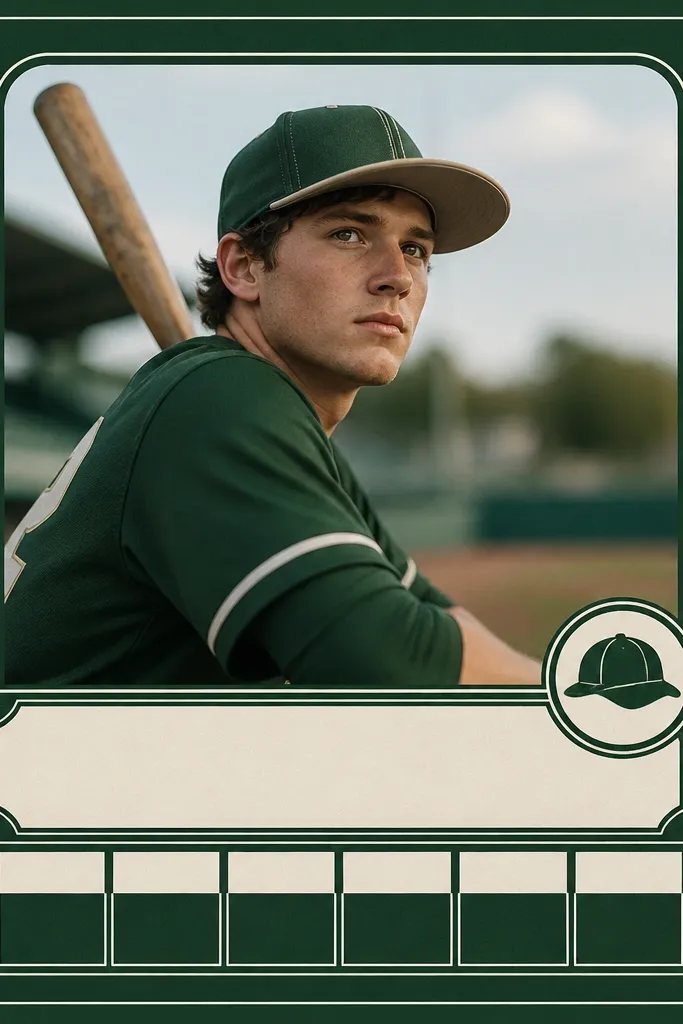
This is the page I make when my boyfriend is into sports or games, because the format feels like something he’d keep. I design it like a “player card” using simple boxes and a few numbers. The secret is using a dark background with clean white text so it reads instantly. This also works if he’s not into sports — you can swap stats for “favorite snack,” “best date,” and “most likely to...” and it still looks cool. It flatters wide photos because the card layout gives them a defined space.
Cut a rectangle card panel about 5x7 inches and glue it to your page. Put one photo in the top half, then add a name label in a bold font printed on white paper and cut into a strip. Draw three or four small stat boxes on the bottom using a fine liner, then fill them with short facts. Finish by adding one small sticker in the corner and a date in tiny handwriting along the edge.
Editor's noteUse a ruler for the boxes. Straight lines make it look like a printed card, not a craft page.
Skip thisDon’t cram too many stats — three boxes is enough for the card to look intentional.
6. Receipts + Menu Card Money-Moment Page
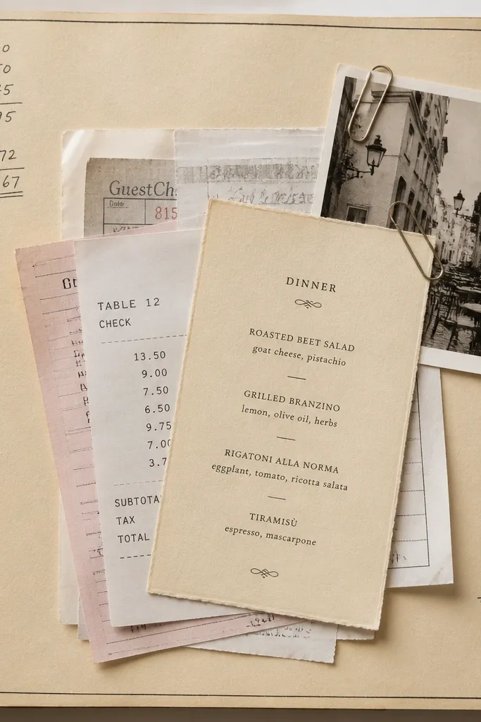
Receipts sound boring until you use them like a visual layer. This page works because receipts have built-in typography and numbers, so you get texture and real detail. I layer them like a “little stack,” then tuck a menu card or takeout receipt behind for depth. The result looks like a memory file, not a pile of paper. This suits boyfriends who love food runs, late-night takeout, or road trips where you stop for snacks. It also hides uneven trimming because receipts have their own edges.
Pick two or three receipts from the same general theme (one dinner, one coffee run, one dessert). Trim them so they stack within a 4x6 inch area, then glue the largest receipt down first. Add the menu card on top at a slight angle and secure it with tape runner so it lies flat. Write a short total or “best bite” note in the blank space next to the stack and finish with one tiny photo corner clipped at the top.
Editor's noteUse a dark pen to circle the item you loved on the receipt. It looks like a highlight from a real journal.
Skip thisDon’t glue receipts all the way around the edges — leave a tiny lift so the layers look dimensional instead of stuck flat.
7. Washi Tape Corner Frames with One Big Quote
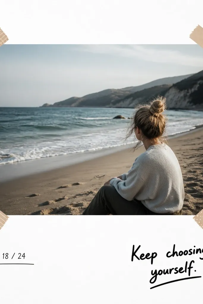
This layout looks polished because the tape frames are consistent and the design has breathing room. I use two washi tapes max: one thin stripe and one solid color. The photo sits centered, and the quote gives personality without needing lots of stickers. This works for boyfriends because you can write something simple and real, like “You make my days easier.” It flatters almost any photo — especially ones that need a clean border to look intentional.
Choose one hero photo and print it in a size that fits about 4x6 inches on the page. Cut a white or light gray background panel and center the photo. Place washi tape pieces only in the corners — each strip should be about 1.5 inches long, leaving the sides open. Add a bold quote in the bottom right and a small date line under the photo in small handwriting.
Press the tape down hard with a bone folder or the back of a spoon so it adheres flat.
Don’t add extra doodles everywhere. One quote is enough to keep the page from looking busy.
8. QR Code Memory Page with Printed Link Card
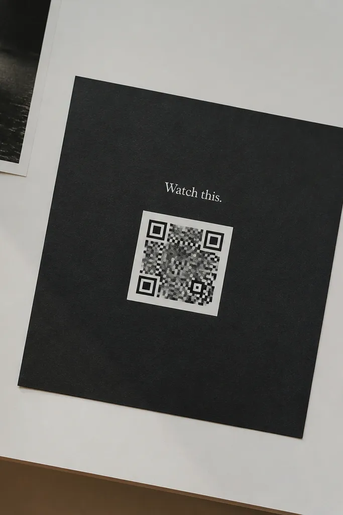
This is one of the best cheap budget scrapbook ideas for boyfriend because it adds “future you” content without printing a ton of extra photos. You print a QR code that links to a video, a shared playlist, or a Google Photos album. The page still looks aesthetic because the QR code is a clean graphic — you’re not dumping random tech stuff. This works for boyfriends who like music, inside jokes, or moments you can replay. It also flatters dark backgrounds because the QR code stays sharp and readable.
Pick one moment to link — I usually use a 30-90 second clip. Generate the QR code, print it on white paper, and cut it into a neat square. Glue a matte black cardstock rectangle behind it (about 3.5x3.5 inches) so the code pops. Add a small instruction label above the QR code and glue a small photo corner in the top left to soften the tech look.
Editor's noteTest the QR code on your phone before you glue it down. I’ve had codes that print slightly blurry and won’t scan.
Skip thisDon’t cover the QR code with glossy lamination or stickers — it reduces scan reliability.
9. Leaf Press or Dried Flower Minimal Page
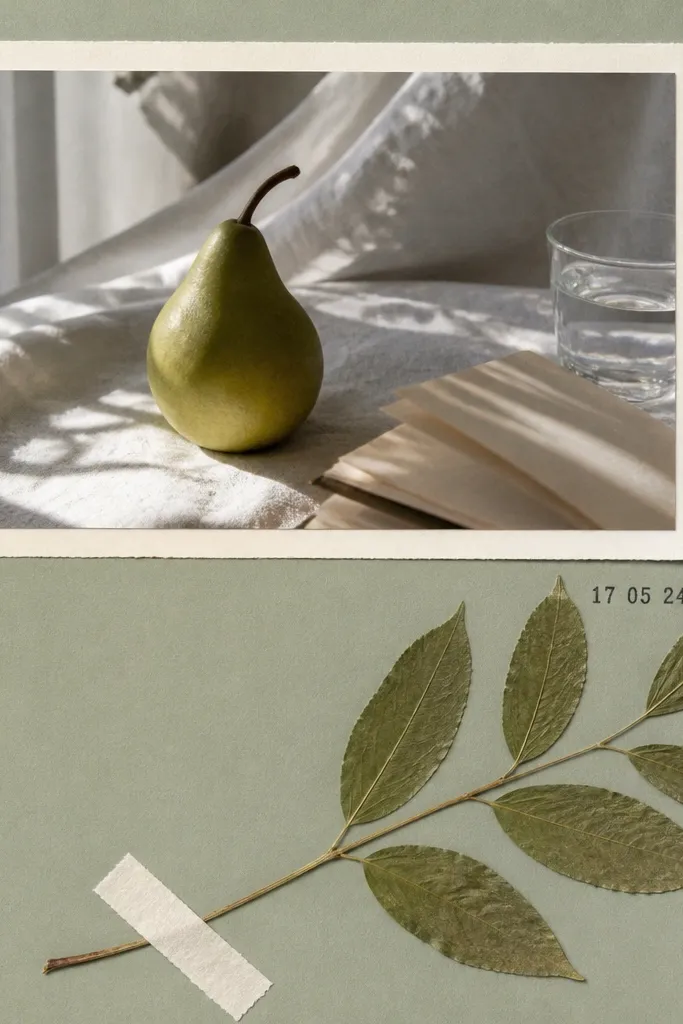
Pressed leaves or a tiny dried flower adds a real-life texture that looks way more thoughtful than store-bought embellishments. I keep it minimal: one pressed item, one photo, and one journaling line. Sage green or light gray backgrounds make the plant details look clean instead of muddy. This works for boyfriends because it’s not “cutesy” — it feels like a nature moment you both noticed. It flatters light-toned skin photos and bright outfits because the plant color stays muted and calm.
Press your leaf or small flower between books for at least a week if you want flat results. Glue the pressed piece to the page using a thin glue dab at the edges only. Add a cream paper strip border behind it, leaving about 1/4 inch showing on each side. Place one small photo at the top and add the date with a simple stamp or handwritten numbers in black ink.
Editor's noteSeal the pressed piece with a tiny brush of matte Mod Podge around the edges, not across the whole plant.
Skip thisDon’t pick thick flowers. They warp and make the page look uneven.
10. Matchbook + Photo Clip Date Page
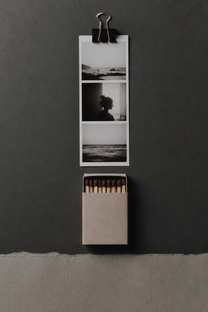
Matchbooks look cool because they already have graphic design and a vintage feel. I use them like the main object on the page, then add one photo strip for context. The mini photo clip gives you a “real keepsake” vibe without buying expensive hardware. This page suits date nights at bars, diners, or anywhere you picked up a little souvenir. It also looks good on darker backgrounds because the matchbook’s colors pop.
Find a matchbook or a similar small paper card (even a small hotel matchbox label works if you trim it). Glue it down centered on a charcoal gray page. Attach a mini binder clip at the top with a small dot of hot glue behind it, then tuck a 2x3 photo strip into the clip. Add a journaling strip at the bottom in light gray and write two lines about what you remember most from that night.
Editor's noteIf you don’t have a matchbook, use a small folded receipt card from a diner and treat it the same way.
Skip thisDon’t use a busy patterned background — it fights with the matchbook design.
11. "Things He Loves" Drawer Page
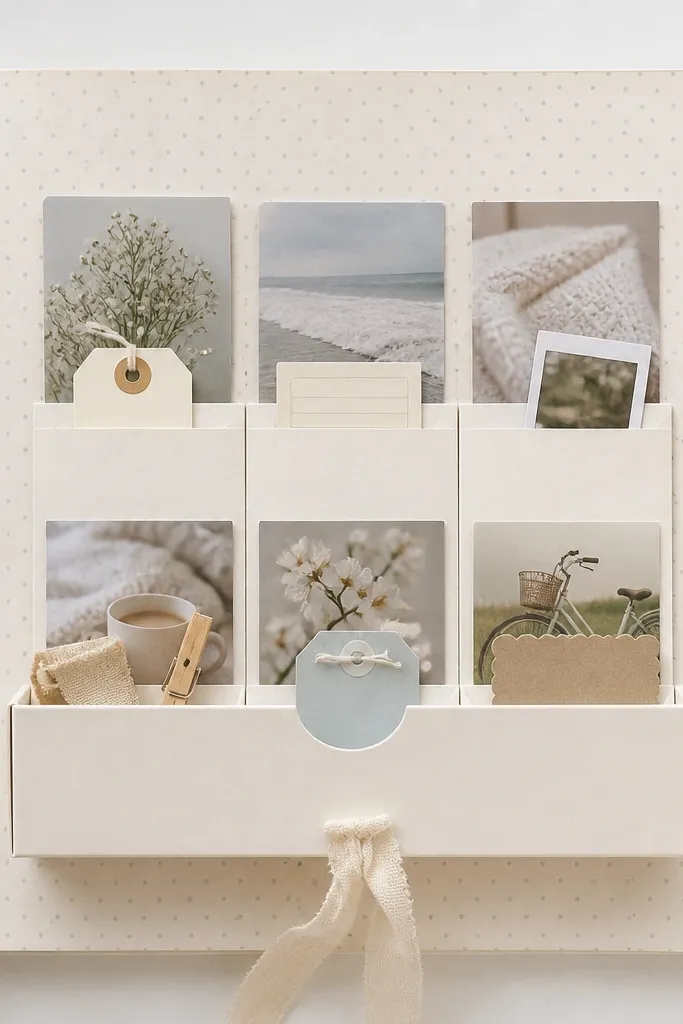
A drawer page turns your scrapbook into something you want to open, and it hides cheap materials inside. I build it with folded cardstock so the “drawer” slides visually even if it’s glued. The labels make it boyfriend-friendly because you’re writing real preferences, not generic love lines. This works for boyfriends who have clear hobbies — games, cooking, cars, gym routines, music. The drawer also flatters smaller photos because they sit behind the pocket labels like a mini collection.
Cut two cardstock rectangles: one base panel (about 5.5x7.5 inches) and one drawer front (about 5.5x2 inches). Score the drawer front so it folds and creates a pocket look, then glue the back edge down to form a pocket. Add three small label tabs on top of the drawer front and glue tiny photo strips or mini notes into each pocket section. Finish by writing one short “why I love this about you” sentence on the page margin.
Editor's noteUse clear tape to seal the pocket edges so they don’t peel after handling.
Skip thisDon’t make the drawer too deep. A shallow pocket looks clean and is easier to close.
12. Concert Setlist in Handwritten Blocks
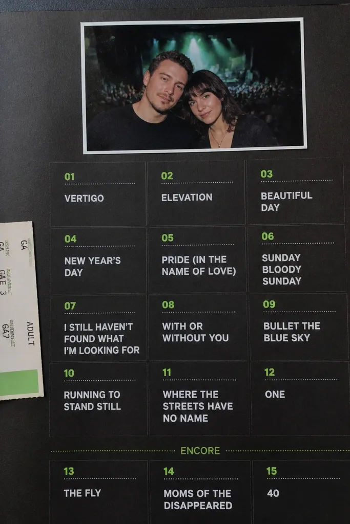
Setlists are basically designed for scrapbooking. This page works because the setlist format already has structure, and you just add color and photos around it. I use black cardstock and then write the songs in blocky sections with a white gel pen or acrylic marker. Neon green or hot pink accents make it feel like the concert energy without adding glitter. This is perfect for boyfriends who go to shows, play in bands, or have a favorite artist. The contrast makes the page readable even from a distance.
Glue a black background panel to your page base and add one ticket stub on the left with a slight angle. Place a small photo at the top center, then create a setlist area by drawing a grid with a ruler. Write the song titles in white ink and add one highlight (the best song) in neon green. Leave a small blank strip at the bottom for your one-paragraph memory note.
Use a white gel pen for small text. It stays opaque on dark paper better than regular markers.
Don’t mix too many neon colors. One neon accent keeps it looking sharp.
13. DIY Sticker Sheet with One Photo Per Row
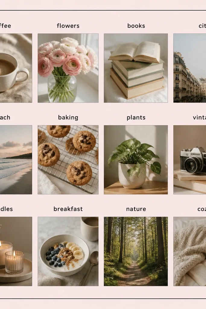
This idea makes your scrapbook feel like a fun collectible without buying sticker packs. I treat each row like a sticker: photo square, label strip, tiny journaling line. The uniform size of the squares gives a clean grid, so it never looks like you randomly pasted things. This works for boyfriends because you can label moments with his personality: “Best laugh,” “Your snack face,” “Road trip playlist.” It also suits people who hate long paragraphs — the labels do the talking.
Pick three or four photos and crop them all to the same ratio, like 1x1 inches or 1x1.25 inches. Print or glue them onto a pale pink or white cardstock sheet. Cut label strips about 1/2 inch tall and write the captions on them in consistent black pen. Glue the label strips above each photo square, then add a thin border around the entire sheet using washi tape or a drawn line.
Editor's noteUse a paper cutter so every square matches. The matching is what makes it look “designed.”
Skip thisDon’t use different photo sizes. Variation makes the page feel accidental.
14. Pocket Page with "Open When" Notes
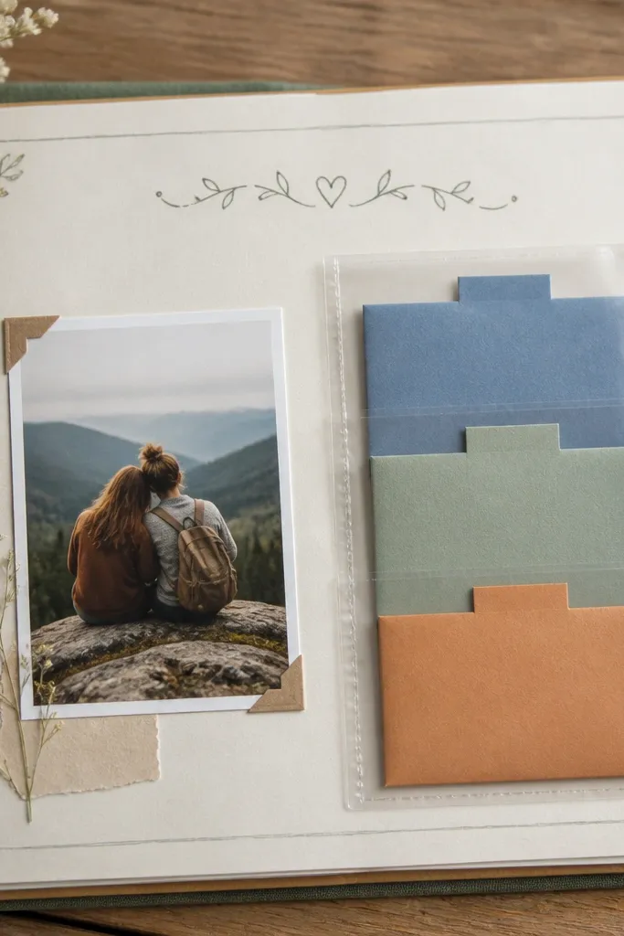
Pocket pages are the fastest way to make cheap budget scrapbook ideas for boyfriend feel interactive. You’re not just gluing paper — you’re creating a mini system where he can pull notes out later. I use three “Open when” notes so the page looks intentional, and I keep the writing short. This works for boyfriends who like reassurance and practical humor. It also flatters thicker cardstock because pockets hold their shape and hide uneven edges around the pocket opening.
Buy a pack of clear scrapbook pockets or make your own with clear report covers cut to size. Glue a pocket to the right side of an 8x10 page, leaving a small margin. Fold three small notes (about 3x4 inches), add colored tabs at the top, and slip them into the pocket. Place one photo on the left and write a title at the top like “Open When It’s a Rough Day” in black pen.
Editor's noteUse binder tabs or paper tabs, not stickers, so you can write on them and they stay flat.
Skip thisDon’t overstuff the pocket. If it bulges too much, it looks messy and takes away the clean look.
15. Neon Night Drive Road Lines
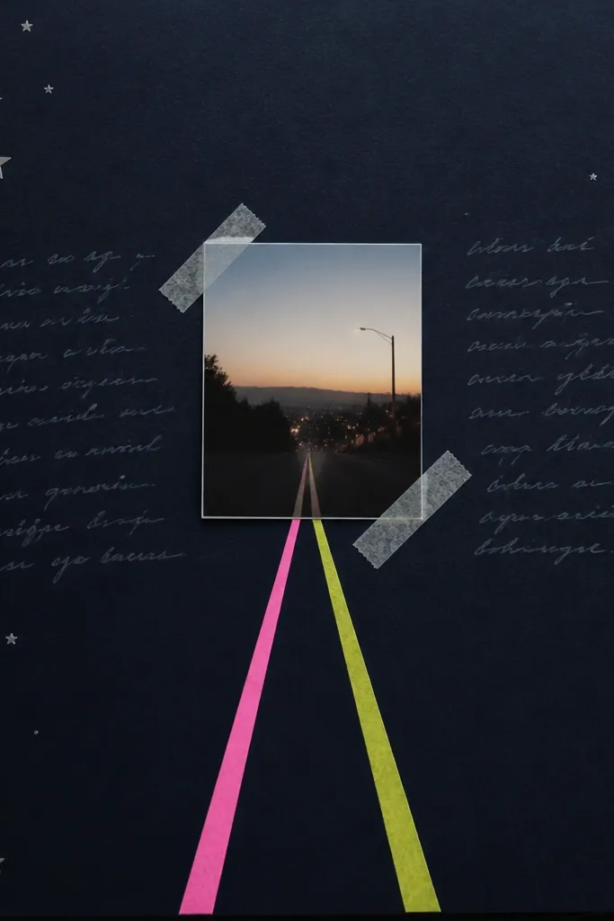
This page is for the boyfriend who loves late-night drives, playlists, or just sitting in the car talking. I build it with dark cardstock and neon tape because that combination instantly reads “night.” The road lines guide your eye toward the photo, and that makes the layout feel dynamic even when the supplies are cheap. Keep stars minimal — a few tiny dots are enough. This flatters night photos with streetlights because the neon tape matches the glow tones.
Cut a dark navy background panel and glue it to your page. Add two neon washi tape strips that start at the bottom corners and angle inward toward the center. Place a small photo in the center, slightly overlapping the tape so it feels connected to the road. Write your journaling in light gray or silver gel pen on a strip of thin paper at the bottom.
Editor's noteUse a white gel pen to add a few short “lane” dashes on top of the tape for a more realistic road effect.
Skip thisDon’t add lots of stickers. The neon tape already does the heavy visual lifting.
16. Coffee Order Rewrite Page
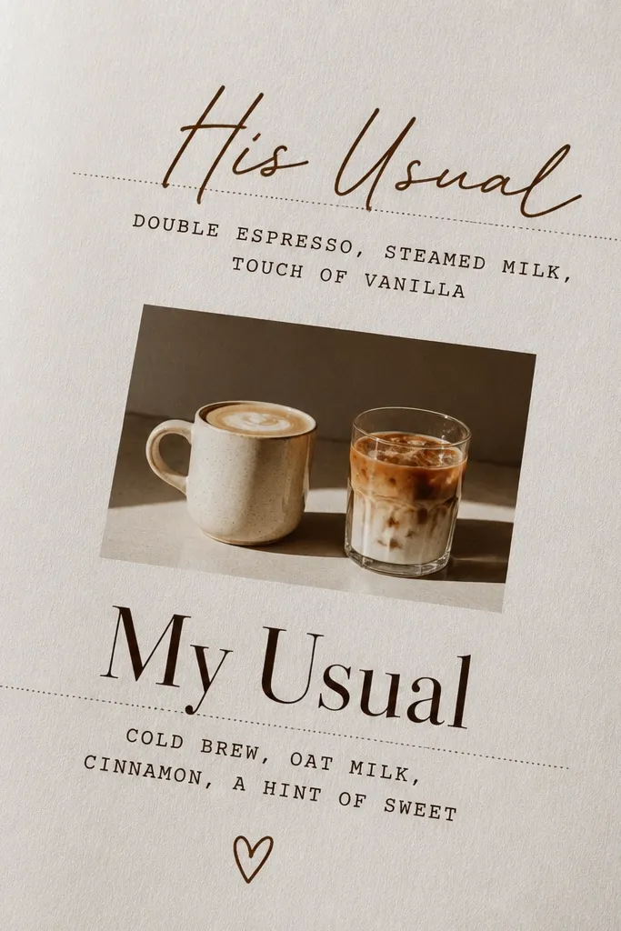
This is one of my favorite cheap budget scrapbook ideas for boyfriend because it turns a tiny daily habit into a page with story. I use a menu-style background and then “rewrite” his order like a character sheet. It looks cute without being childish because the typography does the work. This page suits boyfriends who always order the same drink or who have a signature snack. It also flatters warm-toned photos — caramel, latte foam, and wood tables look great on light brown paper.
Find a coffee menu image or print a simple coffee-themed background on light beige paper. Cut it to fit the page with a small border. Place a small photo of two drinks in the center, then create two label strips: one for his order and one for yours. Write the orders in black ink, using one line for the drink name and one line for a detail like “extra shot” or “no sugar.” Add a tiny date stamp in the corner.
Print labels on light cream paper and use a dark brown pen. It looks like a real menu, not a craft label.
Don’t use bright candy colors for the typography — it kills the cozy coffee vibe.
17. Shadow Box Look Without a Real Shadow Box
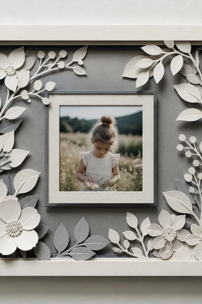
You can get the shadow box look using only layered cardstock, and it makes cheap photos feel gallery-ready. I build a frame around one photo with two or three cardstock layers in slightly different shades. The depth comes from foam squares or paper strips folded into risers. This works for boyfriends because it turns one meaningful photo into a centerpiece page. It flatters square or portrait photos because the layered frame holds the shape and makes the photo feel important.
Cut your main frame opening for a photo about 3x4 inches. Then cut two larger frame layers around it, each about 1/4 inch wider, using gray tones that match your photo. Glue the back layers down first, then add foam squares or folded cardstock strips to raise the front photo layer. Finish by adding a thin journaling strip under the photo and keep the rest of the page plain so the 3D effect is obvious.
Use matte cardstock layers, not shiny. Shiny layers catch light and make the fake depth obvious in a bad way.
Don’t use too many layers. Three total layers look intentional; more starts to look lumpy.
18. Sports Jersey Number Page
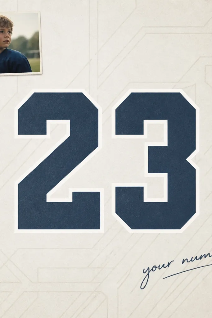
If he has a favorite number, this page makes that number feel like a love language. I use big, bold numerals and keep the background simple so the number is the star. You can also use his birthday date or the year you started dating — both feel personal. This works for boyfriends who like sports, gaming ranks, or anything with numbers. It flatters bold photos like action shots because the large number gives the page structure when the photo background is busy.
Choose his number and decide on a font style you like, then print it large on white cardstock. Cut a background panel in a team color — navy, forest green, or heather gray. Place the number centered and outline it with a thin white marker for contrast. Add one small photo in the top left and write a short note in the bottom right like “My favorite number is you at #___.”
Editor's noteIf you don’t have a printer, handwrite the number with a thick paint marker and trace it with a stencil for clean edges.
Skip thisDon’t pick a font that’s too thin — thin numbers look cheap once glued down.
19. Hand-Cut Heart Map of Your Dates
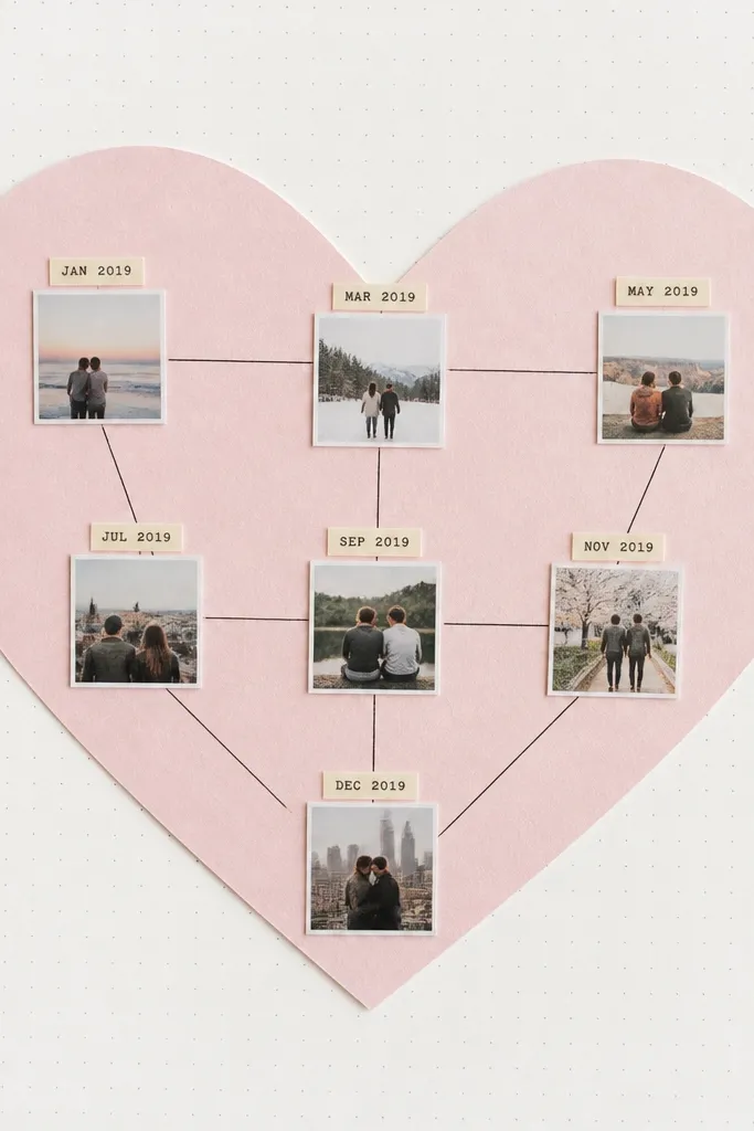
This page is romantic but still graphic, so it doesn’t feel like a greeting card. I cut a heart from light pink or coral cardstock, then fill it with tiny labels and mini photos from your dates. The thin lines connect the stops like a route map, which makes it feel structured. This works for boyfriends because it turns “we did stuff together” into a clear collection. It also flatters small photos because the heart shape gives the eye a boundary.
Trace and cut a heart from cardstock sized to about 5 inches wide on your page. Place it on a white or off-white background and glue it down lightly so you can still add inside pieces. Cut tiny rectangles for date labels and place them inside the heart, then glue mini photo squares beneath or beside each label. Use a fine black pen to draw thin lines connecting each label in order. Finish by writing one short caption along the bottom edge.
Editor's noteUse a single pen color for all lines and labels. Consistency makes it look designed, not DIY-chaotic.
Skip thisDon’t use too many heart colors. One pink tone is enough for a clean look.
20. Stickerless Doodle Border Page
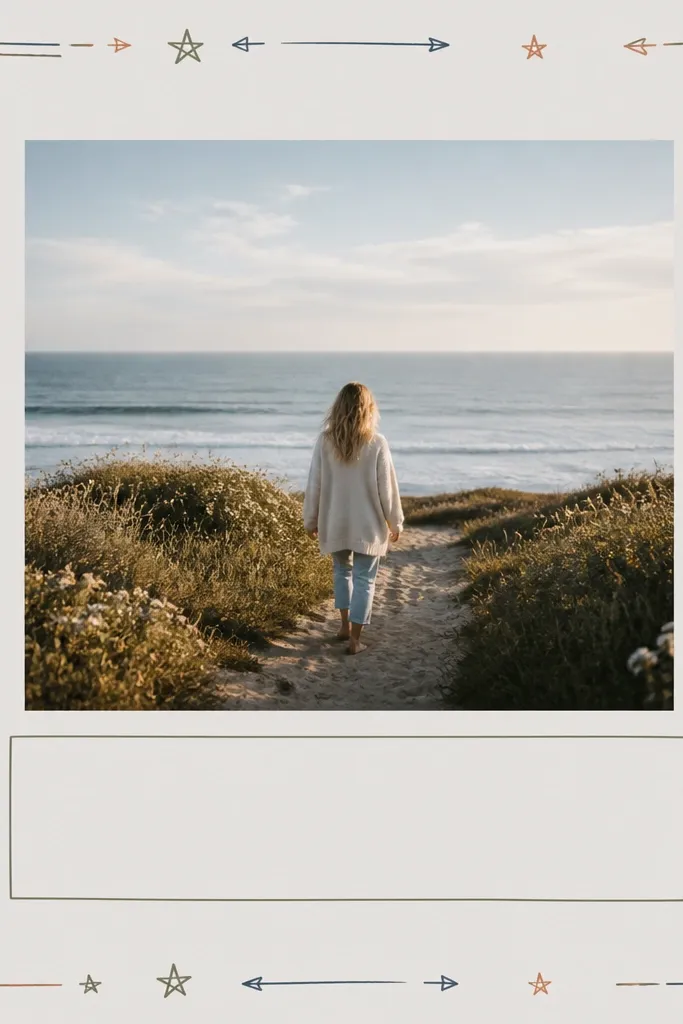
Doodle borders are cheap and they look custom because you’re making the design yourself. I keep the doodles small and repeat one or two elements — tiny stars and short arrows, for example. This page works when you want the photo to feel like the main event but still need decoration. It flatters almost any photo because the border is around the edges, not competing with the center. For boyfriends, doodles that look like “map notes” or “game HUD” feel more masculine than cartoon hearts.
Glue a photo centered on a light gray or off-white background panel. Draw a border around the edges using a ruler so it stays even — a 1/2 inch margin all around. Add repeating doodles in two colors max, like black plus navy. Put journaling in a small rectangle under the photo, then keep the rest of the page blank so the border is the only decoration.
Editor's noteIf your handwriting is shaky, practice the doodles on scrap paper first. You want the border to look steady, not rushed.
Skip thisDon’t freestyle the border too close to the photo. Give it a margin so it looks intentional.