
1. Ticket-Window City Date Page
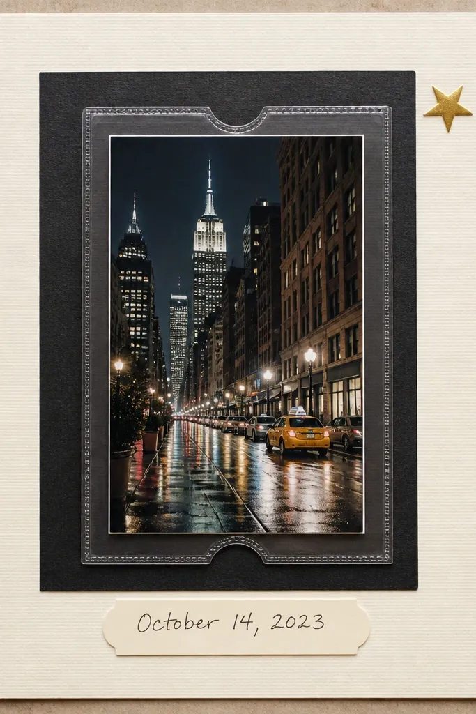
I use this layout when you have one standout night photo — street lights, a restaurant sign, or a skyline. The clear ticket window makes the page feel like a keepsake you could pull out, and the black-and-cream palette keeps it readable even with dark images. It works especially well for boyfriends who love going out, because it looks like a “mini itinerary” page. If your boyfriend has warmer skin tones in the photos, the cream base keeps everything from looking too gray. The styling principle is transparency on top of an anchored photo so your eye lands fast and then reads the handwritten caption.
Start by matting your main photo to about 10x7 inches on cream cardstock, leaving a 1-inch border around it. Cut a ticket-window panel from clear acetate slightly larger than the photo — mine is roughly 10.5x7.5 — then glue only the edges so the center stays flat and glossy. Add a thin strip of black cardstock behind the window, about 1/2 inch thick, to make the photo pop. Finish with a cream label at the bottom (about 3.5 inches wide) and write the date and one sentence in black gel pen. Add one tiny star or location pin near the top corner for a “map vibe,” not a confetti vibe.
Use a non-yellowing clear pocket or acetate and keep it away from direct sunlight to avoid scuffs.
Avoid putting the window over a cluttered photo — the page looks messy when the background is already busy.
2. 3-Photo Timeline With Date Stamps
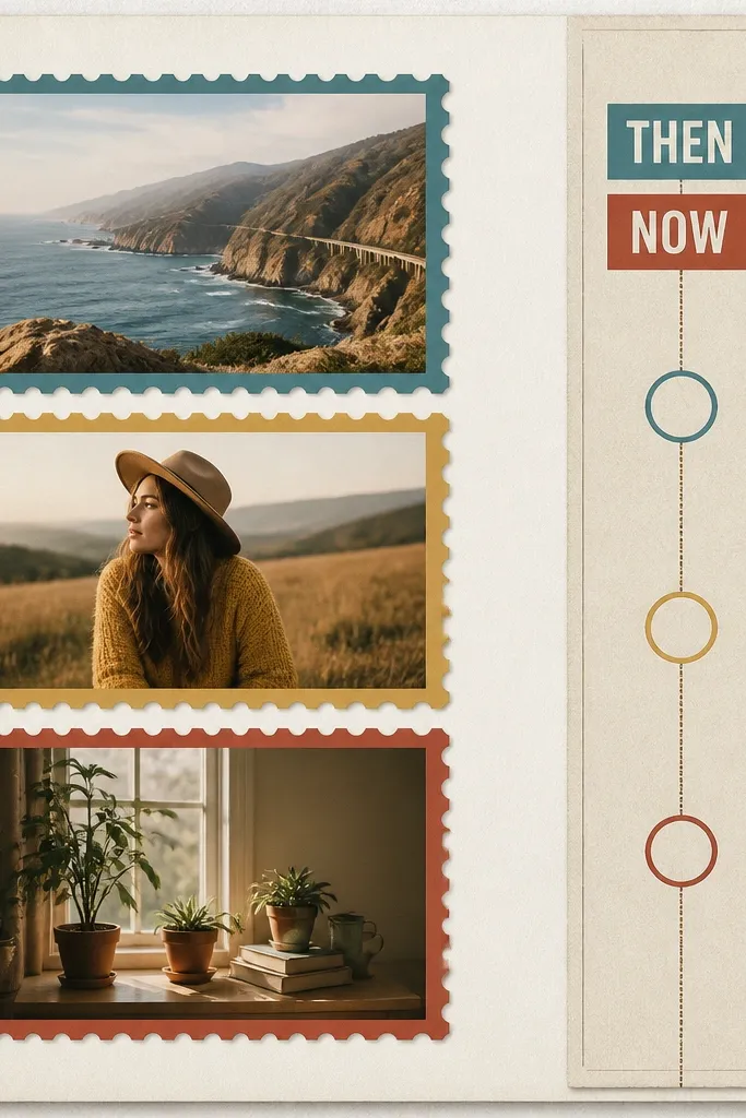
This one is for anniversaries where you’ve got photos from different stages: early dating, a milestone year, and a recent trip. Three photos is the sweet spot; any more and the page turns into a collage wall. The date stamps give it structure, so even if your photos vary in brightness, the page still looks cohesive. I’ve used it with couples whose photos are mixed between phone snapshots and camera shots — the stamp frames make the variation feel intentional. The styling principle is repeating the same border style three times so your eye trusts the layout.
Pick three photos that show a clear story and resize them so the faces sit at similar heights. Mat each photo to about 5x3.5 inches and leave a 1/4-inch white gap between the mat and the border. Create stamp borders using layered cardstock rectangles with a perforated-looking edge (tear edge works too, but keep it straight). Place the three framed photos in a vertical column on the left, then leave at least 4 inches of space on the right for text. Add a vertical date strip using actual stamp images printed on cardstock, or hand-draw circles and write the dates inside.
Use black ink for every date so the page stays readable even when photos are bright.
Avoid using three different border styles — it makes the page feel like leftovers.
3. Fabric-Thread Love Notes Pocket
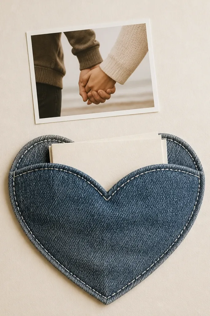
This page is a personal win when your boyfriend has a hoodie, jacket, or flannel you both associate with comfort. Denim fabric feels sturdy and masculine, and the stitched outline looks like you made it on purpose. The heart pocket holds note cards, so the scrapbook keeps giving after you finish it — each card is a new mini memory. It flatters almost every photo style because the neutral blue denim doesn’t fight with skin tones. The styling principle is using one fabric texture as the main visual element, so you don’t need a lot of extra decoration.
Start by selecting denim or canvas fabric in a medium wash (not super faded). Cut a heart pocket template about 8 inches tall and 7 inches wide, then add a 1/2-inch flap at the top for the opening. Stitch around the heart using thick white thread and a straight stitch look, then glue the pocket to a cream cardstock base. Place your main photo above the heart, matting it to about 5x7 inches so it doesn’t compete with the fabric. Add three note cards inside, each trimmed to 3x4 inches, and write one line on the front and one line on the back.
Editor's noteUse a glue that stays flexible on fabric, like fabric glue, so the pocket won’t crack when you open it.
Skip thisAvoid flimsy tissue-paper hearts — the page will sag and look unfinished.
4. Map Coordinates Night Drive Page
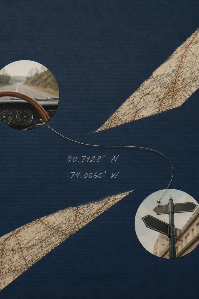
If you’ve done night drives, this is the page that makes him feel like the scrapbook remembers the route. The dark blue base matches night photos without turning them gray, and the map strip adds context without clutter. The circular photo cutouts are friendly because they don’t force perfect straight alignment; they look good even if the photos are slightly different sizes. This layout works for boyfriends who like travel, because maps feel like “we went somewhere” evidence. The styling principle is diagonal movement — the map and thread pull your eye across the page like a drive.
Cut a dark blue cardstock base and apply a vintage map strip about 2.5 inches wide, angled across the page. Add two circular photo cutouts using a 2.75-inch circle punch or template, placing one near the bottom left and the other near the top right. Tie a length of metallic thread between the two circles — I use copper or gold thread — and glue it down lightly with small dots of craft glue. Write the coordinates on a cream label and keep the font blocky and simple. Finish with two tiny arrow stickers pointing toward each circle.
Editor's notePrint the map strip larger than you need so you have clean edges after trimming.
Skip thisAvoid using a bright neon map — it clashes with night photos and looks like a school project.
5. Matchbook Menu and First Date Recipe Card
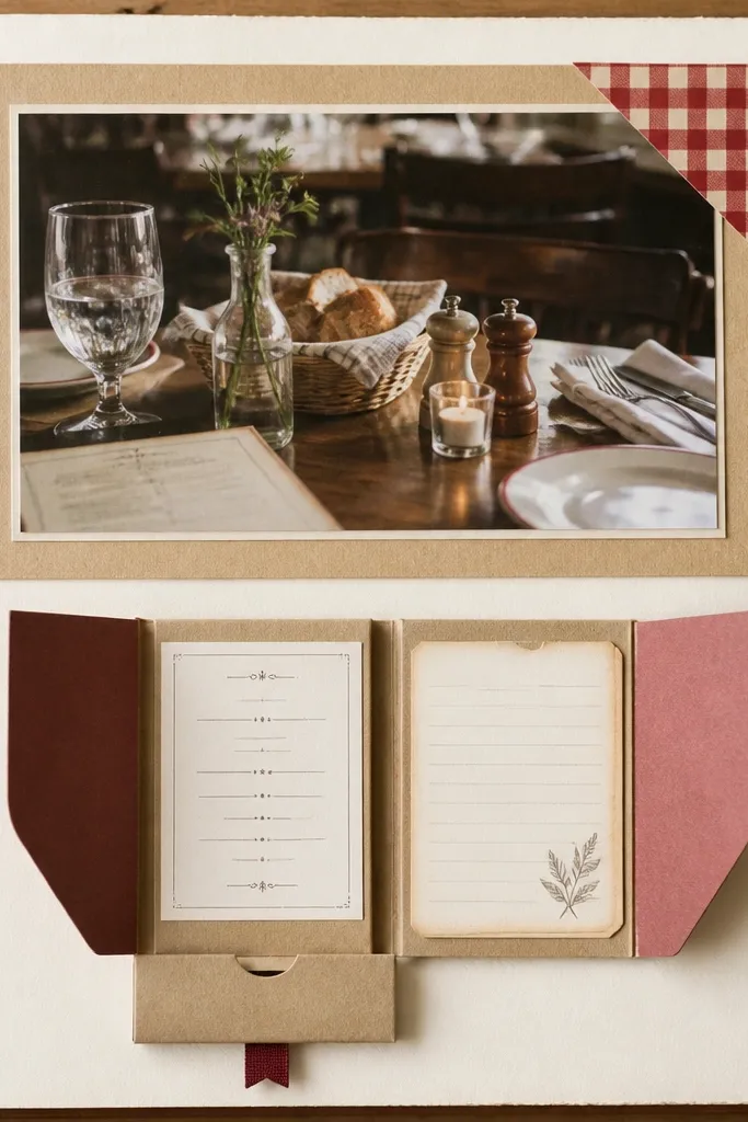
This is one of my favorite anniversary scrapbook ideas for boyfriend because it turns the first date into something he can “use.” A matchbook fold feels like a real object, and the hidden menu print makes it feel curated without being fussy. I like it for dinners, cafes, and takeout nights because you can include a recipe card of something you ate together. It flatters warm-toned photos and makes skin tones look natural against tan cardstock. The styling principle is a functional mini-fold — it creates surprise when he opens the page.
Start by making a matchbook base from cardstock: cut a 4x6 inch rectangle, score it at 1/2 inch intervals, and fold into a small book. Glue a printed menu strip on one inside panel and a 3x4 recipe card on the other, leaving the top open for the fold. Place your restaurant photo centered above the matchbook, matting it to about 8x5.5 inches. Add a small red checkered paper corner behind the photo using a triangle cut. Write “First date — our order” on a small strip at the top and keep it to one line.
Editor's noteIf you can, print the menu in grayscale so it doesn’t fight with the colors in your photo.
Skip thisAvoid overloading the matchbook with too many layers — it won’t close cleanly.
6. Polaroid-Style Frame With Faux Tape Edges
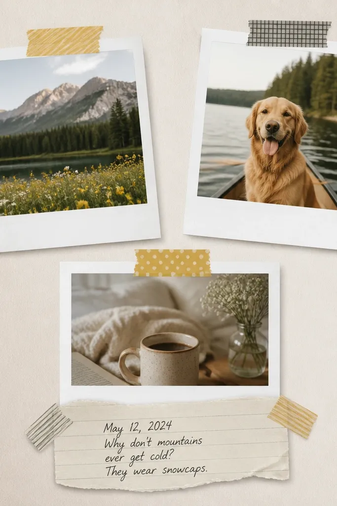
This layout is for couples who have lots of casual photos and want the scrapbook to feel light and playful. Polaroid frames give your pages a consistent look even when the photos were taken in different lighting. The faux tape edges are the secret — they add texture and make the page feel handmade, not printed. It works well for boyfriends with a goofy sense of humor because the captions look like notes you’d write right after the moment. The styling principle is repetition with small imperfections, like real tape and slightly tilted frames.
Print your photos in a 4x6 size and trim them to fit polaroid borders about 3.5x5 inches each. Add a white cardstock mat around each photo, then leave a small bottom caption area on the frame. Place the frames in a tight cluster — I do two overlapping and one slightly below — and keep the cluster centered so it doesn’t feel random. Add washi tape strips across the corners, about 1 inch wide, with one strip slightly wrinkled by hand. Write a caption on a narrow strip of cream paper and glue it under the bottom frame.
Editor's noteUse matte washi tape so it doesn’t glare under light like shiny tape.
Skip thisAvoid glossy tape and glossy photo prints together — the glare makes it look cheap.
7. Concert Wristband Strip + Setlist Tags
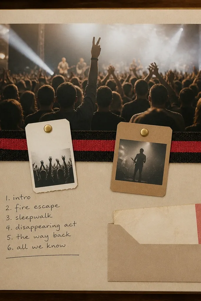
If your boyfriend has a favorite band, this page is the one he’ll keep showing people. A wristband strip is tactile and instantly recognizable, and it adds a bold color band that anchors the page. I like adding small setlist tags because it turns a vague “we went to a show” into a specific memory. This works best for night concert photos with lots of blacks and reds, because the wristband colors match the mood. The styling principle is using one strong color element (the wristband) and keeping text minimal but exact.
Cut a wristband strip into a clean 10-inch length and trim the edges so it’s straight. Place it across the middle of the page on top of a dark photo mat, then glue it so it lies flat. Create two tag cards from 3x4 inch cardstock and punch a hole at the top; attach them with small brads or eyelets to the wristband strip. Tuck a tiny ticket stub into a small pocket at the bottom edge, about 3 inches wide. Write the setlist song titles on one tag and the venue name on the other in black ink.
Editor's noteTrim the wristband so it doesn’t fray — a thin line of fabric glue on the cut edge keeps it neat.
Skip thisAvoid using too many different memorabilia pieces — the page starts to look like a junk drawer.
8. Year-By-Year Growth With Hairline Lines
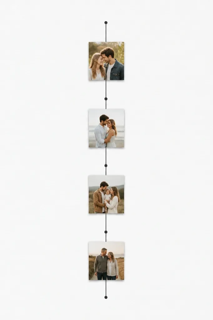
This one is for couples who don’t want a loud scrapbook. The hairline line method gives you structure without filling the page with random stickers. I’ve used it for boyfriend anniversaries where the photos are meaningful but not colorful — the minimal design keeps faces and expressions front and center. It looks good on any skin tone because the background stays light and neutral. The styling principle is letting the photos do the work and using one graphic line to organize them.
Pick 4 photos that represent your timeline and trim them into 3x3 inch squares. Draw a vertical line down the center of the page, starting about 1.5 inches from the top and ending about 1 inch from the bottom. Mat each photo square and place them evenly along the line, leaving consistent spacing. Add tiny circular labels above each photo with years written in a simple font. Finish by writing one sentence at the bottom in a narrow strip: “What we learned this year.”
Editor's noteUse a ruler for the line and a fine black pen so the layout looks crisp.
Skip thisAvoid adding extra embellishments around the line — it breaks the clean look.
9. Envelope Letter From His Future Self
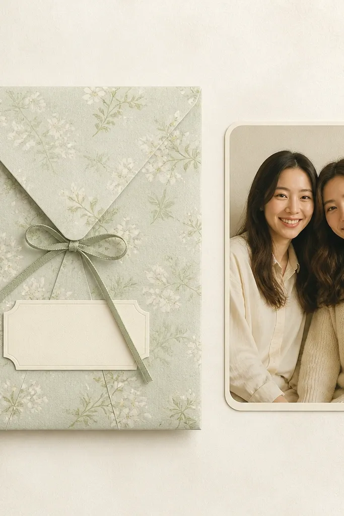
This idea works when you want emotion without making the page look like a greeting card. The envelope holds a letter you write now, but the design feels like a promise you’re delivering later. I’ve done this for anniversary books and the letter becomes the part he re-reads when things get stressful. It flatters almost any photo because the envelope is the main visual weight. The styling principle is hiding the message in a functional shape so it feels like an object, not a paragraph.
Cut an envelope template from patterned paper so it’s about 7.5 inches tall and 5 inches wide. Glue the envelope to the left side of a cream base, then add a ribbon tie across the flap using a 1/4-inch ribbon. Place a rounded rectangle photo mat on the right, about 6.5x4.5 inches, and glue the photo inside. Write “Dear you” or your anniversary date on a small label stuck at the top of the envelope. Slip your letter inside on folded cardstock sized to fit the envelope opening.
Use thick paper for the letter so it doesn’t curl inside the envelope.
Avoid writing the letter on the scrapbook page itself — it will wrinkle and look messy over time.
10. Board Game Scorecard and Dice Corners
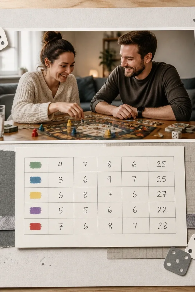
This page is for boyfriends who remember details like points and rounds. A scorecard grid gives you a reason to include numbers, and numbers make the moment specific. The dice corner accents add a playful texture without taking over the whole page. I’ve used it for couples where the photos are casual and not posed — the scorecard makes it feel organized. The styling principle is adding a “game format” to the layout so it matches his personality.
Cut a scorecard rectangle about 9x6 inches from cardstock and draw a simple grid with a fine pen (or print a grid). Add handwritten scores in three lines, one per game, and include the date in the top corner. Place your main game photo at the top, matting it to about 8x5 inches. Add dice corner die-cuts or hand-drawn dice in the four corners using gray and white paper. Finish with a thin ribbon strip under the scorecard, about 10 inches long, glued at the edges only.
Editor's noteWrite the funniest moment on the back of one scorecard so it becomes a secret he finds later.
Skip thisAvoid using too many fonts on the scorecard — it starts to look like a printed flyer.
11. Black-and-Gold Anniversary Night Portrait Page
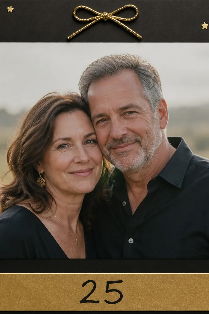
This one is for anniversary photos that are already dramatic — candlelight, city nights, or dressed-up portraits. Black cardstock makes the skin tones look clean and the gold accents add that “we planned this” feeling. It flatters most faces because the background is consistent and doesn’t compete with clothing patterns. If your boyfriend wears dark shirts, the gold strip makes the page feel intentional instead of too heavy. The styling principle is one main photo plus controlled gold accents — no busy collage.
Use black cardstock as the base. Mat your portrait photo to about 8x10 inches on a charcoal or black frame, leaving a thin border. Add a gold cardstock strip at the bottom, about 1.25 inches tall, and write the anniversary year in black marker. Place 6 to 10 gold star stickers around the photo edges, keeping them mostly on one side. Tie a tiny metallic thread bow on the top edge and glue it down so it doesn’t peel.
Editor's noteUse gold foil stickers sparingly; a few placements look better than a full scatter.
Skip thisAvoid mixing gold with bright colored paper — it clashes with night portraits.
12. Recipe Photo Collage With Handwritten Steps
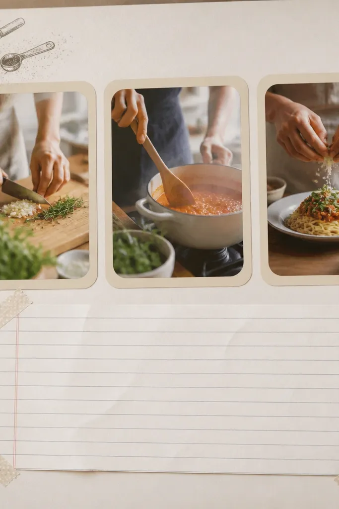
This layout is for anniversaries built around home — cooking, baking, or late-night snacks. It turns your boyfriend’s favorite dish into a repeatable memory, and he’ll like that because it connects to an activity, not just a date. The rounded rectangles keep the page soft, and the lined paper makes the handwriting easy to read. It works well for photos with lots of beige, brown, and warm kitchen light. The styling principle is turning one experience into a mini “how we did it” guide.
Print or crop three cooking photos to about 4x3 inches each and mat them in rounded rectangles using cream cardstock. Arrange them in a row across the top, leaving space for text below. Tape a piece of lined notebook paper across the bottom using 1-inch strips of washi tape at the corners only. Write the recipe steps in short lines: “Heat pan,” “Taste and adjust,” “Plate and steal bites.” Add one tiny doodle in the top corner, like a fork or whisk, in black pen.
Editor's noteUse a black gel pen for the recipe so it stays crisp against light paper.
Skip thisAvoid handwriting too small — if he squints once, the page is hard to enjoy.
13. Sports Jersey Number Page With Match Cards
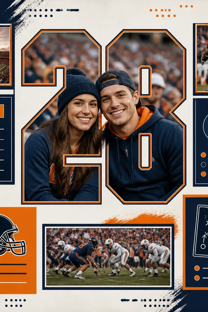
This is for boyfriends who care about numbers, teams, and stats. A jersey-number style layout makes the scrapbook feel like it belongs to his world. It works best when you have one strong photo from a game or sports bar, because the big number frames the memory. The navy and orange pairing looks sharp and doesn’t get muddy in photos. The styling principle is a single oversized element (the number) so everything else stays secondary.
Choose your boyfriend’s jersey number or a meaningful number like your anniversary year. Cut a large number from navy cardstock, about 7 inches tall, and place it behind your main photo. Mat your game photo to about 5.5x7 inches and center it over the number. Create 3 to 4 small stat cards, each about 3x4 inches, and write one stat per card. Arrange the cards around the photo in a fan pattern, then add a thin orange border strip along one edge of the page.
Use foam tape under the number for a slight lift so it catches light.
Avoid adding random team graphics — keep it to the number and your own photo.
14. Sunrise Ticket Receipt Strip With Heat-Embossed Date
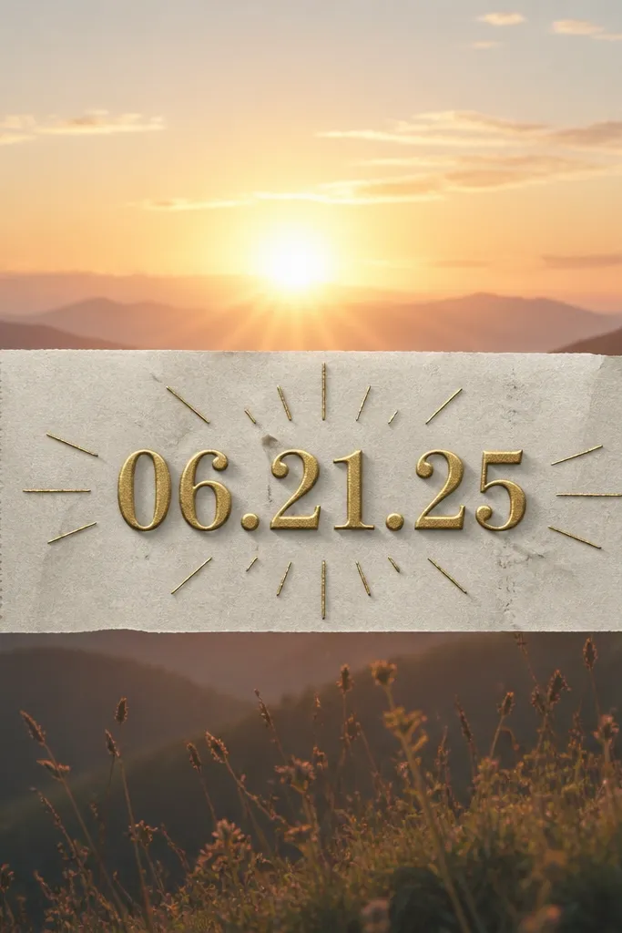
This layout is for travel days and early mornings. Receipt paper looks real and gives you a place to anchor a date without writing a wall of text. The heat-embossed date adds texture you can feel, and that’s what makes it feel premium. It flatters bright sunrise photos because the receipt strip breaks up the wide sky with a grounded line. The styling principle is mixing flat print with one raised element so the eye has a focal point.
Start with a sunrise photo as the background mat, printed large enough to fill most of the page, like 8x10 inches. Cut a receipt strip about 10 inches long and 1.25 inches tall and glue it across the center. Stamp or write the anniversary date on cardstock using embossing ink, sprinkle gold embossing powder, and heat set it before gluing. Place the embossed date label right on top of the receipt strip so it looks like it belongs there. Add small hand-drawn rays in light orange around the embossed area, 1 to 2 inches long.
Editor's noteDo the embossing before assembly so you don’t make a mess on your finished page.
Skip thisAvoid skipping the embossing ink step — dry powder won’t set cleanly.
15. Polished Map Bookmark Insert

If you’ve visited a place that means something, this page turns it into a usable bookmark. Laminated map paper holds up, and the ribbon tassel makes it feel finished instead of temporary. It works best when you have a landmark photo with clear lines — arches, signs, skyline edges. The colors stay consistent because map paper is usually muted, so it won’t fight with whatever outfit your boyfriend wore. The styling principle is adding function — he can pull the insert out and it still looks like part of the scrapbook.
Cut a bookmark insert from map paper to about 2.5 inches wide and 8.5 inches tall. Laminate it or cover with clear contact paper so it resists smudges. Punch a hole near the top and thread a 4-inch ribbon through it, tying a small knot on the front. Glue a small stamped city label at the top of the bookmark and place it on the left side of the 12x12 page using pocket adhesive on the sides only. Add a small pocket on the bottom right that holds a folded mini map or a printed photo of the street name.
Editor's noteUse a matte laminate so the map doesn’t glare in photos.
Skip thisAvoid thick inserts — a bookmark that’s too chunky makes the album hard to close.
16. Scratch-Off 'Reasons I Love You' Card Page
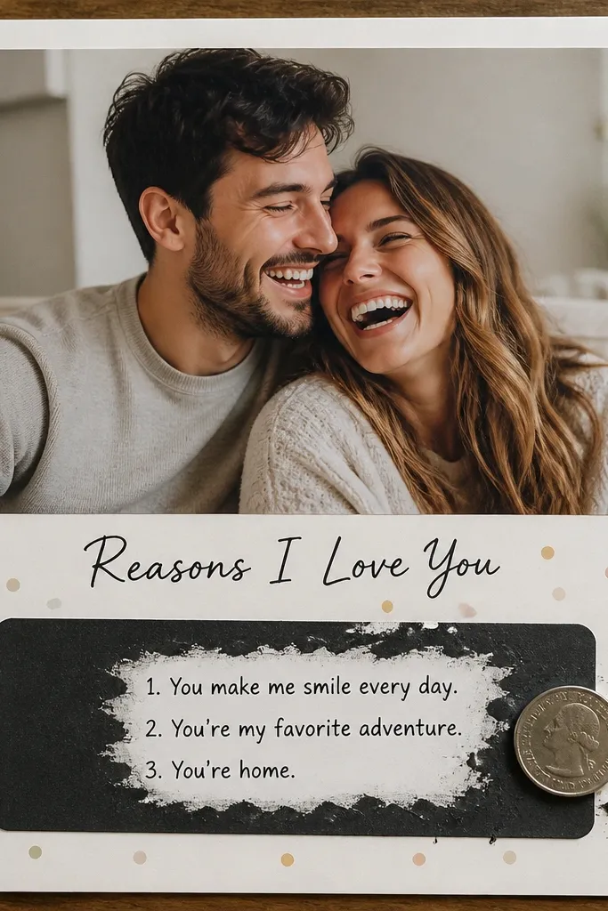
This idea is playful and keeps him engaged, not just sentimental. The scratch-off element turns the scrapbook into an activity, and it gives you a way to include multiple reasons without writing them all over the page. I like it for anniversaries because it feels like a gift he can open repeatedly, even after he finishes reading the book. It works with almost any photo because the scratch panel is controlled and dark. The styling principle is contrast — a bold dark panel at the bottom with the main photo centered above it.
Print or cut your main photo to about 8x10 inches and mat it on cream cardstock. Create a scratch panel from black cardstock sized around 6x4 inches and cover it with a scratch-off coating or DIY scratch layer (white crayon layer rubbed smooth, then black marker over it — test first). Write the header “Reasons I Love You” on a cream strip above the panel. Under the scratch layer, write three short lines on the black surface with a white gel pen so they appear when scratched. Glue the panel at the bottom and add 6 small stamped confetti dots around it in one color.
Editor's noteTest your scratch layer on scrap paper the same day so you know it reveals cleanly.
Skip thisAvoid using tiny handwriting under the scratch — it becomes unreadable when scratched.
17. Before-After Haircut or Glow-Up Side-by-Side
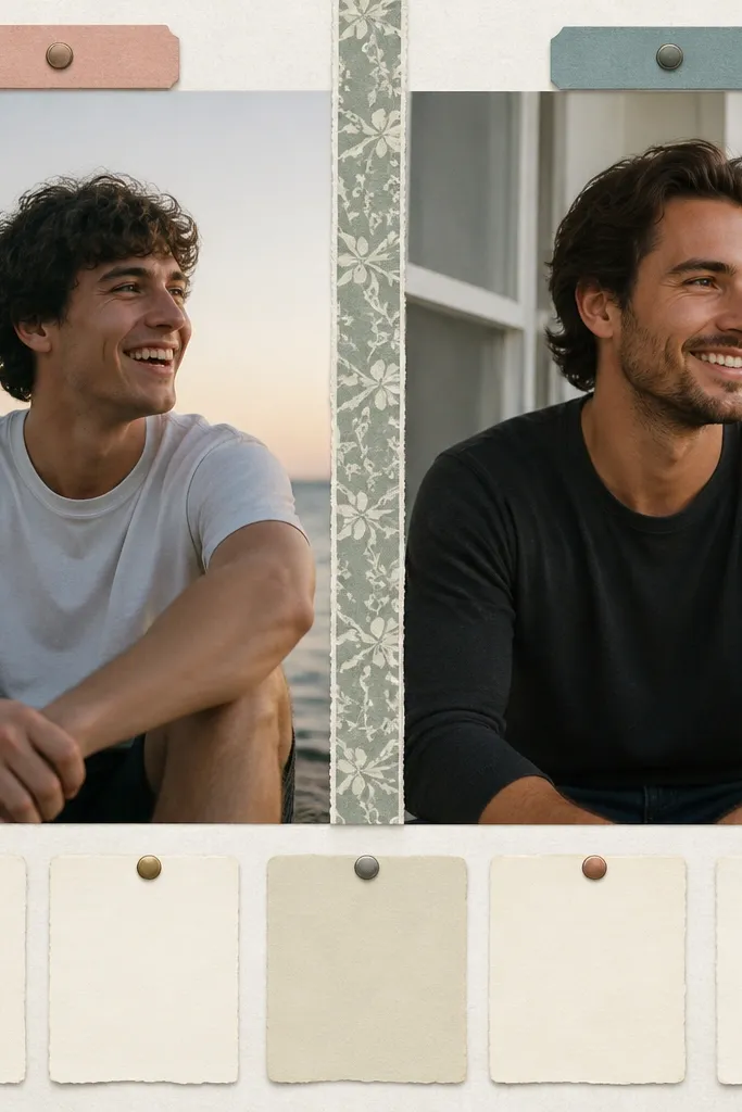
This layout works when you have a clear before-and-after story, like a haircut, beard change, fitness milestone, or style upgrade. Side-by-side is visual proof without needing a long explanation, and boyfriends like that because it feels like a real comparison. The patterned divider stops the page from looking too symmetrical and boring. It flatters photos because each image gets its own space and label, so faces stay centered. The styling principle is separation — two strong images with a clear divider and matching labels.
Choose two photos with similar framing and crop so their heads sit at the same height. Mat the left and right photos to about 4.75x6.5 inches each and place them with a narrow gap in the middle. Add a patterned divider strip about 1 inch wide between them and align it with the top edges. Label the top corners with “Then” and “Now” on small cardstock tabs. At the bottom, write a list of 5 things in a single column on lined paper so it reads fast.
Use the same font style for both labels so the page feels designed, not random.
Avoid mismatched border colors — it makes the timeline feel disjointed.
18. Hand-Drawn Map of 'Our Routes' With Pins
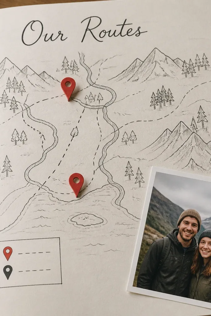
This is the page I make when the couple’s story is more about places they revisit than big trips. A hand-drawn map looks personal because it’s imperfect, and the paper pins add dimension. It works best when you can name two or three places you keep returning to: your go-to coffee shop, the park, or the street where you had your first big talk. The red pins pull attention without overpowering photos. The styling principle is a mini legend — it makes the map feel like a real artifact.
Draw a rough map outline in pencil first — keep it simple, like two streets and a park area. Ink over the main lines with a fine black pen and lightly shade water or park areas with a soft gray pencil. Create two or three pin shapes from red cardstock, about 1.25 inches tall, and glue them on top of the map at the right spots. Add a small photo in a corner, matting it to about 3.5x4.5 inches. Make a legend box at the top right with two lines: “Home spot” and “Talk spot,” written in small caps.
Editor's noteUse a white gel pen to add tiny highlights on pin edges so they look dimensional.
Skip thisAvoid trying to draw a real city map — it looks inaccurate and stressful.
19. Night Stand 'Us' Shadow Box Page
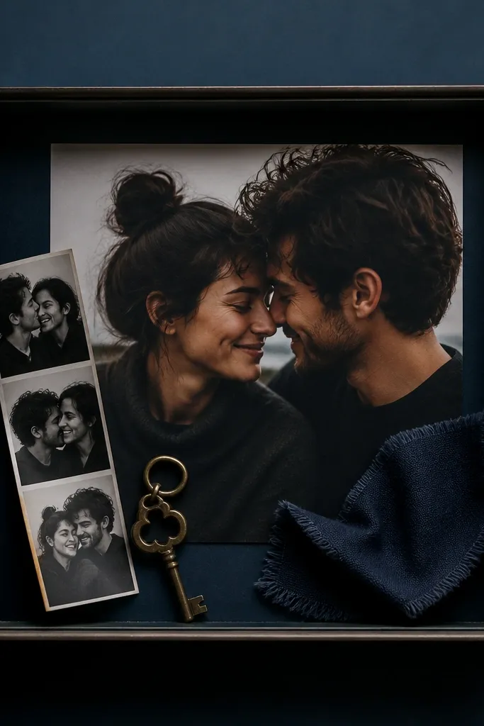
This layout is for the anniversary pages you want to feel like a physical keepsake you’d put on a nightstand. The shadow box look adds depth, and the key charm or small token makes it feel specific to your relationship. I like it when you have a single object that already means something: a hotel key, a small coin from a trip, or a charm from a necklace. The dark background keeps the 3D items from blending in, so the texture reads clearly. The styling principle is depth with restraint — only three or four objects inside the frame.
Cut a shadow box frame from chipboard or thick cardstock, about 10x10 inches, and glue it to a dark blue base. Create a recessed area by layering a thin foam sheet or double-sided tape inside the frame so items sit above the background. Add your main photo centered behind the frame, matting it to about 6x6 inches. Place a key charm, a folded photo strip, and a tiny fabric scrap inside the frame on top of the foam. Glue everything down with small dots so it doesn’t look messy around the edges.
Editor's noteUse a clear top layer or laminate over the frame opening if you’re worried about dust.
Skip thisAvoid adding loose items that can fall — keep everything glued so it stays neat.
20. Two-Color 'Love Letter' Banner Layout
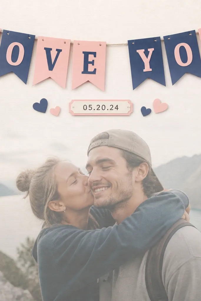
This one is clean, readable, and great when your boyfriend likes straightforward design. Cut-out banner letters look sharp and don’t require tons of tiny embellishments, which is why it looks good even with fewer photos. The two-color system keeps the page from getting noisy, especially if your photos have patterns in the background. It flatters darker outfits because the banner provides contrast. The styling principle is bold text placed on top of a slightly subdued photo so the words stay legible.
Pick two cardstock colors that match your photos — I like cream with deep green, or white with charcoal. Print your main photo and lighten it slightly by adding a translucent tissue-paper layer behind it, if needed. Create a banner strip across the top, about 11 inches long and 2 inches tall, then cut letters out of the second cardstock color. Glue the banner letters directly onto the banner strip and place it across the photo area. Add a small date label (about 3 inches wide) at the bottom and write the anniversary year in black marker. Finish with one small heart sticker near the date label, not scattered everywhere.
Editor's noteUse a cutting machine if you have one; hand-cut letters are fine if you keep them thick and simple.
Skip thisAvoid skinny letter fonts — they tear easily and look flimsy.