
1. Cream + Terracotta Ticket Stack Page
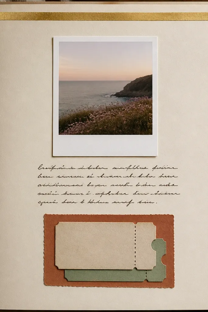
This spread looks expensive because the base is calm. Use cream cardstock (not bright white), then add a terracotta paper mat so your photos feel warmer and skin tones look natural. The ticket stack adds a tactile “date proof” texture without clutter. I like pairing dark brown ink with this setup because it reads like pen-on-notebook, not “craft marker.” It flatters warm-toned photos and works great for coffee dates, movie nights, and any day you have receipts for.
Start with an 8.5 x 11 sheet folded to 8.5 x 5.5, or cut a 12 x 12 page if you prefer big spreads. Cut a terracotta mat to 7.5 x 4.75 inches and center it. Layer your main photo on a white polaroid mat (about 4 x 6 photo with a 0.5-inch border) and place it above the ticket stack. Glue tickets with a slight stagger, then add a thin strip of gold washi tape across the top edge like a header. Finish by writing 3 short lines under the tickets using a ruler to keep the text level.
Trim ticket edges with a craft knife so you get clean corners — it makes the whole page look intentional.
Don’t use neon pens or black ink here; the contrast is too harsh against cream and terracotta.
2. Navy Night Photo + Silver Foil Stars
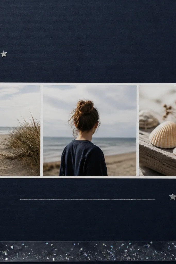
Night photos look best on deep navy because they stop being gray and start looking cinematic. Add silver foil accents so highlights in the photo (streetlights, phone screens, headlights) echo on the page. I use star elements sparingly — just a few clusters near the corners — because too many stars makes it look like a party invitation. This setup works especially well for dates with lights: city walks, concerts, nighttime drives. It also flatters cool skin tones and darker hair because the navy doesn’t overpower you.
Cut a navy cardstock base to your page size (I use 12 x 12 for this). Add a photo strip mat in black or charcoal, sized about 10 x 4.5 inches, centered horizontally. Place the photo across the mat and glue only the edges so it stays flat. Add 6-10 silver star decals or punch-out stars in two corner clusters, leaving the center clean. Write journaling on a small strip of white paper (about 10 x 1 inch) and underline with silver gel pen before gluing it to the bottom.
If your star stickers are thick, warm them under your palm for 10 seconds so they press down without lifting edges.
Skip glitter glue on navy; it catches light unevenly and looks messy in photos.
3. Pressed Flower Corner with Clear Tape Frame
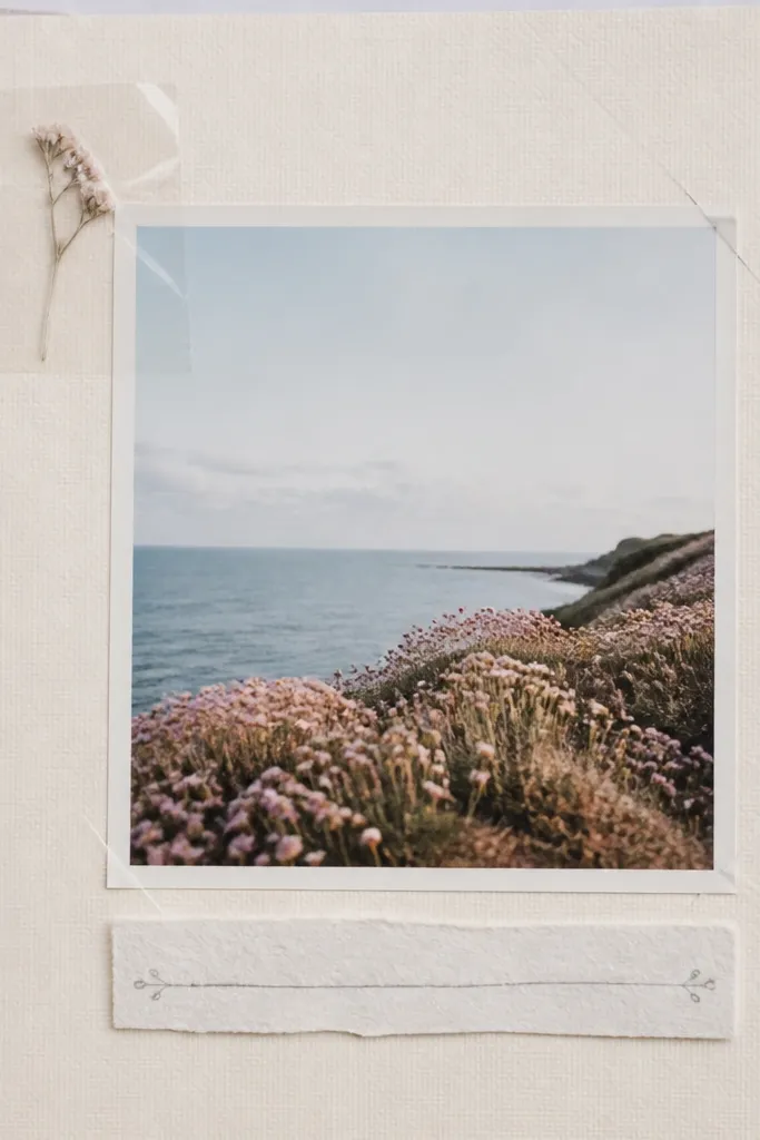
This is one of my favorite “simple but not boring” pages. Pressed flowers add natural texture without taking over the layout. The clear tape frame makes it look like a tiny museum display and keeps the flower from shifting. I use soft gray ink and pale pastel paper (sage, blush, or powder blue) so the flower stays the focal point. This flatters close-up photos like hands holding, bouquets, or a cozy moment on a couch. It also works well for anniversaries where you want something gentle, not flashy.
Start with a pastel cardstock base and cut a photo mat that’s 0.5 inches larger than your photo on each side. Place the photo center and glue down. Press a small flower (tiny petals work best) and trim it so it sits flat. Cut a clear tape square slightly larger than the flower, lay the flower on the tape, then fold/press the tape edges down to form a clean frame in the corner. Add a narrow journaling strip under the photo and write 2-4 lines with gray ink, keeping the text aligned to the strip.
Editor's noteUse a craft iron on low with parchment paper over the flower if you need faster pressing — it helps the petals stay flatter.
Skip thisDon’t use oversized flowers; big blooms lift and wrinkle under tape and ruin the crisp look.
4. Polaroid Border with Washi Tape Checklist
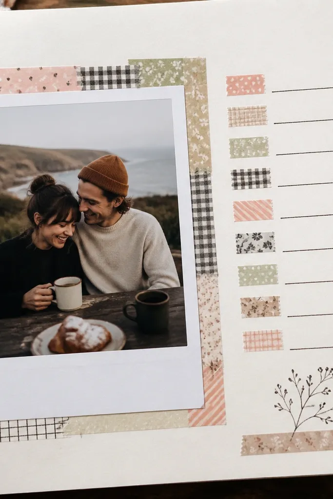
This page looks playful and organized at the same time. The polaroid border gives your photo a classic frame, and the washi tape checklist turns memories into something your boyfriend will actually read. I use black pen for the checklist because it stays crisp on patterned tape. The key is to limit the washi to one theme — like stripes plus one solid color — so it doesn’t feel random. This works best for casual photos: road trips, beach days, and “we tried that place” nights.
Cut a polaroid mat for a 4 x 6 photo: about 5 x 8 inches overall with a 2-inch white bottom label area. Place it slightly left of center for a modern look. Build a thin border using washi strips that are 0.25-0.5 inches wide, only along the top and sides first. Then write a checklist on the right using 4-6 short items like “late fries,” “walked in the rain,” “picked the best song.” Add washi tabs behind each checklist line by gluing tiny rectangles so the tabs show a different color for each line.
Editor's noteKeep checklist items under 3 words so the page stays airy and readable.
Skip thisDon’t cover the checklist with too many patterns; one busy tape plus black pen is enough.
5. Fabric Swatch + Button Date Header
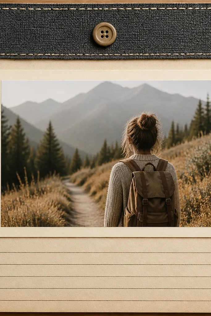
If you want texture that looks handmade, fabric wins. A charcoal or cream fabric swatch adds depth that paper alone can’t. The button date header makes it feel like a keepsake from a sewing kit, not a sticker sheet. I use a photo mat in warm cream so the fabric doesn’t go dull. This page flatters high-contrast photos like outfits, jackets, and restaurants with dark walls. It also looks great for boyfriends because the materials feel “real,” not overly cutesy.
Cut a fabric swatch about 3.5 x 1.5 inches and hem or zigzag stitch the edges if you can. Create a header strip on the page using cardstock (about 12 x 1.5 inches for a 12 x 12 layout). Glue the fabric to the header, then sew a small button on top or glue it securely with fabric glue. Place a cream photo mat under the header and center your photo. Write journaling in a single column beneath the photo using a fine-tip pen so it stays sharp against the fabric texture.
Editor's noteUse double-sided tape for the fabric first, then add one drop of glue under the button so you don’t seep glue through the weave.
Skip thisSkip cheap glitter buttons; the sparkle looks flat and plastic in real photos.
6. Map Coordinates + Tiny Thread Line
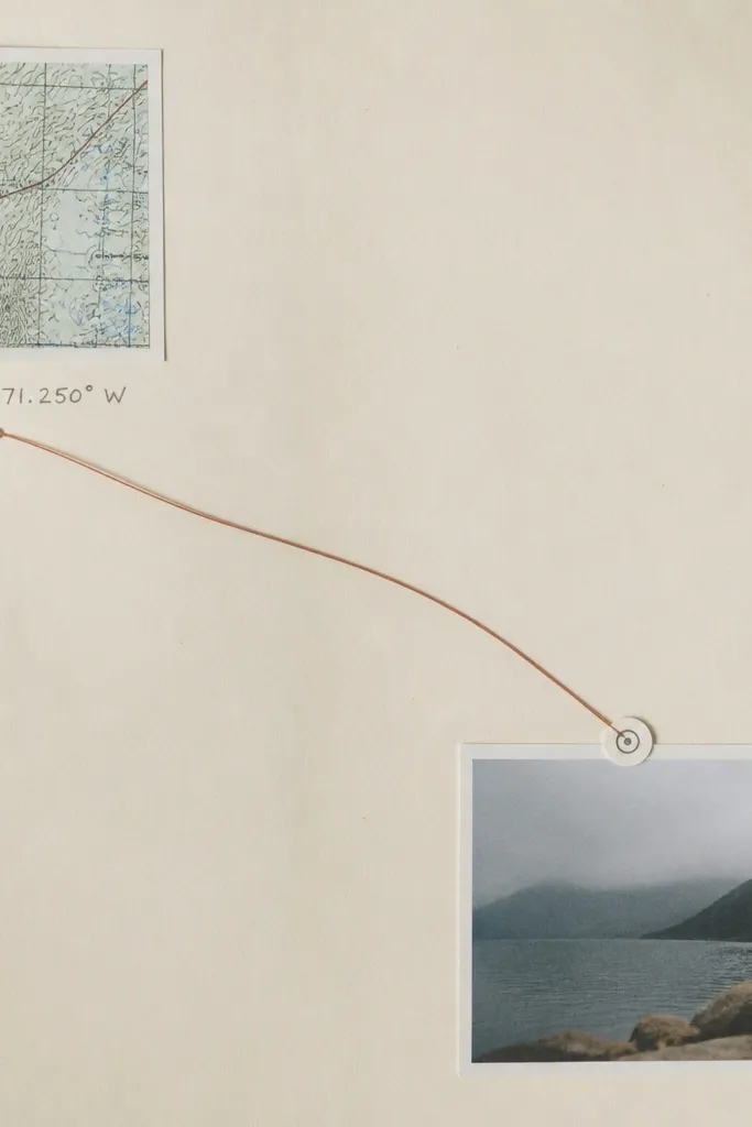
This layout feels personal without needing a lot of stuff. Coordinates tie the memory to a real place, and the thread line gives a “path” you can trace with your eyes. I use a small map print (not a full map page) because too much map makes the spread look cluttered. The thread line makes it feel like you drew the route by hand, which photographs well. This is perfect for travel weekends, meeting up in a new city, or any place that matters.
Start with a light gray or off-white cardstock base. Cut a map square about 3 x 3 inches and place it in the top-left. Write coordinates next to it in small neat text. Cut a piece of thin embroidery thread and glue it along a gentle diagonal path toward where you’ll place the photo. Add tiny glue dots under the thread line every 1-2 inches so it stays taut. Place your photo on a small mat (about 4 x 6) in the lower right and add a tiny label circle on the photo corner.
Editor's noteUse a ruler when drawing the thread path on paper first, then glue the thread over your guide lines.
Skip thisDon’t stretch the thread too tight — if it bows, it looks like a mistake instead of a route.
7. Conversation Ticket Foldout
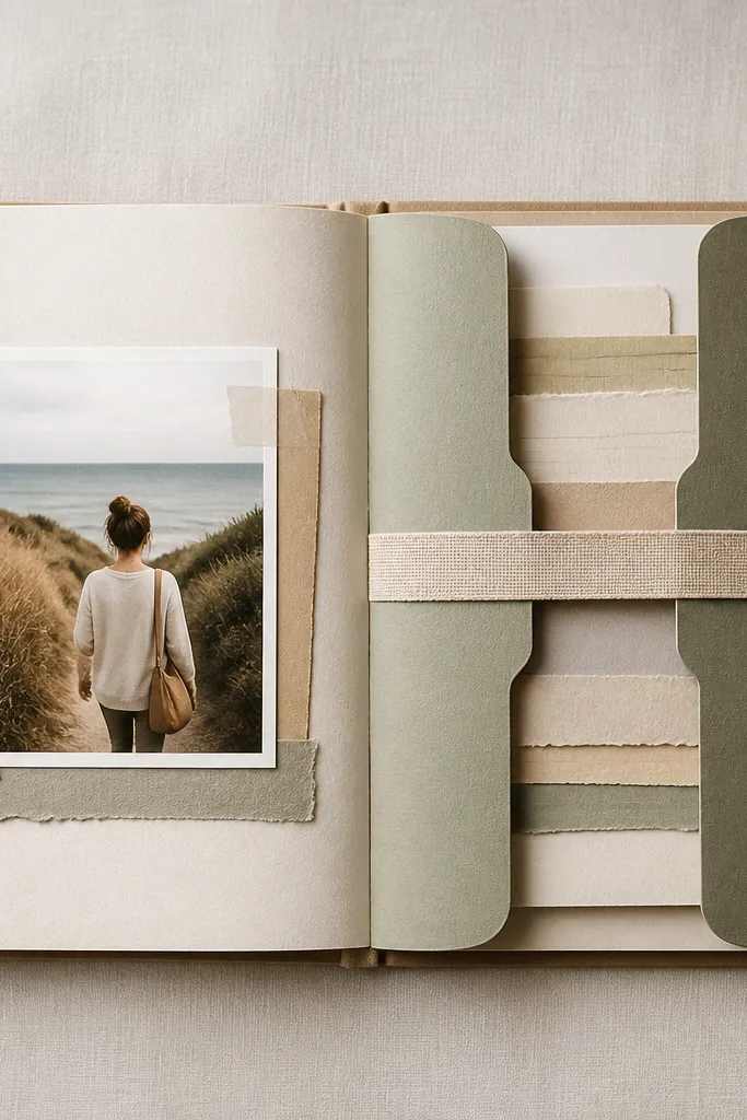
Foldouts look way more “kept” than flat pages because they create a reveal. This one mimics a conversation ticket — perfect for inside jokes, love notes, or the exact lines you texted. The belly band keeps it from flopping and makes the page feel interactive. I keep the messages on narrow strips so they look like little slips, like something you’d pull from a pocket. This works for boyfriends because it turns your words into a tangible thing he can reread.
Create a foldout insert on the right side using a strip of cardstock about 10 x 6 inches, scored at 5 inches. Decorate the outer cover with a small photo corner or a simple caption label. Inside, glue 3-5 narrow journaling strips (about 3 x 5 inches each) spaced vertically. Add a belly band across the foldout using a 1-inch wide paper strip that wraps around the insert and holds it closed. Place your main photo on the left page and write one short sentence under it so the foldout carries the rest of the story.
Editor's noteUse a ruler to keep the message strips aligned — the foldout looks clean only when the edges match.
Skip thisDon’t use bulky embellishments on the foldout cover; it makes the insert hard to close.
8. Game Night Scoreboard Layout
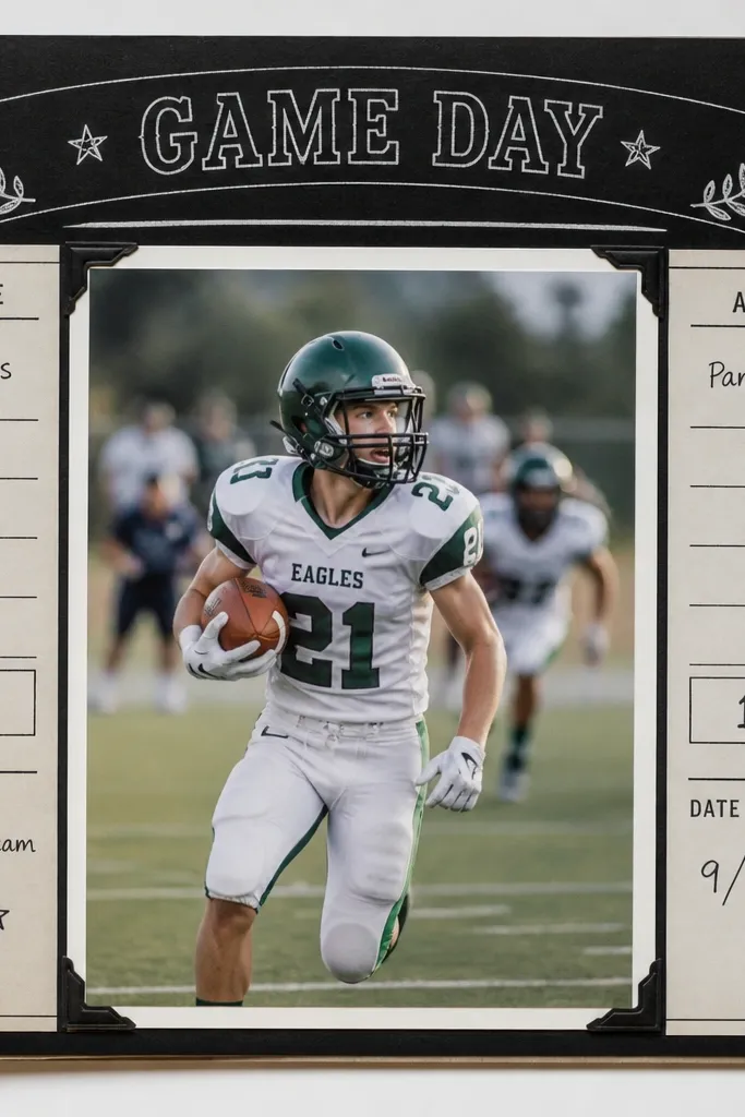
This is the page I make for my boyfriend when we’ve got a “who won” memory. The scoreboard layout gives structure, and it’s naturally aesthetic because it looks like graphic design. Use black cardstock headers and white gel pen for crisp contrast. The photos look sharper because the surrounding area is dark and the photo gets a bright mat. This flatters sports photos, board game nights, and any date where there’s a playful competition. It reads clearly even if the journaling is short.
Cut a black header strip about 12 x 1.25 inches across the top. Write the title in white gel pen, centered. Place your main photo in the middle on a light gray mat (about 6 x 9 inches). Add two side columns: left for “Team A” score, right for “Team B” score, each column about 2.5 inches wide. Write a date line and one sentence under the scores. Finish with a small “final” label at the bottom using a white sticker or cut paper rectangle.
Keep your font consistent by using the same pen for both the header and the scores.
Skip colorful marker splatter; it turns the page into a messy poster.
9. Matte Photo + Outline Sticker Frame
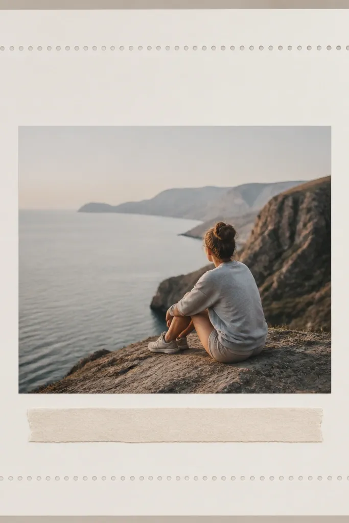
Glossy photos can glare under overhead light, and matte photos look calmer and more “gallery” in a scrapbook. When you pair a matte photo with an outline sticker frame, you get a crisp border without heavy paper layers. I like using small dot corner stickers because they add charm but stay controlled. This works for portraits, outfit photos, and any image where you want the boyfriend’s face or a key object to stand out. The muted look is also flattering if your photos have mixed lighting.
Print or mount a matte photo and place it centered on a light beige mat with a 0.5-inch border. Add outline stickers around the photo edges like a picture frame. Put corner accents (tiny stars or mini circle stickers) only at the four corners. Write journaling on a strip of paper about 10 x 1 inch and glue it under the photo. If you want extra polish, add a thin underline with a fine black pen.
Press stickers down firmly with a bone folder so edges don’t lift and cast shadows.
Don’t use thick chipboard frames here; they create uneven height and blur in photos.
10. Candlelight Glow with Yellow Washi Gradient
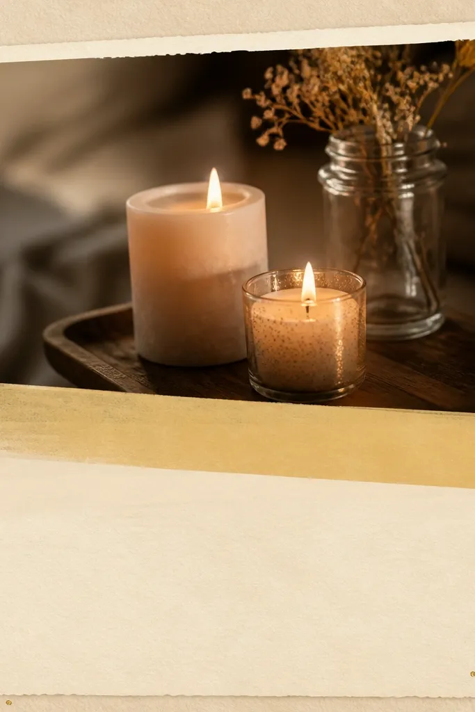
Candlelight dates look best with warm tape gradients, because the page echoes the glow in the photo. Yellow washi tape gives a soft halo without overpowering the image. I add gold dots sparingly around corners to mimic small highlights — not glitter. Use this layout when your boyfriend’s photos have warm lights, string lights, or restaurant lighting. It also flatters skin tones because the yellow warms the overall page palette.
Start with a light warm base like ivory cardstock. Place your photo center on a white mat. Create a diagonal washi gradient across the page behind or slightly over the photo, using overlapping strips of yellow tape in two shades (light and medium). Tear the tape edge by hand so it looks organic, then press it down with a bone folder. Add a cream journaling strip under the photo and write 2-4 lines in dark brown ink. Finish with 4-6 small gold dot stickers at the corners.
Test the tape placement by holding the photo in place first — you want the glow band to sit behind the darkest part of the image.
Don’t use bright neon yellow; it makes the photo look sickly.
11. Sticker + Stamp Layered Corner Tag
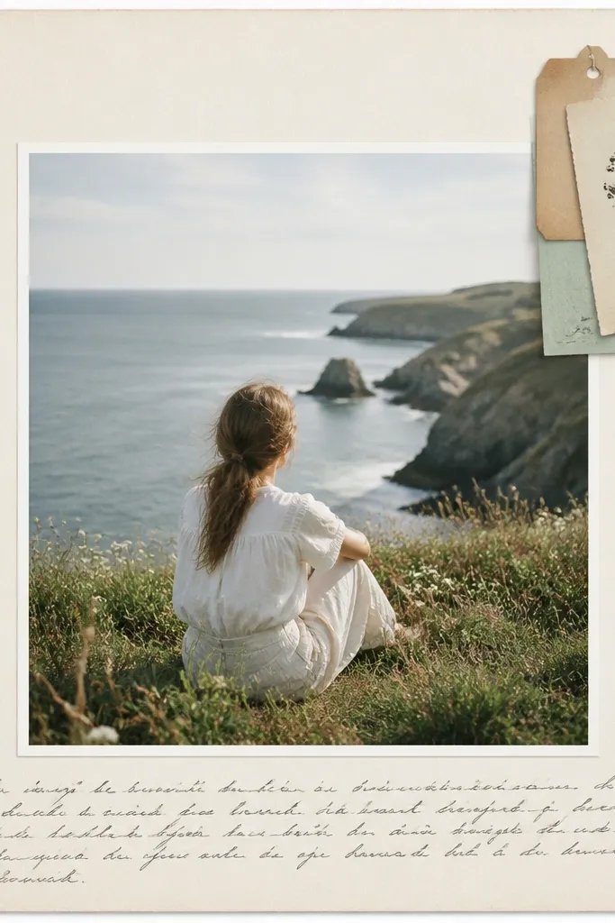
Corner tags are my go-to for adding personality without covering the whole spread. Layered stickers plus a small stamp icon give that “found on a trip” feel. The main photo stays the hero, and the tag adds a secondary focal point. I use a monochrome stamp (like black or dark gray) so it doesn’t fight with patterned stickers. This works for birthdays, where you want cute but not childish, and for trips where you have small souvenirs.
Cut a small tag shape from cardstock (about 3 x 1.75 inches) and round one corner. Layer one sticker strip across the top of the tag, then add a stamp icon in the center. Punch a tiny hole at the top and add a short piece of twine or baker’s string tied into a loop. Glue the tag to the top-right corner of the page. Place your photo center with a simple mat, then write journaling along the bottom using a single line and a date stamp style font.
Editor's noteUse a stamp pad that matches your journaling ink color so everything looks like it belongs together.
Skip thisAvoid stacking too many big stickers on the tag; it turns into a blob.
12. Clear Acetate Window + Photo Reveal
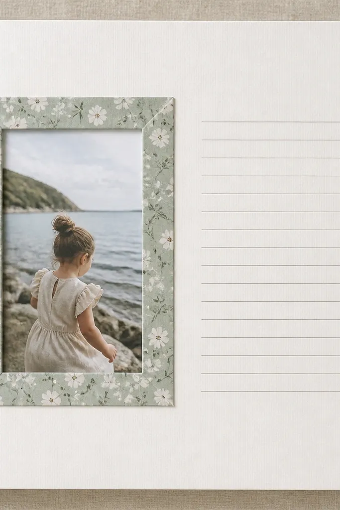
Acetate gives a clean, modern “window” look, and it also protects photos from smudges. When you hide part of the image behind the acetate, you get a reveal effect that looks intentional. I like this for date nights because the photos often have shiny details (drinks, candles, street reflections). The acetate makes those highlights pop without adding more clutter. It also flatters darker photos because the window brightens the area.
Cut a rectangle opening on a patterned paper layer, about 4 x 6 inches, and glue that patterned layer down first. Cut a clear acetate rectangle the same size and tape it behind the opening with double-sided tape so it stays flat. Place a smaller photo behind the acetate so it’s visible through the window. Frame the window with a second paper strip around the edges (about 0.25-0.5 inches thick). On the right side, add a journaling block using a white cardstock rectangle about 5 x 7 inches and write 3-5 lines with a fine pen.
Use a craft knife and a cutting mat for acetate so your edges are straight; crooked windows look messy fast.
Don’t use wrinkled acetate; it creates ripples that show up badly in photos.
13. Receipt Pocket + Mini Zine Notes
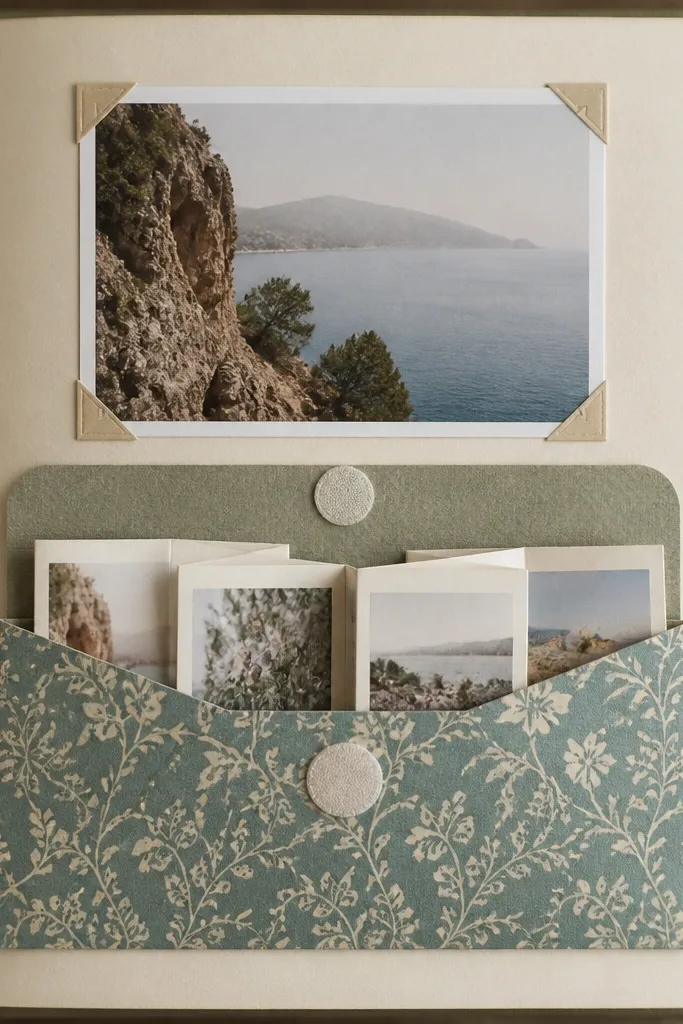
This setup is for when you have lots of little things but you don’t want the page to look like a junk drawer. A receipt pocket holds the proof, and a mini zine gives you space to write without cramming. The pocket also keeps paper from bending, which matters if you plan to flip through the book often. I use patterned pocket paper so the pocket looks like part of the design, not an afterthought. This works for birthdays and anniversaries where you have more writing than photos.
Create a pocket using patterned cardstock: cut a 12 x 6 inch piece, fold it to make a 6-inch tall pocket, and glue only the sides and bottom. Leave the top open with a flap if you want closure. Make a mini zine from 3-4 panels of 5 x 6 inch paper folded accordion-style, then tuck it into the pocket. Place a photo above the pocket on a mat about 8 x 5 inches. Add a small closure dot using velcro or a button and elastic so the pocket stays shut. Write a short caption under the photo so the pocket content has context.
Editor's noteUse thicker paper for the zine panels so they don’t wobble inside the pocket.
Skip thisDon’t glue the pocket to the page with too much adhesive on the top edge; it can make the flap sticky and hard to open.
14. Monochrome Outfit Pages with Color Pop Tag
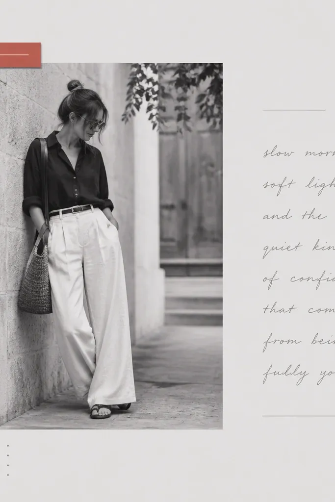
Monochrome photos look clean and expensive, and then one small color pop keeps it from feeling sterile. I pick one accent color from the photo — like a teal hoodie or red scarf — and use it on a tag label. This layout is great for outfit shots, museum days, and “we dressed up” moments. It also flatters almost every skin tone because the background is neutral and the accent points your eye. The vibe is modern and boyfriend-friendly without leaning into cartoon cuteness.
Print your outfit photo in black and white and mount it on a light gray mat with a 0.5-inch border. Keep the page background pale gray or off-white. Cut a small tag label from your chosen accent color (about 3 x 1 inch) and write a short label in white or black pen. Place the tag near the top-right corner of the photo mat. Add journaling under the photo in gray ink using a ruler for straight lines. Finish with two tiny dot stickers in the accent color — one near the tag, one near the journaling.
Editor's notePull the accent color from the photo using your phone screen — match it closely so it looks intentional.
Skip thisDon’t add multiple accent colors; the whole look depends on one pop.
15. Hand-Drawn Map Route with Washi Mileage Markers
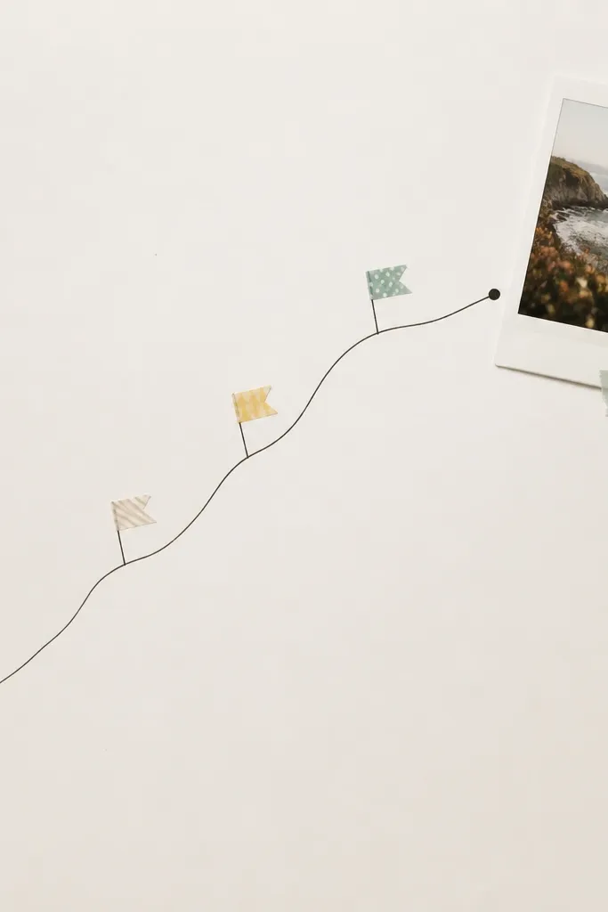
This is the page I use when we walked a route, visited a trail, or did a long day of errands that felt like an adventure. A hand-drawn route line looks personal because it’s imperfect in a good way. Washi tape flags mark key stops and keep the page from looking like a chart. I use black ink for the route and one washi color family so it stays aesthetic. This works best for landscape photos, city walks, and any time you have a “we went from here to there” story.
Start with an off-white base and lightly sketch a diagonal route with pencil. Use black fineliner to trace over the pencil route. Place small washi tape flags on 3-5 spots along the line, each flag about 0.5 inches wide, torn by hand for a natural edge. Add your end photo at the end of the route, on a mat about 4.5 x 7 inches. Write a short label beside the photo in small neat handwriting. Glue everything down only after you like the route thickness and spacing.
Editor's notePractice the route line on scrap paper first so your ink line stays steady and not shaky.
Skip thisDon’t make the route line thick and heavy; thick lines overpower photos.
16. Love Letter Envelope with Wax Seal Look
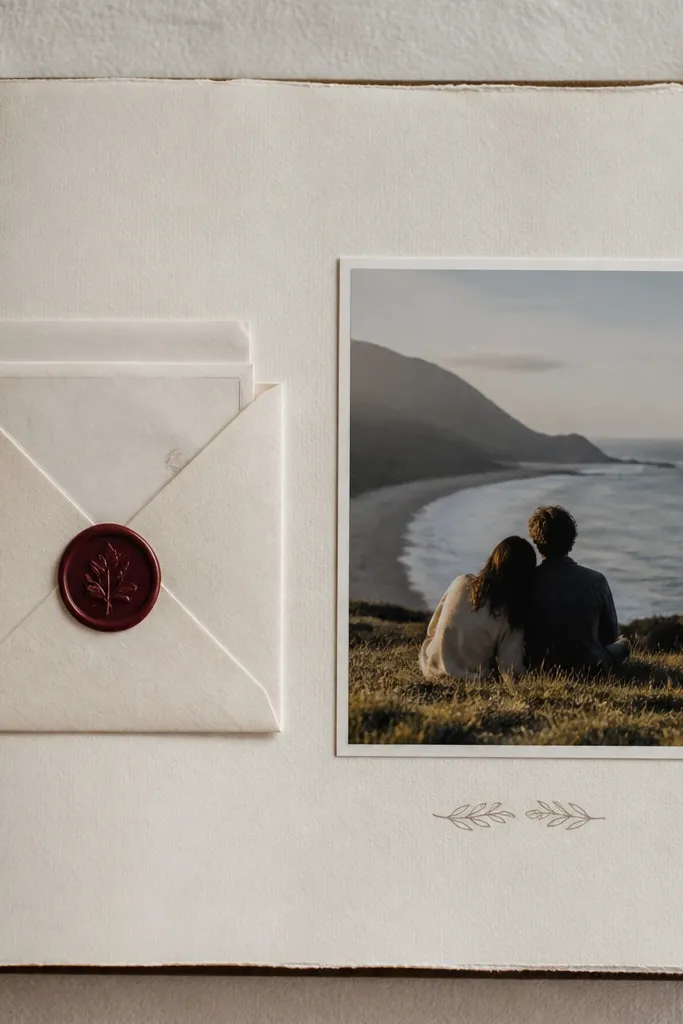
A letter envelope makes the scrapbook feel like a real keepsake, and the wax seal look adds drama without messy wax. I like burgundy or deep green seals because they match most romantic photos and don’t clash with skin tones. The envelope also solves a practical problem: loose notes get bent. This setup is perfect for anniversaries, long-distance updates, and any moment you want to write something you don’t want to print. It reads intimate and stays photo-friendly.
Cut an envelope pocket from cardstock: about 6.5 x 4 inches folded, with a 1-inch flap at the top. Glue the pocket to the left page, leaving the top opening accessible. Insert a letter folded into thirds so it peeks out slightly. Add a wax seal sticker to the flap center, or use a circle paper seal with a dotted pattern if you don’t have stickers. Place a photo on the right page on a light mat, then write a short caption under it. Keep journaling on the page minimal so the letter feels like the main event.
Write the letter first, then fold it and test-fit before you glue the pocket — this prevents a too-tight pocket.
17. Sticker Mosaic Photo Backing
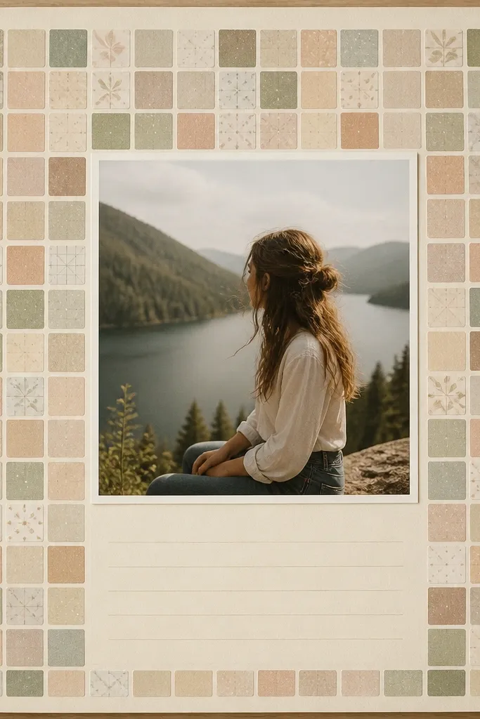
This page looks trendy because the background has pattern, but the photo stays clean. The mosaic sticker backing creates a soft confetti effect that fills empty space without feeling chaotic. I keep sticker colors muted — creams, sage, dusty pink, and one dark accent — so it doesn’t fight the photo. This works best for bright, cheerful pictures where you want the scrapbook to match the energy. It also flatters busy photos because the pattern is small-scale and doesn’t overwhelm details.
Choose a photo and cut a mat that matches it with a 0.5-inch border. Create the mosaic backing on a separate sheet: fill a rectangle the size of your photo mat with small sticker squares, mixing only two to three color families. Glue the mosaic backing behind the photo mat so the stickers show around the edges. Place your photo on top of the mat and press down firmly. Add journaling below on a plain cream strip so the writing stays readable. Use a fine-tip black pen for consistent lines.
Editor's noteBefore gluing, lay the sticker mosaic without adhesive for 2 minutes and adjust until the densest sticker area sits behind the photo center.
Skip thisDon’t use giant stickers in a mosaic; large pieces break the pattern and look uneven.
18. Silk Ribbon Belly Band with Mini Tag
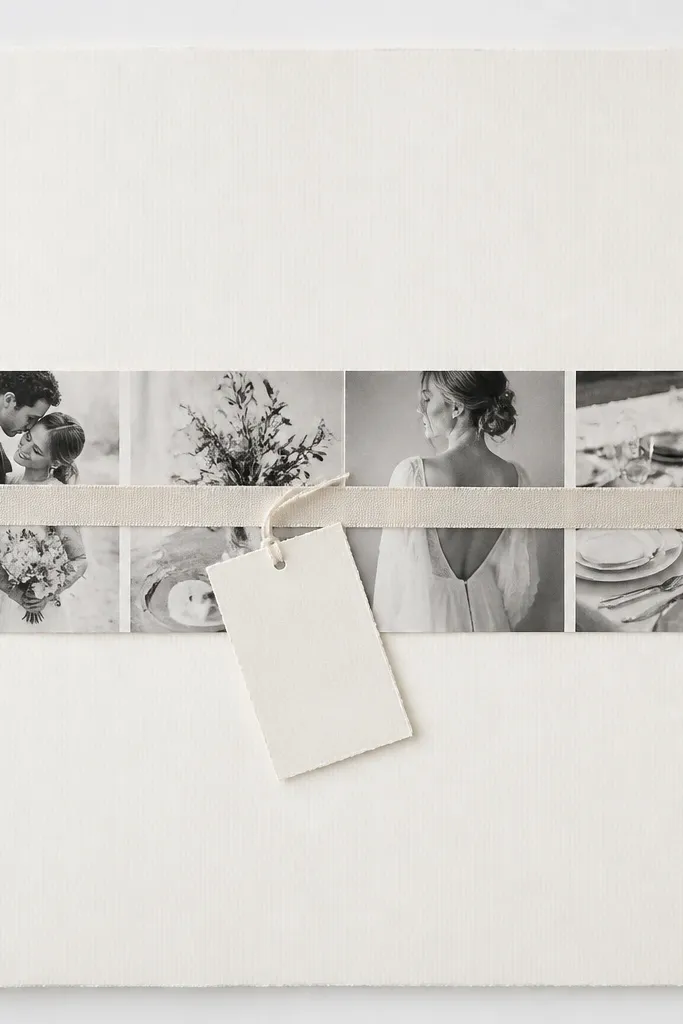
Belly bands make pages look styled because they create a clear horizontal line across the scrapbook. A thin silk ribbon looks softer than paper banding and feels more “real” when you flip through. The mini tag gives a place for a short label like a location or nickname. I use neutral ribbons like ivory, taupe, or soft gold so it works with almost any photo set. This is perfect for anniversary gifts and for boyfriend scrapbooks where you want classy, not childish.
Cut a photo strip mat about 10 x 4.5 inches and center it on the page. Place your photo(s) on the mat and glue. Wrap a thin ribbon across the middle like a belt — position it so it covers the photo strip without hiding faces. Tie a small knot on the side and trim the ends at a diagonal. Add a mini tag below the knot using cardstock about 2.5 x 1.25 inches, punched with a hole for string. Write a single short label on the tag and glue the tag string to the ribbon for stability.
If your ribbon frays, singe the ends with a lighter briefly so it stays neat.
Don’t use wide ribbon; it covers too much photo and makes the page bulky.
19. Film Strip Layout with Date Frames
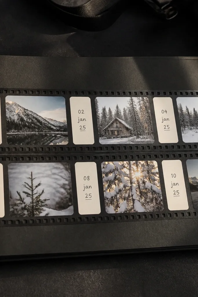
Film strip layouts instantly read as “aesthetic scrapbook,” because they mimic something real you’d find in a camera bag. Small frames keep the page from feeling heavy, and the date labels make it feel like a timeline. I use a dark background with cream labels so everything stays readable. This works for boyfriends because it feels nostalgic without being overly cute. It also flatters small photos — like quick snapshots from dates — because the layout gives them structure.
Pick a dark charcoal or black cardstock base. Cut a long rectangle about 11 x 3.5 inches for the film strip area. Create 5-7 small photo frames inside it, each about 1.5 x 1.1 inches, with small gaps between. Add date labels under or inside each frame on cream paper strips. Glue the film strip down and add a cream journaling block below with 2-4 lines. Use a fine white gel pen for tiny frame numbers or ticks if you want extra realism.
Editor's noteUse the same mat border thickness for every frame so the film strip looks even, not handmade-chaotic.
Skip thisDon’t stretch photos to fit frames; crop them so faces stay centered.
20. Coffee Stain Timeline with Real Tea Bag Labels
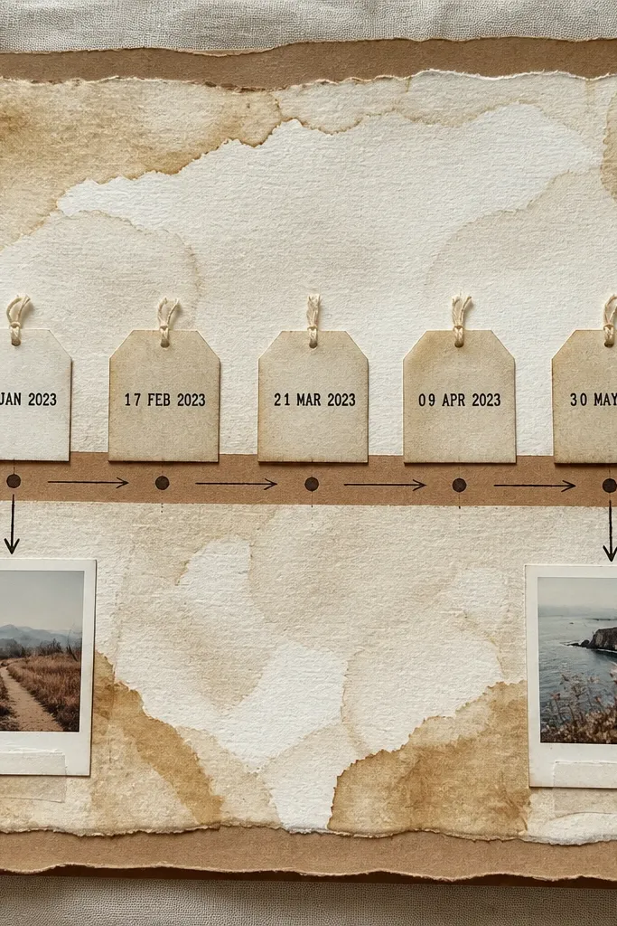
This page looks warm and lived-in because the background is made from brewed coffee, not printed color. I did this for my boyfriend’s birthday and the stains dried with tiny tide-like edges that make the whole page feel personal. The tea bag labels add a real texture — they’re slightly papery, and they take ink in a way that looks vintage without looking fake. A timeline format keeps the layout readable even if you add a lot of moments. It works especially well for long-distance dates or a “how we met to now” story because the page naturally moves forward.
Start with plain white cardstock or thick printer paper. Brew a mug of strong coffee, then dip a wide foam brush lightly and drag it in horizontal bands across the page, leaving a few clean gaps so it doesn’t look muddy. When it’s dry, cut a kraft paper strip the width of your timeline area and glue it down so it looks like a label track. Cut tea bag labels off used tea bags and flatten them under a heavy book for 10 minutes. Stamp or write dates on the labels, then tape them in a straight row on the kraft strip, using a ruler to keep spacing even. Finish by adding two mini photos in the bottom corners and connect each photo to a label with a hand-drawn arrow in black gel pen.
Editor's noteUse strong coffee and apply it in thin passes. If you flood the page, the stains dry too dark and you lose the lighter, smoky edges.
Skip thisSkip instant coffee — it dries blotchy and makes the stains look like a spill instead of a wash.