1. Faux Leather Wrap Cover with Copper Button Closure
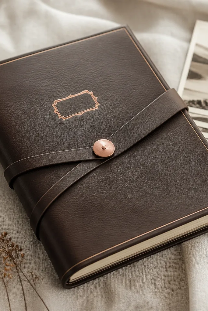
This cover looks expensive because faux leather gives you depth, and the copper button adds hardware weight. I use espresso or black-brown faux leather with a matte finish — it doesn’t glare in photos like shiny vinyl. The cream trim makes the center feel brighter, so it flatters light skin tones in your photos and looks good under warm indoor lighting. It works best for boyfriends who like classic, slightly rugged aesthetics — think watches, bikes, or old books. The key principle is wrapping tension: the strap holds everything tight so the cover corners stay crisp.
Cut two pieces of binder board (or thick chipboard) to your scrapbook size and one spine strip that’s about 1.5-2 inches wide, depending on how thick the pages will get. Cover the front board with faux leather, leaving a 1/4 inch margin on all sides, then fold and glue on the back with a smooth, firm press. Add a cream mat strip to the front — 1/2 inch smaller than the board on each side — then place a copper-foil label centered at eye level. Attach the copper button so the wrap strap crosses over it with slight tension, not loose fabric.
Press a craft bone folder along every fold line before you glue so the faux leather edges look sharp instead of wavy.
Skip hot glue blobs on the leather — they show as shiny bumps and ruin the clean front.
2. Navy Linen Cardstock with White Stitched Border
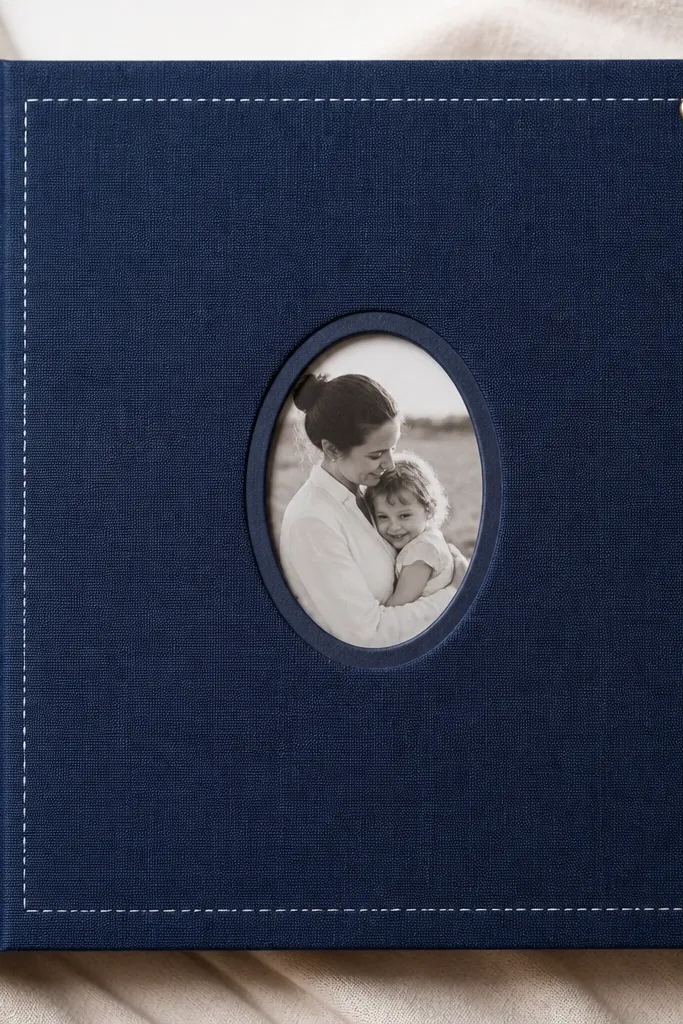
Linen-texture cardstock looks expensive because it has tiny fibers that catch light softly. Navy is also forgiving — it hides pencil marks and makes warm photo tones pop. The white stitched border adds the illusion of craftsmanship without bulky hardware. This style flatters almost every boyfriend vibe: it reads clean for minimal guys and cozy for sentimental guys. The principle here is framing — the center panel sits inside a crisp border so your eye lands immediately on the photos.
Choose navy linen cardstock at least 65 lb or thicker. Cut a front panel and then a center mat panel that leaves a 3/4 inch border around all sides. Add a stitched border by using a white gel pen to draw evenly spaced “stitch” dots along the mat edges, then lightly connect them with short lines. Place an oval photo window (or a rectangle with rounded corners) and secure it with a thin strip of double-sided tape around the edges only.
Use a white gel pen with a smooth tip so the stitch marks look like thread, not scratchy pen lines.
Don’t use glossy paper for the center panel — it makes the linen look cheap by contrast.
3. Black Mat Board with Clear Vellum Pocket and Gold Foil Tag
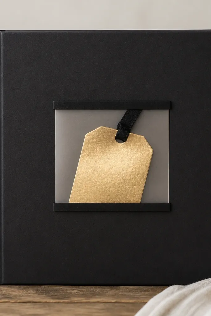
This one reads expensive because vellum adds a layered, see-through depth that looks intentional. The black background keeps everything high-contrast, so gold foil looks like real metal. I like this for boyfriends who enjoy clean design — it feels modern without being cold. It also works well for couples who want a “reveal” element since the vellum pocket hides a tag until you lift it. The principle is controlled transparency: the pocket edges are clean and tape-free so it doesn’t look like a school craft.
Start with a black mat board base and cut a front window area where the vellum will sit. Cut a vellum pocket from 8.5x11 vellum or vellum sheets: make the pocket about 1 inch smaller than the front panel so it doesn’t touch the edges. Attach the vellum pocket with thin double-sided tape strips only along the sides and bottom, leaving the top flap area free if you want it to open. Add a small gold foil tag centered inside, then place a small photo behind the vellum window using photo-safe adhesive.
Burnish the vellum edges gently with your fingertip so they look crisp and don’t curl.
Skip thick glue under vellum — it creates cloudy lumps you can see from the front.
4. Cream Cardstock Cover with Faux Marbled Accent Strip
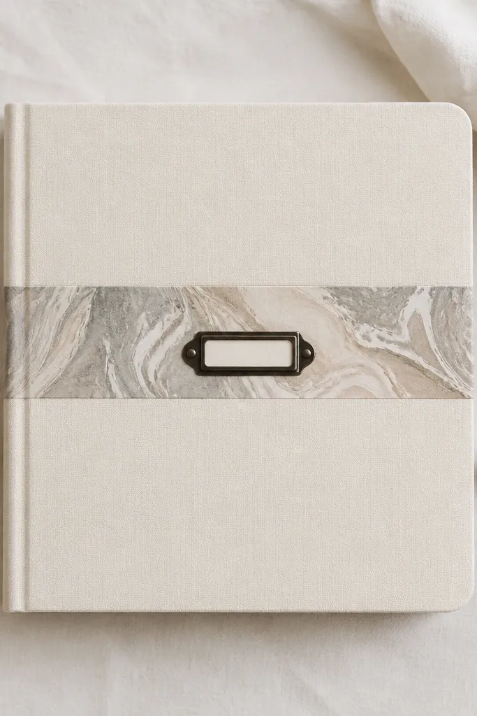
A cream base makes everything look polished because it gives your photos room to breathe. The marbled strip adds the “expensive” texture without needing actual marble or fancy prints. I did this with acrylic paint and a simple comb pattern, and it photographs like a designer stationery set. This style suits boyfriends who like understated design — clean, calm, and slightly artsy. The principle is one hero texture: you add one textured element and keep the rest plain.
Cut your cream cover base and then a center strip area where the marbled accent will sit. Make the faux marble: dab gray and taupe acrylics on a plastic sheet, drag a comb through lightly, then press paper to pick up the pattern. Let it dry flat, then trim the strip so it’s about 1.5 inches tall and runs edge to edge with 1/4 inch side margins. Glue the strip onto the front, then add a small black label (printed or lettered) centered on top of the marbling.
Editor's noteUse a matte clear spray on the finished cover so the paint doesn’t rub off onto your fingers.
Skip thisDon’t add multiple busy patterns — marble plus florals plus stickers reads cluttered fast.
5. Olive Green Fabric Cover with Skinny Black Elastic Closure
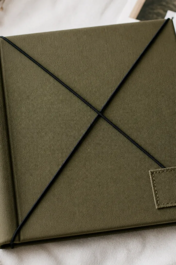
Fabric covers look expensive because they feel finished and they soften the edges. Olive green is a great choice for a boyfriend because it pairs with wood tones, denim blues, and warm skin tones in photos. The thin black elastic closure is the trick — it creates a clean, taut look instead of a bulky button. This style works for outdoorsy or practical boyfriends who like tactile things. The principle is to keep the closure simple and the surface matte.
Cover thick chipboard with olive fabric using fabric glue or spray adhesive, pulling tight so wrinkles don’t form at the corners. Trim the fabric around the edges and fold onto the back with a neat 1/2 inch wrap. Add a thin black elastic band across the front in an X shape — anchor it with small fabric-safe stitching or reinforced tape on the inside. Place a small stitched patch or fabric label on the lower right, centered and about 2 inches above the bottom edge.
Before final gluing, test the fabric stretch by pulling it slightly — if it distorts, switch to a tighter-weave fabric.
Avoid stretchy jersey fabric — it looks wrinkly and hard to keep flat.
6. Walnut Brown Paper with Heat-Embossed Name Plate
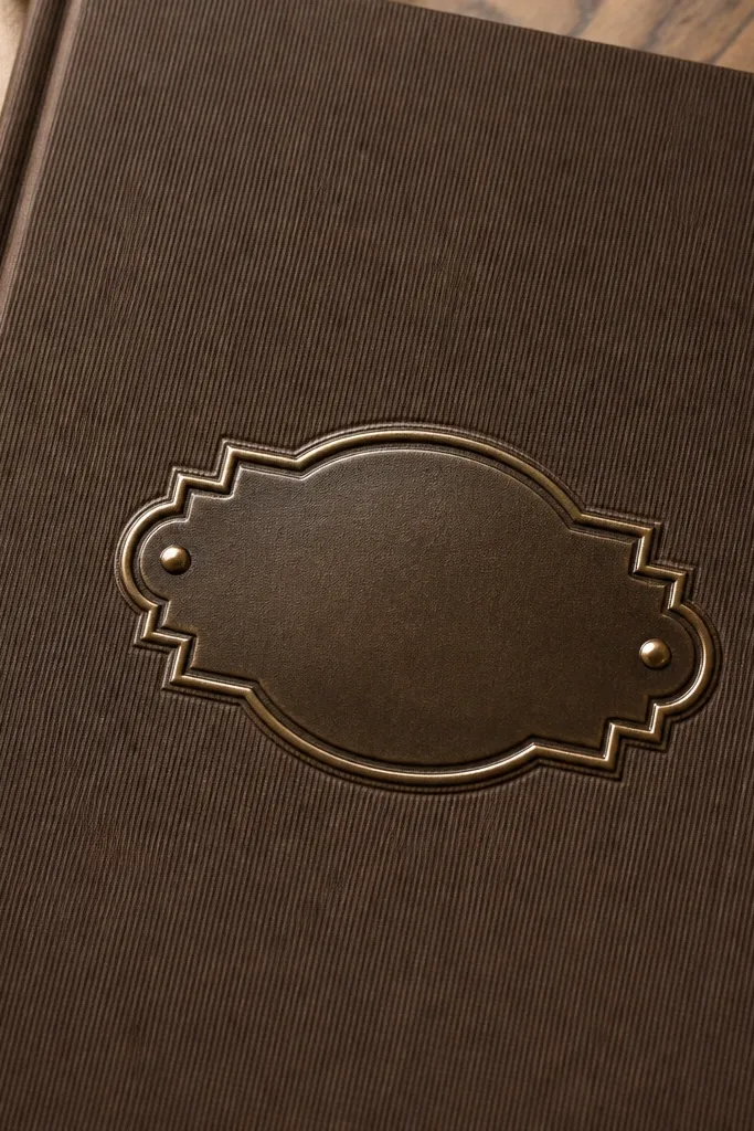
Heat embossing looks expensive because the raised surface catches light differently than printed text. Walnut brown paper gives warmth, and it makes the emboss look like a real plaque. I like this for boyfriends who love personalized gifts — it feels custom without being loud. It also photographs well because the emboss creates shadows that show up even in overhead lighting. The principle is contrast: raised emboss on matte paper.
Use walnut brown cardstock with a subtle texture (linen or lightly grained). Cut a small rectangle label area in cream or leave the walnut exposed, then stamp your design with emboss ink. Sprinkle emboss powder (brushed gold or champagne) and heat with a heat gun until it melts and turns glossy. Press the label onto the cover with double-sided tape so it sits flat and centered. Add two small corner dot details with a fine-tip gold paint pen for balance.
Editor's notePractice the emboss once on scrap — the right heat time makes the powder go smooth instead of speckled.
Skip thisDon’t touch the emboss surface right after heating — fingerprints ruin the glossy finish.
7. Charcoal Cover with "Book Spine" Tape Detail
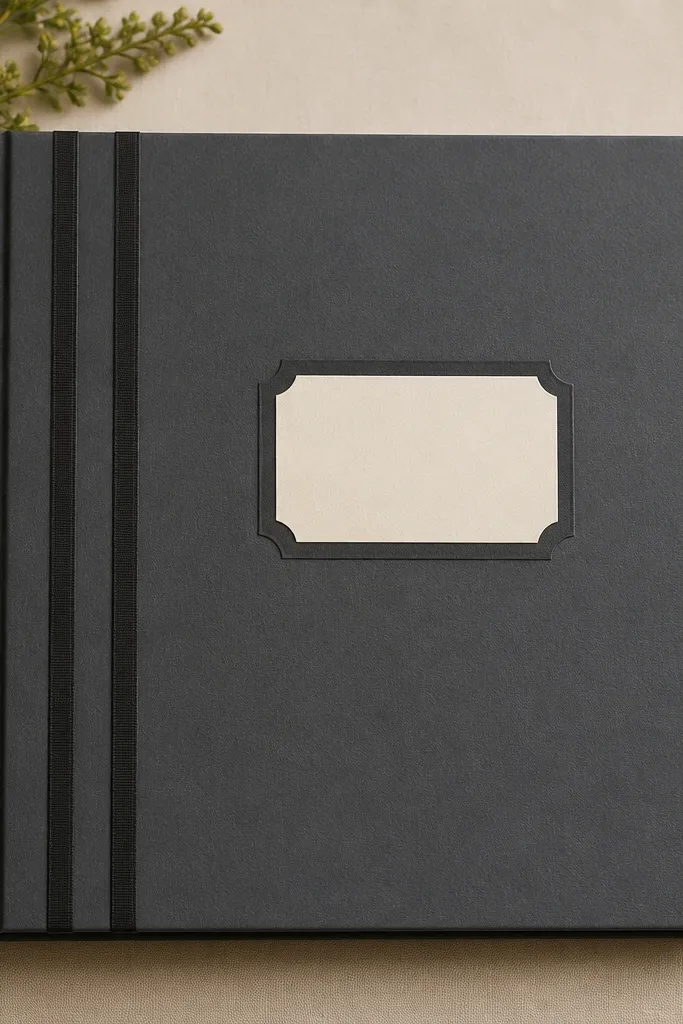
This style mimics a real book, and that’s why it reads expensive. The tape bands give a structured spine look even if your scrapbook isn’t thick yet. Charcoal-gray is also great because it hides smudges and pairs with almost any photo color. This works for boyfriends who like classic reading vibes or who keep things organized. The principle is building a spine illusion that matches the cover edges.
Start by covering your boards with charcoal cardstock. Create the spine bands using matte washi tape or fabric tape: three vertical strips spaced evenly, each about 1/4 inch wide. Keep the bands centered on the spine strip so the alignment looks intentional when the book opens. On the front, add a small cream title panel that’s 1 inch tall and spans about half the cover width, then attach a simple stamped word or printed title beneath it.
Use a metal ruler and press the tape down hard — uneven tape edges show immediately on charcoal.
Avoid shiny tape — it looks like decor, not a book spine.
8. Sand Beige Cover with Black Washi Frame and Leatherette Corners
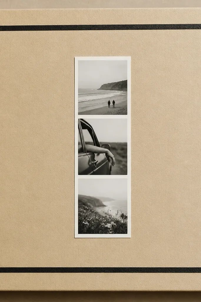
Beige plus black gives you instant “stationery store” energy. The leatherette corners add a finished edge detail that makes the cover look like it has hardware, even if it’s paper-based. I’ve used this for gifts when I want the cover to look upscale but still light enough to ship or carry. It’s flattering for warm-toned photos, and it hides small imperfections because the palette is forgiving. The principle is framing: a thin border plus corner accents makes the whole thing look designed.
Cut a sand beige base and add a black washi frame inset by 3/4 inch from the edges. Make corner pieces from leatherette or faux leather: small squares about 1 inch each, placed exactly in the corners with the same orientation every time. Add a black-and-white photo strip in the center using a thin mat so it doesn’t touch the frame. Finish with a tiny stitched effect on each corner piece using a brown marker or paint pen.
Editor's noteMeasure the frame opening once with calipers or a ruler and mark lightly — then stick all four sides without guessing.
Skip thisSkip thick borders — they look bulky and cheap on beige.
9. Steel Blue Denim Cover with Stitched Patch and Brass Eyelets
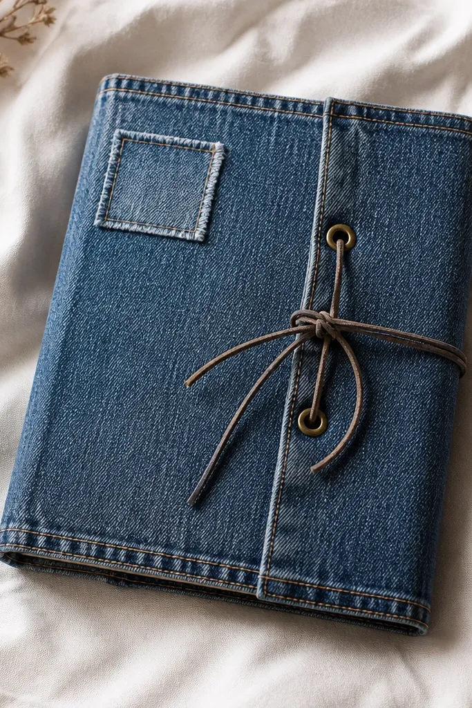
Denim is one of the fastest ways to get an expensive look because it already has texture and edge credibility. Steel blue also makes skin tones look warmer in photos, and it pairs perfectly with brass hardware. This cover works for boyfriends who wear denim, own boots, or like rugged aesthetics. The brass eyelets add function and style — the cord tie makes the cover feel secure. The principle is hardware + fabric: keep your design centered and let the material do the work.
Wrap denim fabric around thick chipboard and stitch the edges with a sewing machine or hand-sew using thick thread. Add a stitched patch using fabric adhesive first, then sew around the edges for a clean look. Punch two holes for brass eyelets near the top half of the front, spaced about 2 inches apart, and install the eyelets. Thread waxed cord through the eyelets and tie a small bow, then add a simple label patch on the flap area.
Use a denim needle and thick thread if you sew — thin thread pops loose on fabric edges.
Avoid frayed edges on purpose unless you’re matching the rest of the cover — random frays look messy.
10. White Glossy Photo Paper with Black Acrylic Nameplate
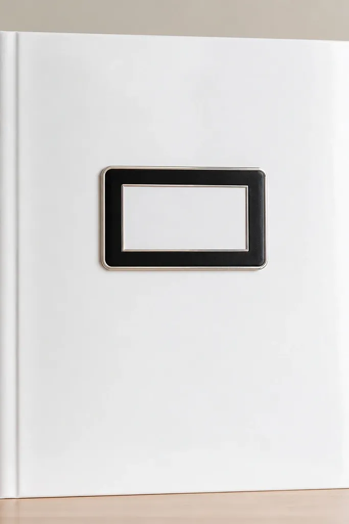
This one looks expensive because it’s high-contrast and clean. Glossy photo paper reflects light smoothly, and a black acrylic-style nameplate looks like a storefront sign. I used this when the boyfriend liked sleek tech vibes or minimal desk setups. It photographs like product packaging, especially with bright window light. The principle is restraint: one strong center element and perfect alignment.
Start with a white base board covered in glossy photo paper — smooth it carefully so no bubbles show. Cut a black acrylic-style nameplate backing from matte black cardstock and place it centered with 1 inch margins on each side. Add a thin silver border strip around the label using foil tape or metallic washi. Print or write the name on white paper, then sandwich it inside a clear pocket or laminate sheet so it looks like acrylic. Round the cover corners slightly and keep the spine edge perfectly aligned with the base.
Wipe your hands before handling glossy paper — fingerprints show as gray smudges.
Don’t layer too many stickers on glossy surfaces — they look like they’re stuck on top, not part of the design.
11. Rose Gold Foil Tape Stripe with Cream Paper Mat
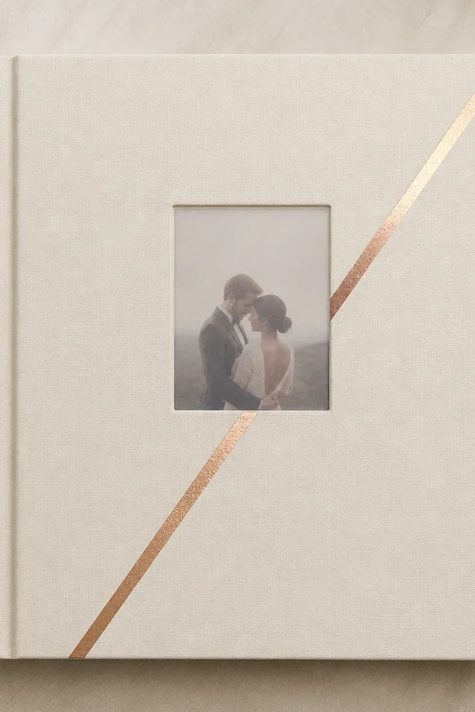
Rose gold foil is the shortcut to an expensive look because it reads like jewelry hardware. The trick is using it as a single line detail, not a full-on foil explosion. Cream paper keeps it soft and romantic, and the diagonal stripe adds motion that makes the cover feel custom. This works for boyfriends who like classy, date-night aesthetics — the kind who wears clean sneakers and watches the details. The principle is one metallic accent, placed with intention.
Cover your base with cream cardstock, then cut a center area mat that leaves a 1 inch border. Add a diagonal stripe of rose gold foil tape with a ruler, about 1/4 inch wide, starting 1/2 inch from the bottom left corner. Place a small photo or journaling card under a clear vellum window so the stripe shows through lightly behind it. Finish with black centered typography in a simple font style, either printed or stamped, small enough to keep the look airy.
Editor's noteBurnish foil tape with a fingernail or bone folder so it bonds and doesn’t lift at corners.
Skip thisSkip multiple foil colors — mixing rose gold with silver usually looks less expensive.
12. Deep Teal Window Cover with Layered Photo Mats
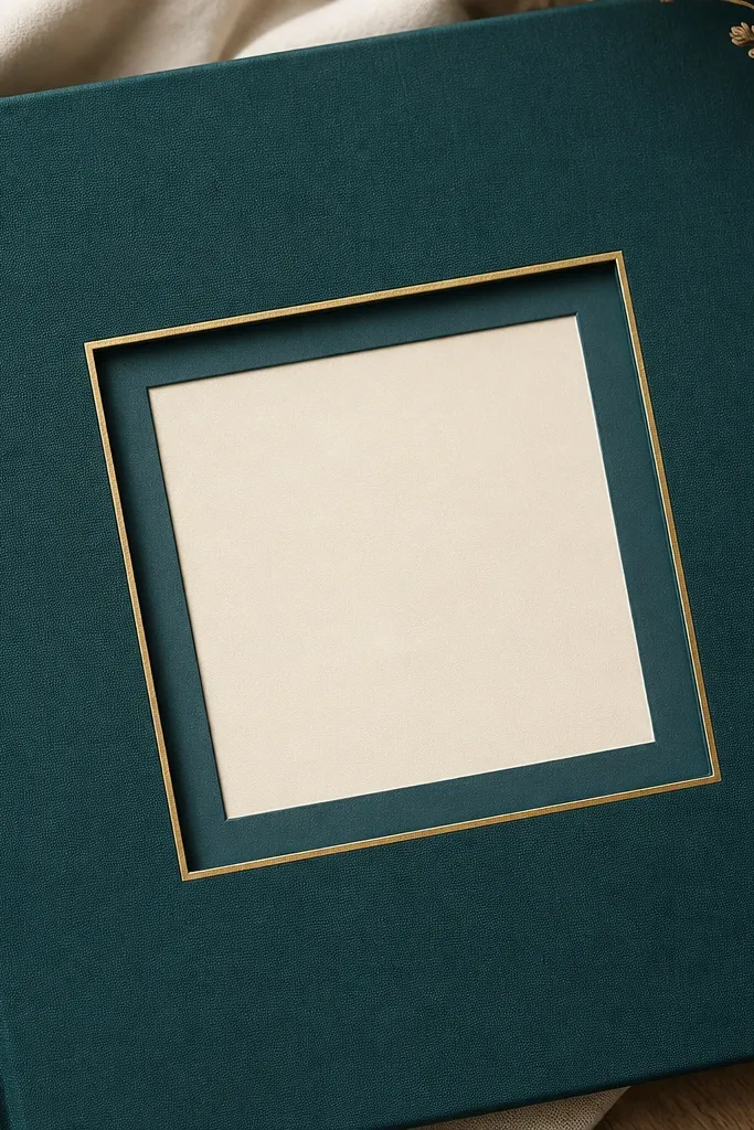
Window covers look expensive because they show the inside immediately, like a curated product. Deep teal gives a rich, moody background that makes prints look richer and skin tones warmer. Layered mats add dimensional spacing so the photo doesn’t look flat. This style works well for boyfriends who like bold color or who take photos with a strong theme. The principle is depth through layering — each mat is a step the eye can travel.
Cut a front window opening on deep teal cardstock or mat board. Build the photo stack: attach a dark teal mat first, then a cream mat on top with 1/8 to 1/4 inch offset so you can see both layers. Frame the window edges with thin gold tape applied carefully along the inside perimeter. Add a clear acetate sheet behind the photo for a clean, glossy window look. Secure the photo stack with photo-safe adhesive only on the edges so you don’t smear it.
Measure the window opening once and test with your photo print before gluing — small size mistakes are obvious in a window cover.
Avoid thick paper mats that crowd the window — it makes the cover look heavy and messy.
13. Black-and-Cream Patterned Paper Cover with Stamped Coordinates
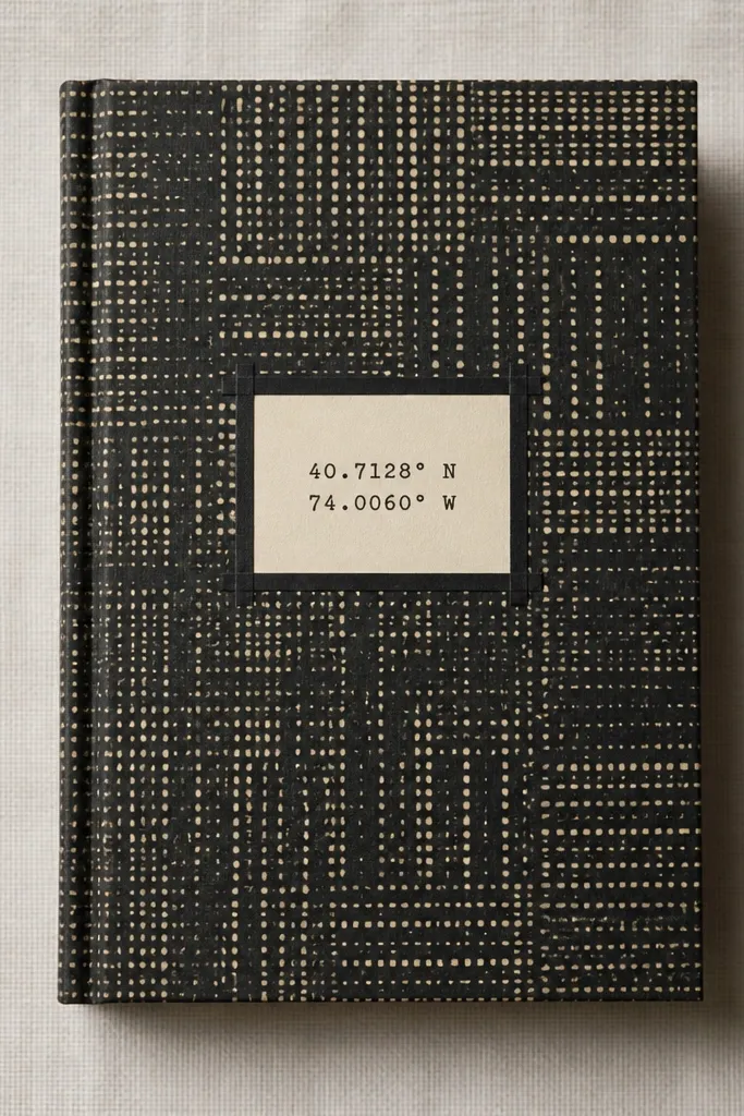
Patterned paper can look expensive if it’s controlled and paired with a crisp label. I use black-and-cream patterns with small scale so the cover still feels tidy. Stamped coordinates add a personal, boyfriend-friendly detail — like the place you met, his hometown, or the first date location. This style fits guys who like travel, maps, or anything sentimental but not overly sweet. The principle is keeping the pattern behind the design, not competing with it.
Cover the base with black-and-cream patterned paper and seal it lightly with matte medium if the paper is delicate. Cut a cream label rectangle about 3 inches wide and 5 inches tall and place it centered on the front. Stamp coordinates in black ink using a clear block so the lines stay straight; let it dry fully before touching. Add a thin border with black washi tape around the label, not around the whole cover. Leave the rest of the front clean so the stamped detail reads like a finished design.
Editor's noteUse a stamp press or firm hand pressure so the ink looks dense and not streaky.
Skip thisDon’t add extra stickers around the pattern — it turns into scrapbook chaos fast.
14. Grey Kraft Cover with Wax Seal Style Star Sticker and Twine
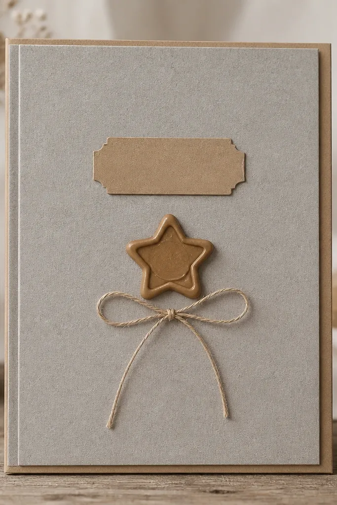
Kraft paper gives you instant craft credibility because it has natural texture, and that texture looks expensive when you keep everything minimal. A wax seal style sticker adds a “letter from an old friend” vibe without needing real wax. Grey kraft is cooler than brown kraft, so it looks more modern and works with black, white, and silver accents. This style flatters a boyfriend who likes simple, outdoorsy, or vintage details. The principle is contrast: rough kraft surface plus a clean, centered focal point.
Use grey kraft cardstock as your base, then add a slightly lighter kraft mat behind your focal area so you get subtle layering. Place a wax seal style star sticker centered on the front and add a small label strip above it with black text. Tie thin twine into a neat bow and anchor it with a small dot of double-sided tape on the back of the twine knot. If you want extra durability, seal the kraft front with a light coat of matte spray from 12 inches away. Keep the rest of the cover blank so the seal and twine are the only details.
Cut twine ends at an angle so the ends don’t look frayed after you tie it.
Skip shiny glitter stickers on kraft — they look pasted on and cheap.
15. Matte Black Cover with White Vinyl Lettering and Micro Polaroid Corner
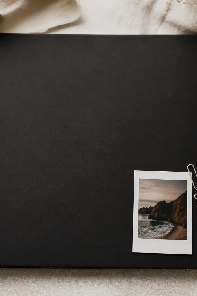
Matte black with white vinyl lettering looks expensive because it’s clean, sharp, and reads like signage. The micro polaroid adds a playful, boyfriend-friendly detail without taking over the whole cover. I like this for guys who like minimal design but still want a small wink of personality. The silver charm gives a tiny metal accent that catches light in photos. The principle is typography first: the letters must be straight and evenly spaced, then you add one small photo detail.
Cover your base with matte black cardstock or matte black faux leather for a smooth finish. Apply vinyl lettering using a cutting machine or pre-made vinyl letters; burnish each letter with a flat tool so edges don’t lift. Place a micro polaroid photo on the bottom right with a thin white mat border — about 1/4 inch — and secure it with corner tabs. Add a small silver charm by attaching a mini paperclip-style hook under the mat edge so it hangs slightly. Keep everything aligned with one vertical reference line so the cover looks designed, not assembled.
Use a small ruler to set the vinyl baseline before you peel the backing — crooked lettering ruins the whole “expensive” feel.
Don’t use thick foam tape under vinyl letters — it makes the letters look bumpy and less professional.