1. Maple Leaf Transfer Stripe Mug
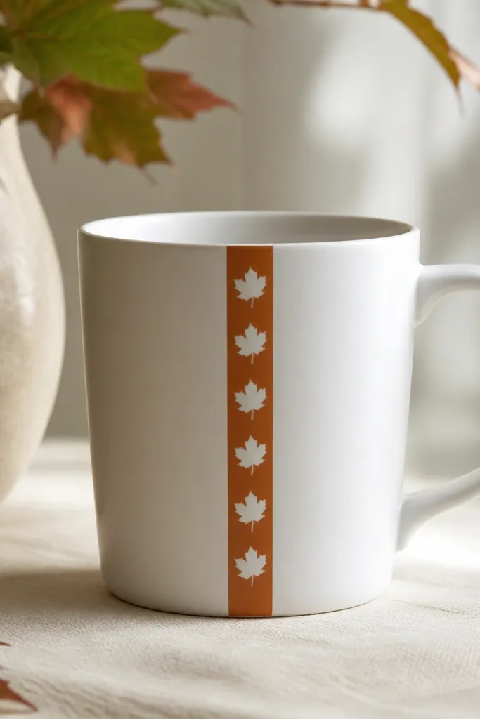
This design uses one strong stripe and a repeating leaf motif so the mug reads clean, even from across a desk. I like warm orange-brown because it pops against white and doesn't look flat. The leaf icons look sharp when you use a heat-set transfer and keep the stripe paint thin.
Wrap a strip of painter's tape around the mug at a slight angle, leaving a 1.5-2 cm band. Paint or transfer that band first, then press the leaf transfer onto the stripe while it's dry. Keep the leaves centered - aim for 7-10 leaves on a standard 11-12 oz mug so the spacing looks intentional.
Pro tipUse a cotton burnisher or the back of a spoon to press the transfer firmly, especially at corners of each leaf.
AvoidDon't flood the band with thick paint - it makes edges look fuzzy after the seal dries.
2. Tiny Constellation Night Sky Mug
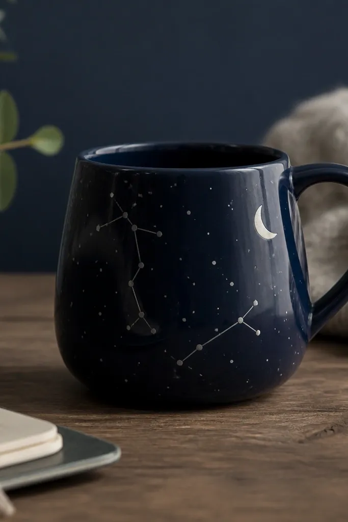
A night-sky design works because tiny details hide small hand-made imperfections. Navy looks richer than plain black, and the pale silver lines catch light when you move the mug. Dots and thin lines also survive sealing better than big, heavy shapes.
Base-coat the mug with navy ceramic paint (or chalky-style acrylic made for ceramics). Use a fine liner brush or a toothpick to dot 25-40 tiny stars. Add constellation lines with a 0.5 mm liner and a small crescent moon near the handle so the composition balances.
Pro tipLet the navy cure at least 24 hours before you add silver lines so the liner doesn't drag.
AvoidAvoid using glossy craft paint - it can stay tacky and smear under your clear coat.
3. Speckled Clay Glaze Look with Painted Rim
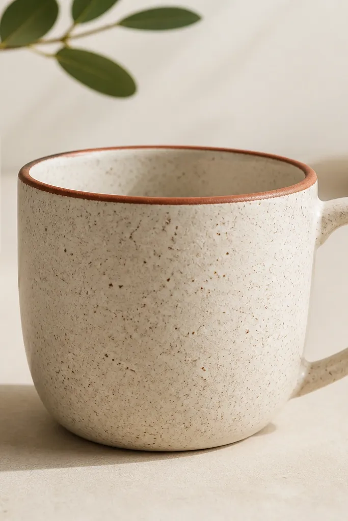
This one looks like a studio ceramic piece without needing glaze or firing. Speckling hides brush marks and gives that handmade ceramic texture. A thin terracotta rim makes it feel finished and frames the design area.
Mix off-white and taupe ceramic paint, then thin it slightly with ceramic medium until it drips like cream. Flick it with a stiff toothbrush over a cardboard shield so you only hit the mug front. Paint a 3-4 mm terracotta line around the top rim with a steady hand or tape guide.
Pro tipDo 2-3 light passes of speckling instead of one heavy flick for tighter control.
AvoidDon't paint over a wet speckle coat - it turns the texture into streaks.
4. Line-Art Rooster on Matte Black Background
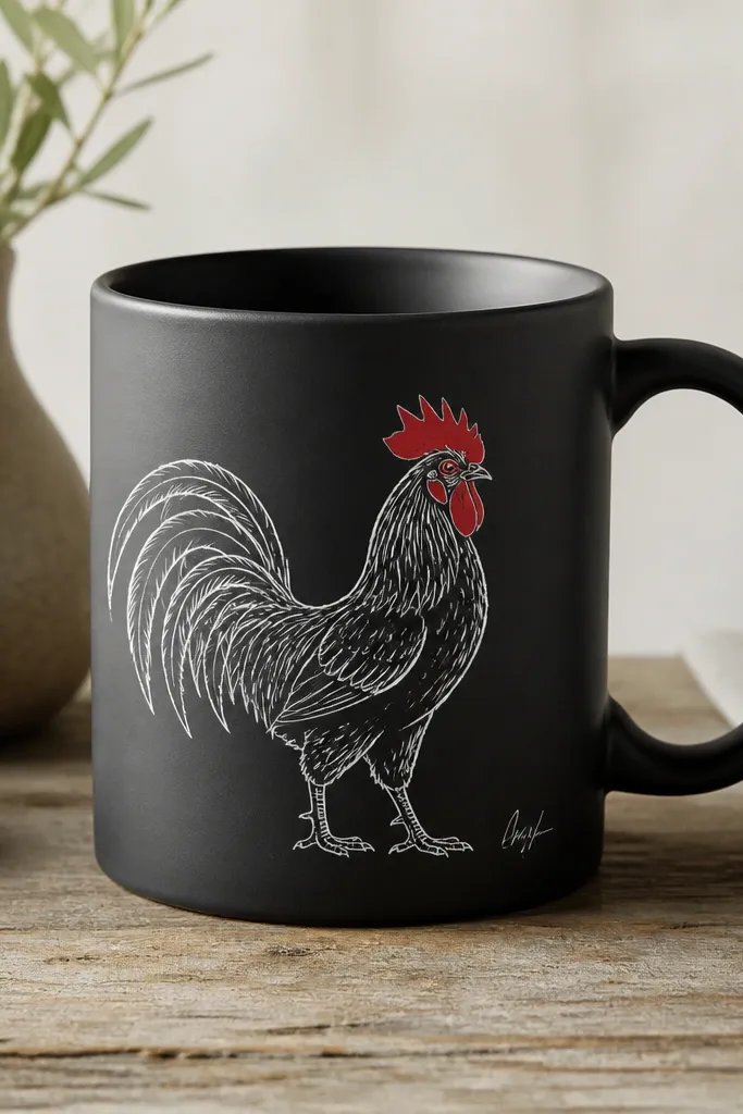
Matte black makes white line-art look crisp and graphic, almost like a screen print. The rooster silhouette reads well because line weight creates shape even if you're not perfectly steady. Tiny red accents in the comb bring warmth without clutter.
Paint the mug black using matte ceramic paint in thin coats (two coats usually cover). Use a stencil for the rooster or trace a printed outline onto transfer paper. Fill only the comb with red, then outline any gaps with a fine brush or paint pen.
Pro tipUse a paint pen for the smallest lines - it keeps consistent thickness.
AvoidSkip thick outlines - they look like stickers once sealed.
5. Watercolor Wash with Salt Texture
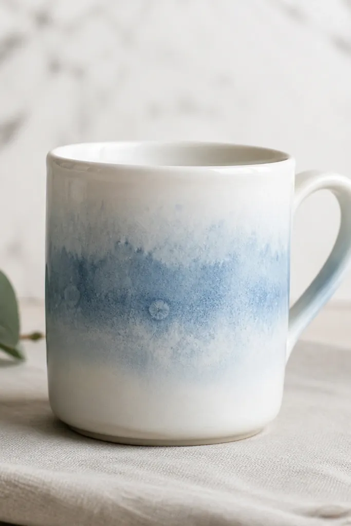
The salt texture gives you that natural, organic "ceramic watercolor" effect that hides uneven pigment. The gradient wash looks airy, and the speckles add depth without needing complicated art. This design is forgiving because watercolor-style textures forgive small application differences.
Wet the mug lightly with clean water (or use a thin base of watered ceramic medium). Apply pale blue watercolor-style ceramic paint in a gradient - darker at the top, lighter toward the bottom. While still wet, sprinkle coarse salt crystals on the blue area only, then let it dry completely before brushing salt away.
Pro tipUse coarse salt, not table salt, so the speckles stay visible after sealing.
AvoidDon't seal while the wash is still damp - you'll lock in smears.
6. Vintage Botanic Label Collage
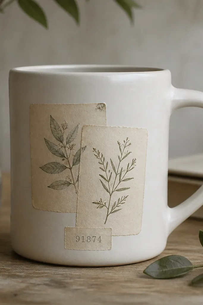
Collage designs look premium when the edges look intentional and flat. Botanical label art gives you natural color variation, so you don't need to paint much. I like this style because it hides small alignment issues behind layered paper strips.
Print or buy botanical label images on laser paper. Cut strips about 2 cm wide, then apply a thin layer of decoupage medium to the mug and press the paper down. Seal over the top with multiple thin coats, letting each coat dry between layers.
Pro tipUse a craft knife and cut the paper edges slightly uneven - it makes the collage look aged instead of pasted.
AvoidAvoid inkjet prints without sealing - they can bleed when you apply medium.
7. Monochrome Geometric Blocks
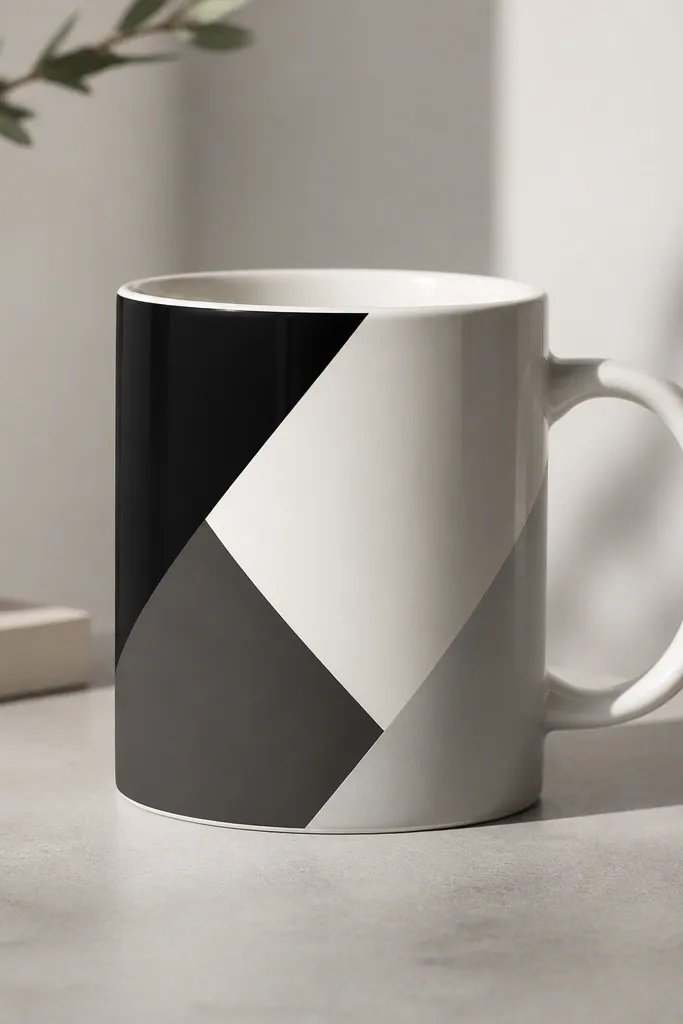
Geometric blocks are the quickest way to make a mug look designer. Monochrome keeps it classy and makes your lines stand out. Sharp tape edges make the difference between "DIY" and "designed."
Mark a diagonal grid lightly with pencil. Use painter's tape to mask three block areas, varying width by about 1 cm and leaving narrow gaps of white between shapes. Paint each block with a foam brush to avoid streaks, then remove tape after the paint is touch-dry.
Pro tipPull the tape back at a low angle to prevent paint tearing.
AvoidDon't stack wet paint under tape - it creeps and ruins the edge.
8. Handle Wrap Vinyl Lettering
Vinyl lettering is one of the cleanest ways to get crisp lines with no brush skills. It also lets you place text exactly where it looks balanced. A small icon like a heart keeps it from reading like plain labeling.
Use permanent vinyl made for glass/ceramics. Clean the mug with alcohol, then apply vinyl letters around the handle area so the text sits at about 30 degrees to the front. Seal with a thin clear ceramic-safe topcoat if you want better scratch resistance.
Pro tipPress vinyl with a firm scraper tool so it seals into the glossy glaze.
AvoidSkip cheap vinyl - it lifts at corners after a few washes.
9. Gold Foil Accent with Brush-Applied Glue
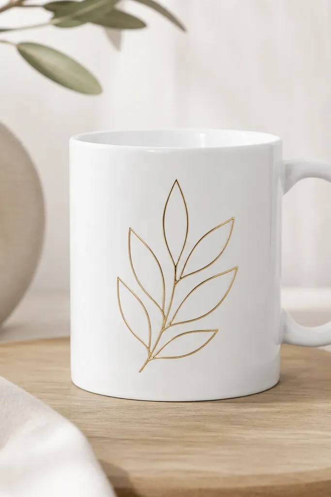
Gold foil makes a simple outline feel expensive fast. It works best as an accent, not a full coverage - foil is textured and forgiving on small areas. The leaf shape gives you an organic curve that hides tiny irregularities.
Sketch a leaf outline in pencil. Brush adhesive foil glue only inside the outline, let it get tacky (not wet), then press gold leaf over it. Burnish gently with a soft cloth, then remove excess foil with a light tap.
Pro tipUse a watercolor brush for glue so the glue line stays thin and even.
AvoidDon't seal foil with random craft varnish - some react and dull the gold.
10. Emoji-Free Smiley Face with Dot Eyes

This is a cute mug design that still looks handmade, not childish. Dot eyes and a simple smile let you control expression without over-detailing. Pastel yellow also makes the brown line-art feel warm and friendly.
Paint the mug pastel yellow with two thin coats. Use a fine liner brush to draw a curved smile and two dot eyes. Add one tiny highlight mark above the smile for personality. Seal after the paint cures fully.
Pro tipPractice your smile curve on paper first - the curve decides whether it looks friendly or weird.
AvoidAvoid thick paint lines - they dry raised and catch on spoons.
11. Monogram in a Faux Ceramic Stamp Style
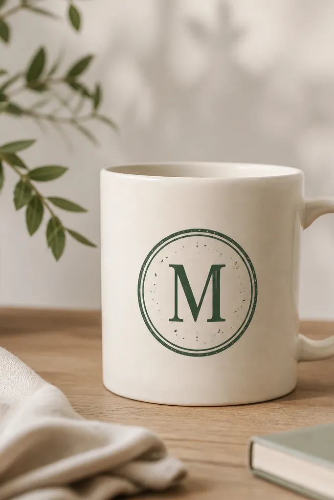
A stamp-style monogram looks like a custom pottery mark. The speckled border gives texture and hides tiny wobble from hand stamping. Dark green feels more "craft" than pure black and pairs well with creams.
Create a simple stamp border using a stencil and a sponge. Use a foam pouncer to dab dark green paint in the circle, then add the monogram letter with a brush. Keep the monogram about 5-6 cm tall so it sits nicely on an 11 oz mug.
Pro tipUse a stencil guide to keep the monogram centered on the mug curve.
AvoidDon't over-ink the stamp - heavy dab marks look muddy after sealing.
12. Chocolate Drip Border with Cocoa Speckle
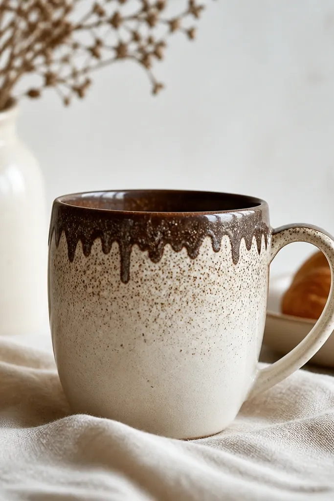
Drip borders look fun, and the speckles make it feel like a real dessert topping. This design works because the "action" is near the rim, where the eye naturally goes when you pick up the mug. The beige base keeps the brown from looking heavy.
Paint the mug beige, then tape a line 1 cm below the rim. From that line, paint 1.5-2 cm drips in dark cocoa brown, leaving gaps between drips. Add a speckle layer in cocoa using a stiff brush flick, then seal.
Pro tipMake the drips uneven - straight drips look like a mistake, uneven drips look intentional.
AvoidDon't let drips connect into a solid band - it flattens the look.
13. Four-Season Icons Around the Bottom Band
Icons around the bottom band look cohesive because they repeat as the mug turns. Keeping them small prevents overcrowding and makes the mug look tidy in photos. I like using limited colors - one per season - so the band stays readable.
Mask a bottom band about 2 cm tall with painter's tape. Paint the background of the band in off-white or leave it white. Add icons with a liner brush or small stencil: snowflake in light blue, leaf in green, flower in pink, sun in yellow. Seal with a mug-safe clear coat.
Pro tipSpace icons by measuring the mug circumference and dividing the distance evenly - spacing looks professional.
AvoidSkip tiny, thin details - they smear if you apply too much clear coat.
14. Ink Wash Portrait Silhouette
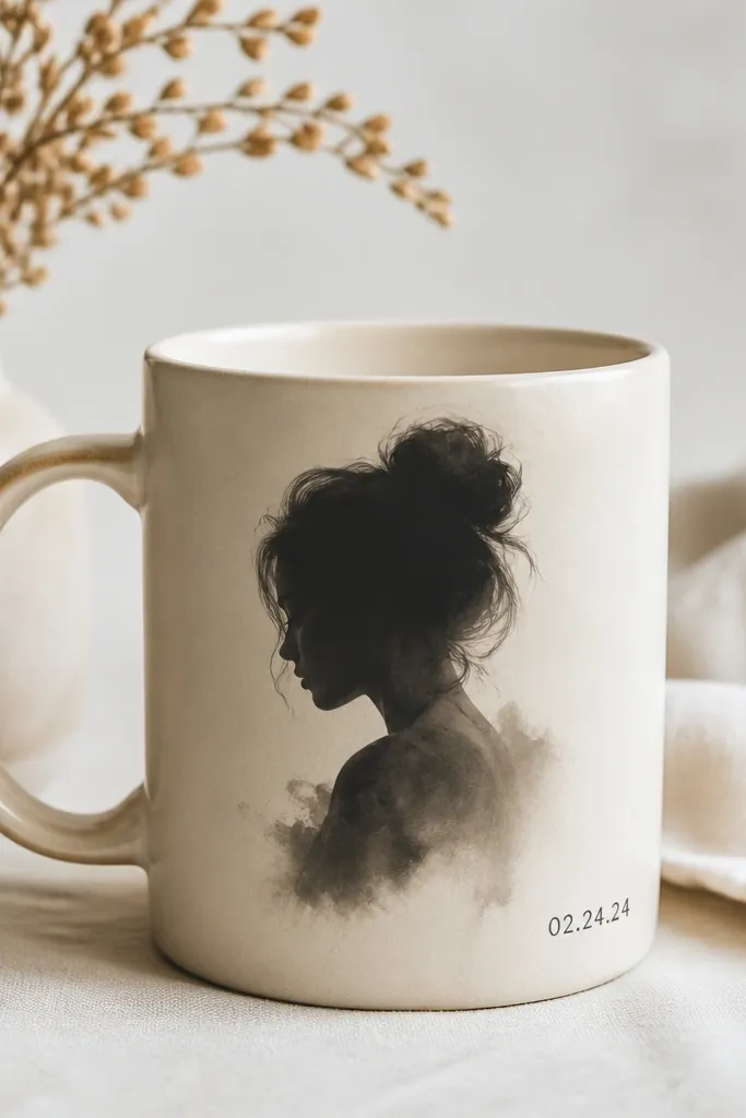
A silhouette with ink-wash edges looks artsy because it mimics real ink spread on paper. The fading edges make it forgiving on a curved mug surface. A small date adds a personal touch without cluttering the face area.
Use diluted black ceramic ink or ink-like paint made for ceramics. Paint the silhouette roughly, then soften the edges by dabbing with a damp sponge while the ink is still wet. Add a date with a fine brush in dark gray or black.
Pro tipWork with the mug horizontal so the wash doesn't drip down the wrong way.
AvoidDon't add too much water - it can bead on glossy glaze and leave patchy spots.
15. Ramen Bowl Pattern Repeat
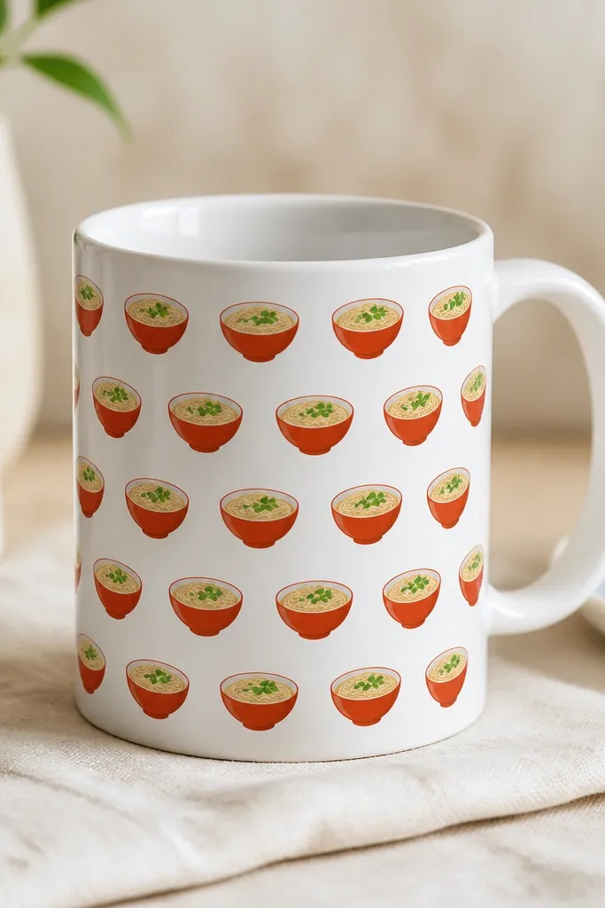
A repeat pattern looks polished because it covers the whole surface without needing perfect placement. Ramen icons bring color variety but stay readable because each bowl has clear shapes. This is the easiest way to hide any minor wonky drawing lines.
Use a small ramen icon stencil or transfer sheet, then repeat it around the mug. Keep each icon about 3-4 cm wide, and offset rows so the pattern feels woven. Paint noodles in creamy off-white, broth in muted red, and garnish in green with a fine brush.
Pro tipMark a starting point with a tiny pencil dot, then align each row to that dot so the repeat stays consistent.
AvoidAvoid overloading the garnish - too many tiny leaves smear under clear coat.