1. Jute-Wrapped Edge Frame with Whitewashed Center
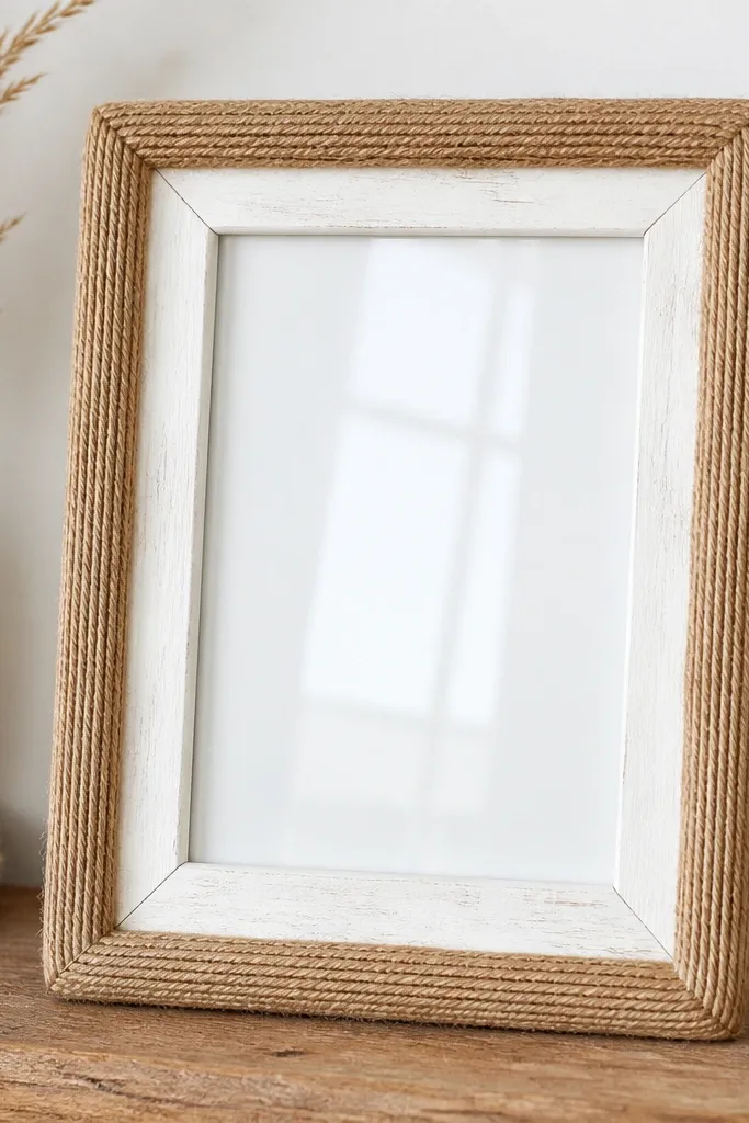
This works because the jute gives you a real, tactile edge without covering your photo. The whitewashed center keeps the photo bright and stops the rope from making the whole frame look heavy. I pair tan jute with slightly warm off-white so the rope texture shows but doesn't turn orange under indoor light.
Use a thrift or old frame with a flat outer rim. Hot-glue jute rope in tight rows along the outer edge, then leave a 1/4-inch clean border before you re-glue the rope to the corners. Whitewash with diluted off-white acrylic (about 1 part paint to 2 parts water) and wipe back with a rag so it looks thin.
Pro tipSeal the rope with two thin coats of matte clear spray so it doesn't shed fibers onto the glass.
AvoidDon't glue rope over the glass edge - any squeeze-out glue shows as glossy blobs.
2. Book Page Frame with Black Ink Outline
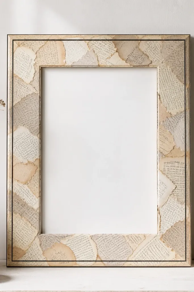
Book paper gives you a soft, nostalgic pattern that looks good behind portraits. The black ink outline makes the whole thing look designed, not like a paper craft that got stuck on. I like this with black-and-white photos because the outline ties everything together.
Tear pages into strips about 1 to 2 inches wide, then overlap them like shingles. Brush on a thin layer of Mod Podge or matte gel medium, press paper, and let it dry fully. After drying, use a fine brush to paint a clean black rectangle 1/8 inch inside the outer edge.
Pro tipLightly sand the dried paper bumps with 220 grit so the frame looks smooth when you run your hand over it.
AvoidSkip thick paper layers - they create a lumpy edge that looks cheap up close.
3. Deep Teal Painted Frame with Gold Leaf Corner Tips
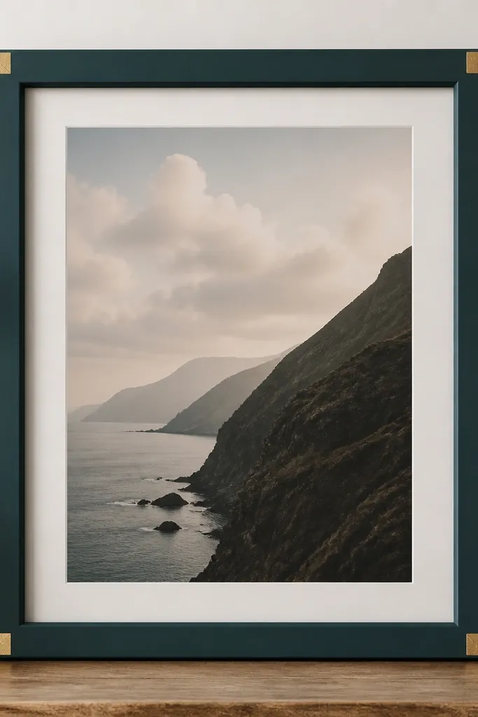
Teal plus gold leaf reads expensive because the contrast is controlled. The corner placement keeps it classy and prevents the frame from competing with the photo. I do gold leaf only on the corners because it catches light when you walk by.
Paint the frame with matte craft acrylic in deep teal (two coats, sanding lightly between). Apply gold leaf adhesive at the four corners in rectangles about 1 inch wide, then press gold leaf and burnish gently with a soft cloth. Seal with matte clear so the gold doesn't look patchy.
Pro tipUse painter's tape to mask straight edges before you gild - it keeps the corners sharp.
AvoidDon't use glitter gold paint instead of leaf - it looks flat and sparkly in a bad way.
4. Copper Wash Frame with Weathered Look
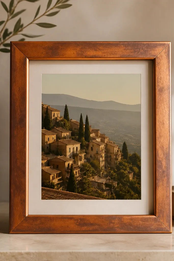
Copper wash creates subtle movement even when the photo is still. The weathered effect keeps it from looking like a plain painted frame. I use this when the photo has warm browns, copper light, or golden hour colors.
Mix acrylic paint: 1 part burnt umber, 1 part metallic copper, and a splash of water. Brush on unevenly, then wipe with a rag to leave streaks. After it dries, add a thin dark glaze with raw umber to deepen the corners and edges.
Pro tipFinish with a matte clear coat if your room light is harsh - it keeps copper from looking too shiny.
AvoidAvoid full coverage with metallic paint - it turns into a uniform blob that hides the frame shape.
5. Fabric Scrap Frame with Bias Tape Border
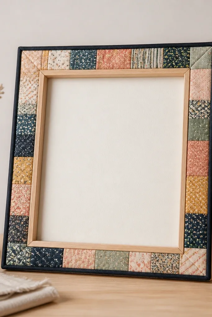
Fabric scraps add pattern without the clutter of full collage. The bias tape border gives you a crisp finish so it looks intentional. I've used this with travel photos because the frame pattern feels like a souvenir.
Choose 6 to 10 fabric scraps (cotton or linen) in one color family plus one accent. Cut them into strips and overlap around the outer edge, then cover seams with black bias tape. Use fabric glue for the scraps, and keep the tape line even - about 1/8 inch from the inner edge.
Pro tipUse a thin iron-on stabilizer on the back of stretchy fabric so it doesn't warp later.
AvoidDon't skip backing - loose fabric edges snag on dust and look messy.
6. Pressed Leaf Frame with Matte Sealer
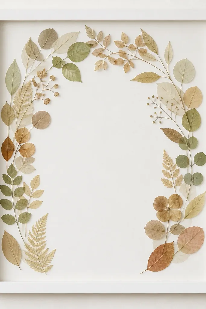
Pressed leaves look delicate, but they need a matte finish to keep them from looking plastic. The arrangement works best when you keep it to a small cluster, like a half-wreath near the top. This is perfect for botanical photos or portraits with greenery in the background.
Press leaves between book pages for 1 to 2 weeks, then trim stems. Arrange them with tweezers on the frame border, glue lightly with clear-drying craft glue, and leave small gaps so the photo breathes. Seal with two light coats of matte clear so the leaves don't yellow or curl.
Pro tipUse a soft brush to remove leaf dust before sealing - it makes the leaves look sharper.
AvoidAvoid thick glue blobs - they dry glossy and show under indoor light.
7. Washed Denim Photo Frame
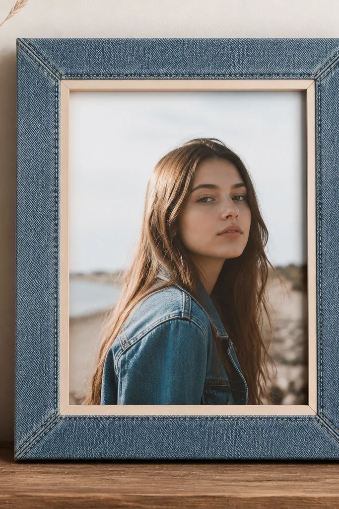
Denim adds a casual, lived-in texture that looks great with family photos and kids' pictures. Keeping it to the outer border prevents the fabric from flattening the photo with too much color. The washed look also hides minor fraying, which makes it forgiving for beginners.
Cut denim strips to cover the outer rim, not the glass area. Glue with fabric glue and tuck corners neatly under. For a cleaner look, add a thin topstitch line with a fabric marker or use a narrow iron-on denim tape along the inner edge.
Pro tipUse a matte clear coat spray after gluing so the denim doesn't collect dust.
AvoidDon't use shiny fabric or satin - it reflects light and makes the photo look dull.
8. Monochrome Washi Tape Grid Frame
Washi tape gives you graphic structure without heavy materials. A grid pattern looks modern because it's controlled and repeatable. I keep the tape monochrome so the photo colors stay the focus.
Lay tape strips horizontally first, then vertically, overlapping each intersection by about 1/8 inch. Trim edges with a craft knife against a ruler for sharp lines. Use two or three tape widths, like 1/4-inch and 1/2-inch, so it doesn't look flat.
Pro tipPress tape down firmly with a credit card so edges don't lift.
AvoidAvoid a random pattern - uneven tape widths create a "messy scrapbook" look.
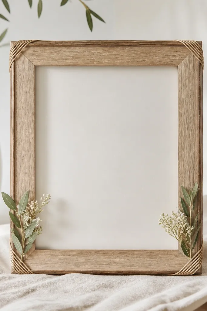
9. Rattan-Coated Frame with Cane Texture
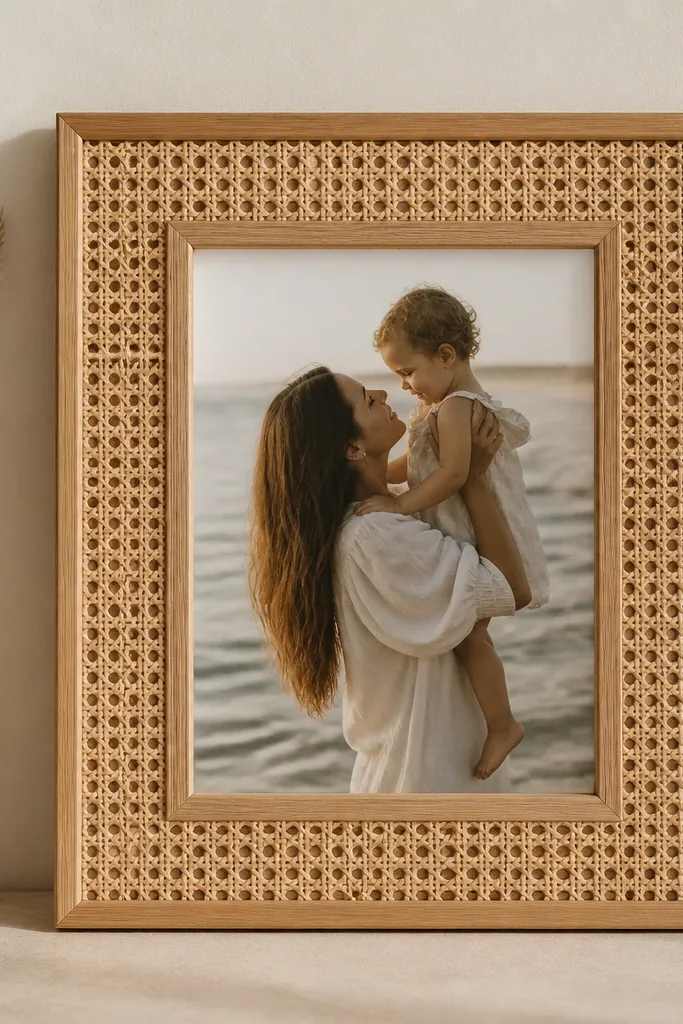
Rattan reads airy and warm, which makes it great for light photos and neutral rooms. The woven texture adds depth without needing paint. I use this when the photo has beige, cream, or natural wood colors.
Buy a thin rattan sheet or cane webbing and cut it to wrap the frame edge. Glue it around the rim with a strong craft adhesive, then trim the inside edge cleanly so it doesn't intrude into the photo opening. Seal the rattan with a matte clear coat so it doesn't darken unevenly.
Pro tipSoak rattan slightly (5 minutes) before cutting so it bends without cracking.
AvoidDon't skip sealing - unsealed rattan gets dusty and looks dull fast.
10. Scrabble Letter Corner Frame

This is a small placement trick that makes a frame feel personal. Letter tiles add character without turning the whole frame into clutter. I like corner-only placement because it frames the photo and keeps the composition balanced.
Use genuine letter tiles or thick wooden letters. Paint them the same color family as the frame (cream, black, or muted terracotta) so they match. Glue two tiles per corner and stagger them slightly so they don't look like a sticker sheet.
Pro tipUse a ruler to set the distance from the corner - about 3/4 inch from each edge.
AvoidAvoid spelling long words across the frame - it pulls focus from the photo.
11. Terracotta Clay Paint Splatter Frame

Splatter adds energy, but controlled splatter looks like design instead of accident. Terracotta on a pale base works because it warms skin tones and pairs with earthy photos. I do it on corners only so the photo stays readable.
Thin terracotta acrylic with water until it drips from a brush in short spurts. Flick with a toothbrush held about 8 to 10 inches from the frame. Mask the photo opening with paper so overspray doesn't land on the glass.
Pro tipTest splatter on cardboard first and adjust thickness until the dots are small.
AvoidAvoid thick paint blobs - they dry raised and look sloppy.
12. Sequin Fringe Frame Edge
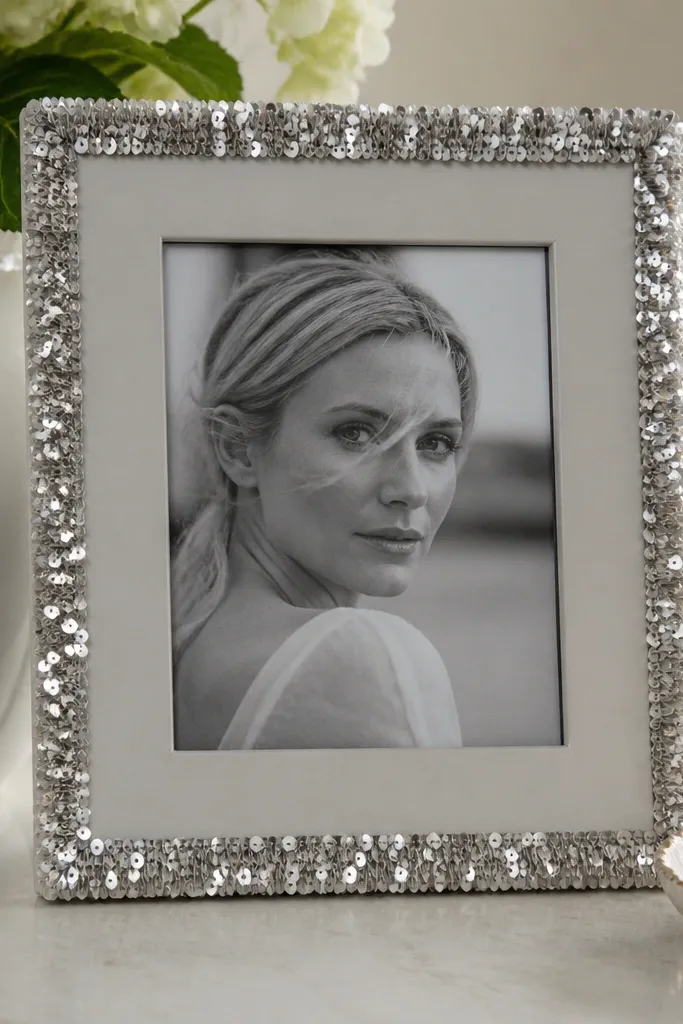
A thin sequin fringe reads glam without covering the whole frame. It catches light when you walk past, which makes the photo feel like it has movement. I keep it silver or gunmetal because it matches more photo palettes than bright multi-color sequins.
Attach a sequin trim strip along the outer rim using fabric glue or hot glue in short sections. Trim the ends neatly at the corners and press flat so the fringe doesn't curl. Finish with a matte clear coat over the frame surface, not over the sequins themselves.
Pro tipUse small binder clips to hold corners while glue sets for a clean edge.
AvoidDon't glue sequins directly to the glass - they'll snag and look crooked.
13. Map Coordinates Frame from Old Atlas
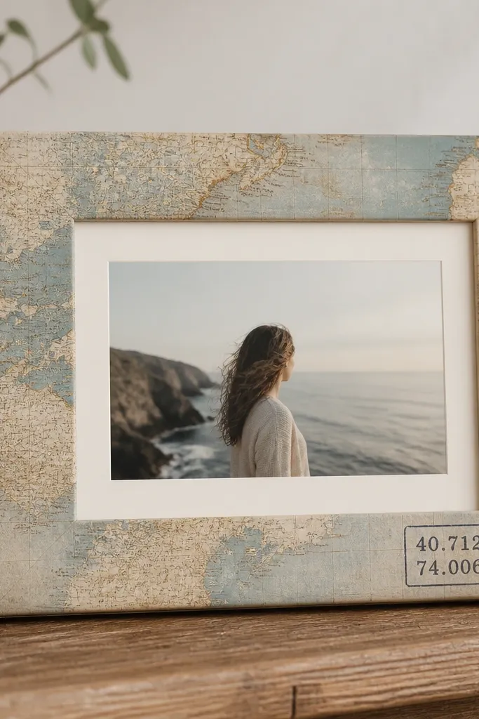
Map print gives you a story without extra clutter. The coordinates label adds a clean focal point, especially for travel photos. I like using muted atlas pages because they don't overpower the image colors.
Cut atlas paper to fit the outer border area, not the photo opening. Brush glue on the frame, lay paper, and smooth with a brayer or plastic card. Add a coordinate label using a small stamp or printed label, then seal the whole thing with matte Mod Podge.
Pro tipPick coordinates that match the photo location and keep the font small so it looks like part of the map.
AvoidAvoid bright modern map prints - they look like wrapping paper behind your photo.
14. Smoked Oak Stain with Charcoal Edge Wash
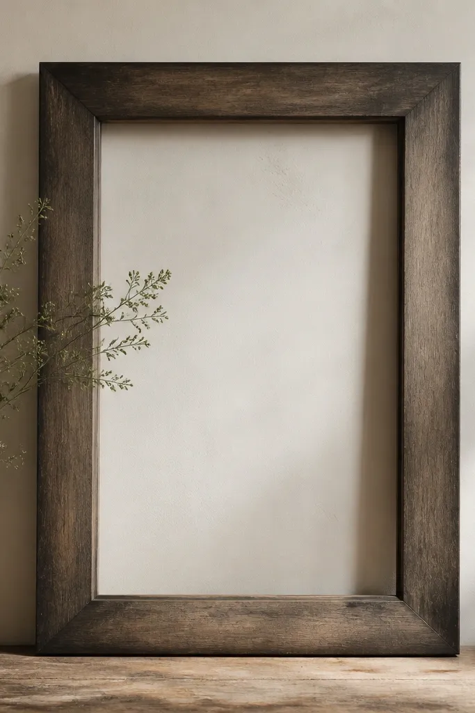
This finish looks like you bought it from a frame shop. The smoked stain gives depth, and the charcoal edge wash makes the frame shape pop. It's my go-to for black-and-white photos and moody color portraits.
Sand the frame lightly and apply a smoked oak stain with a rag, wiping in the direction of the grain. After it dries, dip a dry brush in charcoal acrylic and flick it only at the outer edge corners. Seal with a clear matte or satin wipe-on polyurethane to protect the finish.
Pro tipWipe the stain longer than you think - 2-3 minutes per section - for a more even tone.
AvoidDon't leave the stain too thick - shiny patches read cheap.
15. Pearlized Spray Paint Frame with Faux Porcelain Edges
Pearlized paint makes photos look cleaner because it adds soft highlight without looking metallic-sharp. The darker edge shading adds depth so the frame doesn't look flat. I use this with pastel photos, wedding shots, and anything with soft light.
Prime bare wood or old paint with a bonding primer. Spray pearlized white in thin coats from 10 to 12 inches away. For the faux porcelain edge, lightly dry-brush a tiny amount of cool gray paint around the outer rim.
Pro tipLet each coat dry fully and do a light sand (400 grit) between coats for a smooth finish.
AvoidAvoid heavy spray - it runs and gives an uneven, drippy look.
16. Leather Strip Wrapped Frame with Brass Nail Heads
Leather plus brass feels intentional because both materials age well. The nails create a line of sparkle without covering the photo. I use this for portraits and fashion-like shots because the texture reads structured.
Cut leather strips about 1 inch wide and wrap the outer rim. Glue with contact cement or heavy-duty fabric glue and press firmly. Add brass nail heads along the inner edge with spacing around 1 inch apart, then seal the leather with a light leather conditioner so it doesn't dry out.
Pro tipPre-punch holes in the leather with an awl so nail heads sit straight.
AvoidDon't use thin faux leather - it cracks and the edge looks wrinkled.
17. Concrete-Effect Paint Frame for Minimal Interiors
Concrete-effect paint makes a frame feel architectural. It adds texture without color noise, so your photo stays crisp. This is my pick for modern black-and-white photos, city shots, and any image with strong contrast.
Use a concrete-effect paint product or mix acrylic with textured medium until it looks like thick yogurt. Apply with a foam roller in light passes and don't overwork. After it dries, rub gently with a dry brush to bring up highlights on edges.
Pro tipFinish with a matte clear coat so dust doesn't cling to the texture.
AvoidAvoid glossy topcoat - it makes concrete texture look like plastic.
18. Peel-and-Stick Tile Border Frame
Tile border frames look clean because the pattern is fixed and symmetrical. It's also one of the fastest ways to upgrade a cheap frame without painting. I like it for photos that are mostly white, gray, or soft neutrals.
Measure the outer rim and cut tiles to fit with a craft knife. Apply peel-and-stick tile border strips around the edge, keeping the grout lines aligned. Seal the tile edges with a thin clear sealant if the frame gets handled a lot.
Pro tipUse a ruler and mark corners first - tile borders show every crooked millimeter.
AvoidDon't cover the photo opening with tile - it makes the frame heavy and blocks glass reflections poorly.
19. Vintage Button Flower Frame
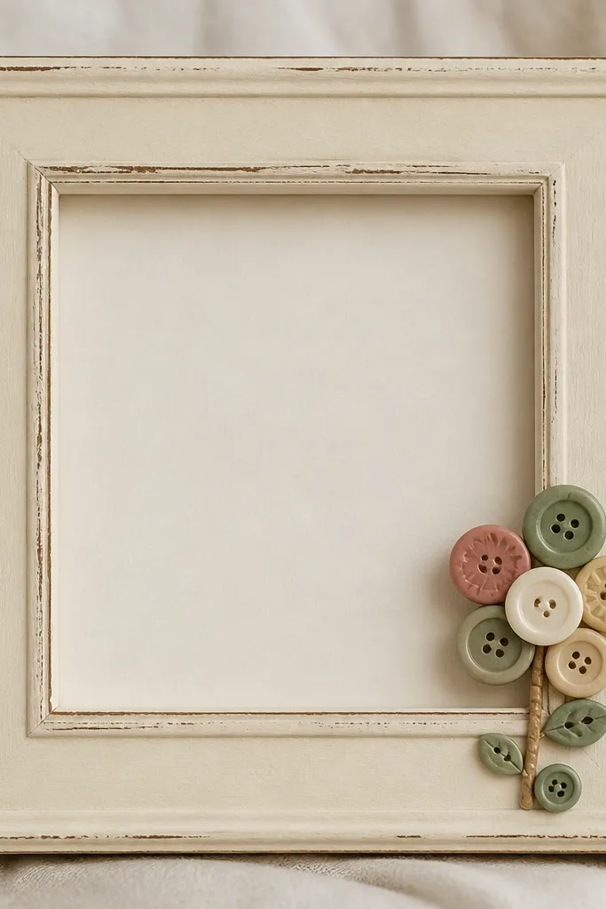
Buttons add charm when you keep the cluster small and repeatable. This looks best when you match button colors to your photo - especially if your photo has soft pastels. The frame stays simple so the button detail reads like a handmade accent.
Arrange a flower cluster using 6 to 10 buttons: one large center button, then petals around it. Glue with clear-drying craft glue and let it set flat. If the frame is dark, paint it with matte chalk paint first so the buttons pop.
Pro tipUse two different shades of the same color family so the flower looks dimensional.
AvoidAvoid random button colors - the cluster turns into a patchwork mess.
20. Gallery Wall Frame Pair with Color Matting
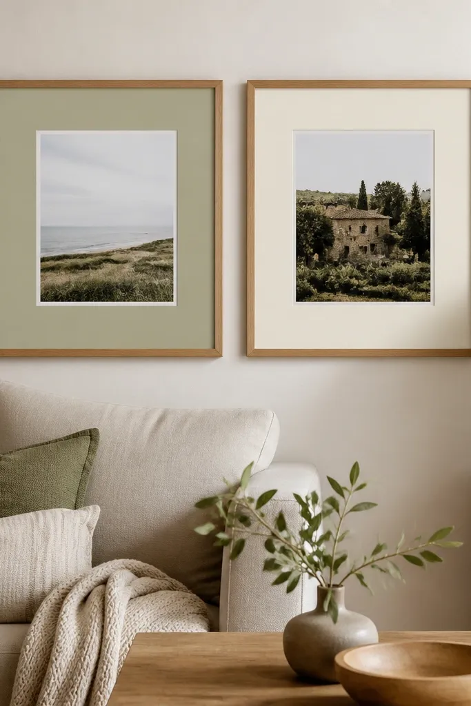
Color matting is the most underrated upgrade. It changes how the photo sits visually without touching the photo itself. When you keep the frame hardware the same and vary only the mat color, the wall looks intentional and calm.
Use matte board or thick cardstock mats. Cut mats so there's a 1.25-inch opening margin around the photo, and keep the outer frame size consistent. Choose two mat colors that match two tones in the set, like sage for greenery photos and cream for warm skin tones.
Pro tipUse double-sided tape to secure the mat so it doesn't bow over time.
AvoidSkip thin mats - they bend and look flimsy under bright light.
21. Hand-Painted Skyline Frame with Negative Space
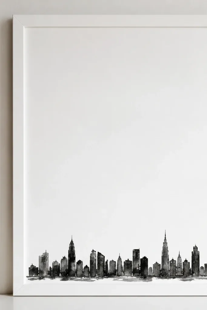
Negative space makes the drawing look confident instead of busy. A small skyline at the bottom ties to travel or city photos without turning the frame into a poster. I like black paint on white because it stays readable from across the room.
Stencil a simple skyline or freehand lightly with a pencil first. Paint with black acrylic using a small flat brush, then let it dry and seal with matte varnish. Keep the skyline about 1.5 inches tall so it doesn't crowd the photo.
Pro tipTest the skyline height against your actual photo - crop changes how much it feels like it dominates.
AvoidAvoid filling the whole frame with scenes - it competes with the photo.
22. Corkboard Frame with Pushpin Photo Corners
Cork makes photos look like a mood board, but inside a frame it looks neat. Pinning corners gives a soft, slightly casual pull without tape marks. This is great when you rotate photos seasonally.
Use a shadow box frame or a frame with a deep backing. Cut cork sheet to fit the back and glue it in place. Place the photo and pin each corner with brass pushpins, then add a thin felt strip around edges if you need to reduce scuffing.
Pro tipPre-measure pin positions with painter's tape so the corners land evenly.
AvoidDon't use too many pins - it makes the photo look like it's being held down, not displayed.
23. Satin Ribbon Bow Frame with Matte Black Base
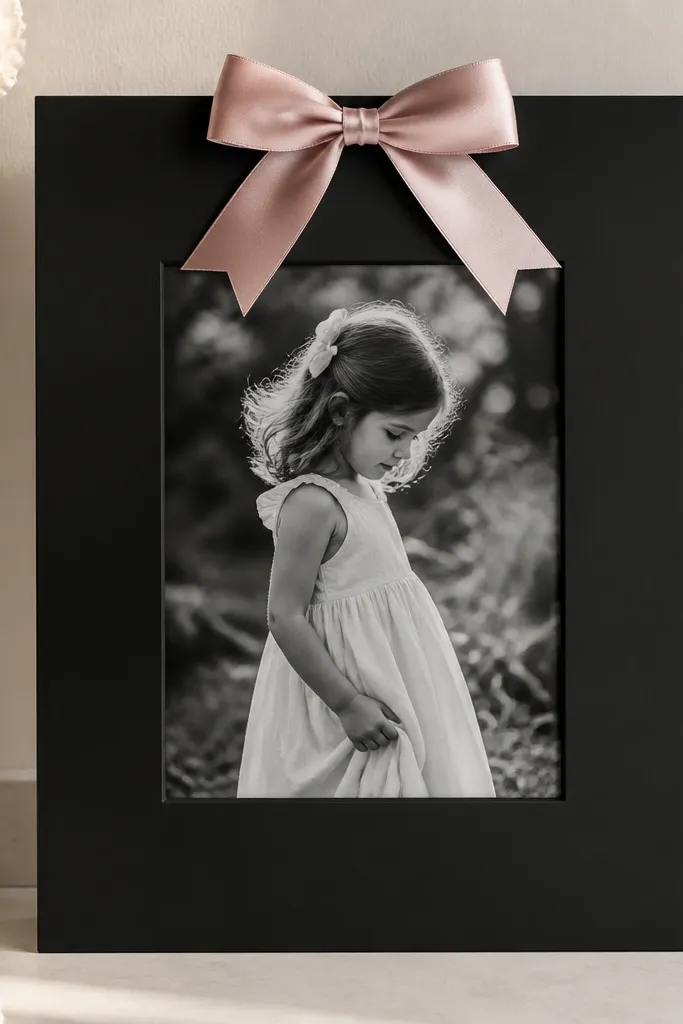
A bow reads romantic, but the matte black base keeps it from looking childish. The satin ribbon adds a smooth highlight that contrasts with the photo. I use this for holiday portraits, engagement photos, and any image that has a soft color palette.
Paint or buy a matte black frame. Use a ribbon about 3/8 inch to 1/2 inch wide and tie a bow with two loops about 2.5 inches each. Glue the bow to the frame backing at the top center so it doesn't touch the glass.
Pro tipCut ribbon ends at a sharp angle and seal with a lighter for clean edges.
AvoidAvoid glossy frames with shiny ribbon - they reflect too much and wash out the photo.
24. Sprig and Twine Frame for Soft Farmhouse
Twine plus a couple of sprigs looks handmade without turning into a full wreath. The twine gives you a line texture that frames the image, and the small sprigs add just enough botanical detail. I do this for family photos in neutral clothing and for prints with warm whites.
Wrap twine around the outer edge in 2 to 3 tight lines. Glue ends on the back so nothing shows. Add two faux sprigs or dried sprigs near the bottom corners and secure with a dot of hot glue under the sprig base.
Pro tipUse a small piece of felt on the back where twine ends meet so the knot doesn't scratch the wall mount.
AvoidSkip thick twine - chunky rope makes the frame look like a prop.
25. Acrylic Paint Drip Frame with Color Blocking
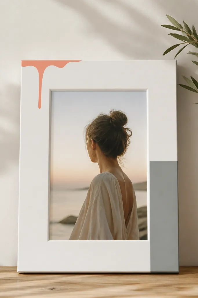
Drips look artsy when they're controlled and paired with clean blocks. The color blocking keeps the frame from feeling like random paint splatter. I use coral drips with light photos because they pull warmth into skin tones.
Mask the center area so paint only hits the outer border. Thin acrylic paint slightly so it drips but doesn't run off the bottom - aim for drips about 1 inch long. Paint a vertical block on one side using a flat brush, then remove tape while paint is still slightly tacky for crisp edges.
Pro tipUse a hair dryer on low to speed up drying between masking steps.
AvoidAvoid drips that reach the photo - they look messy and distract from faces.