1. Speckled Cocoa Stripe with Thin Gold Line
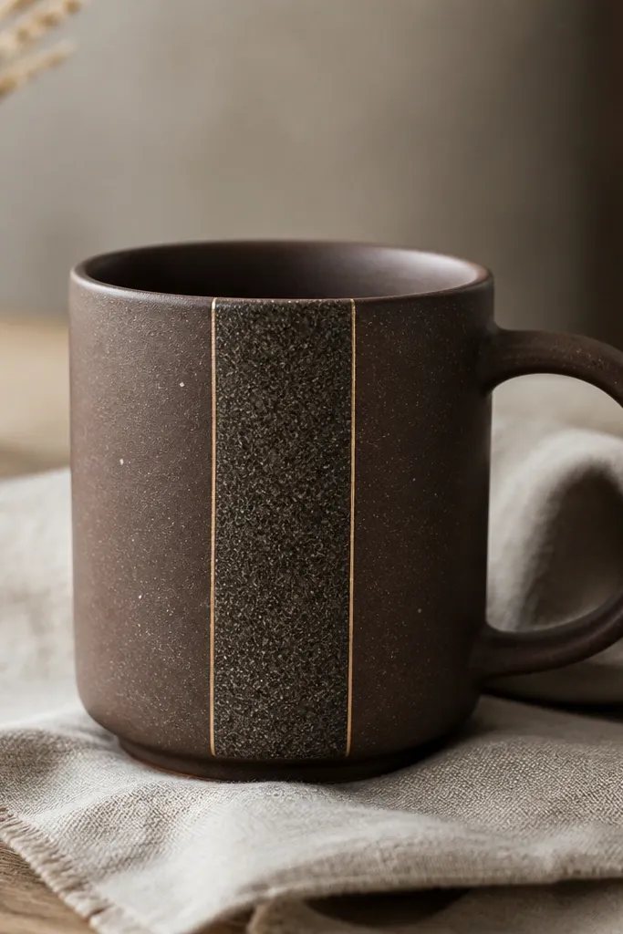
This design works because you get motion from speckles without adding busy shapes. The cocoa base makes the gold line look intentional, not random, and the thin border frames the stripe so it reads clean even if your hand-built body has slight curves. I like using warm gold tones because they don't fight the brown like bright yellow sometimes does under clear glaze.
Paint a vertical stripe about 1.5 inches wide on the front after bisque firing. Use a small stiff brush for the gold line - keep it under 1/16 inch thick. Add speckles with a toothbrush or a fan brush, then keep the rest of the mug mostly plain so the stripe stays the focal point.
Pro tipBefore glazing the mug, press a strip of paper against the stripe area and mark the stripe edges. It helps you keep the gold line straight across mugs.
AvoidDon't overdo the speckles - if the stripe turns fully black, it loses the stripe shape and looks like a stain.
2. Celadon Waves with White Cutout Clouds
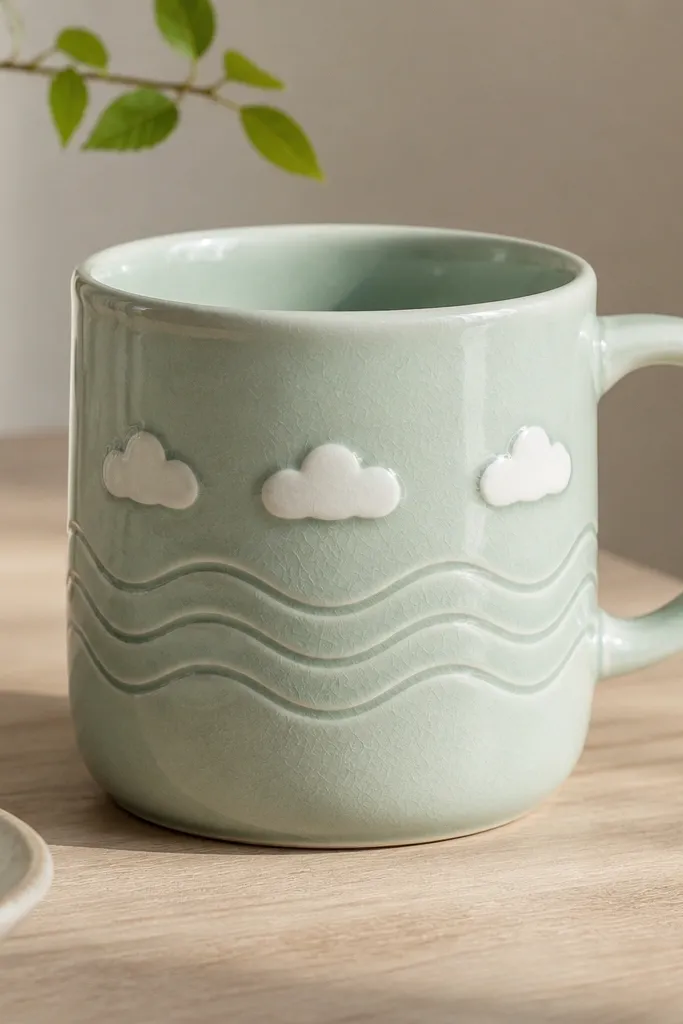
Waves give an easy rhythm, and the raised white clouds add a little dimensional charm. Celadon glazes already have depth, so the underglaze decoration stays soft and soothing instead of harsh. The raised cloud shapes catch light differently than painted ones, which is why it looks more handmade than a flat print.
After bisque, paint three wave bands spaced evenly with celadon-toned underglaze or slip. Roll small coils or slab-cut cloud silhouettes and attach them lightly on top of the wave bands. Seal everything with a clear glaze that shows the celadon body color.
Pro tipUse a ruler to mark wave spacing, then pull the wave lines with a flexible liner brush - they should curve with the mug body.
AvoidSkip thick cloud blobs - if they're too tall, they can look like accidental lumps when fired.
3. Rosebud Dots Around the Handle
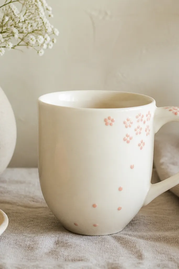
This one is all about placement. Keep the densest dots near the handle so the mug feels framed, like a corsage for your coffee. Rosebud dots are small enough to hide minor hand-building unevenness but still look intentional when repeated.
Use a dotting tool or the back of a small paintbrush to place dots in clusters of 5-7. Make the cluster height roughly 2 inches tall starting just above the handle base. Add a few single dots trailing down - don't cover the whole mug.
Pro tipDip your tool in underglaze, then wipe the tip on scrap clay before every other dot to keep dot size consistent.
AvoidDon't make all dots the same size - identical dots read mechanical and less handmade.
4. Midnight Checker Band
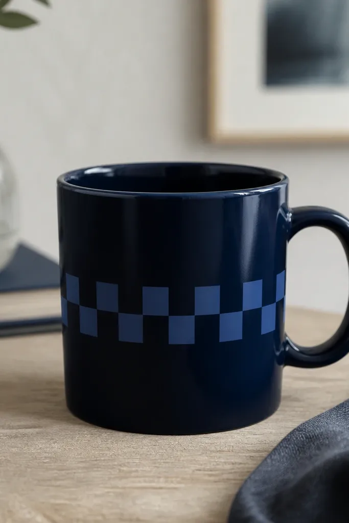
A checker band looks graphic and modern, but it only works if the squares line up cleanly. The dark base makes the lighter squares glow slightly under clear glaze, so the band stays readable. I like this because it hides small surface waves better than detailed floral work.
Mark a straight band across the mug using painter's tape as a guide. Paint squares with a small square brush - aim for each square about 1/4 inch. Keep the band height around 1/2 inch so it stays bold, not busy.
Pro tipDry your underglaze completely before painting the second color, or the edges will bleed and blur the checker pattern.
AvoidDon't go too wide with the checker band - when it covers half the mug, it looks like a mistake.
5. Hand-Painted Lemon Peel Vertical Ribbons
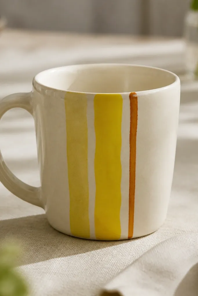
Vertical ribbons elongate the mug visually, which makes a chunky handmade mug look slimmer. Lemon peel colors add warmth without requiring a ton of shapes. The slight irregularity in the ribbons keeps it from looking like a stencil.
Paint three vertical ribbons spaced about 1 inch apart on the front. Use a liner brush for the main yellow and a smaller brush for the orange-brown outline line. Leave a thin strip of the clay body visible between ribbons for breathing room.
Pro tipFor peel texture, drag a dry brush lightly through the wet paint for 2-3 streaks per ribbon.
AvoidDon't outline every ribbon the same thickness - one thick outline makes the whole thing look like a kid's craft.
6. Crackle Wash Fade from Rim to Foot
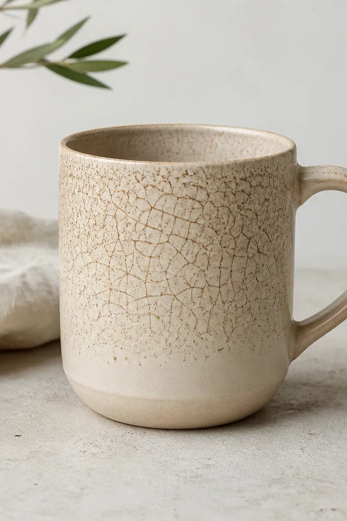
Crackle fades feel expensive because they look like an aged glaze effect, even when you're doing it with underglaze and a clear topcoat. The fade keeps the pattern from overwhelming the mug while still giving you visual texture. It's also forgiving if your crackle density varies a little.
Paint a crackle-style wash using iron-oxide brown underglaze thinned with a bit of water or medium. Start at the rim and blend downward with a damp sponge so it fades over about 2.5 inches. Cover with a clear glaze that doesn't flatten the crackle too much.
Pro tipTest the crackle on a 4x4 tile first at the same thickness. Under-layer thickness changes crackle size a lot.
AvoidAvoid thick coverage at the top - it can pool and turn into a dark patch instead of a controlled fade.
7. Terracotta Leaf Stamps with Salt-Speckled Background
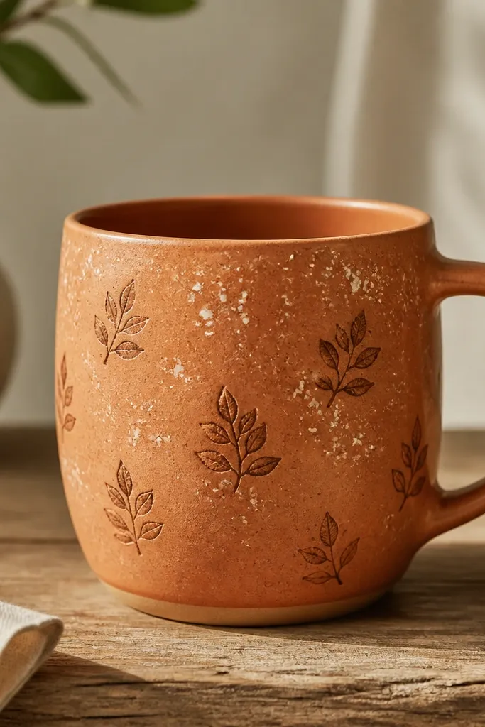
Leaf stamps give a repeating motif without needing freehand drawing, and the salt-speckled background makes it look like sun on clay. This design reads earthy and handmade because it has both pattern and randomness. The speckles also hide tiny pinholes or surface marks from hand building.
Stamp leaves using a texture stamp or carved leaf stamp on bisque. Mix a darker terracotta slip and press lightly so edges stay crisp. For the speckle, flick thinned white slip with a toothbrush over the stamped area, then lightly wipe any big clumps.
Pro tipKeep the leaves mostly in the top half. When leaves reach the foot, the design competes with the mug's base shape.
AvoidDon't stamp too hard - deep stamps can trap glaze and look muddy.
8. Bluebird Line Art with Single Red Beak
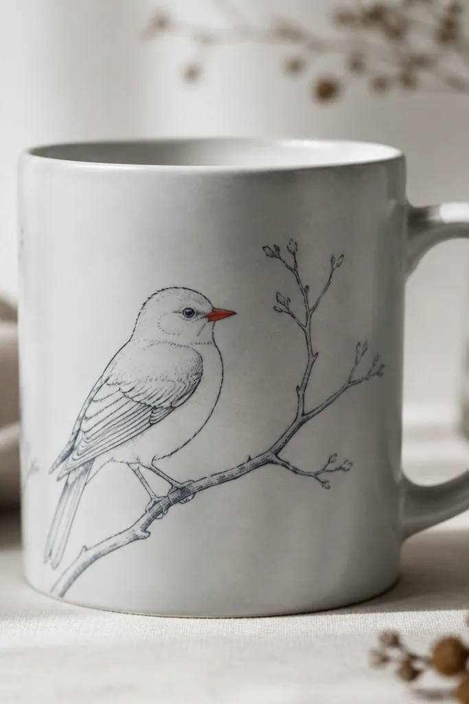
Line art looks sharp on mugs because it doesn't require full coverage. The single red beak gives you a color pop that feels playful but controlled. I use this when I want an aesthetic handmade mug design that still looks good with a plain handle and simple glaze.
After bisque, sketch the bird in light pencil, then paint with a fine liner brush using a deep blue underglaze. Color only the beak with a small dot of red underglaze. Leave the rest of the bird unfilled so the line work stays crisp under clear glaze.
Pro tipMake the bird about 3 inches tall - larger line art tends to distort on curved mugs and looks stretched.
AvoidSkip heavy brush strokes - thick lines bleed under clear glaze and lose the sketchy look.
9. Geometric Arch and Dot Grid
Half-arches and dots create a calm geometry that still feels handmade because the dots are placed with your hand. The grid effect gives structure, while the arches keep it from looking sterile. I like this for everyday mugs because it doesn't depend on fancy colors.
Mark a vertical center line on the mug. Paint two arch shapes that sit above a dot row; keep the arches about 1 inch wide and 1/2 inch tall. Place dots with a dotting tool at consistent spacing, then fill the grid only on the front to avoid wrap distortion.
Pro tipUse painter's tape to mask one edge of the dot grid. Peel it off while underglaze is still wet for clean lines.
AvoidDon't overfill the space - if the grid becomes dense, it reads like a pattern printed on a store mug.
10. Oat Milk Marbling with Peach Ribbon
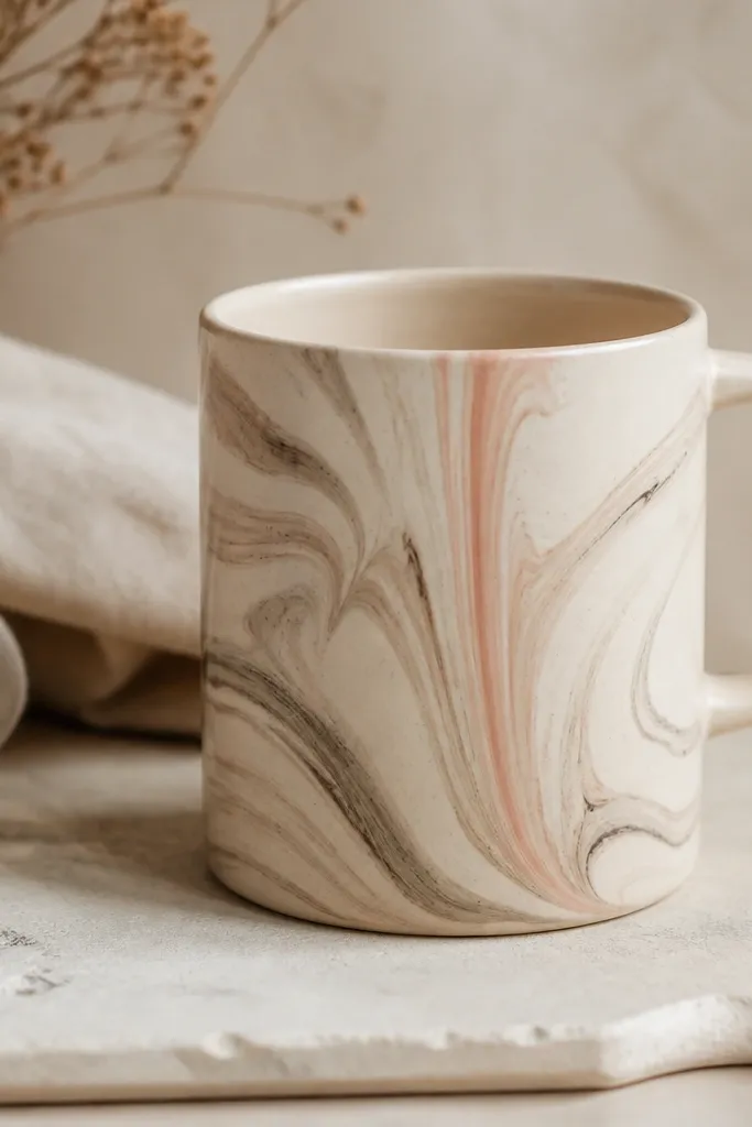
Marbling looks complicated, but you can make it look intentional by keeping the palette tight: oat base plus two muted tones. The peach ribbon gives direction, so the swirl doesn't feel random. This is one of my go-to designs for gifts because it looks warm even with a simple clear glaze.
Blend light brown and gray slip on a palette, then drag a thin ribbon of peach underglaze through the swirls with a comb tool. Apply the marbling to the front panel only, about 3 inches wide. Add the peach ribbon last so it stays sharp and doesn't get swallowed by the marble.
Pro tipIf your marbling turns muddy, mix less - make smaller batches and stop as soon as the swirls look distinct.
AvoidDon't cover the whole mug with marbling - full coverage makes the curve smear into one big blob after firing.
11. Matte Black Underlayer with Glossy Clear Topcoat Specks
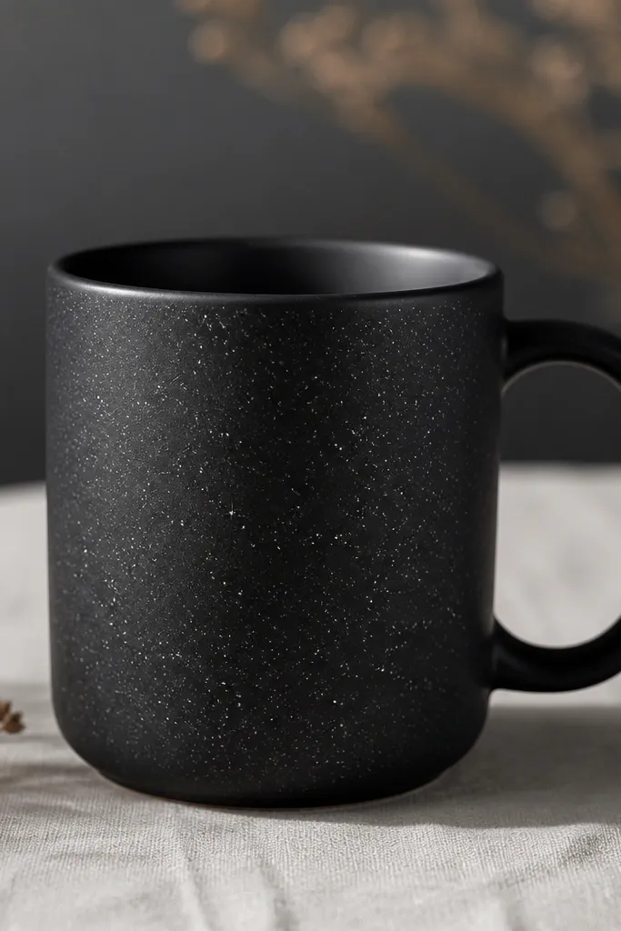
This design is about texture contrast, not color variety. Matte black makes the surface look modern, and glossy specks give you that "this is handmade" sparkle when the mug tilts. It's also forgiving because specks naturally vary - that variation looks like intention here.
Paint the entire mug with matte black underglaze or a matte black slip layer. After bisque, apply clear glaze specks by dipping a brush and flicking gently onto the matte surface. Fire with a clear glaze compatible with your black layer so the specks stay glossy.
Pro tipFlick from farther away than you think. Short-distance flicking creates big blobs that look like drips.
AvoidDon't use glossy clear over a thick matte layer - it can turn the whole mug shiny-black instead of matte.
12. Tiny Raised Basket Weave on One Side
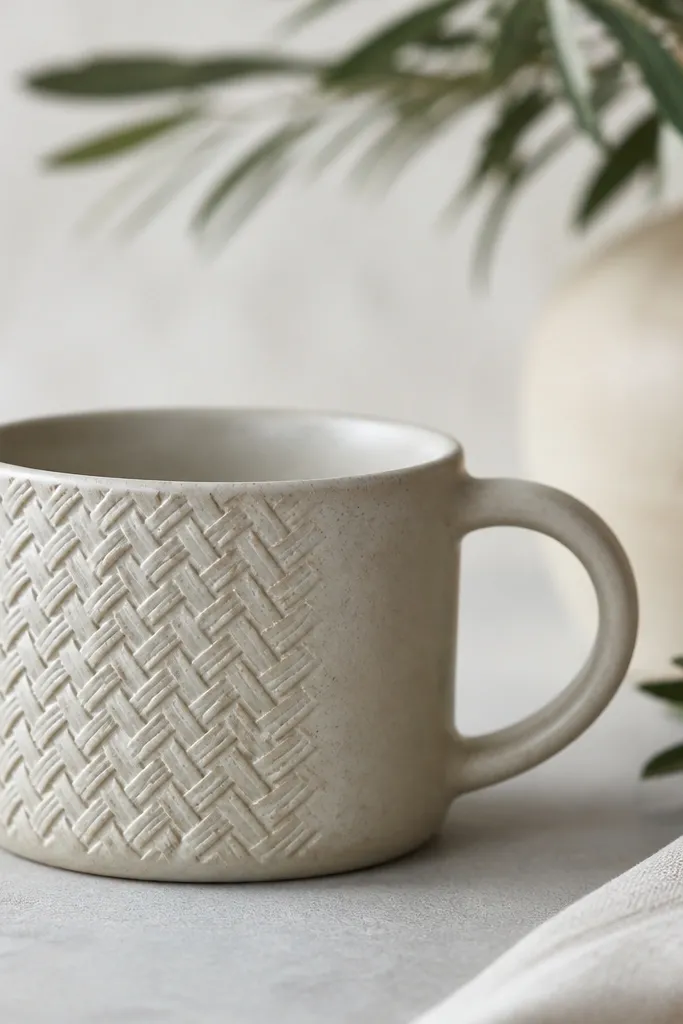
Raised texture reads as luxury because it catches the light without needing bold paint. A single textured panel keeps it from looking like a craft project. The basket weave also feels practical - it looks sturdy like the mug is built strong.
Cut a small rectangle of slab and score it lightly, then press a basket-weave texture with a roller or stamp. Attach the textured slab to the mug front with slip, keeping the edges thin so they don't create seams. After glazing, the weave will show as gentle ridges.
Pro tipSand the edges of the attached slab lightly before glazing so the texture doesn't create a raised seam line.
AvoidDon't cover the whole mug in raised texture - it will feel busy and can chip at stress points.
13. Lavender Wash with Coppery Rim Band
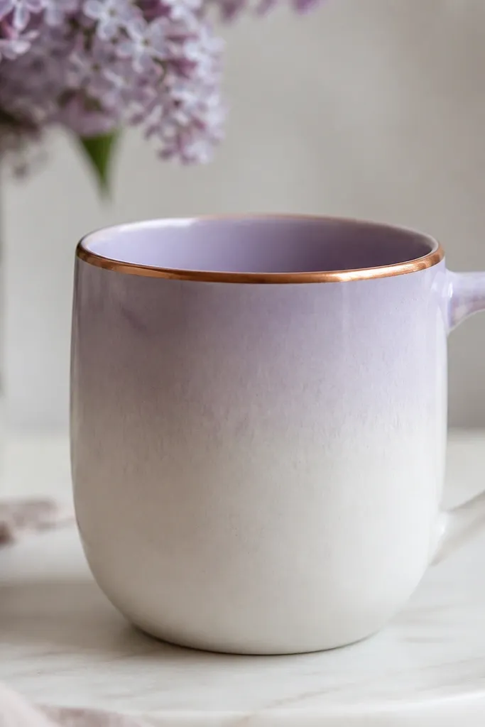
A rim band frames the mug and makes it feel finished, even when the rest is simple. Lavender keeps the mood calm, and the coppery rim adds a warm contrast that looks good in kitchen light. The fade prevents the lavender from turning into a flat, chalky block.
Paint a lavender underglaze wash starting just below the rim and blend down 2 inches with a damp sponge. Create a thin rim band by masking the rim edge with tape and painting a coppery underglaze line about 1/8 inch tall. Clear glaze the whole mug so the rim band looks smooth.
Pro tipIf your rim band smears, clean the tape edges with a damp cotton swab before firing.
AvoidDon't make the rim band too thick - thick metallic-looking bands can blister or look uneven.
14. Mint and Charcoal Concentric Circles
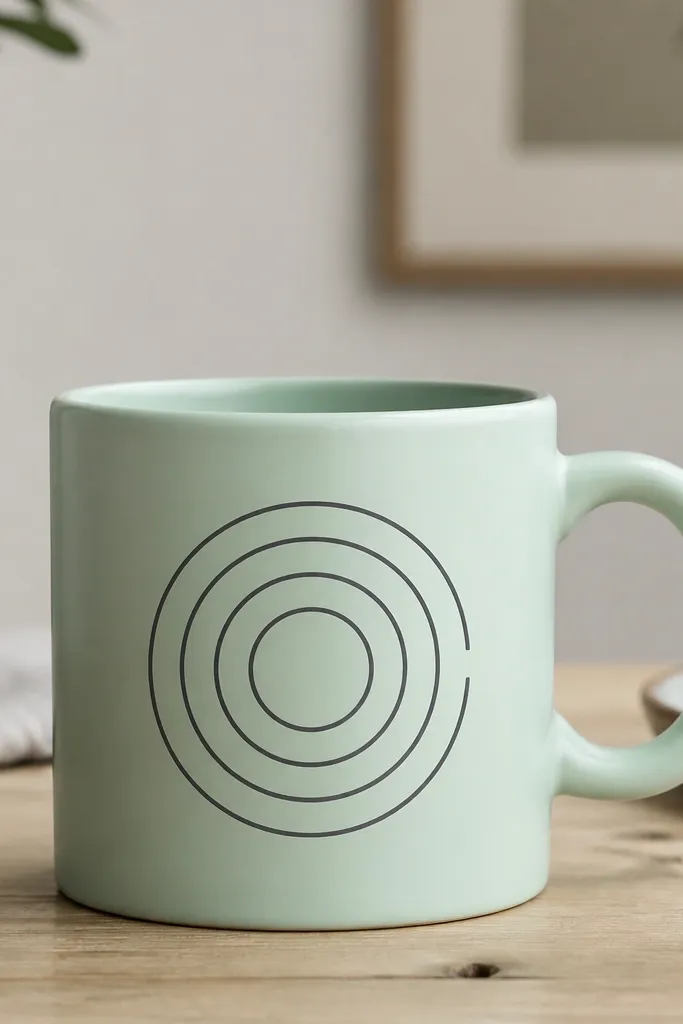
Concentric circles give a clean target-like design that looks modern on a mug. Charcoal rings show crisp contrast against mint, and the intentional gap adds a human touch so it doesn't look like a perfect decal. This is one of the easiest designs to repeat across a batch because you can measure circle spacing.
Use a compass-style tool or a string-and-needle method to mark circle guides on the front panel. Paint rings with charcoal underglaze using a steady hand - each ring about 1/16 inch thick. Leave one small gap in the outer ring near the handle so the pattern doesn't wrap awkwardly.
Pro tipLet each ring dry a few minutes before painting the next. Wet rings bleed together on curved surfaces.
AvoidSkip random circle sizes - uneven rings make the mug look like a wonky sticker.
15. Creamy Brushstroke Ombre with Speckled Edge
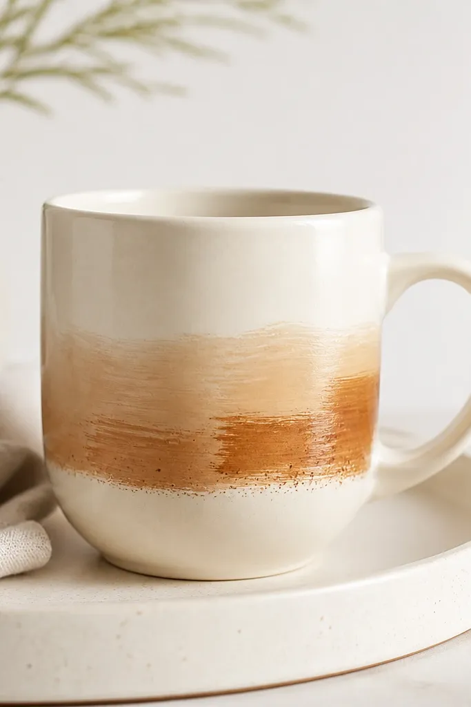
Broad brushstrokes look handmade because you see the direction of the brush. The ombre keeps it soft, and the speckled edge adds a little texture without extra shapes. I like this design for mornings because it looks cozy and doesn't scream for attention.
Paint a horizontal ombre band about 3 inches tall near the bottom half. Start with light tan at the top of the band and blend down into caramel using a sponge or damp brush. Add a thin speckle line at the bottom using a toothbrush loaded lightly with darker underglaze.
Pro tipUse a flat brush for the strokes so your band has clear edges. Round brushes create fuzzy borders that look cheap.
AvoidDon't blend the ombre too far into the plain areas - you want a visible band boundary.
16. Monochrome Portrait Silhouette on the Front
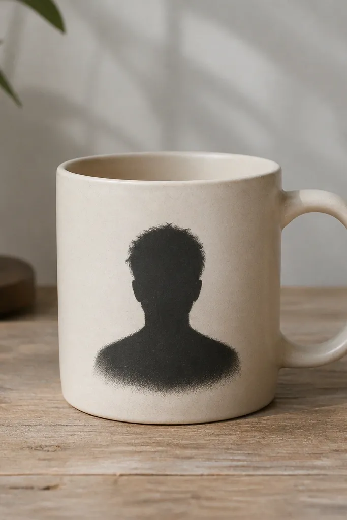
Silhouettes look classy because they rely on shape, not color. Keeping it monochrome makes the mug feel intentional and lets the clear glaze do the shine work. A slightly feathered edge looks human, especially on a hand-shaped mug.
Print or draw a silhouette about 3.5 inches tall, then transfer it lightly with pencil. Paint the silhouette with black underglaze and a flat brush, then soften the edge with a damp cotton swab for a gentle feather. Leave the rest of the mug plain to avoid clutter.
Pro tipIf your silhouette looks too sharp, add one extra softening pass at the edges after the first layer dries 5-10 minutes.
AvoidDon't fill the silhouette with thick, uneven paint - it can crack and look like a patch.
17. Carved Script Initial with Shadow Wash
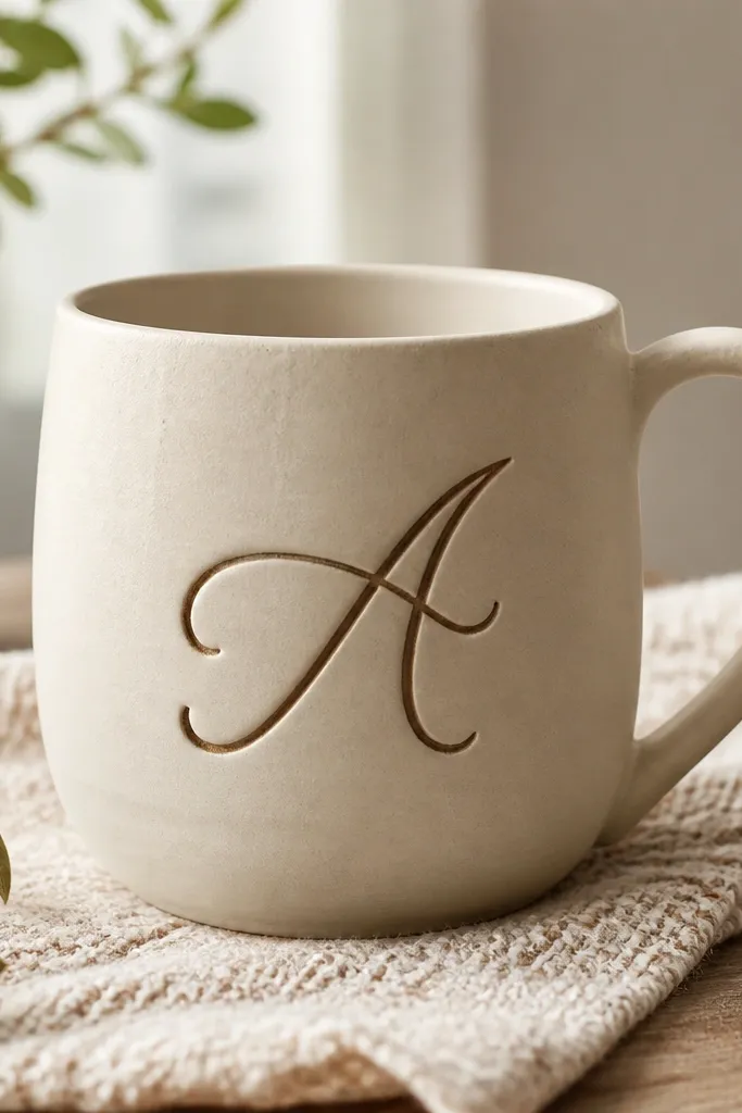
Carving gives you texture you can't fake with paint alone. The shadow wash makes the letters readable and adds depth so the initial looks engraved, not stamped. I'm picky about this one: the initial must be tall and simple or it turns into scribble.
Carve a single initial into bisque using a small needle tool, keeping the stroke thickness about 1/8 inch. Fill the grooves with darker slip or underglaze, then wipe the surface clean so only the carved lines hold color. Glaze over with clear so the grooves catch light.
Pro tipPractice the letter on a scrap tile first. Cursive strokes that work on flat clay look different on a curved mug.
AvoidDon't carve too deep - deep grooves can trap glaze and create rough edges at the lip.
18. Teal Sunburst Rays with Tiny White Center Dot
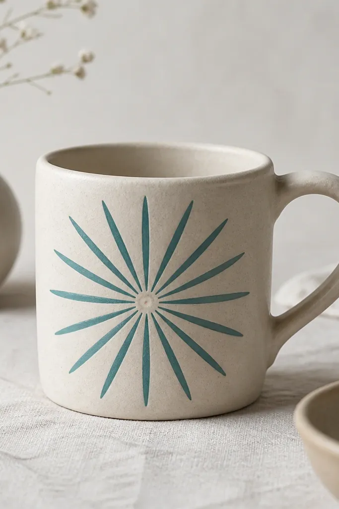
Sunburst rays give instant energy without needing a full illustration. The tiny white center dot anchors the design so your eye knows where to land. Teal underglaze looks clean under clear glaze and reads bright in photos.
Mark a center point on the front panel and draw 12 evenly spaced rays with a pencil guide. Paint rays with teal underglaze using a liner brush, tapering the ends by lifting pressure as you finish each line. Add one small white dot at the center using white slip and keep it perfectly round.
Pro tipCount the rays out loud before you paint so you don't end up with 11 or 13 after the curve distorts your spacing.
AvoidSkip thick rays - wide lines turn into a blob on a mug's curve.
19. Chocolate Drip at the Handle Side
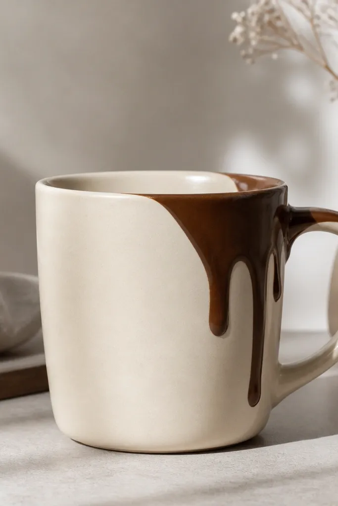
Drips look playful, but they look professional when they're controlled and placed on one side only. This design mimics melted chocolate without covering the whole mug. The clean stop above the base keeps it from looking messy or like a glaze accident.
Paint a vertical stripe about 3/4 inch wide beside the handle. From the top of the stripe, draw drip shapes that widen slightly at the top and narrow as they fall, stopping about 1 inch above the foot. Use a thinner underglaze consistency so drips look like paint, not clay ridges.
Pro tipUse a reference photo with a real drip shape. Copy the rhythm of wide-to-narrow drips, then repeat it across the mug.
AvoidDon't let drips touch the foot - contact with the base edge makes the design look like a spill.