1. Lemon-Leaf Mini Grid for Summer Mantels
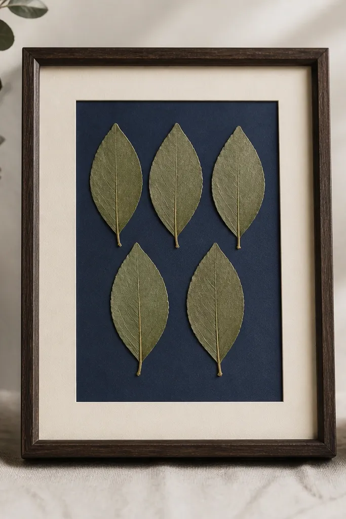
This one works because lemon leaves have thin veins that press flat and read as crisp lines. A navy backing makes the green feel fresh instead of dull. I keep the leaves spaced evenly so the frame looks intentional, not accidental. The cream mat adds a soft border that hides tape edges.
Use a 5x7 inch frame with a removable back and a 1/4 inch mat or spacer. Lay leaves in a 2x3 grid pattern, leaving one spot open for balance. Press leaves in a book for 10-14 days, then test one leaf under the cover to check curl.
Pro tipBefore mounting, hold the cover over the backing and tilt it - if you see glare hotspots, switch to a matte backing card.
AvoidDon't glue the leaf tips - they lift and look shiny under glass.
2. Red Poppy Corner Bloom on Black Card
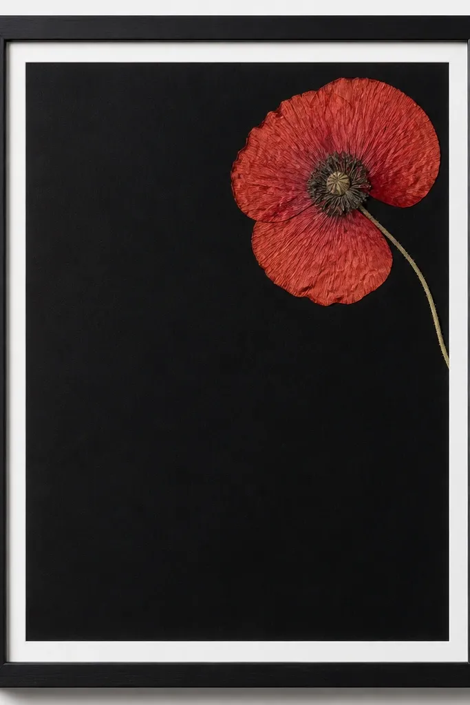
Corner placement looks modern because the flower becomes a focal point instead of a full-page collage. Black card makes red petals look deeper, not washed out. I leave breathing space so you can see the paper texture of the backing through gaps. A thin white edge keeps it from feeling heavy.
Use a 8x10 inch frame and add a white mat cut to leave a 1/2 inch border. Mount the poppy on only the thickest parts - the base and a few petal veins. Keep the flower 3-5 mm away from the cover to reduce glare.
Pro tipUse a soft pencil to mark the exact corner position before you mount anything.
AvoidAvoid centering the poppy - it turns into a "sticker" look.
3. White Daisy Stack with Off-White Backing
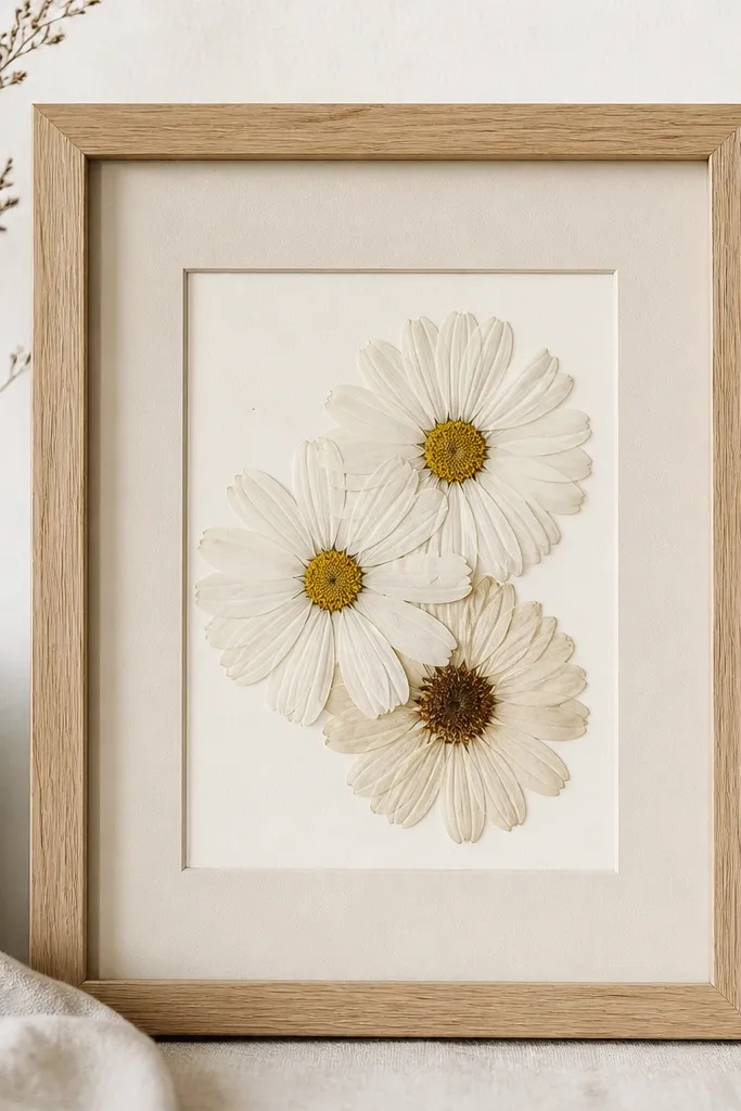
White daisies can look gray if your backing is too stark or your pressing is too short. Off-white backing keeps them warm and natural. Stacking three daisies creates depth without adding bulk, because pressed petals compress flat. The brown centers give you a built-in anchor point.
Pick daisies with thicker centers and press them longer, 14-18 days if the petals curl. Build a stack with the top flower slightly rotated and tucked behind the lower one by 2-3 mm. Use tiny glue dots at the center and one vein per petal cluster.
Pro tipIf petals look translucent, add a slightly textured paper backing instead of smooth cardstock.
AvoidDon't use pure white backing - it makes whites look chalky.
4. Spring Vines in a Round Mat Halo
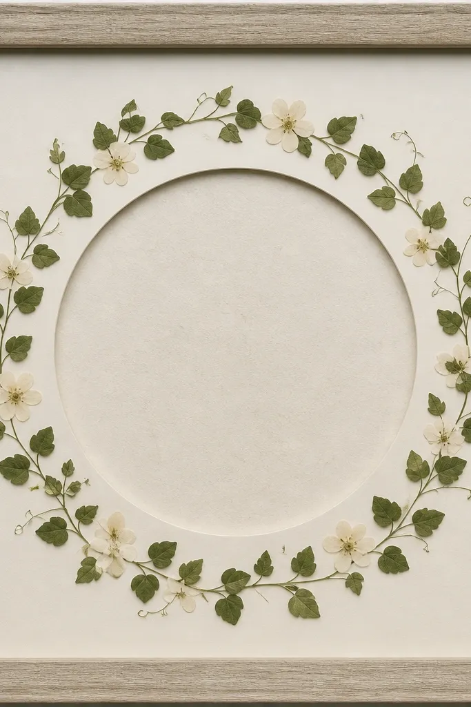
The round mat halo makes the arrangement feel like a wreath without using bulk. Vines press well and look delicate, so the ring shape reads clean. Leaving the center empty keeps the eye from getting crowded. Pale blossoms spaced around the circle look like spring "sparks."
Use a square 8x8 frame and cut a mat with a 5 inch circular window. Arrange vines in a ring so they touch the circle edge lightly, not the center. Mount vines with thin tape strips along thicker stems to avoid glue shine.
Pro tipTrim stems with small scissors so the ends don't extend past the circle window.
AvoidAvoid letting vines overlap randomly - it turns into a tangled look.
5. Thanksgiving Sage Sprig with Kraft Paper
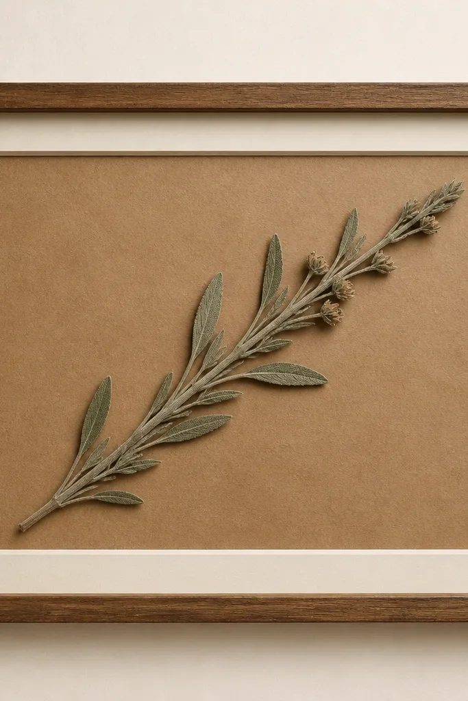
Kraft paper makes greens feel earthy, which fits fall without needing extra decor. A diagonal sprig creates motion, so the frame doesn't look like a pressed herb sample. Seed heads add texture, and the muted cream mat keeps the kraft from swallowing the flower detail. This is one of my go-to "holiday but calm" looks.
Use an 11x8 inch frame and a cream mat border about 3/8 inch wide. Press sage sprigs for 12-16 days - longer if the leaves are thick. Mount the sprig with tape along the stem and a glue dot only under any seed head that lifts.
Pro tipLightly mist the kraft backing with a tiny bit of water before mounting if it curls - press it flat afterward.
AvoidDon't use glossy kraft or shiny adhesive tape - both show through.
6. Winter Holly Pair on Deep Forest
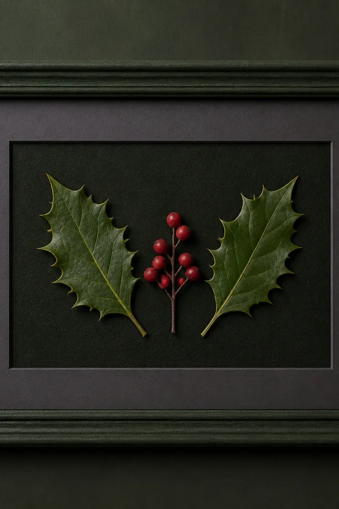
Holly reads instantly as winter because berries give you color contrast. Deep forest backing keeps red berries from looking pink. Symmetry makes it feel balanced even when the flowers are small. Charcoal mat adds a soft frame-within-a-frame effect.
Press holly leaves for 15-21 days, because berries can stay bumpy if you rush. Place one leaf on each side with berries centered between them. Mount berries with micro glue dots at the base so the red stays matte and doesn't smear.
Pro tipIf berries look translucent, press them longer until they flatten - you'll see the color deepen after flattening.
AvoidAvoid gluing berries by the sides - they tip and look uneven.
7. Pastel Lavender Sprig with Blush Mat
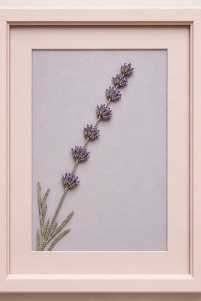
Lavender spikes can look dull if you use dark backing, so I pair them with a soft gray-lilac. The blush mat adds warmth without turning the purple into a "baby" color. A single sprig feels intentional and keeps the frame from turning into a pile. The mat border makes the sprig look framed, not taped down.
Use a 5x7 or 6x8 frame in light wood or painted white. Press lavender for 12-15 days, then trim the stem so it doesn't touch the cover. Mount with a thin strip of double-sided tape under the stem and one tiny dot at the spike base.
Pro tipChoose lavender sprigs with even spike thickness - thin spikes press darker and look patchy.
AvoidAvoid using clear gel glue - it dries shiny under cover glass.
8. Monochrome Dried Ferns on White Mat
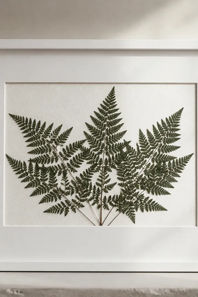
Fern fronds look great because their pattern reads even when the color fades slightly. A textured white backing prevents the fern from turning into a flat silhouette. I like monochrome because it makes the pattern the star. The thick mat gives it a museum vibe without changing the flowers.
Press ferns between blotting paper and change sheets every 2-3 days for faster drying. Use a frame with a mat window wide enough for frond ends to breathe. Mount on two or three tape strips along the stem, not along each leaf - it keeps the fronds from lifting.
Pro tipIf fern edges curl, press again with fresh paper for 3-5 more days before mounting.
AvoidAvoid cutting fern fronds too short - you lose the delicate edge detail.
9. Rosebud Trio in a Vertical Band
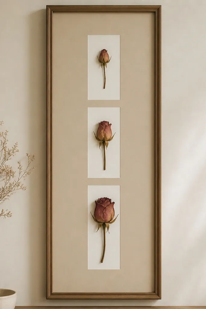
A vertical band works because rosebuds have defined shapes that look good even when pressed flat. Beige backing prevents rose petals from turning gray. The narrow mat columns create separation so each bud stays distinct. It's clean, giftable, and doesn't require lots of flowers.
Press rosebuds 18-24 days - roses take longer to flatten without browning. Arrange buds with 1/4 inch spacing and rotate each bud slightly so the petals show more detail. Use tape under the base of each bud only.
Pro tipIf petals are thick, press rosebuds between two sheets of parchment to reduce sticking to paper.
AvoidAvoid overlapping rosebuds - pressed petals fuse and look muddy.
10. Autumn Marigold Confetti Border
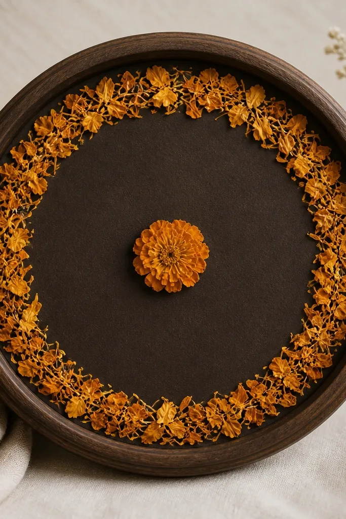
Marigold petals are thin and press into tiny shapes that look like confetti. A border ring keeps the center clean, so the petals don't crowd the whole frame. Dark brown backing makes orange look warm instead of rusty. One center bloom gives you a clear focal point.
Use a round frame with a mat ring. Press marigold petals individually for 7-10 days, then trim any uneven edges. Mount border petals with micro tape dots - I place them only on thicker petal bases so they don't lift.
Pro tipKeep border petals at least 1/2 inch from the cover to reduce glare and shadow smudging.
AvoidAvoid stacking multiple petals in one spot - it creates a lumpy center.
11. Snowflake Paper Cut + Pressed Pale Flowers
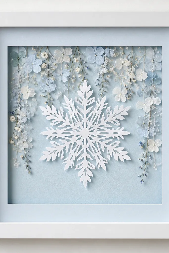
This works because the snowflake cut gives shape and keeps the flowers from floating randomly. Pale blossoms look brighter against light blue, and the paper cut creates a crisp layer that reads winter fast. You get depth without thick glue. It also hides any uneven edges from pressing.
Cut a snowflake from cardstock and mount it slightly in front of the flowers using thin foam tape strips (about 1/8 inch). Arrange blossoms behind the cut so tips point downward. Mount flowers flat to the backing and keep the cutout centered.
Pro tipUse a craft knife and a steel ruler so the snowflake edges stay sharp and don't tear.
AvoidAvoid placing flowers directly on top of the snowflake cut - it blurs the cut pattern.
12. Eucalyptus Minimal Line on Gray Back
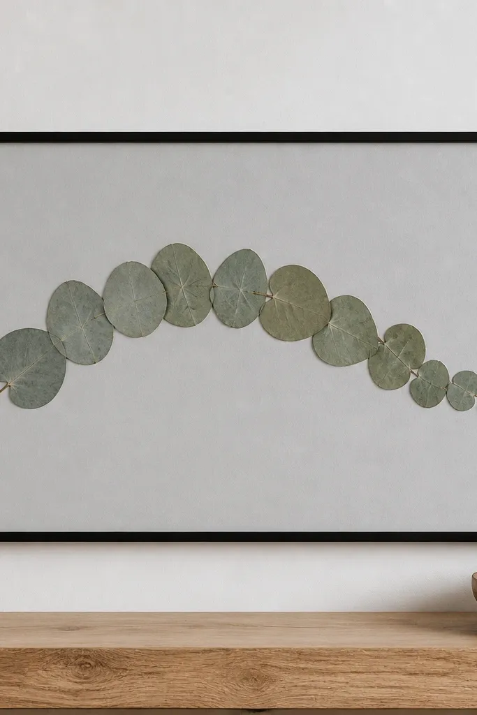
Eucalyptus leaves are great for minimal designs because their shape stays readable even when color fades a touch. Gray backing makes the green feel calm and modern. One sweeping line keeps the frame from looking cluttered. I like a slim black frame because it frames the arc cleanly.
Press eucalyptus for 14-20 days so the leaves flatten. Arrange in a gentle arc, spacing leaves about 1/4 inch apart. Mount with tape along the stem line - I don't glue each leaf because it creates shine and bumps.
Pro tipIf leaves curl, press them with weight and check weekly - don't mount until the edges lie flat.
AvoidAvoid using too many leaves - the arc turns into a blob.
13. Monogram Frame with Tiny Pressed Flowers
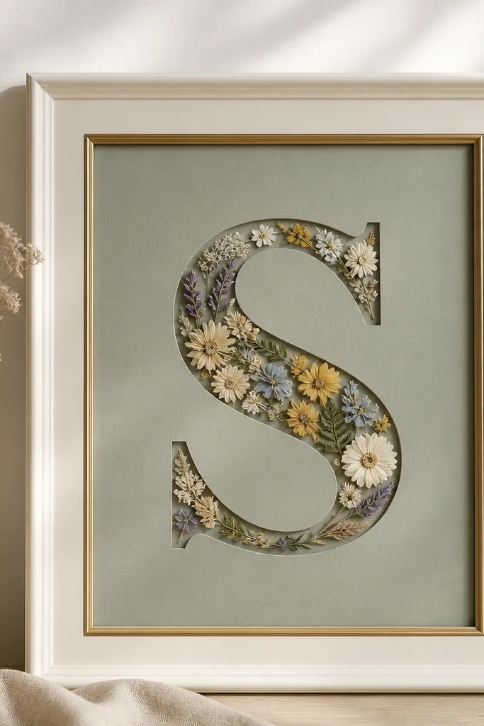
A monogram turns pressed flowers into something you can gift without writing a card. The key is scale: tiny flowers need room to breathe inside the letter. Sage backing keeps greens soft and makes multicolor petals pop. The gold mat adds a warm edge without stealing attention.
Cut a monogram from cardstock or buy a laser-cut letter. Place it on top of flowers using foam tape so you get a layered look. Fill the letter with small pressed blossoms and mount them with micro tape points.
Pro tipUse a matte backing for the inside of the letter so petals look dry, not glossy.
AvoidAvoid big flowers in a small letter - they cover the cut edges and look messy.
14. Red-White-Blue Ribbon Band with Petals
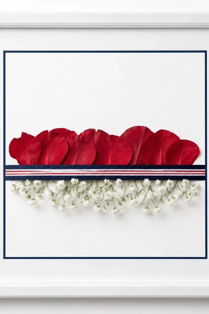
This looks festive because the ribbon gives you a clean horizontal anchor. Pressed petals add color without turning into a thick craft project. The red and blue separation reads clearly under cover glass. I also like how the ribbon hides the seam where mounting tape ends.
Use a frame with a mat that has a center window. Mount ribbon with double-sided tape along the back, then place flowers above and below the ribbon line. Keep ribbon width around 1/4-3/8 inch so it doesn't overpower the petals.
Pro tipTie ribbon ends neatly and cut them at a slight angle so they look sharp even through glass.
AvoidAvoid glossy satin ribbon - it reflects harsh highlights.
15. Pink Heart Frame with Pressed Violets
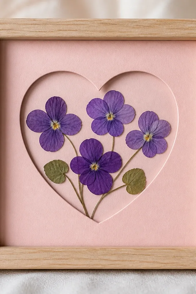
The heart shape makes violets look like they belong together. Pink backing warms the purple so it doesn't look bruised. A cutout heart also hides any uneven mounting edges around the perimeter. This is one of the easiest "holiday" looks for Valentine season without adding stickers.
Cut a heart window in the mat so the flowers sit inside the heart boundary. Press violets for 10-14 days, then trim stems. Mount each violet by its base only, and keep petals flat by pressing under a book for 24 hours after trimming.
Pro tipUse a matte pink paper, not shiny craft foam - you want dry-looking texture under flowers.
AvoidAvoid crowding the heart - leave at least 1/8 inch around the edges.
16. Easter Egg Outline with Tiny Blossoms
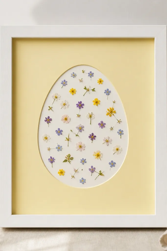
The egg outline gives you a holiday cue even if the flowers are subtle. I like tiny blossoms because they mimic speckling and avoid heavy color blocks. Yellow backing makes spring colors look bright without needing bright frames. It also keeps the arrangement from feeling like a "flower pile."
Cut an egg outline from cardstock and mount it with foam tape so it sits above the flowers by 1/8 inch. Scatter small pressed blossoms inside the outline and secure with tiny tape dots. Use a thin mat border so the egg edges don't touch the frame glass.
Pro tipChoose blossoms with similar scale so the speckle pattern looks even.
AvoidAvoid large stems inside the egg outline - they poke out and break the silhouette.
17. Mossy Green Frame with Pressed Grass Blades
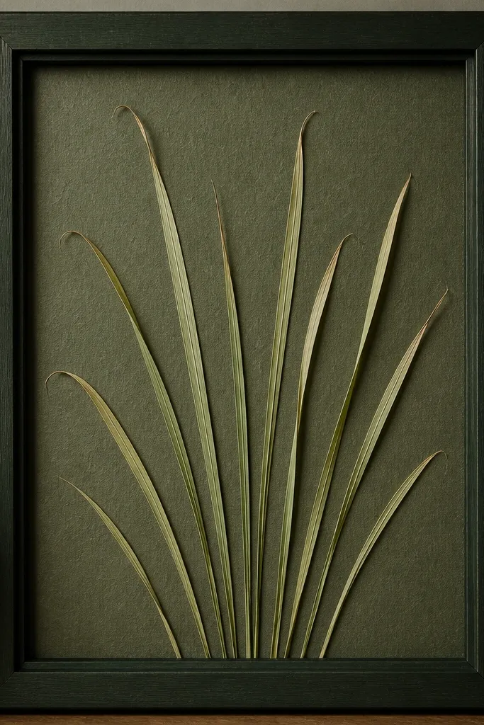
Grass blades add a natural texture that reads seasonal even in winter. The textured backing makes the frame look like it has depth. A fan pattern keeps the blades aligned so it doesn't look chaotic. When pressed correctly, grass looks delicate instead of brittle.
Press grass blades between blotting paper and change sheets every couple days. Arrange in a fan with the bases near the bottom center and tips reaching up. Mount with tape along the base line only - grass is too thin to glue without staining.
Pro tipIf grass shows dark spots, blot it again with fresh paper before mounting.
AvoidAvoid gluing grass tips - they soak glue and darken.
18. Monochrome Black Flower with Gold Mat Accent
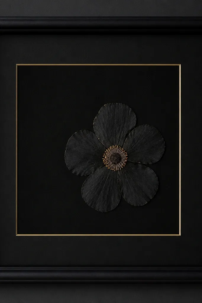
A single dark flower can look stunning when you keep the background equally dark but add gold for separation. The gold mat line gives you a clean edge that makes the flower feel intentional. Off-center placement keeps it from looking like a funeral photo. This one is bold and reads "gallery" without extra decoration.
Pick a flower that presses with strong contrast, like a dark maroon-black bloom. Use a gold pen line on the inside mat edge or a mat with a gold strip. Mount the flower with tape only under the thickest part so petals stay matte.
Pro tipTest the cover for glare by shining a phone flashlight across it at a low angle.
AvoidAvoid using a shiny black backing - it reflects and washes out petal detail.
19. Halloween Witchy Frame with Orange Calendula Sprigs
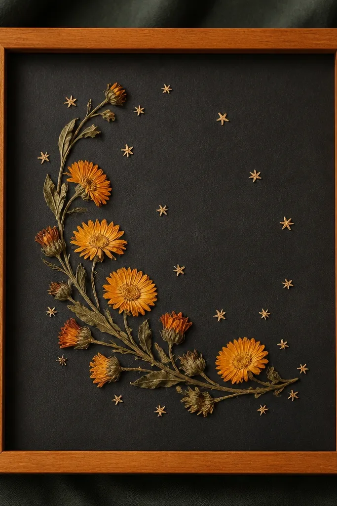
Calendula has a warm orange that presses well and stays readable. Charcoal backing makes it feel Halloween without going neon. The crescent line looks like a spell circle, and the tiny star petals add a "plan" to the composition. This is spooky season that still looks clean on a wall.
Press calendula for 12-16 days. Arrange in a crescent with a consistent gap between sprigs. Mount stars with micro tape dots and keep them away from the cover to prevent glare halos.
Pro tipUse a matte charcoal backing so orange doesn't look smeared under glass.
AvoidAvoid too many scattered pieces - it turns into random confetti.