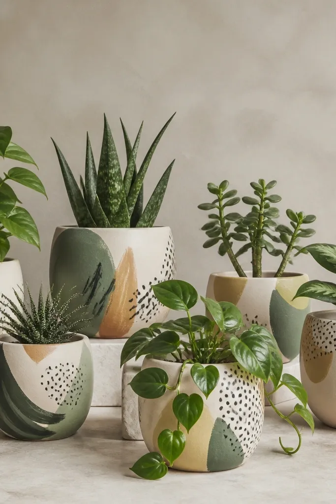
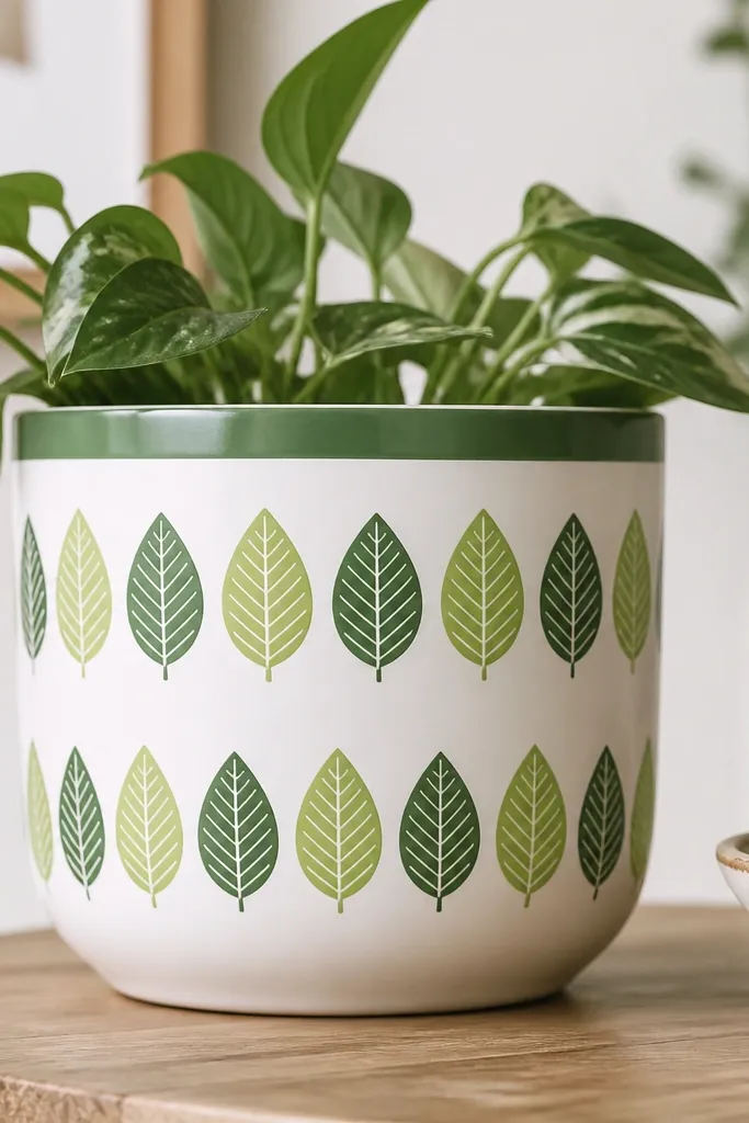
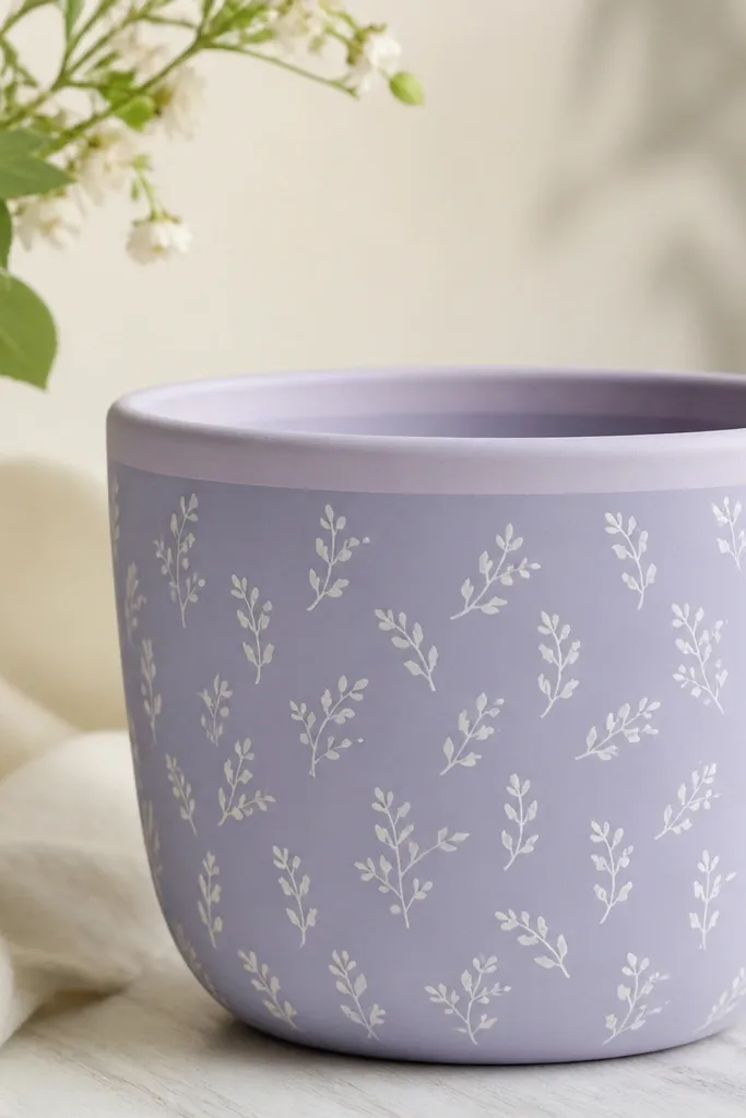
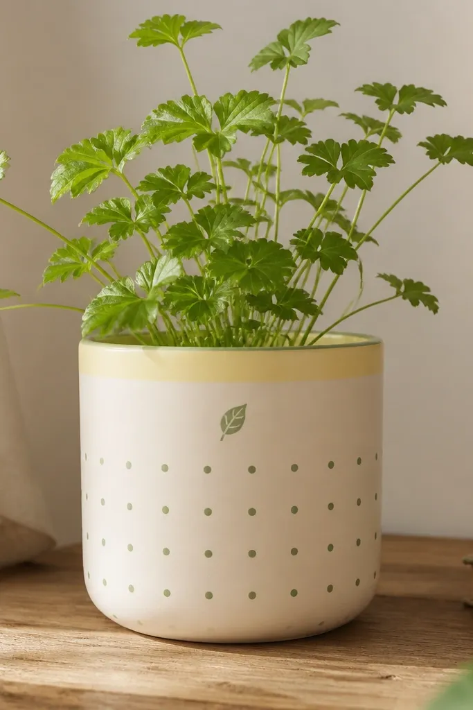
1. Sage rim + tiny leaf dots
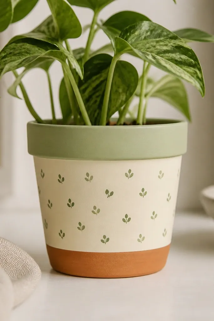
This one works because it echoes the silvery-mint look many herbs and small succulents have. The sage rim frames the plant like a collar, while the leaf dots keep the design light enough not to steal attention from the foliage. I use a cream base so dark leaves don't look heavy. The two-tone dots make the pattern feel hand-done, not printed.
Paint the rim first with painter's tape 1 cm down from the top edge. Use a small foam stamp or the cut end of a craft sponge for dots, spacing about 1.5-2 cm apart in loose rows. Seal with satin clear coat for indoor or matte for a softer look on bright windows.
Pro tipIf your plant is minty, add one extra dot color that matches the underside of the leaves - usually slightly grayer.
AvoidDon't make the dots too big; oversized dots make the pot look like a sticker sheet.
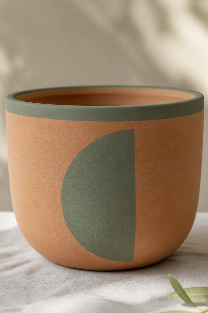
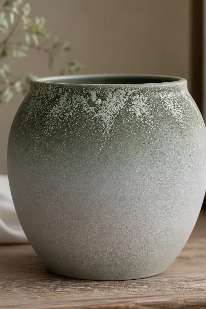
2. Terracotta ombre to leaf-green base
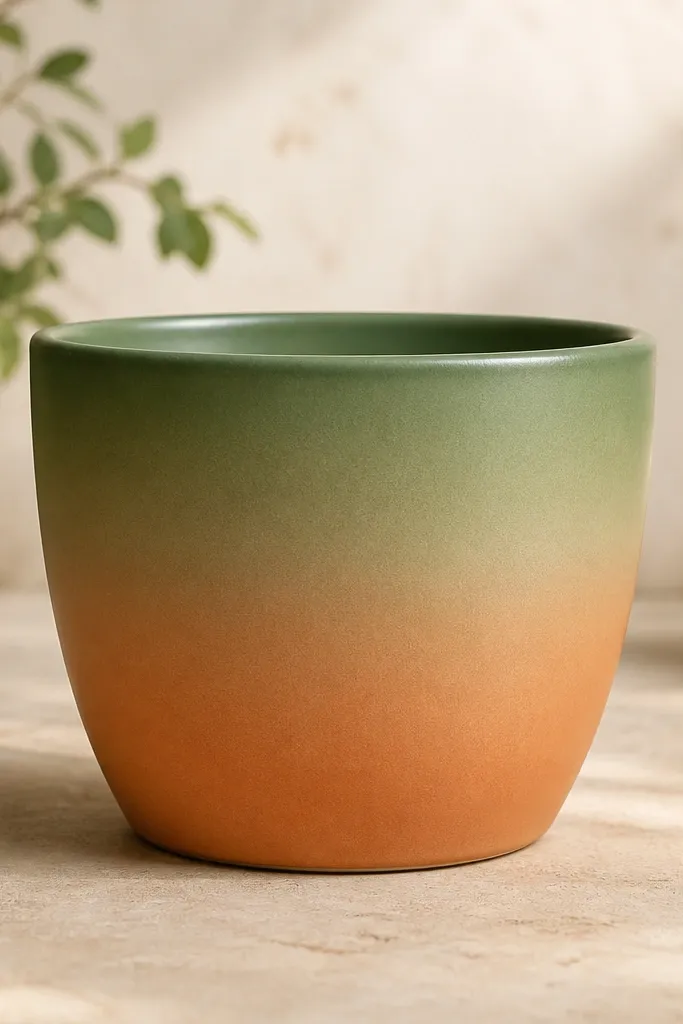
Ombre looks expensive because your eye reads it as a single color story. When the top is leaf-green, the plant blends into the pot instead of contrasting harshly. I like keeping the bottom warm so the pot still feels grounded. This is a great match for plants with long trailing leaves or bright chartreuse growth.
Start by painting the bottom third with a watered-down leaf-green acrylic. As you go up, gradually add more paint to darken it, then blend the transition with a damp sponge. Mask a 1 cm rim band in the darkest leaf-green for a clean finish.
Pro tipBlend in small sections and stop blending once the paint starts to tack - overworking can create muddy edges.
AvoidSkip thick paint layers; they crack on terracotta as they dry.
3. Botanical line art on a cream background
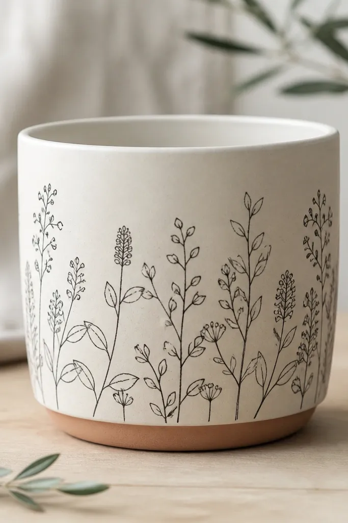
Line art makes plant textures look sharper because it stays thin and doesn't compete with real leaves. The black lines give contrast, but the cream keeps it gentle. I've used this style with pothos and spider plants where the foliage already has lots of fine detail. The wrap-around band makes it feel intentional even on short pots.
Use a fine liner brush or a paint marker to draw one continuous vine line around the pot, then add small leaf shapes branching off. Keep line thickness consistent by loading the brush lightly. Seal with matte clear coat so the line art doesn't glare under sunlight.
Pro tipPractice the vine path on paper first, then transfer by lightly marking leaf "anchors" with a pencil.
AvoidDon't fill the leaves with solid black; filled shapes look heavy on small pots.
4. Watercolor wash with matching plant silhouettes
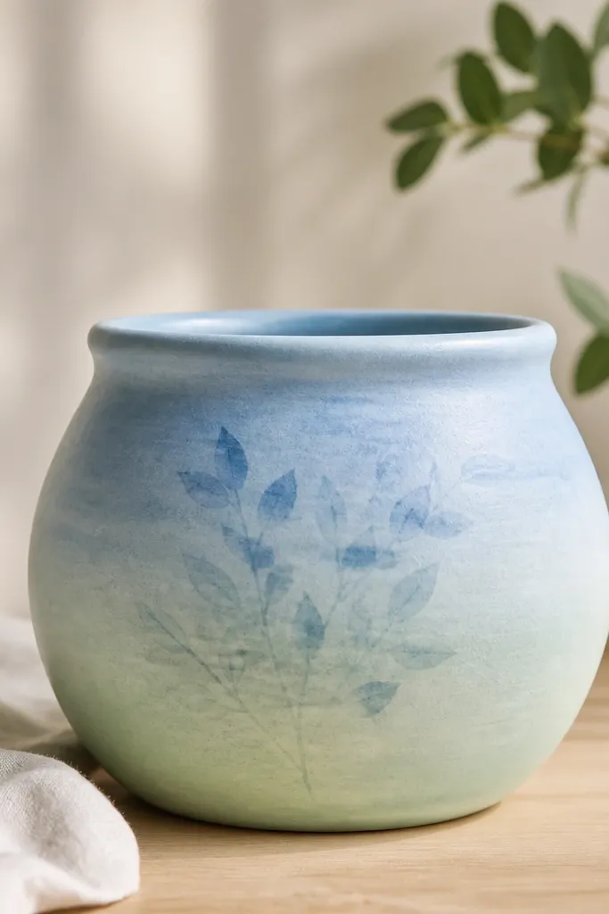
Watercolor effects look soft next to living plants. The fading wash gives movement, and the silhouettes connect the design to the plant without copying every leaf exactly. I love this for ferns and trailing plants because the soft tones mimic misty growth. It also hides small painting imperfections.
Dilute acrylic with water (about 1:1) and dab on with a large brush, then blend edges with a damp sponge. Add silhouettes using a stencil or a simple cutout leaf shape pressed lightly with paint. Keep the silhouettes clustered to one area so the pot doesn't look busy.
Pro tipAdd one darker "cloud" patch behind the silhouette cluster to make it pop.
AvoidDon't outline the silhouettes; crisp edges turn it into cartoon art.
5. Pastel stripes + tiny herb labels
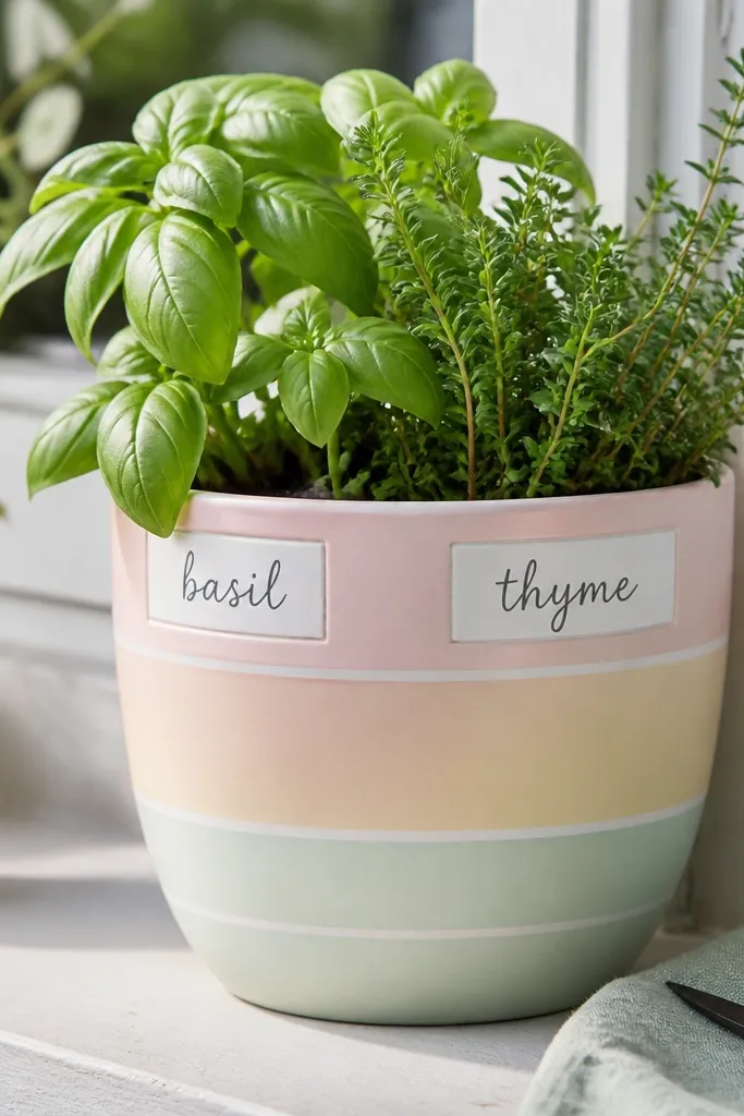
Stripes create instant order for a group of pots on a windowsill. The tiny label boxes feel cute and practical, and they also help you remember which plant is where. Pastels make herbs look fresh instead of harsh. This works especially well for counter-height arrangements where you can read the labels.
Mask horizontal stripes with painter's tape, spacing each band about 1-1.5 cm. Paint labels using a tiny round brush and a light rectangle template made from scrap paper. Seal with satin so lettering stays readable without glare.
Pro tipUse one letter style across all pots - I keep it simple with block capitals.
AvoidSkip neon pastels; they clash with natural leaf colors.
6. Navy stars with moon-rim
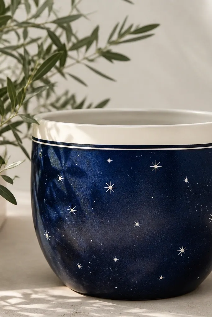
This is a fun winter-to-spring look that still works for plants year-round. The navy makes green leaves look richer, and the white stars give a cozy night-sky feel without getting childish. I've used it with succulents on a porch and it looks great under warm string lights. The rim halo ties everything together.
Paint the pot body navy first and let it dry fully. Add stars with a toothbrush flick or a small star stencil, then paint a cream rim band. Finish with a clear matte coat to reduce sparkle glare.
Pro tipAim for star sizes from pinhead to pea-sized; one-size stars look flat.
AvoidDon't cover the entire pot in stars. Leave breathing space so the plant still leads.
7. Gold scallop edge + green vines
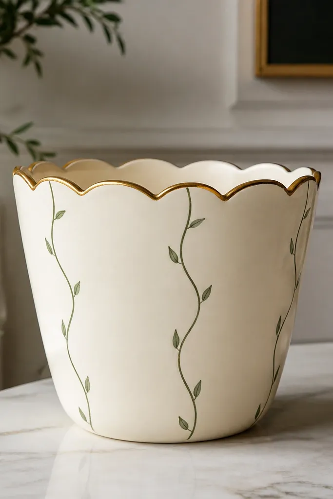
The gold scallops look like pottery from a boutique shop, and they frame the rim where your eye lands. The green vines pull the design toward the plant without mimicking the exact leaves. I use this on plants with trailing growth because the vine direction matches the natural flow. The cream base also keeps gold from looking too loud.
Use a scallop sponge brush or a paper scallop template to paint the gold band 1 cm thick around the top. For vines, use a small liner brush and paint smooth curves in two shades of green. Seal with satin clear coat so gold stays warm.
Pro tipLet the gold band dry, then add vines after - it prevents accidental gold streaks into green.
AvoidAvoid thick gold paint. It looks raised and chips when you handle the pot.
8. Leaf print stamping in two rows
Leaf stamping gives you a texture effect that looks real up close. Two rows keep it clean and make the design consistent across different pot sizes. The alternating green tones make it look intentional rather than random. This is the style I reach for when I want the plant to feel like it has a pattern theme.
Press a real leaf onto acrylic paint, then stamp onto the pot - I like using sturdy leaves like basil or mint. Make two straight rows, spacing about 2 cm between stamps. Paint a rim band in the darker green and seal with matte.
Pro tipWipe the leaf stamp between prints with a slightly damp cloth so the edges stay crisp.
AvoidDon't use too wet paint on the leaf stamp; it smears and turns into blobs.
9. Monochrome terracotta with sage half-moon
This one is minimal and still reads as "designed." Leaving most of the terracotta visible keeps it warm, and the sage half-moon matches leafy greens without turning the pot into a full painting project. It's great for tall plants where you only see part of the pot at a time. The sharp edge makes it look modern.
Tape off a half-moon shape on one side using a flexible tape strip. Paint sage, then remove tape while paint is still wet. Add a thin sage rim band so the design feels connected to the top.
Pro tipPick one side to paint and keep all other pots oriented the same way in your arrangement.
AvoidDon't freehand the half-moon edge; cheap-looking curves happen when tape isn't used.
10. Chunky speckle glaze look
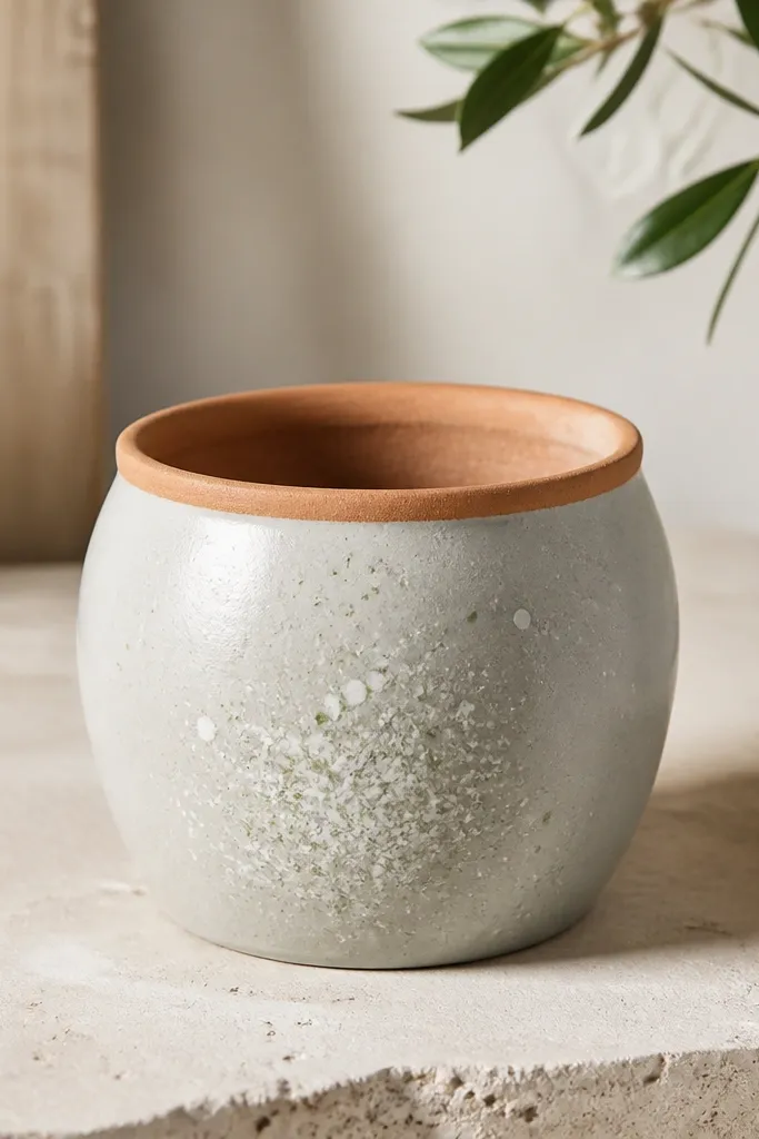
Speckle hides brush marks and makes the pot look handmade. The pale green specks echo new growth, while the gray base gives a calm background for brighter plants. I've used this style on mixed succulents where each plant has different colors - the speckles unify them. It also looks good on small pots because texture reads at a distance.
Use a stiff brush loaded with thicker paint for speckles. Flick from about 6-8 inches away for consistent dot size. Keep the rim unpainted or paint only a thin ring, then seal with satin to keep texture from getting dull.
Pro tipDo a test flick on cardboard first; distance controls dot size.
AvoidDon't make tiny speckles all over. It turns into dust instead of glaze.
11. Christmas red stripe with evergreen bow
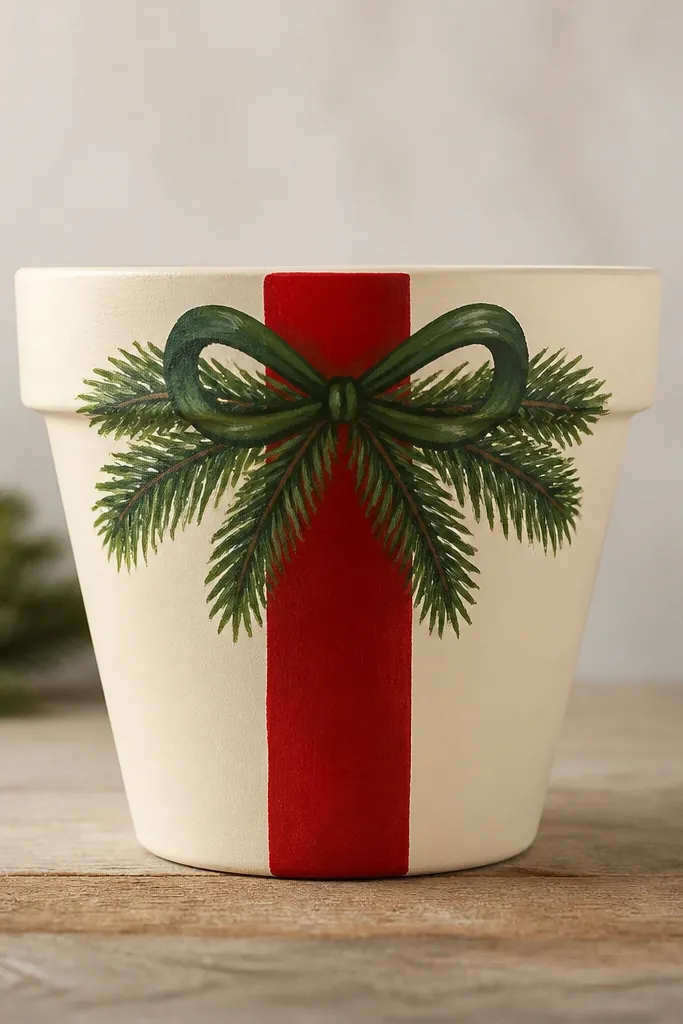
This is a seasonal look that still fits living plants because the bow sits near the top where holiday decor usually goes. The red stripe gives you the holiday hit, and the evergreen bow ties it to needles or pine-like leaves. I've used it for winter houseplants on a mantel and it looks cohesive with wreaths. It's also easy to repeat across a few pots.
Paint the cream base, then mask a vertical stripe about 2.5 cm wide. For the bow, use a small liner brush to paint two loops and a center knot, then add short needle lines in lighter green. Seal with matte so the painted ribbon doesn't shine like plastic.
Pro tipMatch the red to the plant pot color if you already have terracotta - deep red looks best against warm clay.
AvoidSkip metallic glitter paint on the bow; it flakes when you water.
12. Lavender wash + white sprig accents
Lavender pairs beautifully with plants that have purple blooms or dusty leaves. The white sprigs add airy contrast and make the pot feel light, not heavy. I like this for indoor plants because the colors look gentle in warm lamp light. The sprigs also echo the way herbs and small flowering plants branch.
Paint the body with a light lavender wash using a sponge for even coverage. Add white sprigs using a stencil or by painting a simple twig line with tiny side leaves. Finish with satin clear coat to keep the wash looking smooth.
Pro tipUse two sprig sizes: one skinny twig and one thicker one. It looks more natural.
AvoidDon't go too dark with lavender; it can make green leaves look dull.
13. Candy cane rim + striped plant stand look
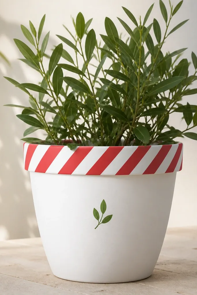
This style gives you a holiday cue without covering the whole pot. A striped rim looks crisp and reads clearly from across a room. The tiny green leaf icon connects it to plants so it doesn't feel like generic Christmas paint. I use it when I'm painting multiple pots for a seasonal table and want them to match but not look identical.
Paint the pot white first. Mask a 1 cm rim band and paint diagonal red stripes, alternating with white. Add a small leaf icon with a dot-and-line method using a fine brush, then seal with matte.
Pro tipLet the white base cure overnight before taping the rim so the tape doesn't pull paint.
AvoidSkip sloppy stripe edges; uneven stripes make it look like kids' crafts.
14. Autumn leaf silhouettes with burnt orange rim
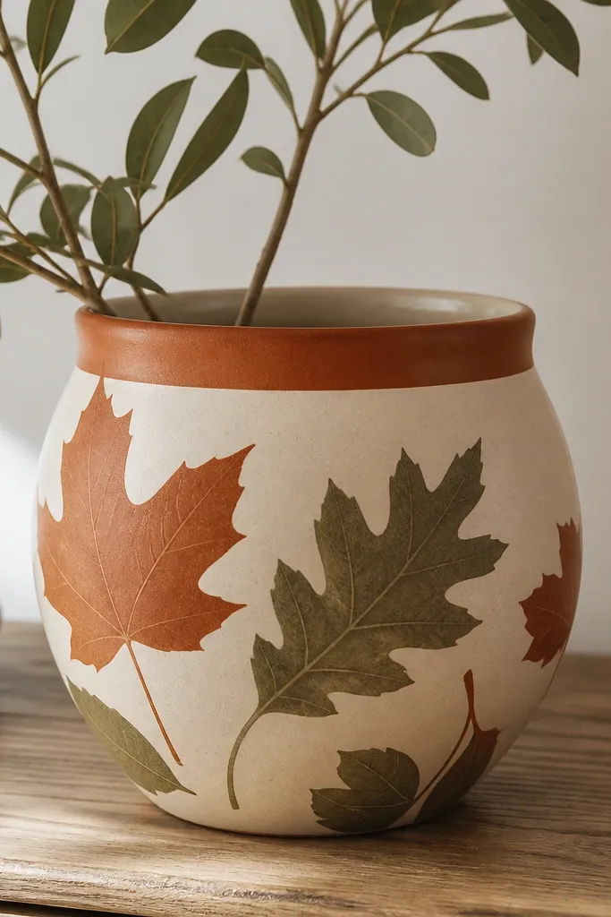
Burnt orange on the rim makes plants look warmer during fall, especially olive-green foliage. The large silhouettes are bold but still plant-related, so it doesn't look like random seasonal decor. I've done this for window boxes with mums and it looked good even after the flowers faded because the pot design remained interesting. The muted colors keep it from feeling too loud.
Paint the rim burnt orange with a clean tape line. Use a leaf stencil for silhouettes, then place them in a diagonal drift across the pot. Seal with satin for a slightly warmer look on terracotta-like tones.
Pro tipUse two silhouette colors only, not three. Two colors keep the pattern calm.
AvoidDon't add glitter to fall leaves; it catches dust and looks messy fast.
15. Seafoam geometric blocks
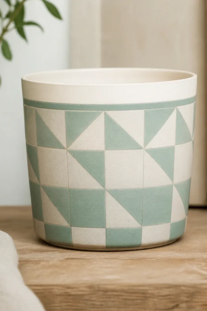
Geometric blocks look modern and make plants look neatly framed. Seafoam works with both green and silver plants, and the off-white keeps it from feeling too cool. I use this for plants that have structured leaves, like jade or some peperomias. The geometry also makes it easy to repeat the look on multiple pots.
Paint a seafoam base, then tape small geometric shapes and fill with off-white. Keep blocks around 1.5-2.5 cm so they read clearly. Seal with satin clear coat for a smooth, clean finish.
Pro tipAfter removing tape, touch up tiny gaps with a toothpick dipped in paint.
AvoidDon't use overly thin paint for taped shapes; it bleeds under tape and blurs lines.
16. Monogram initial with vine border
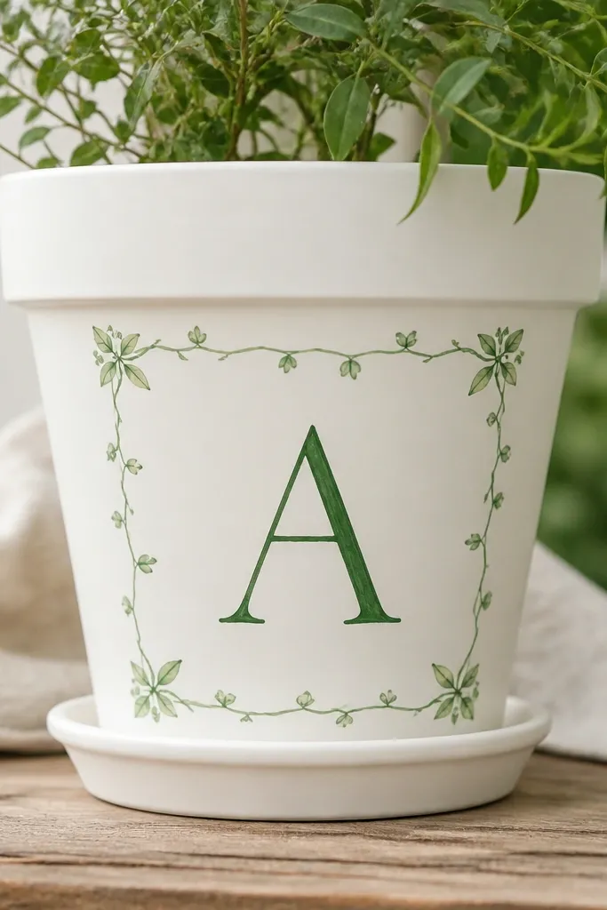
A monogram makes a set feel personal, and the vine border ties it to plants. I like dark green for the initial because it looks like stained wood when sealed. The border stays thin so it doesn't compete with the plant, and it creates a frame effect. This is perfect when you're painting a pot for a specific person or gift.
Paint a white base, then stencil or freehand one initial about 6-7 cm tall. Draw a vine border using a liner brush and add three small leaf buds at top-left, top-right, and bottom center. Seal with matte to keep the initial from looking glossy.
Pro tipUse the same initial style on every pot in a gift set so they feel like a set.
AvoidSkip cursive if you don't have steady control; wobbly letters look cheap.
17. Pink blush with green check accents
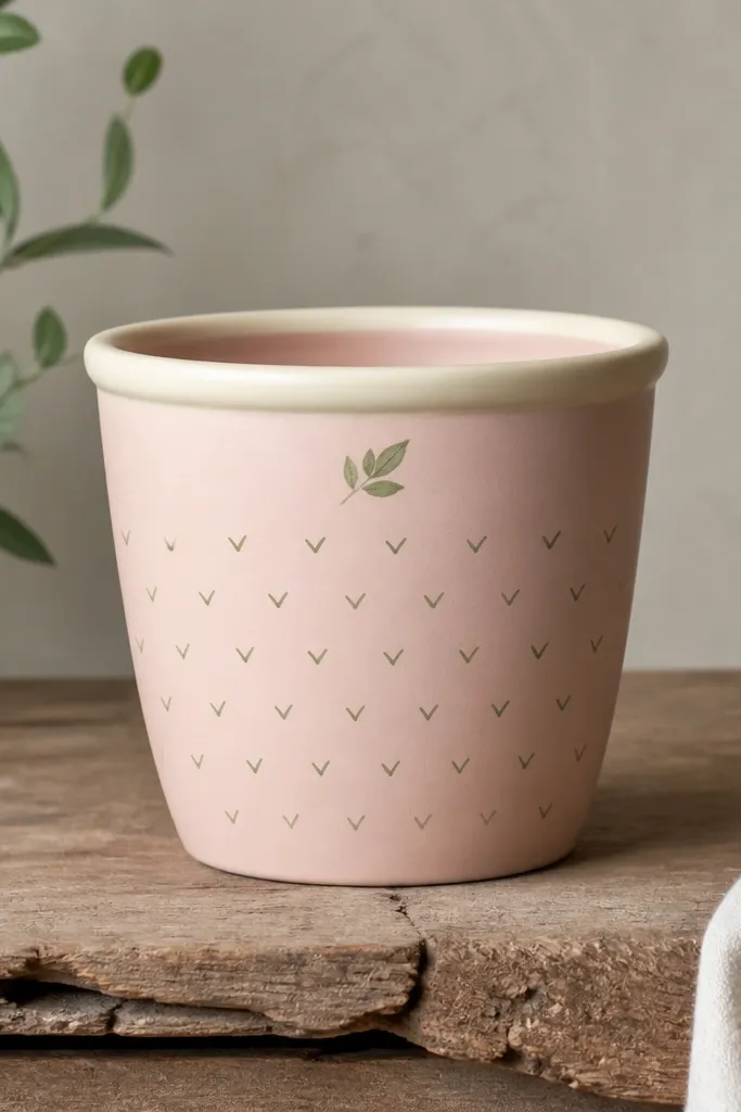
Blush pink makes some plant colors pop, especially deep green and variegated leaves with cream edges. The check pattern adds a playful rhythm without needing large drawings. Keeping the check pattern on one side prevents the pot from looking chaotic when leaves fill the rest. The tiny leaf keeps the theme consistent with "with plants."
Paint the base blush pink, then tape a vertical panel on one side for the check pattern. Paint small squares in two stages: first all squares in green, then add the alternating checks in a slightly darker green. Seal with satin for a clean finish.
Pro tipUse a ruler or a printed square guide under your tape so the checks stay even.
AvoidDon't paint checks too large; big checks look like fabric, not pot art.
18. Black base with gold leaf veins
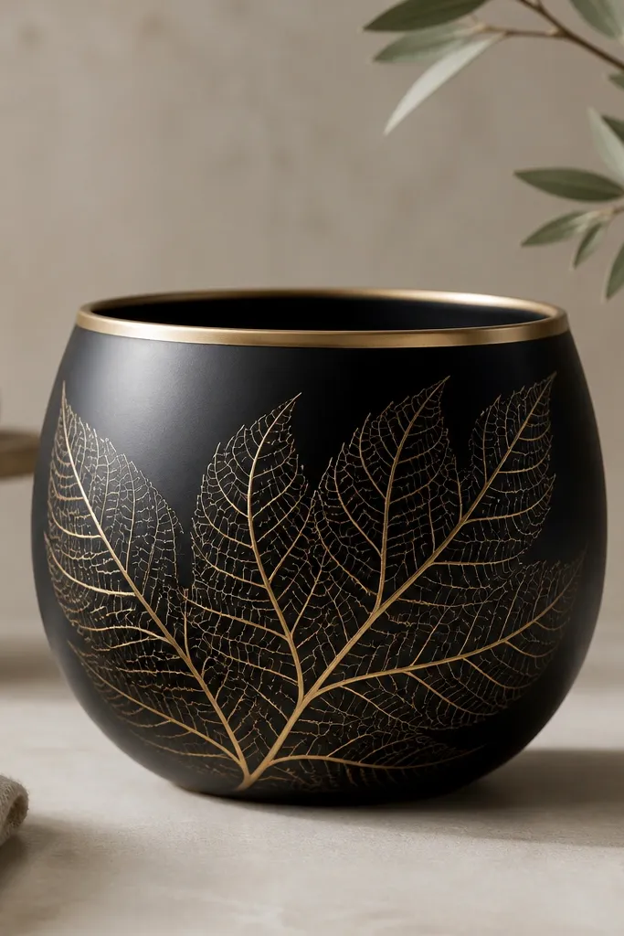
Matte black and gold looks sharp next to bright greens. Because the gold is just veins, it stays delicate and doesn't overpower the plant. I've used this with tropicals like calatheas where the leaves already have patterns, and the pot adds a clean, modern frame. The gold rim makes the plant feel more "finished."
Use matte black acrylic as the base. Paint a thin gold rim band with a small flat brush. For veins, use a fine liner and paint curved lines branching from a center stem, leaving space between lines so it stays airy. Seal with matte clear coat to keep black truly matte.
Pro tipThin your gold paint slightly so it flows like a line, not a blob.
AvoidAvoid thick gold paint. It looks raised and can flake when handled.
19. Whitewashed pot with sage wash band
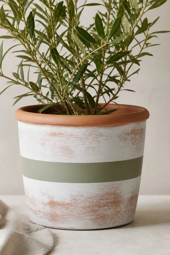
Whitewash gives you that rustic, airy look without needing full coverage. The midsection sage band makes it feel intentional and ties directly to green leaves. This style works when you want a set that looks cohesive but still natural. I use it outdoors on herbs because it hides scuffs better than smooth solid paint.
Mix white acrylic with water so it's semi-transparent, then wipe on with a rag. Let it dry, then paint a sage band around the middle using tape. Leave the rim terracotta or lightly brush it with whitewash so it looks weathered rather than painted.
Pro tipIf the whitewash looks too opaque, wipe again with a damp rag while it's still wet.
AvoidDon't seal before the whitewash dries fully; it can smear under the clear coat.
20. Spring green dots with butter-yellow rim
Butter-yellow rim makes plants look fresh and bright, especially in morning light. The dot rows are tidy and easy to repeat across a group. This design feels cheerful without being holiday-themed, so it works all spring. The tiny leaf icon keeps the pot tied to the plant theme.
Paint a pale cream base, then tape a 1 cm rim band in butter-yellow. Add spring green dots in vertical rows, keeping spacing consistent. Seal with satin clear coat so the dots don't dull.
Pro tipUse a dot stamp or the eraser end of a pencil-like tool for repeatable dot size.
AvoidSkip uneven dot spacing; random spacing makes it look rushed.
21. Mossy vertical stripes with tiny fern tips
Vertical stripes add height and make the pot look taller next to plants. Mossy green stripes work with both soft greens and darker leafy plants. The fern tips at the top echo the plant crown and tie the design to what's growing above. It's a great match for ferns, asparagus fern, and trailing greens.
Tape vertical stripes about 1 cm wide on a cream base. Paint moss green stripes, then remove tape carefully. For fern tips, paint a simple branching shape above the rim and add tiny leaf strokes on the ends.
Pro tipKeep the fern tips slightly off-center so it looks hand-placed, not stamped.
AvoidDon't make stripes too thin; thin stripes show tape lines and look messy.
22. Winter white with pine bough band
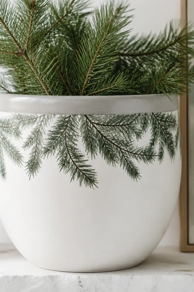
Winter white looks clean next to evergreen plants and holiday greens. The pine bough band sits where you notice it, so the pot reads like seasonal decor even when the plant is small. Needle strokes add texture that matches real pine. Soft gray rim keeps it from feeling too stark.
Paint the pot white with two thin coats. Tape a horizontal band across the top third, then paint pine bough branches with a small angled brush. Add needle strokes by dragging the brush tip out into short lines. Seal with matte clear coat.
Pro tipUse a dry brush technique for needles so they look layered instead of solid blocks.
AvoidSkip thick pine paint; it cracks when the terracotta flexes outdoors.
23. Terracotta base + white vine wrap
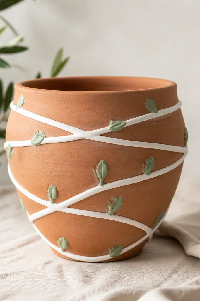
Leaving the terracotta base visible keeps the pot warm and natural, which makes plants look more "at home." The white vine wrap looks like painted pottery, and the pale green buds connect it to the plant without adding heavy color. I've used this with climbing plants because the spiral feels like growth. It's also forgiving if your paint coverage isn't perfect.
Paint only the vine path with a light cream-white, about 6-8 mm wide. Add small buds in pale green at intervals, spaced about 3-4 cm apart. Seal with satin so the vine wrap looks smooth and not chalky.
Pro tipDraw a light pencil guide line for the spiral before you paint the vine.
AvoidDon't cover the entire pot with white; it makes terracotta look like plastic.
24. Silvery sage ombre with speckled top
This one flatters plants with fuzzy or silvery leaves because the pot matches their tone. The ombre gives depth, and the speckles near the top feel like natural frost. It looks great on windowsills where light hits the upper half more. The silvery bottom also hides scuffs better than pure white.
Blend darker sage into silvery gray using a sponge in gentle passes. Add speckles with a toothbrush flick just below the rim band. Seal with satin for a gentle glow that doesn't look shiny like lacquer.
Pro tipKeep speckles only in the top third. Too many speckles make it look dirty.
AvoidAvoid using metallic paint for the whole pot; it turns uneven and can look patchy.