1. Sunburst Terracotta Rim Line
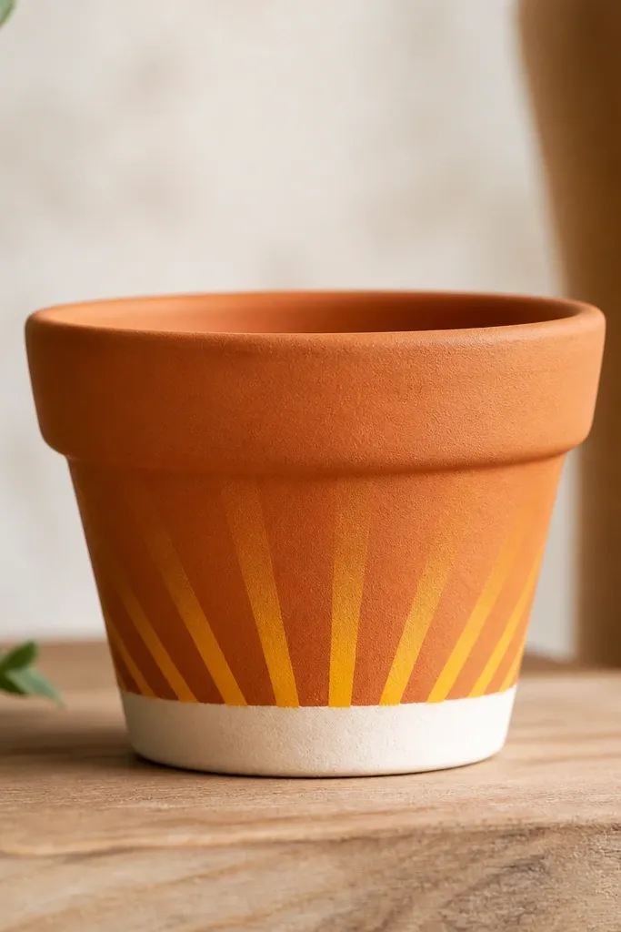
This look is all about one crisp graphic moment. The rim band frames the plant and makes the pot look intentional even when the leaves are sparse. I use a matte white underlayer, then paint rays in warm tones from pale yellow to burnt orange so it reads like light hitting the pot. The top coat keeps the rays from getting chalky after watering.
Prime terracotta with a thin sealing coat so the white band stays opaque. Mask the rim with painter’s tape — aim for a band about 1 inch tall on a 6-8 inch pot. Paint rays using a flat craft brush, about 1/8 inch wide at the center, tapering slightly as they go up.
Use a cheap plastic ruler as a guide for spacing the rays. Mark dots lightly with pencil first, then paint from dot to dot.
Don’t paint thick rays — they dry with ridges on curved surfaces.
2. No-Drill Checkerboard Pots
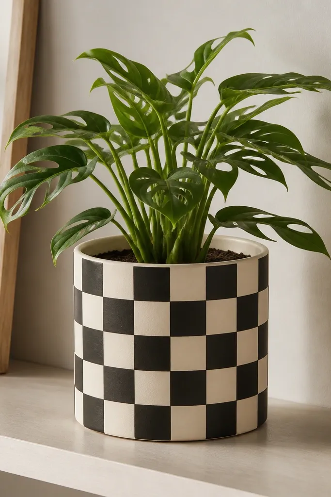
Checkerboard makes a pot look like a designer object because it has structure. You get instant contrast that reads from across a patio. I like cream and matte black because the plant green pops against both. Sealing prevents moisture from dulling the black.
Editor's noteCut tape strips narrower than your planned square width so you can adjust for curvature. Press tape edges down with a credit card edge.
Start with a full base coat in cream acrylic. Measure the pot circumference and divide it into equal square widths; for a 10-inch pot, I use about 1-inch squares. Use tape to mask rows, paint black, remove tape while paint is still slightly tacky for sharp edges.
Skip thisAvoid freehand squares — the pattern warps and looks sloppy when the pot rotates.
3. Faux Tile Moroccan Band
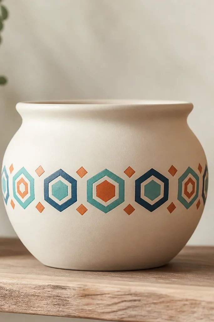
Geometric bands look like real tiles without any tile work. The off-white base keeps it clean, while the teal/navy shapes add movement. I use a stencil for the hex pattern, then hand-paint tiny diamonds in contrasting orange. The result looks expensive because the shapes are consistent.
Paint the full pot off-white first. Mask a band across the middle, about 2.5 inches tall on a 10-12 inch pot. Apply a hex stencil with a foam dabber, then add diamond accents with a fine liner brush.
Keep a damp paper towel nearby and wipe the stencil edges between dabs so you don’t get smudges.
Don’t skip the base coat — stencil paint soaks into rough spots and blurs.
4. One-Line Botanical Silhouettes
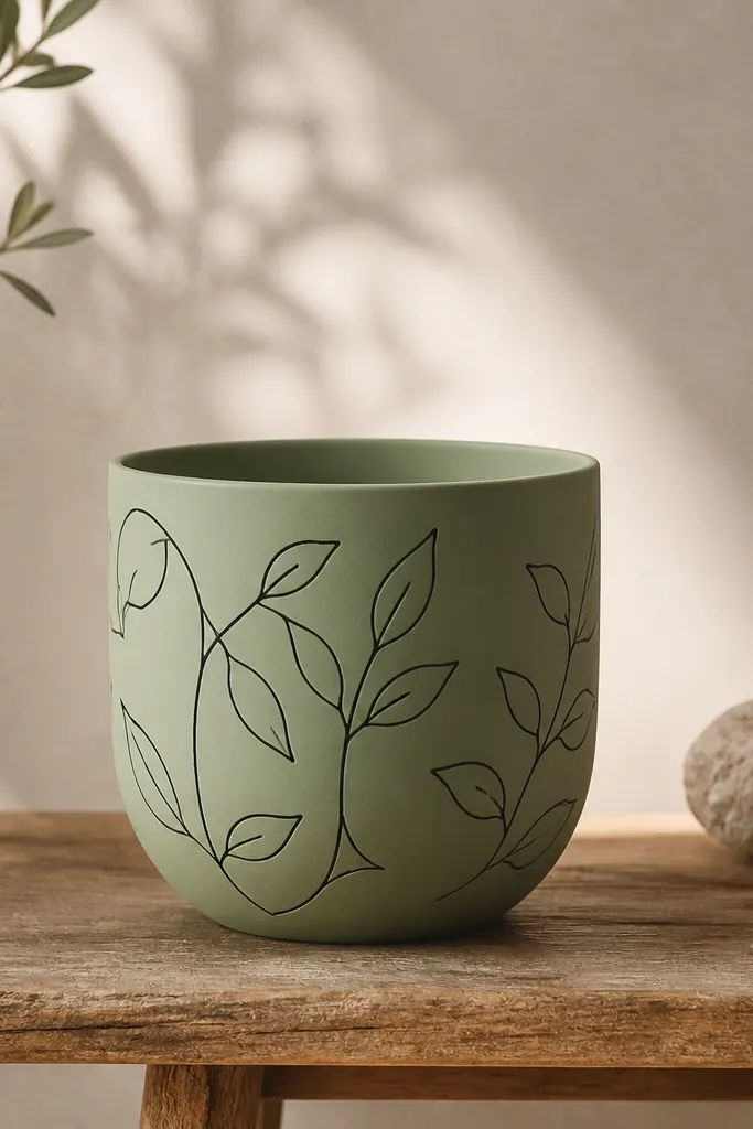
This is my go-to when I want it to look hand-drawn but still neat. Thin silhouettes don’t fight with busy plants — they simply frame them. Sage + black is a calm combo that photographs well. The linework stays crisp when you use a fine liner and seal over it.
Editor's notePractice the vine pattern on paper first and copy the spacing, not the exact leaf shapes.
Base coat the pot sage green. Use a pencil to lightly sketch a single looping vine around the pot, then trace with black acrylic using a 10/0 liner brush. Leave small gaps between leaves so the plant behind shows through.
Skip thisAvoid painting over wet pencil marks — graphite smears under paint.
5. Watercolor Lavender Fade
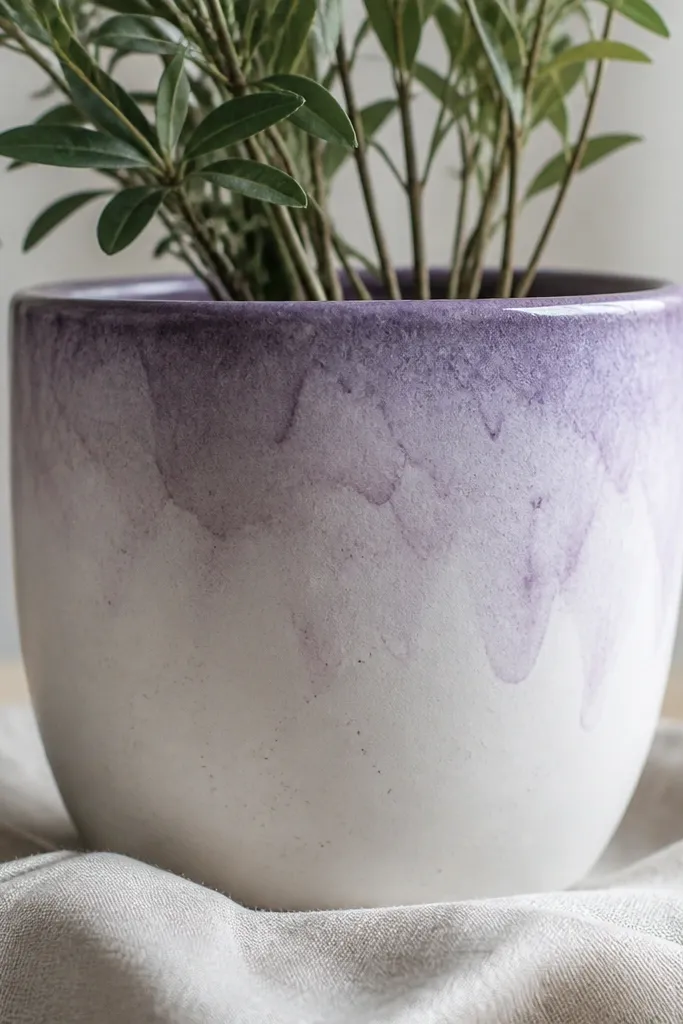
A watercolor fade looks airy and looks good even if your plant is tall. The gradient hides brush streaks because you’re blending on purpose. I use three lavender shades — lilac, medium purple, and deep violet — then blend them while slightly wet. Sealing keeps the soft look from turning patchy after watering.
Base coat with matte white. Wet just the top area with clean water using a damp brush, then dab lilac paint, follow with medium purple, and finish with a small amount of deep violet at the top rim. Blend downward with a clean damp brush in light strokes.
Work in small sections and rotate the pot by hand so the fade stays even around the circumference.
Don’t let paint fully dry between layers — you’ll get hard bands instead of a fade.
6. Gold Speckle Modern Glam
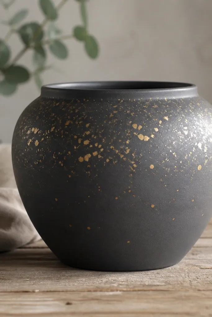
Speckle makes a pot look like it has texture, even on smooth plastic. Charcoal is a great neutral for any flower. Gold specks catch light and make the pot look “finished” without needing a big illustration. A clear coat keeps the speckles from rubbing off during handling.
Editor's noteTest your flick distance on a scrap pot or cardboard first so the speckles land the size you want.
Prime and base coat charcoal matte. For speckles, use a toothbrush or stencil brush loaded with metallic gold acrylic. Flick from a few inches away, and concentrate specks around the upper third. Let it cure, then spray a clear water-resistant top coat.
Skip thisAvoid spraying clear coat too heavy — metallic specks can dull if the coat pools.
7. Pastel Ombré Stacked Bands
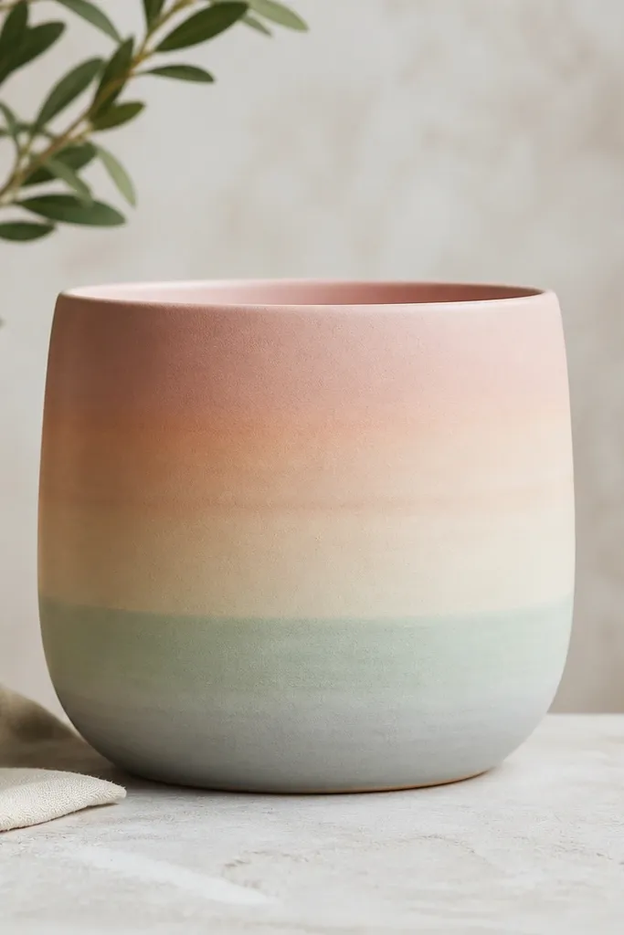
Stacked ombré bands look like candy stripes from a distance, but softer up close. The gradient makes the pot feel light and seasonal without looking childish. I choose pastel sets that match the flowers I’m planting — tulips love blush/peach, herbs love mint/cream. Clear coat protects the gradients from water marks.
Start with a white base. Mask horizontal zones with tape leaving about 1 inch per band on a 10-inch pot. Blend each band with two colors — paint the darker color at one edge, then wash/blend into the lighter color with a damp brush.
Remove tape after each band is dry to the touch, so edges stay crisp.
Avoid using only one coat — thin pastels look patchy at the seam.
8. French Stripe + Tiny Dots
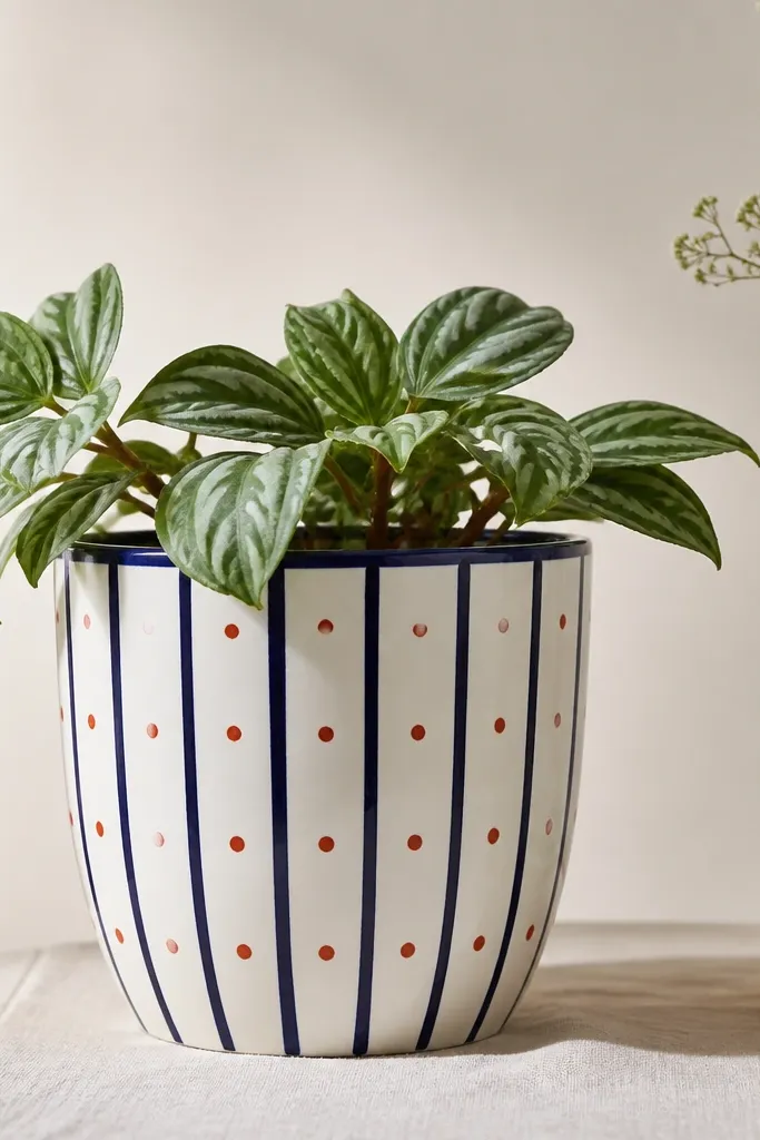
Vertical stripes trick your eye into thinking the pot is taller and sleeker. Adding tiny dots keeps it playful without clutter. I use navy for seriousness and red for a pop that looks great with red flowers or green herbs. The rim line ties it all together.
Editor's noteKeep stripe spacing symmetrical — measure from the front and make the first stripe centered.
Base coat white and let it dry fully. Use painter’s tape strips for vertical stripes about 1/2 inch wide on smaller pots. Paint navy, remove tape carefully. Add red dot accents with a dotting tool or the end of a pencil eraser.
Skip thisDon’t paint over tape gaps with thick paint — it bleeds and makes fuzzy stripes.
9. Terracotta Stamps with Texture Paint
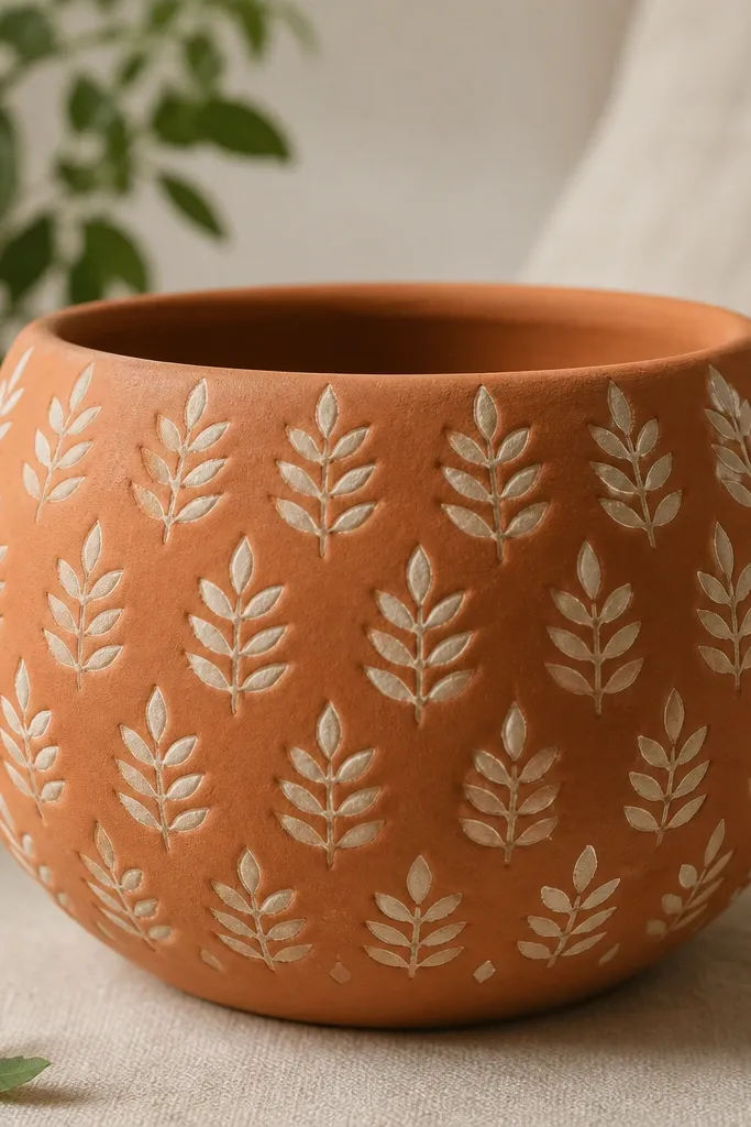
Stamping gives you texture without complicated art. The raised paint catches light and hides minor unevenness in terracotta. I like cream texture paint because it looks like carved plaster. You get a repeating pattern that still lets plants be the main event.
Seal the terracotta first so the texture paint doesn’t sink. Use a leaf stamp and texture paint thinned just enough to spread, not run. Stamp in rows around the pot, rotating it so the pattern meets at the seam neatly. Let it cure longer than flat paint.
Press the stamp straight down and hold for 5-7 seconds — quick taps make faint edges.
Avoid stamping on unsealed terracotta — you’ll get patchy and uneven impressions.
10. Painted Faux Cement Wash
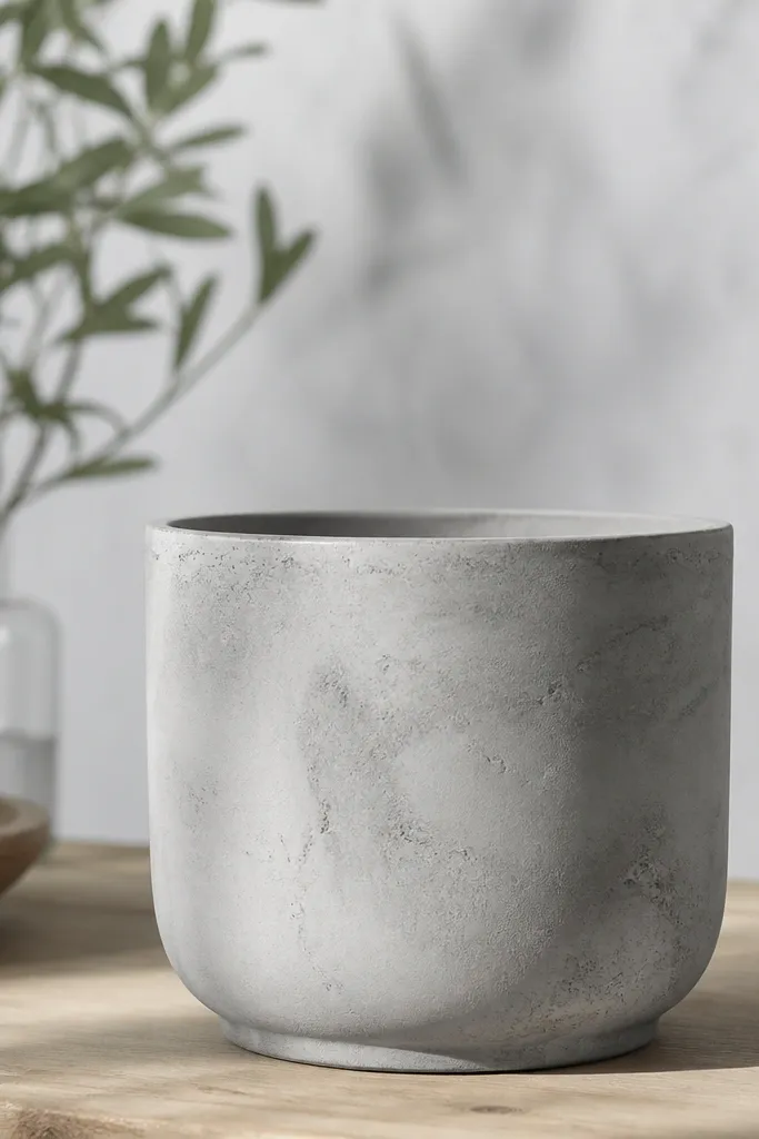
Cement wash looks modern and forgiving. It hides small surface marks and looks good even when your plant is just starting to fill in. I use gray base and then drag a darker gray wash downward with a damp brush. The mottled finish reads like real concrete.
Prime plastic or seal terracotta, then base coat with light gray acrylic or masonry-style paint. Mix a darker gray wash with water so it’s translucent. Drag the wash down in uneven strokes, then add a few tiny speckles with a toothbrush.
For a cement feel, keep the top rim slightly lighter — don’t flood it with the darker wash.
Avoid glossy clear coat — it makes cement wash look like cheap craft paint.
11. Monochrome Line Art Faces
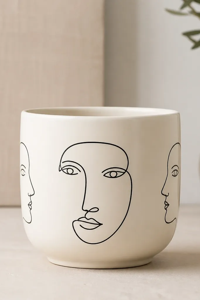
Faces on pots sound bold, but monochrome line art stays classy. It looks like modern ceramics and makes your plant corner a conversation piece. I keep the lines thin and the background clean so it doesn’t compete with leaves. A matte clear coat keeps the ink-like lines from smearing.
Base coat cream and let it fully dry. Use a black paint marker if you have one, or a fine liner brush with thinned acrylic for smooth lines. Draw one larger face front and smaller side profiles, leaving at least 1 inch of blank space between motifs.
Rotate the pot while drawing so the face naturally curves with the shape.
Don’t thicken the lines — thick paint looks like a sticker on curved pots.
12. Seasonal Bloom Frame (Spring/Easter)
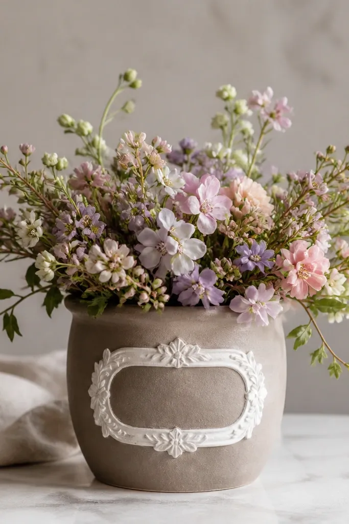
A frame turns a plain pot into a mini wall art piece. It also helps you avoid painting the entire surface — you focus your effort on one central panel. Pastel blooms look fresh for spring and don’t clash with most flower colors. Clear sealing keeps the tiny petals from getting smeared by splashes.
Editor's noteUse a small sponge for petals if you want a soft edge that reads like watercolor.
Paint the pot a soft off-white. Mask a rectangle panel in the center, about 3 inches tall on a 10-inch pot. Fill the panel with small flowers using three shades of pink/lavender plus tiny green dots, then paint a thin green or gold border around the panel.
Skip thisAvoid painting tiny petals too close together — they merge into one blob after sealing.
13. Retro Tropical Palm Silhouette
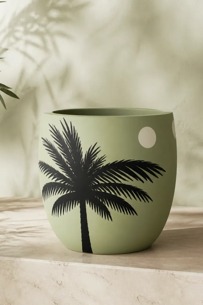
Palm silhouettes look instantly tropical and they’re easy because you’re painting shapes, not details. Black on green gives that retro poster vibe. Add a couple white sun circles for depth and you get a design that looks intentional from one angle and still nice from the others. Seal it well because tropical motifs often go on outdoor pots that get wet.
Use a matte green base in a deep shade like forest green. Sketch the palm trunk and fronds as a single silhouette, then fill with black acrylic. Paint 2-3 white sun circles near the top rim, keeping them small — about 1 inch across.
Sketch with pencil first, then paint the trunk before the fronds so you anchor the composition.
Don’t use glossy black — it looks like plastic ink once sealed.
14. Rainbow Waterline Arc
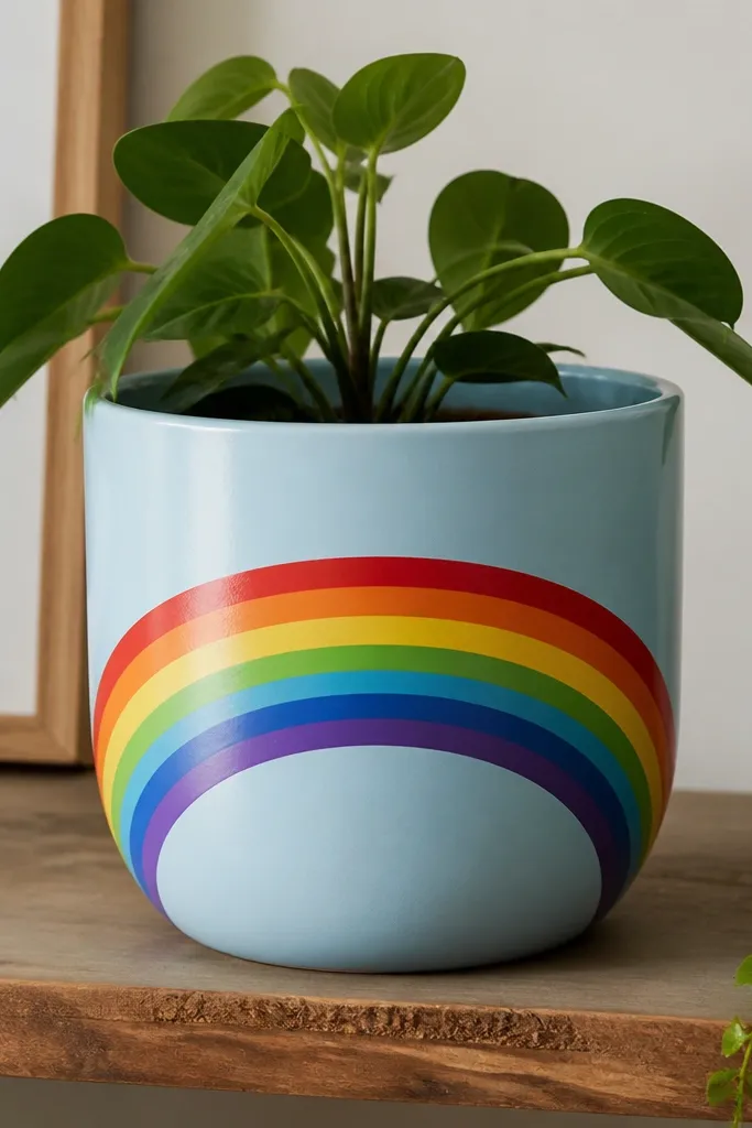
This one looks clean from across the room because it’s a single bold graphic. The pale blue base makes the rainbow feel airy, not loud. I paint the rainbow as bands with a little overlap so the colors stay strong on curved surfaces. A clear coat protects the arcs from water splatter.
Base coat the pot pale blue and let it dry. Mask an arc across the front using flexible painter’s tape — you’ll need to curve it by hand. Paint each rainbow band one at a time, letting each color dry before removing tape. Keep the arc width about 3 inches on a 10-inch pot.
Use a scrap paper template to get the arc curvature right before you tape the pot.
Avoid mixing rainbow colors together on the brush — muddy bands happen fast.
15. Botanical Script Labels (Herb Pot Look)
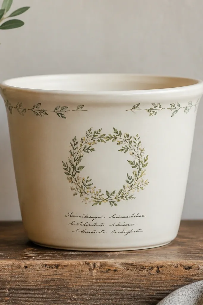
This makes herb pots look organized without buying separate labels. The wreath is small, so it doesn’t fight with the plant. Script text looks best when it’s short — I like two words max. Sealing keeps the lettering crisp so it reads like real pottery labels.
Editor's noteWrite the text on paper first, then lightly trace the letter shapes onto the pot with pencil.
Base coat cream and paint a tiny wreath at the top using sage green and muted olive. Add short script text in black with a paint pen or liner brush. Keep doodles minimal around the rim — 3-5 leaf marks total.
Skip thisAvoid wrapping long script around the curve — it stretches and turns unreadable.
16. Ombre Terracotta with Marbled Center
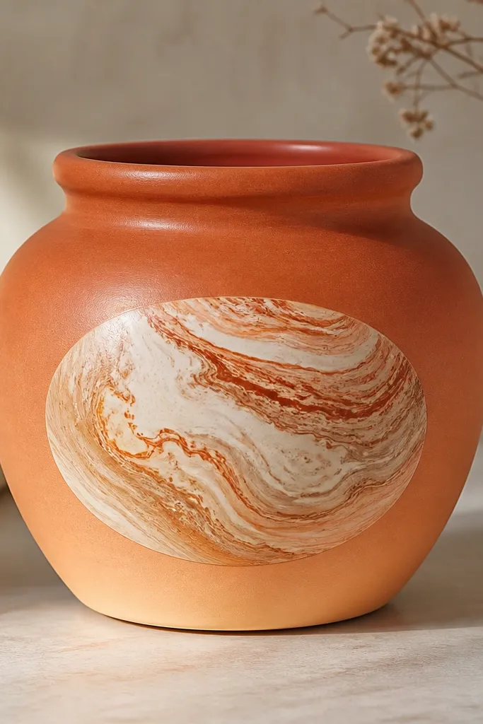
The marbled center gives you a “high-end ceramic” look with a lot less effort than full marbling. The ombre around it frames the oval so the marble doesn’t look pasted on. I use cream and tan for the marble, then add a whisper of copper for warmth. The clear coat smooths the final finish without flattening the marble effect.
Editor's noteKeep the toothpick swirls light — heavy dragging makes the marble look muddy.
Paint the pot with an ombre from terracotta at the top to lighter orange at the bottom using a sponge. Mask an oval in the center, then marble inside: drop cream, tan, and a bit of copper paint onto a slightly wet base and swirl lightly with a toothpick. Remove the mask after the edges set but before the marble fully cures.
Skip thisDon’t seal before the marbling is fully dry or it can smear at the edges.
17. Night Sky Stars with Glow Accent
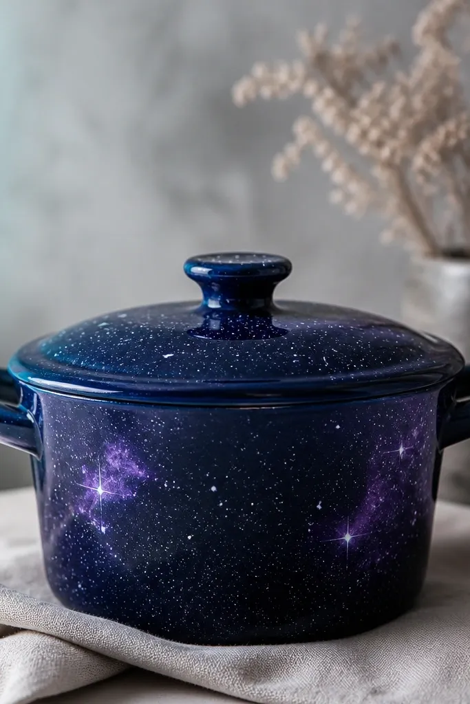
Night sky pots look magical on balconies at dusk. The base navy hides unevenness, and the stars are forgiving because they’re tiny. I add a few nebula swirls in purple so it doesn’t look like a flat sticker pattern. If you use glow paint for a small accent, it stays subtle in daylight and pops at night.
Prime and base coat navy matte. Add stars by flicking white paint with a toothbrush, then dab a few larger star dots with a cotton swab. For nebula, lightly sponge purple and blend edges with a damp brush. Add glow paint as a small teal patch near the top rim.
Use glow paint only on a small area — too much makes the whole pot look washed out.
Avoid glossy top coat — stars reflect light and turn shiny instead of “night”.
18. Minimal Geometric Corner Angles
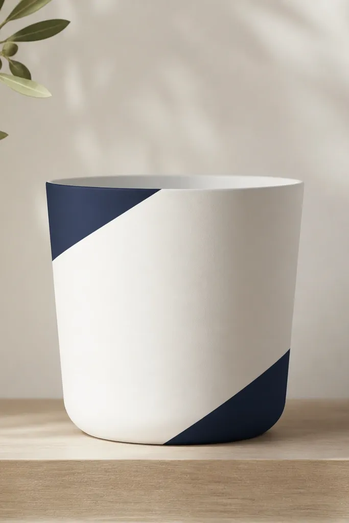
Minimal corner angles look modern and don’t distract from your plant. It’s also the easiest way to make a pot look “designed” when you don’t want to paint full coverage. I stick with one or two colors so it stays clean. The sharp angles look best when you use tape and a steady hand.
Base coat white and let it dry. Tape two diagonal shapes on the top third and bottom third, leaving a gap between them. Paint navy with a small flat brush, then peel tape slowly to keep edges crisp. Add a thin gold line along one angle if you want extra warmth.
Press tape down hard along edges, especially where tape crosses the curve.
Don’t freehand diagonals — tape gives you the only clean lines these pots can handle.
19. Painted Flower Pot Side Panel with Stencil Vines
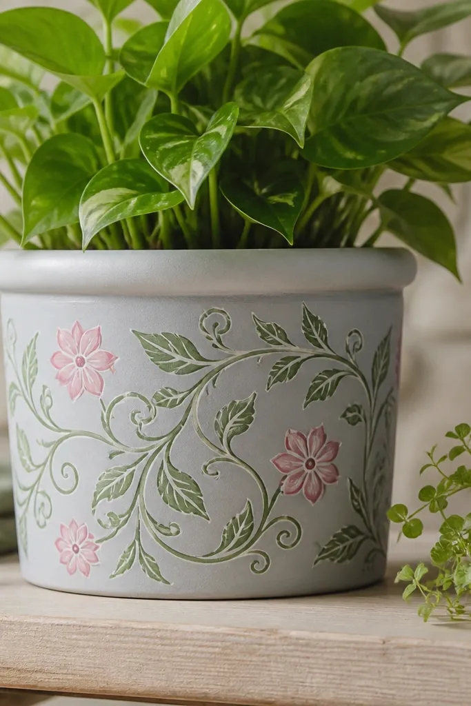
A side panel keeps the design from looking busy. Stencil vines are fast, and adding a few painted flowers makes it feel handmade instead of stamped. I use light gray for the panel so the greens and pinks stay true. Seal the stencil edges so the vine lines don’t blur when water splashes.
Editor's noteUse foam dabbers for stencil — brushes pull paint under the stencil edges on curved pots.
Base coat the pot in a solid color like warm white or pale sand. Mask a side panel rectangle about 4 inches wide. Apply vine stencil in two greens (sage and darker olive), then paint 3 small pink flowers along the vine path.
Skip thisAvoid overloading the stencil with paint or it will bleed and look thick.
20. Pearl White Base with Soft Pink Petal Drips
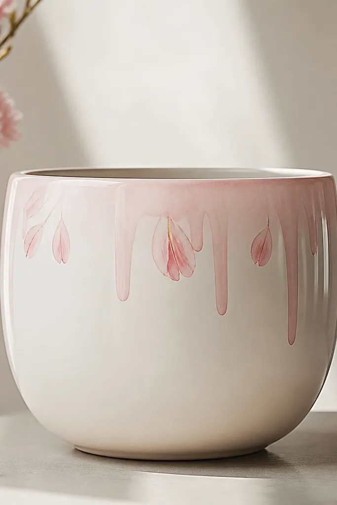
Drips look trendy, but this version stays sweet because it’s light and controlled. Pearl white base makes the pink feel creamy, not hot. I keep drips short so they don’t look like paint accidents. The petal shapes add a floral reason for the drips.
Editor's noteLoad your brush, then tap it on paper until only a thin paint layer remains before touching the rim.
Base coat pearl white acrylic. Thin pink paint with a tiny amount of water so it drips in controlled threads. Add drips only along the top rim — about 1/2 inch maximum length. Add a few small petal shapes with a fine brush between drips.
Skip thisDon’t drag the brush down — you’ll get thick streaks that look messy.