1. Two-Tone Rim Frame with Thin Black Lines
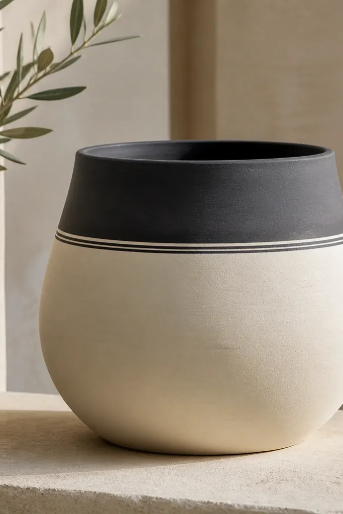
This design looks modern because it treats the rim like a graphic frame. The cream base keeps it bright and calm, while the charcoal band grounds the pot. The thin black lines make the separation crisp, like a label. It also hides small unevenness in the clay because the band covers the most irregular area.
Paint the full outside body cream first, let it dry, then measure a band width of about 1.5 to 2 cm around the top. Tape the top and bottom edges of the band with painter's tape, paint charcoal, then remove tape while paint is still slightly tacky. After the charcoal dries, use a liner brush for two parallel black lines, each about 1 mm wide, centered in the band gap.
Pro tipIf your tape pulls up paint, run tape over a piece of clean fabric first to reduce tack.
AvoidDon't freehand the band edges - crooked lines make it look like a first try.
2. Sunburst Mini Rays Above a Solid Base
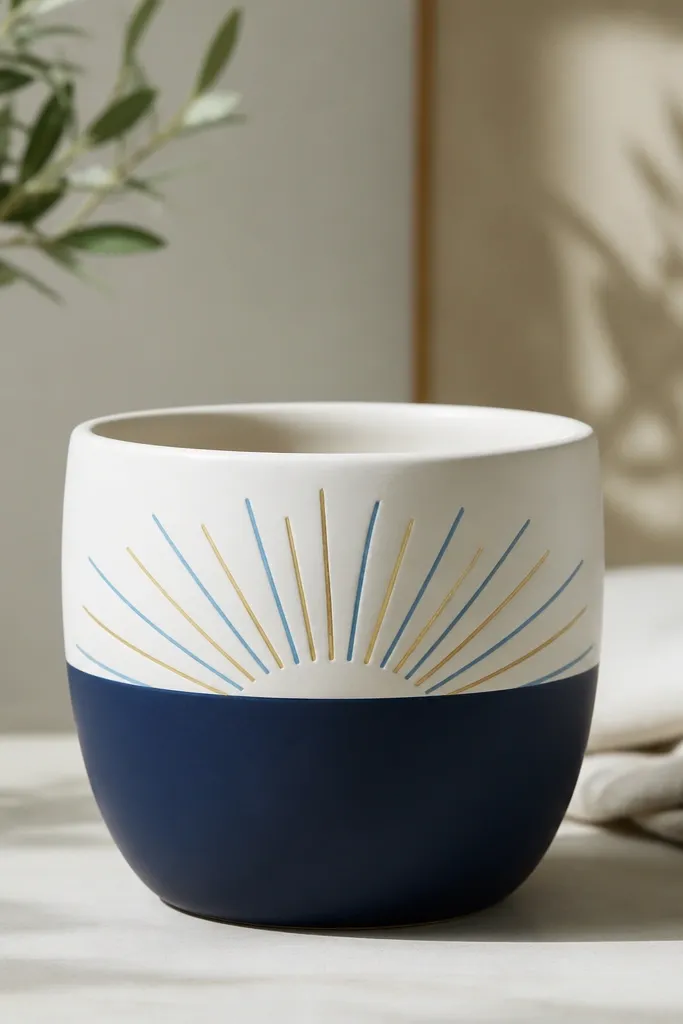
Sunburst rays add motion without covering the whole pot. Keeping the rays confined to one horizontal band makes it feel intentional and modern. The navy base gives contrast, and the two ray colors keep it from looking flat. Short rays also fit beginners because you're not drawing a full pattern around the entire pot.
Paint the lower half navy using a wide brush, then tape a straight horizontal line for the split. Mark a center curve slightly below the rim and draw 12 to 16 rays using a flat brush with light pressure. Add a second color by alternating rays every other one, then let it dry fully before sealing.
Pro tipUse a paper template: cut a small strip of cardstock the width of your ray spacing and mark dots around the curve.
AvoidAvoid long rays that reach the rim - they exaggerate wobble and look messy.
3. Muted Sage Base with Terracotta Speckle
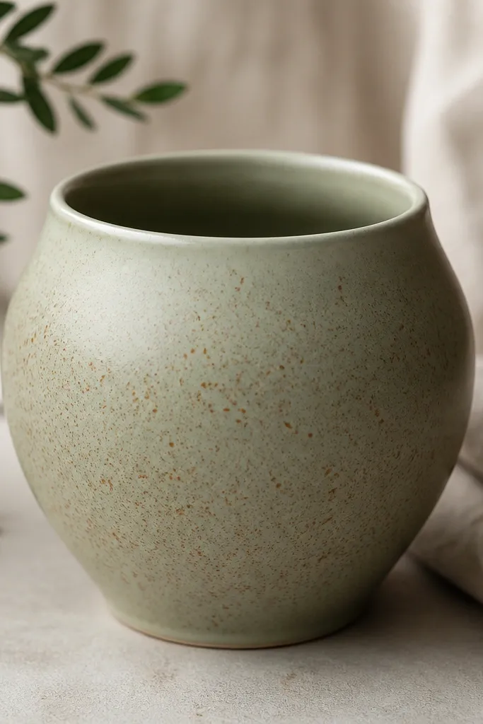
Speckle looks modern when you keep the color family tight. Sage and terracotta-orange belong together, so the specks feel designed instead of random. The uneven speckle sizes mimic ceramic glaze texture. This is also forgiving on brush marks because you're building texture, not crisp edges.
Paint the entire pot sage matte. Load a toothbrush or stiff bristle brush with thinned terracotta-orange acrylic (about 1 part paint to 1 part water). Hold the brush close and tap gently to create tiny dots, then stop before the rim. If you want a fade, lightly reduce paint and tap less near the top.
Pro tipPractice the tapping pressure on a scrap tile first so your specks land the way you want.
AvoidDon't use thick paint for speckle - it blobs and looks like stains.
4. Geometric Blocks with Painter's Tape Corners
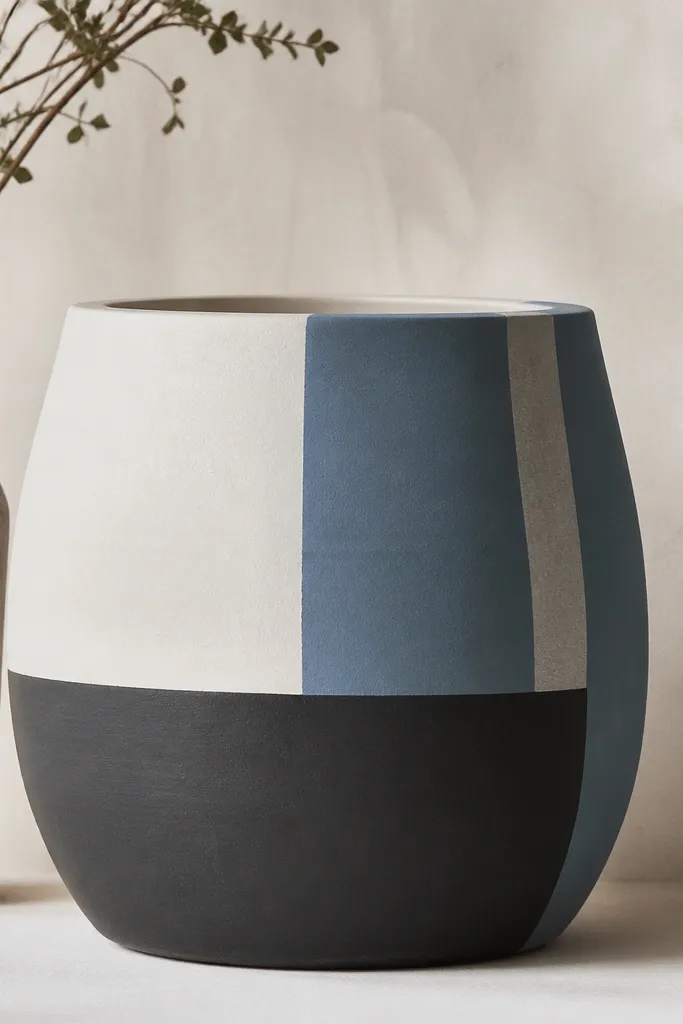
Geometric blocks read modern because they're controlled and high-contrast. Tape edges give you the clean, graphic look that freehand can't match. Using three colors max keeps it from turning busy. The vertical stripe adds a subtle rhythm, like a modern print.
Start with the lightest base color (off-white), let it dry, then tape diagonal and vertical boundaries. Paint dusty blue on one side, remove tape, then tape again for charcoal sections. For the stripe, tape a thin line (about 4 mm), paint pale gray, and remove tape before the paint fully hardens.
Pro tipPress tape firmly with a fingernail along the edges to prevent bleed.
AvoidAvoid layering wet paint over fresh tape - it smears and dulls the corners.
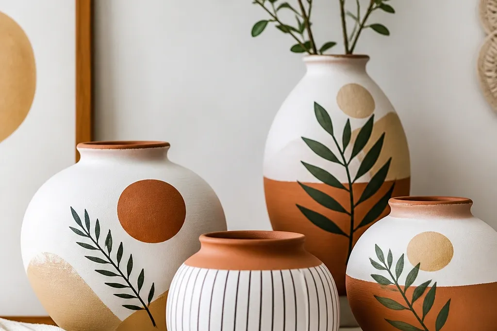
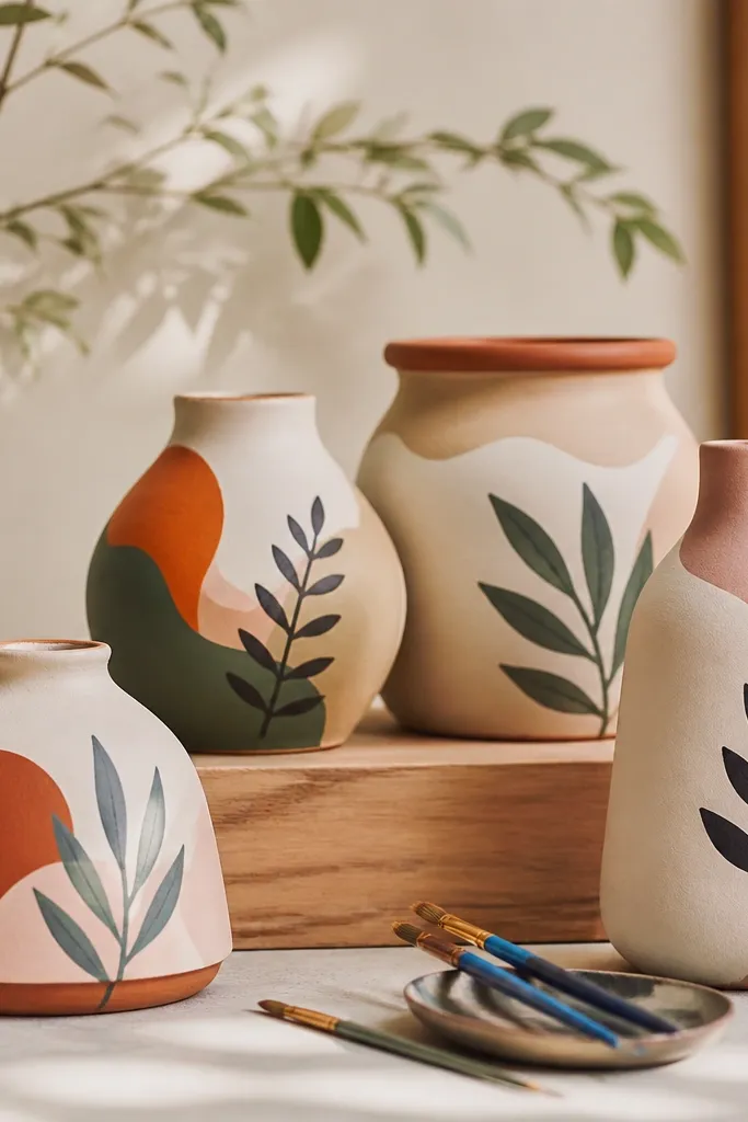
5. Single-Line Leaf Vine in Olive and Cream
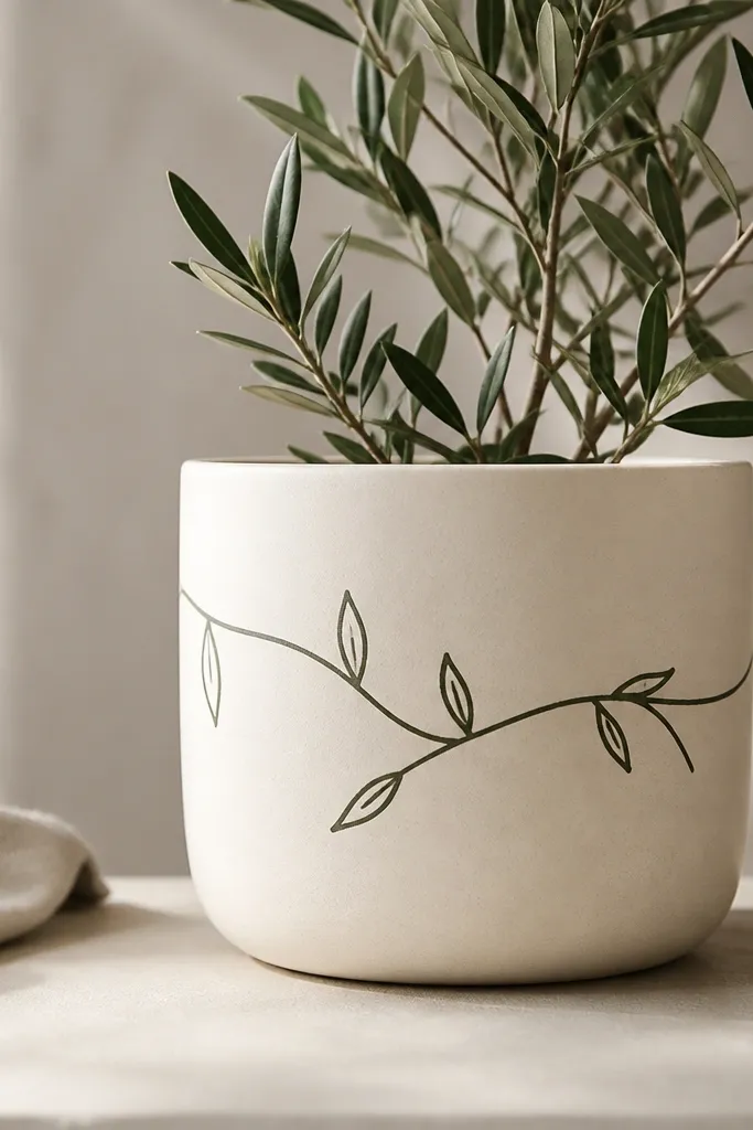
This is modern because it uses negative space. The cream background stays clean, and the vine wraps the pot without covering every inch. Olive is softer than black, so it looks natural but still graphic. Minimal line art also forgives uneven pot curves because the design follows the shape.
Paint the pot cream matte. Use a small round brush or a fine liner pen with acrylic paint thinned slightly for smooth flow. Sketch a light guideline line around the pot with pencil, then draw the vine and leaves on top. Keep leaves about the same size (around 1.5 cm long) for a consistent look.
Pro tipIf your line breaks, don't repaint over it immediately - wait 10 minutes and cover with a second thin pass.
AvoidDon't fill leaves solid - flat blobs look older and less modern than outline shapes.
6. Ombré Fade from Terracotta to Soft Pink
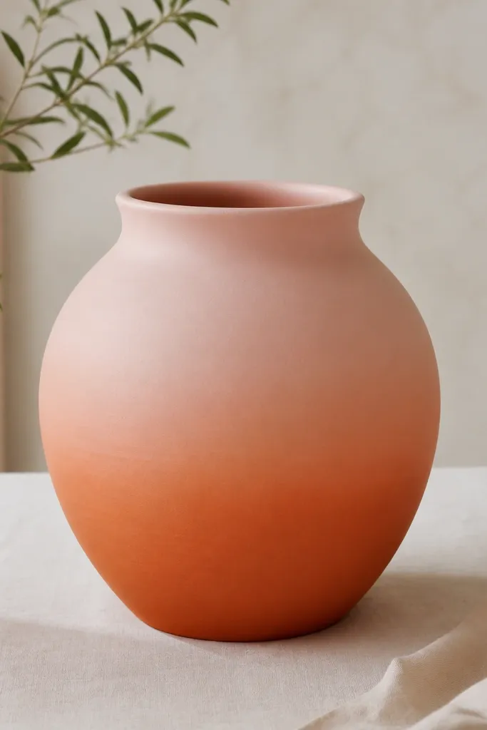
An ombré fade looks modern because it's about smooth transitions, not pattern clutter. Terracotta to blush keeps it warm and fresh. The key is building the fade in steps so the surface doesn't show brush lines. This design also looks good on slightly rough pots because the gradient hides texture.
Paint the bottom 1/3 terracotta-orange. Mix blush pink and a bit of white, then blend upward using a sponge or wide flat brush. Work in three zones: base, mid blend, and top. For a clean fade, feather each zone before the paint fully dries, then let it cure and seal.
Pro tipUse a damp sponge to blend the middle section - it gives a softer transition than a dry brush.
AvoidDon't try to blend the whole height at once - you'll get hard bands.
7. Modern Mountain Peaks in Two Shades of Gray
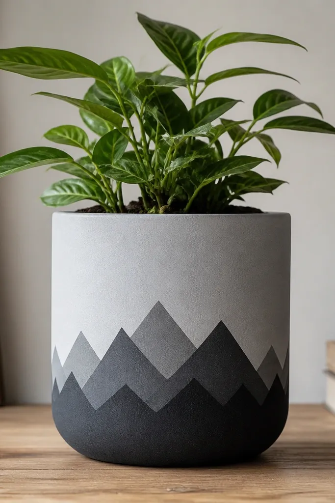
Mountain peaks feel modern when they're simplified. Using two grays makes it calm and design-y, like a minimalist print. Layering triangles gives depth without needing lots of colors. It also looks great in seasonal setups because you can theme it for spring, fall, or winter.
Paint a light gray base. Use painter's tape to block three to four triangle shapes across the pot's middle, then paint the darker gray. Remove tape, then add a second layer of triangles slightly smaller and centered. Keep the peak height consistent so the design reads clean.
Pro tipSketch triangle outlines on paper first with the same pot height you plan to cover.
AvoidAvoid random triangle sizes - uneven peaks make it look like a kid drew it.
8. Matte Black Chalkboard Panel with White Dots
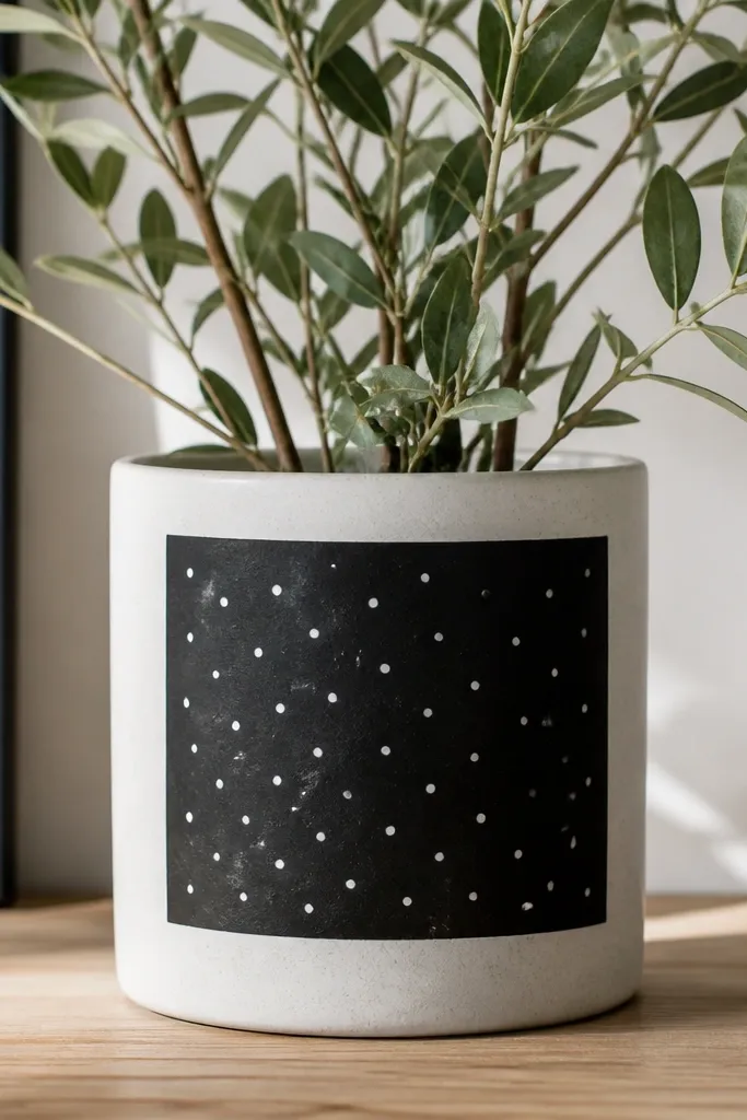
This is a modern "label" look. The matte black panel makes the white dots pop, and it reads like a design object, not a plant container. Dots break up the flat black so it doesn't feel heavy. I like this for indoor desks because it looks tidy from across the room.
Paint the pot a neutral base like cream or light beige. Tape a centered rectangle on the front, paint it matte black, then remove tape carefully. Add white dots using a dotting tool (or the eraser end of a pencil) - keep them spaced so you can still see the black between dots.
Pro tipIf you want the panel to look extra flat, use matte acrylic medium or matte craft paint for the black.
AvoidDon't use glossy black - it shows brush strokes and looks cheap.
9. Watercolor Wash Bands in Blue and Lavender
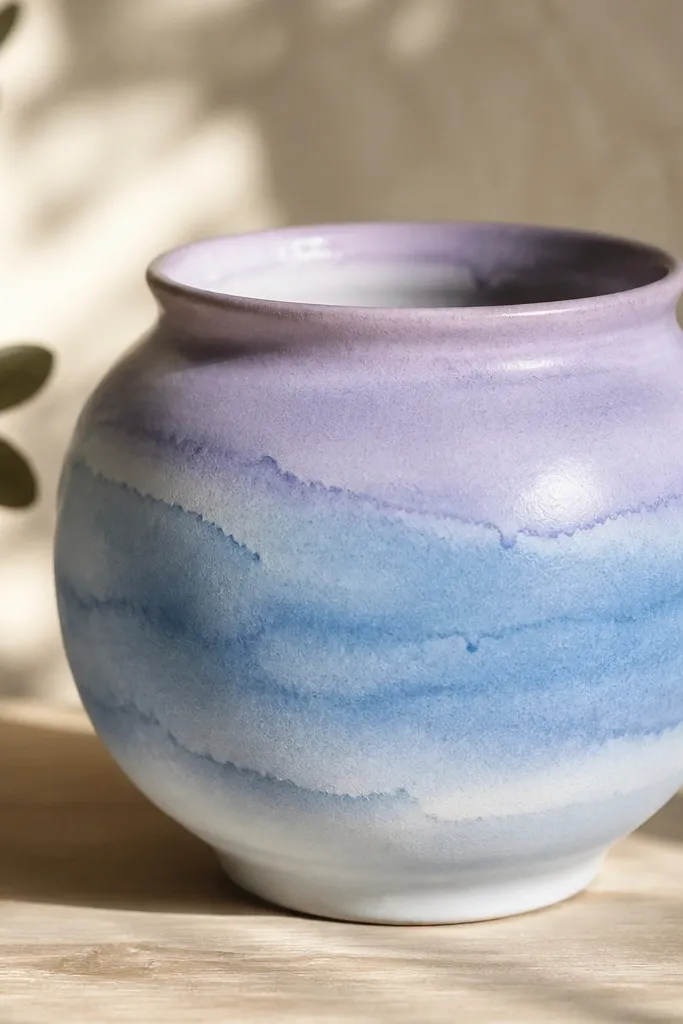
Watercolor-style bands look modern when the colors are cool and the bands are wide. The feathered edges mimic dye on paper, but you control it by working in layers. Blue and lavender feel seasonal for spring and calm interiors. It's also forgiving because imperfect edges look intentional.
Start with a white base. Mix watered-down blue acrylic (about 1 part paint to 3 parts water), brush it on in two or three horizontal bands, and blend edges with a damp brush. Let it dry 20 minutes, then add lavender where you want transitions. Seal gently after fully dry so the wash doesn't smear.
Pro tipUse a fan brush for softer transitions and less streaking.
AvoidDon't overwork the wet area - repeated strokes turn it muddy.
10. Gold Spear Accents on Dark Green Base
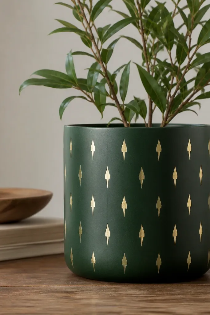
Metallic accents make terracotta look finished fast. The deep green base gives a moody, modern vibe without screaming holiday. Spear shapes are easier than leaves because they're basically teardrops with a point. The gold catches light in a way flat paint can't.
Paint the pot forest green matte. Use metallic gold acrylic or metallic paint marker for the spear shapes. Draw 10 to 14 spears in a vertical repeating row spaced about 2 cm apart, pointing upward. Add a second tiny speck dot at the base of every other spear for rhythm.
Pro tipShake metallic paint hard for 30 seconds so the shimmer doesn't separate.
AvoidAvoid thick metallic blobs - they look like glitter glue.
11. Tiled Half-Moon Pattern with Off-White Tiles
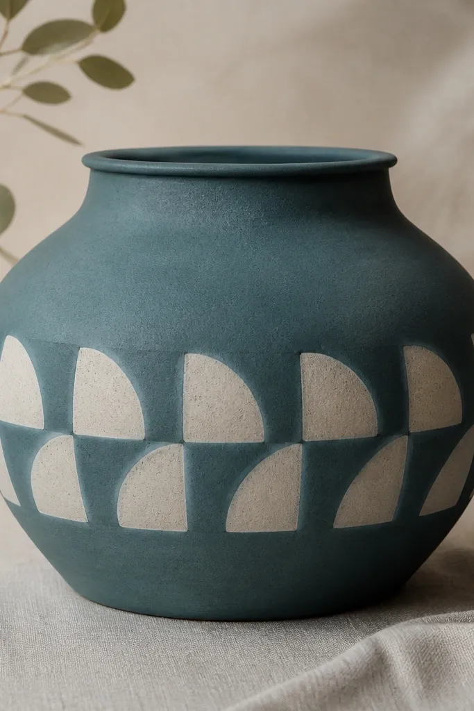
Half-moons make a modern pattern because they repeat cleanly and still feel soft. The teal base keeps it fresh and outdoorsy. Off-white tiles create a crisp contrast that reads well from a distance. This design also gives you a clear math: half-moon size and spacing.
Paint the pot teal matte. Use a round sponge or the rim of a small cup as a stamp for half-moons - dip lightly so you don't get drips. Place the first half-moon row around the pot, then offset the next row so the bumps nest between gaps. Keep each half-moon about 4 cm wide for a balanced look.
Pro tipMark a guide line with pencil first so the pattern stays level around the curve.
AvoidDon't stamp too wet - it smears and the half-moons lose their shape.
12. Thin Stripe Ladder in Navy and Cream
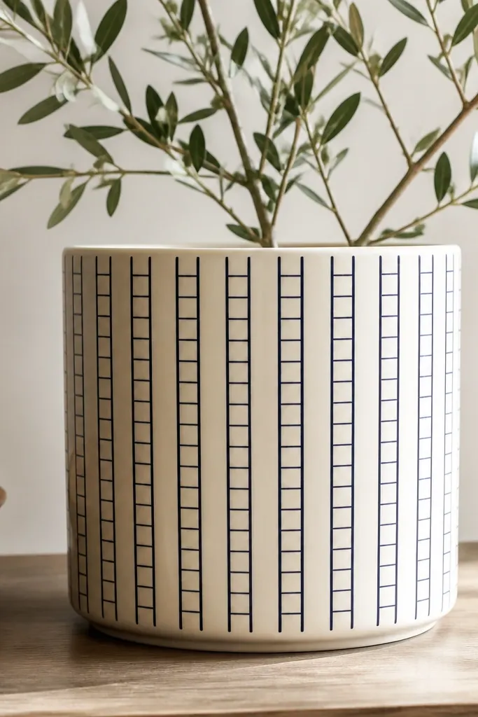
Stripe ladders look modern because they feel architectural. Keeping stripes thin makes the pot look graphic instead of playful. Navy and cream gives you a clean, classic palette that works for every season. The ladder layout also hides uneven pot curvature because the lines create structure.
Paint full pot cream. Tape vertical stripes first: 3 to 4 mm wide tape strips placed evenly. Paint navy, let dry, then remove tape. For the rungs, tape short horizontal lines crossing the verticals, paint navy again, and remove tape while still slightly tacky.
Pro tipUse a ruler and painter's tape, not eyeballing - consistent spacing is the whole look.
AvoidAvoid thick tape lines - they make the ladder look chunky and dated.
13. Botanical Dots with Tiny Pink Centers
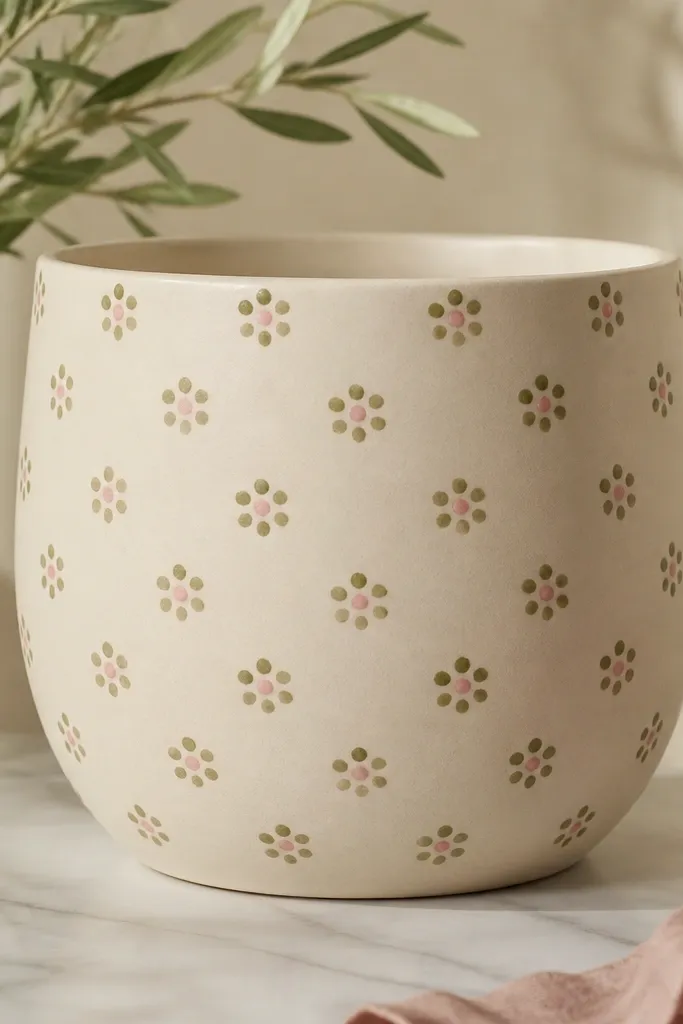
This design is modern botanical without drawing full leaves. Dot clusters feel delicate, and the tiny pink centers add a pop that looks intentional. The beige base makes it calm, and olive keeps it earthy. It also covers small chips on the pot because the dots distract the eye.
Paint the pot beige matte. Use a dotting tool to place 5 outer dots in an oval cluster, then add one small pink center dot. Space clusters about 2.5 to 3 cm apart and keep the pink dot diameter tiny (about 2 to 3 mm). Seal after drying so outdoor moisture doesn't lift paint.
Pro tipDip your dot tool once per dot and wipe excess paint off on a paper towel so you get consistent dot size.
AvoidDon't make all centers the same exact size if your tool is too wet - you'll end up with blobs.
14. Chunky Chevron with One Accent Color
Chevron looks modern when it's chunky and limited to one band. Taupe keeps it grounded, and warm white chevrons give contrast. The single mustard accent is the punch - it makes the pattern feel designed instead of flat. This also works well for beginners because you can tape chevrons easily.
Paint pot taupe matte. Tape chevron lines in a repeating V shape across a horizontal band, leaving about 8 to 10 cm tall for the pattern. Paint warm white in the taped areas, remove tape, then add mustard yellow to every other chevron. Let everything dry, then seal.
Pro tipIf your chevrons drift, fix it by re-taping the band instead of trying to correct with paint.
AvoidAvoid thin chevrons - they show every wobble.
15. Gold Outline Circles on Matte White
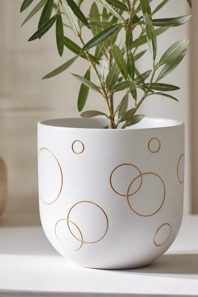
Outline circles look modern because they're light and airy. Matte white keeps the pot clean, and gold outlines create a jewelry-like effect. Different circle sizes make it feel organic without getting messy. This also looks great for holiday because you can keep the rest of your decor simple.
Paint the pot matte white and let it cure at least a couple hours. Use a gold paint marker or a fine brush with metallic gold paint to draw circles. Place 1 large circle near the center, then add 8 to 12 smaller circles around it with light overlap. Let dry, then apply a clear sealer that doesn't turn metallic dull.
Pro tipPractice one circle size on paper - consistency matters more than you think.
AvoidDon't fill the circles solid - thick gold areas look heavy and less modern.
16. Monochrome Terracotta Wash with White Dry-Brush
This looks modern because it feels like layered glaze. The translucent terracotta wash keeps the original clay visible so it feels authentic. White dry-brush streaks add movement and texture without needing a pattern. It also hides small flaws in the pot because the strokes blend into the texture.
Dilute terracotta acrylic with water so it looks like a light glaze, then brush across the pot. Let it dry fully. Load a dry flat brush with white acrylic, wipe most off on a paper towel, then lightly sweep vertical streaks in 3 to 5 areas. Seal gently so the streaks don't get glossy.
Pro tipDry-brush looks best when you keep the streaks uneven - uniform lines look painted-on.
AvoidDon't wet the brush too much - it turns into patches instead of streaks.
17. Seasonal Tag Design with Bold Numbers
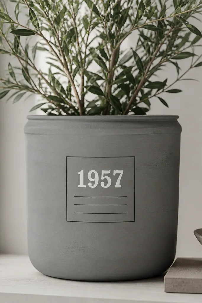
A tag layout makes a pot feel like a decorated object, not just painted clay. The bold numbers give you a seasonal hook without drawing complicated scenes. I've used dates like 3-21 for spring and 10-31 for fall and it always looks clean. This design also helps beginners because you're working inside a taped rectangle.
Paint the pot muted gray matte. Tape a centered rectangle about 8 cm tall near the front. Paint the rectangle off-white, remove tape, then add bold numbers in black using a stencil or painter's tape mask. Add tiny hash marks under the number for detail. Seal after everything dries.
Pro tipUse a stencil brush or sponge to keep numbers crisp instead of streaky.
AvoidAvoid freehand numbers - the uneven curves look amateur fast.
18. Minimal Stripe Halo Around the Midsection
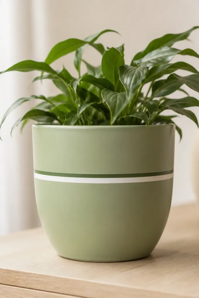
A midsection halo is one of the cleanest modern looks because it frames the plant. The two thin stripes create depth without adding clutter. Light green plus darker green reads fresh and works with almost any plant pot color. The design is also easy to repeat across multiple pots so your set looks consistent.
Paint the pot light green matte. Tape a horizontal line around the midsection, paint a thin white stripe (about 3 to 4 mm). After it dries, tape a second line slightly above it for a dark green stripe. Remove tape and touch up any tiny bleeds with a fine brush.
Pro tipWrap a soft measuring tape around the pot and mark two reference points with pencil so the stripe stays level.
AvoidAvoid skipping the tape edge press - gaps let paint seep under and blur the stripe.
19. Stenciled Geometric Dots in a Single Column
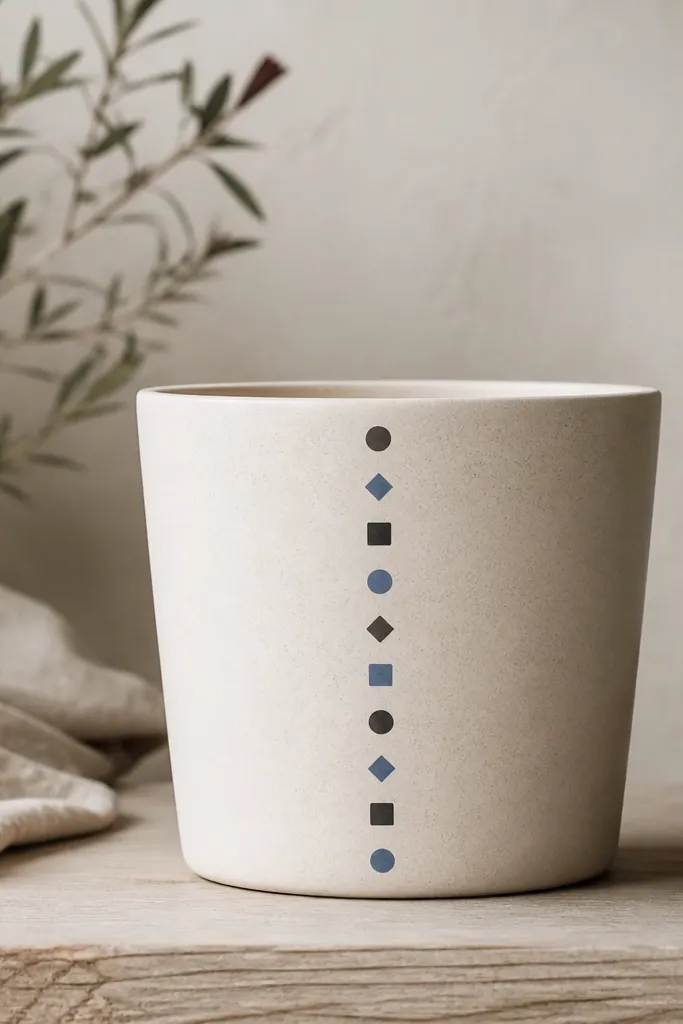
This is modern because the pattern is controlled and vertical. A single column draws the eye up, which is flattering for taller plants. Stencils make the shapes look crisp even if your freehand skills are shaky. Alternating charcoal and dusty blue keeps it from looking too monochrome.
Paint the pot cream matte. Choose a stencil sheet with small dot/shape patterns and tape it in place on the front. Dab paint with a stencil brush so the edges stay sharp, then lift and re-position for the next row. Build 10 to 12 shapes down the column, alternating colors every other shape.
Pro tipUse a scrap paper under the pot so you can dab without contaminating the stencil edge.
AvoidDon't swipe the stencil - that smears paint and ruins the crisp shapes.
20. Crisp Color-Block with Overlapping Semi-Circles
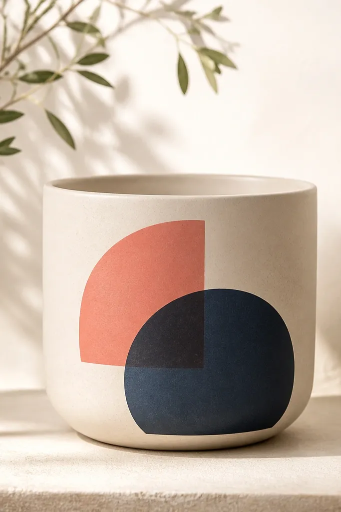
Overlapping semi-circles look modern because they mimic poster design. The clean color blocks make the shapes pop, and the overlap creates a sense of depth. Warm white background keeps it bright and modern. Coral plus navy is a strong combo that still feels friendly.
Paint the pot warm white first. Tape two semi-circles on the front using a flexible tape guide or a cut paper template. Paint coral for the first shape, remove tape, then tape and paint navy for the second semi-circle that overlaps. After both dry, add a thin white gap line if the overlap needs more separation.
Pro tipCut a semi-circle from cardstock and use it as a reusable mask to get repeatable curves.
AvoidAvoid muddy edges by removing tape only when paint is tacky, not fully wet.