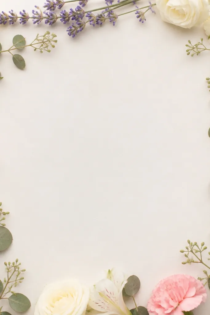
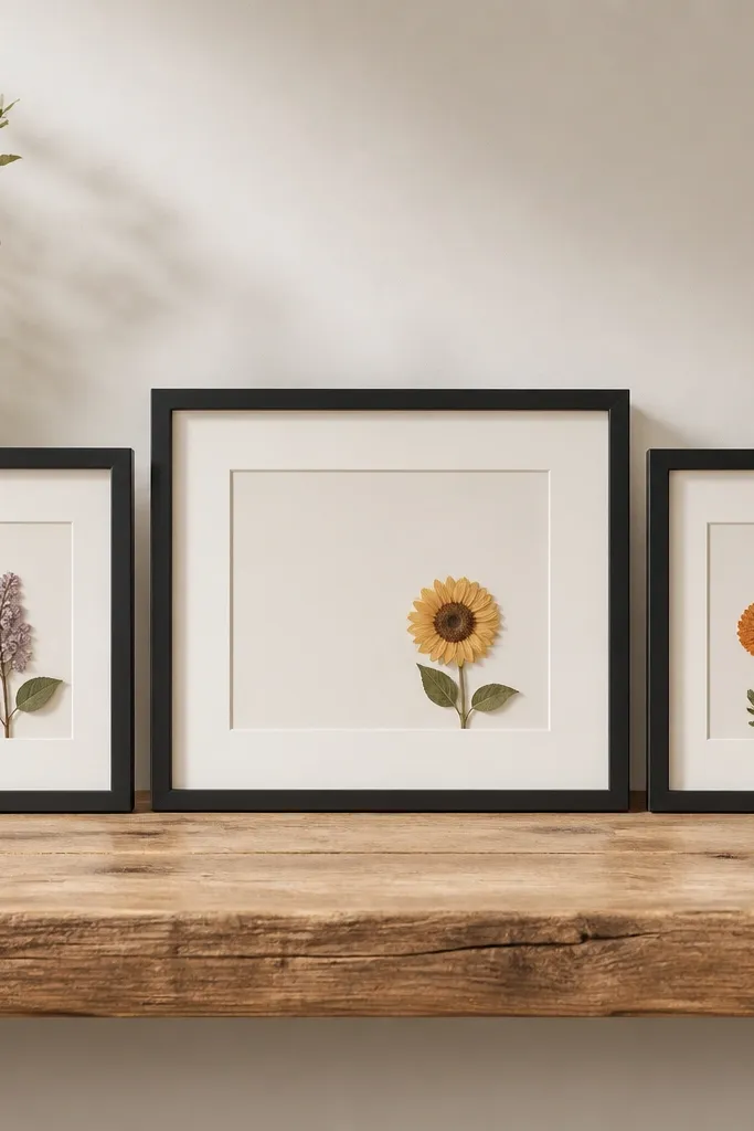
1. Ivory Mat Black Frame Monochrome Lavender Trio
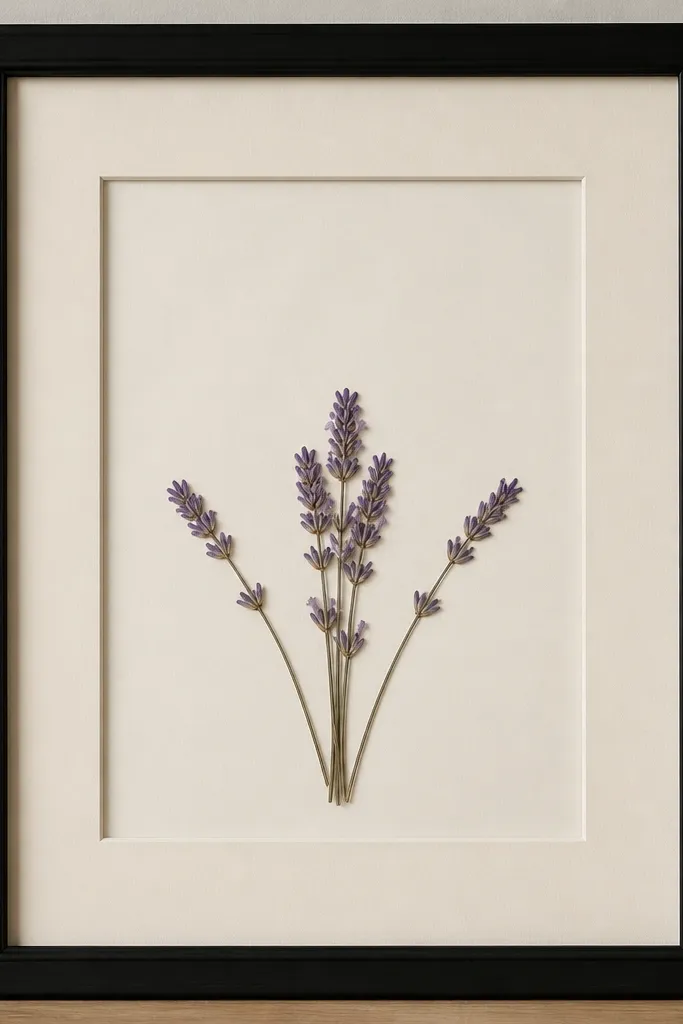
This one looks luxe because the palette is tight and the layout is airy. Lavender reads delicate, but it can get muddy if you mix too many shades. Keep everything in the same purple family and let the ivory mat brighten the whole piece. The black frame adds contrast so the pale petals still pop from across the room.
Use an 8x10 frame with a removable backing and a 1.5mm+ ivory mat. Arrange three sprigs - two smaller at the corners and one slightly taller in the center - then secure only the stem bases. If your lavender is very pale, place a thin strip of light lilac paper behind the cluster for subtle warmth.
Pro tipDry-fit the flowers on the mat without glue for 10 minutes and move them until the tallest sprig hits about 1 inch below the top mat edge.
AvoidAvoid filling the mat edge-to-edge - crowded petals make it look like a pressed-plant collage.
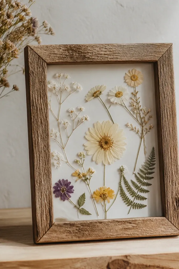
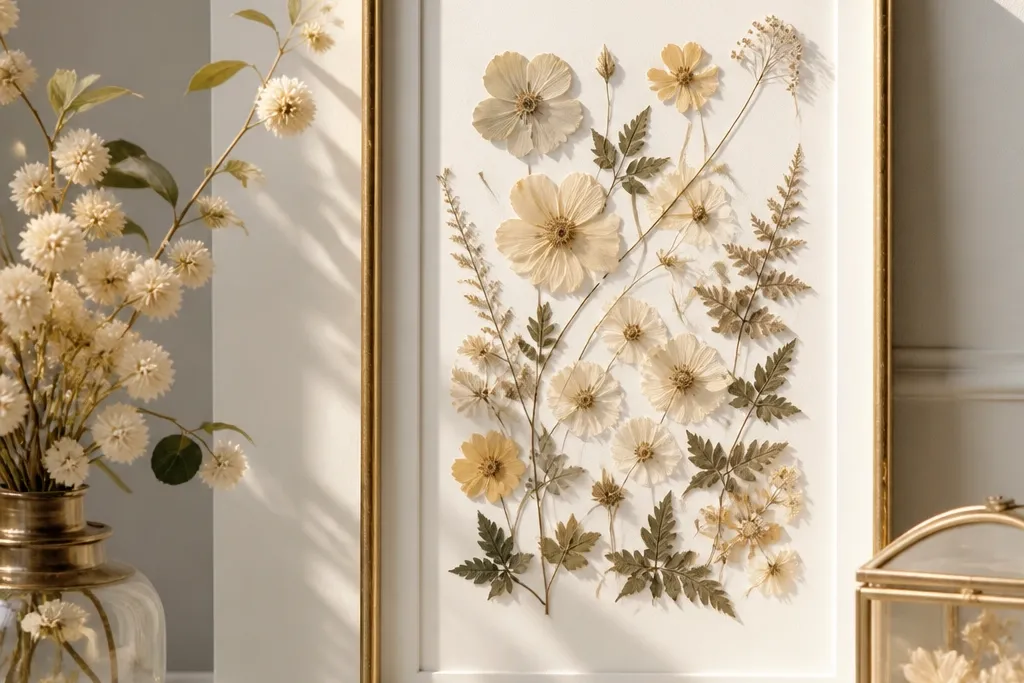
2. Champagne-Gold Frame Daisy Confetti Grid
Daisies are perfect for an aesthetic that reads clean and celebratory even when they're pressed. The gold frame warms the whites so the flowers don't look stark or washed out. The grid idea works because it creates rhythm - your eye knows where to land. Tiny scattered petals fill the negative space without turning into clutter.
Use 11x14 so you have room for a grid. Cut small circles of off-white cardstock for the flower centers if your pressed centers are too faded - glue the center pieces lightly. Place the largest daisies in a 2x2 arrangement and add micro petals between them.
Pro tipKeep all flower stems pointing inward toward the center. It makes the whole grid feel intentional, not accidental.
AvoidDon't use thick glue on the tiny petals - it shows as dark bumps under glass.
3. Terracotta Frame Autumn Leaf Arch
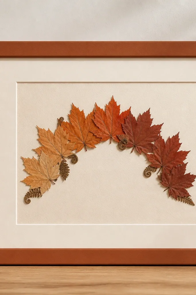
An arch composition gives the piece structure, even when pressed leaves look organic. Terracotta frames pair naturally with warm leaf tones and make the reds look richer. The cream mat keeps everything from getting too dark. This design looks great for fall and also works in an earthy everyday gallery wall.
Press maple leaves flat until edges don't curl - curl reads messy under glass. Arrange the arch so it peaks near the top third of the mat. Layer fern pieces under the arch with a small overlap so the leaves read dimensional.
Pro tipIf your leaves are brittle and break, glue only the underside at the vein line and press gently for 10 seconds.
AvoidAvoid mixing green leaves with fully orange ones unless you're deliberately making a "fresh to fall" gradient.
4. Blush Pink Frame Rosebud Halo
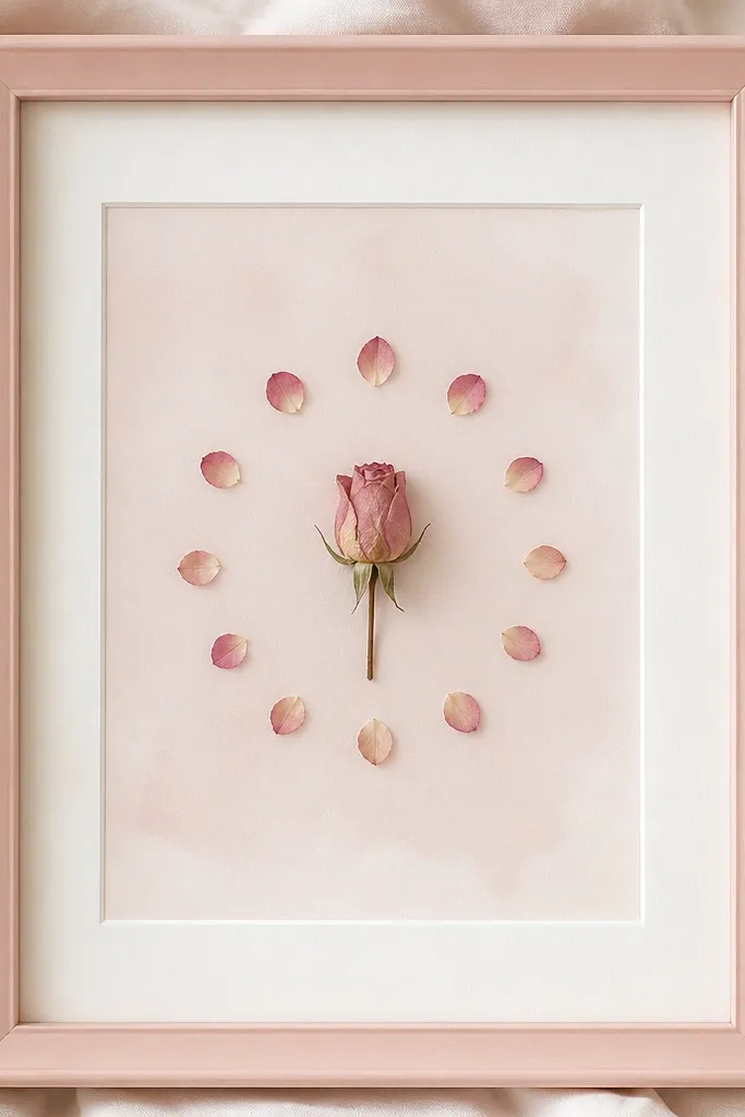
A rosebud halo looks luxe because the center is clear and the ring of petals is controlled. Blush pink makes the pressed petals feel romantic without needing extra colors. The evenly spaced ring creates a clean, jewelry-like effect. Leave a small gap between the halo and the rosebud so the center stays crisp.
Use archival clear glue and attach the rosebud first at the center. Then place 10-16 petals in a ring, each petal angled slightly different to catch light. Add a faint blush background wash using watercolor paper behind the mat opening.
Pro tipMake the halo radius about 1.5 inches from the rosebud edge on an 11x14 mat - that spacing reads balanced.
AvoidAvoid using dark charcoal paper behind pale rose petals - it turns everything gray.
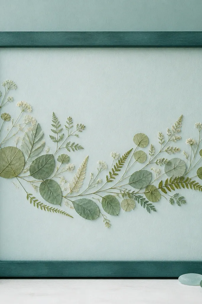
5. Seafoam Frame Eucalyptus Branch Split
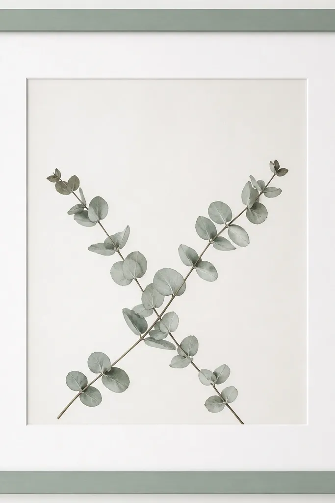
Eucalyptus has that airy, spa-like look, and pressed leaves keep it subtle. The split diagonal layout makes it feel modern instead of traditional. Seafoam frames make the gray-green tones look intentional and calm. It's also forgiving - eucalyptus veins create texture even if the petals aren't perfect.
Use a 8x10 or 11x14 frame depending on how long your branches are. Arrange the branches so they cross slightly below center, then secure only near the stem base. Tuck a couple of micro leaves under the crossing point for depth.
Pro tipLightly bend the stem before gluing so the leaves fall naturally along the diagonal - flat stems look stiff under glass.
AvoidAvoid fully covering the mat - keep corners open so the leaves don't look like a pressed pile.
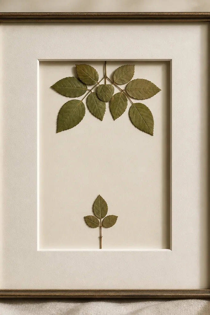
6. Forest Green Frame Fern + Tiny Gold Leaf Dot
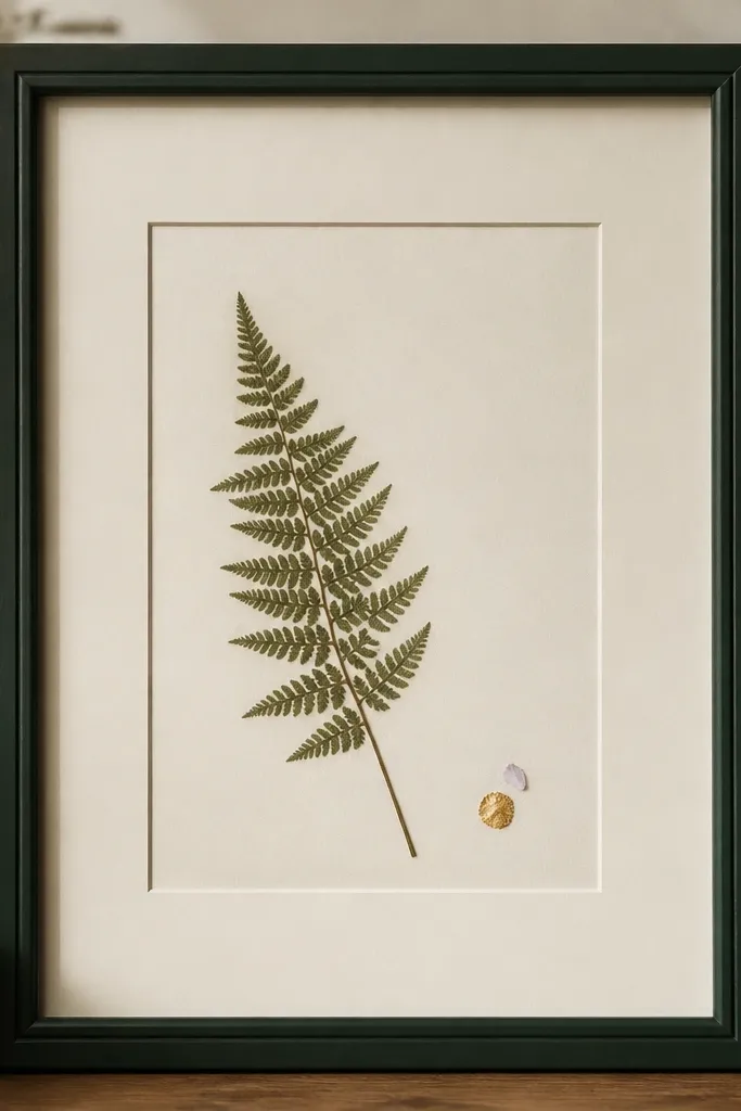
Fern fronds look expensive because the texture is already detailed - you don't need lots of blooms. The single gold leaf dot adds that "jewelry detail" effect without turning into a craft project. Forest green makes the fern veins look darker and clearer. The empty space keeps the fern from feeling busy.
Use a 8x10 frame with a thick ivory mat. Place the fern so the longest tip points toward the upper left quadrant. Add gold leaf only in a small patch - I use a toothpick to place it and seal it with a tiny amount of clear archival medium.
Pro tipIf the fern frond is too long, trim it after pressing and keep the cut end hidden under the mat opening.
AvoidAvoid scattering gold leaf everywhere - it reads messy under close-up glass.
7. Clear Acrylic Shadow Box Frame Dried Baby's Breath Drift
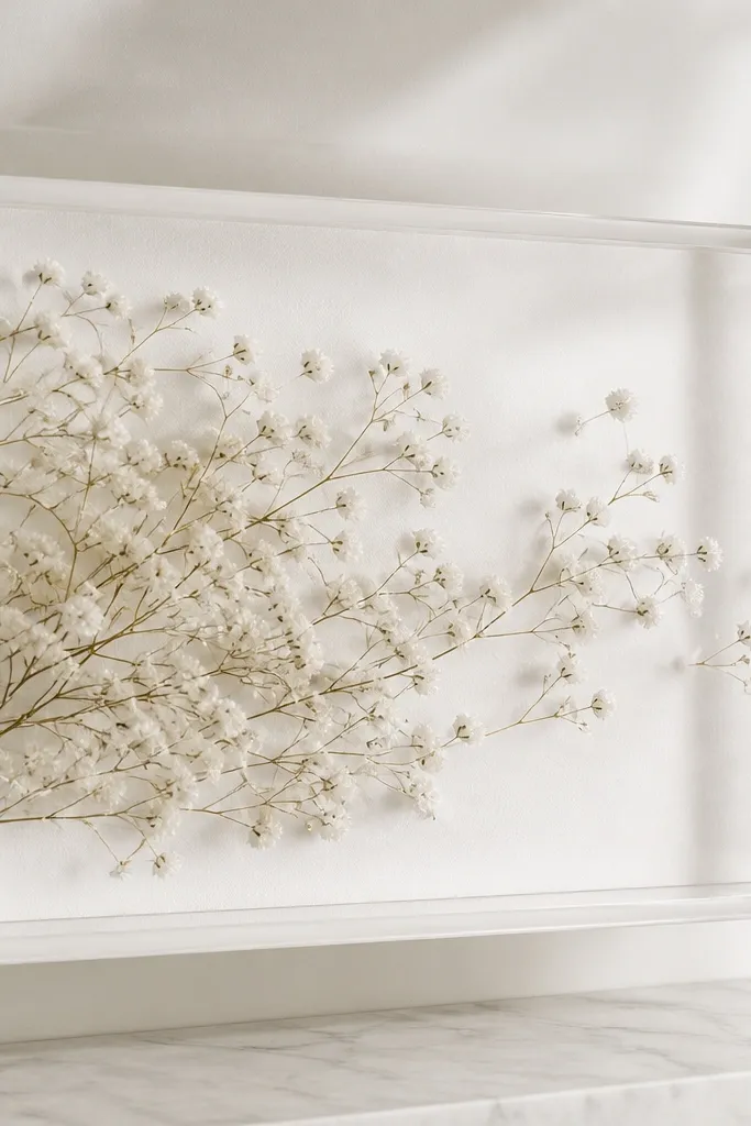
Shadow boxes are the secret weapon for pressed flowers that want to curl. With acrylic depth, the petals sit without being smashed flat into the mat surface. Baby's breath is tiny and airy, so it looks like a cloud when you drift it across the frame. The white backing keeps everything bright and clean.
Use a shadow box with 1-2 inches depth so petals have room. Arrange baby's breath in a diagonal sweep and secure with small dots at stem clusters. Back the shadow box with white cotton rag paper for a softer look than glossy cardstock.
Pro tipPress baby's breath longer than you think - 3-4 weeks - so it stays crisp instead of puffing.
AvoidAvoid using a flat glass frame for very delicate tiny flowers - they crush and lose shape.
8. Black Frame With Blue-Tinted Background Hydrangea Square
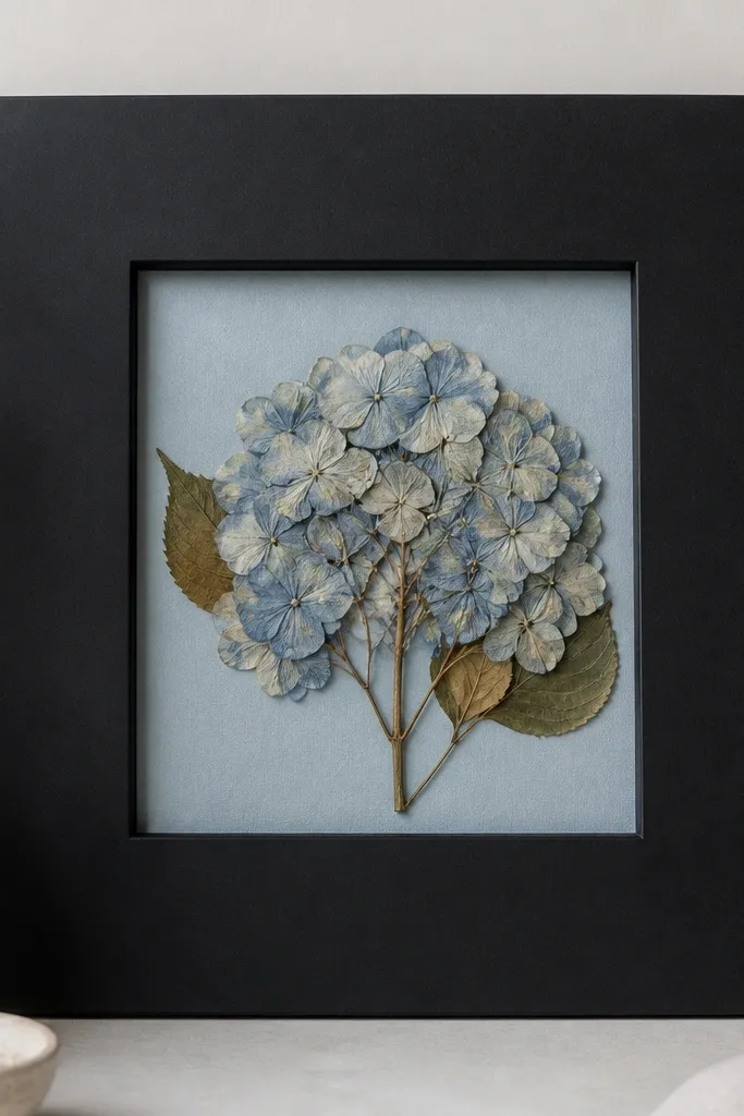
Hydrangea clusters can look flat, but a blue-tinted background makes them read like watercolor. The matte black frame keeps the piece from looking too sweet. Centering the hydrangea gives it a "stamp" look - clean and graphic. Add just a couple of leaves so it feels botanical, not stuffed.
Use a 11x14 frame and cut the mat to a square opening so the hydrangea sits inside like a print. Tone your background with diluted acrylic paint on watercolor paper - pale blue, not navy. Glue the hydrangea at the bottom edge and tuck two small leaves to either side.
Pro tipIf the hydrangea is already brownish, tint the background slightly deeper blue to counter the warm tone.
AvoidAvoid using patterned scrapbook paper behind flowers - it fights the cluster.
9. White Frame Minimal Orchid Pair With One Empty Side
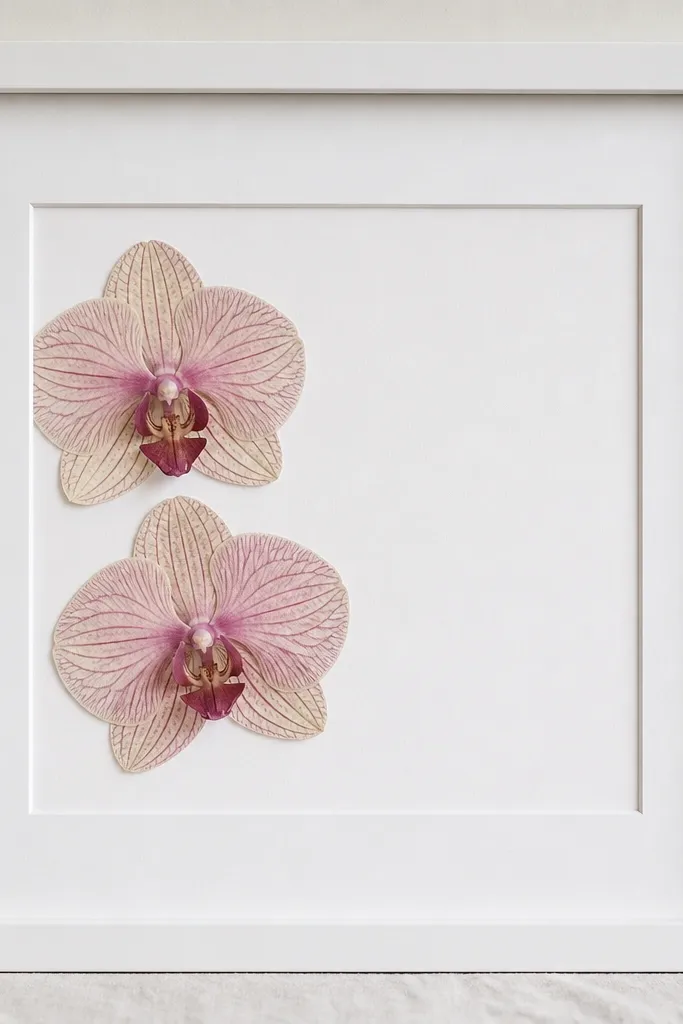
This is the luxe version of minimalism. Orchids have strong shape, so you only need two blooms. By leaving one side empty, the piece looks like interior design, not a craft. The white frame and mat keep everything bright and airy, which makes the orchid veins look crisp.
Pick an 8x10 with a wide mat for real breathing room. Glue the orchids at the base so the petals don't flatten into the mat. Add a tiny paper spacer under the left orchid if it needs height to match the right one's curve.
Pro tipUse a ruler to place the orchids so the left edge sits 1 inch from the mat opening - it looks balanced instantly.
AvoidAvoid putting both orchids dead center - it turns into a symmetrical "sticker" look.
10. Gold Leaf Frame Tiny Pressed Wildflower Strip
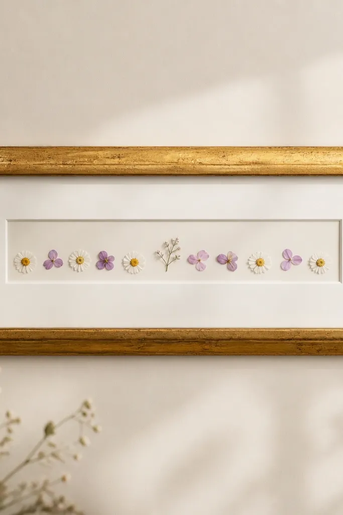
A horizontal strip reads modern and luxe because it looks like a curated botanical label. The gold leaf frame warms the paper and makes the wildflowers feel intentional. The key is the line - everything sits on one axis, and the rest of the mat stays clean. It's perfect for kitchens, hallways, and above a console table.
Use a custom-sized frame or a long mat opening in a 11x14 frame. Arrange flowers in a single row, varying height slightly but keeping the baseline straight. Glue only the stems so petals stay light and not glued down flat.
Pro tipCut a thin strip of matching paper behind the flowers so the baseline color stays consistent across the whole row.
AvoidAvoid mixing very large blooms with tiny ones in the same strip - it looks lopsided.
11. Rust Frame Pumpkin Vines With One Small Flower Pop
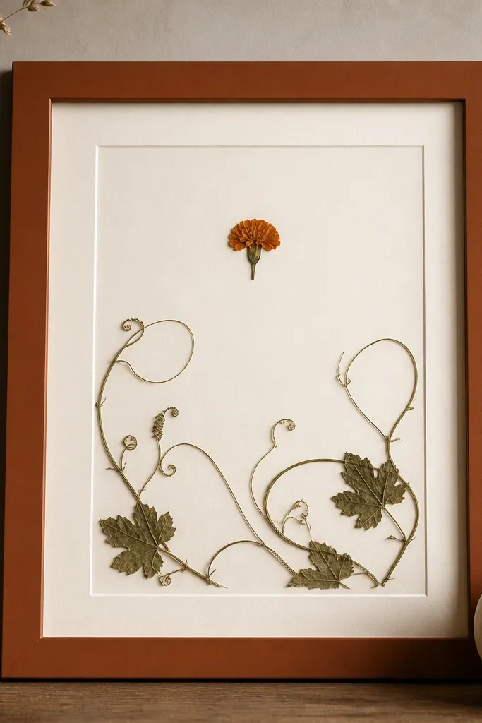
This design looks luxe because it uses negative space and one clear focal bloom. Pumpkin vines have a natural swirl that fills the area without needing dozens of leaves. The marigold pop adds seasonal color without turning into a collage. Rust frames make the vine detail stand out and keep the whole piece warm.
Press vine tendrils until they lie flat; if they curl, trim and re-press. Arrange the vines as a loose S-shape across the lower third, then place the marigold at the top center. Glue vines at contact points so they don't lift at the ends.
Pro tipUse a toothpick to apply glue only where the vine touches the mat - fingerprints ruin the look fast under glass.
AvoidAvoid adding multiple big flowers - the focal point stops feeling special.
12. Mocha Frame Coffee Blossom Brown Tones
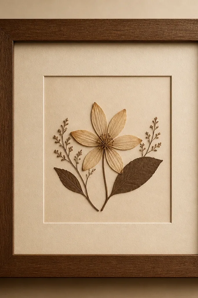
Coffee blossoms look like delicate lace when pressed, and browns feel cozy year-round. The mocha frame keeps the tone consistent so the pressed petals don't look like they were pasted on. Centering the blossom gives it the look of a vintage botanical print. It's also great for fall and winter walls because browns don't scream season.
Use a warm beige mat so you don't kill the blossom's highlights. Glue the blossom at the base and let the petal edges float. Add one or two tiny leaves on the sides like footnotes - keep them smaller than the blossom.
Pro tipIf the blossom has dark edges, lightly brush the petals with a dry soft makeup brush to remove dust before sealing.
AvoidAvoid cool gray backgrounds - they make coffee blossoms look dirty.
13. Black Frame White Flower Confetti Corner
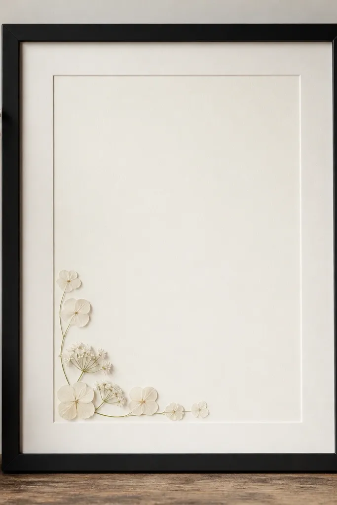
Corner placement looks expensive because it mimics how designers use decorative elements on a page. The black frame gives contrast, while the off-white mat keeps the flowers from going stark. A small corner cluster is also easier than trying to fill the whole space - your eye still reads it as intentional. This design works great for seasonal swaps because you can keep the frame and change the corner floral.
Glue a cluster using one main bloom and several small petals around it. Keep the cluster inside a 4x4 inch area in the bottom left of the mat opening. Use clear glue sparingly, and press the edges with a dry cotton swab so petals lie flat.
Pro tipStand back and check from across the room before sealing - corner pieces can look too small up close.
AvoidAvoid putting the cluster exactly in the corner with no margin - it looks like it got cut off.
14. Burgundy Frame Signed-Look Script Mat With Pressed Rose Petal
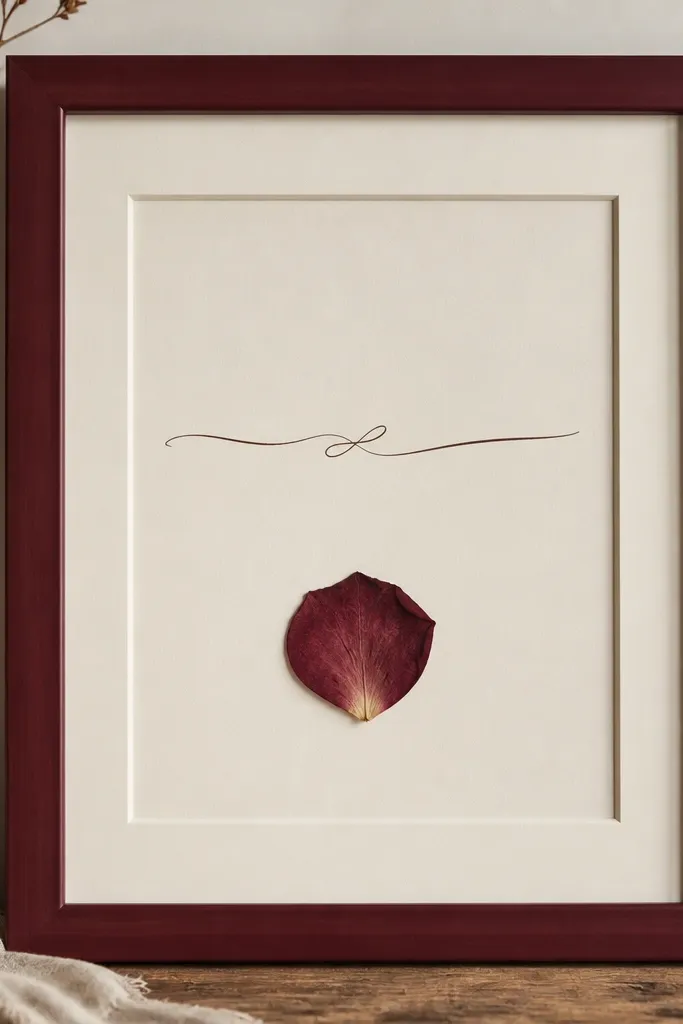
This reads luxe because it pairs one perfect petal with simple typography. Burgundy adds depth and makes the rose tone look richer. The key is that you're not building a whole bouquet - you're designing a focal statement. Pressed petals are fragile, but when you isolate one and let it breathe, the texture looks intentional.
Cut a mat opening that leaves a wide border. Place one rose petal vertically and glue only the stem edge. Write your script on the mat background using archival ink or a printed label - keep the text small so it doesn't fight the petal.
Pro tipUse a pencil to lightly map where the petal will sit before you glue - one crooked petal ruins the "designed" feel.
AvoidAvoid using metallic paint on the mat near the petal - it can smear under sealing tape.
15. Pastel Frame Butterfly-Leaf Placement With Two Colors
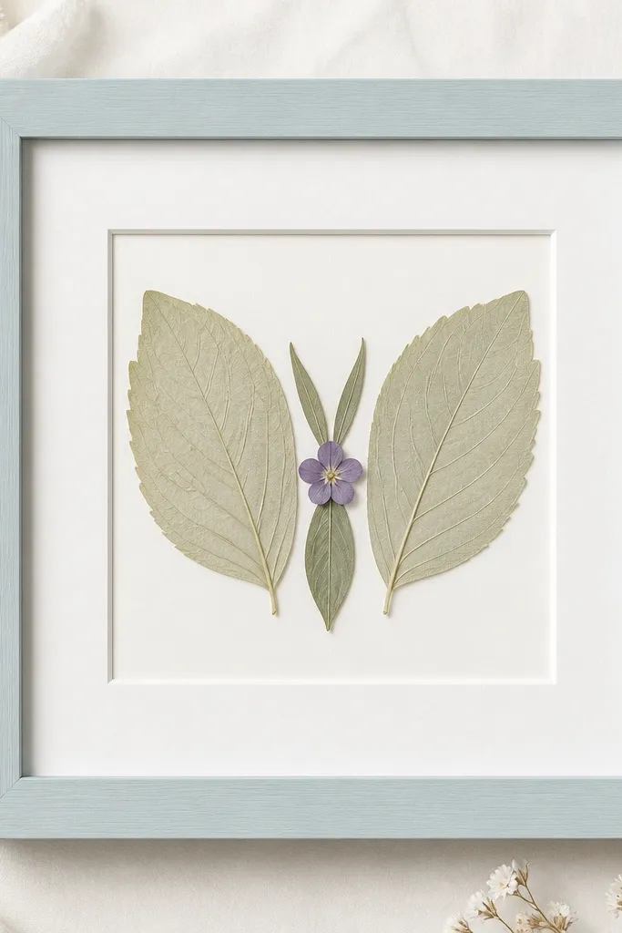
This layout is luxe because it uses shape language. When you arrange leaves like wings, the piece reads graphic instead of random. Keeping to two main colors - leaf green and one purple bloom - keeps it clean under glass. The pastel frame makes it feel springy without going childish.
Choose leaves with clear veins so the wing shape looks crisp. Build the butterfly: two wing leaves, then a small leaf body, and glue the tiny purple flower at the center. Keep the wings slightly angled so the top edges catch light.
Pro tipTrim leaf edges with clean scissors after pressing so the "wings" look symmetrical.
AvoidAvoid mixing more than two leaf shades - it turns into a muddied collage.
16. Natural Wood Frame Botanical Recipe Card Layout
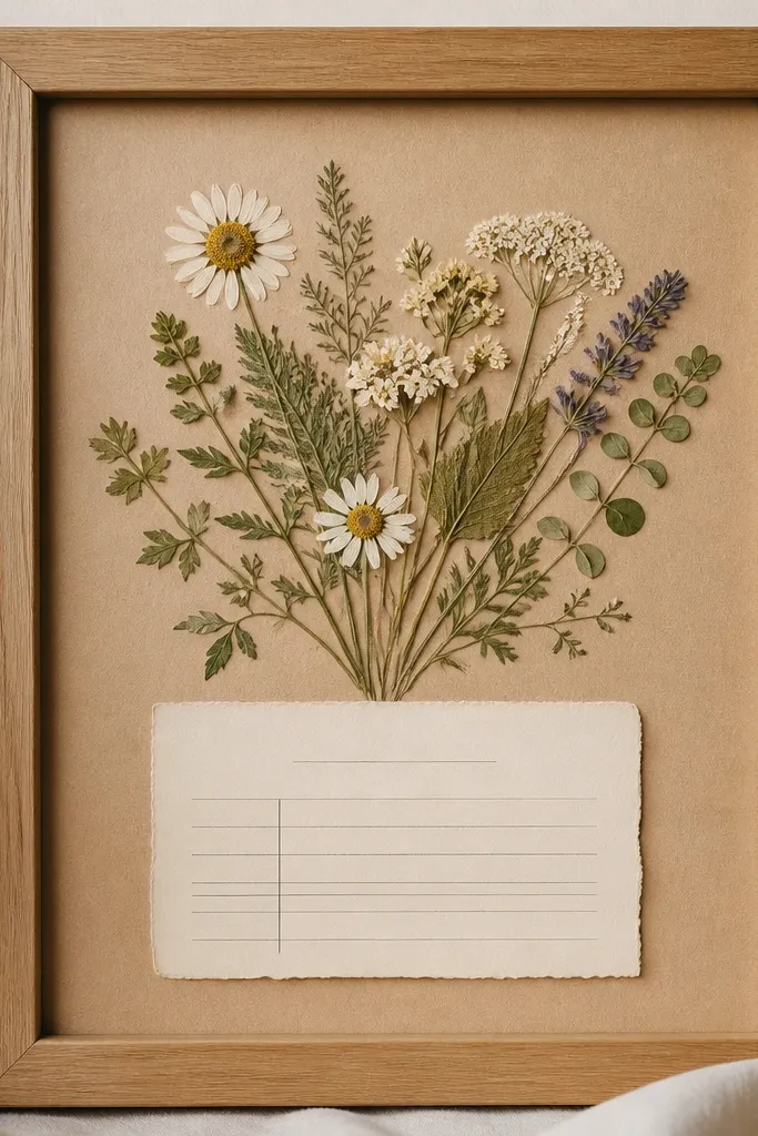
The recipe-card layout looks luxe because it gives the flowers a job: frame the text like a botanical label. Kraft paper adds warmth and makes greens and tiny blooms look grounded. This is a great way to use pressed herbs that aren't showy - the layout makes them look purposeful. It also gives you an easy seasonal update by swapping the text block.
Use a frame with a kraft background or line the backing with kraft paper. Place a small rectangular label area in the lower third and glue pressed herbs around it. Keep herbs small and use one main sprig above the label for focus.
Pro tipPrint the text on thick paper and tape it flat before gluing any petals so you don't accidentally shift the layout.
AvoidAvoid glossy paper for the background - it reflects light and makes the flowers look less crisp.
17. Silver Frame Monochrome Winter Sprig With White Mat
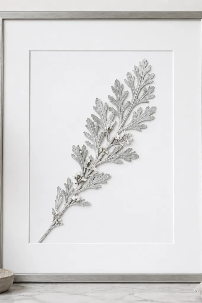
Winter sprigs already look silvery, and monochrome keeps the piece elegant. A bright white mat makes gray leaves look crisp instead of dull. The diagonal line gives movement and keeps the frame from feeling static. It also works for holiday decor without adding obvious holiday symbols.
Use a silver frame or thin metallic frame so the tones match. Arrange the sprig diagonally and secure it with tiny glue dots along the stem. Add 2-3 tiny white petals near the top right to balance the weight.
Pro tipIf the leaves are slightly curled, press a flat scrap of parchment on top for 30 seconds after gluing so they settle.
AvoidAvoid warm cream mats with silvery leaves - they make the gray look brown.
18. Clear Glass Frame With Dried Rose Leaf Edge Shadow
This looks luxe because it uses shadow and spacing, not lots of material. When leaf edges sit slightly lifted with a mat border, you get a soft dimensional effect under the glass. The minimal center makes the shadows read like design, not clutter. It's also a smart option if your pressed flowers are imperfect - the spacing hides small flaws.
Use a frame with a deeper mat or spacer so the flowers sit above the backing. Place leaf edges near the mat border so they cast a visible line. Glue only the center base points so edges float a bit.
Pro tipUse a thin foam tape strip behind the leaf base if you want consistent height across the cluster.
AvoidAvoid using too much height - if petals lift aggressively, they look unstable and catch light harshly.
19. Teal Frame Sea Glass Palette With Pressed Wild Greens
Teal plus aqua background makes pressed greens look like they belong in a modern coastal home. The wave arrangement gives motion and keeps the composition from feeling flat. Use tiny pale flowers as accents so the scene stays airy. This is a great seasonal piece for spring and summer because it doesn't scream "beach" - it reads clean.
Tint the backing with diluted acrylic or watercolor paper in pale aqua. Arrange greens in a wave from left to right, keeping the tallest leaf near the middle. Secure with clear glue at stem points and add tiny white petals at intervals like highlights.
Pro tipMatch your accents: use only one accent flower color (white or pale yellow) for the whole frame.
AvoidAvoid neon teal frames - they overpower the muted pressed tones.
20. Black Frame Seasonal Swap Trio Set Layout
A matching trio looks luxe because it reads like a planned gallery wall, not separate crafts. Keeping the same layout rules in all three frames makes them cohesive even when the flowers change. The black frames unify the look, and the consistent placement gives it a designer feel. This is also practical - you can swap the pressed blooms when seasons change.
Use one frame size for two pieces and a larger one for the horizontal to create hierarchy. In every frame, place the focal bloom near the same corner - for example, bottom center for the vertical ones and center for the horizontal. Use the same mat color and same empty-space rule so the set stays consistent.
Pro tipLabel the back of each frame with the bloom type and date pressed. It makes future swaps fast.
AvoidAvoid mixing frame finishes across the set - glossy and matte together look inconsistent.