1. Sage + Porcelain Band with Gold Fleck Rim
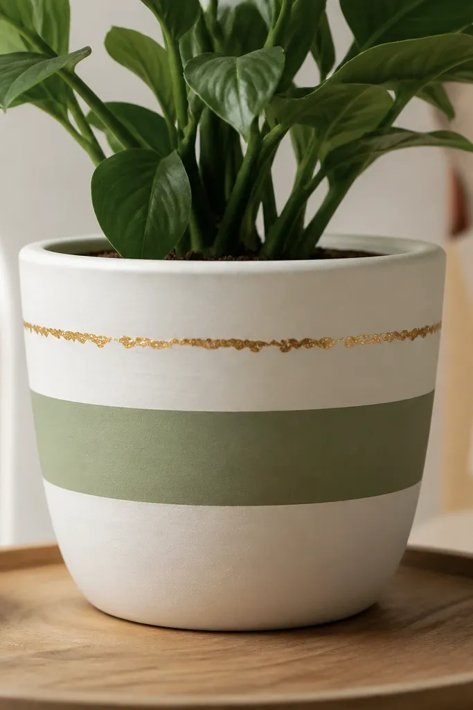
This design looks high-end because it limits colors to three values: white base, sage stripe, and gold accents. The band gives structure, while the gold flecks mimic the speckled finish you see on luxury ceramics. Keep the flecks clustered near the rim so the pot reads polished from across a patio. It also pairs well with herbs and small evergreen cuttings.
Sand the pot lightly, then prime with an adhesion primer. Base coat the whole pot in porcelain white acrylic enamel, then tape a straight band about 5 cm tall around the middle. Paint the band in sage green and remove tape while the paint is still slightly tacky. Finish with a clear satin topcoat and a tiny amount of metallic gold fleck medium applied with a dry brush near the rim.
Pro tipIf your stripe looks wobbly, measure the pot circumference and mark with a pencil every 2-3 cm before taping.
AvoidSkipping tape or removing tape after paint fully dries usually leaves jagged edges that look amateur.
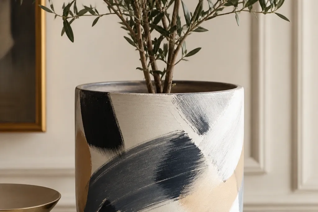
2. Black Lacquer Lines Over Oat Milk Matte
The contrast between oat milk matte and glossy black makes this read "designer." The curved vertical lines follow the pot's shape, so it looks custom instead of printed. I like it for modern greenery because it doesn't fight the plant's texture. It also works for winter arrangements because black stays crisp in low light.
Prime and base coat in oat milk matte. Use pin-striping tape or thin painter's tape to place two vertical lines spaced about 4 cm apart. Paint over tape with black enamel mixed with a gloss medium (or use a gloss black). After the lines cure, seal the entire pot with a satin clear coat so the base stays soft while the lines stay reflective.
Pro tipPress tape down with a plastic card so paint doesn't creep under the edges.
AvoidUsing flat black on top of matte base can look dull and cheap - aim for a shinier finish on the lines.
3. Champagne Marble Swirl (Tape-Resist)
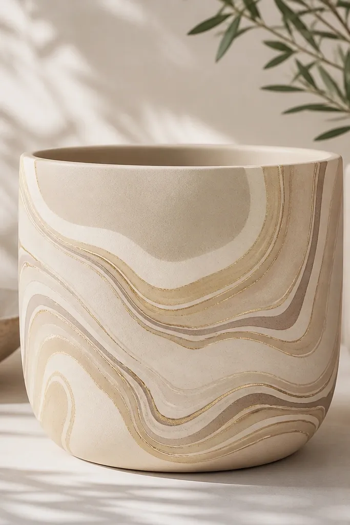
Marble looks luxe because it has variation without chaotic colors. The tape-resist method gives you crisp "veins" instead of fuzzy brush blobs. I've done this on six pots for holiday hosting and they always look like they came from a boutique ceramic shop. Pair it with white poinsettias or a single tall plant so the pattern stays the star.
Base coat in warm beige (oat or sand tone). Draw a loose swirl pattern lightly in pencil on the dry surface. Lay thin strips of tape along the vein paths, then paint the surrounding areas with sponge-applied taupe and champagne metallic acrylic. Remove tape after 10-15 minutes, then add a thin final vein line in metallic gold. Seal with a clear satin topcoat.
Pro tipUse a makeup sponge for the veining texture - brush strokes show too much on a small pot.
AvoidOvermixing colors while wet creates muddy marbling - let each layer dry before adding the next.
4. Cranberry Velvet Dots on Ivory
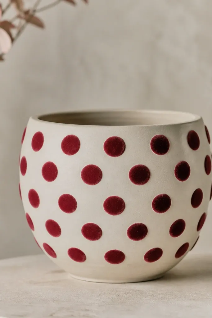
Dot patterns look polished when the spacing is consistent and the paint has a slight dimensional effect. Cranberry on ivory reads holiday without turning into cartoon Christmas. I add a tiny lighter center to each dot so it looks like painted enamel beads. This one looks amazing with winterberry stems or a small cactus.
Base coat the pot in ivory matte. Use a dotting tool or the end of a foam paint brush dipped in cranberry acrylic. Mark a grid lightly with pencil so dots land evenly; spacing about 2.2 cm works well on a standard 10-12 inch pot. For the "velvet" look, dab a second tiny lighter cranberry-pink dot in the center after the first layer dries. Topcoat with a satin clear so the dots keep a soft sheen.
Pro tipPractice on a scrap terracotta piece first - dot size changes how luxe the pattern feels.
AvoidDragging the dot tool across the surface flattens the shape and makes it look messy.
5. Emerald Leaf Silhouette with Gold Veins
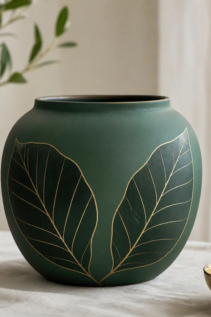
Leaf silhouettes feel expensive because they're graphic and intentional. The trick is using one or two big leaves, not many small ones. Gold veins add that "jewelry" detail without turning the pot into a glitter bomb. I use this design for spring and early summer when the plants are still small and the pot needs presence.
Prime and base coat in deep emerald green matte or satin. Find a leaf stencil (or print one at the size you want) and tape it in place. Paint leaf shapes in slightly darker green enamel, then use a fine liner brush or paint pen for gold vein lines. Add a few small gold dots at the leaf base for balance. Seal with satin topcoat.
Pro tipKeep gold veins thin - about the width of a sewing thread - so it looks like ceramic detailing.
AvoidUsing too many leaf shapes makes the pot look busy and cheap, especially in photos.
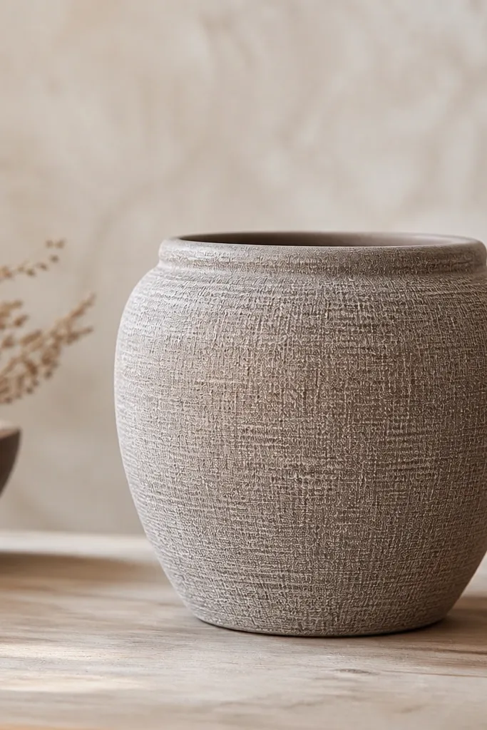
6. Terracotta Base with White Scallop Edge Trim
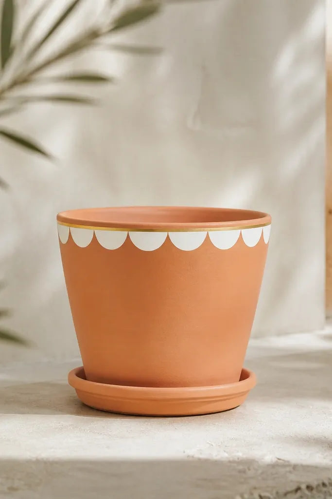
Leaving the terracotta visible keeps this grounded and expensive-looking. The white scallop trim gives a clean, tailored border, and the thin gold line adds a finishing touch. When you place it near natural wood furniture, the terracotta + white combo reads like high-end patio decor. It also hides minor unevenness in the pot shape because the trim is only at the rim.
Clean the pot and scuff-sand where you'll paint. Prime only the areas you'll cover (rim band and gold line) with an adhesion primer. Paint a white scallop band using a scalloped edge stencil or a cut sponge with a scalloped edge. Add a thin gold line above the scallops with tape as a guide. Seal with exterior clear satin.
Pro tipIf the pot rim is uneven, use smaller scallops so gaps don't show.
AvoidCovering the whole pot when you want a luxe border look - it removes the natural material warmth.
7. Gold Arches on Matte Black Night
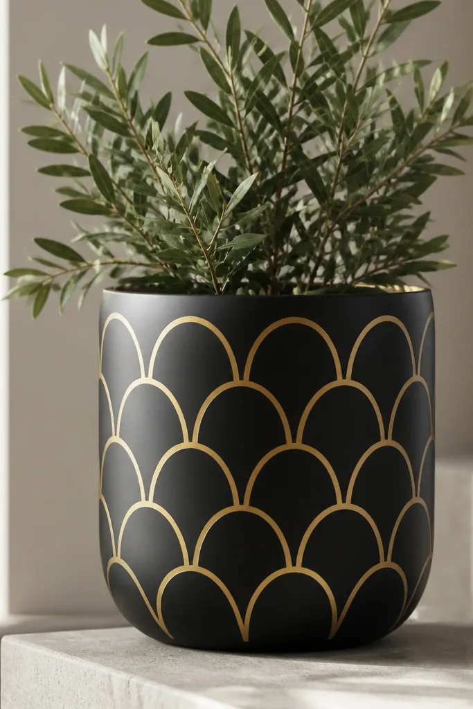
This is the kind of pot that makes people ask where you bought it. Matte black gives the backdrop, and gold arches read like architecture. The pattern works because it repeats cleanly and doesn't require freehand art skills. I've used it for holiday porch displays with white lights and a single evergreen branch.
Prime and base coat in matte black exterior paint. Use a small arch stencil and a sponge stipple method for even metallic coverage. Place the arches in rows, keeping the top row about 3 cm below the rim. Paint with metallic gold acrylic and let it dry fully before removing any stencil. Finish with a clear matte or satin topcoat depending on how reflective you want it.
Pro tipStipple the gold instead of brushing it - brush strokes show through metallics on small surfaces.
AvoidTrying to paint arches freehand - uneven arches make it look like craft paint, not decor.
8. Ice Blue Ombré with Silver Mist Fade
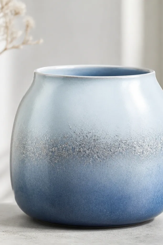
Ombré looks luxe when it has a smooth gradient, not a hard line. The silver mist adds depth and makes the pot photograph well in winter light. This design pairs with silver-dusted plants or white blooms because the color story stays cool. It also hides small surface texture since the gradient blends it.
Prime and base coat in white. Mix ice blue acrylic with a little white and paint the bottom third first. Then fade upward by feathering with a damp sponge, adding more white each step. For silver mist, load a dry brush with silver metallic paint and flick lightly at mid-height from a distance. Seal with satin clear to keep the gradient soft.
Pro tipWork in sections: do one pass, then blend immediately before the paint sets.
AvoidOverworking the gradient after it dries - it turns patchy and looks streaky.
9. Rose Blush Florals with Tiny Gold Dot Centers
Small florals look high-end when they're spaced like wallpaper, not scattered like stickers. The gold dot centers make the flowers feel like hand-painted porcelain. I used this on a set of four pots for a bridal brunch and the guests kept touching the gold because it looked raised. It's feminine without looking childish.
Base coat in blush pink matte. Use a small flower stencil or freehand roses with a fine liner brush. Keep leaf shapes to two or three strokes each, using dusty green paint. Add gold dot centers with a dotting tool or gold paint pen. Topcoat with satin clear so the florals stay soft and the gold doesn't go dull.
Pro tipPaint flowers in pairs, then repeat - it keeps spacing consistent and the pattern looks intentional.
AvoidUsing bright neon pink or heavy outlines - it makes florals look like party favors.
10. Ivory Base with Charcoal Geometric Frames
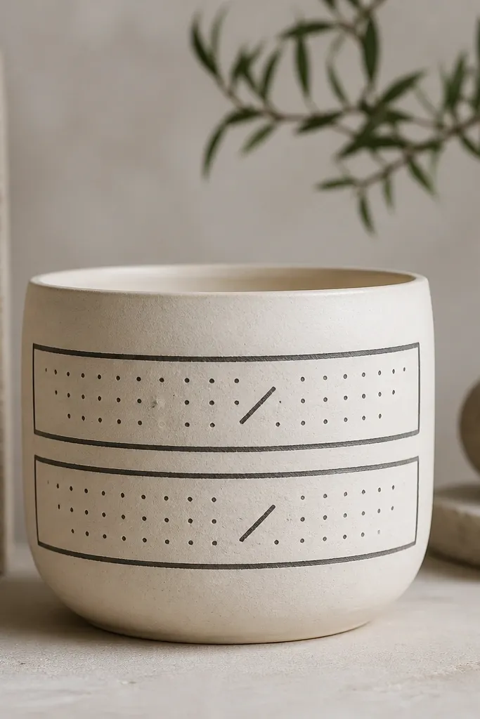
Geometry reads luxe when lines are crisp and the palette stays restrained. Ivory + charcoal looks modern and expensive, especially next to stone planters or black metal stands. The inner dot grid adds detail without needing complicated illustration. This one suits succulents and grasses because it frames them instead of competing.
Prime and base coat in ivory matte. Tape two horizontal rectangular frames using painter's tape widths around 6-8 mm. Paint frames in charcoal enamel, then remove tape carefully. For the inside detail, use a fine brush to add a dot grid and one diagonal line per frame. Seal with satin topcoat.
Pro tipPress tape edges down and keep paint strokes one direction to prevent seepage under tape.
AvoidThick lines everywhere - one bold color line plus small details looks styled.
11. Soft Taupe Linen Look with Dry-Brush Highlights
This design feels luxe because it mimics fabric texture. Dry-brush highlights catch light the way linen does, even when you use neutral colors. It's a great option when you want something calm and expensive-looking for everyday plants. I like it for fall because taupe looks warm without being orange.
Prime and base coat in warm taupe. To create texture, stipple a slightly darker taupe layer with a sponge, then lightly dry-brush a lighter taupe over raised spots. Keep the dry-brush strokes short and random, mostly toward the outer curve. Finish with a satin clear coat so the texture stays visible but protected.
Pro tipUse a nearly dry brush - if paint transfers in wet streaks, the texture becomes sloppy.
AvoidSkipping topcoat on textured paint - it scuffs easily when you move pots.
12. Holiday Pine Needles with Weathered Gold Wash
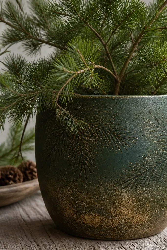
The weathered gold wash makes pine needle patterns look aged and intentional, not festive-craft. Forest green is forgiving and hides small brush marks, so you can keep the branches slightly imperfect. This is perfect for winter arrangements on a porch because the pot matches the mood of evergreens. It also looks good with warm white lights.
Base coat in forest green satin. Paint pine needles using a small angled brush - short strokes outward from a central stem. Mix gold acrylic with water and a tiny bit of clear medium for a wash consistency. Brush the gold wash lightly over the lower third and around the needle tips. Seal with satin topcoat so the wash doesn't rub off.
Pro tipLet the gold wash pool a little in the creases of the pine - that's the "antique" look.
AvoidUsing full-strength metallic gold paint like frosting - it looks too new and flat.
13. Monogram Band in Cream on Deep Navy
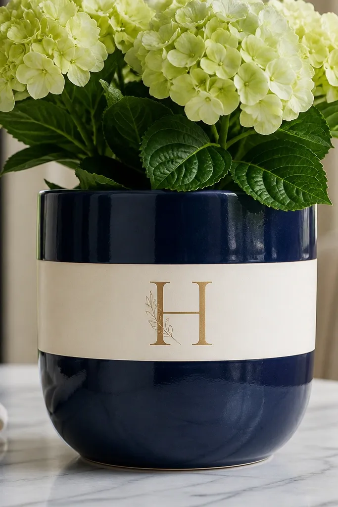
Monograms look luxe because they feel personal and controlled. Navy + cream is a classic contrast that reads expensive in every season. The thin gold monogram lines add a finishing jewelry detail without stealing attention from the plant. I've done this for housewarming gifts and it's always the one people ask me to make again.
Prime and paint the pot deep navy satin. Tape a centered horizontal cream band about 7-8 cm tall and paint it in cream matte. Use a vinyl stencil for the monogram or a printed transfer guide, then paint gold with a fine liner brush. Add a tiny flourish under the letter with a single curved line. Seal with satin clear.
Pro tipIf you don't have a stencil, print the letter large, tape it to the pot, then lightly trace with a pencil through the paper edge.
AvoidThick monogram strokes - they look like signage, not decor.
14. Sunburst Rays from the Center in Soft Gold
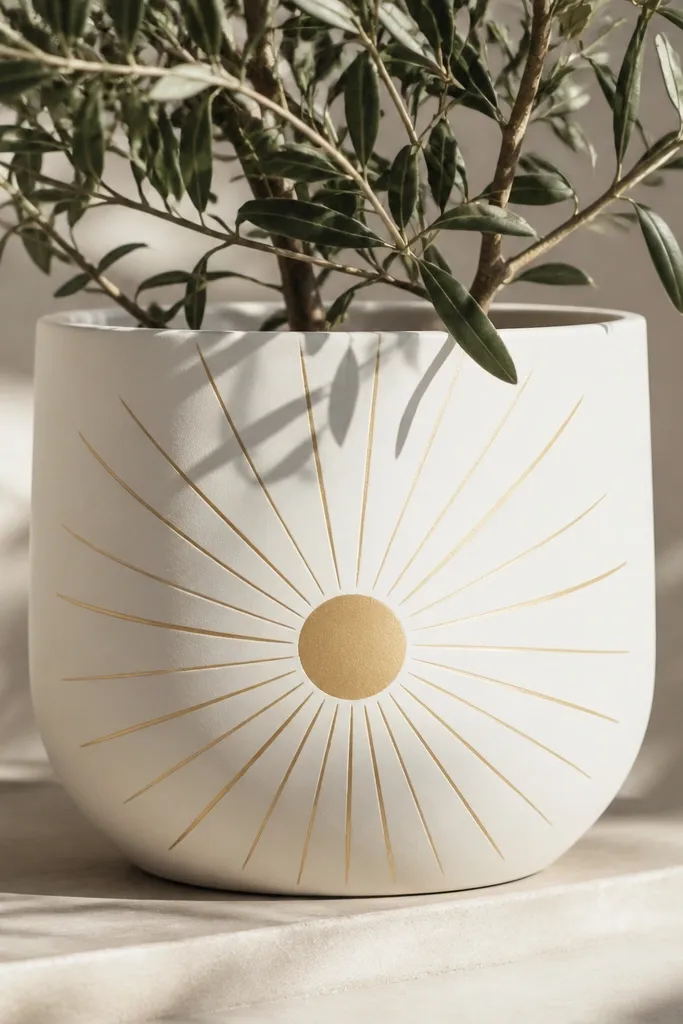
Sunburst rays feel high-end because they create movement and a sense of design planning. The key is thin rays and a soft gold shade, not bright yellow. Matte white keeps the rays crisp, and the central circle grounds the composition. This one works for spring and summer, especially with bright blooms.
Base coat the pot matte white. Mark a center point and draw a circle about 5 cm across. Use a ruler to space rays every 10-12 degrees around the circle, then use tape or a thin brush to paint the rays in soft gold. Blend slightly at the base of each ray with a damp brush so they look hand-painted, not mechanical. Seal with satin topcoat.
Pro tipMake 1-2 test rays on the pot bottom first so you know your line width before committing.
AvoidOver-thick rays - they make the design look like carnival decor.
15. Charcoal Wash Over White with Stenciled Stars
A wash adds depth and makes a simple stencil design look like it has history. The fading charcoal keeps the pot from looking flat, and the stenciled stars create a focal pattern without clutter. This is one of my favorite winter options because it looks good with both evergreen and holiday picks. It also hides minor paint brush marks under the wash.
Base coat in matte white. Mix charcoal acrylic with water and paint it lightly starting at the bottom, then drag upward with a damp brush to fade. Let it dry, then stencil stars using a stencil brush with pure white paint so the stars pop. Finish with a clear satin topcoat that won't yellow.
Pro tipSpray the pot with a light mist of water on the wash layer before it dries if you want a smoother fade.
AvoidUsing black instead of charcoal - black wash looks heavy and harsh on small pots.
16. Metallic Copper Chevron with Matte Terracotta Base
Chevron stripes look luxe when they're aligned and the metallic is controlled. Copper on terracotta ties into the pot's original color and makes the paint look intentional, not pasted on. I like this for fall arrangements because copper echoes autumn tones without going orange-red. The matte base keeps it calm while the chevrons add energy.
Seal and clean the terracotta, then prime the areas you'll paint. Keep most of the pot natural, and base coat painted sections in a matte terracotta tone if needed to even out color. Tape chevron lines with painter's tape, making V shapes across the middle band. Paint with metallic copper acrylic, then remove tape after 10-15 minutes. Topcoat with satin clear.
Pro tipUse a small level or phone compass app to keep chevrons from drifting off-angle.
AvoidLetting copper paint pool at tape edges - it creates ridges that catch light unevenly.
17. Pastel Rainbow Arc Band with Pearl Topcoat
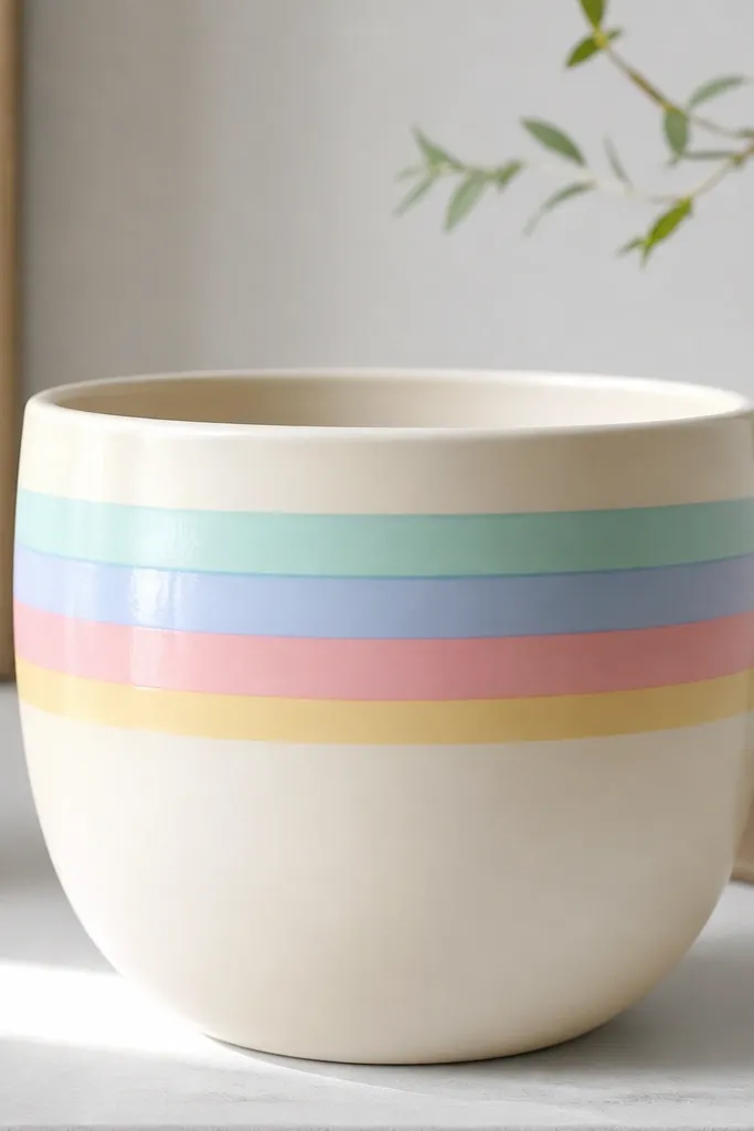
This design looks luxe because the colors are soft and the finish is pearly, not glittery. The arc band feels decorative and intentional, and it frames plants like a little crown. I've used it for Easter and spring brunch centerpieces - it photographs well and still looks classy when the flowers fade. The pearly topcoat makes the pastel stripes look like ceramic glaze.
Prime and base coat in cream matte. Tape a curved band using a flexible tape strip and a pencil guide; the band height is about 6-7 cm. Paint stacked pastel stripes, keeping each stripe narrow (about 1-1.5 cm). When dry, apply a pearl clear topcoat over the whole painted area for the glaze effect. Seal the rest with satin clear so the pearl doesn't spread.
Pro tipPaint stripes from the inside edge outward to prevent smudging the curve.
AvoidUsing fully saturated rainbow colors - they look like kids' art instead of decor.
18. Matte White with Tiny Black Script Nameplate
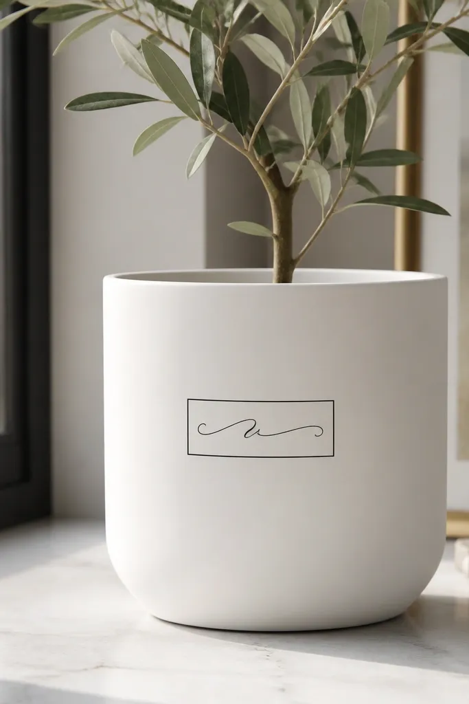
A small nameplate is one of the fastest ways to make a pot look like a gift item. The trick is scale: keep the script tiny and the border thin so it feels like engraved porcelain. Matte white makes the black readable, and the swashes add that hand-finished charm. This works for seasonal hosting when you label pots for guests or a buffet table.
Base coat in matte white exterior paint. Tape a thin rectangle around where the nameplate will go, then paint the border in charcoal-black. Use a vinyl letter stencil or a fine paint pen to add script inside the rectangle. Add one small decorative line under the script for balance. Seal with matte or satin clear depending on how flat you want it.
Pro tipWrite the script on paper first and match the letter height to the pot size - tiny script is the whole point.
AvoidBig lettering - it turns the pot into a sign.
19. Burgundy Velvet Fade with Gold Corner Frames
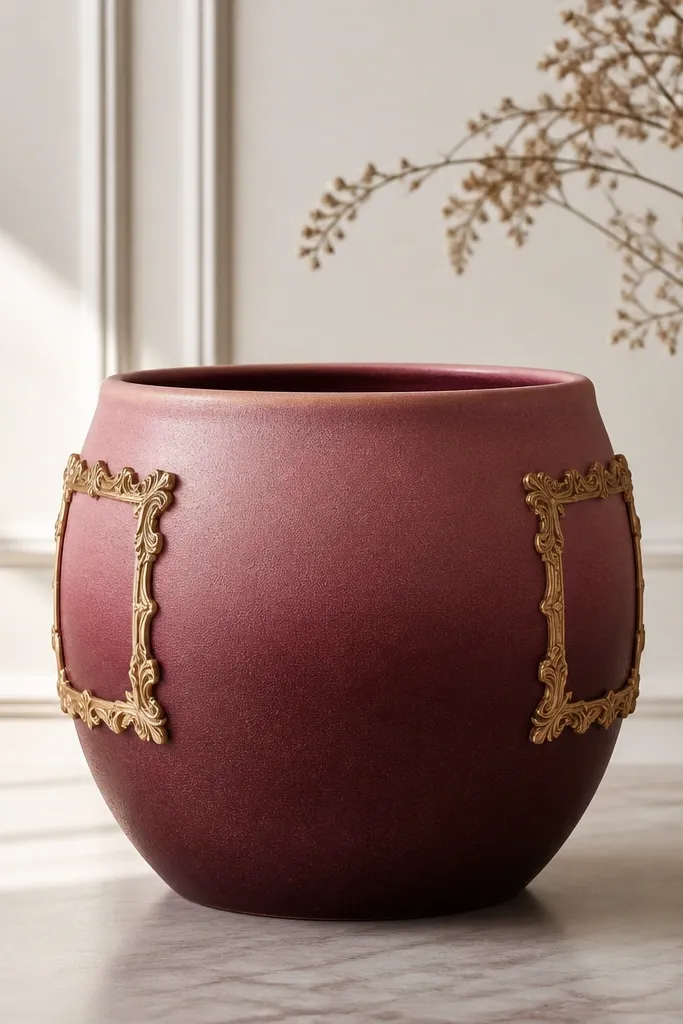
This design reads luxe because it combines a soft gradient with precise framing. Burgundy velvet fade looks rich without being loud, and the gold frames add a tailored, gallery feel. I like it for winter through early spring because the burgundy stays warm even when plants are bare. The corner frames also make the pot look structured in photos.
Prime and base coat in rose-pink matte. Add burgundy at the bottom third and blend upward with a sponge to create a smooth fade. Tape small gold corner frames in two spots on the pot sides. Paint the frames in metallic gold and remove tape after 10-15 minutes. Topcoat with satin clear over the fade and a second light coat over the gold so it stays smooth.
Pro tipBlend the fade with a slightly damp sponge, not a wet brush - damp gives control without streaks.
AvoidGold frames too wide - narrow corners look like decor, wide ones look like packaging.
20. White Daisy Repeat with Honey Gold Center Spots
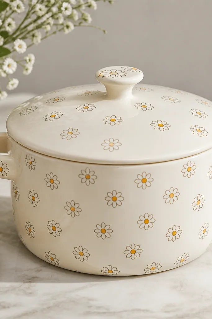
A repeated daisy pattern feels high-end when the petals are consistent and the center color is warm. Honey gold centers keep it from looking flat or too holiday. This design is cheerful but still classy because the palette stays tight. It pairs perfectly with fresh herbs, small flowering plants, and spring bulbs.
Base coat in cream matte. Use a daisy stencil or a small round brush to paint petals in white, then lightly outline petals with a gray liner for definition. Add gold centers with a small dotting tool. Repeat at even spacing around the pot, leaving breathing room near the rim. Seal with satin topcoat for a smooth, protected finish.
Pro tipLightly outline with gray only - black outlines make daisies look cartoonish.
AvoidCrowding daisies all the way to the rim - it looks cluttered.