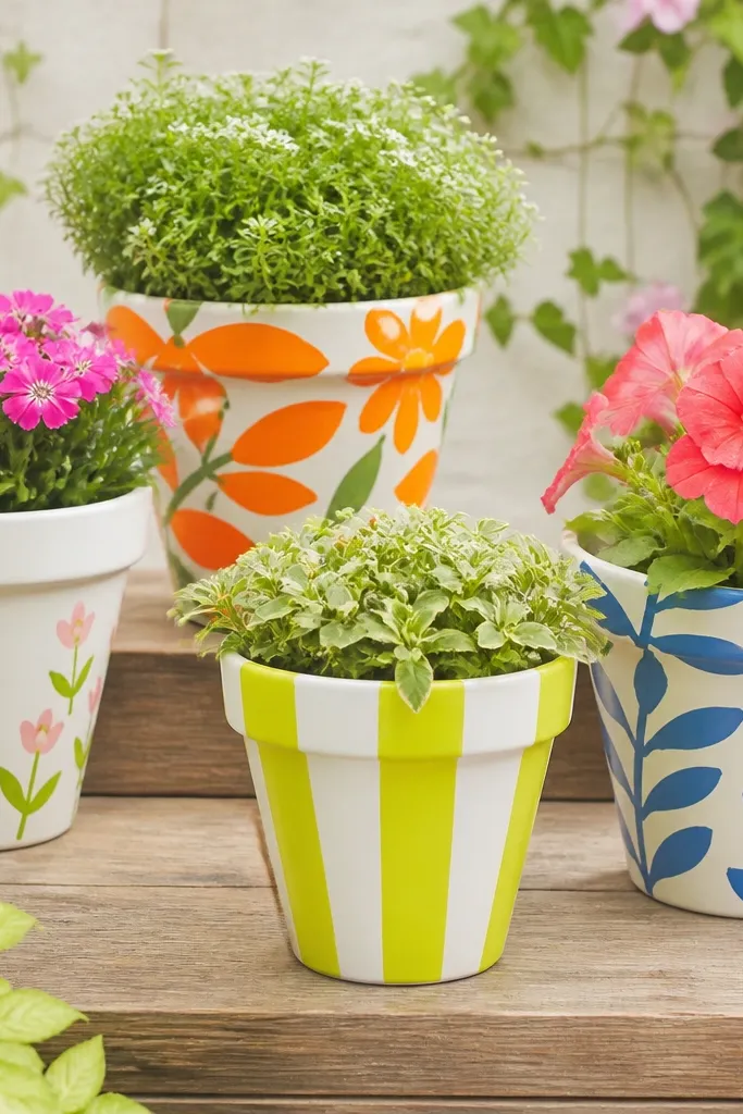
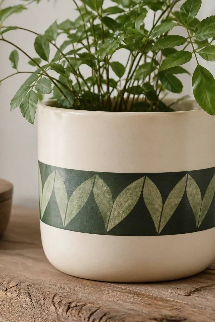
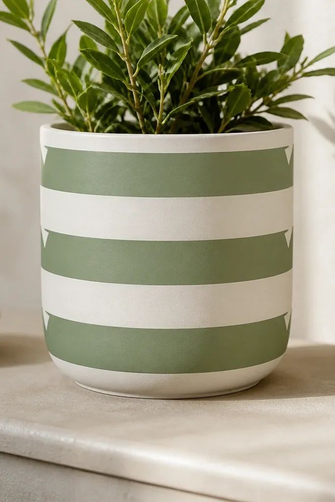
1. Two-tone band pot with matte off-white
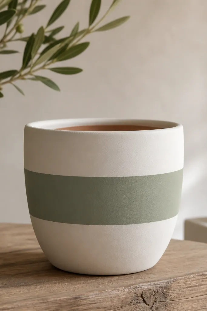
This design is my go-to when I want a clean look without fiddling with tiny details. The thick band hides uneven coverage and makes even a slightly rough pot look intentional. Off-white brightens the whole planter in low light, while sage keeps it calm for spring through fall. I seal it satin so it doesn't look chalky after a few weeks outdoors.
Paint the base off-white first, let it dry hard, then tape a straight line for the band. Use a foam roller for the off-white and a flat brush for the band so the edge stays sharp. Keep the band height about 1/3 of the pot circumference - for a 10-inch pot, that's roughly 3 to 3.5 inches tall.
Pro tipBurnish the tape edges with a fingernail before painting so the paint doesn't creep under.
AvoidDon't do thin paint layers on the band - it streaks and makes the tape line look fuzzy.
2. Terracotta ombre with sea-glass fade
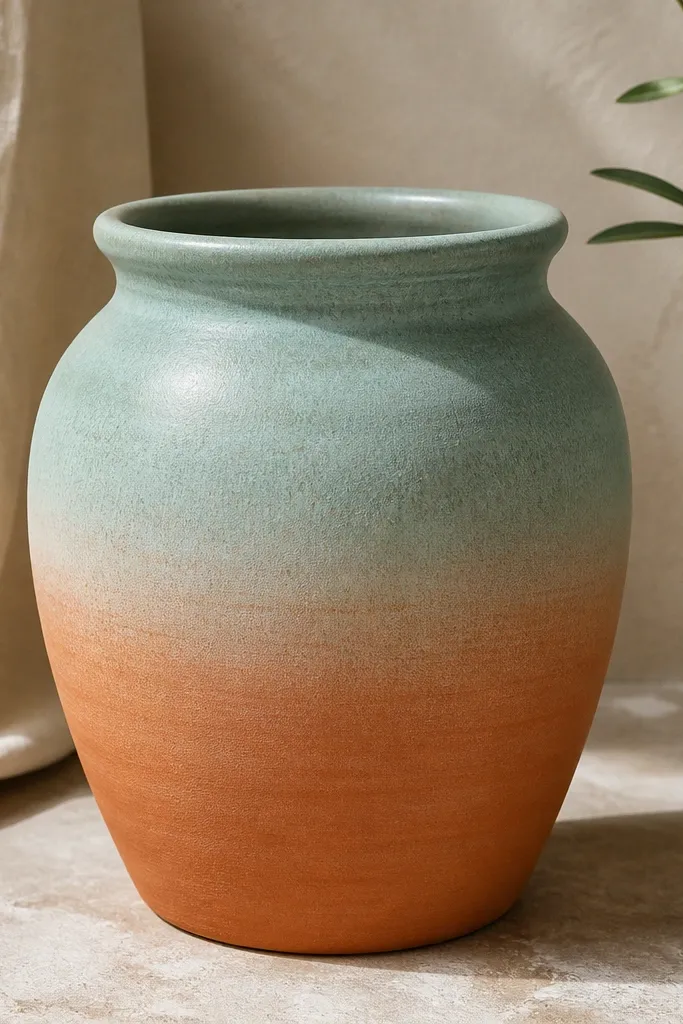
Ombre looks fancy, but it's forgiving. The fade hides brush strokes because your eye reads the color shift, not the exact edges. Sea-glass teal looks good with almost any plant - it makes leaves pop without screaming. A sealed finish keeps the teal from turning powdery in sun.
Use sea-glass teal acrylic and a dry-brush technique: load the brush lightly, paint the top area, then pull color downward with a mostly-dry brush. Work in 2 to 3 passes, letting it dry between. Stop the fade around 2 inches above the base so the bottom can stay warmer and grounded.
Pro tipUse a damp paper towel to wipe your brush halfway down so the fade gets lighter naturally.
AvoidAvoid painting the ombre in one wet layer - it creates hard stripes instead of a smooth fade.
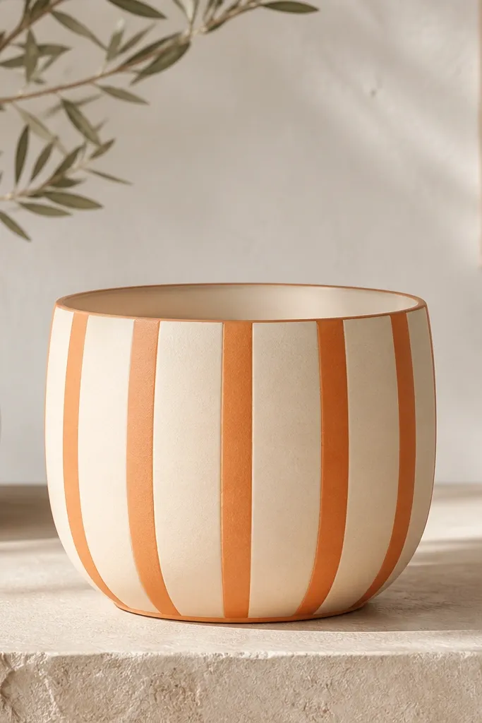
3. Crisp vertical stripe pot with exterior black
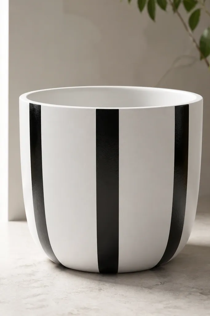
Vertical stripes make a pot look taller and more designed, even when the plant is sparse. Black on white reads clean from across a patio. I like exterior black because it stays opaque and doesn't turn greenish as it weathers. The design is low maintenance because the stripes tolerate small chips better than tiny motifs.
Prime or scuff first, then paint the pot white. Tape 3 stripes, about 1 inch wide each on a 10- to 12-inch pot, leaving equal gaps. Paint black in two thin coats and remove tape while the paint is still slightly tacky for the sharpest edge.
Pro tipIf your tape pulls paint, wait until the layer is fully dry, then seal over the edges to lock it in.
AvoidDon't use craft black that's too thin - it streaks and forces you to repaint, which thickens the stripes.
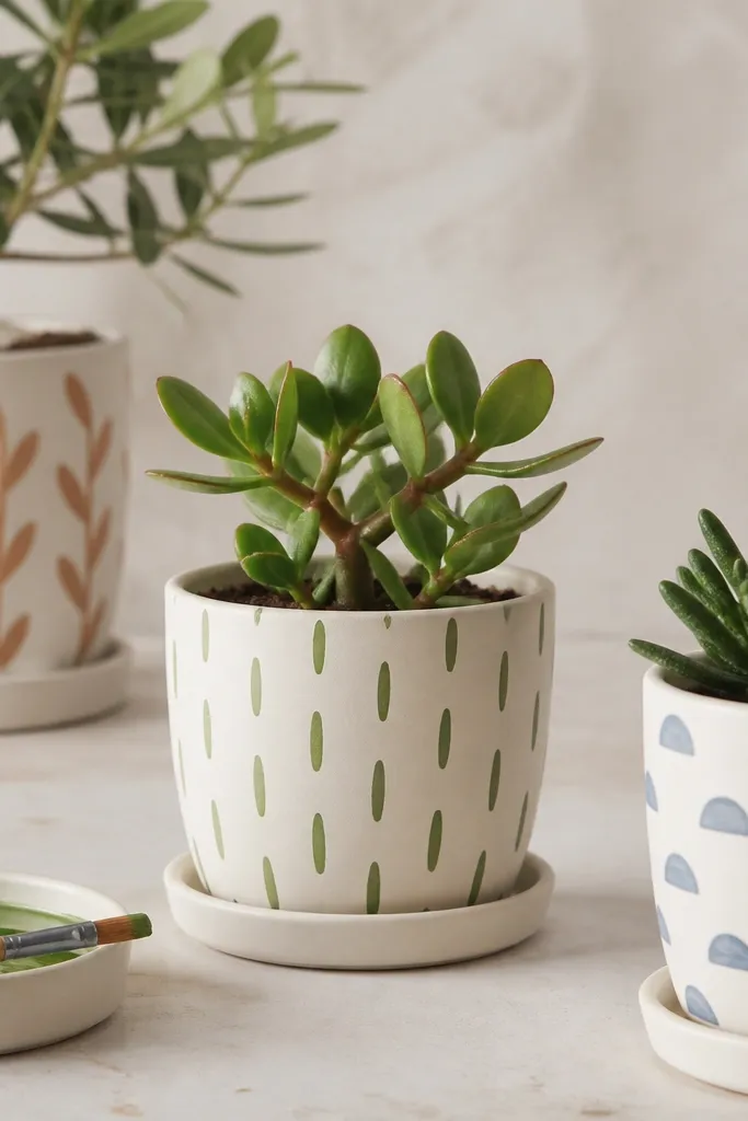
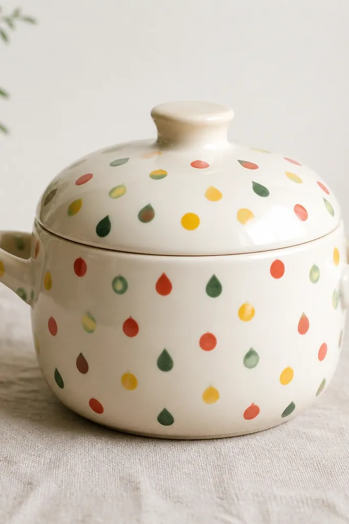
4. Dot grid pot in two shades
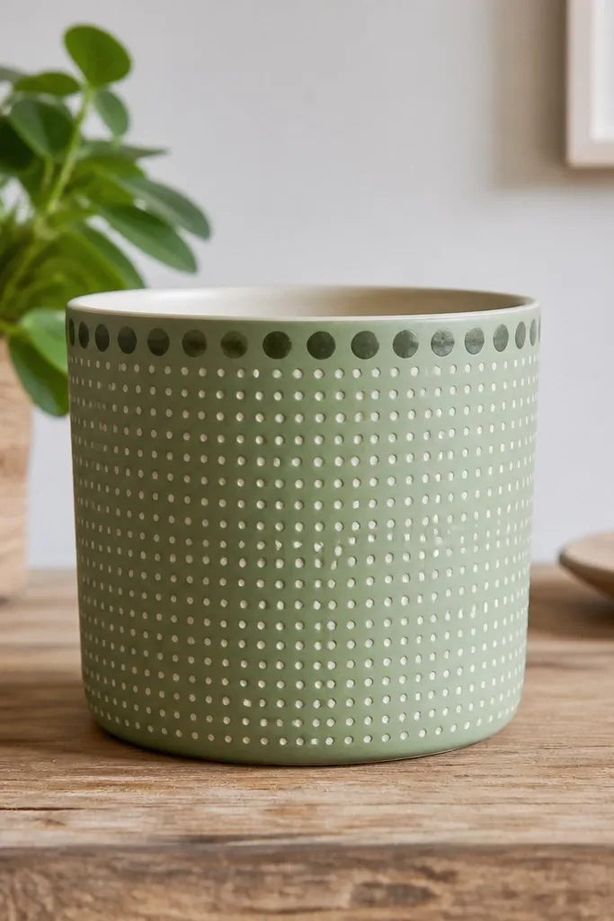
Dot grids look modern and they're the most forgiving pattern for beginners. If a dot is slightly off, it still reads as intentional because the spacing is the style. Two shades - light dots plus a darker accent row - make it look planned without extra effort. Sealing keeps dots from dulling and protects against minor scuffs.
Use a stencil with round holes or make your own guide by marking dot positions with a pencil. Dot size: for a 10-inch pot, use about 1/4-inch dots with a small round brush or paint marker. Put the darker accent row 1 inch below the rim for a finished look.
Pro tipLet dots dry 10 minutes before adding the next color so you don't smear the first layer.
AvoidAvoid dotting on a glossy surface - the paint beads and you lose crisp circles.
5. Seasonal label pot with faux paper edges
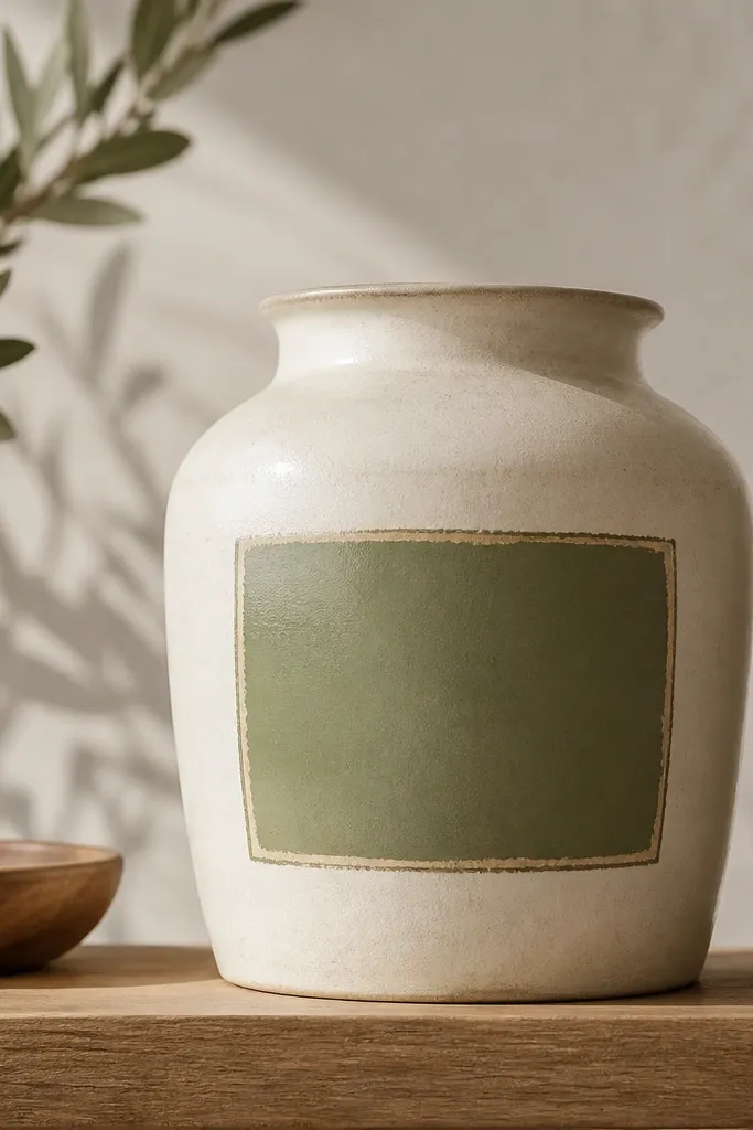
This is my "quick seasonal swap" design. You can keep the pot the same and repaint only the label block for different holidays. The faux paper edge makes it look layered without real decoupage. It's low maintenance because the label area is a simple rectangle you can refresh in under an hour.
Paint the pot cream, then add a rectangle label with a rounded-corner brush. Use a slightly darker olive as the label base, then dry-brush a lighter cream along the label edges to mimic torn paper. Add a thin border line in black or charcoal for separation.
Pro tipWrite the seasonal word with a fine paint pen only after the label base is sealed and cured.
AvoidDon't freehand lettering directly on wet paint - it bleeds and looks messy fast.
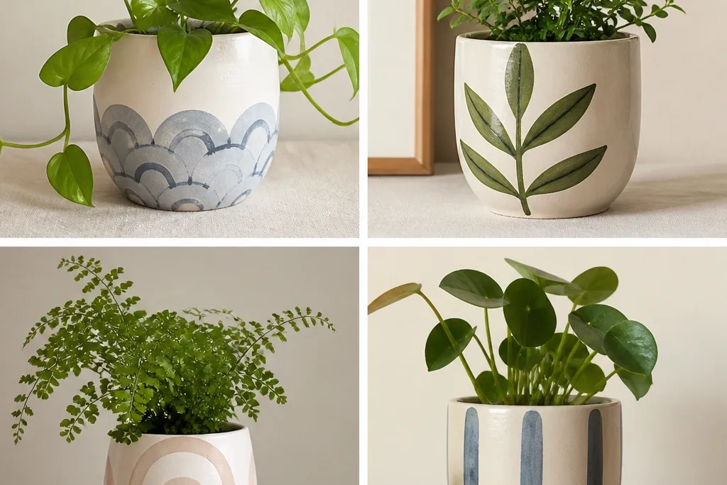
6. Feathered fan pattern near the rim
Rim designs make the pot look finished even when the plant covers most of the body. Feathered fans are easy because you repeat the same stroke shape, just angled differently. The soft gray and pale green keep it subtle for spring and summer. A clear coat over the top prevents the feather edges from wearing down.
Tape a light guideline arc where the fan starts. Use a liner brush and pull short strokes from the guideline outward, each stroke about 1.25 inches long. Alternate pale green and soft gray so the fan has movement without needing a lot of colors.
Pro tipPractice 10 strokes on scrap cardboard first so your brush angle matches every time.
AvoidAvoid thick paint on the feather tips - it makes the tips look like blobs.
7. Stenciled herbs corner pot
Herb icons are a great way to make a plain pot look themed without covering the whole surface. I like using a corner placement because it looks natural when plants lean or spill. The stencil gives you crisp shapes even if your freehand drawing isn't great. It holds up well because the design is concentrated in one area.
Paint the pot beige or warm white. Choose a stencil with small sprigs, then use a sponge dauber for even coverage. Place the cluster about 2 inches below the rim and 2 inches from the side so it stays visible when the pot sits on a shelf.
Pro tipWipe the stencil edge with a damp rag between uses so the next prints don't get heavy spots.
AvoidDon't use a roller over stencils - it smears and pushes paint under the edges.
8. Minimal mountain silhouette in navy
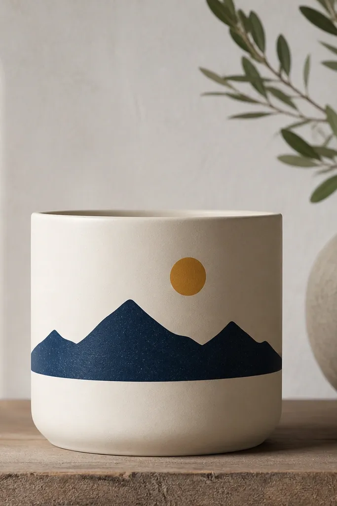
A single silhouette is clean, modern, and easy to repeat across a set. The navy makes it readable from a distance and stays classy for fall without looking like Halloween. It's low maintenance because you only paint one shape and you can repaint it quickly if it chips. Seal it satin so it doesn't glare under sunlight.
Tape a straight horizontal line where the mountains sit. Use a stencil for the mountain shape or freehand with a thin pencil guide. Paint the sun circle first, then the mountain, then add a thin highlight line at the base if you want depth.
Pro tipUse painter's tape to block the sun area while you paint the mountain so the edges stay crisp.
AvoidAvoid using multiple shades inside the silhouette - it turns into a muddied blob on small surfaces.
9. Gold leaf look using metallic rub-on
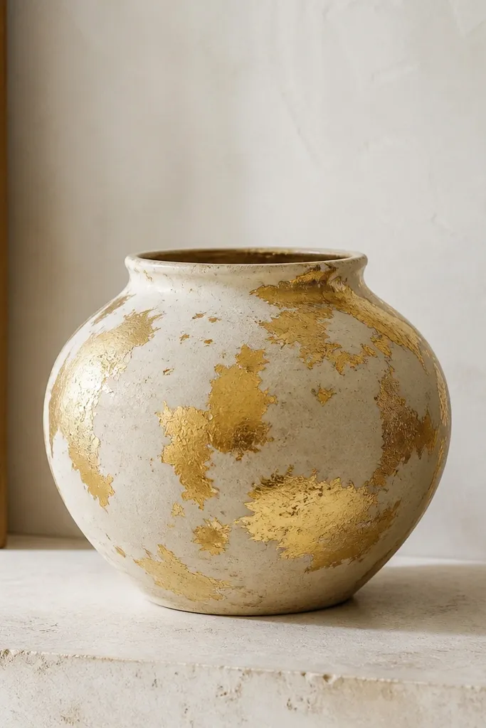
This one looks expensive because the texture breaks up flat color. Metallic rub-on gives a leaf-like effect without the mess of real leaf sheets. I use it as an accent - a few irregular patches in corners or around the rim - so it doesn't overwhelm the plant. Sealing is key so it doesn't scuff when you move pots.
Paint the pot a creamy base, then use metallic rub-on leaf sheets or rub-on metallic wax. Press small pieces into an adhesive area or directly over a thin layer of medium. Keep patches irregular, about 1 to 2 inches wide, and leave gaps so the base shows through.
Pro tipBurnish gently with a soft cloth, not your fingertips, to avoid streaks.
AvoidDon't seal too soon - metallic rub-ons can dull if the adhesive isn't cured.
10. Bamboo stripe pot with warm green
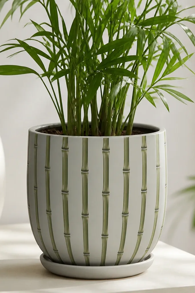
Bamboo stripes give you a plant-themed look even if you're using a non-bamboo plant. The warm green feels fresh but still cozy. Tiny node dots make it read like bamboo, not random lines. It's low maintenance because the repeating stripe pattern is easy to correct with a small brush.
Paint the base light gray. Add 6 to 8 vertical stripes using painter's tape, then remove tape and paint the stripe edges with a small liner brush. Add node marks by tapping a darker green paint with the tip of a round brush every 1.5 inches.
Pro tipKeep stripe width around 1/2 inch so it looks like bamboo segments at a glance.
AvoidAvoid uneven stripe spacing - it makes the pot look handmade in a messy way instead of intentional.
11. Starry night speckle pot
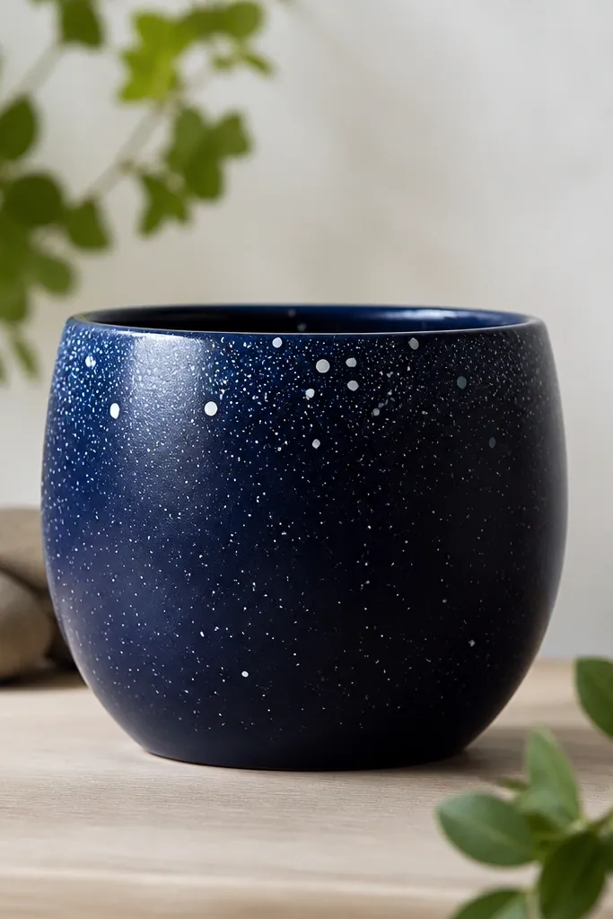
Speckle is the easiest way to make a plain pot feel magical. I like deep navy because it makes the white dots pop without needing a full illustration. You can control density by how loaded your brush is, so it's repeatable. Seal it matte or satin so the speckles don't smear.
Use a sponge or stiff brush to flick paint. Start with a navy base, then load a toothbrush with white paint and flick over the pot. Add a few light blue speckles for color variation near the rim. Protect your work surface - this gets everywhere.
Pro tipPractice flicking over scrap first so you learn the right wrist snap for dot size.
AvoidDon't use watered-down paint for speckles - it makes big splatters instead of tiny dots.
12. Checkerboard pot with softened edges
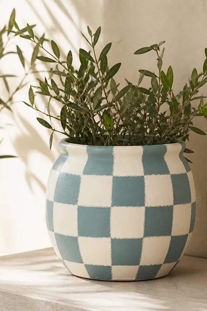
Checkerboard looks playful, but softening the edges keeps it from looking harsh. Cream and muted teal read springy and work with both flowers and herbs. The pattern hides small missed spots because every square is similar. A clear coat keeps the sponge texture from turning rough.
Tape a grid lightly with low-tack tape or use pencil marks as guides. Paint alternating squares with a sponge brush so edges stay slightly rounded. For a 10-inch pot, aim for squares around 1 inch each so the pattern fits without getting too tiny.
Pro tipUse a ruler to mark the first row perfectly - the rest stays aligned.
AvoidAvoid tiny squares under 3/4 inch - they show brush mistakes and look messy fast.
13. Painted terracotta base with white drip accents
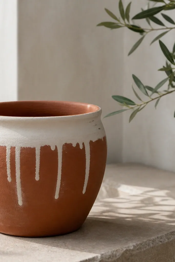
Drips are fun and they hide imperfections in the pot itself. Keeping the terracotta base means less painting and less prep, so it's truly low effort. The white band anchors the look so it doesn't feel random. Seal it after the drips dry so they don't smear when you water.
Paint a thick white band about 2 inches tall near the top. After it dries, load a small brush and pull drips downward - aim for 4 to 8 drips around the pot, not all the way around. Leave the bottom plain terracotta so the design stays airy.
Pro tipDip your brush lightly, then touch it to the band so the drips start where you want.
AvoidDon't over-thicken the drip paint - it will run too far and look like a mistake.
14. Holiday stripe pot with thin red and green lines
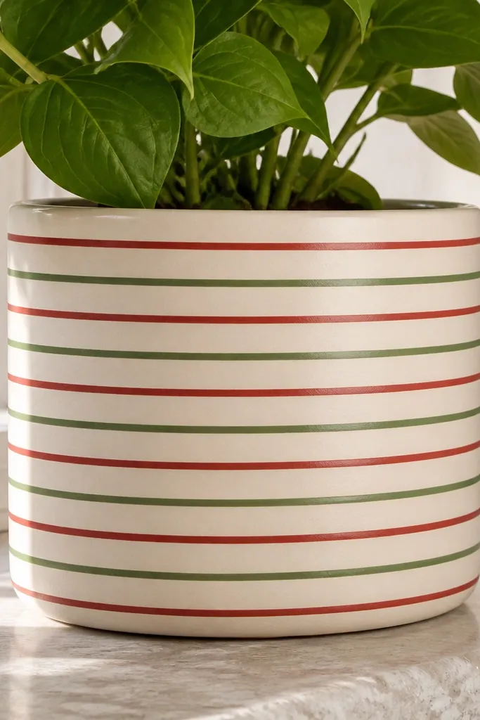
This reads seasonal fast, but it's still clean enough for everyday decor. Thin lines look crisp and modern when spacing is consistent. Red plus green is a classic combo, and a clear sealer keeps the colors from dulling. It's low maintenance because you can repaint only the stripes if they chip.
Paint base cream. Tape horizontal guide lines with painter's tape - start with 5 to 7 lines depending on pot height. Paint alternating red and green, then remove tape after slight tack. Seal in satin so lines don't glare.
Pro tipUse a hair dryer on low for quick dry between colors so tape doesn't lift.
AvoidAvoid sloppy spacing - uneven stripes make it look like accidental paint splatter.
15. Snowflake stencil pot in icy blue
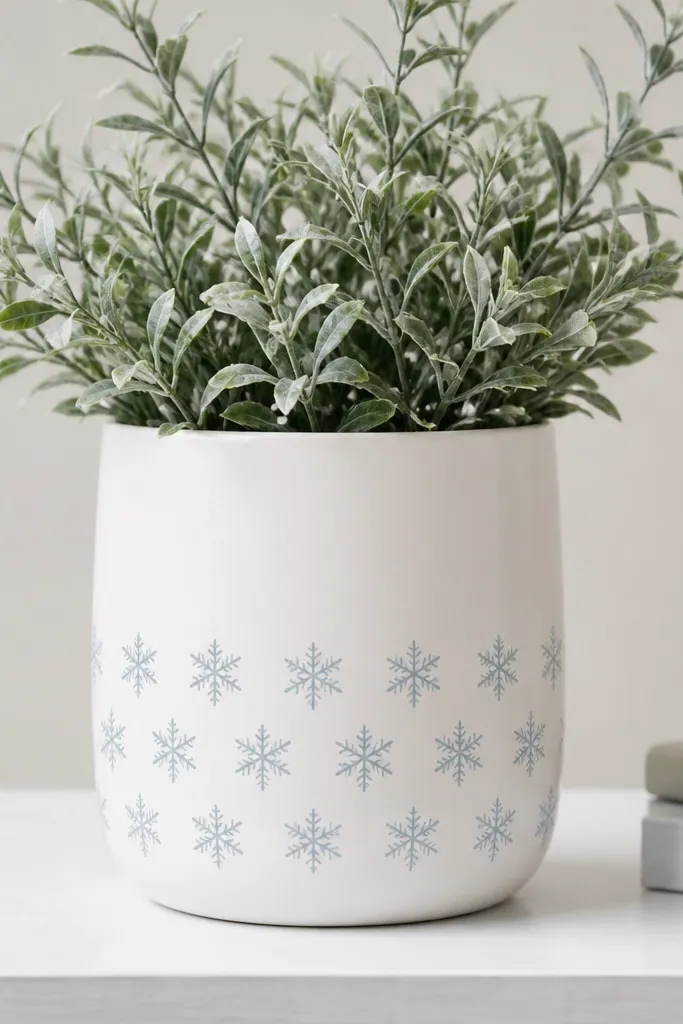
Snowflake stencils make winter decor look intentional without freehand drawing. Icy blue on white looks cold and fresh, not childish. Repeating a small motif across the lower half means it's visible even when plants fill the top. Seal it so the stencil edges don't soften over time.
Paint the pot white first. Use a snowflake stencil with small shapes; place the first row about 2 inches above the base, then repeat upward. Apply paint with a sponge dauber, two light coats for opacity. Let it dry 24 hours before sealing.
Pro tipAlign your stencil with a pencil mark on the pot's side so the pattern stays straight around the curve.
AvoidAvoid thick paint application - it makes snowflakes look chunky and less crisp.
16. Wreath ring pot with simple leaf arcs
A wreath ring looks holiday-ready without covering the whole pot. The leaf arcs are easy because you repeat a single curved stroke shape. Dark green reads rich without needing metallics, and cream keeps it bright. This design is low maintenance because the ring area is simple to repaint each season.
Paint the pot cream. Mask a ring area around the middle with tape and paint it dark green. Inside the ring, paint leaf arcs with a light green - each arc is a curved stroke with a slightly darker tip. Keep the leaves spaced so you can still see the green ring behind them.
Pro tipUse a fan brush if you have one - the leaf tips come out naturally tapered.
AvoidDon't fill the ring completely - empty space makes it read like a wreath, full paint looks like a blob.
17. Fall pumpkin stripes with soft orange
Pumpkin stripes are the simplest fall theme that still looks like a pumpkin at a glance. The soft orange feels less harsh than bright Halloween orange. I like adding a darker outline because it makes the stripes look dimensional. Sealing protects the orange from fading quickly.
Paint base warm cream. Mark and tape 6 stripes - for a 10-inch pot, stripes around 3/4 inch wide. Paint soft orange, then after drying, outline each stripe edge with a darker orange using a liner brush. Remove tape carefully so the stripe edges stay clean.
Pro tipCurve your stripe placement slightly so the pattern follows the pot's natural shape instead of looking ruler-straight.
AvoidAvoid painting orange too thin - it looks patchy and cheap after it dries.
18. Leaf silhouette pot in muted olive
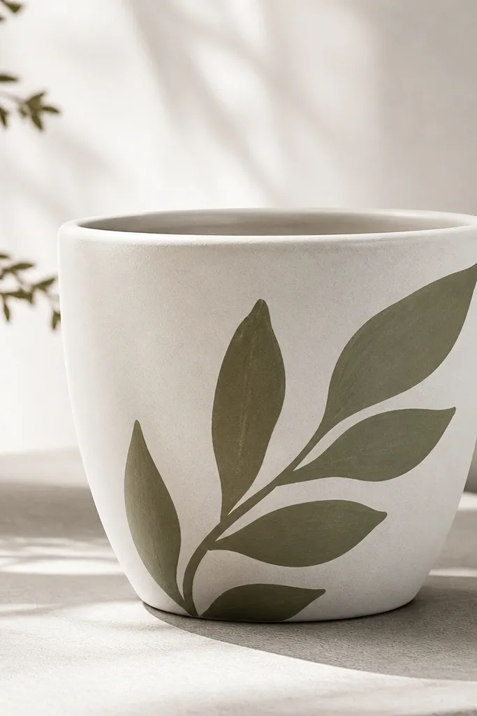
Big leaf silhouettes look calm and expensive, and you paint them with one color. Muted olive works for spring, summer, and fall because it doesn't scream a single holiday. Diagonal placement looks natural when plants spill outward. It's low maintenance because there are only a few shapes to place.
Paint base matte white. Use a leaf stencil or trace a leaf shape from cardboard. Paint two to three silhouettes about 3 to 4 inches long, spaced diagonally. Add a lighter olive vein line with a thin brush if you want extra detail.
Pro tipUse painter's tape to mask the leaf edges if you want ultra-clean silhouettes.
AvoidAvoid tiny leaf shapes - small details disappear once the pot is outdoors.
19. Rainbow bands pot with muted pastels
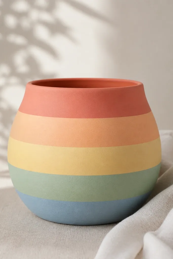
Muted rainbow bands are festive without being loud. Horizontal bands make the pot look graphic, and pastel colors pair well with greenery and flowers. Clean edges matter more than perfect blending, and tape does the hard work. Seal with satin so the colors stay soft and do not look glossy under sun.
Prime or scuff, then paint a base coat if needed. Tape off 5 bands across the pot height; for a 10-inch pot, each band can be about 1.5 inches tall. Paint each band in thin coats, let dry, then remove tape. Finish with a clear outdoor sealer.
Pro tipPlan your band order on paper first so you don't accidentally put two similar tones next to each other.
AvoidDon't overload paint thickness - thick bands crack as the pot heats and cools.
20. Monogram pot using paint pen and stencil guide
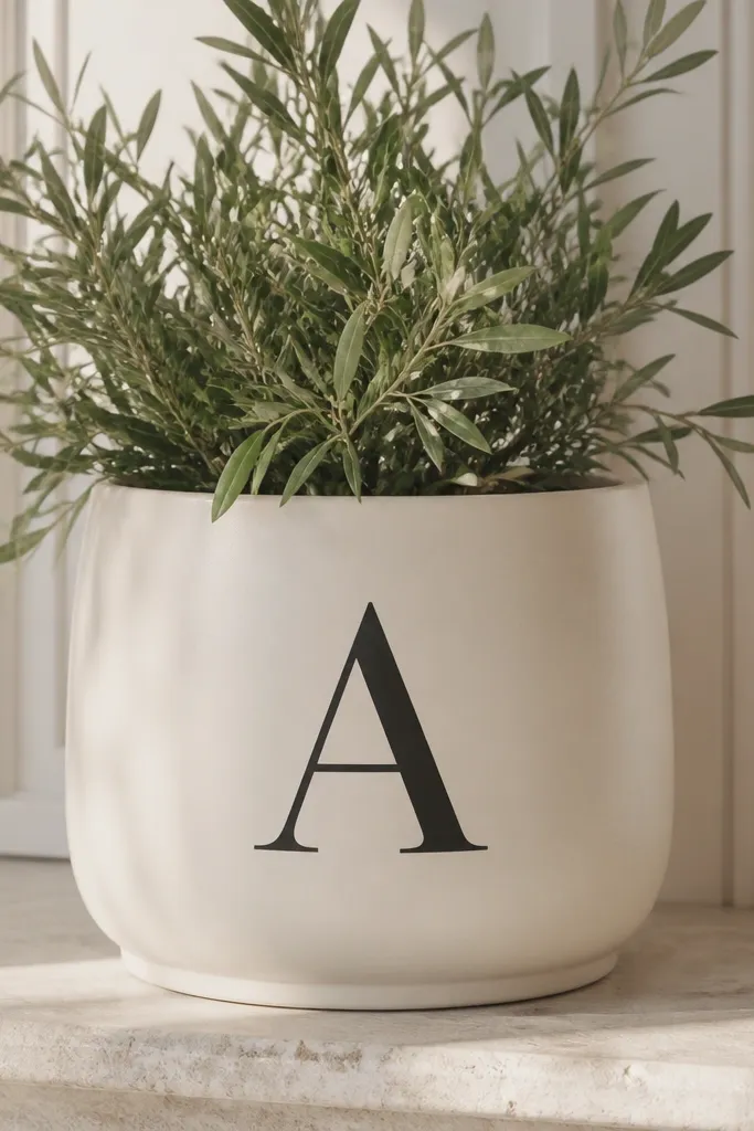
A monogram makes a pot look like it came from a gift shop, but it's still low maintenance because you only paint one area. I use it for birthdays and holidays by changing the letter color or adding a small accent dot above it. Black monograms look sharp on light backgrounds and read well from across a room or patio.
Paint the pot cream or light gray. Use a letter stencil sized to about 3 inches tall for a 10-inch pot. Trace lightly with pencil through the stencil, then paint over with a paint pen or thin brush. Let dry fully, then seal.
Pro tipTest your pen on cardboard first - some pens need shaking longer and make thick lines.
AvoidAvoid writing freehand - wobbly letters scream "quick job" even if the pot is cute.
21. Matte black pot with white speckle halo
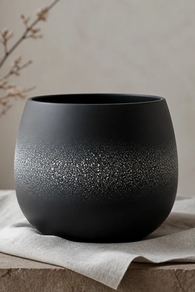
This one looks modern and it hides scuffs because the speckles blend wear. The halo placement draws the eye to the plant and keeps the rest of the pot simple. I use matte black because it doesn't glare, and white speckles keep it bright. It stays low maintenance because you can touch up speckles with a tiny brush.
Paint pot matte black. Mask around the middle with a circle of tape or a cardboard ring to create a halo zone. Speckle with white paint using a toothbrush, then remove the mask to reveal a clean circle boundary. Seal with matte or satin clear coat after drying.
Pro tipHold your brush farther away for smaller speckles - about 10 to 12 inches.
AvoidDon't seal before the paint is fully dry - speckles can blur into a fog.
22. Candy cane pot with curved stripes
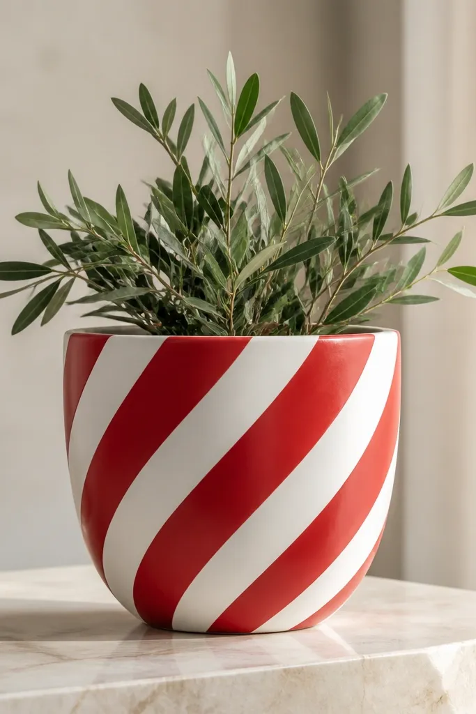
Curved candy cane stripes look playful, but the twist makes them look more natural than straight diagonal paint. Red and white also work for winter and holiday tables. Because the stripes are broad, you don't need super fine brush control. Seal the finish so the stripes don't scuff where you grab the pot.
Paint the whole pot white first. Use painter's tape strips to form diagonal guides - you'll angle them so they curve slightly as they wrap around the pot. Paint red over the taped guides, remove tape, then add a second red coat if needed. Twist the tape placement a bit every few inches so it looks like wrapping.
Pro tipUse a small foam brush for red so you don't push paint under the tape.
AvoidAvoid thin red paint - it turns pink and you lose the holiday punch.
23. Hydrangea-inspired dots and blobs in periwinkle
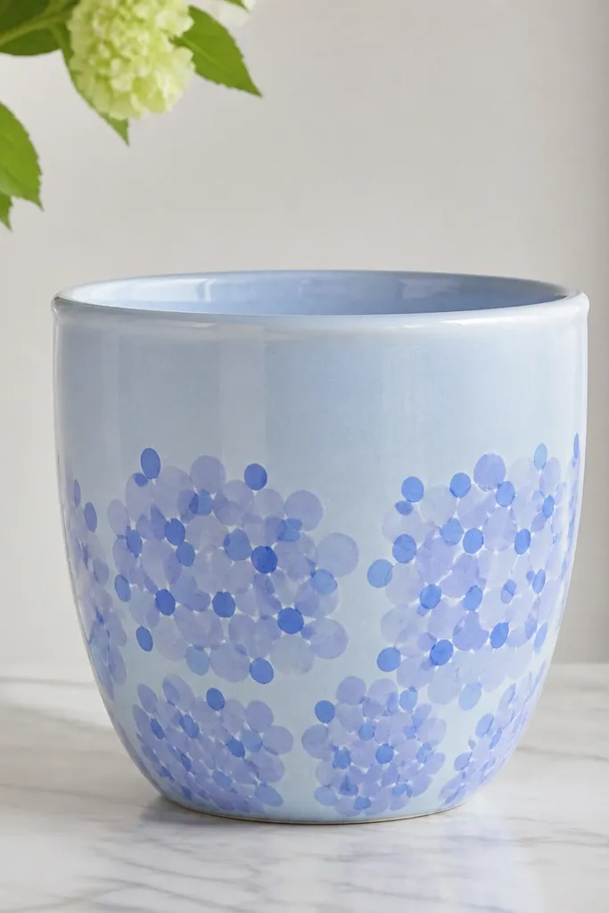
Hydrangea looks complicated, but you can fake it with blobs and dots. Periwinkle and soft blue read like flower clusters even when the plant is something else. This design is low maintenance because you're repeating a simple mark, not drawing petals. Sealing protects the textured marks from washing off.
Paint the pot light blue. Add clusters using a small round brush: start with larger blobs, then top with smaller dots in a darker periwinkle. Place 3 to 4 clusters around the lower half, leaving space between them. Add a few tiny dots as "sparkle" between clusters.
Pro tipUse the same brush for the whole pot so blob sizes stay consistent.
AvoidDon't blend blobs together - distinct dots and blobs make it look like flowers.
24. Minimal face pot with single-line expression
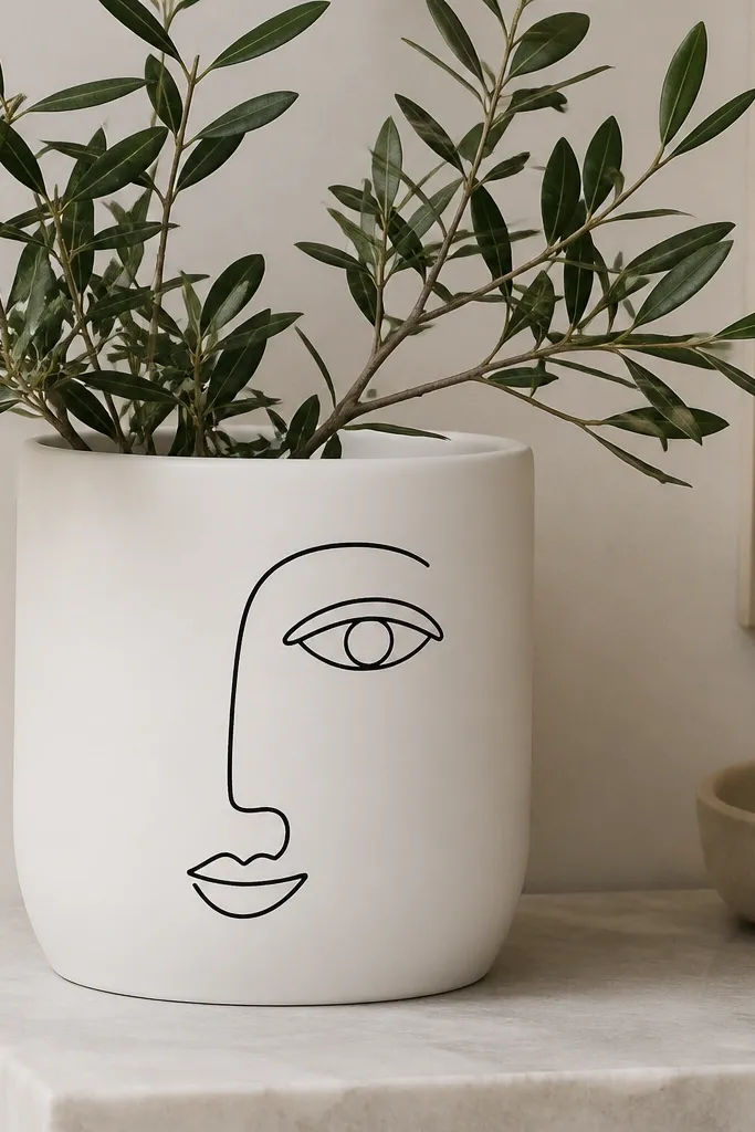
Minimal faces look cute and modern, and they're quick because you paint one continuous line. I use black because it stays readable against light backgrounds. This design is low maintenance because it doesn't require tiny details - the expression reads even if the pot has minor chips later. Seal it so the line doesn't fade from water splashes.
Paint base white or light cream. Use a pencil to lightly sketch the face placement, then draw with a paint pen for a smooth line. Keep the face about 4 inches tall so it fits the pot and doesn't look cramped. Add one small cheek dot if you want a little personality.
Pro tipLet the line dry 30 minutes before adding any extra marks so you don't smear the pen.
AvoidAvoid gray or thin lines - they look faded once sealed outdoors.
25. Terracotta base with painted faux grout lines
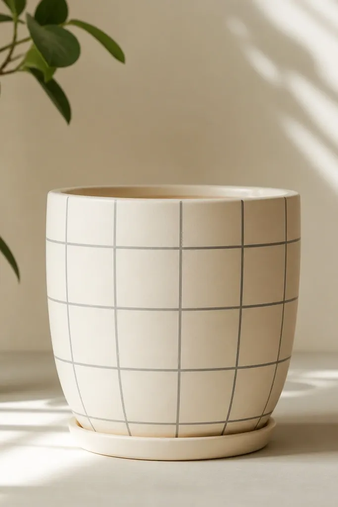
Tile-grid paint makes a pot look like it has a ceramic surface, and it's surprisingly easy. The grout lines hide uneven coverage because every square gets its own outline. I like gray lines on a cream base because it looks clean and works year-round. Seal it because grout-like lines are where chips show first.
Paint the pot cream, then use a ruler and pencil to mark a grid. Line width: aim for about 1/16 to 1/8 inch using a liner brush. Make squares around 1.25 inches wide on a 10-inch pot. Add thicker corner accents by doubling the line at intersections.
Pro tipWipe the brush tip on a rag between lines so the gray stays consistent.
AvoidDon't make the grid too dense - tiny squares look messy on curved pots.
26. Rim-only pattern pot with tiny dots and stripes
Rim-only decoration is the most low-effort way to make a pot look finished. You paint less area, so it dries faster and you don't need perfect coverage everywhere. Tiny dots and thin stripes look neat and don't compete with your plant. It's also easy to refresh seasonally by swapping colors on the rim band only.
Paint the pot base color you want, then tape a narrow band around the top about 1 inch tall. Inside that band, paint a thin stripe, then dot a row, then paint another stripe. Use a small round brush or paint marker for dot consistency.
Pro tipPress the tape down firmly and pull it straight up to avoid jagged edges.
AvoidAvoid decorating below the rim band - leaves and water splash will wreck the look.
27. Botanical line art strip pot
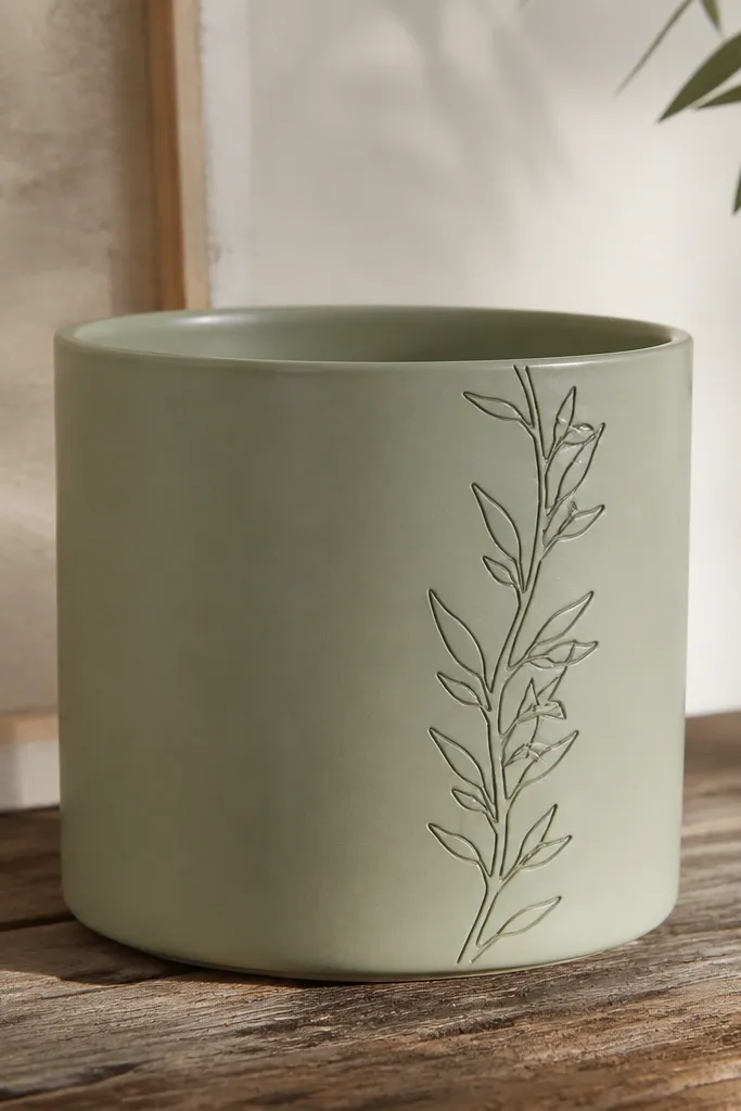
Line art strips look like printed labels, but you paint them by hand in one controlled area. The narrow strip keeps the design from getting busy. Black ink-like lines contrast nicely against sage and look good with almost any greenery. Seal so the lines stay crisp when you rinse the pot.
Paint the pot sage. Draw a vertical strip about 3 inches wide on one side with pencil first. Use a fine brush and black paint to draw one stem and 5 to 7 leaves - keep them simple, like teardrops. Add one small flower dot at the top if you want.
Pro tipMake your first leaf bigger than you think - small line art disappears outdoors.
AvoidDon't shade the leaves - shading makes the strip look smudged after sealing.
28. Confetti pot with sponge stamps
Confetti is fun and it hides small paint chips because the pattern is everywhere. I stamp with a sponge cut into small shapes so each mark is slightly different, which looks natural. This works for spring and summer because it feels playful, not seasonal holiday specific. Sealing keeps the stamped texture from turning chalky.
Paint base white. Dip a sponge stamp lightly into each color and press - don't drag. Use 3 colors max so it stays cohesive: a warm red, a sunny yellow, and a muted green. Place most marks around the lower half for the best visibility.
Pro tipPress straight down for crisp edges - side-to-side motion smears.
AvoidAvoid using too many colors - the pot looks like accidental craft mess.
29. Classic stripes with tiny corner triangles
This is my "extra detail with low effort" design. The stripes do the heavy lifting visually, and the corner triangles add a finished, patterned feel. It looks good on plain planters because the design keeps repeating. Seal so the edges stay sharp along the stripe boundaries.
Paint the pot white, then tape horizontal stripes. Paint stripes in muted green. After stripes dry, add tiny triangles at two corners of each stripe band using a small angled brush. Keep triangles about 1/4 inch wide so they read as accents, not separate shapes.
Pro tipUse a damp paper towel to wipe the brush edge before placing triangles so they don't blob.
AvoidAvoid painting triangles too large - they crowd the stripes and look cartoonish.
30. Citrus slices pot with half-moon segments
Citrus slices look bright even in cloudy weather, and they're easy because you repeat the same half-moon. Use deeper yellow for segment depth and thin white lines for the rind glow. This design works for summer and can still feel fresh in early fall. Sealing keeps the rind lines from dulling.
Paint base pale yellow. Cut a simple half-moon template from cardboard and trace lightly. Paint segments in a deeper yellow, then add thin white lines to mimic rind. Place segments around the lower half so they show when the plant sits.
Pro tipKeep the half-moons all the same height so the pattern looks intentional.
AvoidDon't freehand the segment outlines - wobbly rind lines make it look rushed.