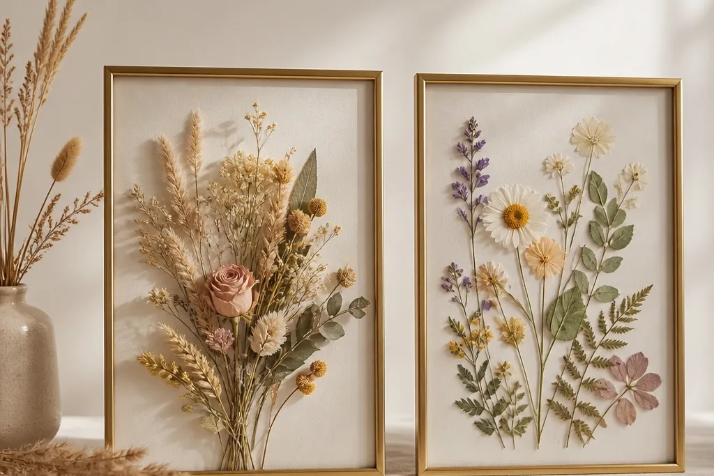
1. Flat Rose Bud Press on Cream Mat
Pressed rose buds look like miniature lace when you keep them flat and give them a light background. Cream mat paper makes the pinks read warmer and prevents the flowers from looking gray. I like placing buds smaller near the top - it mimics how bouquets tuck toward the center.
Use a 5x7 frame with a mat that leaves a 1-inch border. Glue only the very edges with a dot of clear gel glue so the center petals stay lifted. Keep petals under 1/4 inch thick so the cover closes without squashing.
Pro tipIf a petal edge curls, press it again for 24 hours before gluing - it fixes the "bent sticker" look.
AvoidAvoid hot glue for pressed work - it soaks through thin petals and creates shiny bumps.
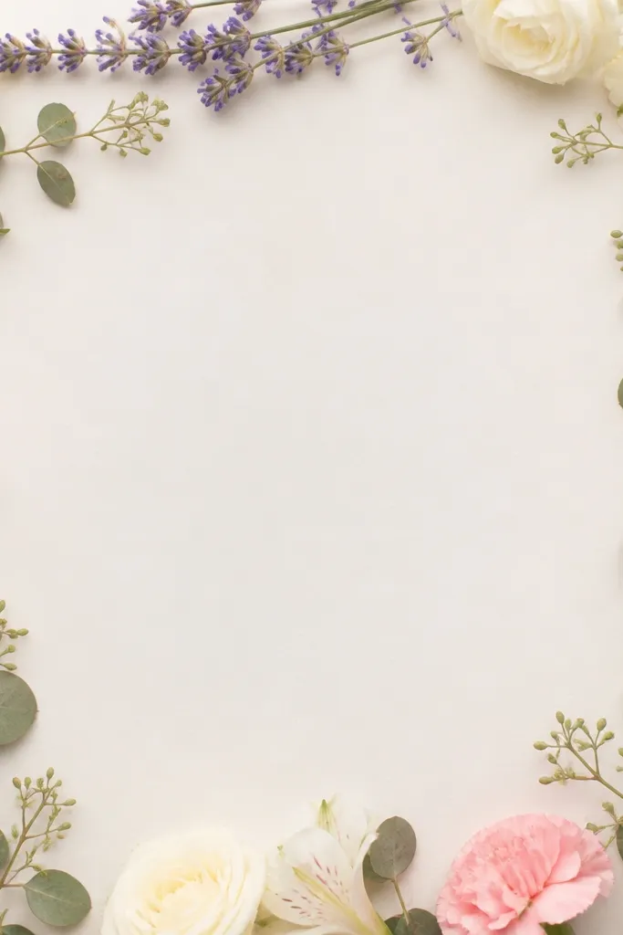
2. Lavender Sprig Press in a Soft Border
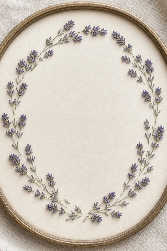
Lavender is one of the easiest pressed flowers because it lies flat and keeps its color longer than many blooms. A soft oval border makes the frame feel like a wreath without needing green bulk. The gaps matter - they keep the design airy and prevent the center from turning into a brown patch.
Press lavender sprigs between blotting paper and change the stack every day for 2-3 days. Use a cool gray mat so the lavender reads true instead of orange. Glue the stem line first, then place a few sprig tips as accents.
Pro tipTrim the stem ends after pressing so they don't look fuzzy under magnification.
AvoidAvoid stacking pressed pieces too close - contact points brown first.
3. Dried Baby's Breath Cloud Center
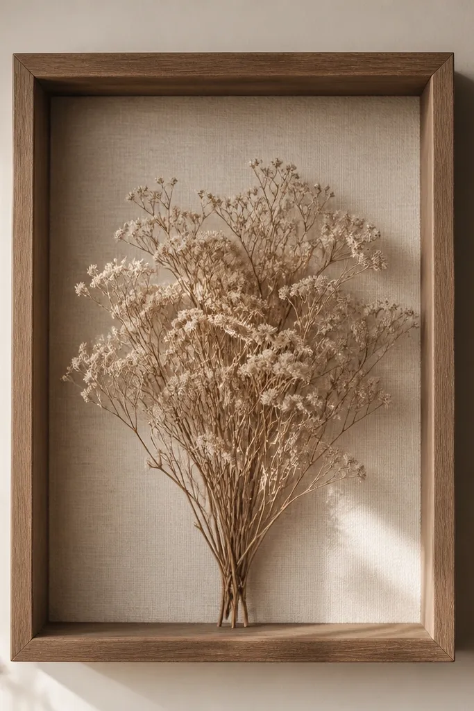
Dried baby's breath creates a cloud effect because the tiny florets keep volume and cast soft shadows. This is where dried flower frame vs pressed becomes obvious: pressed baby's breath looks like thin confetti, dried baby's breath looks like texture. The center cluster pulls the eye while leaving space around it.
Use a shadow-box frame at least 1 inch deep. Secure stems with a thin line of hot glue at the base only, then add a second layer of florets around the edges for fullness. Keep the cluster 1/4 inch away from the glass to reduce rubbing.
Pro tipShake the stems gently over a trash bag before gluing so loose bits don't fall later.
AvoidAvoid putting dried florets right against the cover - they shed and smear.
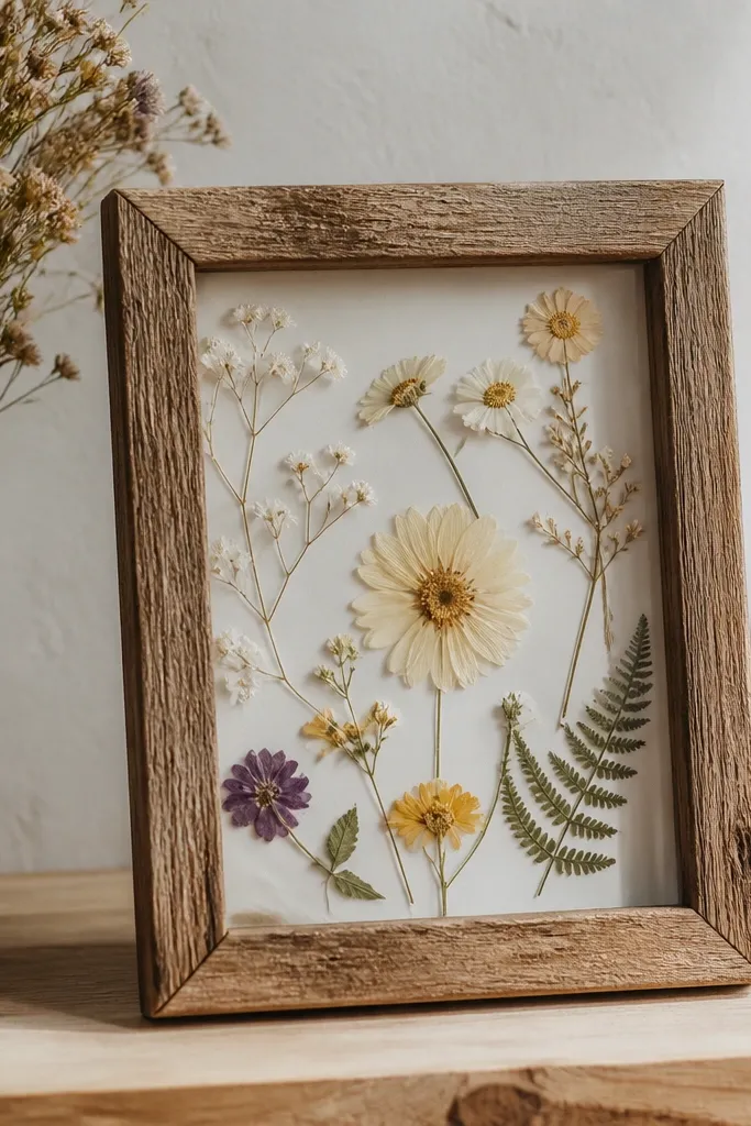
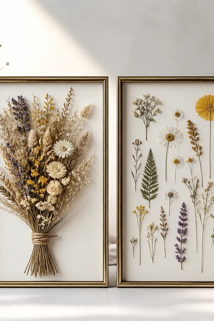
4. Pressed Wildflower Strip Across the Bottom
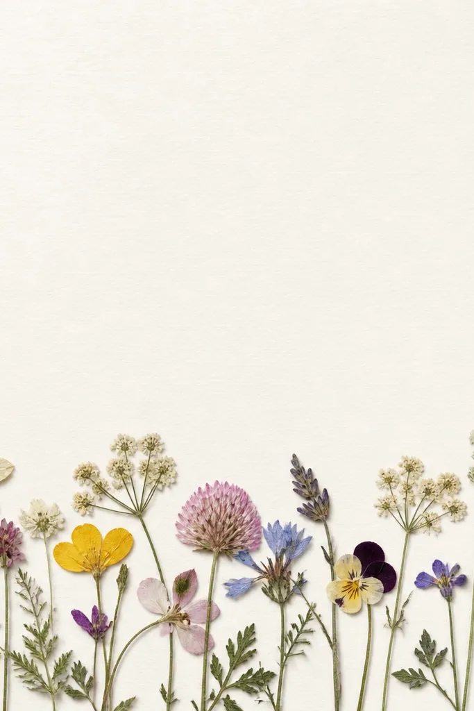
A single strip composition makes pressed flowers look intentional instead of crowded. Wildflowers give variety - little petals, tiny leaves, and thin stems - but you keep them controlled by sticking to one band. The blank space keeps the frame from looking like a scrapbook page.
Pick 8-12 pieces total so you can place each one flat. Use a watercolor-style background paper in off-white or light sage. Glue stems first; press each piece down with a flat tool for 5 seconds so it bonds without shifting.
Pro tipIf you see a petal fold, fix it with tweezers while the glue is still tacky.
AvoidAvoid covering the whole mat - dense glue makes pressed work look muddy.
5. Dried Citrus Peel and Rose Combo
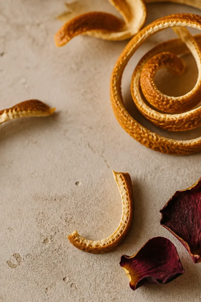
Dried citrus peel adds a graphic, curled shape that pressed flowers can't replicate. The thin, spiral ridges catch light and make the frame feel seasonal without needing extra decorations. Pair it with one darker element like dried rose for contrast.
Dry orange peel until it feels stiff, then trim into curls. For the rose, strip off thick stems and use only petal clusters. Glue citrus at the base with a small amount of clear craft glue, then tuck rose petals around it like a focal patch.
Pro tipSpritz the finished frame lightly with matte fixative from 10-12 inches away to calm any powdery texture.
AvoidAvoid glossy sealers - they make citrus look plasticky.
6. Pressed Fern Leaf Frame in Monochrome Green
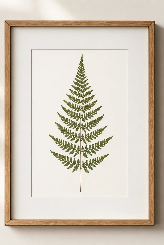
Fern leaves press beautifully and show detail in a way most flowers can't. A monochrome green look feels modern and calm, and it hides the minor color shifts pressed flowers sometimes have. This design works when you want "quiet" more than "busy."
Press fern fronds flat using parchment or blotting paper - keep the leaf centered so fronds don't overlap. Use a white mat and a thin black frame for contrast. Glue only the midrib and a couple of frond tips so the rest stays light and flat.
Pro tipIf fronds overlap after pressing, separate them with tweezers before gluing so you don't get a thick lump.
AvoidAvoid using thick stems - they press unevenly and warp the cover.
7. Pressed Hydrangea Confetti Corner
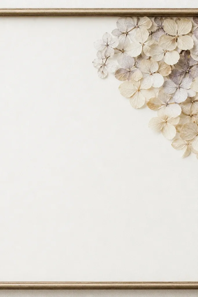
Hydrangea makes a strong visual because the flower heads have lots of tiny pieces. When pressed, you get a delicate confetti effect that looks like handmade stationery. Corner placement keeps it from overwhelming the mat.
Press hydrangea heads between absorbent paper for 5-7 days, changing sheets every day at first. Use a light beige background so the blues and purples stay soft. Glue the outer edge of the cluster first, then add two or three inner fragments for depth.
Pro tipPress one spare head and keep it - sometimes the first one bruises or curls at the edges.
AvoidAvoid heavy glue in the center - it darkens and makes the cluster look clumped.
8. Dried Eucalyptus Halo Around a Photo Window
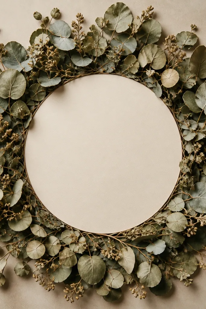
Eucalyptus leaves stay structured when dried, so they create a halo that reads like a wreath but still looks clean. This is a dried flower frame that gives you depth without needing a lot of different blooms. The central blank spot keeps the design from turning into a busy collage.
Use a frame with a cutout or a removable center mat. Dried eucalyptus should be fully dry and stiff; trim leaves so the halo ring stays even. Glue leaves with tiny dots under each leaf edge, then add a second ring of smaller leaf tips to cover gaps.
Pro tipDry eucalyptus by hanging in a dark room for 2-3 weeks so color stays deeper green.
AvoidAvoid touching dried eucalyptus with wet hands - fingerprints show through the leaves.
9. Pressed Daisy Faces with Tiny Leaf Arrows
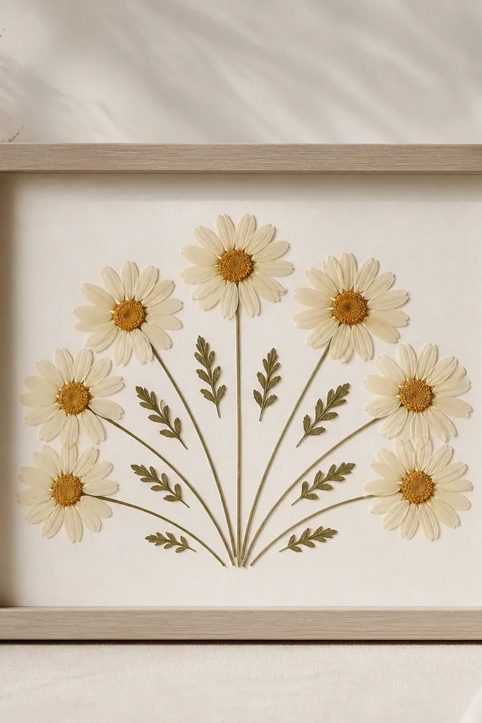
Daisies give you a clear focal pattern: petals radiate and read like mini suns. Add small leaf pieces like arrows to guide the eye toward the center. Pressed work looks best when each element has breathing room and you keep the center from stacking too thick.
Press daisies flat and remove the thick green backs if they show through. Use a sky-blue mat to make whites look brighter. Glue each daisy by its center so petals stay delicate and spread.
Pro tipUse a craft knife to shave any extra thickness at the back of a pressed flower head so it sits flat under the cover.
AvoidAvoid gluing daisy petals - glue in the center keeps the flower face clean.
10. Dried Rose Buds in a Layered Shadow Box
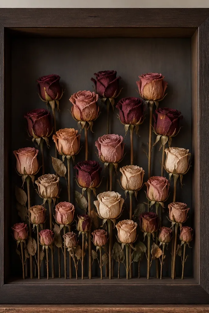
Layering dried rose buds creates a real depth effect. You can build height without adding extra decorations - the buds do the work. The shadows fall across the mat, so the frame looks "finished" even when the lighting changes.
Use a shadow-box frame 1.5-2 inches deep. Glue the back layer first on small blocks of foam tape so it sits 1/2 inch behind the front layer. Keep buds grouped in clusters of 3-5 for a balanced look.
Pro tipIf buds are shedding, mist the loose florets lightly with matte fixative before building the layers.
AvoidAvoid one flat layer in a deep box - it looks like a mistake rather than intentional depth.
11. Pressed Calendula Petals in a Grid
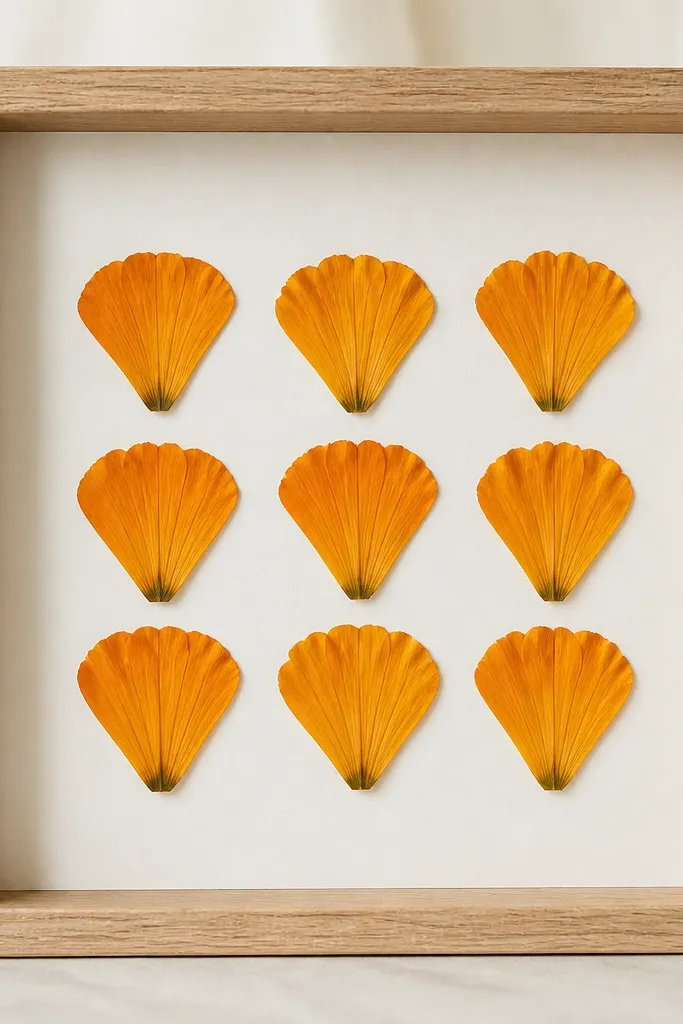
A grid makes pressed flowers look graphic and modern. Calendula petals are thin enough to press well and they keep color better than many delicate blooms. The consistent spacing hides the natural unevenness of pressed pieces.
Use a light gray or white mat and draw a faint grid on the back side of the mat so you can place pieces evenly. Glue each petal at two points near the center - don't flood the surface. Keep spacing about 1/8 inch between petals for crisp lines.
Pro tipCut the pressed petal edges with small scissors so each tile looks intentional.
AvoidAvoid irregular clusters - the grid styling needs consistent placement.
12. Dried Thistle Spikes for a Spiky Corner
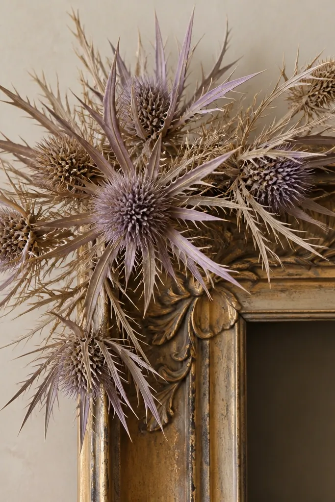
Thistle spikes read like line art. Dried bracts keep their structure, so you get that sharp, airy corner effect. Pressed thistle would turn flat and lose the "spike" look, so this is a dried-flower-only win.
Use a frame with a deeper backing so the spikes don't press against the cover. Trim spikes to 2-3 inch lengths and glue the base bracts to the mat. Keep the corner composition tight and leave at least 3/4 inch of blank space around it.
Pro tipStabilize the base with a tiny dab of glue and a micro piece of paper under it so the spike doesn't loosen.
AvoidAvoid letting spikes touch the glass - friction makes them shed.
13. Pressed Pansy Silhouette Centerpiece
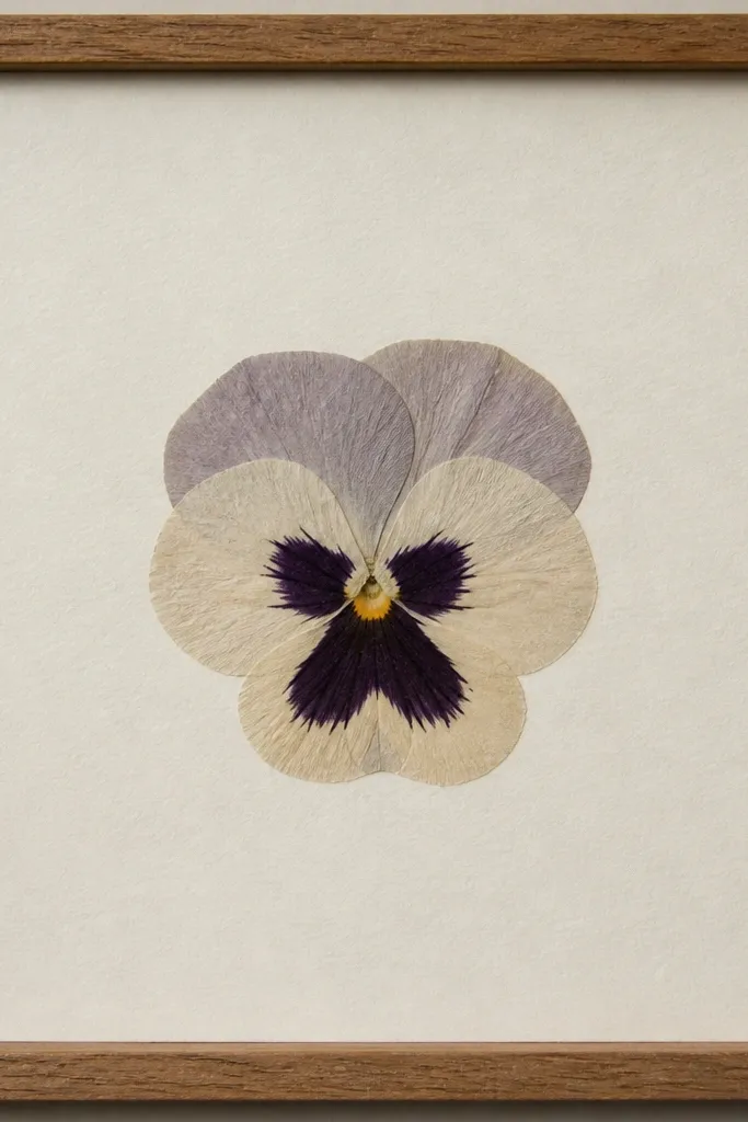
Pansies have strong contrast in the center, so pressed versions look like little stained-glass shapes. Center placement makes the pattern read instantly. The trick is keeping the petal thickness controlled so the cover doesn't warp the flower face.
Press pansies between paper with a blotter layer under them so color stays even. Use a deep navy or charcoal mat so the lighter petals pop. Glue only the petal edges lightly, leaving the center throat free of glue so it stays flat-looking.
Pro tipIf the pansy curls, place it face-down on the press stack and re-press for another day.
AvoidAvoid bright white mat - it can wash out the throat detail.
14. Dried Strawflower Starburst Border
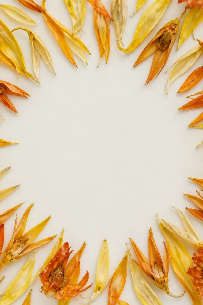
Strawflowers are built for drying, and they keep a papery stiffness that looks intentional. A border ring gives you movement without cluttering the center. The curled edges catch light like little paper cutouts.
Choose a frame with an inner border width of at least 1 inch. Glue strawflower segments along the ring with tiny dots at the base of each petal. Mix two tones - warm yellow and burnt orange - so the ring looks layered instead of one-note.
Pro tipTrim petals to the same approximate width so the ring looks even from a distance.
AvoidAvoid using too many colors - strawflower is already visually loud.
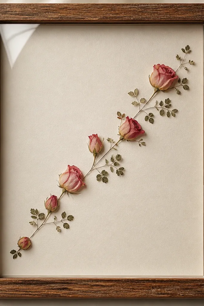
15. Pressed Fern + Rosebud Corner Pair
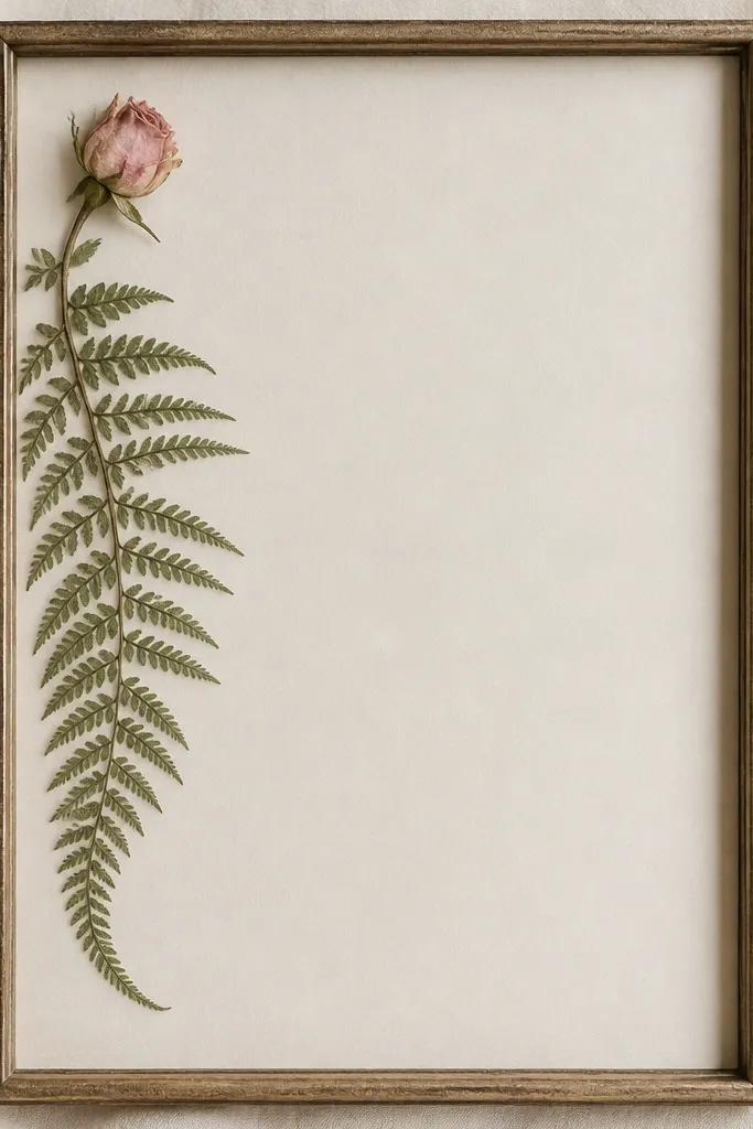
This combo works because fern texture gives movement and rosebud gives color focus. Corner placement feels styled, like a botanical print pulled from vintage stationery. Pressed flowers stay crisp here because you keep the rosebud small and let the fern occupy the edge line.
Press the fern first so it lies flat; then press the rosebud separately so you can re-position it without disturbing the fern. Use a white mat with a thin gold frame for warmth. Glue fern midrib along the edge, then glue the rosebud at two points - one at the base and one at a petal edge.
Pro tipDust pressed pieces with a dry paintbrush before gluing if they look papery-dusty.
AvoidAvoid overlapping fern fronds too tightly - it creates a dark smear.