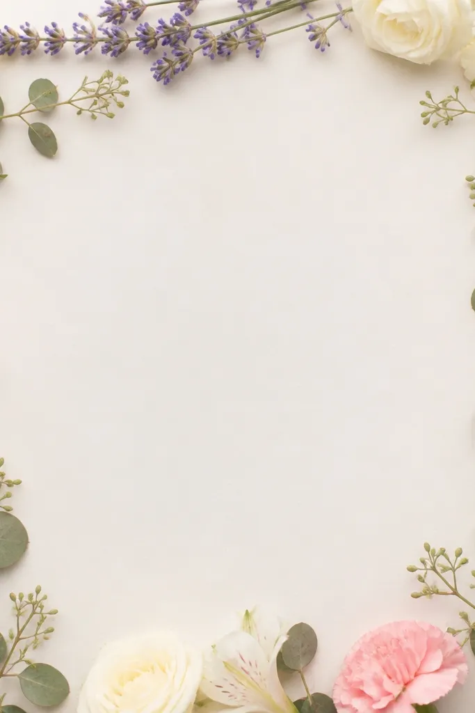
1. Pansy Gradient Frame with Matte Backing
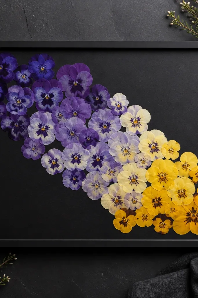
I love pansies for before after dried flower frame transformations because they keep their shape and color after pressing. The charcoal backing makes the purple edges look deeper and keeps the yellow centers from washing out. When you arrange petals in a gradient, your eye reads direction instantly, even if some petals are slightly thinner than others.
Use 2-3 sizes of pressed pansies, mixing whole flowers and just petal halves. Place them so the tallest bloom sits near the top-left corner and the rest steps down. Keep about 1/4 inch between clusters so the acrylic doesn't make everything look jammed together.
Pro tipBefore gluing, lay the gradient dry and take one photo with your phone flash off - that's your truth test for dullness.
AvoidAvoid a bright white backing with purple flowers unless you want a washed, flat look.
2. Tiny Daisy Spiral on Cream Mat
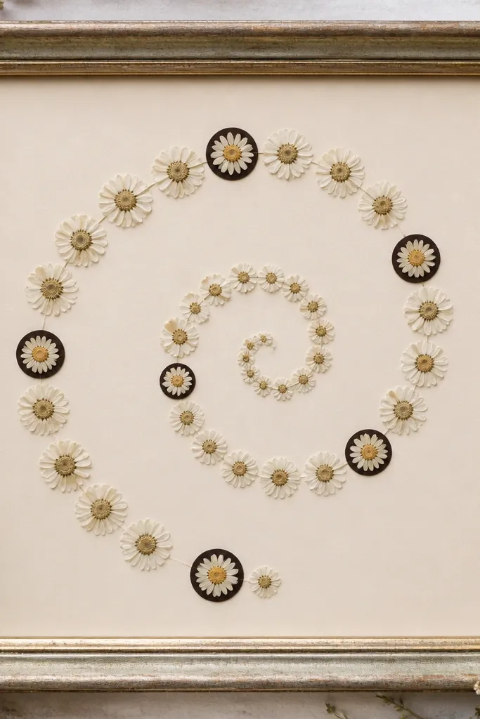
A spiral arrangement hides small imperfections because the viewer follows the curve. Tiny daisies press flatter than big blooms, so they stay readable even under acrylic. Cream mat plus subtle yellow centers makes the frame feel light without looking childish.
Cut a circular or slightly oval window in the mat about 3/4 inch smaller than the acrylic opening. Arrange daisies so the outer ring sits about 1/2 inch from the window edge, then spiral inward with consistent spacing. If your daisies vary in size, sort them into two piles and use the larger pile only on the outer ring.
Pro tipUse a toothpick to nudge petals into the spiral path after the glue dot sets for 30-60 seconds.
AvoidSkipping the mat window usually makes the petals look like they're floating on a muddy, busy background.
3. Calendula Sunburst with Layered Petal Tips
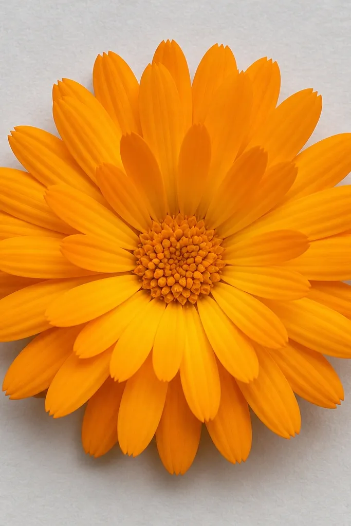
Calendula petals give you that "sun" look even when they're pressed flat. Layered petal tips add depth without thick glue, so the surface stays smooth under acrylic. Light gray backing keeps the orange warm but not neon.
Press calendula petals separately if you want crisp tips. Build the center with 1/2-inch diameter clusters, then add outer petals in a ring. Overlap only at the base - keep the tip edges free so they don't look stuck together.
Pro tipIf petals are slightly curled, press them again between dry blotting paper for 24 more hours before using them in the outer ring.
AvoidAvoid thick glue between layered petals; it creates bumps that catch glare.
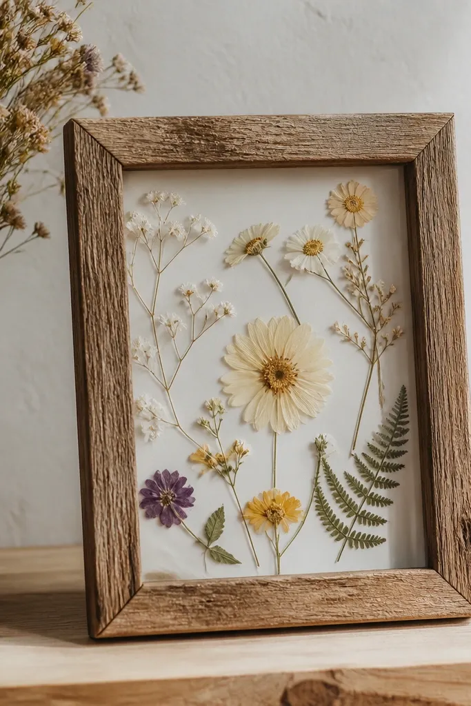
4. Eucalyptus + Baby's Breath Minimal Frame
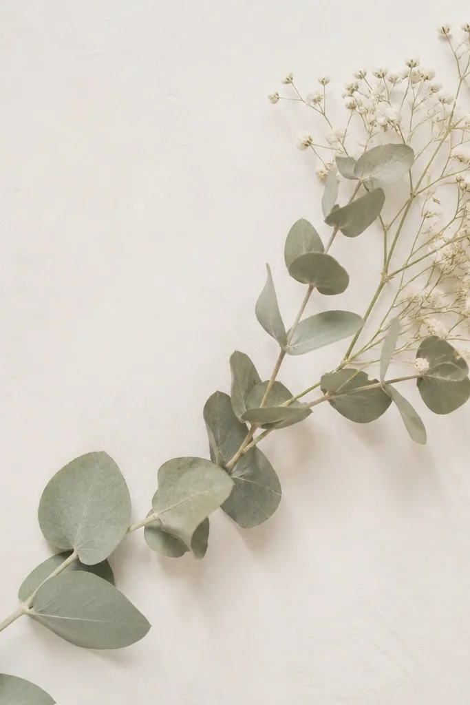
Minimal compositions look expensive when the spacing is intentional. Eucalyptus leaves press into smooth shapes and read well even if they're slightly thinner. Baby's breath adds texture without taking over, and the pale palette makes it perfect for seasonal spring or wedding-style decor.
Use two eucalyptus branches laid diagonally, then place baby's breath in a small cluster about the size of a quarter. The cluster goes at one end only - don't sprinkle all over or it turns into static. Keep the diagonal line about 1 inch away from the frame edges.
Pro tipUse black or dark charcoal paper behind the baby's breath specks if your pressed pieces look too gray on off-white.
AvoidAvoid using five different flower types; it turns into a craft mess fast.
5. Red Rose Petal Window with Black Frame Edge
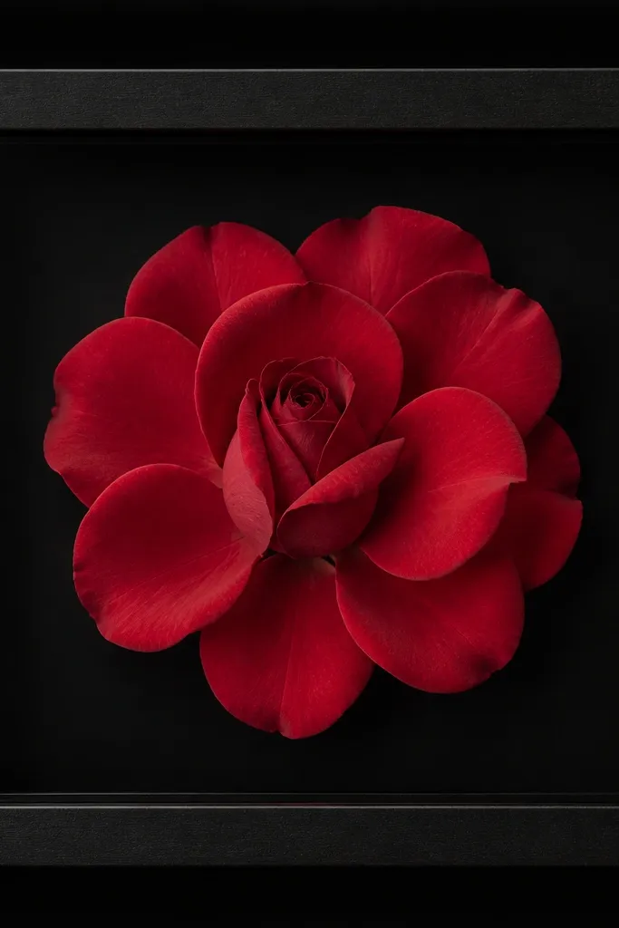
Rose petals give you bold color and a clear focal point. When you keep the layout centered and use a deep black backing, the red looks richer and the petals look sharper. This style is the easiest way to get a dramatic before after dried flower frame without adding lots of pieces.
Press rose petals individually, then sort by shape. Place the largest petals first in a fan, then tuck two smaller petals at the center overlap point. Leave a tiny gap between fan layers so you can see each petal edge.
Pro tipWipe the acrylic with a microfiber cloth before final assembly - fingerprints kill the contrast on dark backgrounds.
AvoidAvoid gluing full flowers on top of each other; pressed roses look best when petals overlap with visible edges.
6. Lavender Sprig Corner Frame for Spring
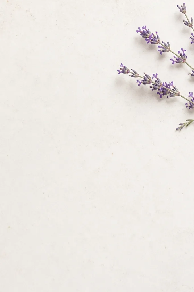
Corner placement makes the frame look intentional and airy. Lavender sprigs press into clean lines, so you get a "drawn" effect without needing extra embellishments. Warm white backing keeps purple soft and not harsh.
Place the sprig so the longest stem points toward the center but stops short by about 1/2 inch. Add two tiny leaf clusters only where the sprig changes direction. Keep the corner composition within a 2-inch box so it doesn't drift across the whole window.
Pro tipUse a soft brush to remove any loose dried dust before sealing; dust shows as gray haze.
AvoidAvoid sealing before you've confirmed the sprig sits flat; lifted edges show through acrylic.
7. Holiday Poinsettia-Style Petal Frame in Red + Evergreen

This is the seasonal trick: you mix one bold flower shape with one color that reads like foliage. Red petals give instant holiday energy, while evergreen-green leaves make the frame look complete even if the center is simple. Dark green-black backing keeps reds from turning pink.
Cut red petals into slightly uneven lengths so the outer ring looks layered, not identical. Use green leaves as separators between red petals, then cap the center with a tiny cluster of smaller pieces. Aim for a bloom diameter around 3 inches inside the window.
Pro tipIf your red petals fade after pressing, add a second layer of pressed red from a fresh bloom so the after photo still looks saturated.
AvoidAvoid using glossy scrapbook paper as backing; it reflects light and makes the red petals look dull.
8. Fall Leaf Frame with Copper Accents
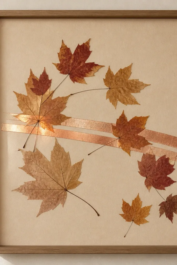
Pressed leaves look best when you pair them with one metallic accent. Copper-toned paper or thin foil behind parts of the leaf arc creates warmth without clutter. Light tan backing keeps the whole thing grounded and reads like autumn even with only a handful of leaves.
Press leaves flat under weight so veins stay crisp. Arrange 5-7 leaves in an arc, with the largest leaf near the center. Place copper accents behind the lower half only, so the top half stays matte and readable.
Pro tipUse a matte craft knife to trim leaf edges clean; torn edges often look sloppy under clear covers.
AvoidAvoid overfilling the frame; leaves need breathing room or they blend into one brown blob.
9. Monochrome Blush Dried Flowers with Clear Layering
Monochrome is harder than it looks because you lose contrast. The trick I use is to vary texture: mix slightly darker beige petals with lighter sprigs so you still get depth. Off-white linen-like backing gives texture without adding competing colors.
Use 3-4 main elements max: two larger petal clusters, one sprig, and a few tiny filler pieces. Keep every element within a 2.5-inch circle so your eye has a shape to lock onto. Seal evenly so the translucent petals don't turn patchy.
Pro tipTake a photo from straight above. If it looks flat in the photo, add contrast by switching the backing to cream instead of white.
AvoidAvoid using bright white backing with blush petals; it makes them look gray and lifeless.