1. Matte Olive + Cream French Stripe Band
This looks expensive because the stripes are tight and the palette is quiet. Matte olive reads calm and modern, and cream makes the terracotta feel intentional instead of orange. Keep the stripe band one continuous wrap so the pot looks styled as a set. The cream rim stops the eye from seeing bare clay at the top.
Prime the whole pot, then paint the body matte olive. Tape two parallel lines spaced about 1/2 inch apart, paint the band cream, and remove tape while paint is still slightly tacky. Finish with a clear matte outdoor sealer, and paint the rim cream last with a small foam brush.
Pro tipPress tape down with a fingernail along the curve so paint does not creep under the edge.
AvoidDo not paint stripes freehand - wobbly edges make it look like a weekend craft.
2. Antique Gold Sunburst Over Terracotta Base
Leaving some terracotta visible keeps the look warm and believable. Antique gold rays catch light without turning into bright yellow paint. The dot clusters add texture so it does not look like flat lines. A controlled burst pattern also looks great from across a room.
Prime lightly where you will paint the gold, or use a thin bonding primer to prevent bleeding. Mix a gold acrylic with a touch of brown to get antique gold, then paint 12-16 rays from a drawn circle guide. Add tiny dots at the ray ends with a toothpick tip. Seal with satin so the gold has a ceramic sheen.
Pro tipUse a paper template to mark ray spacing before you paint - it keeps the burst even.
AvoidAvoid bright metallic yellow; it looks like school paint under outdoor light.
3. Cream Marble Veins with Soft Gray Swirls
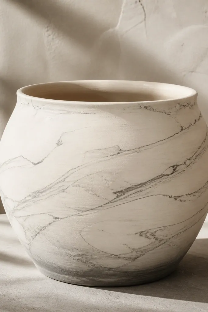
Marble looks expensive because it has layers, not perfect symmetry. Cream gives the clean base, and soft gray veins mimic natural stone movement. Adding a faint shadow near the bottom makes the pot feel dimensional. This style also photographs well because the veins show up clearly in side lighting.
Paint the pot cream and let it fully dry. Drag a thin liner brush loaded with diluted gray to create 6-10 main veins; then add smaller offshoot lines. Use a damp sponge to lightly blend the edges of a few swirls. Finish with a matte sealer to keep it from looking like glossy resin.
Pro tipWipe your brush on a paper towel before every vein so the lines stay hair-thin.
AvoidDo not over-blend; if everything looks smudged, it reads like accidental paint.
4. Terracotta Boho Dots in a Vertical Ombre Column
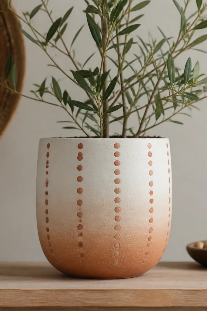
Ombre columns look modern because they guide the eye up and down. Dots add a hand-crafted vibe, but the ombre keeps it from looking random. Muted peach and rust sit nicely against terracotta shades and make the whole pot feel warm. The pattern also works for both indoor plants and holiday greenery.
Paint the top 2/3 white, then blend down into terracotta using a sponge from top to bottom. For dots, use a dotting tool or eraser end, starting with larger dots near the middle and smaller dots toward the top. Space the columns evenly - 3 columns per side works well on an 8-9 inch pot. Seal with satin so the dots keep their raised feel.
Pro tipPractice your dot size on a scrap clay tile or cardboard first so your dots match across the pot.
AvoidAvoid using only one dot color; flat dot patterns look cheap fast.
5. Holiday Evergreen Wreath Ring with Pine Needle Texture
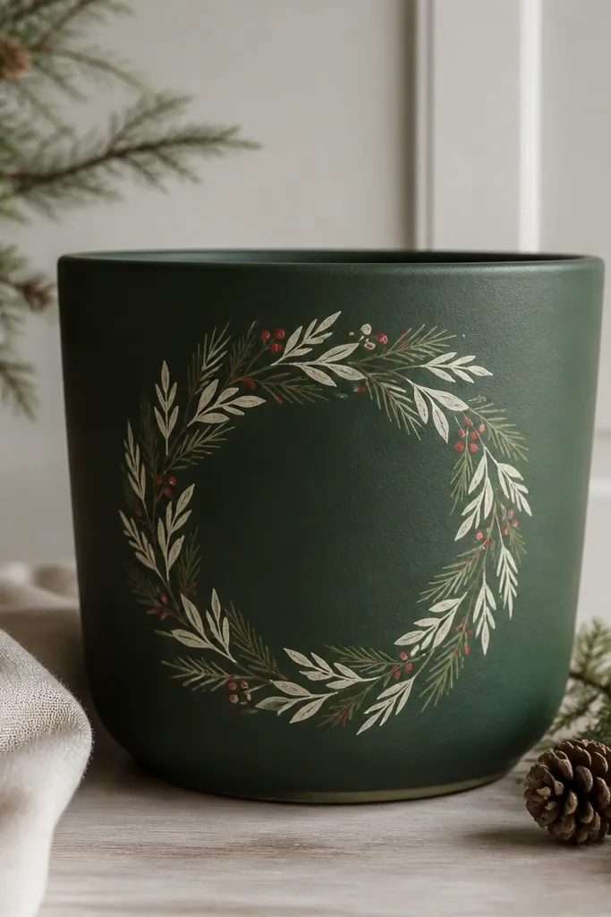
A wreath ring looks festive without turning cartoonish. Forest green is classic, cream shows up cleanly, and pine needle texture makes it feel hand-painted. Red berries add the holiday pop, but keep them small so the pot still looks classy. The ring placement at mid-height is what makes it readable from a distance.
Paint the pot deep forest green and let it dry. Draw a circle guide for the wreath, then paint the ring cream. Use a small angled brush to add short pine-needle strokes inside the circle, then dot 6-10 berries in a muted red. Seal with matte so the wreath looks like painted ceramic.
Pro tipAdd a tiny lighter green highlight on 1/3 of the wreath needles for depth.
AvoidDo not make the berries too big; big dots look like cheap stickers.
6. Crisp Black Cat Eyes for Halloween Minimalism
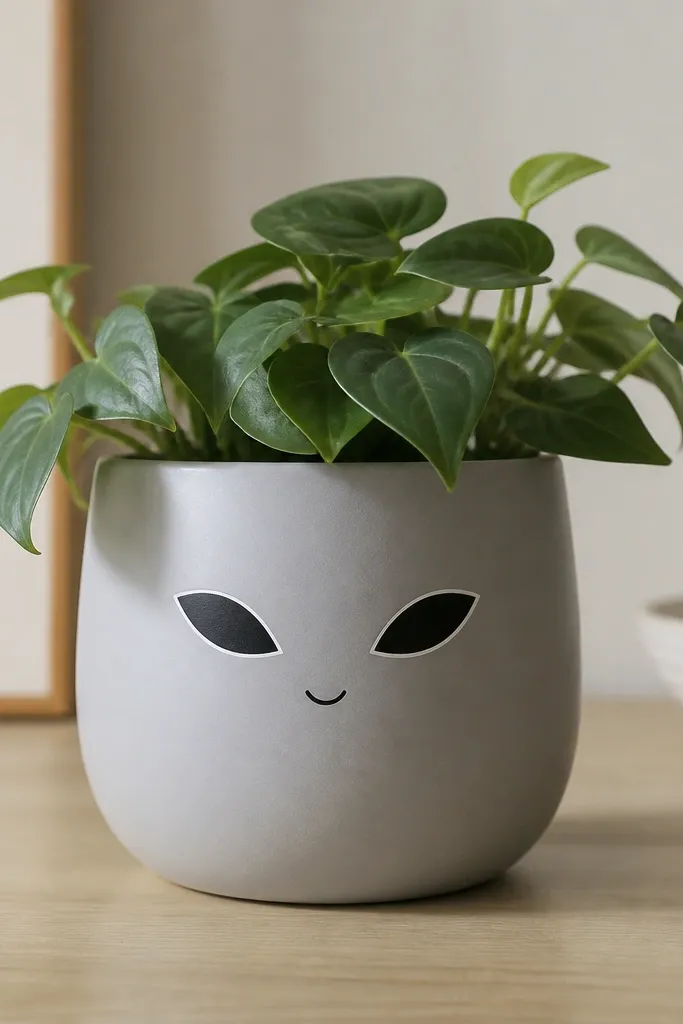
Minimal Halloween looks expensive because it avoids clutter. Pale gray is a great base for spooky details since black stands out cleanly. The thin white highlight line makes the eyes look glossy even with matte paint. Keeping the face small and centered makes the pot feel designed, not themed-overkill.
Paint the pot pale gray, then mark eye positions with pencil. Use a fine liner brush to paint narrow black almond shapes, add a short white highlight stroke, and finish with a tiny curved smile in black. Add a single black whisker line on each side. Seal with satin so the highlights pop.
Pro tipUse painter's tape to mask the area around the face so black paint stays crisp.
AvoidAvoid full cat faces with lots of fur lines; they look messy at pot scale.
7. Terracotta + Speckled Clay Glaze Effect
Speckled glaze looks like the kind of pot you'd pay for at a boutique market. The trick is controlling speckle size - tiny dots feel ceramic, large dots feel like splatter. Layering translucent terracotta gives depth instead of a flat orange. A darker band near the base makes it look like a real glaze run.
Use a translucent terracotta acrylic glaze medium mixed into your terracotta paint. Apply in two thin coats so you can see the clay warmth underneath. For speckles, dip a stiff toothbrush into a thin mix of white and dark brown, then tap over the pot for fine dots. Paint a 1-inch darker terracotta band near the base. Seal with satin for a glazed look.
Pro tipTest speckle density on paper first; you want "dust," not "paint rain."
AvoidDo not skip sealing - speckles can rub off where you touch the pot.
8. Soft Pink Blush with Tiny Black Floral Sprigs
Blush + black reads high-end because the contrast is intentional. Small floral sprigs look delicate without needing huge artwork. Matte black rim makes it feel like a finished piece, not a pot with paint just on the outside. This one works for spring and also looks good with herbs.
Paint the pot soft pink with two coats for even coverage. Use a fine liner brush to draw 4-6 tiny sprigs around the pot - each sprig has a short stem and 3 small petals. Add tiny dots in between as centers. Paint the rim matte black and seal with matte so it stays refined.
Pro tipKeep your flowers small: about 1 inch across total per sprig looks right on an 8-inch pot.
AvoidAvoid thick paint strokes; they make the florals look like chunky stamps.
9. Boho Terracotta Waves in Sand + Chocolate
Waves give movement, and sand + chocolate feels like a neutral interior palette. Using two stacked wave bands makes the pot look styled, not random doodles. Leaving the rim terracotta keeps the color story grounded. This is one of my go-to looks when I want something that matches any planter set.
Prime, then paint sand as the base. Tape two horizontal bands, then paint chocolate brown waves inside each band using a thin brush and a steady wrist. Add a narrow terracotta rim by dry-brushing a terracotta shade around the top edge. Seal with satin to keep the sand from looking chalky.
Pro tipMark the wave peaks with pencil dots first so the waves stay rhythmic.
AvoidDo not make the waves too tall; big waves overwhelm the pot shape.
10. Cobalt Blue Geometric Tiles with White Lines
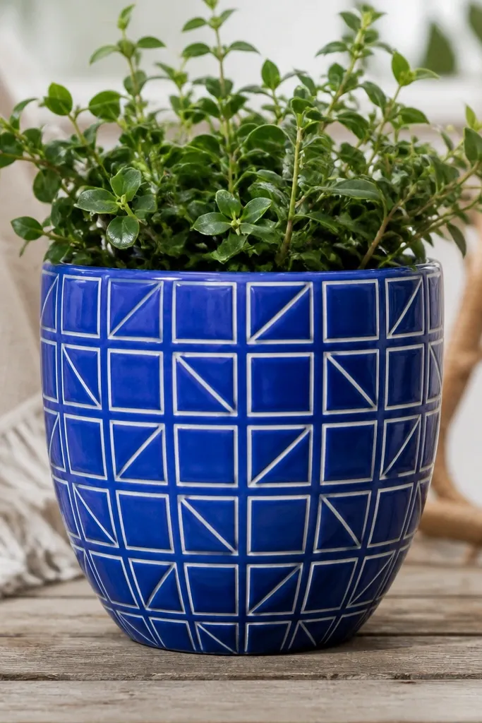
This looks expensive because it has clean boundaries like ceramic tiles. Cobalt is bold but still classic, and white lines create that "glazed tile" illusion. A repeating pattern makes the pot look intentional even if the plant fills part of it. It also makes a great backdrop for green leaves.
Paint the entire pot cobalt blue. Use painter's tape to create a grid-like pattern, then paint white and remove tape. After drying, use a fine brush to touch up any tape edges and add tiny triangle accents if you want extra detail. Seal with satin for that smooth tile feel.
Pro tipPress tape edges firmly and pull tape back on itself slowly to keep lines sharp.
AvoidAvoid thick white lines; thin lines look more like tile grout.
11. Monochrome Cream with Raised Look Using Sponging

Monochrome looks pricey when the surface has texture. Sponging makes the paint look like a plaster finish instead of flat acrylic. The darker band near the top gives a design moment without adding images. This style is perfect when you want the plant to be the main character.
Paint a base cream coat. While it's still slightly tacky, sponge a second cream shade (about 1-2 shades darker) lightly around the top third. For a raised look, use a sea sponge and dab rather than swipe. Seal with matte to keep the texture visible.
Pro tipUse two different sponge sizes so texture doesn't look uniform.
AvoidDo not over-sponge; heavy texture can trap dust and look rough.
12. Deep Burgundy with Gold Script-Style Dots
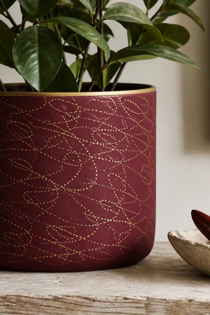
Gold dot "script" looks classy because it's airy and delicate. Burgundy is moody but not Halloween-y, so this pot works year-round. The thin gold rim makes it feel finished and frames the plant. Dot lines also hide tiny imperfections in terracotta.
Paint the pot deep burgundy and let it dry completely. Use a dotting tool to create curved dot lines that mimic script - 2-3 lines across the midsection is enough. Add a thin stripe of gold around the rim. Seal with satin so gold looks warm, not chrome.
Pro tipKeep your dot spacing consistent; irregular spacing makes it look accidental.
AvoidAvoid using thick strokes in gold paint - dots are cleaner at pot scale.
13. Winter Snow Hills in Soft White and Light Blue
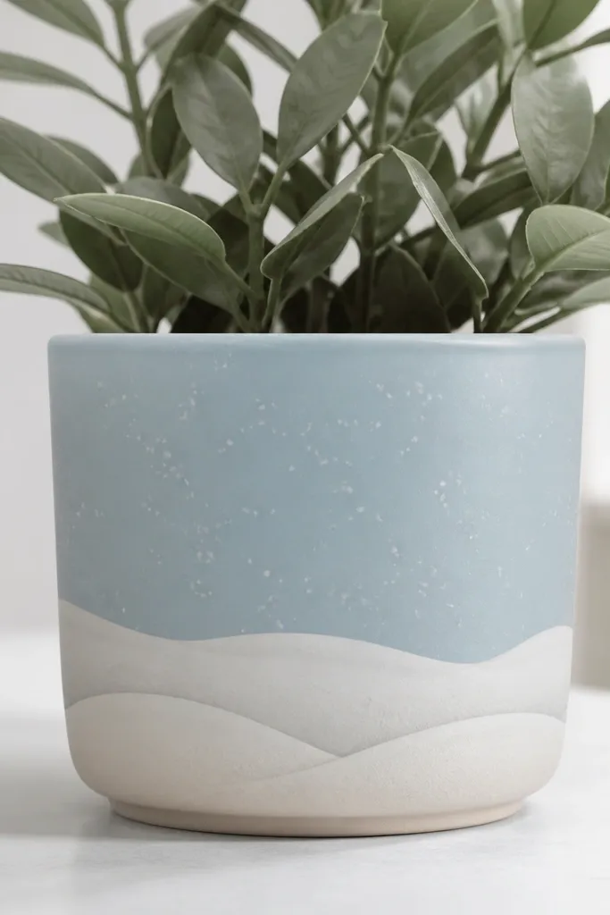
Snow hills look expensive because they create depth with layering. Light blue gives a frosty background, and soft white hills give the illusion of distance. Tiny snow dots add realism without turning it into a cartoon. This one sits nicely with winter stems and evergreens.
Paint the pot light blue, then dry-brush a slightly darker blue shadow around the lower third. Paint three overlapping snow shapes using a wide flat brush - each higher layer is slightly smaller. Add speckles using a toothbrush with diluted white paint. Seal with matte so snow reads like paint, not plastic.
Pro tipLet each snow layer dry before adding the next so edges stay crisp.
AvoidDo not make one flat white strip; it looks like spilled paint.
14. Terracotta Base with White Cutout Polka Band
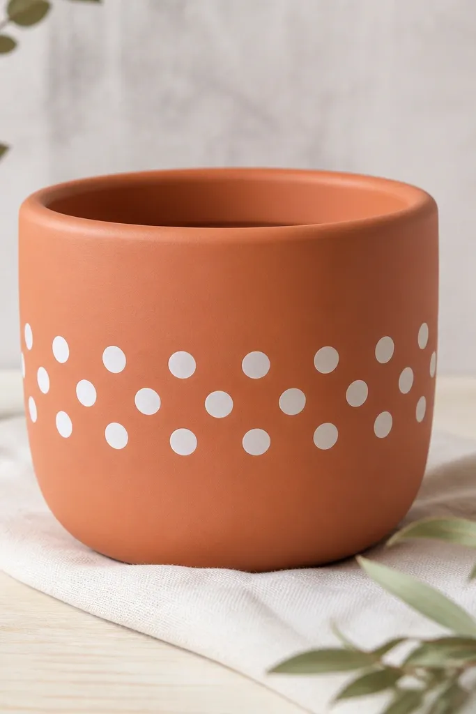
This works because it uses negative space, not more paint. White polka dots against terracotta feel vintage but clean when edges are sharp. Masking keeps the dots from bleeding and makes the band look graphic. It's also easy to repeat across multiple pots for a matching set.
Prime and paint the pot a smooth terracotta shade close to the original clay color. Tape a horizontal band where the polka will go. Dab white paint through a stencil or use a dot marker, then remove tape after the paint sets. Seal with satin for a smooth, slightly ceramic finish.
Pro tipUse a stencil with dot holes sized about 1/2 inch for medium pots.
AvoidAvoid freehand polka; uneven dots make the pattern look sloppy.
15. Mossy Green Ombré with Black Outline Leaves
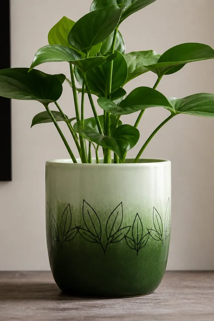
Leaf outlines give the pot a botanical look without needing realism. The ombré background makes it feel natural and layered. Black outlines keep it crisp and prevents the green from blending into itself. This style is great for herb planters and spring decor.
Prime, then paint the top third pale green and blend down into moss green with a sponge. Use a fine liner brush to draw 6-8 leaf outlines - simple teardrop shapes with a center vein line. Fill leaves with a darker green wash, leaving the outline visible. Seal with satin so the ombré doesn't go flat.
Pro tipUse a reference leaf shape and repeat it - consistency reads expensive.
AvoidDo not fill leaves with thick paint; it causes uneven shine after sealing.
16. Spring Pastel Stripes with Gold Dipped Ends
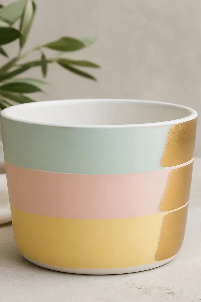
Pastel stripes feel fresh, and gold dipped ends add that "gift shop pottery" vibe. The key is keeping stripes evenly spaced so the gold looks like intentional glaze. A white rim ties all colors together and makes the pot look sharper in photos. This one suits Easter, spring herbs, and small desk plants.
Prime, then paint a white base first so pastels pop. Tape 3-4 stripe bands and paint mint, blush, and pale yellow in alternating order. When stripes are dry, use a small brush to paint thin gold tips at the right edge of each band. Seal with satin, not gloss, so gold looks like ceramic glaze.
Pro tipLet the pastel stripes dry overnight before adding gold so gold does not smear.
AvoidAvoid thick gold blobs; thin dipped ends look more expensive.
17. Blackboard Paint Label Panel with White Chalk Text
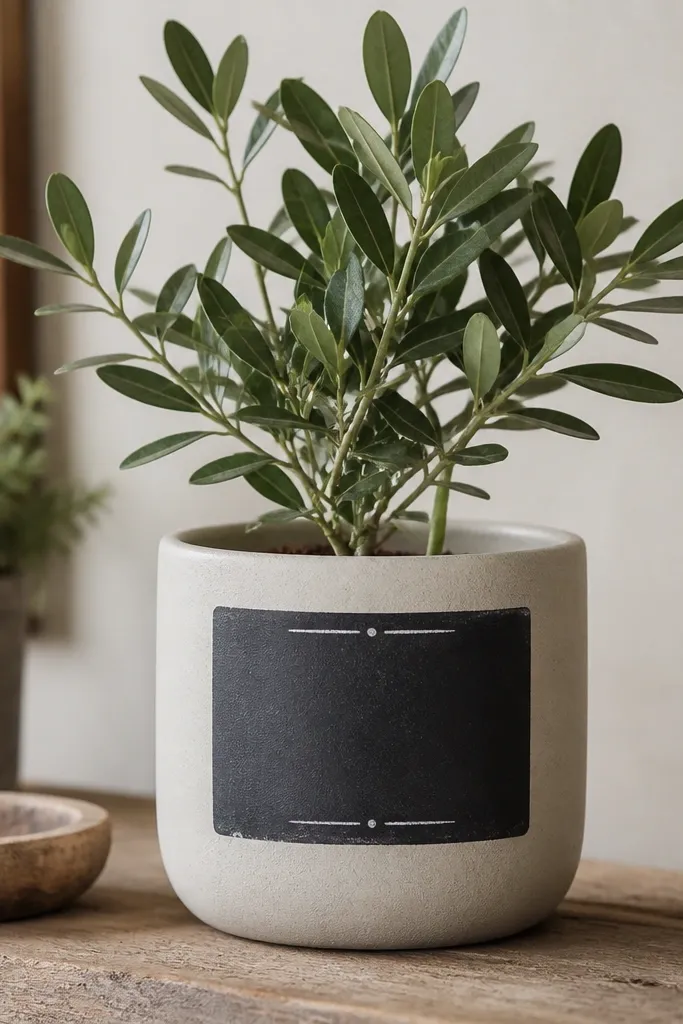
A chalkboard label makes the pot feel functional and styled, not purely decorative. The matte black panel hides small imperfections and gives you a place to change the plant name by season. White chalk text looks crisp and fun, and it reads clearly from a distance. I use this for herb pots because labels matter in real life.
Paint the pot beige or warm gray. Mask a rectangle with tape and paint the panel with blackboard paint (or matte black made for indoor boards). After curing, write with chalk or chalk marker. Seal around the panel edges only with a matte topcoat if needed; keep the writing matte so it stays erasable.
Pro tipUse chalk marker for cleaner lines if you plan to photograph it often.
AvoidDo not seal directly over chalk text - it turns dull and can smear.
18. Red + Cream Candy Cane Twist Spiral
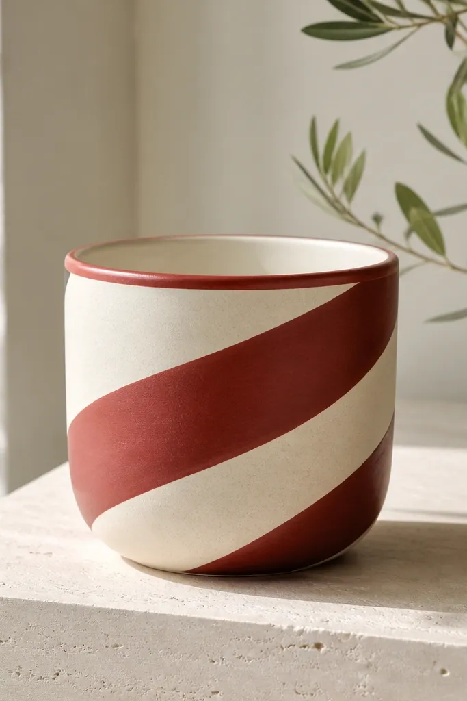
Candy cane spirals look expensive when the stripe is perfectly even and centered. Cream base keeps the design bright without looking harsh. A thin red rim band finishes the top edge so it looks like one piece. This is a great holiday pot for winter plants and small faux greenery.
Prime and paint the pot cream. Lightly mark a spiral guide using pencil and a flexible measuring tape. Tape along the spiral line in short segments, paint the red stripe, then remove tape. Paint a narrow red band around the rim. Seal with satin for a smooth candy-glaze look.
Pro tipUse short tape segments (2-3 inches) - long strips slide on curves.
AvoidAvoid uneven stripe width; it makes the spiral look accidental.
19. Terracotta Pottery Look with Washi Tape Resist Frames
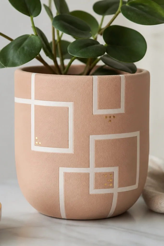
Washi tape resist gives you sharp geometric frames without complicated stenciling. The contrast between the painted base and the tape-negative lines reads like pottery glazing. Adding tiny gold dots in corners gives the "expensive" finish without crowding the design. This also makes it easy to create matching sets - tape patterns repeat well.
Paint the pot a pale clay or warm beige base. Press washi tape into straight and angled frame shapes, then paint over it with a slightly darker shade (like muted terracotta brown). Remove tape after the paint dries to the touch. Add a couple of gold dots with a toothpick. Seal with matte to keep the frames crisp.
Pro tipWarm the tape slightly with your hands before applying so it conforms to the curve.
AvoidDo not use thick masking tape; it can pull paint and leave ragged edges.
20. Halloween Jack-O-Lantern Minimal Face with Orange Burst
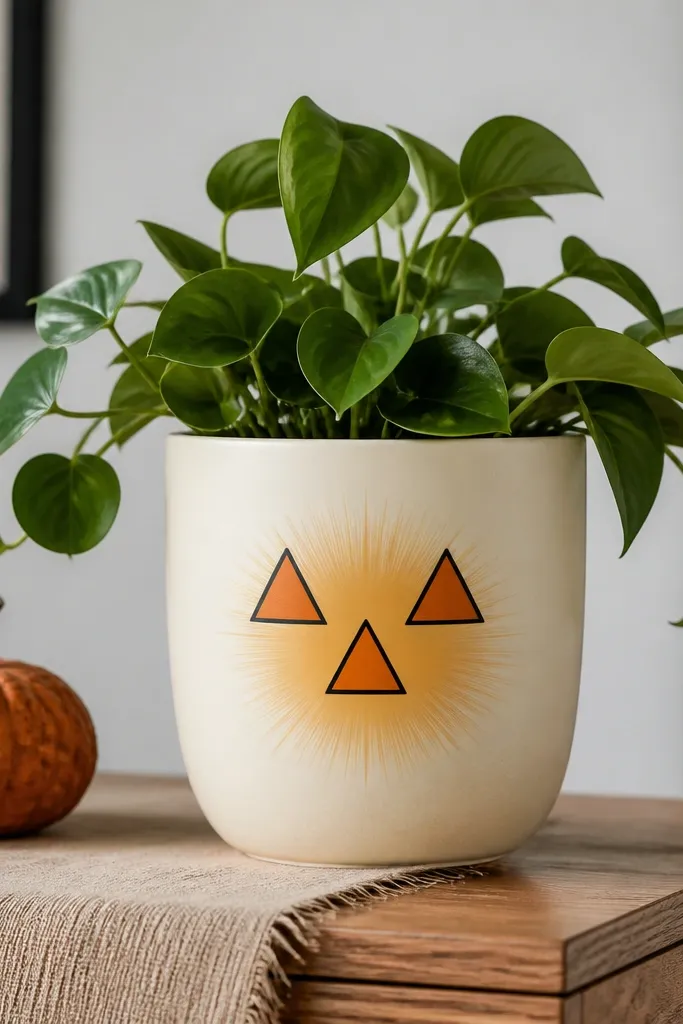
Minimal faces look cleaner than full pumpkin carving painted on a pot. The orange burst behind the face adds warmth and makes it pop without covering the whole surface. Using only a few shapes keeps it modern and still clearly Halloween. The cream base stops it from looking too heavy.
Paint the pot cream, then draw a small circle where the burst will sit. Paint an orange burst using 8-10 short rays. Outline a tiny jack-o-lantern face with black, then fill triangles with orange or leave them as negative space. Seal with satin so the black lines stay crisp.
Pro tipKeep the face small and centered; bigger faces overwhelm the pot curve.
AvoidAvoid painting lots of tiny pumpkin lines; they look muddy once sealed.
21. Thanksgiving Harvest Cornucopia Outline
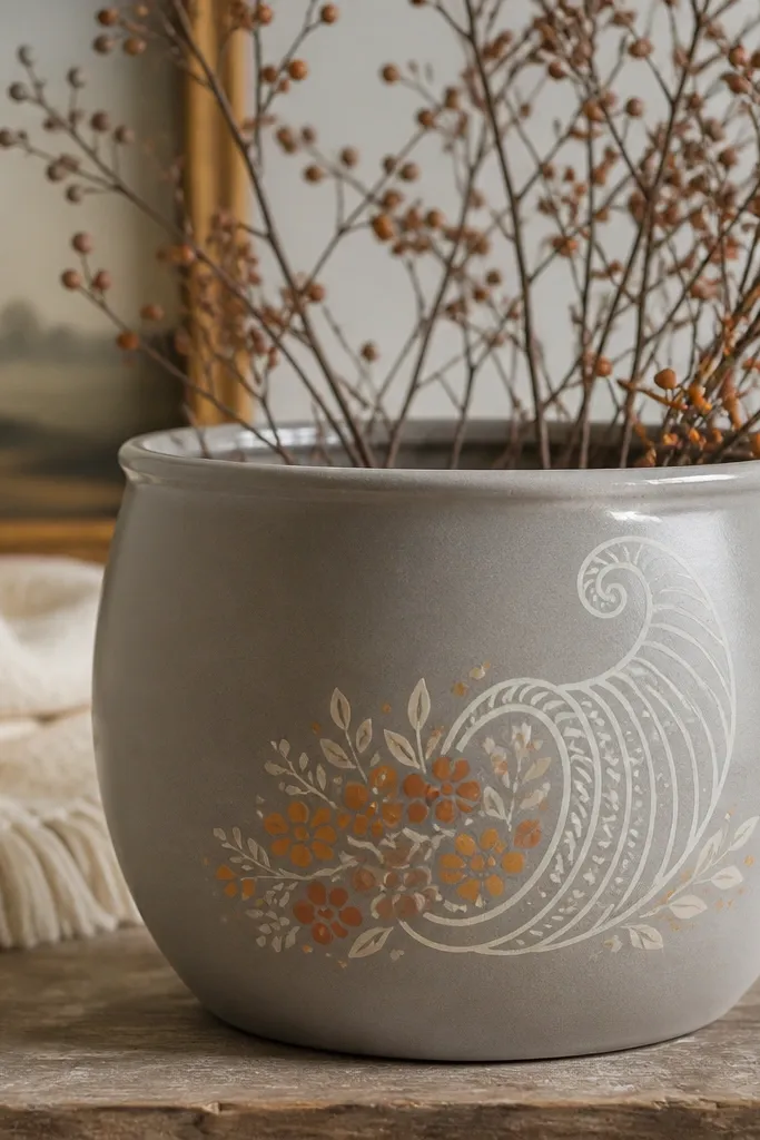
Cornucopia outlines look elegant because they use line work instead of filling the whole pot. Warm gray is the perfect neutral base for autumn colors. Tiny dot "fruit" inside the cornucopia makes it look detailed without needing heavy brushwork. It reads Thanksgiving even after the holiday because the palette still feels earthy.
Prime and paint the pot warm gray. Sketch the cornucopia with pencil, then paint the outline in cream using a fine brush. Fill the basket with small orange-brown dots and a few leaf marks in muted green. Add a thin cream rim stripe for polish. Seal with matte so the linework stays sharp.
Pro tipUse a single dot size for most berries, then add 2-3 larger dots for depth.
AvoidAvoid bright neon orange; it looks cheap on terracotta.
22. Matte Black Base with White Lace-Look Border
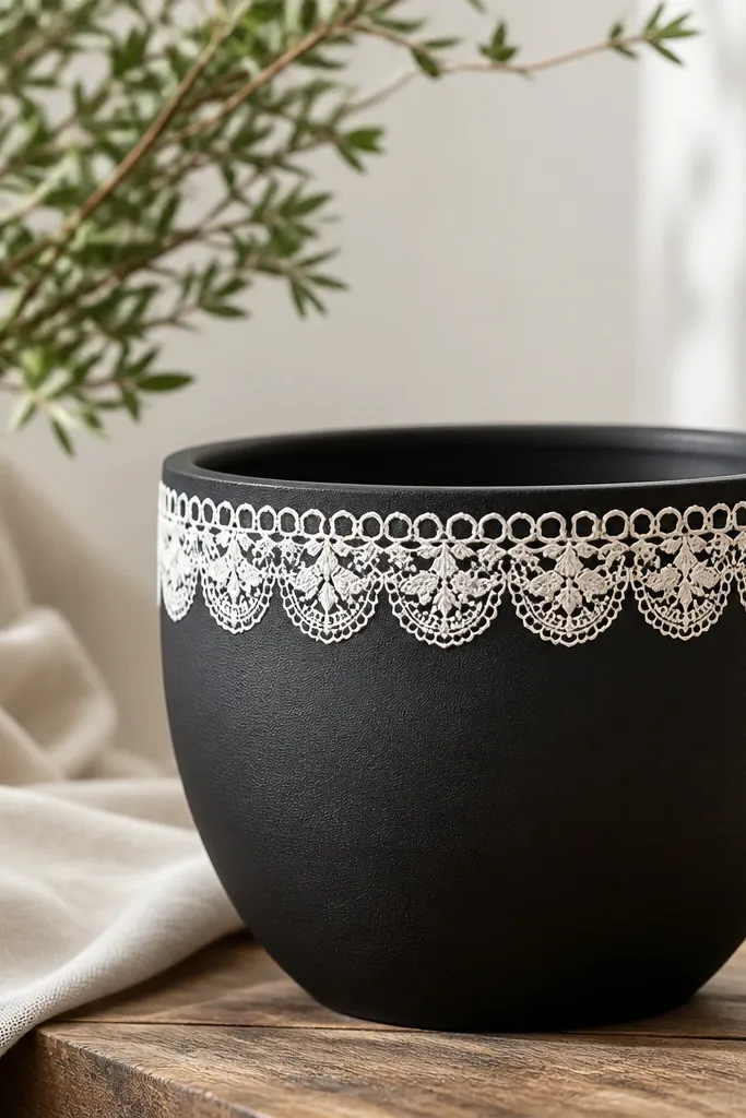
Black with a lace border looks expensive because lace is naturally delicate and the contrast is high. Keep the border near the top so it feels like trim, not a full pattern cover. White lace lines also make a simple pot look styled even when the plant is small. This is a strong option for winter decor and indoor plants.
Paint the pot matte black in two coats. Use a lace stencil or a scalloped edge stencil for the border band and paint it white. If you do it freehand, draw small scallops first, then add tiny loop lines between them. Seal with matte outdoor sealer so the black stays flat and hides brush strokes.
Pro tipLet stencil paint dry fully before removing the stencil to prevent smears.
AvoidAvoid glossy topcoat on black; it turns into a cheap plastic shine.
23. Blue-and-White Delft-Style Doodles
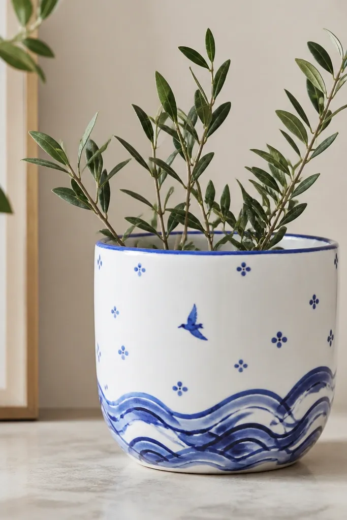
Delft-style doodles look expensive because the whole design stays in one color family. White base plus cobalt blue feels like ceramic tiles, even with paint. Add waves and tiny florals so it looks like a story, but keep the elements small. The thin rim ties the pattern together.
Paint the pot white and let it dry hard. Use a stencil or freehand to place 2-3 motifs around the pot - a wave band, a small bird, and small flower dots. Paint everything in cobalt blue, then add a few lighter blue highlights. Seal with satin for a glazed ceramic look.
Pro tipUse a toothpick for tiny dot flowers; it gives cleaner dots than a brush.
AvoidDo not overfill the pot with too many motifs; it becomes cluttered.
24. Soft Gray Concrete Effect with Tiny Sand Specks
Concrete effect looks modern and expensive when it is subtle. The gray base keeps it calm, and the specks mimic real texture. A darker ring near the bottom makes it feel grounded, like a planter made for patios. This one is great for minimalist spaces and masculine holiday decor too.
Paint the pot soft gray, then while it is slightly tacky, sprinkle a tiny amount of fine craft sand mixed with clear medium. Use a small brush to press down stray sand so it sticks. Paint a darker gray ring about 1 inch tall near the base. Seal with matte so the texture stays visible.
Pro tipShake off loose sand after 30 minutes so you do not end up with gritty piles.
AvoidAvoid chunky sand; large grains look like accidental mess.
25. Red Berry Garland with Faux Bead Accents
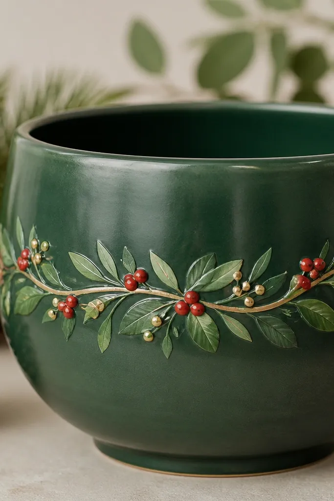
A garland across the middle makes the pot look like it has a holiday outfit. Deep green is the background that makes red berries feel rich without being loud. White highlights on berries create a glass-bead effect. Gold bead dots add that expensive finishing detail without turning into glitter.
Paint the pot deep green and let it dry. Paint a gentle ribbon curve across the middle with a slightly lighter green for depth. Add red berries as small circles and add a tiny white dot highlight on each. Add a gold bead dot every 1-2 inches along the ribbon. Seal with satin to keep the berry highlights crisp.
Pro tipUse a toothpick for berry highlights; you get a sharper tiny dot.
AvoidDo not use glitter paint for the berries; glitter catches dust and looks messy fast.