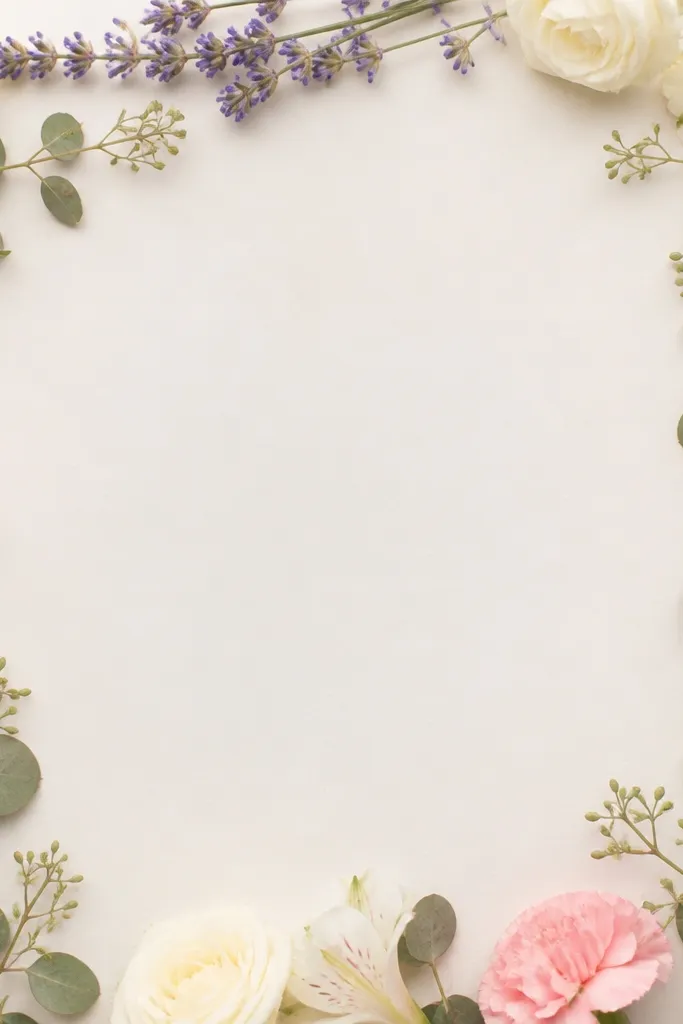
1. Blush Center Bloom with Tiny Baby's Breath Halo
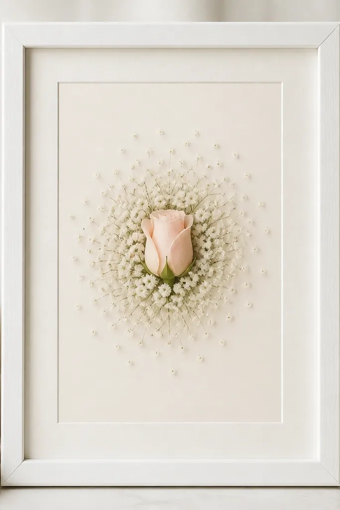
This layout makes the frame look "styled" because your eye lands on one clear focal point. The blush rosebud gives a soft shape, and baby's breath adds light texture without overpowering pink. I like cream matte paper here because it warms the pink and keeps it from looking gray. The halo pattern also reads clean even from across the room.
Press 1 rosebud and 10-20 baby's breath florets. Mount the rosebud at the exact center of the opening, then place baby's breath in a loose circle about 1/3 inch away from the rose edges. Keep baby's breath pale so the ring looks like a glow, not a second main flower.
Pro tipUse a pair of tweezers with a rubber tip so you don't dent the petals when you position the halo.
AvoidAvoid gluing the baby's breath stems - glue only the petal bases so they stay flat.
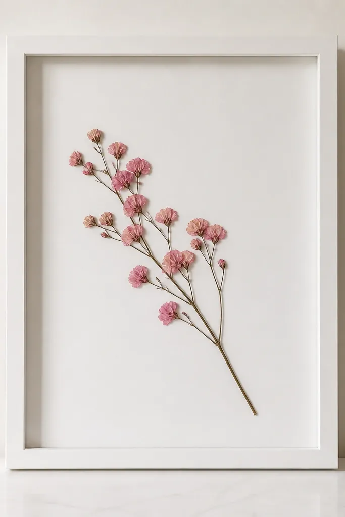
2. Dusty Rose Diagonal Sweep with One Hot Pink Accent
Diagonal layouts look expensive because they create motion. Dusty rose flowers along the diagonal feel calm and cohesive, and one hot pink accent makes the frame feel intentional. The diagonal sweep also hides tiny irregularities in pressed petals because the line pulls your eye forward. It's the one I use when I want a pink frame that still looks airy.
Use a longer opening like 8x10 so you have room for the sweep. Place the first flower near the bottom-left corner, then stagger 5-7 more along a diagonal, keeping gaps between each bloom. Add a single hot pink accent near the top-right - small, about the size of a dime.
Pro tipMask the diagonal line lightly with pencil on the back of the matte so you place petals in a straight path.
AvoidDon't put the hot pink accent in the middle - it will steal focus from the diagonal design.
3. Two-Flower Symmetry Left and Right
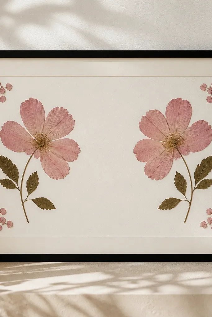
Symmetry makes a pressed flower frame look like decor, not a craft project. This idea works because the brain reads balance instantly, even if your flowers aren't identical. I keep both main blooms in the same dusty rose family, then add tiny blush filler petals near the corners to soften the edges. The result feels neat and calm on shelves.
Choose 2 similar-sized pressed flowers. Measure the opening width and place the center gap at about 1 inch (for an 8x10). Add 3 tiny filler petals near each outer side, angled slightly inward so the design breathes.
Pro tipUse the matte's center crease as your guide and build from the inside outward.
AvoidAvoid tiny mismatched blooms that are wildly different in size - the frame will look lopsided even if you think it's close.
4. Pink Rosebud Corner Cluster on Cream
Corner clusters look modern and work great for small spaces. The top-right placement feels like "light catching a flower," and the cream matte keeps everything soft. I like using one larger rosebud plus two smaller pieces so the cluster has depth. This layout also hides imperfect petals because the cluster sits away from the center where people stare first.
Keep the cluster within a 2.5x2.5 inch box in the top-right of the opening. Glue the largest rosebud first, then tuck thinner sprigs around it like framing. Leave the rest of the matte completely clean so the corner reads intentional.
Pro tipIf your petals curl, press them between parchment paper for 24 hours again before gluing.
AvoidDon't spread the flowers across the whole matte - corner placement is the whole point.
5. Blush Flower Netting Frame with Micro Petal Grid
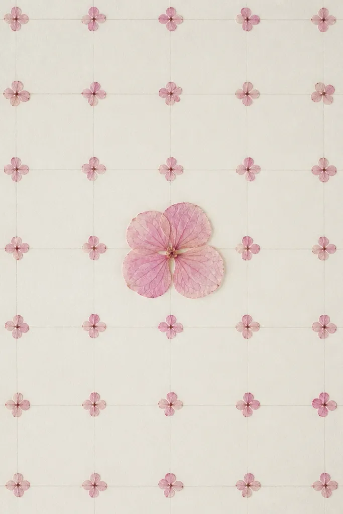
This one looks like handmade wallpaper when you stand back. The micro petal grid gives texture without heavy bulk, and the center flower anchors the pattern. I use blush and pale pink only, so it stays cohesive. It also photographs well because the repeated shapes create a clean visual rhythm.
Use very small petals or mini petals cut from pressed blooms. Mark a light grid on the back of the matte (not the front) with 1 cm squares. Place petals in alternating squares so it doesn't look like a sticker sheet.
Pro tipCut petals into consistent sizes with small craft scissors so the grid looks uniform.
AvoidAvoid big, chunky blooms in a grid - they break the pattern and make the frame look uneven.
6. Pressed Pink Book Page Backer with Floral Edges
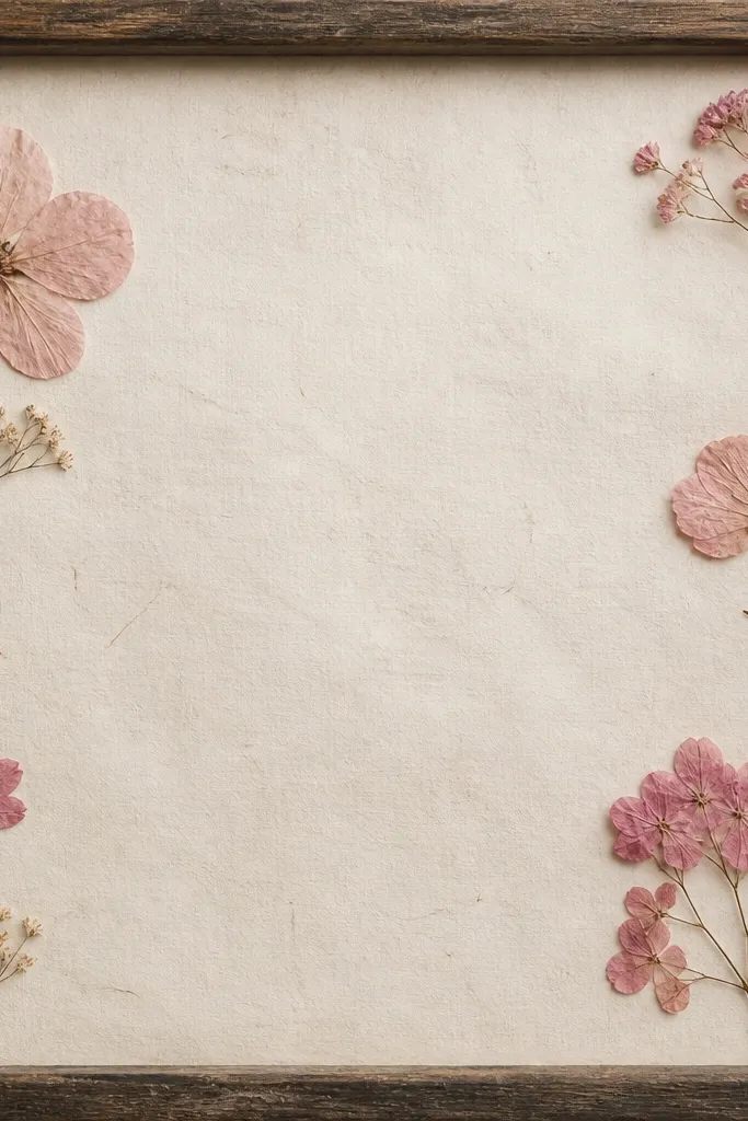
A paper backer adds depth and makes the pink petals look richer without adding more flowers. I've used old dictionary pages and vintage-style book paper, but I always seal it so it doesn't yellow the pressed blooms. The floral edges placement also keeps the design light. It feels like spring decor with a hint of vintage softness.
Use acid-free backing paper that looks like aged print (or print your own text on acid-free paper). Glue flowers around the perimeter - 1 bloom at each corner and thin filler petals between. Keep center mostly empty so the paper texture shows.
Pro tipSeal the paper backer with a clear matte medium before adding flowers so nothing smears when you glue.
AvoidAvoid glossy scrapbook paper - it reflects light and makes the petals look flat.
7. Hot Pink Petal Confetti Bottom Border
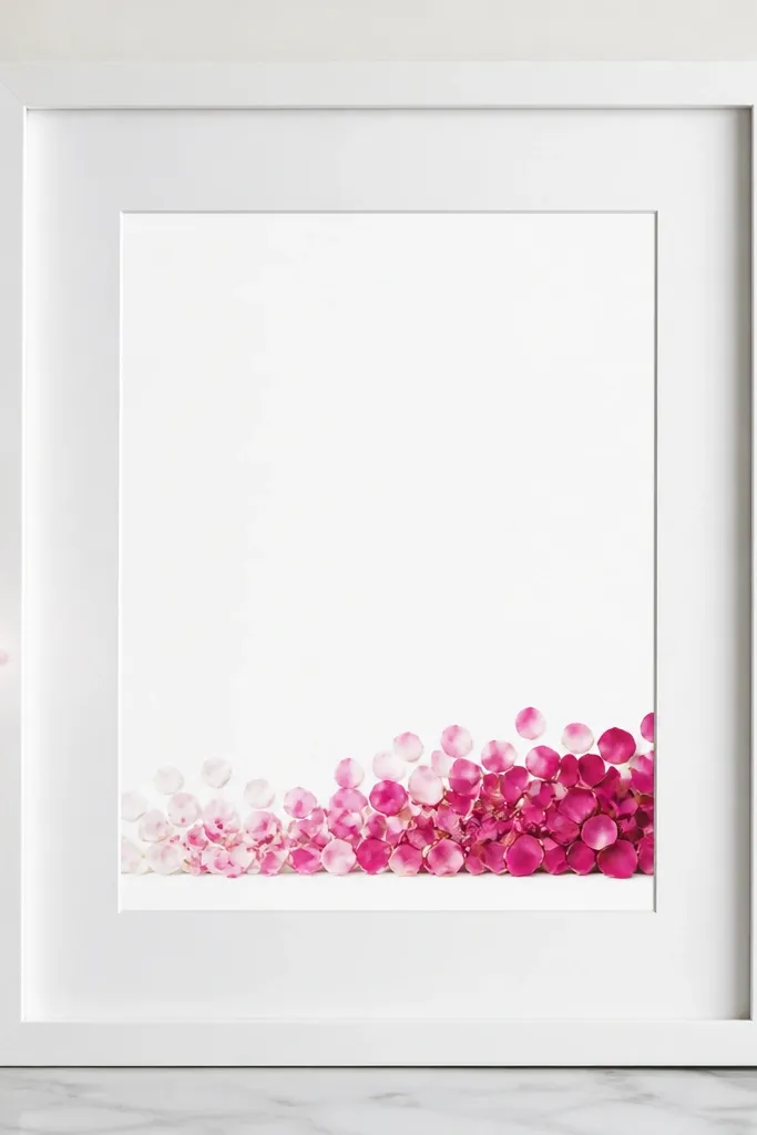
Bottom borders look great in rooms because they frame the rest of the wall. The confetti style gives a party feel without turning into a cluttered collage. I build this with hot pink at the center and fade to blush on the ends so the border feels dynamic. It also works for holidays because you can swap the flower types while keeping the same border structure.
Pick 15-25 small petal pieces so they form a textured line. Glue them in a gentle curve across the bottom, with the densest part in the center. Use lighter blush pieces on the left and right ends to create the fade.
Pro tipCut a few petals shorter than others so the border looks layered, not flat.
AvoidDon't make the border perfectly straight - a tiny wave looks handmade and prettier.
8. Blush Peony-Look Layered Cluster (3 Depths)
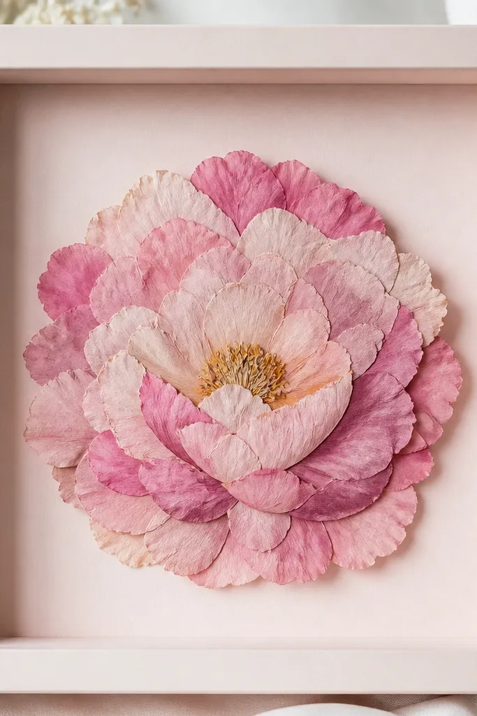
Layering pressed flowers gives you that fuller "peony look" even when the petals are flat. I make three depth levels by placing one flower flat, one on top with only the petal edges glued, and one tucked behind. The effect reads 3D without needing thick resin. This is my go-to for romantic season decor.
Use a shadowbox frame or a frame with enough depth for overlapping petals. Layer 1 larger blush bloom flat in the center, then add 1 medium dusty rose bloom slightly offset on top. Tuck a small pale pink filler behind the mound so it shows at the edges.
Pro tipUse glue gel sparingly. Press the top flower down for 10 seconds so it bonds without squeezing out.
AvoidAvoid stacking three big blooms directly on top of each other - you'll end up with a lumpy center.
9. Pink Flower Timeline with Tiny Buds at Intervals
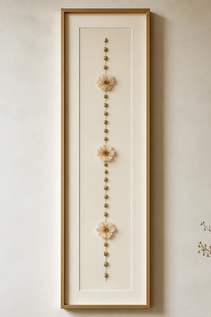
This design is simple but it looks intentional because the spacing is the whole pattern. Tiny buds at regular intervals create order, and bigger blossoms mark "events." I keep everything in pink shades and use one off-white bud as a highlight so the line doesn't blur into one pink stripe. It's great for a tall wall or a hallway shelf.
Use a vertical frame around 8x16 inches if you can. Place the first tiny bud near the top, then space buds about 1.5-2 inches apart down the center. Add three slightly larger blossoms at the 1/3, 1/2, and 2/3 points of the vertical length.
Pro tipMark spacing with a ruler on the back of the matte so your intervals look even.
AvoidDon't crowd the top - the eye needs breathing room at the beginning of the line.
10. Blush Ombre V-Shape from Center
Ombre color planning makes pressed flowers look more "designed" than randomly placed. The V shape gives structure, and the color shift creates a soft gradient effect. I use pale blush at the bottom tips and deepen the shade as the V widens upward. It looks delicate, especially under natural light.
Place one small bloom at the top center of the opening, then build two arms that curve slightly outward. Each arm should have 4-6 flowers, starting pale at the bottom and moving darker as you go up. Leave a clear gap between the two arms so the V reads sharply.
Pro tipSort your flowers by shade before you start. It makes the ombre look smooth instead of patchy.
AvoidAvoid mixing random pink shades in the same arm - you lose the gradient.
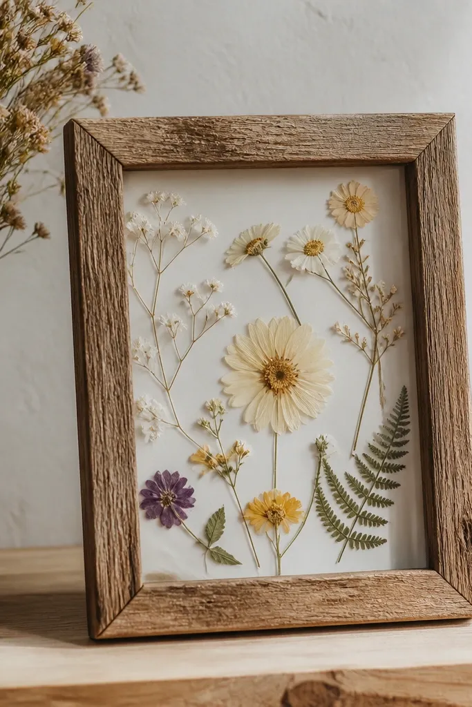
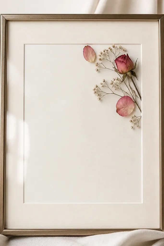
11. Pink Sprig Under Glass with Clean Border
If you want a frame that looks like it belongs in a gallery, keep it minimal. One sprig lets the viewer see the actual petal shape, and the empty border makes it feel modern. I pair a single rose sprig with tiny filler petals so it doesn't look bare. This style works for both spring and year-round because it doesn't scream holiday.
Use a frame with clear acrylic or glass so the petals look crisp. Position the sprig so it enters from the lower-left and exits at the upper-right, leaving about 1 inch of empty border on all sides. Glue only the base of the sprig and a few tiny petal edges.
Pro tipTrim the matte opening so the petals sit 1/4 inch inside the frame edge. It keeps the design centered.
AvoidAvoid overcrowding with extra flowers - minimal only works when it stays minimal.
12. Pressed Pink Floral Wreath for a Door-Shelf Look
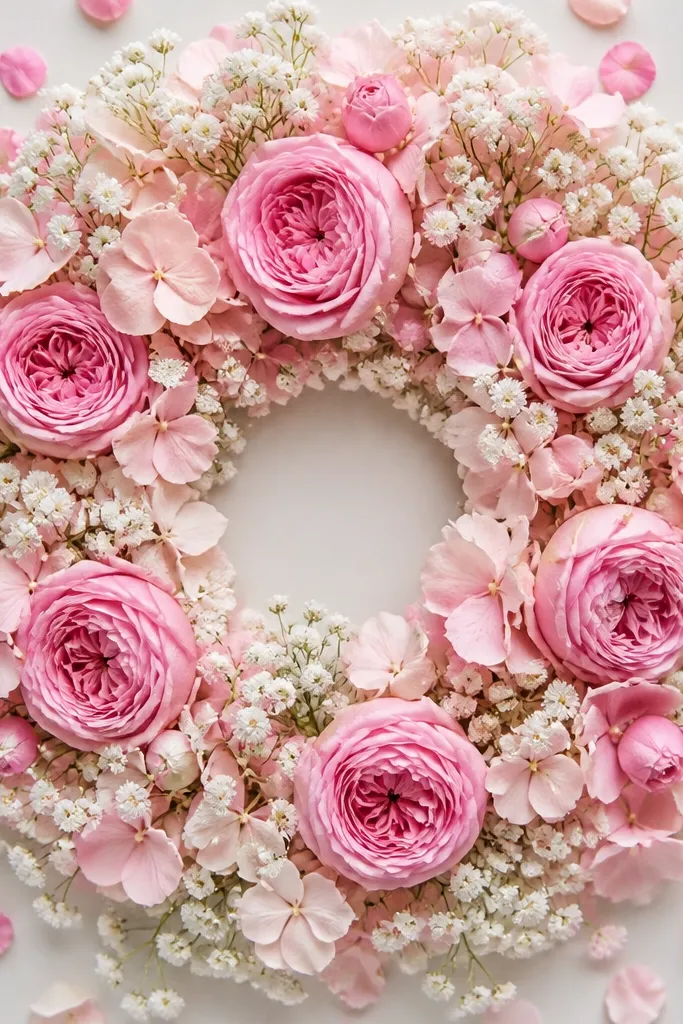
A wreath reads festive without adding any holiday symbols. The empty center gives structure, and the ring of pinks looks like soft garland. I like using a mix of rosebuds and baby's breath because the tiny bits fill the circle while the rosebuds keep the shape. This layout is also forgiving if some petals break - the ring hides imperfections.
Use a square frame with a circular arrangement. Create the circle first with baby's breath or small petals, then place 6-8 rosebuds evenly around the top half and a few around the bottom. Keep the center empty at least 2 inches wide for a clean wreath look.
Pro tipDry-fit the ring without glue. When it looks right, glue only the bottom contact points.
AvoidDon't fill the center - a packed wreath looks like a flower clump.
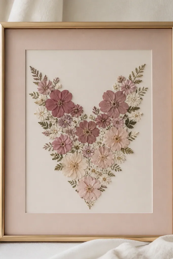
13. Dusty Rose and Blush Micro Flowers in a Heart Outline
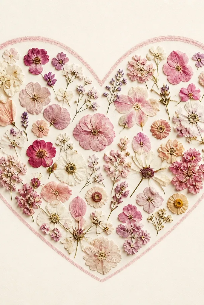
A heart outline gives you instant romance, but micro flowers keep it from looking chunky. I use dusty rose and blush micro blossoms so the heart edge looks soft instead of hard. The cream matte outside the heart makes the shape readable even from a distance. This is a sweet option for Valentine season and anniversaries.
Lightly draw a heart on the back of the matte. Fill the heart with small petals, working from the pointed bottom up. Leave a narrow margin around the heart outline so it doesn't bleed into the background.
Pro tipUse tweezers to place only the petal tips on the outline line, then fill inward.
AvoidAvoid using large flowers for the heart outline - they create thick lumps that look amateur.
14. Rosebud Frame Within a Frame (Double Mat Look)
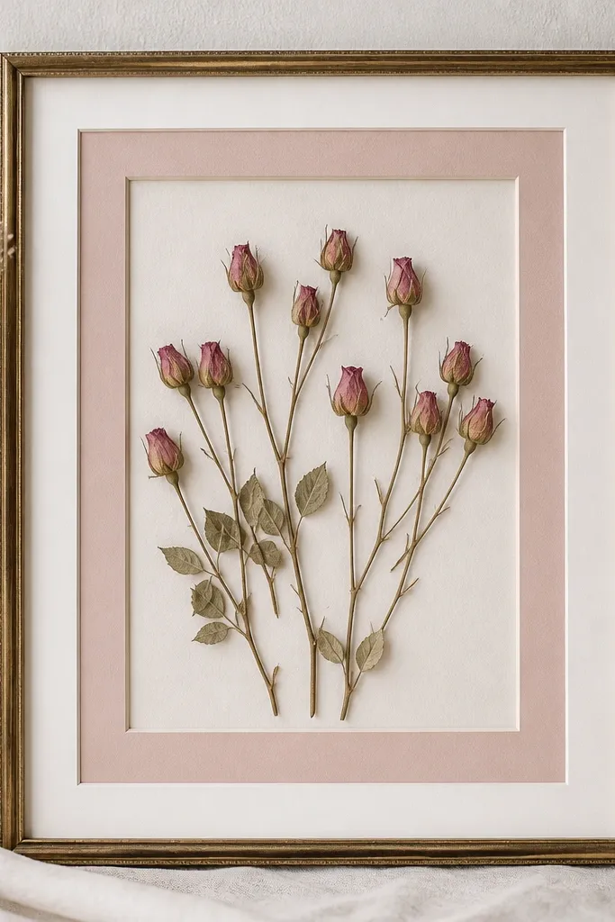
Double matting makes pressed flowers look more expensive because it creates a built-in border. The rosebuds feel like art, not craft, when they sit inside that inner window. I use a narrow inner mat so the petals still feel close and romantic. The outer mat stays crisp and clean, which helps the pink read clearly.
Buy or make a double mat: outer mat about 1 inch wide, inner window sized so flowers have room. Place 3 rosebuds clustered slightly above center, with tiny filler petals around them. Keep the inner matte background white or cream for the cleanest pink tone.
Pro tipCut your inner mat window with a sharp craft blade. Clean edges make a huge difference.
AvoidAvoid crooked mat alignment - it shows immediately in double-mat designs.
15. Pink Pressed Flowers with Handwritten Month Script at the Side
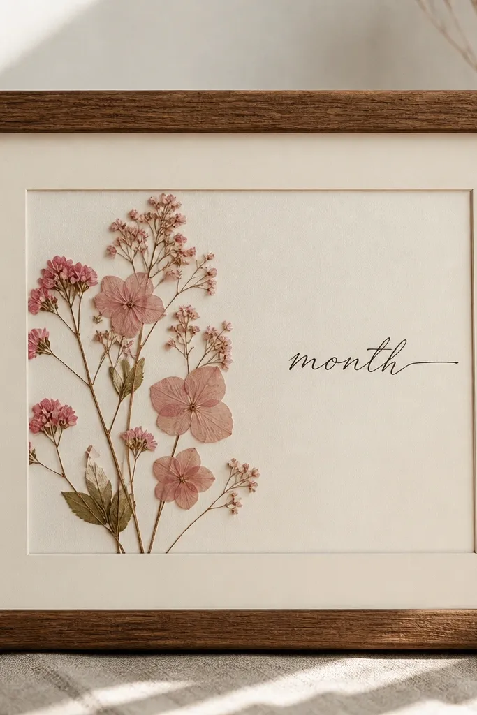
This one turns your pressed flowers into a keepsake without needing a photo. The handwritten month script gives context, and the flowers stay purely aesthetic on the side. I use dark gray ink so it doesn't fight the pink. The frame reads like a monthly memory display when you repeat the layout with different blooms.
Write the month on the matte using a fine-tip archival pen. Place pressed pink flowers on one side only - about 40% of the opening - and leave the other side clean for the text. Seal the flowers under clear cover so the ink and petals stay protected.
Pro tipPractice your handwriting on scrap matte first so the letter height matches the frame size.
AvoidAvoid wet ink that smears near petals - let the ink dry fully before you glue anything.