1. Sunburst stripe tote with 1-inch wedges
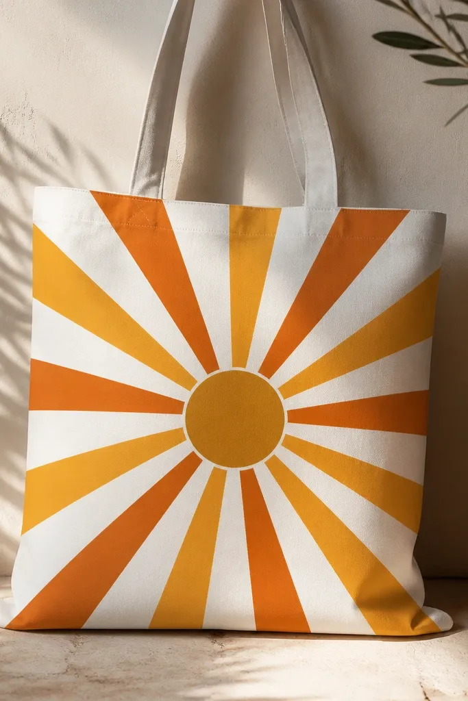
This one looks like store-bought screen print because the stripes are consistent in width. I paint 1-inch wedges, so the rhythm stays even from top seam to bottom fold. The burnt orange on warm white reads bold without needing extra details.
Mark a center point on the front, then draw 10-12 wedge lines with chalk. Mix acrylic paint with a tiny bit of fabric medium so it spreads but holds shape. Fill each wedge with a small flat brush, then let it dry fully before the next color.
Pro tipIf your stripes wander, stop and re-mark one wedge at a time - chalk lines disappear once paint goes on, so you need fresh guides.
AvoidDon't flood the fabric; pooled paint spreads and your wedge width turns into a blurry band.
2. Two-color ombre sky with sponge clouds
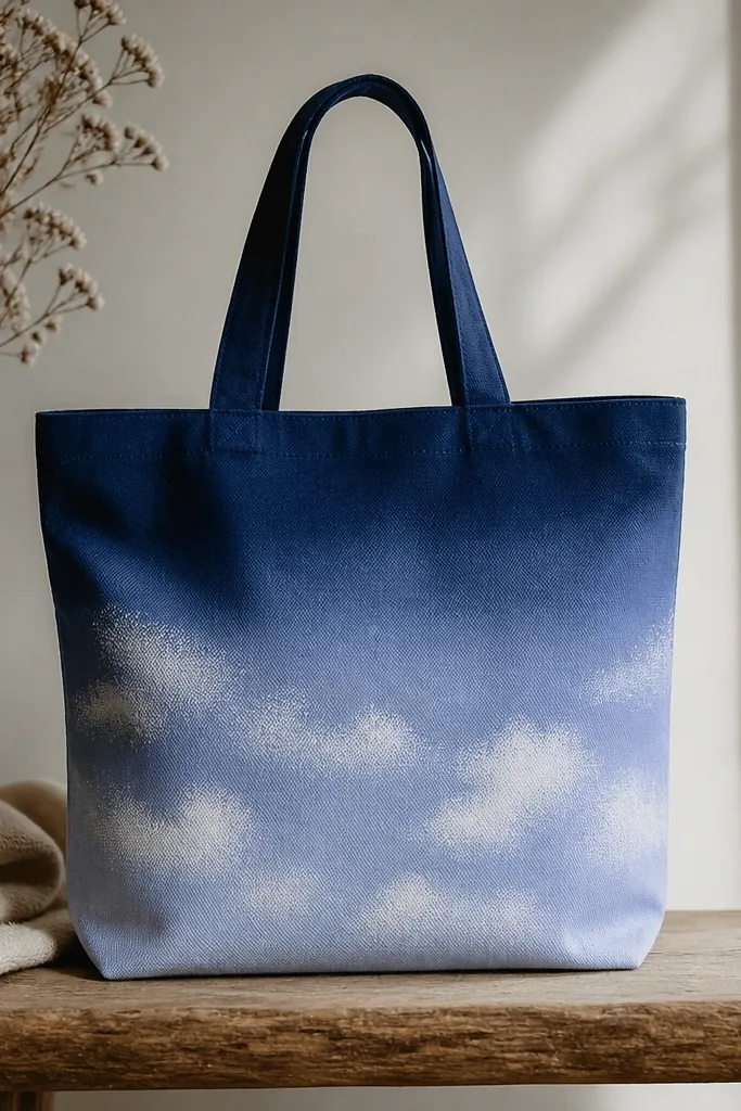
The ombre reads clean because you control the transition bands instead of trying to blend perfectly wet. Sponge clouds add a natural edge that doesn't need outlines, and the speckle looks intentional up close. Two colors only keeps it from getting muddy.
Paint the navy band first, then dry-brush periwinkle into it using a wide sponge. For clouds, dab a slightly lighter blue-gray over the sponge-painted area with a torn sponge edge. Leave small gaps in the clouds so the base shows through.
Pro tipUse a hair dryer on low for 30-60 seconds between layers so the sponge texture stays crisp.
AvoidDon't use too much water; watery paint soaks and blurs the ombre into patchy puddles.
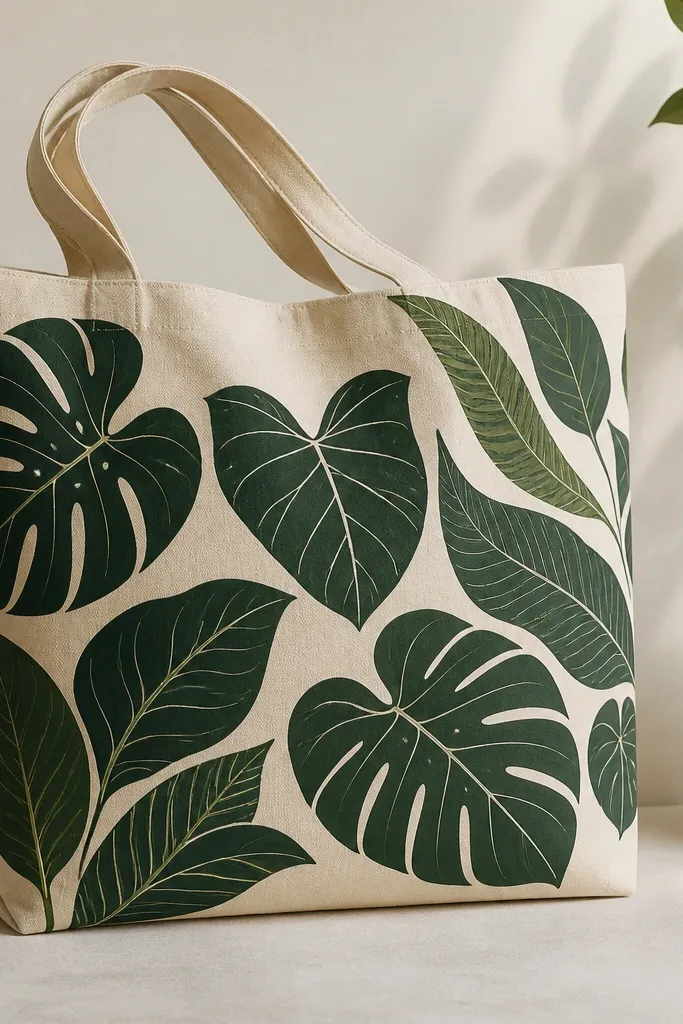
3. Botanical branch stencil with emerald leaves

A branch stencil works because the layout gives your eye a path - diagonal lines feel dynamic without extra clutter. Emerald + dark brown gives a classic "botanical print" look. The lighter green highlights make the leaves look dimensional even though it's just flat paint.
Tape stencil corners in place with painter's tape so it doesn't shift. Paint the branch with a fine liner brush, then stencil leaves along it. Add highlight leaves with a smaller brush, keeping highlights on the same side of each leaf for consistency.
Pro tipStencil paint should be dry-ish on the brush; press and lift quickly so you don't get ridged edges.
AvoidDon't try to freehand leaf veins on top of wet stencil paint; it smears and kills the crisp look.
4. Bold polka dot grid with painter's tape dots
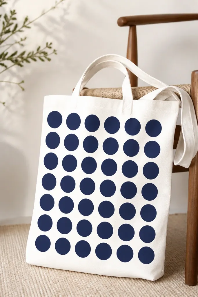
Painter's tape dots are the fastest way I've found to get real circles. The grid spacing makes the bag look designed, not doodled. Navy dots on white read graphic and stay readable even from a distance.
Cut small circles from painter's tape using a craft punch or trace with a coin and cut by hand. Press tape firmly, then paint over with a foam brush. Peel tape while the paint is still slightly tacky for the cleanest edge.
Pro tipDo two thin coats instead of one thick coat; thick coat can seep under tape edges.
AvoidDon't peel tape after the paint fully cures; you'll pull up paint and get ragged edges.
5. Marbled frame around a simple monogram
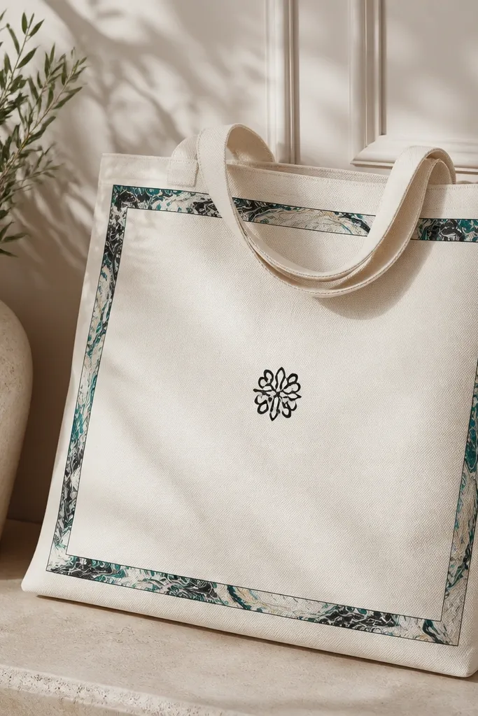
Marbling looks impressive because the frame draws attention, while the monogram keeps it from getting chaotic. I use a limited palette - teal + black + cream - so the marbling stays controlled. The thin frame makes the tote look polished instead of "crafty."
Paint the background cream first. For the frame, use a small sponge to dab teal, then black, then a few off-white streaks, keeping the rectangle edges crisp with tape. Finish with a simple monogram in black using a paint pen or liner brush.
Pro tipUse parchment paper under the bag so marbling doesn't transfer to the back side.
AvoidDon't overwork the marbled frame; too much blending turns it into one gray smear.
6. Galaxy tote with star dots and crescent moons
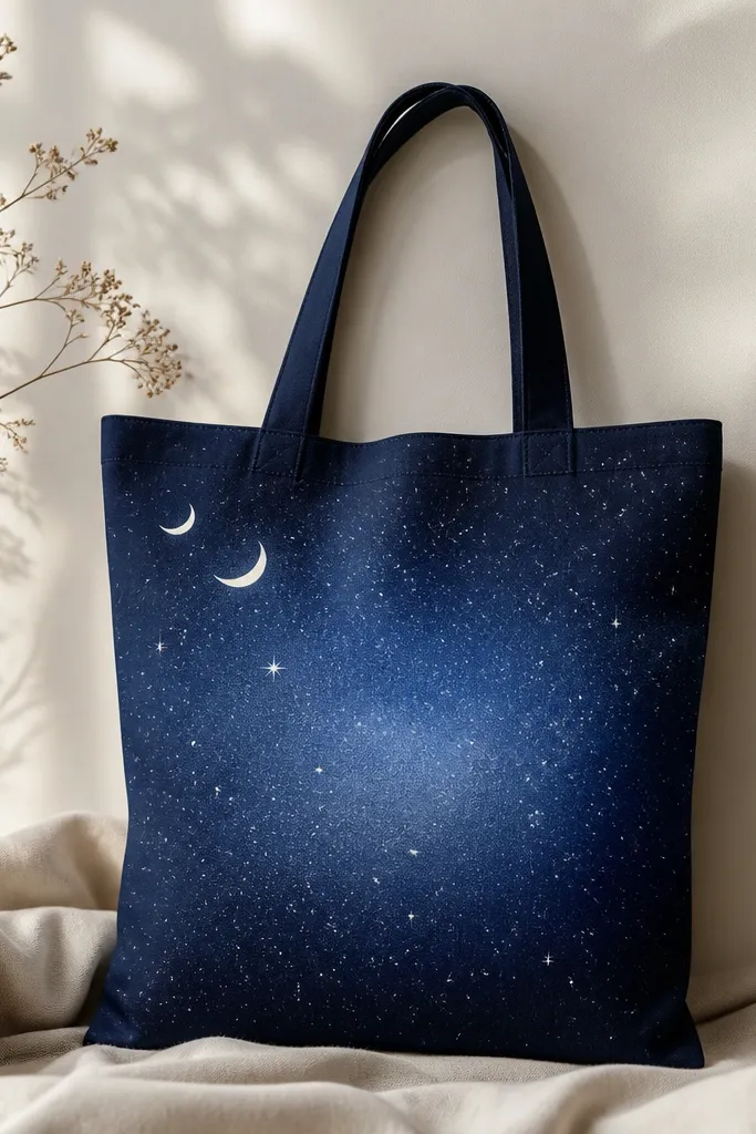
A galaxy bag works because the texture sells it - not just the colors. I do a gentle gradient first, then add star dots with a toothbrush for natural variation. Crescents keep it themed without needing a full planet scene.
Paint navy base, then sponge in lighter blue toward the center. For stars, load a toothbrush with white paint and flick over the tote. Add crescents with a stencil or a cut-out circle, painting the crescent shape with a thin brush.
Pro tipCover the back of the tote with cardboard so flicked paint doesn't hit the inside seam.
AvoidDon't spray too close for stars; it makes blobs instead of tiny points.
7. Minimal face line art with black paint pen
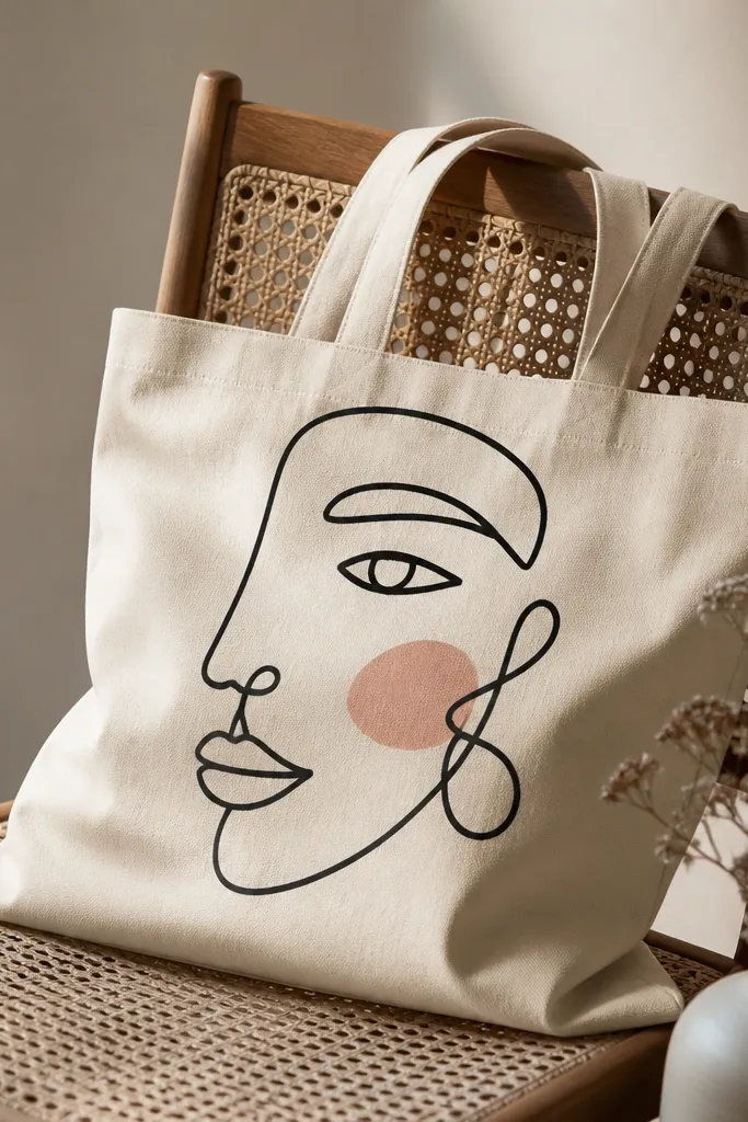
Line art looks expensive because the negative space stays clean. Black paint pen gives consistent line weight, and the tiny blush patch adds warmth without turning it into a cartoon mess. This design also hides small fabric texture, which I love.
Sketch lightly with chalk, then trace with a fabric-safe paint pen. Let the first line dry, then add a small blush using a dry brush with muted pink. If the pen bleeds, set the first layer with a quick iron pass through parchment.
Pro tipKeep line weight uniform by reloading the pen before it starts to lighten.
AvoidDon't go back over wet lines; it widens the line and looks like marker instead of paint.
8. Large watercolor flower using salt texture
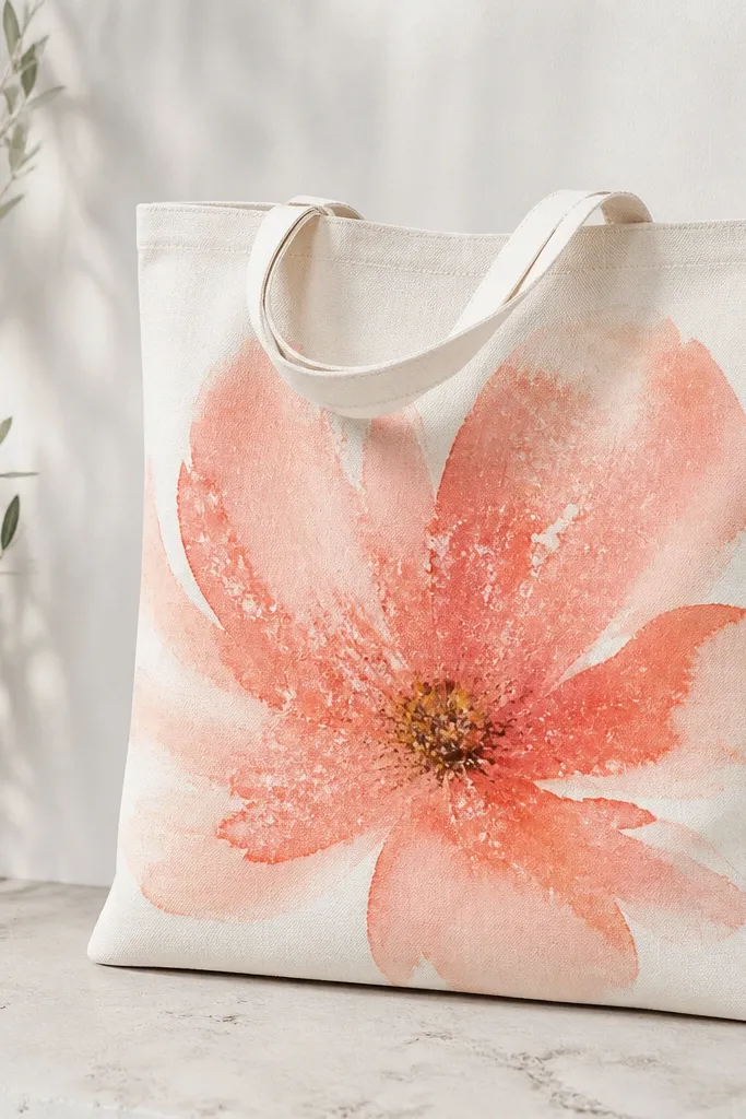
Salt texture gives a watercolor look without complex blending. The speckles appear inside the wet paint, so it looks like natural pigment granules. Coral + peach petals look soft but still pop against white.
Wet the petal area lightly, then brush coral across and peach at edges. Sprinkle coarse salt on top while paint is still wet. After it fully dries, brush off salt and seal lightly to stop any loose texture.
Pro tipUse coarse salt, not table salt - the texture is bigger and shows up clearly.
AvoidDon't move the tote while the salt is on; the speckles smear and turn into streaks.
9. Retro picnic stripe with scalloped bottom border
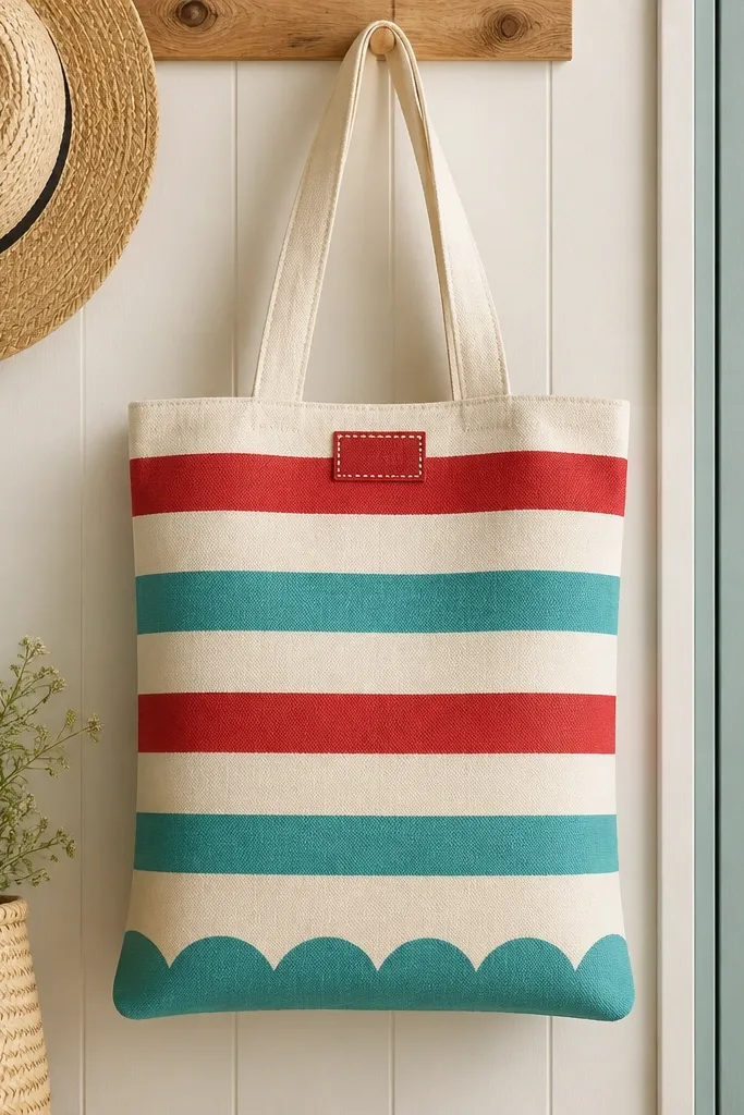
Scallops make the bag feel vintage and playful, and the stripes give it that picnic vibe. I use three colors only so it stays readable and not messy. The scalloped border gives you a finished edge even if your tote stitching is slightly uneven.
Mask stripes with painter's tape, leaving consistent spacing. For scallops, use a bottle cap or a small circle stencil and repeat at the bottom. Add a small label rectangle in red with white dots using a dotting tool or the handle of a paint brush.
Pro tipPress tape edges down hard with a credit card so paint doesn't creep under.
AvoidDon't paint over tape when it's loose - lifting tape edges create jagged stripes.
10. Geometric triangles with fabric medium grip
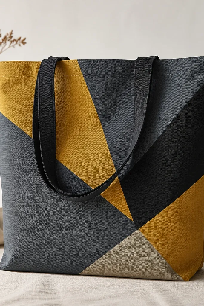
Triangles look bold because they create movement across the tote. Fabric medium helps the paint grip the weave so it doesn't crack when the tote flexes. The highlight triangle keeps it from looking flat.
Tape off triangles with straight edges, then paint the largest triangle first. Use fabric medium mixed into each color so it stays flexible. Add a highlight by painting a slightly lighter shade on one edge of a triangle after the base dries.
Pro tipLet each taped section dry before removing tape so edges stay crisp.
AvoidDon't skip fabric medium on cotton if you want it to wash well; pure acrylic can crack.
11. Monochrome marble dots background
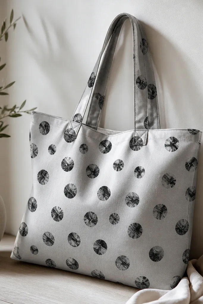
This is my "looks cool with no drawing skills" design. Dots hide uneven fabric texture, and the marble inside each dot makes it look hand-made instead of stamped. Monochrome keeps it classy on everyday outfits.
Paint the tote light gray first. For dots, use a round sponge or a dot stamp lightly loaded with black. While black is still wet, drag a toothpick through each dot for a tiny swirl effect.
Pro tipWork in small sections so the dot marbling stays wet while you add the swirl.
AvoidDon't overdo the toothpick - too many strokes turn the dot into a blob.
12. Rainbow wave bands with rag blending
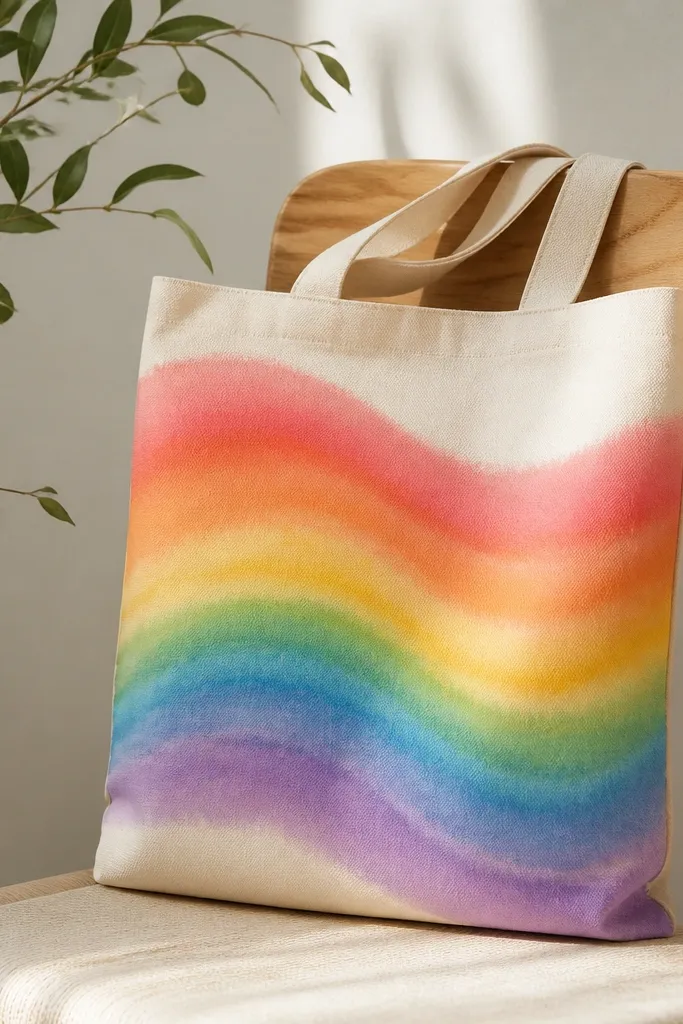
Wave bands feel fun and movement-y, but the rag blend keeps it from looking like tape lines. I paint bands in order and blend the boundary while paint is still wet. The rag makes the gradient look like fabric dye.
Mask a gentle wave line using chalk first so the curve stays consistent. Paint each band in thin layers, then use a slightly damp rag to soften the boundary between two adjacent colors. Let it dry, then do a second thin pass if any band looks patchy.
Pro tipUse a rag that's not fluffy; lint specks show up on light totes.
AvoidDon't blend after paint fully dries; you'll get harsh stripes and smudgy edges.
13. Cherry cluster with tiny leaf accents
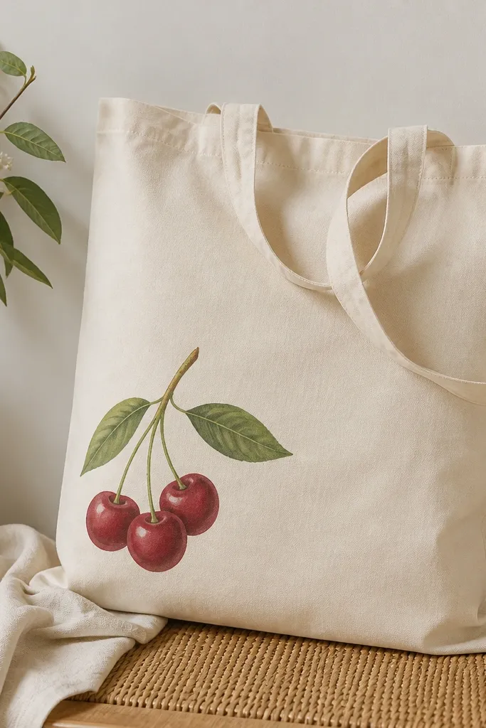
Cherry art works because the shapes are small and repeated, which hides slight brush variation. Highlights on each cherry make it look glossy without using expensive mediums. Tiny leaves add balance so the cluster doesn't sit like a sticker.
Paint cherry stems first with a thin liner. Add red circles for cherries, then dab small white highlights on each one after the red dries. Add green leaves by painting an almond shape, then dragging a slightly darker green line down the center.
Pro tipUse a toothpick for the highlight dots; it gives you a clean, round speck.
AvoidDon't paint highlights over wet red; the highlight turns pink and fades.
14. Color-blocked tote with one oversized letter
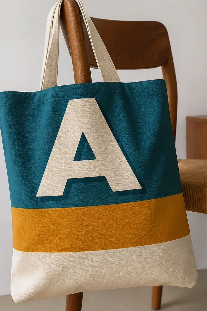
One oversized letter makes this tote look intentional even if your hand isn't steady for detailed art. Color blocks hide minor fabric wrinkles because the shapes are large. A faint shadow makes the letter pop without adding clutter.
Tape horizontal blocks, paint bottom to top, and let each layer set before removing tape. For the letter, use a stencil or cut vinyl stencil with painter's tape. Add a shadow by brushing a darker teal around the letter edges with a small sponge.
Pro tipSpray a light coat of fabric sealant after the final cure so the edges don't scuff.
AvoidDon't use neon colors next to each other; they can look harsh and make the letter look dirty.
15. Stencil city skyline with night lights dots
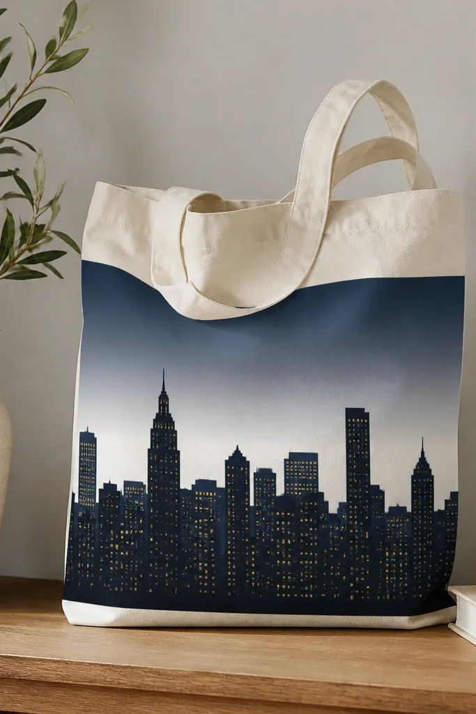
City skylines look crisp because stencils keep building edges straight. Yellow window dots add life, and the gradient behind them gives depth. It reads like a poster, but it's simple to paint in layers.
Paint the sky gradient first using a sponge. Then stencil the skyline in black. Use a dotting tool for windows so you keep consistent window size and spacing.
Pro tipPractice the stencil alignment on paper first; skyline stencils shift if you start crooked.
AvoidDon't paint windows over wet black; the dots smear into streaks.
16. Tropical leaves with white outline pop
White outlines make leaves look clean even on textured fabric. The contrast is what sells this one - the leaves look like a design print, not a brush painting. I keep the palette to dark green and one lighter green so it stays cohesive.
Paint leaf shapes in dark green first. For veins, add lighter green lines with a small round brush. Once dry, go back with white paint and a thin liner to trace the outline.
Pro tipThin your white paint slightly so it flows for outlines without clumping.
AvoidDon't outline too early; wet green underneath makes the white look gray.
17. Café latte face with foam swirl
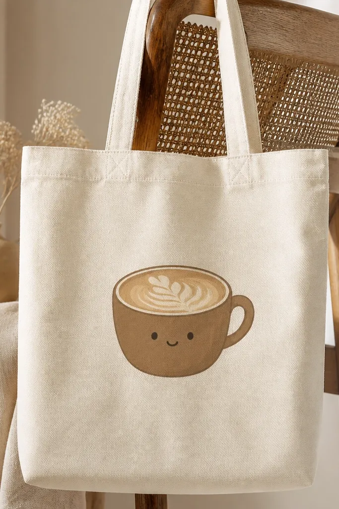
Food art is forgiving because people read the shapes quickly. The foam swirl gives texture, and the face keeps it playful. I like brown for the cup and a creamy off-white for the foam so it doesn't look like muddy gray.
Outline the cup with a fine brush in dark brown. Fill the cup interior with medium brown. For foam, sponge a lighter beige across the top, then add swirl lines in white with a small brush or paint pen.
Pro tipCenter the cup using chalk marks on the tote - the bag shape can trick you once it hangs.
AvoidDon't over-detail the face; two eyes and a small mouth look better than tiny features.
18. Maroon and cream half-arch with dots
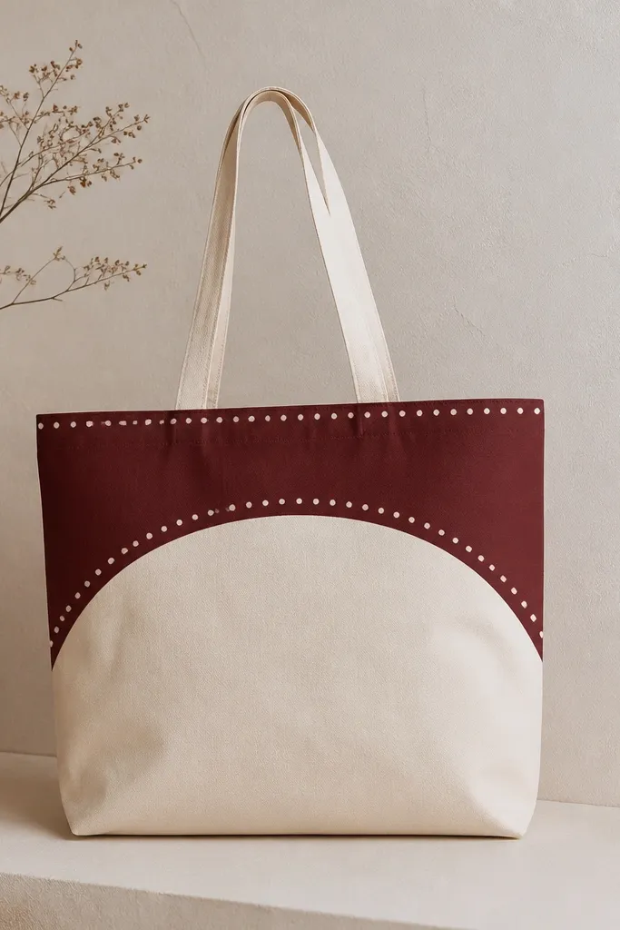
Half-arches feel modern because they're graphic and simple. Dots add a little motion and fill space so the arch doesn't look lonely. Maroon + cream looks good on both casual and dressy outfits.
Mask a half-arch using tape and a flexible curve template. Paint the arch maroon, remove tape, then add white dots along the arch with a cotton swab tip or dot tool. Let the dots dry before sealing.
Pro tipMake dots by pressing straight down, not dragging - dragging turns them into commas.
AvoidDon't use glossy craft paint; shine makes it look cheap on fabric.
19. Lettering in a paint-splatter border
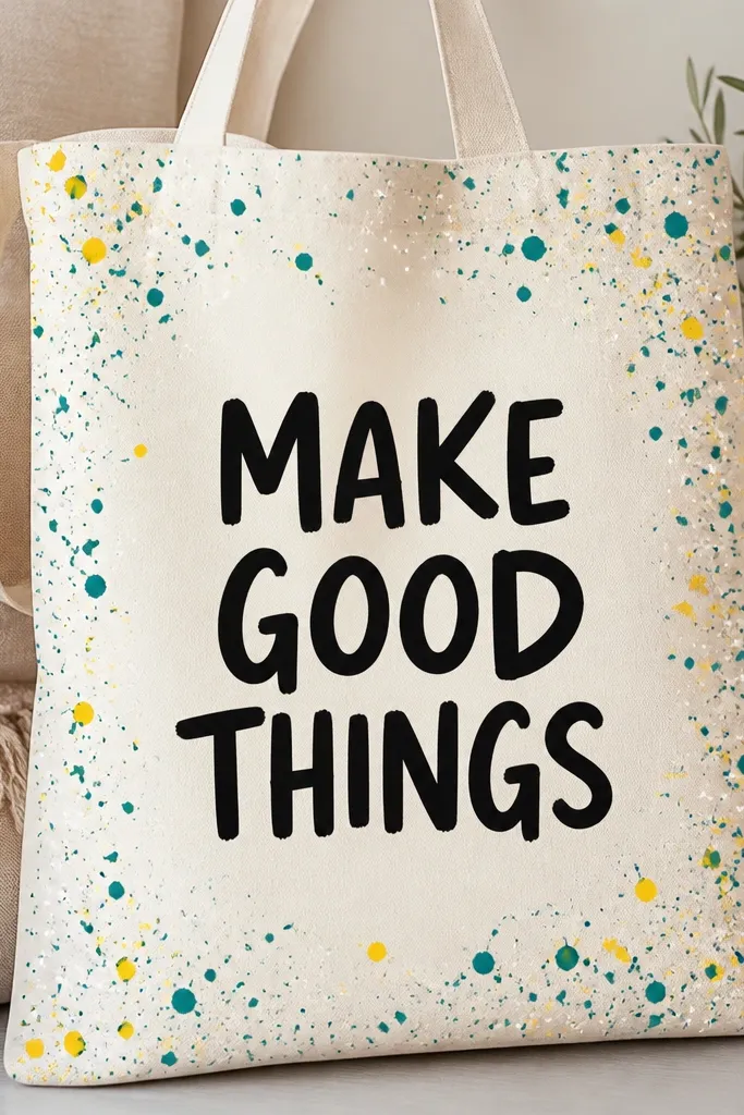
A splatter border frames the lettering and makes the tote feel celebratory. It works because the center stays solid and readable. I keep splatter colors limited so it doesn't turn into random mess.
Paint your center lettering first using a thick brush or paint marker. Protect the lettering with paper while you splatter around the edges. Flick paint with a toothbrush from a consistent distance so the splatters are the same size.
Pro tipTape a cardboard shield inside the tote so splatters don't hit the back panel.
AvoidDon't splatter over a wet background; it smears into a stain.
20. Navy waves with white dry-brush foam
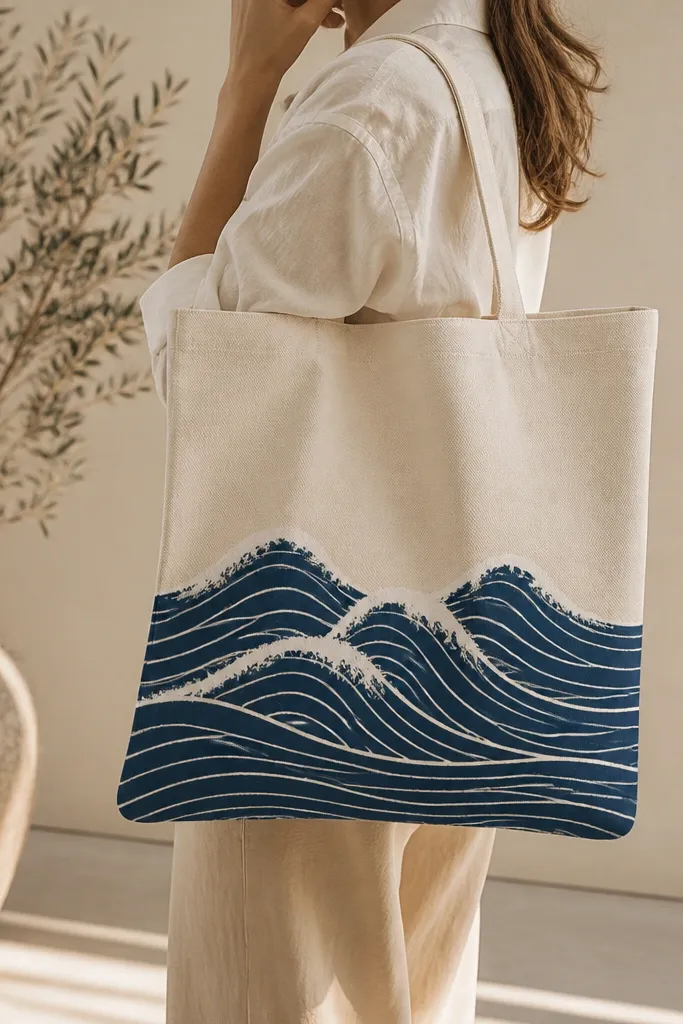
Dry-brush foam looks like sea spray because it's broken texture, not smooth paint. Navy waves keep it calm and wearable, and the white foam adds contrast. This is one of those designs that looks better the more your brush is slightly imperfect.
Mark wave lines lightly with chalk. Paint the navy waves as thin curves, then dry-brush white on top of the wave crests. Keep the dry brush mostly unloaded so you get speckled foam instead of thick white stripes.
Pro tipTest the dry-brush on scrap fabric - you want faint specks, not big opaque chunks.
AvoidDon't use a wet brush for the foam; it turns into a solid white smear.


