1. Sunset tape-block stripes with a crisp horizon
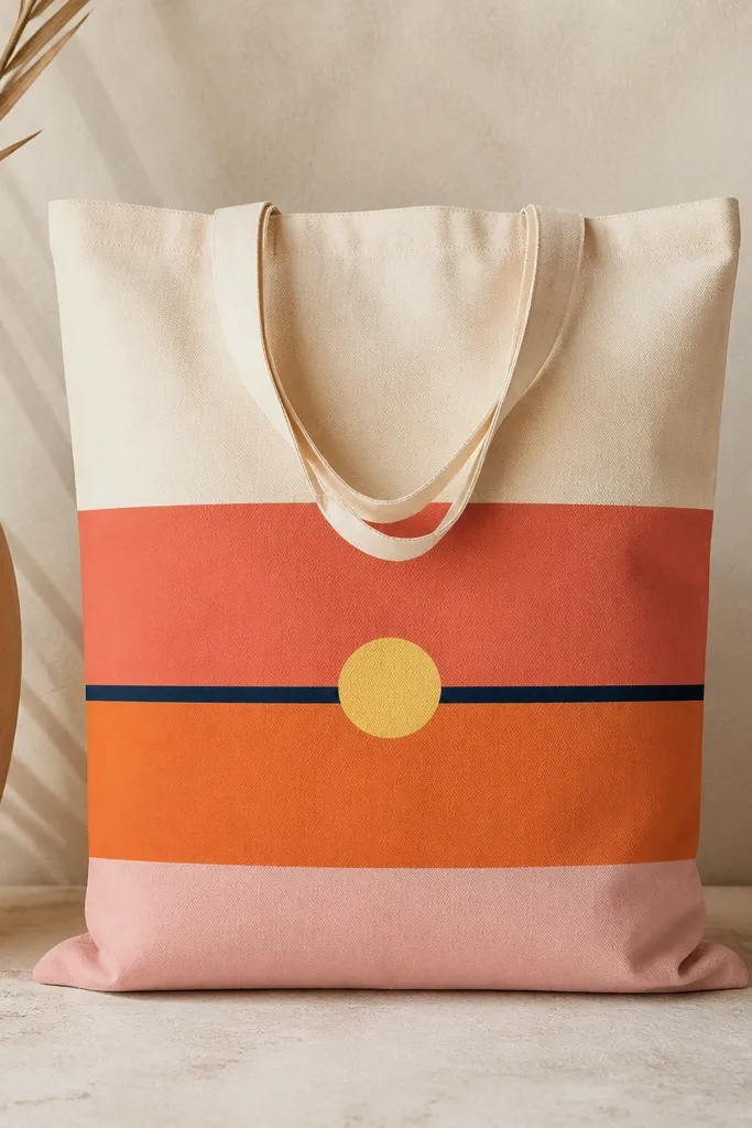
This design looks polished because the edges are straight and the color transitions are simple. I use tape for the borders, then paint each band with a flat brush so the surface stays even. The navy horizon line gives the whole tote structure, even though the palette is warm and playful.
Start by marking the horizon with a pencil, then lay painter's tape along the line and at the top/bottom of each stripe. Paint coral (top), orange (middle), and soft pink (bottom) with a light hand, then remove tape while the paint is still slightly wet. Add a 2.5-inch pale yellow sun circle centered on the horizon and outline it with a thin navy ring.
Pro tipPress the tape down with a plastic card so paint doesn't creep underneath.
AvoidDon't wait for paint to fully dry before peeling tape - you'll get jagged edges.
2. Lemon branch line art with tiny leaf dots
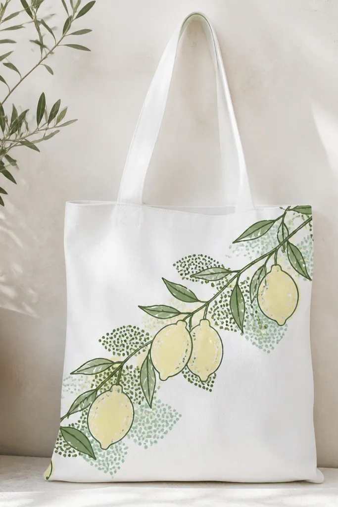
Line art like this reads stylish because it stays airy. The dark outline keeps lemons from looking flat, and the dot shadows add texture without heavy shading. The mint and olive dots make the piece look intentional instead of "just cartoon fruit."
Sketch a diagonal branch from upper left to lower right. Paint lemon bodies with pale yellow, then outline with dark green. Add tiny leaf shapes in olive, then dot mint beside them for shadow - keep dots small (1-2 mm).
Pro tipUse a liner brush and keep your lines consistent thickness by loading paint lightly.
AvoidSkip thick outlines everywhere - if the outline is too heavy, the tote looks crowded.
3. Monochrome wave wash with navy dry-brush edges
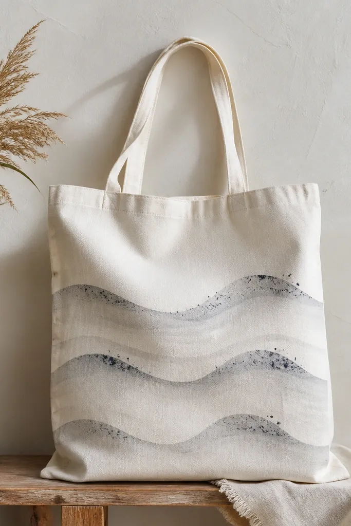
A monochrome wave wash looks modern because it's mostly one tone with controlled texture. The dry-brush foam effect gives movement without complicated details. It also hides small brush marks better than bright color blocks.
Paint three horizontal wave bands using thinned gray acrylic (about 1:1 paint to water or use a fabric medium). Once tacky, use navy on a mostly-dry brush to flick along the crest edges. Add one thin white line where you want the brightest foam.
Pro tipPractice one wave crest on scrap fabric first so you nail the flick pattern.
AvoidDon't overwork wet paint - repeated strokes turn foam into a muddy blob.
4. Pastel botanical sprigs with a single black stem
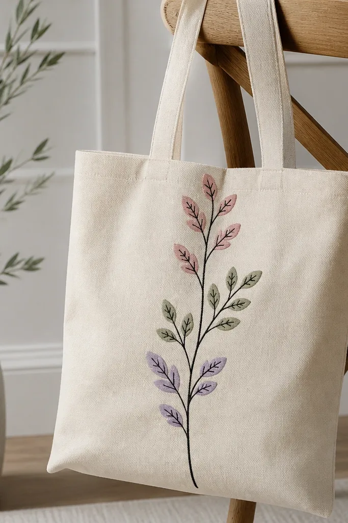
This design is stylish because it's anchored by one bold stem line. The pastel sprigs stay light and wearable, and the black vein lines add structure. It looks great on bags you'll carry to brunch or a casual workday.
Draw one central stem about 1/2-inch wide using a brush or paint marker. Add 5-7 sprigs branching left and right, keeping each sprig under 3 inches tall. Paint sprigs in pastel colors, then add one vein line per sprig in black for consistency.
Pro tipKeep sprigs spaced evenly - gaps matter more than extra details.
AvoidDon't use too many black lines - if every leaf has veins, it gets busy fast.
5. Retro rainbow arc with hand-lettered "hello"
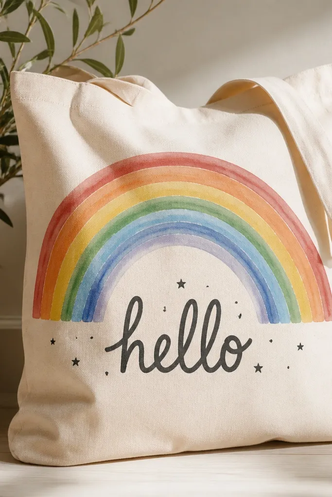
The rainbow arc makes the tote feel cheerful, but the hand-lettered word stops it from looking like generic clipart. Use charcoal or dark gray for the lettering so it doesn't compete with the colors. Star dots add charm without needing extra illustrations.
Mask a wide arc using tape or draw with a string compass. Paint thick bands of red, orange, yellow, mint, and sky blue. Let dry, then letter "hello" centered below in script - keep letters about 1 inch tall. Add 6-8 small star dots around the word.
Pro tipIf lettering scares you, paint the word with a stencil first, then refine a couple letters freehand.
AvoidDon't blend rainbow colors into each other - clean separation looks more retro.
6. Black-and-white checker pocket panel
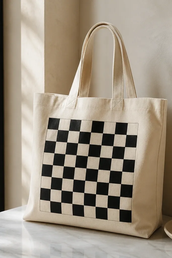
A checker panel is stylish because it's graphic and controlled. Keeping it inside one rectangle makes it look like a design feature, not a random doodle. The high contrast also photographs well for social posts and quick outfit pics.
Measure a front panel about 7 x 10 inches. Tape the rectangle, then mark a grid of 1-inch squares. Paint alternating squares with matte black and off-white acrylic, letting each row dry before the next to avoid smears.
Pro tipUse a ruler and tape down each grid line - crooked checks scream "I rushed."
AvoidDon't paint checkers over heavy wrinkles - iron the tote first if it's creased.
7. Watercolor ombré corners with splatter restraint
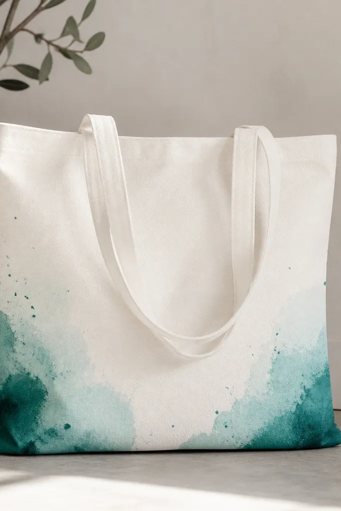
Corner ombré looks stylish because it frames the tote without filling the whole surface. Teal-to-aqua gradients feel calm, and restrained splatter adds texture like paint on paper. This is a good option when you want something pretty but not loud.
Lightly dampen the corner with water (or use a wet brush) and apply teal acrylic thinned with fabric medium. Drag the color outward with a damp brush to create the fade. When it's semi-dry, flick a tiny amount of teal on the corner - keep splatters within 3 inches of the corner.
Pro tipUse a separate brush for the fade so the teal doesn't turn the entire tote tinted.
AvoidSkip full-tote splatter - it makes the bag look messy instead of artistic.
8. Geometric triangle cluster with metallic gold accents
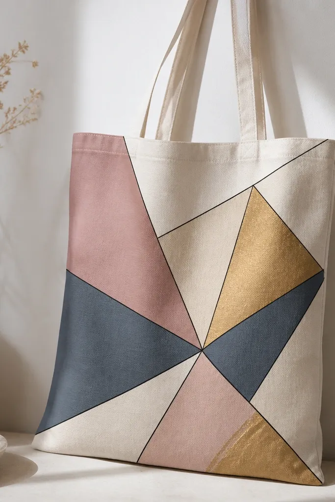
Geometric clusters look stylish because they're structured, and metallic accents catch light. The thin black separators keep the shapes crisp and make the colors pop without turning muddy. I like using metallic gold sparingly so it feels like jewelry, not confetti.
Sketch a loose triangle cluster about 10 inches wide. Paint large triangles with dusty rose and slate blue, then add cream triangles in between. Outline edges with thin black paint, then paint just two triangle corners with metallic gold.
Pro tipApply metallic gold with a small sponge or stipple brush to avoid streaks.
AvoidDon't outline every tiny edge with thick black - it kills the clean geometric look.
9. Small floral stamps using a foam brush and repeat pattern
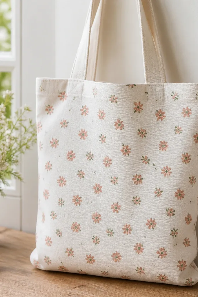
Stamp-style florals look stylish because they're consistent and subtle. A repeat pattern also hides minor paint variation across the tote. Muted coral plus soft green feels like spring without looking childish.
Make a simple flower stamp by cutting a small foam shape or using a craft stamp. Dab muted coral acrylic mixed with fabric medium onto the stamp and press lightly. Space flowers about 2.25 inches apart in rows, then add tiny green dot centers and a few leaf stamps.
Pro tipStipple the stamp - don't drag it - so edges stay crisp.
AvoidDon't overload paint on the stamp - thick blobs dry darker and look uneven.
10. Portrait-style face in profile with soft peach shading
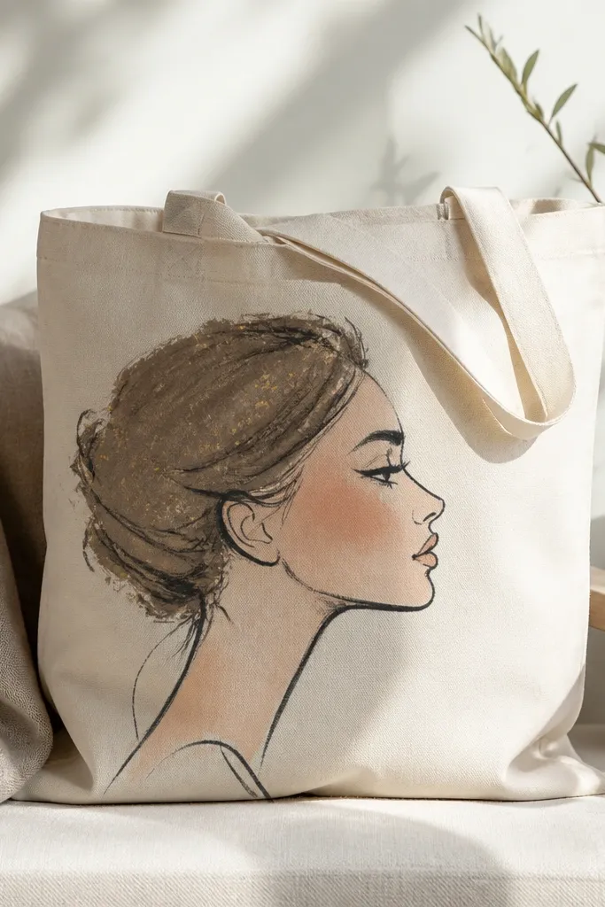
A single painted face feels fashion-forward when you keep it minimal. Charcoal line work keeps it classy, and peach shading adds warmth without needing complex realism. Gold specks in the hair give a subtle glow that looks great in daylight.
Draw a profile face about 8 inches tall centered on the bag. Use charcoal for outlines, then fill cheeks and nose shading with peach acrylic thinned slightly. Paint hair with muted brown, then add gold specks using the tip of a small brush.
Pro tipDo one layer at a time - thin shading first, then deepen only the hair and jaw line.
AvoidSkip heavy black fills - solid black on fabric can look harsh and cheap.
11. French stripe border with tiny anchors at each corner
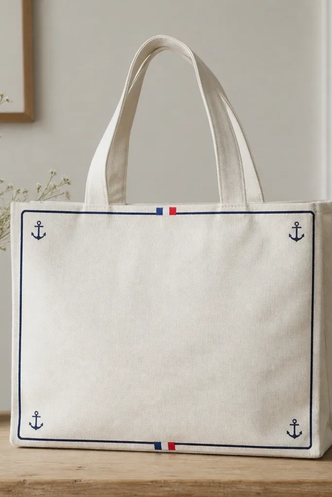
Borders look stylish because they frame the bag like a design label. French stripes add a classic nautical vibe, and anchors keep it themed without covering the whole tote. It looks clean even when you carry it daily and it gets scuffed.
Mask a border about 3/4-inch from the tote edge. Paint a top and bottom stripe band in alternating navy and cream. Add tiny anchor drawings in each corner - keep them under 2 inches tall so the border stays the focus.
Pro tipUse a corner ruler trick: tape two short strips to form a right angle before painting near seams.
AvoidDon't paint over seams with thick paint - it cracks where the tote folds.
12. Tie-dye inspired spiral using tape resist
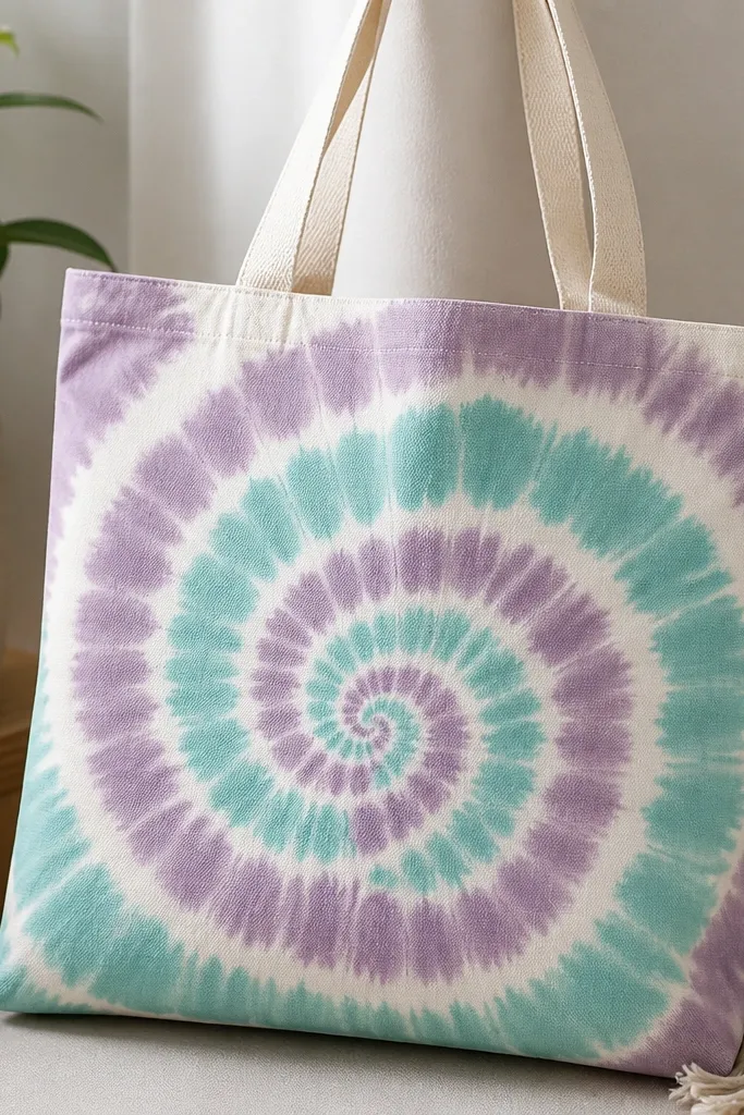
Tape-resist spirals look like tie-dye but with cleaner lines. The white gaps make the pattern read clearly and keep it from turning into a watercolor mess. Pastel purple and aqua look trendy and stay wearable.
Mark a circle center on the front, then plan a spiral path. Lay tape along the spiral lines so you create white channels. Paint between tape bands with watered purple and aqua mixed with fabric medium, let it soak in, and peel tape after it's no longer wet.
Pro tipPress tape down hard and overlap ends slightly so colors don't bleed.
AvoidDon't use glossy paint for resist - it can slip under tape and blur the spiral.
13. Botanical butterfly with marbled wings
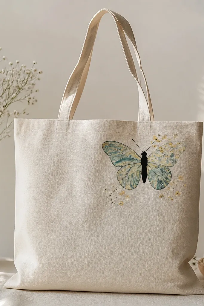
Butterflies look stylish when the wings have texture instead of flat color. Marbling gives that organic, collectible-art feel. Keeping the body black and simple makes the wings the star.
Paint a butterfly outline in black about 6-7 inches wide. For wings, use a marbling method: dab thinned paint colors onto a plastic sheet, swirl with a toothpick, then press the wing area with a sponge or directly paint the marbled look with a loaded brush. Finish with small flower dots.
Pro tipPractice on paper first - marbling timing matters more than drawing skill.
AvoidDon't over-saturate the tote with too much water - it can warp thin fabric.
14. Monogram in bubble letters with shadow offset
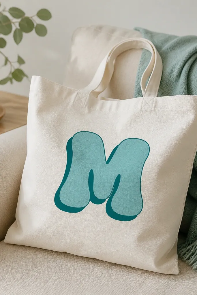
Monograms look stylish because they personalize the bag instantly. The shadow offset gives depth without needing gradients. Bubble letters keep it fun, but the clean two-color system keeps it looking grown-up.
Choose a letter height around 9 inches. Paint the main monogram in teal, let dry, then paint a shadow behind by offsetting 1/4-inch down and right using a darker teal. Add a thin white highlight line inside one curve for extra pop.
Pro tipUse painter's tape to block the shadow shape so the offset stays even.
AvoidAvoid freehand shadow - uneven offsets make it look sloppy.
15. Ink-style city skyline with one spotlight window
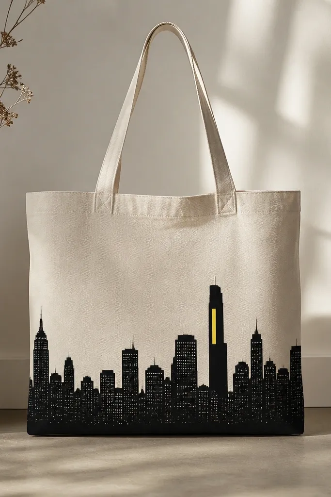
City skylines are stylish because they feel artsy but still simple. Dot windows read cleanly on fabric, and one bright yellow spotlight adds drama. The skyline also works well on totes you use for travel or errands.
Draw a skyline band across the lower third using black acrylic. Vary building heights with quick strokes. Add window dots with a fine brush or toothpick tip. Paint one spotlight rectangle in bright yellow on a tall building and add a thin black outline.
Pro tipKeep the skyline height consistent along the baseline so it doesn't look like it's leaning.
AvoidDon't add too many colors - one accent window is enough.
16. Minimal star map with coordinates and tiny moons
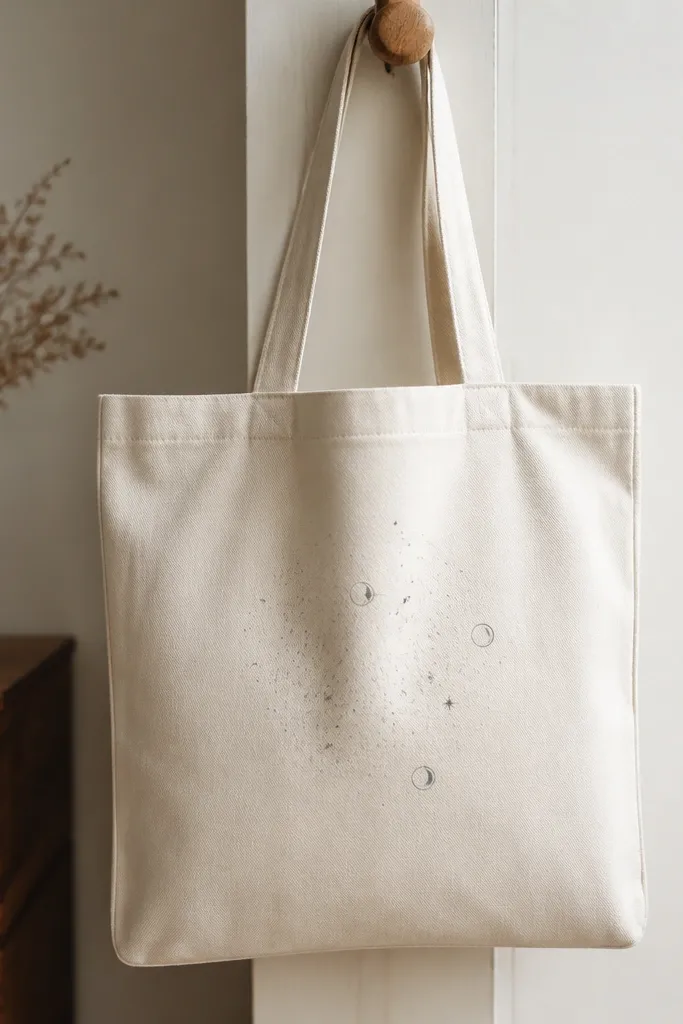
Star maps look stylish because they're subtle and graphic. The mix of faint gray dots and bright white stars creates depth, and the coordinate text makes it feel specific. Silver-gray moons add a cool night vibe without going overboard.
Paint a light gray grid or just a field of faint dots. Place a cluster of 10-15 dots, then add 3-5 larger white stars. Draw three tiny moons and include coordinate numbers in a small font (keep it short).
Pro tipUse a stencil for the numbers so the text stays crisp.
AvoidSkip long paragraphs of text - it makes the tote cluttered.
17. Oversized polka dots with a half-tone effect
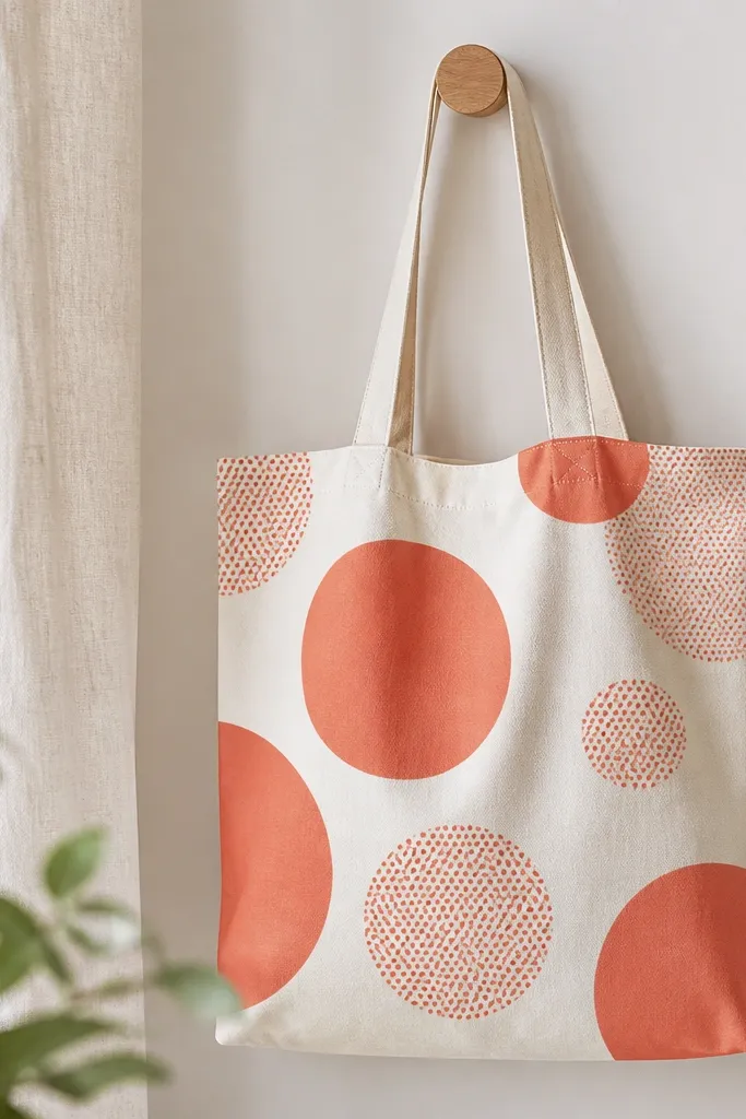
Half-tone dots look stylish because they add a printed poster vibe. Pairing solid dots with dotted dots gives contrast and keeps the design playful. It also hides small imperfections because dot patterns forgive uneven paint application.
Mask or draw 4-6 large circles across the front. Paint half in solid coral, and for the other half use a stippling technique: load a stencil brush with coral, dab small dots inside the circle. Leave off-white space between circles so it stays airy.
Pro tipUse a stiff brush and tap straight down for a clean dot edge.
AvoidDon't smear the dotted circles - dragging creates messy halos.
18. Safari stripes with a leopard print cuff
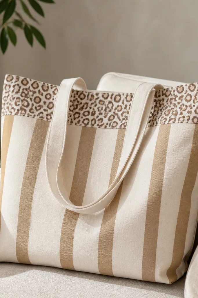
This combo looks stylish because it gives you two textures: stripes for structure and leopard spots for fun. The cuff at the top makes it feel like fashion trim. Use tan base plus warm browns so it stays cohesive.
Mask a middle stripe panel about 8 inches wide. Paint vertical tan stripes, then add leopard spots along the top edge only. Leopard spots should be small teardrops with a few inner dots - keep the pattern inside the cuff so it doesn't take over.
Pro tipStencil leopard spots with a small brush, then add tiny inner dots to make them look like real fur.
AvoidAvoid big clumsy blobs for leopard spots - small shapes look intentional.
19. Bold "CAPTION" style quote in block letters

Block quotes look stylish because they read fast and feel graphic. A thin white outline keeps black letters crisp on fabric, especially after sealing. One red underline adds a pop that looks like a design system.
Pick a short quote that fits across the front, around 10-12 characters. Outline letters first with a pencil grid, then fill with black. Add a thin white outline around the outside edges and a small red line under the baseline.
Pro tipUse a letter stencil for the first pass, then thicken two or three strokes by hand so it looks less machine-made.
AvoidDon't skip the outline - black-only letters on cream fabric can look flat and slightly messy.
20. Retro cassette tape with rainbow speaker waves
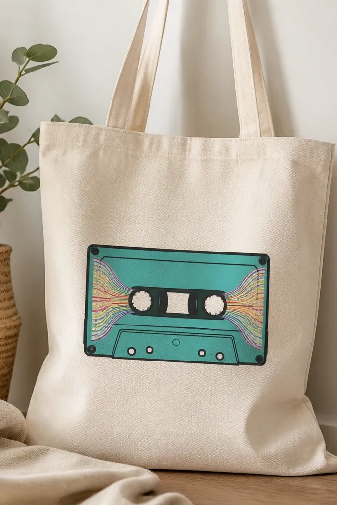
This is stylish because it's a recognizable icon with a clean color plan. The cassette outline keeps it from looking childish, and rainbow speaker waves add motion without covering the whole bag. It's great for music lovers and weekend bags.
Draw a cassette rectangle about 6 inches wide. Paint teal body, add black outline, and two small silver reels. For the speaker area, paint wave lines in red, orange, yellow, green, and blue - keep waves inside a small circle so it stays tidy.
Pro tipUse a round sponge to paint the teal evenly so the cassette doesn't look streaky.
AvoidDon't make the rainbow waves too tall - they should sit in the speaker area only.
21. Coastal stripe with rope border and tiny shells
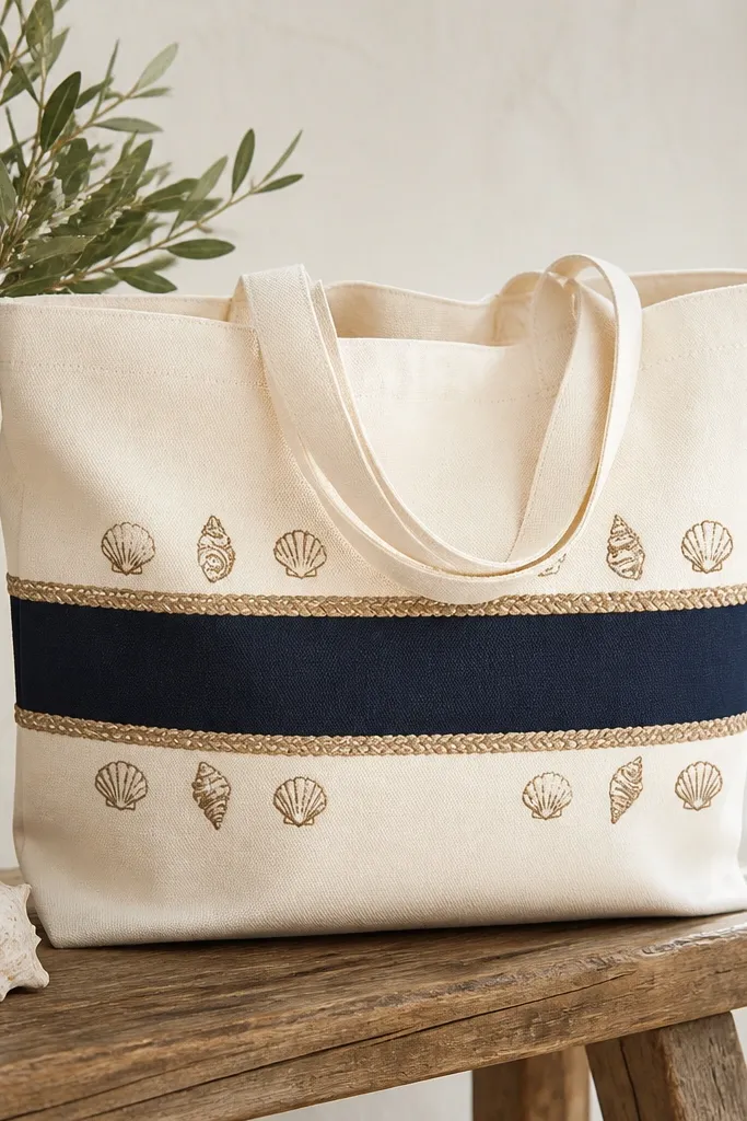
Rope borders look stylish because they mimic texture without messy fabric work. The navy stripe gives a strong anchor, and the tan rope lines make it feel nautical but clean. Shell doodles add theme without cluttering.
Mask a navy stripe panel about 2.5 inches tall. Paint the stripe, then draw a rope border around it using a tan paint line that curves like twisted rope. Add 6-8 tiny shell outlines in tan and fill them lightly with pale peach.
Pro tipMake rope lines with a single consistent stroke and then add a second thinner line for twist detail.
AvoidSkip thick rope borders - they look like sticker edges instead of drawn rope.
22. Colorful confetti dots with one large painted letter
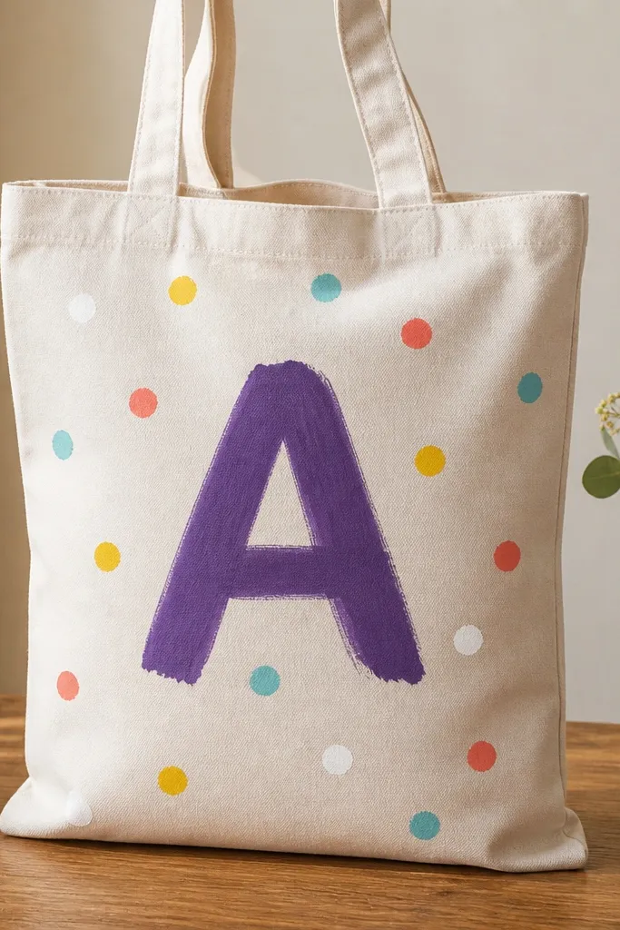
This design looks stylish because it has one clear focal point and lots of small energy around it. The confetti dots act like decoration, while the big letter keeps it intentional. It also works with any letter you want, so it feels personal.
Paint one large letter centered - about 8 inches tall - in deep purple. Add confetti dots around the letter using a toothbrush flick, but keep the dots within a 6-inch radius so it doesn't cover the whole tote. Mix bright colors with fabric medium so they stay flexible after sealing.
Pro tipCover the handles with paper so splatter doesn't land where you'll touch it.
AvoidDon't use big splatters - dots only look cute; blobs look messy.
23. Floral frame rectangle with open center
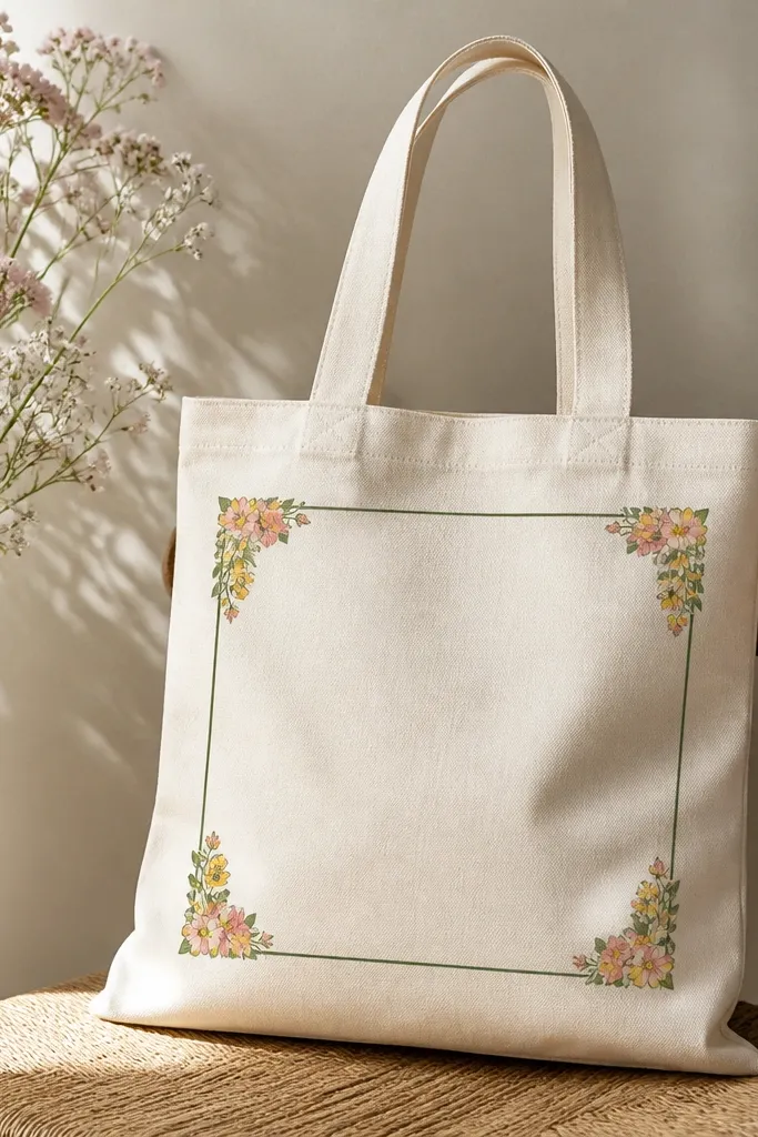
Frames look stylish because they create a gallery-like boundary. Keeping the center open makes the tote feel breathable and avoids a heavy painted feel. Corner flowers add interest without turning the whole bag into a busy canvas.
Draw a rectangle frame about 9 x 12 inches on the front, leaving 2 inches from the sides. Paint a dark green outline, then add small flowers only in the corners. Flowers should be simple: 5 petals in pink, yellow dot center, and a tiny leaf in sage.
Pro tipUse a ruler for the rectangle, then touch up corners with a small brush instead of repainting the whole line.
AvoidAvoid uneven frame width - if the rectangle is crooked, it looks cheap.
24. Marimekko-style blocks with bold black linework
Marimekko-inspired blocks look stylish because the design is graphic and high-contrast. Thick black linework makes the colors look intentional, like a print. The blocks also hide small paint texture because the shapes are bold.
Sketch a few big rectangles and one small triangle across the front. Paint mustard yellow and sky blue, leaving cream as negative space. Outline each shape with thick black paint, then add 10-15 black dots in one corner for balance.
Pro tipLet black linework dry before adding dots so the dots stay sharp.
AvoidDon't over-blend colors under thick lines - keep edges clean and separate.
25. Ink splatters with a single solid color anchor
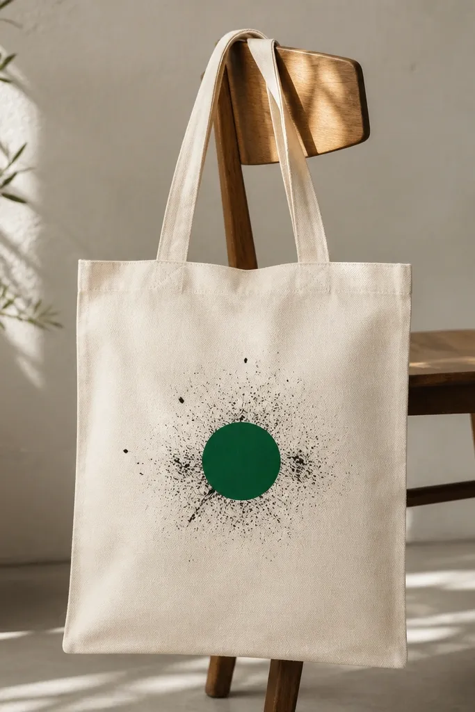
This looks stylish because the splatter is controlled and the design has one anchor shape. The emerald circle keeps it from looking random, and the black splatter adds texture like street art. It's a great look for tote bags you want to feel edgy but still wearable.
Paint one solid emerald circle about 4 inches wide. When it's dry or at least tack-free, load black paint on a toothbrush and flick lightly around the circle. Keep splatters mostly outside the circle and avoid covering the letter or anchor.
Pro tipDilute black paint slightly so splatters look like ink, not thick blobs.
AvoidDon't splatter while the circle is wet - the splatter will merge and blur.
26. Soft watercolor butterfly trio with matching stems
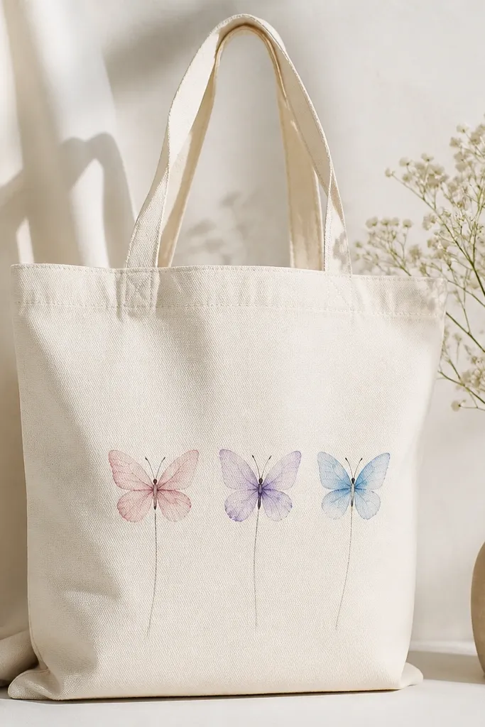
A trio of small watercolor butterflies looks stylish because it stays light and airy. The faint stems connect the pieces so it feels like a set, not random stickers. Pastels also hide minor brush inconsistencies better than bright neon.
Paint three butterflies stacked diagonally across the center. Use diluted pink, lavender, and blue for wings, then add a thin gray outline for each body. Draw faint stems in soft sage green under each butterfly.
Pro tipUse a hairdryer on low for quick drying between butterflies so colors don't bleed together.
AvoidAvoid heavy outlines in pure black - it kills the watercolor softness.
27. Bold polka stripe hybrid across the bottom edge
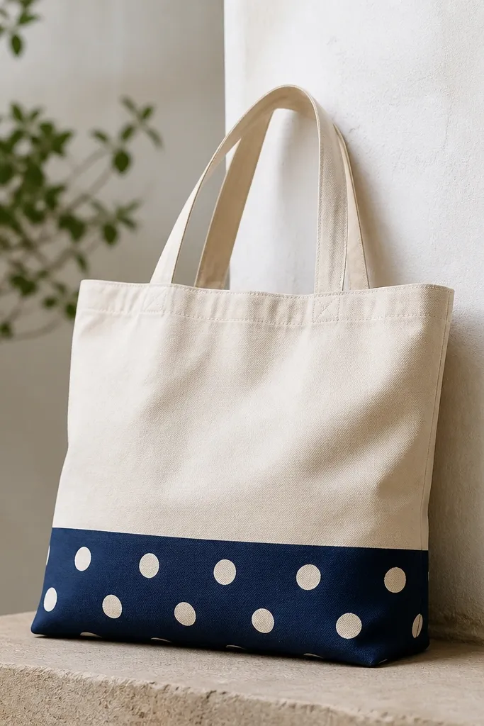
This works because it uses one strong band that frames the tote like a hem. The polka dots make the stripe feel playful, while the navy keeps it grounded. I like designs like this for work totes because they don't look childish when the dots are small.
Mask a bottom band about 3 inches tall. Paint it navy, let dry, then dot with off-white using a dotting tool or the end of a round brush. Keep dots evenly spaced, around 3/4-inch apart. Finish by adding one tiny coral dot cluster on the far right of the band.
Pro tipMark dot positions lightly with pencil dots first so spacing stays consistent.
AvoidDon't make dots too big - large dots on a stripe start looking crowded.
28. Two-tone heart garland with stitched line effect
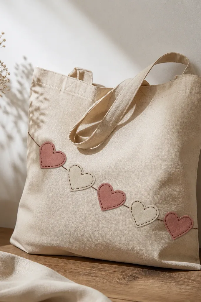
Hearts look stylish when they look stitched, not cartoonish. The stitched outline effect adds a handmade feel, and the two-tone palette keeps it modern. Hanging the garland diagonally makes it feel like decoration on a gift, but for your daily bag.
Draw a diagonal line across the front and add hearts along it, about 2 inches wide each. Paint alternating hearts in dusty rose and cream. Outline each heart with dark brown and add small "stitch" dashes along the outline - 6-8 dashes per heart.
Pro tipUse a fine liner brush and keep dash lengths consistent for a real stitched look.
AvoidSkip wobbly stitch dashes - uneven dashes make it look hurried.
29. Classic anchor in a circle with distressed edges
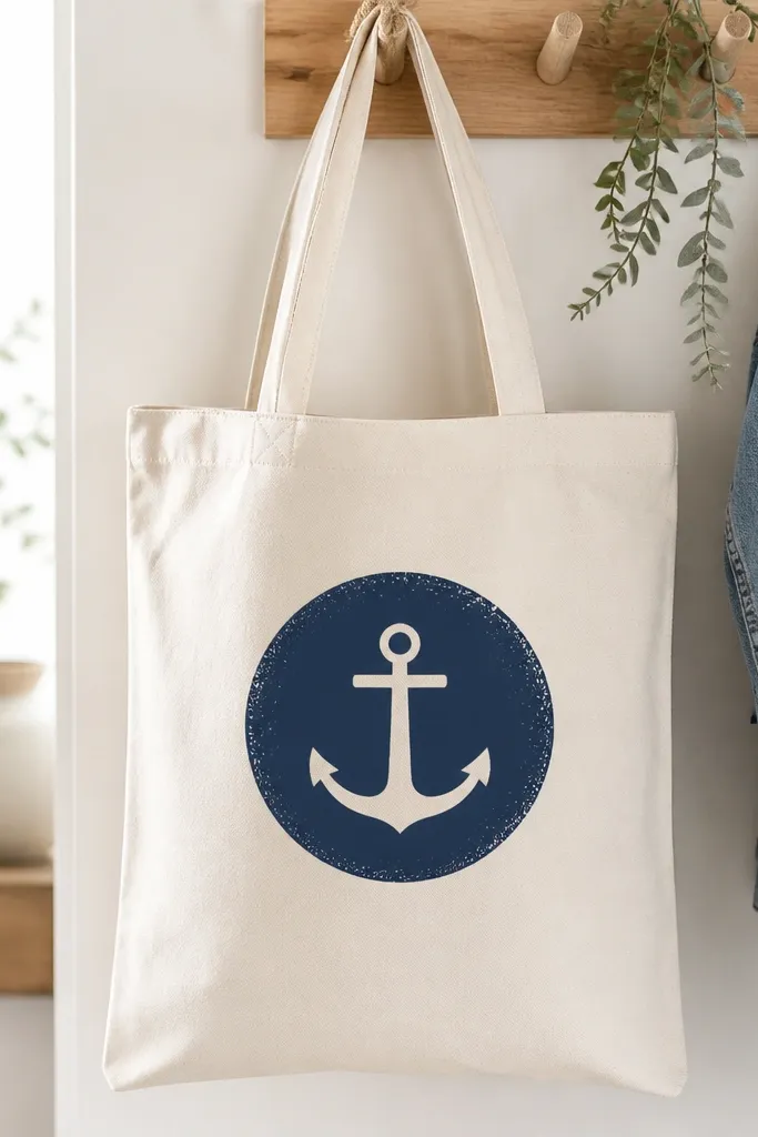
A circle emblem is stylish because it's clean and reads like a brand mark. The distressed edge adds character without turning the design messy. The anchor stays simple so the tote doesn't feel overly themed.
Paint a navy circle about 6 inches wide centered on the front. Draw a simple anchor inside with thin lines, then fill the anchor slightly with off-white highlights. For distress, lightly dab extra paint specks around the circle edge with a dry brush.
Pro tipLet the base circle dry fully, then distress so the edge looks intentional.
AvoidDon't distress while wet - you'll smear the icon.
30. Alphabet mini icons row with color-coded letters
This looks stylish because the icons are small and the color-coded letters create order. It feels like a playful label, not a random collage. I like limiting it to four items so it stays bold and readable.
Pick four letters (like A B C D) and assign each a color. Paint the icons above each letter using simple shapes: star, sun, cloud, heart. Letter height should be around 2.5 inches so everything fits without crowding.
Pro tipUse a stencil for icons if your lines get wobbly - crisp icons make the whole row look intentional.
AvoidAvoid adding too many icons - five or more starts turning into clutter.


