1. Cream Paper Frame with Black Micro-Border
This layout looks expensive because it mimics a printed label on paper. The cream background softens the whole cover, while the micro-border keeps it sharp instead of busy. I like using a black title with tight letter spacing so it stays crisp after Instagram compression. The small icon gives it a finished "system" feel without stealing attention from the name.
In Canva, set background to a warm cream (#F5EBDD) and use a 16-20px border in pure black (#000000). Put the title in the center with 2 lines max, using a bold sans font like Montserrat SemiBold. Add one small circle icon (24-28% of the width) beneath the title. This one fits clean niches like skincare routines, book recaps, or cafe menus.
Pro tipUse a paper texture overlay at 10-18% opacity so it looks tactile without looking grainy.
AvoidDon't use a thick border with thin text - it makes the cover feel cramped and cheap fast.
2. Rounded Corner Frame with Two-Tone Edge
Two-tone edges create a "designed" look even with simple labels. The muted sage outer border adds calm, and the off-white inner line keeps the frame from looking heavy. Left-aligned text helps when you have longer highlight names, because it doesn't force text into awkward center spacing. The icon on the right balances the layout so it feels symmetrical but not boring.
Use a rounded rectangle shape with a corner radius around 44px at 1080 width. Make the outer border 28-32px in sage (#A7BFA9) and an inner line 14-16px in off-white (#F8F6EF). Place the title left with a margin of about 110px from the left edge, and align the icon so its center sits around the 620px vertical mark. This works great for lifestyle highlights and studio updates.
Pro tipKeep the icon color the same as the inner line to make the whole cover feel intentional.
AvoidAvoid placing the icon too close to the text - if they overlap, Instagram makes it unreadable.
3. Bold Black Frame with Negative Space Title
Negative space makes your highlight covers look graphic and modern. The bold black frame gives you instant structure, and the cutout title area keeps the typography clean. White text on negative space stays readable even when Instagram compresses the image. This layout is a lifesaver when you want your highlights to feel "brand-first" instead of decoration-first.
Start with a light background (#FAFAFA) and place a black rounded rectangle frame with a border thickness around 34-40px. Set the title in white (#FFFFFF) with a heavy font weight and center it. Add one small icon at the top center around 220px from the top. Use this for collections like "Tips," "Routes," or "Workouts" where names are short.
Pro tipTest one export on your phone before batching - if your title is thin, switch to a heavier weight.
AvoidDon't use gradients inside the frame - they blur and look muddy at small sizes.
4. Pastel Gradient Border with White Center Panel
A gradient border gives you motion without turning the whole cover into a rainbow. Keeping the center panel pure white makes the title pop and prevents color clashes. I use dark gray text (#333333) instead of pure black, because it looks less harsh on pastel backgrounds. The outlined icon ties the palette together without clutter.
In Canva, build a gradient frame using two nested rounded rectangles: outer rectangle with gradient stroke, inner rectangle solid white. Outer border thickness 26-30px, inner panel padding about 90px from the edge. Place the title in the center panel with 2 lines max. This is perfect for beauty, travel, and anything with soft color branding.
Pro tipLimit your gradient to two colors (like #F7A7C4 to #A9C7FF) so it stays classy instead of candy-like.
AvoidAvoid putting the gradient behind text - it kills readability.
5. Minimal Line Frame with Corner Marks
This template looks clean because it's basically a design skeleton. The thin frame and corner marks create structure without filling the space. It's also the easiest to keep consistent across lots of highlight covers. Single-line icons keep the style uniform, and the airy spacing keeps text legible.
Use a rectangle stroke with 2-3px thickness in medium gray (#6B6B6B). Add corner marks as small L-shapes at each corner, about 22-26px long. Put the title centered, with a line height that doesn't crowd - leave at least 70px between title and icon. Export PNG at 1080 width. Great for art accounts, coaching, and photo diaries.
Pro tipUse one icon style across all covers (outline or filled), never mix them.
AvoidSkip tiny fonts under 40px at 1080 width - they turn blurry after compression.
6. Geometric Hexagon Frame with Label Strip

Hexagon outlines look modern because they add shape hierarchy. The teal frame gives a clear brand color, and the label strip gives the eye a stopping point for the title. Using white text on the strip keeps contrast high. I've used this layout for highlight sets where the names are short but you want the design to look intentional.
In Canva, place a hexagon shape outline as the outer frame and set stroke weight around 10-14px. Add a horizontal rounded rectangle strip across the center with teal fill (#2AA7A3) and set its height to about 110px at 1080 width. Title goes on the strip in white; keep it to one line if possible. This works well for product categories and studio services.
Pro tipMake the strip width 70-78% of the canvas so it feels balanced inside the hexagon.
AvoidDon't add extra shapes around the hexagon - it crowds the label.
7. Gold Foil Look Frame with Charcoal Type
The gold foil effect reads as premium because it mimics reflective print. Charcoal text keeps it grounded so the gold doesn't look like a cheap filter. This one shines for events, styling, and "special" highlight categories. I've used it for holiday content and it still looks clean after multiple posts.
Set background to charcoal (#1F1F1F). Add a gold border using a metallic-looking element in Canva or a gold texture overlay clipped to a rounded rectangle. Keep the border thickness around 22-26px. Title in a serif bold or clean font in near-white (#F2F2F2), centered. Add a small leaf icon in gold at the top right, about 90px from the top.
Pro tipIf your gold looks flat, increase contrast by darkening the background one step.
AvoidAvoid gold-on-white for this style - it looks like a low-res sticker.
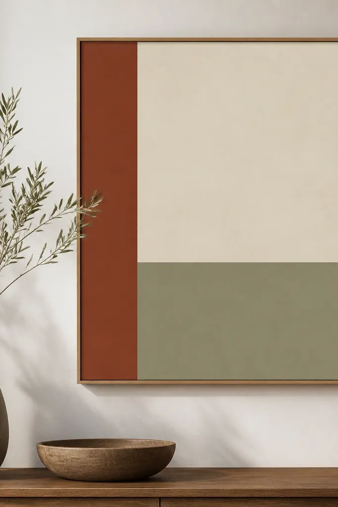
8. Terracotta Border with White Script Title
Terracotta + beige feels warm and handmade. A white script title adds a soft personality, but the frame keeps it from looking like a random quote card. The icon beneath gives you a consistent anchor point across highlight covers. I like using this for cooking, home decor, and anything seasonal.
Use background beige (#F0E3D1). Add a terracotta border around 26-30px thick (#C86B4A). Choose a script font for the title and keep the word count to 2-3 letters per line. Place a small terracotta icon at the bottom center, around 160px from the bottom edge. Keep the title size large so it doesn't get lost after upload.
Pro tipIf the script font looks jagged, switch to a slightly thicker script weight or increase title size by 5-8px.
AvoidDon't use thin script with high-contrast colors - it turns crunchy in export.
9. Checkerboard Accent Frame with One Color Pop
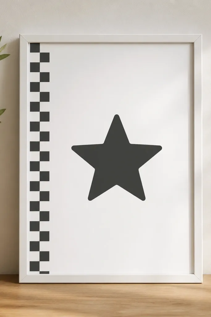
A tiny checkerboard accent makes the cover feel playful without turning messy. The key is keeping the checker strip small and letting one color pop do the rest. When everything else is neutral, the pop icon becomes a clear brand signature. This template works when you want a cohesive set but you don't want all covers to look identical.
Background is off-white (#F7F7F7). Use a gray border around 18-22px thick. Add a checkerboard strip only on the left side width about 140px and height around 720px, in two soft colors (like #D7D7D7 and #FFFFFF). Put the title centered, and place the icon bottom center in one color like cobalt (#1F4ED8).
Pro tipKeep the checkerboard cell size consistent across all covers so it reads as a pattern, not noise.
AvoidAvoid multiple pop colors - two accents max.
10. Photo-Inset Frame with Solid Border
If you already have highlight photos you love, this layout makes them look intentional. The solid outer border keeps the frame consistent across categories, while the inset photo adds variety without breaking the set. The semi-transparent overlay makes the title readable on busy images. I use it for travel and recipe highlights where a photo instantly explains the category.
Outer border: thick 28-34px in a single brand color (like navy #12324A). Inset photo rectangle should be about 70% of the canvas width and centered. Add a title text layer on top with a dark overlay at 25-35% opacity (#000000). Use a bold sans font in white. Export at 1080 width and check readability on your phone.
Pro tipPick one consistent photo style (same filter or same lighting) so the set looks cohesive.
AvoidDon't let the title sit directly on bright highlights - it becomes hard to read after compression.
11. Chalkboard Style Frame with White Chalk Text

Chalkboard style feels cozy and handmade, and it hides small image imperfections. White chalk text pops hard on dark green, so it stays readable in Instagram's little thumbnails. The speckled background texture keeps it from looking like a flat block. This layout works best for meal plans, reminders, and home projects.
Background: dark green #1F3A2E with a chalk texture overlay. Frame color: slightly lighter green #355E46 at 24-28px thickness. Use a chalk font or a handwritten style, and keep the title to one line if possible. Add a small doodle icon like a star or leaf in white at the bottom. Place everything centered to avoid awkward crops.
Pro tipReduce text opacity slightly (90-95%) so it looks like chalk, not printed white ink.
AvoidAvoid pure black backgrounds - the white text looks harsh and cheap.
12. Soft Marble Frame with Clear Title Plate
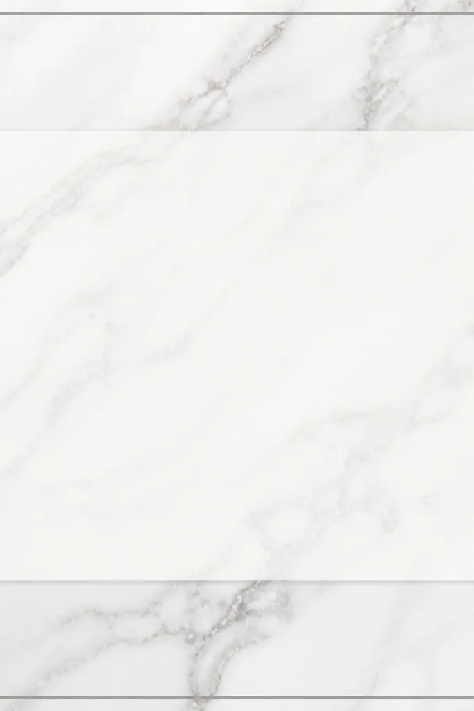
Marble gives a clean, premium feel without needing extra icons. The trick is keeping the marble subtle and using a title plate so text stays readable. The semi-transparent plate looks like glass, but it still behaves like a solid area for typography. I use this for skincare routines, wellness, and any account that wants "calm" without being boring.
Background: marble image element with low contrast (white #FBFBFB and gray #B9B9B9). Border: thin 14-18px in gray. Title plate: rounded rectangle with white fill at 85-90% opacity. Text in #4A4A4A, centered. Add an icon only if it's simple outline style; otherwise leave it out.
Pro tipUse a stronger font weight than you think you need, because marble swirls can reduce contrast.
AvoidDon't place text over the densest marble parts - use the title plate every time.
13. Navy Sailor Frame with White Rope Border
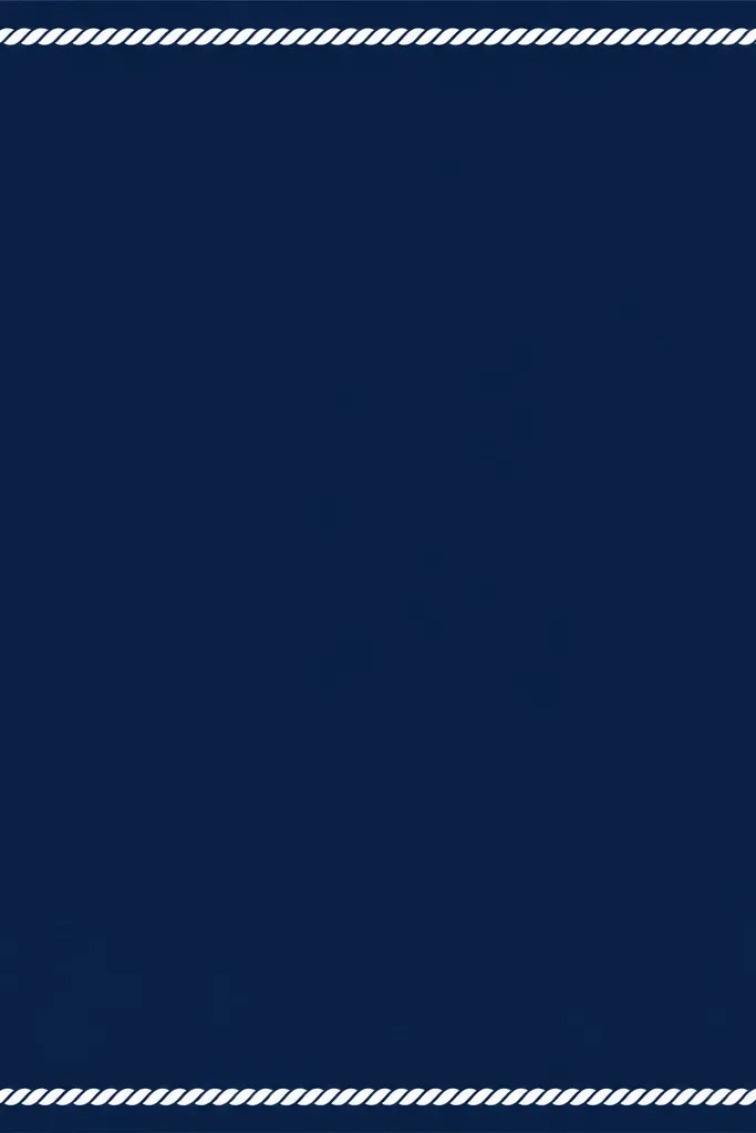
This one looks handcrafted because the rope border reads like texture, not a flat line. Navy + white gives instant readability, and the anchor icon makes the style cohesive across travel or "weekend" highlights. I like the rope border inside the frame so it feels layered. It's also great when you want a theme that isn't pink or pastel.
Background: navy #0B2A3A. Add an inner rope border effect - in Canva you can fake it with a rope element or textured stroke, keeping thickness around 18-22px. Outer border can be a simple solid line 10-14px if you want extra structure. Title in white, centered, with a bold sans font. Anchor icon top left with consistent padding (about 120px from left, 160px from top).
Pro tipKeep the rope border slightly inset so it doesn't touch the title plate.
AvoidAvoid adding extra nautical icons (compass, waves, ship) - it turns into a sticker sheet.
14. Color-Blocked Stack Frame with Left Stripe
Color-blocking makes highlight covers look like a mini poster. The left stripe gives you instant organization, and the two horizontal bands let you pair colors without clutter. I like this for accounts that post categories like "Reviews," "Tutorials," or "Before/After." The title stays clean because it sits on the lighter band.
Use a background split: top band 45% height and bottom band 55% height. Pick two colors that match your feed - for example, top #F2D7C7 and bottom #C97A5B. Add a vertical stripe on the left about 120px wide in a darker shade (#8E4A33). Put the title centered in the bottom band and keep it to one line. Add a small icon on the stripe center if you want a consistent marker.
Pro tipUse the same stripe color across all covers, even when the title colors change.
AvoidDon't cram the title over the boundary line between bands - it looks accidental.
15. Monochrome Photo Booth Frame with Film Grain
This style looks like an old photo print, and it hides compression artifacts better than clean flat graphics. The monochrome approach keeps everything cohesive even when your photos vary. A small caption area makes the title feel like part of the photo rather than pasted on. I use it for memory highlights, event recaps, and personal journals.
Create a frame with a monochrome photo strip centered, with a thin white border around 14-18px. Add film grain overlay at low opacity (10-15%) so it doesn't look gray and dirty. Put the title in a small bottom caption rectangle that's about 18% of the canvas height, with white text on a semi-transparent black (#000 at 35%). Keep the font small but bold so it reads at thumbnail size.
Pro tipUse the same photo aspect ratio across all covers so the photo strip doesn't shift.
AvoidAvoid full-color photos in this template - the monochrome frame makes them look off.


