1. Painter's Tape Color Blocks with a Clean Bottom Edge
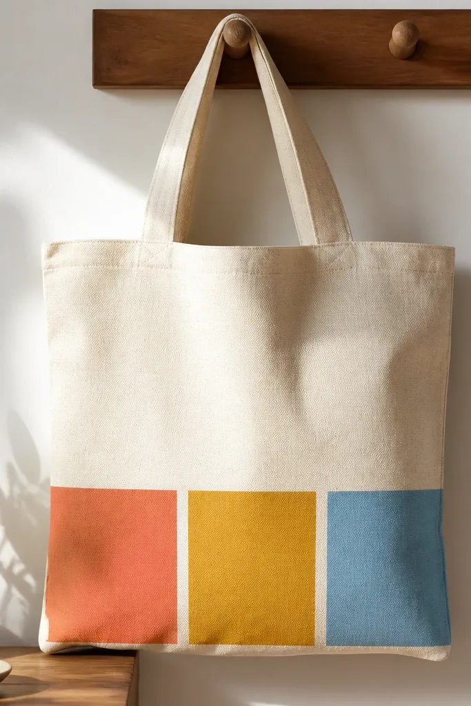
This one looks sharp because the boundaries are literal tape edges. I paint horizontal blocks that are each about 3 inches tall, then remove the tape while the paint is still tacky so the line stays crisp. Use three opaque colors that contrast with the tote: coral on natural, mustard on cream, sky blue on beige. The top stays blank so the design feels modern instead of busy.
Use a tote that is at least 14 inches tall so the blocks have room. Measure from the bottom up: make each block 3 inches, with a 1/8 inch tape gap between colors. Let the first block dry 30-45 minutes before the next so you don't smear.
Pro tipPress tape down with a fingernail along the weave so paint doesn't sneak under.
AvoidDon't paint over tape once it's fully dried and hardened - it lifts and leaves ragged edges.
2. One-Row Dots in a Gradient Like a Sunset
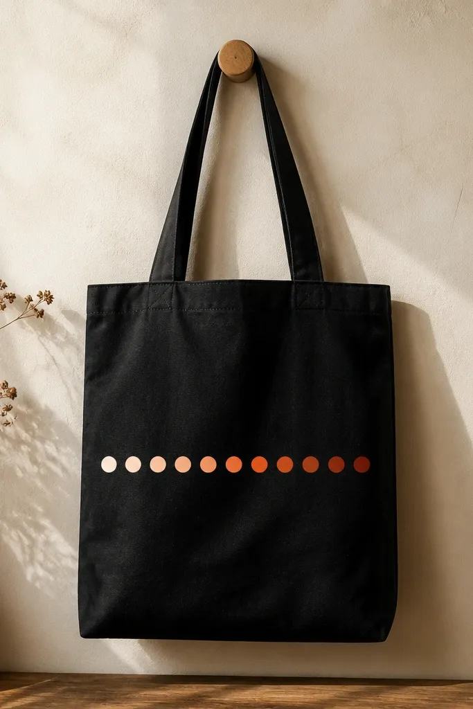
Dots are forgiving, and a single row keeps it classy. I use a round sponge or the back of a paintbrush to stamp dots, so every circle lands with the same size. Start with lighter peach near the left handle and work to deeper rust on the right. The gradient reads as intentional even if your dot spacing isn't perfect.
Mark 10-12 dot positions with a pencil dot guide. Mix three paint shades: peach, orange, and rust, then blend in between by cutting the middle color with the lighter one. Let each pass dry before adding more dots so they don't smear into blobs.
Pro tipUse painter's tape as a straight guide line so the dot row stays level.
AvoidDon't use watery paint - thin dots turn into rings around the edges.
3. Tiny Botanical Sprigs with a Marker Outline
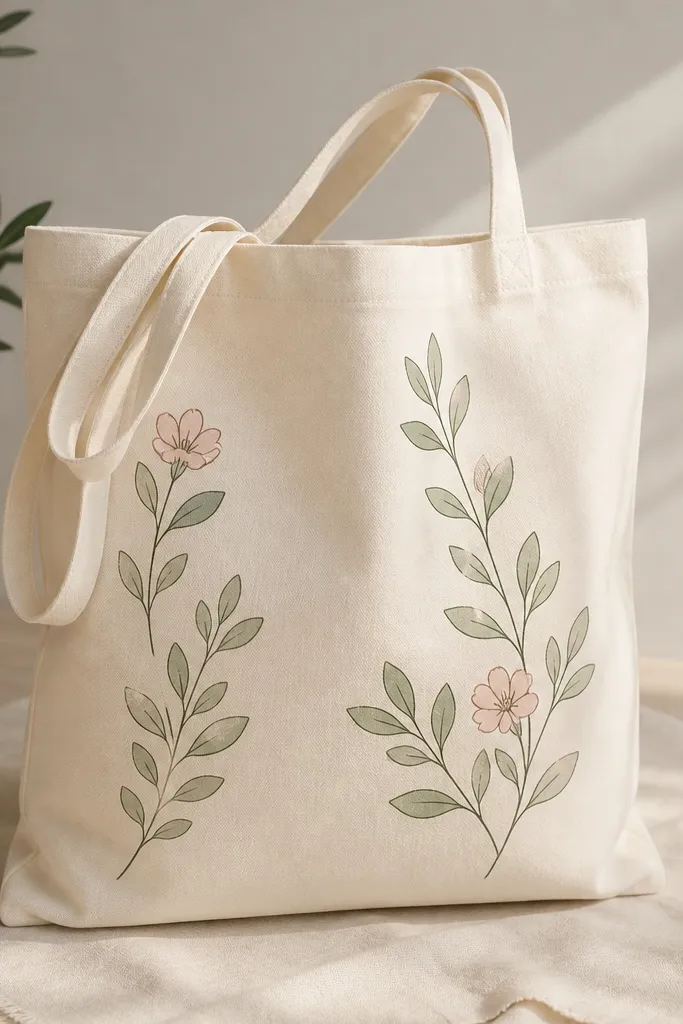
This design works because the outline keeps the leaves readable. I sketch sprigs about 4 inches wide total, then fill each leaf with slightly different greens so it feels hand-drawn. Add two small blossoms using a dot center and a few petal strokes. The muted palette looks good on off-white totes and doesn't feel childish.
Use a fine fabric marker for the outline first. Paint leaf fill with a small round brush (size 2 or 3), then add flower details with a toothpick for the dot centers. Keep the sprigs clustered near one side seam so the tote still looks clean when worn.
Pro tipLet the marker dry fully before painting over it so the ink doesn't bleed.
AvoidDon't add too many leaves - the design gets cluttered fast.
4. Minimal Wave Line with Two Accent Colors
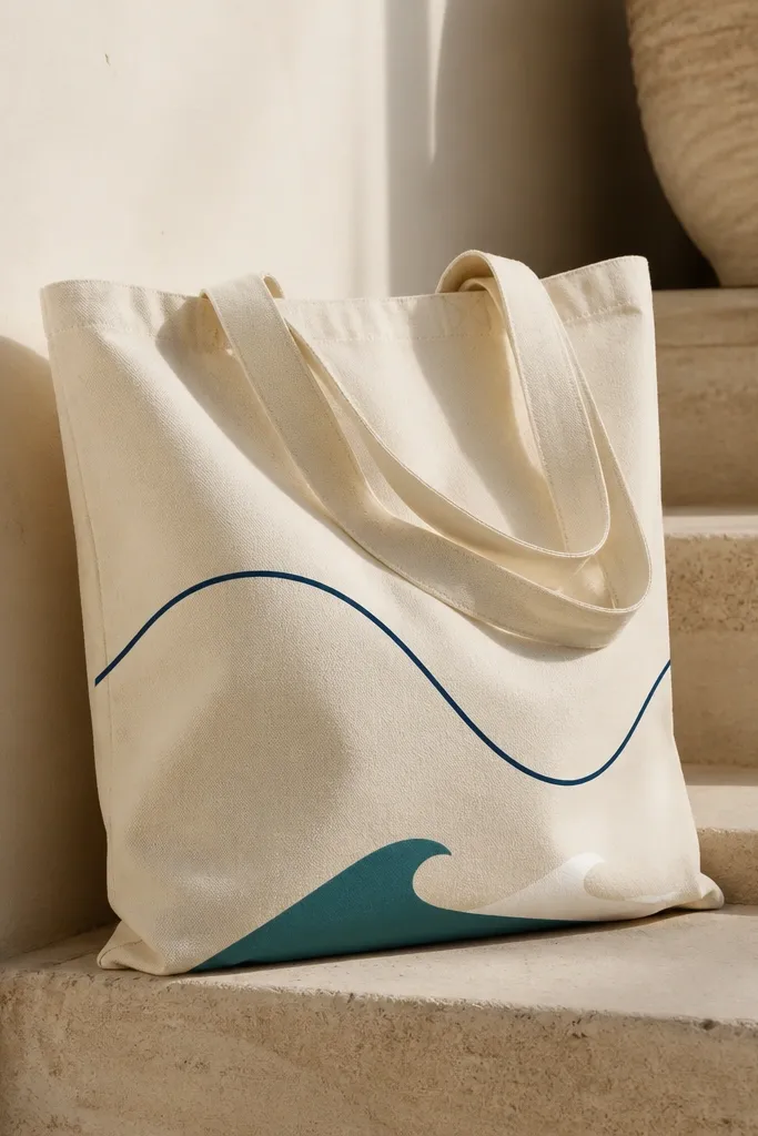
A single continuous line is the fastest way to get a "designed" look. I draw a long wave that starts near the left side seam and curls across the front about 10 inches. Then I fill two sections with teal and white so the line feels dimensional. Keep the palette to navy + one bright accent to avoid a messy look.
Use a fabric pen for the line, then fill with fabric paint using a small liner brush. Make the filled wave segments about 1.5 inches long each. Let the outline dry before you paint so the line stays clean.
Pro tipPractice the wave on paper first, then copy the rhythm onto the tote with light pencil dots for the peaks.
AvoidAvoid painting directly over a wet pen line - it spreads and looks fuzzy.
5. Sunflower Center Burst with Petal Tips
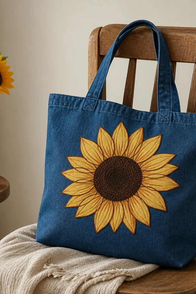
Sunflowers look bold without needing lots of detail. I start by painting a circular center in dark brown, then add a ring of short strokes to suggest seeds. Petals get a simple oval shape filled with yellow and tipped with a darker shade on the outer edge. The contrast makes it read from across a room.
Draw a circle about 5 inches across. Paint the center first, then add 12 petals around it, each about 1 inch long. Outline petals with a darker mustard using a small brush so the shape stays crisp on textured fabric.
Pro tipUse a paper circle template for the center so it's perfectly round.
AvoidDon't over-blend the center - it turns into a muddy blob on canvas.
6. Monogram Block Letters with Shadow Offset
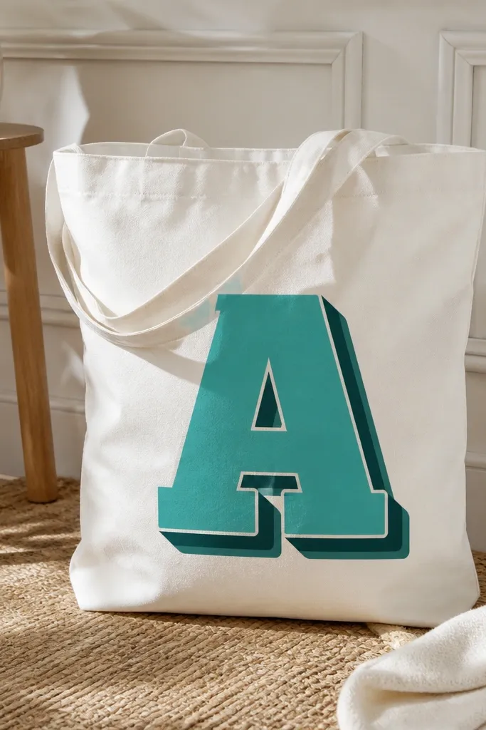
Block letters look clean and modern, and the shadow makes it feel layered. I paint the main letter first, then repeat it as a shadow shifted about 1/4 inch diagonally. Use opaque paint so the letter edges stay solid. This design is also easy to customize - pick any two-letter combo and keep the style consistent.
Tape a border around the letter area to keep the paint from drifting. Use a stencil for the letters or print a font and trace. Paint the shadow with a darker shade, let it dry, then fill the main letter on top.
Pro tipUse matte fabric paint for the letters so the shadow doesn't look glossy and plastic.
AvoidSkip freehand cursive - it's harder to keep edges straight on fabric.
7. Stitched Look with Faux Thread Outline
The stitched effect tricks your brain into thinking the tote has sewn patches. I draw a simple shape like a rounded rectangle, then paint tiny dashes along the border with a thin liner brush. A second pass in a darker red makes the dashes look like thread shadows. Keep the design to one outline so it stays neat.
Tape the rectangle first so the corners are even. Use a fabric marker to sketch dash spacing, then paint each dash about 1/4 inch long. Let it dry, then add the darker shadow dashes offset slightly.
Pro tipUse a size 0 liner brush - bigger brushes make the dashes smear into lines.
AvoidDon't paint over wet dashes - you'll lose the separation.
8. Geometric Triangle Stack with a Tape Grid
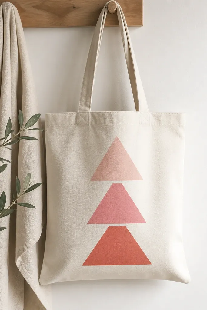
Triangles look energetic, and tape gutters keep them clean. I stack triangles so each one points up, with the bottom triangle slightly wider. The color shift from light pink to coral gives depth without complex shading. This works great on totes with wide flat fronts.
Create a tape grid: two diagonal tape lines form the triangle edges, then tape the base line. Paint the largest triangle first, then the next size inside it, leaving a tape gutter between. Remove tape after the paint is tacky.
Pro tipMake the smallest triangle about 60% of the width of the largest so it doesn't look cramped.
AvoidAvoid using too many colors - three tones read best.
9. Big Heart with Two-Tone Fill and White Highlight Line
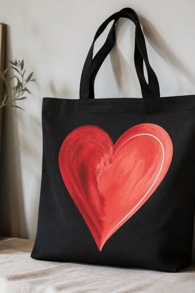
Hearts are the easiest way to get a friendly look, and the two-tone fill makes it feel more polished than a flat heart. I paint the whole heart in coral first, then glaze the left half with deeper red so it looks like light hits one side. The thin white highlight line sells the 3D effect.
Trace a heart template about 6 inches wide. Paint coral base, let dry 20-30 minutes, then paint the left half with red using a clean angled brush. Add the white highlight as a single curved line about 1/8 inch thick.
Pro tipUse masking tape to keep the half-and-half boundary straight.
AvoidDon't add glitter paint - it feels scratchy and flakes when the tote flexes.
10. Abstract Splash Marks with a Controlled Drip
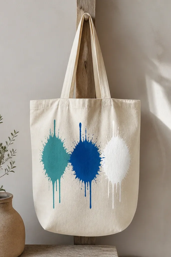
Splashes look artsy without needing a full illustration. I load paint on a brush, then flick it with my thumb so dots and short splatters land in a cluster. For control, I use thicker paint for the main splashes and thinner paint for tiny drips so it doesn't run everywhere. White paint on natural fabric gives that "clean art" look.
Cover the inside of the tote with cardboard or plastic so drips don't soak through. Tape off the area behind the splash so you can keep it centered. Do one color cluster at a time, letting each dry before adding the next.
Pro tipPractice the flick on scrap fabric first - your thumb pressure changes the splatter size a lot.
AvoidDon't shake the brush over the tote - it creates long streaks you can't fix.
11. Cat Face in Simple Shapes with Nose Triangle
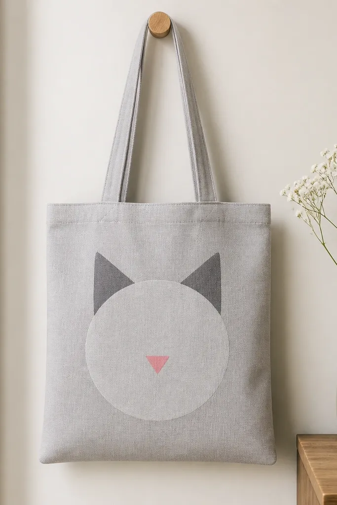
This is a kid-friendly idea that still looks good as an adult tote. The trick is to keep every part a simple shape: ears as triangles, face as a circle, eyes as two small ovals, and nose as a triangle. Use two fur colors max, plus a tiny pink nose. It reads instantly and doesn't require fine line work.
Draw the head circle about 5 inches across. Fill the ears and face with solid paint, then add eyes and whisker lines with a liner brush. Add a small cheek blush dot in a lighter pink so the face looks alive.
Pro tipOutline the eyes with a darker fur color so they don't blend into the face.
AvoidAvoid tiny details like whisker dots - they disappear after washing.
12. Rainbow Side Stripe with a Little Cloud
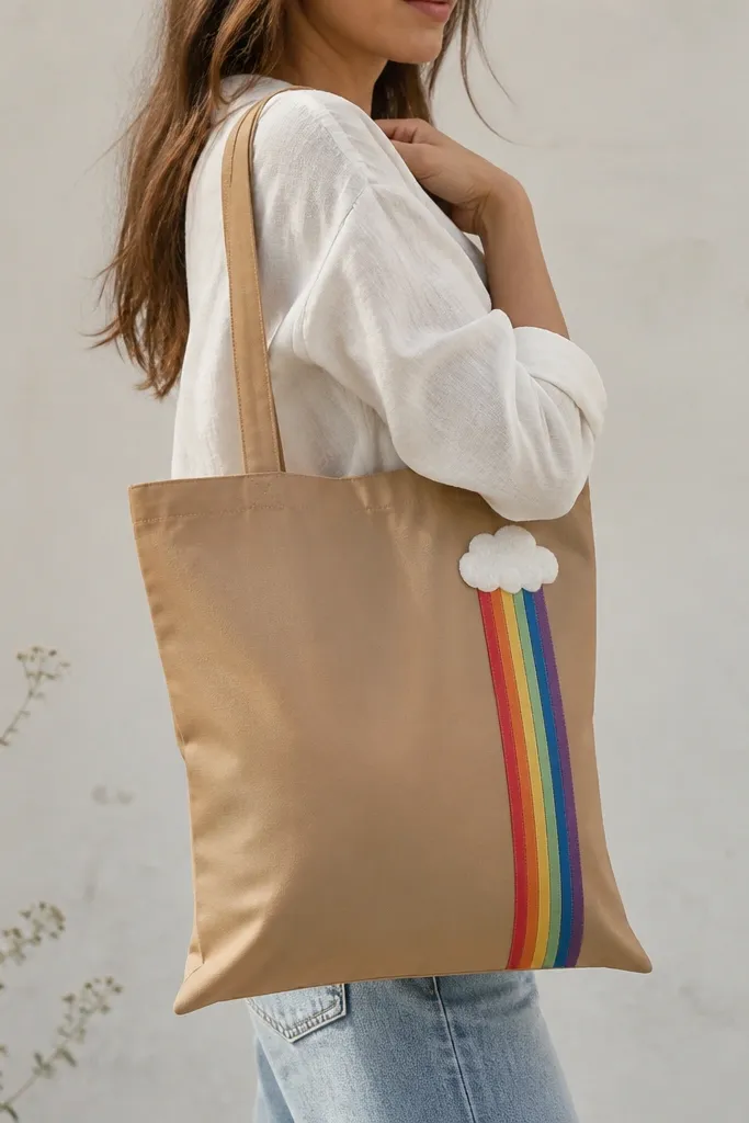
A single vertical stripe uses color without covering the whole bag. I paint six stripes that are each about 1 inch wide, stacked from red to violet, then add a small cloud in white with a light gray shadow under it. The cloud makes it feel playful but still neat. This design also hides small paint imperfections because the stripe is bold.
Mark a vertical guide line 2 inches from the side seam. Tape horizontal boundaries between rainbow bands so the edges are straight. Paint the cloud first so it dries before you add the stripe, or keep it small so it doesn't smear.
Pro tipUse a flat brush for stripes so the paint edge stays crisp.
AvoidDon't put the stripe too close to the seam - it gets distorted when the tote folds.
13. City Skyline Silhouette with One Window Color
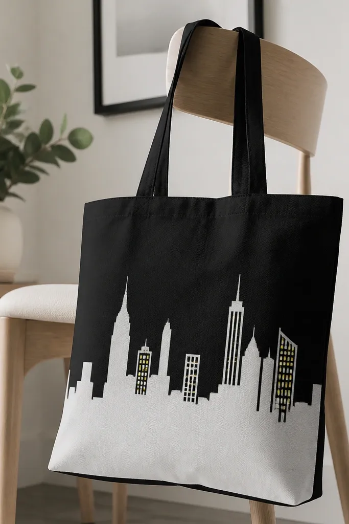
City silhouettes look great because they're just shape control. Paint the entire skyline in one solid color, then add a handful of windows in a single accent color. I like yellow windows on white skyline because it looks like lights without needing tiny detail everywhere. The spacing makes the skyline feel intentional.
Use a cut-paper stencil skyline or draw one long strip of buildings with varied heights. Keep the silhouette height around 6 inches tall. After the base dries, paint 15-20 windows with a toothpick or fine brush so they don't look like random dots.
Pro tipAdd one taller building at the center - it anchors the whole design.
AvoidSkip full-window coverage - it turns into a busy pattern quickly.
14. Waves and Stars Minimal Set in Navy and White
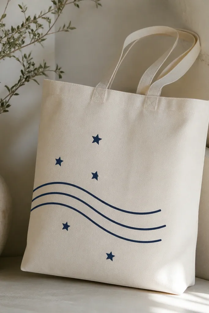
This is a "tiny symbols" design that looks great on tote sizes where big art would crowd the bag. Waves and stars are easy to repeat, and repeating shapes makes it look planned. Keep everything navy and white so it feels clean. The diagonal placement makes it look like motion.
Draw a diagonal line guide from lower left to upper right. Paint three wave lines, each about 3 inches long, then add stars between them. Use a round brush for stars: dot center first, then four short strokes for points.
Pro tipLet the navy dry fully before adding white so you don't get gray smudges.
AvoidAvoid using black outline around everything - it makes it look like a coloring book.
15. Hand-Painted Plaid Using Two Brush Angles
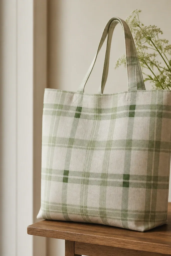
Plaid looks harder than it is. You're just painting straight lines at two angles, then touching intersections. I use two greens: a mid green for most lines and a darker green for the intersection points. The effect looks like a woven fabric pattern even though it's painted.
Mark a grid lightly with pencil: start with vertical lines about 1 inch apart, then add horizontal lines. For the angled plaid effect, add diagonal lines crossing between the verticals. Use thin paint so the tote weave still shows through slightly.
Pro tipUse a ruler and keep your wrist locked - straight plaid depends on your movement, not your talent.
AvoidDon't flood the lines - heavy paint makes plaid look shiny and thick.
16. Botanical Line Art Frame Around a Quote Area
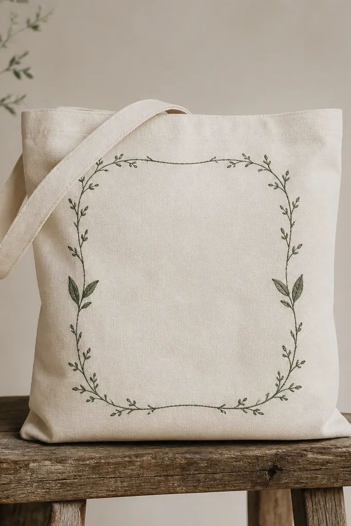
This is one of my favorite styles because it looks like a printed label. You draw a simple frame - think rectangle with rounded corners - and add vines that curl in. Keep line weight thin so the tote still looks light. Leave the center blank or add one small word in the same color.
Use a fabric marker for the frame, then paint the vines with a slightly lighter green for a subtle depth. Keep the frame about 1.5 inches from the tote edges so it doesn't get cut off by the seam. Let the marker dry before painting to avoid bleeding.
Pro tipDo one corner first, then mirror the other side so it looks symmetrical.
AvoidAvoid thick marker lines - they make the frame look heavy.
17. Ombre Bottom Fade with a Soft Brush Technique
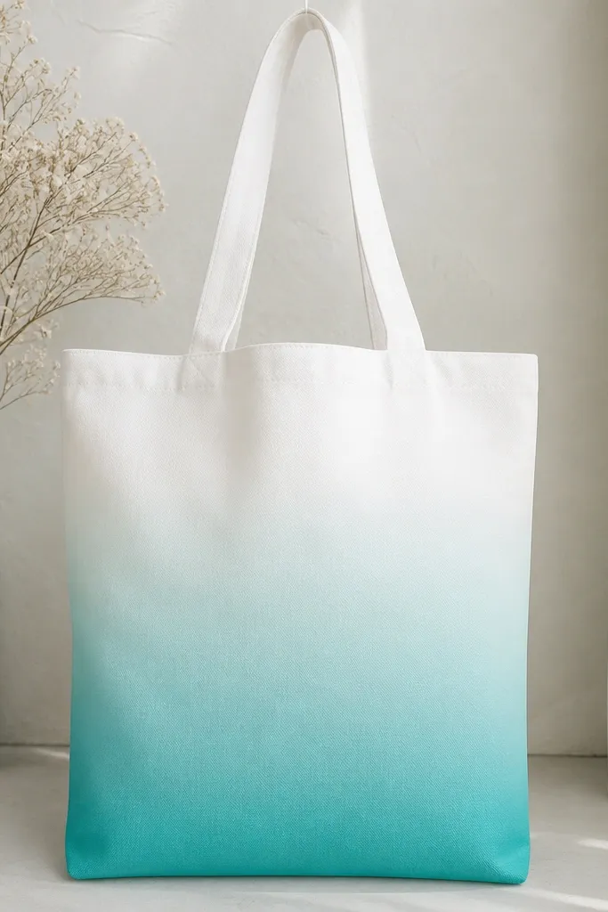
Ombre is all about blending while paint is still workable. I paint the bottom edge fully saturated, then pull paint upward with a damp brush so the color thins gradually. For crispness, I stop the ombre at a measured height like 6 inches. Teal on white looks clean and modern.
Wet the brush lightly, then apply teal at the bottom strip about 2 inches tall. Add medium teal just above it and blend the boundary with a clean damp brush. Finish by blending into the tote fabric so there's no hard line.
Pro tipRinse your brush between blend steps - dirty brush water turns ombre gray.
AvoidDon't wait until the paint is dry to blend - you'll get stripes.
18. Abstract Sun Disc with Rays and Negative Space
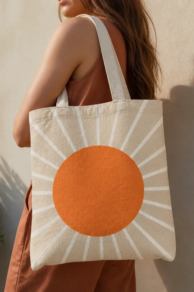
Negative space rays make the sun look graphic instead of cartoonish. I paint only the disc solid, then add rays using light orange lines or leave them blank depending on your tote color. The disc grabs attention, and the rays keep the design from looking flat. This works especially well on medium or dark totes.
Use a stencil circle about 5.5 inches across. Paint the disc in orange-red, then use a thin brush to add 10-12 rays spaced evenly. If your tote is dark, outline the disc lightly with a lighter orange so the circle edge pops.
Pro tipTape the stencil down and paint in two thin coats for a smooth edge.
AvoidAvoid thick rays - they look like marker scribbles on fabric.
19. Geode Effect with Crack Lines and Layered Color
Geode art looks impressive because of the crack lines and color layers. I paint the main geode in teal, then glaze violet toward one edge. The cracks are thin and irregular, painted with a light gray or off-white. Add a tiny touch of metallic gold along a few cracks if you want extra sparkle.
Sketch a freeform geode blob about 7 inches tall. Paint base teal first, then layer violet in a crescent shape. After drying, add crack lines with a thin liner brush and let them sit on top without overworking.
Pro tipKeep crack lines fewer than you think - 15-25 cracks look better than 60.
AvoidDon't mix metallic paint into the whole area - it turns the geode muddy.
20. Mars Rover-Style Dots and Lines Diagram
This design has that "printed label" vibe because it uses diagram rules: circles, dots, and consistent line weight. I paint one big dotted circle, then add a few smaller circles and measurement lines pointing inward. Keep the palette to gray plus one warm accent like orange. It looks cool on plain totes and doesn't require realistic drawing.
Mark the main circle about 5 inches across and paint it with gray dashes using a round brush. Add three straight lines with arrowheads made from triangles. Fill 6-8 nodes with orange so there's visual interest.
Pro tipUse a ruler for measurement lines even if the rest is hand-drawn.
AvoidAvoid random scribbles - the diagram look depends on consistent shapes.
21. Polka Dot Frame Around a Center Icon
A dotted frame makes the center icon feel like it belongs on a sticker. I paint a rectangle frame about 9 inches wide, then stamp dots along the edges. The center icon can be a heart, star, or simple flower - keep it one thing. Teal dots plus coral center looks cheerful without becoming childish.
Tape a rectangle border first. Stamp dots along the taped edge, then remove tape after the dots are tacky. Paint the center icon last and keep it small around 2 inches.
Pro tipStamp dots with the same pressure each time so the circles stay the same size.
AvoidDon't crowd the frame - leave breathing room between dots and corners.
22. Hand-Painted Stripes with Fabric Marker Guides
This is the stripe version that stays straight. I use a fabric marker to draw thin guide lines first, then paint between them with a flat brush. The marker disappears after heat-set if your marker is fabric-safe and intended for that use. The alternating muted colors give a tailored look.
Draw guide lines about 1/2 inch apart across the width. Paint one stripe color, let it dry, then paint the alternate. Keep stripe edges crisp by loading paint on the brush and not dragging too long.
Pro tipPaint stripes in the direction of the tote weave to reduce streaks.
AvoidAvoid thick marker ink lines showing through - use a light touch for guides.
23. Tie-Dye Inspired Ombre Blocks with a Stencil Edge
You get a tie-dye vibe without the mess by using a stencil edge. I paint a rounded rectangle area, then sponge in two colors and blend edges lightly so it looks smoky. The stencil keeps it from spreading across the whole bag. Teal and lavender look especially good on cream.
Use a thick paper stencil or a plastic stencil sheet shaped like a rounded rectangle about 6 inches tall. Sponge teal first, then sponge lavender where you want the "cloud" effect. Blend by lightly dabbing with a damp sponge, then let it dry fully before removing the stencil.
Pro tipUse a sea sponge - it gives irregular edges that feel like dye.
AvoidDon't use a foam roller - it makes the blend too uniform and plastic-looking.
24. Single Line Lettering with a Painted Underline
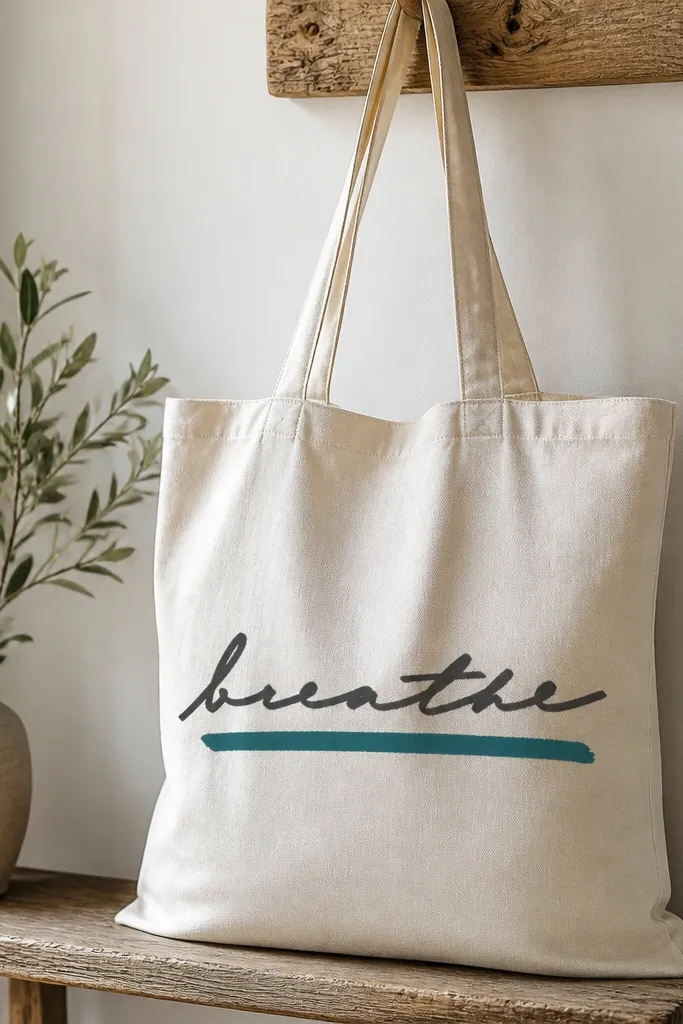
Hand lettering looks best when you keep it to one line and add one graphic element. I write a single word about 10 inches long, then paint a thick underline that matches one letter accent. The underline adds structure so the design doesn't float. Charcoal plus teal looks clean and modern.
Use a fabric marker to write the word lightly, then trace over it with paint if you want thicker lines. Let the marker dry 10 minutes before painting. Paint the underline as a 1-inch tall bar with a flat brush, stopping short of both ends so it looks intentional.
Pro tipPractice your word on paper with the same spacing you'll use on the tote.
AvoidAvoid multiple lines of text - the tote front gets crowded fast.


